#CSSLayouts
Explore tagged Tumblr posts
Visit Tumblr Blog
Explore Tumblr blogs with no restrictions, modern design and the best experience.
Last Seen Tumblr Blogs


Fun Fact
Users from the US are the majority of Tumblr visitors.
Text
Understanding CSS Grid Behavior in Different Browsers

When working with CSS Grids, you might encounter issues where your layouts behave unexpectedly in different browsers. In this comprehensive guide, we'll delve into the complexities of CSS Grid behavior and explore strategies to address these challenges.
Browser Compatibility
CSS Grid is a powerful layout system, but like any web technology, it may exhibit variations across different browsers. While modern browsers generally provide excellent support for CSS Grid, subtle differences can impact your layouts. Here are some common browser-related issues you might face: - Overflows and Scrollbars: Browsers may interpret grid layouts differently, leading to overflows and unwanted scrollbars. - Scaling: The scaling of your browser or system display settings can affect how grid layouts are rendered. - Rendering Engines: Browsers use different rendering engines (e.g., Blink in Chrome, Gecko in Firefox) that can influence how CSS Grid is interpreted.
Tackling CSS Grid Challenges
Now, let's explore some strategies to address these challenges and ensure consistent grid behavior across browsers. 1. Use Vendor Prefixes Vendor prefixes like -webkit- and -moz- can help ensure compatibility with older browser versions. While modern browsers typically don't require these prefixes for CSS Grid, they can be useful for addressing legacy browser issues. CSS /* Example of using vendor prefixes */ .grid-container { display: -webkit-grid; display: -ms-grid; display: grid; /* Other grid properties here */ } By including vendor prefixes, you can enhance compatibility with older browsers that may not fully support the latest CSS Grid features. 2. Test on Multiple Browsers Testing your CSS Grid layouts on various browsers is essential for identifying and addressing compatibility issues. Popular web development tools like Chrome DevTools and Firefox Developer Edition allow you to preview your site in different browser environments. Additionally, consider using browser testing services or virtual machines to ensure your layouts work smoothly across a wide range of browsers and versions. 3. Adjust Grid Definitions When facing overflow or scrollbar issues, you can adjust your grid definitions to accommodate content more effectively. Experiment with grid-template-columns and grid-template-rows to fine-tune your layouts. 4. Media Queries Media queries are a powerful tool for responsive design, and they can also help address CSS Grid issues. You can create specific grid layouts or adjust properties based on screen size, ensuring optimal rendering on different devices and resolutions. CSS /* Example of using media queries for grid adjustments */ @media screen and (max-width: 768px) { .grid-container { grid-template-columns: repeat(2, 1fr); /* Other grid properties for smaller screens */ } } 5. Flexbox as a Fallback If you encounter persistent CSS Grid issues in certain browsers, consider using Flexbox as a fallback layout. While CSS Grid offers powerful grid capabilities, Flexbox can provide a reliable alternative for older browsers or situations where Grid falls short. CSS /* Example of using Flexbox as a fallback */ .grid-container { display: grid; grid-template-columns: repeat(3, 1fr); /* Other Grid properties here */ } /* Fallback for browsers without Grid support */ @supports not (display: grid) { .grid-container { display: flex; flex-wrap: wrap; /* Other Flexbox properties here */ } }
Testing and Optimization
As you implement these strategies, it's crucial to continuously test your layouts on different browsers and devices. Browser compatibility can evolve over time, so regular testing ensures your website remains functional for all users. Optimization is another key aspect. Minimize the use of vendor prefixes when unnecessary, as modern browsers often don't require them. Additionally, keep your CSS clean and organized to facilitate troubleshooting.
Conclusion
CSS Grid is a versatile layout system that greatly enhances web design capabilities. While it provides consistent results in most cases, variations in browser interpretation can pose challenges. By employing the strategies outlined in this guide, you can overcome CSS Grid issues and deliver a seamless and responsive user experience across diverse browsers and devices. Web development is a dynamic field, and staying up-to-date with best practices and techniques is essential. CSS Grid is just one aspect of modern web design, and mastering it opens doors to creating complex and visually stunning layouts. Here is the demo. See the Pen CSS Grid Demo by CSS Monster (@CSS-Monster) on CodePen. Remember that web development is a journey of continuous learning and improvement. Embrace challenges, experiment with new features, and strive for web experiences that delight users. Thank you for reading this in-depth guide on tackling CSS Grid issues in various browsers. We hope it equips you with the knowledge and confidence to build outstanding web projects that perform consistently across the web. Read the full article
1 note
·
View note
Text
CSS (Cascading Style Sheets) is a styling language used to control the appearance of HTML elements. It allows developers to separate content from design, making web pages more visually appealing and easier to maintain.
#CSS#WebDevelopment#FrontendDevelopment#WebDesign#CSS3#TechEducation#CSSForBeginners#TechBooks#CSSStyling#CSSGrid#CSSFlexbox#ResponsiveDesign#WebAppDevelopment#CSSAnimation#CSSLayout#TechLearning#UIUXDesign#WebDesignTips#CSSBestPractices#TechTutorial#FrontendWebDesign#CSSDesign#WebDesignSkills#CSSVariables#MobileFirstDesign#CSSFramework#HTMLCSS
0 notes
Text
A Vital Layout Tool - Flexbox
youtube
In this weeks Web Authoring class we learnt about a crucial tool for the layout aspect of websites - Flexbox. In the CSS text document, Flexbox lays things out in 1 dimension and targets specific containers and their children components from the HTML file. You change a container’s display to ‘flex’ like shown below to start using Flexbox:
display: flex;
However, it is wrong to use the terms ‘left’ and ‘right’ when talking about how the direction works in Flexbox. It is a very flexible tool that can be used on multiple screens (desktop and mobile for example) so it is preferred to see its ‘direction’ values in terms of two axis’s, with ‘start’ and ‘end’ points. The Main Axis means the main direction of flow in Flexbox while Cross Axis equals the perpendicular direction to the Main Axis. There are row and column properties to reference when indicating in CSS what style of layout to have the children of the chosen container be:
Row = left to right
Row-reverse = right to left
Column = top to bottom
Column-reverse = bottom to top
You can also make a row of content boxes (container children) be wrapped or not (it is not wrapped on default). Wrapping enables the children items to flow onto the next line (depending on what Axis they are on) if they run out of room or when the browser window is minimized/shrunken down:
flex-wrap: wrap;
Additionally, It helps to reorder elements in Flexbox too. This is helpful for future scenarios when designing a site for mobile for example (order: 1; (or 2, 3, etc.)). There is also a few Flexbox spacing options available too:
Flex-grow: A; (how much to grow to fill space)
Flex-shrink: B; (how much to shrink if run out of space)
Flex-basic: C; (default ‘size’/’space’ of element)
Or Altogether = flex: A, B, C;
Other tools include ‘align-items’ (for Cross Axis) and ‘justify-content’ (for Main Axis). These are ‘line’ or ‘axis’ spacing tools that enable the child elements to be spaced out in certain ways - whatever is specified by the developer.
We will be looking at Grids soon in Web Authoring class - this tool is said to be more detailed. Nevertheless, I find that Flexbox has numerous tools and properties within them. I feel it may take time for me to learn them all and what exactly they do. However, overall I understand the purpose of Flexbox being so ‘flexible’ when it comes to directional/placement values - it allows for more possibilities on numerous devices (viewing websites on devices for instance) instead of limiting to ‘left’, ‘right’ or ‘up’, ‘down’.
0 notes
Photo

𝟏𝟎 𝐌𝐮𝐬𝐭-𝐊𝐧𝐨𝐰 𝐆𝐢𝐭 𝐂𝐨𝐦𝐦𝐚𝐧𝐝𝐬 𝐓𝐡𝐚𝐭 𝐚𝐫𝐞 𝐤𝐧𝐨𝐰𝐧 𝐛𝐲 𝐟𝐞𝐰𝐞𝐫 𝐩𝐞𝐨𝐩𝐥𝐞 (newbie). 𝟏. 𝐀𝐝𝐝/𝐂𝐨𝐦𝐦𝐢𝐭 𝐀𝐥𝐥 Standard way: git add . git commit -m "Message" Another way: git commit -a -m "Message" 𝟐. 𝐀𝐥𝐢𝐚𝐬𝐞𝐬 With aliases, you can write your own Git commands that do anything you want. Eg: git config --global alias.ac '!git add -A && git commit -m' (alias called ac, git add -A && git commit -m will do the full add and commit) 𝟑. 𝐑𝐞𝐯𝐞𝐫𝐭 The revert command simply allows us to undo any commit on the current branch. Eg: git revert 486bdb2 Another way: git revert HEAD (for recent commits) 𝟒. 𝐑𝐞𝐟𝐥𝐨𝐠 This command lets you easily see the recent commits, pulls, resets, pushes, etc on your local machine. Eg: git reflog 𝟓. 𝐏𝐫𝐞𝐭𝐭𝐲 𝐋𝐨𝐠𝐬 Gives you the ability to print out a pretty log of your commits/branches. Eg: git log --graph --decorate --oneline 𝟔. 𝐒𝐞𝐚𝐫𝐜𝐡𝐢𝐧𝐠 𝐋𝐨𝐠𝐬 One can also use the log command to search for specific changes in the code. Eg: git log -S "A promise in JavaScript is very similar" 𝟕. 𝐒𝐭𝐚𝐬𝐡 This command will stash (store them locally) all your code changes but does not actually commit them. Eg: git stash 𝟖. 𝐑𝐞𝐦𝐨𝐯𝐞 𝐃𝐞𝐚𝐝 𝐁𝐫𝐚𝐧𝐜𝐡𝐞𝐬 This command will delete all the tracking information for branches that are on your local machine that are not in the remote repository, but it does not delete your local branches. Eg: git remote update --prune 𝟗. 𝐁𝐢𝐬𝐞𝐜𝐭 For finding which commits caused certain bugs Eg: git bisect start git bisect bad git bisect good 48c86d6 𝟏𝟎. 𝐃𝐞𝐬𝐭𝐫𝐨𝐲 𝐋𝐨𝐜𝐚𝐥 𝐂𝐡𝐚𝐧𝐠𝐞𝐬 One can wipe out all changes on your local branch to exactly what is in the remote branch. Eg: git reset --hard origin/main 🚀 Follow @rehman_coding for more daily web development tips and tricks. #content #webdev #coding #css #webdevelopment #comment #contentcreation #devcontent #frontend #frontenddevelopment #HTML #Javascript #react #codewithcoffee #grid #codewithcoffeeindia #future #share #connections #like #css3 #csstip #html #htmltip #csslayout #cssgrid #grid #cssgrid #gridlayout #terminology Ruby, etc. (at I-8 Markaz Islamabad) https://www.instagram.com/p/Coo4IHtg9Wc/?igshid=NGJjMDIxMWI=
#content#webdev#coding#css#webdevelopment#comment#contentcreation#devcontent#frontend#frontenddevelopment#html#javascript#react#codewithcoffee#grid#codewithcoffeeindia#future#share#connections#like#css3#csstip#htmltip#csslayout#cssgrid#gridlayout#terminology
4 notes
·
View notes
Photo

http://bit.ly/2Xi73WU
#layoutissues#crossbrowserproblems#fixcssissues#cssproblems#internetexplorer#layoutissue#cssbugs#bugs#designissues#csslayoutissue#webdevelopment#webapps#webDesign#csslayoutdistraction#csslayout#IE
0 notes
Text
Crypto Tax Calculator As Per 2022 Finance Budget
Crypto Tax Calculator As Per 2022 Finance Budget
form_structure_1=[[{"form_identifier":"","name":"fieldname4","shortlabel":"","index":0,"ftype":"fCommentArea","userhelp":"","userhelpTooltip":false,"tooltipIcon":false,"csslayout":"","title":"Kindly fill in the amount based on the annual profit\/deposit ratio.","fBuild":{},"parent":""},{"form_identifier":"","name":"fieldname1","shortlabel":"","index":1,"ftype":"fnumber","userhelp":"Insert the…
View On WordPress
0 notes
Text
67+ CSS Only Layouts, Components & Patterns - csslayout
67+ CSS Only Layouts, Components & Patterns – csslayout
The csslayout project provides a collection of 67+ commonly used layouts, components, and patterns for the modern web & mobile design.
Layouts:
Holy grail
Same height columns
Sidebar
Simple grid
Split screen
Sticky footer
Sticky header
Navigation:
Breadcrumb
Circular navigation
Dot navigation
Drawer
Dropdown
Full-screen menu
Menu
Pagination
Previous next buttons
Split navigation
Tab
Wizard
For…
View On WordPress
0 notes
Video
youtube
CSS Website Layout Design
1 note
·
View note
Text
Choosing Between Flexbox and Grid for Your Basic Layout Structure

Introduction
Beyond the aesthetics of web design, the choice of layout structure forms the backbone of a project's responsiveness and adaptability. At the heart of this decision lie two powerful CSS tools: Flexbox and Grid. These elements are more than mere design choices; they dictate how a webpage responds to different screen sizes and user interactions, impacting usability and visual appeal.
Understanding the Basics

Flexbox: Flexbox is a one-dimensional layout model best suited for organizing items within a container, offering flexibility in managing space distribution, alignment, and order. Its strength lies in its ability to handle complex layouts while maintaining simplicity in code structure. Grid: Grid is a two-dimensional layout system that creates a grid-based design, allowing precise placement and alignment of elements in rows and columns. Its advantages include fine control over both the rows and columns, making it ideal for overall page structure and layout alignment. Both Flexbox and Grid can be effectively utilized for basic layouts by structuring a header, main content area, and footer with distinct approaches tailored to their strengths.
Comparative Analysis

Flexbox Pros: - Efficient for arranging elements in a single direction, vertically or horizontally. - Great for small-scale layouts like navigation menus or individual components within a page. - Simplified syntax and intuitive approach make it easier to learn and use. Cons: - Complex layouts might require nested flex containers, leading to potential complications. - Challenges in controlling the alignment of both rows and columns simultaneously. Suitable Scenarios: Ideal for smaller, simpler layouts or for organizing elements in one direction, such as in menus or single-axis content layouts. Grid Pros: - Perfect for managing both rows and columns simultaneously, enabling more precise layouts. - Best for complex and multi-dimensional layouts, especially entire page structures. - Offers fine control over placement, making it suitable for responsive designs. Cons: - Complexity in understanding and implementing for beginners due to its comprehensive grid structure. - Not as effective for single-axis layouts compared to Flexbox. Suitable Scenarios: Best suited for larger-scale layouts or designs that demand strict control over both rows and columns, like entire webpage structures or responsive grid systems.
Usage Scenarios

Flexbox Scenarios Where Flexbox Shines: - Small-Scale Components: Flexbox excels in organizing smaller elements within a webpage, like menus, buttons, or individual sections. - Single-Direction Layouts: It's perfect for arranging elements in a single direction, simplifying the structure for one-dimensional layouts. - Mobile-First Designs: Ideal for mobile-responsive designs where content needs to adapt to smaller screens with straightforward layout adjustments. Grid Scenarios Distinct Advantages of Grid: - Full-Page Layouts: Grid is optimal for structuring entire pages, managing complex alignments in multiple directions (rows and columns). - Multi-Dimensional Layouts: Perfect for designs that require precision in both row and column placement, ensuring a cohesive and responsive layout. - Responsive Grid Systems: Offers extensive control for building responsive grid systems that adapt seamlessly across various screen sizes.
Responsiveness and Adaptability
Flexbox and Responsiveness Catering to Responsive Design: Flexbox simplifies responsiveness by allowing elements to adjust based on available space and container size. It facilitates flexible resizing of components within a single direction, aiding in responsive designs. Adaptability in Viewport Sizes: Flexbox is particularly suitable for smaller devices where elements need to flexibly adjust in a single axis, making it easier to adapt content to varying viewport sizes. Grid and Responsiveness Catering to Responsive Design: Grid systems provide a more comprehensive approach to responsiveness by allowing precise control over both rows and columns, enabling intricate adjustments for various screen sizes. Adaptability in Viewport Sizes: Grid excels in handling complex layouts across different viewport sizes, ensuring elements maintain their specified placement and alignment in both axes, enhancing adaptability in various screen sizes.
Best Practices and Recommendations
Choosing Between Flexbox and Grid When to Choose Flexbox: Opt for Flexbox when dealing with simpler, single-direction layouts or smaller components within a webpage. It's ideal for basic layouts requiring flexibility in one axis. When to Choose Grid: Prefer Grid for more complex, multi-dimensional layouts or when structuring entire pages. Choose it when precise control over both rows and columns is necessary. Combining Flexbox and Grid Effective Combination: Consider using Flexbox within specific sections or components within a grid-based layout. For instance, employing Flexbox to organize elements within grid-defined areas can harness the strengths of both techniques. Hybrid Approach: Experiment with combining both Flexbox and Grid to achieve optimal results. For instance, using Flexbox for header and footer elements while implementing Grid for the main content area can leverage the strengths of each method within a single layout.
Real-world Application
Flexbox in Real Projects Project Example: Portfolio Website In a portfolio website, Flexbox was utilized to arrange sections within the main content area. Each project section was organized in a single direction, allowing for easy adaptation to various screen sizes. This choice enhanced responsiveness, especially for mobile devices, providing a seamless browsing experience. Grid in Real Projects Project Example: E-commerce Platform An e-commerce platform used Grid to structure its product listings and category sections. The complex layout demanded precise alignment in both rows and columns, ensuring scalability across different viewport sizes. This choice significantly improved the scalability and responsiveness of the platform, offering a consistent and visually appealing layout.
Conclusion
Flexbox and Grid stand as powerful tools in the realm of web design, each offering distinct advantages based on the nature of the layout and design requirements. Distinguishing Factors: Flexbox excels in simpler, single-direction layouts and smaller components, offering flexibility and ease of use. On the other hand, Grid shines in complex, multi-dimensional layouts, providing precise control over both rows and columns. Significance of Choosing the Right Layout: The choice of layout structure forms the foundation of a project's scalability and responsiveness. A well-thought-out decision between Flexbox and Grid, or a strategic combination of both, is pivotal in ensuring a website's adaptability across various devices and screen sizes. Read the full article
2 notes
·
View notes
Photo

CSS Grid is going to be the standard when moving forward with website design. CSS Grid is a layout that is going to save you a lot of time in your website design. Having a strong understanding of core CSS will allow you to easily create user interfaces without having to use third-parties such as Bootstrap. Find out more about CSS Grid on our website at https://finalwebdesign.com/web-design/coding/css/css-grid #CSS #Grid #CSSGrid #Website #Webdesign #Webdevelopment #CSSLayout #Websites #Bootstrap (at Final Web Design) https://www.instagram.com/p/BpK4QasBWEt/?utm_source=ig_tumblr_share&igshid=zq6lht11i9eu
1 note
·
View note
Text
Glucosamine for dog calculator
form_structure_2=[[{"form_identifier":"","name":"fieldname2","shortlabel":"","index":0,"ftype":"fnumber","userhelp":"","userhelpTooltip":false,"csslayout":"","title":"What's your dog's weight in lbs?","predefined":"26","predefinedClick":false,"required":true,"readonly":false,"size":"small","thousandSeparator":"","decimalSymbol":".","min":"1","max":"500","formatDynamically":false,"dformat":"digits","formats":["digits","number"],"fBuild":{},"parent":""},{"dependencies":[{"rule":"","complex":false,"fields":[""]}],"form_identifier":"","name":"fieldname1","shortlabel":"","index":1,"ftype":"fCalculated","userhelp":"","userhelpTooltip":false,"csslayout":"","title":"Suggested mg\/day ","predefined":"","required":false,"size":"small","toolbar":"default|mathematical","eq":"fieldname2*20","suffix":"","prefix":"","decimalsymbol":".","groupingsymbol":",","readonly":true,"hidefield":false,"fBuild":{},"parent":""}],{"0":{"title":"Glucosamine For Dogs Calculator","description":"","formlayout":"top_aligned","formtemplate":"cp_cff_letter","evalequations":1,"evalequationsevent":2,"autocomplete":1,"persistence":0,"customstyles":""},"formid":"cp_calculatedfieldsf_pform_2"}];
As you know there are many types of glucosamine supplements, do you know how to choose the right one for your dog? make sure to read our next article to learn why your dog is likely to suffer from arthritis.
amzn_assoc_placement = "adunit0"; amzn_assoc_search_bar = "true"; amzn_assoc_tracking_id = "samediusa-20"; amzn_assoc_ad_mode = "manual"; amzn_assoc_ad_type = "smart"; amzn_assoc_marketplace = "amazon"; amzn_assoc_region = "US"; amzn_assoc_title = "Recommended Picks For You"; amzn_assoc_linkid = "277d4091fa68d6069dedd92682f9a003"; amzn_assoc_asins = "B07FZQT1MP,B003ULL1NQ,B016MY21XG,B076H97KY5,B07R42T4VP,B07NPZP1SF,B07FRP3MR4,B002RGU0AA";
0 notes
Text
What’s the Deal with Margin Collapse? https://t.co/zpdn8FUCy0 #CSSLayout
What’s the Deal with Margin Collapse? https://t.co/zpdn8FUCy0 #CSSLayout
— Macronimous.com (@macronimous) July 24, 2018
from Twitter https://twitter.com/macronimous July 25, 2018 at 02:45AM via IFTTT
0 notes
Photo

Programming Languages VS Scripting Languages --------------------------------------- --------------------------------------- Most programming languages require the code to be compiled into machine code before it can be executed. --------------------------------------- Scripting languages are interpreted and executed line by line. Many programming languages have strict typing, where variables must be declared with a speciic data type. --------------------------------------- Scripting languages often have dynamic typing, where the data type of a variable is determined at runtime. Programming languages often require manual memory management. --------------------------------------- Scripting languages have automatic memory management. Due to their compiled nature, programming languages can be faster than scripting languages. --------------------------------------- Scripting languages are usually easier to develop with and faster to write. 📌Just like Flexbox containers we have Grid containers but have different container properties. ⇒ Simplifying GRID layout for you in this post ♥️ Hit like, if you found it useful!! 🔖 Save it for the future 📤 Share it with your connections 💭 Comment your thoughts 🚀 Follow @rehman_coding for more daily web development tips and tricks. #content #webdev #coding #css #webdevelopment #comment #contentcreation #devcontent #frontend #frontenddevelopment #HTML #Javascript #react #codewithcoffee #grid #codewithcoffeeindia #future #share #connections #like #css3 #csstip #html #htmltip #csslayout #cssgrid #grid #cssgrid #gridlayout #terminology https://www.instagram.com/p/CoiU3fRAPrz/?igshid=NGJjMDIxMWI=
#content#webdev#coding#css#webdevelopment#comment#contentcreation#devcontent#frontend#frontenddevelopment#html#javascript#react#codewithcoffee#grid#codewithcoffeeindia#future#share#connections#like#css3#csstip#htmltip#csslayout#cssgrid#gridlayout#terminology
3 notes
·
View notes
Link
Some great CSS layout demos by Jen Simmons.
0 notes
Text
Centering Headers in CSS: Stylish Layouts

Introduction
Welcome to the world of web design, where the visual appeal of a website plays a crucial role in engaging visitors. One fundamental aspect of creating stylish layouts is the effective use of CSS to center headers. In this blog post, we'll delve into the art of achieving aesthetically pleasing designs by mastering the techniques to center headers using CSS. Whether you're a novice or an experienced developer, understanding these methods will empower you to create visually stunning and well-balanced web pages. Let's embark on this journey to enhance your layout skills and bring a touch of style to your digital creations.
The Basics of CSS for Layout
Cascading Style Sheets (CSS) form the backbone of web design, providing the tools to control the layout and presentation of HTML documents. Understanding the basics of CSS is crucial for creating effective and visually appealing layouts. Let's dive into the essential concepts that lay the foundation for stylish web design. CSS Selectors CSS selectors are patterns used to select and style HTML elements. They can target specific elements, classes, or IDs on a webpage. For example, using the selector p { } will style all paragraphs, while .container { } will style all elements with the class "container." Box Model The CSS box model is fundamental to layout design. Each HTML element is treated as a rectangular box with properties like margin, border, padding, and content. Understanding how these properties interact is key to controlling the spacing and dimensions of elements on a webpage. Positioning Positioning allows you to control the placement of elements on a page. The position property can be set to relative, absolute, fixed, or static. Combine this with top, right, bottom, and left properties for precise control. Display Property The display property defines how an element is rendered. Common values include block, inline, and flex. Understanding these values is crucial for achieving the desired layout structure. Responsive Design In the era of diverse device sizes, responsive design is a must. Use media queries and relative units like percentages and ems to ensure your layout adapts seamlessly to different screen sizes. This is essential for providing a consistent user experience across devices. List of CSS Properties Here's a quick list of some essential CSS properties: - color: Sets the text color. - font-family: Defines the font used for text. - margin: Controls the space around an element. - padding: Defines the space between the content and the border. - border: Sets the border properties. Table of CSS Units Understanding units in CSS is vital. Here's a table summarizing some common units: UnitDescriptionpxPixels%PercentageemRelative to the font-size of the element Mastering these basic concepts lays a strong foundation for creating captivating layouts with CSS. As we progress, we'll explore advanced techniques, including centering headers to add that extra touch of style to your web pages.
Centering Headers with CSS

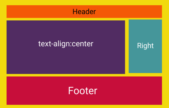
Centering headers is a crucial aspect of creating visually appealing and well-balanced layouts in web design. In this section, we'll explore various methods to achieve this, ensuring your headers become eye-catching focal points on your web pages. Method 1: Text Alignment One of the simplest ways to center headers is by using text alignment. Apply the CSS property text-align: center; to the parent container of the header. This method is quick and effective for horizontally centering headers within their container. Method 2: Flexbox Flexbox provides a powerful and flexible layout model. To center headers using Flexbox, set the container's display property to display: flex; and use justify-content: center;. This method is especially handy for both horizontal and vertical centering, offering great control over the positioning of headers. Method 3: Grid Layout CSS Grid Layout is another robust option for centering headers. Create a grid container using display: grid; and set the place-items: center; property to center the header both horizontally and vertically. Grid Layout is excellent for more complex layouts and precise control over alignment. Responsive Design Considerations As you implement these centering methods, it's essential to consider responsiveness. Utilize media queries to adapt your centering techniques based on the device's screen size. This ensures that your headers look well-centered and aesthetically pleasing across various devices. Optimizing for Performance While achieving stylish layouts, it's important to optimize for performance. Minimize the use of unnecessary CSS properties and consider the impact of your chosen centering method on page load times. Striking the right balance between style and performance is key to providing a seamless user experience. List of CSS Properties for Centering Here's a quick reference list of CSS properties for centering: - Text Alignment: text-align: center; - Flexbox: display: flex; justify-content: center; - Grid Layout: display: grid; place-items: center; By mastering these centering techniques, you'll have the tools to create visually stunning headers that enhance the overall appeal of your web pages. In the next sections, we'll delve into specific details of each method, providing step-by-step guidance for implementation.
Method 1: Text Alignment
Text alignment is a straightforward method for centering headers in CSS. By using the text-align: center; property, you can effortlessly align text, including headers, within its containing element. Let's explore the details of implementing this method. Implementation Steps - Identify the container or element containing the header you want to center. - Apply the CSS property text-align: center; to the container. - Ensure that the header is a block-level element or inline-block to be affected by the text alignment. Example: Consider the following HTML and CSS example: HTML Centered Header CSS: CSS.header-container { text-align: center; } Advantages - Simplicity: This method is easy to implement and requires minimal CSS. - Compatibility: It is supported across all major browsers, making it a reliable choice. Considerations While text alignment is a quick solution for centering headers, it may not offer the same level of control as more advanced methods like Flexbox or Grid Layout. It primarily centers content horizontally, and additional techniques might be necessary for vertical centering. When to Use Text alignment is suitable for simple layouts where horizontal centering is the primary requirement. If your design involves more complex structures or vertical centering, exploring other methods like Flexbox or Grid Layout might be more appropriate. By employing text alignment, you can easily achieve visually centered headers in your web layout. However, as your design needs evolve, you may find it beneficial to explore other methods for more nuanced control over your header positioning.
Method 2: Flexbox
Flexbox, short for Flexible Box Layout, is a powerful and versatile method for centering headers and other elements in CSS. It provides a one-dimensional layout model that allows you to create complex designs with ease. Let's explore how to use Flexbox to achieve centered headers. Implementation Steps - Set the display property of the container to display: flex;. - Use the justify-content: center; property to horizontally center the child elements, including the header. - (Optional) For vertical centering, use the align-items: center; property on the container. Example: Consider the following HTML and CSS example: HTML Centered Header CSS: CSS.flex-container { display: flex; justify-content: center; /* align-items: center; (optional for vertical centering) */ } Advantages - Flexibility: Flexbox allows for easy manipulation of layout, offering flexibility in both horizontal and vertical alignment. - Responsive Design: It simplifies the creation of responsive designs, adapting to various screen sizes effortlessly. - Browser Compatibility: Flexbox is well-supported across modern browsers. Considerations While Flexbox is a versatile solution, it might be overkill for simpler layouts. Additionally, older browsers may have partial support, so it's essential to consider your target audience. When to Use Flexbox is an excellent choice when you need both horizontal and vertical centering, and when you want a straightforward way to distribute space within a container. It's particularly useful for creating dynamic and responsive layouts. By harnessing the power of Flexbox, you can achieve beautifully centered headers with minimal code, making it a valuable tool in your web design arsenal.
Method 3: Grid Layout
CSS Grid Layout is a robust method for creating two-dimensional layouts with precise control over both rows and columns. It provides an excellent solution for centering headers and other elements in a more structured manner. Let's explore how to use Grid Layout to achieve centered headers. Implementation Steps - Set the display property of the container to display: grid;. - Use the place-items: center; property to center both horizontally and vertically within the grid container. Example: Consider the following HTML and CSS example: HTML Centered Header CSS: CSS.grid-container { display: grid; place-items: center; } Advantages - Precision: Grid Layout provides precise control over both horizontal and vertical alignment, making it ideal for complex layouts. - Responsive Design: Like Flexbox, Grid Layout simplifies the creation of responsive designs by adapting to different screen sizes. - Grid Gaps: Easily incorporate gaps between rows and columns for added visual appeal and spacing. Considerations While Grid Layout is powerful, it might be more than necessary for simpler designs. Additionally, similar to Flexbox, browser compatibility should be taken into account. When to Use Grid Layout is an excellent choice when you need advanced control over the positioning of elements in both directions. It's particularly beneficial for creating intricate and responsive designs with a grid-based structure. By leveraging the capabilities of CSS Grid Layout, you can achieve centered headers with a high degree of precision, making it a valuable tool for sophisticated web layouts.
Responsive Design Considerations
In the modern era of diverse devices, ensuring that your centered headers look visually appealing across various screen sizes is a crucial aspect of web design. Responsive design allows your layout to adapt gracefully to different devices, providing an optimal user experience. Let's delve into the considerations for making your centered headers responsive. Media Queries Media queries are a cornerstone of responsive design. By using media queries in your CSS, you can apply specific styles based on the characteristics of the device, such as screen width or device type. For example: CSS @media only screen and (max-width: 600px) { /* Styles for devices with a maximum width of 600px */ .header-container { font-size: 18px; } } Relative Units Utilizing relative units, such as percentages and ems, instead of fixed units like pixels, ensures that your layout scales appropriately on different screens. This applies not only to the font size but also to padding, margin, and other layout properties. Fluid Grids Implementing a fluid grid system is essential for responsive design. Instead of using fixed-width containers, set container widths as percentages. This allows your layout to adjust proportionally to the screen size. For example: CSS.container { width: 80%; margin: 0 auto; } Viewport Meta Tag The viewport meta tag is crucial for controlling the viewport on mobile devices. Including the following tag in the head of your HTML document ensures proper scaling on various devices: HTML Testing on Multiple Devices Regularly testing your website on various devices and browsers is essential for identifying and fixing any responsiveness issues. Emulators, simulators, and real devices can all be valuable tools in your testing process. Conclusion By incorporating these responsive design considerations into your web development process, you ensure that your centered headers maintain their aesthetic appeal and functionality across the ever-expanding array of devices. Prioritizing responsive design not only enhances the user experience but also future-proofs your website in the dynamic landscape of technology.
Optimizing for Performance
While creating visually stunning layouts with centered headers is essential, it's equally important to optimize your web pages for performance. Users expect fast-loading websites, and optimizing your CSS can contribute significantly to a smoother user experience. Let's explore key strategies for optimizing the performance of your stylish layouts. Minimize CSS Files Reducing the size of your CSS files is a fundamental step in optimizing performance. Remove unnecessary styles, comments, and whitespace. Consider using tools like CSS minifiers to automatically compress your stylesheets without sacrificing readability during development. Concatenate and Bundle CSS Concatenating multiple CSS files into a single file and bundling them together can reduce the number of HTTP requests, leading to faster page loading times. This is particularly beneficial for larger projects with numerous stylesheets. Use Efficient Selectors Optimize your CSS selectors to ensure efficient rendering. Avoid overly broad selectors that may result in unnecessary styling calculations. Specific and targeted selectors contribute to a more streamlined rendering process. Implement Browser Caching Utilize browser caching to reduce load times for returning visitors. By setting an appropriate expiration date for your CSS files, users can retrieve previously loaded styles from their local cache rather than downloading them anew on each visit. Consider Critical CSS Implementing critical CSS involves identifying and inlining the minimal styles required for rendering above-the-fold content. This ensures that users see a styled page quickly, even before the entire CSS file is downloaded. Tools like critical CSS generators can automate this process. Optimize Images Images are often a significant contributor to page load times. Optimize images by compressing them without compromising quality. Use responsive image techniques to serve appropriately sized images based on the user's device and viewport. Lazy Loading Lazy loading is a technique that defers the loading of non-essential resources, such as images, until they are about to be displayed on the user's screen. This can significantly improve initial page load times, especially for content-heavy websites. Regular Performance Audits Perform regular performance audits using tools like Lighthouse, PageSpeed Insights, or browser developer tools. Identify and address any bottlenecks or issues affecting the loading speed of your web pages. Conclusion: By incorporating these performance optimization strategies into your web development workflow, you not only ensure a visually appealing user interface but also deliver a fast and efficient user experience, contributing to overall user satisfaction and engagement.
FAQ
Explore the frequently asked questions about centering headers in CSS and enhance your understanding of creating stylish and visually appealing layouts. Q: What is the simplest method to center a header horizontally? A: The simplest method is to use text alignment. Apply the CSS property text-align: center; to the parent container of the header. Q: Can I use Flexbox for both horizontal and vertical centering? A: Yes, Flexbox provides a versatile solution for both horizontal and vertical centering. Set the container's display property to display: flex;, and use justify-content: center; for horizontal centering and align-items: center; for vertical centering. Q: When should I choose CSS Grid Layout over Flexbox for centering headers? A: CSS Grid Layout is more suitable for two-dimensional layouts with precise control over rows and columns. If you need advanced control over both horizontal and vertical centering, particularly in a grid-based structure, Grid Layout is a better choice. For simpler layouts, Flexbox may be sufficient. Q: How can I ensure my centered headers remain visually appealing on different devices? A: Implement responsive design strategies, including the use of media queries, relative units, and a viewport meta tag. Test your layout on various devices to ensure your centered headers adapt gracefully to different screen sizes. Q: What are some tools for performance optimization of CSS? A: Tools like CSS minifiers for file size reduction, critical CSS generators for prioritized loading, and performance auditing tools such as Lighthouse and PageSpeed Insights can help optimize your CSS for better performance. Read the full article
1 note
·
View note
Text
Centering Forms with CSS: Sleek Layouts

In the world of web development, creating sleek and visually appealing forms is a crucial aspect of building user-friendly websites and applications. The way you layout and design your forms can significantly impact the user experience and overall aesthetics of your site. This blog post is dedicated to exploring the art of centering forms using CSS, a skill that every web developer should have in their toolkit. When forms are centered on a page, they not only look more attractive but also enhance accessibility and ease of use. Visitors to your website are more likely to engage with your forms when they are thoughtfully centered, making it a fundamental practice in web design. Whether you're a beginner looking to learn the basics or an experienced developer seeking advanced techniques, this post will guide you through the process of creating stunning, centered forms with CSS. Centering forms is not just about aesthetics; it's about creating a positive and efficient user experience. From aligning login and registration forms to centering contact and search bars, this guide will walk you through various CSS techniques, including Flexbox and CSS Grid, to achieve beautiful, functional form layouts. So, let's dive into the world of CSS and form design to learn how to create sleek, centered forms that captivate and engage your website's visitors.
Why Centering Forms Matters

Centering forms on a web page is more than just a design choice; it's a fundamental aspect of user experience and accessibility. Let's delve into why form centering matters and why it should be a priority in your web development projects. 1. Visual Appeal Centered forms have a distinct visual appeal. They look organized and balanced, drawing the user's attention without overwhelming them. A centered form creates a focal point, making it easier for users to identify and interact with it. This visual harmony contributes to the overall aesthetics of your website. 2. User-Friendly Design Users appreciate simplicity and intuitive design. When a form is centered, it conveys a clear message that this is the primary action you want the user to take. This reduces cognitive load, as users immediately understand where to focus their attention. It's a subtle way of guiding them through their interaction with your site. 3. Improved Accessibility Centering forms improves accessibility, making your website more inclusive. When forms are not centered, users with varying screen sizes and disabilities might have difficulty finding and interacting with the form elements. Centered forms ensure that the form is consistently positioned in the user's field of vision, enhancing usability for all. 4. Consistency Consistency in design is key to a user-friendly experience. Centered forms create a standardized layout that users can expect to encounter across your website. This uniformity promotes a sense of familiarity, which is comforting and reassuring for users. It reduces the learning curve for navigating your site. 5. Mobile Responsiveness With the increasing use of mobile devices, responsive design is crucial. Centered forms are inherently mobile-friendly because they adapt well to different screen sizes. This ensures that your forms remain centered and easily accessible, regardless of whether your users are on a desktop, tablet, or smartphone. 6. Better Call-to-Action Placement Centered forms serve as effective call-to-action elements. Whether it's a sign-up form, a search bar, or a contact form, a centered position makes it clear to users that this is where they can take action. This improved call-to-action placement can lead to higher conversion rates. 7. Psychological Impact Form centering has a psychological impact on users. It communicates a sense of professionalism and attention to detail. Users are more likely to trust and engage with websites that display a polished appearance. A well-centered form can convey reliability and credibility. 8. First Impressions First impressions matter. When users visit your website, the layout and design are the first things they notice. Centered forms create a positive first impression, setting the tone for the user's overall experience. It signals that your website is well-crafted and user-oriented. In summary, centering forms with CSS is not just a design trend; it's a strategy for enhancing the user experience, improving accessibility, and increasing the overall appeal of your website. Whether you're building a personal blog, an e-commerce site, or a corporate web application, mastering the art of form centering is a valuable skill that can positively impact your project's success.
Basic CSS for Form Centering
When it comes to centering forms on a web page, you don't need to be a CSS expert to achieve impressive results. There are basic CSS properties and techniques that can help you create beautifully centered forms without breaking a sweat. Let's explore these fundamental methods and get you started on your journey to sleek form layouts. 1. Text Alignment One of the simplest ways to center a form is by adjusting the text alignment. You can center-align the content of a container to place your form in the center of the page. Use the CSS property text-align: center; on the parent element of your form to achieve this. 2. Margin Auto Another straightforward method is to use margin: 0 auto; on your form element. This will center the form within its parent container horizontally. It's a quick and effective way to achieve form centering. 3. Width and Max-Width Setting a fixed or maximum width for your form can also help with centering. By specifying a width, your form will automatically center itself within its parent container. For instance, use width: 50%; to make your form take up half of its parent container's width, effectively centering it. 4. Display: Inline-Block You can apply display: inline-block; to your form element and its parent container to center it both horizontally and vertically. This method allows you to create centered forms while keeping other elements inline, if necessary. 5. Using Tables CSS tables can be a handy tool for centering forms. By setting the display properties of the parent container to display: table; and the form itself to display: table-cell;, you can easily achieve both horizontal and vertical centering. 6. Vertical Alignment To vertically center a form, you can use the CSS property vertical-align: middle;. This works well when your form is an inline or inline-block element within a container. Make sure to set the parent container's height to match your design requirements. 7. Centering with Flexbox While these basic CSS techniques work, using Flexbox is a more modern and flexible approach to centering forms. Flexbox provides precise control over alignment and spacing, making it a popular choice for form centering. We'll delve deeper into this method in the following sections. These basic CSS techniques are a great starting point for centering forms on your web page. Depending on your specific design requirements and the complexity of your layout, you can choose the method that suits your needs best. As you become more proficient with CSS, you can explore advanced techniques like Flexbox and CSS Grid to enhance your form centering skills further.
Using Flexbox for Form Centering
Flexbox is a powerful CSS layout model that simplifies the process of centering forms on a web page. With its flexible and intuitive approach, you can create both horizontally and vertically centered forms with ease. Let's explore how to leverage the power of Flexbox for form centering. To use Flexbox for centering forms, follow these steps: - Create a Container: Start by creating a container element that wraps your form. This container will serve as the parent for the form element. - Apply Display Flex: Apply the CSS property display: flex; to the container. This single property declaration turns the container into a Flexbox container, allowing you to control the alignment of its child elements. - Center Horizontally: To horizontally center the form within the container, use the property justify-content: center; on the container. This aligns the form along the horizontal axis to the center of the container. - Center Vertically (Optional): If you want to center the form vertically as well, you can add align-items: center; to the container. This property aligns the form along the vertical axis to the center of the container, achieving both horizontal and vertical centering. Here's an example of using Flexbox for form centering: HTML HTML Read the full article
1 note
·
View note