#css-grid
Explore tagged Tumblr posts
Visit Tumblr Blog
Explore Tumblr blogs with no restrictions, modern design and the best experience.
Last Seen Tumblr Blogs


Fun Fact
Tumblr Inc. has $15.1M in annual revenue.
Text
Understanding CSS Grid Behavior in Different Browsers

When working with CSS Grids, you might encounter issues where your layouts behave unexpectedly in different browsers. In this comprehensive guide, we'll delve into the complexities of CSS Grid behavior and explore strategies to address these challenges.
Browser Compatibility
CSS Grid is a powerful layout system, but like any web technology, it may exhibit variations across different browsers. While modern browsers generally provide excellent support for CSS Grid, subtle differences can impact your layouts. Here are some common browser-related issues you might face: - Overflows and Scrollbars: Browsers may interpret grid layouts differently, leading to overflows and unwanted scrollbars. - Scaling: The scaling of your browser or system display settings can affect how grid layouts are rendered. - Rendering Engines: Browsers use different rendering engines (e.g., Blink in Chrome, Gecko in Firefox) that can influence how CSS Grid is interpreted.
Tackling CSS Grid Challenges
Now, let's explore some strategies to address these challenges and ensure consistent grid behavior across browsers. 1. Use Vendor Prefixes Vendor prefixes like -webkit- and -moz- can help ensure compatibility with older browser versions. While modern browsers typically don't require these prefixes for CSS Grid, they can be useful for addressing legacy browser issues. CSS /* Example of using vendor prefixes */ .grid-container { display: -webkit-grid; display: -ms-grid; display: grid; /* Other grid properties here */ } By including vendor prefixes, you can enhance compatibility with older browsers that may not fully support the latest CSS Grid features. 2. Test on Multiple Browsers Testing your CSS Grid layouts on various browsers is essential for identifying and addressing compatibility issues. Popular web development tools like Chrome DevTools and Firefox Developer Edition allow you to preview your site in different browser environments. Additionally, consider using browser testing services or virtual machines to ensure your layouts work smoothly across a wide range of browsers and versions. 3. Adjust Grid Definitions When facing overflow or scrollbar issues, you can adjust your grid definitions to accommodate content more effectively. Experiment with grid-template-columns and grid-template-rows to fine-tune your layouts. 4. Media Queries Media queries are a powerful tool for responsive design, and they can also help address CSS Grid issues. You can create specific grid layouts or adjust properties based on screen size, ensuring optimal rendering on different devices and resolutions. CSS /* Example of using media queries for grid adjustments */ @media screen and (max-width: 768px) { .grid-container { grid-template-columns: repeat(2, 1fr); /* Other grid properties for smaller screens */ } } 5. Flexbox as a Fallback If you encounter persistent CSS Grid issues in certain browsers, consider using Flexbox as a fallback layout. While CSS Grid offers powerful grid capabilities, Flexbox can provide a reliable alternative for older browsers or situations where Grid falls short. CSS /* Example of using Flexbox as a fallback */ .grid-container { display: grid; grid-template-columns: repeat(3, 1fr); /* Other Grid properties here */ } /* Fallback for browsers without Grid support */ @supports not (display: grid) { .grid-container { display: flex; flex-wrap: wrap; /* Other Flexbox properties here */ } }
Testing and Optimization
As you implement these strategies, it's crucial to continuously test your layouts on different browsers and devices. Browser compatibility can evolve over time, so regular testing ensures your website remains functional for all users. Optimization is another key aspect. Minimize the use of vendor prefixes when unnecessary, as modern browsers often don't require them. Additionally, keep your CSS clean and organized to facilitate troubleshooting.
Conclusion
CSS Grid is a versatile layout system that greatly enhances web design capabilities. While it provides consistent results in most cases, variations in browser interpretation can pose challenges. By employing the strategies outlined in this guide, you can overcome CSS Grid issues and deliver a seamless and responsive user experience across diverse browsers and devices. Web development is a dynamic field, and staying up-to-date with best practices and techniques is essential. CSS Grid is just one aspect of modern web design, and mastering it opens doors to creating complex and visually stunning layouts. Here is the demo. See the Pen CSS Grid Demo by CSS Monster (@CSS-Monster) on CodePen. Remember that web development is a journey of continuous learning and improvement. Embrace challenges, experiment with new features, and strive for web experiences that delight users. Thank you for reading this in-depth guide on tackling CSS Grid issues in various browsers. We hope it equips you with the knowledge and confidence to build outstanding web projects that perform consistently across the web. Read the full article
1 note
·
View note
Text
Hello audience. Unfortunately, I am still on my break. However, I am happy to announce that I am still alive and kicking. In fact, I decided to make use of my unemployment and revisit HTML, CSS, and JavaScript to create... A visual novel.
Good News: code is 100% reusable because I used a JSON (i do not know how that works, someone can kindly explain to me...)
Bad News: this code sucks ass, and NOTHING works except playing the story. Transitions? Doesn't work. UI/UX? Ass. Effects? Hell no... Also, 70% of the features aren't present yet I'm gonna do it later.
Oh, this is CrossDust, if you can't tell.
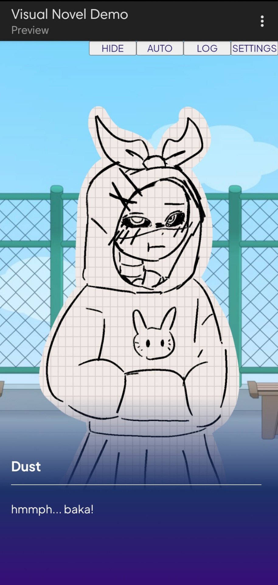
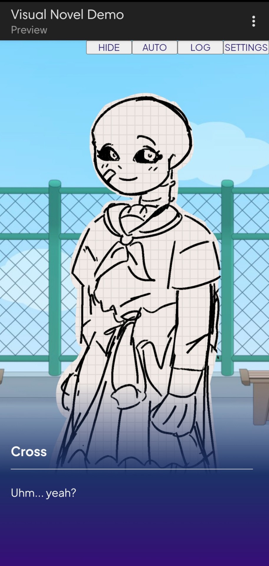
Dust Sans by Ask-Dusttale, Cross Sans by Jakei
I'm gonna respond to asks and do requests later (After my break is over). This is just a small update teehee.
#dsevalyappuccino#TIME TO GO INSANE IN THE TAGS!!#i hate css#i still hate css#css hell no#guys why is css so hard. ive literally been doing this for months and css is still hard#i was about to use css spritesheets for the sprites and emotions#but my ass gave up and instead i just use seperate images#GUYS!!! DISPLAY: FLEX 💪. DISPLAY: GRID?!?!#javascript i hate you tooq#i hate java script naurrrr#what do you mean DOM objects#what do YOU MEAN#also i do not understand error handling and JSON integrations#papaGPT doesn't explain anything#i don't know what I just wrote#coding???????????#kids don't be unemployed#actually maybe if you're unemployed but still making money that's great#also the sprites are just for testing purposes im probably gonna make new better ones if i chose to expand this into#a full blown anime high school visual novel project#i don't wanna think of all that story crap but then again i can just write the cringiest thing on earth
23 notes
·
View notes
Text
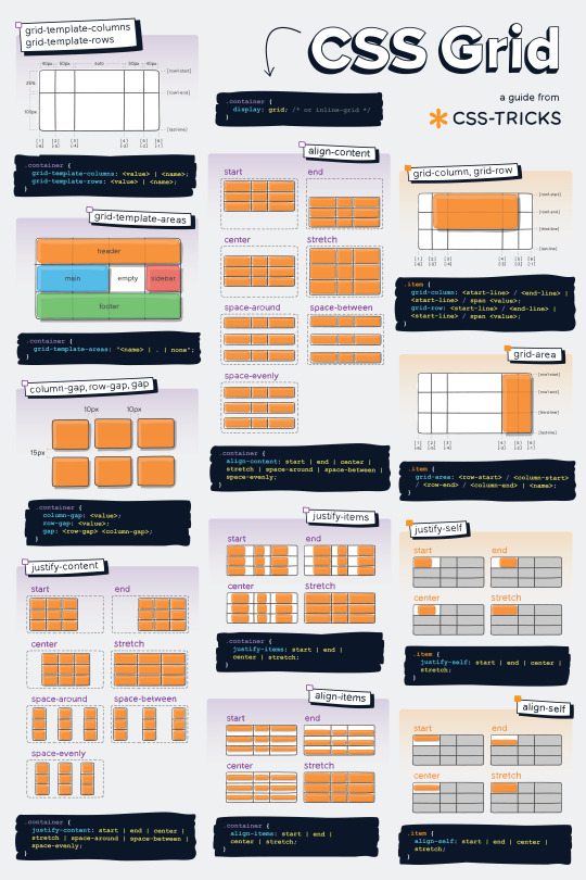
Helpful Poster Guide from CSS-Tricks for CSS Grid
#codeblr#coding#studyblr#studying#progblr#programming#programmer#coder#study#css#code blog#grid#css grid
172 notes
·
View notes
Text
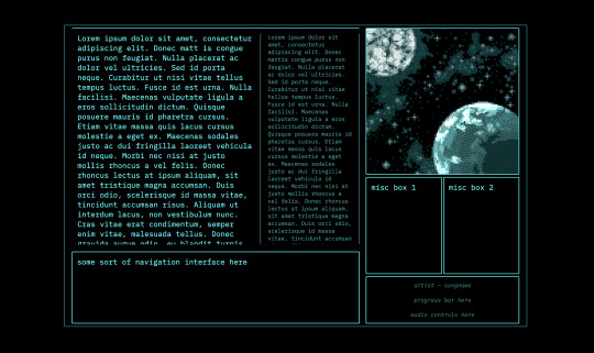
Adding color to my website design⭐
6 notes
·
View notes
Text
the flexbox isnt doing what i want....!!!

#css#grid would be better but i need the space to the side to be able to disappear if nothing is in it omggg#i feel like what im doing should be feesible#flex works but only if i dont define the width of the container i need to be able to collapse when empty#omg omg#im done#it looks fine enough for now#but ill try again later#my god#codeblr#webdev#i just wanna make the container to the left slightly smaller when the screen is small orz#i cant do that apparently#it might be a tailwind issue too#like its too complicated for it#or i need to read 500 things to figure it out
2 notes
·
View notes
Text
Yet Another Anchor Positioning Quirk
New Post has been published on https://thedigitalinsider.com/yet-another-anchor-positioning-quirk/
Yet Another Anchor Positioning Quirk
I strongly believe Anchor Positioning will go down as one of the greatest additions to CSS. It may not be as game-changing as Flexbox or Grid, but it does fill a positioning gap that has been missing for decades. As awesome as I think it is, CSS Anchor Positioning has a lot of quirks, some of which are the product of its novelty and others due to its unique way of working. Today, I want to bring you yet another Anchor Positioning quirk that has bugged me since I first saw it.
The inception
It all started a month ago when I was reading about what other people have made using Anchor Positioning, specifically this post by Temani Afif about “Anchor Positioning & Scroll-Driven Animations.” I strongly encourage you to read it and find out what caught my eye there. Combining Anchor Positioning and Scroll-Driven Animation, he makes a range slider that changes colors while it progresses.
Amazing by itself, but it’s interesting that he is using two target elements with the same anchor name, each attached to its corresponding anchor, just like magic. If this doesn’t seem as interesting as it looks, we should then briefly recap how Anchor Positioning works.
CSS Anchor Positioning and the anchor-scope property
See our complete CSS Anchor Positioning Guide for a comprehensive deep dive.
Anchor Positioning brings two new concepts to CSS, an anchor element and a target element. The anchor is the element used as a reference for positioning other elements, hence the anchor name. While the target is an absolutely-positioned element placed relative to one or more anchors.
An anchor and a target can be almost every element, so you can think of them as just two div sitting next to each other:
<div class="anchor">anchor</div> <div class="target">target</div>
To start, we first have to register the anchor element in CSS using the anchor-name property:
.anchor anchor-name: --my-anchor;
And the position-anchor property on an absolutely-positioned element attaches it to an anchor of the same name. However, to move the target around the anchor we need the position-area property.
.target position: absolute; position-anchor: --my-anchor; position-area: top right;
This works great, but things get complicated if we change our markup to include more anchors and targets:
<ul> <li> <div class="anchor">anchor 1</div> <div class="target">target 1</div> </li> <li> <div class="anchor">anchor 2</div> <div class="target">target 2</div> </li> <li> <div class="anchor">anchor 3</div> <div class="target">target 3</div> </li> </ul>
Instead of each target attaching to its closest anchor, they all pile up at the last registered anchor in the DOM.
The anchor-scope property was introduced in Chrome 131 as an answer to this issue. It limits the scope of anchors to a subtree so that each target attaches correctly. However, I don’t want to focus on this property, because what initially caught my attention was that Temani didn’t use it. For some reason, they all attached correctly, again, like magic.
What’s happening?
Targets usually attach to the last anchor on the DOM instead of their closest anchor, but in our first example, we saw two anchors with the same anchor-name and their corresponding targets attached. All this without the anchor-scope property. What’s happening?
Two words: Containing Block.
Something to know about Anchor Positioning is that it relies a lot on how an element’s containing block is built. This isn’t something inherently from Anchor Positioning but from absolute positioning. Absolute elements are positioned relative to their containing block, and inset properties like top: 0px, left: 30px or inset: 1rem are just moving an element around its containing block boundaries, creating what’s called the inset-modified containing block.
A target attached to an anchor isn’t any different, and what the position-area property does under the table is change the target’s inset-modified containing block so it is right next to the anchor.
Usually, the containing block of an absolutely-positioned element is the whole viewport, but it can be changed by any ancestor with a position other than static (usually relative). Temani takes advantage of this fact and creates a new containing block for each slider, so they can only be attached to their corresponding anchors. If you snoop around the code, you can find it at the beginning:
label position: relative; /* No, It's not useless so don't remove it (or remove it and see what happens) */
If we use this tactic on our previous examples, suddenly they are all correctly attached!
Yet another quirk
We didn’t need to use the anchor-scope property to attach each anchor to its respective target, but instead took advantage of how the containing block of absolute elements is computed. However, there is yet another approach, one that doesn’t need any extra bits of code.
This occurred to me when I was also experimenting with Scroll-Driven Animations and Anchor Positioning and trying to attach text-bubble footnotes on the side of a post, like the following:
Logically, each footnote would be a target, but the choice of an anchor is a little more tricky. I initially thought that each paragraph would work as an anchor, but that would mean having more than one anchor with the same anchor-name. The result: all the targets would pile up at the last anchor:
This could be solved using our prior approach of creating a new containing block for each note. However, there is another route we can take, what I call the reductionist method. The problem comes when there is more than one anchor with the same anchor-name, so we will reduce the number of anchors to one, using an element that could work as the common anchor for all targets.
In this case, we just want to position each target on the sides of the post so we can use the entire body of the post as an anchor, and since each target is naturally aligned on the vertical axis, what’s left is to move them along the horizontal axis:
You can better check how it was done on the original post!
Conclusion
The anchor-scope may be the most recent CSS property to be shipped to a browser (so far, just in Chrome 131+), so we can’t expect its support to be something out of this world. And while I would love to use it every now and there, it will remain bound to short demos for a while. This isn’t a reason to limit the use of other Anchor Positioning properties, which are supported in Chrome 125 onwards (and let’s hope in other browsers in the near future), so I hope these little quirks can help you to keep using Anchor Positioning without any fear.
#amazing#amp#anchor positioning#animation#animations#approach#Articles#attention#browser#change#chrome#code#colors#comprehensive#CSS#eye#fear#focus#Future#game#gap#grid#how#inset#it#Method#One#Other#positioning#Read
3 notes
·
View notes
Text
every so often i rediscover css and rediscover why i hate it
#caique posts#i hate absolutely everything about css but if there's one thing i hate more than using css it's not using css#why is flexbox?#it's like a horse. powerful but fragile. most other parts of css are robust but flexbox will just die for no reason even though#you did your all to take care of it#grid layouts (like the one pictured here) are fun to make though
3 notes
·
View notes
Text
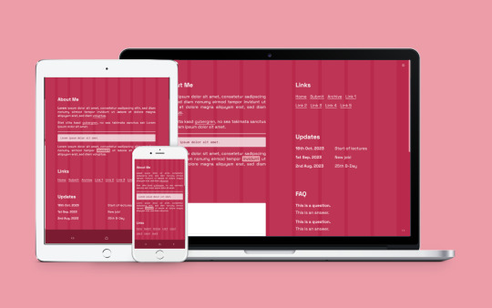
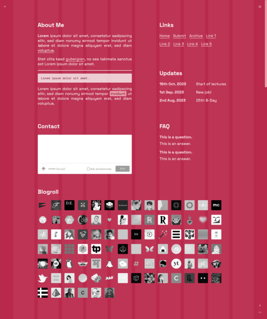
Vivale
Page 50 by @eossa
A responsive grid-based all-in-one page inspired by Pantone's color of the year 2023, "Viva Magenta".
For more information, please follow the source link or click here.
Grab the code here: buymeacoffee | ko-fi | payhip
#eossa#tumblr page#aidpaidcontent#support content creators#responsive#css grid#minimal#all in one#all in one page#pantone#viva magenta#blog#my codes#my pages#page 50#p50 vivale#price: prm
9 notes
·
View notes
Text
2 notes
·
View notes
Text
wow spent hours not understanding that what i was trying to do was nest grids, which is not what “inline grids” mean 🫠
4 notes
·
View notes
Text
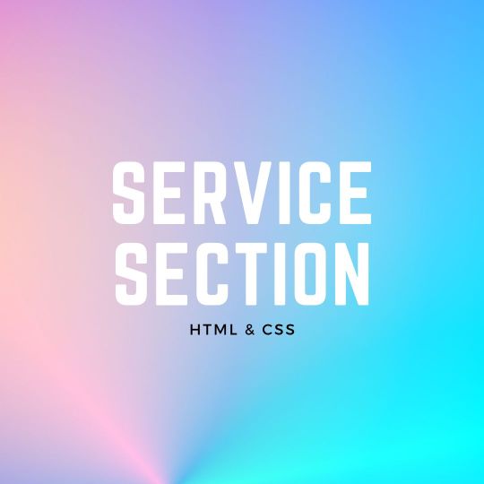
Responsive Neumorphism Service Section
#service section design#dark neumorphism#css neumorphism#responsive web design#html css#codingflicks#learn to code#code#frontend#html#css#css3#frontenddevelopment#webdesign#css flexbox layout#css flexbox grid
5 notes
·
View notes
Text
just found out i have to make a whole website by tuesday night…
if y’all don’t hear from it’s bc i’m crying trying to throw it together
#thankfully i can use filler text#but i’ve never made an external style sheet#and i’m so rusty with css#i don’t remember how to make a grid#but i can do it#chats ☕️
2 notes
·
View notes
Text
Responsive Grid Image Gallery
#responsive image gallery#responsive grid css#html css#learn to code#css3#frontenddevelopment#divinectorweb#image gallery css#responsive grid image gallery
1 note
·
View note
Text
CSS Grid Guide
This CSS grid guide from CSS-Tricks is super helpful, and of course, if you're interested and want to check it out feel free to.
Happy Coding!
#codeblr#coding#studyblr#studying#progblr#programmer#programming#coder#study#css#code blog#grid#css grid
48 notes
·
View notes
Text
4 Practical Use Cases for CSS Grids in Modern Web Design
CSS Grid is a powerful layout system that has transformed the way web designers structure and style websites. It provides a flexible, two-dimensional grid-based approach, making it easier to create complex layouts without the need for excessive code or tricky workarounds.

Download Infographic
Building Stunning Image Galleries

Image galleries are a staple in modern web design, and CSS Grid is an ideal tool for creating them. Unlike traditional layout methods, CSS Grid allows you to define precise rows and columns, making it easy to align images without breaking the overall design.
Why Use CSS Grid for Image Galleries?
Flexible Layouts: Easily control the number of columns and rows based on screen size.
Gap Control: Use the grid-gap or gap property for perfect spacing.
Responsive Design: Adjust column sizes and row heights without breaking the layout.
Layering and Positioning: Position images in creative ways, including overlapping elements.
Basic Image Gallery Example
<div class=”gallery”> <img src=”image1.jpg” alt=”Image 1″> <img src=”image2.jpg” alt=”Image 2″> <img src=”image3.jpg” alt=”Image 3″> <img src=”image4.jpg” alt=”Image 4″> <img src=”image5.jpg” alt=”Image 5″> </div>
.gallery { display: grid; grid-template-columns: repeat(auto-fill, minmax(200px, 1fr)); gap: 16px; } .gallery img { width: 100%; display: block; border-radius: 8px;
Advanced Image Gallery Layouts
Experienced web designers can also create more intricate layouts by spanning images across multiple rows or columns using the grid-column and grid-row properties, giving your galleries a more dynamic and polished look.
In this infographic blog post, we’ll explore four practical use cases for CSS Grids that can elevate your web design projects.
Try CSS Grid Generator
Creating Main Website Layouts

CSS Grid shines when it comes to designing the main structure of a website. Whether you’re building a blog, portfolio, or business website, grids provide the framework for responsive and organised layouts.
Why Use CSS Grid for Main Layouts?
Clear Structure: Define headers, sidebars, content areas, and footers precisely.
Responsive Design: Create layouts that adapt effortlessly to different screen sizes.
Efficient Code: Reduce the need for excessive wrapper divs and floats.
Complex Designs: Easily create overlapping sections and layered effects.
Basic Main Layout Example
<div class=”main-layout”> <header>Header</header> <nav>Navigation</nav> <main>Main Content</main> <aside>Sidebar</aside> <footer>Footer</footer> </div>
.main-layout { display: grid; grid-template-areas: “header header header” “nav main sidebar” “footer footer footer”; grid-template-columns: 1fr 2fr 1fr; gap: 20px; } header { grid-area: header; } nav { grid-area: nav; } main { grid-area: main; } aside { grid-area: sidebar; } footer { grid-area: footer; }
Advanced Main Layouts
For more complex designs, consider using CSS Grid in combination with Flexbox for greater flexibility and control over nested elements.
Designing Attention-Grabbing Banners

Banners are crucial for grabbing user attention, and CSS Grid makes it easy to create stunning, multi-layered designs without relying on complex positioning hacks.
Why Use CSS Grid for Banners?
Flexible Positioning: Easily place text, images, and buttons exactly where you want them.
Responsive Design: Maintain structure across different devices.
Layer Control: Use grid layers to create engaging, multi-dimensional designs.
Basic Banner Example
<div class=”banner”> <div class=”overlay”></div> <h1>Welcome to Our Website</h1> <p>Discover our range of services.</p> <button>Learn More</button> </div>
.banner { display: grid; grid-template-areas: “overlay”; position: relative; background-image: url(‘banner.jpg’); background-size: cover; background-position: center; height: 300px; color: #fff; text-align: center; } .overlay { grid-area: overlay; background-color: rgba(0, 0, 0, 0.6); position: absolute; top: 0; left: 0; right: 0; bottom: 0; z-index: 1; } .banner h1, .banner p, .banner button { position: relative; z-index: 2; }
Perfectly Centring Items

Centred layouts are a common design choice, and CSS Grid provides a simple way to centre content without relying on margin hacks or flexbox tricks.
Why Use CSS Grid for Centring?
Simplicity: One line of code can achieve perfect centring.
Cross-Browser Support: Reliable centring across all major browsers.
Versatility: Works for both single items and entire sections.
Basic Centring Example
<div class=”centre”> <h2>Centred Content</h2> </div>
.centre { display: grid; place-items: center; height: 300px; background-color: #f4f4f4; }
Conclusion
CSS Grid is an incredibly versatile tool that can streamline your web design workflow, reduce code complexity, and enhance the overall user experience.
Whether you’re building image galleries, main layouts, banners, or perfectly centred designs, CSS Grid offers a flexible and powerful solution.
Experiment with these practical use cases to unlock the full potential of CSS Grid in your projects.
0 notes
Video
youtube
🇺🇦 Грід для новачків. CSS GRID - як користуватися? Complete beginners gr...
#youtube#🇺🇦 Грід для новачків. CSS GRID - як користуватися? Complete beginners grid tutorial. Частина 3 ч1 - https://www.youtube.com/watch?v=RUu14
0 notes