#Chinese Typography
Text
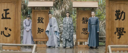
Anyone speak mandarin and wanna watch my dad infodump about typography?
I have no idea how folks looked at both my dad and I and thought either of us were neurotypical i stg but here is a lil over a minute out of the usual lengthy infodump swap we have when I visit my family
vine voice: you're my dad! boogiewoogiewoogie
(dad knows he is being filmed and finds this extremely amusing)
#video#dad#mandarin#chinese typography#the three types he talks about here are brush style printing press and woodblock print styles i think#idk my mandarin isnt.... fantastic..........
603 notes
·
View notes
Text


Hanzi Kanji Hanja 2: Graphic Design with Contemporary Chinese Typography
Published by Victionary, 2022
Softcover, 304 pages, full color, 7.3 × 9.8 inches
ISBN: 978-9-88-75665-6-4
Available at Draw Down Books
instagram
#Hanzi Kanji Hanja 2#Chinese graphic design#graphic design#typography#Draw Down Books#Chinese typography#Instagram
57 notes
·
View notes
Text

Huang O, tr. by Kenneth Rexroth, from Women Poets of China; "Flowers of Fire,"
#lit#huang o#poetry#quotes#words#poetry in translation#selections#fragments#typography#chinese literature#p
257 notes
·
View notes
Text
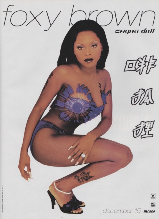
Foxy Brown for The Source Magazine n°112 Issue (1999)
#foxy brown#the source magazine#the source magazine archive#issue#n°112#1999#chyna doll#chyna doll era#magazine#photography#chinese#typography#y2k aesthetic
529 notes
·
View notes
Text
Cypress Skiff from The Shambhala Anthology of Chinese Poetry, tr. J.P. Seaton
#cypress skiff#the shambhala anthology of chinese poetry#j.p. seaton#quote#typography#aesthetic#dark academia#light academia#romantic academia#original post#the sun#the moon#asian poetry#chinese literature#asian literature#chinese poetry
195 notes
·
View notes
Text

Chinese is like a puzzle :)
Have fun with it at CHINESEFFECT.COM
#mandarin#learn chinese#learn mandarin#chinese langblr#mandarin langblr#edublr#langblr#mandarin edublr#chinese vocabulary#mandarin chinese#chinese edublr#study chinese#learning chinese#learning mandarin#mandarin vocabulary#中文#study mandarin#汉语#chinese studyblr#chinese#font#typography#japanese#japanese characters#japanese font#typeface
9 notes
·
View notes
Photo
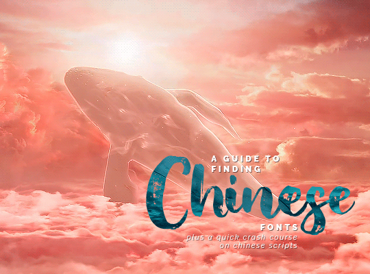
I’ve been using a pretty good website for Chinese fonts and thought it would be nice to do a little guide to using it, since everything is in Chinese!
The website: https://www.fonts.net.cn/fonts-zh-1.html
Why I love it:
It has over 6000 Chinese fonts
There’s an option to toggle your sample text between simple and traditional so you don’t have to type it in twice
The fonts are actually decently categorised and sorted vs other websites that just give you a dump which makes it very difficult to find a certain style you might be looking for
This guide will cover:
How to navigate the website
How to differentiate whether a font is simplified or traditional
How to download a font
How to choose a font by style - this is where the “quick crash course on Chinese scripts” comes in 🤡

✦ NAVIGATING THE WEBSITE
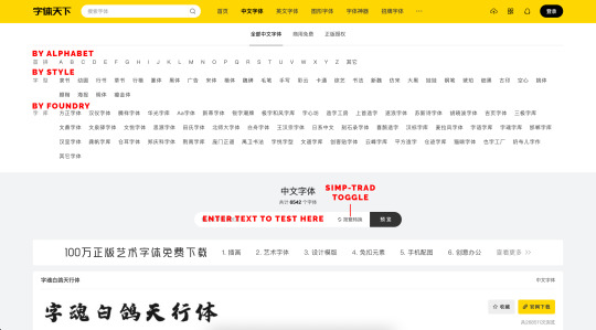
There are three ways to filter the fonts: alphabetically, by style, or by font foundry (i.e. the company that designs/ distributes the fonts)
The most convenient way to find a font based on a “look” you’re looking for is to filter them by style
You can either play around with the style filters by yourself, but I’ve put in the translations for each category at the end of this post
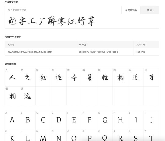
There is also an area you can key in your sample text to see how it will turn out with the font and (very important) check whether the font has that particular character
The simplified-traditional toggle will automatically convert words that have simplified/ traditional forms when clicked so you don’t have to retype anything on your part (yay!) (¬‿¬ )
✦ SIMPLIFIED VS TRADITIONAL
A quick way to identify whether a font is simplified or traditional is by the font name
简 (jiǎn) indicates a simplified font
繁 (fán) indicates a traditional font
However, not all fonts will indicate whether they are simplified or traditional in their name

If so, one way of doing it is to enter a word you know has simplified and traditional versions and see which version pops up
Example 1: I keyed the simplified 龙 (lóng) “dragon” into the sample text bar. The results I got were mostly simplified, but there was one that gave me 龍 - the traditional way of writing 龙

Example 2: I keyed in 红尘醉微醺的岁月 (one of my favourite lines from one of Jay Chou’s songs lmao) in simplified form, and got this
Some traditional fonts automatically convert characters into the traditional form, even though you had entered the sample text in simplified
For instance, in the two traditional fonts in the screenshot above, the simplified characters 红, 尘, and 岁 were automatically converted into the traditional 紅, 塵, and 歲 respectively

However, when I clicked the simplified-traditional toggle to test out the traditional form of the phrase, this happened
When fonts don’t have a particular character, there will be a space/ gap/ crossed out box where it should be
And even though some traditional fonts do actually have that traditional character, it, strangely enough, only shows up when you search your text in simplified ヽ(´ー` )┌
This is why it’s really important to check (in both simplified and traditional) whether a particular font has the characters you want before choosing/ downloading it!

And then there are those very few fonts that have both simplified and traditional, like this one
✦ DOWNLOADING A FONT
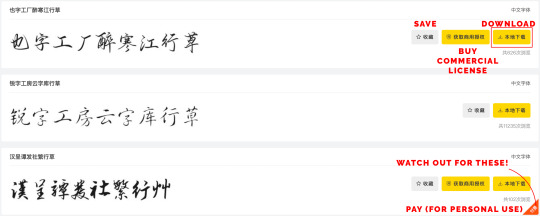
To download a font, click the right most yellow button with the download icon
And that’s it! It’ll download automatically, don’t need to do or wait for anything else
Watch out for the fonts with the orange triangle at the corner - you’ll need to pay to use these fonts, even if it’s for personal use!
You can also click on the font itself to open up the page and see sample characters
And this is the end of the guide if you’re content with just searching around and exploring on your own! If you want to know a little bit more about the font styles and different scripts, read on (at your own risk) ᕕ( ᐛ )ᕗ
✦ FONT STYLES
+ quick crash course on Chinese scripts
Disclaimer: I don’t have any background in Chinese calligraphy (the most Chinese calligraphy I ever did was in school when they made everyone take it for like a semester or something which ended up in most of us doodling around with ink and absolutely wrecking the brushes) nor have I academically studied the history of Chinese writing. All of the below is just compiled from my own Googling around out of interest since I’ve always been fascinated by fonts, etymology, and the evolution of words over time
The categories in the style filter are quite haphazardly placed, so I’ve grouped them into different sub-categories/ groups based on their commonalities. I’ve tried to put in links to gifsets/ edits where possible, but going back to that disclaimer: I can only recognise the very broad styles (mostly Groups 1 and 3), but not the “sub-categories” (Group 2).
GROUP 1: WIDELY RECOGNISED CALLIGRAPHY/ SCRIPT STYLES
These are the fonts based on the five major styles that are still widely used in Chinese calligraphy today

1. 篆��� (zhuàn tǐ) - seal script
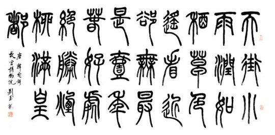
Actual term in calligraphy: 篆书 (zhuàn shū)
Oldest style that is still widely practised today
Used to be common in the latter half of the 1st millennium BC, but the Qin variant eventually became the standard and was standardised during the Qin dynasty (221-206 BC)
Today, it’s commonly used in seals (name chops), hence the name
When making gifs/edits, these fonts may be good if you want to convey something that is older or has an ancient feel, or very formal/ official
Gif example: [x - the sect names]
Side note: one thing that really stood out for me when I was watching LBFAD was that the “heavenly realm” uses seal script while the “mortal realm” uses the clerical or regular scripts - which kinda gives the feeling that the heavenly realm is much older or more traditional which makes sense since the folks there are immortals
2. 隶书 (lì shū) - clerical script
Evolved from the late Warring States period to the Qin dynasty, but only became dominant during the Han dynasty (202 BC-9 AD, 25-220 AD)
Characters are typically wide and flat, with long horizontal strokes and short vertical strokes
Another important characteristic is 蚕头燕尾 (cán tóu yàn wěi): literally “head of a silkworm, tail of a swallow”, meaning the start of a stroke is heavy but the end of the stroke is light (tapered)
Sometimes, horizontal strokes or downward diagonal strokes have very dramatically flared tails
3. 楷体 (kǎi tǐ) - regular script

Actual term in calligraphy: 楷书 (kǎi shū)
Emerged between the Han dynasty and Three Kingdoms period (220-280), gained dominance during the Northern and Southern dynasties (386-589), but only matured during the Tang dynasty (618-690, 705-907)
Still very commonly in use today, and is till today the most easily and widely recognised style since this is the script to which beginners to the language (whether kids in China learning it as their first language or people from around the globe learning Chinese as a foreign language) are usually first exposed
Each stroke is placed slowly and carefully, and all strokes are distinct from each other
Gif example: [x] [x] [x]
4. 行书 (xíng shū) - running/ semi-cursive script

Emerged during the Han dynasty
Approximates normal handwriting
Strokes (and more rarely, characters) are allowed to run into one another (i.e. join up), for instance the word 东 (dōng) in the third line in the image above where the horizontal stroke is joined to the vertical stroke
The brush/ pen leaves the paper less often than in the regular script, explaining the joining of strokes
Characters appear rounder and less angular
I like to use these fonts when trying to show it’s someone’s handwriting, or when I want something that’s a bit carefree but still want the text to be more or less legible
Gif example: [x]
5. 草书 (cǎo shū) - cursive script

Originated through two phases during the period from the Han to Jin dynasties (266-420)
A fully cursive script with drastic simplifications that requires specialised knowledge, therefore it’s not particularly legible to the average person and has never achieved widespread use beyond the realm of literati calligraphers
Characters may be written without lifting the brush from the paper at all
Strokes are modified or eliminated completely to facilitate smooth writing and to create a beautiful, abstract appearance, and have a highly rounded and soft appearance with a lack of angular lines
I usually use cursive script fonts when I want to convey a mood that is more 潇洒 (xiāo sǎ) - unfettered and unrestrained
Gif example: [x]
This script is the source of Japanese hiragana and many modern simplified forms of Chinese characters
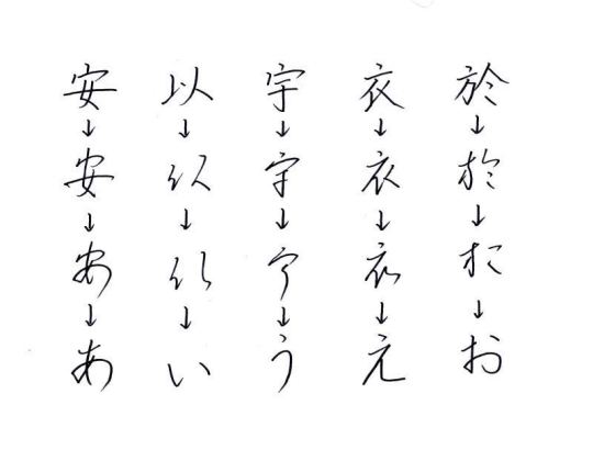
Regular script -> running script -> cursive script -> Japanese hiragana a-i-u-e-o line
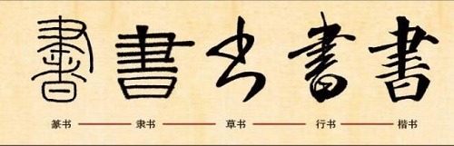
書 (shū) traditional form of “book”: in seal script, clerical script, cursive script, running script, and regular script
The cursive script (in the middle) is how the simplified form of the character 书 was derived
GROUP 2: OTHER CALLIGRAPHY/ SCRIPT STYLES & VARIATIONS
Other styles of calligraphy that are different types/ variations of the above 5

1. 行楷 (xíng kǎi) - running regular script
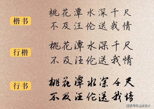
The running regular script follows (mostly) the stroke order of the regular script, but is “freer” than the regular script while being more regular than the running script
Regular script: emphasises stroke order and in calligraphy, is very strict about how the brush is held, when the brush is stopped, and how the brush is turned,
Running regular script: more “spirited” and convenient, still follows stroke order to a large extent especially for the main strokes
Gif example: [x] [x] [x]
2. 颜楷 (yán kǎi) - Yan-style regular script
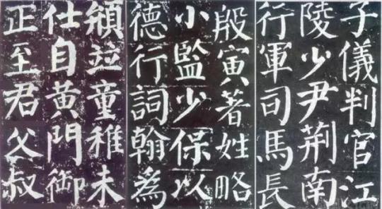
Sometimes also called 颜体 (yán tǐ) “Yan script”
Created by the Tang dynasty calligrapher 颜真卿 Yan Zhenqing (709-785)
Conveys a spirit that is solemn, upright, and full of vigour
This is in comparison to early Tang calligraphy which was characterised by thinner strokes and an overall more “introverted” feeling
3. 魏碑 (wèi bēi) - Wei stele script

Sometimes also called 魏楷 (wèi kǎi) “Wei-style regular script”
This is the name given to the script of stone engravings of the Northern dynasties during the Northern and Southern dynasties
Later had a big influence on the regular scripts of the Sui (581-618) and Tang (618-907) dynasties
4. 新魏 (xīn wèi) - new Wei script

Came about towards the end of the Qing dynasty (1636-1912) and the start of the Republican era (1912-1949)
From the Wei stele script, it emphasises dots, top right to bottom left strokes, and top left to bottom right strokes (I don’t know how to properly translate 撇捺 (piě nà) lol), especially the edges and corners of strokes
Strokes are straighter which emphasises the strength and hardness of the original Wei stele script
5. 瘦金体 (shòu jīn tǐ) - slender gold script

A type of regular script, also called 鹤体 (hè tǐ) “crane script”
Created by Emperor Huizong (1082-1135) of the Song dynasty
A pretty unique script in that the strokes are slender yet stern and hard, while still being quite well-bodied, and having a free and easy spirit
As the strokes are relatively thin and hard, the brushwork tends to be exposed: you can clearly see the movement of the brush as it turns, is lifted, and pauses
It was originally called 瘦筋体 (shòu jīn tǐ) “slender sinew/ vein script”, but 筋 was changed to the homophone 金 “gold” out of respect to the emperor
GROUP 3: MOVEABLE TYPES & BEYOND
Hello invention of the moveable type!

1. 宋体 (sòng tǐ) - Song script
The Chinese version of serifs
Vertical strokes are thick while horizontal strokes are thin with triangles at the end of single horizontal strokes to mimic the pausing of a brush at the end of a stroke in calligraphy
The names “Song ti” and “Ming ti” refer to the same thing - mainland China uses “Song ti”, Hong Kong and Macau use “Ming ti”, and Taiwan uses both
However, the Song script as we know it today didn’t actually first emerge during the Song dynasty (960-1279), but during the Ming dynasty (1368-1644) with the rapid advancement of printing technology
During the Song dynasty, there were three major areas of production (Zhejiang, Sichuan, Fujian) but instead of using scripts we would recognise as Song/ Ming today, they actually each referenced the calligraphy style of a Tang dynasty calligrapher
It was only during the Ming dynasty that the Song/ Ming script we’re familiar with today was formed from the mimicking of the scripts used in Zhejiang but also making changes such as straightening the strokes
(Confusing I know)
Gif example: [x]
2. 仿宋 (fáng sòng) - imitation Song

Differences from Song script: horizontal strokes slant up slightly, horizontal and vertical strokes do not have very big variations in width, horizontal strokes lack the triangles at the end
Originated during the Republican era, specifically around 1915-1916, modelled after the scripts used in woodblock printing in Lin’an (modern Hangzhou) during the Song Dynasty
Image below: Song script (pink) vs. imitation Song (green)

3. 明体 (míng tǐ) - Ming script
See Song script above
4. 黑体 (hēi tǐ) - sans serif

The Chinese version of sans serifs
Characters have strokes of even thickness and lack decorations
Designed for printing and legibility
Gif example: [x - the smaller characters; yes it applies to Japanese fonts too!]
5. 大黑 (dà hēi) - heavy sans serif
A classification that this font website uses to differentiate the thicker sans serif fonts
6. 细黑 (xì hēi) - light sans serif
A classification that this font website uses to differentiate the thinner sans serif fonts
7. 姚体 (yáo tǐ) - Yao script

Similar to Songti, but tends to be slimmer and longer
Combines the bold and flat look of Heiti with the regularity and neatness of Songti to produce a sturdy yet delicate and dignified font
GROUP 4: MODE OF WRITING
If the above categories are too granular in the details, these two are more generic filters that group fonts based on what tool had been used to write them

1. 毛笔 (máo bǐ) - brush-written
2. 钢笔 (gāng bǐ) - pen-written (actually means “fountain pen”)
GROUP 5: MISCELLANEOUS
And lastly, the more decorative fonts that have been grouped together based on their look or common use

1. 幼圆 (yòu yuán) - rounded fonts
2. 广告 (guǎng gào) - advertisement
3. 彩云 (cǎi yún) - colourful clouds
Kinda like bubble fonts
4. 卡通 (kǎ tōng) - cartoon
5. 综艺 (zōng yì) - variety show
6. 娃娃 (wá wa) - baby
7. 琥珀 (hǔ pò) - amber gemstone
Fonts where individual glyphs in a character overlap
8. 古印 (gǔ yìn) - ancient prints
9. 空心 (kōng xīn) - hollow
Outlined fonts
10. 海报 (hǎi bào) - poster
And congratulations! You’ve come to the end of this really long guide!
Sources:
https://en.wikipedia.org/wiki/Chinese_calligraphy
https://en.wikipedia.org/wiki/Chinese_script_styles
https://en.wikipedia.org/wiki/Seal_script
https://www.sohu.com/a/252351217_100196776
https://baike.baidu.com/item/隶书/835864
https://en.wikipedia.org/wiki/Clerical_script
https://www.sohu.com/a/247074794_488853
https://en.wikipedia.org/wiki/Semi-cursive_script
https://www.sohu.com/a/258068634_99919464
https://en.wikipedia.org/wiki/Cursive_script_(East_Asia)
https://new.qq.com/omn/20200924/20200924A08ZWR00.html
http://www.yifanwaiyu.com/data/7
https://ishare.ifeng.com/c/s/7nzHhWqbaxO
https://baike.baidu.hk/item/行楷/9415199
https://www.sohu.com/a/458616249_120744518
http://k.sina.com.cn/article_6658302472_18cdda20800100brol.html?cre=tianyi&mod=pcpager_fintoutiao&loc=30&r=9&doct=0&rfunc=100&tj=none&tr=9#/
https://en.wikipedia.org/wiki/Yan_Zhenqing
https://baike.baidu.com/item/魏碑/7187676
http://www.dxbei.com/s/20170316/268604.html
https://baike.baidu.com/item/新魏书/410469
https://baike.baidu.com/item/瘦金体/884949
https://zh.m.wikipedia.org/zh/瘦金书
https://www.lsqww.com/zh-mo/lishimishi/lszx/331358.html
https://www.uisdc.com/why-is-the-song-so-popular
https://zh.wikipedia.org/wiki/宋体
https://baike.baidu.com/item/宋体/836154
https://en.wikipedia.org/wiki/Ming_(typefaces)
https://izihun.com/news/article/361.html
https://zhuanlan.zhihu.com/p/66725620?u=https%3A%2F%2Fzhuanlan.zhihu.com%2Fp%2F66725620
https://en.wikipedia.org/wiki/Imitation_Song
https://zh.wikipedia.org/zh-sg/仿宋體
https://en.wikipedia.org/wiki/East_Asian_Gothic_typeface
https://zh.wikipedia.org/wiki/姚体
https://m.topys.cn/article/21230
https://baike.baidu.com/item/姚体/332103
#fonts#chinese fonts#ps resources#resource#typography#allresources#completeresources#usergif#font resource#graphic resources
165 notes
·
View notes
Text
when at the library today i picked up a book abt typography to pick up some more theoretical skills there and to no one's surprise it pretended that european languages were the only languages in the world which like whatever i'll still learn what principles it has to teach and then try to reverse-engineer applications to cn font design based on what i know.
despite not trusting the english-language resources available online to be as in-depth or technical as i desire, i got curious and googled "chinese typographic design" anyway n scrolling through the introduction to the first result, you can kind of tell it's not written with a chinese-speaking audience in mind, or at the very least an audience with some semblance of chinese cultural sensitivities bc its section headed by the words "navigating the simplified and traditional divide" goes on to basically say it's an Aesthetic Decision which. well. is certainly a way to pretend you're avoiding politics.
#mostly you get the impression bc one of the first sections is like 'so how do chinese words work?'#and goes on to explain the idea of radicals and components n stuff and it's like If You Knew Literally Any Chinese#even as a foreigner starting to learn you'd understand the concept of semantic radicals#the worm speaks#phrasing that heading as 'navigating a divide' feels like it's alluding to An Awareness of the political implications n stuff#which most people in the west are not actually aware of!! so then to go on and be like#'oh yeah simplified is like swiftly efficient and ~modern~ while traditional holds fast to its cultural roots from a bygone era'#like. this is some stares straight into the camera type shit to me. like you really didn't have to call us bygone y'know.#like i'd have been fine if they were like 'simplified is what's used in the mainland china n is thus used much more frequently'#'whereas traditional is used in taiwan hk and with older communities' like that's Fine you did it you Navigated The Divide#but if you frame it in terms of an aesthetic choice based in how ~modern~ or ~bygone~ you want to feel#then you're going to end up with people who are merely curious abt cn typography bc it's a very foreign language to them#who take that at face value. good lord#AND ALSO they have separate encodings in unicode. like just saying. they are also encoded differently and that's an important thing#you do not know how many times i've downloaded allegedly traditional cn fonts only to discover they expect simplified input#in order to display the glyphs which Are still designed as traditional to be fair but anyway. it's a nuisance.
7 notes
·
View notes
Text


叄葉公館
#branding#graphic design#chinesecalligraphy#hongkong#calligraphy#chinese culture#typography#typo#logotype#logoconcept
29 notes
·
View notes
Text

Xi'an. Entering the City
Typographic poster to the dear @protopaper_design
2023
Big thanks for the kind invitation!
.
© Anna Kuzminskaya, All rights reserved
#m210297#typography#graphic design#branding#m210297_posters#anna kuzminskaya#chinese design#posterart#eventposter
8 notes
·
View notes
Text

— Sue Lynn Tan in Heart of the Sun Warrior, p. 421
#heart of the sun warrior#sue lynn tan#literature#lit#young adult literature#chinese literature#chinese authors#words#quotes#quotes from books#typography#jasmineiros 2024 readings#jasmineiros reads
3 notes
·
View notes
Text

Happy Lunar New Year! 2024 is the Year of the Dragon! 🐉🔥✨
---
My commissions are open! If you’d like to commission me, please fill out the form here. DM me if you have any questions.
#happy lunar new year#chinese new year#chinese zodiac#year of the dragon#2024 year of the dragon#dragon#lunar new year#chinese dragon#cute#dragon fire#long dragon#illustration#graphic design#card design#open art commissions#commissions open#commisson#support small artists#typography#hand lettering#dragon art#year of the dragon art#year of the dragon 2024 art#dragon zodiac
2 notes
·
View notes
Text
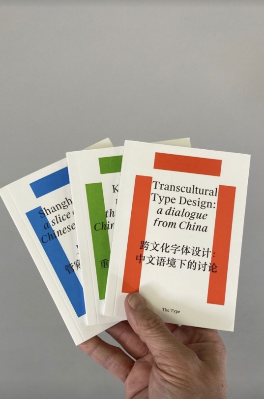
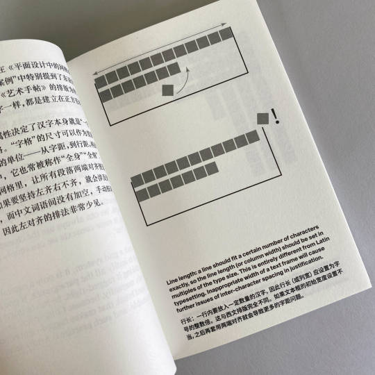
Collection of Research on Chinese Typography (中文文字设计研究选集)
A three-volume collection of on-going research and writing about typography and design in China. Includes coverage of typography and design's history and development, conventions and contemporary practices, as well as applications in transcultural contexts.
Available at Draw Down Books
This set has been produced by The Type (Type is Beautiful), an online platform that has promoted an awareness of typography and design to the Chinese-speaking public for over ten years. The Type introduces Western typographic theories and knowledge to its readers, conducts independent research on Chinese typography, and aims to address both typography education in China, and the lack of exchange Chinese designers have typically had with the international community of designers.
This compact set includes:
上海活字:管窥现代中文字体设计史
Shanghai Type: A Slice of Modern Chinese Type History
The development of Chinese type design since the foundation of the People’s Republic in 1949 has cast a significant influence on contemporary practice. Yet this history has remained as much a mystery to the outside world as to local designers. This volume, based on designer Li Zhiqian's Shanghai Type research project, illuminates a portion of modern Chinese type design's history—tracing how it began as a groundbreaking state-initiated endeavor, and then gradually was transformed, fading in the age of commercialization. Consultant: Chen Qirui. Edited by Richor Wang.
跨文化字体设计:中文语境下的讨论
Transcultural Type Design: a Dialogue from China
Among Chinese-speaking designers, discourse around transcultural typography is still in its infancy. This volume is the record of the first of a series of open discussions moderated by The Type, which addresses both this global trend as well as the debate and strategies that are specific to the Chinese context. Moderated by Mira Yang, with panelists Peiran Tan, Li Zhiqian, Zheng Chuyang, Du Xiyao, Tien-min Liao, and Roman Wilhelm.
孔雀计划:重建中文排版的思路
Kǒngquè: Restoring the Mindset of Chinese Typesetting
The convention and wisdom of Chinese typography that was developed over centuries has failed to be inherited by designers today. This is caused partially by the domination of Latin-orientated computer software, coupled with negligence in Chinese design education. The Kǒngquè project aims to fill this gap by revisiting the typographic traditions of China in the modern context and restoring the traditions and mindset of native Chinese typography. By Eric Liu.
Editor-in-Chief: Rex Chen
Series Editor: Mira Ying
Translators: Hui Jing, Peiran Tan
Designed by Atmosphere Office
Published by The Type, 2020
Bilingual, text in English and Chinese
3 volumes: (Shanghai Type) 116 pages, with 2-color 7.5 × 11 inch mini-poster / (Transcultural Type Design) 122 pages / (Kǒngquè) 104 pages, b&w, 4.3 × 5.75 inches
ISBN: 978-1-91-624848-0-7
#Chinese Typography#Chinese Typesetting#Transcultural Type Design#Type Design#Chinese Type History#Type History#Typography Books#Type Books#Draw Down Books#Atmosphere Office#Chinese-English Design Books
26 notes
·
View notes
Text
found an animatic so good its inspired me to seriously consider starting work on that rwd set me free animatic again as if i dont already have 64521234 other things to be working on. why must you do this to me
#asto speaks#hello welcome back to me windging#its an ak chongyue animatic using changgwi by ahn yeeun which#if nothing else thanks for introducing me to that song holy shit. what the fuck#yknow how my music taste is music that doesnt quite sound like music. yeah this is music that sounds like a horror movie#actually obsessed. also the original music video fucks severely#but ALSO the animatic is sooo good but i cant really show it on here because like its in chinese but so much of what makes it so good is li#the INCREDIBLE typography. man that artist sure knows how to compose and edit what the fuck#changgwi 🤝 set me free: chorus of buddhist chanting that makes life difficult if youre planning an animatic apparently
2 notes
·
View notes
Text
being sufficiently nerdy that when double checking some information about ornamentals and their history and compendiums on the wikipedia that you discover you have one of the compendiums sitting on your bookshelf.
(Franz Sales Meyer, Handbook of Ornament. )
#trying to get my head around basic shapes 'n shit#typography research#ornamentals my beloathed#why do you hate me so#interesting point dropped on the wiki though about Later Islamic and Chinese scroll decorations incorporating more flowers#compared to their European counterparts#(did I turn around and check the camphor blanket box to look at the engraving? Yes. Flowers <3 <3 and leaves. But importantly flowers)
2 notes
·
View notes
Text

You Took Ship from The Shambhala Anthology of Chinese Poetry, tr. J.P. Seaton
#you took ship#quote#typography#literature#poetry#j.p. seaton#the shambhala anthology of chinese poetry#aesthetic#dark academia#light academia#romantic academia#love#original post#asian poetry#asian literature#ancient china
86 notes
·
View notes
Last Seen Blogs