#Color Schemes
Explore tagged Tumblr posts
Visit Tumblr Blog
Explore Tumblr blogs with no restrictions, modern design and the best experience.
Last Seen Tumblr Blogs


Fun Fact
Celebrities use Tumblr as well.
Link
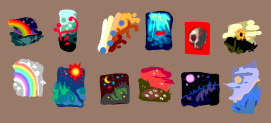
#part 2 of 3#coscon2020#peaceful#abstract art#stylish#online sport#book quotes#color schemes#girl in red
56 notes
·
View notes
Text
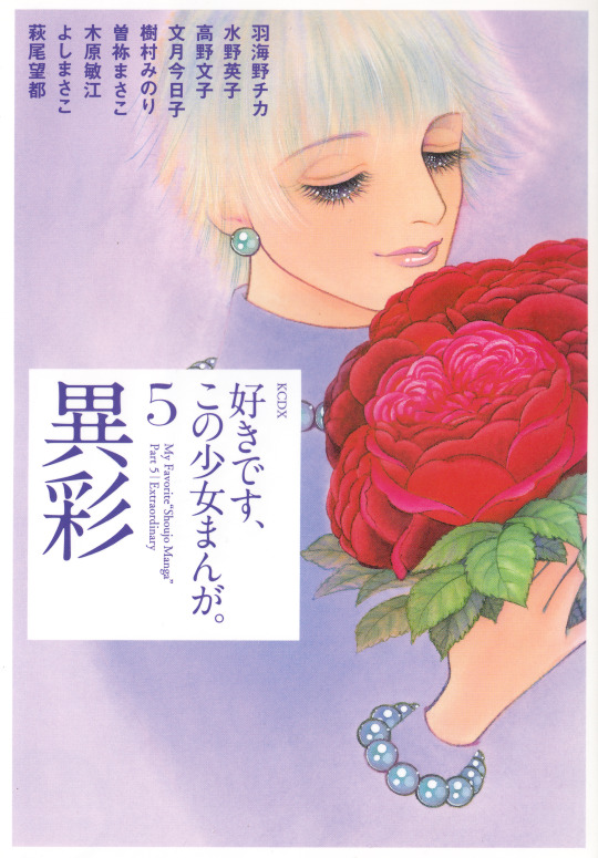

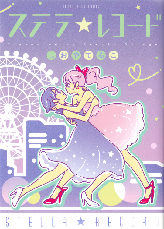
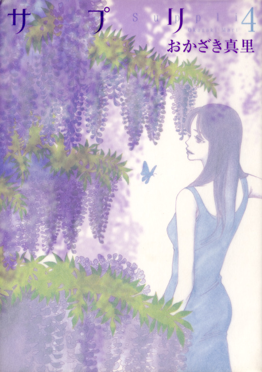

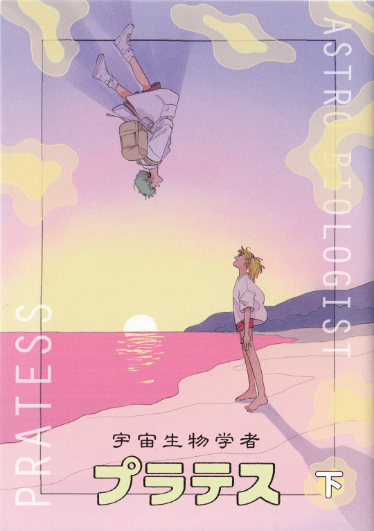
好きです、この少女まんが。(Suki Desu, Kono Shoujo Manga.), cover by Chiki Ooya 女の園の星 (Onna no Sono no Hoshi), Yama Wayama ステラ☆レコード (Stella☆Record), Teruko Shioya サプリ (Suppli), Mari Okazaki ふきよせレジデンス (Fukiyose Residence), Natsuko Taniguchi 宇宙生物学者プラテス (Astro Biologist Pratess), Sarami
#sorry i just had to rearrange this a bit...#chiki ooya#suppli#natsuko taniguchi#teruko shioya#astro biologist pratess#yama wayama#color schemes#my scans#colors#photosets#if you liked how it looked at first you can check the reblogs!
131 notes
·
View notes
Text

#BEC7D5 • #B3BDCE • #A8B4C7 • #9DABC0 • #92A1B9
like my work? consider donating to my paypal!
✘ PLEASE DO NOT REMOVE THE CAPTION OR REPOST ✘
#colors#color palettes#color#color schemes#itsphotoshop#completeresources#dailyresources#f2u#free to use#usermaximoff
34 notes
·
View notes
Note
yo, hi,
please rant about the use of colours/shots in dead boy detectives (if you want to), that would be amazing to read!
omg hell yeah i would love to. <3 buckle up everybody!
(there were some other people in the comments who wanted to hear more as well. for convenience's sake i'm going to keep it all in one post.)
I'm not going to talk about every single frame in the last post, because there are a lot, but I'll be sure to touch on all of the ones that have a good amount of depth beyond the dramatic lighting. (sorry, Angie shot.)
...this is going to get long.
so first, this one:
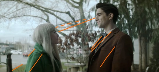
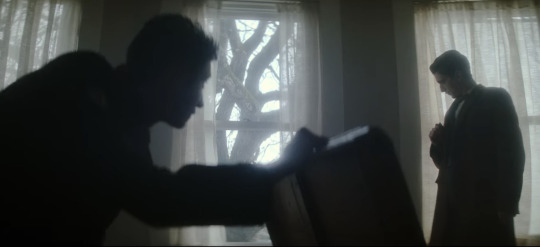
With Edwin's brown coat, Niko's green coat, the brown bushes in between them, and the trees behind Edwin, this shot is cohesive and satisfying. I drew the orange lines to sort of illustrate how your eye moves across the frame; the line of eye contact, the tree branch (dashed lines) almost parallel to that, the sidewalk/grass line, and the lapels/shadows/folds of their jackets all form a general diagonal streamlined snapshot. Then the black post behind Niko, the tree between them, and the tree trunk behind Edwin continue to divide the frame vertically and add to the additional invisible "line" created by their height difference. Finally, the sky behind Niko, as well as her hair, contrast heavily and very well with the darker colors of the tree behind Edwin, though there is still white on his side (the building) and brown on hers (tree branches). If you were to take a single diagonal line from the bottom left corner to the top right, you would get two incredibly distinctly colored sections, but they complement each other so well.
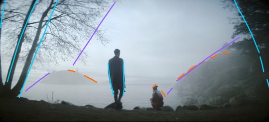
This whole scene is gorgeous because of the pale sky and water up against Niko's hair and the brown tree trunks with Edwin's jacket, but I also love it because it's so simply colored. We have the classic blue+orange color dynamic, but diluted down to very pale blue and very dark brown. This shot specifically features Edwin focused at the center (the blue lines show that he is standing mostly straight up, while the trees on the borders of the frame are all leaning inwards), with Niko crouched down to fit with the shape of the hillside (orange) AND the silhouetted rocks in the foreground. Then the hillside, the shadow on the water, the general cutoff of the tree branches, and the island in the distance (purple) frame the two of them in the middle without making a Point of it. It looks very natural, especially with the dark shadows around the border of the frame. (personally sort of brings to mind Wanderer Above The Sea of Fog).
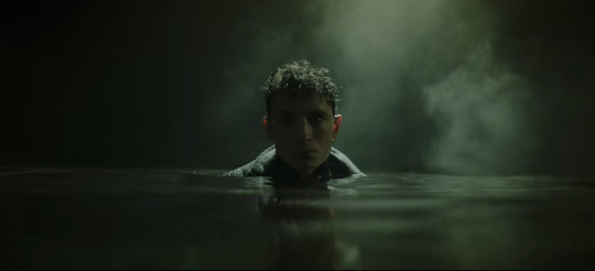
I don't think I need to add any annotations to this one. The lighting is sharp and so are the shadows. The fog and the shine on the water, his hair, and the collar of his coat are starkly lit, while everything else, including his face, is deeply shadowed. Plus it's all an ominous, murky green. It's almost the opposite of Lilith coming out of her blood-red ocean. 10/10 frame, I have no words.
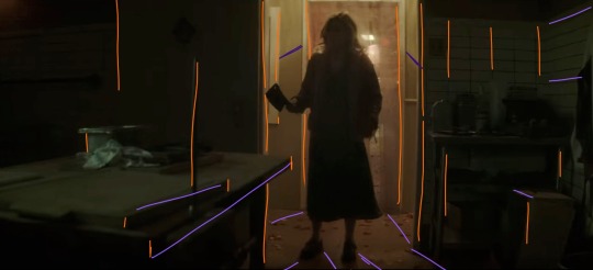
I gasped the first time I saw this shot. There are so many vertical lines (orange), which make the space feel thinner: the spike, the bulletin board(?) on the far left, both doorframes, the edges of the table and boxes, the tile on the wall on the right, Maxine herself... and then there are the diagonal lines, all sort of spreading out from Maxine, which includes the table edge, the shadows, and the wall tiles again. Then there's the fact that it's all so dark, but not quite pitch black. Once again we have a green/orange combo, and the light behind Maxine being so small in the whole frame makes it very effectively claustrophobic. We also never saw her enter this room from behind, which elevates her as threatening, because the camera work makes it seem as though we, the audience, are backing away from her as she enters, and then hiding from her as well. While I am devastated by the lack of a sapphic romance arc, I have to say I was blown away by the production of this scene.
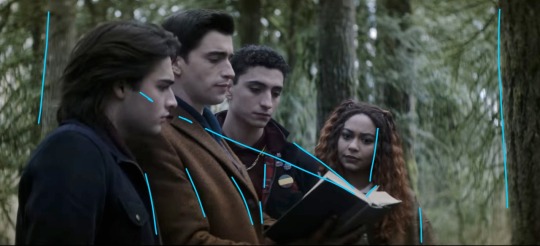
I love this one because they're arranged so neatly around the book. I didn't draw a curve over their heads, but it's easy to visualize by following Monty's hairline up to Edwin's, and then Edwin's down to Charles' down to Crystal's. The height order is perfect. Then there's the black-brown-black-brown of Monty's jacket, Edwin's jacket, Charles' jacket, and Crystal's hair. The book itself helps frame their faces (diagonal blue lines), and their clothes fall into uniform with the vertical trees behind them, creating a satisfying, natural, unobtrusive background. This is definitely more visually appealing than a shot of them leaning over and looking down at the book/camera. It's also broken up very nicely by the greenery. Plus, none of their faces are shown from the same angle! Refreshing!
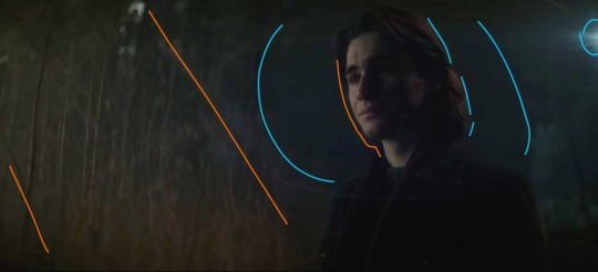
Poor Monty :( but hey, he gets a really awesome shot here! We're back to orange+blue, and the angle of this shot makes it look like the vertical trees behind him are positioned diagonally (orange) to follow the dark blue shadow behind his head. We also get two light sources: one of them is the moon, and the other one comes from the same place as the music. The moonlight (blue) sort of encircles his head and cuts off at the line of trees about halfway across the frame. Both the back of his hair and the far side of his face are illuminated, which is very effective in terms of bringing him into the foreground and making him the focus of the shot even though he's not in the middle of the frame. It's also balanced nicely by having background detail on the left, with the orange trees, but not on the right, where there's nothing but dark blue behind Monty. This is also a great shot when it comes to his hair and jacket, because the jacket is used to add to the framing of his face with the dark blue background, and his dark brown hair is lit sparingly, which ties in the left side of the frame.
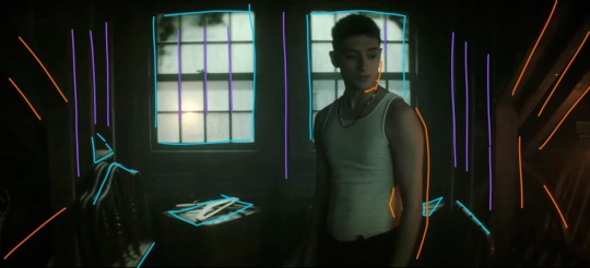
Like the frame with Maxine, this one has a lot of shadow and a little bit of light, and again works with an orange/blue (or teal, really) color scheme, but this one is much friendlier. The windows are larger than the doorframe and Charles isn't actually blocking the light the way Maxine did. Instead, he's illuminated from the right by Edwin's orange lantern, and the shot is balanced by highlights (blue) that stop it from becoming cramped and stressful. There are stable vertical lines (purple) and rafters and shadows spreading out from the center (orange). Charles, though he is blocking the window, is wearing a white tank top, and his skin takes on the warmth from the lantern, so he's not in silhouette and he blends very nicely with the scene. I love that he's not at the center of the shot, but instead framed almost perfectly in the right window. (Another thing I love about this show is that the characters almost always interrupt the continuity of the background even when they're positioned to be framed by it. It makes the scenes feel much more natural even while they continue to be gorgeously directed from an artistic/stylistic point of view.)
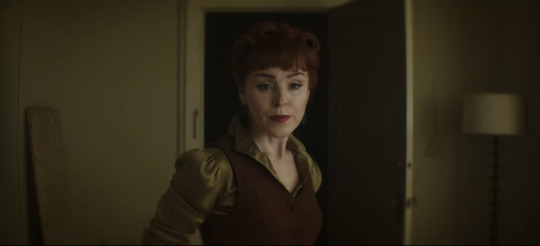
This is one of the simpler ones, but it's perfect. The Night Nurse's hair and vest are the same brownish orange, and her shirt is the same as the walls, sticking with our tried and true brown/green (easy variation on orange/blue) color scheme. She is framed in the blackness of the doorway, but once again interrupts the white doorframe on the left side. Even the lamp and the board (?) on either side of the frame fill the negative space in a natural way. Also, the vertical lines of the board, doorframe, door, and lamp aren't perfectly spaced apart, which makes the whole shot feel more down-to-earth.
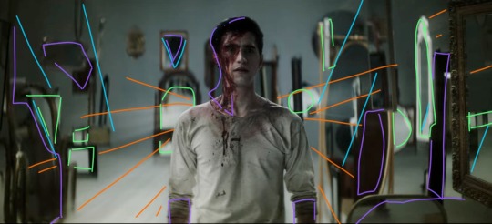
There is so much going on in this shot. The beams of light (orange) are emanating from behind Edwin in a shape sort of reminiscent of wings. The angles of light/shadow and the immediately obvious position of some of the mirrors (blue) also spreads out from behind him, reinforcing the wing imagery and focus. The background is lighter than the floor, and Edwin's clothes blend in with the floor and the reflecting highlights (green) in the mirrors. It's all balanced by shadows (purple), which aren't so much shadows as they are dark-colored mirrors and the blood on Edwin's face. This shot is an unsettling combination of chaos and order, increased by the strange phenomena of mirrors endlessly reflecting into each other, especially since Edwin doesn't show up in any of them. You'd expect him to look out of place, and he mostly does, but there's just enough immediate immersion with the color scheme and light angles to make him fit perfectly. And he wouldn't fit in this shot nearly as well if he were wearing his usual clothes. It's such a good way to introduce Despair. I love this scene.
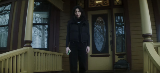
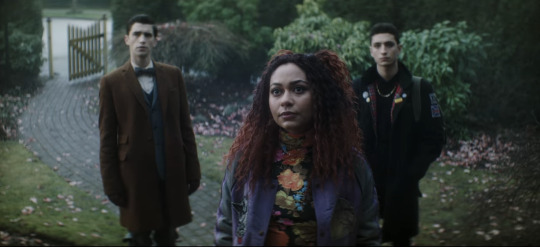
Now I needed to include these two next to each other, because they're. They're the same scene. Maren is on the porch looking down at Crystal and the boys, but the color schemes and blocking are so starkly different. Maren is wearing black, and the house is washed-out yellow and maroon, both unfriendly colors in this scene. The windows all show the gray reflections of the dead tree instead of even a glimpse inside the house, immediately showing that Maren is hiding something. Then in the shot with Crystal and the boys, they're positioned behind her on the path. Edwin is next to the brown gate and gray stones, and Charles is sort of shadowing Crystal and framed by the green bushes. Crystal's shirt is flower-patterned to match the pink petals on the ground, and her red hair and purple jacket make the whole shot more vibrant and friendly-looking than Maren's, even though Maren is supposedly the one being helpful/friendly/hospitable. The first time I watched this episode I knew I couldn't trust Maren as soon as I saw her standing on her front porch. This scene is, as Charles would say, brills.
Okay, last one, I have to stop somewhere. (I have so many more. I have. SO many more. that i could talk about. but this post is so long already). There are three windows, evenly spaced, white light and curtains framed in them. Charles is in nearly full silhouette as he opens that chest; his head and the lid of the chest intersect with the vertical window frame, and his arm runs parallel to the middle bar. He also blocks a good portion of the leftmost window, while Edwin stands in front of the one on the right. He's fully framed by the window and standing farther back than Charles, not quite silhouetted but still very dark compared to the background. When he ducks down to inspect the cabinet, his head ends up in front of the wall between the two windows. This whole scene is an excellent display of blocking/framing/lighting, just in terms of where they end up holding any given position while they talk. Once again, there's nothing artificial or manufactured about their blocking. These aren't statement shots (all film projects have a few Really Good Shots, but they're often at extremely important, pivotal, or emotional times, instead of spread out through the storyline.), which makes them even better.
I might have to make another post and include shots with Jenny, the sprites, the Cat King, Esther, and more landscape shots. There is no shortage of stunning frames and scenes, and there's no reason not to dive into the production and hidden meanings.
TL;DR: this show is an ARTISTIC MASTERPIECE. Please watch it. :)
#dead boy detectives#edwin payne#charles rowland#crystal palace#niko sasaki#monty finch#monty the crow#film stills#cinematography#this. got away from me.#appreciation post#color schemes#film techniques#analysis#symbolism
105 notes
·
View notes
Text


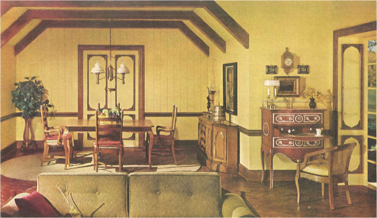
Decorative Plates
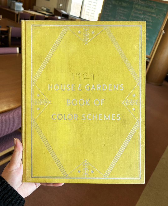
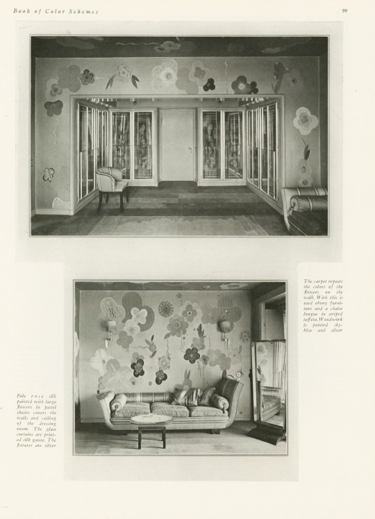
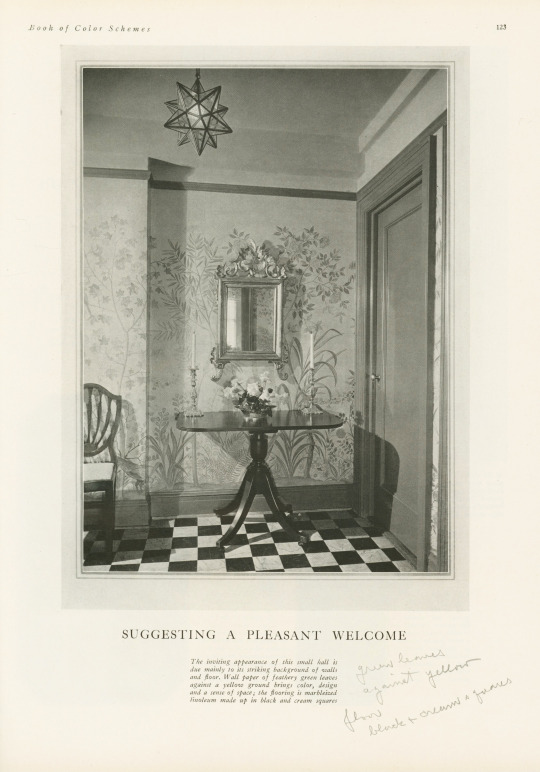
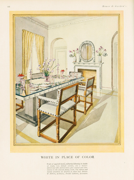
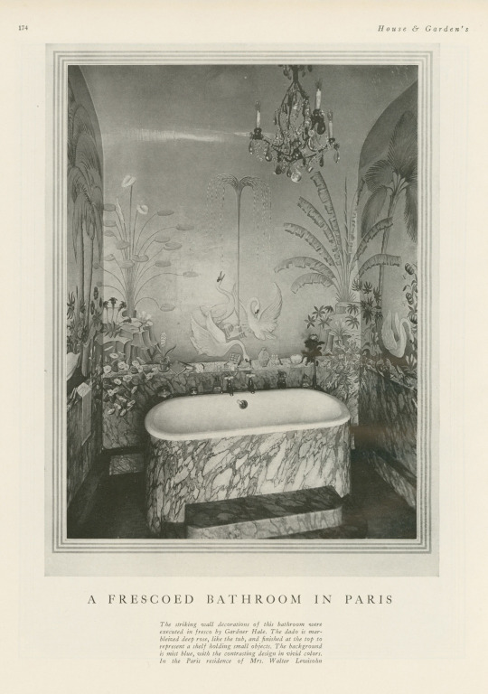
It's been awhile since we last posted something on the theme of the decorative arts, so I'm happy to have found this book—especially because it was mis-shelved in the stacks! This book is House and Garden's Book of Color Schemes, which contains "over two hundred color schemes and three hundred illustrations of halls, living rooms, dining rooms, bed chambers, sun rooms, roofs, garden rooms, kitchens and baths; the characteristic colors of each decorative period; how to select a color scheme, with unusual treatments for painted furniture and floors; a portfolio of crystal rooms and eight pages of unusual interiors in color." It was edited by long-time editor of House & Garden Richardson Wright (1887-1961) and Margaret McElroy, associate editor, and published by Condé Nast Publications, Inc. in 1929.
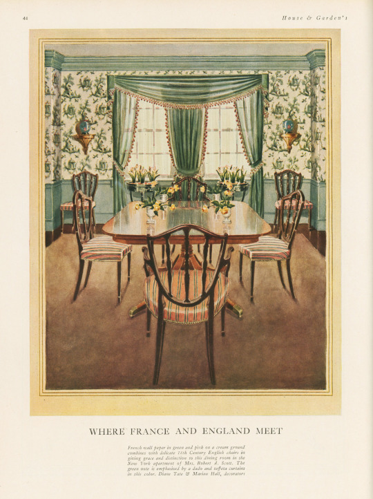
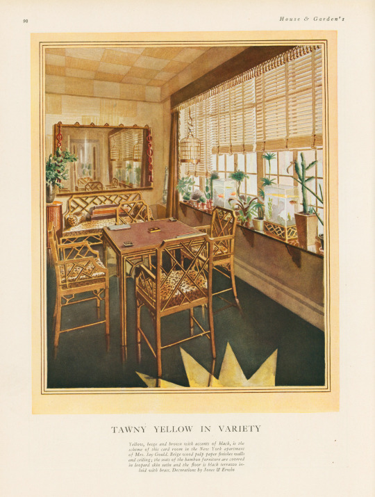
The book includes a large number of photographs of rooms, however, they are mostly in black and white—an unfortunate thing for a book about color! The promised eight color illustrations of rooms are not all present in our copy, but the five that are still in the book are shown here, alongside some of their black and white compatriots. I especially love the one titled "Tawny Yellow in Variety" that features a shocking amount of leopard print.
If you've read any of the posts I usually write, you know that I love a good binding—this one is a publisher's binding in a chartreuse-y yellow book cloth with art deco-style silver tooling featuring stars and leaves. Somebody took it upon themselves to write the publication date on the cover above the title—how thoughtful!
View more posts featuring Decorative Plates.
-- Alice, Special Collections Department Manager
#Decorative Sunday#Decorative Plates#decorative arts#House and Garden's Book of Color Schemes#color schemes#color#decoration#home decor#interior decorating#Richardson Wright#Margaret McElroy#Conde Nast#Conde Nast Publications#art deco#chartreuse#Publishers' bindings
91 notes
·
View notes
Text

some free to use color schemes i've made, two variations
286 notes
·
View notes
Text

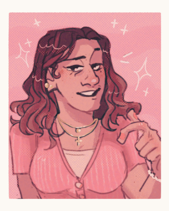
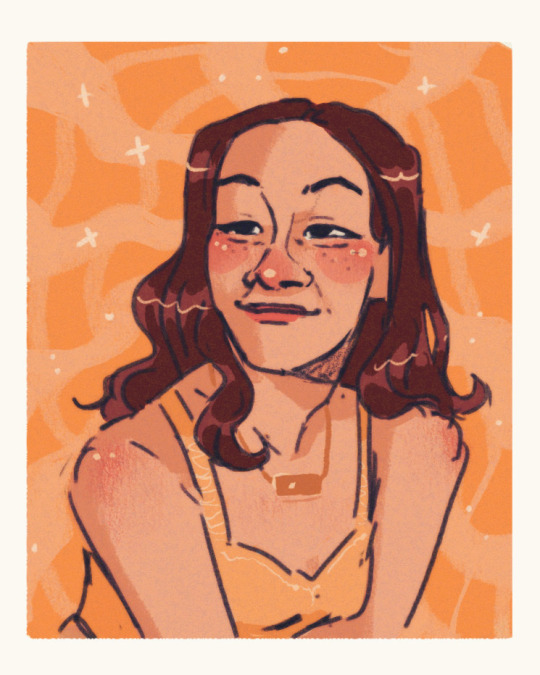


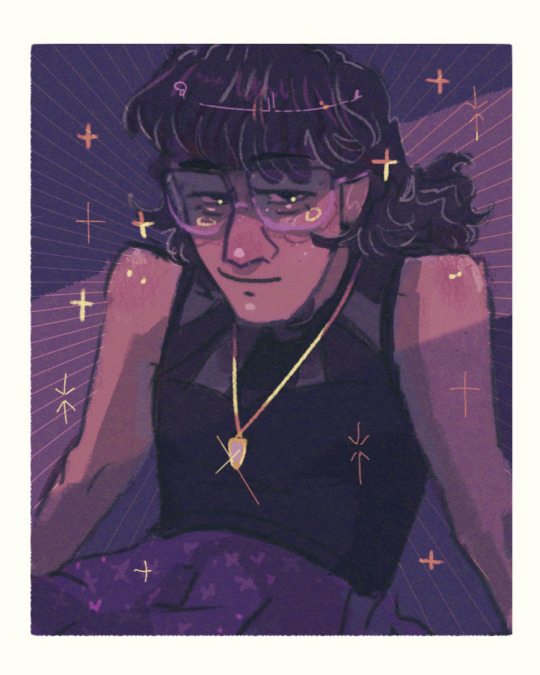
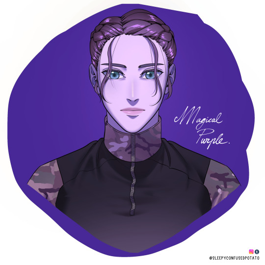
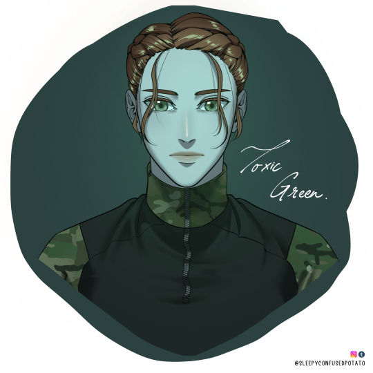
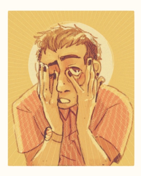
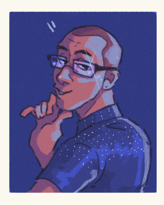
Color studies part 2 I am !!! so normal !
#purple is my gf I love her <3333#artists on tumblr#digital art#portrait#digital portrait#portrait study#color study#color palettes#color schemes#starry eyed
206 notes
·
View notes
Text


ルックバック (Look Back), Tatsuki Fujimoto カツカレーの日 (Katsu Curry no Hi), Keiko Nishi 天使なんかじゃない (Tenshi Nanka Janai), Ai Yazawa 天然コケッコー (Tennen Kokekko), Fusako Kuramochi ときめきまんが道 (Tokimeki Manga Michi), Koi Ikeno スラムダンク (Slam Dunk), Takehiko Inoue
#photosets#my scans#colors#Color Schemes#tatsuki fujimoto#keiko nishi#ai yazawa#fusako kuramochi#koi ikeno#slam dunk
135 notes
·
View notes
Text

pantone inspiration #57B5CF • #66B4D9 • #85C7DB
like my work? consider donating to my paypal!
✘ PLEASE DO NOT REMOVE CAPTION OR REPOST ✘
#colors#color palettes#pantone#color schemes#itsphotoshop#usermaximoff#completeresources#dailyresources#f2u#free to use
31 notes
·
View notes
Text
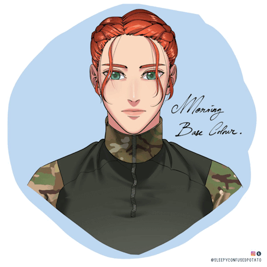


🌹🎨 Colour Scheme Notes Because Why Not🌹🎨
I had some free time today and felt like playing with colours inspired by my favourite Webtoons and animes!. Plus I wanted to finalize Jade's design a little bit, especially on the braids.
Jade's braids had been a big trouble of mine as it's not good ~(>_<。) It's very hard to draw and difficult to get right for some angles, It takes too much time/wastes so much time to draw, and it's overbearing - too much line art happening on the head while the rest of the face/body is just simple which creates an imbalance.
So yep I simplified the way I draw her hair! Much tidier now isn't it? ( •̀ .̫ •́ )✧
Anyway, this is just a note post for me, and could be a colour guide/palette for my future projects! (❁´◡`❁)
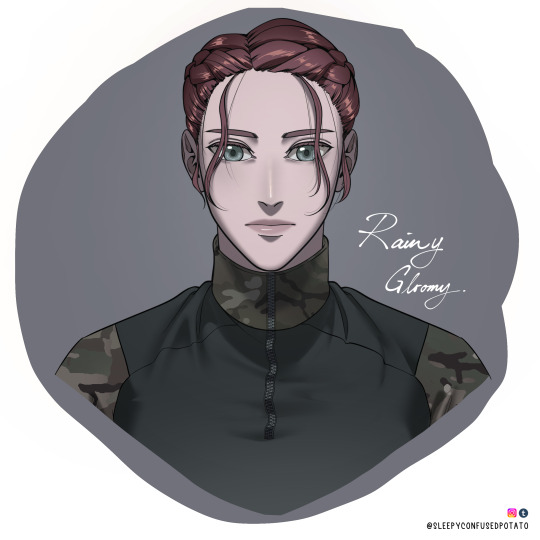
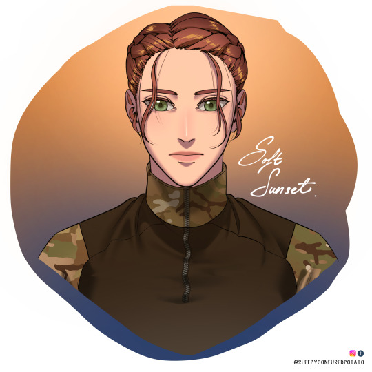
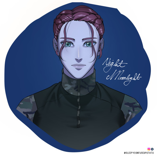
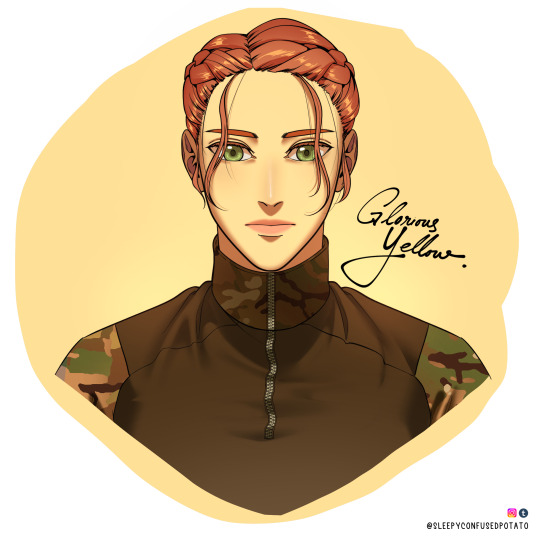
#call of duty#call of duty modern warfare#cod mw#cod#call of duty oc#cod oc#original character#colors#color guide#color schemes#art tips#art guides#art problems#cod mw22#charlotte jade le jardin#art#sleepyconfusedpotato art
333 notes
·
View notes
Text
youtube
46 notes
·
View notes
Text
Matcha inspired Color palette ★

Matcha color palette| a soothing blend of earthy browns and refreshing matcha greens| perfect for calm and cozy vibes for anything you want to use for
A color scheme that enhances your diary, notes themes, art, website, etc
#diaryblr#journalblr#studyblr#hex code#hex color#hex codes#colors#color palette#color scheme#color schemes#color palettes#matcha latte#matcha girl#girl blogger#girlblogging#girlhood#cafe aesthetic#aesthetic#cafe#japanese#artinspiration#digital illustration#illustration#stationery#mini vlog#aesthetic notes#bujoblr#green aesthetic#colored pencil#bakery
5 notes
·
View notes
Text

This was rly fun to fill out 🌈
#arts#practice#colored pencil#color schemes#color palettes#rainbow#rainbow aesthetic#colorful aesthetic#op
7 notes
·
View notes
Text
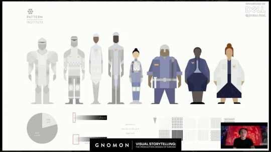
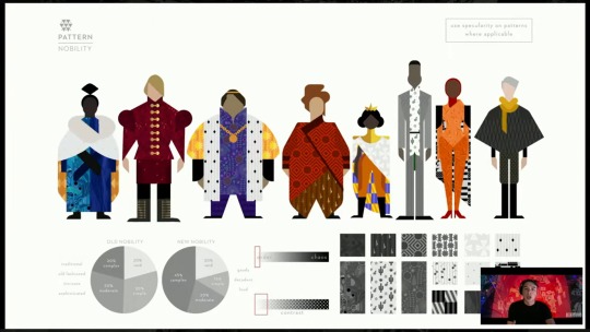
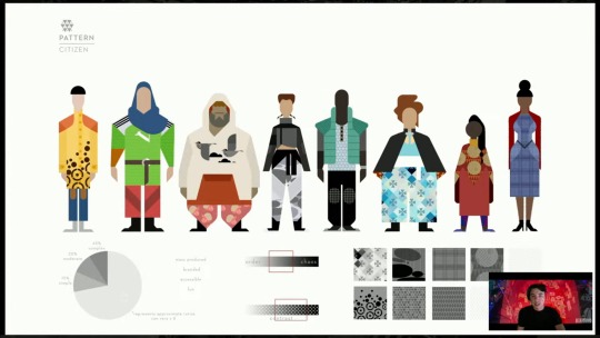
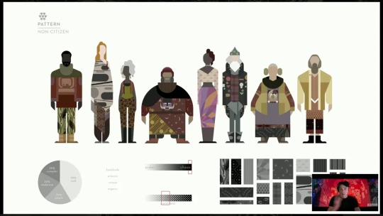
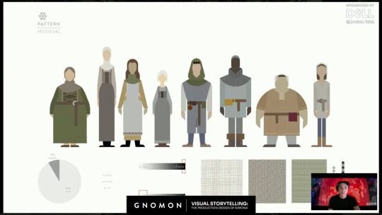
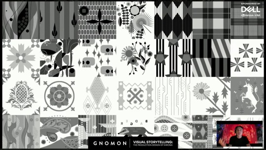
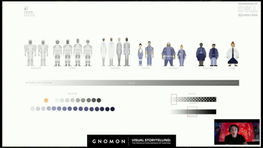
Maybe this was in the online digital Nimona artbook before it went offline, but I didn't pay attention to the costume design rules for all the people in the Kingdom, until this video "Visual Storytelling: The Production Design of 'Nimona'" by Gnomon (from which I screencapped all these pics).
It's interesting to consider how these clothing design rules symbolized Ballister's and Ambrosius's positions in society, but also might have reflected bits of their personalities.
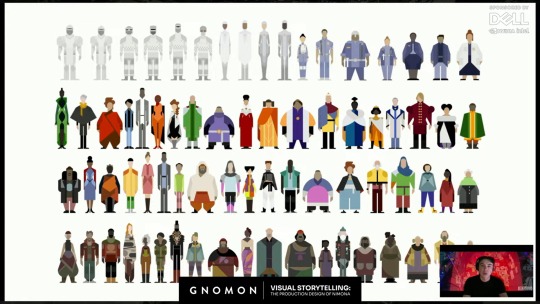
"So we first approached it by a very anthropological approach, where we sat down and said, "if this world was to actually evolve in a closed setting, behind these walls, from the medieval, in this kind of fear-based world, how would society evolve from the medieval rules? And how would that work?" So we researched the medieval rules and found that there was the distinction between, you know, nobility and citizenry, and then non-citizens. And so that was a good place to start for us, to say of "How do we organize this massive pool and system of crowd characters? but in a---in a getable way, that also relates to our story and expresses this world that we're doing?""
The Institute:
Nobility:
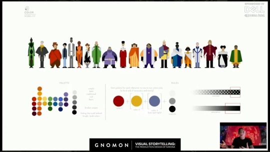
"So we broke we broke it down into contemporary, um, a contemporary ideology, where our main---our nobility was much more based on, um you know, haute couture rules, where we were---they were simple. They were bold. They were evolution of the kind of royal colors and sumptuary laws that the medieval had, but in a modern, in a modern take."
Citizens:
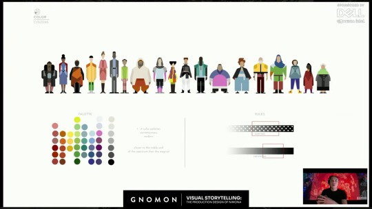
"Same with the citizens, where we leaned more into broader scope, where we needed to have the ability to have business wear, and athleisure, and, um you know, the color palettes that would be associated. …The range of body types that you would need, and…the range of races and ethnicities."
The Magicals:
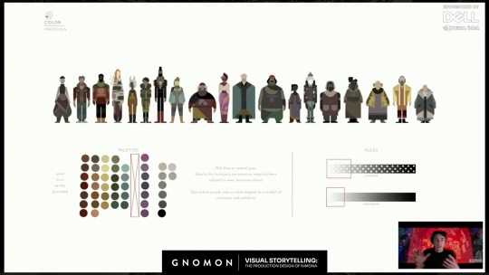
Interesting thing about The Magicals, is this note "NO blue or neutral grey (due to the Institute's persecution, magicals have refused to wear Institute colors)."
Ballister's regular clothes seem to be the same color palette as The Magicals. Given the order of these slides, The Magicals seem to be the lowest rank in the Kingdom's society. Previous concept art showed that the Nimona 2023 movie originally would have portrayed a secret society of people with magical powers like Nimona. I assume these costume design rules were for them, though they got cut from the final movie. It seems appropriate that though Ballister has no magical powers, he is dressed in the colors of the Kingdom's lowest societal rank. But as anyone who has drawn him has noticed, the pendant on his shirt is blue. The one color which The Magicals do not wear, because it is the color of The Institute. Ballister is a commoner trying to become a Knight of the Institute, so it makes sense for him. And though Ballister's clothes could maybe be considered shades of gray (as per The Institute), they have the same dark values of The Magicals and are actually more of the "earthy" tones, noted in The Magicals' palettes. Ballister does not wear the light, almost silver, grays of The Institute. But he does wear a blue pendant. And though his pants have a thin golden stripe running down the sides, which is another color emblematic of The Institute, on second look, it is less gold, and more of a light tan, another earthy color. Almost makes me think that after the end of the movie, maybe he should change his blue pendant to purple, since these design instructions for The Magicals also note "One subtle purple item on each magical as a symbol of resistance and solidarity". (It explains the shade of purple in Nimona's skirt.)
Interesting to look at Ambrosius's outfit, while considering these design instructions. Ambrosius does not wear the "bold" colors or high amount of patterns prescribed for Nobility. Instead, he wears white and a dark shade of blue, with mostly solid, non-patterned clothes, as prescribed for The Institute. He is their symbol, through and through. Except for one point: his hoodie's secondary color of tan. Not only is tan an earthy tone, like The Magicals, the lowest societal rank in the Kingdom, but is takes up a noticeable amount of space in his outfit. It is almost like his one little piece of rebellion against his birth position and the expectations of society for him to represent The Institute and Nobility. It may be his one expression of who he is as a person, rather than the expectations placed onto him. It's kind of interesting that they let him get away with that. Maybe he had to fight for it. Maybe it makes him feel closer to Bal. Maybe he likes the distance it puts between him and the Institute. Maybe he didn't get brave enough to start wearing such colors until after he met Bal. (Now I'm getting into headcanon territory.)
Medievals:
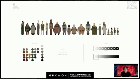
This was explained as the costume design instructions for the flashback characters from 1,000 years ago.
#drawing reference#costume design#nimona 2023#official art#headcanons#character analysis#ballister boldheart#ambrosius goldenloin#pinkfluidnf#ambrbalnf#color schemes#color palettes#patterns#fabric patterns#food for thought#nimona2023
25 notes
·
View notes
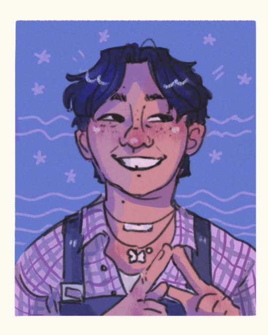
Text

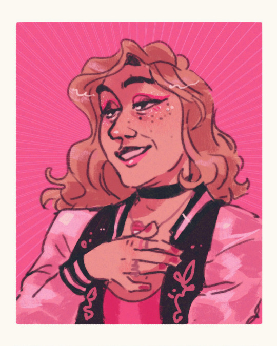


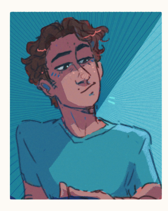
Portrait studies part 1 look at these freaks
#hehe it’s me I’m yellow !!!#artists on tumblr#digital art#digital portrait#portrait study#color study#light blue looks like steve minecraft lol#color schemes#color palettes#man idk just look with your eyebarls
180 notes
·
View notes