#ColorPalettes
Explore tagged Tumblr posts
Visit Tumblr Blog
Explore Tumblr blogs with no restrictions, modern design and the best experience.
Last Seen Tumblr Blogs


Fun Fact
The KCSC sent more than 20K requests to delete posts related to prostitution and porn to Tumblr from January to June 2017.
Text
My biggest cultural impact was making these when I was a teenager


392 notes
·
View notes
Text
✨ Celestial Color Theory: How Your Zodiac Sign’s Color Palette Boosts Your Wardrobe ✨

Your zodiac sign doesn’t just influence your mood—it can shape your aesthetic. Let’s break down the cosmic colors that align with your sign and how to weave them into your wardrobe for that star-powered glow-up. 🌈🌌
🔥 Fire Signs (Aries, Leo, Sagittarius)
Aries: Bold reds & scarlet—colors of confidence and action. Add a red blazer or lipstick for a powerful look. Leo: Golds, oranges, and sun-drenched tones. Go for metallics, warm yellows, and anything regal. Sagittarius: Deep purple, cobalt, and turquoise. These adventurous hues inspire movement and truth-seeking style.
🌿 Earth Signs (Taurus, Virgo, Capricorn)
Taurus: Soft pinks, sage, and earthy greens. Lean into luxurious textures like velvet or silk in these tones. Virgo: Ivory, tan, and muted olive. Structured, clean silhouettes in these colors = chef’s kiss. Capricorn: Charcoal, deep brown, navy. Sleek and powerful—perfect for your boss energy.
💨 Air Signs (Gemini, Libra, Aquarius)
Gemini: Yellow, mint, and sky blue. Think vibrant, light-hearted pieces that reflect your dynamic vibe. Libra: Pastels, blush, baby blue. Romantic and balanced—you shine in soft, harmonious color palettes. Aquarius: Electric blue, silver, neon accents. Unconventional and future-forward. Try color-blocking or chrome accessories.
🌊 Water Signs (Cancer, Scorpio, Pisces)
Cancer: Pearl white, seafoam, and moonlight gray. Flowy fabrics and soft tones for a dreamy, comforting look. Scorpio: Black, burgundy, and deep maroon. These mysterious tones empower your magnetic presence. Pisces: Lavender, sea green, and iridescent shades. Reflect your ethereal nature with shimmer and softness.
🌟 Style Tip:
When in doubt, layer your sun sign's core color with your rising sign’s flair and Venus sign’s finish. It’s like personal alchemy—but make it fashion. 💫👗
#celestialcolortheory#zodiacfashion#stylebythesigns#astrologyvibes#zodiacaesthetic#colorpalettes#cosmicstyle#zodiaccolorpalette#astrologytumblr#fashionmagic#astrowardrobe#tumblrstyle
0 notes
Text
Shout Out to GOLDIE
I saw this kind artist recently made some wonderful color palettes and I really want to bring attention to them and their art overall, they really deserve it <3
If only more people were like them, the world would truly be a lot kinder and better for it
0 notes
Text

Transform your strata building's exterior into a captivating masterpiece with innovative paint ideas that blend aesthetic appeal with durability. Explore a spectrum of color palettes and design techniques to enhance curb appeal and reflect the unique character of your community. From timeless neutrals that exude elegance to bold hues that make a statement, discover how thoughtful color selection and application can rejuvenate your building's facade, creating a welcoming and vibrant atmosphere for residents and visitors alike. Visit https://www.makuspainter.ca/services now!
0 notes
Text
Why to Use Warmer Colours in Your Home Instead of Dark Colours: Benefits and Drawbacks
Ddivine by Monika Gupta says When it comes to choosing the right colours for your home, one of the most significant decisions you will make is whether to go for warm or dark tones. While dark colours have their place in interior design, warmer colours often prove to be a better option for many homes. Whether you're working with an architect, an interior designer or seeking architectural services in Jaipur, understanding the benefits and drawbacks of warmer colours will help you make an informed decision.
The Benefits of Warmer Colours
1. Creates a Welcoming Atmosphere
Warmer colours, like soft oranges, yellows and earthy reds have the power to create a welcoming and inviting environment. These colours have a psychological impact, making a room feel more relaxed and homely. If you want your living room, kitchen, or dining area to feel like a place where family and friends can come together comfortably, warmer colours are an excellent choice. Many residential architects in Jaipur and luxury interior designers in Jaipur recommend these tones for high-traffic areas where relaxation and connection are key.
2. Makes Rooms Feel Larger
Dark colours tend to make rooms appear smaller and more enclosed. On the other hand, warmer tones can open up a room and make it feel more expensive. For example, light warm hues like beige, cream, or light brown can create the illusion of more space, which is particularly important in compact homes or apartments. Modern interiors by Ddivine often incorporate these shades to maximize space and create a sense of openness.
3. Works Well with Natural Light
Warmer colours tend to look more natural when paired with daylight. They reflect sunlight in a way that brightens up a room, making it feel more airy and light. This is particularly useful for homes that receive a lot of natural sunlight. Working with residential interior designers at Ddivine ensures that the colour palette you choose complements your home’s natural lighting and enhances the overall mood of the space.
4. Adds Comfort
Warm tones often evoke a sense of comfort and coziness. This makes them a great choice for bedrooms and living rooms where comfort is paramount. For those seeking a residential interior designer, a warm colour scheme can help create an atmosphere conducive to rest and relaxation.
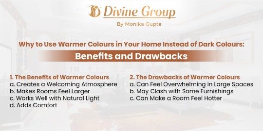
The Drawbacks of Warmer Colours
1. Can Feel Overwhelming in Large Spaces
While warm colours are inviting, they can also become overwhelming if overused in large spaces. If you have a room with high ceilings or a large living area, too much warmth might make the space feel heavy or overbearing. Working with An Ddivine interior designer can help you balance warm tones with other elements of the room, ensuring that the space remains comfortable without feeling too intense.
2. May Clash with Some Furnishings
Not every piece of furniture or décor works well with warm colours. For example, certain wood finishes or upholstery fabrics may not complement warm tones, leading to a disjointed or mismatched look. This is where the expertise of Ddivine architects can help in selecting complementary pieces that harmonize with the chosen colour palette.
3. Can Make a Room Feel Hotter
Warmer colours, while comforting, can sometimes make a room feel warmer, especially during the summer months. In a climate like Jaipur's, where temperatures can soar, opting for cooler tones might sometimes be a more practical choice. Ddivine Interior design services can offer guidance on how to balance warmth and coolness, using colour strategically to regulate room temperature.
Conclusion
Choosing the right colours for your home is a decision that should align with both the practical needs of your space and the emotional atmosphere you want to create. While dark colours have their own appeal, warmer tones tend to make spaces feel larger, brighter and more inviting. Whether you're working with female architects or modern flat interior designers, they can help you create a home that feels warm, welcoming and well-balanced. At Ddivine by Monika Gupta, we understand the importance of choosing the right colour scheme for your home and offer expert design services that cater to your unique vision.
Ultimately, selecting the right tone requires careful thought and the right guidance. With the right mix of colour and design, your home can become the sanctuary you've always wanted it to be. To know more visit www.ddivinegroup.com
#InteriorDesign#WarmColors#HomeDecorIdeas#ModernInteriors#LuxuryLiving#ResidentialDesign#JaipurInteriors#ArchitecturalServices#HomeDecorTips#WarmToneInteriors#DdivineDesign#CozySpaces#SpaceOptimization#NaturalLightDesign#LuxuryInteriorsJaipur#ColorPsychology#InteriorStyling#HomeAesthetics#InteriorDesignerJaipur#ColorPalettes#DreamHomeDesign#ComfortableLiving#DdivineByMonikaGupta#InteriorAndArchitecture#DesignInspiration#WarmAndInviting#ModernLivingSpaces#LuxuryHomesJaipur
0 notes
Text


Perfect Color Combos for Photo, Video, and Graphic Design
Discover the ultimate color combinations to enhance your photo, video, and graphic design projects! These carefully curated color palettes are designed to help you create visually stunning and cohesive content. Whether you're editing photos, producing videos, or designing graphics, these combos will ensure your work stands out with professional flair.
#ColorCombos#DesignTips#PhotoEditing#VideoEditing#GraphicDesign#ColorPalettes#CreativeDesign#DesignInspiration#EditingTips#VisualDesign#hyderabad#srnagar
0 notes
Photo
Color inspo Immerse yourself in a vivid world of colors with these breathtaking images that will inspire your artistic soul.
0 notes
Text


#hasret-iazam#bakirpost#aesthetic#grunge#waterpainting#oceanpainting#seascapepainting#abstractart#contemporaryart#blueart#greenart#turquoiseart#tealart#colorpalette#acrylicpainting#oilpainting#canvasart#fineartprints#artgallery#artcollector#artlover#artoftheday
60 notes
·
View notes
Text


Phthalo green is my new obsesion.
#green#bluegreen#phthalo#color#colorpalette#home#homedecor#19th century#homedesign#pluviophile#rain#rainymood#house#old#dark
131 notes
·
View notes
Text

#character_design#dnd#dungeonsanddragons#original#art#originalcharacter#fantasy#moth_girl#refsheet#adoptablesopen#digitalart#goth#bug#adoptable#wings#maid#aiart#adoptableauction#ai#ttrpg#cute#characterdesign#colorpalette#monstergirl#humanoid#moth_wings#moth#eyes#character#adoptables
46 notes
·
View notes
Text

~ The Best of Gothic Maxis - Color Palette by LadyFausta ~
20 colors perfect for your haunted mansions and moody boudoirs!
🖤💀🐦⬛🖤💀🐦⬛🖤💀🐦⬛🖤💀🐦⬛🖤💀🐦⬛
My favorite swatches for objects are ones from the more gothic packs like Vampires, Paranormal, and Life and Death. To give myself an easy way to have the palette I want for build/buy recolors I put together this palette of my favorite ones!
#sims4#sims4palette#palettes#colorpalette#recolor#for modders#cc creator#custom content resource#simblr#ts4#ts4palettes#maxismatch#ts4mm#s4mm#ts4 color palette#ts4cc#s4cc#ts4 custom content#sims4cc
11 notes
·
View notes
Text
Checkmate
🧩 Author: ChiiAka 🔗 Code Link: 52. || Checkmate on Toyhouse 💠 Use Type: Free to Use (F2U) 📄 Purpose: Character Profile 📝 Description: A sleek, modern character profile code that uses smooth animated buttons to swap between detailed panel sections like Likes, Trivia, and Story. The interface is structured with clear segmented areas for personality sliders, relationship blurbs, and profile stats. Its dark background and amber-gold accents create an elegant, tactical vibe—perfect for characters with a regal, strategic, or high-intellect theme. The layout is both visually rich and compact, with multi-tab efficiency and strong aesthetic cohesion.
📷 Previews:

#toyhouse#toyhou.se#html#code#charactercodes#f2u#multi-tab#gridlayout#personalityslider#statbars#quotehighlight#profilebuttons#traitlists#boldcontrast#monochrome#colorpalette#chiiaka
9 notes
·
View notes
Text

day 33 - Heat Abnormal
I love this song so much
also why so many lim gachas for Minori....
#daily minori doodle#minori hanasato#pjsk minori#pjsk fanart#doodle tag#project sekai#prsk minori#mmj minori#prsk#heat abnormal#mafu cover pls colorpalette#this is a blog unsuccessfully trying to summon minori but I am not above trying to summon other stuff here
18 notes
·
View notes
Text


unpopular opinion: la mezcla de texturas + colores es una de las cosas mas cool que hay.
#fashionjournal#personalstyle#fashion#runway#couture#chanel#menswear#style#outfit#ootd (Outfit of the Day)#fashionblogger#trend#lookbook#streetstyle#highfashion#fashioninspo#fashionillustration#designermood#colorpalette#textileart#runwayinspiration#fashiondesigner#stylistlife#editorialfashion
7 notes
·
View notes
Text

I just got csp and wanted it out with a little portrait
#digital art#artists on tumblr#drawing#oc#original character#portrait#original art#dalblauw ocs#jester#iiiiim still figuring out her colorpalette#dont really like the red hair i went with here
42 notes
·
View notes
Text
🌟 Color Palettes for Every Zodiac Sign 🎨✨

Align your vibe with the stars using these curated color palettes for each zodiac sign! Whether you're picking an outfit, painting your room, or designing your dream aesthetic — let the cosmos guide your color choices. 🌌💫
♈ Aries – Bold, fiery, and unapologetic 🔥 Cherry Red – Electric Orange – Charcoal Black – Pure White
♉ Taurus – Earthy luxury and soft sensuality 🌿 Sage Green – Rose Pink – Cream – Mocha Brown
♊ Gemini – Playful, bright, and a bit chaotic 🌈 Butter Yellow – Sky Blue – Lavender – Silver
♋ Cancer – Soft, nurturing, and sentimental 🌊 Dusty Blue – Pearl – Blush – Soft Gray
♌ Leo – Glamorous, warm, and radiant ☀️ Gold – Marigold – Coral – Midnight
♍ Virgo – Clean, minimal, and grounded 🌾 Olive – Sand – Ivory – Slate
♎ Libra – Romantic, charming, and balanced 💗 Mauve – Baby Pink – Pistachio – Champagne
♏ Scorpio – Intense, mysterious, and magnetic 🖤 Wine – Black – Deep Teal – Crimson
♐ Sagittarius – Adventurous, free, and fiery 🔥 Rust – Turquoise – Plum – Sunset Orange
♑ Capricorn – Sleek, classic, and ambitious 🪨 Charcoal – Forest Green – Taupe – Ivory
♒ Aquarius – Futuristic, quirky, and visionary 🔮 Electric Blue – Silver – Mint – Neon Purple
♓ Pisces – Dreamy, intuitive, and magical 🐚 Lavender – Seafoam – Peach – Opal
✨ Tag your sign & reblog with your favorite shade! 💫 Which palette feels most you?
4 notes
·
View notes