#HDR image processing
Explore tagged Tumblr posts
Visit Tumblr Blog
Explore Tumblr blogs with no restrictions, modern design and the best experience.
Last Seen Tumblr Blogs


Fun Fact
When “GIF” was named word of the year in 2012, Oxford Dictionaries U.S.A. credited Tumblr for pushing the word.
Text

i told my friend i would find him some beginner’s giffing tutorials, but all the one’s i could find were either years out of date, used a method that made me go “huh”, or incorporated ready-made actions. all perfectly fine, but if i’m sending someone a tutorial i’d rather it be one for a method i understand enough to help with.
so, here is a beginner’s guide to giffing, as told by cleo, a neurotic, detailed, and organization happy individual. there will be many pictures.
this tutorial will strictly cover the gif making portion of the process, from getting your screencaps to importing in photoshop, resizing/cropping, and sharpening. i was going to briefly go over colouring, but tumblr only allows 30 images and i ran out of space, so i'll have to do a separate colouring tutorial (which also means i can go into more detail, yay).
downloading the videos, whether direct downloads or t*rrents, is also another tutorial. but make sure you’re using at least 1080p, and the bigger the file the better. a single episode of a ~45 minute show should ideally be 2gb at minimum. a full length movie should ideally be at least 5gb. imo 2160p/4k files are not really necessary; the quality increase is negligible, and it takes a lot longer to screencap them. if you do use 2160p/4k files, try and make sure it is not HDR, as those videos are often washed out and require a different screencapping program to fix.
Programs
I am using a cracked version photoshop 2022, but whichever version you use should be pretty much the same
Actions. not a program but a function inside photoshop, where you essentially record a series of steps, and then you can simple play that action when needed and those steps will repeat, which saves considerable time when giffing. I will note which parts of the tutorial are best saved as actions, and explain how to create actions at the end.
For screencapping i use kmplayer it’s free and very simple to use
not at all a necessary program, but i use freecommander instead of the regular windows file explorer as i find the dual panels very helpful when moving the frames around
Screencapping
there are many programs you can use to get the screencaps from a video, a lot are basically the same, some are better suited for particular video file types. kmplayer is a very simple program to use, but afaik the capture function only works on mkv. files (the only other file type i’ve tried is mp4, which plays but does not capture)
once you open your video file in kmplayer, we’re going to open the advanced capture window, found under capture→advanced capture, or alt+v
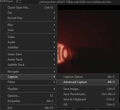
the window should look like this
A-this is where all your screencaps will save to. i recommend making a specific folder for all your screencaps
B-make sure this is set to png for best quality
C-this is the number of screencaps you want to take, guesstimate how many you will need, keeping in mind that most videos are approx. 25 frames per second, and you should always cap a bit more than you think just in case
D-make sure “every/frame” is selected and set to 1
E-make sure “original” is selected, resizing will be done in photoshop
F-make sure “correct aspect ratio” is unselected
go to the part of the video you want to gif, and pause it just slightly before that part starts, then select ‘start’. the screencaps will start to save to the file, no need to play the video, and will automatically stop once it has capped the number of frames you have chosen
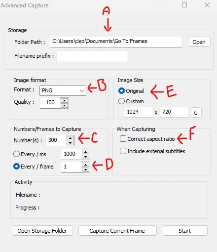
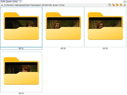
and here is how they look inside freecommander. i have already made a folder for this gifset, which is on the left. now you’re going to make a folder for each individual gif. i’ve decided this one will have four gifs, so create four folders (i just label them gif 01, gif 02, etc) and then move the frames for each gif into their respective folder
while you can always delete frames once the gif is made if it’s too big, i prefer to make sure i have the correct number of frames before i start. the gif limit on tumblr is 10mb, so it’s good to look at the scene/shots you’re giffing and decide approx. what dimensions your gif will be. full size gifs have a width of 540px and your choice of height. if you go for a square gif (540x540) you can usually fit 40-50 frames. if you’re planning for a smaller height (such as 540x400) you can usually fit more around 50-60 frames.
and here are the caps inside the folders. another reason i like freecommander is it’s ability to “multi-rename” files. the default file explorer can do so as well, but you have to do each folder individually and you can’t customize the new names as much. either way, i prefer to rename the files to each gif just to scratch my organization itch.
Introduction to Photoshop
NOTE: i have changed many of my keyboard shortcuts in photoshop to ones i prefer, so any you see listed in the menus of these screenshots are likely not the original shortcuts. you can see and change them yourself under edit→keyboard shortcuts

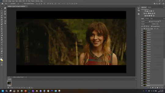
quick run-down of the photoshop interface. i have adjusted placement of some things from the default so this isn’t exactly how your photoshop will look when you open it, but everything is labelled, either on top or by hovering over the element. once you’re more familiar and have your process down i would recommend adjusting the workspace to suit your process.
A-your main tools and colour selector. almost all the tools have either several tools in one, or have alternate options which can be accessed by right-clicking the tool. you can also hover over each tool to get a pop-up with a quick explanation of the tool
B-additional “windows” such as history, properties, actions etc. can be opened from the window menu at the top and moved around with click-and-drag. history and properties should already be there by default, but probably on the right hand side instead. each window opens and closes with a click
C-the timeline window where the gif is made. the white square is a single frame of a gif, and on the row below is the play controls. this will not be there by default and will need to be opened from the window menu
D-adjustment layers for colouring
E-layers box. this is where the screencaps will show, along with adjustment layers, text layers, etc.
Opening Screencaps in Photoshop
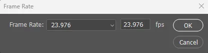
go to file → open navigate to the folder for your first gif, select the first screencap, and check the image sequencing, and click open

a window will open labelled frame rate. set it to 23.976 and select ok
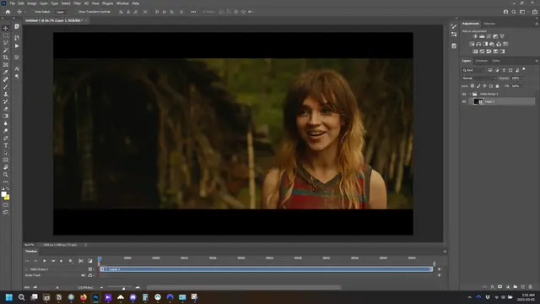
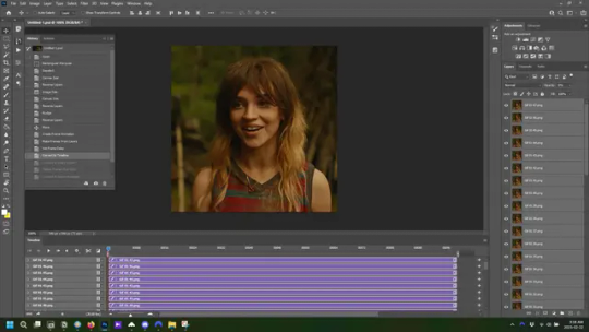
the screencaps will open in the timeline view, seen as the blue panel line at the bottom, and the screencaps are combined into video layer in the layer panel on the right.
Creating Frames
technically, you could go right into your cropping/resizing and sharpening from here, however if you do that directly then you have to keep the screencaps in the folders you have, otherwise if you save and re-open the gif it won’t move.
this next part should be made into an action.
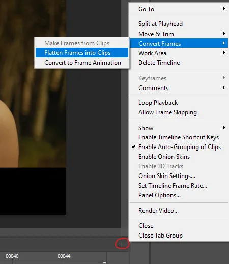
at the top right of the timeline window, click four vertical lines to open the menu and select convert frames → flatten frames into clips. depending on how long the gif is, this can take a minute.
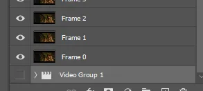
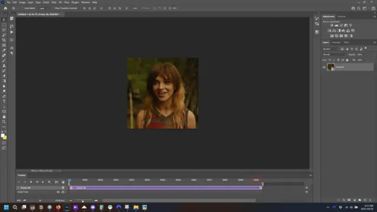
the layers panel should now look like this, each frame of the gif is now its own layer.
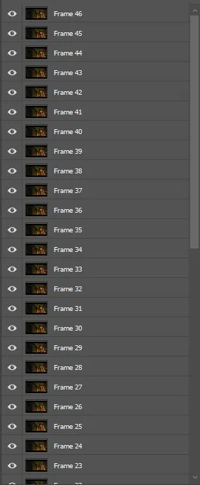
the very bottom layer will be the video group. this can be deleted as we’ve made the frames from it
in same timeline menu as before, right under “flatten frames into clips”, select “convert to frame animation” and the screen should now look like this. this will be the end of this action.
Cropping and Resizing
with widescreen footage, sometimes it’s just shorter than 1080p, but most of the time it will have the black bars on the top and bottom, and frustratingly, they’re not always the same size. it’s good to save the most common sizes as actions.
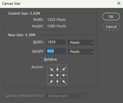
to find the size of the actual screen you turn on the rulers under view→rulers and check the height. then open your canvas size dialogue box under image→canvas size and change the height, making sure pixels are selected in the dropdown. yellowjackets is what i call “xtra wide” which is 800px. “normal” widescreen is 960px.
next we’re going to resize the caps. i also make actions for this, one for each potential gif size. open the image size dialogue box under image→image size and change the height of the image to your desired height plus 4 pixels. these extra pixels are to prevent a line at the top and/or bottom of your completed gif. now re-open the canvas size box, change the width to 540px, and the height to the desired, removing those 4 extra pixels. i have set this one to 540x540. this is where you would end the resizing action.
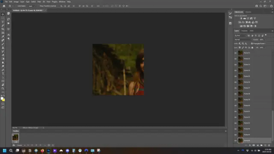
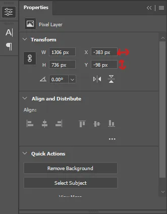
and as you can see she is off-screen. select the top layer, hold down shift and select the bottom layer to select them all, and with the move tool (the very top one) activated, click and drag to move it left to right as needed to centre the figure/s. as you move it a box will appear telling you how far you are moving it in any direction. make sure you are only moving it left or right, not up or down. to be certain of that, open the properties tab.
the y axis is your up/down, x is left/right. for this gif the y needs to stay at -98. you can also manually change the x axis number instead of dragging the image. also helpful for making sure multiple gifs of the same shot are all positioned the same.
the layer are currently ordered with the 1st at the top and the last at the bottom. with all layers still selected, go to layers→arrange→reverse. the last layer will be on top now. if there is movement in your gif, check if you need to alter the position again to make sure the movement properly centred. but once you are satisfied with the position, the layers should be in “reverse” position, of last layer on top. this is to ensure that the gif plays forwards.
Converting Gif
this should also be made into an action, going through sharpening process
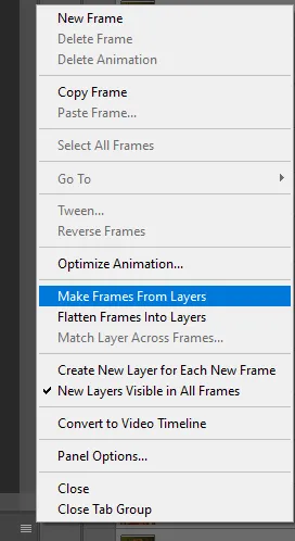
in the timeline menu, select “make frames from layers”
the frames are now populated in animation window. in timeline, click select all frames. go to any of the frames on the bottom and click the little arrow beneath it, select other, and enter 0.07 seconds. this is not a necessary step, as we will have to adjust the frame rate at the end, most likely to 0.05, but if we don’t change the frame rate here, then when we play the gif while working on it to check how it looks, it will play very fast.
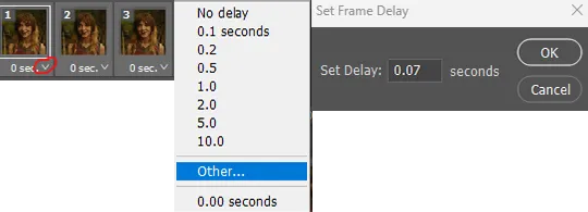
in the same menu at the right of the timeline box, select “convert to video timeline”
then, making sure all layers in the panel on the right are selected, go to filter→convert for smart filters. this turns all the layers into a single smart object.
but if you look where i’ve circled, it says the gif is 99 frames long*, when in fact there are only 47. if you are making regular “scene” gifs, basic colouring and maybe a caption, this is fine and does not need to be fixed, it will play at the same speed. if you want to change it to display (approx.**) the correct number of frames, go to the timeline menu on the right, select “set timeline frame rate” and change it from 30 to 15
*if it does not list a frame number by 4 digits but instead says 5f, 10f, 15f, etc. go to the timeline menu on the right, select panel options, and change timeline units to “frame number”
**the reason why this is only approximate is because the actual frame rate is not a a whole number, so when changing the frame rate it isn’t a 1:1, and 47 frames becomes 50 frames. the extra frames are removed at the very end, but if you are not doing any edits that require working frame by frame, there’s no need to change the frame rate here at all
Sharpening
this is, as it sounds, making the gif look sharper. to start go to filter→sharpen→smart sharpen and this window opens. play around with the dials to see what each ones does. the below settings are good for most high quality footage.
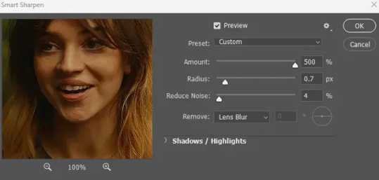
Amount-basically, how sharp do you want it
Radius-hard to explain, but this essentially sets how deep the lines of the sharpness are
Reduce Noise-smooths the pixels
once you click okay your single layer should look like this.
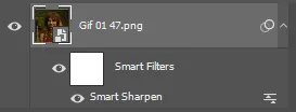
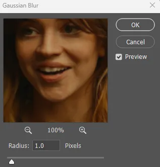
you’re going to then right click the layer and select duplicate layer. with the top layer selected, go to filters→blur→gaussian blur and set the radius to 1.0 pixels.
then change the opacity of the top layer to 10%. this is to essentially soften the sharpening a bit, as if it’s too sharp it can make the colouring wonky. this opacity level can also be changed depending on need.
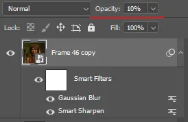
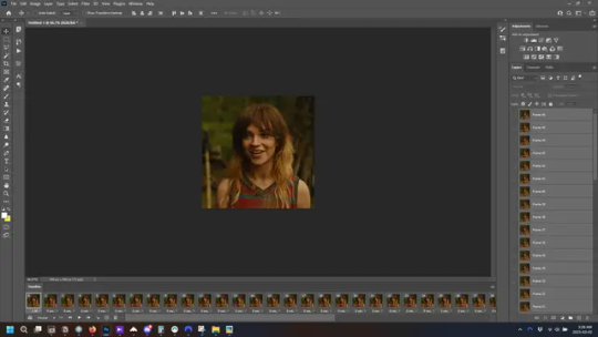
finally, select both layers, right click, and click “group from layers”. your gif is now fully made and sharpened.
Colouring
yeah. ran out of image space. but this is where you would do your colouring and add a caption or any other text.
Converting & Exporting
when all your colouring is done, you’re ready to start saving your gif. you can do it directly from your current file, but that means essentially losing your colouring, as all those layers will be merged together. i am someone who likes to save my psd’s (photoshop files), at least until i’ve posted the gifs, in case i need to fix something in the colouring. if you’d like to keep yours as well, open the history tab and select the first icon at the bottom “create new document from current state”. this will open a copy of the file in a new tab. save the original file and you can close it, continuing all work on the copy file.

select your all your layers, convert them into a smart object from filter->convert for smart filters, then follow the same steps from Creating Frames above. once you're back in frame animation, select Create Frames From Layers, and once again set the frame animation speed.
most people set the speed to 0.05. i personally set it to 0.05 or 0.06 depending on the length of the gif. check how it looks at 0.05, if it seems too fast, try 0.06.
now to save. go to file->export->save for web (legacy). the number is the lower left corner is your gif size, it needs to be under 10mb or else you'll have to delete some frames.

the right panel is your save options. the preset dropdown has some built-in settings, but you won't use them because (at least on my version) the presets only go up to 128 colours, instead of the full 256. the 3 i've highlighted in green are the only one's you'll adjust as needed. the settings below i use for i'd say 90% of my gifs. i'll sometimes change the adaptive dropdown to one of the other options, ocaissionaly the diffusion, and rarely the no transparency dither, but play around with them and see how they change the look of the gif.

when you're satisfied with the look of your gif, click save at the bottom right of the window.
voilà! you now have a gif.
Actions
this is your actions panel. the triangle on the left side is the button to open it. remember, if it's not already there, go to windows->actions to open it.
the buttons on the bottom, left to right, are stop recording, record action, play action, new folder, new action, and delete.

as you can see, i have different folders for my resizing, sharpening, captions, saving, and my 1 step (temporary) actions. to run an action is very simple; click the action, and click play.
to create an action, click the new action button, a box will pop up, give the action a name, and click record. the record button at the bottom of the action window will turn red. now perform all the steps you want it to record, and click stop recording. keep in mind it will record every single thing you do, including in other open files, so if the action you plan to record will have a lot of steps, it might help to write them down first.
to modify an action, select the step in the action above where you'd like the new step to be, hit record, perform the step, stop recording. select the step you'd like to delete, and click the delete button.
steps within the actions can be clicked and dragged, both within that action and moved to other actions. actions can also be moved between folders.
264 notes
·
View notes
Photo

2025 March 25
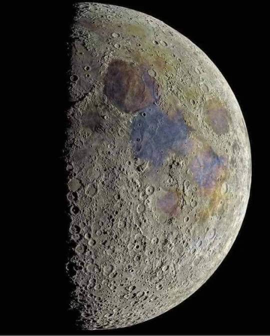
A Blue Banded Blood Moon Image Credit & Copyright: Zixiong Jin
Explanation: What causes a blue band to cross the Moon during a lunar eclipse? The blue band is real but usually quite hard to see. The featured HDR image of last week's lunar eclipse, however -- taken from Norman, Oklahoma (USA) -- has been digitally processed to exaggerate the colors. The gray color on the upper right of the top lunar image is the Moon's natural color, directly illuminated by sunlight. The lower parts of the Moon on all three images are not directly lit by the Sun since it is being eclipsed -- it is in the Earth's shadow. It is faintly lit, though, by sunlight that has passed deep through Earth's atmosphere. This part of the Moon is red -- and called a blood Moon -- for the same reason that Earth's sunsets are red: because air scatters away more blue light than red. The unusual purple-blue band visible on the upper right of the top and middle images is different -- its color is augmented by sunlight that has passed high through Earth's atmosphere, where red light is better absorbed by ozone than blue.
∞ Source: apod.nasa.gov/apod/ap250325.html
172 notes
·
View notes
Text
Andromeda Galaxy !
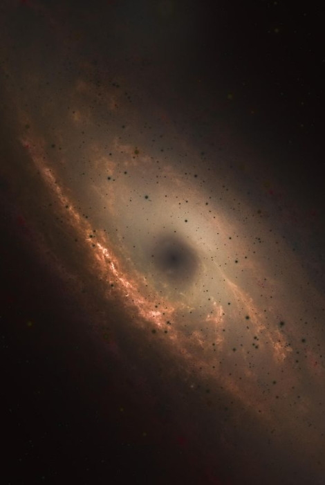
⚫️ HDR Negative photo (roughly inverting the colors) of Andromeda Galaxy .
The stars and core of Andromeda appear black in this image because it was processed using HDR Negative, meaning that the colors in this are roughly the inverse of their visible light coloration. Thus, the bright white stars appear black, and the enormously bright core (from massive amounts of light orbiting a supermassive black hole) appears dark as well.
#space#nasa#universe#art#astronomy#science#galaxy#moon#stars#cosmos#spacex#scifi#astrophotography#photography#earth#astronaut#love#alien#nature#mars#spaceart#sky#spaceexploration#planets#aliens#spaceship#spacetravel#rocket#digitalart#design
285 notes
·
View notes
Note
hi! i was wondering if you have any advice/certain programs or anything you use for making gifs, because there’s something i really want to make but i have zero experience 💔💔
hello hello!
ah, yes, I have a TON, let's hope this ADHD girlie can give a somewhat concise description lmao. I will answer this publicly, in case it's useful for anyone else.
Software I use:
To make the screenshots: - for single scenes: KMPlayer 12.22.30 (the newer versions are trash) - for shorter videos, or something you want to get all the screenshots out of Free Video to JPG converter is awesome.
To make the gifs: - Adobe Photoshop 2021 (I don't recommend much later versions, because of the Cloud connection they have)
General gif-maker wisdom: "we spend more time on making sure that something looks serviceable, not pixelated, and good quality, than to get it moving and shit" - Confucius, probably
Useful stuff to make your life easy:
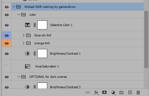
- Squishmoon's action pack for sharpening your screenshots. You can also find their detailed use explained here. - If you are planning to gif Wicked, some scenes are a bit tricky, ngl. But I have two PSDs that you can use, while you're perecting your own craft, and you can edit and update them to make them more "you".
A neutral PSD for mostly indoors and lighter scenes | download

A blue-enhancing PSD for darker scenes | download
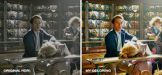
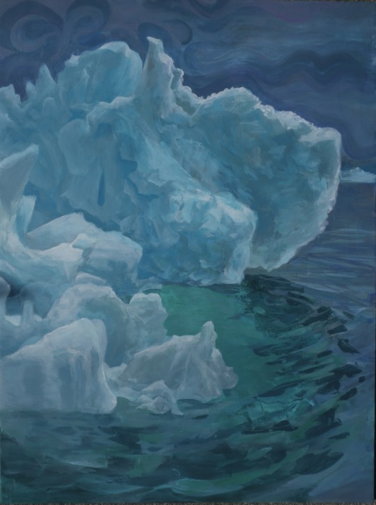
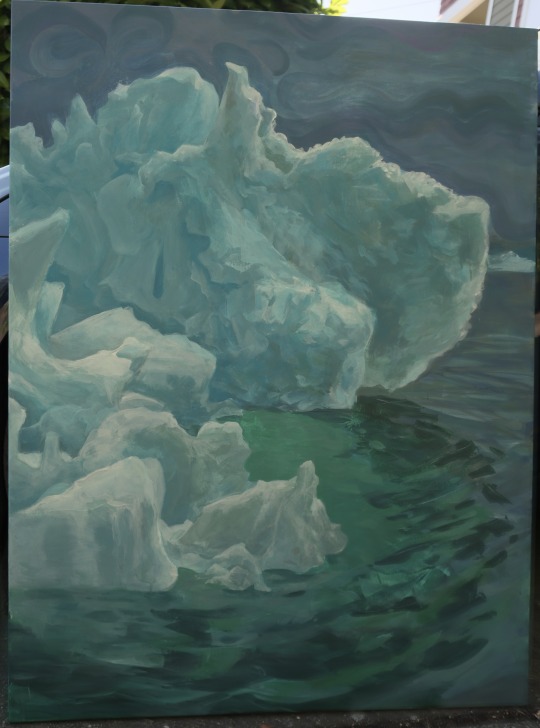
Some info on videos to use: - always, always (ALWAYS) use at least HD videos. Otherwise your gif will look like shit. This should be ideally at least 720p in resolution, but go with 1080p for the best results. Coloring gifs in 1080p is easy, but... - if you want to go pro *rolls eyes*, you could go for HDR (2160p) quality. However HDR is a mf to color properly and I would not recommend it for a beginner. When you extract frames from an HDR video, the image colors will end up being washed out and muddy so you will always have to balance those colors out for it to look decent, however, the quality and number of pixels will be larger. If you ar okay with making small/medium sized images, then stick with 1080p. (Storytime, I spent a lot of time making HDR screenshots, only for me to realize that I really hate working with them, so I'm actually considering going back to 1080p, despite that not being "industry standard" on Tumblr lmao. I'm not sure yet But they take up so much space, and if you have a laptop that is on the slower side, you will suffer.)
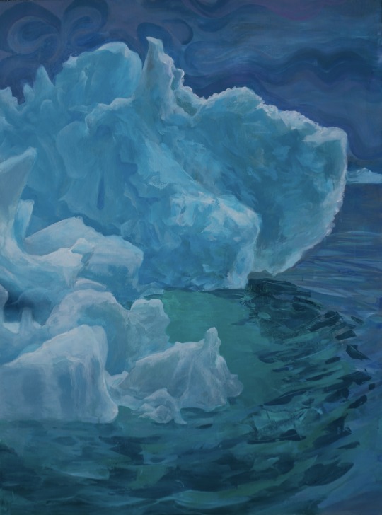
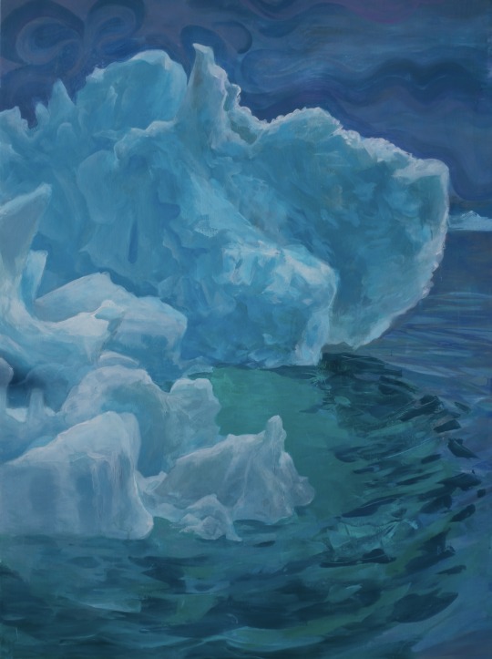
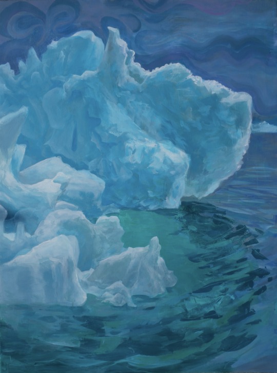
See the below example of the image differences, without any effects. You will probably notice, that HDR has some more juicy detail and is a LOT sharper, but well... the color is just a lot different and that's something you will have to calculate in and correct for.

The ✨Process✨
Screencaptures
I like to have all screenshots/frames ready for use. So as step one, you need to get the movie file from somewhere. This should definitely be a legal source, and nothing else (jk).
Once I have the movie. I spend a lot of time making and sorting screencaps. Since I mostly work in the Wicked fandom only atm, that means I will only need to make the frames once, and thats awesome, cause this is the most boring part.
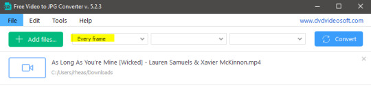
For this, I let the Video to JPG Converter run the whole movie while I was aleep, and by morning, it created gorgeous screenshots for me and my laptop almost went up in flames.
You need to make sure you capture every single frame, so my settings looked like this:
Screenshots do take up a lot of space, so unless your computer has a huge brain, I suggest storing the images in an external drive. For Wicked, the entire movie was I think around 200k frames total. I reduced that to about 120k that I will actually use.
And then I spend some time looking through them, deleting the scenes I know I won't do ever (goodbye Boq, I will never gif you, I'm so sorry :((( ) and also, I like to put them into folders by scene. My Wicked folder looks like this:

If you don't want this struggle and you only need a few specific scenes, there is this great tutorial on how to make frames from KMPlayer. Note that some of the info in this tutorial on gif quality requirements and Tumblr's max allowance of size and # of frames are outdated. You are allowed to post a gif that is a maximum of 10 Mb and 120 frames (maybe it can be even more, idk, said the expert) on Tumblr. But the process of screencapturing is accurate. Also ignore the gifmaking process in this tutorial, we have a lot easier process now as well!
Prepping the images
I have a folder called "captures", where I put all of the specific screenshots for a set I want to use. Inside this folder I paste all the shots/scenes I want to work on for my current gifset, and then I create subfolders. I name them 1, 2, 3, etc, I make one folder for each gif file I want to make. Its important that only the frames you want to be in the gif are in the folder. I usually limit the number of images to 100, I don't really like to go above it, and usually aim to go lower, 50-70 frames, but sometimes you just need the 100.
Sidetrack, but: Keep in mind that Tumblr gifs also need to be a specific width, so that they don't get resized, and blurry. (Source) Height is not that important, but witdth is VERY. But since there is a limit on Mb as well, for full width (540px) gifs you will want to go with less frames, than for smaller ones.
Once you have the frames in folders, you will open Photoshop, and go to: File > Scripts > Load files into stack.
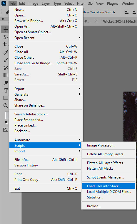
Here you select Folder from the dropdown menu, and then navigate to the folder where you put the frames for your first gif. It will take a moment to load the frames into the window you have open, but it will look like this:

You click "OK" and then it will take anther few moments for Photoshop to load all the frames into a file.
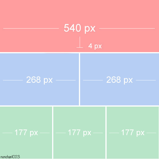
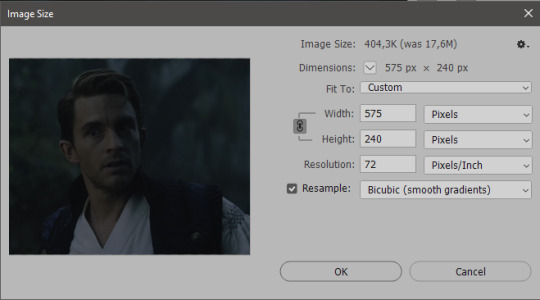
But once that's done, and you have the frames, you next have to resize the image. Go to Image > Image size... When you resize in Photoshop, and save as gif, sometimes you do end up with a light transparent border on the edge that looks bad, so, when you resize, you have to calculate in that you will be cutting off a few pixels at the end. In this example, I want to make a 268px width gif. I usually look at heights first, so lets say I want it to be a close-up, and I will cut off the sides, and it will be more square-ish. So I set height to 240px. Always double check that your width doesn1t run over your desired px numbers, but since 575 is larger than 268 (can you tell I'm awesome at math?), I should be good. I click OK.
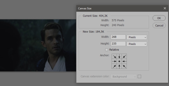
Next, you have to crop the image. Go to Image > Canvas size... At this point we can get rid of those extra pixels we wanted to drop from the bottom as well, so we will make it drop from the height and the width as well. I set the width to 268px, and the height to 235px, because I have OCD, and numbers need to end with 0 or 5, okay?
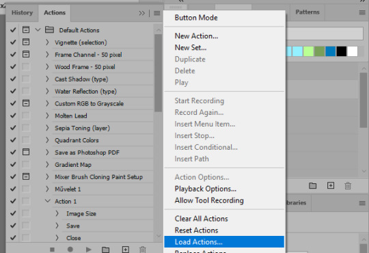
And now, the magic happens! First, go to Window > Actions to have the actions window show up. While you're at it, in the Window menu also select Timeline (this will be your animation timeline at the button) and also Layers. Once you have the Actions window showing up, on the menu in the upper right corner click the three lines menu button, and from the list select "Load Actions". I hope you downloaded the Squishmoon action pack from the start of this post, if not, do it now! So you save that file, and then after you clicked Load, you... well, load it. It will show up in your list like so:
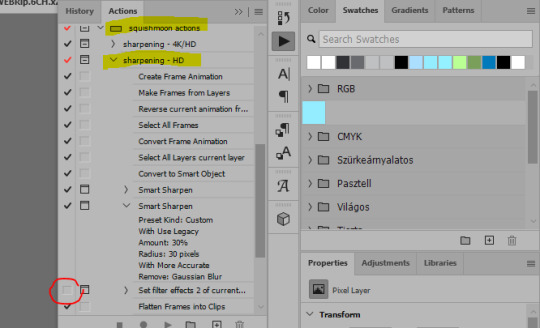
You will want to use the sharpening - HD one, BUT I personally like to go, and remove the tick from the spot I circled above, so leave that empty. This will result in the image having more contrast, which is very much needed for these darker scenes.
When you have that, you select the action itself like so, and click the play button at the bottom. The action will do everything for you, sharpen, increase contrast and also, create the gif and set the frame speed. You won't need to edit anything, just whatever window pops up, click "OK"

Now it should all look like something like this:
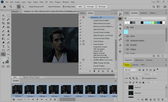
In the Layers window on the side, scroll all the way up to the top. The frame on the top is your last frame. Every effect you want to add to the gif should go to here, otherwise it won't apply to all frames. So at this point I open my PSD for darker scenes, and pull the window of it down, above the gif I'm working on like so:

And then I grab the folder I marked with yellow, left click, hold the click down, and drag that folder over to my current gif. And bamm, it will have the nice effect I wanted! You can click the little play button at the button to see a preview.

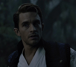
Once you have it sorted, now its time to extract it, but first, here's our before and after view:

Now, if you are happy with this, you can just save and close.
If you want to add subtitles, you can do that as well either manually with the text tool (remember, to add as the TOP layer as we did with the coloring) or you can use a pre-set PSD for that as well, here's mine.
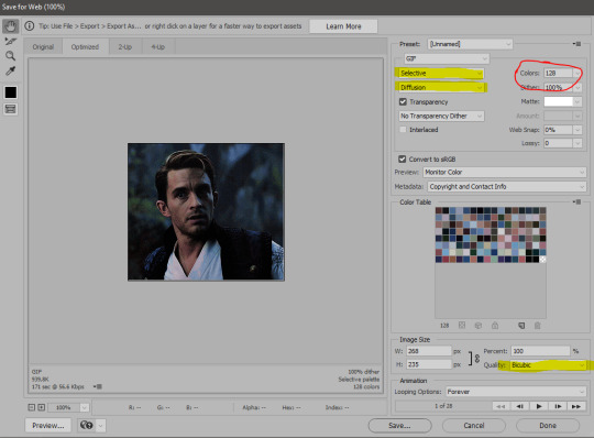
Now, we just need to export it. Go to File > Export > Save for Web (Legacy) and copy my settings here. Others may use other settings, but these are mine, so! I hope you are happy with them :3
In this case, for colors, I picked 128 colors, because on dark sscenes you can get away with using less colors, and the larger that number is, the bigger the filesize. If you use lighter images, you will need to bump that shit up to 256, but that will make your file larger. You can see at the bottom of the screen, how large your file will end up being. So long as you are under 9 Mb, you should be good :3
Conclusion
Look, Gif making and Photoshop in general is a bit scary at first. There are a lot of settings you can mess around on your own, a lot to play with, and also a lot can go wrong. This is a very basic tutorial, and also my current process and preferred coloring. However if you look at "gif psd" or "gif tutorial" or similar tags on Tumblr, you can find a LOT of great resources and steps, for many-many things. Usually people are not too antsy about sharing their methods either. You make 4-5 gifs, and you will have the steps locked down, and then it's all about experimenting.
After you have some muscle memory, your next step should be to explore what is inside a PSD coloring folder that you use. Open them up, try clicking around, click the little eye, to see what happens if they are turned off, and double click them, and play around with the sliders, to see what each does. Most people on Tumblr don't really know what each one does, we all just pressed a few buttons and got really lucky with the results, lol.
If anything is unclear, don't hesitate to ask, I'll gladly help!
Good luck <3
45 notes
·
View notes
Text
Astronomy Picture of the Day
2025 March 25

A Blue Banded Blood Moon
A developing total lunar eclipse is shown in three frames. At the top part of the uneclipsed Moon is visible with a distinctive blue band separating it from the rest of the reddened Moon. The middle frame shows a mostly reddened Moon with a the blue band just visible on the upper right, while the lowest frame shows an entirely eclipsed moon all in red.
Image Credit & Copyright: Zixiong Jin
Explanation: What causes a blue band to cross the Moon during a lunar eclipse? The blue band is real but usually quite hard to see. The featured HDR image of last week's lunar eclipse, however -- taken from Norman, Oklahoma (USA) -- has been digitally processed to exaggerate the colors. The gray color on the upper right of the top lunar image is the Moon's natural color, directly illuminated by sunlight. The lower parts of the Moon on all three images are not directly lit by the Sun since it is being eclipsed -- it is in the Earth's shadow. It is faintly lit, though, by sunlight that has passed deep through Earth's atmosphere. This part of the Moon is red -- and called a blood Moon -- for the same reason that Earth's sunsets are red: because air scatters away more blue light than red. The unusual purple-blue band visible on the upper right of the top and middle images is different -- its color is augmented by sunlight that has passed high through Earth's atmosphere, where red light is better absorbed by ozone than blue.
Authors & editors: Robert Nemiroff (MTU) & Jerry Bonnell (UMCP)
NASA Official: Amber Straughn
A service of: ASD at NASA / GSFC,
NASA Science Activation
& Michigan Tech. U.
27 notes
·
View notes
Text
Can someone knowledgable about photography (and specifically white balance and color adjusting) help me out here? I'm going a bit crazy.
@etirabys posts pictures of her completed paintings (which you should go check out if you don't already) that she takes with her 3-year-old iPhone, and I figured it would help them sell if the images on her website were taken with my Fuji XT-5 instead. But I've fiddled with a bunch of settings, and the iPhone image is better in every way. The Fuji flattens all the colors, even when shooting in HDR mode. I'm convinced it's sharper as well.
Attached are a bunch of shots I took of this painting, in various lighting conditions, HDR settings, and Fuji color modes. They all suck.

cc @drethelin and @curse-that-wren-tern-skyline as the main photographers I know here. I know Apple's computational post-processing is really good, but surely I do can do at least as good and with four times the megapixels.
46 notes
·
View notes
Text
canmom's notes on fixing the colours
ok so if you've been following along on this blog for the last week or two i've been banging on about colour calibration. and i feel like it would be good to sum up what i've learned in a poast!
quick rundown on colour spaces
So. When you represent colour on a computer, you just have some numbers. Those numbers are passed to the monitor to tell it to turn some tiny lights up and down. The human visual system is capable of seeing a lot of colours, but your monitor can only display some of them. That's determined by its primaries, basically the exact colour* of its red, green and blue lights.
(*if you're wondering, the primaries are specified in terms of something called the CIELAB colour space, which is a model of all the different colours that humans can possibly see, devised by experiments in the early-mid 20th century where the subjects would turn lights at different frequencies up and down until they appeared visually the same. Through this, we mapped out how eyes respond to light, enabling basically everything that follows. Most human eyes tend to respond in pretty close to identical ways - of course, some people are colourblind, which adds an extra complication!)
Now, the problem we face is that every display is different. In particular, different displays have different primaries. The space in between the primaries is the gamut - the set of all colours that a display can represent. You can learn more about this concept on this excellent interactive page by Bartosz Ciechanowski.
The gamut is combined with other things like a white point and a gamma function to map numbers nonlinearly to amounts of light. All these bits of info in combination declare exactly what colour your computer should display for any given triplet of numbers. We call this a colour space.
There are various standard sets of primaries, the most famous being the ITU-R Rec.709 primaries used in sRGB, first defined in 1993, often just called the sRGB primaries - this is a fairly restricted colour space, intended to be an easy target for monitor manufacturers and to achieve some degree of colour consistency on the web (lol).
Since then, a much wider gamut called Rec.2020 has recently been defined for 'HDR' video. This is a very wide gamut, and no existing displays can actually show it in full. Besides that, there are various other colour spaces such as AdobeRGB and P3, which are used in art and design and video editing.
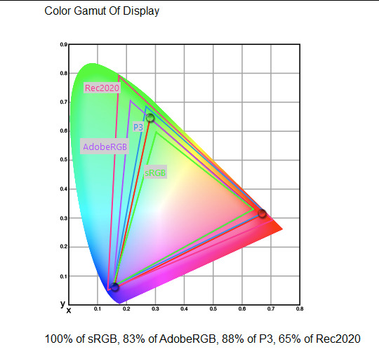
What you see above is something called a 'chromaticity diagram'. the coordinate system is CIE xyY with fixed Y. The curved upper edge to the shape is the line of monochromatic colours (colours created by a single frequency of light); everything other colour must be created by combining multiple frequencies of light. (Note that the colours inside the shape are not the actual colours of those points in CIE XY, they're mapped into sRGB.)
In this case, the red, green and blue dots are the primaries of my display. Since they are outside the green triangle marked sRGB, it qualifies as a 'wide gamut' display which can display more vivid colours.
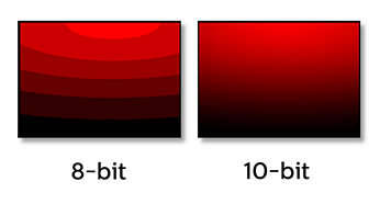
Sidebar: you might ask why we didn't define the widest possible gamut we could think of at the start of all this. Well, besides consistency, the problem is that you only have so many bits per channel. For a given bit depth (e.g. 8 bits per channel per pixel), you have a finite number of possible colours you can display. Any colours in between get snapped to the nearest rung of the ladder. The upshot is that if you use a higher gamut, you need to increase the bit depth in order to avoid ugly colour banding, which means your images take up more space and take more time to process. But this is why HDR videos in Rec.2020 should always be using at least 10 bits per colour channel.
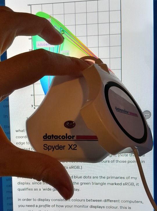
in order to display consistent colours between different computers, you need a profile of how your monitor displays colour. Yhis is something that has to be measured empirically, because even two monitors of the same model will be slightly different. You get this information by essentially taking a little gadget which has a lens and a sensitive, factory-calibrated colour meter, and holding it against your screen, then making the screen display various colours to measure what light actually comes out of it. This information is packed into a file called an ICC profile.
(Above is the one I got, the Spyder X2. I didn't put a lot of thought into this, and unfortunately it turns out that the Spyder X2 is not yet supported by programs like DisplayCal. The Spyder software did a pretty good job though.)
Wonderfully, if you have two different ICC profiles, and you want to display the same colour in each space, you can do some maths to map one into the other. So, to make sure that a picture created on one computer looks the same on another computer, you need two things: the colour space (ICC profile) of the image and the colour space (ICC profile) of the screen.

Now different operating systems handle colour differently, but basically for all three major operating systems there is somewhere you can set 'here is the icc profile for this screen'. You might think that's the whole battle: calibrate screen, get ICC profile, you're done! Welcome to the world of consistent colour.
Unfortunately we're not done.
the devil in the details
The problem is the way applications tell the operating system about colour is... spotty, inconsistent, unreliable. Applications can either present their colours in a standard space called sRGB, and let the OS handle the rest - or they can bypass that entirely and just send their numbers straight to the monitor without regard for what space it's in.
Then we have some applications that are 'colour managed', meaning you can tell the application about an ICC profile (or some other colour space representation), and it will handle converting colours into that space. This allows applications to deal with wider colour gamuts than sRGB/Rec.709, which is very restricted, without sacrificing consistency between different screens.
So to sum up, we have three types of program:
programs which only speak sRGB and let the OS correct the colours
programs which aren't colour aware and talk straight to the monitor without any correction (usually games)
programs which do colour correction themselves and talk straight to the monitor.
That last category is the fiddly one. It's a domain that typically includes art programs, video editors and web browsers. Some of them will read your ICC profile from the operating system, some have to be explicitly told which one to use.
Historically, most monitors besides the very high end were designed to support sRGB colours and not much more. However, recently it's become easier to get your hands on a wide gamut screen. This is theoretically great because it means we can use more vivid colours, but... as always the devil is in the details. What we want is that sRGB colours stay the same, but we have the option to reach for the wider gamut deliberately.
Conversely, when converting between colour spaces, you have to make a decision of what to do with colours that are 'out of gamut' - colours that one space can represent and another space can't. There's no 'correct' way to do this, but there are four standard approaches, which make different tradeoffs of what is preserved and what is sacrificed. So if you look at an image defined in a wide colour space such as Rec.2020, you need to use one of these to put it into your screen's colour space. This is handled automatically in colour managed applications, but it's good to understand what's going on!
(*You may notice a difference in games even if they're not colour managed. This is because one of the things the calibration does is update the 'gamma table' on your graphics card, which maps from numeric colour values to brightness. Since the human eye is more sensitive to differences between dark colours, this uses a nonlinear function - a power law whose exponent is called gamma. That nonlinear function also differs between screens, and your graphics card can be adjusted to compensate and make sure everyone stays on the standard gamma 2.2. Many games offer you a slider to adjust the gamma, as a stopgap measure to deal with the fact that your computer's screen probably isn't calibrated.)
For what follows, any time you need the ICC profile, Windows users should look in C:\Windows\System32\spool\drivers\color. MacOS and Linux users, see this page for places it might be. Some applications can automatically detect the OS's ICC profile, but if not, that's where you should look.
on the web
Theoretically, on the web, colours are supposed to be specified in sRGB if not specified otherwise. But when you put an image on the web, you can include an ICC profile along with it to say exactly what colours to use. Both Firefox and Chrome are colour-managed browsers, and able to read your ICC profile right from the operating system. So an image with a profile should be handled correctly in both (with certain caveats in Chrome).
However, Firefox by default for some reason doesn't do any correction on any colours that don't have a profile, instead passing them through without correction. This can be fixed by changing a setting in about:config: gfx.color_management.mode. If you set this to 1 instead of the default 2, Firefox will assume colours are in sRGB unless it's told otherwise, and correct them.
Here is a great test page to see if your browser is handling colour correctly.
Chrome has fewer options to configure. by default it's almost correctly colour-managed but not quite. So just set the ICC on your OS and you're as good as it's gonna get. The same applies to Electron apps, such as Discord.
To embed a colour profile in an image, hopefully your art program has the ability to do this when saving, but if not, you can use ImageMagick on the command line (see below). Some websites will strip metadata including ICC profile - Tumblr, fortunately, does not.
For the rest of this post I'm going to talk about how to set up colour management in certain programs I use regularly (Krita, Blender, mpv, and games).
in Krita
Krita makes it pretty easy: you go into the settings and give it the ICC profile of your monitor. You can create images in a huge variety of spaces and bit depths and gamma profiles. When copying and pasting between images inside Krita, it will convert it for you.
The tricky thing to consider is pasting into Krita from outside. By default, your copy-paste buffer does not have colour space metadata. Krita gives you the option to interpret it with your monitor's profile, or as sRGB. I believe the correct use is: if you're copying and pasting an image from the web, then sRGB is right; if you're pasting a screenshot, it has already been colour corrected, you should use 'as on monitor' so Krita will convert it back into the image's colour space.
in Blender
Blender does not use ICC profiles, but a more complicated system called OpenColorIO. Blender supports various models of mapping between colour spaces, including Filmic and ACES, to go from its internal scene-referred HDR floating-point working space (basically, a space that measures how much light there is in absolute terms) to other spaces such as sRGB. By default, Blender assumes it can output to sRGB, P3, etc. without any further correction.
So. What we need to do is add another layer after that which takes the sRGB data and corrects it for our screen. This requires something called a Lookup Table (LUT), which is basically just a 3D texture that maps colours to other colours. You can generate a LUT using a program called DisplayCal, which can also be used for display calibration - note that you don't use the main DisplayCal program for this, but instead a tool called 3DLUT Maker that's packaged along with it. see this Stack Overflow thread for details.
Then, you describe in the OpenColorIO file how to use that LUT, defining a colour space.

The procedure described in the thread recommends you set up colour calibration as an additional view transform targeting sRGB. This works, but strictly speaking it's not a correct use of the OpenColorIO model. We should also set up our calibrated screen as an additional display definition, and attach our new colour spaces to that display. Also, if you want to use the 'Filmic' View Transform with corrected colours (or indeed any other), you need to define that in the OpenColorIO file too. Basically, copy whatever transform you want, and insert an extra line with the 3D LUT.
Here's how it looks for me:
in games (using ReShade)
So I mentioned above that games do not generally speaking do any colour correction beyond the option to manually adjust a gamma slider. However, by using a post-processing injection framework such as ReShade, you can correct colours in games.
If you want to get the game looking as close to the original artistic intent as possible, you can use the LUT generator to generate a PNG lookup table, save it in the Reshade textures folder, then you load it into the LUT shader that comes packaged with Reshade. Make sure to set the width, height and number of tiles correctly or you'll get janked up results.
However... that might not be what you want. Especially with older games, there is often a heavy green filter or some other weird choice in the colour design. Or maybe you don't want to follow the 'original artistic intent' and would rather enjoy the full vividness your screen is capable of displaying. (I certainly like FFXIV a lot better with a colour grade applied to it using the full monitor gamut.)
A 3D Lookup Table can actually be used for more than simply calibrating colour to match a monitor - it is in general a very powerful tool for colour correction. A good workflow is to open a screenshot in an image editor along with a base lookup table, adjust the colours in certain ways, and save the edited lookup table as an image texture; you can then use it to apply colour correction throughout the game. This procedure is described here.
Whatever approach you take, when you save screenshots with Reshade, it will not include any colour information. If you want screenshots to look like they do in-game when displayed in a properly colour managed application, you need to attach your monitor's ICC profile to the image. You can do this with an ImageMagick command:
magick convert "{path to screenshot}" -strip -profile "{path to ICC profile}" "{output file name}.webp"
This also works with TIFF and JPEG; for some reason I couldn't get it to work with PNG (you generate a PNG but no colour profile is attached.)
It's possible to write a post-save command in ReShade which could be used to attach this colour space info. If I get round to doing that, I'll edit into this post.
video
In MPV, you can get a colour-corrected video player by setting an appropriate line in mpv.conf, assuming you're using vo=gpu or vo=gpu-next (recommended). icc-profile-auto=yes should automatically load the monitor ICC profile from the operating system, or you can specify a specific one with icc-profile={path to ICC profile}.
For watching online videos, it seems that neither Firefox nor Chrome applies colour correction, even though the rest of the browser is colour-managed. If you don't want to put up with this, you can open Youtube videos in MPV, which internally downloads them using Youtube-DL or yt-dlp. This is inconvenient! Still haven't found a way to make it colour-corrected in-browser.
For other players like VLC or MPC-HC, I'm not so familiar with the procedure, you'll need to research this on your own.
what about HDR?
HDR is a marketing term, and a set of standards for monitor features (the VESA DisplayHDR series), but it does also refer to a new set of protocols around displaying colour, known as Rec. 2100. This defines the use of a 'perceptual quantiser' function in lieu of the old gamma function. HDR screens are able to support extreme ranges of brightness using techniques like local dimming and typically have a wider colour gamut.
If your screen supports it, Windows has a HDR mode which (I believe) switches the output to use Rec.2100. The problem is deciding what to do with SDR content on your screen (which is to say most things) - you have very little control over anything besides brightness, and for some reason Windows screws up the gamma. Turning on HDR introduced truly severe colour banding all over the shop for me.
My colorimeter claims to be able to profile high brightness/hdr screens, but I haven't tested the effect of profiling in HDR mode yet. There is also a Windows HDR calibration tool, but this is only available on the Microsoft store, which makes it a real pain to set up if you've deleted that from your operating system in a fit of pique. (Ameliorated Edition is great until it isn't.)
Anyway, if I get around to profiling my monitor in HDR mode, I will report back. However, for accurate SDR colour, the general recommendation seems to be to simply turn it off. Only turn it on if you want to watch content specifically authored for HDR (some recent games, and HDR videos are available on some platforms like Youtube). It's a pain.
is this all really worth the effort?
Obviously I've really nerded out about all this, and I know the likely feeling you get looking at this wall of text is 'fuck this, I'll just put up with it'. But my monitor's gamma was pretty severely off, and when I was trying to make a video recently I had no idea that my screen was making the red way more saturated and deep than I would see on most monitors.
If you're a digital artist or photographer, I think it's pretty essential to get accurate colour. Of course the pros will spend thousands on a high end screen which may have built in colour correction, but even with a screen at the level I'm looking at (costing a few hundred quid), you can do a lot to improve how it looks 'out of the box'.
So that's the long and short of it. I hope this is useful to someone to have all of this in one place!
I don't know if we'll ever reach a stage where most monitors in use are calibrated, so on some level it's a bit of a fool's errand, but at least with calibration I have some more hope that what I put in is at least on average close to what comes out the other end.
94 notes
·
View notes
Text

A Great Blue Heron eyes it's prey in the water below it's basking spot.
This heron has been living at this stream it's whole life. I had the privilege two years ago to watch it lose it's downy feathers on it's first year. I'm so happy to see it thriving and growing larger each year!
This was my first ever attempt at an bracketed stack on a bird to capture HDR. Luckily Herons stay very still, allowing me to snap a good stack of 5 images at different shutter speeds to combine in post processing.
#photography#bird photography#birding#birds#nature#wildlife#wildlife photography#birder#my photos#nature photography#Heron#Great Blue Heron#wetlands
23 notes
·
View notes
Text

If I remember correctly I think this also was an in-body processed HDR image. Through bracketing. 😳 Shot with a Pentax K-1 II and XS 40mm lens in Madrid, Spain. ✨
10 notes
·
View notes
Text
An incredibly detailed image of the Moon was compiled by an Indian teenager, who captured 55,000 photographs — accumulating more than 186 gigabytes on his laptop in the process — to obtain a pastache of celestial proportions.
Prathamesh Jaju, 16, from Pune, Maharashtra, shared his HDR image of a waning crescent moon on Instagram. He admitted that compiling so many photos for his most detailed and sharp image to date tested his technology. "The laptop almost killed me with the processing," he said.
The amateur astrophotographer began the project by filming several videos of different small sections of the Moon in the early hours of May 3. Each video contains about 2000 frames; the trick was to merge and stacking the videos to create a single image, while overlapping them to generate a three-dimensional effect.
"So I took about 38 videos," Jaju explained, according to News 18. "We now have 38 images." "We focus each of them manually and then photoshop them together, like a huge tile."
Jaju told ANI on Twitter that he learned to capture and process those composite images with web articles and YouTube videos. After some touch-ups, the nearly 40-hour processing resulted in an impressive composition of the Moon with magnificent details, rich texture, and an amazing range of colors.
Colors are a fascinating phenomenon. They represent the minerals of the Moon that DSLR cameras can distinguish with greater clarity than the human eye.
"The blue tones reveal areas rich in ilmenite, which contains iron, titanium, and oxygen," he said. "While the colors orange and purple show relatively poor regions in titanium and iron." White and gray tones indicate areas exposed to more sunlight.
The teenager shared with his tech-savvy followers on Instagram the specifications of his telescope, high-speed USB camera, tripod, and lenses, as well as the software he used to capture the images.
In the future, Jaju hopes to become a professional astrophysicist.
9 notes
·
View notes
Text
Hi pals!
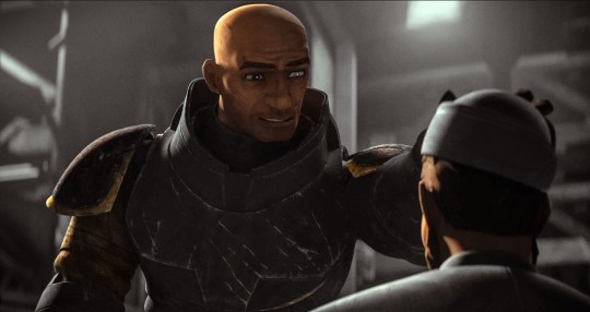
I’ll still be travelling when you’re seeing this and haven’t watched the finale, so I don’t have any new content to share, but last week (maybe longer? I don’t know— rainforest brain lol) I posted a poll asking if anyone was interested in seeing a snippet of my editing process, so here it is feat. possibly one of my favourite Wrecker moments.
I use a myriad of different software depending on: my mood, what computer/tablet I’m using, what the image looks like, and how much energy I’m willing to put into it lol In this video, I’m using Lightroom on my iPad.
The three main factors I look mostly closely at when I’m editing shots are 1. lighting, 2. noise, and 3. resolution (read: clarity).
This image required pretty minimal work so it’s probably not the best example, but ah well. The process in the above video is as follows, and please note the video had been sped up to 2x for file size reasons lol
The first thing I’ll do is see what the auto edit function defaults to. Often times it overexposes the image, resulting in significant colour noise, but it gives me a decent idea of what I should expect in terms of colour corrections and exposure mapping. The auto edit function wasn’t terrible in this case, but did produce some colour noise, mainly on Wrecker’s chest plate, his sleeves, and the officers hat. Once I’m done the initial scope out, I’ll exposure the image as high as possible to crop it— usually with the subject being as centered as possible.
This software lets the user tweak the bones of the image individually in three ways, all of them very quickly demonstrated here. The first is the curve method which I despise and NEVER use— because it alters multiple aspects at once, I don’t feel like I have the same degree of control as the other methods. Next is HDR setting (the default upon import) using the sliders on the right. This is effective for images that are already pretty well lit, and does give me a little more control, but most of the time because the screenshots are so dark, I’m editing in SDR mode.
Once I’m satisfied with the exposure/lighting, I’ll move on to correcting colour distortion and saturating the image. This software also provides three methods for colour alternation and I’ll typically use all three in conjunction with each other. Colour mixing is extremely crucial when it comes to reducing odour noise and distortion. Because this software lets me isolate certain colours to adjust their hue, saturation, and luminance, I can typically reduce most of or all of the colour noise. However, it does have its limitations. In this particular post, desaturating the colour noise in Crosshair’s rifle coincided with blanching his skin tone, because this software does not let me isolate certain areas of an image. It was also important to me to emphasize the warm tones from the sunset in the background for the overall mood of the shot, so I opted to remove what colour noise I could and leave the rest. (You can’t win em all… especially when the starting image is near-black lol)
Correcting the colour distortion in this image was not particularly difficult, desaturating all purple tones removed the noise from his chest plate, and shifting green tones to something near a yellow instead removed the noise from his sleeve. I didn’t notice the colour noise on the officers hat until a little later, but that was pretty easily corrected too.
Once I’ve fixed the colour noise, I’ll shift to toning the overall image. Wrecker particularly looks good in cool tones, but It’s nice to contrast a cool tone background with the warmth of his skin.
Once the toning is done, I’ll move on the image clarity. I don’t have the means to alter the actual resolution of the image, but I’m particularly picky with balancing texture and clarity. Wrecker always looks the best with texture and clarity increased, because it brings out the scarring on his face and further humanizes him, but overdoing the texture can also emphasize pixelation. Once that’s done, I’ll reduce the overall noise only slightly (doing too much makes them look airbrushed and unnatural), and whatever is left of the colour noise (too much of this setting makes them look like ghouls LOL)
This software also offers a series of preset alterations/filters briefly shown in this video… but I’m not the biggest fan of any of them. I’m a bit of a control freak and would rather tweak each aspect individually to the degree that I like, instead blanketing the image with present modifications and then undoing certain aspects.
Before exporting the image I’ll do another once over and make sure I’m happy! In this case, I opted to go back in and add some darker tones back into the image. I don’t do this often, particularly when they start so damn dark, but I wanted to keep the focus centrally on Wrecker’s radiance lol
That’s about it. If I’m working on multiple edits in a set, this software lets me just copy and paste the settings, so the following images only require extremely light tweaks and take almost no time. And that, I’ll export, autograph, and upload!
Thank you for attending this unprofessional Ted Talk.
#starqueensrambles#things no one asked for but are getting anyways#Jedi queue-doo#starqueensedits#ungatekeeped lol#thats not a word#well… it is now
14 notes
·
View notes
Text
Yvette Heiser - Phone Photography Essentials without Formal Education
In today's digital world, the art of photography has become more accessible than ever. You no longer need a formal education or expensive camera equipment to create stunning images. With advancements in smartphone technology, your phone can be a powerful tool for capturing professional-quality photos. Here’s everything you need to know to excel in phone photography without a formal education.
Understanding Your Phone’s Camera
Before diving into photography, it’s essential to understand the capabilities of your phone’s camera. Modern smartphones are equipped with high-resolution sensors, multiple lenses, and advanced image processing software. Take some time to familiarize yourself with the various settings and features available on your phone's camera, including HDR, portrait mode, night mode, and manual controls for ISO, shutter speed, and white balance. For more detailed insights, consider exploring resources like Yvette Heiser Texas – All You Need to Know about Phone Photography.
Mastering the Basics of Photography
Even without formal education, you can learn the fundamental principles of photography. Start with the basics:
Composition: The rule of thirds, leading lines, and framing are essential techniques that can help you create balanced and visually appealing photos.
Lighting: Excellent lighting is essential for taking outstanding photos. Natural light is your greatest ally, so it's important to learn how to use it effectively. Understand the differences between soft and hard lighting and how to leverage shadows and highlights to enhance your images.
Focus and Exposure: Ensure your subject is in sharp focus. Most smartphones allow you to tap the screen to set the focus point. Adjusting exposure can help you manage the brightness and contrast of your photos.
Leveraging Photography Apps
One of the advantages of phone photography is the plethora of apps available to enhance your images. Here are a few must-have apps:
Editing Apps: Tools like Adobe Lightroom, Snapseed, and VSCO provide robust features for tweaking exposure, contrast, saturation, and other elements. They also come with presets and filters that can add unique and creative touches to your photos.
Camera Apps: Apps like ProCamera and Camera+ offer advanced manual controls, allowing you to fine-tune settings like ISO, shutter speed, and white balance.
Special Effects: Apps such as Lens Distortions and Afterlight can add unique effects and overlays to your photos, helping them stand out.
Building a Strong Portfolio
Your portfolio is your introduction in the photography world. Create a diverse collection of your best work to showcase your skills and style. Include different subjects such as landscapes, portraits, and macro shots. Regularly refresh your portfolio with updated and enhanced photographs. Sharing your portfolio on social media platforms like Instagram, Facebook, and Pinterest can help you reach a wider audience and attract potential clients.
Networking and Marketing
Building a successful photography career requires more than just taking great photos. Networking and marketing are essential components:
Networking: Join online photography communities, attend local meetups, and participate in photography challenges. Networking with other photographers can lead to collaborations, referrals, and learning opportunities.
Social Media Marketing: Use social media to market your photography services. Regularly post your work, engage with your audience, and share behind-the-scenes content. Consider creating a website to establish an online presence and make it easy for clients to find and contact you.
Continuous Learning and Experimentation
Photography is an ever-evolving field, and staying updated with the latest trends and techniques is crucial. Follow industry leaders, read photography blogs, and watch tutorial videos. Don’t be afraid to experiment with new styles and subjects. Continuous learning and experimentation will help you grow as a photographer and keep your work fresh and innovative.
Conclusion
Excelling in phone photography without formal education is entirely achievable with dedication and practice. By understanding your phone’s camera, mastering photography basics, leveraging apps, building a strong portfolio, networking, and continuously learning, you can create stunning images and establish a successful photography career. Yvette Heiser- Is it possible to start a career in photography without formal education? Embrace the journey, and let your creativity shine through your lens!
#wedding#moments#camera#pictures#photographer#photography#childphotography#yvette heiser#photographytips#events
8 notes
·
View notes
Note
Regarding your Plex server, do you have any tips for compressing media to save space?
Right now, almost all 1080p content is encoded in the H.264 codec. So my biggest tip would be to convert all of your H.264 content to a newer codec called H.265 10-bit.
First, you'll want to make sure that all of the devices you play media on can handle the H.265 10-bit codec. Pretty much any device that says it can do 4K HDR will suffice. It's okay if you have a device that can't do this, as Plex can transcode your media as you watch it, but you are going to use up a lot of computer resources and it can also be slow and buggy.
So to get the best experience, I would definitely recommend upgrading anything that cannot do H.265 10-bit. Thankfully, even the cheapest $30 4K Fire TV Stick is capable.
H.265 allows you to heavily compress your media and maintain quality. The 10-bit color, even if the original file was 8-bit, can reduce color banding in gradients which can often be a consequence of compressing video.
The rule of thumb is you can reduce the file size by 50% of H.264 and not take a hit on image quality. But you can actually go beyond that and still get acceptable quality.
Yes, H.264 will play on pretty much any device these days, but eventually that will be true of H.265. So if saving space is more important than dealing with a few compatibility issues that may crop up (and are usually solvable), then you can definitely shrink the size of your media library while maintaining image quality.
The bad news is that converting your media, depending on how much you have, could take a while. Even with a super beefy computer, compressing in H.265 is a slow process. And you can't use hardware encoding because that is meant more for streaming than media preservation.
Also, I do not recommend compressing 4K content at this time. Only 1080p. Re-encoding and compressing a 4K file takes more time than it is worth. A 4K movie could take 12 to 24 hours even on a very fast computer. Though if you have a 4K file and you don't care if it is 1080p, that might be worth it.
Handbrake is pretty much the only game in town as far as re-encoding your media. It can have a learning curve if you want to use it to its full potential, but there are a ton of decent presets you can use if you don't have the time to learn the fine details of what everything does.
I can give you some recommendations for a few important settings.
In the video tab...
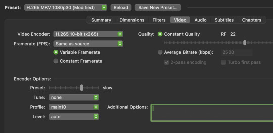
I'd start by finding a preset that is close to your end goal. In this case I chose the H.265 MKV 1080p30 preset in the "Matroska" presets that I will slightly tweak.
I usually want to make MKV files because they can hold subtitles in the file container without a separate subtitle file. I want H.265 10-bit. Most of my content is 1080p. And most of it is 24fps, so I'll just ignore the 30 frames the preset uses and change it later.
So once you select the preset, change framerate to "same as source" to just carry over whatever it was originally. You do not want to monkey with the framerate unless you have a really good reason.
You'll want "constant quality" selected. And then the RF or "rate factor" is basically how much compression you want to use. A lower number is less compression and a higher number is more compression. Once you have experience using Handbrake you'll be able to make a pretty good guess at what RF you should use, depending on the content. But I can give you some basic guidelines for you to test out.
When picking an RF, a higher number will give you a smaller file and a lower number will reduce the chances of creating unwanted compression artifacts. Since you are doing 10-bit, that will help a lot with color banding, but if you overcompress you may get unsightly blocks, especially in dark and fast moving scenes. If you watch dark content on YouTube, you probably know what I mean.
So before I compress media, I ask myself a few questions...
How important is this content to me?
Is good image quality what makes this content special?
Does this content have a lot of dark or fast moving scenes?
If this is my favorite show or movie, then I am going to want to preserve it at the highest possible quality. Or if the content is a visual spectacle, like Avatar, then I am going to want to make sure I preserve visual fidelity. And if this content is prone to compression artifacts due to dark and/or fast moving scenes, like a horror movie or an action movie, I am going to want to use less compression to avoid distracting artifacts.
However, if it is just a game show I like to put on in the background, I might not care if I compress it more. As long as it is watchable, I am not going to be precious about the compression quality.
Typically I choose an RF between 17 and 24.
17 will give bigger file sizes but will almost never create compression artifacts that were not already in the original content to begin with. This is for the stuff you really care about. Your absolute favs.
And if it is the game show I play in the background, I will probably choose 24.
But all of that space in between 17 and 24 is where you have to figure out what you can tolerate for different media. It may take some trial and error and test encodes to figure out what you prefer.
Like, when I compressed Law & Order for my mom, I knew that wasn't a huge visual spectacle. So I did 22. But for an action movie for my dad, I'd probably do 20 because of all of the fast moving scenes. And for my precious Batman TAS cartoons, I went with 17 because I wanted those files to be as close to perfect as possible.
The final slider I will talk about is the encoding speed. In the image above the preset is set to "slow." This ranges from "very slow" to "ultra fast." (Don't use placebo.) This setting basically allows Handbrake to either take its time and figure out the absolute best and most efficient compression... or to hurry up and just get the job done.
Think of this as the efficiency slider. If you give your computer more time to think, your compression will be more efficient. It will be the best compression possible for the quality RF you chose.
If you set it to a slower speed you will be able to get smaller file sizes with fewer compression artifacts, even if your chose a higher RF. But it could take one file many hours to encode.
At faster speeds your filesizes will get a little bigger and there is a chance some compression artifacts may sneak into your video, even if you chose a lower RF.
It's a little confusing, because the RF is supposed to be the only factor in image quality. But the encoding speed does factor in a little bit too. Especially in difficult to compress dark or fast scenes.
I was pretty happy with the "medium" setting. I have a fast computer with a lot of CPU cores and a lot of free time. So I didn't mind how long it took. But I actually think the "fast" and "faster" setting still gave great results while still shrinking file sizes.
Again, if it is super important to you, maybe do medium or slow for those files. Otherwise the fast setting is probably acceptable for most other things.
And finally the audio tab...
You are not going to get much benefit from compressing the audio. You might save a few megabytes. So I highly recommend just preserving whatever the original audio was. And you do this by selecting a "Passthru" codec. Handbrake will not touch the audio data and just copy it exactly to the new file.
However... if there is an audio codec that you know does not play nice with one of your devices, then you might want to convert it to something that works better. Though if you are using Plex, it can usually transcode audio without using significant CPU resources.
When I finished converting my media collection, I think I calculated that I saved myself about 20 TB of hard drive space when all was said and done. I think I have around 250 shows and 2000 movies. This left me a lot more room to keep more 4K content that is not worth compressing.
I definitely recommend watching some Handbrake tutorials and learning about some of the other functions. I also recommend learning how to do "batch encoding" so you can set up a bunch of files and just let your computer compress while you aren't using it.
But I covered the most important settings to get your started. Definitely do some tests and familiarize yourself with the process before you start converting your entire media collection.
I hope that was helpful. I promise explaining it is a lot harder than picking a few settings and hitting "start."
30 notes
·
View notes
Text
HDR Moon, first attempt.

Photo by Xer S. Rowan, Creative Commons Attribution license
I haven't done very much with the various types of stacking and merging of images. This is my first attempt at using multiple photos to create an HDR image (high dynamic range).
I was browsing through my 'to possibly be processed eventually' photos and came across a set of four or five photos of the moon, taken all at the same time, with different camera settings, so I decided to try to use them to create a photo with more detail than any of the individual images, using an HDR merge and processing the result.
.
I'm a disabled hobby photographer taking photos for the love of photography and sharing them under a free-to-use-as-long-as-I-am-properly-credited license. For more information, visit linktr.ee/DoingItForTheExposure.
#moon#moon photography#lunar photography#photography#sky#orbit#lunar phases#moon phases#hdr photography#original photography on tumblr#original photography blog#creative commons photography#creative commons#free stock images#free photos
3 notes
·
View notes
Text
Motorola Edge 50 Neo Processor: Everything You Need to Know
Motorola has been making waves in the smartphone market with its Edge series, offering premium features at competitive prices. The Motorola Edge 50 Neo is no exception, delivering a stylish design, impressive display, and a capable processor that ensures smooth performance. But what exactly powers this device? Let’s take a closer look at the processor inside the Motorola Edge 50 Neo and what it brings to the table.
Which Processor Does the Motorola Edge 50 Neo Use?
The Motorola Edge 50 Neo is equipped with the MediaTek Dimensity 7030 processor. This is a mid-range chipset designed for efficient performance and power management, making it a great choice for users who want a balance between speed, battery life, and affordability.
MediaTek Dimensity 7030: Key Features and Performance
The MediaTek Dimensity 7030 is built on a 6nm process, ensuring better power efficiency and thermal management. Here’s what it offers:
1. Octa-Core CPU for Smooth Performance
The chipset features an octa-core CPU with two ARM Cortex-A78 cores clocked at up to 2.5GHz and six Cortex-A55 cores for efficiency.
This setup ensures smooth multitasking, allowing users to switch between apps seamlessly.
2. Mali-G610 GPU for Gaming
The Mali-G610 MC3 GPU enhances graphics performance, making the device suitable for gaming and media consumption.
Games like Call of Duty Mobile and PUBG should run smoothly at moderate settings.
3. 5G Connectivity for Faster Data Speeds
The Dimensity 7030 supports 5G connectivity, ensuring faster internet speeds and lower latency for streaming and online gaming.
It also supports Wi-Fi 6 and Bluetooth 5.2 for seamless wireless connectivity.
4. AI Enhancements and Camera Processing
The chipset includes MediaTek’s AI Processing Unit (APU), improving camera performance, image processing, and battery optimization.
With support for HDR video, AI-powered photography, and night mode enhancements, the Motorola Edge 50 Neo offers a great photography experience.
5. Power Efficiency for Better Battery Life
The 6nm architecture ensures better power management, helping the device last longer on a single charge.
Combined with the Edge 50 Neo’s 5000mAh battery and 68W fast charging, users can expect all-day usage with minimal downtime.
How Does the Motorola Edge 50 Neo Perform in Real Life?
With the MediaTek Dimensity 7030, the Motorola Edge 50 Neo delivers a smooth experience in day-to-day tasks like browsing, social media, and video streaming. Gamers can enjoy stable frame rates on popular titles, while multitasking remains fluid. The addition of 5G connectivity ensures users stay future-proofed for high-speed internet.
Upgrade to the Motorola Edge 50 Neo – Sell Your Old Phone on CashyGo.in!
If you're planning to upgrade to the Motorola Edge 50 Neo, you can sell your old smartphone for instant cash at CashyGo.in. This platform offers an easy and hassle-free way to trade in your old device and get the best price. Don't let your old phone sit unused—convert it into cash and upgrade to a new smartphone today!
Conclusion
The Motorola Edge 50 Neo, powered by the MediaTek Dimensity 7030, is a solid mid-range smartphone that balances performance, battery life, and 5G connectivity. Whether you’re a casual user, a mobile gamer, or someone who loves photography, this device offers a well-rounded experience at an affordable price.
Would you consider buying the Motorola Edge 50 Neo?Share your thoughts with us—leave a comment below!
2 notes
·
View notes
Video
When the Super Heavy booster lined up for the "chopsticks" catch, we knew we were witnessing a new era of space tech! by Peter Thoeny - Quality HDR Photography Via Flickr: My son and I decided to attend the launch of Starship 5, which was scheduled form Sunday October 13. This SpaceX mission was historical: The objective was to catch the Super Heavy booster on return with the Mechazilla arms, nicknamed "chopsticks". The booster slowed to a near hover and did a horizontal slide maneuver to line itself up with, and rest on two massive "chopstick" arms on the launch tower. It was an amazing feat many considered impossible! I processed a balanced and a photographic HDR photo from 3 RAW exposures, blended them into a composite image, and carefully adjusted the color balance and curves. I welcome and appreciate constructive comments. Thank you for visiting - ♡ with gratitude! Fave if you like it, add comments below, like the Facebook page, order beautiful HDR prints at qualityHDR.com. -- ƒ/6.3, 375 mm, 1/640 sec, ISO 1600, Sony A6400, Tamron SP 150-600mm f/5-6.3, HDR, 3 RAW exposures, _DSC8608_10_21_hdr1bal1pho1f.jpg -- CC BY-NC-SA 4.0, © 2024 Peter Thoeny, Quality HDR Photography
#SpaceX#Boca Chica#South Padre Island#Texas#Starship#Starship 5#Super Heavy#Super Heavy booster#Mechazilla#chopsticks#catch#landing#return#rocket#rocket launch#launch tower#fire#plume#exhaust#thrust#outdoor#science#science and technology#technology#aerospace#day#dawn#Sony#Sony A6400#A6400
5 notes
·
View notes