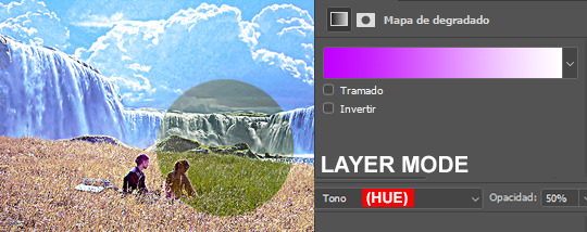
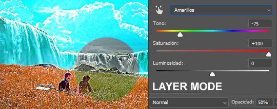
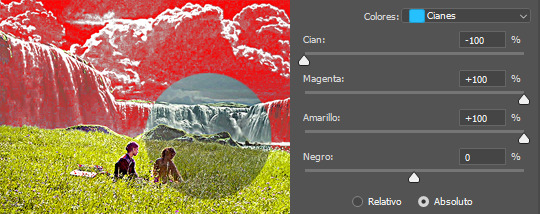
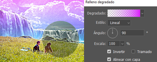
#How to Make Colors More Vibrant in Photoshop
Text

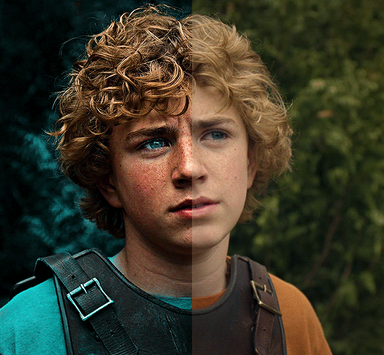
summer 1985, hawkins.
byler week 2023 | day iv: summer love
song used
#byler#bylerweek2023#Day 4 Summer Love#byler edit#byler gifs#mine#mine:gif#to get a more summer-esque vibe you should listen to the song!#creative process: i never have a creative process when it comes to gifsets. i tend to start my infamous laptop and run photoshop and see#what comes out of it. this time i really wanted to put some extra effort. when i make a gifset the first thing is finding out the vibes#i want to give to it. since it's summer love i wanted to have bright warm colors that recall summertime and i decided to use of course#footages from S3 - since it's the only season set in summertime - but of course it wouldn't be a gifset of mine if i didn't add a “gloomy”#vibe to it. that is why i spent an entire afternoon finding out a song that would give me summertime sadness kinda vibes and i found#“free with you” which is an incredible song with an incredible mv that i ofc linked in the post description. so#this gifset is all about summer love and it's meant to make you feel the love; the summer vibes; but at the same time i wanted it to be#a little angsty because 1st that's what S3 is about and 2nd - this is how i picture summer loves#i love to put this dualtity in my gifsets: vibrant colors and a really melancholic undertone that you can perceive just if you look twice
136 notes
·
View notes
Text
HOW TO: Make Animated Neon Text
Hi! No one asked for this tutorial, but this is one of my favorite typography effects as of late — so I thought I'd share how I do it. You can see this effect in the first gif of this *NSYNC Celebrity set and the last gif of this Anthony Bridgerton set. Disclaimer: This tutorial assumes you have a basic understanding of gif-making in Photoshop. It's also exclusively in Timeline and uses keyframes for the fading effect seen on the blue text.

PHASE 1: PREP YOUR BASE GIF
1.1 – Choose a dark scene.
This effect looks best contrasted against a dark background. You can definitely do it with a bright background, but just like a neon sign irl, you only turn it on in the dark/at night — so keep that in mind!
1.2 – Determine the length of your clip.
Depending on how much you want your text to flash or fade in, you'll want to make sure you have a scene long enough to also allow the text not to flash — reducing the strain it takes to actually read the text. For reference, my gif is 48 frames.
1.3 – Crop, color, etc. as you would.
New to gif-making? Check out my basic tutorial here!
PHASE 2: FORMAT YOUR TEXT
Before we animate anything, get your text and any vectors laid out and formatted exactly as you want them!
2.1 – Finding neon sign fonts.
It's easy as going to dafont.com and typing "neon" into the search bar!
2.2 – Fonts I used.
Neon Glow by weknow | Neon by Fenotype | Neon Bines by Eknoji Studio
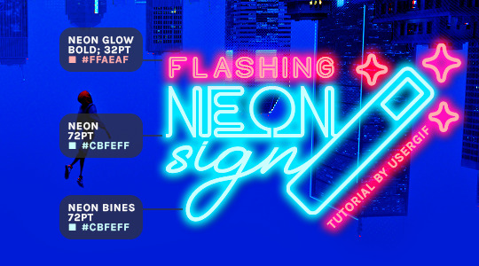
And to not leave my fellow font hoarders hanging, the font for "tutorial by usergif" is Karla (it's a Google font) 🥰
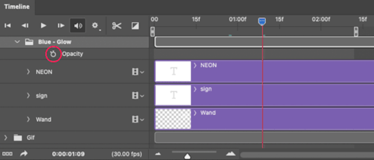
2.3 – Group your text layers. (Conditional)
If you plan on having multiple text layers like I did and you want them to appear connected (like how the last letters of "NEON" and "sign" intersect with the wand icon), I suggest putting the layers into groups according to color (the shortcut to group layers is Command+G). If you don't group your text and just apply the outer glow settings to each individual layer, you'll end up with something like this:
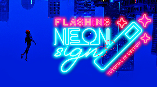
—where you can see the glow overlap with the line, instead of the smooth connection you see in my final example gif. I'm using 2 colors for my text, so I made a group for red and a group for blue.
2.4 – Apply Outer Glow.
Right-click your text layer (or your group if you have several layers) and select "Blending Options" to open the Layer Style menu. Check "Outer Glow" and feel free to play around with the settings until you like the way your text looks!
Your outer glow color should be darker and more vibrant than the color of the text itself. The text should be within the same color family but much brighter and, sometimes, almost white (see Step 2.2 again for my text colors).
Here are the settings for the Red Glow (the glow color is #FF3966) and Blue Glow (#00F0FF):
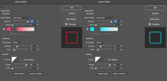
These aren't always my exact settings but they're pretty close to my standard. I always set the blend mode to Hard Light and usually have the opacity at 100%.
For every gif I use this effect on, I like to play around with Spread and Size. Spread will make the glow look denser and "expand the boundaries" (source: Adobe) and Size will diffuse the glow and blow it out so it covers a larger area (Adobe says it "Specifies the radius and size of blur").
2.5 – Duplicate your text layer/groups and remove glow.
We're only going to be animating the glow on our text, and since doing this affects its opacity/visibility, we want to preserve the base text by creating a duplicate.
I just hit the Command+J shortcut to duplicate my groups and delete the Outer Glow effects, making sure that the "No Glow" version is above the "Glow" version:
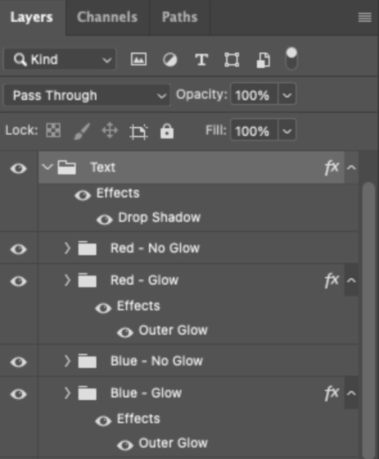
I also put all these groups into one group called "Text" for organization and so I could apply a drop shadow to all the elements for better visibility.
PHASE 3: CREATE THE FLASHING EFFECT
This is for the effect you see on the RED text in my gif!
3.1 – The 0.03-Second Rule
If you've read any of my animation tutorials before, you're probably already familiar with this rule. In my experience (and for reasons I can't explain), Video Timeline pauses every 0.03 seconds (try clicking the forward button a few times, you'll probably find a "duplicate" or paused frame). So, keep all your layers a duration of 0.03-second increments (e.g. 0.06 or 0.09 seconds can also work) and align them on the Timeline at 0.03-second intervals. If you don't follow this rule, you'll get duplicate frames when you export, resulting in a choppy final gif.
3.2 – Trim and arrange your text layers.
Only on the layers/groups WITH the Outer Glow effect, trim them into several segments of varying lengths where the glow will be "on" (visible) and leaving spaces where the glow should be "off."
Typically, I'll have a mixture of 0.06 and 0.03-second text. That's when the glow will be visible. Between each "flash" of visibility, I've got a 0.03-second blank space, baby *pen clicks* and I'll write your name:
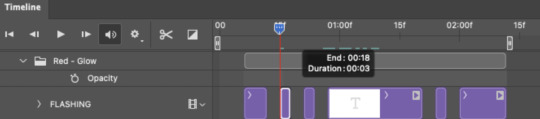
The layers shown above are arranged with a few flashes and two long segments of no flashing. This is the order and duration of each segment shown above (purple = visible segments):
0.06 blank, 0.06 visible, 0.03 blank, 0.03 visible, 0.03 blank, 0.03 visible, 0.03 blank, 0.24 visible (the long bit where "FLASHING" doesn't flash at all), 0.03 blank, 0.03 visible, 0.03 blank, 0.12 visible
(I only did this for the text that says "FLASHING" to give it a glitching effect. The other red text keeps the glow visible starting at the first long segment.)
PHASE 4: CREATE THE FADE-IN EFFECT
This is for the effect you see on the BLUE text in my gif!
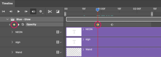
4.1 – Animate using the Opacity Keyframe.
Again, we're only touching the layers/groups WITH the glow effect. If you only have one layer of text, you'll find the Opacity Keyframe by clicking the film reel icon:
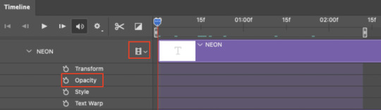
If you're working with groups like me, you'll find it in the Timeline panel under the group when it's expanded:
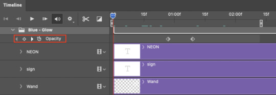
As you can see, I already added my keyframes (lil diamond babies). And luckily, it's super easy to do!
4.2 – Add the ending Keyframe first.
We're starting at the end because our layers/groups are already at 100% opacity. Drag the playhead (the blue arrow attached to the red vertical line) to a spot where you want the glow to be 100% opaque — this is where the glow will be fully "on" or visible. [Again, follow the 0.03-Second Rule. You will get duplicate frames regardless when using keyframes (this will be explained in the note in Phase 5), but abiding to the rule will mitigate the amount of dupes you get.]
Then, click the clock icon by "Opacity" to place a keyframe:
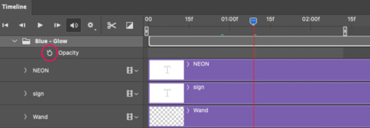
4.3 – Add the starting Keyframe.
Go backward from the ending Keyframe you just placed (I went back 0.12 seconds — but you can play around with the duration of the fade, just keep it a multiple of 0.03):
And drop another keyframe, this time by clicking the diamond icon by "Opacity":
4.4 – Reduce the opacity on the starting Keyframe.
Keeping that keyframe you just placed selected, go to the layers panel and reduce your layer's/group's opacity to 0%:
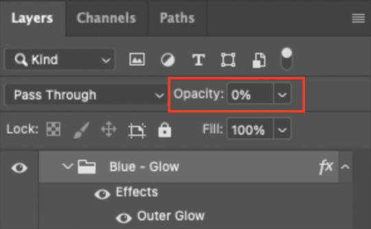
Now, this Outer Glow will slowly fade from 0% to 100% opacity.
And just for a visual aid, here's where my fade-in keyframes are in relation to my flashing segments:
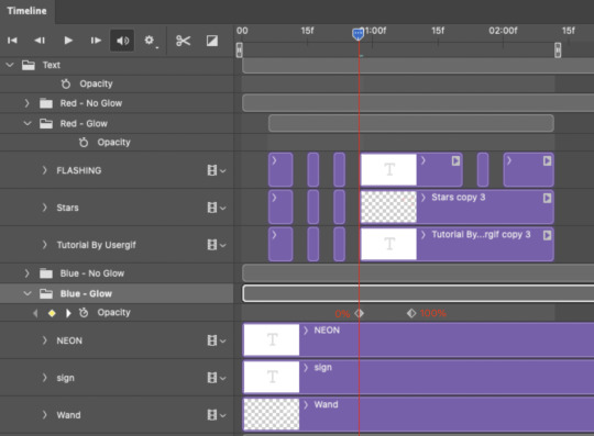
To refresh your mind, the 0% Opacity Keyframe starts when "FLASHING" is visible for 0.24 seconds (the first long segment of visibility).
With these keyframes, you'll get a smooth fade-in à la ✨light switch with a dimmer✨
PHASE 5: EXPORT
Yay, we're finished! Convert from Timeline back to Frames and export your gif!
NOTE: If you only did the flashing effect and followed my 0.03-Second Rule, you shouldn't have any duplicate gifs.
BUT if you included the fade-in effect using keyframes, you WILL have duplicate frames. 'Tis the nature of keyframes. 🤷♀️ I had 4 extra frames where the fade-in starts, which I deleted. So, as always, I recommend checking your frames when you convert from Video Timeline back to Frame Animation — and manually delete any duplicate frames.
Sorry this tutorial is so long 🙈 I over-explain so you're not just mechanically copying steps, but understanding the WHY behind each step! Thanks for bearing with me
If you have specific questions about this tutorial, feel free to send a message to usergif and I'll try my best to help! :)
More USERGIF tutorials • More resources by Nik • USERGIF Resource Directory
#typography#gif tutorial#completeresources#usershreyu#useryoshi#userelio#userzaynab#userives#usertreena#usercim#userrobin#userkosmos#usersalty#userhella#alielook#uservalentina#uservivaldi#*usergif#*tutorial#by nik#flashing gif
777 notes
·
View notes
Text
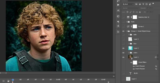
The silent art of gif making
The gif above has 32 layers plus 6 that aren't shown because this is part of a larger edit. I wanted to share it to give everyone a glimpse of the art of gif making and how long it usually takes for me to make something like this. This one took me about an hour and a half but only because I couldn't get the shade of blue right.
I use Adobe Photoshop 2021 and my computer doesn't have a large memory space (I don't know what to call it) so usually most of psds get deleted because I'm too lazy to get a hard drive. It doesn't really bother me that much because I like the art so when it's done, it's done. Off to somewhere else it goes.
Here are the layers:

Everything is neat and organized in folders because I like it that way. I prefer to edit it in timeline but others edit each frame. There's a layer not shown (Layer 4 is not visible) and it's the vector art. Here it is:
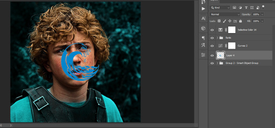
Now it is visible. I don't plan to make this a tutorial, but if you're interested I'd love to share a few tricks about it. I'm pretty new to the colors in gifmaking but the rest is simple to understand. Here, I just want to show how much work it takes to make it.
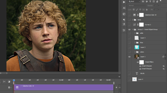
I opened Group 2 and here's the base gif. I already sharpened and sized it correctly but that's about it. Let's open the base coloring next.
Yay! Now it looks pretty! The edits are in Portuguese but it doesn't matter. There's a silent art of adding layers depending on how you want the gif to look but you get used to it. The order matters and you can add multiple layers of the same thing (for eg. multiple layers of levels or curves or exposure).
This was pretty much my first experiment with coloring so I don't know what I'm doing (this happens a lot with any art form but gifmaking exceeds in DIYing your way to the finished product) but I didn't want to mess up his hair, that's why the blue color is like that. Blue is easy to work with because there's little on the skin (different from red and yellow but that's color theory). I painted the layers like that and put it on screen, now let's correct how the rest looks.
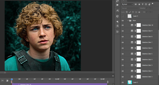
I was stuck trying to get the right teal shade of blue so yes, those are 10 layers of selective color mostly on cyan blue. We fixed his hair (yay!) we could've probably fixed the blue on his neck too but I was lazy. This is close to what I wanted so let's roll with that.
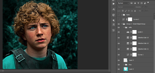
BUT I wanted his freckles to show, so let's edit a little bit more. Now his hair is more vibrant and his skin has red tones, which accentuates the blues and his eyes (exactly what I wanted!). That lost Layer 2 was me trying to fix some shadows in the background but in the end, it didn't make such a difference.
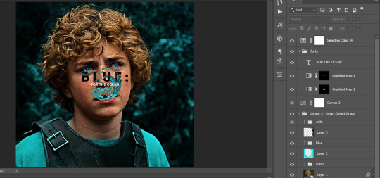
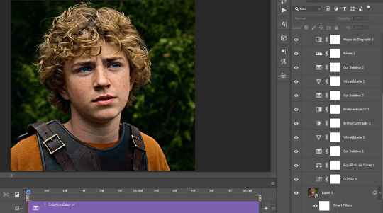
This was part of an edit, so let's add the graphics and also edit them so they're the right shade of blue and the correct size. A few gradient maps and a dozen font tests later, it appears to be done! Here it is:
Please reblog gifsets on tumblr. We gifmakers really enjoy doing what we do (otherwise we wouldn't be here) but it takes so long, you wouldn't imagine. Tumblr is the main website used for gif making and honestly, we have nowhere to go but share our art here. This was only to show how long it takes but if you're new and want to get into the art of gif making, there are a lot of really cool resource blogs in here. And my ask box is always open! Sending gifmakers all my love.
#gif making#gif tutorial#resources#completeresources#y'know what that post yesterday got me into this#i love creativity so i send all my love to gifmakers#this is HARD#my tutorials#tutorials
385 notes
·
View notes
Text
hi everyone!! my wrist is too sore to draw today, so instead i thought i'd share some of my favorite csp assets + how i like to use them! i also linked some procreate brushes at the end of the post!!
lineart brushes:
SU-Cream Pencil: i swear by this brush and i use it very often!! if you lower the pen density and use a gradient map over it when coloring your drawing, it has a nice effect. that's what i did in this drawing here! i also use this brush like i would draw on paper, so as a sketching tool. recently i've been enjoying blending it for shading. the pics below are drawn on one layer; left is more manga style while the one on the right is from a WIP of my singer sargent study, so it can be used for more realistic styles pretty well!


Found Pencil: another pencil brush that feels really nice to use, created by @/pigpenandpaper.
PS style brushes: a recreation of photoshop's (i believe) default brush. very versatile and also blends well!
analog wind variant pen: a nice pen that i like to use for lineart that is intended to have a bit of a sketch look.
zakutoro real g-pen: i used it for the lineart of this piece. although, it was drawn before i started using 600dpi in my works, so the lower resolution might make it look a bit unclear.
sets of rough pens: great for manga lineart with a rougher vibe; some of them have varying line weight.
coloring brushes:
zaku brushes: very nice and painterly mixing! i definitely recommend it for those who like to leave their colors a bit unblended.
softie marker: as the name implies, it's very soft! i like to use it for blush in chibi illustrations.
analog watercolor brushes: realistic-looking watercolor brushes. i recommend using it with csp's default paper textures, or those i linked below!
993 coloring pen: it's very soft and watery, though it can be made more solid by adjusting the paint density. i actually think it works very nicely for lineart too.
rock dog pen: another soft marker brush i like, that i once again also use for lineart and doodles.
thick coating brush set: recommended for paintings that show brush strokes.
cartoon cloud: don't let the name narrow your vision!! this has to be one of the BEST brushes for painting in my opinion, and of course it's great for clouds and explosions but so so much more!! and it's FREE try it try it!!
decoration/miscellaneous brushes:
neon pen
paper textures
symmetry move brush
close and fill without gaps
rope brush
sphere fisheye guide
flash balloon
speech bubble set: a lifesaving collection for comic artists!! dimensions and line weight can be adjusted by using the operation tool.
gradient map to use in color mode at 15% and another gradient map to use at 20%: the percentage refers to the opacity of the gradient map layer, but they are just the creator's recommendation and i tend to actually increase it. to use gradient map efficiently, i recommend putting all your colors (and lineart if you want) in a folder. then, right-click the folder, select "new correction layer" and then "gradient map". this allows you to modify the gradient map without worrying about affecting the original colors in case you decide not to use it in the end. to import a gradient map from your downloaded csp assets, click the wrench icon next to the name of the gradient set that's currently in use, then select "add gradient set".


you'll also notice that the creator recommends to use their gradients in "color mode". of course, this is also only a recommendation and i suggest trying as many layer modes as you like! to change a layer's mode, simply highlight the layer and click on "normal" (the default mode) and csp will display the available modes.

fruit ninja gradient map: fun to use if you want really drastic/vibrant colors! the names of the gradients are cute too, as you can see in the above screenshot!
BONUS: jeremy fenske's free photoshop brush pack: these aren't csp brushes per se, but they can be imported into the program! excellent for environments, i recommend watching fenske's video on how he uses the brushes to get a clearer picture since there are so many in this pack!!
BONUS 2: my good friend clem has a few brush packs for procreate that are ideal for painting,decorating drawings, and y2k-inspired illustrations, i definitely recommending checking out her shop!
in conclusion i hope this post can be helpful to you!! i tried to explain how to use the brushes as best as i could, but feel free to let me know if anything is unclear!! i hope you will enjoy using them! :D
#clip studio paint#clip studio paint brushes#csp#csp brushes#procreate#procreate brushes#brushes#tutorial#art tutorial#sort of hehe
53 notes
·
View notes
Note
My partner just bought a print of your starlings and plums - I’m really impressed by how vibrant the colors are - how do you make your prints?
All of my prints are giclee prints on archival matte paper! Printing nerd stuff below but that's the short answer 😊
Giclee is a very hi-res ink-based printing process using a special printer, giving you a really incredible depth of color and a ton of accuracy. They're really expensive to have, and I'm a very small business (i.e. it's just me over here) so I get my prints made by Giclee Today, who are based in Pennsylvania and are wonderful to work with.
To get the colors as accurate to the original painting as possible, I scan my work, often in pieces, and then piece them together in photoshop and color-correct to account for any scanning weirdness. When I do this, I've got the painting next to me and I'm constantly comparing between the two to keep my colors crisp and clear and accurate.
that's probably more info than you wanted but I love this stuff and I work really, really hard to make sure my prints are high-quality, so it's fun to talk about it!! I'm glad y'all like the print ✨
37 notes
·
View notes
Note
HII I LOVE UR BLOG SM ITS SO PRETTY😭❤️
I wanted to ask how you make your cute PNGs with no bg and the animated thin lines???
They’re so cute (T T)
Hi nonnie, thank you that's honestly so sweet of you!!! Sorry for the delay, I got a little busy and tried to see if there are any free sites you can use to make these. Before I get to the tutorials tho I’d like you to know that you can totally request animated dividers from me lol (I’ve taken a couple before here!) just send me a few hex codes / theme colors + bg / transition colors (optional) <33
Anywhoooo I use photoshop for everything but the tutorials below the cut have free-to-use friendly options (I believe!!) ++ I made a separate post for the animated thin lines because tumblr only lets me upload one video per post!!

Tutorial on how I make my banners <3

⟢ ┈ for this tutorial, you can use Photoshop (Paid) or GIMP (Free)
GIMP was my 'training ground' for photoshop lol and the tutorial is pretty much the same for both editors.
I use the wand tool to remove plain / obvious BGs and the pen tool to remove any stubborn parts that the wand tool can't detect (some people prefer masking but this is just how I like to do it)
++ YouTube tutorials are pretty much available for both tools, and unfortunately I don't think there's any way around learning how to use them + the pen tool might be a little tough to get the hang of at first, but you'll get there!
FYI, I tried to use a few 'free bg remover' sites and they don't really do the trick for me :c Canva Pro has one bg remover tool but I haven't tested it out for myself!
Here's a quick little vid lol, I used my darling Eliza as an example + it's sped up to 4x!! Tip: You may add a green (or any vibrant color) layer at the bottom just so you can clearly spot any "strays" (also, my apologies just bc this is a very rough clean up pffft)
After 'cleaning up' I like to color panels with my signature colors <33 I usually just add a color overlay (double click / right click the layer + select ‘blending options’) and play around with blend modes
FYI, some people use Picsart to color their banners but tbch, I played around with it once before and I really just have no patience for the tool I'm sorry ;-;

I'm using Vivid Light @ 50% opacity for this example (it's also more or less what I used for the one on my pinned)

The rest is really just about layering + framing!! (if you're happy with the colors of your panel, you can absolutely do everything else on Canva Free)
For my banners, I almost always use this heart shape I got off google:

For the heart layer itself, I set 'Fill' @ 0% and use the outer glow feature in blending options so it looks something like this: (it looks transparent now but it becomes more vibrant when uploaded)

Then I put my 'cleaned' PNGs inside the heart, crop / remove borders (using the wand tool!!!), add sparkles (totally randomly placed lol) or other brushes, add a BG if I want, and that's it! All that's left is to export as PNG <33
BUUUUT AT THE END OF THE DAY If cleaning up panels / images is too much work (I know it is lol), you can always try to look for 'transparent [keyword]’ (e.g., transparent manga) images / panels here on tumblr or on pinterest. Most of them are free to use anyway + recolored too!! That way you can edit them more liberally on sites like Canva (Free) that more or less have similar options.
#nani?!#nonnie chan ♡#!edits#banners#banner tutorial#theme resources#transparent png#manga panel#png#aesthetics
23 notes
·
View notes
Text
Making of Ashes to Ashley
Recently I posted my comic Ashes to Ashley, and got such a tremendously kind and loving response that I felt like sharing a little bit more about where it came from.
The story is about a transgender awakening, where the quiet and somber Ash explodes out of the closet as the loud and colorful Ashley. This was always the plan, however the details changed along the way. Quite quickly I realized that I was writing about myself and my own trans journey. I never played in a band and I don't imagine I'll ever grow bunny ears (sadly), but still Ashley is undoubtedly a reflection of myself. I just allowed life to become a stage and gender performance a rock concert.
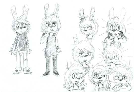
Above are the first idea doodles I drew late at night in early April. I quite enjoyed giving Ashley lipstick and prominent eye shadow, since I hadn't ever done a character like that before. The idea was a bit of exaggerated femininity that accidentally becomes raw punk expression. One or two people have pointed out the Um Jammer Lammy similarities, and they are absolutely not coincidental. Initially I imagined Ashley would've been more reluctant about her transformation, which is why she looks a bit more annoyed in some of my sketches, but the story became more bright and funny if it was made immediately clear that this all happens off of her own volition.

Some method and color tests. My girlfriend suggested I instead go a lot more raw with it, which is why I ended up adamantly using an ugly sponge brush built into Photoshop. Sapphic Disaster are some form of punk-shoegaze band, so combining rough pencil linework with crunchy texture coloring felt like a fitting visual representation of them. This also side-stepped the biggest problems I've always had with drawing comics – dealing with inking is a boring waste of time, and working digitally always makes me fixate on perfection. By just using pencil on paper I had to stick with whatever errors couldn't be saved by a regular eraser, in fact I dedicated myself to only using an old worn down Bic mechanical pencil and embraced the idea that the comic would consistently look a bit off and amateurish. Of course I allowed myself the luxury of cleaning up my drawings digitally before coloring, but that can only take you so far. This way of working helped me make fast progress and kept each step engaging, I've never had as much fun drawing a comic as I had with Ashes to Ashley.
Here's a before and after from initial scan to finished panel. I often only tidy up around focal points like faces or hands, and allow the rest to remain as it is, usually parts like the legs or Ashley's ears.
Character references and my initial color picks, they went through small changes as I went along. I liked giving all the band members different sorts of rabbit ears to make them all look distinct from each other.
Here's some ideas for the Sapphic Disaster band logo and the comic's color palette, notice how Ashley is more vibrant than Ash.
While working I filled up numerous papers with doodles trying to workshop panels and layouts. It's too much to show all of them here, so I composed a few collages of my favorites.
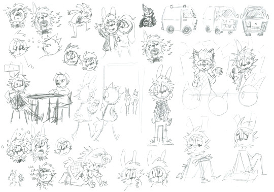
It was pivotal for me that Ash would always look painfully cute. The sketch of the table scene with Floyd shows a rare out-of-character confident and laid-back Ash. In the presence of Floyd?! Never!
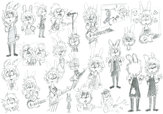
I was very concerned about the reader recognizing the old Ash when first seeing Ashley. She may be all excited about being a girl, but her nervous cluelessness remains. I ended up going back and redrawing two panels in Ashley's introduction to strengthen this impression.
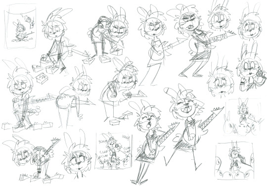
For those not in the know, shoegaze is a rock subgenre that centers around noisey guitar textures, typically achieved through heavy use of effect pedals at the musicians feet; hence the name. When Ashley plays her guitar she produces a cacophony of strange sounds, the reader will have to imagine what they actually sound like, but I always imagined their opening number "I Wanna Be a Girl" to sound like a couple of amateurs trying to recreate Lush's Blackout.
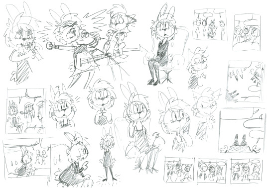
The page where the band go around looking for Ashley while she's receiving her makeover was shoehorned in at a later stage for pacing purposes. That's why Gabriel is suddenly back to pulling cords after previously claiming they're all set, oops!
One of the core rules to this story is that everyone is always overly supportive of Ashley's transition no matter what. This is what makes the otherwise stern and serious Floyd especially funny, my girlfriend was pivotal in sprucing up his dialogue, adding bits like "have you seen the health care waiting lists?, "I know an endocrinologist who owes me a favor or two" and "give me 35% more danger"
Towards the end I discovered that Ashley and Debbie dancing was apparently the most important panel in the entire comic, judging by how much I tried to perfect it. (For the record, my favorite panel is when Ashley screams into the microphone that she wants to be a girl.) Maybe Ashley and Debbie dancing should've replaced the final full-page panel? Well, we got a lot of cute doodles out of it regardless. Just kiss already!
Initially I imagined Ashley to be standing alone in the "could this be the real me" final panel, but I realized her odd family of friends was equally a part of the real her. She was always right where she needed to be, she just needed to find herself within that place. (I ended up giving Ashley a cigarette because otherwise it looked like she was praying.)
Here are some ideas for the cover illustration, of course in 1:1 format to look like an album cover. Up until last minute I planned for the comic to have You Made Me Realize as its subtitle to distinguish it from eventual follow-ups, which is why the You Made Me Realize EP cover art is paraphrased in the top-middle. I ended up just going with Ashes to Ashley to keep it clean and simple. The title Ashes to Ashley was blurted out immediately by my girlfriend when I first showed her my concepts for the story. It's perfect, she's perfect.
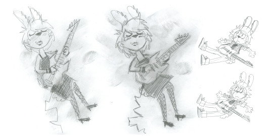
I drew two Ashes and two Ashleys for the cover art and let my fingers smudge all over the latter. While most obviously riffing on the cover for My Bloody Valentine's Loveless, it's equally taking from the Ecstasy of Saint Theresa's Pigment.
And there you have it.
However I never intended this to be the full extent of Ashley's story, just a satisfying and complete end of a chapter. I've already finished writing the next story, Today Forever, and I hope I can get it out to you all soon enough. Your love for Ashley keeps me going.
/Kiki
40 notes
·
View notes
Text
4 Seasons Back Yard Remodel + Crystal Yard
My 4 seasons remodels of the Petz 5 Back Yard are now available for download! And because I went on a bit of a side-quest, I’ve also made a bonus version, a fantasy, crystal back yard!
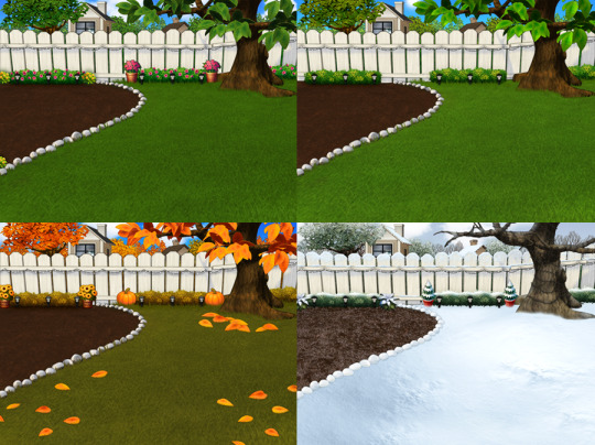
You can read my creator's notes below:
I somewhat wonder if it's fair to criticize the original Petz 5 playscenes too harshly. It's possible that the development team faced tight deadlines or budget constraints, factors that may not have been entirely within their control. However, regardless of the circumstances, the end result was a disappointingly sloppy product, and it's difficult to ignore some of the glaring flaws. While I can understand that the developers were working with dated software, there are certain flaws that can't be attributed to software limitations. Rather, they seem to reflect a clear lack of attention to detail. Here's what I mean.
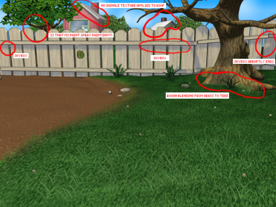
The more you look at it, the harder it is to decide which flaw is the worst. The blatant MS paint spray paint "touch-up" in the upper left, that there was no effort put into blending in the skybox, or that they neglected to add textures to the roof.
Alright, enough ranting there. None of this is to say my playscenes are perfect either, but they were a labor of love and I hope that this is evident in the final results.
SPRING
I smoothed out the grass texture to give it a more velvety, manicured lawn appearance. I brightened up the dingy looking fence to a more brighter white. The original playscene had a hole in the fence, and while it might add "character", I opted to cover over it for a more polished look. I added bushes behind the fence to cover up the skybox and to conceal the bottom of the houses.
Speaking of houses. Wow these needed a big work-up. The texture work (or lack of) on these is just bad. I'm no expert in house construction, but even mostly-brick houses will have some accents like trims to break up the monotony of a fully-brick façade.
Because of how fuzzy the brick texture is in the original, I drew in the mortar lines of the bricks to enhance the texture. I added roof shingles, siding, and trim boards to the house to make it look more like a typical suburban house. Despite these edits, it's still not a "great" house - the way it looks through the windows, it looks like the house is one room lol. I wish I could put better houses in the backdrop but because Tinker doesn't allow me to edit the animated blinds, I'm constrained to keeping them the shape that they are. Oh well. We can use our imagination.
I added landscaping rocks to make the flower bed look nicer. I also added some landscaping details like bushes, garden lights, and string lights for ambiance.
[ Enlarged picture of the garden light I made ]
I also worked to improve the skyboxes in all 4 seasons of the of the Back Yard playscenes. It would be lengthy to get into the details of all that but here's a before and after of the night skybox. You got to love them high-quality MS paint stars in the original.
SUMMER
I had a hard time with the summer one because it was hard to come up with ways to make it look different from the spring version. I did make the grass, bushes, and tree leaves slightly more vibrant. Originally I had some flowers by the bushes but I just wasn't really happy with them. At the last minute, I made the decision to remove them entirely. This makes the playscene a little more "plain" but I think some people may want a more "plain", undecorated version so that they can dress it up how they want with toyz.
FALL
Fall is my favorite season, so this was a joy to make. I toned down the color of the grass and added fall landscaping motifs. Recoloring the tree's leaves was done by using Photoshop's gradient map feature. If time permits, I may do a tutorial on this in the future.
Gradient mapping is a powerful tool for recoloring almost anything. It can give way better results than methods such as hue/saturation, replace color, etc. And thanks to photoshop actions, applying this recolor to all the animation frames took just a couple of minutes.
Unfortunately, the fall leaves look "bright" in the nighttime version of the playscene. There does not seem to be a way to implement a darker version of these leaves for the nighttime playscene. If you look at the sprites in Tinker, you'll see that there are two sets of animations for Leaves A, B, and C and they're labeled "PropsAd" and "PropsAn", which would lead you to think that the developers originally intended for there to be a set of leaves for the day time, and a darker set for the night time. I guess the developers scrapped this idea because this does not work in the actual gameplay. When I experimented with this, the game appears to randomly display the nighttime sprite even during the day time, effectively ruining the intended affect. I'm not sure why the developers scrapped this. Either they had issues coding this properly or were just didn't want to put in the effort to make two sets of leaves.
WINTER
Instead of doing recolored leaves for this scene, I made all the leaves transparent and added holiday lighting to the tree. I know the lights aren't perfect - it was kind of hard to make out which direction a branch was going, so it has hard to maintain 'perfect' perspective.
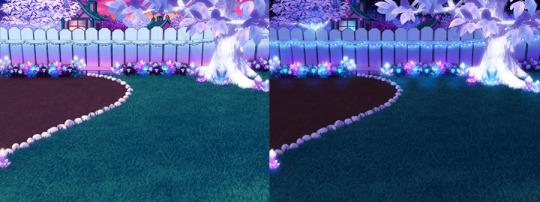
CRYSTAL YARD
This is a bonus playscene that I made because I got a little side-tracked as I was working on the 4 seasons back yards. This is inspired by the Suramar zone from World of Warcraft, so it has a bit of that fantasy, night-elf feel and color scheme. It's been years since I've played WoW but I still appreciate the enchanting aesthetic of the elven zones.
I used gradient mapping again to recolor the leaves to give it this lavender, shimmery, iridescent look. I did a little bit of gaussian blurring and layer effects to make them look a little more "glowy" than the originals.
As before, Tinker won't let me edit the blinds, so it limited what edits I could do to the houses. I would love it if I could have done curtains instead or something. I did my best to make these houses look a little less suburban and more elven. It's not perfect but it was rough working with what I had.
KNOWN ISSUES / THINGS I COULDN'T EDIT
As far as I'm aware, there is no way to turn off the snow effect for seasons like summer where it wouldn't make sense. This probably involves some code-editing that is beyond my technical skillset.
The winter playscene still has the green grass footprint when your petz walk. The sprites for these are not housed within the .env itself but in the Petz 5 Rez.dll file. It would probably involve a bit of tweaking in the code to switch the sprites to something else.
The fall leaves are "bright" in the night time version because there is no way to implement a second, darker set of leaves.
I cannot edit the blinds animation. Tinker gives you an error when you try to edit this sprite. This unfortunately limits what edits I can make to the house and the fence because of where the sprite is positioned.
If anyone does know of solutions to these, do let me know as I'd love to enhance these scenes further!
ICONS
Making the icons for these was also a fun little project. For some odd reason though, the game puts a stray pixel over them when I import them through LnzPro. I did my best to disguise them but there does not seem to be a way to fix that.
BEFORE / AFTER
With all that rambling out of the way, visit my main page over at Magnolia Road > Resources > Playscenes to download the goodies!
29 notes
·
View notes
Photo
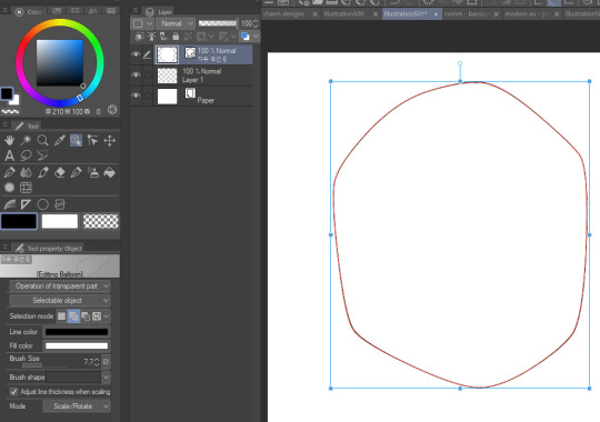
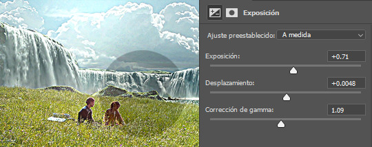
A lovely anon asked for a coloring tutorial and here’s is it! My photoshop is in spanish so I added a translation in some parts that I felt it was necessary (the other stuff is pretty much in the same place) but if you have questions let me know!!
(image heavy!!)
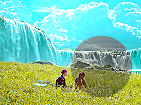
First, I choose my scene > delete the unnecessary frames > sharpen my gif, you know, the basics, this tutorial is pretty good explaining it!
Then, I start with an exposure layer, I feel you can play with values more than a curves or brightness/contrast layer (which is useful when you work with dark scenes). This scene is not too dark so I didn’t do much
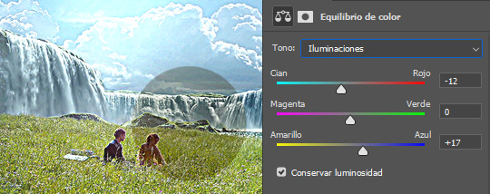
After that, I use a color balance layer. Most scenes have either a yellow or a blueish filter, so depending on the scene you have to play with the numbers. If it’s a yellow scene, try to add more blues, if it’s a blue scene, add more yellows (and the same if it has a different filter). In this case my scene has a soft yellow filter, so I added more blues. If I see the filter is too difficult to work with color balance I use a curves or a channel mixer adjustement! these are good tutorials explaining how those works

Now it’s time to make the colors pop! and i start with a selective colors adjustement. I set it in absolute because the change is more ~radical~, if you are going for a softer look, set your selective color to relative (that part at the end). In this case, the predominant colors are blue and green so I play with them:
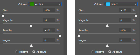
Here’s how it looks now! as you can see, the sky is more blue and the grass looks more greenish

You can end the coloring there if you want, but I’m too extra so I add a vibrance layer to make the colors pop more. Adding a vibrance layer can make the skin look orange so I advice to check this tutorial explaining how to fix it

Then I add other exposure layer to add more contrast in the gif so it doesn’t look ~plain~
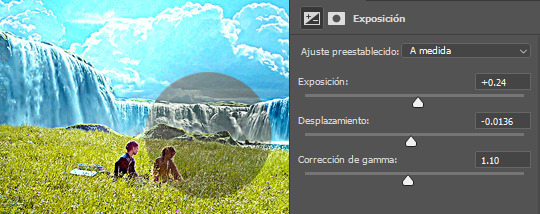
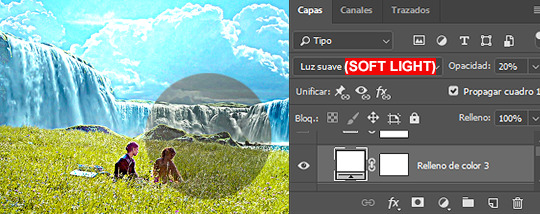
This is optional and I usually do it when I work in dark scenes but I like to add a white layer, set it in soft light and play with the opacity depending of how light I want the scene
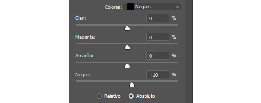
Now, a new selective color layer again! I wanna make the sky more cyan and the grass more ~lemon green~ so here are my settings:
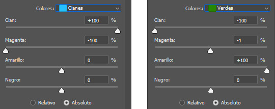
Here’s how it looks now, it make a BIG difference
Optional but I like to add other vibrance layer if the scene let me do it (which means is not grainy/the colors are well defined)

And finally, I add a levels layer to add more contrast on my gif. I set this one in 50% (forgot to add it to the screencapture sorry lol)

And that’s it! That’s the basic coloring. Of course you can play with layer modes or other adjustements! I like to do it depending of the ~vibe~ I’m looking for my gifs, here’s for examples of what I do when I’m in the mood of experimenting
1. Gradient map, set it to hue 50%
2. Hue/Saturation, in this case I’m playing with the yellows, set it in normal 50%
3. Selective color, modifying the cyans
4. Gradient layer, the layer mode is color 100%
Keep in mind that every scene is different, so what works for this gif It could look bad in others and that’s why it’s important to experiment! Depending of how vibrant/colorful you want the gif to be you can add more or less adjustements
And that’s it! if you have a question feel free to send me an ask and I’ll gladly explain it :)
#completeresources#allresources#dailyresources#makersleague#tutorial#coloring tutorial#rresources#gif tutorial#photoshop tutorial#reblogresources#is this clear?? i hope so fjdshjs i tried my best anon#also idk who to tag sorry sdhfd#ps help
256 notes
·
View notes
Note
Seeing your art on my dash literally nakes my month oh my god so beautiful and stylish!!!
Idk if you've discussed this, but how do you find such cohesive and vibrant color palettes for big pieces?
Oh wow got to ask the hard questions huh. Lol I don't think I've talking about this. Becuase it's hard to articulate. A lot of what I do in art is just trial and error. I don't have a set formula or pretext color palettes for each mood or setting (tho I really should would save me a lot of time)
I mainly mess around with a ton of color layers in Photoshop on various blending modes at various opacity levels add in adjustment layers (mostly Selective Color) and play around with the values of the file and I let my artist intuition lead me to the atmosphere I'm trying to portray.
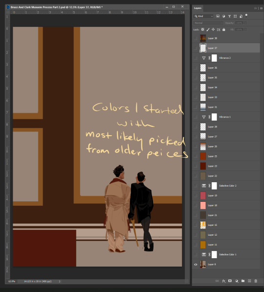
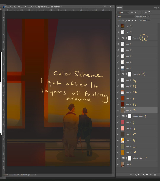
Here's a snapshot of just how many I used to get to the base color scheme for my Mueasume picture. ( and I used more later on in the piece.)
But I know that doesn't help you so here are some tips.
Know your mood and your setting for your piece (Time, Weather, Indoor Outdoor, Sad, Happy, Angry, etc.)
Learn the color language for each mood and setting Pintrest is great for this. Make some boards.
If your colors are not cohesive and you working digitally make a new layer Fill that layer with whatever color is the main mood of your piece (red for anger blue for sad etc.) and set that layer to like 50% opacity and then just go down the list of your layer options until you find something you like.
You can repeat this step with other layers and become the basket case like me and also have 20+ layers in your file lol.
You could add a color fill layer set it to Hue, flatten the image, then cut that whole image revert back to before you made the color fill layer paste your monochrome picture on top of your original piece, and then play with the monochrome layer on different layer settings and opacity
And if you have the option to use Selective Color do it and play with the sliders. The ability to tone down a hue in each value is a game changer.
You can also use Hue and Saturation tho you need a light hand if you're going to play with this setting.
I hope some of this help and I'm sorry if it wasn't clear feel free to send me another ask or message me through the chat feature and I can try to clarify.
80 notes
·
View notes
Text
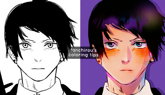
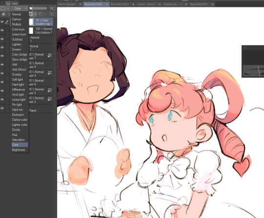
hello everyone (੭*ˊᵕˋ)੭* ̀ˋ i’m back with another coloring tutorial to share some tips on how i personally color mangas! you can check out my first tutorial here where i go over the basics of coloring. in here i’ll go a little more in depth about shading and lighting, and the areas that i like to focus!
so without further ado here we go !! ♡
before we start
all of my colorings are done in photoshop
i have a psd that i personally made for my colorings, so the tutorial will already have the psd on top. i personally like to color with a psd on and then make adjustments as i go along.
these are tips on how i personally like to color. the process is different for everyone, so take it with a grain of salt ^^
#1 - Base Colors
self explanatory, just fill in the base color of your character

ooo la la
#2 - Tips for Shading
my shading is broken up into two major parts
1. soft shading
2. hard shading
Soft shading
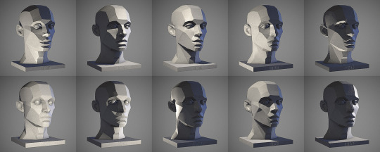
i like to do soft shading whenever i want my coloring to look slightly more realistic and for the base color to look less flat. other times i skip it altogether if i’m coloring something cute or chibi-like. If you’re like me who has difficulty sometimes imagining where the shadows/light should be, i highly suggest looking at references to get a general idea! here is just one example.

❗reminder that each step requires new layers! color everything on different layers so you can make changes in the future if you need to!! ❗
Hard shading
next, I like to add hard shadows to my colorings for more details. these are the shadows where i don’t blend into the skin. the areas where i almost always focus are
Under the hair
Neck
Ears
Under the eyebrows
but again, the hard shadows can also heavily depend on the angle that the character is in. like always, if you struggle with that, references will be your best friend!! i’ll show you a reference that i used for this coloring! :)

Tip: set your shading layer to multiply and then adjust the opacity to your liking. mine is set to 80% here
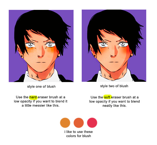
#3 - Tips for Blush
not everyone includes blushes in their colorings, but i personally like to add it because i feel like it adds a lot of life to the characters (and i find it cute 🥰)
#4 - Lighting/Color Details
another tip to make your coloring stand out is to add lighting! this is one of my favorite process as i really enjoy experimenting with different colors and seeing which one works best. you can use as much layers as you want until you get a result that you’re satisfied with.
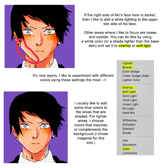
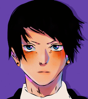
here is my result after i add more colors to the shadows and Aki’s face. i also colored in the eyes and added some pale colors to his lips because i know aki uses his chapstick 👑💅💁♀️
#5 - Brightening the Line Art
right now, the lines that we have are black, but i would prefer to brighten it up a little more. here, i will set a new layer above my manga cap, and choose a red or orange shade to add some colors to it
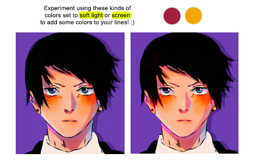
if you want a more vibrant effect, use a more vibrant version of those colors, or vice versa. you can also adjust the colors using your selective coloring tool
#6 - Finishing Touches
now that i’m nearing the finished product, i will begin to add some final details to it. are there areas that should be brighter or colors that should be less saturated? are there any areas where i should add highlights to? here is where i fix minor things until i’m satisfied with the outcome. i will also adjust my psd as well if i need to!
and finally, here is my result! :)

#mine#tutorial#tutorials#manga coloring tutorial#usergojoana#userokkotsus#usertorichi#usergokalp#usermica#hope it’s okay to tag some friends in this 🥹
213 notes
·
View notes
Note
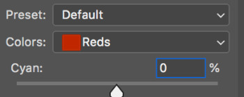
hello jen. how did you change the color of lucrezia's dress? in lucreziahelaena(.)tumblr(.)com/post/759094859124572160/holliday-graimger-as-holliday-graimger-as-lucrezia i can't figure it out. thank you.
hi there!! even though i'm not great at making tutorials, changing the color is actually quite simple, so i hope this explanation will make sense; (i use photoshop cs6 just fyi)

ok so this is the original color of her dress, cyan. (i slightly increased the brightness in the ss btw)

2. select hue/saturation and choose the original color of the dress (cyan). then, ensure to meticulously select all the areas of the dress's original color using the arrows in the color options below. (i marked it with a red circle).

3. now, as you can see in this ss, i altered the colors by adjusting the hue first to select the desired color for the dress. i chose violet for the ss! (remember to manipulate the hue only after you have covered all the original colors of the dress on the color bars using the arrows below, where i marked with a white circle.) once you have chosen a color for the dress, increase the saturation to make the color more vibrant!

there you go, anon, i hope that helped! and please feel free to ask me again if you need me to clarify :)
11 notes
·
View notes
Note
Hey there! I love your blog 🫶 quick question: how do your make your gifs? The quality is so good!
hi thank you!! im really glad you like them <3
so the gist of it is: photoshop, and then smart sharpen, and working with levels to get the light and dark values looking nice and contrast-y enough but also not Too much y’know? i do mainly eyeball that lmao it’s just acc to my personal preference
now i actually detailed most of my main process over on my tennis sideblog here! ive been more or less using the same/similar settings for 2.5 years so idk if there’s a better way to do it, but i’m just used to this method
as for the recent leon gifs though, i’m particularly proud of those bc i learned a new coloring technique to get them nice and vibrant. and that involves using the eyedroppers on the curves tool for color correction. (i don’t really know how to describe it but i just used instructions off youtube so it should be easy to find if you search those terms!)


you can SEE the difference right? the og video was dark and in the first clip also slightly blue tinged. but the curves tool is what let me get to the real colors!! of course, quality suffered a bit cause of the darkness but well you win some you lose some
anyway i hope this makes sense! feel free to lmk if you have any other questions 🫶
9 notes
·
View notes
Text
Helpful RP TIPS ✨feat. beta editor
subject : how to make custom text colours && formatting.
using beta editor is a learning curve for those of use that are used to legacy ( rip ol' boi ) . you can say goodbye to all that beautiful custom formatting that gave your blog that PIZZAZ. . . . SIKE !! you can still do all that time consuming / wonderful formatting just as easy. there is a small work around but one you should be used to if you are using Roleplay Formatter ( view this tutorial here ) .
⇧ this right here ? garbage. trash. colour choice is not the vibe. do better t/umblr. what even is that red ?? that green ?? CARDINAL SIN.
luckily for you, i'm going to show you an easy way to make your text colours match your blog aesthetic using icons && graphics.
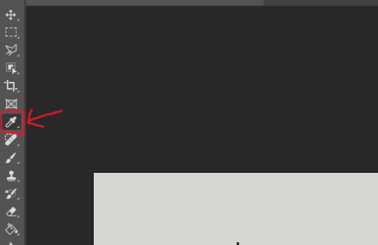
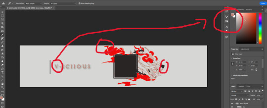
first youre going to want to pull up adobe PhotoShop ( PS for short ) or any other editing service you use for your icons / graphics. the most important part if that it uses the ' EYEDROPPER ' tool function. now assuming your icons / graphics ( i'll be using my icons as an example ), already have the PSD you want attached an active-- use the eyedropper tool on the colours you want to use. i recommend three for variety but you can do as many as you want.
keep in mind by default most people's blog editors have a white background. so using white text is not recommended. i personally like to use 1 vibrant colour && 2 muted colours because of eye strain. vibrant colours can be overwhelming for some viewers but you are welcome to do whichever colours you like. it is subjective after all.
now that youve selected your colour, consider having a notepad ready ( either digital or ol' fashioned pen & paper ) . at the TOP RIGHT side of the program in PS you'll see your colours, click the top overlayed square. this will open a sub-menu that shows you indepth stats. from there you'll see that EXACT colours HEXCODE.
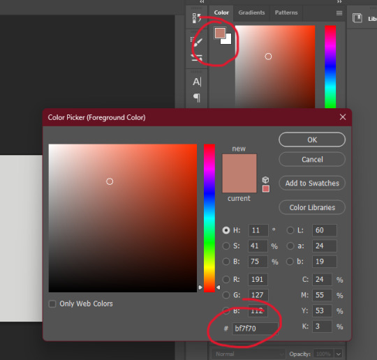
go ahead && write down the HEXCODEs including the ' # ' sign. you'll plug in this code here in the Roleplay Formatter. ( the ' A ' symbol at the TOP RIGHT. ) from there another sub menu will open and you'll click ' More Colors '. that is where you will plug in your hexcode. while the editor is open it will save your colours, however when you close they will disappear which is why i recommend writing them down. but you can always just have PS open and copy & paste them from there. its a matter of personal prefenece at this point.
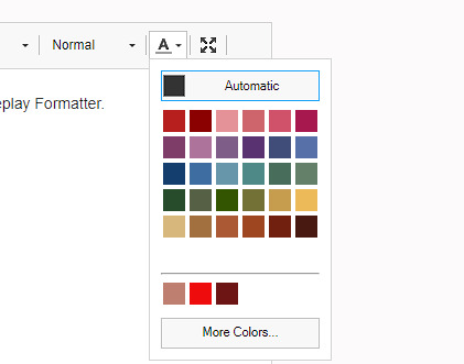

and thats it. Thats the whole thing. take your now formatted and coloured reply, copy the source code and paste it into t/umblr's HTML editor ! play around with bolding, italics, capitalizing, && enlarging / shrinking specific words or phrases to give your reply that speical little OMPH !! you're on your way to being a pro, good job !

78 notes
·
View notes
Note
please could you do a tutorial on how you enhance the colouring of a gif to be really vibrant in one colour without it changing the coloring of the rest of the gif? you do it really well and it looks great!!
hii, thank you anon!! and yes, i will grab different psds i have around my laptop and explain how i achieved that coloring. very long tutorial under the cut!
it's a bit hard for me to explain how my brain works when it comes to selecting the type of coloring/scenes i want to gif so please bear with me lmao. okay so first things first, i always try to choose scenes that are in the same section of the color wheel, this makes things easier in photoshop.
i will use this gif as an example
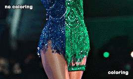
i chose this particular scene to turn it green because blues and cyans are close to the green tones in the color wheel, so that's gonna make things WAY easier in photoshop, especially if the subject is moving. another tip is to find scenes where there's a color that's really separated or isolated from the rest, that helps me so much in ps because then i can basically change its color without worrying about turning her legs the color i chose.
i don't apply all these tips at the same time because it truly depends on the case but i tried changing the color of the same gif to red with hue/saturation and it looks quite good as well since the blue is really separated from the rest:

now things get a bit more complicated, because now that taylor's bodysuit has the same tones as her skin tone editing everything gets a bit harder, bc let's say i want her legs to look a bit more purple-ish since they're a bit yellow and i want to tone that down (another tip: look at the color wheel to figure out which opposite color you need to cancel out a particular one you want to get rid of) i usually go liiiittle by little with selective color and i only work in the yellows and reds (sometimes magentas), this is trial and error, drag the tiny arrows in each color to see what looks best or what looks somewhat decent lol. this is how the finished psd would look like, i only had to tweak the yellow section in selective color, and that worked out well!

that's usually what i do 90% of the time. other times i try to edit the color just a bit, so i can further separate it more in case it still picks up similar tones that are around it.
_
other tip i have is that most of the times i choose scenes where the subject doesn't move that much, especially if i'm changing the color of something in particular.

like this lwymmd gif, it's a very radical change in color so i had to use a brush and stuff to make the red turn white, but see how there's barely any movement? that's the type of scenes you want to use when you want to change its color (especially if it's something as contrasting and different as white) this one had a combination of hue/saturation and using a brush with a green color for the most part and selective color to finish tweaking her skin tone.

for example since the red was super isolated i didn't have to tweak much, but for example when you want to include a bunch of colors you can play with the slides that are circled in teal to tell photoshop "i want you to include this specific tone in your color selection" so then you can desaturate it and increase the lightness (that's how you turn anything to white) or change it to another color, whatever you choose. that's what i did for the midnights bodysuit:

i dragged the shit out of those sliders lmfao, but it's how i got to change the color in a uniform and faster way.
-
hue/saturation is my favorite adjustment because i loooove turning things white/black bc of two reasons: makes the scene so unique, bc no one has seen the red dress from lwymmd white, so it automatically stands out AND if for example you're making an orange set and you have a random color that you don't need (like blue, or green, etc,. again, make sure they're a bit isolated at least and that they are not close in the color wheel) you can always turn them white or black to enhance even more the orange! it's what i did with this gif. my focus were pinks, yellows and oranges, so i got rid of the blues/purples/cyans by desaturating them and add lightness to them (like i did with the rep gif)

when it comes to enhancing a color that already exists in the scene i take some liberties, but it might not apply to every single scene. sometimes i do discard gifs bc it's not working how i want to. i just use selective color to adjust anything and again i go little by little.
-
another example of me changing the color and using a different technique: halsey isn't moving at all so that gives me the chance to change the background to anything i want, in this case i used hue/saturation but in a different way, i selected colorize and increased the saturation. that way you're turning your gif whatever color you choose. with a layer mask i then got rid of the parts i didn't want to be affected by this change.

-
and same with this one, got rid of the green because it's a very isolated color so that makes things easier when it comes to change its color or get rid of it. and for this set i went for an all pink color palette so see how me desaturating it and turn it into white makes the pink pop even more? it always depends on what your set is going to look like, i could've changed it to blue or purple depending on the color combo.
i think this is everything i can think of, since i color every gif from scratch one case might not apply to another one, so pls if you have any doubts about a particular gif i colored don't hesitate and ask! i'd be happy to help and explain!
18 notes
·
View notes
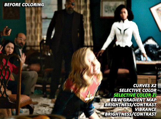
Photo
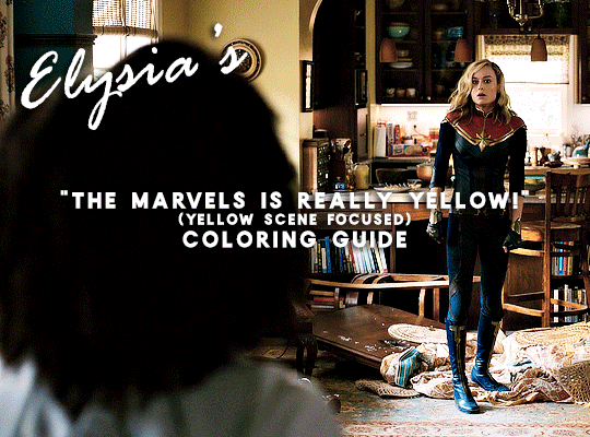
A few days ago (last week actually 🙈) @nikolatexla sent me a lovely message about my Carol in The Marvels set and asked for some guidance about my coloring process for that set. So, what follows is a fairly general guide to how I color, which a special emphasis on how I tried to combat the extreme amounts of yellow in a lot of The Marvels footage.
(And, just as a quick fyi, this not a full gifmaking tutorial--I’m focusing only on coloring and assuming that readers have a working knowledge of Photoshop.)
The Footage: File quality isn’t technically a part of coloring, but I do my best to work with only the highest quality footage options available to me. For trailers, this means that, excepting the stuff I am 100000% out of my mind excited for/simply cannot wait to gif and that I am fine giffing in fairly small dimensions, I wait until a non-YouTube copy is available. The Carol set in question was made using footage from a 1080p iTunes trailer download.
Layer Overview: This can vary slightly from gif to gif, but, when coloring, I pretty much always use: Curves x2, Selective Color, Gradient Map, Brightness/Contrast x2, and Vibrance. For gifs in need of more extensive color correction, I often add a second Selective Color layer and/or a Photo Filter layer.
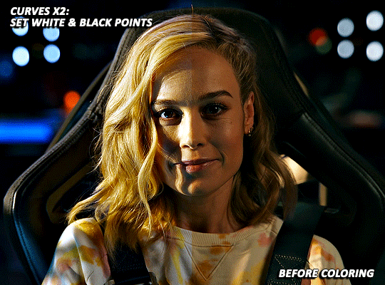
Curves: All my colorings begin with two curves layers. The first, on the left, is used to set the white point. The second, on the right, is used to set the black point.
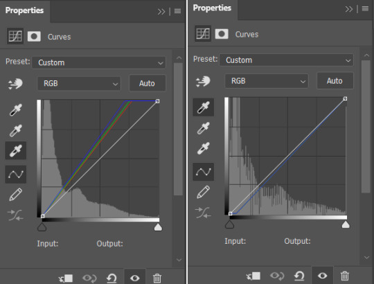
Using the appropriate dropper, I click on the brightest/whitest or darkest/blackest points of my image until I find a point that produces a result I like. For scenes with strong single-color tinting (heavily yellow, heavily blue, etc.), setting the white point can involve a bit of trial and error as heavily tinted white points can sometimes result in very weird or overly extreme results. Setting the black point is less likely to produce such extreme image transformations, but, if I’m struggling to find a point that doesn’t make the image darker than I want, I may lower the opacity of this layer.
As shown below, how much these layers do varies depending on the scene:

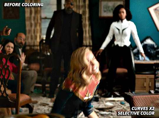
Selective Color: For selective color, I focus on whatever colors are most prominent within my image/whatever colors I want to reduce or enhance. I don’t have any particular formula for this, just dragging things up and down until I start to see changes I like. With super yellow/orange scenes or with scenes where your characters are looking just extra orange for some reason, this means focusing on the reds, yellows, and magentas. I also always increase the blacks: +2 magenta, yellow, and black. (For most Carol in uniform gifs, I also increase the amount of cyan and reduce the amount of yellow in the Cyans and Blues). As reducing reds and yellows in an image can leave white characters looking either pinker or greyer than you’d like as well as lead to the white washing of characters of color, I sometimes click over into another tab or image, wait a few minutes, and then go back to whatever I’m working on to see if I still think the coloring changes I’ve made look good. This is ALSO why I often add a second Selective Color layer after I’ve added all my other coloring layers. (I’ll discuss this more later on).
(Further, specific to Carol, reducing the amounts of reds and yellows in the image can help her face look less orange, but also does make the red parts of her uniform less vibrant. Layer masks can help mitigate that, but it’s harder to pull off on higher movement shots, so less red/orange image vs. less washed-out suit is mostly something that you will have to balance according to your personal preferences.)
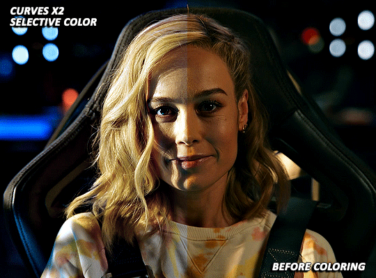
Gradient Map: I add a Black and White gradient map, make sure the method is set to classic and that the layer as a whole is set to soft light and 20% opacity. It’s subtle, but I think this helps given the image some extra depth and contrast.
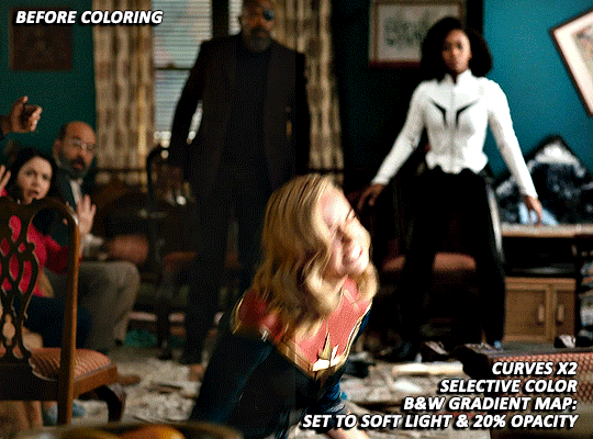
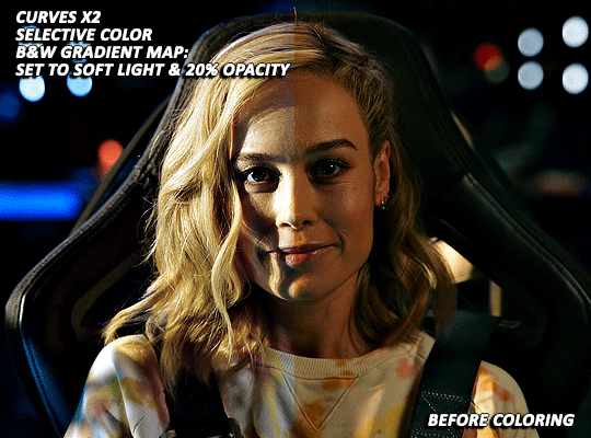
Brightness/Contrast x1: For my first Brightness/Contrast layer, I tend to play things super safe. It’s easy for the light points in your image to start looking completely blown out, which, while sometimes unavoidable in order for the rest of your image to be visible, is something that I prefer to avoid or minimize when possible. (And I like to see what everything looks like before I potentially start more dramatically dragging things around on my second Brightness layer 😅).
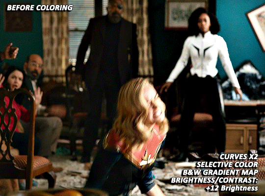
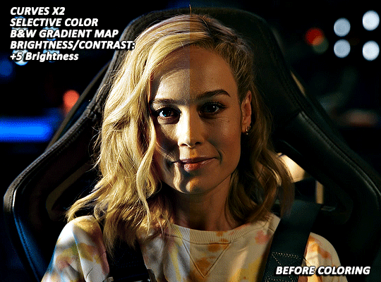
Vibrance/Saturation: My standard settings for this layer are +5 Vibrance and +3 Saturation. The only time I really add more is if I’m making a colors focused set. For sets where I’m pulling a lot of yellow/red tones out via selective color, this layer can help make things look a bit more alive (but also is the main reason why I sometimes go back in with a second selective color layer).
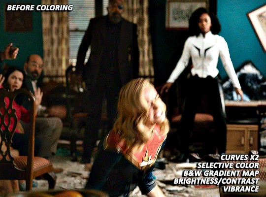

Brightness/Contrast x2: Now that I’ve got my coloring 85% done, it’s time for some more brightness!
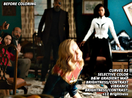
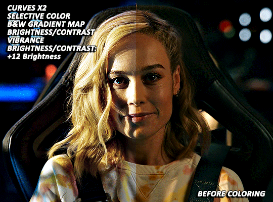
EXTRA TWEAKS: At this point, both gifs are at a point where, depending on the set/my mood/my energy level, I might post them as is. But they’re also not exactly where I’d really love them to be. Both are still a bit more yellow than I’d like and are, I think, good examples of the different ways I try and tackle this sort of thing. For both gifs, I’m going back in with some more selective color to further try and tamp down the yellow/orangey tones in Carol’s skin.
With the first scene, Carol can still skew somewhat orange/pink at times, even after the extra selective color layer, but, due to the red in her suit, there is limit to how far I can take things. And, while a Photo Filter layer could theoretically help things go a bit farther, I found that the cooling/blue filters I tried all tended to push Carol more towards the pink, rather than natural looking, end of things.
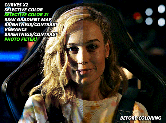
With the second scene, however, I did find a photo filter layer (Cooling Filter 80, with the layer set to 20% opacity) helpful in getting my coloring where I wanted it to be. Carol’s hair and skin doesn’t look as yellow as it did before and the rest of the image still looks fairly natural, rather than venturing into extremely blue or pink territory.
Final Thoughts: I know this has gotten long and is probably a bit more vibes (rather than exact adjustment instructions) heavy than some tutorials, but that is basically just how my coloring process is. I don’t think there’s any exact right way to color, but rather just what you find works for you and appeals most to your specific sensibilities. When we encounter new projects/pieces of media (even within already familiar mega franchises like the MCU), there also tend to be unique quirks that we have to get used to. I don’t think I’ve fully figured out coloring The Marvels at all (it was such a headache that, after three gifsets, I was 10000% done and didn’t open Photoshop for multiple days), but I do think that my experiences with other extreme color grading projects has helped me figure out how to at least start tackling it 🤷🏽♀️😅.
54 notes
·
View notes
Last Seen Blogs

joe-palmeri-blog
Weird Shit

astrology-wwitch
ASTROLOGY

insomniac-under-your-bed
Anime Galore! (That's Probably Spelled Wrong)

inventor-researcher-chef
Netflix said fuck grey morality

mhizkiahasbie
Mochamad Hizkia Hasbie