#I like bookbinding
Text
Branderson's leatherbounds are testing me. I swear to god, I've been eyeing the mistborn leatherbound for years but I just can't justify it to myself - the postage makes it insane. I have a hard copy of all the mistborn books already.
But I don't have a hard copy of warbreaker. Just the ebook. And that leatherbound is beautiful :'( .
BUT I also want the bookends.... I'm holding out hope that they'll eventually become available on their own. Might be a slim hope, although Branderson did say there's some merch announcements in November.
Anyway the point of this post is just to complain about the pretty things that I Want but definitely don't Need.
#the 'buy all the leatherbounds' bundle makes me want to cry#do I want them?#Yes.#look#I like bookbinding#I appreciate pretty books#I appreciate pretty books when I love the story Even More#but the bundles a hard no#individual books? particularly mistborn 1? unfortunately tempting#I love that book#I want the leatherbound#it is $100 US#WITHOUT POSTAGE#and I am not american#AND I HAVE THE BOOK ALREADY#otherwise in all honestly I would already have the leatherbound#I don't love Warbreaker as much as mistborn#but without already owning a hard copy.......#in other words: argh why!!!!
0 notes
Text
Thinking again about how many disabled people end up getting shunted into art/craft work because like. You can technically do it. Sometimes. Yeah you make a pittance at best and are almost certainly going to make your physical health worse by pushing yourself to get things done, but what else are you gonna do? You're too sick for anyone to hire you. You're "not sick enough" to qualify for benefits. Just devote every scrap of time and energy you have to a chronically underpaid, low-prestige, incredibly labor-intensive industry. A few people manage to make it work with luck and help and the right skills. Many people don't. Everyone gets pressured to monetize their hobbies, but it's especially insidious if you're disabled because any tiny thing you manage to accomplish to bring yourself joy gets twisted into proof that you should somehow be able to work.
#curseblogging#the thing is like#i went to bookbinding school#i saw what it was like to try to make a living as a craft worker for able-bodied people with significant starting resources#and the answer is: fucking hard!#people generally being like well if you work long hours and never allow yourself a break#and do a bunch of events and shows and teaching#and are good at not just the work but at finances and marketing and every other aspect of business management#(and ideally have a spouse with a regular job so you don't have to pay for your own healthcare. because this is America)#then maybe#MAYBE#you can make a reasonable living as a craftsperson#but this same VERY DIFFICULT PROFESSION#gets pushed on disabled people as something obvious and easy#and a lot of people do try their best to make it work because what other choice do they have?!
431 notes
·
View notes
Text


Clamshell box for my binding of Dr. Jekyll and Mr. Hyde
Materials used
boxes - grey board (1,5mm and 1mm)
case - grey board (1,5mm, cardboard, 2,4mm)
covering material - iris bookcloth (commercial)
decorative paper - handmade paste paper
#bookbinding#clamshell box#jekyll and hyde#paste paper#measuring cutting and gluing the cardboard for recessed areas was a pain and don't get me started on the paper#I really liked how it turned out though#there will be a few WIP pics and closse-ups of where I fucked up soon#I was a bit worried about the k/y situation in Jekyll#at some point I just couldn't tell anymore whether I saw it because I knew or others could see it too
186 notes
·
View notes
Text
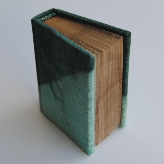


because he's a poet by red0aktree [link]
Bound for the @renegadepublishing Tiny Book Bang. Typeset by @mythrilthread. Bookcloth hand dyed by @epitomereally for her Everything is Relative to You project... and I think she gave me the end pages as well...? Edges are buff 'n rub wax.
#this was done and sent away back in early August...#little book#book arts#TINY BOOKS BANG 2023#I really liked that bevel to the edge of the cover...#bookbinding#wish I'd had time to enqueue this post sooner... it feels so far away now...#exchange
452 notes
·
View notes
Photo


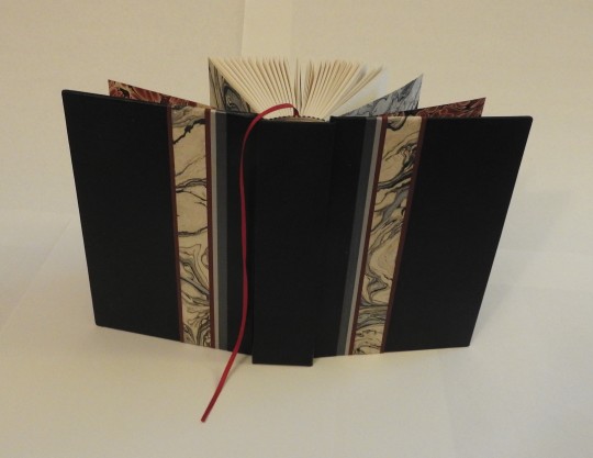

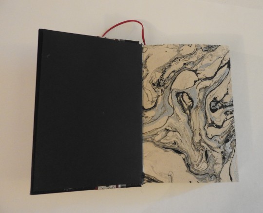


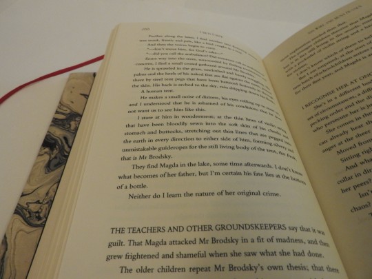
[Start ID: 10 photos of a bound book of the I am in Eskew transcripts. Photos 1 through 4 show the casing with and without a dust jacket. The dust jacket is marbled silver and white with the title written on it in black ink, and the casing is black leather with vertical insets of the same silver and white paper, grey book cloth, and red book cloth. Photos 5 through 10 show the inside: the red and black marbled endpapers, the silver and white decoration paper, the title page with an illustration of a bird turning into a city, a translucent vellum page before Chapter Zero: Initiation, the beginning of Chapter 15: Crossroads which displays the red binding, and a closeup of a page from episode 20: Cruelty. /End ID]
I have always had plans to, once I finished the titlecard art pieces, print them with their corresponding transcripts for myself. Then I decided that I wanted to add the lineart pieces. Then I realized that the transcripts were not fully accurate, so I went through and transcribed corrections to match the audio. Then I decided that I wanted to go back and redo a couple of the titlecard pieces, etc, etc. This printed version ended up not including any art-- I don’t have access to a printer which can handle that--but I wanted a physical copy which I could annotate. As a result, this thing is huge. It’s easily twice the size of any book I’ve bound before, and the cut edges are a bit wonky, but I’m still really happy with it.
#i am in eskew#my art#bookbinding#Part of the reason I prioritized this now even though I am so close to being done with the titlecards#Is because I am moving at the end of the month#and I won't have access to most of my art supplies for a couple of months at the very least#Also because. New city. New region. All alone travelling thousands of miles and living in a new part of the world.#Perfect time to read Eskew#I did do a proof of concept bind of Correspondence with my art in it a couple of months ago.#But I like this much better
1K notes
·
View notes
Text
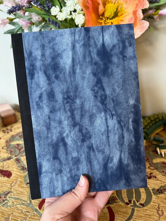
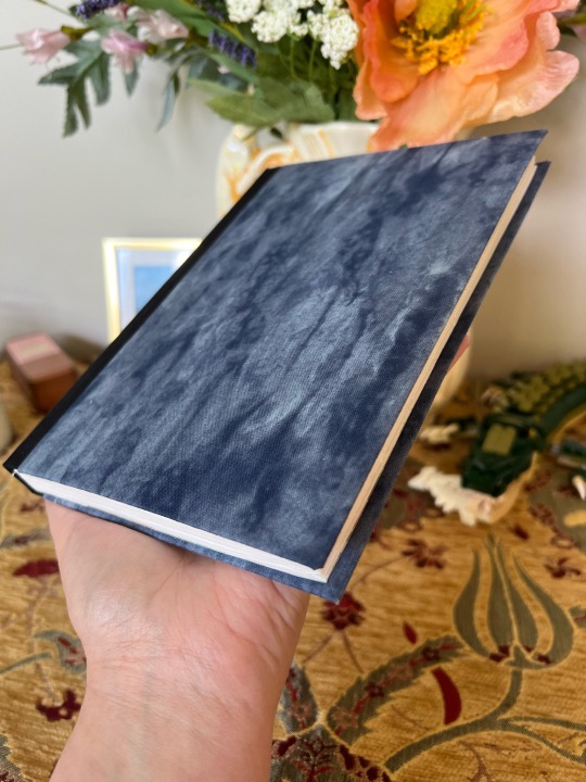
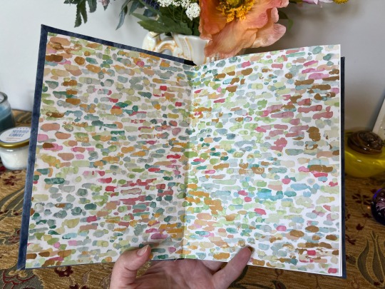
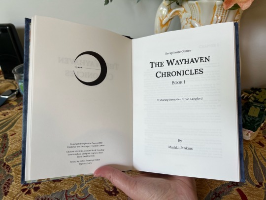
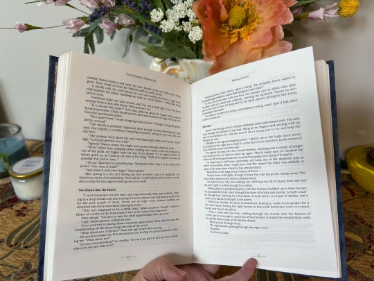
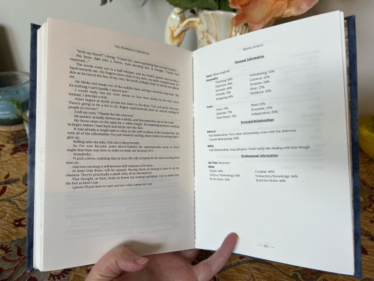
IT'S DONE! I made a book! I never thought I'd ever be able to make a book. Sure mistakes were made but it was still a fun process and I learned so much from making this first one.
This a binding of The Wayhaven Chronicles IF but with my personal Detective's choices included and the resulting text smoothed out to read more like a novel.
Honestly, I thought something like this would be way beyond my skill set but it wasn't as scary as I thought once I got started. Definitely check out @renegadeguild for some book making and typesetting guides and their discord is super friendly and helpful as well.
If you want to learn from my mistakes I'll go into some trials and tribulations under the cut.
I'm not sure how well this book will hold up long term but that's ok! It was more about learning and I'll make some adjustments and try again with the same text probably.
Typsetting
Margins - need to make them bigger. I mostly read paperbacks so I was going for that format with narrower margins but then when I ran into paper problems, I didn't have a ton of room for trimming.
There was an option on the imposer to add dotted lines to the center fold and I clicked that but they're visible still even after binding. Could be that I needed to sew my signatures tighter and that would help but regardless I don't think I need them in the future so I'll be skipping that feature.
The font was intentionally small, along with the margins, because I was trying to minimize the number of signatures I was dealing with for a first project. I'll bump it up in the future.
Paper (so much wrong)
So the grain should run parallel to the spine but I couldn't find short grain paper. I read at some point that someone recommended using sketch books instead because that should be the right grain. It was not, at least not what I bought, so it still ended up going the wrong way.
The sketch note book I bought had perforated pages. It made them easy to get out but I didn't realize that the page widths were inconsistent until everything was printed out. The paper width varied by at least 1/8 of an inch. I wasn't planning on trimming my pages but my top was super uneven because of this so an attempt at trimming was made. It could have gone worse (there was no blood) but the trimming could have been a lot better too.
Should have just used printer paper. The results would have been the same.
Making Book Cloth
Used the Heat and Bond method with some spare fabric and it worked pretty well. The problem was when it came to adding backing. I'd read tissue paper or even plain paper so I grabbed some piecing paper that was close at hand. That was a mistake. It was good quality fabric so it was thicker already and the paper backing made it too thick. I could barely fold it over and it kept wanting to flip up. It's the spine fabric and I'm still concern it's going to do this in the future.
Used tissue paper for the marbled looking fabric and it was much easier to work with.
Book Board
Not measuring right was all on me. The rice box worked in a pinch but I think it will be prone to bending. Got me the experience I needed be wouldn't be my go-to material for a project of this size.
Glue
I used Elmer's All Purpose and it got the job done but, again, probably not going to hold up the best long term. However, I'm glad I didn't buy PVA and basically waste it on this project. Elmer's was good and cheap enough for practice. I'll be getting some PVA for future projects.
#the wayhaven chronicles#twc#bookbinding#life at nerdy holler#nerdy makes a book#Already poking the typeset for a second attempt#I really and truly am pleased with this though#even if it isn't super fancy or didn't come out exactly like I wanted#so jealous of the fancy htv titles and cover designs people make#but sadly I don't know anyone with a cricut or similar to make it
225 notes
·
View notes
Text
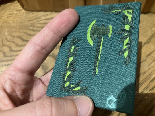


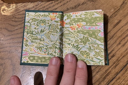
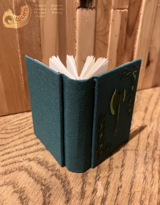

Gawain & the Green Knight bookbinding, Nov 2023. Typesetting by @mourningmountainsbindery
Materials: textblock is acid-free printer paper, PVA glue, cotton thread coated in beeswax, and cover is acid-free board, Italian bookcloth (3 colors), metallic green foil backed with scrap paper, and chiyogami paper endpapers.
#my art#bookbinding#artists on tumblr#handmade books#tiny books#gawain and the green knight#it would have worked better with higher contrast between bookcloth colors but ah well!#binding from the#tiny books bang 2023#I really like this typeset! the decorative details are fun and match really well#described#id in alt text#tailfeather binding
448 notes
·
View notes
Text


It's BOOK TIME again! It has been forever since I last bound a book wow.
This is Interim by @punishandenslavesuckers, which is a fantastic botw post-canon Link/Zelda/Ganon fic that you all should go read if you haven't already. It's great, go check it out. I stayed up way too late reading it.
The binding is a sewn-board binding, which means the cover stiffeners are sewn directly into the text block, instead of wrapped around and glued to the endpapers. This makes for a very tidy and modern looking binding, AND because the boards are doubled (sewn in like the endpapers) allows for fun shenanigans like that indented triforce.
I'm SO proud of how the triforce came out! I was really careful with all of my measurements and it really paid off.
Oh yeah and I finally found a place with a good guillotine, so now I can make SMALLER books and still have nice crisp edges. Look at it, it's such a cute size. Perfect for holding.
Next step… painted fore-edges, maybe owo
#bookbinding#moth draws#moth talks#interim#loz#tloz#botw#fic rec#fanfic#fanbinding#obligatory disclaimer this is just for me and my little private library I'm not making any profit off of this#i read this fic and then immediately started replaying botw though#it do be like that
126 notes
·
View notes
Text


This is my second non-fanfic bind! Copper Coins by Musuli (TLed by the amazing huxiyi), bound as a 600-page chonker of a quarto.
The book features handmade bookcloth, headbands, endpapers and their matching Oxford hollow (and edge speckling), and coin string decoration. I added distressed bronze toner-reactive foil to the spine label for an even more vintage look.
Fonts used: Adobe Jenson Pro, Grenze Gotisch, FZKai-Z03.
#i have to make stuff with my hands or else. doctor's orders.#i wanted to use an art with xue xian in his wheelchair but dragon form is also good#everything in this book is handmade except like the ink. i'm pretty proud of my first ever headbands and oxford hollow.#bookbinding#ro talks#danmei#cnovelartreblogs#(if this is relevant)
88 notes
·
View notes
Text
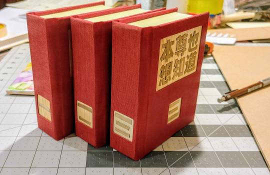
A new project: Devil Venerable Also Wants To Know! Oh man, so I've been leveling up in straw marquetry as fast as I possibly could. And it was VERY much with this goal in sight. Maybe not this book specifically, but my intention has been very much to bring this back around to books! And this one had a LOVELY vibe to go with the story, there's something so magnificent about Wenren È et al, this was a great vibe match for the story. I started reading this in 2021, stalled for some reason, and I'm SO glad I came back now!
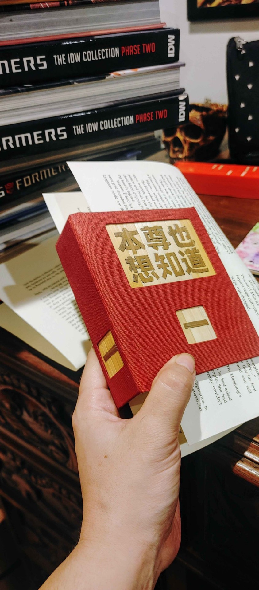
Especially as more and more of my faves get official licenses, those serve great as practical books, and I get more freedom to make my preservations of fan translations an extravagant expression of my love for the story and work that went into translating that. I got into this hobby assuming none of these novels would ever get official translations, so it's definitely something I've given a lot of consideration to over the last few years, and I think this set articulates it really well!


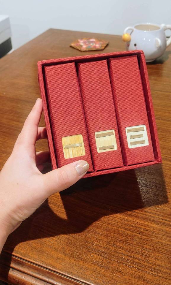
And oh man. I knew this was ambitious, but I still flew PRETTY darn close to the sun. I set this up so that each character had a nominal inch to work with, felt good about it, then opened up font previews for the text and immediately broke into a cold sweat. But with patience and lots of fresh knife blades, I got there! Cutting these pieces took some delicate wrangling, assembling them took more, and after all that, I still had to finish the cases and case in the books. But I made it work, and man, I think it really, really paid off

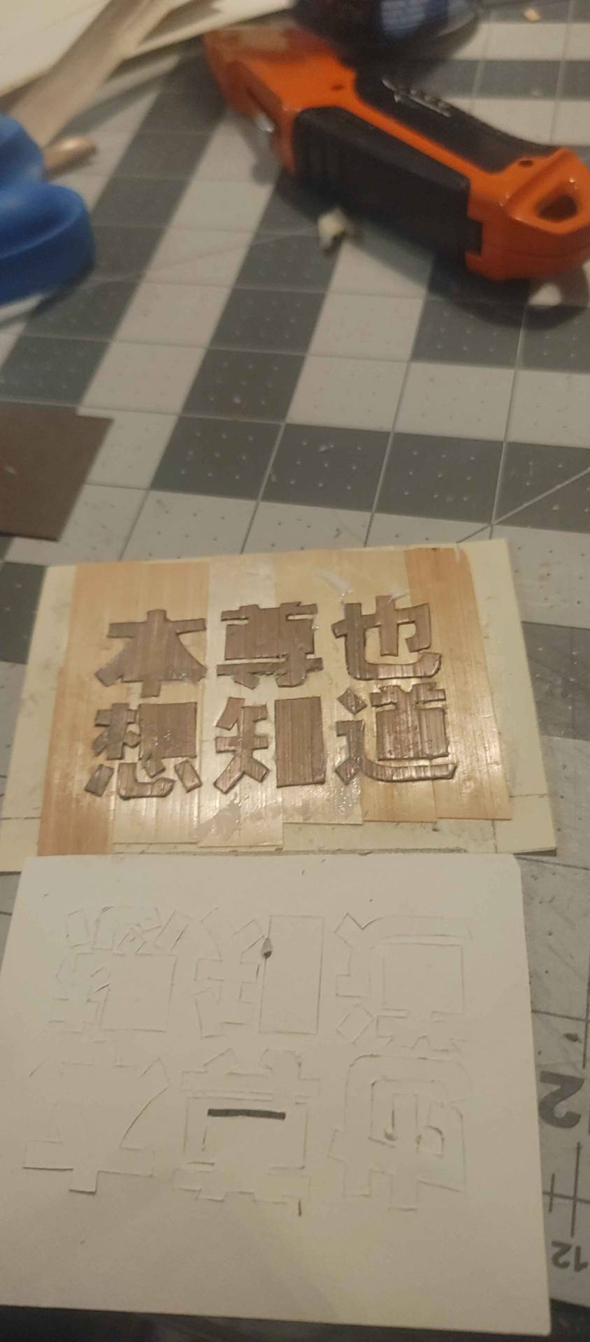

Did I tape my very first cutting template upside down? Don't worry about it!
And I was pleased with the straw marquetry on its own, but I have to say that attaching the boards for the cases took my delight ALL the way up to the next level. The effect is everything I could have dreamed of, which is amazing for a story that I loved so much. This is 1000% something I need to repeat, and it will probably take more practice before I reach the level I dream of, but SOMEDAY I'm gonna be doing pictorial straw marquetry on book covers. I might take a detour to more wall projects, and inlays with other materials, but soon! It's coming! And in the meantime, I'm so excited to share this with you, I think it turned out absolutely fabulous


#devil venerable also wants to know#bookbinding#straw marquetry#box making#the textures are SO pleasing#if i do something like the jwqs set again#I'll have to see about doing a picture across the back of the box
115 notes
·
View notes
Text
From the Library of Jurgen Leitner.
Handbound book I made inspired by the Magnus Archives podcast episode 88 : Dig, which you can hear a clip from on the video
My instagram is taikavaris if you want more weird art
#the magnus archives#tma#jurgen leitner#tma fanart#the magnus archives fanart#tma fears#the buried#tma buried#magnus archives jurgen leitner#tma jurgen leitner#cursed books are very fun to make I stayed completely sane#shoutout to anyone who answered my poll about this book#my art#bookbinding#what kind of tags am I meant to even use#hope yall like this#tma podcast#magnus archives#the magnus archive fanart#I hand stamped all +300 pages
83 notes
·
View notes
Text
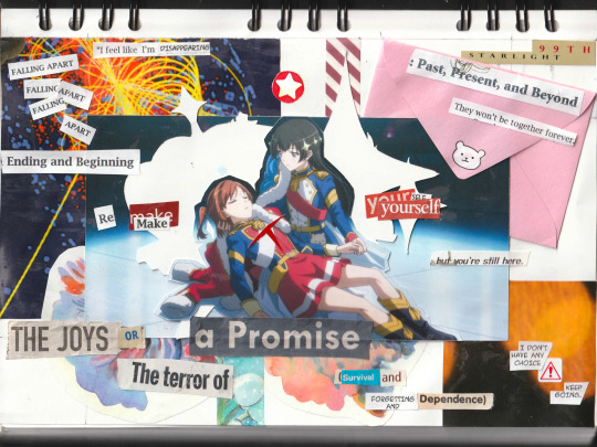
yeah idk
#so much of this is scraps from my other projects like the crown & star silhouettes are from. another super star spectacle thing#that ive been procrasinating#almost all the serif font cutouts are from misprints when i was bookbinding and the manga font ones are from the hnk drawers#theres also 2 bits thats from an old anti-drug psa booklet i found in the basement and im not telling you which#hikaren#karehika#revue starlight#corey if you see this shoutout to you for being the cool collage guy#actually i think anyone reading this should be legally obligated to shoutout corey my friend corey for insp and also being cool in general#aijo karen#karen aijo#kagura hikari#hikari kagura#shoujo kageki revue starlight#revstar#starira#my art
214 notes
·
View notes
Text
fanbinding of An Easy Death by @youareinacomawakeup


author copy~ massive thank you to nika for letting me send them this copy and for continuing to write banger after banger of klance fics. i will treasure them forever in my heart!!
this was such a fun fic to do, the mushroom vibes were so strong i knew i had to draw up some mushroom graphics to fit the vibe. eternal thanks to elentori for letting me use her beautiful illustration too!
#fanbinding#bookbinding#ficbinding#blueberry bindery#my books#fanfiction bookbinding#fanfic#klance#voltron#vld#voltron legendary defender#i love octavos#theyre so little and so cute#i read this fic in about 2 hours#cried#and looked at the timeline for the tiny books bang like#yeah i can do this#and speedran the typeset
80 notes
·
View notes
Text


I (partially) finished my bookcloth dustjacket designs for the first two BBC Merlin books!
(if folks want, once I finish all the designs, I can make a how-to post for making these for your own merlin books)
Symbols:
For The Dragon's Call, the top two are supposed to look like two sides of an old style coin that was stamped with the symbols that appear on Excalibur in the show. The bottom two are chains in reference to Kilgharrah (and something something the chains of destiny and knowing how it "should be" or smthing...)
Valiant was a little harder, not as much to pull from. So it gets crossed swords for the tournament that's taking place, with the dog statue's head as the bottom symbols.
#I still have to figure out what design I want for the spines (currently thinking of doing a connecting skyline of the castle)#but I do quite like how these came out!#the new HTV is sooo pretty#however it is still a beast i am learning to tame#as you can see by the bare spots on the dragon's call book#tho I quite think it adds to it#makes it look worn and aged and all that#merlin#bbc merlin#bookbinding#kinda-ish#my art
68 notes
·
View notes
Text
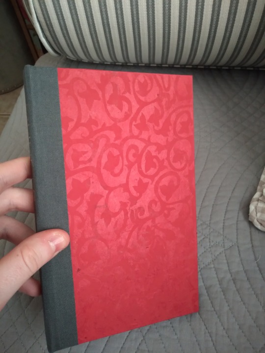
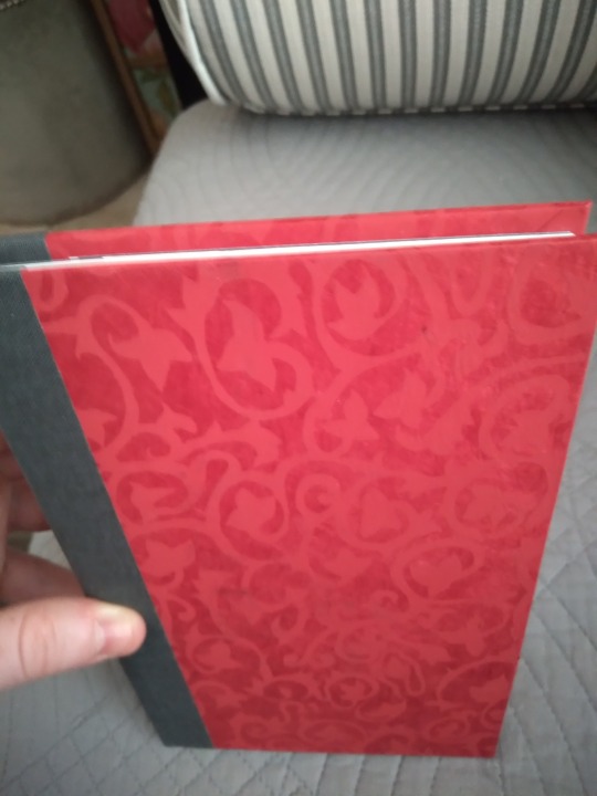
Today's completed book is a bind of Glimmer, by @tawnyontumblr (hi, it's me, the person who asked to bind your story way back in April). This story is a Good Omens human au about sex workers in the Regency era, and it's gorgeous and lush and fantastic. Sexy and vulnerable and all the good adjectives. Go read it if you haven't yet, it's wonderful.
This is another legal-size quarto, my second (of 4; more are on the way). It really is an addictive size, and perfect for fics this length. The cover is done in this really pretty red damask lokta paper that highlights different parts of the image depending on the angle of the light. I was toying with the idea of binding this fic, and when I found this paper I immediately bumped it up the list because it's so perfect. The spine is dark gray lineco book cloth that I simply cannot resist putting on spines. I realize this is a pattern and I do not care. It's softer visually than black and it coordinates with everything and I will not stop.
More photos under the cut!
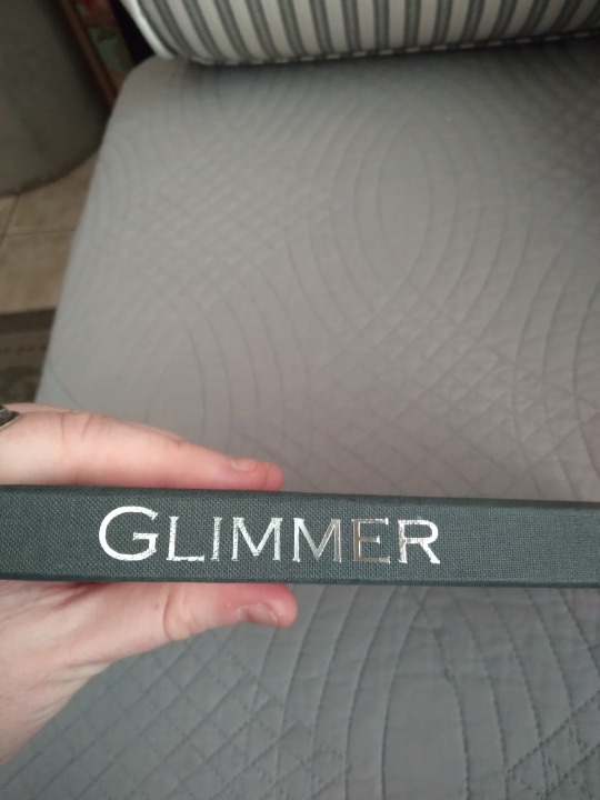
What did I tell you, it coordinates with everything. I used silver foil HTV for the title, and I elected to put it just on the spine so as not to cover up any of the floral patterns on the cover. Honestly, I thought about it but just couldn't bring myself to cover it up. The interior of this one has some very fancy fonts and I wanted one for the spine but they were all too spindly. But this one's a good compromise, I think. Delicate but straightforward.
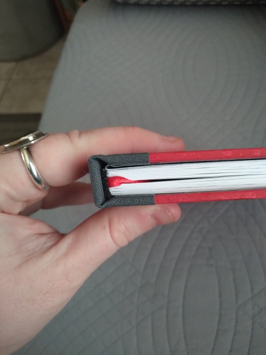
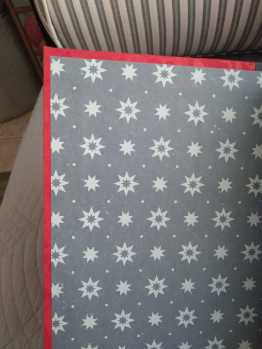
Top view. I really wanted to do custom end bands for this one, for maximum luxury, but it was too thin, so it has pre-made black ones. They sort of disappear in the photos but make a nice contrast in person. I am totally in love with the starry endpapers even though they are only scrapbook paper from Joann's. It was surprisingly difficult to find something that looked good with the red cover, because plain solid colors looked too lackluster and most prints were too bold with the floral, not to mention a lot of colors clashed with the red. But I love these gray-on-gray stars. They're perfect. And a lot of the fic takes place under cover of darkness, and stars are a symbol of hope, and this fic's about wanting to escape your current circumstances, so it's kind of thematically appropriate. I'm going to say it is, anyway XD
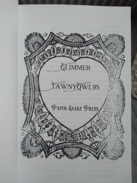
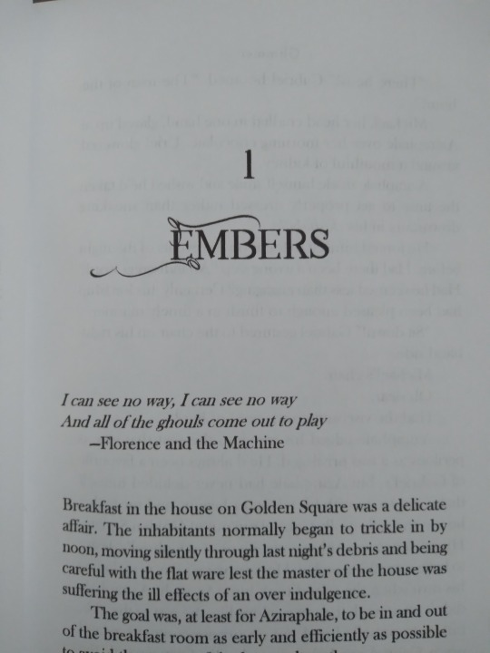
So I think the title page is my favorite part of the bind again. I found this vintage valentine graphic on rawpixel for free and it's probably the most opulent thing in the whole typeset. The sort of uneven ink distribution is on purpose and adds to the vintage feel. I remember thinking about a year ago that my title pages were too plain and I needed to level them up somehow, and with the batch of binds I've been posting for the last week or two I think I've done it. The fonts here are called Annabel (the one with the trailing ends) and Victorian Decade (the swirly one that my bindery name is in). Both are available for free from DaFont. I did have to get a little tricky with the line spacing to get them to print correctly, but it was worth it. I wanted opulence for this one.
And that's that! I hope I did the fic justice, because I couldn't be more pleased with the outcome.
#bookbinding#fanbinding#good omens#fic rec#snek makes books#i don't think the time will even come when i don't feel like i've forgotten a tag#i'm trying not to flood the bookbinding tags cause it's pretty quiet in there and i don't want it to be all my stuff#but i have so many things to talk about#it is an eternal conflict
57 notes
·
View notes
Text
Bookbinding for Beginners by a Beginner
All of the stuff I've written thus far. [October 28th 2023]
Part One
Part Two
Part Three
Part Four
Part Five
Part Five and A Half
Part Six [Added October 31st 2023]
Trouble Shooting Aside [Added November 11th 2023]
Part Seven [Added November 16th 2023]
Part Eight- and Final Post (Until I ultimately write more, cause lets face it, I've already started tweaking how I do things) [Added November 29th 2023]
#I would have a part six out today#but since it's my birthday on the day of writing this#I went and did absolutely nothing#save for this#cause I like y'all#bookbinding#book binding help#DIY#fan binding#a beginner doing their best to explain all the things
305 notes
·
View notes