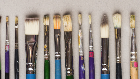
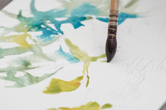
#I'm still experimenting with brushes and style in general
Explore tagged Tumblr posts
Visit Tumblr Blog
Explore Tumblr blogs with no restrictions, modern design and the best experience.
Last Seen Tumblr Blogs


Fun Fact
The total number of visits Tumblr.com received during January 2021 is 327 million.
Text

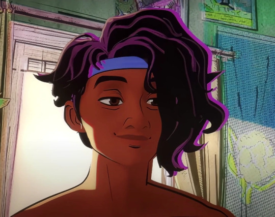
What is hidden beneath The Lake House
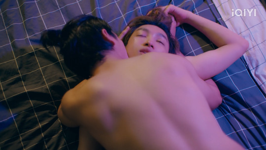
#kiran estevez#agent estevez#the lake house#alan wake 2#aw2#alan wake fanart#remedy entertainment#remedy connected universe#my art#I'm still experimenting with brushes and style in general#dunno if I do well#but I hope I do
754 notes
·
View notes
Text
The Psychology of Sex in Media: Mame Shows
This is going to be a very base-level post. If you want to learn more, you can look into research on sex in media!

I'm going to hit on a few points in this post:
How ♀ vs ♂ Brains Process Sexual Content
Examples: PayuRain's First Time, MutRak and CirPhu additions
~~~ These are generalizations based on averages, and not necessarily 100% true for individual people. Research paints with a broad brush, nothing is one-size-fits-all. ~~~
Disclaimer: Throughout this post I will refer to "male" and "female". By this I mean those assigned male or female at birth.
I am in no way trying to exclude trans, intersex, or nonbinary individuals.
Disclaimer Pt 2: The information I am sharing is based on research presented when I was studying media psychology in University over 10 years ago. I have no idea how it may be different for intersex individuals, or those who began hormone therapy treatments at earlier stages of development while the brain was still forming.
I don't know how much research has been done broadening this out to include those groups.
How ♀ vs ♂ Brains Process Sexual Content
Did you know male and female brains are very much different? When it comes to sex, that difference manifests primarily through the lens of empathy.
Female brains have more nerve endings. It's why women experience pain more acutely (and have a higher pain tolerance as a result), and why women, very generally speaking, tend to have the ability to empathize more with others.
That empathy response plays a huge role in how we perceive- and get off on- sex in media.
Males: Men are the largest consumer of video pornography by a mile. On average, men have a stronger response to what they can see with their eyes. If you look at pornography made for male consumption, it's going to focus on genitals. Close-ups of penetration, oral, breasts, fluids- that is what is going to speak loudest to the male brain. Very direct, very in-you-face.
What about females?
Females are extremely likely to be drawn to erotica vs pornography, at almost the same overwhelming ratio as males are to video pornography. By "erotica", I mean sex in written form (not necessarily hentai/graphic novels/animated pornography because again, visual medium depends on media psychology).
Female brains lean into that empathetic advantage, and how that manifests in the consumption of sexual media is that females tend to focus on emotion-based elements with any sexual media they consume (literary or visual).
What speaks most strongly to a male is seeing the bump-n-grind, but what a female is going to focus on more than the close-ups of a dick in a vag/ass is going to be things related to emotion. Facial expressions, moaning, hands (we convey so much emotion through hands), or elements of physical movement that convey emotion.
More than just grabbing and slamming, the way a body moves and shifts, the intensity or restraint, and again, very much rooted in hands and facial expressions.
Literary based sexual media features emotion heavily through narration. That's why erotica is more popular for females to consume. If you did look at traditional pornography to see how it is shot for the male gaze, also look for porn marked "Made for Women". It is an entirely different shooting style (so long as they mean it, and it's not just a Joss Whedon type who is like "I know women" and just reinforces stereotypes).
If you're reading this post, then you don't need to be told that, by and large, the main consumer of BL content is ~women~. Not getting into why that is, that's a whole different thing that I didn't study in Uni.
But the directors and actors of BL content are extremely aware of who their primary audience is, and Mame and her team demonstrate a perfect understanding of how to film sexual content to appeal the strongest to a female audience.
Example
You can apply this to every single NC scene in a Mame show, so let's just look at the ep 4 scene from LITA.
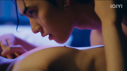
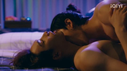
The overwhelming focus of the scene is on Rain and his desire. The camera emphasizes hands to break up the action, and the raw hunger in Payu's eyes as he goes to town on Rain's body.
Whenever they are both in the shot, the focus remains on Rain, the one who is receiving the pleasure. Payu's face often disappears behind the left side of Rain's neck, or his face is away from the camera entirely.
Rain is carrying the visual weight of the scene, and emoting as hard as possible. There are no significantly wide nor overly close shots, all medium to medium-wide, keeping the emotion of the scene front and center.
Also, famously the audio for LITA is a bit of a train wreck, but for the sex scenes, they never miss on the moans and groans. Rain's broken gasps, the whimpering cry as he climaxes, Payu's louder shout and ragged breath- everything you are seeing and hearing is conveying emotion.
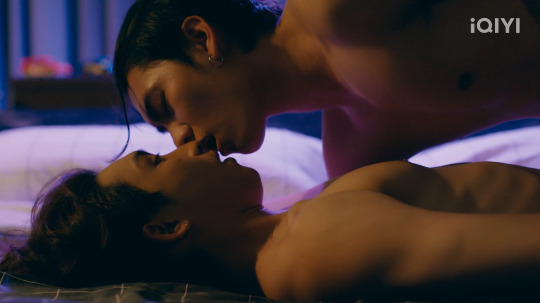
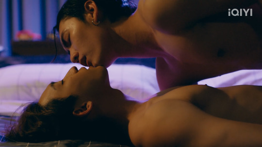
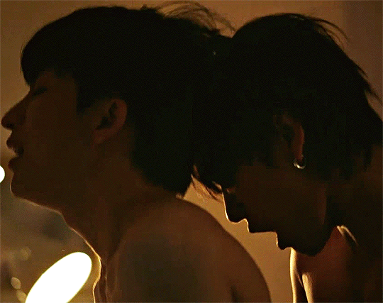
I know I said this would focus on the LITA NC, but I want to include a couple of examples as well from Love Sea and BNW.
These are two of my favorite shots:
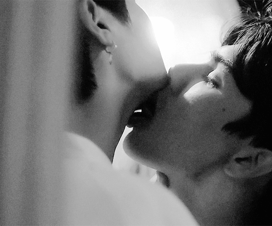
I love these two shots, because they're fantastic examples of creating a silhouette of both actors, while also conveying their emotions and desire through body language.
Tongrak is controlled by Mahasamut's tongue on his throat- and Mahasamut in turn is controlled by Tongrak's gaze.
Phukan has given himself wholly to his desire and pleasure, and Cir is moaning as loudly as his man, mouth wide open behind him. Wanting to lick and bite but being too overwhelmed to do it.
I just wanted to highlight these two shots, because unlike the main example above, the focus is shared by both partners. Boy Next World was interesting in that Cirrus carries a lot of the expressive weight in NC scenes (not all of it, but a significant amount), while Phukan carries the aural weight- his moans are emphasized in multiple NC scenes while Cir remains relatively quiet.
#i decided to only include PayuRain examples with just a little hit on a Love Sea and BNW Example#because it really is incredibly repetitive if I go to other scenes as well#Like you can just about swap PayuRain's names out for any duo in a recent Mame show and it's still accurate#media psychology#analysis#love in the air#lita#payu#rain#payurain
73 notes
·
View notes
Text
let's talk about radiant garden!
hello and welcome back to another installment of KH3 Retry, my chaotic thought experiment where i try to fix everything i hate about the game
i've said it before and i'll say it again: radiant garden should have been the playable hub world instead of twilight town. there are so many plot threads wrapped up in this world, so many paths that cross here, and it's a shame that kh3 never bothered to explore them in any meaningful way
instead, all of the world's depth is flattened into set dressing for tedious exposition, with all the things that made it memorable either cut entirely or moved to twilight town, a poor substitute which is itself lacking in any meaningful development
so let's talk about it! i have a veritable mountain of ideas for what radiant garden could have been like in a universe where it continued to matter after bbs
take my hand
even beyond the general lack of final fantasy in kh3, which is its own can of worms, brushing the restoration committee aside and reducing all of their hard work to an unplayable HD recreation of the bbs map is downright bleak. as much as nomura wants to, you can't just sweep legacy characters under the rug and expect me to forget about them. i'm glad they at least got to appear in re:mind, but it doesn't change the fact that their absence feels like a massive, gaping hole in reality, like the universe has written them out of existence. i'm sure sora can relate
the problem is best summed up by ienzo:

yeah. that's called regression, and it sucks.
so on that note, please disregard (almost) everything that happens in radiant garden in kh3, because we are starting from scratch babeyyyy!!!
this got really long so i broke it down into sections covering different topics
-----
introduction
the town, finally livable again, looks not quite like the utopia of its past, but still beautiful, with the gardens of its namesake in full bloom and the streets filled with smiling faces
the debris has been cleared away to make room for zigzagging rows of houses and apartments, all built in a mish-mash of styles, sizes, and colors—a mosaic of the lives lived outside of this world. from a distance, the vast array of colors resembles a flowerbed, vibrant and alive
baskets of multicolored flowers hang from windows and the beginnings of vines grow around corners. now that the aqueduct system has been restored, life has really begun to flourish all around
patchwork stone walls and bridges weave through the town and line the border. outside the city walls, the water levels have risen and settled, but you can still see remnants of crumbling, moss-covered architecture poking through the surface
finally: the castle, once a pristine but imposing fortress, has been repurposed as a community center. the gates and guards have been removed so that the townspeople can visit freely, and indeed the balconies and halls are usually busy. just like the rest of town, plants bloom in abundance along its facade, nurtured by the light
the library has been reopened and other public services have moved into the castle to help with day to day life. however, some areas are closed off to the public for safety reasons
-----
characters
we'll start with cid—a brand new helipad and gummi garage have been built into one of the castle's tallest towers, and, naturally, he's in charge! now that the restoration is complete, he can focus on his true passion: flying contraptions :) he offers special blueprints for completing gummi ship challenges (including races, maybe??). he also runs a revamped gummi shop, with assistance from chip and dale
speaking of chip and dale, they've been busy. on top of inventing the gummiphone, they've also set up an inter-world network to connect the computers in disney castle and radiant garden, among other places, so they can share data, including the data from jiminy's journals
as a result, data riku gets a cameo as the equivalent of the network's clippy
over in the castle's lab, ienzo and leon are sorting through all of ansem the wise's notes for anything that might help sora or the town. they're working together, but the alliance is...uneasy. ienzo, dilan, and aeleus were, of course, with the people who kidnapped and experimented on civilians before inviting the darkness that destroyed everything. leon only agrees to their involvement on the condition that he supervises, and he always keeps his gunblade within reach
while leon manages the lab, yuffie manages aeleus and dilan as captain of the guard—or, as she calls it, Supreme Ninja Guardian. goofy congratulates her on the promotion! the two men don't particularly enjoy reporting to a teenager, but they also don't put up a fight because yuffie is actually quite reliable despite her antics, and she knows the town like the back of her hand. mainly they deal with any stray heartless that the claymore defense sytem doesn't catch. they feel that it's the least they can do
back in town, a new and improved shopping district has opened up, which is where you'll find aerith's gardening shop! you can trade her common cooking ingredients for specialty ones that she grows herself. when she's not running the shop, she's usually tending to the flowers around town or helping with the community garden
merlin's house hasn't changed, but it has moved, as is his tendency. it's now situated in a park on the outskirts of town, away from all the hubbub. since it's no longer being used as a base of operations, all the computer junk has been excised so he can finally have some peace and quiet. he's recently come into possession of a new project, which we'll get into later
after the events of this game, when ansem the wise has returned to radiant garden, he retires to live out the remainder of his days in peace, leaving the lab in ienzo's hands. the town has moved on without him and has no need for the rulers of its past. his former apprentices, especially ienzo, visit him from time to time, and i think he'd get on well with merlin
-----
axel and kairi
okay so axel and kairi! remember how both of them are from radiant garden? well instead of locking the two of them in a hyperbolic time chamber while the plot stalls out, how about letting them hang out here and bond over the things they have in common?
imagine axel's history with me. lea knew kairi's grandma as the kind old lady down the road who would hand out treats to all the neighborhood kids. he and isa once played a childish prank on her and got in heaps of trouble with their parents. they had to apologize to her in front of a crowd, which convinced them to never pull a stunt like that again (instead, they pivoted toward sneakier, much more dangerous stunts)
axel is also roughly the same age as leon (based on kh1 concept art and inference) so they probably went to school together, though they hung out with different crowds. leon remembers lea as an obnoxious class clown, but axel remembers squall as a broody punk. i think they'd get along now. imagine the banter
since they're not doing any dumb keyblade training
axel takes kairi on a tour of the town and shows her where her grandmother's house was. unfortunately, the lot is now empty, having been cleared of the wreckage. as tribute, kairi picks some of the nearby flowers and lays them in the place it used to stand
her conversations with axel help to clear up some of her hazy memories, which is something she's always been a little scared to do, but now something for which she's grateful. axel's just glad that he's doing something good for once
as kairi's happy memories begin to resurface, so too do the bad ones, and eventually they lead her deep within the castle to the ark where xehanort upended her life. she finds another one of xehanort's reports here with cryptic hints about what his intentions really were—something related to what he calls "the other side" of light and darkness
this concept is vaguely familiar to ienzo as something he overheard in the castle as a child, but he doesn't know any more about it. with any luck, something will turn up in ansem's notes
and then there's subject x, the girl axel and saix befriended inside the castle as children. i'll talk more about this further down
-----
gameplay
one of the defining features of the rebuilt radiant garden is that all the new architecture allows for a variety of ways to get around. you can take the stairs and bridges, of course, but you can also glide along the aqueducts, climb over rooftops, and swing across steel beams
i have a specific vision of being able to parkour your way up and down the outside of the castle on a series of jungle gym contraptions
it should also be noted that i have nothing but disdain for kh3's wall running ability, as i feel it takes all the fun out of platforming, so go ahead and pretend that doesn't exist
in addition to the gardening shop, the new shopping district houses the item, weapon, and accessory shops (manned by, who else, donald's nephews) as well as a moogle emporium for synthesis and keyblade upgrades
i'm also moving remi and the bistro here since twilight town is getting the axe. nothing else about them or the cooking minigames is changing, because they're fun and cute and i like them as is <3 i think scrooge decided to open shop here to stimulate the town's burgeoning economy. it's his way of helping
the outdoor movie theater can come too since it's related to the classic kingdom minigames. just stick it in a corner somewhere
-----
the castle
while the castle was being renovated, leon and the others uncovered even more secret passages, because this building is a lovecraftian nightmare. this is one of the areas barred off from the general public, but leon says that sora can go check it out whenever he has time. he might even join the party? 🤔
the passages lead deep into the earth and appear to be so old that ansem the wise may not have even known they existed
i've gotta tread lightly when it comes to lore that might be overturned in the future, but basically i want this to be an optional dungeon, à la cavern of remembrance, that hints at a connection to scala ad caelum and/or daybreak town. but the specifics are undecided
maybe the dark inferno boss can be moved here?? gotta think more about that one
also related to exploring the castle, i think we should get to see the chamber of repose and the prison cells connected to it, possibly by way of the new passages. both of these things play a role in the story
the chamber represents the part of xemnas that remembers being terra, which is something i want to flesh out more in this AU, to give xemnas more of an identity than master xehanort's goon. perhaps he and anti-aqua (see here for details) have a confrontation? imagine aqua discovering her armor in xemnas's secret clubhouse, imagine how conflicted she'd feel about him being her enemy
as for the prison...
-----
subject x
the prison cells once housed a girl known only by the designation of "subject x," a girl whom team nort seems very interested in these days
when subject x vanished, apprentice xehanort's experiments were brought to an abrupt halt. now, ansem SoD, ever the scientist, is spearheading the search to find the test subject that got away so he can finally complete the research he started all those years ago
saix, meanwhile, has been waiting for this opportunity since the day he joined the organization, and so volunteers to assist. if he plays his cards right, he may be able to kill two birds with one stone: find his friend, and commit subterfuge
but while ansem SoD is convinced that his old master had something to do with the girl's disappearance, saix is more perceptive. he had never trusted xigbar to begin with, but now the man is acting even more suspicious whenever the topic arises
at some point i want saix to go pester axel and try to deliver a covert message about the organization's plans, including subject x. he's a double agent, after all
axel doesn't have much reason to trust saix, but he takes the hint and goes to check the prison cell where they talked to her. what he finds is evidence that she must have been taken by someone within the castle, i.e. a keycard or something
basically i want saix and axel to have a more active role in this plot thread, seeing as it's the reason they joined the organization in the first place
unfortunately the subject x stuff can't really be resolved in this game since we still don't know her identity for sure. but since she's definitely from the union x era, i'm thinking maybe i can leave a clue in that optional dungeon, along with all the other stuff related to the age of fairytales
-----
hundred acre woods
also when those secret passages in the castle were uncovered, they found something else of interest: another volume of the winnie the pooh books, which merlin has been studying. it's in pretty bad condition, and while he's been trying to restore it, he's hit a wall, and so asks sora to check it out from the inside
inside, sora discovers that the books contain a shared universe, but the pathway to the first book is blocked due to the damage to the book's structure
it's implied that there's a whole series of these books, which merlin has been trying to collect for millenia
i'm cutting the entire plot of kh3's hundred acre woods because it goes nowhere and i hate it. what i would like to do is find a way to shoehorn in the plot of the tigger movie, but i haven't thought it through
in any case, you can count on more minigames 💃
-----
miscellaneous thoughts that didn't fit anywhere else
i wonder how riku feels about being back in the castle where he experienced his darkest moments. i go back and forth about this
in case you're wondering, my headcanon is that cloud isn't from radiant garden. i haven't decided if he's showing up in this AU, but if he does, it'll be in a different world. maybe he keeps in touch with aerith though?
with all that said, i would be down for a rinoa cameo! kh2 got my hopes up ;__;
i have an inkling of a potential tron/rinzler cameo by virtue of the bug blox appearing in san fransokyo. haven't worked through all that though. maybe the inter-world network intercepts a rogue signal that corrupts some data in the hollow bastion OS or something, idk
speaking of which, i know i also want to loop yen sid in to the network, simply because i never want to see the inside of his tower ever again. this could have been an email etc. etc. and if i have anything to say about it, it will be
i guess i could connect twilight town as well, but the problem is that nothing happens there, which is why i wanted to remove it in the first place
#hoo wee that was a lot#radiant garden is...so important to me#i spent several days on this post to ensure i wouldn't forget anything#but knowing me i'll remember something as soon as i hit post#kingdom hearts#kh3 retry#<- check out my other posts here
63 notes
·
View notes
Text
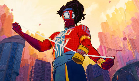
In Which I Ramble About Pavitr's Character Design and the Indian Cultural Stuff Related to It
DISCLAIMER: I'm an Indian, and these are all my thoughts and analyses, but I'm also just one person and by no means am I speaking for everyone. I am not all knowing, and I am not immune to being wrong sometimes. These points are all my own thoughts and stuff that I know through my lived cultural experiences and some history and book knowledge, but I've not particularly researched any of these. I'm just out here giving my take from what I know. This is mostly just going to be me rambling, okay? Okay. Let's go!
Anyway okay so I just wanna go from the top down:
No. 1:
First of all his hair
His fucking hair
This is one aspect that i k n o w I'm overthinking and probably wasn't as significantly thought out in the design but it just Spoke to me and by all accounts I'm not the only one
But I'm so glad we have him with his thick gorgeous fricking hair, especially them being like curly/wavy and slightly long instead of straight and cropped or whatever
Like. Indians usually have very thick and luscious hair, not everyone ofc but generally it's a thing, and it's considered a point of pride to have long dark thick hair.
And the thing is for the longest time the beauty standard in India was to have very straight and shiny hair, all the actresses and heroes were doing it, even though that's literally not the realistic case for a lot lot LOT of Indians. There's a pretty big variety of hair texture in India; some of it is regionally concentrated too, eg. in South India you get a lot of frizzy, tightly coiled hair that's rough textured, whereas curly hair is usually silkier and looser curled as you go Northwards,, Bengalis tend to have very wavy thick hair,, etc. By no means a rule or anything, it's just a thing that there's a lot of curl variety and a lot of it was for the longest time considered ugly and unkempt (there are some classist/regionalist elements to this stereotype also unsurprisingly) still is by some people,,, bc the standard was Shiny Straight Hair. It's a standard that's slowly shifting. It's currently leaning more on the wavy and voluminous side. But it's def a thing still.
All that to say, it makes me so so happy to see Pav with his curly-ish lush hair that he wears with such pride and style,, that are a symbol of his own pride and self care too!!!
Also the line about "coconut oil, prayers and good genetics" - I LOVE THAT REFERENCE AHAHABSSK, using coconut oil for the hair is a very common thing here, it's so so good for the hair and the scalp alike and it's relaxing to massage it in too.
I've seen people try to write Pavitr in fics as "quickly brushing some coconut oil through his hair" as part of his morning routine and. Um. That's not how it's done askaskjas, I don't mean to be rude to the writers at all, everyone does the best with what they know and no one knows everything, but also practically speaking that would be greasy and awful.
There are multiple ways to apply coconut oil, ofc. Coconut oil is often massaged into the scalp and rubbed into the hair like an hour before washing, sometimes with lemon juice mixed in, and then washed off when bathing. Some people, especially those with drier and finer hair, apply it as a regular after-hair-wash thing, too, but even so it needs to be rubbed in.
A really beloved thing we have is coconut oil champis, too! This is basically when you sit down cross legged in front of youe mother/grandmother, and she massages the coconut oil into your scalp and hair in a way that literally cures all tension and headaches and leaves your head reeling and is so so good for hair and stress and everything. It's a family bonding thing more than just a hair routine. It's not always done by the mom/grandmother ofc, it's just how most of us first experience it, and they have a technique that none of us can ever quite replicate to the same effect later. As we grow up, we often do it for ourselves and for others. It's a weekly or monthly or even just occasional thing depending on who you ask. But yeah that reference was great I love it dearly!
Also about the hair length
So in the current modern "civilized" standard (Indian schools and society in general tend to do a lot of shit trying to assimilate us into western culture and stamp out our own,, for example all my life I've been in schools where speaking Hindi and Telugu and stuff in class or in the hallways was Wrong and Forbidden and We Must Speak Only In English Bc We Are Educated And Cultured. This is so fucking hypocritical bc they would also have Hindi and Telugu classes and then criticize us for not getting it right or whatever), boys are meant to have short hair. Teachers literally single boys out in class for leaving their hair longer, not the exact length they set as the limit. This was my entire school experience; thankfully it doesn't seem to be the case in college, but that may just be bc I'm in an artsy college. In the workplace it's less stringent but it's still a thing.
HOWEVER, historically and culturally, long hair was considered good and even Important for both men and women. There's huge regional variations in this ofc; Maratha peshwas and higher classes and stuff for example wore a "pilaka" (idk what else it's called), which is the head shaven clean except a tuft in the middle that's sometimes braided. Brahmins still do it too.
But my point being, long hair was considered good for the most part, at most it would be worn in a bun for fighting and working,,, braids are a pretty big deal too. Having to cut your hair short=a symbol of dishonour and/or exile, or reserved for menial workers and so called "low classes".
(This is not stuff you even get explicitly told btw. This is stuff I've mostly inferred and studied from history and mythology and stuff , so there's no guarantee I'm 100% right)
Also, in Sikkhism (I'm not Sikh myself so correct me if I'm wrong, this is just what I know) having long hair is super fucking important for men. The hair is wrapped up in the turban, and the turban is a symbol of honour and pride and literally considered life. The long hair is considered sacred.
Removing the turban is basically a symbol of literally losing your honour pride and sense of self,, not just in Sikkhism, just generally at this point. Cutting your hair? Insult on injury.
Pavitr doesn't have particularly long hair ofc
But having grown up with such rigidly enforced things abt boys having very short cropped hair, it makes me so happy to see an Indian character who defies that.
Also!! Quick tangent about braids and their significance,, they're considered very beautiful and another symbol of pride, intricate buns and what not too! Just wanna drop this to give you an idea of what i mean:
In the Hindu myth of the Mahabharata, Draupadi, the wife of the Pandavas (she's a very interesting and important and beloved character, regionally also considered a goddess, she was a princess born of fire married to five princes and the vengeance for her honour literally fuelled the war for righteousness etc etc) vows never to braid her hair again until she has washed it in the blood of Dushasana, a man who forcefully tried to disrobe her in court (it's a whole myth of its own). At the apex of the war, Bheem, her husband, brings her his blood. She washes her hair in it and then for the first time in thirteen years, she braids it.
Braids are not as significant now but it was basically a Pretty Big Deal and I just wanted to talk abt it.
In Hinduism too the gods are portrayed with long hair, it's a Thing.
No. 2:
Okay so moving more downwards,, I have a bunch of Thoughts abt Pavs mask design!

Okay so obv we have the spiderweb-pattern that's a given.
But. The interesting parts are these:
The bindi-like design on his forehead.
Bc my point is
Sure that looks like a bindi. And that's beautiful in itself but I HAVE ANOTHER TAKE
Bindis are traditionally worn by women as a symbol of beauty, prosperity, and again, pride. But while nice, that's not quite a symbolism that fits imo
You know what else is ver similar where my mind immediately goes? A tilak.
The shape is kind of off for a tilak actually, a tilak is more of a U or a V with a dot or a flame-like stroke in the middle. So in that case it looks more like a bindi
But i really like thinking that it's inspired by a tilak too, bc
While a bindi is a decorative mark stuck or painted on a woman's forehead as a symbol of beauty and prosperity
A tilak is basically a mark that's finger-painted on the forehead of , usually a man but there's a softer smaller version for women too and ofc there are women warriors who got tilaks, for auspicious and blessing reasons. So in a Puja or ceremony, a tilak is put as a blessing and an auspicious thing, also meant to impart strength. The head of the household usually gets the most striking or biggest one.
Pandits usually wear tilaks for blessing purposes too, although their design is different and more elaborate than the ones given to others
Gods and goddesses had their own tilaks, some of them very distinctive like Shiva's
The part that applies to Pav is the warrior tilak
Basically before a king or warrior went to battle, it was customary to do a small sending off ritual and for the wife or mother to put the tilak for them and say "Vijay bhava" (may you be victorious)
It's still done for big undertakings and challenges like exams and new jobs and stuff.
It's basically for strength, bravery and victory
The main difference in a bindi and tilak is the intent:
Bindi is for beauty
Tilak is for valour
Which. For a HERO. Just. Chef's kiss.
2. the markings around his eyes!!
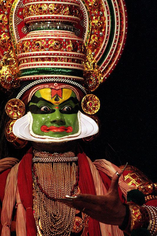
I'm sure this has been said before, but it's very very reminiscent of kathakali makeup.
Regionally there's a lot of eye makeup stuff also btw. There are some absolutely beautiful tribal designs and regional designs with a lot of colours but I cant remember specifics rn
Also!! The very distinctive black lines around Pav's eyes?? I love them sm bc they feel so so based in kohl and kajal. Another huge beauty and often pride related thing.
There's even a whole thing where a mother or older sister will often rub a bit of her kohl off on her fingertip and press it behind their loved one's ear so that "buri nazar na lage" (no one's bad gaze catches you). It's called a kaala teeka
The idea being that you're so beautiful and/or cute and bright and lovable and nothing should jinx that and nothing bad should happen to you. It's very rare now and I've never experienced it myself but it's so so precious <33
3. the white markings on his cheeks!
I've seen that explanation of how it's reminiscent of Ganesha, the elephant headed god who is kind of a symbol of new beginnings, intelligence, prosperity, and a ton of stuff I don't even know how to explain honestly, but he's very cool and beloved and has a lot of Good Vibes™ and i love him basically.
I personally am reminded more of kathakali makeup again!! But that explanation is very cool too and i like it!! I don't know if I agree bc i think it m i g h t be a blasphemy to have that imagery on your face, afaik no one here does it for any reasons and we have literal festivals and pujas dedicated to Ganesha
But then again I am a human with limited knowledge and i don't know everything
I personally think the tusk like designs are very cool. However, I also think it would be a bit of a No No for religious reasons. I also think it reminds me more of classical dance face makeup and stuff.
I also think if they meant to make it a Ganesha reference, then he should only have a tusk on one side, bc there's a huge deal about Ganesha being "ekdanta" (transl: one toothed) bc he has a well known myth of breaking off one of his tusks to write a mythologically and culturally significant epic.
There are also a lot of actual cultural face painting things in India that are way cooler than the Ganesha thing in my opinion. So while that theory is cool, I don't personally agree with it. I could be wrong, again, idk what the design intent was exactly.
No. 3:
Next thing: this is a very very small thing and i only have a sentence on it, but i really appreciate Pav's neckline in his suit.
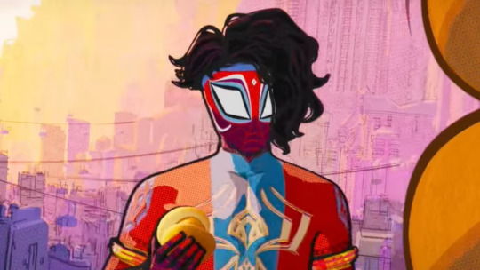
The neckline here? That's the kind of cut that's most typical of kurtas. Especially more ceremonial, kingly, wedding sherwani, or generally festive attire; a regular kurti might have a v-neck or something, but this curved collar? Very Indian and classy in a way I can't fully explain.
No. 4:
This next thing I'm going to go completely ballistic about, everyone hold on to your seats!!!
THE FUCKING MOTIF ON HIS UPPER ARMS. IT'S EVEN ON THE MEHENDI-ISH PATTERN ON HIS WRISTS AND HANDS. THE SPIDER SHAPE TOO. I AM NOT NORMAL OKAY
LISTEN.
LISTEN TO ME
TBIS IS CONFIRMATION THAT KRISHNA PAVITR IS CANON
HE IS SO SO KRISHNA CODED
Idc if I'm delusional, i DARE you to look at that blue design and tell me it doesn't look like a peacock feather
THE SHAPE OF HIS FUCKING SPIDER IS OH SO SUBTLY CURVED TO BE PEACOCK FEATHER SHAPED TOO
There is no human way for me to be normal about this i need a minute
Okay for context:
Krishna is a very important and beloved god in Hinduism. I cannot overstate the love I have for him, even being mostly non religious myself.
There is SO MUCH about him he is such a big deal and thanks to him being made a character in popular Indian cartoons and so many animated and live action movies being made about him, he is literally woven in the fabric of our collective consciousness and love for our culture
He's a mischevious and fun and chaotic and lowkey antiestablishment kid deity. He contains the literal universe. He has a deep abiding love for his people and his family and loved ones and the world he serves. He is a dancer, flute player, sweetheart, lover of life. He has a thousand wives, yet one Radha who he never married but is his literal immortalized soulmate. He guides heroes to duty. He is full of wisdom but also silly hijinks. He is so so beloved.
The peacock feather is his symbol! You could see the peacock feather anywhere and it's immediately OH KRISHNA! He wears a peacock feather, famously. In all his iterations, from childhood to adulthood. Peacock feather is his emblem.
Krishna is depicted through the peacock feather. It's become a very common motif in arts like mehendi and various textile arts to have peacock feather and peacock patterns; I'm sure that existed before Krishna too in several cultural circles but he is definitely a huge part of it since. There is a chikankari motif that is very recognisable that's reminiscent of peacock feather but I'm mostly unsourced on that, going off my own interpretation
But there's a definite link between peacock feather=Krishna=inextricable part of culture and art.
At least in North India. He's less of a big deal the further south you go. Still very widespread and overall loved tho.
So anyway seeing that peacock feather type motif on Pav?? Mixed with his Spiderman identity??? Is so amazing to me.
Krishna coded Pavitr real ✨
(Also yeah people have already pointed out that Pav's hand designs are based on mehendi so I don't need to go into that askjasjkas)
No. 5:
Also. Huge fan of his arm cuffs. It's just another Indian warrior thing; often in ye olde times and in mythology, the cuff would be a lot simpler, often just a thread with an amulet to grant you protection. But it steadily became fancier, and now it can be decorative or a valour thing or both
Very often just decorative now actually. Often seen in weddings and ceremonies too
No. 6:
Okay about his bangles now:
I absolutely LOVE THEM I love them so much I am so obsessed with them actually!!
So. First of all
I remember there being a confusion in like earlier fics especially on whether they were bracelets or damrus or bangles or what
And i have Thoughts
So first of all
They are not damrus/damarus.
Damarus are a musical instrument made of wood and with two beaded ropes to beat on the small drum-like ends. They're also symbols of lord Shiva who uses a damaru.
They are very different from what Pav wears and i remember my fucking whiplash when earlier fics called his bangles damarus. I think i choked on my maggi.
I don't mean to be rude to the writers ofc, they were doing the best with what they knew. But it's just very jarring to me to hear that
I think an explanation I heard was that Pav's web shooter design was inspired by damarus? Which yeah I get that and I actually wanna talk about it bc I very much see it. But they are very much NOT damarus themselves
So
First of all i personally have never seen nor heard of the kind of bangles Pav wears which appear to have a strip of cloth in the middle? While being gold cuffs on both ends? Which is new and interesting actually and opens up aspects abt his character that i find really interesting
Bc first of all: that implies he made them himself from stuff he already had inspired by things he saw. It seems, at least to me, like he used bangles/kadas he had to make the shooters he uses, which are designed the way they are for easier slinging and his cool tricks with them which would be harder if they were solid gold, and also the shape when he does the cool yoyo-y trick and hits The Spot with it and everything is very damaru shape. Which is also pretty cool if it's meant as a reference to Shiva and his damaru (he's a very fierce god with the damaru) or a reference to the street performers who use it nowadays.
Either way - and also additionally the fact that PAV LITERALLY DOUBLED HIS BANGLES AS WEB SHOOTERS WHICH IS SO CREATIVE AND SMART - and developed his own whole signature skillset with it?? And made his own bangle/shooters as I said before????
My boy is PEAK jugaadu
He is the embodiment of jugaad
Never has anything been so true to the Indian spirit than jugaad
Okay so for context, the jugaad that I keep talking about:
It basically means makeshifting and/or inventing stuff you need from the limited stuff you have. That's a very simple way of explaining it. Just imagine that, but up the silliness level x100.
For example, a guy jugaaded a showerhead by poking holes in a sprite bottle and putting a hose in it and routing it to the tap.
Jugaad can be both very smart, and very funny and silly
And it usually involves combining useless stuff/trash/just stuff you had lying around to make smth that you didn't wanna waste money buying, and often ends up having more functions than the stuff it was meant to replace. This but it's also very crackheaded. Like idk how to explain. It's basically makeshifting, but it's just developed into such an Indian Spirit Thing™ that we have a word for it
So i love that Pavitr's bangles do all of that. He is a true Indian boy to his core!
No. 7:
Okay I have thoughts on his dhoti too!
So.
Blue.
I know why they used blue for his dhoti, what with the spiderman colours, the need to complement his bright red with smth softer, and everything. I get it and i love it so so much. What I'm about to say next is not a complaint against this at all, it's very good design imo
But.
Everytime I look at him in his fucking blue dhoti
I just remember all the times my grandmother has apprehended me and made me go and change for trying to wear blue or black at a Puja
Bc they're apparently unholy colours ;_;
Basically yellow, saffron, red are the appropriate holy colours. Now that i think about it, I've never seen a god or mythological king depicted in a blue dhoti or generally blue clothing either - farthest they go from the three i described is pink or green
I never really thought about it until my Nani pointed it out. I'm still not sure if anyone except her even knew or cared about it.
But that is the memory that bonks me on the head every time i Perceive the blue dhoti
Bro upgraded from funeral colour (white, which is his dhoti in the comics and absolutely infuriates me on a visceral level) to unholy colour askaskjjska it's so funny to me
Purple was still a luxurious colour, but generally warmer and/or lighter colours are The Done Thing. It's an old notion and the cultural connotations are now very diluted by Western influence and also none of us Caring about a lot of it anymore (not necessarily a good or bad thing particularly)
Indigo also has. Loaded connotations.
Because Britain did a Colonialism and a lot of Indians suffered for it. It's a whole history lesson.
I would rather not get into the whole details but basically Indigo (the plant from which the dye was made) was a valuable commodity and Britishers essentially forced farmers to grow only that, ignoring their need to grow food or sustenance or care for the land in general, especially in the Bihar-UP regions. There were eventually a lot of revolts where many people, esp farmers, died.
Basically a double whammy of starvation and death as a direct result of colonialism. It was a major part, historically, that sparked rage for the freedom movement
If you wanna learn more abt it you can search up Champaran farmer revolts!
Also about the drape of Pav's dhoti:
I've seen a couple of memes and reels abt how Pav, in an emergency, suiting up for Spiderman duty, would be taking an hour to drape the dhoti and stuff
And those are hilarious and i love them
But also
That's literally not even a proper dhoti -
So the thing pav wears is basically more of dhoti-pants with a cummerbund.
So okay I need to explain this better hold on
A dhoti is basically a sheet of fabric that is draped around the waist and down. The elaborateness of the cloth can vary vastly from intricately patterned silk and brocade, to plain white cotton with a thin gold border optional
The drape of the dhoti varies even more depending on region, occasion, occupation, and status. You can have everything from the casual simple towel like drape and tuck that some men wear to relax on a daily basis, to an intricate thing with many folds and pleats and tucks and the middle part that hangs (I forget the name for that) that would actually legitimately take hours and is often adorned with jewellery . To a thing that's flexible to move in and also looks very pretty and is genderneutral some dance forms call for.
Basically. The drape varies vastly. And it's all one cloth, maybe a second one for a separate cummerbund sometimes, I'm not that well versed abt dhotis tbh.
But the thing Pav wears?? It doesn't seem to me to be folded the way I've ever seen any dhoti
The way it's folded and shaped is not how those style of dhotis work. There would be a lot more pleats and folds, for one. But it's not shaped the way to match the less-folded dhotis either.
Now, I'm no dhoti expert, but that leads me to believe that's not a full on dhoti. What it's more likely to be is dhoti-pants
Dhoti pants are this fusion thing. It's in the name. I haven't seen it much but I know/think/am pretty sure its a thing, bc most Indian guys now don't know how to drape a dhoti either and it's a good solution. Worn like a pant, looks like a dhoti. Simple. A cummerbund for the middle drape, and you're set!
Also side note: the fold with the distinct two legs and the middle drape that Pav has? Is the most commonly depicted warrior and king drape,, at least in North and Middle India, I'm not as well versed about the South but I think it's the case there too. The gods are depicted in that drape too
I have fewer comments on his leg design, I like that it's reminiscent of mehendi even on his feet bc yeah that's also done on the feet, although rarer now and also a bridal thing
No. 7:
He has gold cuffs on his ankles that I really like!
Okay so here's the interesting thing:
I could be wrong, but
But that kind of thick ankle cuff is not actually an Indian thing?? At least not in the warrior hero context that a lot of his design seems based on. At least not of that shape and width.
What we do have though are very simple metal ankle cuffs put on (I think) one ankle of young kids for protection,, again a tradition I'm not very familiar with, it's more localised
The other thing we have that's more interesting tho:
We have payals and ghungroos!!! Which opens up so many exciting prospects to me because those are both dancer things
Like. The payals are ornamental. They are beauty things as well. All women would wear them, their elaborateness and style depending on status, money, and region ofc
They double as dance and performance things too ofc
But ghungroos are specifically dance things
Very very sacred and honoured to the dancers, too. Quite personal
(These are all little bells on the ghungroos btw!! Hundreds of them. They ring out when the dancers dance)
This is what Pav's ankle cuffs most remind me of. It's not the same thing ofc, and idk if the designers were even thinking of this.
But it would be really cool if he was inspired by ghungroos to have cuffs of similar thickness and placement on his legs. Perhaps even familiar to him hmmm?
This is me theorizing HARD to support my headcanon, but combined with Pav's classical dance-n-martial-arts-y moves, i present to you: Pav learning classical dance when he was younger (a thing that a lot of Indian kids do and only a few seriously continue for their lives) is real.
I rest my case
Like yeah it's known at this point that Pav's moves are based a lot off the martial art of kalaripayattu. Which is SO AMAZING AND I LOVE IT SO MUCH!!! But I also think this would be a cool influence alongside that, bc it really feels visible too.
No. 8:
The fact that Pavitr is barefoot is so so important and dear to me!!!
In Indian culture, you're supposed to take your shoes off as a mark of respect, before entering the ranabhoomi (literal transl: battleground, but not in an actual war with swords and shit ofc)
Being barefoot for pujas and in temples and on sacred ground in general is very important
As is being barefoot when you're walking onto a kabaddi or wrestling ground,, basically any fight that's supposed to be important and/or with honour. It's a respect thing for the opponent and for the earth you fight on.
There are a lot of contexts where being barefoot is important or a given
There's the prayer ground bc it's sacred and holy and you can't be dragging your dirty ass shoes there it's super disrespectful. You gotta enter with clean feet specifically, dirty feet are considered disrespectful too. that's also why there wil often be feet washing areas outside of temples here
Then there's the ranabhoomi that I just said, which is more of respect for your opponent and the earth. Respect to the earth especially is very important in the combat forms and sports I know of at least
Then there's the basic respect and tbh the hygiene thing too, of always taking off your footwear before entering another persons house. That one is more flexible, sometimes you can take it off inside, but the done thing is to take them off outside generally. Especially if you're a guest who's not particularly close. You'd be considered really rude if you didn't take them off at all. But again that still varies by person,, the older generations are way stricter abt it
Then the bride thing,,, it's actually a whole small ritual. The bride and groom will enter the groom's house for the first time,, which is considered the bride's new home bc misogynistic tradition so yeah. But basically it's supposed to be an auspicious beginning to a new home and life. (Btw being barefoot during the wedding ceremony is also generally required)
Usually, at least in North Indian tradition, a small vessel of rice is kept at the threshold that the bride must tip over with her foot when entering. It's for prosperity. Then she steps directly into a plate of a red liquid I forget the word for, but it's basically a sindoor paste type of thing. Her first steps into the house must be taken leaving those red footprints behind. That's for auspicious beginning
So Pavitr being barefoot is so so cool from a cultural and a character building standpoint
He takes his job seriously, he does it with respect and honour!!! He seems so chill and happy go lucky, but he's deliberate and respectful abt it!! And he's super connected to his culture too, bc you could just Not and no one would care, but it's so important that he does!!
So yeah!
That has been my full ramble askjasjkas. If you made it this far, have a cookie! Thank you and I hope this was interesting <33
#pavitr prabhakar#atsv pavitr#spiderverse pavitr#spiderman atsv#across the spiderverse#spider man: across the spider verse#character design#rant#starr rambles#analysis#design analysis#character analysis#culture#indian culture#cultural references#pavitr my beloved#myths and legends#chaipunk#goldenpunk#spiderman india#india love#indian#long post
580 notes
·
View notes
Note
Hi hi!! What’re some of your Timber hcs? It can be just in general, related to your idea of Bernard having been experimented or ect~! Also, feel free to do SFW or NSFW hcs, too, if you wanna! I just love those boys to pieces 🤧💖💖
I'm not sure where to start I have so many headcanons and different story ideas I like to think about for them.
I've posted a lot of them on here previously as like singular post rambles but I'll try and think of some of the top of my head (sorry if a lot these are mainly about Bernard. He lives in my head rent free)
I headcanon that Tim started dating Bern because he knew he had feelings for him and wanted to explore them more, but he hadn't fallen head over heels yet. Because of this, he falls for Bernard very hard overtime, slowly learning more little things about him and loving him more and more as they get closer.
A headcanon I personally like is that Bernard has naturally curly hair. This is one of the many things Tim discovers about Bernard because, after their first time together, he wakes up and Bernard's hair is messy and not nearly as straight as it usually is. He is fascinated by this and likes to brush his fingers through his hair when it's curly. Bernard explains to him that he wanted to look like his Dad in high school so he started straightening his hair and it just kinda became a habit. Tim tells him he loves his hair no matter the style but he does like that he gets to see his hair curly as well.
Another headcanon is that Bernard still has a complicated relationship with pain and its something Tim and Bern's therapist are trying to help him work on. When Bernard spirals or dissociates he often stress cooks and/or hurts himself unintentionally. He'll dig his nails into his arm hard enough to bleed or bite his finger nails down to the skin, stuff like that. He's even nicked himself with a knife while stress cooking before and Tim had to insist he stop and patch it up for him.
And one more! Tim tends to bottle things up when somethings really bothering him, but Bernard can tell somethings up because Tim doesn't talk to him like he usually does - he responds to questions or hums to show he's listening, but it's like Tim's trying to keep up the appearance that everything's fine. This happens a lot after Tim's nightly Robin work and Bernard has gotten into the habit of leaving a late night meal out for Tim. If he can't stay up late that night he'll also leave a note out for Tim that he makes sure will be extra cheesy for him writing stuff like "Good evening, handsome ;)" and then jotting down one of his silly random thoughts whether it's a fun conspiracy idea or him remembering a joke someone told him that day. In general he enjoys giving Tim little notes if he also packs a lunch for him and stuff. In high school when he was more pushy about wanting attention from his peers, he would leave notes in Tim's locker all the time (later realizing this was because he was very much in love with Tim and wanted his attention most out of everyone)
Tim fondly remembers reading Bears notes in high school and having them to read in his life again helps him feel better when his brain is being too loud as it reminds him of simpler times before so he lost so many people in his life
Also a quick one to add onto that is that Tim can often be overprotective when he's with Bernard. He knows Bear can defend himself in a fight but there are days where Tim's PTSD flares up bad and he's so scared he's going to lose Bernard like he lost Steph for a time and Kon and his Dad, etc.
#thanks for the ask anon!#a few of these ive been meaning to write down#bernard dowd#tim drake#anon friend#asks#timber#timbern#tati's post
41 notes
·
View notes
Text
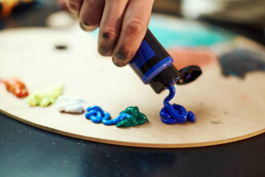
Love at First Paint: A Beginner's Guide to Painting

"Almond Blossom" by Vincent van Gogh (1853 - 1890), Saint-Rémy-de-Provence, February 1890
Have you ever dreamed of being like Picasso or Vincent Van Gogh? If you do, you are looking at the wrong blog because I am far from them. But hey there! I'm Eden Amor, a freshman student and a self-taught artist who just loves to paint.
Art has been my passion since I was a kid, and as I grew older, I fell even more in love with it and started trying out different mediums and styles. But there's just something about painting that really excites me! I started with graphite, then moved on to colored pencils, and even dabbled in charcoal (although I never got around to using those charcoal pencils I ordered online). Finally, I found my true love in watercolors, and I've been obsessed with working with wet mediums ever since!
If you are a beginner in painting (like me, have been a skill of a beginner for years), you can enjoy my blog and get some tips that I learned from my starting journey. But if you are just interested in painting or in art generally, you can still read this blog.
Just a disclaimer: I am no expert and just a self-taught artist. Some things might work for me and not for you, and vice versa, so take this blog with a grain of salt.
LEARN ABOUT PAINTING
Since I am a self-taught artist myself, I never applied for workshops in drawing or painting. But most of my art knowledge is from YouTube tutorials, shorts, and IG reels (I have no TikTok, I don’t know why). I suggest learning about the basics before painting whatever you want because you’ll get disappointed after the result or wondering why everything is not working the way you wanted.
But before anything else, find the medium that you want. Mediums like acrylic, oil, gouache, and watercolor. There might be more but these four are some of the common wet mediums. One thing to address about these mediums is that they all have different properties and the techniques you’ll approach, the materials you’ll use, and the finish or outcome of the painting will depend on the medium.
MEDIUMS
Watercolor
My recommendation for anyone wanting to start painting with no experience is to use watercolors. The only things you need are watercolor paint and water. Unlike acrylic paint, which, although water-based, can get pretty messy and dries quickly, giving you little time to blend and touch up unless you use an acrylic medium called Retarder, which is a medium that you mix with the paint to slow its drying time, but will cost you more. So, as simple as watercolor can be, it's a great starting point for a beginner in painting.
However, watercolor painting can be tricky when it comes to water manipulation. The amount of water your brush holds affects in creating an even layer of paint. The drying time takes hours, especially if you are working in layers, if you paint the still-damp surface too early, you will ruin everything and you cannot cover it up since watercolor is transparent. That is why watercolor painting is done light-to-dark because dark colors cannot be covered by light colors. So planning ahead of time is suggested and should not paint with watercolor impulsively.
Acrylic
If you want to take the next level or just explore other mediums, acrylic painting is great for high coverage and textures. What watercolor doesn’t have but acrylic has is the ability to cover mistakes. In acrylic painting, you can paint on top of a painting, which is great especially if you change your mind or decide to start all over again, as long you coat more than one layer of white paint then you have a blank canvas again.
However acrylic paint, as said earlier, dries quickly which can be a disadvantage if you are a slow painter (like me) and especially if you are making a seamless gradient, which is very difficult to achieve and not as easy as you think. Since acrylic is water-based, cleaning is very easy with just water as long as the paint is still wet. Hardened paints can be peeled off easily but only on smooth surfaces, but if you got it on something like fabric, it will be forever on it.
Gouache

I describe gouache (pronounced as ‘goo-aash’) as a combination of watercolor and acrylic. Because like watercolor, gouache is water-activated paint, which means that dried paints can be revived and used the paint again when wet. And just like acrylic, gouache has high coverage and a thick consistency which is great for texture. But unlike acrylic, which has a glossy finish, the gouache creates a matte finish once the paint is dry and it also dries fast giving you no more time for creating flawless gradients.
I use gouache for mini projects, or creating art trends I saw online, but I don’t recommend it for painting a big major project since it can be smudge once wet, and as of now, I don’t know if there’s an appropriate varnish for gouache so if you have any idea please let me know in the comment section.
Oil
The most expensive of the four mentioned paint mediums is oil paint. However, oil paint creates the most realistic paintings. Despite its high cost, what makes me love oil paint is how smoothly the paintbrush glides, like butter. Blending oil paint is very easy, and you can create flawless gradients between colors. Oil paint has a very slow drying time. For small projects, such as those the size of half a sheet of bond paper, it can take days to weeks to fully dry and be ready for varnish. This slow drying time can be both an advantage and a disadvantage, depending on the complexity of your painting. It allows you to fix mistakes or make adjustments even the next day. Additionally, a small amount of oil paint goes a long way.
Oil painting can be hazardous because it involves flammable oil-based paints, as well as mediums like thinner and linseed oil. While water is used to dilute watercolor, gouache, and acrylic paints, oil paint requires the use of thinner. It's important to avoid washing oil paintbrushes with water, as it can damage the brushes and won't effectively remove the paint. Additionally, it's crucial to store oil paints, thinner, and linseed oil away from sources of heat and fire.
Since I am only new to oil painting, I cannot give much in-depth information about it and if you do please I beg for some advice and tips in oil painting.
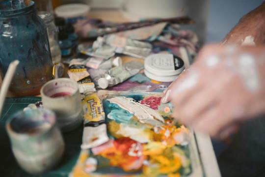
Materials in Painting
Painting can be an expensive hobby given that the materials used (especially the branded ones) are not really as cheap as a pencil and a piece of paper. But aside from being a painter, I am also a cheapskate.
I will never buy an art supply that is as expensive as my kidney, UNLESS if it is worth it or I can make money out of it. I don’t really have all the money to buy all the art supplies I want, I am still dependent on my parents and have no job yet (currently at college, 18, and an irresponsible young adult).
That is why I chose to buy art supplies online instead from the art stores near my place. And I think as a beginner, expensive materials are unnecessary because for me an artist should be able to make a masterpiece with his/her skill and not the tools. But that doesn’t mean the quality of materials will not make a difference. So if you are the same as me, you can use my tips.
Paint
The paints I use are not of great quality, but they are good enough. I honestly thought that some of the paints I bought were much better than the pricier ones.
In watercolor, there are two common types: in the tubes and in the pans. The tubed paints have a consistency of acrylic, unlike the ones in the pans, which are hardened. What I have is the Superior Watercolor in pans set. I bought them online for less than $10, and it is a set of 18 colors with a brush pen and sponge included. The quality is great, it is not chalky, and it doesn’t smudge once dried. I spent my money wisely, and I do not regret buying it even though $10 is already a lot to me.
When it comes to acrylic and oil paint, I suggest buying the primary colors (ultramarine blue, crimson red, cadmium yellow), titanium white, black, and magenta only. I highly suggest buying a large amount of white because you’ll need it most of the time. Buying a set is very costly, but with these 6 colors, you can create any color, save money, and at the same time improve color-matching skills, which is an essential skill as a painter. If you wonder why I added magenta, it is because the combination of red and white is not bright enough to be pink or it is just different from the color magenta, and I think having magenta in the collection is a good addition. I used the Mont Marte brand in acrylic and Marie’s for oil paint.
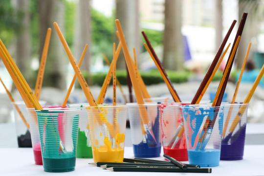
Paintbrush
There are different shapes of brushes: flat, round, filbert, and detail are the commonly used shapes, and it depends on the medium you are using. For watercolor, a round brush is recommended, and a flat brush is recommended for thick paints like acrylic and oil paint. A filbert brush is also a flat brush, but the trim is round, and it is good for painting clouds. A detailed brush is used for small details like painting dots and thin lines or for small paintings. There are more shapes of brushes out there, but having a variety of brushes can be overwhelming. Get only the brushes you need and have them in sizes small, medium, and large. The size of the brush will depend on how small or big your painting is. Using the appropriate shape and size of the brush will lessen your expenses and you’ll learn to depend more on your skills than the tools.
There are cheap but not too cheap brushes available online. They are not branded, but the quality is good enough (like the ones I use), and the bristles don’t come off easily.
Paper
We can paint on anything, but nothing beats paper. However, the paper used in painting is not just an ordinary paper. The thickness of the paper used in painting, particularly watercolor paper, is important so that the paint would not easily destroy it.
Watercolor paper is usually combined with cotton, making it more durable than regular paper or cardstock. The percentage of cotton in the paper varies as the price varies. It is recommended to use 200 gsm paper, which is what I have because it is affordable and good enough to hold a few layers of paint.
However, I highly recommend using 300 gsm paper because the 200 gsm papers I use still curl up or bend and get wavy, which is a hassle when painting. The higher quality, 300gsm paper or paper containing 100% cotton is easier to work with, as I have observed online, even without taping the paper down, it doesn’t curl up. But of course, high-quality paper costs more, so 200 gsm paper is good enough.
If you are wondering why I called the paper used in painting "watercolor paper," it's because you can also use watercolor paper for acrylic, gouache, and oil painting.
There are two types of watercolor paper:
Cold Press - Cold-pressed watercolor paper has a rough texture, which is great for watercolor painting because it gives more depth to the flat painting (water is water, they can't have shapes and textures like acrylic).
Hot Press - The hot-pressed one is recommended for thick paints because it has a fine, smooth surface, which is great for blending smoothly.
Aside from paper, you can also use canvas paper, stretched canvas, or a canvas panel for thick paints. However, since you are only starting in painting, paper is recommended for practice and is much cheaper than the canvas mentioned above.
OTHERS
Masking Tape
Why masking tape? It is used for tapping down the edges of the watercolor paper so it stays put and flat on the surface which makes painting much easier, and also it creates a clean border. You may see other artists use washi tape because they are less sticky and won't damage the paper once it is peeled off, but I think using washi tape costs more, instead, stick first the ordinary masking tape onto your clothes until it becomes less sticky, and then you are good to go.
Mixing Palette
Usually in watercolor paint sets, the lid of the container serves as the palette. However, when using thick paints like acrylic or oil, a better alternative to a traditional paint palette is a picture frame. Mixing paint on a glass surface is convenient for two reasons: (a) it is smooth and does not absorb the paint, and (b) it is easy to clean. Dried acrylic or oil paint can be easily peeled off the glass or scraped with a blade or glass scraper, leaving a fresh and clean surface for mixing. Additionally, the wood or plastic frame around the glass provides protection against breakage and sharp edges.
Towel/Tissue
A used towel or tissue is not only used for cleaning; it is also mainly used for soaking up the excess water on a brush or for wiping off the excess paint. It is very handy, so you should always have it by your side while painting.
Jar
A brush washer is a must-have for painting. This is where you wash off the paint with water from the brush. You can use an old cup or jar as a brush washer instead of buying the fancy ones which is unnecessary. I prefer using a jar because it is heavier than a regular plastic cup, which prevents it from tumbling or spilling.
Here's a tip I learned from YouTube: use two brush washers. When you wash your brush once in a single container, the water gets muddy. This can make your fresh paint muddy when you switch colors. To prevent this, wash your brush twice: once in the first container and then again in the second container. This ensures that the water picked up by your brush is clean and not muddy.
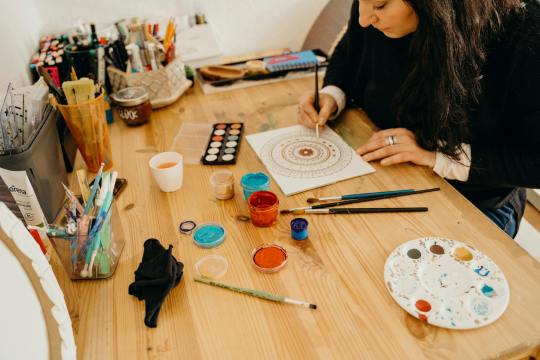
ART STYLE
Early in my painting journey, I started practicing by painting scenic landscapes because they seemed easy to me. Of course, I overestimated myself. So I continued practicing more. Painting nature has grown on me, and I realized that my genre is landscape painting. The good thing about it is there is less structure unlike a portrait of a person, and shapes are organic so I will have no problem with imperfections.
However, I still don’t have the ability to create my own work. I still have to watch tutorials online to have a guide. Most of my artworks were tutored by the artists I follow. Once I start painting with just a reference from Pinterest, I tend to get lost and suddenly don’t know what to do. I end up not continuing the work, which is a waste of time, energy, and material.
Lately, I returned to working with watercolor, but instead of nature, I used a reference photo of a person as a subject. Sketching the face first is my least favorite part, because if I mess up sketching the face, the whole painting is also a mess. Most of my subjects are K-pop idols, especially BTS, because I am also an ARMY! Working with faces is difficult but once you succeed, it is all worth it.
Social media has highly influenced my art style. The fact that I get envious whenever I see new art trends gives me a push and inspires me to continue doing my art and explore more.
Check Out These Artists I Follow
Correa Art
Youtube: https://www.youtube.com/@CorreaArt
Instagram: instagram.com/correaart_
Jess Chung
Youtube: https://www.youtube.com/@JessChungArt
Instagram: instagram.com/jesschungart
Emily Mackey Art
Youtube: https://www.youtube.com/@EmilyMackeyArt
Instagram: instagram.com/emilymackeyar
Genelyn Sandaga
Youtube: https://www.youtube.com/@GenelynSandaga
Instagram: instagram.com/genelyn_sandaga
Socials
If you want to know more about my art, you can visit and support my two Instagram accounts:
@ChiliCheeseLover
@paintwith_amore
💜💜💜
If you have feedback to share, please do! I am eager to hear your thoughts. If not, kindly give this blog a heart; it is greatly appreciated!
💜💜💜
49 notes
·
View notes
Note
do u have any writing tips dar??? Ur stories are immaculate
nonnie?? that's so sweet of you to say, thank you😭🩷 in general, a lot comes to mind bc there's so many different components to writing (i.e dialogue, characterisation, structure,, even mindset!!) so if you want to hear abt anything specific pls lmk🥺 for now tho, i've summarised a few across the subject that i think are helpful, and they will be below the cut bc i'm shit at explaining things, so i ended up writing a lot hhh
i also wanna point out that these are just things that i've personally made note of over the years from my own experiences + being friends w/ other writers, but that doesn't mean they will apply to everyone!! more than anything, i always believe that you shouldn't let other ppl dictate how you do and enjoy things, so if smth works for you and you like it, there's nothing wrong w/ that even if it contradicts an opinion you got from some rando on the internet (a.k.a. me😔💔)
Know your game
I'd like to say that in writing, there's a vein of liberty that isn't echoed in very many other creative fields; a lot of the times you can go in blind, and still make something of it because the nature of fiction is liquid — if you can imagine it, it can work. So to say, I find that nine times out of ten, room for improvement doesn't necessarily lie in the content of someone's writing, and more so its execution.
You could play a desultory game of chess without knowing all the rules, but if you wanted it to be your best match, you'd have to be aware of every move you could make, no? What you do from there then becomes a matter of choice, and choice is a landmark divider between doing something and being good at doing something. There's a difference in omissions due to lacking the technical knowledge, and omissions made because you are aware they are optimal.
Knowledge on the fundamentals of literature will always serve you, and that isn't to say you have to study all forms and contexts, but if you want to write a story, for example, it will always help to know the common elements of one. Grammar, punctuation, structure — brushing up on those things will build your toolkit, and once you've got that, you have the self-autonomy to decide what to use from it. My three favourite writers only use commas and full stops, and their works are, on all levels, spectacular. Still, if you asked them how to use a semi-colon, they'd be able to tell you.
Appreciating the basics will also tie into your creative exploration as a writer, which is a cornerstone in developing your distinctive writing style. I doubt a person in any type of craft hasn't heard a variation of know the rules before you break them, so studying until you do, inside out, remains beneficial to both new and old writers alike.
2. Have a starting point
This tip is fairly applicable to a range of different types of writing, and how one would practice it depends strongly on individual preference and styles of working. Some people like to plan things out thoroughly whilst others, including myself, like to dive in headfirst, and there's nothing wrong with either approach. The commonality between both types of writer is that regardless, they will have at least a vague idea of where to start from — a scene that they've bullet-pointed prior, a lyric that resonated with them, a mental image, an emotion or even just a single word that everything branches from. What all these details achieve is writing that has motion, because you have something of substance to piggyback you to an end point (the establishment of which is also important, but I will not be covering in this post).
3. Decide a structure
Again, this can be done both comprehensively or as simply as just having the thought to adhere to a certain method. As you gain more experience as a writer, you'll begin to understand what works best for you and create a system of your own, but starting out, there are a number of templates that have already been established by writers that you can follow, and find by researching. What matters most is that by using one — whichever it may be — you're turning your text into a story.
As an example, I'll detail two that I use regularly, in their simplest forms for the sake of brevity:
A linear narrative moves from point A to point B, and from point B to point C, etc. and all subsequent points build on the previous ones until your goal is reached. It's a system that works well for shorter pieces because it has a definite structure, like a length of spine and its individual vertebrae (and although we're talking about writing here, I think Newton's Third Law of Motion sums it up very well: every action has a reaction.)
A coalescing narrative considers all points as separate elements that may or may not always interact, but all contribute to the end point to different extremes. It's a useful template for creating depth in a piece, but due to its complexity, is better applied to longer projects.
They are visualised respectively below.


4. Iterate
If you think of your first draft as a block of clay, everything you do to it will equate to it being moulded and shaped, and if you think of your first draft as a skeleton, everything you do to it will equate to flesh being put on the bones. If you want your piece to be the best it can be, there's a sort of detachment you must have from it, where you won't have the fear of changing it until it is in the image of what you have intended. Write and rewrite, add things, take them away, make a separate copy for every edit if that makes it easier for you, but keep working it until you are happy.
Iteration doesn't just apply to drafts — chapters, paragraphs, sentences and even singular words can be given the same treatment. When you pick up the habit, the process becomes second-nature and you'll find that the first lines you put down are the ones that make it into the final piece, and that is in light of sorting through the renditions unconsciously. Additionally, you don't have to do things in one sitting; sometimes taking a break and coming back to your writing with a fresh outlook is valuable.
5. Analyse and apply
One piece of advice I always see given when someone asks how to improve their writing is to read more, and though it is — at its core — a tip worth acknowledging, it always comes across as unserviceable to me. There is nothing that reading will change for you if you are not actively practicing the things you learn, or even actively learning to begin with. So to address it as a matter of semantics, I feel it's best put as studying the writing of others, as opposed to reading.
If you have a favourite author, go over their works twice — once as a reader to identify what you like about them, and then again as a writer to identify why you like those things. To put it into context, if I read something and decided that I enjoyed how clear and easy to understand it was, I'd do a second pass to figure out the attributing qualities. Perhaps it's the use of punctuation, chosen sentence forms or even the simplicity of words used. My first tip of knowing different literary fundamentals is complementary here, because it makes the analysis and application of isolated features that much more smooth, and also means you'd be able to adapt them into your own style instead of just copying the other writer, which is what you want to avoid.
(Some writers I personally recommend studying are @ozzgin, @monstersholygrail, @aayakashii and @urprettylildoe for readability and clarity in execution, @moyazaika, @carnivorousyandeere and @purerae for characterisation and dialogue, @suiana and @unhappy-last-resort for engaging plots and concepts, and @sabotsen and @lirational for word choice.)
#lovenotesfromdar#one more informal piece of advice bc i focused a lot on the technicalities here but it's also super important to be kind to yourself!!#just the other day i was editing the doc w/ sun's story in it so my friend could beta read and i spent a lot of time#beating myself up about the quality of writing not being consistent across some of the chapters and i got over myself eventually but i thin#k it's so easy for writers to fall into the mindset that they are the sum of all their works and if you fall short on one or it isn't up to#par with your standard you can get angry and frustrated w/ yourself and stuff#but truth be told; you're not always going to be at your best bc things happen#you're gonna have bad days and days where you're super tired or things have been shitty#days where you're stressed out or feeling emotional#and days where you wanna quit#and you'll write on those days and the outputs aren't going to be mirrors of your works on your best days bc at the end of the day we are#only human and things impact us and though you might be the same person holding the pen each time what you're able to create will obviously#change w/ the amount of boulders on your back as a figure of speech#so also be patient w/ yourself is my last tip#okay that's it i will legally change my name to waffletron3000 now this was not meant to get this long lmao i have two assignments due#also sorry to everyone i tagged at the end😭
31 notes
·
View notes
Note
As far as I remember, or like years ago, you’ve used sai right? Sai or sai2(man the brush engines better and Binary brushes feel smoother..) but I also saw you used procreate at some point for that one Jessie draw- which digital programs have you used that you enjoy the most for different things, or which kind of traditional medium for example also, is interesting and/or satisfying? Have been doing lots of ref and tutorial searching and looking at art inspiration for the direction I wanna take my stuff and I was curious about your preferred setup; I just like to hear people’s workflow and what they use to create what they do. I think it’s neat. Also if this is too long sorry 😅
I use sai 2. I switched to sai once oekaki became more and more inoperable. The binary style aspect ended up sticking. Oekaki has limited layer capabilities and this rewarded a simpler pixel style that was more easily edited. I still miss the ease of using pixelated screen tones in oekaki. There are other programs that can make them, but not how oekaki did. But I prefer sai 2 most now.
I use clip studio for larger scale images like print pages for its more versatile and expensive selection of brushes. It has unique settings that still allow me to turn these brushes into pixelated work without anti-aliasing artifacts. There is a setting for level of anti-aliasing, but this is often not enough for more complex brushes using spraying patterns. Using the "replace alpha" blending mode forces many brushes into a binary color mode because drawn on top of a solid color the brush's color can only be 100% opaque. The binary layer color mode also allows you to do this. Both of the latter options often only let you do this with black and white. I usually do this to be able to transfer it back to sai 2 where it's more comfortable to work in. I also use it for its ability to produce text in multiple sizes without anti-aliasing. Sai 2's text tool is fairly primitive.
I use Aseprite for animating. It is mostly for pixel art. It reminds me of an animation program I used to use a long time ago called easytoon due to its simplicity though...
For traditional I prefer paint pens (I mostly use poscas). Gel pens are okay but very small and cheaply made. I really wish someone would make paint pen versions of gel pens. I also had a big black and white plain ink and hatching phase a long time ago. Generally I gravitate towards opaque materials that make the process feel straightforward. The ability to "erase" or white out mistakes for correction is one of the most important qualities in a medium to me.
Less opaque, more time-consuming layered media yield more textured and nuanced results, but I hate few things as much as ruining a piece of art irrecoverably over a relatively small mistake be that accidentally pilling the paper or drawing a line wrong or splashing watercolor the wrong way. Mixed media was fun, but I just prefer having more purpose to what I'm doing. When I'm too preoccupied with the aesthetics I waste a ton of time on useless tweaking or experimenting that never goes anywhere.
26 notes
·
View notes
Text

✦ AA girls getting boba tea ✦
A few days ago I felt like drawing Ema, Kay, Maya and Franziska hanging out and drinking boba tea, cuz I really like the idea of these four having a friendship group :-D however, I unfortunately couldn't fit all four characters in so I (mostly) cut Franziska from the pic. Sorry Fran fans! I do love her but, I wanted to draw the other three girls a bit more (cuz that's just the mood I was in) and didn't want to stray away from this specific concept as I felt really inspired to draw them walking while chatting with boba tea.
Overall I do like how this picture came out, even if I definitely rushed it a bit (I think this was mostly because I got hyped over getting time to draw again, cuz I've been busy on and off). Unfortunately I lost my favourite brush liner before doing lineart on this and halfway threw my other liner magically dried up! So that was frustrating but, I worked around it and want to regain confidence in using fine liners so kind of a useful problem lol. I also decided to change up how I draw Kay in my art style a little and I think I like it :3 And, really like the outfits I gave the girls. Even if they are simple. They're also summer outfits because Australia is once again breaking the record for hottest summer (and it's still technically spring (´-﹏-`;)). Fun fact, Ema is wearing a striped shirt as a reference to the stripe motifs in her aai design!
Now time for boba tea hc's cuz why not XD. Maya has a Taro milk tea with the regular black pearls, because it's purple and in my mind Taro and chocolate being her favourite flavours just makes sense. Kay has a iced tea with lychee jelly (mainly cuz I didn't feel like colouring the jelly but I see Kay liking lychee), idk what flavour her tea is, but it's probably a fruit flavour cuz in my experience ice teas are often fruit flavours. I also have the random hc that whenever Kay gets boba around Miles she gets a weird combo (e.g. chocolate milk tea with green apple pearls) just to see his upset reaction lol.
Ema and Franziska also have boba, you just can see it cuz Ema has them in a shopping bag which Kay is in front of. As for flavours, Ema's is definitely chocolate milk tea cuz her snacks in the English version of the games seem to be similar to tee vee snacks (idk if tee vee snacks are a thing in us, if they aren't they are small long cookies cotted in chocolate, kinda like pocky but much shorter, but thicker and fully coated) though I can also see her getting brown sugar with black pearls. Franziska I could see getting something like the regular tea flavour (which is called "Thai tea" or "original flavour" depending on the boba shop I go to) with no pearls or jelly because in my mind she doesn't like them :P, in general I don't think she'd like a lot of sweet flavours but that's because I hc her as not liking sweet food for no logical reason, my brain has simply decided this ¯\_(ツ)_/¯
Hope you all enjoy this drawing and my super austic ramble about what boba tea I think these fictional characters drink XD
Next traditional drawing will be in a new sketcbook as I'm almost finished this one (and the last pages won't be as fanart so I won't post them here). I'm shocked cuz I haven't finished a sketchbook in less than a year for several years now! But this makes sense because I drew a lot this year for several reasons :-P
#ace attorney#ace attorney art#ace attorney fanart#traditional art#aa#my art#ema skye#kay faraday#maya fey#franziska von karma#artists on tumblr
45 notes
·
View notes
Text
Mint Plays Games - Liminal Horror and On The Hill.
It's time for a new year and some new games, and my first game of the year was Liminal Horror, by Goblin Archives!

I do not consider myself an OSR aficionado, but I'm aiming to try and remedy that a little this year, and Liminal Horror has been haunting since I discovered it's existence.
Since the last time I tried to run an OSR game, I've learned that it's often a good idea to get a sense of how these games are meant to be played through using an adventure, so I went on the hunt for a compelling adventure to play through for this one. I settled on the adventure On the Hill, by M. Allen Hall, mostly because it was free, printed nicely, and I saw some good reviews for it!

The Adventure
On the Hill is a remix of the adventure module Horror on the Hill, writing for Basic Dungeons & Dragons. It's a voidcrawl, an iteration on a pointcrawl. There is a map with locations attached to an encounter die to mark each turn of play with a hint of tension and various omens or clues to keep the game interesting. Many Liminal Horror modules are voidcrawls, and On the Hill is easy to read and navigate, with three different maps - one for the GM, and two for the players to discover as they play.
The basic premise is that you are journeying through a state park, looking for a lost hiker while strange creatures of the hill haunt your steps. There's lore woven in throughout the module, and at the beginning is enough information to let the GM know what to expect from the intial NPCs, as well as a reason for why the Hill is as it is. The PC's will uncover clues in a random order, depending on what the GM rolls on the Clues table, as well as what path they decide to travel. I tried to introduce as much as I could, but overall our group paid little attention to it - and we still managed to cobble together a story in our short amount of time.
The Mechanics
The checks for Liminal Horror are very simple: you only roll when you're in danger, and you're rolling a d20 with the hopes of getting a value under your related stat. There are only 3 stats, and they double as your Health over the course of your adventure. You can take physical damage and wounds, which decrease your inventory, and you can also take metaphysical damage, which can inflict you with Fallout.
Fallout is a kind of strange consequence that changes your character, giving them some kind of benefit but also alienating them further and further from normal society. At the end of the game, death might be kinder than what the weird has in store for these characters. The module comes with a d6 table of custom Fallouts, such as a crown of bone that slowly emerges from your skull. Our table had a slight brush with Fallout - since we were just running a one-shot, I introduced a Fallout as soon as a character rolled for one. We still only ended up with two Fallout-related consequences the whole game, although the players who did find themselves changed fully embraced those changes. One of them received eyes as black as night, while the other found himself taking on cracked bark-like skin.
As a horror game, Liminal Horror pulls no punches. My GM-ing style is usually very forgiving, as I personally find it hard to punish my players, but I warned the party that this time, there was no more Mrs. Nice-Rabbit - and while nobody died, one player got pretty close. Another one lost his eyes, and I consider that a personal win, when it comes to ruthlessness. A few times I re-rolled a dice, but that was mostly because I kept rolling the same result, and I wanted to keep things fresh, rather than experience like, 6 cave-ins in a row.
The Drawbacks
One thing that I'm still unsure about when it comes to the OSR is the... lack of rules about certain things. I know that in general, it's expected that the party should allow the GM to make a ruling rather than stick rigidly to a detailed set of rules. That being said, the combat rules reference a stress die, and I'm still not entirely sure whether that's a d20 or a different die, and the wording makes it seem as if the topic is covered earlier in the rule-book - and as far as I can read, it's not. This lead to an awkward pause in play, while I tried to figure out how exactly Stress is supposed to work.
The Final Thoughts
Liminal Horror is compact, with simple character creation that allows you to come back quickly even if you die. Most of the time I found myself relying more on the module than on the game document, simply because of the amount of stuff in the module. Quinn of Quinn's Quest talks about how modules are where it's at in his Mothership review, and this approach certainly made me appreciate how much of a burden modules take off of the GM's shoulders. At the end of 2024, I felt a little run down from constant reading and GM-ing, and this game was a gentle return that made planning much much easier! I also don't think I'd have achieved the same amount of complexity if I had written my own adventure.
I also personally appreciate the Fallout system. It gives you a chance to impose non-physical consequences on your characters without turning the scary parts of the game into a sanity-eroding circus, which is often one of the weakest parts of traditional horror games.
Also, despite the style of play being drastically different from what we usually do, my players enjoyed it. I let them know ahead of time this was a horror game, and horror was what they signed up for. There's also a lot of really neat adventures out there! I'd recommend checking out The Twisted Classics Jam, the Tales From the Void Jam, and the Horror of America's Jam, which is actually going on from October to April!
If you as a group want to dive into some really freaky, horrific scenarios that treat the characters (and players) with respect, even as they're putting them through the meat grinder, then you should check out Liminal Horror.
22 notes
·
View notes
Note
HI GEIER A FUN QUESTION FOR U but do you have any particular artists and/or pieces of media (like movies shows videogames etc) that inspire your own art style/you want to take inspiration from?? Ive asked a couple peeps and I'm curious abt you!!!
OMG MY TURN?? THANK U HHH Im still baffled sometimes by you knowing i exist dhdhdh but im honored.
Sooo Inspiration huh. Very interesting topic for me because i am. Very much shaped by the art and media I like / consume. And yet i dont feel like much of it shows up in my own art style really. I am not sure why, probably because i never fully. Studied art tbh. Went to art school in free time ever since i was a 1st grader but i still feel like i skipped some major steps in actual art teachings. Color theory is my enemy.
But as direct inspirations I would say I have wayy to many to count.
Signalis (unsuprisingly) has been a literal life changing experience and I am putting down here because i cannot fully express how much it fuels me and my artistic aspirations ever since i played it. I truly wish to make a story on signalises level that can impact others.
As a second biggest inspo , i have to go with my long term soft spot that i have for the Dishonored series , specificly the art of Dishonored 2 will never leave my soul. There were multiple incredible artists working on the design team but the general feel and dedication they put into this world is smth i wish to do similiarly. Arkanes general philosophy aligns with mine.
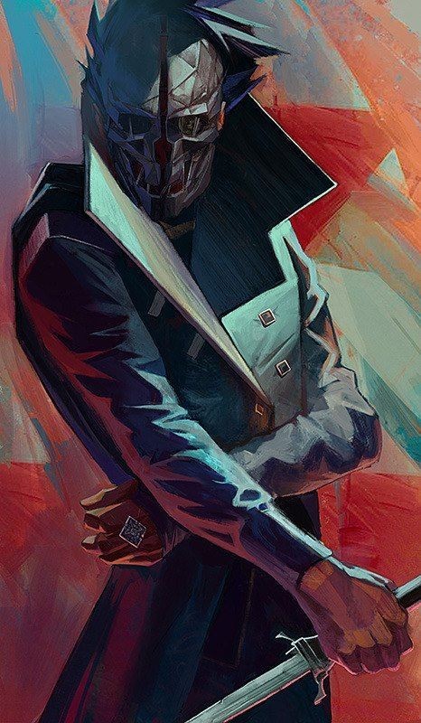
For final big game i suppose ill put Ultrakill. I dont know what it is specificly about it that makes me so. At awe of it but it scratches my brain in similair way signalis did with its low poly style and striking colors and solid designs.
For artists god uh theres to many fjfhshdhg my own art changes style everydamn week i feel like but at least for people that impact me lately . @mrzuddie(sorry for the tag)s style has personaly spoken to me on a lot of levels , dont know why specificly but it scratches my brain so well . I always admired the more. Chaotic artstyles ? Sketchy , or rough looking pieces speak to me more than smth hyper realistic or shaded. Thats why i like pixelated stuff too. Remarins speedpaints on youtube were big part of my teen years i would say and they shaped me into being a digital artist mainly. Shiwasu Hoshikawa's Bungo Stray Dogs art also falls under the scratchy wild art category i love and wish i could replicate more .
I cant really think of any movie funikly enough that shaped me artisticly much. I like Top Gun Maverick but thats cause im a pilot and have a history with it fjfhfj. 9 film from 2009 was striking though that might have been subconciously affecting me. Also as most i think Into the spideverse and any recent well animated movie can fall in this category.
Idunno i just. Like to draw. I need to create stuff. And everything around me influences the way i draw. Including you btw your art is incredible and It is honestly fascinating studying the texture of your brushes and strokes. Thank you for asking me :]
#BLEUHGH BIGG YAPP#i have no idea if i answered this in good way but its way to late and in tired but i wanted to answer this#cause its very lovely questiom thank u again for asking lynx ur incredible#ijust. love goobers. thats it fjfjf and imlavtful stories and wilder more chaotic artstyles#yappin
8 notes
·
View notes
Text
"Nice Corpse House My Guy" Remastered Behind Scenes!
The most glaring and obviously annoying thing that's evident in this comic- if you even wanna call it that- are the god forsaken BACKGROUNDS. There was a lot of experimentation going on for backgrounds here. Because the first couple pictures, THAT is what I used to draw backgrounds as. Trees are sticks and grass is flat. I realized that wasn't gonna cut it. I didn't like it at all. So I started experimenting and boy was it messy. It finally sorta settled on the style by the end of the comic. I'm still unhappy with it, but it'll have to do for now.

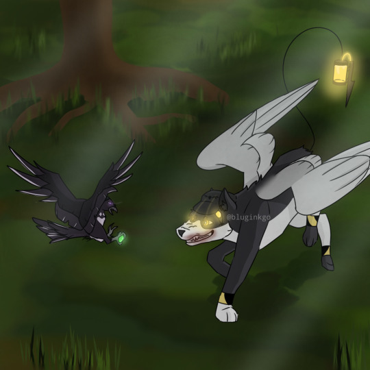
Here's a small comparison
One thing that I ran into was how I was gonna show that N was in his "killer mode." I could have placed the X's over the pupils, but found it unnatural looking in my style. So instead, it was settled to a concentrated light in the pupils.
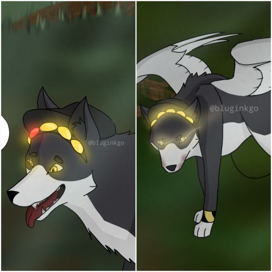
Best seen between these two. The second N snaps out of it, the X/light in his pupils disappears, and the normal light returns to his eyes, which is similar to Uzi's.
Another thing I started slowly including was Uzi's little tooth on her beak.
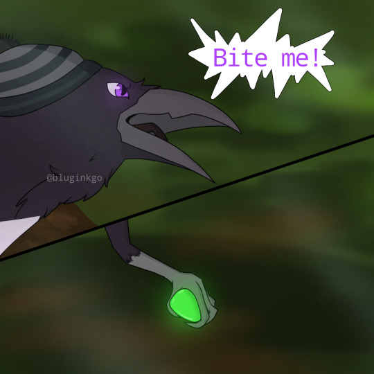
The jutting out portion on her beak is a personal touch. Although it doesn't really matter, I included it to separate her from the rest of the "worker drones." Seen as she's an absolute solver host and has a solver form, something was going to creep up in her crow design, hence the little teeth. Doll would have them too, given I draw her in the form I've been thinking about.
Another thing I ran into, was WHAT WAS UZI GONNA TAKE N DOWN WITH?! This is a bird vs. a dog! No way was a bird gonna decommission a whole dog! Then this scene came up in my recent rewatch of Murder Drones.
And it clicked. Loooong long time ago, I had a very specific hyperfixation: birds. One thing I learned that some pigeons do, was they're capable of doing a somersault. And in mid-air, too!
I was finally set. The SICK AS HELL RAILGUN was downgraded to a simple piece of shiny glass/pebble that attracted Uzi- and crows love shiny things. And the same pebble will be used to launch at N's sensor that made him trip over. Because I was also not going to draw N doggo losing his head. I love gorey and bloody shows and art- hence why I watched Murder Drones- but I honestly had no idea how to recreate that, and I suck at drawing gore in general, I mean, did you SEE the crow N was chewing on? That was my best try honestly.
Here are some progress shots and how the layers worked in the scene where N is bonked with a stick.
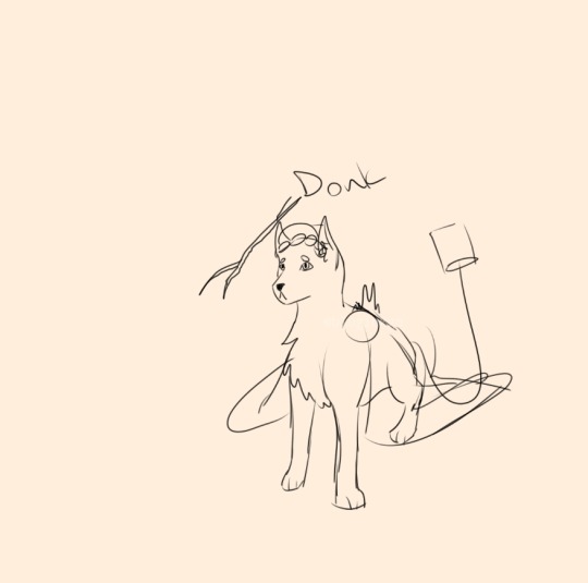
As per usual, start with a sketch, this is actually 2nd sketch. The first is much rougher, just some circles and random shapes to outline his body form.
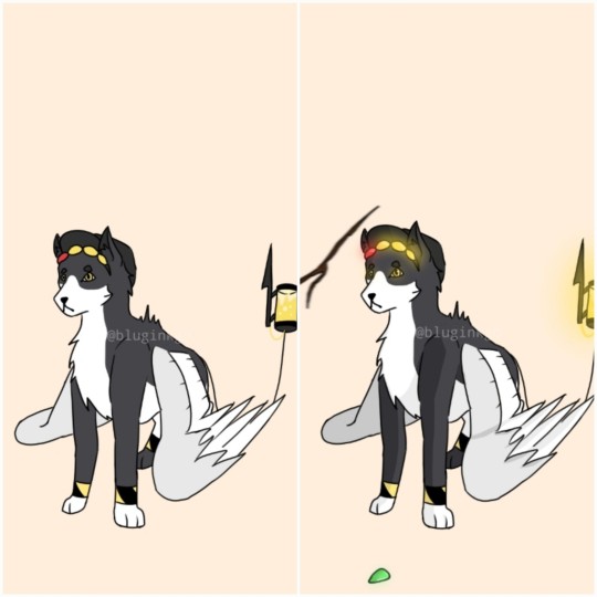
Then, this is all outlined and rendered. Along with some additions like the stick and the little rock.
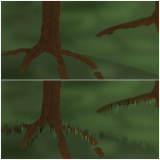
The background was the hardest, aside from some weird angles I picked to draw Uzi and N at. I suck at backgrounds, like I've mentioned many times before. So, this needed a lot of testing and experimenting. Most of this works because I found some cool brushes to use. But aside from that, I honestly still don't like how it looks. It's slightly better than my stick trees and flat grass though, I guess.
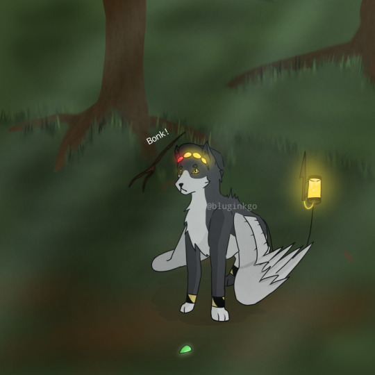
Put it all together, add a black layer to simulate nighttime, put some lights to show moonlight through trees and voila, you've got an N doggo that got bonked by a stick! I see this project/comic mostly as practice and testing. Background testing mostly, and some brushes. The background/brush testing actually spilled over into another post of the solver Uzi I made a bit back. I'd say I was pretty happy how it turned out, but brush wise, I was going to test around a little more.
NUzi comic 'Sleep' is my next project. Uhhh, don't ask me when I'm gonna have it out, I have no idea. I'm guessing sometime end of Jan and beginning of Feb. But that might be delayed seeing as Murder Drones ep7 should be out sometime soon too, so I'll need to go crazy about that for a bit and then I'll go back to my usual thing ^_^ 'Sleep' will take place still between the Pilot and Heartbeat.
P.S. I have all 26 pages story boarded... good god what happened to the 'mini' part of the comic 😭
Anyways, why are you still here?! Have a cookie ^_^ you made it! Have a nice day now, bye bye <3
#murder drones#glitch productions#serial designation n#uzi doorman#murder drones fanart#md uzi doorman#md uzi#md serial designation n#murder drones serial designation n#murder drones n#bluginkgo's murder drones as animals#n x uzi#murder drones uzi#md n#n md#md nuzi#murder drones nuzi#nuzi#md biscuitbites#biscuitbites#n murder drones
92 notes
·
View notes
Text
AF MidWeek Round-up!

This is just a simple post compiling all of my attacks so far along with some artists notes! Mostly because I found myself much more active this year than last year (Minus these few couple days due to some appointments). I'll be tagging everyone and linking to other socials so you can see these lovely folks. Of course if you want to attack me, I'm ready to fight! Without further ado, here's all the attacks so far :>
@cosmicdenro @stellarknightz - Weekend Date The name of the game for these first few attacks was to get everyone who I was supposed to last year but ran out of time ^^;;. I decided upon Jesse's Zircon over Jesse the character (one in my bookmarks) b/c it seemed like Turquoise Zircon was less drawn this year but was his icon on AF. So easy pick from me :> (Btw doing Sodalite's stripes and copying Zircon's shape language was really fun!!)

@/clawothy (Twitter) - Chill Cat Another attack from last years bookmarks! It was definitely a soft but enjoyable opening into drawing furries since Claw's so human shaped. It was fun drawing his tail and patterns :>. This is just a nice character design all around.
@twidaisi - Speedy Service Twi was also one from my bookmarks, but also a doorway down an ArtFight rabbit hole. Which will become apparent in the next two pieces. For this one, I had a pretty clear pose in mind so I placed it onto O.R.B.I and went from there!! His design is so neat and he seems so cool! The pose was also pretty fun to do as well, just an overall fun art piece (Also this one got a revenge!!! I still really really love thank you so much!!!!!)
@scratchgeist - Escapism Ho! This was a doozy! Twi had Scratch's profile linked so I ended up hitting him with an attack too. Drawing Scratch's mane turned out to be a pleasant experience despite me originally fearing it. This scene idea also came from a prompt of Scratch going outside. I ended up putting Polish on this because all those scratchy "ink like" lines I actually did manually (take a fuzzy brush and then go over it using a sketchbook eraser). It was nice dipping my toes into BatIM again and trying out more animal feature.

@/stylin.art Instagram @/crypticc0rpse Instagram - Pirates in arms One of those two people were linked on Scratch's profile and the person linked also linked to the other person. But I realized that both Stylin and Crypt had some shared characters. So this ended my little rabbit hole of people by attacking these two lovely fellows at the same time. This little crossing swords idea took me a nice minute to come up with but I liked how it ended up anyway. I really did like drawing James together like this (probably helps that I really like pirates in general). Also yes I know her hand is fucked up I noticed way to late to fix it.
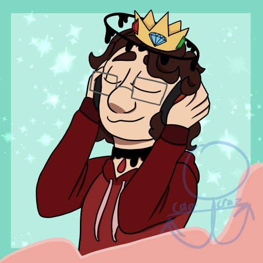
@smoresthehalloweenqueen - Listen to the waves Once I finished up with that I moved onto the next bookmark, which was Smores! Originally I was gonna draw Brutus but then I was like "I like his sona it looks like fun!" So I drew them listening to music because why not :>. I struggled on the arms initially but it came out real clean and nice. Honestly might be my best work so far! (Fun fact, I color picked the waves + background from Seafoam's icon.)
@skittisketch - I got it! Mr. Sascachawean himself! I referenced this pose form the classic Objection point because I thought it would fit his personality. This was also a little bit of a test with a style I had only done in sketches (Basically my human style but omitting a neck which somehow shaves off a lot of time). This was a super fun pose to do with a pretty nice background! (Once again, fucked up hand I know I noticed too late again)
@justpainterrobot - Rare Nightly Sight I had this really really clear picture of what I thought up for this attack and I'm happy that I was able to make it a reality. I put the polish tag on this one because I almost got super super detailed of what the junk was below her (Stuff coming down from Elysium n all that) but due to a lack of references I just went with typical metal and wood. Fun fact, the night sky in the background is based on the one from Deponia itself (The first game's scenes with the professor at night). I think this rewrite of Toni was really cool from what I could find about her. Overall a labor of love type of attack.

@coelpts @swan-swanno - Boss Battle I thought to myself "Hm, I see Coelpts around a lot, lets hit him with an attack." and it turns out Ciel's gay married to Swanno's charater Mikhail, who was the last one in my bookmarks from last year. So another double attack for this one! It was a struggle starting this one mostly because I was debating whether or not to draw Ciel's Lord outfit but I ended up doing so because why not :>. It was a fun experience copying Swanno's more angular style, which is a stark departure from my more rounded shapes (As you can see here). Has a nice venture doing the lighting as well, overall a good experience.
@tailsylennon - Sweet Treats Mitchell showed off Tasily's proflie one day and I saw their sona and was I was like "Lemme draw it!" and did! I ended up following another prompt by her because it was their birthday! (By the time I started on this it was 8 pm and I freaked tf out and got to work). Her sona was really cool and I really loved drawing them. Fun fact, each of the set pieces references the Hallows Souls trio. The chair is decorated after Terra, Markus is the table, and Whistle pallet is used for the tea set :>. It was just a pleasant and cozy attack to make overall.
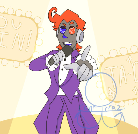
@ceaseless-enemy - Congratulations!!!! I've actually known about Voila for quite awhile now and thought his design n theaming is quite neat! I actually based the pose off of Ai from Oshi No Ko (I think one of her key arts before the anime released, ifykyk). But I skillfully cut out the legs because I can't draw digitigrade legs... Hooray... Otherwise it was quite nice to work on this attack in particular, especially the eyes and the hair :>.

@killbent - Getting Ready This is another one I had a real clear idea of prior to doing this, specifically because Killbent gave a prompt to give Mr Fairchime pink hair, so i thought a "pre-show" set up would look nice :>. The lighting was another new venture for me, because I usually do cool/night time like lighting but I think it turned out nicely for Fairchime. It was also fun doing the accessories and stuff on the vanity as well. Fun Fact, it's a bit hard to see through the watermark + lighting but the face paint and pallet both have the colors of his make up! Overall a pleasant and warm attack for this year.
And that's all of them so far! I picked up some new bookmarks + I gotta get Twi back for drawing Compact!! So those will probably be compiled by the end of AF so about, early August-ish if I keep up the pace. Anyway, thank you so much for reading and gracing me with the opportunity to draw all of these amazing characters!
Until next time!
-Gappy, Witch of the Stars
#my art#art#artists on tumblr#gappy's diary#artfight#art fight#artfight attack#af 2024#team stardust#digital art#digital drawing
21 notes
·
View notes
Note
In one of your weekly roundups you talked about Century of Love and Offroad chewing the scene disrupting your enjoyment. Two questions:
What do you mean by 'Chewing the scene'? I think I get it but am not exactly sure
There have been some discussions of the on-set atmosphere and perhaps the director's attitude towards the actors (Offroad specifically), how much does this impact the actor's ability to do their job. I say this as I think Offroad has a lot of potential, but wonder if on-set drama may have negatively impacted him.
BTW, love all your posts!
Chewing the scenery? Here's the definition:
2. I can't/won't comment on the specifics of this. But Imma gonna try to explain a bit.
Directors yell at actors all the time in my experience, but yelling at someone in Thailand (out of anger or frustration) is NOT normal, culturally speaking.
The answer in general (broad brush strokes) is the impact of this kind of abuse (for lack of a better term) depends on the personality of actor in question. Some get stuck in their heads with a difficult director and their performances deteriorate, some can switch it on an off. Generally, younger actors will have a harder time with director conflict, but that is not a universal.
It's a little like asking how much does a coach impact their athlete's performance in a competition. It's more significant early on in a career, but talent/natural ability counts for a lot. BUT we still see very seasoned athletes switch coaches and that's for a reason usually personality related.
In other words: a bad/difficult director may or may not impact a very good/seasoned actor but will impact a very green or not great actor.
In Offroad's case, we can only compare this performance to his pervious one (Love in Translation), and I personally loathed that character (and likely would regardless of performer) and thus I can't really judge.
I still have an opinion, of course I do. I personally think he has a tendency to overact, just going from LIT and this one. He may be being directed to do so, because that is part of Thailand's style - especially with more comedic, cheerful, and uke characters.
IMHO a good director could/should rein this tendency in, but I'm not seeing it on my screen in Century of Love. So this could be the director's fault, or the director might not see this as a flaw. I have no idea.
That said, this could also be where his current director's frustration is coming from. If Offroad is being consistently directed to pull back to match Daou's style and not doing it, that would piss of any director.
Which is a very long way of saying, from this side of the screen, we have no idea what is actually going on, even with the BTS leaks. Any set is a boiling pot of emotions and tensions, mistakes and one crisis after another.
I will input a warning tho. If the set is VERY toxic it can detrimentally impact the actor's career and feelings about acting. If Offorad breaks his pair or leaves the industry after this show finishes it's promo run, it is a pretty solid sign that this director was a BIG problem.
An actor can be forced out of the industry by a director, but it almost never goes the other direction (unless there is a criminal legal element).
19 notes
·
View notes
Text

General Info Bruce. Adult. Student. He/They. General DNI.
Art Tag #thriftybruce's makings
Misc. Tags #bruce's recs (for music recommendations)
BYF: Aside from the general DNI, I would appreciate if you followed me for my artistic style/approach, rather than solely just for my fanart!
About Me

Movies
Dog Day Afternoon (1975), Taxi Driver (1976), After Hours (1985), Mean Streets (1973), Dawn of the Dead (1978), Marty (1955), The Deer Hunter (1978), Hi, Mom! (1970), The Godfather (1972), and more!

Music
Artists: Franki Valli and the Four Seasons, Bruce Haack, + others but I don't generally have favorite artists, more like favorite songs
Genres: Vintage Italian Soundtracks (or old movie soundtracks in general), Electronic, Moog, Experimental, + others (most of my fav. songs are scattered across different genres)

Art Inspo.
American Illustration generally from the 20s to 70s
Realism
Anything that contrasts naturalism with eccentric details
Vintage Pinups and poster illustrations

Special Interests
John Cazale
Moog and Bruce Haack
70s Fashion
A Bunch of Movie and T.V. Characters
Costumes (Not as in Design but rather dressing up as fictional characters with what you already have)
Blog Content
Generally, I'll post what I like at the time. I don't have any original characters of my own, but I love making illustrations of my favorite things. These can include stuff like studies, mockup posters and products, short comics, rendered illustrations, and doodles. If you have any questions, feel free to message me.
(P.S. In case this blog ends up changing its content, and I feel the need to specify who I don't want to interact with, I'll make sure to make a post about it and update my bio!)
General Inquiries
What art program do you use/what brush do you use, etc.?
I use Ibispaint X on my XP Pen Tablet, and here is the QR code for the brush that I use, with its adjustments. It's basically a dupe I had to make because I actually lost the original QR code for my original brush a while ago. (P.S., I always use my brush at around 30-45% opacity, just to be clear. Also, I usually use this one for sketching and simple rendering.)

If you're looking for the textured brush, it's this one. It's basically the same as the previous one, except I messed around with the brush texture.
What texture do you use for your art?
I use this one:

Are you open for commissions?
Short answer, no. Maybe in the future, but this depends on how future me feels.
How frequent do you upload on your blog?
I'm in college right now (and also based on previous experience), I tend to try to upload at least 3 times a month. To be clear, I consider me posting art an 'upload', so I'm not counting reblogs/ramblings uploads. But they at least let people know I'm still alive.
15 notes
·
View notes
Note
Recently bought some watercolors but i have 0 experience and i really like your style, so can i know your secrets?
Oh I'm flattered that you asked me! Watercolor has become a medium I’m super passionate about, so I’m more than happy to talk about my process. (Putting a readmore bc it’s pretty long)
TL;DR: I like to layer my watercolor and use it in a graphic style, which I learned partly through experimentation and partly by watching other people's speedpaints/process videos.
Technique/Basics
3 years ago I suddenly thought to myself, “Wait, can’t you layer watercolor?” and my artistic life changed…
I’ve taken some simple process pictures to explain what I mean by that as best I can:


Step 1: Putting down the base color. Have fun letting different colors mix on the paper instead of in the palette while the paint is wet - I have a theory that this is the best way to get hue variation with this medium…
Note: Sometimes I have to repeat this step a few times if it’s not as dark or saturated as I want it to be. Usually, you’ll get a smoother area of color if you gradually build up many lighter layers instead of trying to fill a large area with a high concentration of paint in one go. Remember not to paint over areas that you want to stay light.
Step 2: After waiting for the base layer to dry, add general areas of shadow. Often, I can drop my shadow color directly onto my base color. Sometimes I reverse this process and I’ll put the shadows down before the base colors - this is usually for things like clothing folds or very large gradients.
Step 3: Adding texture/fine details. Hatching with a small brush can be a nice way to build up value (darkness) without disturbing the layers of paint underneath, but I like to reserve it for areas of high detail/focus.
Step 4: Outlines - I used to use colored pencil for this, but lately I’ve liked how it looks when I use watercolor on a small brush.
I have a few videos up on my Tiktok and Youtube where you can see this process in action.
*worth noting: I painted this demo on cellulose paper. Cotton rag paper is definitely the best for maximum layering and color vibrancy, but you can do a lot with cellulose too, so don't underestimate it for practicing.
Learning/Improving:
Watercolor technique
I didn’t actually watch very many “how to” instructional videos, but as a disclaimer I have had experience with other physical media and art classes before (charcoal, oil, acrylic).
I mostly learned watercolor techniques by finding artists who use watercolor in the same style I like and watching their speedpaints. (Apologies if not all of these have English subtitles; most are in Japanese, one is in Vietnamese - seeing the painting technique is the most important part though)
Mokumoshieru: Really great examples of underpainting to determine the color gamut of a piece
Yukorin: Wet into wet technique, still very graphic style, lovely hue variation
P..Potato: (afaik they really just call themselves potato) - Great examples of underpainting shadows
So Kimura: Variety of techniques for a very graphic/cel shaded style
Color Theory/Fundamentals
The book Color and Light by James Gurney completely changed how I approached painting, regardless of the type of paint. I usually work with a limited palette and try to do some underpainting to keep my colors harmonious.
Bonus: Setup/Tools

1) Paintbrushes
My first set was an inexpensive nylon set from Amazon, and it works just fine. As long as the bristles hold a point when wet they should be okay. It’s more useful to have larger than smaller ones; the smallest size I use is maybe a 2 or 4.
I recommend looking into Japanese or Chinese calligraphy brushes instead of quills if you need a larger brush because they’re cheaper and they hold a lot of water. I bought mine from Sekaido (Japanese art supply chain), but I think the brand Yasutomo exports them internationally.
2) Painting Rag
Very important! I use this constantly to control the amount of water on my brush. By the end of a painting session it’s usually totally soaked. If you don’t have a rag, you can use some paper towels.
3) Water cups/holders (plural)
Also very important: You need one cup for clean water and one for dirty/brush washing water. Because water is the carrying medium for the paint, it needs to be clear or the colors will mix together and get muddy. I also put a brush cleaner in the dirty water side to help get more of the paint out before I switch colors.
The process when you’re painting is: dip brush in clean water -> add paint, paint on paper -> wash brush in dirty water cup -> dry/swipe off dirty water -> dip again in clean water and repeat
4) Watercolor Paper and Backing Board
Taping the paper to a board with masking tape is optional, but will help the paper dry flat, especially if you plan to use a lot of water. Technically the right way to prepare paper is to completely soak it, let it dry, and then tape it down but… I’m too lazy so I just tape it and it’s usually okay. XD
5) Paint palette
I have several, including one that’s actually a plain ceramic tray from the dollar store. Ceramic is nicer than plastic because the water will bead up on plastic and it will be hard to get the paint off of your brush for mixing.
6) Paints
Whatever paints you have is fine… One of my favorite palettes is an old eyeshadow palette that I cleaned out and put paint in. I usually like working from dry paints, even if I bought them in tubes. Random tangent, Holbein paints are nice but it absolutely kills me how they get marketed as some sort of luxury expensive high end paint overseas cause they're pretty affordable in Japan lol,
Also, I've noticed (although this is just personal opinion) that paints made in East Asia (I have paints from Japan and China) seem to be more aimed at graphic art/character illustration: the paints are less granulating, but some trade permanence for saturation/vibrance. It's not necessary to get super expensive paints starting out, but eventually you'll get a feel for the difference between super cheap chalky craft paints, student grade, and professional grade.
And that's it! I love love working with watercolor, although sometimes I wonder if I'll have to migrate to something opaque like gouache for certain painting techniques or getting my values to be more cohesive. For now I'll continue to see how far I can push this medium on its own. I hope you have fun on your painting journey!!
11 notes
·
View notes