#Image vectorizer app
Explore tagged Tumblr posts
Visit Tumblr Blog
Explore Tumblr blogs with no restrictions, modern design and the best experience.
Last Seen Tumblr Blogs


Fun Fact
The most popular pages on Tumblr are about Minecraft, GIFs, and David J. Peterson.
Text


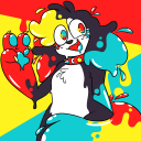
humanized gabriel doodles
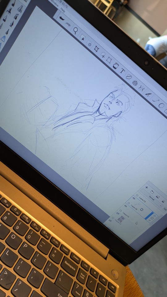
#my art#fanart#gabriel ultrakill#these are from last year. on the app noteshelf. i dont really draw on there anymore bc it uses vector data not image layer data
39 notes
·
View notes
Text
Discover Our Interactive Edge Extractor to SVG Tool! ✨
Are you looking to create stunning vector graphics from your images without the hassle of software installation? Our Edge Extractor to SVG is the perfect solution for you! This interactive web app allows you to extract prominent contours and outlines from your images, transforming them into clean, scalable SVG files.
🔍 Key Features:
Extract Prominent Edges: Unlike traditional vectorization tools, our app focuses on the most significant edges of your image, ensuring that you get crisp outlines without unnecessary details.
Customizable Options: Tailor your output to your liking with our user-friendly options:
Outline Color: Choose the perfect color for your extracted edges to match your design.
Smooth/Blur: Reduce noise and enhance the quality of your outlines with our smoothing options.
Curvature Control: Adjust the complexity and smoothness of your vector lines to achieve the desired look.
Stroke Size Slider: Easily modify the thickness of the resulting lines to fit your project needs.
🌐 No Software Installation Required! Simply upload your image, adjust the settings, and watch as your contours come to life in SVG format. It’s that easy!
🎨 Perfect for Designers and Creatives: Whether you’re creating logos, icons, or illustrations, our Edge Extractor to SVG tool is a game-changer for your design workflow.
🔗 Try It Now! Ready to elevate your designs? Check out our Edge Extractor to SVG tool here and start creating beautiful vector outlines today!
0 notes
Text


Pride Wall Lights
There are 3 files with lights.
Pride String Lights
3 swatches of rainbow flip-flop string lights.
Polygon Count: 668 (this is the same count as the EA lights)
REQUIRES: Free Holiday Celebration Pack* (to download via origin, see this post: https://answers.ea.com/t5/Technical-Issues-PC/The-Sims-4-Holiday-Celebration-pack-won-t-let-me-purchase/m-p/8872842 In the EA app, it may not show up as an add on. If not, go to search bar and put in "the sims 4 holiday" and the free add-on should appear for you to download and add to your game.)
Pride Neon Wall Lights
26 swatches of Neon Pride-themed Wall Lights. These lights are compatible with retail signs.
Polygon Count: 6
Pride Heart Neon Wall Lights
18 swatches of Neon Pride-themed Heart Wall Lights. These lights are compatible with retail signs.
Polygon Count: 6
DOWNLOAD for FREE: SFS
OR at Patreon*
*You must be over 18 to access my Patreon page.
The Pride String Light was produced as a selective clone using Sims 4 Studio.
The neon wall lights are new 3d meshes created using Blender and Sims 4 Studio.
CC created by SexyIrish7
All CC have:
*Ability to search catalog using search terms: sexyirish7 and si7
*Customized thumbnail
*******
CREDITS:
Software credits:
Sims 4 Studio v. 3.2.4.3 (Star): https://sims4studio.com
Blender 4.0: https://www.blender.org/download/
GIMP v. 2.10.34: https://www.gimp.org/
Inkscape v. 1.2: https://inkscape.org/
Thank you to the creators and moderators producing tutorials and answering questions!
*******
Model and Image credits:
Mesh created by me.
Simlish font credit to Franzilla: https://modthesims.info/
Pride String Lights Image Credits: IMGBIN https://imgbin.com/png/i64QLdZ0/flip-flops-shoe-rainbow-sandals-sock-png
Pride Neon Wall Lights Image credits:
Swatches 1, 5, 8, 11-12: Design by katemangostar via Freepik https://www.freepik.com/search?author=1757139&format=author&last_filter=selection&last_value=1&selection=1
Swatch 2: Design by Freepik https://www.freepik.com/free-vector/pride-day-neon-signs-design_7932599.htm
Swatch 3: Design by Freepik https://www.freepik.com/free-vector/pride-day-neon-signs-concept_7747200.htm
Swatch 4: Design by Freepik https://www.freepik.com/free-vector/pride-day-neon-signs_7751478.htm
Swatch 6: Design by Freepik https://www.freepik.com/free-vector/neon-sings-style-pride-day_7665447.htm
Swatch 7: Design by pikisuperstar via Freepik https://www.freepik.com/free-vector/pride-day-neon-sign-collection_4661795.htm
Swatch 9: Design by Freepik https://www.freepik.com/free-vector/pride-day-neon-signs-set_7713711.htm
Swatch 10: Design by Freepik https://www.freepik.com/free-vector/pride-day-neon-signs_7769778.htm
Swatch 13: Design by Freepik https://www.freepik.com/free-vector/pride-day-celebration-neon-signs_7665436.htm
Swatch 14: Design by Freepik https://www.freepik.com/free-vector/pride-day-neon-signs_7776877.htm
Swatches 15-16: Design by Freepik https://www.freepik.com/free-vector/pride-day-neon-signs-style_7799514.htm
Swatches 17-20: Design by Freepik https://www.freepik.com/free-vector/neon-signs-with-pride-day_7656518.htm
Swatches 21-22: Design by Freepik https://www.freepik.com/free-vector/pride-day-neon-signs_7751483.htm
Swatches 23-24: Design by Freepik https://www.freepik.com/free-vector/pride-day-neon-sign-collection-theme_7747184.htm
Swatches 25-26: Design by Ekaterina Pravednova via Vecteezy https://www.vecteezy.com/vector-art/24813738-pride-lgbt-symbols-lettering-not-a-phase-with-shapes-in-rainbow-colors-supporting-love-freedom-flat-vector-illustration
Pride Neon Heart Lights Image credits:
Swatches 1: Designed by Freepik https://www.freepik.com/free-vector/pride-day-neon-light-signs-set_7713780.htm
Swatch 2: Design by Freepik https://www.freepik.com/free-vector/pride-day-neon-signs-concept_7747200.htm
Swatches 3, 11-12 : Design by Freepik https://www.freepik.com/free-vector/pride-day-celebration-neon-signs-style_7665465.htm
Swatches 4 and 7: Designed by katemangostar via Freepik https://www.freepik.com/search?author=1757139&format=author&last_filter=selection&last_value=1&selection=1
Swatch 6: Design by Freepik https://www.freepik.com/free-vector/pride-day-neon-signs_7751478.htm
Swatches 8-10: Design by rawpixel.com via Freepik https://www.freepik.com/free-vector/rainbow-heart-lgbt-pride-month-icon-set-vector_18710813.htm
Swatch 13-14: Design by Freepik https://www.freepik.com/free-vector/pride-day-neon-sign-collection-theme_7747184.htm
Swatches 15-18: Design by Freepik https://www.freepik.com/free-vector/colorful-pride-day-neon-signs_7733145.htm
*******
TOU:
Do not re-upload and claim as your own
Do not re-upload and hide behind a paywall
#pride#pride month#sims 4 pride#lgbt pride#gay pride#the sims 4#the sims 4 cc#ts4cc#sexyirish7#sims 4 cc#wall lights#neon lights#string lights#lights#wall decor#featured
20 notes
·
View notes
Text
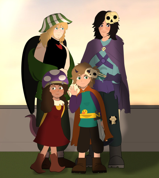
DEATH FAMILY It is the continuation of my previous image, my beloved family, but time passed…
Chayanne is no longer a toddler, he is a little king and developed his own style of dressing, using his deflated float as a belt (he put his mask on his horn for the photo).
Now there is Tallulah with them, with her classic hat of fungus.
Phil's appearance changed over time, he now has some scars, some beard and longer hair, and he now shows off his wings.
The only apparent change in Missa is the wear and tear of his clothes, as he spends his time wandering the world and sleeping rough during his travels (his hair grows, but he doesn't like having it so long and he cuts it from time to time).
Chay did not want to take off his mask because he has such a pretty face that he is always mistaken for a girl. To get him to agree, Missa told him that he would also take off his for the photo. Chay agreed immediately because everyone wanted to see Missa's face, in this HC he has never taken off his mask before, that's why he looks very shy. And Phil… let's just say he looks at him very curiously…
(Hahahaha the photo has its own story and all that XDD)
I hope they take a family photo soon :3
I made this with vectors in illustrator, is a complicated shit, but is the app that learned in my career. I suck in depth of field and lights but… I try…
Close up!
The kids

Phil & Missa
See you!!
#death family#deathduo#missa#philza#chayanne the egg#tallulah the egg#pissa#QSMP#qsmp missasinfonia#qsmp fanart#Phil qsmp#death duo#missasinfonia
82 notes
·
View notes
Note
Haii, Sosaaa! Okay, so i wanna get into animation BUT I'm really new. Lucky for me I know someone who's awesome at animating (that's you btw) so I need your expertise. What program do you use, and also do you have any tips for a newbie?
Aww Jay, you flatter me~✨but before answering I must put the disclaimer that I'm just a hobbyst animator with no formal training, that during quarintine thought "Oh woah, these Multiple Animation Projects that people do in YT are so cool! I want to join them!" and started learning by herself. Take everything I say with a grain of salt.
First things first: I mainly use TV Paint. However I'm not letting you spent money on paid stuff you don't even know you'll like, so here are some free alternatives that I've used as well:
Krita is mostly a drawing program, but it also has a animation interface. The red and black parts of the Helena AMV were made with this.
Flipaclip is kinda neat phone/tablet app for when you want to animate on the go, but it can also feel more limiting since various features have to be unlocked by watching ads or getting the premuim version (in typical app fashion, I guess...)
Blender, while mainly meant for 3D animation, also has been developing Grease Pencil, that allows 2d animation in both 2D or 3D spaces. And the lines are vectors, so you can edit them after drawing them and such.
You can even use normal drawing programs. I've animated with Paint Tool Sai and Medibang by drawing all the frames, saving each frame as a image in sequence (001, 002, 003...) and putting them together in some editing program or gif maker. It's possible, but it's more work.
There's also OpenToonz, which is an open source version of the software used by Studio Ghibli in some movies?? I haven't used this one, but I'll leave it here in case you want to give it a try.
For editing (In the rare scenarios where I do fancy editing) I use After Effects. I can't personally recommend any free substitute, but as far as I've read, DaVinci Resolve seems like a good replacement.
Now, regarding actual animation advise, I won't explain the principles or terminology because:
It's very overwhelming since it's A LOT of information, specially for a beginner
I work mostly by vibes, so there are concepts I don't undertand well enough to explain to others
Instead I'll foward you this whole book that goes in detail about all that technical stuff.
That being said, at the end of the day, hand-drawn animation is drawing main poses (aka key poses) and then drawing a bunch of more drawings in between until the drawings together look like they move.
So yeah, it's a lot of work,
....but it doesn't have to be tedious work~ 👀✨
As a hobbyst I live for the philosophy of vibing during the process instead of chasing perfect results, and I'm assuming that you just want to try for funsies and not that you're trying to become a pro industry animator anyways. Here are my personal tips to make the animation process more bearable:
1- Pick something you love! Seriously, any long task becomes more bearable when it's about a theme or character you enjoy. There's a reason why most of my animations have been about HnK or Signalis,
2- SIMPLIFY THAT DESIGN! Before you even pick the pencil, I want you to really look at the design of whatever you're going to animate and ask yourself "Are all the details in this design really necessary?" Every extra detail really starts to add when you have to draw the same thing multiple times for a single second of animation. You don't need to add all the robotic details on replika bodies, or draw every single stripe a tiger has, to put an example.
3- Keep it simple! At some point you might have a cool idea of an anime style epic battle with looks of cool explosions, camera angles, awesome fighting choreograpies and whatnot; but you first have to start small or else you'll get overwhelmed and not finish anything (been there, done that). Start with something simple like a bouncing ball, or if you're feeling brave, a walk cycle or a character turning their head. In that same sense, remember the book I linked? Don't try to learn all of it at once, go one step at a time.
4-Use references! On google images there are multiples breakdowns of things like run, flight or walk cycles, for example, and you can even use youtube videos! (tip: pause the video and use "," and "." to move back and forth between frames). In case you need help with a very specific pose or movement, you can use yourself or a friend recreating the pose irl (yes, the process is very embarrasing, and yes, the results are worth it)
4- You don't have to animate/redraw everything everytime. We aren't going for Oscar winning levels of animation here anyways. It's ok to copy and paste across different frames, only animate certain parts of the body and leave the rest static, panning the camera to simulate movement... Listen, if actual standars profesionals cut corners, why can't we? We aren't even getting paid for this!
6- It's ok to suck at first. My first animation was this kitty back in 2016,

and here's this Elster from last year doing similar movements.

It's not perfect by any means, but I feel like both art and animation-wise there has been some improvement. And I guess that right now I could remake it and make it even better, but that's because I got more experience and a better eye at finding mistakes and how to solve them, and you get that with practice.
...So yeah, there's that, have fun in your animation endeavors 👍✨
#OH MY GOD THIS IS A TESTAMENT#I'm so sorry Jay for making you read all of this#I know less that you think#but the little I know I try to share to the best of my habilities#animation#ask#the yappening
13 notes
·
View notes
Note
How do you make your symbols? :)
I make them in Affinity Designer 2!
It's a vector art program similar to Adobe Illustrator, but better in almost every way (doesn't have AI image generation, has a 6 month long free trial where they don't ask you to put in your credit card info, is a one time purchase!!)
For more info about the specifics of how I make them you can check out my style guide!
18 notes
·
View notes
Text
Rune Art:
THE DRAGON AND THE SPEAR (Part I) @gifts-of-heimdall-runes

THE DRAGON AND THE SPEAR was the name given to a design created in the second half of 2023 that subsequently became the title for a 2024 rune art project shared upon Instagram & Facebook.
●
The project began amidst chasing deep labyrinths of Dragons' Earth Energy that wind their way throughout the Anglo-Saxon Futhorc that was helped by a visit to Somerset and Glastonbury in June 2023. This project uses 33 runes of the Anglo-Saxon / Northumbrian Futhorc inspired by the works of Ingrid Kincaid.
●
The Anglo-Saxon runes scribed for this project were created using Serif Draw X8. Backgrounds and textures were developed using original images foraged from various internet sources, developed by MirrorLab app, and assembled via personal aesthetic preferences.
●
An intuitive colour model was used for the respective four eights of the Anglo-Saxon Futhorc:
Red: JOURNEYS OF LIFE
Blue / Black: JOURNEYS WITHIN
Purple: JOURNEYS OF SPIRIT
Green: JOURNEYS OF GROWTH
White: JOURNEYS BEYOND
●
Rune names and translations of 'The Anglo-Saxon Rune Poem' were copied from Stephen Pollington (1995) "Rudiments of Runelore." Anglo-Saxon Books, Norfolk.
●
Image refs:
▪︎ 'Celtic Frames' font by Typographer Mediengestaltung [Copyright©2000.]
▪︎ Old English fonts by Peter S. Baker


These final two designs began "The Dragon And The Spear" Rune Art Project in Autumn 2023.
●
The Dragon & The Spear
Image references:
(all of which were flagrantly adapted with sincerest appreciation):
Celtic Ring
Double Headed Dragon Vector
Ouroboros / World Serpent Vector (Edited)
Celtic Patterns Font by Omega Font Labs
●
Background textures were all adapted from originals found via PINTEREST.
●
This rune art project was created for fun.
It was shared to honour guidance of personal Inner Spirits.
●
GIFTS OF HEIMDALL RUNES (FACEBOOK)
GIFTS OF HEIMDALL RUNES (INSTAGRAM)
●
ML. Birmingham, UK
September, 2024.
#gifts of heimdall runes#gifts of heimdall#Gifts of Heimdall Runes#Gifts of Heimdall#gifts of heimdall rune art#Gifts of Heimdall Rune Art#Rune#Runes#rune#runes#rune art#Rune Art#futhorc#Futhorc#futhorc runes#anglo saxon runes#anglo saxon futhorc#anglo frisian runes#Anglo Saxon Runes#Anglo Saxon Staves#anglo saxon rune art#norse pagan#norse paganism#Anglo-Saxon#anglo saxon runes art#anglo sxon rune designs#The Dragon and The Spear#the dragon and the spear#the dragon and the spear rune art#FUThORC art
13 notes
·
View notes
Text

tryin out adobe fresco with this little blue penguin! (review below)
i’m not super into it.
i’ve seen people hype it up as the “procreate killer” but i don’t see myself making the switchover completely. yes, it plays nicely with other adobe products, the brush engine is decent, the multicolor swatch thing is cool af and so are the live brushes. but the interface has a lot of the same density and clunkiness problems as other adobe ipad apps, and (here’s the dealbreaker for me) you can’t reference the entire canvas or an image in a dedicated tab as you work. also… procreate (probably) doesn’t spy on you to train its ai. so. yeah. there’s that. the only thing i think both are on equal footing with is their smudge engine (both are textureless dogshit). i do want to mention that i only tried it using the pixel brushes, and i might find a way to work it into my workflow with the vector brushes since ipad illustrator is straight up garbo. maybe i could use them to ink comics if i ever start doing them again? idk.
#scad student#adobe fresco#illustration#digital art#bird#birds#penguin#little blue penguin#fairy penguin#personal work
9 notes
·
View notes
Text
VFX Era: Your Future Begins with Graphic Designing Course in Kanpur

VFX Era is redefining creative education in Uttar Pradesh through its comprehensive graphic designing course in Kanpur. Combining artistic training with career-readiness, this course equips learners with both the vision and the tools to become successful design professionals. Whether you're a recent school graduate or a mid-career switcher, VFX Era has built a design ecosystem that blends theory, practice, and professional mentorship.
What makes VFX Era unique is its complete learning cycle. From learning tools like Adobe Photoshop and Illustrator to understanding brand identity, visual storytelling, and user interface design, students are nurtured into becoming designers who solve real-world problems.
Why VFX Era's Graphic Designing Course in Kanpur Is the Ideal Starting Point
The growing demand for visual content across industries has created a need for trained graphic designers who are not just tool-users but thinkers and creators. VFX Era’s graphic designing course in Kanpur is designed to meet this demand with a practical, future-focused approach. Here, you don’t just learn how to use design software — you learn how to build brands, shape user experiences, and communicate visually.
From logos and brochures to social media content and website layouts, students work on real-time projects that mirror the needs of businesses today. This course doesn’t just prepare you to enter the industry—it prepares you to stand out in it.
The VFX Era Learning Philosophy: Creative, Practical, Professional
At the core of VFX Era’s teaching model is a blend of hands-on practice and conceptual clarity. The course aims to empower students with skills that are instantly applicable in the job market:
Understanding how design solves business problems
Translating ideas into visual campaigns
Creating cross-platform consistency for brand visuals
The course also introduces students to design systems and workflows that are used by professionals in advertising agencies, startups, eCommerce platforms, and global brands.
Course Structure: From Fundamentals to Industry-Level Mastery
Here’s a breakdown of what the curriculum covers:
Design Principles: Color theory, visual hierarchy, composition
Image Editing: Retouching and visual manipulation using Adobe Photoshop
Vector Graphics: Logo and icon creation using Illustrator and CorelDRAW
Typography: The art of readable and brand-oriented text design
Layout and Publishing: Flyers, posters, banners, and social media creatives
UI/UX Basics: Designing for websites and mobile apps
Brand Identity Projects: Packaging, logo kits, visual guidelines
In addition to these, students also receive special training in:
Freelancing and client handling
Building an online design portfolio
Content design for social media platforms
Basics of animation and motion graphics
Project-Based Learning at VFX Era
Every module is accompanied by a project. This means by the end of the course, each student has an impressive portfolio that includes:
Company logos
Product packaging
Event banners
Ad creatives
Website UI samples
Infographics and visual resumes
Students also receive reviews on their projects, just like in real agency settings. These critiques from mentors help learners understand what employers and clients expect.
Career Pathways After a Graphic Designing Course in Kanpur
The beauty of a graphic designing career is its versatility. After completing this course, you can work in:
Digital Marketing Agencies
Media and News Companies
Corporate Design Teams
Freelance Marketplaces
Startups and E-commerce Brands
You can also specialize in:
Branding Design
Social Media Content
Web Graphics
Packaging Design
Presentation & Pitch Deck Design
And if you want to scale further, combining your design skills with digital marketing or front-end development knowledge creates a competitive profile for roles like UI Designer or Digital Content Strategist.
The Role of Mentors in Your Creative Growth
Unlike self-paced online tutorials, the VFX Era experience is guided by mentors. These are industry professionals who:
Review your design drafts
Provide actionable feedback
Teach shortcuts and design hacks
Guide you on pricing, pitching, and professionalism
This mentorship accelerates learning, builds confidence, and prepares students for freelance gigs or full-time jobs.
The Power of Design in Kanpur’s Business Ecosystem
Kanpur is no longer just an industrial city. With the digital boom, local businesses are investing in branding, social presence, and customer engagement. From cafés and real estate firms to coaching centers and eCommerce brands, every business needs visual design.
As a certified designer from VFX Era, you can help these brands:
Build recognition through visual identity
Enhance online reach through engaging content
Improve customer retention through consistent visuals
And the best part? You can do all this while working from home or even as a part-time freelancer.
Expand Your Horizons: Combine Graphic Designing with Digital Marketing & Web Development
VFX Era doesn’t just stop at design. For students who want to expand their skillset, the institute also offers:
A full-fledged digital marketing course in Kanpur, where students learn SEO, PPC, email campaigns, and influencer marketing.
A practical web development course in Kanpur, covering HTML, CSS, JavaScript, and responsive design to build fast, beautiful websites.
By learning how your designs can integrate with marketing and web technologies, you’ll stand out as a full-stack creative professional.
Portfolio Building and Career Support
The course ends with a powerful capstone project and a complete review of the student’s portfolio. But VFX Era goes a step further by helping students:
Create Behance and Dribbble profiles
Draft a winning freelance pitch
Appear for mock interviews and client meetings
Build a design CV and pitch deck
Get referrals to freelance clients and agencies
This comprehensive support ensures you don’t just complete a course—you start a new career.
Final Thoughts: Why VFX Era Is the Top Choice for Graphic Designing Course in Kanpur
There are many ways to learn graphic design, but only VFX Era combines:
Experienced mentors
Real-world projects
Personalized feedback
Industry connections
Career-focused curriculum
That’s why it has become the most trusted name for anyone looking to become a designer in Kanpur.
Address: 117/H1/368 Pandu Nagar Neer Cheer Chauraha, Pandu Nagar, Kakadeo, Kanpur, Uttar Pradesh 208005 Contact: 063904 67467 Website: https://vfxera.com
If you’ve ever wanted to build a creative career, launch your own brand, or work in design globally — your journey starts here. Join the graphic designing course in Kanpur at VFX Era and unlock your true creative potential.
2 notes
·
View notes
Text
Book Covers
Aka the bane of every writer's existence (minus summaries of course). This was something I struggled with a long time. At first I tried using Procreate but didn't like the way it came out mostly because my art skills are not the greatest lol. So what programs/apps can you use instead?
Canva
Let's start with Canva! Canva has an app and a website and has honestly saved my life in terms of creating book covers. Even if it it's just a temporary book cover to use, this app is pretty cool and is fairly easy to use even if you have no previous editing experience. The downsides? Well, I personally found the interface a little finicky at first which meant doing a few quick googles to figure out how to reorganise layers and whatnot. Using the free version is, of course, limited which means you don't have access to as many graphics as you'd probably like/need so if you can afford it, try and get a subscription going!
But do be aware that not all of these images in the program are copyright free so make sure you own the rights to the images you're planning to use in your final book cover design. I haven't done much research into the legalities of everything just yet so once I do I'll probably make another post dedicated to Copyright.
The covers below were made using Canva just to give you an idea of the kind of stuff you can create.


Photoshop
Always a popular choice and it's easy to see why! I used it quite a bit back in college just because I could and found it cool to learn and use. However this program does require a lot more googling, tutorials, etc, and you'll have to do some research to find images you can use without any copyright issues arising. Since I don't use this program I haven't got any images to give you an example of the stuff you can create.
Desygner
This is another app that is similar to Canva (from what I've managed to gather from some research). It's a good beginner app but does require a strong internet connection and can be slow at times.
Adobe Illustrator
Another classic. This is a vector graphics editor and design tool that allows you to create your own graphics but good lord I found it a pain to use in college. It wasn't that it was hard necessarily and there are definitely benefits especially since you'll be making the designs by hand by yourself which means no copyright issues. It's a brilliant program but can be overwhelming to learn at first.
It also costs money and I made the mistake of googling how much and my bank account is crying xoxoxo
I believe that Wattpad also had a book cover app of some sort but I think it's been removed from the app store? Or maybe it's Desygner now? I have no idea anymore. Anyway, these are just a few suggestions so before deciding what program to use, make sure to do your own research!
#writing#fantasy worldbuilding#fantasy writer#writerscommunity#writer stuff#writers advice#writer tips#writing help
4 notes
·
View notes
Note
Could you show your workflow for these animations? What Programs you use, etc. :)
Of course! I'll show you my workflow for this scene with David since it's probably one of the more complicated ones I'm doing.
First, I use Moho Animation. I love it. I learned how to use it in about 10 days. It's FUCKING expensive ($400 💀💀💀) but you can get the demo version for 30 days, or the debut version for like $60. I'm working on the demo version, so you'll see the ugly watermarks all over my screen lol. But no matter, it still works! The nice thing about Moho is it uses vectors to let you move shapes so you don't have to actually draw frame by frame. I like to sketch key frames in my sketch app and then I import the images and use the vectors to recreate the characters. Here's David's eye for example:


It's made of points and I can move the points.
This is the sketch I made for the scene:
Then I put it in Moho and traced my sketch to create the characters in vector format:

Idk how much you know about vectors and such, but coloring, shading, making designs is a bitch. I like to get the characters done first, and then add in the background, and then after the animation is done I'll go back and add shading and lighting.
Moho also has an amazing bone rigging system and "smart bones" which are super useful. Head turns are AMAZING to use smart bones for.
Now, I'm very new to animating. I can tell you what I know, but I barely even scratched the surface. I've also used Synfig before which has an amazing tutorial available on YouTube and Synfig is FREE. I found it was a tad glitchy when I was using it but that was back before I really knew what I was doing so it was probably user error.
When I say I learned Moho in 10 days, I mean I literally spent 8-10 hours a day for almost two weeks straight just watching tutorials and following along 💀 you could ask my roommate, I barely moved from the computer 😂 some days I remember getting up around 7am to animate and going to bed around midnight. I'd take breaks for farm work but I don't think I really ate much or did anything else lol.
Here's a short clip of what I've been working on from around 4pm yesterday to right now. Stayed up until 1am and woke up around 5:30am. Pretty much just doing this:
Getting to this point has taken me about 15 hours. It's barely 4 seconds long. I had to make my sketch, then convert the characters into vectors. Make sure all the layers were set before moving onto the background. Then I had to make switch layers for the eyes so they can change color. Not pictured is I made more switch layers for a glowing affect, but I cant add that until after I add the shading and lighting. I still want to make him "talk" (I want to have text appear since I'm not using voices), but I have no idea how to do that, so to YouTube tutorials I go!
10 notes
·
View notes
Note
Hey I love ur art I wanna know which program u use for ur art cuz I wanna draw a lot better then on paper ?
Hiya tysm!! I currently use a number of programs depending on what method I wanna work with or what I wanna make. I'll list and explain the ones I use or used for my illustration work.
Clip Studio Paint EX - Main choice for illustration and hand-drawn animation. I enjoy painting and sketching in Clip Studio more than Photoshop personally. The animation feature is pretty neat and I like using it mainly for the clean up process.
Adobe Photoshop - Illustration and hand-drawn animation. There are a few features Photoshop has that Clip Studio doesn't have that I personally need to make exporting multiple images faster and ready for animating. It can also make importing stuff from it faster and easier into After Effects.
Adobe Illustrator - Vector Illustration and 2D rig asset creation. If I wanna make quick clean art or I know I'll need multiple sizes of the same art, I use Illustrator. Creating vector art is a bit of a learning curve for beginner digital artists, so I wouldn't jump into it until you have an understanding on non-vector art programs.
Procreate - I don't turn on my iPad as much anymore, but it's an amazing and affordable art app. If you can afford an iPad and an Apple Pencil, definitely give it a try.
Gimp - I used to use Gimp back in high school since I had no way of purchasing any art program at the time, but I wanted something similar to Photoshop after learning how to use it in school. It's a decent free and open-source art program that served it's purpose for me.
MS Paint - Literally started out digital art and animation with Windows 7 MS Paint and a wireless mouse back when I was around 10yo. But the upcoming latest MS Paint update includes layer and transparency support for the Windows 11 version. Honestly I'd give that a try if you use a PC and have 11 on it!
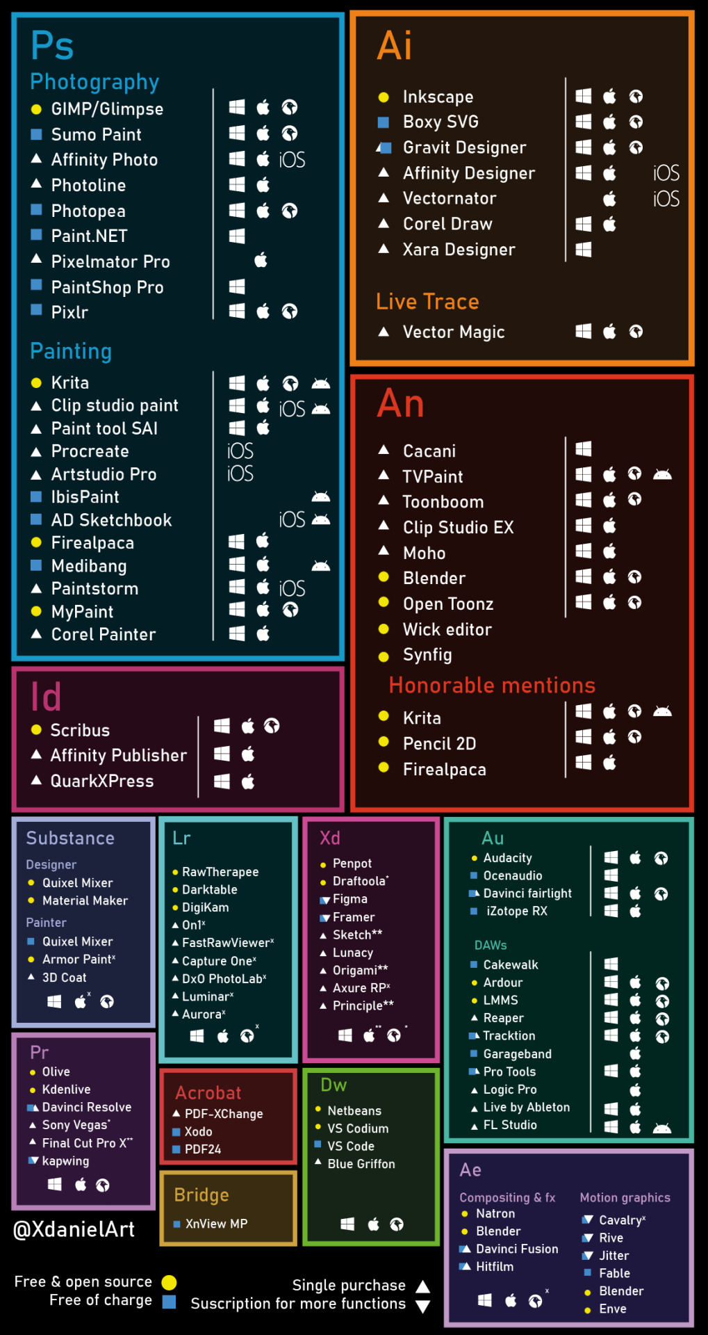
Hope this helps! Also here's a graphic made by XdanielArt on Twitter listing a bunch of program alternatives to the Adobe ones. There's a good number of neat art programs to research and try out!
41 notes
·
View notes
Text
Building AI Apps Using OpenAI’s Models: OpenAI’s GPT Model, Codex Model, DALL·E Model, and Whisper Model - A Comprehensive Guide
Innovative medicine abstract composition with android image demonstrating elements of medical hud interface vector illustration OpenAI’s suite of models is transforming the way developers build intelligent applications. From generating human-like text to coding assistance, from creating compelling visual art to transcribing speech, these models empower businesses and developers to push the…

View On WordPress
2 notes
·
View notes
Text
HEY I'm trying out new drawing apps in preparation for my upcoming webcomic bc the one I've been using for years has very limited features and no text tool, does anyone have recs? I was gonna go with Clip Studio but it's not available on my tablet. I'm not really interested in Procreate, but I plan on trying Krita and Medibang.
What drew me to CSP was the vector image function and easy comic creation, so if anyone has (preferably cheap/free) app recs I'd appreciate it! I'm using a Simbans PicassoTab that runs on Android :]
#HELP PLEASEEEE#i was leaning towards krita but the reviews talk about how bad the text tool is soooo#artists on tumblr#<<im calling you#art help#art#im tagging all the things bc i need answers
2 notes
·
View notes
Text
"Homophile organization publications had always looked at their more daring physique counterparts with envy. In the wake of the Manual v. Day decision, they had already begun to resemble physique magazines. After 1967, with the threat of prosecution removed, they adopted a similar racy format. Vector, published by San Francisco's Society for Individual Rights, offered its first nude male centerfold in June 1969, and a few months later full-frontal nudity had migrated to its cover. Soon Mattachine Times in New York followed suit, featuring cover images of young men in posing straps...
This tendency to combine gay news, nude images, and raunchy classified advertising continued until magazines sought to attract large, mainstream advertisers. New York's GAY felt pressure early on from advertisers who objected to the use of nudes, particularly on the cover, forcing editor Nichols to moderate their use. Thus began a movement away from a sexual liberation ethos to a more sanitized, corporate look. Like lots of gay periodicals, GAY abandoned its cor gay business in search of mainstream acceptance.
The Advocate resisted this trend at first, keeping its racy classified ads but segregating them to a pullout section. "I like them; their fun," the Advocate's editor-in-chief Richard Rouilard proclaimed. "This is the way gays and lesbians talk to each other worldwide. And if you are going to compromise this community for advertisers or so that your mother can read the magazine, go buy yourself a copy of 'Catch-22.'" But even the Advocate eventually had to succumb to the demands of larger advertising dollars, spinning off its classifieds and naked images into a separate magazine. With the rise of upscale publications such as Genre and Out in the 1990s, the realms of homoerotic imagery and gay news have become increasingly divided. In many ways this represents a return to a politics of respectability practiced by the homophile organizations, a trend reinforced in the twenty-first century as the LGBTQ movement became dominated by the political struggle for gay marriage.
The current bifurcation in LGBT media between the political and the erotic makes it difficult for us to see that the worlds of gay commerce, sex, and politics were once mutually reinforcing. Today gay men go to smart-phone apps like Grindr to hook up but to news websites or an LGBT advocacy organization to catch up on civil rights issues and community affairs. But historically it was the desire to connect and find one another that gave rise to such community publications. It was [gay physique photographer] Bob Mizer's classified ad in Strength & Health that had alerted him to the large reservoir of gay men seeking contact with one another. Gay men had pleaded with physique and homophile organizations to allow them to connect, but the first tentative steps in that direction were met with swift and decisive state suppression. Gay men went to prison and others lost their jobs merely for participating in a gay pen-pal club. But thanks to physique entrepreneurs such as Lynn Womack, the correspondence club was able to thrive and morph into the classified ad, which was soon replaced with phone sex lines, followed by AOL chatrooms, and now hookup mobile applications such as Grinder and Scruff. The technology may have changed, but the business of connecting gay men has a long and rich history.
Today the term "gay power" is remembered as a political slogan shouted at the 1969 Stonewall Riots, but in the beginning it was understood largely in economic terms. Two years before the riots, Vector inaugurated a new column called "Gay Power" featuring information about its advertisers. The idea came from a young but vocal SIR member, Pat Hallinan, who suggested that it was time to invoke "our secret weapon, GAY POWER, upon the economic world." As the column advised, "When you visit our friends and advertisers, tell 'em you saw it in Vector--that's GAY POWER!" A few months later, the founder of the Los Angeles Advocate similarly advised readers, "You can do much to strengthen and promote power in the gay community because you wield the great deciding weapon: The Almighty Dollar." He defined "gay power" as "buying power, selling power, voting power...No dear, it isn't a queen with muscles," he joked.
...
Even when shouted at Stonewall, the cry for gay power was largely about the desire of gay men and women to have control of their own commercial spaces. "Get the Mafia and the Police Out of Gay Bars," proclaimed one of the first pamphlets in response to the raid of the Stonewall Inn. Craig Rodwell called for "gay businessmen" to open bars and shops to create a healthier social atmosphere than bars like Stonewall. And he simultaneously encouraged customers to support them and "Buy Gay."...
For many gay liberationists, especially in New York City, physique magazines also came under attack as exemplary of the negative effects of a gay ghetto. In contrast to previous generations of young men who found comfort in images that glorified the male body, gay liberationists saw exploitation. "These magazines crudely showed men as nothing but sex objects; if they were objects, I could be one too," remembered John Murphy. "That frightened me then, and it infuriates me now," he wrote in 1971. Some worried that the "masculine mystique" depicted in these magazines was so inaccessible and exaggerated that it constituted a form of self-hatred. "Those male idols so worshiped cannot possibly be faggots!" they complained. Following the Black Nationalist, Black Power, and feminist movements, they envisioned a world where gay men and women owned and managed their own, more equitable and inclusive, businesses.
Despite his "Buy Gay" campaign, Craig Rodwell refused to sell "sexploitative" magazines in his own Oscar Wilde Memorial Bookshop, offended by both the high price-tag for nude male images and what he found to be an over-emphasis on sex. He was unaware of how physique publishers such as Bob Mizer were among the oldest gay businesses around and had been created with precisely the same goal of fostering community. But Mizer's crusading mission had waned as many straight and gay publishers had since entered the market with an eye toward making a quick buck. Rodwell and other gay liberationists tarred them all with the same brush. They did not appreciate the tremendous struggles they had encountered in the face of government censorship. They increasingly saw physique businesses as part of the problem of, not the solution to, community empowerment."
David K. Johnson, Buying Gay: How Physique Entrepreneurs Sparked a Movement
10 notes
·
View notes
Text
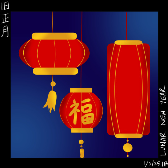


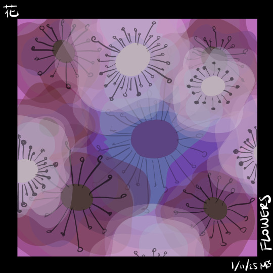


Sketch-A-Day challenge from Sade's server-- non-ff6 related drawings.
Lunar New Year / 旧正月 - playing around with shapes, colors, concepts for iconic imagery with bold colors. Heavily inspired by the work of Lorena Alvarez Gomez
Sakura / 桜 - playing with layers, vector-ish images, and color saturation/hue/luminosity
Snake / 蛇 - I've been heavily influenced to make all snakes green thanks to Verdi by Janell Cannon (a favorite book of Pika's)
Flowers / 花 - layers and opacity! I was happy to get a similar effect to one I enjoy in the Tayasui sketches app
Spirit / 魂 - an abstract playing with gradation for (what I hope is) a dreamy feel
Space/ 宇宙 - more abstracts, but thinking of cosmos
OC Appreciation/ オリキャラ鑑賞 - potato's goth OC
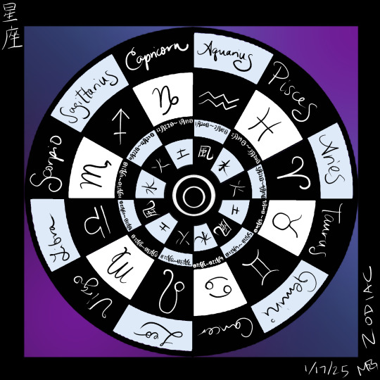
Zodiac / 星座 - trying for more uniform, clean iconography
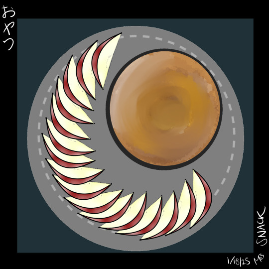
Snack / おやつ - I'm really pleased with the shapes and how long it did *not* take me to finish this piece. I still dithered too long with background and plate color, but the apples themselves came together quickly. BTW, have been obsessed with apples & peanut butter since my baby was born.
Sleeping / 寝ている - self portrait based off a photo of me and Little. Yes, this is how we sleep. Unless he's smothering me with his tummy.
#my art#sketch a day#self portrait#abstract#clip studio pro#iconography#brown tabby#moogle little fighter
3 notes
·
View notes