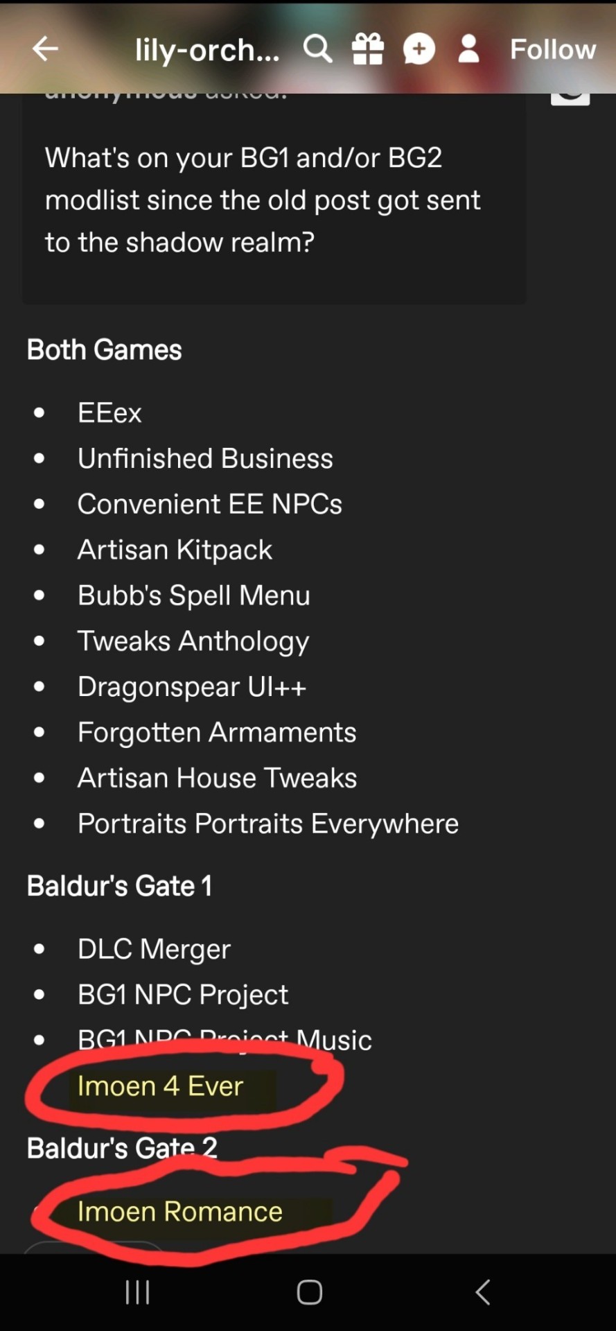
#Imoen
Explore tagged Tumblr posts
Visit Tumblr Blog
Explore Tumblr blogs with no restrictions, modern design and the best experience.
Last Seen Tumblr Blogs


Fun Fact
In 2020, 27% of US Tumblr users had an annual household income of over $100,000.
Text


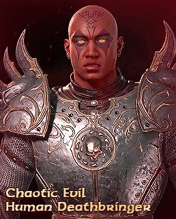


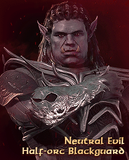
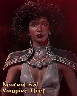

Re-creating my favourite Baldur's Gate 1 & 2 party in BG3 (x)
#Baldur's Gate#Baldur's Gate 1#Baldur's Gate 2#Baldur's Gate 3#BG1#BG2#BG3#Viconia DeVir#Drow#Imoen#Sarevok Anchev#Dorn Il-Khan#Dorn Il Khan#Half orc#Hexxat#Larian Studios#dailyvideogames#vgedit#bg3edit#Blighted Gifs#OC: Telvesh#Can they please give Viconia a set eye colour omg#I gave her red bc it's used the most in her official art and I like it best
1K notes
·
View notes
Text


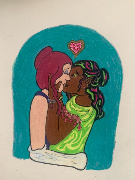
redraws of Viconia and Imoen’s sprites :-) since i’m kinda dedicated to this bit now lol
545 notes
·
View notes
Text
Mikaila Orchard sucks at Paneling
I debated making this a video or not. But, I decided against it. If you guys are interested in me making videos about this sort of thing, let me know and perhaps it's something I could cover in the future.
So Mikaila Turkleson aka Mikaila Orchard has always made... questionable art. To me it seems like a weird amalgamation of Equestria Girls and Sophie Labelle's art. Anatomy bad character design bad etc etc. I don't however see a lot of people talk about her paneling.
Recently, Mikaila and presumably her partner, Lily Orchard started a new art endeavour. I assume to turn over a new leaf and bury the now-infamous Pokemadhouse. You can find it over at bhaalspawnfunnies. It appears as if the blog will focus around the player character of Baldur's Gate 1, Gorion's Ward, and their half sister, Imoen. This is the first entry.
Source
youtube
Where to start? My first impression is that this is very poorly drawn, and low effort even by Mikaila's standards. The speech bubbles are low contrast against the background. The ground/floor blurry blob looks extremely bad. As a fellow artist I get the distinct impression that Mikaila did not want to draw this piece.
Moreover, there's a huge issue with the panelling and pacing. Comics are really cool in that you can kind of use panelling and negative space to "time" jokes, leading the eye where you want it to go and using framing and other art tricks to make a punchline land a little better.
This "comic" has none of that. There is no pacing, there is no comedic timing. It's all bland and presented as a block. I took it upon myself to re-panel this piece, and I've made two versions: One, with Mikaila's art style and visuals, but with the panelling slightly adjusted to be more punchy and effective, the other I completely redrew, using the same joke.

Excuse the sloppiness. I'm not going to expend too much energy polishing and gilding this turd.
That being said, this is already a huge improvement. Even if Mikaila isn't at the technical level of a professional artist, this is very attainable with only a few more minutes of effort. The timing is punchier, the speech bubbles draw your eyes down the page, and even without colour coding, it's clear which of the characters is talking. This isn't exactly a hot take but in my opinion you shouldn't need colour coding on a comic page to denote who is speaking. It should be very obvious! Moreover, speech bubbles should be included in the composition, not added as an after thought.
I'm guessing the original comic took her less than an hour to make. I think I'm being generous here, honestly if this took her more than twenty minutes I would be concerned. Being generous though I gave myself one hour to make a version completely redrawn.

This was again, very quickly put together and of course is in no way perfect, but its to demonstrate what a little bit of thought can do to improve a comic page. I decided to change the pose of Gorion because making family guy references should be a a cardinal sin for artists, as well as make the characters a little more recognizable. "Aryana" is, notably, Lily's OC and bears little resemblance to the canon character of Gorion's Ward, but considering Baldurs Gate does allow character customization and dialogue choices, I decided to make their gender a little more ambiguous so players of any gender could see their version of Gorion's Ward in the comic, but kept the elf with long dark hair appearance from Mikaila's original. I also looked over the pic after I was all done and ready to upload and noticed some small flaws I could easily fix, and went back and did those things. You should always go over your pieces when you're finished them with fresh eyes before you submit them as a final piece.
Again, this certainly isn't perfect and I'd probably put more effort into a piece with characters I care about and a joke I actually find funny, but I hope this demonstrates that pacing and expression really are everything in comics.
151 notes
·
View notes
Text
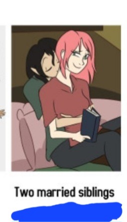
This is the reason why Solid Lily desperately wants to chase Rebecca Sugar out of animation, so she can take "the place that was rightfully stolen from her" and create....well, whatever the hell this is.
Then I realize this is also the real reason Lily hated Baldur's Gate III. Because it was nothing like her awful, sister x sister coffeshop fanfiction here.
#lily orchard#venom lily#solid lily#anti lily orchard#lily orchard critical#lily orchard is a hack#lily orchard is a creep#lily orchard is a predator#lily orchard is a bad critic#lily orchard loves incest#baldur's gate#gorion's ward#imoen#lily ships siblings#two married siblings#tw inc*st#screw lily orchard#justiceforcourtney#the simpsons#itchy and scratchy#rebecca sugar
59 notes
·
View notes
Text


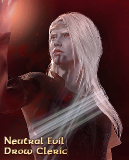
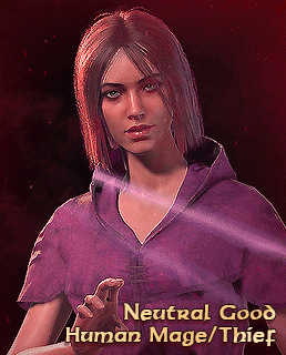
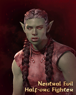
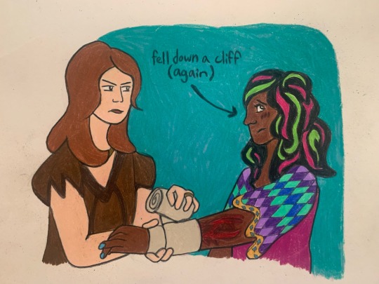
guess what!! finally time for bg2 portraits, baby. imoen, illasera, viconia and yoshimo!
#baldurs gate#bg2#baldur's gate#imoen#imoen bg#illasera#illasera bg#viconia devir#yoshimo#yoshimo bg#colored#painting#finished
70 notes
·
View notes
Text

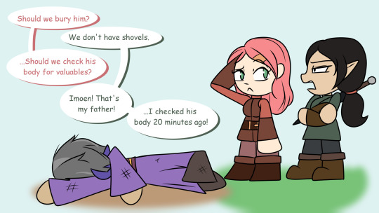
found this old screenshot and it re-dumbfounded my brain and I immediately thought of just all the party members hitting him with The Look of Judgement after that
so now Edwin gets the red solo cup stare:tm:
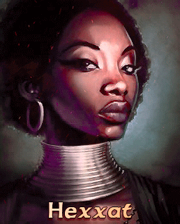
#fanart#artists on tumblr#digital art#baldurs gate#baldur's gate#baldur's gate 2#baldurs gate 2#bgee#bg2#bhaalspawn#gorion's ward#imoen#baldurs gate imoen#minsc#baldurs gate minsc#minsc of rashemen#hexxat#baldurs gate hexxat#jaheira#baldurs gate jaheira#aerie#baldurs gate aerie#baldurs gate nalia#nalia de'arnise#rasaad yn bashir#baldurs gate rasaad#yoshimo#baldurs gate yoshimo#dorn il khan#baldurs gate dorn
81 notes
·
View notes
Text
Real conversation in BG2

118 notes
·
View notes
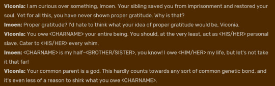
Text
Personally if I was trying to convince people I didn’t molest my sister I would not be parading around the fact that one of my favourite ships is of two siblings, constantly pointing this out and not making any effort to disavow mods that write them as siblings while still being a romance but hey maybe I’M the weird one in this situation
61 notes
·
View notes
Text
Lily's confusing "line weight" for "thin lines." Line weight means like, literally just how thick or thin the lines are. They teach you to vary or consider your line weight based on a bunch of different factors when you learn to illustrate professionally. Line weights are just another element of design you can use for utilitarian and stylistic purposes. You can pull attention to something by giving it heavier line weight, you can give something a more dynamic or organic quality by varying line weight, you can give something a delicate or textured quality with very light lineweight, etc. And of course, obviously, some illustrations has no lines.
Here's some good visual examples I just pulled off Google.


#lily orchard#lily orchard critical#anti lily orchard#lily peet#lorch posting#lily orchard stuff#youtube#eldrich lily#liquid orcard#art tips#lineart#balders gate 3#imoen
56 notes
·
View notes
Text
Aww is that what Lily said? Her incest mod written by incest fetishists is the best "RPG" romance?

[Lily's Post]
Too bad that was on her old now terminated blog lost forever to time. Oh wait.
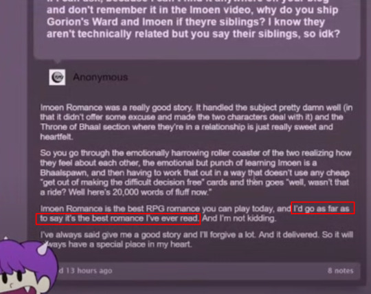

Ah yes, one of the best romances ever written according to Lily.
Credit to this now anonymous post for this info on the mod.
94 notes
·
View notes
Text
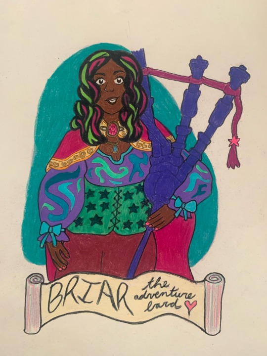
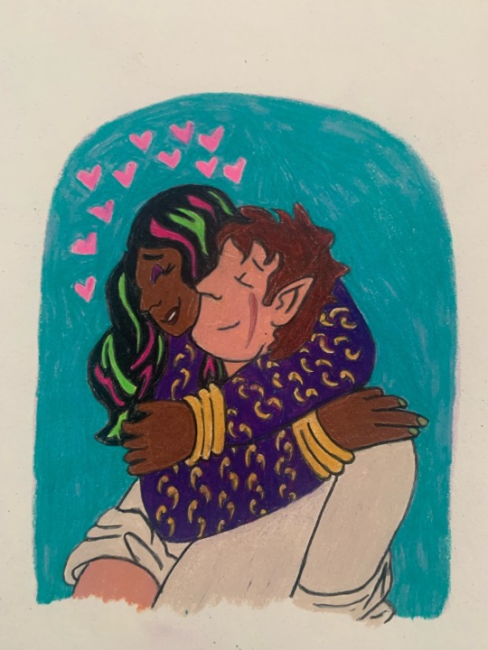
world’s most adventure bard and her most favorite people, circa bg1 🩷
#celiart#briar the adventure bard tag#FINALLY her hair exists in a way that satisfies me!!! you really gotta do things yourself around here lol#anywayyyy#khalid#skie silvershield#jaheira#imoen#princess4princess#i like to believe briar got into dyeing her hair bc of imoen ……#in my head that’s them at candlekeep being babies
38 notes
·
View notes
Text


Lily, is it incest to ship siblings together?


#lily orchard#lily orchard critical#lily orchard stop mentioning incest challenge#baldur's gate 2#Imoen
56 notes
·
View notes
Text


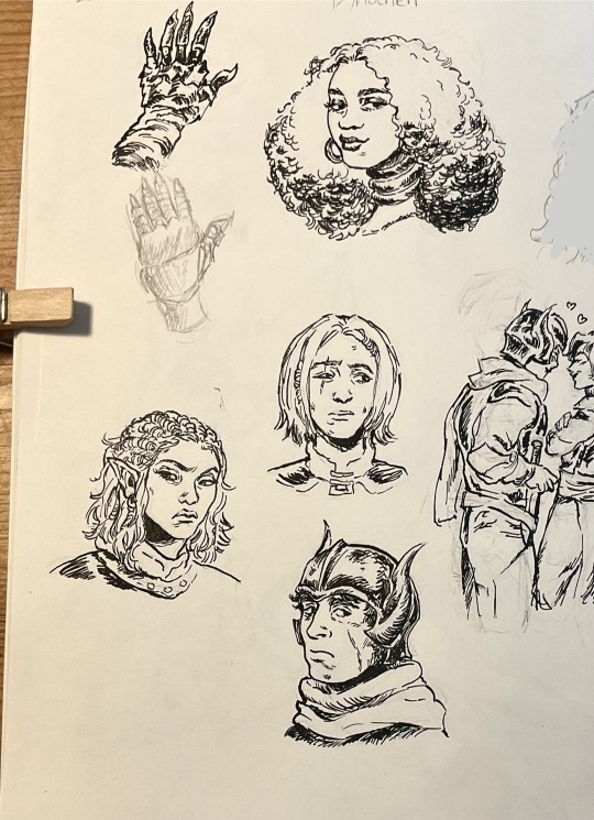
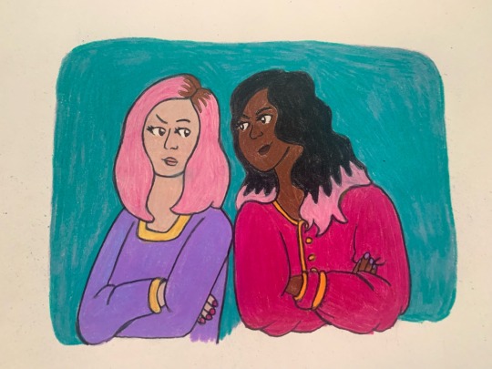
Some ink practice with some bg1-2 characters
#some of theses are rough ok let me be vulnerable for a moment#baldurs gate minsc#baldurs gate fanart#baldurs gate#baldurs gate 2#bg3 minsc#bg3 jaheira#dynaheir#minsc of rashemen#minsc and boo#bg minsc#jaheira x khalid#imoen#baldurs gate khalid#pen and ink#ink drawing#ink#sketch#sketches#artists on tumblr#bg3#art
119 notes
·
View notes
Text

#lily orchard#solid lily#plastic lily#lily orchard critical#anti lily orchard#baldur's gate#baldur's gate 1#baldur's gate ii#bg1#bg2#imoen#gorion's ward#screw lily orchard
29 notes
·
View notes
Text


my favourite part of bg2 is how everyone is so downright miserable
34 notes
·
View notes
Text

Heya! It's me, Imoen
25 notes
·
View notes