#Income Inequality
Explore tagged Tumblr posts
Visit Tumblr Blog
Explore Tumblr blogs with no restrictions, modern design and the best experience.
Last Seen Tumblr Blogs


Fun Fact
25% of US internet users with an annual income of $80-100K use Tumblr.

Text


Source
“Rent prices have exceeded income gains by 325 percent”
#eat the rich#homelessness#end homelessness#capitalism#socioeconomic inequality#the left#progressive#economic inequality#current events#news#working class#income inequality
33K notes
·
View notes
Text


312 notes
·
View notes
Text
Struggling financially due to the cost of living? You're not alone. A new survey shows most Canadians feel like they're only just covering their living costs. A new H&R Block Canada survey on how much money Canadians save shows that they're increasingly worried about not putting enough away for a rainy day. As a rule of thumb, 20 per cent of people's paycheques should go towards savings. However, on average, participants said they only manage to put away 7 per cent of their earnings. That's because the majority of participants said that they feel like living paycheque to paycheque is the "new reality." "When thinking about the prevailing culture of saving in Canada, a whopping 85 per cent feel that living paycheque to paycheque is the new norm," reads the survey. "This is up from 60 per cent who said they felt that way in a similar H&R Block study from 2024."
Continue Reading.
Tagging: @newsfromstolenland
189 notes
·
View notes
Text
{ MASTERPOST } Everything You Need to Know about Repairing Our Busted-Ass World
On poverty:
Starting from nothing
How To Start at Rock Bottom: Welfare Programs and the Social Safety Net
How to Save for Retirement When You Make Less Than $30,000 a Year
Ask the Bitches: “Is It Too Late to Get My Financial Shit Together?“
Understanding why people are poor
It’s More Expensive to Be Poor Than to Be Rich
Why Are Poor People Poor and Rich People Rich?
On Financial Discipline, Generational Poverty, and Marshmallows
Bitchtastic Book Review: Hand to Mouth by Linda Tirado
Is Gentrification Just Artisanal, Small-Batch Displacement of the Poor?
Coronavirus Reveals America’s Pre-existing Conditions, Part 1: Healthcare, Housing, and Labor Rights
Developing compassion for poor people
The Latte Factor, Poor Shaming, and Economic Compassion
Ask the Bitches: “How Do I Stop Myself from Judging Homeless People?“
The Subjectivity of Wealth, Or: Don’t Tell Me What’s Expensive
A Little Princess: Intersectional Feminist Masterpiece?
If You Can’t Afford to Tip 20%, You Can’t Afford to Dine Out
Correcting income inequality
1 Easy Way All Allies Can Help Close the Gender and Racial Pay Gap
One Reason Women Make Less Money? They’re Afraid of Being Raped and Killed.
Raising the Minimum Wage Would Make All Our Lives Better
Are Unions Good or Bad?
On intersectional social issues:
Reproductive rights
On Pulling Weeds and Fighting Back: How (and Why) to Protect Abortion Rights
How To Get an Abortion
Blood Money: Menstrual Products for Surviving Your Period While Poor
You Don’t Have to Have Kids
Gender equality
1 Easy Way All Allies Can Help Close the Gender and Racial Pay Gap
The Pink Tax, Or: How I Learned to Love Smelling Like “Bearglove”
Our Single Best Piece of Advice for Women (and Men) on International Women’s Day
Bitchtastic Book Review: The Feminist Financial Handbook by Brynne Conroy
Sexual Harassment: How to Identify and Fight It in the Workplace
Queer issues
Queer Finance 101: Ten Ways That Sexual and Gender Identity Affect Finances
Leaving Home before 18: A Practical Guide for Cast-Offs, Runaways, and Everybody in Between
Racial justice
The Financial Advantages of Being White
Woke at Work: How to Inject Your Values into Your Boring, Lame-Ass Job
The New Jim Crow, by Michelle Alexander: A Bitchtastic Book Review
Something Is Wrong in Personal Finance. Here’s How To Make It More Inclusive.
The Biggest Threat to Black Wealth Is White Terrorism
Coronavirus Reveals America’s Pre-existing Conditions, Part 2: Racial and Gender Inequality
10 Rad Black Money Experts to Follow Right the Hell Now
Youth issues
What We Talk About When We Talk About Student Loans
The Ugly Truth About Unpaid Internships
Ask the Bitches: “I Just Turned 18 and My Parents Are Kicking Me Out. How Do I Brace Myself?”
Identifying and combatting abuse
When Money is the Weapon: Understanding Intimate Partner Financial Abuse
Are You Working on the Next Fyre Festival?: Identifying a Toxic Workplace
Ask the Bitches: “How Do I Say ‘No’ When a Loved One Asks for Money… Again?”
Ask the Bitches: I Was Guilted Into Caring for a Sick, Abusive Parent. Now What?
On mental health:
Understanding mental health issues
How Mental Health Affects Your Finances
Stop Recommending Therapy Like It’s a Magic Bean That’ll Grow Me a Beanstalk to Neurotypicaltown
Bitchtastic Book Review: Kurt Vonnegut’s Galapagos and Your Big Brain
Ask the Bitches: “How Do I Protect My Own Mental Health While Still Helping Others?”
Coping with mental health issues
{ MASTERPOST } Everything You Need to Know about Self-Care
My 25 Secrets to Successfully Working from Home with ADHD
Our Master List of 100% Free Mental Health Self-Care Tactics
On saving the planet:
Changing the system
Don’t Boo, Vote: If You Don’t Vote, No One Can Hear You Scream
Ethical Consumption: How to Pollute the Planet and Exploit Labor Slightly Less
The Anti-Consumerist Gift Guide: I Have No Gift to Bring, Pa Rum Pa Pum Pum
Season 1, Episode 4: “Capitalism Is Working for Me. So How Could I Hate It?”
Coronavirus Reveals America’s Pre-existing Conditions, Part 1: Healthcare, Housing, and Labor Rights
Coronavirus Reveals America’s Pre-existing Conditions, Part 2: Racial and Gender Inequality
Shopping smarter
You Deserve Cheap Toilet Paper, You Beautiful Fucking Moon Goddess
You Are above Bottled Water, You Elegant Land Mermaid
Fast Fashion: Why It’s Fucking up the World and How To Avoid It
You Deserve Cheap, Fake Jewelry… Just Like Coco Chanel
6 Proven Tactics for Avoiding Emotional Impulse Spending
Join the Bitches on Patreon
#poverty#economics#income inequality#wealth inequality#capitalism#working class#labor rights#workers rights#frugal#personal finance#financial literacy#consumerism#environmentalism
877 notes
·
View notes
Text

For the past six years or so, this graph has been making its rounds on social media, always reappearing at conveniently timed moments…
The insinuation is loud and clear: parallels abound between 18th-century France and 21st-century USA. Cue the alarm bells—revolution is imminent! The 10% should panic, and ordinary folk should stock up on non-perishables and, of course, toilet paper, because it wouldn’t be a proper crisis without that particular frenzy. You know the drill.

Well, unfortunately, I have zero interest in commenting on the political implications or the parallels this graph is trying to make with today’s world. I have precisely zero interest in discussing modern-day politics here. And I also have zero interest in addressing the bottom graph.
This is not going to be one of those "the [insert random group of people] à la lanterne” (1) kind of posts. If you’re here for that, I’m afraid you’ll be disappointed.
What I am interested in is something much less click-worthy but far more useful: how historical data gets used and abused and why the illusion of historical parallels can be so seductive—and so misleading. It’s not glamorous, I’ll admit, but digging into this stuff teaches us a lot more than mindless rage.
So, let’s get into it. Step by step, we’ll examine the top graph, unpick its assumptions, and see whether its alarmist undertones hold any historical weight.
Step 1: Actually Look at the Picture and Use Your Brain
When I saw this graph, my first thought was, “That’s odd.” Not because it’s hard to believe the top 10% in 18th-century France controlled 60% of the wealth—that could very well be true. But because, in 15 years of studying the French Revolution, I’ve never encountered reliable data on wealth distribution from that period.
Why? Because to the best of my knowledge, no one was systematically tracking income or wealth across the population in the 18th century. There were no comprehensive records, no centralised statistics, and certainly no detailed breakdowns of who owned what across different classes. Graphs like this imply data, and data means either someone tracked it or someone made assumptions to reconstruct it. That’s not inherently bad, but it did get my spider senses tingling.
Then there’s the timeframe: 1760–1790. Thirty years is a long time— especially when discussing a period that included wars, failed financial policies, growing debt, and shifting social dynamics. Wealth distribution wouldn’t have stayed static during that time. Nobles who were at the top in 1760 could be destitute by 1790, while merchants starting out in 1760 could be climbing into the upper tiers by the end of the period. Economic mobility wasn’t common, but over three decades, it wasn’t unheard of either.
All of this raises questions about how this graph was created. Where’s the data coming from? How was it measured? And can we really trust it to represent such a complex period?
Step 2: Check the Fine Print
Since the graph seemed questionable, the obvious next step was to ask: Where does this thing come from? Luckily, the source is clearly cited at the bottom: “The Income Inequality of France in Historical Perspective” by Christian Morrisson and Wayne Snyder, published in the European Review of Economic History, Vol. 4, No. 1 (2000).

Great! A proper academic source. But, before diving into the article, there’s a crucial detail tucked into the fine print:
“Data for the bottom 40% in France is extrapolated given a single data point.”
What does that mean?
Extrapolation is a statistical method used to estimate unknown values by extending patterns or trends from a small sample of data. In this case, the graph’s creator used one single piece of data—one solitary data point—about the wealth of the bottom 40% of the French population. They then scaled or applied that one value to represent the entire group across the 30-year period (1760–1790).
Put simply, this means someone found one record—maybe a tax ledger, an income statement, or some financial data—pertaining to one specific year, region, or subset of the bottom 40%, and decided it was representative of the entire demographic for three decades.
Let’s be honest: you don’t need a degree in statistics to know that’s problematic. Using a single data point to make sweeping generalisations about a large, diverse population (let alone across an era of wars, famines, and economic shifts) is a massive leap. In fact, it’s about as reliable as guessing how the internet feels about a topic from a single tweet.
This immediately tells me that whatever numbers they claim for the bottom 40% of the population are, at best, speculative. At worst? Utterly meaningless.

It also raises another question: What kind of serious journal would let something like this slide? So, time to pull up the actual article and see what’s going on.
Step 3: Check the Sources
As I mentioned earlier, the source for this graph is conveniently listed at the bottom of the image. Three clicks later, I had downloaded the actual article: “The Income Inequality of France in Historical Perspective” by Morrisson and Snyder.
The first thing I noticed while skimming through the article? The graph itself is nowhere to be found in the publication.
This is important. It means the person who created the graph didn’t just lift it straight from the article—they derived it from the data in the publication. Now, that’s not necessarily a problem; secondary analysis of published data is common. But here’s the kicker: there’s no explanation in the screenshot of the graph about which dataset or calculations were used to make it. We’re left to guess.
So, to figure this out, I guess I’ll have to dive into the article itself, trying to identify where they might have pulled the numbers from. Translation: I signed myself up to read 20+ pages of economic history. Thrilling stuff.
But hey, someone has to do it. The things I endure to fight disinformation...
Step 4: Actually Assess the Sources Critically
It doesn’t take long, once you start reading the article, to realise that regardless of what the graph is based on, it’s bound to be somewhat unreliable. Right from the first paragraph, the authors of the paper point out the core issue with calculating income for 18th-century French households: THERE IS NO DATA.
The article is refreshingly honest about this. It states multiple times that there were no reliable income distribution estimates in France before World War II. To fill this gap, Morrisson and Snyder used a variety of proxy sources like the Capitation Tax Records (2), historical socio-professional tables, and Isnard’s income distribution estimates (3).
After reading the whole paper, I can say their methodology is intriguing and very reasonable. They’ve pieced together what they could by using available evidence, and their process is quite well thought-out. I won’t rehash their entire argument here, but if you’re curious, I’d genuinely recommend giving it a read.
Most importantly, the authors are painfully aware of the limitations of their approach. They make it very clear that their estimates are a form of educated guesswork—evidence-based, yes, but still guesswork. At no point do they overstate their findings or present their conclusions as definitive
As such, instead of concluding with a single, definitive version of the income distribution, they offer multiple possible scenarios.
It’s not as flashy as a bold, tidy graph, is it? But it’s far more honest—and far more reflective of the complexities involved in reconstructing historical economic data.
Step 5: Run the numbers
Now that we’ve established the authors of the paper don’t actually propose a definitive income distribution, the question remains: where did the creators of the graph get their data? More specifically, which of the proposed distributions did they use?
Unfortunately, I haven’t been able to locate the original article or post containing the graph. Admittedly, I haven’t tried very hard, but the first few pages of Google results just link back to Twitter, Reddit, Facebook, and Tumblr posts. In short, all I have to go on is this screenshot.
I’ll give the graph creators the benefit of the doubt and assume that, in the full article, they explain where they sourced their data. I really hope they do—because they absolutely should.
That being said, based on the information in Morrisson and Snyder’s paper, I’d make an educated guess that the data came from Table 6 or Table 10, as these are the sections where the authors attempt to provide income distribution estimates.

Now, which dataset does the graph use? Spoiler: None of them.
How can we tell? Since I don’t have access to the raw data or the article where this graph might have been originally posted, I resorted to a rather unscientific method: I used a graphical design program to divide each bar of the chart into 2.5% increments and measure the approximate percentage for each income group.
Here’s what I found:

Now, take a moment to spot the issue. Do you see it?
The problem is glaring: NONE of the datasets from the paper fit the graph. Granted, my measurements are just estimates, so there might be some rounding errors. But the discrepancies are impossible to ignore, particularly for the bottom 40% and the top 10%.
In Morrisson and Snyder’s paper, the lowest estimate for the bottom 40% (1st and 2nd quintiles) is 10%. Even if we use the most conservative proxy, the Capitation Tax estimate, it’s 9%. But the graph claims the bottom 40% held only 6%.
For the top 10% (10th decile), the highest estimate in the paper is 53%. Yet the graph inflates this to 60%.
Step 6: For fun, I made my own bar charts
Because I enjoy this sort of thing (yes, this is what I consider fun—I’m a very fun person), I decided to use the data from the paper to create my own bar charts. Here’s what came out:

What do you notice?
While the results don’t exactly scream “healthy economy,” they look much less dramatic than the graph we started with. The creators of the graph have clearly exaggerated the disparities, making inequality seem worse.
Step 7: Understand the context before drawing conclusions
Numbers, by themselves, mean nothing. Absolutely nothing.
I could tell you right now that 47% of people admit to arguing with inanimate objects when they don’t work, with printers being the most common offender, and you’d probably believe it. Why? Because it sounds plausible—printers are frustrating, I’ve used a percentage, and I’ve phrased it in a way that sounds “academic.”
You likely wouldn’t even pause to consider that I’m claiming 3.8 billion people argue with inanimate objects. And let’s be real: 3.8 billion is such an incomprehensibly large number that our brains tend to gloss over it.
If, instead, I said, “Half of your friends probably argue with their printers,” you might stop and think, “Wait, that seems a bit unlikely.” (For the record, I completely made that up—I have no clue how many people yell at their stoves or complain to their toasters.)
The point? Numbers mean nothing unless we put them into context.
The original paper does this well by contextualising its estimates, primarily through the calculation of the Gini coefficient (4).
The authors estimate France’s Gini coefficient in the late 18th century to be 0.59, indicating significant income inequality. However, they compare this figure to other regions and periods to provide a clearer picture:
Amsterdam (1742): Much higher inequality, with a Gini of 0.69.
Britain (1759): Lower inequality, with a Gini of 0.52, which rose to 0.59 by 1801.
Prussia (mid-19th century): Far less inequality, with a Gini of 0.34–0.36.
This comparison shows that income inequality wasn’t unique to France. Other regions experienced similar or even higher levels of inequality without spontaneously erupting into revolution.
Accounting for Variations
The authors also recalculated the Gini coefficient to account for potential variations. They assumed that the income of the top quintile (the wealthiest 20%) could vary by ±10%. Here’s what they found:
If the top quintile earned 10% more, the Gini coefficient rose to 0.66, placing France significantly above other European countries of the time.
If the top quintile earned 10% less, the Gini dropped to 0.55, bringing France closer to Britain’s level.
Ultimately, the authors admit there’s uncertainty about the exact level of inequality in France. Their best guess is that it was comparable to other countries or somewhat worse.
Step 8: Drawing Some Conclusions
Saying that most people in the 18th century were poor and miserable—perhaps the French more so than others—isn’t exactly a compelling statement if your goal is to gather clicks or make a dramatic political point.
It’s incredibly tempting to look at the past and find exactly what we want to see in it. History often acts as a mirror, reflecting our own expectations unless we challenge ourselves to think critically. Whether you call it wishful thinking or confirmation bias, it’s easy to project the future onto the past.
Looking at the initial graph, I understand why someone might fall into this trap. Simple, tidy narratives are appealing to everyone. But if you’ve studied history, you’ll know that such narratives are a myth. Human nature may not have changed in thousands of years, but the contexts we inhabit are so vastly different that direct parallels are meaningless.
So, is revolution imminent? Well, that’s up to you—not some random graph on the internet.
Notes
(1) A la lanterne was a revolutionary cry during the French Revolution, symbolising mob justice where individuals were sometimes hanged from lampposts as a form of public execution
(2) The capitation tax was a fixed head tax implemented in France during the Ancien Régime. It was levied on individuals, with the amount owed determined by their social and professional status. Unlike a proportional income tax, it was based on pre-assigned categories rather than actual earnings, meaning nobles, clergy, and commoners paid different rates regardless of their actual wealth or income.
(3) Jean-Baptiste Isnard was an 18th-century economist. These estimates attempted to describe the theoretical distribution of income among different social classes in pre-revolutionary France. Isnard’s work aimed to categorise income across groups like nobles, clergy, and commoners, providing a broad picture of economic disparity during the period.
(4) The Gini coefficient (or Gini index) is a widely used statistical measure of inequality within a population, specifically in terms of income or wealth distribution. It ranges from 0 to 1, where 0 indicates perfect equality (everyone has the same income or wealth), and 1 represents maximum inequality (one person or household holds all the wealth).
#frev#french revolution#history#disinformation#income inequality#critical thinking#amateurvoltaire's essay ramblings#don't believe everything you see online#even if you really really want to
249 notes
·
View notes
Text

Call to mind who was elected President in 1980...
35 notes
·
View notes
Text

Source
Source
#capitalism#eat the rich#tax the rich#news#current events#wealth inequality#income inequality#socioeconomic inequality#the left
34K notes
·
View notes
Text
Zachary Pleat at MMFA:
Headlines from NBC News, USA Today, The Hill, and CBS News gave credit to Sen. Josh Hawley (R-MO) for helping to introduce a bipartisan bill to increase the federal minimum wage to $15 per hour. But many of these same news stories neglected to mention Hawley’s past opposition to minimum wage increases, both in his state and nationwide, and his support for policies that will harm members of the working class — even as they printed his quotes about the hardships they face.
[...]
These articles all explained that the bill is cosponsored by Sen. Peter Welch (D-VT). All four articles also included quotes from Hawley about economic headwinds confronting working-class Americans.
Unfortunately, these news stories failed to inform their readers that Hawley has a history of opposing minimum wage increases. In March 2021, Hawley voted against a federal minimum wage increase to $15 per hour that passed the House. Afterward, the Missouri Independent reminded readers that “in 2018, then Attorney General Hawley opposed Proposition B, a modest proposal to gradually increase the minimum wage by eighty-five cents a year.”
Additionally, Hawley has never before cosponsored Democratic bills to raise the federal minimum wage since he was elected to the Senate. He never signed on as a cosponsor for the Raise The Wage Act bills in 2019, 2021, or 2023. (In 2019, the bill passed the House with a bipartisan vote, but was killed in the Republican-controlled Senate.) [...] Media critic Paul Waldman portrayed this as the latest episode of Hawley’s history of fake populism. Waldman specifically cited Hawley’s 2018 Senate campaign, during which he aired an ad defending coverage for preexisting medical conditions. But “the problem was that as state attorney general, Hawley spearheaded a multi-state lawsuit trying to get the Supreme Court to declare the Affordable Care Act — the law that for the first time made those very denials illegal — unconstitutional.”
Sen. Josh Hawley (R-MO), who recently co-sponsored a federal minimum wage increase to $15 with Sen. Peter Welch (D-VT), has been rebranding himself as a “working class champion”. His record, however, blows that claim to smithereens, as Hawley has repeatedly voted against minimum wage increases and other pro-worker policies during his time in the Senate.
#Josh Hawley#Workers' Rights#Minimum Wage#Mainstream Media#CBS News#NBC News#The Hill#USA Today#US Senate#119th Congress#Income Inequality
49 notes
·
View notes
Text
LETTERS FROM AN AMERICAN
January 16, 2025
Heather Cox Richardson
Jan 17, 2025
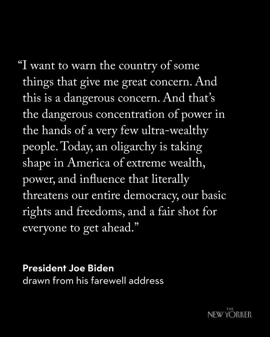
In his final address to the nation last night, President Joe Biden issued a warning that “an oligarchy is taking shape in America of extreme wealth, power, and influence that literally threatens our entire democracy, our basic rights and freedoms, and a fair shot for everyone to get ahead.”
It is not exactly news that there is dramatic economic inequality in the United States. Economists call the period from 1933 to 1981 the “Great Compression,” for it marked a time when business regulation, progressive taxation, strong unions, and a basic social safety net compressed both wealth and income levels in the United States. Every income group in the U.S. improved its economic standing.
That period ended in 1981, when the U.S. entered a period economists have dubbed the “Great Divergence.” Between 1981 and 2021, deregulation, tax cuts for the wealthy and corporations, the offshoring of manufacturing, and the weakening of unions moved $50 trillion from the bottom 90% of Americans to the top 1%.
Biden tried to address this growing inequality by bringing back manufacturing, fostering competition, increasing oversight of business, and shoring up the safety net by getting Congress to pass a law—the Inflation Reduction Act—that enabled Medicare to negotiate drug prices for seniors with the pharmaceutical industry, capping insulin at $35 for seniors, for example. His policies worked, primarily by creating full employment which enabled those at the bottom of the economy to move to higher-paying jobs. During Biden’s term, the gap between the 90th income percentile and the 10th income percentile fell by 25%.
But Donald Trump convinced voters hurt by the inflation that stalked the country after the coronavirus pandemic shutdown that he would bring prices down and protect ordinary Americans from the Democratic “elite” that he said didn’t care about them. Then, as soon as he was elected, he turned for advice and support to one of the richest men in the world, Elon Musk, who had invested more than $250 million in Trump’s campaign.
Musk’s investment has paid off: Faiz Siddiqui and Trisha Thadani of the Washington Post reported that he made more than $170 billion in the weeks between the election and December 15.
Musk promptly became the face of the incoming administration, appearing everywhere with Trump, who put him and pharmaceutical entrepreneur Vivek Ramaswamy in charge of the so-called Department of Government Efficiency, where Musk vowed to cut $2 trillion out of the U.S. budget even if it inflicted “hardship” on the American people.
News broke earlier this week that Musk, who holds government contracts worth billions of dollars, is expected to have an office in the Eisenhower Executive Office Building adjacent to the White House. And the world’s two other richest men will be with Musk on the dais at Trump’s inauguration. Musk, Amazon founder Jeff Bezos, and Meta chief executive officer Mark Zuckerberg, who together are worth almost a trillion dollars, will be joined by other tech moguls, including the CEO of OpenAI, Sam Altman; the CEO of the social media platform TikTok, Shou Zi Chew; and the CEO of Google, Sundar Pichai.
At his confirmation hearing before the Senate Committee on Finance today, Trump’s nominee for Treasury Secretary, billionaire Scott Bessent, said that extending the 2017 Trump tax cuts was "the single most important economic issue of the day." But he said he did not support raising the federal minimum wage, which has been $7.25 since 2009 although 30 states and dozens of cities have raised the minimum wage in their jurisdictions.
There have been signs lately that the American people are unhappy about the increasing inequality in the U.S. On December 4, 2024, a young man shot the chief executive officer of the health insurance company UnitedHealthcare, which has been sued for turning its claims department over to an artificial intelligence program with an error rate of 90% and which a Federal Trade Commission report earlier this week found overcharged cancer patients by more than 1,000% for life-saving drugs. Americans championed the alleged killer.
It is a truism in American history that those interested in garnering wealth and power use culture wars to obscure class struggles. But in key moments, Americans recognized that the rise of a small group of people—usually men—who were commandeering the United States government was a perversion of democracy.
In the 1850s, the expansion of the past two decades into the new lands of the Southeast had permitted the rise of a group of spectacularly wealthy men. Abraham Lincoln helped to organize westerners against a government takeover by elite southern enslavers who argued that society advanced most efficiently when the capital produced by workers flowed to the top of society, where a few men would use it to develop the country for everyone. Lincoln warned that “crowned-kings, money-kings, and land-kings” would crush independent men, and he created a government that worked for ordinary men, a government “of the people, by the people, for the people.”
A generation later, when industrialization disrupted the country as westward expansion had before, the so-called robber barons bent the government to their own purposes. Men like steel baron Andrew Carnegie explained that “[t]he best interests of the race are promoted” by an industrial system, “which inevitably gives wealth to the few.” But President Grover Cleveland warned: “The gulf between employers and the employed is constantly widening, and classes are rapidly forming, one comprising the very rich and powerful, while in another are found the toiling poor…. Corporations, which should be the carefully restrained creatures of the law and the servants of the people, are fast becoming the people's masters.”
Republican president Theodore Roosevelt tried to soften the hard edges of industrialization by urging robber barons to moderate their behavior. When they ignored him, he turned finally to calling out the “malefactors of great wealth,” noting that “there is no individual and no corporation so powerful that he or it stands above the possibility of punishment under the law. Our aim is to try to do something effective; our purpose is to stamp out the evil; we shall seek to find the most effective device for this purpose; and we shall then use it, whether the device can be found in existing law or must be supplied by legislation. Moreover, when we thus take action against the wealth which works iniquity, we are acting in the interest of every man of property who acts decently and fairly by his fellows.”
Theodore Roosevelt helped to launch the Progressive Era.
But that moment passed, and in the 1930s, Franklin Delano Roosevelt, too, contended with wealthy men determined to retain control over the federal government. Running for reelection in 1936, he told a crowd at Madison Square Garden: “For nearly four years you have had an Administration which instead of twirling its thumbs has rolled up its sleeves…. We had to struggle with the old enemies of peace—business and financial monopoly, speculation, reckless banking, class antagonism, sectionalism, war profiteering. They had begun to consider the Government of the United States as a mere appendage to their own affairs. We know now that Government by organized money is just as dangerous as Government by organized mob.”
“Never before in all our history have these forces been so united against one candidate as they stand today,” he said. “They are unanimous in their hate for me—and I welcome their hatred.”
Last night, after President Biden’s warning, Google searches for the meaning of the word “oligarchy” spiked.
LETTERS FROM AN AMERICAN
HEATHER COX RICHARDSON
#President Joe Biden#warning#political#oligarchy#Letters From An American#Heather Cox Richardson#income inequality#history#American History#FDR#Theodore Roosevelt#Robber Barrons
75 notes
·
View notes
Text


437 notes
·
View notes
Text
Dandelion News - December 8-14
Like these weekly compilations? Tip me at $kaybarr1735 or check out my Dandelion Doodles for 50% off this month!
1. Rooftop Solar Keeps Getting More Accessible Across Incomes
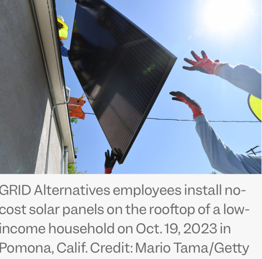
“The long-term trend is that the median income for a household with rooftop solar is getting closer almost every year to that of the median income for owner-occupied households.”
2. Endangered seabirds return to Pacific island after century-long absence

“"No native species were harmed during the removal of invasive rats from Kamaka Island,” Esposito said. […] The team also collected and planted native sedges and grasses while removing invasive trees to enhance nesting conditions.”
3. First-of-its-kind crew welfare measure adopted at Pacific fisheries summit

“The new measure establishes minimum standards on board, including access to clean food and water, medical care, and sleeping quarters. It stipulates that workers have “unfettered access” to their identity documents […] and “unmonitored access to communication devices to seek assistance.””
4. Greyhound racing is increasingly rare worldwide. New Zealand now plans to outlaw the practice

“New Zealand’s government rushed through a law to prevent dogs from being killed while the industry winds down, unless a veterinarian deems it unavoidable. This will prevent owners from euthanizing dogs for economic reasons, Peters said.”
5. Possible Win-Win for Wildlife Management and Food Security
“Wild-harvested meat donation programs can help improve food insecurity while also helping manage overabundance of wildlife species like white-tailed deer[…. In one program,] hunters donated 600,000 meals. But that’s only 5.7% of the amount of venison that food donation facilities could use, according to the Food Bank Council of Michigan. The researchers say this suggests there’s room for scaling up these programs.”
6. Poll of American Farmers Shows Strong, Widespread Support for Increased Farm Bill Conservation Funding

“The polling, which surveyed over 500 farmers and ranchers across the country, found broad support for continuing and increasing funding for climate-smart agriculture conservation programs.”
7. Long-distance friendships enhance trust in conservation efforts

“Relative to a person with no long-distance friends, having even just one friend in another village led to a 15% increase in conservation activities such as beach cleanups, reporting illegal fishing practices and educating others about sustainable resource management.”
8. Two major Sunshine State airports make switch to 100 pct renewables

“Power for operations ranging from lighting and air conditioning to escalators and charging stations will be provided from renewable energy projects [...] at the beginning of 2025, ensuring clean energy operations for the more than 8 million passenger journeys averaged each year.”
9. Expansion of federally subsidized public housing may offer a path out of LA's homelessness crisis

“[… A] half-cent sales tax [was] recently approved by L.A. County voters expected to generate $1 billion per year to address homelessness. […] “Metros with higher concentrations of federally financed public housing tend to have lower rates of unsheltered homelessness," Schachner said.”
10. $20 Million Available to Advance Habitat Restoration Priorities of Tribes and Underserved Communities

“Through this funding, NOAA will help support community-driven habitat restoration and build the capacity of tribes and underserved communities to more fully participate in restoration activities.”
December 1-7 news here | (all credit for images and written material can be found at the source linked; I don’t claim credit for anything but curating.)
#hopepunk#good news#solar#solar panels#solar power#rooftop solar#income inequality#low income#birds#conservation#invasive species#human rights#workers rights#fishing#dogs#greyhound#tw dog death#tw pet death#dog racing#hunting#farmers#climate#climate action#community#renewableenergy#airport#unhoused#homelessness#noaa#habitat restoration
65 notes
·
View notes
Text
The housing crisis is having a severe impact on tenants' mental health, say organizations calling on Premier François Legault to take action. It has become the leading cause of stress for psychiatric patients in Quebec, according to the Regroupement des ressources alternatives en santé mentale au Québec (RRASMQ), which held a news conference in Montreal on Sunday along with the Regroupement des comités logement et associations de locataires du Québec (RCLALQ). The two groups presented an open letter addressed directly to Legault, which will be published in the media on Tuesday. More than 300 organizations specializing in housing and mental health are imploring Legault to take concrete action to resolve the housing crisis, which is causing so much distress.
Continue Reading.
Tagging: @newsfromstolenland
#Housing crisis#Housing#income inequality#Mental Health#cdnpoli#canada#canadian politics#canadian news
619 notes
·
View notes
Text
Any news article that lists worker demands without also listing CEO and executive pay is essentially propaganda for the wealthy.
There’s no justification for not including that information.
Take the UAW strike, for example. The union’s 40% pay raise demand is often painted as out of touch or too high, but it is based specifically on the average pay raise that their CEO’s got this past year. If you didn’t know that and you knew about the strike, then the articles you’re reading are nothing less than anti-union agitprop.
639 notes
·
View notes
Text


#homelessness#social mobility#wealth gap#media manipulation#millionaire#economic disparity#income inequality#class consciousness#working class#brainwashing#class status#social inequality#wealth distribution#billionaire#social stratification#economic mobility
164 notes
·
View notes
Text
« For ages, Democratic leaders have tried to have it both ways, calling for marginal improvements to the tax code but shying away from anything that might repel the corporate interests that are also in their coalition. But, at some point, the worsening suffering of tens of millions of workers must persuade them to take the risk.
And — who knows? — maybe if Democrats take that risk, it will free them, and all of us, from the dreary cycle of the past two decades in which frustrated voters turn from one party to the other and then back again, never finding the change they are seeking. And then, for the first time in decades, maybe working people will again vote reliably Democratic, because Democrats will have restored their working-class identity. »
— Dana Milbank at the Washington Post. (archived)
Democrats need to declare war on greed.
Some people have a pathological obsession with the accumulation of wealth which is hurting almost everybody else. These robber barons, mostly in tech, make their late 19th century counterparts seem like Buddhist monks. It's no longer enough to be a mere billionaire, the mega-greedy now aspire to become multi-billionaires or even trillionaires.
It's only when income inequality is reduced that we can get back to something approximating the post-WWII prosperity.
#democrats#war on greed#greed#income inequality#billionaires#oligarchs#excessive wealth#dana milbank
60 notes
·
View notes