#Italians explain
Text
modern au where eddie and robin are roommates and steve is italian <3
-
eddie has always known that his roommate robin is in the US for college, but grew up in and is from italy. sure, sometimes he forgets, because she somehow has a near-perfect american accent and also speaks two other languages, but he’s always known.
and for the past year and a bit, he’s known how much robin wants her best friend stevie to come visit. she talks about them all the time, and ever since she and eddie moved out of the dorms and into an apartment together for their next year of university a month ago, he’s known stevie is going to come and visit.
he just kind of forgot the exact day stevie would be arriving.
so when he, clad in nothing but his garfield pyjama pants and a metallica t-shirt that’s falling apart, walks into the kitchen one morning and sees someone he doesn’t know at the kitchen counter fiddling with their instant coffee machine, he almost shits himself.
luckily, he doesn’t, because he remembers in that split second that stevie was due to arrive last night. but he still flinches pretty hard at the fright and grabs for the nearest grabbable thing, which turns out to be the doorframe. somehow, he makes a noise loud enough to get the mystery person’s attention, and they turn around.
holy shit. eddie did not know stevie is hot. or that stevie’s actually a guy. he kind of just assumed, with the nickname and all? but the man standing there looks like he could’ve been carved by the gods eddie doesn’t believe in, and- eddie realises he’s been staring at the guy for a few seconds now, and decides to talk like a normal human being. he first adjusts his position so he’s no longer holding onto the archway of the kitchen for support, and smiles at the guy.
“hi, you must be stevie?” he offers, and stevie takes a few seconds to process his words before nodding with a smile.
“my name is steve. robbie just is… hm, silly?”
eddie blinks a couple times, because steve has an accent. a thick one. he should’ve expected that, because- hello? they’re both literally from italy. but it catches him off guard, and adds to steve’s hot factor. why didn’t robin warn him about this.
“yeah, robin is very silly.” he agrees with a chuckle, and then realises steve might not know him, “i’m eddie. robin’s roommate. you probably knew that already though, so now i probably look like an idiot. well- more of an idiot than i already do in these clothes…”
he lets his words trail off as he realises steve is frowning at him in subtle confusion. he’s picked up robin’s rambling-when-nervous habit over their friendship, and hot guys tend to make him pretty nervous. but then he realises maybe steve isn’t as fluent in english as robin is, and even if he is eddie’s a fast talker that doesn’t always pronounce things fully.
“i am sorry,” steve looks embarrassed, “my english is not as good as robin.”
eddie feels so guilty at the pink that’s made itself known on steve’s cheeks, and shakes his head immediately.
“no! you don’t need to be sorry. i just talk a lot when i’m nervous.” he confesses. why did he say that? now steve knows he’s nervous. or does he? maybe he didn’t catch his full sentence.
steve raises one eyebrow at eddie though, and one side of his mouth quirks up into a smile as he turns around to keep trying to make himself a cup of coffee.
“i am making you nervous? why?” steve asks, his back still turned. now eddie’s the one with red cheeks. dammit.
“it’s because eddie here thinks you’re hot, stevie.”
eddie’s flinch at robin’s magical appearance behind him is somehow more spectacular than earlier, and he clutches dramatically at his heart and spins around to glare at robin.
“robin! what the fuck, man!” he yelps when he realises what she’s said. but robin isn’t listening, she’s too busy speaking to steve in italian about who knows what.
probably about how she knows all eddie’s tells for when he finds a guy attractive and how she knows eddie’s type and steve checks every single box. or, eddie squints at the pair as robin tsks at steve and takes over manning the coffee machine, maybe robin’s just telling steve how to make a coffee with the machine?
“you think i am…” steve starts as he spins around to look at eddie, and seems to be searching for a word for a few moments, “attractive?”
eddie’s eyes widen, and then he sighs and fixes a glare on robin. robin just shrugs and makes a very insincere ‘oopsie’ expression, and eddie is about to start denying like his life depends on it, but he looks back at steve.
and steve has that blush back on his face, and a tiny smile, and he’s looking eddie up and down even in his ridiculous outfit.
“um, yes.” eddie practically squeaks, not used to having someone’s eyes on him like this.
steve says something to robin in italian that sounds like it ends with a question mark, and robin rolls her eyes.
“steve wants me to translate a pick up line he wants to use on you, but i literally refuse to do that. google translate is free.”
and with that, she leaves the kitchen.
#steddie#italian steve harrington#steddie drabble#steddie ficlet#steve harrington#eddie munson#stranger things#st#mywriting#robin buckley#steve is so smooth in italian and so not smooth in english#he just lacks confidence#eddie doesnt believe him#thank you to the person who explained how tumblr tagging system works <3
4K notes
·
View notes
Text
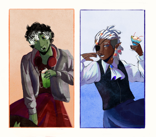


The Bad Kids + Summer drinks
#ill explain the drinks after character tags For anyone who cares#dimension 20#fantasy high#gorgug thistlespring#fabian aramais seacaster#figueroth faeth#kristen applebees#adaine abernant#adaine o'shaughnessey#riz gukgak#btw none of these r alcoholic cuz i love my silly sweet drinks#gorgug has melon soda Cuz i think that’s the best ramune flavor i am not debating Facts#fabian has a blue hawaiin frozen punch Purely for the aesthetics#riz had thai iced coffee because once again it’s the best coffee and I am not arguing facts#also there’s so much trig and astrophysics references on his tattoos because i love math and projecting#speaking of projecting fig has a rooh afza because i love projecting myself in silly ways .. best swana drink To Me#kristen has taro boba because I felt like giving her a protein shake would be Too obvious and taro is So Good#Lasty adaine has a strawberry Italian cuz she deserves a sweet drink#ive worked on this for So long i think u can tell which were the last . im so sorry#going to pass out And never do this again / silly#taya art
414 notes
·
View notes
Text


No, no, what ice cream?
#tbh he drinks like a kitty...#someone pls explain the ice cream stuff to me i can't understand italian#f2#prema racing#kimi antonelli#ollie bearman#formula 2#hungarian gp 2024#bearnelli
213 notes
·
View notes
Text

🥲💔💔💔
79 notes
·
View notes
Note
I just recently started following you so i don't have the full lore of your murderous gay religiously traumatized doggos, BUT, from my understanding, they are Italian and i don't know what part of Italy they are from, yet i can't help headcanoning Vasco as Tuscan, while Machete is probably from some part of Veneto. And as an Italian who has heard Tuscans and Veneto dialet, well it's an hilarious mental image.
Vasco is indeed Tuscan, Florentine to be specific. He comes from a wealthy and influential noble family that has lived in Florence for centuries. He's proud of his roots, and it's usually easy for strangers to tell where he's from. He's a resonably successful politician and has worked as an ambassador and representative of Florence on numerous occasions.
Machete is originally Sicilian (ironically about as far from Veneto as possible), although he was taken to mainland at young age and has lived in several places since then, before ending up in Rome. The way I see it, he exhibits very little local color, his demeanor and (even though Italian hadn't become a standardized language yet) way of speaking are formal, neutral and scarcely give away any hints about his personal history, at least in the 16th century canon.
#I tend to take the easy way out with the various Italian dialects/languages and temper their effect on how the dog world works#even though to my understanding in reality they differ drastically from each other even today and they aren't always mutually intelligible#especially when you compare northern and southern ones#I know at least Sicilian is so different from modern day Italian it's considered a separate language entirely#it isn't the only one but I'm not a linguist and not even Italian so I'm not really qualified to be explaining any of this to you#main point is that my dogs are well traveled educated and adaptable so I'd like to believe that they manage#otherwise making this whole scenario work would become very complicated#language barriers aplenty#Machete is a fast learner with a natural knack for languages so he absorbs/decodes new ones easily#and I can see him acting as an interpreter if necessary#which is a valuable trait for someone working as the secretary of state I'd imagine#a lot of people he ends up dealing with speak at least passable Latin so at a pinch they might perhaps try switching to that?#Vasco might have a Tuscan flavor but Machete is more of a blank slate (at least in public and at work)#answered#fallenoftheromaempire#feel free to correct me if I've gotten something wrong I'm not an expert and this stuff is complicated for an outsider
196 notes
·
View notes
Text
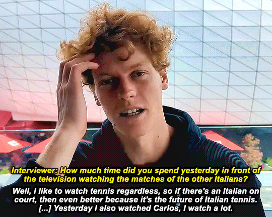
jannik sinner for supertennis after r2 of the australian open (17.01.2024)
#jannik sinner#carlos alcaraz#sincaraz#australian open#ao24#tennis#*gifs#big thanks to vega for not only informing me this exists but also helping me out with the italian <33#anyway#like. he really was not asked about carlos at all guys.#how did we get from italian tennis to watching carlos. jannik please explain.
99 notes
·
View notes
Text
the brothers karamazov amv wip
(song: se ne va by nayt)
#my passion is using italian songs to explain russian novels#i def have to rethink the transitions and how to write the lyrics bc i pulled this out of my ass in an hour with windows movie maker#my art#the brothers karamazov#russian literature#fyodor dostoevsky#tbk#ruslit#artists on tumblr#ivan karamazov#alexei karamazov#agrafena alexandrovna svetlova#digital art#digital illustration
91 notes
·
View notes
Text

Painting by Auguste Bernard d’Agesci (French, 1756–1829), Lady Reading the Letters of Heloise and Abelard
#tap for better quality!#just me trying to regain some seriousness shhh#also hands off I AM IN LOVE WITH THOSE LINES. IDK HOW MANY TIMES I EXPLAINED THEM TO PEOPLE.#I love you gaspara#always will#my edit#gaspara posting#gaspara stampa#letteratura italiana#poetry#poesia#Italian tag#art#literature#love quotes
42 notes
·
View notes
Text
Not me adding annotations to a book to make it more accessible for my mom when she will read it
#i am once again complaining about italian translators not adding enough context and explainations in queer non fiction books#90% of non queer people or people who do not speak english don't have enough fucking context to get certain things#i need tranlators to add the necessary context to make these books accessible for everyone#olay surely mainly queer people will read a book about going outside the binary but if we want more people to understand us#we need to add the necessary context to make these things comprehensible to everyone#both those who do not have a queer background and therefore have never see certain words and those who do not speak any english#why the fuck are we assuminng everyone reading this knows english and the linguistic and cultural context between certain words#most people i know do not know one word on english and since it's an italian translation you should make it completly accessible for anyone#i don't want people to read this with their phone in their hands to look for meaninga here and there#i have had this complaint before and i will keep complaining#it's frustrating because this book makes the concept of going outside the binary very easy and accessible and the translation is not as good#also the translation of this particular chapter did a terrible job language wise too so i can't expect much#the concept is there but oh boy do a few sentences look like they have been translated with google#so yep i resorted to making my own notes because i want my mom to read this and understand it without here needing to ask me for context#i mean i want conversations to start but not because of translation reasons if you know what i mean#and it would be very unmotivating to read a book that has too many words you don't know bc the translator took things for grated#cris speaks#i am done complaining for now#the og book is super good tho i am happy i am reading it again after so many years#the---hermit
33 notes
·
View notes
Text
Crisp those Lines!
Or: a small collection of suggestions for a crispy, neat lineart.
SO MANY OF YOU ASKED FOR THIS (it feels absurd to say, yes), so here you go.
A premise: there's no right or wrong way of inking, and some of the following tips entirely depend on the type of inking I do. Which is neat and clean, with no blacks, and moreover: digitally. More under the cut because it's gonna be long and full of explanatory pictures. Here's an example:
SOFTWARES AND BRUSHES:
Let's address the elephant in the room: Photoshop SUCKS for inking and linework. The stabilisation of the brush there is SHIT. Good for colouring and painting and doing photobashing, but for Lineart you want it to be precise. Do yourself a favour and don't use Photoshop.
I generally use Clip Studio Paint, but i have to say that the best program for it that I've tried keeps being Paint Tool SAI 2. It has few functions, it's true, and I use CSP because it has more instruments. But if you don't want to pay much, SAI is incredible as for brush rendition and stabilisation.
As for the brush: you don't need a fancy brush, anything in your software will go. What I use and what works best tho must have:
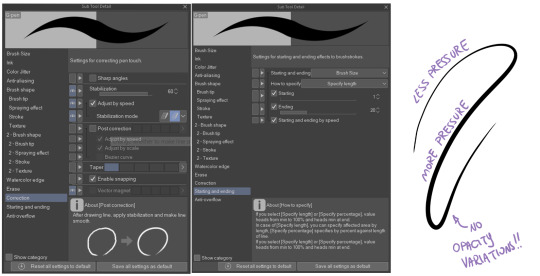
Tapered start and end.
High stabilisation (I go from 60 upward, lower it down for trees and grass or anything more natural that needs to be less neat and flowy)
Low tapering.
It must be set so that pressure controls only the dimension. The more you push on your pen, the bigger the line gets. No colour or opaciy variation!
On Clip Studio Paint, I use the G-Pen in the program. It's good as it is, but I think I did some variations as per here:
FILE DIMENSIONS:Better work larger and then resize down. Sizing files up digitally is possible, but it leads to unfocused images.
I generally work on files at 600dpi (300 is fine too, but don't go any lower. Particularly if that's something you want to print later on, any printing wants a minimum of 300dpi). in roughly an A3 format (bigger dimension is 43cm). Most pictures I upload here are 6000x5000 pixel.
A bigger file will give you more possibilities with brush sizes, and it'll be easier. Remember: digitally, sizing down is ok, sizing up is not something you should do.
SKETCH:
This is the suggestion I should follow but never do.
Having a clean, polished sketch simplifies your life A LOT. This is because if you don't have to worry about drawing details and fixing the anatomy of your drawing during the lineart, and doing it so GOOD because it's the lineart... You'll go that much slower and your life will be more complicated (it's not impossible, my sketches usually are very rough. I am ok with it, the most I do drawing wise is during the lineart... But I'm lazy, don't do like me. A good sketch will help you out.)
Compare the two sketches below:
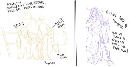
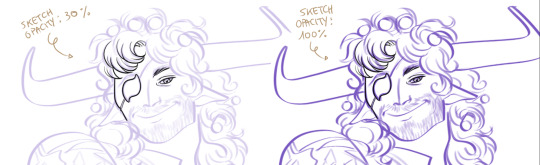
Another note about your sketch layer: you know those memes that complains that the sketch looks good but when you hide it the lineart is shitty? That's easily solvable.
When you're inking, lower the opacity of the sketch layer down, A LOT. I generally go for a 30 or 40% opacity (depending on the colour of the sketch. the yellow sketch will go around 40% because it's less visible, the purple one lower).
When you're inking, you MUST see clearly the lineart you're doing. If the sketch isn't contrasting enough, you won't see clearly what you're doing... It's like trying to sketch with a dim light, not seeing the paper clearly. See the difference:
BEFORE YOU START:
You probably have read it everywhere, but it bears repeating: warm up your hand.
You're using muscles and for more than five minutes. The warmer they are, the firmer your hand is, the easier it gets controlling your lines. It also prevents you from damaging your wrist. Stretching is also great, and grippers are nice to have. Keep your hand fit!
As for warming up: I usually do some calligraphy exercises, practicing on flowy cursives. You want to practice varying the pressure of your lines in a single trait, hence why calligraphy is good. But generally, what you can do is...

PRESSURE VARIATION AND LONG LINES:
So. My main tip and trick is to vary the pressure of your lines. In the same line, and between different details. This will help making the lineart more dynamic and interesting.
A note: this works for semi-realistic styles. If your goal is obtaining a Cartoon Network style: they have generally little to no variation and it works. My suggestion would be to study the kind of style and effect you want to obtain, different styles will work best with different linearts. If you're aiming at hyperrealistic painting, there's no point in spending time over a lineart, for example, I inked the same lineart, but with a brush that doesn't vary it's dimensions with pressure, and not changing the dimension of the brush.
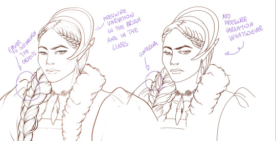
What makes my linearts look "flowy" and "neat" is the fact that I tend to draw less lines and longer, and pay attention when I stop, to start the line where I end it. This will give the impression of one continuous, single line, and make everything more fluid. See above in the french hood: on the right, I left the line rough on purpose, you can see where I stopped and started again. On the left, where I took care of it, you can't.
Generally speaking:
Thick, dark lines communicate that the object is close to the viewer (always keep the viewer in mind!) or in shadow. Lines should be thicker on the outside of your objects, to separate two planes, and in stuff closer to you.
Thin lines are delicate, they should be used in the background, for small details (see the hair, the lips, the small wrinkles around her eyes.)
As for line continuity: in both cases, the line of her face is one single line I drew. This can be obtained with a smooth result, particularly in curved lines, by getting the brush stabilisation on higher settings (80-100): sacrifice speed for accuracy.
MORE IS MORE, WHEN IT COMES TO LEVELS:
Particularly when there are two objects intersecating, or more characters interacting… Instead of inking all on the same level, I always do one level for each object, trace the WHOLE line as if there was nothing above, and then erase where it's not shown. This is a little thing, but pays off. Always in the drawing of above, the feather and the hem of the bodice were on separate layers, and then I erased the bodice under the feather. Take advantage of being inking digitally and not traditionally!

For many characters, here's an example of a vignette of a comic page before cleaning it up and erasing. Every single character and the weapons are on separate layers

For this it's very useful knowing your recurring mistakes. For example, I tend to draw heads bigger than they should. I know I do, so generally I keep the head on its own level, and the body on another, so it's easier to modify and size down just the head without getting crazy selecting only the lines you want with the lazo.
Again, you're inking digitally. It's not easier than traditionally necessarily, take full advantage of your instrument!
OTHER TIPS AND TRICKS:
High brush stabilisation sacrifices speed for accuracy. The line will lag a little from your cursor. Get used to watching the cursor and not the line, and trust that the line will follow.
GO SLOW.
Rotate and flip the canvas. Don't ask me why, but tracing long lines towards me is always easier than not the other way around.
Use the Free Transform, Warp, Distort etc etc and the Liquify to your heart's content if you notice the lineart has something wrong. The only cheating in art is using fucking AI generators (and AI pictures are not art, sorry not sorry)
References are your friends. Study how an artist you like does the lineart. Try and imitate them, and if you can and need to post them: tag them! (don't trace and sell it as your own)
Experiment with brushes, find one that you like for the effect you'd love. You do you, there's no right or wrong way of inking.
Remember to breathe when you trace those lines! (and to drink and do pauses and stretch, you don't want a tendonitis!)
Have fun. Lineart is not evil, lineart is your friend!
I hope this essay is exhaustive enough. I'm tagging ALL THE PEOPLE that requested it (and giving each of you a muffin).
@ndostairlyrium @narina-gnagno @salsedine @whimsyswastry @layalu @n7viper
If you have any questions, don't hesitate in asking!
#tutorials#lineart#inking#digital inking#digital art#tips and tricks#petrel explains#COME LO FECI (cit)#listen if we're mutuals and we chat... ask me to share my screen I don't mind the company when I work if it's not something I can't show#or if it's not too late at night for me#also I unironically like how Alyra inked without variation looks even angrier and more judgemental than normal LOL#also some spoilers for The Last Bacchae if you follow that#“Marmotta” means “Groundhog” in italian#art ref
132 notes
·
View notes
Text
the idea that once a woman is too strong, too fast, too athletic, and worst, not sufficiently performing femininity, she becomes disqualified from womanhood is sure something but that thing is not feminist
#REAL WOMEN are weak as shit say true feminists I guess??#imane khelif#olympics 2024#as always fuck terfs and their fake ass white feminism#not to mention that it's at least the second time the Italian delegation has landed on bigotry to explain a loss#see: accusing Asian judges of favoring Hong Kong in men's foil for why Macchi lost
25 notes
·
View notes
Text
You know I've been thinking... I kinda wanna do stuff for qsmp in Italian. I have a YouTube channel and I've been wanting to post essay etc or stuff there for a while and idk if it's been done bc i haven't looked but I kinda wanna recap the qsmp month by month with videos in Italian for Italian fans, with also English subtitles
#itd be A lot#and it wouldn't be complete bc how would one person be able to cover Everything#but!!! lets take the begining and the eggs arrival and explaining the ccs and synopsis of it. itd make a great video i think#I'd have tons of fun too rewatching stuff#and the beginning isnt as heavy and i wouldnt specifically post theories with it#i couldake separate videos for that rho#both in italian and English#rare rambling
58 notes
·
View notes
Text
i wasn't planning to, but i came out to my nonni today
not in any specific vocabulary, but i told them that me and Nadia are together
they've seen Nadia a bunch over the last 8 years, they know she's my friend, and they know we're living together, but i was upset about something unrelated and so i told them "we're together, and we have been for 8 years and im sorry i haven't told"
and my 102-year-old nonna and 99-year-old simply said "okay", my nonna specifically saying "i accept you" to me and Nadia
my grandparents are a hundred year old catholic italian immigrants that barely speak french, my grandmother doesn't speak english at all, and they simply just said okay, we accept you, Nadia's like a granddaughter to us
im just. really glad i finally told them.
#i grew up with them more than did with my parents#i don't know how to explain transness to them in italian and i don't know if they'll really understand it#i spent my girlhood with them speaking italian and im okay with them gendering me as girl#but it doesn't really matter as much as wanting to tell them about Nadia#im glad i got to tell them while they're still here#okay gonna go cry some more now#orientaytion#Tay Tag#Nadiaphale#i also got to show them my eclipse pictures and they were very excited about them :')
29 notes
·
View notes
Text
I love this tradition of Nico rosberg commenting quali and race with sky Italy and all the other sessions with either uk or Germany
11 notes
·
View notes
Text


อย่าเขย่าเเรงกล้องสั่น
#jack jaktrin#chat wasutha#jackchat#playboyy#playboyy the series#jack looks so italian in this#i cant explain why? maybe its the outfit#maybe its the hair?#he just embodies italian in this video#m:gifs
39 notes
·
View notes
Note
what part of italy are machete and vasco from? not their birthplace since from what i've seen you're still workshopping that. where do they live? i assume rome?
In the 1500's setting Vasco lives and was born in Florence, his family has lived there for centuries. Machete was born in Sicily, was taken to Naples to serve as an apprentice and ended up living and working in Rome (and more specifically today's Vatican city, which as you may know has been an independent country since 1929 but wasn't back then). They first met when they were both studying in Venice in their late teens/early twenties.
I think in the modern au they live together somewhere in Florence.
#characters travelling this extensively at the time#from one end of the country to another#may not be very realistic but it's more fun to include a variety of interesting historical locations#let me be greedy and self indulgent for a moment#(not to mention that Italy wasn't unified until late 1800's and was instead made of various states kingdoms and duchies#that didn't always get along with each other that well and were culturally and linguistically diverse#and some of them were actually ruled Spain and Austria for example)#I say this as lovingly as possible but the history of Italian peninsula as a whole is just a real clusterfuck#I feel like I still haven't wrapped my head around it adequately to be explaining any of this to you#but please be patient with me I promise I'm trying my best#answered#anonymous
185 notes
·
View notes
Last Seen Blogs

sherrywaves
I'll Swim Way Down, Would You?

chevalliere
chev·a·lier

mbr189vip-https-www
MBR 189 VIP⪼SITUS OFFICIAL TERBARU DAN MUDAH MAXWIN

worldclassairambulance
World Class Air Ambulance Service, Delhi NCR India

peachesnpinky
pinky