#ProPhotoRGB
Explore tagged Tumblr posts
Visit Tumblr Blog
Explore Tumblr blogs with no restrictions, modern design and the best experience.
Last Seen Tumblr Blogs


Fun Fact
The most popular pages on Tumblr are about Minecraft, GIFs, and David J. Peterson.
Photo
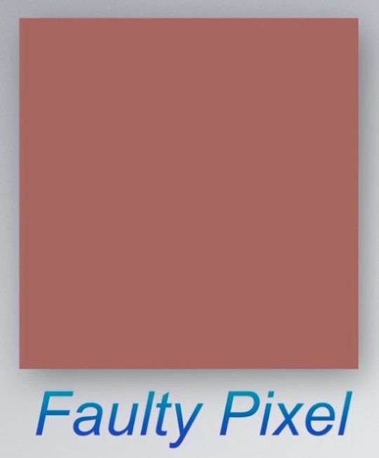
#week #photodump the first 2 ref a wallpaper that caused android phones to self destruct #wallpaper #prophotorgb #android #crash #selfdestruct https://www.instagram.com/p/CjKj8gSKs-CfubEFJEDt4vTuz5tbastUyBRjDA0/?igshid=NGJjMDIxMWI=
0 notes
Text
Colour Management
Questions
Gamut is the range of colours that a device (camera/computer screen etc.) can show or capture.
A colour space is a set range of colours/tones that are available to display in an image.
Most DSLR cameras offer sRGB and Adobe RGB.
The standard colour space that most computer monitors can display is sRGB.
When switching from sRGB to Adobe RGB, the colours that will be improved are generally the reds and greens.
When the colour space in Photoshop is changed this will modify the way that the colours in the images are displayed.
ProPhoto RGB is a larger colour space than Adobe RGB.
When an image is mapped to a larger colour space, it can mean that soft shadows or subtle changes in colours can become more defined and create lines in the image because of the new tones that are available and displayed.
Import/Output Research
The colour space setting in my camera is found in the 'Shooting Menu' section of the setting menu. In the settings menu, the colour space shows as 'Adobe' on the screen, but not on the camera settings menu when shooting.
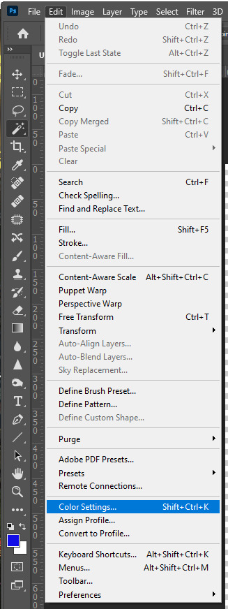
To find the colour space in a Photoshop workspace, go to Edit > Colour Settings.
sRGB:

Adobe RGB:

ProPhoto RGB:

#colourspaces#sRGB#AdobeRGB#ProPhotoRGB#adobephotoshop#gamut#research#postproduction#folio3#nqphotography#cogc
0 notes
Text
Colour management - photoshop
sRGB

adobRGB

ProphotoRGB

1 note
·
View note
Text
Intensify For Mac

Intensify For Mac
Intensify Pro For Mac
Intensify Pro For Mac
Intensify For Apple Mac
Reveal the hidden beauty of your photos. Get instant results with dozens of pro presets. Or use powerful Structure, Sharpness, Detail and Pro contrast enhancements for.
Intensify Pro is for Mac photo enthusiasts who want their photos to stand out. Intensify Pro gives you powerful new ways to create dramatic results. Professionally created presets make it 'one.
Same functionality as on a mac? Canon 5D Mark II Canon 70-200mm f/2.8L IS USM Canon 35L Sigma 85 1.4 Helios 44M-6 58mm(M42) Zeiss 50mm 1.4 (C/Y) Canon 135L (2) 430EX II Photo Comments.
Intensify is the first product in a new line-up of softwares by McPhun targeted at professional photographers, and is available in two versions: Intensify sells for $19.99 and is only available on the Mac App Store; Intensify Pro, which adds the ability to run as a plug-in to popular host applications as well as several other features, has a.
Support OS: Mac OS X 10.8 or later The Verdict: 10/10 Do you want your images to look amazingly impressive? Intensify is here to help you. With thousands of professional photographers, Intensify makes your images vivid and eye-catching.
Updated on 5/20/2014 – Version 1.0.2
I had the opportunity to test a new software released today by MacPhun Software named Intensify Pro. According to MacPhun Software:
Intensify enables photographers of all skill levels to create powerful images using precision tools for enhancing detail. By offering superb control of contrast, structure, detail and sharpening across tonal ranges, Intensify is able to reveal otherwise hidden details and deliver the highest quality results no matter the style of image.
Intensify is the first product in a new line-up of softwares by McPhun targeted at professional photographers, and is available in two versions: Intensify sells for $19.99 and is only available on the Mac App Store; Intensify Pro, which adds the ability to run as a plug-in to popular host applications as well as several other features, has a suggested retail price of $59.99.
Intensify was named to Apple’s Mac App Store “Best of 2013” list and has ranked among the top 10 paid photography apps in the Mac App Store since its initial release in November 2013.
Even though MacPhun Software sells Intensify Pro as a detail enhancement software, what I find it is a complete package of image enhancement. In fact, Intensify Pro supports layers, smart brushes, RAW file format, and has tools that range from basic image tuning to various levels of contrast, detail and sharpness enhancements.
The Pro version of Intensify adds support to run as a plug-in to popular image editing software like Adobe Photoshop, Adobe Lightroom and Apple Aperture.
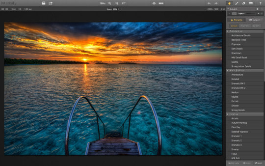
Intensify Pro in Action
When you open Intensify Pro, you are presented with a clean and well laid out interface. On the top there is a navigation bar with common zooming tools, a pup-up navigation window and before/after buttons. On the top right there are undo/redo buttons, and a set of four tools: the Hand Tool for moving your entire image within a window, the Draw Mode, the Erase Mask and the Gradient Tool.
Using the Draw Mode and the Erase Mask, you can craft masks using brushes. You can set brush size, opacity and softness, and you can clear and invert the mask. You can also toggle a show mask button that shows a red overlay of your mask over the image. The Gradient Tool allows you to create, well, gradients in your masks. This set of tools is very similar to Lightroom masking capabilities.
The masking capabilities are quite good, fast and reliable. This, paired with the layering capabilities of Intensify Pro, allows quite complex adjustments to images. What I miss here is a sort of feature like Lightroom’s auto mask or Perfect Photo Suite’s smart brush, and this could be a nice addition to a future release. Also, unlike Lightroom’s gradient tool, once you’ve positioned your gradient and applied it, you can’t move it anymore, but you can always reshape it using brushes.
On the right column of the interface there is the “core” of the software. On the top there is a layers panel where you can add and remove layers, set their opacity and toggle their visibility. Under the layers panel there are two buttons to switch from a presets view or an adjust view.
There is a good number of presets organised in folders. However there isn’t a preview of presets, but they’re applied instantly when you click on them. Also, under each preset there’s an opacity slider to tune their intensity. The default presets are quite over the top for my tastes, and they’re unusable at their default opacity, but they may be a good starting point. Obviously you can create your own presets and folders.
The Adjust view is where the “beast” is hidden. The depth of control over your image is amazing!
The first two panels are basic and common to a lot of softwares. You can fine tune colour temperature, exposure, overall contrast, highlights and shadows, vibrance and saturation. Quite identical to Lightroom’s Basic panel in the Develop module. There isn’t a colour picker to set the white balance though.
After this Basic Tune panel, there are the three core panels of Intensity Pro: Pro Contrast, Structure and Details.
Pro Contrast
In Pro Contrast you can adjust the contrast separately according to tonal ranges. You can set the contrast for highlights, midtones and shadows. Also, under each slider there’s an offset slider to adjust the median value for the contrast tonal range.
Intensify For Mac
It is intimidating at first and it takes a while to understand that offset slider, but after a little trial and error, the power of this contrast controls allows you to set the contrast precisely in a way no other tool allows you to do. Even the Pro Contrast filter in Google’s Nik Color Efex Pro isn’t as deep as Intensify Pro!
Structure and Details
Structure allows you to enhance low contrast areas of the image, helping reveal texture and details. You can control two levels of it: global and micro to target small or really small elements of the image.
You can control it separately for highlights, midtones and shadows (if you’ve used Google Silfer Efex Pro you know what that means). A softness slider allows you to set how soft or crisp this details should be, deciding how artistic or realistic the image is.
Details allows you to make the image crispier. You can act globally, on highlights or shadows on small, medium and large details. I find the effect of Details is quite strong, and it’s easy to overdo it. To obtain a natural effect I use it sparingly. However, the amount of control you have here is intimidating (in a good way!).
The Adjust view also contains a Micro Sharpness panel that allows to sharpen the image, and a Vignette panel to fine tune a vignette effect on the image. I don’t think I will ever use them in my own workflow, but they can be useful in some cases.
What’s new in the 1.0.2 release
The new Intensify release adds additional RAW file support for more cameras, more fully integrates features from Apple’s latest Macintosh OS (Mavericks), introduces the MacPhun Print Lab (powered by MILK Books) and adds the ability to export images to SmugMug, increasing the software’s sharing capabilities.
This is a small update. The big improvements are in the sharing capabilities with SmugMug and the MacPhun Print Lab, which I don’t think are really useful to the professional photographer. Being Intensify Pro an addition in the workflow (not a substitute for Lightroom or Aperture), I think they should focus in improving the editing capabilities rather than integrate it with SmugMug and such. This is a free update, so it’s ok. We’ll wait for the version 2.0 for something exciting.
Beware of colour spaces
MacPhun has solved the color spaces issue I pointed out on the initial release, and now it works correctly with ProPhotoRGB!
Before concluding, I want to write about a strange behaviour in handling colour spaces that looks like a bug.If you work in ProPhotoRGB in Photoshop, you can open correctly the image in Intensify Pro, but when you send it back to Photoshop, it somehow fails to save it with the correct profile, and you have to convert it manually.
This tells me Intensify Pro doesn’t work in the original colour space of the image, and I don’t like it!This happens only with ProPhotoRGB. I tested it with AdobeRGB images and it worked well.I hope MacPhun will fix this soon, because if they want to target professional photographers, they should know they much prefer to work in ProPhotoRGB for masters (a bigger colour space), and convert in sRGB only when exporting image copies for the web.
Conclusion
Intensify Pro is a great piece of software. Even though it doesn’t have groundbreaking technologies built in, in fact all the functions are already seen here and there in other plug-ins, Intensity Pro allows an unprecedented depth of control over contrast and detail in a single package.
It’s incredible, and quite intimidating, how deep the controls in Pro Contrast, Structure and Details go. Add to this the snappy performances and stability of the software, and you know that MacPhun has done a great job for its first professional package.
Here is a sample before/after of a recent image of mine, on which I tested
You can buy Intensify Pro here with a 10% discount using the coupon “DAVIDE2014”.
About MacPhun Software
MacPhun Software is a California based Mac app developer focusing on consumer photography and professional digital imaging markets, serving over 22 million customers worldwide.
Intensify Pro For Mac
First established in 2008 with a mission to create innovative photography software, Macphun’s products such as ColorStrokes, Snapheal, Focus 2, Intensify and Fx Photo Studio are consistently ranked among the top 15 in the paid photography category on the Mac App Stores around the world. The company has recently launched another new app–Lost Photos–a unique free app that enables anyone to re-discover forgotten photos in their email, save them to a folder on Mac or share via social networks.
Intensify Pro For Mac
If you enjoyed this article, consider to share it with your community. Also, consider to subscribe to this blog!
Intensify For Apple Mac
Disclaimer: if you purchase the software using one of the links in this article, I might earn a commission. Rest assured that my review is honest, and that it express my real opinion of the product.
0 notes
Photo

New Post has been published on https://techcrunchapp.com/photographer-behind-viral-phone-breaking-wallpaper-speaks-to-gadgets-360/
Photographer Behind Viral Phone-Breaking Wallpaper Speaks to Gadgets 360
San Diego-based scientist Gaurav Agrawal has emerged as the photographer behind the image that caught headlines for crashing many Android phones recently. Agrawal took that image at Saint Mary Lake in Glacier National Park, Montana, back in August last year. After capturing the sunset landscape, he uploaded the image on Flickr without knowing the fact that it would become viral — not for any good reasons but for randomly affecting a large number of smartphone users. Android devices from Google and Samsung were amongst the most impacted by the image that was used as a wallpaper by several users.
“It was alarming to say the least,” Agrawal, 41, told Gadgets 360 in a conversation. “I felt sympathetic to people who may have lost their data and photographs due to the crash.”
The image was captured using a Nikon DSLR and uploaded on Agrawal’s Flickr profile on September 16, 2019. But before sharing publicly, he explained on Flickr that he used the image editing tool Adobe Lightroom through which he changed the format to ProPhotoRGB. This isn’t supported by some Android devices and, thus, resulted in issues with several phones.
“This photograph is in the news lately with Android phones crashing when setting this as a wallpaper,” Agrawal wrote in an updated description of the image in question.
The Saint Mary Lake sunset image that became popular for crashing various Android devices Photo Credit: Gaurav Agrawal
Agrawal told Gadgets 360 that he got to know about the crashes users faced from his image from some of his followers on Flickr. After receiving comments and messages on the platform, he searched the term “Android crashing wallpaper” on Google to understand the issue.
“I would have been very disappointed if something like that would happen to me,” he said. “There were some websites touting conspiracy theories that it may be a targeted attack by China or Russia. This made it even more unsettling.”
Agrawal’s image was praised by Flickr users initially. But late last month, it became popular after a Twitter user – Ice Universe – warned people to not apply it as a wallpaper on their devices to avoid sudden crashes. Some users, however, did the opposite and reported the results on social media. Various Google and Samsung phone owners were amongst the most affected users. Nevertheless, the image didn’t cause any issues on iPhone models.
People weren’t aware that the image was captured by Agrawal until he gave an interview to BBC earlier this week. He told Gadgets 360 that the original source of the image wasn’t public as it was mainly shared by a third-party wallpaper site that didn’t credit him and was circulating the image without any due credits.
Not just another hobbyist Agrawal started his journey with landscape photography as a hobbyist — perhaps by hijacking what was initially the interest of his wife. He got his first camera phone as the instrument to capture scenes in his frames back in 2006. But that was just a beginning.
The Indian-origin photographer, who did his Ph.D. from the Indian Institute of Science in Bengaluru, has been selected as a part of National Geographic photo assignments. He said that one of the photographs he took at the Salton Sea of the Great White American Pelicans was even selected as the cover page of the yearly calendar of the Audubon Society of North America. Further, he won various photo competitions earlier, including one at the University of California, San Diego, where he did his post-doctoral work.

Gaurav Agrawal started his journey with landscape photography has a hobbyist
Having said that, the crashing of some Android phones through one of his best sunset shots made him popular in the tech world.
“It was a part of a short landscape series of Glacier National Park,” he said. “I was hoping that this series would make the viewer appreciate the beauty of the grand landscapes of the national park.”
The crashes with that single photo have ultimately made Agrawal to switch to another format from now on. Furthermore, he’s planning to expand his photography reach by joining Instagram — alongside maintaining his Flickr profile that has over 10,600 followers.
“I deeply care about my viewers and look forward to their appreciation as well as constructive criticism,” he said.
OnePlus 8 vs Mi 10 5G: Which Is the Best ‘Value Flagship’ Phone in India? We discussed this on Orbital, our weekly technology podcast, which you can subscribe to via Apple Podcasts or RSS, download the episode, or just hit the play button below.
0 notes
Note
Hi! Could you tell me what color space do you use for exporting images in Lightroom? Do you use sRGB, Adobe RGB or ProPhotoRGB? Goodbye :)
Adobe RGB :)
2 notes
·
View notes
Text
Colour Management
What is gamut?
Gamut is the range of colours that a device can record or display
What is a colour space?
A colour space is the colour range that is displayed in a photograph
What two colour spaces do most DSLR cameras offer?
The two colour spaces you find on most DSLR cameras are sRGB and Adobe RGB
What colour space can most computer monitors display?
Most monitors display sRGB colour space
If you switch from sRGB to Adobe RGB on your camera what colours will you see an improvement in?
You will see an improvement in reds, greens and blues when switching to Adobe RGB
When you change the colour space in photoshop what does it do?
It will adjust the amount of colour that you see in the image
Name a larger colour space than Adobe RGB
Pro Photo RGB
What can happen to a digital image if you map colours to a really large colour space?
The image can appear oversaturated
Set up your camera to Adobe RGB colour space note where this is in your camera menu.


Does this display on your camera LCD screen?
I am using a Nikon D5100 and it does not display what colour profile I'm using on my Screen.
Set up photoshops working space to Adobe RGB Can you find out how you can quickly find out the working space in photoshop? Can it display anywhere other than in the edit >assign profile menu? You can find out the Colour Space being used on your working space in both the 'Colour Settings' and 'Assign Profile' under the Edit menu.
sRGB Image

AdobeRGB Image

ProPhotoRGB Image

1 note
·
View note
Text
A Complete Guide to Browser Color Management (and Issues Explained)
youtube
Color management can be a mystery to some. When things just go slightly wrong with color, it can drive people crazy and into sheer frustration. But it does not have to be. In this video and article, we de-mystify how things work in browsers and what steps you can take to make sure your images display properly.
The Problem
We all spend countless hours making our images and artwork look pretty. However, once they leave a professional, color managed environment we cannot be sure for others to see images how they were intended to be seen. This is where color management comes into play and especially for the web we want to take care of everything on our side to potentially deliver the best viewing experience possible.
There are three main reasons why images may look wrong in a browser.
1. Images got another profile than sRGB embedded, those may have gotten discarded.
2. The browser does not support color management and cannot read the embedded profiles.
3. The browser cannot map colors to your wide gamut display due to the lack of color management or missing profiles.
This image demonstrates color management issues. Left: ProPhoto color interpreted as sRGB. Middle: normal color. Right: sRGB interpreted as ProPhoto Color. Note: The color values do not change until they are saved out into the file and get connected to a color space.
Actionable Steps
Not all Browsers are currently color managed. Some do not have any color management, others only support ICC v2, some of the newer version ICC v4.
1. Make sure You have one of the latest versions of your Browser.
2. Check if your browser supports color management.
3. Possibly activate color management in your browser config.
4. If you have a color calibration profile, tell the color management engine to use this profile.
5. Check if the embedded color profiles of your images are sRGB in case your images appear dull on the web.
Real World Color Management Issues In Your Browser
Let me start by talking about what issues most people face which eventually lead them to look into color management. There are a few common mistakes and misconceptions to clear up. So what are the issues one might experience when putting images on the web?
Images Look Dull
One issue one might encounter is: images look too dull, desaturated and have a slightly yellow color cast.
This can happen if an image was worked on in a larger color space and on export the color space has not been down-converted to sRGB. For once, it can occur that a browser or app does not read color profiles and therefore simply interprets colors as sRGB colors. Secondly, it could be an image without a color profile embedded. Then the color reference is lost and by default, most apps and browsers will also interpret those images as being in sRGB color space.
Images Look Oversaturated
The second scenario one might encounter is: images looking way oversaturated. With other people’s images, it is sometimes hard to tell, but you will notice when images you worked on look so much more vibrant compared to how they looked when you were working on them in Lightroom or Photoshop.
Here, when using a wide gamut display, your browser does not map colors to the wider gamut of your monitor. Potentially, the browser cannot access your display gamut / custom color profile to map the colors or does not support color management at all.
About Color Gamuts And Color Spaces
Color spaces are defined frameworks in which we reference colors usually by coordinates in a 3-dimensional space.
The whole of all colors to be described in a color space is called the color gamut. Different color spaces can hugely differ in the number of addressable colors and therefore in the size of gamut.
sRGB is a minimum common denominator color space. It was created by Microsoft and HP in 1996 and represents a typical office or home viewing equipment and conditions. It has a small color gamut that can be accurately reproduced by almost all devices.
Never use sRGB as your main working color space, since it’s smaller than most digital camera color spaces, leading to unnecessarily clipped colors. Work on a larger color space like Adobe RGB, or preferably ProPhotoRGB, and convert to sRGB only on output when preparing images for the web.
3 Most Common Issues With Browser Color Management
1. Wrongly Embedded Color Profile
If you have worked in a larger color space than sRGB and have not converted your image to sRGB on export, this can lead to all sorts of issues.
Considering, there is no embedded profile, no application will ever know how to interpret the color information and by default will look at the available color data as if it is an sRGB image.
You can imagine, issues are pre-programmed, and almost always this will result in a lousy viewing experience.
2. No Color Management Or Discarded Profile
Should you have worked in a larger color space than sRGB and have embedded the color profile but not converted to sRGB, the result depends on the capabilities of the application you are viewing the image with.
If the application or browser does not support color management, the embedded profile won’t be read, and all colors will be interpreted as if they were in sRGB.
In some cases, upon upload, the server/system will strip away the images metadata and color profile information. Should this happen, the result will be the same as if you have not embedded a color profile, to begin with.
This image demonstrates the color shift happening to an image when working in ProPhoto color space and an application either cannot access the color profile or if there is no color profile embedded to the image
To avoid issues demonstrated in scenario one and two, make sure to always down-convert your image’s color space to sRGB and preferably embed the sRGB color profile information into your image’s metadata.
3. Images Look Way Oversaturated – Even In SRGB And Correctly Embedded Profile
In some cases, you might experience your images in an app or browser to look super saturated, much more compared to how the same photo looks within Photoshop.
The Color Space of the exported image was set to sRGB, and the profile has been embedded correctly. So what happened there?
This scenario can occur if you are working with a wide gamut display (much larger color space than sRGB) and viewing an image with an application that either does not support color management or its color management features are not activated properly.
Oversaturation issue when viewing an image on a wide gamut display without proper color management. sRGB colors will not be mapped down according to the color space difference.
The Web Is Still SRGB
The reality is that images nowadays mainly go onto the web. While in print, you are sort of in control of the outcome, with the internet, you are not in control of what devices your images are being looked at with. You cannot know it the displays people use are calibrated, if they are color-managed applications or not, or how wide the display device’s gamut will be.
In the earlier days of the internet, things were a bit easier. Wide gamut displays were rarely used outside of a professional print and design environment, so the number of colors was pretty much restricted by the technology of graphics cards and the operating system. The outcome then was more predictable.
With today’s variety of devices and different color gamuts, things have gotten a bit trickier. Color management is necessary to implement for a predictable outcome. Unfortunately, some browsers have worse progress in adopting those features than others. It still can be hit and miss.
As sRGB is the smallest common standard color space, it still is the basis of all colors and images displayed in browsers, if not tagged otherwise.
Browser Color Management Test
It is always recommended to check if your browser currently supports color management or not. If you have the latest updates dated in 2019, you most likely have been using a color managed browser. However, some of us do not always update their browsers and might be on an earlier revision of the software, possibly without color management features.
As I said, luckily, now almost all browsers have adopted a color management engine. That said, Firefox has a color management engine but most likely needs some tweaking or even manual activation. We will get into the details of that in a bit.
ProPhotoRGB Tagged Image Vs. SRGB Tagged Image
The difference shows how much wider your display’s gamut is, compared to sRGB.
SRGB Untagged Vs. SRGB Image
If these display as the same color, untagged images are getting color managed. If there is a difference, you might want to activate color management for untagged images.
Untagged CSS Element Vs. SRGB Image
Shows if non-image elements are getting color managed.
Current State Of Color Management Support (2019)
This table contains information about the state of color management engines in 2019. If you are on an older browser version, you might want to consider updating. Color management features have been adopted by most browsers over the year of 2018 and chances are, if you had issues with your favorite browser before by now they might have been sorted out, either partially or entirely.
Mobile devices are still the Achilles heel of color management. Most mobile operating systems and their browsers struggle with displaying colors correctly. The lack of color managed apps and lack of calibration capabilities still can make every photographer cringe. Hopefully, this will change shortly, too!
Color Management Is More Than Just Printing
Google Chrome
Chrome is not a color managed browser, but there’s some movement in this direction. Chrome 16, currently in beta, is the first version to offer ICC v2 and v4 color profiles support on the Mac OS X platform. The Windows version still doesn’t have any color profiles support but provides a command line switch to treat all images and page elements as sRGB, avoiding over-saturation problems for wide gamut display users. What we need now is a combination of both.
Apple Safari
Safari supports both v2 and v4 ICC profiles. Unfortunately, it has no control over color on other page elements. Tagged images look right, but every other page element has over-saturated colors on a wide gamut LCD.
Mozilla Firefox
Firefox has been one of the first browsers to adopt color management features. In earlier versions, you might need an add-in to enable color management and to use the settings that now are integrated into the base-engine of firefox. Most times, color management has to be controlled and activated in the advanced config settings. *see all settings and how to access them below
Microsoft Edge
While Microsofts Internet Explorer supports color management out of the box. The edge browser is still stuck in development regarding the color management features. Unfortunately, Microsoft has announced to eventually drop the browser, so there is not much further feature development to be expected.
How To Enable Color Management For Firefox
1. Open a new tab in Firefox
2. Type “about:config” into the URL field
3. Access the Firefox config after the notice of warning.
4. Filter for “color_management” in the search field.
5. Change “gfx.color_management.enablev4” to the value “true”
6. Change “gfx.color_management.mode” to the value “1” to enable color management for all tagged and untagged colors.
7. Add the URL of your custom monitor profile as value for “gfx.color_management.display_profile”
8. Restart Firefox for the changes to take effect.
About the author: Daniel Hager is a retoucher and Adobe Photoshop Certified Expert. The opinions expressed in this article are solely those of the author. Hager is the founder of the retouching agency BOUTiQUE RETOUCHING. You can find more of Hager’s videos on YouTube. This article was also published here.
source https://petapixel.com/2019/02/08/a-complete-guide-to-browser-color-management-and-issues-explained/
0 notes
Text
A Complete Guide to Browser Color Management (and Issues Explained)
youtube
Color management can be a mystery to some. When things just go slightly wrong with color, it can drive people crazy and into sheer frustration. But it does not have to be. In this video and article, we de-mystify how things work in browsers and what steps you can take to make sure your images display properly.
The Problem
We all spend countless hours making our images and artwork look pretty. However, once they leave a professional, color managed environment we cannot be sure for others to see images how they were intended to be seen. This is where color management comes into play and especially for the web we want to take care of everything on our side to potentially deliver the best viewing experience possible.
There are three main reasons why images may look wrong in a browser.
1. Images got another profile than sRGB embedded, those may have gotten discarded.
2. The browser does not support color management and cannot read the embedded profiles.
3. The browser cannot map colors to your wide gamut display due to the lack of color management or missing profiles.
This image demonstrates color management issues. Left: ProPhoto color interpreted as sRGB. Middle: normal color. Right: sRGB interpreted as ProPhoto Color. Note: The color values do not change until they are saved out into the file and get connected to a color space.
Actionable Steps
Not all Browsers are currently color managed. Some do not have any color management, others only support ICC v2, some of the newer version ICC v4.
1. Make sure You have one of the latest versions of your Browser.
2. Check if your browser supports color management.
3. Possibly activate color management in your browser config.
4. If you have a color calibration profile, tell the color management engine to use this profile.
5. Check if the embedded color profiles of your images are sRGB in case your images appear dull on the web.
Real World Color Management Issues In Your Browser
Let me start by talking about what issues most people face which eventually lead them to look into color management. There are a few common mistakes and misconceptions to clear up. So what are the issues one might experience when putting images on the web?
Images Look Dull
One issue one might encounter is: images look too dull, desaturated and have a slightly yellow color cast.
This can happen if an image was worked on in a larger color space and on export the color space has not been down-converted to sRGB. For once, it can occur that a browser or app does not read color profiles and therefore simply interprets colors as sRGB colors. Secondly, it could be an image without a color profile embedded. Then the color reference is lost and by default, most apps and browsers will also interpret those images as being in sRGB color space.
Images Look Oversaturated
The second scenario one might encounter is: images looking way oversaturated. With other people’s images, it is sometimes hard to tell, but you will notice when images you worked on look so much more vibrant compared to how they looked when you were working on them in Lightroom or Photoshop.
Here, when using a wide gamut display, your browser does not map colors to the wider gamut of your monitor. Potentially, the browser cannot access your display gamut / custom color profile to map the colors or does not support color management at all.
About Color Gamuts And Color Spaces
Color spaces are defined frameworks in which we reference colors usually by coordinates in a 3-dimensional space.
The whole of all colors to be described in a color space is called the color gamut. Different color spaces can hugely differ in the number of addressable colors and therefore in the size of gamut.
sRGB is a minimum common denominator color space. It was created by Microsoft and HP in 1996 and represents a typical office or home viewing equipment and conditions. It has a small color gamut that can be accurately reproduced by almost all devices.
Never use sRGB as your main working color space, since it’s smaller than most digital camera color spaces, leading to unnecessarily clipped colors. Work on a larger color space like Adobe RGB, or preferably ProPhotoRGB, and convert to sRGB only on output when preparing images for the web.
3 Most Common Issues With Browser Color Management
1. Wrongly Embedded Color Profile
If you have worked in a larger color space than sRGB and have not converted your image to sRGB on export, this can lead to all sorts of issues.
Considering, there is no embedded profile, no application will ever know how to interpret the color information and by default will look at the available color data as if it is an sRGB image.
You can imagine, issues are pre-programmed, and almost always this will result in a lousy viewing experience.
2. No Color Management Or Discarded Profile
Should you have worked in a larger color space than sRGB and have embedded the color profile but not converted to sRGB, the result depends on the capabilities of the application you are viewing the image with.
If the application or browser does not support color management, the embedded profile won’t be read, and all colors will be interpreted as if they were in sRGB.
In some cases, upon upload, the server/system will strip away the images metadata and color profile information. Should this happen, the result will be the same as if you have not embedded a color profile, to begin with.
This image demonstrates the color shift happening to an image when working in ProPhoto color space and an application either cannot access the color profile or if there is no color profile embedded to the image
To avoid issues demonstrated in scenario one and two, make sure to always down-convert your image’s color space to sRGB and preferably embed the sRGB color profile information into your image’s metadata.
3. Images Look Way Oversaturated – Even In SRGB And Correctly Embedded Profile
In some cases, you might experience your images in an app or browser to look super saturated, much more compared to how the same photo looks within Photoshop.
The Color Space of the exported image was set to sRGB, and the profile has been embedded correctly. So what happened there?
This scenario can occur if you are working with a wide gamut display (much larger color space than sRGB) and viewing an image with an application that either does not support color management or its color management features are not activated properly.
Oversaturation issue when viewing an image on a wide gamut display without proper color management. sRGB colors will not be mapped down according to the color space difference.
The Web Is Still SRGB
The reality is that images nowadays mainly go onto the web. While in print, you are sort of in control of the outcome, with the internet, you are not in control of what devices your images are being looked at with. You cannot know it the displays people use are calibrated, if they are color-managed applications or not, or how wide the display device’s gamut will be.
In the earlier days of the internet, things were a bit easier. Wide gamut displays were rarely used outside of a professional print and design environment, so the number of colors was pretty much restricted by the technology of graphics cards and the operating system. The outcome then was more predictable.
With today’s variety of devices and different color gamuts, things have gotten a bit trickier. Color management is necessary to implement for a predictable outcome. Unfortunately, some browsers have worse progress in adopting those features than others. It still can be hit and miss.
As sRGB is the smallest common standard color space, it still is the basis of all colors and images displayed in browsers, if not tagged otherwise.
Browser Color Management Test
It is always recommended to check if your browser currently supports color management or not. If you have the latest updates dated in 2019, you most likely have been using a color managed browser. However, some of us do not always update their browsers and might be on an earlier revision of the software, possibly without color management features.
As I said, luckily, now almost all browsers have adopted a color management engine. That said, Firefox has a color management engine but most likely needs some tweaking or even manual activation. We will get into the details of that in a bit.
ProPhotoRGB Tagged Image Vs. SRGB Tagged Image
The difference shows how much wider your display’s gamut is, compared to sRGB.
SRGB Untagged Vs. SRGB Image
If these display as the same color, untagged images are getting color managed. If there is a difference, you might want to activate color management for untagged images.
Untagged CSS Element Vs. SRGB Image
Shows if non-image elements are getting color managed.
Current State Of Color Management Support (2019)
This table contains information about the state of color management engines in 2019. If you are on an older browser version, you might want to consider updating. Color management features have been adopted by most browsers over the year of 2018 and chances are, if you had issues with your favorite browser before by now they might have been sorted out, either partially or entirely.
Mobile devices are still the Achilles heel of color management. Most mobile operating systems and their browsers struggle with displaying colors correctly. The lack of color managed apps and lack of calibration capabilities still can make every photographer cringe. Hopefully, this will change shortly, too!
Color Management Is More Than Just Printing
Google Chrome
Chrome is not a color managed browser, but there’s some movement in this direction. Chrome 16, currently in beta, is the first version to offer ICC v2 and v4 color profiles support on the Mac OS X platform. The Windows version still doesn’t have any color profiles support but provides a command line switch to treat all images and page elements as sRGB, avoiding over-saturation problems for wide gamut display users. What we need now is a combination of both.
Apple Safari
Safari supports both v2 and v4 ICC profiles. Unfortunately, it has no control over color on other page elements. Tagged images look right, but every other page element has over-saturated colors on a wide gamut LCD.
Mozilla Firefox
Firefox has been one of the first browsers to adopt color management features. In earlier versions, you might need an add-in to enable color management and to use the settings that now are integrated into the base-engine of firefox. Most times, color management has to be controlled and activated in the advanced config settings. *see all settings and how to access them below
Microsoft Edge
While Microsofts Internet Explorer supports color management out of the box. The edge browser is still stuck in development regarding the color management features. Unfortunately, Microsoft has announced to eventually drop the browser, so there is not much further feature development to be expected.
How To Enable Color Management For Firefox
1. Open a new tab in Firefox
2. Type “about:config” into the URL field
3. Access the Firefox config after the notice of warning.
4. Filter for “color_management” in the search field.
5. Change “gfx.color_management.enablev4” to the value “true”
6. Change “gfx.color_management.mode” to the value “1” to enable color management for all tagged and untagged colors.
7. Add the URL of your custom monitor profile as value for “gfx.color_management.display_profile”
8. Restart Firefox for the changes to take effect.
About the author: Daniel Hager is a retoucher and Adobe Photoshop Certified Expert. The opinions expressed in this article are solely those of the author. Hager is the founder of the retouching agency BOUTiQUE RETOUCHING. You can find more of Hager’s videos on YouTube. This article was also published here.
from Photography News https://petapixel.com/2019/02/08/a-complete-guide-to-browser-color-management-and-issues-explained/
0 notes
Photo


COLOUR PROFILES
Colour management is the process in which the characteristics of colours from devices in the imaging chain are known as utilised and precise in the transport of colour.
In terms of the imaging chain, this consists of the device that the image is captured on, the device the image is displayed on and the device that the image is printed on. All of these devices will have a different colour profile and that effects the way that you will see it from start (capture) to finish (Print). To ensure that the finial image produced is to the standards that you wanted to achieve colour profiles are used. Different types of colour profiles will determine how large or small of a colour range you are working with. (Image two) explains the difference in colour range between sRGB and AdobeRGB as both only contain of three colours, however this shows that the scale in AdobeRGB has a larger difference between them which means that photos which are taken in this colour space will appear more vibrant where as sRGB will have more subtile tones among the image.
in certain situations where you are photographing subjects with strong colour tones AdobeRGB would be the more suitable colour space to use as this will show the colours more accurately compared to sRGB. In comparison AdobeRGB is overall the better of the two, it represents 35% more colour ranges than what sRGB is able to, however this does not mean that it is better for photography as the world works more with sRGB than it does with AdobeRGB. sRGB came first therefore mainly everything on a computer is built around this ( The internet, video games,ect). Most computer monitors can only display about 97% of the sRGB colour space, and even less of AdobeRGB (76%).
Printers have began adapting to the AdobeRGB colour space, which allows more vibrant colours in your prints, better colour consistency than the monitor can even replicate. When shooting in AdobeRGB you can convert it to sRGB at any point without having to worry about any loss of colour in the image, however you can not shoot sRGB and then convert back into AdobeRGB.
sRGB is more suited for images being put on the web and AdobeRGB for images that you will be printing.
ProPhotoRGB offers a larger colour space compared to both sRGB and AdobeRGB (Shown in image three).
Sources: http://www.cambridgeincolour.com/color-management-printing.htm https://fstoppers.com/pictures/adobergb-vs-srgb-3167
0 notes
Photo


COLOUR PROFILES
The imaging chain consists of the device the photograph is capture on, the device the photographed is displayed on and then the device that the photograph is printed on. Each device has a different colour profile and the way you see the image at the start (the capture) might not result (the print) in the appearance you originally saw at the start. Therefore to ensure that the final image results in the standard that you expect colour profiles are used. Different colour profile allows you to use a broader or smaller range of colours. The first image shows that if AdobeRGB is used to take a photograph of something bright and vibrant these colours will pull through in the final outcome however if sRGB was to be used those vibrant colours would be reduce.
In certain cases, AdobeRGB is much better than sRGB as it can represent just under 40% more colours than sRGB can. Although this may be the case, sRGB is used more widely around the world as it came first and is used for electronic games, the internet, apps and on the majority of computers. When unloading images on the internet the colour profiles of the image will default to sRGB which as a results is not complimentary of your work as it will dull and darken the brighter and vibrant tones in your image, as show in the second image. The models skin tones are duller and chalkier than the original and even the red tone in the background has faded. Using sRGB can cause the loss of colours in the final print. Image three shows the difference of the range of colours AdobeRGB and sRGB represent. AdobeRGB can be converted to sRGB so that the photographs’ display for the web is correct however sRGB cannot be converted into AdobeRGB.
To conclude, sRGB is more reliable for photographs that are being put on the web and AdobeRGB is more reliable for photographs that are being printed as it offers more accurate colours.
ProPhotoRGB offers a much larger range of colours (shown in image four, the largest triangle) compared to sRGB and AdobeRGB. Although this may seem good, printers can’t produce this amount of colour on a photographic print.
SOURCES- https://fstoppers.com/pictures/adobergb-vs-srgb-3167
https://www.martinbaileyphotography.com/2014/05/27/why-use-the-prophoto-rgb-color-space-podcast-423/
0 notes
Text
Colour Profiles
What is a Colour Space?
A colour space is an implementation of a colour model. There are lots of RGB and CMYK colour spaces.
What is a colour profile?
A colour profile is a numerical model of a colour space. Software will need to be able to have access to describe a colour so that the colour can be interpreted correctly. Colour management requires all images file to have profiles that are embedded into the file. A profile is a description of a specific colour space.
Working colour spaces - while we are editing images, we are editing the images in a specific working colour space.
Device - Display these images on a particular screen or print it on a particular paper. Which has been calibrated for that specific colour space.
Output - Outputting to a particular paper. Deliver images to a client for a specific purpose. Convert from one colour space to the other.
Adobe RGB (1998) - It was created by Adobe in the 90s when Photoshop had full colour management. Most cameras have this for JPEG images. Adobe RGB does not contain as many colours as ProPhotoRGB. Although it has pretty much all the colours that you would need for printing.
ProPhoto RGB - Is a universal standard for the high-bit image editing and includes all the colours that the human eye can actually see. It only works for 16 bit images not 8 bit like Adobe RGB. 15% of the colour space is beyond the human vision colour mapping is happening in ways that we can’t even see. Therefore it seems slightly pointless as we can’t even see them. It gives you a wider editing latitude, good for retouchers and colour grading. Also compositing images where you might change parts of an image that comes from different sources dramatically so that it blends together.
ECI RGB v2 - an alternative to Adobe RGH and used by some professional pre-press and printing companies for its cleaner whites. You would export from RAW to ECI RGB v2 instead of RGB.
Delivery Spaces - when images are sent from one person to another it can be appropriate to consider converting the working space. The choice of the space depends on what the photographer knows about how the client will receive the image. Some times the delivery space will be defined, other times it may just be left to you to decide.
sRGB - the colour space is a small colour space. This makes sRGB a good choice to send to unknown users. Most monitors will assume this space as it is the most common colour space, even really old computers. This colour space is the only appropriate space to put images uploading to the web not all web browsers support colour management. sRGB is not appropriate as a working space as it is not wide enough.
NEVER CONVERT FROM A SMALL COLOUR SPACE TO A LARGE COLOUR SPACE
0 notes
Photo


Color Space. It took me thousands of post-processed photos to realize there was something wrong with the way the output turned out.
Let's start at the beginning...
I just started challenging myself to shoot raw. This requires me to post-process photos in order to come up with a .JPEG file. I have always used Lightroom for this. I was just getting to terms with the whole export process when I noted a drop-down list box that prompted me to choose the color space for the output; it said, sRGB, Adobe RGB (1998), and ProPhoto. I had no idea what the difference was so I just (mindlessly) chose ProPhoto.
The outputs usually turned out great in my version of Microsoft photo viewer because, apparently, it does something to enhance the photo, so I just went along with it. However, when I use a different computer to check on my photos, they were drab and weren't how they looked on my screen! I attributed it to a problem with the LIghtroom software and my notebook's unrealistic color rendition. That was, until last night, when I was post-processing a batch of portrait photos and was devastated as the skin tone looked grayish. I then thought of, for some reason, changing the color space to sRGB. VOILA! The colors came out just I intended them to be!
Moral lesson? Tweak, research, and experiment. You may not know what you're missing out on.
p.s. some of the photos uploaded in my Tumblr were exported using the ProPhoto color space; hence, they may appear duller than intended. *sighs*
1 note
·
View note