#colourspaces
Explore tagged Tumblr posts
Visit Tumblr Blog
Explore Tumblr blogs with no restrictions, modern design and the best experience.
Last Seen Tumblr Blogs


Fun Fact
69% of Tumblr users are millennials.
Text

Sleeptober day 4 — Wrath
he fuckign. BITE !!!!
#idk why the colours keep exporting so dark ;w;#my colourspace might be wrong since im exporting to png idk#sleep token#sleep token fanart#sleep token ii#ii sleep token#elkk.art#cat nap#kitty token#cat token#sleeptober#sleeptober 2024
216 notes
·
View notes
Text
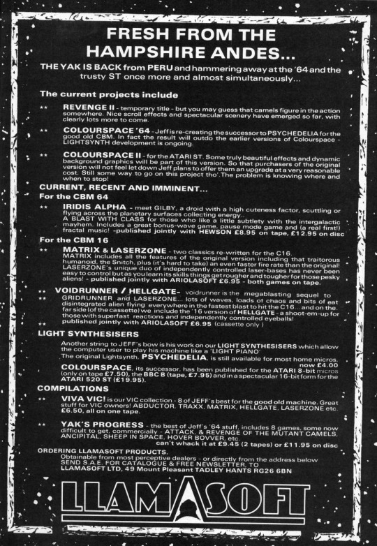
UK 1987
#UK1987#LLAMASOFT#ACTION#MULTIMEDIA#C64#VIC20#ATARI400/800#BBC#ATARIst#C16#AMIGA#REVENGE OF THE MUTANT CAMELS#MATRIX AND LASERZONE#IRIDIS ALPHA#PSYCHEDELIA#COLOURSPACE#ATTACK OF THE MUTANT CAMELS#ANCIPITAL#HOVER BOVVER#HELLGATE#TRAXX#ABDUCTOR#METAGALACTIC LLAMAS BATTLE AT THE EDGE OF TIME#ANDES ATTACK#YAK'S PROGRESS#VIVA VIC
12 notes
·
View notes
Text
Saw a tip online that unchecking "Imbed ICC Profile" when exporting a .png in Clip Studio would help fix my issues with incongruous colourspace. But it seems to not have worked. There is no setting in Clip Studio for a smart phone colour space DCI-P3 or similar either. :-/ Are my colours just doomed to be different on different devices? I want my art to be the same no matter where someone sees it. Especially for my comics.
#colour#colour space#colourspace#colour management#art#rgb#srgb#dci-p3#clip studio#icc#icc profile#saturation#colouring#png
1 note
·
View note
Text
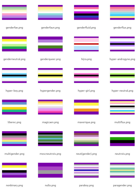
What Pride Flags Mean Pt 2: Disability
What do colours on pride flags mean when it comes to disability? Here's what I found!

I assembled a data set of 624 queer & disabled pride flags, containing a total of 2060 colour choices. I tagged each colour choice based on its known meaning(s). There are 41 disability-related tags, with 403 colour choices from 134 different pride flags.
On the left are the names of the tags. To the right of each tag is a series of squares, representing all the pride flag colour choices that were given that tag. The more squares there are, the more pride flags I found which had that meaning.
I then calculated a median colour for each tag. Every colour was converted into okLCH colourspace, where colours are represented with three values: lightness, chroma, and hue. I took the median lightness, median chroma, and median hue, and used those to create the colours on the left (the backgrounds of the tag names).
Detailed results are under the cut, and at the very bottom is a simplified & condensed colour-meaning association list that should be easier to remember & keep track of.
RESULTS
Disability in general came out as purplish blue. I kinda expected it to be blue, but guess more people think of it as purple!
Medicine & madness
Only a single flag - the Crohn's disease flag - had anything positive to say about the medical establishment. The Crohn's flag uses white to represent the doctors/nurses/researchers/etc who help Crohn's patients.
Most often if disability pride flags had something to say about the medical establishment, it was negative. There are five entries under underdiagnosis/misdiagnosis (mostly black/grey), and six for undiagnosed (mostly white).
And nine entries that I tagged with "iatrogenesis" which is the term for when medical intervention causes disease/disability.
The most common form of iatrogenesis was psychological trauma caused by the medical establishment. In particular, psychiatry was most often implicated for this, as seen in the psychpunk, systempunk, and traumatic psych experience flags. These were mostly purple, probably because mad pride is pink/purple.
Also related to mad pride was the psychosis+schizo spectrum, also using purple. (See: psychosis+schizospec flag, schizoaffective flag). Plurality also tended towards magenta but had a large range.
On the flip side of mad pride were flags that talked about mental health/illness as a negative thing. These tended to use blue or green. For example, the HS flag uses blue for "the toll that HS takes on mental health". This chronic pain flag uses a bluish green for how chronic pain messes you up emotionally.
Psychological trauma and dissociation was usually dark - often a dark grey. Red, purple, and teal were all used. The median winds up being a dark purple.
Mood disorders wound up with a median being blue but it had a bunch of subthemes. Red was used for anger & manic episodes. Yellow was also used for manic. Green and teal for panic/anxiety. Blue for depressive. Purple and black used for general negativity.
Neurodivergence
Autism was almost equally split between red (#RedInstead started in 2015 by a Canadian ASAN activist) and yellow (#GoingGold started in 2018 by AutisticUK). These are two prominent colours used as alternatives to the blue of Autism Speaks. I went into this personally inclined to the gold because of the Au=Autism pun, but splitting the difference and being orange actually is kinda nice. Feels inclusive.
Being non-verbal was reddish brown. It overlapped a lot with non-verbal autism but wasn't 100% autistic so I kept it a distinct tag.
ADHD had a bunch of variety. Orange was the most popular colour (7 out of 22) but purple (6) also got used a bunch. Some flags made a distinction between inattentive ADHD & hyperactive, usually with violet for inattentive and orange for hyperactive. But both orange and purple were used for all ADHD types.
Dyslexia was navy blue. Dyscalculia was dark green. Less common learning disabilities/differences which only had one pride flag representing them (e.g. dysorthographia) I lumped into "other learning-disabilities". It also came out orange.
Borderline PD had equal amounts of yellow and blue, yielding a median green because green is in between yellow and blue.
General neurodiversity was green. Yellow and blue also got used. I don't think the blues (like in this dyspraxia flag) in my data set are references to Autism Speaks but I personally would avoid using blue for neurodivergence regardless.
Cognitive difficulties was where I lumped together brain fog and memory problems. These were generally coming from chronic illness flags, like the chronic migraines flag. These were generally grey or greyish and a bit purple.
Sensory & communication disabilities
In @capricorn-0mnikorn's original meanings for the disability pride flag, green is used to represent sensory disabilities. I recently proposed some new meanings for the stripes, but I've felt least sure of my suggestion for the green stripe, so I wanted to find out if existing sensory flags really use green.
Blind & low-viz tended to be black/grey, like this one.
Deaf/deaf/HOH was blue, which is popularly used in Deaf culture (including the deaf flag). Stuttering, which isn't a sensory disability but is a communication disability like deafness, was also blue.
Sensory processing issues, such as auditory processing disorder (flag1, flag2), tended towards the cool greens & teals. This is probably in line with how neurodiversity in general was green.
So it's kind of a mixed result. As I already kinda suspected, it doesn't seem like Deaf/blind folks were really using green. But sensory processing like auditory processing disorder does use it. 🤔
Chronic illnesses
The tag for chronic illness in general was a mix of blue, purple, and red. The median winds up being a pinkish purple.
Chronic pain and chronic fatigue both wound up as bluish purple, but with some notable reds. Autoimmune conditions like lupus were also purple, but a pinkish purple. Epilepsy was purple.
Sleep disorders were also bluish purple, like in this narcolepsy flag. This makes sense to me: there's a connecting theme here of sleep and rest, and bluish purple being considered a colour of the night.
Respiratory conditions were sky blue - probably a reference to air and breathing (e.g. the blue in this long covid flag).
Gastrointestinal conditions such as gastroparesis were generally lime green or chartreuse (the colour between yellow and green). This is probably a reference to bile & gastric juices having these colours.
Reproductive disorders were about half yellow (e.g. this endometriosis flag), about one quarter purple, and one quarter red (e.g. this endometriosis flag). The median wound up being yellow.
Invisible disabilities were usually white, but a bit of teal.
Mobility & physical differences
Low mobility wound up as brown. Red was a common choice, but yellow/brown was more common, such as in this disability flag.
Within the mobility tag, motor coordination/coordination tended to be yellow (e.g. this autism flag), body weakness tended to be green (e.g. this ME/CFS flag).
Physical differences such as deformities also wound up as a warm yellow. There's the red from this congenital amputee flag, and the greenish yellow from this radial dysplasia flag.
Models of disability
I did not include the new proposed meanings for the disability pride flag in this data set. I wanted to see if the proposed meanings are in line with pre-existing flags.
Social model wound up as blue, in line with my proposal. 🩵
Ableism came out as dark grey, with a bit of teal. This includes both fighting ableism and being victims of ableism. If I were to match it to a model of disability, the radical or social models seem most relevant.
Disability visibility & pride came out as yellow. This is in line with yellow being culturally associated with happiness and joy. I consider this to be in line with the affirmation model and my proposal. 💛
Disability caused or amplified by racism/classism came out as dark brown/red, but there also were only four entries (purple/red/brown/black). The black and brown I assume are in reference to the brown skin of POC (e.g. this fibromyalgia flag).
My proposal has red as debility (disability caused by violence). This arguably lines up to the racism/classism, but I think it's kind of weak because of how few disability+racism/etc flags I found. I'm considering this inconclusive.
The economic model showed up as olive (between yellow and green). The economic model was presented as ableist. For example, the bad disabled flag has a green stripe for "being useless/uneconomic" in a context that makes clear that this is a way of "sham[ing], discredit[ing], denigrat[ing] disabled people".
As mentioned at the top, the only pro-medical entry was a single white stripe from the Crohn's flag.
This has me now second guessing the white & green in my original proposal - maybe the medical model should be under the "other models" of the white stripe? 🤔 And change green to something that would more easily include sensory processing disabilities? Like maybe the human rights model? 🤔 IDK, would like feedback! 💚 ***
SIMPLIFIED RESULTS
The feedback I got from @queercripintersex on my analysis of gender/attraction colours is it'd be easier to have results that are clustered around a small set of colours with memorable colour-meaning associations.
So I did another round of clustering to simplify things down. I brought the 41 tags down to a more manageable 18. And I've added how I personally would remember each colour.
White: medical model. White like the lab coats doctors wear.
Off-white: invisible disabilities. Off-white like you're barely visible against a white background.
Grey: confusion (brain fog + un/misdiagnosis). Grey like fog.
Black: blind/low-viz. Black like absence of light.
Dark red: trauma. By this I mean both physical trauma (injury) and psychological trauma. Red like blood.
Dark brown: oppression (ableism/racism/etc). Red like blood plus brown like black/brown skin.
Reddish orange: autism/ADHD spectrum. Orange is opposite of blue on many colour wheels, so is a good option for being the opposite of Autism Speaks. Orange is also used in a lot of safety equipment and the like because of how it catches the eye's attention, and the association with attention -> ADHD.
Orange-ish yellow: reproductive disorders. Gold like the intersex flag.
Yellow-brown: physical disabilities. I don't have a good memory aid here, best I'm coming up is it's like the colour of wood, which is used for making mobility aids like canes but also "wooden" is used to describe some motor coordination impairments. If you have a better way to remember it let me know!
Yellow: positivity (disability pride + mania). Yellow is often associated with happiness.
Yellow-green: gastrointestinal. Like bile and vomit.
Green: neurodiversity. Because these are natural differences and green is associated with nature.
Teal/cyan: negativity (depression/etc, negative aspects of disability). Teal is has the same first three letters as tears, and we say people have the blues.
Blue: communication (Deaf/stuttering/etc). Blue also gets associated with openness and clarity.
Purplish blue: social model. Honestly the way I'll remember this one is that social attraction was a similar colour. Blue is often associated with society, conformity, and tradition.
Bluish purple: disability in general. Indigo is a good colour for not fitting in: we're neither blue nor purple.
Purple: chronic illness (pain/fatigue/etc). Purple is associated with the night and sleep, and chronically ill people need rest.
Pink-purple/magenta: madness. Pink and magenta aren't "real" colours in the sense that there do not exist wavelengths of light that make pink and magenta specifically. Those colours are made by our brains, which seems apt!

(Everything here is Creative Commons Sharealike 4.0, so you're free to reuse and build on my visualizations, tables, etc. Enjoy!)
EDIT (2024-07-24): earlier version of this post incorrectly wrote that the median hue for reproductive disorders was red. It was yellow.
#disability#disability pride#disability pride month#disabled#actually disabled#disabled pride#crip#crip pride#flag design#colour nerdery#vexillology#colour
174 notes
·
View notes
Text

drew a weird rat whilst playing around with lab, srgb and cmyk colourspaces
2 notes
·
View notes
Text
When software changes.
Stuff they don't teach you in art school but probably should - how to cope with changes to software you use regularly. Not been posting to much last few days, I've been trying to work out a problem with ffmpeg that I suddenly found when trying to use methods I was using last year , in the meantime I had swapped linux distros from my usual devuan stable ( 4) to an arch based os Eandeavour os, very different distros but both very good. On revisiting techniques I'd used last year I discovered that newer versions of ffmpeg ie 5 and above no longer support basic things id been doing involving passing ffmpeg output to ffplay in a specific way and while i found workarounds in 6 for some of my command line scripts it seriously restricted working with colourspaces like tmv or monob which are the basis for a lot of my scripts, these only work in ffmpeg 4.4.4 or below as far as I've discovered so far so I had to go back to archived versions of Devuan 4 I have squirreled away to make work and then go on to try and find a solution for a more up to date os. I'm still working out kinks but I have solutions but none which so far work with ffmpeg six or on endeavour os ( there has been a newer change to binutils which mean I cant build a static binary for ffmpeg 4 on endeavour but I can build a static binary on the newest stable version of Devuan 5 ( but not Devuan testing - excalibur) once I have the kinks worked out there will be new work.
3 notes
·
View notes
Text
retro wave 448

Gemini Drive - Passenger Mecha Maiko - Electric Heat Emil Rottmayer - Contact Powernerd - Pushing Binaries Earmake & Walras - Celestial Lifeforms Aisle 9 - Eternal Overdrive TV Players - Signs KING PALM - Rush Hour Stilz - Initiate (Castroe Remix) A.L.I.S.O.N, VIQ, Krosia - Breathe In Vennwave - Coming Back Tholos - Silver Screen Voyage - Colourspace Absolute Valentine - Lost Paradise Evanton - On and On Das Mörtal - NOSHAME Carlights - Neon Dreams
2 notes
·
View notes
Note
your gifs are so gorgeous and crisp! do you use photoshop?
Yes! The crispness just comes down to me using 4k/2160p copies of the episodes. Probably need a good rig to do it without photoshop exploding, but if you have the know-how and resources it's worth it. I did my first gifset with just 1080p copies and the crispness isn't quite there.
The episodes are about six gigabytes each, 115gb for the show so far. Since 4k torrents are usually in HDR, I clip out the part of the episode I want using Handbrake and apply the BT.709 colourspace to it, exporting at 2160p. Without and with the colourspace filter for comparison.
After that you've got your 4k clip to use for giffing, and just do your usual stuff from there. I still do sharpen on top of it but not very much, mainly just levels and vibrancy/colour adjustments.
I'm still experimenting with this stuff so I haven't gotten it down to an exact science, and I don't know enough about codecs and the like to know this is the best result, but that's what I've been doing so far.
2 notes
·
View notes
Text
Which colourspace?
You all have colors assigned to you, by the way. Completely on vibes.
437 notes
·
View notes
Video
vimeo
WE WERE IN LOVE - Ta-Ku [OFFICIAL MUSIC VIDEO] from Dan Ax on Vimeo.
View project and framegrabs here > axvisuals.com/portfolio/taku-we-were-in-love/
Directed & Produced by Jason Bock
Cinematography by Dan Ax
Artist - Ta-Ku > takumusic.com
____
STARRING
Constanze Rudduck Jenna Smith Chrystal Ashford Michael Engelbrecht Diaz Grimm Jason Bock Megan Henderson Mikayla Mills Sarah Norris Ben Montgomery Samantha Attenborough
Additional Cinematographers Ben Montgomery Žiga Zupančič (aka. "The Sniper") Matic Prusnik
1st AC Michael Engelbrecht
Colourist David Mclaren
Sound Designers David Liversidge Solomon Bagley
Composer Tom Dennison
Editor & VFX Jason Bock Macro Scientist Allan Blackman
Voice Bailey Wiley
__
VANCOUVER UNIT
Director Josias Tschanz
Producer Jason Thompson
Cinematographer Dan Ax
1st AC Phat ‘Oak’ Siriwat
Aerial Coordinator Jason Thompson
Pilot Roland Choe
A Special Thanks to:
Flying Fish Fishnclips Staples Productions COUNTINGANTS || RAREBORNE Colourspace Radiate Sound Bang
___
Dan Ax | Cinematographer, Filmmaker axvisuals.com
Instagram > instagram.com/axvisuals/
0 notes
Text
I was gone to a nearby restaurant close to my house, but what I didn't know was that Savage Interactive laid out a ginormous set of things ready for launch via Procreate Dreams in Ver. 1.1. Here's the basic rundown I gathered:
• Selections in Draw & Paint (including "Lasso". Yes, you read that right.) • Transform, Adjustments and Cut / Copy / Paste featured in the former • Merging of layers • Control over fixed vs dynamite scale painting • Brush Sliders with size/opacity memory • Per brush stabilisation options • Timeline edit improvements and Drag Drop mutliple tracks / contents / keyframes • Quick method to change movie duration within the timeline • Advanced Export Studio • GIF import / export • Customizable keyboard support • Video transparency playback + export (HEVC + ProRes) • Improved colourspace handling with imported videos • Luminace masks (The option to use the luminance instead of the alpha for layer masks)
Any thoughts on this?
1 note
·
View note
Text
Llamasoft: The Jeff Minter Story Review (PlayStation 5)
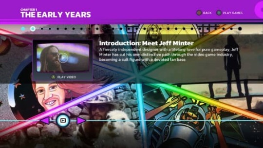
Llamasoft: The Jeff Minter Story Review, 42 of the weirdest, trippiest, sheepiest games ever created. Enter the mind of Jeff Minter, the legendary creator of Attack of the Mutant Camels, Gridrunner, and Tempest 2000, in this interactive documentary from Digital Eclipse.
Llamasoft: The Jeff Minter Story Review Pros:
- Graphics are from every generation. - 3.97GB download size. - Platinum trophy. - You get the PlayStation 4 and the PlayStation 5 versions of the game. - Interactive documentary gameplay. - You work your way along the timeline of events. - Videos can be fast-forwarded, rewound, and paused. - Subtitles can be turned on and off with a button press. - High-quality video. - Simple controls. - You can turn menu music on and off. - Clear crisp and clean menu system that is just so good to look at. - An excellent time capsule. - If you have played the Atari 50 The Anniversary Celebration you get that again but for the one game. - Thumbnails for the games show the original box art and original scans of the floppy discs. - There are four chapters to the documentary and each has a completion percentage. - Original scans of paperwork, notes, concept art, letters, and more. - All images can be zoomed in and out and pan around. - Attack the documentary in any order you like. - Such high production value. - Full games list - - Sinclair ZX81 - 3D3D - Centipede Commodore VIC-20 - Abductor - Andes Attack - Deflex V - Gridrunner - Hellgate - Laser Zone - Matrix: Gridrunner 2 - Metagalactic Llamas Battle at the Edge of Time - Ratman Commodore 64 - Ancipital - Attack of the Mutant Camels - Batalyx - Gridrunner - Hellgate - Hover Bovver - Iridis Alpha - Laser Zone - Mama Llama - Matrix: Gridrunner 2 - Metagalactic Llamas Battle at the Edge of Time - Psychedelia - Revenge of the Mutant Camels - Revenge of the Mutant Camels II - Rox 64 - Sheep In Space - Voidrunner Sinclair Spectrum - City Bomb - Headbangers Heaven - Rox III - Superdeflex Atari 8-bit - Attack of the Mutant Camels - Colourspace - Gridrunner - Hover Bovver - Turboflex Konix Multi-System - Attack of the Mutant Camels '89 Atari ST - Llamatron: 2112 - Revenge of the Mutant Camels - Super Gridrunner Atari Jaguar - Tempest 2000 Reimagined - Gridrunner Remastered - A real joy to experience. - It's such a fun amazing insightful trip into the mind of one of Britain's most popular and famous Developers. - You get a glimpse into how the British gaming scene was in the early days like events and the art of selling. - Play all original and concept games. - High-scan images of the cassettes and box art with all of them in 3D. - Each timeline has an explored percentage and makes a noise to say you've done it. - Handy just play the games option. - 43 games to play including the different versions of the same game. - You can launch games from the timeline. - An excellent mix of games and mini-documentaries laceEvery game has a fast save/load feature. - Each game has a screen mode, filter, and border settings. - Stick settings can be adjusted – Invert the axis and sensitivity sliders. - You can reset games. - All games can be quit and returned to the main menu. - This shows again why Digital Eclipse is the team to deliver these exceptional museum pieces. - You get to see how devs used to show off and introduce their games to the public. - Full history of the Llama obsession? - Shows how the game used to be whacky, fun, a bit out there and dare I say experimental. - Gameography shows each game in a list. Llamasoft: The Jeff Minter Story Review Cons: - No cheats or adjustments are built into any of the games. - Doesn’t have any online leaderboards. - Uninspiring trophy list with nearly half of them being for one game. - The background music is not great. - Timelines in this one seem a bit more subdued with a lot of images and only a few videos per chapter. - Doesn't include the newer games like PSVR games and Atari branded games. (more an FYI) - Needs a physical release. Related Post: Tomb Raider I-III Remastered Starring Lara Croft Review (PlayStation 5) Llamasoft: The Jeff Minter Story: Official website. Developer: Digital Eclipse Publisher: Digital Eclipse Store Links - PlayStation Read the full article
0 notes
Text
ASUS ProArt PA32UCXR: Your Key to Beautiful Images!

ASUS launches ProArt PA32UCXR Display
ASUS launches ProArt PA32UCXR Display, a 1600-nit small LED display with a colorimeter, delivering realistic pictures and accurate color in January 2024.
Mini LED backlighting with 2304 zone local dimming, 1600 nits peak, 1000 nits sustained.
Color accuracy:
99% Adobe RGB, 97% DCI-P3, true 10-bit depth, Delta E<1;
Dolby Vision, HDR10, and Hybrid Log Gamma compatibility.
Built-in motorized colorimeter with Self and Auto Calibration. Calibration software ProArt
Comprising double Thunder Bolt 4 connections, The DisplayPort port 1.4, two the HDMI 2.0, earphones plug, and USB cable hub for multidevice connectivity
ASUS first reported that ProArt PA32UCXR Display would ship in January of 2024. The following 32-inch 4K monitors has petite LED backlighting, 2304-zone local dimming, 1600 nits peak brightness, and 1000 nits continuous brightness without partial patch restriction. PA32UCXR has 99% Adobe RGB and 97% DCI-P3 gamut.
Designed for post-production processes, each monitor is pre-calibrated for Delta E<1 color accuracy and includes a motorized flip colorimeter, Auto Calibration, and Self Calibration for ease. PA32UCXR ensures professional-grade colors with ProArt Calibration software1 and third-party products like Calman and Light Illusion ColourSpace CMS2. Experience smooth and efficient creative operations with two Thunderbolt 4 connections and several connectivity choices on this display, perfect for multimedia makers.
Super realistic images
Most small LED technology uses data scanning for linked zones instead of control ICs to save costs. For best performance, this strategy demands stronger graphics, which might cause screen flickering, inconsistent brightness, and lower LED lifetime.
ProArt PA32UCXR Display has amazing 2304-zone local dimming. Multiple control ICs individually handle illumination zones, eliminating display flicker during transitions and maintaining brightness. PA32UCXR has excellent brightness uniformity, heat dissipation, and HDR picture quality.
Peak brightness of 1600 nits and industry-leading 1000 nits of full-screen continuous brightness provide ProArt PA32UCXR Display excellent contrast between deep blacks and dazzling whites.
Realistic colors PA32UCXR outperforms industry standards with 99% Adobe RGB, 97% DCI-P3, 100% sRGB, 100% Rec. 709, and 87% Rec. 2020 color gamut, perfect for post-production. The real 10-bit IPS screen displays over 1.07 billion colors, giving content developers a wide color palette.
To provide industry-leading color integrity, ProArt displays are factory pre-calibrated utilizing a novel three-scale method. The display is tested utilizing ASUS sophisticated grayscale tracking technology to guarantee smoother color gradations, homogeneity, and great color accuracy (Delta E<1 color difference value). Each grayscale level is measured and configured to meet medical DICOM standards.
Intelligent, intuitive calibration ProArt Display PA32UCXR’s motorized colorimeter flips into position during calibration and offers a revolutionary self-calibration function for ease. It works with any OS and doesn’t need calibration software. The OSD menu lets users start calibration at any time or plan it during off-hours.
ASUS ProArt Calibration maintains color parameter profiles on PA32UCXR’s scaler IC chip instead of the PC. User may calibrate the display and rebuild the look-up table to connect it to devices with various OS or apps without adjusting monitor settings. ProArt Color Center3 supports ProArt PA32UCXR, allowing users to centralize critical functions with remote group control and calibration.
Professional precision may be maintained using calibration schedules and specific color settings. Regular calibration periods may be scheduled using ProArt Calibration technology. The integrated colorimeter also works with Calman or Light Illusion ColourSpace CMS professional hardware-calibration software.
Create stunning HDR Exclusive ProArt PA32UCXR Display supports Dolby Vision4, HLG, and HDR10 with ASUS Smart HDR technology. Dolby Vision enhances viewing with superior brightness, contrast, and colors. HLG lets users watch and produce content for BBC iPlayer, NHK TV, and DirecTV. HDR10 support enables interoperability with streaming providers and more HDR-enabled games.
Enjoy more efficient processes Dual Thunderbolt 4 connectors, DisplayPort 1.4, and two HDMI 2.0 interfaces offer future-proof display and device compatibility. One Thunderbolt 4 port can daisy-chain multiple monitors without a hub or switch and charge devices with up to 90 W Power Delivery. PA32UCXR has USB hub and earphone jack.
PbP and PiP are supported by PA32UCXR. The former lets users examine four input sources concurrently. Each window may be set to sRGB, Adobe RGB, DCI-P3, Rec. 2020, User Mode 1, 2, or 3. PiP mode displays material from a second input source in a tiny window in either corner.
PA32UCXR’s ambient light sensor dims or brightens the display. When no one is in front of the monitor, a proximity sensor dims the display.
Users may operate confidently in the studio or on location with a bundled wraparound cowl that reduces on-screen reflections from adjacent light sources.
PA32UCXR’s ergonomic stand lets users tilt, swivel, pivot, and height adjust to their chosen viewing position. Posters, playbills, and other large-format projects benefit from being able to flip the screen 90° clockwise or anticlockwise to portrait mode. A quick-release function lets customers VESA install the monitor to conserve desktop space.
Adobe Creative Cloud for free Adobe products are essential for many creative sectors. ASUS and Adobe collaborate to enable creative processes with Creative Cloud applications and services. In some locations, a ProArt PA32UCXR Display comes with a complimentary three-month Adobe Creative Cloud, Substance 3D, and Acrobat membership (US$397.44 value).
Read more on Govindhtech.com
0 notes
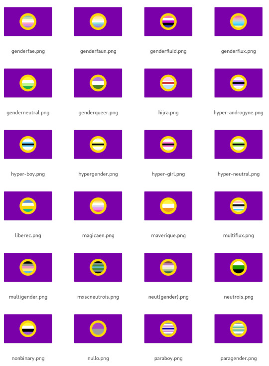
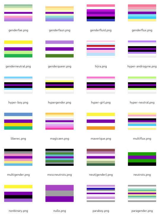
Text
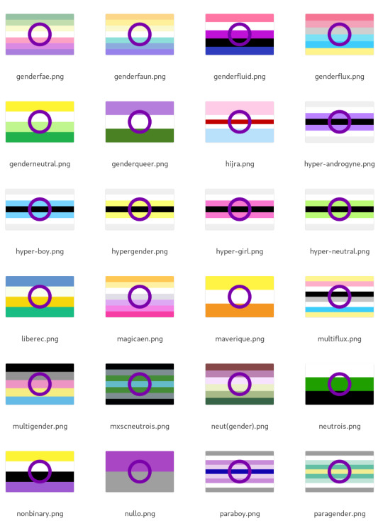
(pasted from under cut for archival)
Here's a subset of the results. Some, like genderfaun, look nice, but most look awkward:

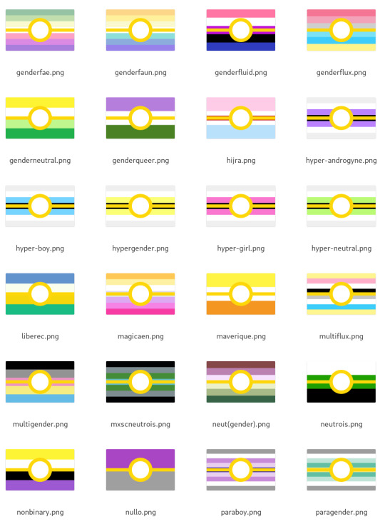
A yellow ring is even worse:

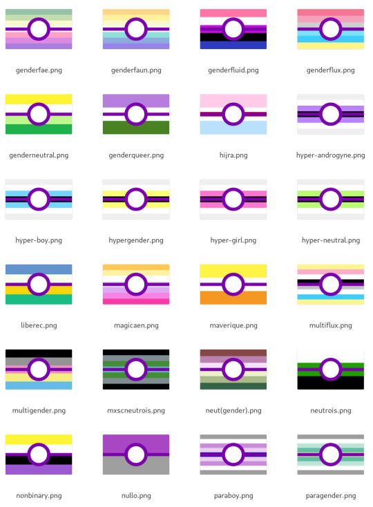
I think the purple ring has a bit of potential, but I think it's not really viable for being used as a consistent, procedural way to make intergenders.
***
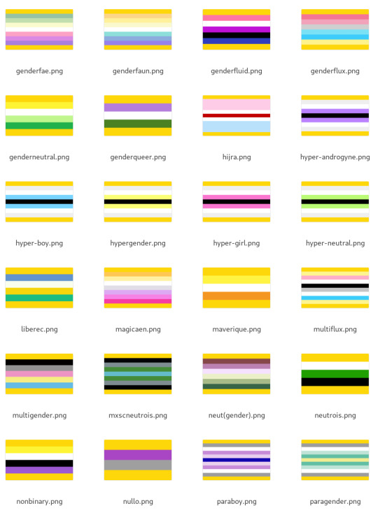
Method 2: stick a belt on it - advantages: already used for some existing mashups - disadvantages: some other genders are doing similar things, like voidpunk, and a white belt has been used by tons of groups for their mashups (e.g. neurogender).
It looks better than the ring alone, but I was still kinda underwhelmed because of how much it depends on the background stripes to not clash. Very roughly I'd say about 40% of the total results look good. Again, here's genderfae through paragender for comparison:

Using a purple belt helps in some cases but makes for some visually busy results:

The purple ones make me think of pokéballs. Again, there are some nice looking ones, but the effect over the whole group was underwhelming.
***
Method 3: inset into the ring - advantages: it's the most clearly "intersex plus X" - disadvantages: hard to read flags where the stripes are similar to each other; might clash with ring colour
When zoomed out like this the results aren't always super easy to read, but overall I'd say this is a reasonably reliably method - very roughly 60% of the results look good to me.
Playing with lightness and contrast on the inset flag likely would improve that number, but my goal here is to compare methods without tweaks.

Insetting into the intergender flag has similar results:

Method 4: add intersex-coloured stripe to the middle - advantage: seems like it would be simple - disadvantage: yellow middle stripe used for pansexual mashups; purple stripe is used in a bunch of of existing mashups - also disadvantage: turns out to actually be complicated in how to do it. Many flags have an odd number of stripes, not all flags have equal-length stripes, etc. I got buggy results on a whole bunch of flags like hijra and hypergirl and honestly if it takes dedicated debugging to fix it's probably too complicated.
When the original flag has an odd number of stripes, I doubled the original middle stripe up and this only works if there's a symmetry to the flag and all the stripes are of equal size.
The results are kinda busy. It looks good to my eyes very roughly 1/8 of the time (~12%) (I did an alternate version where I doubled the purple stripe around the original middle stripe and it's way worse.)
Purple stripe:

Yellow stripe looks less busy but more confusing:

Method 5: add border stripes with intersex colours - advantages: simple - disadvantages: maybe not as obviously intersex
I honestly didn't expect to like this one, but it has turned out to be my favourite. It works really reliably, like ~90% of the time, and it's distinctive.

Surprisingly, using purple gives a really different vibe. It kinda makes me feel claustraphobic:

Method 6: change the colours
This one I don't have automated results to share (at least not yet). Right now there are flags like how ultergender recolours the trans flag, that could serve as a template for recolouring.


This is much more complex computationally - I spent a bunch of time playing around with different colourspaces (HSV, LCH, oklab, okLCH) to try to do this automatically and have concluded that this actually a difficult computational problem and not feasible as a widescale recipe.
Part of why the ultergender recolouring works is there are just two colours to recolour. How should one recolour the genderfluid flag? The demigender flag? It's possible to create a convention but not something I'm up to this moment.
I think recolouring is better suited to creating entirely new identities (like ultergender) rather than intergenders that are "<gender> but in an intergender way". ***
Discussion
My goal in all of this has been to try and identify some reliable recipes for creating hybrid flags particularly for intergenders.
My entirely subjective and imprecise estimates of how reliably each method yielded a decent-looking result were: 1. Add yellow border: ~90%-ish 2. Inset: ~60% 3. Belt: ~40% 4. Ring: ~20% 5. Add middle stripe: ~1/8-ish
I was honestly surprised at how much I liked the yellow border method and the friends I've shown it to so far have liked it as well!
I'd like to propose adding yellow border stripes as a recipe for creating intergender flags. This is already in use for interfluid (genderfluid in a specifically/uniquely intersex way):

Indeed, it's the only one of the mashup functions I wrote that yields something for genderfluid that I actually like:

Extrapolating, here are examples of some gender coinings that I think would work:
Interdemigender: demigender in a specifically/uniquely intersex way and/or demigender in a way linked to being intersex/intergender


Intervaguegender: vaguegender in a way that is specifically intersex, such as in a way that is connected to being intersex (i.e. one's gender is vague not just for being neurodivergent but also intersex)


I think it works well! I hope you like it! Let me know if you have any feedback. If there are other mashup techniques I didn't think of, let me know. :)
A review of intersex/intergender flag mashup techniques
I really like it when I can figure out what a new pride flag means just from my knowledge of other flags, and I know I'm not alone on this. For example, here are some flags other people have made that I could immediately figure out were <thing> plus intersex:

So, I've been thinking about how we as intersex flag creators can create hybrid flags in consistent way. I'm most motivated to figure out a recipe for intergender flags: genders that are connected to being intersex.
I assembled a spreadsheet of 66 gender flags, and wrote a Python script to take my csv file, parse it, and use the drawsvg library to draw the different flags in different ways. And then I stared at the results, showed them to friends, and discussed what would be both reliable in terms of producing clear, decent-looking results. (A subset of the results are under the keep reading cut.)
In this post I'm gonna review five mashup techniques that I automated and talk about advantages/disadvantages to each. But first a TLDR: adding yellow border stripes is a simple and reliable way to make an intersex-hybrid flag that is now my favourite (and recommended) way to make a new intergender flag.
For example, here's the interfluid flag (genderfluid in a way that is specifically intersex):
***
Method 1: put a ring on it - advantages: simple to do, simple to understand - disadvantages: incredibly dependent on how well the ring colour works with background stripes, and the number of stripes. Would very roughly estimate only ~20% look decent.
Here's a subset of the results. Some, like genderfaun, look nice, but most look awkward:
A yellow ring is even worse:
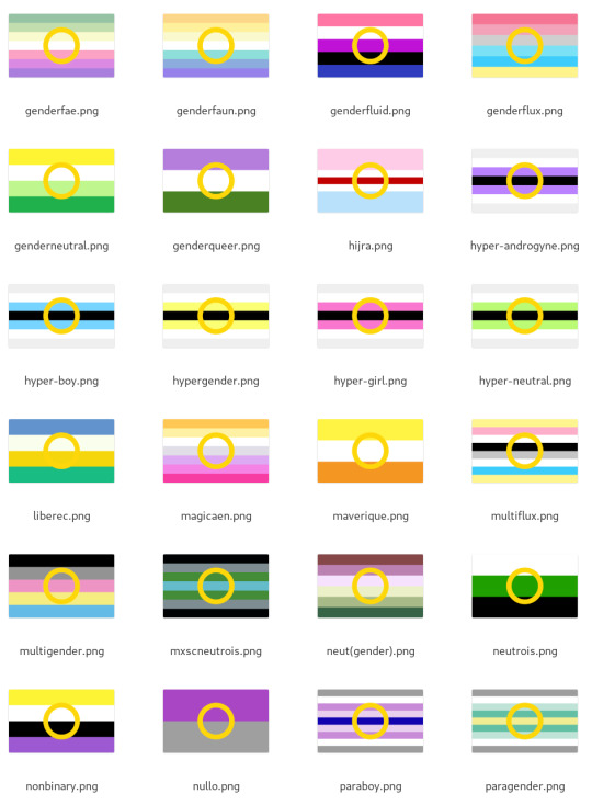
I think the purple ring has a bit of potential, but I think it's not really viable for being used as a consistent, procedural way to make intergenders. ***
Method 2: stick a belt on it - advantages: already used for some existing mashups - disadvantages: some other genders are doing similar things, like voidpunk, and a white belt has been used by tons of groups for their mashups (e.g. neurogender).
It looks better than the ring alone, but I was still kinda underwhelmed because of how much it depends on the background stripes to not clash. Very roughly I'd say about 40% of the total results look good. Again, here's genderfae through paragender for comparison:
Using a purple belt helps in some cases but makes for some visually busy results:
The purple ones make me think of pokéballs. Again, there are some nice looking ones, but the effect over the whole group was underwhelming. ***
Method 3: inset into the ring - advantages: it's the most clearly "intersex plus X" - disadvantages: hard to read flags where the stripes are similar to each other; might clash with ring colour
When zoomed out like this the results aren't always super easy to read, but overall I'd say this is a reasonably reliably method - very roughly 60% of the results look good to me.
Playing with lightness and contrast on the inset flag likely would improve that number, but my goal here is to compare methods without tweaks.
Insetting into the intergender flag has similar results:
Method 4: add intersex-coloured stripe to the middle - advantage: seems like it would be simple - disadvantage: yellow middle stripe used for pansexual mashups; purple stripe is used in a bunch of of existing mashups - also disadvantage: turns out to actually be complicated in how to do it. Many flags have an odd number of stripes, not all flags have equal-length stripes, etc. I got buggy results on a whole bunch of flags like hijra and hypergirl and honestly if it takes dedicated debugging to fix it's probably too complicated.
When the original flag has an odd number of stripes, I doubled the original middle stripe up and this only works if there's a symmetry to the flag and all the stripes are of equal size.
The results are kinda busy. It looks good to my eyes very roughly 1/8 of the time (~12%) (I did an alternate version where I doubled the purple stripe around the original middle stripe and it's way worse.)
Purple stripe:
Yellow stripe looks less busy but more confusing:
Method 5: add border stripes with intersex colours - advantages: simple - disadvantages: maybe not as obviously intersex
I honestly didn't expect to like this one, but it has turned out to be my favourite. It works really reliably, like ~90% of the time, and it's distinctive.
Surprisingly, using purple gives a really different vibe. It kinda makes me feel claustraphobic:
Method 6: change the colours
This one I don't have automated results to share (at least not yet). Right now there are flags like how ultergender recolours the trans flag, that could serve as a template for recolouring.


This is much more complex computationally - I spent a bunch of time playing around with different colourspaces (HSV, LCH, oklab, okLCH) to try to do this automatically and have concluded that this actually a difficult computational problem and not feasible as a widescale recipe.
Part of why the ultergender recolouring works is there are just two colours to recolour. How should one recolour the genderfluid flag? The demigender flag? It's possible to create a convention but not something I'm up to this moment.
I think recolouring is better suited to creating entirely new identities (like ultergender) rather than intergenders that are "<gender> but in an intergender way". ***
Discussion
My goal in all of this has been to try and identify some reliable recipes for creating hybrid flags particularly for intergenders.
My entirely subjective and imprecise estimates of how reliably each method yielded a decent-looking result were: 1. Add yellow border: ~90%-ish 2. Inset: ~60% 3. Belt: ~40% 4. Ring: ~20% 5. Add middle stripe: ~1/8-ish
I was honestly surprised at how much I liked the yellow border method and the friends I've shown it to so far have liked it as well!
I'd like to propose adding yellow border stripes as a recipe for creating intergender flags. This is already in use for interfluid (genderfluid in a specifically/uniquely intersex way):
Indeed, it's the only one of the mashup functions I wrote that yields something for genderfluid that I actually like:
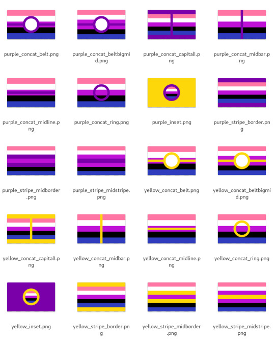
Extrapolating, here are examples of some gender coinings that I think would work: Interdemigender: demigender in a specifically/uniquely intersex way and/or demigender in a way linked to being intersex/intergender


Intervaguegender: vaguegender in a way that is specifically intersex, such as in a way that is connected to being intersex (i.e. one's gender is vague not just for being neurodivergent but also intersex)


I think it works well! I hope you like it! Let me know if you have any feedback. If there are other mashup techniques I didn't think of, let me know. :)
45 notes
·
View notes
Text
I just want to say something about "the rainbow" (or spectrum or whatever).
The basis for this is that it's traditionally split into seven colours:
Red
Orange
Yellow
Green
Blue
Indigo
Violet
There are problems there. The first problem is indigo. Indigo is, really, a purple-blue kind of colour. Then there's violet, which gets the short end of the stick in a lot of illustrations because people often use the actual colour, violet, in place of indigo and depict violet as something closer to lilac or even pink.
The second problem is inconsistency of primary and secondary ordinality. Since I'm writing about the conception and depiction of, chiefly, rainbows I'll concentrate on the additive (light) primaries. These are:
Red
Green
Blue
Combining these we produce the secondaries:
Yellow
Cyan
Magenta
Hang on, what's magenta? Well magenta is a sort of pinkish, purplish colour. In fact it's one of the shades often used by well meaning people, in simple depictions, in place of violet. So that takes care of the confusion over violet and, indeed, indigo.
Taking these primary and secondary colours and placing them in order we get:
Red
Yellow
Green
Cyan
Blue
Magenta
and now we have a satisfactory ordinality of primary and secondary colours. But wait, what's happened to the cardinality? That is to say, the number of colours in the list. We have six now, but we started with seven.
This is a good time, then, to ask why we are told that there are seven colours in a rainbow. Depending who you ask (and frankly I can't be bothered to pin it down) you might be told that the blame lies either with Isaac Newton or Pythagoras. Yes, really. In both cases it is allegedly for mystical reasons.
Newton is said to have started with six colours and added indigo, whereas Pythagoras is accused of starting with five and adding both indigo and orange. I find the latter highly dubious given that ancient concepts of colour seem dramatically different than our own, but in any case indigo appears in both stories which is why I singled it out above.
In any case both indigo and orange are absent from our list, because both are tertiary colours. Yes, I know that you get orange by mixing red and yellow paint, but those are subtractive opaque colours. When talking about rainbows and additive colours you only get orange by mixing red with a little green,* so that red dominates.**
It might be nice, not for mystical reasons but just for the sake of matching, to insert another colour into our list. We've run out of appropriate primaries and secondaries, so let's try some ideas.
If we combine all additive colours we get white, which we could broadly call a secondary because it can be made with the three additive primaries, more-or-less. But where would we place it? If we put it after magenta we get primary secondary primary secondary primary secondary secondary. I personally find that unsatisfying.
We could put it at the beginning, so that the new rainbow is bookended with secondaries, but I dislike the idea of placing white before red.***
Really though, nether of these work because white light is split to maker the rainbow, it's not a part of it. Following that line we can also dismiss black on the grounds that it does not appear in a rainbow and is a total absence of light.
So let's directly compare the old rainbow to the new and see where the gap is.
Red -> Red
Orange -> ???
Yellow -> Yellow
Green -> Green
Blue -> Cyan
Indigo -> Blue
Violet -> Magenta
Aha! The gap aligns with orange. It's a tertiary colour, but if we really wanted to maintain the cardinal seven, then orange seems like the most appropriate addition, with steps Primary Tertiary Secondary Primary Secondary Primary Secondary.
Besides, I like orange. Especially at sunset.
-----
* Or by emitting light at a frequency which activates mostly red and some green cones in the human eye, but that's a whole other way of making and describing colours.
** It's interesting to note that the colour we know as orange was long considered merely a shade of red, and gets its name from the fruit.
*** Because red feels lower energy to me.
13 notes
·
View notes
Text
Colour Management
Questions
Gamut is the range of colours that a device (camera/computer screen etc.) can show or capture.
A colour space is a set range of colours/tones that are available to display in an image.
Most DSLR cameras offer sRGB and Adobe RGB.
The standard colour space that most computer monitors can display is sRGB.
When switching from sRGB to Adobe RGB, the colours that will be improved are generally the reds and greens.
When the colour space in Photoshop is changed this will modify the way that the colours in the images are displayed.
ProPhoto RGB is a larger colour space than Adobe RGB.
When an image is mapped to a larger colour space, it can mean that soft shadows or subtle changes in colours can become more defined and create lines in the image because of the new tones that are available and displayed.
Import/Output Research
The colour space setting in my camera is found in the 'Shooting Menu' section of the setting menu. In the settings menu, the colour space shows as 'Adobe' on the screen, but not on the camera settings menu when shooting.
To find the colour space in a Photoshop workspace, go to Edit > Colour Settings.
sRGB:

Adobe RGB:

ProPhoto RGB:

#colourspaces#sRGB#AdobeRGB#ProPhotoRGB#adobephotoshop#gamut#research#postproduction#folio3#nqphotography#cogc
0 notes