#Product Use Segmentation
Text
me a few weeks ago: "i should make a google docs version of my buddy cole timeline so i can have it on hand when i interview people for the doc"
a few weeks later
i have a 54-page google doc with each point on my buddy cole timeline in chronological order as well as thorough details of each event and how it contributed to the overall evolution of buddy cole, baseline interview questions for each point, screenshots of interviews and reviews for each project buddy cole appeared in over the past several decades, and dedicated pages for several of the queer writers and performers scott referenced in interviews over the years, along with a list of every time buddy cole swears on camera. i am printing this document out and putting it into a binder that's never leaving my side throughout the rest of production. the binder has its own theme song
#i just kept singing to myself:#''it's the big book of buddy! it's the big buddy binder! it's the product of jessamine having too much time on zir hands!''#so i figured out the chords on my keyboard and now i'm going to record a theme song for my binder of buddy cole facts#tbh i kind of want to use that ''theme song'' for like a series of shortform (under 3 minute) videos while we work on the big project#when something's enough of a fun fact to be interesting but likely won't be able to make it into the larger doc#like the ''list of every time buddy swears'' would be a good segment. i could get an explanation from scott and maybe make people guess#how many times he swears on the tv show itself#i also have a list of ten buddy cole trivia questions i wanted to ask the kids in the hall to see how many obscure facts people remember#so i could chop those up question by question and be like here's the question and now let's see the guesses of the people i interviewed#(i really wish someone else could make a different list of buddy trivia so you could have me vs scott and see who knows more)#(the person who's been playing buddy for almost 40 years vs the nerd who's directing the buddy cole documentary)
9 notes
·
View notes
Text
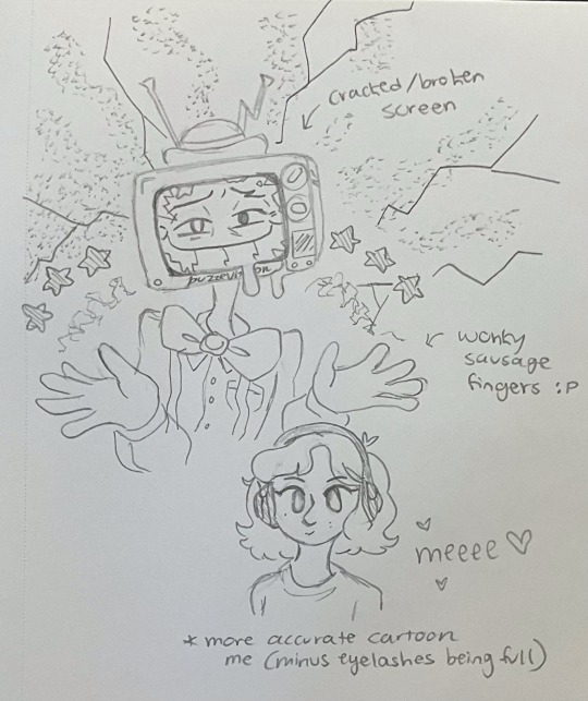
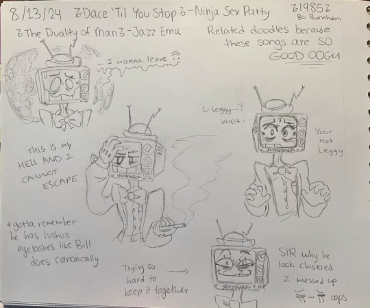
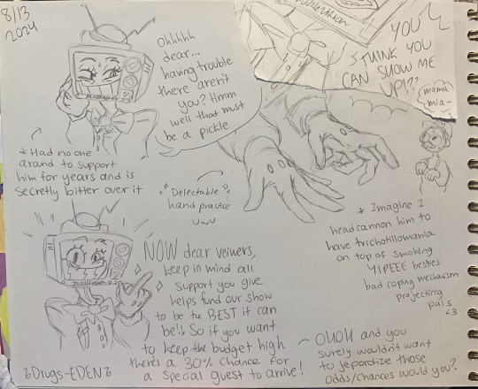
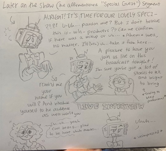
Another batch or Mr. Puzzles quick sketches. I kept forgetting to draw his side pocket in the last couple ones. Random character featured in the little comic-ish Live Interview is some version of doodlesona. Can’t guarantee the dialogue will be believable/sound in character for Puzzles because honestly I’m still working on understanding his talking style and when he sarcastically jokes around or when he chooses to be serious and drop performance act. But in the off chance you wanna read it goes from left to right with reading
#GUYS it’s so hard drawing a character who uses his hands to communicate 24/7 jksjsksp PLEASE#my brain doesn’t know what pose to put him at any given time because he keeps SWITCHING inbetween words#he’s so animated and that’s why I love him so much expression and emotion in display#but I don’t like drawing hands at any given time if I can avoid it so screw him jskjso#the last two pages I think I’ve started to get a hang of how his expressions operate#still need to see if I can pull off the full range in my own style tho#and yes I inserted my silly doodle sona in the interview segment hello wazzup lol#although it’s very much a caricature because in reality I have no issues being on film. Been doing that since I was a toddler it’s natural#was even in a production class in high school operating camera equipment like I honestly love it#speaking of that art…still trying my best to figure out how his dialogue is meant to sound?#like I’ve always struggled with writing character dialogue I’m unfamiliar with the style of#thing is I’m good at acting the part if you give me a script to follow and example of tone inflections#but writing it from scratch is a whole nother struggle#so I’m sorry if it doesn’t feel on point I’ll try to get better at analyzing his speech patterns#honestly think I made it too formal sounding here? Or jumbled in some parts because I was stumped on how he’d translate thoughts to words#still fun interaction tho!#like I think he’d try his best to drop a few moments of empathy and try to get someone with anxiety to feel comfortable#but he’s also got the ratings to worry about and can’t afford it being ruined by someone’s anxiety hiccup#so kinda treading the line of being compassionate and giving advice to calm them v.s impatience to get the show rolling#or something idk still trying to analyze him and how he reacts to given circumstances#can you tell I think way too deeply about all this trivial stuff?#doodles#sketches
2 notes
·
View notes
Text
youtuber sponsors are fucking 2 minutes long now shUT UP ABOUT NEW AGE ONLINE BANKING AND FUCKING SCENTBIRD I'M AT MY LIMIIIIIIT
#HOW MUCH MONEY DO YOU NEED#I KNOW YOU MAKE 10K OFF SPONSORS EVERY MONTH#YOU CAN CHILL A LITTLE BIT#NOT EVERY VIDEO NEEDS A 2 MINUTES SEGMENT FILLED WITH LIES AND SUPPOSED ILLEGAL FEATURES#OF AN OVERHYPED PRODUCT#you can't actually use a vpn to watch the netflix of a different country btw that's a full on lie and its the main talking point in so#many sponsors#born to fish forced to post#also the owner ceo of scentbird is a hitler apologist and trying to start a cult. btw#shes like fr fr absolutely insane#but yeah keep giving her a platform and sm profit#and dont even get me started on betterhelp fjwksjsisusuDFBKESHfsjsiDBWKSNSOWJDJ
4 notes
·
View notes
Text

I offer WIP bits from the same project. Img 1 (An Image that encapsulates the dread i felt on needing to do the text in photoshop), Img 2 (the beloved cottage core girly of Hermitcraft), Img3 (Mossman and KingDog), and Img 4 (Joe Hills)
#Hermitcraft#hermitcraft s9#HCs9#king Ren arc#geminitay#renthedog#bdoubleo100#joehills#i dunno if i should tag cub or cleo since they’re just poking their heads… and this is like a big bunch of WIP screen shots anyways#i’m so tempted to share the animatic but like#i am so close to getting the finished product done and dusted man#so close#(lie because so close is silly 1ps file and like 3 animated segments and then like idk man something funky#so close tho#ALSO A SILLY BACKGROUND SHOT#watch me just use the miners and crafting art
9 notes
·
View notes
Text
So this one might be a little too meta but...
The Hacker Arc. One of the Viewers noticed that the "Yiga Clan takes over Glitch Productions" segments of the IRL Arc were a little too well animated and acted, and realizes that the SMG4 characters, and possibly all characters, really are alive. They try for months to make the rest of the world see the truth, but without any tangible evidence they're written off as a crazy conspiracy theorist. So, desperate for proof, they hack into Luke's computer to "borrow" one of his characters.
They end up getting Tari, and put her into a copy of The Stanley Parable to wait for an interested party who are pretty much the only ones who've heard them out, and were the ones to provide them with the resources to codenap Tari in the first place. Unfortunately for both of them, said party is a shady organization who already knows about digital beings, and is far more interested in researching a live specimen for their own ends than revealing anything to anyone.
Meanwhile, everyone back in the Mushroom Kingdom and Glitch Productions is freaking out and desperately trying to figure out where Tari is and how to reach her.
#smg4#tari gets codenapped au#the hacker arc#tari smg4#glitch productions#the viewers#the stanley parable#figured that this would serve as a good reminder that for as much as the viewers seem like eldritch horror monsters when they show up#they're literally just us#to avoid determinism issues i'm gonna say that luke-as-a-character is more of a chronicler than a writer#even if he invented the characters (and the personalities of the preexisting characters)#he just lets them do their own thing and then makes videos about it#the exceptions are the sponsorship segments and the animated announcement videos and trailers#went with the stanley parable as tari's prison since narratively speaking it's canonically impossible for characters to escape#granted stanley and the narrator are normally the only characters in there so maybe tari can bring some outside-context perspective#i'll come up with names for the viewer/hacker and the spooky evil organization later
11 notes
·
View notes
Text

pwease stop using your ad block we are just a small indie company trying to make a living 🥺🥺🥺
#this is why people refuse to quit using ad blockers#this is why i hope chrome burns lmao#cant believe people are like ''ehh even without ad block i just dont feel like making the switch''#1.3M??? DOESNT THIS BOTHER YOU??? DO YOU HAVE ANY IDEA WHAT PERCENTAGE OF YOUR LIFE IS SPENT CONSUMING ADS?????#DO YOU HAVE ANY IDEA HOW MANY HOURS YOU'VE SPENT STARING AT PRODUCTS#IT ACTUALLY MAKES ME SICK TO THINK ABOUT LIKE. SLASH SERIOUS I HATE IT#recently downloaded that youtube thing that also blocks sponsored segments bc i got tired of skipping past them#GOD SEND. i'll never see an ad again amen#chat
26 notes
·
View notes
Text
Ive been listening to the radio these past couple of days 'cause my aux cable broke and my god am i getting sick of ads. Every time one comes up, I switch to another station playing music. An hour ago, though, I kept switching from station to station and every single one of them was either playing adds or not playing music. I got so frustrated that I just shut off the radio.
I'm tired.
#my petpeeve is ads#i have spotify premium yeah#i also have adblockers on my desktop *and* my phone#i used to have a hacked version of youtube that got rid of the ads + gave you the option to autoskip sponsored segments in videos#because yeah i hate those too and im not sorry#i just wanna enjoy stuff without constantly being bombarded with Product™ after Product™#im broke!!! i cant buy anything you're trying to sell to me!!! there's no point!!!
2 notes
·
View notes
Text
it is possible that maybe the film related internship i did kind of ruined my desire to engage with anything remotely film industry adjacent like. yikes.
#seeing any franchise get talked about and i'm like okay but how many people suffered in the making of this thing#one of the initial people i was working for was like ''you all have talent don't let the industry horrors sap your will to create''#and esp. because this internship was part of this like. diversity initiative#we were (at first) treated relatively well and accommodated#i mean i did get into one or two brawls but the first segment of the internship was alright.#but then. hoooly fuck#like there was this point where me and a few other people called out some bullshit during an industry orientation and this one guy#(also an intern) got pissed at us because we were eating up his time#and everyone else was pissed at us for yelling at the precious blonde woman#(we were not yelling. we were actually being sooo much more reasonable than she was)#film industry people will look you dead in the eyes and tell you that if you're not willing to give your whole life to disney or whatever#you're not right for the career#like they look for people with history in the military or as paramedics or firefighters because#those people are more likely in their eyes to be able to handle the exploitation#and there is no reason for this breakneck / exploitative production schedule
0 notes
Text
Visionary Perspectives: Mapping the Global Camera Lens Market Size and Segmentation (2016-2020)

Witness the evolution of the global CCD and CMOS Camera Lenses Market through a comprehensive analysis spanning 2016 to 2020, coupled with forward-looking forecasts from 2021 to 2026. This report unravels market trends with a spotlight on region-wise dynamics, intricate product type differentiations, and nuanced end-use segmentation. Industry stakeholders can leverage this intelligence to strategize for the future, understanding market shifts and positioning themselves for success in the ever-changing camera lens landscape.
#"Global CCD and CMOS Camera Lenses Market#Camera lense market size#Region-wise Analysis#Product Type and End-Use Segmentation
0 notes
Text
i think everyone should buy a roll of double-sided hook-and-loop fastener ("velcro") to cut to length for cable ties.


this stuff. it's so much better than any alternative i've found or used. wrapping cables without a tie leaves them with inconvenient kinks and bends. zip ties are wasteful and annoying. pre-made cable ties can be good, but arent always practical for very large and very small cables, plus they cost multiple times as much in relative terms. this stuff works for everything, and costs hardly anything, with only fairly low effort required. (it's, not, technically, as easy as pre-made cable ties. you do need something to cut it with, if you don't have a segment already cut. if you do; it's as low-effort as it gets. in any case i'd argue that it's close. if it's an issue, then just, like. keep it by whatever you use to cut it to length. problem solved.)
i've bought a roll that was 50 feet (~15 meters) long x ("0.78in" 🙄) 20mm wide (i know; i know—mixed units. yuck. blame the manufacturer and the seller's marketing) twice, and each time it was less than $10. that was... a couple years ago(?), so it might cost a little more—but less than $20, certainly. you probably won't even need to buy two. i didn't, and i have a lot of cables. i just bought an extra in case i ran out and couldn't find it again later.
it's nice "velcro," too. not that low density shit or on a hard plastic backing like you usually find in stores for premade cable ties. it's soft and flexible and works great even for long, thick cables like extension cords and power strips! and if you want a small strip for a very thin, very short cable, you can just cut it! shorter, and thinner! do whatever you want!
oh, uh. while you're getting used to cutting cable ties to length—err on the side of "too long" instead of "too short." it's fine to wrap a cable tie around itself an extra time or two—but you'll have to cut a whole new strip if it's too short to reach and connect up securely. (and if you do cut it too short; it's not wasted. you can probably use that for a smaller cable, or—failing that—stick it back on the roll for now and wait until you have two or more "too short" segments, and. stick them together. just overlap the segments by, like. an inch. (or 25.4mm. yes, exactly) and press firmly. those suckers will never come apart accidentally. for best results maybe wrap it a way that doesnt try to pull them apart when taking it off the cable—but honestly it doesn't matter.)
while you're at it, buy "shears" from, like a hardware store.

like this. to use instead of scissors where appropriate. they won't go dull the instant you use them for something heavier than printer paper, and they're invaluable for getting into clamshell packaging and cutting things, such as the aforementioned strips of hook-and-loop fastener. (they're also less than $20, which is. so much less expensive than a pair of scissors that cut thicker materials even half as well.)
sometimes scissors (even fancy, expensive, more sturdy scissors) just aren't the right tool for the job, and using one better suited to what you're doing removes, like. ≥90% of the frustration. plus, if you have big, fuck-off hands like i do they might be one of the first pairs of comfortable "scissors" you've ever used. might be worth it for that alone tbh.
#it's pretty great#or just get pre-made cable ties#you can find a 50 pack of nice ones for; like. $3 shipped. on ebay.#personally i recommend a mix of both so you can accommodate all kinds of cords and frequencies of use#use the pre-made ones for small cables you use frequently but want to keep the cable tie with for when it needs to be stored#otherwise i just wrap the cut segments of fastener back around the... disc...? of fastener i cut it from.#a segment like 3.5–6in in length works great for almost everything; so i don't generally need to keep track of which cable tie goes with—#—which cord#anyway. i'm not; like. selling these or making any money. i just like them enough to recommend and felt like doing so#long post#product recommendations#apparently#that's what i'm doing here ig#idk should probably tag that so people can filter if they want
0 notes
Text
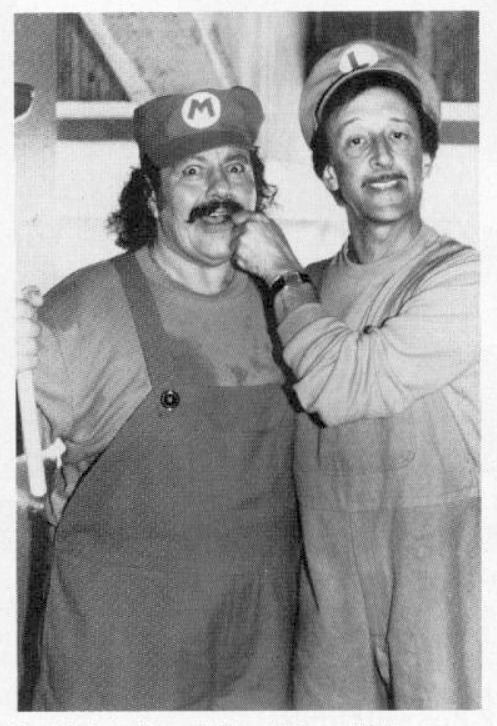
Behind-the-scenes photo of Lou Albano and Danny Wells from the production of the live-action segments of the Super Mario Bros. Super Show, wearing less detailed (likely early) versions of their Mario and Luigi outfits. It is possible that test or pilot recordings of them using these outfits exist, though none have yet surfaced.
Main Blog | Twitter | Patreon | Source: twitter.com user "SuperShowHQ"
1K notes
·
View notes
Text
There's a lot to be said about how many Native tribes, often lacking in the economic opportunities available in many non-tribal areas, have turned their economic development models towards providing services that are forbidden to provide outside of tribal land. The 1987 California v. Cabazon Band of Mission Indians ruling acknowledged the right of tribes to operate gambling facilities regardless of state regulations, and the Obama-era loosening of weed regulations made it easier for them to sell marijuana with less concern for non-tribal laws.
Although these policy developments were not something that most tribes actively sought out, they eventually realized that these policies gave tribal lands a monopoly on certain goods and services that people were unable to acquire elsewhere. Perhaps for the first time ever, government decisions had given tribal economies an advantage over the non-tribal economies surrounding them. This led many tribes to lean hard into their newfound policy-based comparative advantage, building up their local economies around non-Native tourism in a way that sits awkwardly with many Native activists' desire for economic sovereignty.
Tribes with well-managed tribal governments have been able to use this arrangement to great advantage. The Eastern Band of Cherokee Indians (who this post is really about, simply because I know a lot about them) not only uses the money generated by their casino resort to fund social services, they also distribute some of the casino's earnings as cash dividends to Cherokee residents, effectively funding a basic income for the tribe with the money lost by gamblers (who are, disproportionately, white outsiders). After centuries of being robbed by surrounding white communities, there's something of a perversely poetic justice to this (even if those losing the most money at the casino are not necessarily the same segments of the white population who gained the most from Cherokee dispossession).
But it's not all good news. This arrangement also has some concerning side effects on the political economy of Native tribes. The EBCI Cherokee tribe have long opposed federal recognition of the Lumbee, another group in North Carolina who are the largest Native tribe in the US that is unrecognized by the federal government. One of the reasons that the Cherokee have turned their backs on the Lumbee's quest for recognition is because it would threaten their monopoly on gambling in North Carolina. If the Lumbee were treated as a proper tribe, they could open up their own casino, threatening the monopoly profits of the Cherokee casino. Thus, another use of the Cherokee's casino funds has been to actively lobby against another Native tribe.
The EBCI Cherokee's economic reliance on their casino has damaged any prospect of inter-tribal Native solidarity in North Carolina. From the Cherokee's perspective, they have been placed in a situation where the desires of other tribes come at the direct expense of their own tribes' desires. The tension between these two is not a natural phenomenon, but rather the product of a policy framework which leaves little choice for tribal economic development outside of cutthroat monopoly preservation. If solidarity is to live, the casino-first model must die. The question is: what replaces it?
#North Carolina#Native American#we're doing old school Afloweroutofstone effort posting today I guess#Cherokee#Lumbee
785 notes
·
View notes
Text
Good Omens graphic novel update: June 2024
Welcome to the June update. A lot of behind the scenes work at the moment but we're grabbing the travel sweets, popping in the Bentley and hitting the road. More on that below.
Admin
Ongoing reminder that the project FAQ can be found here.
I pledged using my Apple ID, or no longer use the address my pledge is attached to, or I cannot work out what email address my pledge is connected to. What should I do?
Please contact us via your Kickstarter account where the pledge is connected; we will be able to see on our system which address it is. If it's one you have access to, great! The FAQ has information on how to resend your invite link to access the PledgeManager. If it's one you are not able to access, then you can let us know which email is preferred and we can update this on the system, which will automatically send a new invite.
Events
We've had a lot of queries about when the Good Omens team will be attending events more formally, after some Aziraphale and Crowley spotting at conventions we'd been to previously. Well, we're excited to confirm the first: Good Omens HQ will be at ACME Comic Con in Glasgow, Scotland this September.

We'll be bringing the actual-real-life-home-to-Crowley-and-his-plants Bentley from Season 2 of Good Omens, the first time the car has been made available publicly for fans to come see and get photos with, ahead of its journey back to the set and the start of Season 3 filming.
We also see Quelin Sepulveda, aka Muriel, has been announced for the event for some additional ineffable joy.
You can get your tickets for ACME Comic Con here. We hope to see some of you there.

While we won't be rocking up with the Bentley to this next one, we want to let you know about Ineffable Con which, though sold out in person, is also taking place virtually in July. The fan-run event hosts great panels, auctions and more, with money raised going to Alzheimer’s Research UK, in memory of Sir Terry Pratchett.
Where next? We have - not an exaggeration - a list of about 200 events somewhere from when we asked fans this on Instagram and while we can't promise quite that amount of convention attendance, we're certainly looking to do some more things in future with Good Omens at large. Watch this space.
Good Omens items...
This month has largely seen prototypes and samples for the wider Good Omens merch store arriving, and while we can't share those yet, we are certainly excited to see more fan product suggestions coming to life. That does, however, leave our public item updates a little slim on the ground.
To make up for that, here's some new panels from Colleen:

Also known as, "What could possibly go wrong?" And:

Also known as, "Well why don't you ▇▇▇ ▇▇▇▇▇▇ ▇▇▇ ▇▇!@#▇" or words to that effect, we'd imagine.
Update from Colleen
Following such a positive response to Colleen's piece last month, bringing you behind the scenes into making the Good Omens graphic novel, we are delighted to say that she has agreed to write something for our updates going forward! For June, she's going more in depth into the process of flatting and the technicalities of colouring on screen vs print. Over to you, Colleen.
---
I mentioned the other month that I use a flatter to help me with technical work on GOOD OMENS, and here is a great example.
This is my original, hand drawn line art.

And this is the flatting file which was created using the MultiFill computer program.

It will put your eyes out.
The raw image above demonstrates how the color art lines up solidly under the line art. If it doesn't do that, you get a weird phenomenon in print called ghosting, a tiny little line of white around each segment of color. I had this issue on one major project and ended up redoing every single color file after I got a look at the first printing. Nearly two weeks of work.
The same image with the line art on top.

The layer order looks like this.

Background copy is the clean, line art layer.
I scan the art at 600 dpi, then make the blacks pure black, the whites pure white. Then I convert back to greyscale, then RGB, then duplicate the layer. Then I delete the white on the upper layer so the line art layer is transparent but the blacks on that layer are not.
If you have blacks on a layer that has been multiplied, you can see slight color through those blacks. You want pure black.
The lower layer is where I use the MultiFill program to create the digital flats. First you use MultiFill to drop in the random colors, then the companion plug-in Flatter Pro to make those colors seal under the black lines.
This probably sounds like a silly thing to worry about, but if the flat colors don’t line up perfectly under the black line art, you get the dreaded ghosting I mentioned. You can see it below in this image. It’s a tiny little white line that will appear around the black lines and color areas.

This drives me nuts and is an absolute nightmare to fix.
It’s a very common problem, especially for people who work for web and don’t anticipate the problems going from web to print.
What looks great on your computer can cause big problems in print.
From here, my flatter Jul Mae Kristoffer, who is way over in the Philippines, does flatting that is more in keeping with the areas of color I want to isolate. As you see on Layer 1.

But again, this is still pretty ugly, and not what I would use for final color. Flatting is a technical issue, not a creative one, though in some cases a flatter will make choices you may use. Most of the time they don't.
Here is my final color page.

Sometimes my MultiFill flats are so wonky I have a hard time getting my brain to snap out of what I see before me. If I get stuck, it's a good idea to just pick at it and come back to it later.
If it really, really bothers me, I’ll take the MultiFill flatter layer and desaturate the color so it doesn’t poke my eyes out.
Here’s an example. The digital flat file.

The desaturated flat file that doesn’t make me want to poke my eyes out.

And the final color.

Sometimes I just put in a solid white layer so I don’t see the flats at all. Flatting is there to allow you to easily pick spots to color in, and doesn’t usually appear in the final work.
Sometimes I want to create my colors using transparent color over a white ground, which is more delicate in the final.
Here’s an example from Neil Gaiman’s American Gods. I also selected all black line art here and converted it to sepia to give it a vintage look. Except for the fairies. They’re green.

A colorist must also consider color settings.
Different clients can have different requirements. I find these color settings, which I got from the Hi-Fi Studio, to be pretty solid. I use them as my default for all my projects unless otherwise requested. If your publisher has other settings, they’ll usually send you a csf file which you can upload to Photoshop. The program will save your files and you can just switch between them as you need them.

This tells the printer things about the paper and the spread of the ink you will use. That’s what dot gain means - it makes printed color look darker than intended, so you set up your files to account for it.
When you hover your pointer over each box, it will tell you what each setting is supposed to accomplish.
Another really important thing to consider when coloring comics is color range.
I’m coloring this book in RGB range, but for print you use CMYK.
I’m about to confuse the heck out of some people with this post, I’m afraid. But here we go.
Here is this shot in RGB color setting.

And here is the same page calibrated for print in CMYK.

The biggest shift is in the reds. Print cannot match those reds.
You may not see much difference here, but it’s the sort of thing that drives artists crazy.
A computer should be perfect for conveying exactly what you want, right? It's all just 0's and 1's, binary information, and that information should be the same from one computer to the next?
Nope. Not even close.
First off, computer monitors must be calibrated. You can use a computer program or a tool that measures the color on your computer screen and then adjusts the color to an industry standard.
Have you ever been in an electronics shop where a bunch of TV shows were on display, all of them playing the same show, and have you noticed how different the color was from one TV to the next?
It's like that.
I freely admit I don't pay a whole lot of attention to calibration, but if I were a professional photographer I would. I'd have a little spectrometer attached to my screen and software would adjust my monitor to the best possible standard range. As it is, I just use the default setting on my computer and hope for the best.
If your monitor is properly calibrated and your art is shown on another monitor that is properly calibrated, the art will look almost identical from one monitor to the next.
YAY!
But from one monitor to the next, that's about where the resemblance ends.
Colors are calibrated to something called RGB, or Red, Green, Blue.
All colors come from a mix of red green and blue. At their greatest intensity, all the colors in the spectrum together become pure white light.
This is why RGB is called ADDITIVE color, because you ADD colors from the spectrum to get ALL colors, and all colors create the entirety of the rainbow, and pure white light.
Your computer monitor, your phone, your television, all images are created via light using RGB, a gamut that covers all possible colors that can be created.
That's a lot.
And that's why some of the colors you see on your TV or phone are so deep and intense.
For the widest possible range of color and intensity, you use RGB.
Unfortunately, there is what you can create with light, and then there is what you can create with pigment or ink. And that is why printing what you see on your computer almost never looks exactly like what you see in a book.

For printing, you must use a color setting known as CMYK. This stands for Cyan, Magenta, Yellow and Key/Black.
In printing, the pure blue is actually Cyan and the pure red is actually Magenta.
CMYK color range is not created by addition, but by SUBTRACTION. In order to get the color you want, you reduce the percentage of one of the four colors for ink mixing. Mixing all colors, instead of giving you white, gives you black.
The gamut of CMYK is limited to what can be created with ink.
You've probably heard the term four color press? This is what that means. Four colors, with each color of ink run over the paper on rollers which, combined in varying layers of opacity, create all the printing colors you see.
But remember, what you see on your computer monitor and what CMYK gamut can handle are two different things.
Now, I’ve been really careful with the color settings on Good Omens, so there haven’t been any big surprises, but let me show you a snippet of a project I did for the French fashion house Balmain.
The RGB version:

And then this shot after it was converted to a CMYK file for print.

That's a pretty big difference.
Now, you see this shift mostly with vibrant colors, such as that pink there. But other colors hardly changed at all, right?
That's because this issue is about range of color. CMYK and RGB occupy a shared range which you can see demonstrated by this graphic I got from Wikipedia.

The graphic shows the RGB ranges supported by various digital formats. SWOP CMYK is the most common range my publishers use. Note that the bounding box line shared by the RGB and SWOP CMYK formats shares about half the range space. So whatever RGB colors you use that are outside that range will be digitally converted to the smaller SWOP CMYK range.
And you may not like what you end up with.
As you can see, some of the most ethereal and intense colors get lost outside of the SWOP CMYK boundary.
A look at the Dark Horse Comics color settings in Photoshop. Theoretically, this information should prevent your art from looking like mud on publication.

Now, after I just told you the dangers of coloring in RGB then converting to CMYK for print, I tell you I am coloring Good Omens in RGB anyway. There’s a couple of reasons for this.
Remember, RGB give you a greater range of color, so it can be to your advantage to preserve your original files using a format that gives you the greatest range.
Again, here is the unaltered file.

You can see what the CMYK result will be simply by clicking the Proof Colors button here. This will show you how the art will convert.

And the Gamut Warning will show you which colors are out of gamut range for print.

The intensity of that magenta and that purple in the top right are not going to print true.
This is how it will look in final.

So even if you do what you think is perfect color on screen, there is no way it can perfectly convert to print. Almost everything will involve a little bit of compromise.
Even though you have to consider the color shift issues, preserving your files in RGB gives you greater wiggle room, especially if you get lucky someday and get to work with a printer who can print in 6 colors. Or maybe some technology you don’t know about will pop up and make printing super glorious. Who knows.
Regardless, you should keep an eye on that gamut and color for CMYK print, while preserving your master files in RGB.
Until next time.
830 notes
·
View notes
Text

Gloria and Phoebe!
i missed goblin week this year due to Situations but every week is goblin week so whatever.
Gloria, Dame of Daylight, is the titular host of of the spooky late day show Beam Dreams, which has a huge cult following among non-human and mostly nocturnal horror fans. she started the show 20 years ago after growing bored of playing the same role over and over in human-led productions and posing for monster girl pin-up gigs. she used the money from her former jobs to buy equipment, hire some buddies, and start her own campy public access show highlighting a few of her favorite monster-led indie horror films. these days she's going grey (well, greyer) and gravity is Happening which make her already racy costumes more of a gamble, but the show still holds the ghoulish charm that made it a success.
Gloria leans more comedienne than dark and broody despite the media she platforms and she always has a witty observation or subtle joke at the ready. she also has a soft spot for physical comedy and will casually pull an item out of her hair or cleavage unprompted. she doesn't critique any of the work that makes it onto the show unless specifically asked to, but those segments are always fan favorites since they're always equal parts sincere, insightful, and cheeky. she's a real Character.
Phoebe has much more humble origins. as a mostly mellow music nerd, she currently owns the record shop across from the Beam Dreams studio and lends her expertise to help with segments spotlighting up and coming musicians who fit the vibe of the show. she's found a lot of weird little bands for Gloria, and the current program wouldn't be the same without her.
even though she makes an effort to stay out of the spotlight as much as possible, it's common knowledge that she's one of Gloria's close friends, which is good for business and also very annoying sometimes. over the years she's had to train herself to spot red flag Beam fans trying to cozy up to her for information or access to Gloria and now she's real mean about it when it happens.
2K notes
·
View notes
Text
Oh, you know, just the usual internet browsing experience in the year of 2024

Some links and explanations since I figured it might be useful to some people, and writing down stuff is nice.
First of all, get Firefox. Yes, it has apps for Android/iOS too. It allows more extensions and customization (except the iOS version), it tracks less, the company has a less shitty attitude about things. Currently all the other alternatives are variations of Chromium, which means no matter how degoogled they supposedly are, Google has almost a monopoly on web browsing and that's not great. Basically they can introduce extremely user unfriendly updates and there's nothing forcing them to not do it, and nowhere for people to escape to. Current examples of their suggested updates are disabling/severly limiting adblocks in June 2024, and this great suggestion to force sites to verify "web environment integrity" ("oh you don't run a version of chromium we approve, such as the one that runs working adblocks? no web for you.").
uBlockOrigin - barely needs any explanation but yes, it works. You can whitelist whatever you want to support through displaying ads. You can also easily "adblock" site elements that annoy you. "Please log in" notice that won't go away? Important news tm sidebar that gives you sensory overload? Bye.
Dark Reader - a site you use has no dark mode? Now it has. Fairly customizable, also has some basic options for visually impaired people.
SponsorBlock for YouTube - highlights/skips (you choose) sponsored bits in the videos based on user submissions, and a few other things people often skip ("pls like and subscribe!"). A bit more controversial than normal adblock since the creators get some decent money from this, but also a lot of the big sponsors are kinda scummy and offer inferior product for superior price (or try to sell you a star jpg land ownership in Scotland to become a lord), so hearing an ad for that for the 20th time is kinda annoying. But also some creators make their sponsored segments hilarious.
Privacy Badger (and Ghostery I suppose) - I'm not actually sure how needed these are with uBlock and Firefox set to block any tracking it can, but that's basically what it does. Find someone more educated on this topic than me for more info.
Https Everywhere - I... can't actually find the extension anymore, also Firefox has this as an option in its settings now, so this is probably obsolete, whoops.
Facebook Container - also comes with Firefox by default I think. Keeps FB from snooping around outside of FB. It does that a lot, even if you don't have an account.
WebP / Avif image converter - have you ever saved an image and then discovered you can't view it, because it's WebP/Avif? You can now save it as a jpg.
YouTube Search Fixer - have you noticed that youtube search has been even worse than usual lately, with inserting all those unrelated videos into your search results? This fixes that. Also has an option to force shorts to play in the normal video window.
Consent-O-Matic - automatically rejects cookies/gdpr consent forms. While automated, you might still get a second or two of flashing popups being yeeted.
XKit Rewritten - current most up to date "variation "fork" of XKit I think? Has settings in extension settings instead of an extra tumblr button. As long as you get over the new dash layout current tumblr is kinda fine tbh, so this isn't as important as in the past, but still nice. I mostly use it to hide some visual bloat and mark posts on the dash I've already seen.
YouTube NonStop - do you want to punch youtube every time it pauses a video to check if you're still there? This saves your fists.
uBlacklist - blacklists sites from your search results. Obviously has a lot of different uses, but I use it to hide ai generated stuff from image search results. Here's a site list for that.
Redirect AMP to HTML - redirects links from their amp version to the normal version. Amp link is a version of a site made faster and more accessible for phones by Bing/Google. Good in theory, but lets search engines prefer some pages to others (that don't have an amp version), and afaik takes traffic from the original page too. Here's some more reading about why it's an issue, I don't think I can make a good tl;dr on this.
Also since I used this in the tags, here's some reading about enshittification and why the current mainstream internet/services kinda suck.
#modern internet is great#enshittification#internet browsing#idk how to tag this#but i hope it will help someone#personal#question mark
1K notes
·
View notes
Note
oooh can u do one of those with Tom and reader where she does one of those celebrity skincare routine videos. How u go abt the story is completely up to u, have a nice day!
Vogue beauty secrets || Tom Blyth x singer!reader
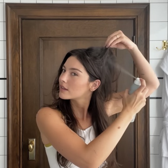
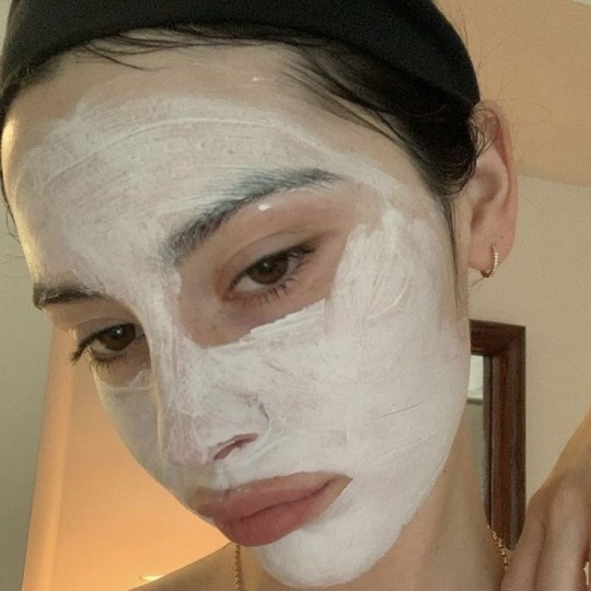
A/n: I haven't post a tom blyth x singer!reader in so long, apolgies! but hope you enjoy this one :)
Wc: 577
Warnings: nonee

Divider by @pommecita
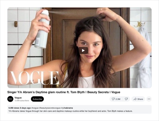
You stand in front of the bathroom mirror, ready to film your Vogue beauty secrets video. The soft lights illuminate the room, casting a flattering glow on your face. "Hi Vogue! I'm Y/n Abrams and I'm going to walk you through my skincare and my current glam-ish makeup routine!" You smile.
"So for my morning skincare routine, I keep it very simple and only use four products," you showcase the products before tucking your hair behind your ears.
Picking up a bottle of a renowned cleanser, you speak with a gentle, almost ASMR-like quality, "I first go in with this la roche possay face wash," You squeeze the contents in your hands.
"I used to have really bad teenage acne and my mum actually put me on this when I was about 14 and I've been using it ever since!" You say as you lather it up in your hands.
You lightly pat your wet face and with a confident smile, you began detailing more of your skincare routine, highlighting each product with precision. You get closer to the camera as you delicately applied a moisturiser, your voice resonating with enthusiasm.
The ambiance shifted when you transitioned to your makeup routine, showcasing the products that you use. "Most days I just keep it very very simple, using very light products on my skin," You comment as you pull out foundation.
"But for my sort of glam days I use this foundation from charlotte tilbury, it's not too heavy for me but it has great coverage." As you meticulously applied the product on your face, the door to the bathroom creaked open as you look towards the reflection of the mirror.
Tom casually strolls in, a lazy grin on his face, his eyes locking onto you. He wraps his arms around you, his warmth and affection catching you off-guard as you smile. He rests his chin on your shoulder, "Hi gorgeous," he whispers against your skin.
His eyes then move to the camera that he hadn't seen, "Oh- are you filming that video right now?" Tom seemed genuinely concerned, but instead of pulling away, he tightens his embrace, placing light kisses on your exposed skin. The unexpected intrusion caught everyone watching at home off-guard, but the genuine affection between you and Tom added an endearing touch to the video.
"Yeah, but it's okay, you can stay," You assure your boyfriend as you both lock eyes with each other through the reflection. "What's the video again?" Tom lifts his head up from your shoulder as he straightens up behind you.
"My beauty secrets with Vogue," you explain, motioning to the products on the counter. "I'm doing my makeup routine right now," almost forgetting you still had to get through the rest of your routine, you go back to doing your makeup.
Tom, seemingly unfazed by the cameras, continued to watch you with adoration with his hands resting on your hips. “You don’t need makeup, you’re already gorgeous,” he remarked. “Hm?” You look at him, “I said, you already look gorgeous, you don’t need makeup,” he repeats, his words sincere and heartfelt.
You give your boyfriend a grateful smile for his sweet words. Caught in the moment, Tom continues to watch you, occasionally leaning in to drop a playful comment or offer a sweet compliment. The chemistry between you two is palpable, and it added an unexpected charm to the video.
You wrapped up the video with Tom still beside you as he gives a small wave. You thought for sure that the vogue editing team would cut off most, if not, all the parts that Tom was in.
But little did you know, the vogue team decided to keep the segments with your boyfriend, finding his genuine affection and compliments wholesome.
When the video gets uploaded to YouTube, the internet goes wild. Both your fans couldn't get enough of Tom's unscripted, heartfelt moments. Clips of him wrapping around you, calling your gorgeous, and showering you with affection became viral sensations.
Social media explodes with comments praising how sweet Tom is and the chemistry between the two of you. Memes circulate, capturing the hilarious and heartwarming snapshots from the video.
The unexpected blend of beauty tips and genuine love only fueled the video's popularity.
#tom blyth#fanfiction#tom blyth imagine#tom blyth x gf!reader#tom blyth x singer!reader au#tom blyth x singer!reader#social media#fanfic#tom blyth fluff#boyfriend!tom blyth#coriolanus snow fanfiction#the hunger games#tom blyth x reader#the hunger games the ballad of songbirds & snakes#the ballad of songbirds and snakes#tbosas imagine#tbosas x reader#tom blyth the man you are#singer!reader#gracie abrams
2K notes
·
View notes
Last Seen Blogs

eroc97
Untitled

soartisanfire
Без названия
beautybymagik-blog
Beauty by Magik
sparklygems
Crying Over Animal Crossing Kabuki Since 2005

salesbear
Nerd Life