#Red and white design
Explore tagged Tumblr posts
Visit Tumblr Blog
Explore Tumblr blogs with no restrictions, modern design and the best experience.
Last Seen Tumblr Blogs


Fun Fact
70% of Tumblr users say the Dashboard is their favorite place to spend time online.
Text
MANCHESTER UNITED WALL CLOCK
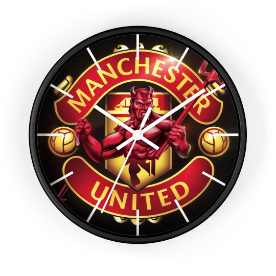
Every second counts! An exciting and practical accent in any room, this unique high quality Wall Clock serves as a statement piece, creating a personalized environment.
.: Materials: 100% wood (frame), 100% plexiglass (face), 100% metal (mechanism) .: One size: 10" x 10" (25.4 x 25.4 cm) .: Pre-installed backside hook .: For indoor use .: Requires one AA battery (NOT included) .: Silent clock mechanism.
Get it now from here
#Manchester United#Man Utd logo#The Red Devils#Old Trafford inspiration#Premier League team#Football club crest#Soccer team emblem#Red and white design#English football pride#MUFC#Manchester pride#Club badge design#Timepiece for fans#Football memorabilia#Team spirit clock#Man United decor#Sports fan merchandise#Soccer enthusiasts gift#Club crest art#Red Devils wall clock#United fan gift#Premier League decor#Iconic football crest#Stylish sports clock#Soccer collectibles#Manchester United supporters#Red and black design#“Glory Glory Man United”#Football-themed clock#Champions League pride
0 notes
Text
does anyone have like an anti aesthetic. like something you look at and can recognize as a complete fashion/interior design/artistic movement and understand it but it makes you shudder seeing it. i am not talking like “its morally bad” “its poorly structured” like just sheerly devoid of joy for you actually invites a repulse response.
#also if it wasnt clear this isnt ‘its bad its lazy’ there is a level of like#completion consistancy i am thinking for with this#personally i really do not enjoy the like. vintage chic long red nails fur coats noir esque aesthetic HOWEVER 💥💥💥#i can recognize that it is put together it is Intentional#i feel like a lot of people are going to say minimalism on this so LET ME SAY 🫰☝️ i recognize that minimalism is Considered an aesthetic#but i *PERSONALLY* do not consider it an aesthetic i consider it the void of one#it is a lapse in aesthetic or personality in the same way a silence in a song is still technically a ‘beat’ but no music is played#however the importance of Space or Breath in design is more akin to a purposeful silence in music#because that silence matters in the same way rhythm and breath in design do#so i guess minimalism is more comparable to like. white noise. the sound of a fan#very little effort and there is a comfort in it i suppose but its not. A Design. okay#TO ME 🤫#if minimalism has one hater its me if minimalism has no haters im dead
27K notes
·
View notes
Text
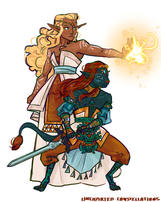
The Princess and Hero of the First Great Calamity
The orange snoot is very important to me….
#tloz#princess zelda#link#assumedly?#botw#totk#technically#loz redesigns round 2#the first great calamity#the ancient heroes aspect#the ancient hero’s aspect#art#my art#redesign#listen this is probably the one and only time ill draw something furry so if it looks a bit wonky i dont really care lmao#this is one of the few designs where im Under designing one of the characters#ie the heroes aspect is such a messy design#i went of the mural a little bit more for the coloring so a little more orangey red involved in his design#and also changing his face to look a little less offputting#and the greener looking eyes from the mural#the darker fur also helps the teal pop#but yes i made his armor a little less zonai-y and a tad more guardian inspired?#i didnt take away all the zonai vibes because he’s seemingly related to them somehow#i do wish we had a timeline for how long after rauru sealed ganon that this calamity happened#but oh well#but yeah uh zelda#vaguely based on sonia#thats pretty much all i have to say about her lmao#i used more neutrals on her dress to semi emulate the pure white of the mural#while also bringing in more of those sheikah tech colors
2K notes
·
View notes
Text
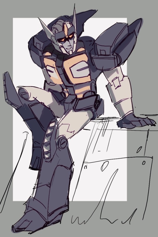
Drift’s “Dead end” design is my Roman Empire…
Like. His Crystal City look is great. His mtmte look is also great. And the Lost Light one too. But when I look at this specific design eh idk there’s something very special about it. It’s the way he was created by Cybertron if I’m not wrong. I love this colour scheme. It’s so calm and simple.
#maccadam#transformers#drift#mtmte#………#I almost tagged it as Deadlock haha#but it’s not Deadlock. It’s what Drift looked like before he became Deadlock#but gjjgjg GOSH he’s s o similar eah#bear with me. His Lost light design is cool but it has so much contrast. Shiny white with RED-red and pitch black#still. cool.#but I kinda. KINDA SORTA wish that after all the changes he did to his frame#wouldn’t it be poetic if he returned to his original form?#I just.#My boy is always so quick to change himself. And every time he strays further and further away from his original frame#the only thing that stayed till the end are his finals and kinda maybe top part of his helmet
2K notes
·
View notes
Text

realizing how much i like drawing him a million years too late :<
#my art#jujutsu kaisen#jjk#yuta okkotsu#okkotsu yuuta#yuuta#fanart#jjk fanart#i amn so sleepy today GJHKGJDS just felt like doing a bit of a return 2 form with red/white/grey colour palettes... smth easy#i will get back to being Actually productive now that i hav purged th yuuta brainworms fr the time being#rly tho it is criminal that i am only Now realizing how fun his design is given th state of canon.......#i want to draw him more! but ... the gojo suit.....#i think that whenever i draw yuuta it will b original flavour. i do not particularly want 2 draw limited edition gojo yuuta#also will i shut up abt these brushes yet the answer is no smile :)#the little Rake-y one is my LOVE when i was swatching them i honestly didnt think i would like it#but shes got so much personality!!!!!!#need to fill space? pastel rake. shadows not blending and look muddy? pastel rake#s tier brush in this Already stacked set
2K notes
·
View notes
Photo


“Cat Fangs” by Malicious.X – A fierce union of fashion and effects artistry, blending sleek leather with menacing teeth motif. 🖤
#2023#white#japanese fashion#surreal#red#unique design#black#malicious.x#fashion#accessory#special effects#contemporary
596 notes
·
View notes
Text
A lot of Tails’ stuff being blue, most of Sonic’s belongings having a hint of yellow.


#sonic the hedgehog#miles tails prower#sonic and tails#unbreakable bond#they are cosmic truth#they’re brothers your honor#wholesome sonic and tails wednesday#Sonic has so few belongings and a lot of them are red cause it’s his favorite color (some are blue because of brand)#but a lot of them have little hints of yellow! (not because they’re made by his brother of course not)#even if sonic has very few possessions that are actually his own like the Tornado or his white sunglasses he still has alot of yellow stuff#Tails designed stuff! Prower produced!#his most iconic possession his shoes do have some golden color on them but remember! gold is just shiny yellow!#could probably add his yellow wrist comm to the short list of his actual belongings but we still haven’t seen it out of the IDWs so not yet
2K notes
·
View notes
Text

I recently played through Arkham Knight four times back-to-back. I'm sure that's just a coincidence, though.
#jason todd#red hood#batman#batfam#dc#though AK just mostly reminded me of how much i love UTRH (movie) jason#and any time he's drawn ugly i take it as a personal affront#so this is also my humble contribution to a noble cause#plus that white streak is just 10/10 character design#one hairstyle is not enough#fanart#my art
709 notes
·
View notes
Note
Forgive me if this comes across as strange, but I really enjoy the rich color you use for blood in your drawings. It's great for contrast against Machete's otherwise pale complexion, but it also really conveys the blood's vitality - it makes it feel alive and living, warm, even. That color, and all your art, really, is vibrant and full of life, enough so that it challenges the negative associations of death and injury that blood conveys. I just wish poor Machete had more of it inside him than outside
Thank you! I've never thought about it from that angle.
I know that realistically I should color the blood darker, maybe with a more maroon tint, but the visual intensity of vivid scarlet is just irresistable to me I guess. The excuse I tell myself is that in Machete's case, his white fur naturally provides the lightest possible background for that blood to sit on, maximizing the brightness and vibrancy it has to offer.
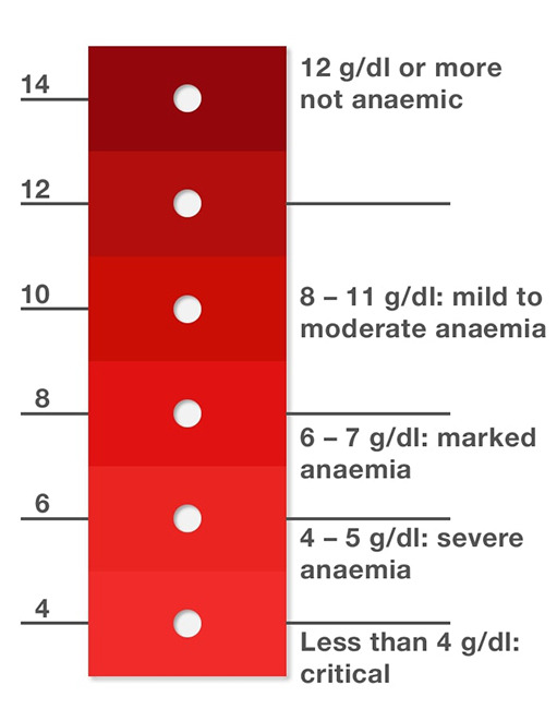
This is beside the point but I've also understood that anemia can affect the color of your blood if severe enough, but I'm not a medical professional so I can't really verify how visible that is to a naked eye. Not having enough hemoglobin makes it look diluted in a way.
#not to ramble aimlessly about this but the color red and the theme of “blood=vitality” are central to his character in general#it's the color of his cardinal robes obviously and an eyecatching symbol of his accomplishments which are a crucial part of his identity#vivid red dye like that was exceedingly expensive so being able to wear it was a mark of high status#since he doesn't produce pigment of his own and doesn't have natural markings per se all color in his design#the hues of peachy pink and salmon even the vascular dark circles under his eyes#come from blood showing through the subtly translucent tissue#he struggles with an undiagnosed blood disorder and goes through regular bloodletting in a lamentably misguided attempt to cure it#a widespread and ordinary treatment at the time#and eventually gets assassinated and dies of hypovolemic shock#as a result of not being able to let go or escape his position in the church in time#answered#skespers#white dog syndrome
474 notes
·
View notes
Text
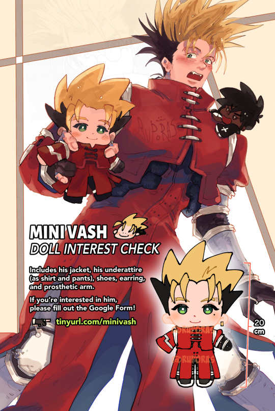


the interest check for the max vash plushie is finally available! he's the same size as his buddy wolfwood and comes with numerous accessories. there's more photos on the form itself, including what the current sample looks like.
if you're interested in him, please fill out the form here!
#minivaa#vash the stampede#trigun maximum#trigun#ruporas art#he's here..... sdmgskgmsdk honestly my brain is at power 0 as i type this up BUT IM VERY excited for him...#i think he's super cute.. gh... please fillout the form if you like him and want him!!!#and if you know any vash lovers 🥺 esp max vash lovers 🥺 perhaps theyd be interested in this!!#i will say theres like some design liberties ive taken with this including the white part on his red jacket#ive been drawing it like that so long i forget it was canon that he didn't have the white part. i hope it's not a deal breaker!!#im willing to change it if enough ppl are dissatisfied with that though. and that applies to other parts of him too... any suggestions#please take it to the form!!!! thanks!!!
628 notes
·
View notes
Text


©𝐈𝐎𝐕𝐄𝐀𝐑𝐓𝐅𝐈𝐋𝐌: Give credits in tags if used. (#by ioveartfilm) Likes & Reblogs are appreciated.
#by ioveartfilm#dividers#christmas#christmas dividers#carrd graphics#carrd decor#carrd material#carrd resources#carrd dividers#carrd inspo#carrd layouts#carrd icons#red dividers#white dividers#black dividers#cute dividers#tumblr dividers#aesthetic dividers#lace dividers#blue dividers#post dividers#page dividers#rentry graphics#web graphics#graphic design#rentry resources#blog resources#web resources#carrd moodboard#kpop layouts
615 notes
·
View notes
Text
LIVERPOOL FC WALL CLOCK

Every second counts! An exciting and practical accent in any room, this unique high quality Wall Clock serves as a statement piece, creating a personalized environment.
.: Materials: 100% wood (frame), 100% plexiglass (face), 100% metal (mechanism) .: One size: 10" x 10" (25.4 x 25.4 cm) .: Pre-installed backside hook .: For indoor use .: Requires one AA battery (NOT included) .: Silent clock mechanism.
Get it now from here
#Liverpool FC#Liverpool Football Club#You'll Never Walk Alone#Club crest#Liverbird#Soccer club emblem#Red and white design#Football memorabilia#Sports fan clock#EST 1892#Decorative wall clock#Team spirit#Premier League merchandise#Flames design#Timepiece for fans
0 notes
Text


okay i think i am learning.... something
#fursona#minecraft#furry#i need to do gold and diamond next#and i am 100% incorperating the dragon skull into the netherite design. id be foolish not to#i only have a few things im ? about.#1) should the leather get redyed for each new metal/ore armor? like for iron it could be dyed dark blue and white. lugia moment#2) for the hoodie tassel. it changes color to comliment the ore. what would match best w gold??? i already did red for leather erm#3) i cant tell if the leathers too dark. originally i ahd it more orangey/'cowboy' leather as forrest called it but he said it was too clo#to the critters fur so i made it darker.but now idk....#my art
4K notes
·
View notes
Text


no idea which doodle of sleeping shadow it is of mine, very likely not last. there's something poetic about tough-acting characters allowing themselves to be so vulnerable
and something that looks like you'd find it foraging in your backyard dumpster
#THE STAR SHAPED BEAST IS FLABBERGASTED!!!!!!#i like the fan design choice i see in some art of shadows paw undersides being white#but what I'm not exactly a fan of#is the way they did the large quills in movie designs#that they look like chunks of flesh covered in fur with just some quills growing here and there#i prefer them as. you know. smaller long quills forming clusters#sonic#shadow the hedgehog#red toe beans because i said so#still havent recovered from the movie. we enter 2025 absolutely unhinged
366 notes
·
View notes
Text
Briar and Apple are actually insane for each having the colour scheme of half the lesbian flag. They make a whole lesbian when put together. What the fuck was that about huh. What was the reason for that.
#yes ik technically apple's colour scheme is red but she also has like a frankly hilarious amount of#orangey-orange colours in her character design for someone whose whole thing is the red apple#so i count it.#ever after high#eah#apple white#briar beauty#applebeauty#brapple#was it casual when you and your bestfriend were literally the lesbian flag when put together apple?
223 notes
·
View notes
Text

falling in love with you ♪
#this is just the design of that firstprince charm I've made last year but I never posted it so#(and I dont produce a lot of new art SO)#red white and royal blue#rwrb#rwrb fanart#rwrb movie#firstprince fanart#firstprince#alex and henry#alex claremont diaz#henry fox#prince henry of wales#henry fox mountchristen windsor#art#fanart#my art#artists on tumblr
482 notes
·
View notes