#Responsive Design
Explore tagged Tumblr posts
Visit Tumblr Blog
Explore Tumblr blogs with no restrictions, modern design and the best experience.
Last Seen Tumblr Blogs


Fun Fact
The “We are the 99%” Tumblr blog became the slogan for the Occupy Wall Street movement.
Text


theme - streetlights: preview/code (ko-fi, free)
a responsive theme
features: 70x70px icon image, blog title, three custom links, about section**, updates section, short to do list section, 450px to 540px text posts
notes: it's my birthday! enjoy this virtual slice of cake. <3 npf posts friendly! ask and submit button will automatically show if allowed (please check your settings). ** you have to go directly to the code to edit these features. thank you @/glenthemes for the griddery script. credits link to the resources, tutorials and scripts used to make this theme possible is found on the bottom right corner of the theme. join me on patreon.
#mine: themes#theme#themes#blog theme#blog themes#code#codes#tumblr theme#tumblr themes#free content#responsive design
116 notes
·
View notes
Text
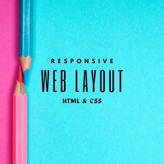
Responsive Web Layout Design
#responsive web design#html css#frontend#css#html#css3#frontenddevelopment#webdesign#responsivedesign#neduzone#create a website#responsive design#css tutorial#css tutorial for beginners
9 notes
·
View notes
Text


La Hauss. Máster Online en Diseño UX-UI y Programación Web 2023-24. Proyecto Final de María Lázaro Rivera: diseño web responsive para site de Frame:
#diseño web online#diseño web#web design#María Lázaro#web Frame#prototipado web#diseño ux-ui#diseño ui#diseño responsive#responsive design#diseño ux-ui y programación web#programación front-end#diseño de interfaces#diseño de interfaces web
5 notes
·
View notes
Text

Responsive Image Gallery
#responsive image gallery#responsive web design#webdesign#responsive design#html css#codenewbies#frontenddevelopment#html5 css3#css for beginners#pure css tutorial#basic html css tutorial#css image gallery#html css image gallery
4 notes
·
View notes
Text
I've found someone you should follow on Pinterest!
I thought you'd like the ideas this person's been saving on Pinterest... https://pin.it/4ZUJ4bryL
https://pin.it/4ZUJ4bryL
Follow me on Pinterest 😉
#pinterest#html#css3#tamilitmemes#tamilwebdesign#css animation#web design#web development#website#webdesign#youtube#web developer#website development#development#developer#responsive webdesign#responsivewebdesign#responsive design#responsive web design#it memes#office memes#memelife#memes#funny memes#programmers#programminglanguage#programmer#program#work in progress#affiliate program
10 notes
·
View notes
Text

Responsive Website Layout
#css slider#slider#slider css#responsive web design#responsive web layout#html css#divinector#css#frontenddevelopment#webdesign#html#css3#responsive design#website design#web design
4 notes
·
View notes
Text
Sneha Trivedi Freelancer | Web Designer | Freelancing Service Provider | Indore
https://tinyurl.com/3rdw5ctz
Sneha Trivedi is a skilled web designer with over 6 years of experience in creating stunning, user-friendly websites. Specializing in both web design and graphic design, she brings a unique blend of creativity and technical expertise to each project. With a strong background in the latest design trends and technologies, Sneha also collaborates with top web hosting companies to ensure seamless hosting solutions for her clients. Her comprehensive services extend to internet marketing, helping businesses grow their online presence through tailored strategies. Whether it’s design, hosting, or digital marketing, Sneha provides end-to-end solutions to elevate brands online.
#sneha freelancer#website designer#web hosting#graphic design#logo design#creatives#banner design#responsive design#bootstrap website#wordpress website#html coding#indore
2 notes
·
View notes
Text
Create Stunning Sliders Without Coding
Transform your website with Slider Revolution! This powerful WordPress plugin lets you create stunning sliders, carousels, and dynamic hero sections—all without coding. Choose from 250+ templates and easily customize them with a drag-and-drop editor.
In the fast-paced digital world, your website’s visual appeal plays a crucial role in engaging visitors and boosting conversions. Slider Revolution is the most advanced WordPress plugin. It empowers you to design responsive sliders, carousels, and hero sections. You can even create full one-page websites without writing a single line of code. With its intuitive drag-and-drop interface, even…
#Digital Marketing#Drag-and-Drop Editor#Dynamic Content#Interactive Sliders#Responsive Design#SEO Optimization#Slider Revolution#User Engagement#Web Design Tools#Web Development#Website Design#WordPress Plugin
2 notes
·
View notes
Text

Are you in search of the top web design company in Hyderabad? Look no further than Webxperts Digital Solutions! Our team of skilled professionals is dedicated to creating stunning websites tailored to your specific needs. Enhance your online presence with our state-of-the-art web development services and designs. Contact us today +91 8466886735 Visit : https://webxperts.in/Hyderabad
#SEO#UX Design#UI/UX#Responsive Design#Mobile Development#Ecommerce#WordPress#Content Marketing#Social Media Marketing#Online Advertising#web development#digital marketing
2 notes
·
View notes
Text
Transform Your Online Business with ERPNext's Website & ECommerce Solutions by sigzen
Running an online business presents various challenges, from inventory management to order tracking and ensuring seamless customer experiences. This is where ERPNext comes into play. Think of it as a highly efficient assistant that takes care of all your business tasks, allowing you to concentrate on your core competency: growing your business. With ERPNext’s Website & ECommerce solutions, you’ll…

View On WordPress
#Automated Processes#business growth#Business Integration#ECommerce Management#ERPNext#Integrated Solutions#Online Business#Responsive Design
3 notes
·
View notes
Text
Paso a Paso: Creando un Sitio Web Básico
Te guiaré paso a paso para crear un sitio web utilizando las secciones que hemos desarrollado. Elegiremos la sección de Blog de Noticias como ejemplo principal, pero los principios son los mismos para las otras. Guía Completa: Desarrolla Tu Sitio Web Paso a Paso 1. Planificación y Estructura Básica: Los Cimientos Digitales Una buena planificación es crucial y te ahorrará mucho tiempo y…
#barra lateral#blog#código#contenido principal#contenido web#crear sitio web#CSS#desarrollo web#Diseño web#e-commerce#encabezado#estructura web#guía#HTML#integración código#Interactividad#Javascript#navegación#paso a paso#personalización#pie de página#planificación web#portafolio#programación#responsive design#SEO#tutorial#tutoriales#usabilidad#validación web
0 notes
Text


theme - all these and more: preview/code (paid, $5: ko-fi or payhip)
features: 292x200px sidebar image, 70x70px icon image, blog title, blog subtitle, seven custom links, about information + skills section**, about section**, short updates + projects section**, tags list section**, 450px to 540px text posts
notes: this is a responsive theme. npf posts friendly! ask and submit button will automatically show if allowed (please check your settings). thank you @/glenthemes for the griddery script. <3 ** you have to go directly into the code to edit this section. credits link to the resources, tutorials and scripts used to make this theme possible is found on the bottom right corner of the theme. become a subscriber on patreon?
#themes#blog theme#blog themes#tumblr theme#tumblr themes#code#codes#mine: themes#premium content#responsive design
49 notes
·
View notes
Text
SEO Minneapolis Services That Drive Results
Want your site to rank better? Oxsome Web Services provides top-notch SEO in Minneapolis to improve your visibility and attract organic traffic. Our data-driven approach optimizes your search rankings and gets more customers onto your site. From technical audits to content optimization, we offer everything to deliver long-term success. Let Oxsome Web Services take care of your SEO while you concentrate on your business development.
#digital marketing agency#custom ai development#web design#seo#ai solutions development#website designer#website design#responsive design#web design companies#web developers
0 notes
Text


La Hauss. Máster Online en Diseño UX-UI y Programación Web 2023-24. Proyecto Final de Laura Martos Gris: diseño web responsive para site de Frame:
#diseño web#diseño web online#Laura Martos#diseño ux-ui#programación web#desarrollo front-end#diseño responsive#responsive design#web Frame#diseño ui#diseño interfaz web
2 notes
·
View notes
Text
Responsive Animated Website With HTML & CSS
youtube
#html#tamilitmemes#css3#tamilwebdesign#css animation#web development#web design#website#webdesign#youtube#responsivewebdesign#responsive design#responsive webdesign#responsive web design#webdev#htmlcodes#htmlcss#learn html#html5#html course#css tutorial#html css#html5 css3#css#htmlcoding#frontenddevelopment#javascript#csstricks#websitedesign#website development
5 notes
·
View notes