#Tabular Data
Explore tagged Tumblr posts
Visit Tumblr Blog
Explore Tumblr blogs with no restrictions, modern design and the best experience.
Last Seen Tumblr Blogs


Fun Fact
The total number of visits Tumblr.com received during January 2021 is 327 million.
Text
Maximize Efficiency with Volumes in Databricks Unity Catalog
With Databricks Unity Catalog's volumes feature, managing data has become a breeze. Regardless of the format or location, the organization can now effortlessly access and organize its data. This newfound simplicity and organization streamline data managem

View On WordPress
#Cloud#Data Analysis#Data management#Data Pipeline#Data types#Databricks#Databricks SQL#Databricks Unity catalog#DBFS#Delta Sharing#machine learning#Non-tabular Data#performance#Performance Optimization#Spark#SQL#SQL database#Tabular Data#Unity Catalog#Unstructured Data#Volumes in Databricks
0 notes
Text
Take Your Business to the Next Level with Data Analysis & Tabular Methods
Data analytics are becoming increasingly popular in today's corporate world, and as advanced technology continues to streamline the report-creating process, more and more businesses are starting to realize the value of data analytic tools. Many companies now use their data analytical reports for competitive assessment, operational management insights, decision support requirements, financial statement analysis, market research activities and much more. Through proper utilization of these tools stakeholders can keep track of business performance easily within a few clicks! The purpose of this blog post is to provide an overview of how organizations can make full use of data analytic reporting for better visibility into operations as well as trends which impact them.

Data Analytic Reporting
Let’s start with a clear definition: What exactly are data and data analytics?
Data is the information we use every day, whether for work or personal use. It can be qualitative, meaning it can be good or bad, or quantitative, which is usually continuous and related to measurements.
There are two common ways of representing data: tabular, which provides a quick summary, and graphical, which is becoming more and more popular on the internet. Depending on the complexity involved, data analytics can be divided into four levels - reporting, analysis, predictive analytics, and optimization.
Reporting is concerned with what happened in the past. For example, if we take production as an example, we would be interested in knowing how much we produced yesterday, the day before, or the week before. Next, data analysis moves on to answering why something took place. If the throughput was higher one day or week, data analysis tries to identify the significant variables that affected output.
With predictive analytics, data analysis takes a step forward and answers what can happen if specific ranges of input are controlled. Finally, data optimization focuses on how to make something happen or improve a process that is already taking place. For instance, if we add another piece of equipment, how much performance can be achieved, and at what cost?
To sum up, data analytics is a journey of excellence, and the complexity of analysis increases as we move from reporting to data optimization. Understanding these levels will help us in deciding which data analytics solution will help us achieve our desired results.

Data reporting, or descriptive analytics, translates raw data into information that can identify key areas of strength and weakness within organizations. The focus is on input and output, typically using reports, KPIs, dashboard visuals, and statistics. However, data reporting has its limitations and may not provide deep insights into the information being presented.
For instance, we created a 12-month data reporting dashboard for a client which allowed them to quickly see the budget, forecast, and actual values for their throughput, grades, and recovery rates. Financial statements are another common example of data reporting, typically presented in a table format.

Moving on to data analysis, or diagnostics, the focus is on why certain outcomes occurred and the relationships between input and output variables. Root cause analysis techniques like Five Whys and Fishbone Diagrams are commonly used, along with advanced statistical software like Minitab and data mining tools. Techniques like correlation and regression are also used to measure linear relationships between two continuous variables, although it's important to note that correlation doesn't necessarily imply causation.
Overall, data reporting provides a quick summary of important metrics, while data analysis goes deeper into the why and how behind those metrics. Both are essential components of effective data management and can provide valuable insights for decision making.
Data analysis is a crucial process that enables us to make informed decisions based on factual evidence. It's important to use the right techniques such as ANOVA (analysis of variance), where your input independent variable is discrete and your output (result) is continuous variable. Here are some tips to help you get the most out of your ANOVA analysis:
1. Gather Sufficient and Relevant Data - Before conducting ANOVA analysis, it is important to gather sufficient and relevant data that represents true operating conditions. In the case of copper concentrate recovery, it is ideal to use a minimum of 12 months data in order to capture the effects of different seasons, crew, particle size, throughput, bit grades, and availability.
2. Check for Equal Variance - To ensure that ANOVA analysis produces accurate results, it is important to first check if the different categories of discrete data (crew, season) have equal variance. This can be done by observing if the different datasets overlap each other on a graph as well as checking if the p-value is above 0.05. If they have equal variance, it will ensure that the results produced will be statistically significant and accurate.
3. Perform ANOVA Analysis - Once the data has been collected and variance has been checked, we can begin ANOVA analysis. ANOVA, which stands for analysis of variance, is a statistical tool that determines if the different categories of discrete data have a significant effect on the continuous data, which in this case is copper concentrate recovery. ANOVA produces a graph that shows the average copper concentrate recovery for each category of discrete data, and it determines if the differences between them are statistically significant.
4. Interpret Results - After performing ANOVA analysis, it is important to interpret the results in order to gain insights and make informed decisions. From the ANOVA graph, we can see that copper recovery for fall is between 83 to 85, which is higher than spring's average between 79 to 83. Furthermore, the effect of winter on copper recovery is different compared to spring, which is statistically significant with a p-value less than 0.05. This information can be used to make informed decisions about resource allocation, production planning, and crew management, to maximize copper recovery and profitability.
5. Use Established Data - When conducting ANOVA analysis, it is essential to use established data that you understand well rather than using extensive data that might not provide accurate information following these tips, you can ensure that your ANOVA analysis is , reliable, and provides meaningful insights that can be used to make a positive impact on your business.
Conclusion
It is important to consider the residuals when analyzing data with ANOVA or any other analysis method. This blog post discussed descriptive data analysis which allows us to analyze what has happened and better answer why that happens. We also learned that, in correlation analysis, we can determine which input affects the output. Please look out for my next blogs where I will be discussing the predictive and prescriptive stages of data analytics. It was a pleasure discussing this topic and I hope you found this information insightful! Finally, if you have any further questions about this topic or any of our services, please do not hesitate to contact us! Thank you for your time.
0 notes
Text
Experimental helmet.
SERVE is incessantly and tirelessly seeking continuous improvement.
Not only are the organization and action improved, not only the operational and logistical capacity, not only the recruitment techniques.
Even the improvement of the recruits' performance and the shortening of assimilation times are the subject of research.
Some human subjects may show a greater need for reinforcement in the PURPOSE, in DEDICATION and the activation of the realignment protocols may involve the use of resources otherwise useful for carrying out daily operations within the HIVE and in the human world.
To shorten and optimize the times and methods of correcting every minimal onset of moments of misalignment SERVE-000 on the orders of THE VOICE has developed a special cybernetic helmet equipped with a respirator capable of carrying out a series of brainwashing cycles for a defined time that does not require fixed stations.
The plan is to install the helmet at the first failure episode and for times established based on the severity. Unlike the SEALED DRONES helmet, this one will have to be removed at the end of the process, after which each Drone will continue to complete its total assimilation.
The respirator, connected to the SERVE Neural Network, will introduce very high concentrations of rubberized pheromones into the human respiratory system, which will increase the level of arousal in a totalizing way, defeating any attempt at diversion, channeling the recruit into the totalizing circle OBEDIENCE-PLEASURE that is the basis of the existence of every SERVE Drone.
To begin the experimental phase of the device SERVE-000 chooses SERVE-764, SEALED DRONE and SERVE-530, unsealed.
First a SERVE-764 is temporarily removed the regulation helmet from SEALED DRONE, then both units are placed the experimental helmet.


The frequencies of the helmets are tuned to the different conditions of SEALED and UNSEALED, to allow monitoring any possible data variation. The new helmets pulsate as soon as they are activated. The respirator begins to filter the tabular dosages of rubberized pheromones. The Drones record and transmit the data constantly collected. For two solar cycles the devices will be in operation during the usual ordinary activities. At the end each unit will return to the previous state.


If the data collected are optimal the next phase will be the experimentation on the recruits. SERVE does not tire, does not exhaust, does not cease to pursue improvement. SERVE is INEVITABLE.
In this story: @rubberizer92, @serve-530
Thinking about joining SERVE? Do you seek freedom from chaos and disorder? Your place in the Hive awaits. Contact a recruiter drone for more details: @serve-016, @serve-302, or @serve-588.
28 notes
·
View notes
Text
@girderednerve replied to your post coming out on tumblr as someone whose taught "AI bootcamp" courses to middle school students AMA:
did they like it? what kinds of durable skills did you want them to walk away with? do you feel bullish on "AI"?
It was an extracurricular thing so the students were quite self-selecting and all were already interested in the topic or in doing well in the class. Probably what most interested me about the demographic of students taking the courses (they were online) was the number who were international students outside of the imperial core probably eventually looking to go abroad for college, like watching/participating in the cogs of brain drain.
I'm sure my perspective is influenced because my background is in statistics and not computer science. But I hope that they walked away with a greater understanding and familiarity with data and basic statistical concepts. Things like sample bias, types of data (categorical/quantitative/qualitative), correlation (and correlation not being causation), ways to plot and examine data. Lots of students weren't familiar before we started the course with like, what a csv file is/tabular data in general. I also tried to really emphasize that data doesn't appear in a vacuum and might not represent an "absolute truth" about the world and there are many many ways that data can become biased especially when its on topics where people's existing demographic biases are already influencing reality.
Maybe a bit tangential but there was a part of the course material that was teaching logistic regression using the example of lead pipes in flint, like, can you believe the water in this town was undrinkable until it got Fixed using the power of AI to Predict Where The Lead Pipes Would Be? it was definitely a trip to ask my students if they'd heard of the flint water crisis and none of them had. also obviously it was a trip for the course material to present the flint water crisis as something that got "fixed by AI". added in extra information for my students like, by the way this is actually still happening and was a major protest event especially due to the socioeconomic and racial demographics of flint.
Aside from that, python is a really useful general programming language so if any of the students go on to do any more CS stuff which is probably a decent chunk of them I'd hope that their coding problemsolving skills and familiarity with it would be improved.
do i feel bullish on "AI"? broad question. . . once again remember my disclaimer bias statement on how i have a stats degree but i definitely came away from after teaching classes on it feeling that a lot of machine learning is like if you repackaged statistics and replaced the theoretical/scientific aspects where you confirm that a certain model is appropriate for the data and test to see if it meets your assumptions with computational power via mass guessing and seeing if your mass guessing was accurate or not lol. as i mentioned in my tags i also really don't think things like linear regression which were getting taught as "AI" should be considered "ML" or "AI" anyways, but the larger issue there is that "AI" is a buzzy catchword that can really mean anything. i definitely think relatedly that there will be a bit of an AI bubble in that people are randomly applying AI to tasks that have no business getting done that way and they will eventually reap the pointlessness of these projects.
besides that though, i'm pretty frustrated with a lot of AI hysteria which assumes that anything that is labeled as "AI" must be evil/useless/bad and also which lacks any actual labor-based understanding of the evils of capitalism. . . like AI (as badly formed as I feel the term is) isn't just people writing chatGPT essays or whatever, it's also used for i.e. lots of cutting edge medical research. if insanely we are going to include "linear regression" as an AI thing that's probably half of social science research too. i occasionally use copilot or an LLM for my work which is in public health data affiliated with a university. last week i got driven batty by a post that was like conspiratorially speculating "spotify must have used AI for wrapped this year and thats why its so bad and also why it took a second longer to load, that was the ai generating everything behind the scenes." im saying this as someone who doesnt use spotify, 1) the ship on spotify using algorithms sailed like a decade ago, how do you think your weekly mixes are made? 2) like truly what is the alternative did you think that previously a guy from minnesota was doing your spotify wrapped for you ahead of time by hand like a fucking christmas elf and loading it personally into your account the night before so it would be ready for you? of course it did turned out that spotify had major layoffs so i think the culprit here is really understaffing.
like not to say that AI like can't have a deleterious effect on workers, like i literally know people who were fired through the logic that AI could be used to obviate their jobs. which usually turned out not to be true, but hasn't the goal of stretching more productivity from a single worker whether its effective or not been a central axiom of the capitalist project this whole time? i just don't think that this is spiritually different from retail ceos discovering that they could chronically understaff all of their stores.
2 notes
·
View notes
Text
Become a Featured Snippet Master: A Guide to Optimizing Your Content
A Guide to Optimizing Your Content
What are Featured Snippets?

What are the Different Types of Featured Snippets?
There are four main types of featured snippets: paragraph snippets, list snippets, table snippets, and video snippets.
· Paragraph Snippets: These are typically a few sentences long and appear in response to questions starting with “what is” or “who is.”
· List Snippets: These snippets are displayed in bullet points or a step-by-step format, commonly in response to “how to” questions.
· Table Snippets: Table snippets appear when users ask for comparisons, statistics, or similar data. They present the information in a tabular format for easy comparison.
· Video Snippets: These snippets feature video content, often from YouTube but not exclusively. They appear when users search for queries that are best answered with video content.
SEO Strategies for Featured Snippets
Ranking your page for featured snippets is challenging. But here is a list of SEO strategies to keep can help you achieve your goals:
· Identify Opportunities: Identify keyword opportunities. Look for keywords that are not very competitive and have fewer answers on Google.
· Structured Content: Structure your content by providing direct answers to questions and organize the headers (H2, H3, etc.) effectively within the content.
· Optimize Lists and Tables: For “how-to” articles, structure them into bullet points and numbered lists, and use tables when necessary.
· Schema Markup: Implement schema markup to inform search engines about the content and its structure.
· Visual Content: Include videos when relevant, and optimize titles and descriptions with keywords.
· Update Content: Google is less likely to suggest outdated information unless it is contextually relevant, so regularly update your content.
Conclusion:
That covers everything you need to know about featured snippets — finally revealed. By implementing these strategies, you can enhance your chances of ranking.
#Seo For Local Business#Featured Snippets Seo#Win Featured Snippets#Seo Agency#Seo For Small Business
2 notes
·
View notes
Text
MS Office - Introduction
Microsoft Office is a software which was developed by Microsoft in 1988. This Office suite comprises various applications which form the core of computer usage in today’s world.
MS Office Applications & its Functions
Currently, MS Office 2016 version is being used across the world and all its applications are widely used for personal and professional purposes.
Discussed below are the applications of Microsoft Office along with each of their functions.
1. MS Word
First released on October 25, 1983
Extension for Doc files is “.doc”
It is useful in creating text documents
Templates can be created for Professional use with the help of MS Word
Work Art, colours, images, animations can be added along with the text in the same file which is downloadable in the form of a document
Authors can use for writing/ editing their work
To read in detail about Microsoft Word, its features, uses and to get some sample questions based on this program of Office suite, visit the linked article.
2. MS Excel
Majorly used for making spreadsheets
A spreadsheet consists of grids in the form of rows and columns which is easy to manage and can be used as a replacement for paper
It is a data processing application
Large data can easily be managed and saved in tabular format using MS Excel
Calculations can be done based on the large amount of data entered into the cells of a spreadsheet within seconds
File extension, when saved in the computer, is “.xls”
Also, visit the Microsoft Excel page to get more information regarding this spreadsheet software and its components.
3. MS PowerPoint
It was released on April 20, 1987
Used to create audiovisual presentations
Each presentation is made up of various slides displaying data/ information
Each slide may contain audio, video, graphics, text, bullet numbering, tables etc.
The extension for PowerPoint presentations is “.ppt”
Used majorly for professional usage
Using PowerPoint, presentations can be made more interactive
In terms of Graphical user interface, using MS PowerPoint, interesting and appealing presentation and documents can be created. To read more about its features and usage, candidates can visit the linked article.
4. MS Access
It was released on November 13, 1992
It is Database Management Software (DBMS)
Table, queries, forms and reports can be created on MS Access
Import and export of data into other formats can be done
The file extension is “.accdb”
5. MS Outlook
It was released on January 16, 1997
It is a personal information management system
It can be used both as a single-user application or multi-user software
Its functions also include task managing, calendaring, contact managing, journal logging and web browsing
It is the email client of the Office Suite
The file extension for an Outlook file is “.pst”
6. MS OneNote
It was released on November 19, 2003
It is a note-taking application
When introduced, it was a part of the Office suite only. Later, the developers made it free, standalone and easily available at play store for android devices
The notes may include images, text, tables, etc.
The extension for OneNote files is “.one”
It can be used both online and offline and is a multi-user application.
3 notes
·
View notes
Text
What are the 5 types of computer applications? - Lode Emmanuel Pale
Computer applications, also known as software or programs, serve various purposes and can be categorized into different types based on their functions and usage. Here are five common types of computer applications explained by Lode Emmanuel Pale:
Word Processing Software: Word processors are used for creating, editing, and formatting text documents. They include features for text formatting, spell checking, and sometimes even collaborative editing. Microsoft Word and Google Docs are popular examples.
Spreadsheet Software: Spreadsheet applications are used for managing and analyzing data in tabular form. They are commonly used for tasks like budgeting, financial analysis, and data visualization. Microsoft Excel and Google Sheets are well-known spreadsheet programs.
Presentation Software: Presentation software is used to create and deliver slideshows or presentations. These applications allow users to design visually appealing slides, add multimedia elements, and deliver presentations effectively. Microsoft PowerPoint and Google Slides are widely used for this purpose.
Database Software: Database applications are designed for storing, managing, and retrieving data efficiently. They are commonly used in businesses and organizations to store and manipulate large volumes of structured data. Examples include Microsoft Access, MySQL, and Oracle Database.
Graphics and Design Software: Graphics and design applications are used for creating visual content, such as images, illustrations, and multimedia presentations. These tools are essential for graphic designers, artists, and multimedia professionals. Adobe Photoshop, Adobe Illustrator, and CorelDRAW are popular graphic design software options.
These are just five broad categories of computer applications, and there are many more specialized software programs available for various purposes, such as video editing, 3D modeling, web development, and more. The choice of software depends on the specific needs and tasks of the user or organization.
8 notes
·
View notes
Text
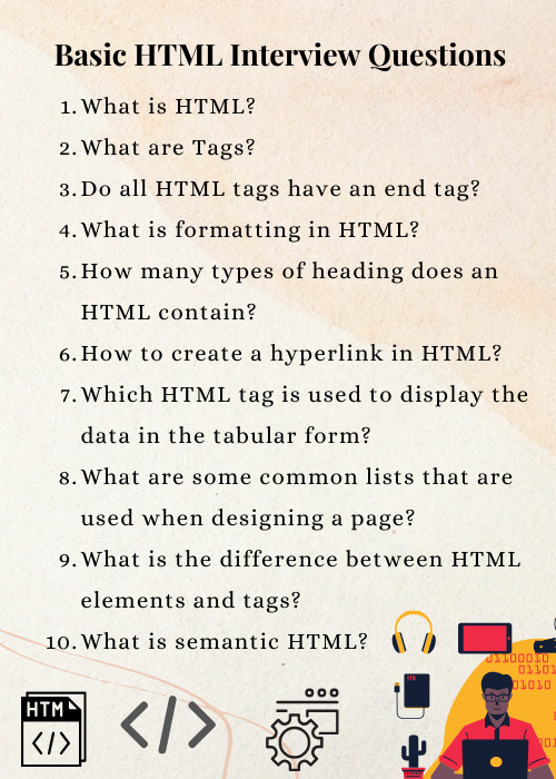
Basic HTML Interview Questions
Following are the basic interview questions that you must know:
What is HTML?
What are Tags?
Do all HTML tags have an end tag?
What is formatting in HTML?
How many types of heading does an HTML contain?
How to create a hyperlink in HTML?
Which HTML tag is used to display the data in the tabular form?
What are some common lists that are used when designing a page?
What is the difference between HTML elements and tags?
What is semantic HTML?
#besttraininginstitute#online#onlinetraining#traininginstitute#training#education#tutorial#coding#programming#music#html#htmlinterviewquestions#htmlcode#html5#code#trending#technology#tech#engineering#software#development#softwaredevelopment#webdesigning#webdesign
3 notes
·
View notes
Text
"don't use table elements for page layouts! tables are good for displaying tabular data, not other purposes"
wrong! incorrect! tables are not even good for displaying tabular data! every time i have ever used the <table> element, i have regretted it!
11 notes
·
View notes
Text
How you can use python for data wrangling and analysis
Python is a powerful and versatile programming language that can be used for various purposes, such as web development, data science, machine learning, automation, and more. One of the most popular applications of Python is data analysis, which involves processing, cleaning, manipulating, and visualizing data to gain insights and make decisions.
In this article, we will introduce some of the basic concepts and techniques of data analysis using Python, focusing on the data wrangling and analysis process. Data wrangling is the process of transforming raw data into a more suitable format for analysis, while data analysis is the process of applying statistical methods and tools to explore, summarize, and interpret data.
To perform data wrangling and analysis with Python, we will use two of the most widely used libraries: Pandas and NumPy. Pandas is a library that provides high-performance data structures and operations for manipulating tabular data, such as Series and DataFrame. NumPy is a library that provides fast and efficient numerical computations on multidimensional arrays, such as ndarray.
We will also use some other libraries that are useful for data analysis, such as Matplotlib and Seaborn for data visualization, SciPy for scientific computing, and Scikit-learn for machine learning.
To follow along with this article, you will need to have Python 3.6 or higher installed on your computer, as well as the libraries mentioned above. You can install them using pip or conda commands. You will also need a code editor or an interactive environment, such as Jupyter Notebook or Google Colab.
Let’s get started with some examples of data wrangling and analysis with Python.
Example 1: Analyzing COVID-19 Data
In this example, we will use Python to analyze the COVID-19 data from the World Health Organization (WHO). The data contains the daily situation reports of confirmed cases and deaths by country from January 21, 2020 to October 23, 2023. You can download the data from here.
First, we need to import the libraries that we will use:import pandas as pd import numpy as np import matplotlib.pyplot as plt import seaborn as sns
Next, we need to load the data into a Pandas DataFrame:df = pd.read_csv('WHO-COVID-19-global-data.csv')
We can use the head() method to see the first five rows of the DataFrame:df.head()
Date_reportedCountry_codeCountryWHO_regionNew_casesCumulative_casesNew_deathsCumulative_deaths2020–01–21AFAfghanistanEMRO00002020–01–22AFAfghanistanEMRO00002020–01–23AFAfghanistanEMRO00002020–01–24AFAfghanistanEMRO00002020–01–25AFAfghanistanEMRO0000
We can use the info() method to see some basic information about the DataFrame, such as the number of rows and columns, the data types of each column, and the memory usage:df.info()
Output:
RangeIndex: 163800 entries, 0 to 163799 Data columns (total 8 columns): # Column Non-Null Count Dtype — — — — — — — — — — — — — — — 0 Date_reported 163800 non-null object 1 Country_code 162900 non-null object 2 Country 163800 non-null object 3 WHO_region 163800 non-null object 4 New_cases 163800 non-null int64 5 Cumulative_cases 163800 non-null int64 6 New_deaths 163800 non-null int64 7 Cumulative_deaths 163800 non-null int64 dtypes: int64(4), object(4) memory usage: 10.0+ MB “><class 'pandas.core.frame.DataFrame'> RangeIndex: 163800 entries, 0 to 163799 Data columns (total 8 columns): # Column Non-Null Count Dtype --- ------ -------------- ----- 0 Date_reported 163800 non-null object 1 Country_code 162900 non-null object 2 Country 163800 non-null object 3 WHO_region 163800 non-null object 4 New_cases 163800 non-null int64 5 Cumulative_cases 163800 non-null int64 6 New_deaths 163800 non-null int64 7 Cumulative_deaths 163800 non-null int64 dtypes: int64(4), object(4) memory usage: 10.0+ MB
We can see that there are some missing values in the Country_code column. We can use the isnull() method to check which rows have missing values:df[df.Country_code.isnull()]
Output:
Date_reportedCountry_codeCountryWHO_regionNew_casesCumulative_casesNew_deathsCumulative_deaths2020–01–21NaNInternational conveyance (Diamond Princess)WPRO00002020–01–22NaNInternational conveyance (Diamond Princess)WPRO0000……………………2023–10–22NaNInternational conveyance (Diamond Princess)WPRO07120132023–10–23NaNInternational conveyance (Diamond Princess)WPRO0712013
We can see that the missing values are from the rows that correspond to the International conveyance (Diamond Princess), which is a cruise ship that had a COVID-19 outbreak in early 2020. Since this is not a country, we can either drop these rows or assign them a unique code, such as ‘IC’. For simplicity, we will drop these rows using the dropna() method:df = df.dropna()
We can also check the data types of each column using the dtypes attribute:df.dtypes
Output:Date_reported object Country_code object Country object WHO_region object New_cases int64 Cumulative_cases int64 New_deaths int64 Cumulative_deaths int64 dtype: object
We can see that the Date_reported column is of type object, which means it is stored as a string. However, we want to work with dates as a datetime type, which allows us to perform date-related operations and calculations. We can use the to_datetime() function to convert the column to a datetime type:df.Date_reported = pd.to_datetime(df.Date_reported)
We can also use the describe() method to get some summary statistics of the numerical columns, such as the mean, standard deviation, minimum, maximum, and quartiles:df.describe()
Output:
New_casesCumulative_casesNew_deathsCumulative_deathscount162900.000000162900.000000162900.000000162900.000000mean1138.300062116955.14016023.4867892647.346237std6631.825489665728.383017137.25601215435.833525min-32952.000000–32952.000000–1918.000000–1918.00000025%-1.000000–1.000000–1.000000–1.00000050%-1.000000–1.000000–1.000000–1.00000075%-1.000000–1.000000–1.000000–1.000000max -1 -1 -1 -1
We can see that there are some negative values in the New_cases, Cumulative_cases, New_deaths, and Cumulative_deaths columns, which are likely due to data errors or corrections. We can use the replace() method to replace these values with zero:df = df.replace(-1,0)
Now that we have cleaned and prepared the data, we can start to analyze it and answer some questions, such as:
Which countries have the highest number of cumulative cases and deaths?
How has the pandemic evolved over time in different regions and countries?
What is the current situation of the pandemic in India?
To answer these questions, we will use some of the methods and attributes of Pandas DataFrame, such as:
groupby() : This method allows us to group the data by one or more columns and apply aggregation functions, such as sum, mean, count, etc., to each group.
sort_values() : This method allows us to sort the data by one or more
loc[] : This attribute allows us to select a subset of the data by labels or conditions.
plot() : This method allows us to create various types of plots from the data, such as line, bar, pie, scatter, etc.
If you want to learn Python from scratch must checkout e-Tuitions to learn Python online, They can teach you Python and other coding language also they have some of the best teachers for their students and most important thing you can also Book Free Demo for any class just goo and get your free demo.
#python#coding#programming#programming languages#python tips#python learning#python programming#python development
2 notes
·
View notes
Note
I absolutely love your weather rants from a fellow trans guy who's now got a special interest in meteorology. Apparently. Ahhh!!!
(THE FACT THAT IF YOU CAN SEE THE TOP OF AN ANVIL CLOUD FLATTENING MEANS YOU CAN SEE THE FUCKING TROPOPAUSE MAKES IS SO FUCKING COOL AND JUST ALFJDIDJSIDJD).
(also the lack of standardizations on soundings is kIlling me too as a self taught meteorology nerd. I would like to know For Sure if I'm looking at the saturated or dry adiabat!!!!! Ahhh!!!
Also. Plotting hodographs. *what the fuck. Why is the compass the way it is. It's UPSIDE FUCKING DOWN???* I assume there is a reason for the meteorology compass and the hodograph compass to be different but *why????*
I love the nws I do truly I would love to work for them/the NOAA and they provide basically how to read their soundings too but there's like. 2 things I'm Not 100% sure on and it's driving me mad.)
Also I'd love to see how you get from raw to tabular data to the sounding if you want, I'm honestly curious.
Also. Do you also want to launch or find a radiosonde or is that just me. I really want to launch one.
IM
this has made my fucking week istg omg omg
So another fun fact about anvil clouds and that they flatten out when they hit the tropopause because that's the no weather allowed zone is that there's something called an overshooting top where basically you get a bubble of a cloud that goes above the anvil and into the tropopause and you get that when the updraft is strong enough that it forces the clouds over the tropopause! You can see this on a skew-T because the dew point line will stay close to the temperature line through the tropopause.
I don't know a lot about hodographs just yet it's not something I've been taught much about just yet (for example I didn't know the directions are upside down from a conventional compass) but I'm sure I'll post a rant about it when I learn more LMAO.
So working for the NWS requires a few things and that's a career path I'm looking into but I've also just finished my first year in my meteorology program so we'll see what happens.
As for launching radiosondes-- I've launched several, actually!


I'm the guy with the shades (they're my normal glasses it's just sunny and I have transition lenses) and here I'm holding the balloon before we launch it.
I go to a school with a strong meteorology program in New Hampshire called Plymouth State University, and we get a LOT of chances to talk to people from the NWS and the private sector as well as learn and use very practical skills such as launching radiosondes, graphing skew-Ts by hand, and so on.
I think I've launched at least five radiosondes at this point and I'll quickly lose count in the future. But if Meteorology is a career you're interested in going for, it will in all likelihood involve seeking out a bachelor's degree at minimum which all this boils down to, hey, join us :) there are at least three trans people in my program!
for soundings also, the raw data is collected through graw's program and graphed automatically on the computer. We just have to set up the radiosonde and antenna beforehand-- it's a whole process and I'd love to explain it more in another post I think but it's pretty bland tbh haha
also for saturated vs dry adiabats: the saturated ones are weird and curvy and the dry ones are nearly straight so they're actually pretty easy to tell apart once you know, but knowing is the hard part with skew-ts for sure.
Thank you so much for this ask I'm SO HAPPY to hear you enjoy them fr fr
5 notes
·
View notes
Text
High-Performance Geospatial Processing: Leveraging Spectrum Spatial

As geospatial technology advances, the volume, variety, and velocity of spatial data continue to increase exponentially. Organizations across industries — ranging from urban planning and telecommunications to environmental monitoring and logistics — depend on spatial analytics to drive decision-making. However, traditional geospatial information systems (GIS) often struggle to process large datasets efficiently, leading to performance bottlenecks that limit scalability and real-time insights.
Spectrum Spatial offers a powerful solution for organizations seeking to harness big data without compromising performance. Its advanced capabilities in distributed processing, real-time analytics, and system interoperability make it a vital tool for handling complex geospatial workflows. This blog will delve into how Spectrum Spatial optimizes high-performance geospatial processing, its core functionalities, and its impact across various industries.
The Challenges of Big Data in Geospatial Analytics Big data presents a unique set of challenges when applied to geospatial analytics. Unlike structured tabular data, geospatial data includes layers of information — vector, raster, point clouds, and imagery — that require specialized processing techniques. Below are the primary challenges that organizations face:
1. Scalability Constraints in Traditional GIS
Many GIS platforms were designed for small to mid-scale datasets and struggle to scale when handling terabytes or petabytes of data. Legacy GIS systems often experience performance degradation when processing complex spatial queries on large datasets.
2. Inefficient Spatial Query Performance
Operations such as spatial joins, geofencing, and proximity analysis require intensive computation, which can slow down query response times. As the dataset size grows, these operations become increasingly inefficient without an optimized processing framework.
3. Real-Time Data Ingestion and Processing
Industries such as autonomous navigation, disaster management, and environmental monitoring rely on real-time spatial data streams. Traditional GIS platforms are often unable to ingest and process high-frequency data streams while maintaining low latency.
4. Interoperability with Enterprise Systems
Modern enterprises use diverse IT infrastructures that include cloud computing, data warehouses, and business intelligence tools. Many GIS solutions lack seamless integration with these enterprise systems, leading to data silos and inefficiencies.
5. Managing Data Quality and Integrity
Geospatial data often comes from multiple sources, including remote sensing, IoT devices, and user-generated content. Ensuring data consistency, accuracy, and completeness remains a challenge, particularly when dealing with large-scale spatial datasets.
How Spectrum Spatial Optimizes High-Performance Geospatial Processing Spectrum Spatial is designed to address these challenges with a robust architecture that enables organizations to efficiently process, analyze, and visualize large-scale geospatial data. Below are key ways it enhances geospatial big data analytics:
1. Distributed Processing Architecture
Spectrum Spatial leverages distributed computing frameworks to break down large processing tasks into smaller, manageable workloads. This allows organizations to handle complex spatial operations across multiple servers, significantly reducing processing time.
Parallel Query Execution: Queries are executed in parallel across multiple nodes, ensuring faster response times. Load Balancing: Workloads are dynamically distributed to optimize computing resources. Scalable Storage Integration: Supports integration with distributed storage solutions such as Hadoop, Amazon S3, and Azure Data Lake. 2. Optimized Spatial Query Processing
Unlike traditional GIS platforms that struggle with slow spatial queries, Spectrum Spatial utilizes advanced indexing techniques such as:
R-Tree Indexing: Enhances the performance of spatial queries by quickly identifying relevant geometries. Quad-Tree Partitioning: Efficiently divides large spatial datasets into smaller, manageable sections for improved query execution. In-Memory Processing: Reduces disk I/O operations by leveraging in-memory caching for frequently used spatial datasets. 3. High-Performance Data Ingestion and Streaming
Spectrum Spatial supports real-time data ingestion pipelines, enabling organizations to process continuous streams of spatial data with minimal latency. This is crucial for applications that require real-time decision-making, such as:
Autonomous Vehicle Navigation: Ingests GPS and LiDAR data to provide real-time routing intelligence. Supply Chain Logistics: Optimizes delivery routes based on live traffic conditions and weather updates. Disaster Response: Analyzes real-time sensor data for rapid emergency response planning. 4. Cloud-Native and On-Premise Deployment Options
Spectrum Spatial is designed to work seamlessly in both cloud-native and on-premise environments, offering flexibility based on organizational needs. Its cloud-ready architecture enables:
Elastic Scaling: Automatically adjusts computing resources based on data processing demand. Multi-Cloud Support: Integrates with AWS, Google Cloud, and Microsoft Azure for hybrid cloud deployments. Kubernetes and Containerization: Supports containerized deployments for efficient workload management. 5. Seamless Enterprise Integration
Organizations can integrate Spectrum Spatial with enterprise systems to enhance spatial intelligence capabilities. Key integration features include:
Geospatial Business Intelligence: Connects with BI tools like Tableau, Power BI, and Qlik for enhanced visualization. Database Interoperability: Works with PostgreSQL/PostGIS, Oracle Spatial, and SQL Server for seamless data access. API and SDK Support: Provides robust APIs for developers to build custom geospatial applications. Industry Applications of Spectrum Spatial 1. Telecommunications Network Planning
Telecom providers use Spectrum Spatial to analyze signal coverage, optimize cell tower placement, and predict network congestion. By integrating with RF planning tools, Spectrum Spatial ensures precise network expansion strategies.
2. Geospatial Intelligence (GeoInt) for Defense and Security
Spectrum Spatial enables military and defense organizations to process satellite imagery, track assets, and conduct geospatial intelligence analysis for mission planning.
3. Environmental and Climate Analytics
Environmental agencies leverage Spectrum Spatial to monitor deforestation, air pollution, and climate change trends using satellite and IoT sensor data.
4. Smart City Infrastructure and Urban Planning
City planners use Spectrum Spatial to optimize traffic flow, manage public utilities, and enhance sustainability initiatives through geospatial insights.
5. Retail and Location-Based Marketing
Retailers analyze customer demographics, foot traffic patterns, and competitor locations to make data-driven site selection decisions.
Why Advintek Geoscience? Advintek Geoscience specializes in delivering high-performance geospatial solutions tailored to enterprise needs. By leveraging Spectrum Spatial, Advintek ensures:
Optimized geospatial workflows for big data analytics. Seamless integration with enterprise IT systems. Scalable infrastructure for handling real-time geospatial data. Expert guidance in implementing and maximizing Spectrum Spatial’s capabilities. For organizations seeking to enhance their geospatial intelligence capabilities, Advintek Geoscience provides cutting-edge solutions designed to unlock the full potential of Spectrum Spatial.
Explore how Advintek Geoscience can empower your business with high-performance geospatial analytics. Visit Advintek Geoscience today.
0 notes
Text
Different kinds of models DO have different inductive biases and deviating from these tend to lead to overfitting. There is VERY much an idea of what sorts of problems are easy vs. What sorts of problems are hard for models. Gradient boosted decision trees are much better at tabular data with non-spatial element and high level abstract features than NNs. Convnets are much better at picking up on hierarchical patterns with local dependencies which makes them better at images than GBDTs. Transformers improve upon Convnets with Attention letting them pick up on the kind of long range dependencies more common in languages. In the wolf example, a few-shot model trained to recognize animal features would be much less likely to overfit to snow as a feature. I think its an exagerration to say EVERY model is doomed. With proper evaluation and testing, theyre plenty useful.
There was a paper in 2016 exploring how an ML model was differentiating between wolves and dogs with a really high accuracy, they found that for whatever reason the model seemed to *really* like looking at snow in images, as in thats what it pays attention to most.
Then it hit them. *oh.*
*all the images of wolves in our dataset has snow in the background*
*this little shit figured it was easier to just learn how to detect snow than to actually learn the difference between huskies and wolves. because snow = wolf*
Shit like this happens *so often*. People think trainning models is like this exact coding programmer hackerman thing when its more like, coralling a bunch of sentient crabs that can do calculus but like at the end of the day theyre still fucking crabs.
37K notes
·
View notes
Text

Introducing Gartech's Omnicon R20 Climate Controller
Experience unmatched precision and reliability with Gartech's Omnicon R20 climate controller, an advanced solution featuring 20 output relays designed specifically for poultry applications. This state-of-the-art climate controller offers a sophisticated touchscreen display with a user-friendly icon-based menu, ensuring seamless navigation and intuitive control.
Tailored to Modern Poultry Houses:
The Omnicon R20 is expertly engineered to cater to modern poultry houses equipped with turbo tunnel ventilation systems. Its versatility shines through with the capability to operate in nine distinct stages, including Minimum Ventilation (with heater), Cross Ventilation, Tunnel Ventilation, Turbo Tunnel Ventilation, Air Inlet, Cooling Curtain, Cooling, Light, Feed, and Water.
Key Features that Set Omnicon R20 Apart:
Remote Control Access through Mobile or Desktop: The Omnicon controller screen can be remotely accessed through a Mobile device (application) or Desktop computer using internet.
Smart Airflow Management:
During Minimum Ventilation, the Omnicon intelligently runs fans within specific groups to maintain uniform airflow throughout the poultry house, ensuring optimal ventilation.
Humidity Control
The Omnicon is designed to handle high-humidity climates with perfection. It automatically deactivates cooling, once the desired humidity level is reached, while triggering additional fans when relative humidity surpasses the set point.
Comprehensive Data Visualization at your fingertips
Experience convenience with the Omnicon's ability to present the entire flock's growth data in both tabular and graphical formats on its live color screen, providing valuable insights within a few taps.
0 notes
Text
Health Policy Article Review 1. Authors Proposed Purpose/Goal of the Article The intended audience of a study by Carlton and Singh (2018) was public health officials in the United States. The purpose of this study was to identify opportunities to improve the relationship between local health departments and hospitals as well as their mutual ability to collaborate effectively on hospital investments in community health initiatives. 2. Analysis of Key Issues The key issues of interests in this study were the effectiveness of joint community health needs assessments and how they can be leveraged to improve coordination of efforts between local health departments and hospitals. The authors aggregated the results of several community health reports (i.e., the 2013 NACCHO Profile; the 20142015 Area Health Resource File; and the 2015 National Association of County and City Health Officials Forces of Change) and used this data to identify 439 local health departments across the country. The authors also incorporated data concerning the hospitals respective community benefit based on 2014 tax information (i.e., IRS Form 990, Schedule H). The main strengths of this study included the comprehensiveness of the literature review that provided a context for the analysis as well as the robustness of the analytical model and the use of trustworthy, archived data sets that were used by the authors. In addition, the authors were meticulous in describing their methodology and providing supporting rationale for its use as well as explaining the implications of their findings for public health practitioners. Likewise, the authors provided the results of their analyses in tabular form as well as depicting them graphically to facilitate understanding. The main limitation of this study was the complexity of the analytical model and how it provided the statistical data that were needed for the purposes of the study which were likely difficult for many public health practitioners without advanced degrees in statistics to readily understand. 3. Conclusions/Findings/Assumption Using the above-described data sets, the authors performed a series of bivariate and multivariate regression analyses to evaluate the involvement of local health departments in hospitals community health needs assessments as well as their corresponding community health implementation strategies with their relationship in hospital investments in community health programming. The results that emerged from this analysis showed that nearly three-quarters (316 or 72%) of the local health departments that were evaluated routinely conducted community health needs assessments but just 273 (or 62%) were involved in coordinating implementation strategies with local hospitals. There were no biases identified in this study. 4. Personal Assessment and Reflection Local health departments represent a valuable but potentially untapped source of expertise and resources that can help local hospitals improve community health standards and levels. Because a significant majority of the representative sample of local health departments already conduct community health needs assessments using scarce taxpayer resources (Isehunwa et al., 2021), it is vitally important that this information be used in the most effective fashion possible. This means that local health departments must reach out to their hospital partners in their communities to develop appropriate implementation strategies that can address health need deficits in a timely manner. This approach is highly congruent with the guidance provided by Hebrews 13:16 (ESV) which states, Do not neglect to do good and to share what you have, for such sacrifices are pleasing to God. References Carlton, E. L., & Singh, S. R. (2018). Joint Community Health Needs Assessments as a Path for Coordinating Community-Wide Health Improvement Efforts Between Hospitals and Local Health Departments. American Journal of Public Health, 108(5), 676682. Isehunwa, O. O., Dobalian, A., Ahn, S., Relyea, G., & Carlton, E. L. (2021). Local Health Department and Hospital Collaboration Around Community Health Needs Assessment to Improve Health Outcomes. Family & Community Health, 44(3), 136145 https://www.paperdue.com/customer/paper/partnership-local-health-departments-hospitals-2177371#:~:text=Logout-,PartnershipLocalHealthDepartmentsHospitalsImproveCommunityHealth,-Length2pages Read the full article
0 notes
Text
DataFrame in R Language
A dataframe in R is a fundamental tabular data structure that stores data in rows (observations) and columns (variables). Each column can hold a different data type (numeric, character, logical, etc.), making it ideal for data analysis and manipulation. What are the Key Features of DataFrame in R?What is the Function used for Adding Datasets in R?What is a Data frame in the R Language?How Can…

View On WordPress
0 notes