#TypographyTips
Explore tagged Tumblr posts
Visit Tumblr Blog
Explore Tumblr blogs with no restrictions, modern design and the best experience.
Last Seen Tumblr Blogs


Fun Fact
Mobile US users spent an average of 115.8 minutes on Tumblr app monthly.
Photo

Evangelos is a bold, easy-to-read display handwriting font inspired by the designer's father's handwriting style, perfect for headlines and text-based designs.
Link: https://l.dailyfont.com/ljXXa
#aff#Typography#Fonts#DesignInspiration#CreativeWriting#HandwrittenFonts#DisplayFonts#HeadlineFonts#TextBasedDesigns#ReadabilityMatters#BoldFonts#EasyToRead#FontLove#DesignElements#TypographyTips#CommunicationDesign#GraphicDesign#SocialMediaContent#TextGraphics
2 notes
·
View notes
Text
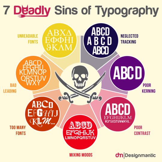
Are you guilty of any of the 7 deadly sins of typography?
🧐 Avoid these common mistakes and elevate your design skills: https://www.designmantic.com/blog/infographics/7-deadly-sins-of-typography/
0 notes
Text
Exploring CSS Heading Styles: Typography Tips

Introduction
Welcome to an exploration of the fascinating world of CSS heading styles and typography on CSS Monster! In the realm of web development, the way text is presented plays a crucial role in user experience and visual appeal. Cascading Style Sheets (CSS) serves as a powerful tool to control the styling of text, and in this blog post, we will delve into the nuances of CSS heading styles, offering valuable insights and practical tips to enhance your website's typography.
Understanding CSS Basics
CSS, or Cascading Style Sheets, is a fundamental component of web development that allows developers to control the presentation and layout of HTML documents. To harness the full potential of CSS for effective typography, it's essential to grasp some basic concepts. Selectors: CSS selectors are patterns used to select and style HTML elements. Understanding selectors is crucial for applying styles to specific elements on a webpage. Common selectors include element selectors, class selectors (.class-name), and ID selectors (#id-name). Properties and Values: CSS works on a system of properties and values. Properties define the aspects of an element to be styled, such as color, font-size, or margin, while values specify the settings for those properties. For instance, the property 'color' might have the value 'red'. Box Model: The CSS box model is a foundational concept for layout design. It comprises the content, padding, border, and margin of an element. Understanding how these components interact helps in creating well-structured and visually appealing layouts. Cascade and Specificity: The term "cascading" in CSS refers to the order of priority when multiple style rules apply to the same element. Understanding the cascade and specificity helps ensure that styles are applied as intended and that conflicts are resolved systematically. External and Internal Stylesheets: CSS can be implemented in various ways. External stylesheets, often stored in separate .css files, allow for a consistent style across multiple pages. Internal styles, on the other hand, are defined within the HTML document using the tag. List of CSS Properties: Here is a concise list of essential CSS properties for text styling: - font-family: Defines the font of the text. - font-size: Specifies the size of the font. - font-weight: Sets the thickness of the font. - color: Determines the color of the text. - line-height: Establishes the spacing between lines of text. - text-align: Aligns the text to the left, right, center, or justified. CSS Properties and Descriptions PropertyDescriptionfont-familyDefines the font of the text.font-sizeSpecifies the size of the font.font-weightSets the thickness of the font.colorDetermines the color of the text.line-heightEstablishes the spacing between lines of text.text-alignAligns the text to the left, right, center, or justified. By grasping these CSS basics, you lay the foundation for creating visually appealing and well-structured typography on your website.
CSS Heading Styles
Headings are a crucial element of web design, providing structure and hierarchy to content. CSS offers a variety of styling options to make headings not only visually appealing but also aligned with the overall design of a website. Default Headings: HTML provides six levels of headings, from
(the most important) to (the least important). These headings come with default styles, but CSS allows for customization to suit the design requirements of your website. Font Properties: CSS enables the modification of font properties for headings. You can use the font-family property to specify the type of font, font-size to set the text size, and font-weight to control the thickness of the font. This customization helps in creating a distinctive look for your headings. Text Color and Alignment: The color property allows you to define the color of your heading text. Additionally, the text-align property lets you align the text within the heading element, providing flexibility in design and layout. Margin and Padding: CSS provides the margin and padding properties to control the space around and within headings. Adjusting these properties helps in achieving the desired spacing and layout for your headings. Underlining and Decoration: Customize the appearance of your headings by using the text-decoration property. For example, you can underline or remove the underline from headings, adding a stylistic touch to your typography. Example CSS for Headings: CSS h1 { font-family: 'Arial', sans-serif; font-size: 32px; font-weight: bold; color: #333; text-align: center; margin-bottom: 20px; text-decoration: underline; } h2 { font-family: 'Helvetica', sans-serif; font-size: 28px; font-weight: bold; color: #666; text-align: left; margin-bottom: 15px; text-decoration: none; } Table: Commonly Used CSS Properties for Headings PropertyDescriptionfont-familySets the font for the heading text.font-sizeSpecifies the size of the heading text.font-weightControls the thickness of the heading text.colorDetermines the color of the heading text.text-alignAligns the heading text within its container.text-decorationAdds or removes decoration, such as underlining, from the heading text. By utilizing these CSS heading styles, you can enhance the visual appeal and readability of your content, creating a more engaging user experience on your website.
Typography Tips with CSS
Typography plays a pivotal role in web design, influencing how users perceive and interact with content. Leveraging CSS for typography allows developers to go beyond the default styles, providing a unique and visually appealing reading experience. Here are some key tips to enhance typography using CSS: Font Choices: Carefully selecting fonts contributes significantly to the overall aesthetic. CSS offers the font-family property, allowing you to specify a preferred font or a combination of fonts. Consider pairing a readable font for body text with a more distinctive font for headings to create a harmonious balance. Font Size and Line Height: Achieving an optimal font size and line height improves readability. Use the font-size property to set the text size and line-height to control the spacing between lines. Balancing these elements ensures a comfortable reading experience for users. Letter Spacing and Word Spacing: Adjusting letter and word spacing can add a touch of elegance to your typography. CSS provides the letter-spacing and word-spacing properties, allowing you to fine-tune the spacing between characters and words for a more polished look. Text Alignment: Proper alignment enhances the visual flow of content. Utilize the text-align property to align text left, right, center, or justify it. Consistent alignment across your website contributes to a cohesive design. Text Decoration: CSS allows you to customize text decoration, such as underlining or overlining, using the text-decoration property. Carefully consider whether to apply these decorations based on your design goals and overall aesthetic. Responsive Typography: Ensure your typography remains effective on various devices and screen sizes. Use relative units like percentages or ems for font sizes to create a responsive design that adapts to different viewing environments. Variable Fonts: Embrace the versatility of variable fonts, a modern CSS feature that enables dynamic adjustments to font weight, width, and other properties. This allows for more flexible and efficient typography, enhancing the visual appeal of your text. Example CSS for Typography Tips: CSS body { font-family: 'Open Sans', sans-serif; font-size: 16px; line-height: 1.5; letter-spacing: 0.5px; word-spacing: 2px; text-align: justify; text-decoration: none; } h1 { font-family: 'Roboto', sans-serif; font-size: 36px; line-height: 1.2; letter-spacing: 1px; word-spacing: 3px; text-align: center; text-decoration: underline; } Table: CSS Properties for Typography PropertyDescriptionfont-familySets the font for the text.font-sizeSpecifies the size of the text.line-heightControls the spacing between lines of text.letter-spacingAdjusts the spacing between characters.word-spacingDefines the spacing between words.text-alignAligns the text within its container.text-decorationAdds or removes decoration, such as underlining, from the text. By incorporating these typography tips into your CSS styles, you can elevate the visual appeal and readability of your website's content.
Responsive Typography
Responsive design is a critical aspect of modern web development, ensuring that websites provide a seamless user experience across various devices and screen sizes. Typography plays a significant role in responsiveness, and utilizing CSS for responsive typography is essential for maintaining readability and visual appeal. Here are key considerations and techniques for achieving responsive typography: Relative Units: When defining font sizes in CSS, opt for relative units like percentages (%), ems, or rems instead of fixed pixel values. Relative units scale more fluidly, allowing text to adapt to different screen sizes while maintaining proportionality. Viewport Units: CSS offers viewport units, such as vw (viewport width) and vh (viewport height), which are particularly useful for responsive typography. Using these units enables text to scale based on the dimensions of the viewport, enhancing readability on both large desktop screens and smaller mobile devices. Media Queries: Implementing media queries in CSS allows you to apply specific styles based on the characteristics of the device or screen. Utilize media queries to adjust font sizes, line heights, and other typographic properties for different breakpoints, ensuring optimal readability across a range of devices. Flexible Grid Systems: Incorporate flexible grid systems into your design to create a responsive layout. CSS frameworks like Bootstrap or custom grid systems enable you to establish a grid-based structure that adapts to the screen size, providing consistent spacing and alignment for text elements. Breakpoint Considerations: Identify key breakpoints in your design where the layout transitions to accommodate different screen sizes. At each breakpoint, evaluate and adjust typography styles to ensure a harmonious reading experience. This may involve modifying font sizes, line heights, and margins to maintain balance. Fluid Typography: Implementing fluid typography involves using CSS techniques like the 'calc' function and adjusting font sizes based on a percentage of the viewport width. This approach ensures that text remains legible and visually appealing as the screen size changes. Example CSS for Responsive Typography: CSS body { font-size: 16px; line-height: 1.5; } @media only screen and (min-width: 600px) { body { font-size: 18px; } } @media only screen and (min-width: 1200px) { body { font-size: 20px; } } Table: CSS Properties for Responsive Typography PropertyDescriptionfont-sizeSpecifies the size of the text.line-heightControls the spacing between lines of text. By implementing these responsive typography techniques with CSS, you can ensure that your website's text adapts gracefully to different screen sizes, providing an optimal reading experience for users on various devices.
Optimizing for Accessibility
Accessibility is a core principle in web development, and optimizing typography for accessibility is crucial for ensuring that your content is inclusive and usable by a diverse audience. CSS plays a significant role in making typography accessible. Here are key considerations and techniques for optimizing typography for accessibility: Contrast Ratios: Pay attention to the contrast between text and its background. Use the color property in CSS to ensure an appropriate contrast ratio, making text readable for users with visual impairments. The Web Content Accessibility Guidelines (WCAG) recommend a minimum contrast ratio of 4.5:1 for normal text and 3:1 for large text. Font Size and Scalability: Provide flexibility in font size by using relative units like percentages or ems. This allows users to adjust the text size according to their preferences. Avoid setting fixed font sizes, as this can hinder users with low vision who rely on larger text for readability. Proper Heading Structure: Organize content with a logical heading structure using
to tags. Screen readers rely on heading structure to navigate and understand content hierarchy. Ensure that headings accurately represent the content they precede and maintain a hierarchical order. Descriptive Link Text: When using hyperlinks, ensure that the link text is descriptive and provides context about the target. Avoid generic terms like "click here" and use meaningful phrases that convey the link's purpose. This improves navigation for users who rely on screen readers or other assistive technologies. Text Alternatives for Images: Include descriptive alt text for images using the alt attribute. This is crucial for users who are visually impaired and rely on screen readers to understand the content. The alt text should convey the content or function of the image. Focus Styles: Ensure that interactive elements, such as links and buttons, have visible focus styles. Users who navigate with keyboards or assistive technologies rely on these focus styles to understand which element is currently active. Use the :focus pseudo-class in CSS to customize focus styles. Accessible Color Choices: Consider color choices carefully, taking into account color blindness and other visual impairments. Ensure that information is not conveyed solely through color, and provide alternative indicators, such as patterns or labels, for users with different color perception. Example CSS for Accessibility: CSS body { font-size: 16px; line-height: 1.5; color: #333; background-color: #fff; } a { color: #0066cc; } a:focus { outline: 2px solid #ff9900; } Table: CSS Properties for Accessibility PropertyDescriptionfont-sizeSpecifies the size of the text.line-heightControls the spacing between lines of text.colorDetermines the text color.background-colorSets the background color of the element.aStyles the default link text color.a:focusStyles the focus state of links. By incorporating these accessibility considerations into your CSS styles, you contribute to a more inclusive web experience for all users.
Advanced CSS Techniques
As web development evolves, so do the possibilities offered by CSS. Advanced CSS techniques go beyond the basics, providing developers with powerful tools to create intricate and visually stunning designs. Here are some advanced CSS techniques to elevate your web typography and overall design: Variable Fonts: One of the cutting-edge features in CSS is variable fonts. Unlike traditional fonts, variable fonts allow for dynamic adjustments to various attributes, such as weight, width, and slant. This provides greater flexibility and control over typography, enabling smoother transitions and a more customized appearance. Custom Text Effects: CSS enables the creation of captivating text effects through properties like text-shadow and background-clip. Experiment with gradients, shadows, and other effects to add depth and dimension to your text, creating a visually engaging experience for users. CSS Grid for Layout: While not exclusive to typography, CSS Grid is a powerful layout system that significantly impacts the overall design. Utilize CSS Grid to create complex and responsive layouts, allowing for precise placement and alignment of text elements within a grid structure. Transform and Transition: Apply transformations and transitions to text elements using properties like transform and transition. Create smooth animations, rotations, and scaling effects to enhance the user experience and bring dynamism to your typography. Blend Modes: CSS blend modes provide the ability to blend elements with their background in various ways. Experiment with blend modes to achieve unique and artistic effects for text, allowing it to seamlessly integrate with background images or colors. Text Clipping: The text-overflow and white-space properties can be used to control text clipping and overflow behavior. This is particularly useful when dealing with limited space or designing elements like tooltips where concise text display is essential. Calc Function for Responsive Sizing: The calc() function in CSS allows for dynamic calculations, enabling responsive sizing based on mathematical expressions. This is useful for creating flexible and adaptive typography that adjusts based on screen size or layout requirements. Example CSS for Advanced Techniques: CSS h1 { font-family: 'VariableFont'; Read the full article
0 notes
Text
Why 'Imitate First' is the Golden Rule of Learning and Innovating🥢🌈
In a society that values creativity, imitation often receives negative attention. However, imitation is not mere copying but a way to learn. It lays the groundwork for mastering the essentials before you create something new. Many successful innovators, artists, and entrepreneurs have started this way.

Read more 🌈 https://designerdollar8.blogspot.com/2024/11/why-imitate-first-is-golden-rule-of.html
Here’s why and how "imitate, then innovate" can lead to success:
⁜ Why imitating is the First Step ↴
→ Learn From Experts 🧑🏫
↝ You can grasp industry standards and learn effective techniques by mimicking established work. It’s like learning to walk before you run.
→ Build Your Confidence 💪
↝ Reproducing successful work helps you gain the skills and confidence to take creative risks later.
→ Save Time and Effort 🔄
↝ Starting with a strong foundation allows you to focus your energy on refining and innovating.
⁜ How to imitate Effectively ↴
→ 1. Study Carefully 📚
↝ Watch how the experts operate. Analyze their techniques and strategies to see why they succeed.
→ 2. Practice Consistently 🎨
Use what you’ve learned by replicating their work. This builds your skills and confidence.
→ 3. Review and Enhance 🔍
↝ Look at your work and compare it to the original. Identify your strengths and areas for improvement.
→ 4. Add Your Personal Flair ✨
↝ Once you feel confident, infuse your ideas or style into your work. This is where true creativity begins.
-- Connect me ↷
🎖️ Behance: www.behance.net/designerdollar8
🎖️ Dribbble: www.dribbble.com/designerdollar8
🎖️ YouTube: www.youtube.com/@designerdollar8
🎖️ Pinterest: www.pinterest.com/designerdollar8
Connect Me: 📝[email protected]
⁜ Why Creation Follows ↴
After mastering the basics through imitating, you are ready to:
→ Think Creatively 🧠
↝ With a solid understanding of what works, you can adapt these ideas to solve new problems.
→ Differentiate Yourself 🌟
↝ Your creations are now based on expertise, giving you a competitive advantage.
→ Motivate Others 🔥
.
.
#designguidelines #designguide #commondesignerrors #designerdollar #kazifaizahmed #letsconnect #dollarproduction #graphicdesign #motiongraphics #animation #QuickHacks #DesignTips #GraphicDesign #DesignMistakes #VisualHierarchy #RuleOfThirds #ColorTheory #TypographyTips #DesignConsistency #UIUXDesign #CreativeProcess #DesignInspiration #DigitalDesign #CompositionRules #VisualStorytelling #DesignSuccess #DesignThinking #ProDesignTips #BetterDesigns #CreativeWorkflow
0 notes
Text


FREE DOWNLOAD!!! WARINGIN - SCRIPT TYPEFACE Waringin is a retro styled and graceful script font. Fall for its gorgeous style and use it to create gorgeous wedding invitations, beautiful stationary art, eye-catching social media posts, and much more! TAP HERE FOR FREE DOWNLOAD
TAP HERE TO BUY FOR COMMERCIAL USE
THANKS FOR YOUR LOVE
#font#fonts#type#typeface#displayfont#futuristicfonts#alphabet#myfonts#logodesign#esportlogo#fontdesign#typefacedesign#typography#typographicdesign#template#trendingfonts#typespecimen#typedesign#fontstyle#typographytips#fontsforyou#displayfonts#contemporarytype#letters#art#artists on tumblr#books & libraries#illustration#music#graphic design
3 notes
·
View notes
Photo
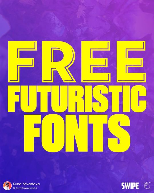
FREE #FUTURISTIC #SPACE #FONTS . . . . . . Save Them For Future Reference 💜💜💜 If You Like My Content, Save, Share & Follow Me For More Such Contents!👍👍👍 . . . Show Some Love ❤️❤️❤️ . . For More Such Free Content Follow @srivastavakunal16 Follow @srivastavakunal16 Follow @srivastavakunal16 . . . . . . . . . . . . . . . . . . . . Hashtags . . #infographics #infographic #graphicdesigners #designinspiration #designstrategy #designbusiness #brandingdesign #typographytips #typographyguide #geekyfonts #futuristicfonts #graphicdesignstudent #graphicdesign #typography #typographyinspired #typographydesign #graphicdesigners #typographyinspiration #typographyideas #digitalcreator #instagramgrowth #freewebsitesfordesigners #instagramgrowthtip #iggrowth #srivastavakunal16 (at Dehradun देहरादून) https://www.instagram.com/p/CmMfrdkDCzR/?igshid=NGJjMDIxMWI=
#futuristic#space#fonts#infographics#infographic#graphicdesigners#designinspiration#designstrategy#designbusiness#brandingdesign#typographytips#typographyguide#geekyfonts#futuristicfonts#graphicdesignstudent#graphicdesign#typography#typographyinspired#typographydesign#typographyinspiration#typographyideas#digitalcreator#instagramgrowth#freewebsitesfordesigners#instagramgrowthtip#iggrowth#srivastavakunal16
0 notes
Photo
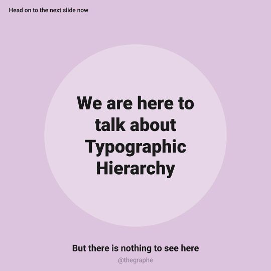
Are you typographic hierarchy? Because my eyes follow you all along😉 #typographydesign #typographytips #tipsandtrick #designtips #typographic #typehierarchy #typographyart #typographylove #typographicdesign #typographical #graphicdesigners #designprinciples #designprocess #designdetail #balanceandharmony #compositionart #designbook #designblog #designblogger #designbooks #designlogo #logodesignersclub #graphicdesignersclub #graphicdesigncentral #graphicdesignstudio #graphicdesigncommunity #graphicurry #graphe #designagency #graphicdesignerlife (at WORLD of Designers) https://www.instagram.com/p/CI5RItilAIf/?igshid=vplac2mpamuc
#typographydesign#typographytips#tipsandtrick#designtips#typographic#typehierarchy#typographyart#typographylove#typographicdesign#typographical#graphicdesigners#designprinciples#designprocess#designdetail#balanceandharmony#compositionart#designbook#designblog#designblogger#designbooks#designlogo#logodesignersclub#graphicdesignersclub#graphicdesigncentral#graphicdesignstudio#graphicdesigncommunity#graphicurry#graphe#designagency#graphicdesignerlife
0 notes
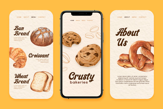
Photo
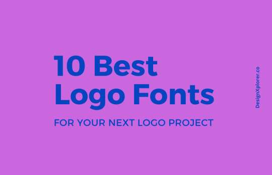
10 Best Logo Fonts For your Next Logo Project
We have created a list of 10 best logo fonts for designers to use it in your next logo project. Be sure to read this blog post completely to find our awesome collection and useful tips.
0 notes
Photo


Some simple tips which you can try for yourself to make your insta post interesting. Do let me know your secret insta tips. And do you want a second part on how to used image backgrounds or colors in insta posts? Let me know! . . Attribution Most of the quotes are original except for the two mentioned (it simple to be happy and the pen is mighter than the sword) - Image - The Pen by Wolfman- K available on Flickr https://flic.kr/p/5Pkd73 under CC BY-NC 2.0 license
0 notes
Photo

Lovestone Script is a fun yet elegant script font with nice shape and trendy design, ideal for creating beautiful handmade typography.
Link: https://l.dailyfont.com/mmksH
#aff#Typography#DesignInspiration#HandmadeFonts#ScriptFonts#BeautifulTypography#ElegantDesigns#TrendyTypefaces#FontLove#CreativeWriting#GraphicDesign#InspirationalQuotes#QuoteOfTheDay#WordsMatter#LanguageLovers#TypographyTips#FontFrenzy
0 notes
Photo

Best Google Fonts Combination For Your Next Website Or Mobile App
Typography is the technique and art of working with text where you design, arrange the type accordingly. It’s more than making the words more legible.
#TypograpgyPlugins#TypographyTools#BestFonts#BestGoogleFontsCombination#Typography#TypographyInspiration#TypeFaces#GoogleFonts#TypographyTips
0 notes
Photo
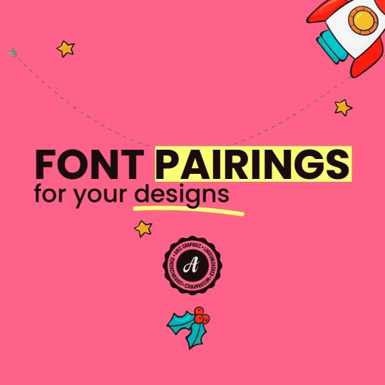
🔍 Are you tired of using the same old fonts? 🆘 Don't worry, I got you covered! 🎨 Check out these amazing FONT pairs that will take your designs to the next level! 💯 -by @logo.unleashed Follow me: @logo.unleashed for more logos and branding concepts on the gram 😍 ! —— #logounleashed #fonts #typeface #type #fontlibrary #adobefonts #googlefonts #freefonts #commercialuse #usadesign #logomaker #illustrator #typography #visualidentity #logousa #fontpairing #typographylove #graphicdesigninspiration #designfonts #designinspiration #fontcombo #graphicdesigntips #typographydesign #fontduo #typographyinspired #designthinking #typographytips #fontdesign #designblog #graphicdesign —— https://www.instagram.com/p/Cp-nPdpreu5/?igshid=NGJjMDIxMWI=
#logounleashed#fonts#typeface#type#fontlibrary#adobefonts#googlefonts#freefonts#commercialuse#usadesign#logomaker#illustrator#typography#visualidentity#logousa#fontpairing#typographylove#graphicdesigninspiration#designfonts#designinspiration#fontcombo#graphicdesigntips#typographydesign#fontduo#typographyinspired#designthinking#typographytips#fontdesign#designblog#graphicdesign
0 notes
Photo

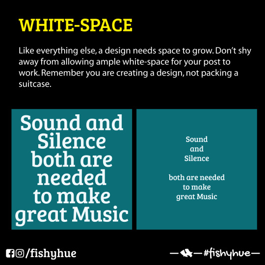
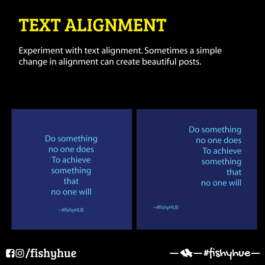
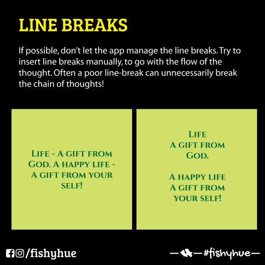
🔠 #TypographyTip: Align and Shape your Text Blocks When in doubt, justify to the left. Right justification is for small blocks of text and style contrast. Center justification is mostly used for headlines and light copy that’s 3 lines or fewer unless it’s a poem. When you justify to one side, you’ll see one side is ragged. After the copy is placed, go back through and create your own line breaks to make that ragged edge as even as possible. Also, check to make sure there are no "widows and orphans" — lines that land on the next page or single words at the end of text blocks. 🎯 #design #marketing #typography
0 notes
Text
Master typography for book illustrations: 7 pro tips
"It’s a kid’s book. The typography should have just as much importance as the illustrations themselves, they should work together. Hence, it’s fair to say that I really wanted to go to town with the typography when it came to doing my own book, and hopefully I did. So here are a few general tips and that to help when incorporating typography into your illustration, whether it be for a one off piece or a children’s book."
Read the rest of the article by Fitz Fitzpatrick on Creative Bloq.
8 notes
·
View notes
Text


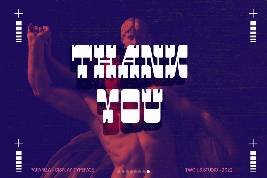
FREE DOWNLOAD!!! PAPARIZA - UNIQUE DISPLAY TYPEFACE Papariza is a retro and western looking display font. This bold, unique and vintage font can easily become your favorite. It can be used for books, magazine covers, social media posts, invitations, and so much more!
TAP HERE FOR FREE DOWNLOAD
TAP HERE TO BUY FOR COMMERCIAL USE
THANKS FOR YOUR LOVE
#font#fonts#type#typeface#displayfont#futuristicfonts#alphabet#myfonts#logodesign#esportlogo#fontdesign#typefacedesign#typography#typographicdesign#template#trendingfonts#typespecimen#typedesign#fontstyle#typographytips#fontsforyou#displayfonts#typefoundry#contemporarytype#letters#design#graphic design#handmade#collage#illustration
0 notes
Link
For the workshop on Thursday we had to read a few articles. The first one is this one from Christian Bailey. It provides a short overview about important terms when talking about typography, as kerning, leading an tracking and provides further literature recommendations.
At the end Bailey even provides some Typography Tips which are:
Information Hierarchy
Select Typefaces That Support the Theme
Get Familiar
Use Your Own Judgement
Typography Is Everywhere
The other 3 resources we got were: http://www.ted.com/talks/david_carson_on_design?language=en#t-38007 https://medium.com/re-form/a-refutation-of-the-elements-of-typographic-style-3b18c07977f3 http://www.sagmeisterwalsh.com/images/u_work/AIGAdetroit_LORES.jpg
0 notes