#WCAG guidelines
Text
#AODA Compliance#AODA Checklist#Website Compliance#WCAG#Section 508#Disabilities#Screen Magnifiers#WCAG guidelines#Website Accessibility#Contrast Ratios#reCAPTCHA#AEL Data#PDF#Word Document
0 notes
Text
Table Header Cell Has No Associated Sub Cells
Learn how to resolve the 'Table Header Cell Has No Associated Sub Cells' error in PAC 2021 and enhance PDF accessibility! #PDFUACompliance, #PAC2021, #TableHeaderCellError, #AdobeAcrobat, #WCAG, #AssistiveTechnology
Welcome to an in-depth exploration of a specific issue related to PDF/UA compliance testing, known as the ‘Table Header Cell Has No Associated Sub Cells’ error. This error often comes up when using the PAC 2021 checker, and today, we’re going to walk you through how to address it.
Video Overview
This video will provide an overview of this post but in video format.
Understanding the ‘Table…

View On WordPress
#Accessibility#adobe acrobat#Assistive technology#PAC 2021#PDF/UA Compliance#Table Header Cell Error#WCAG Guidelines
0 notes
Text

Accessible Web Design
Accessible web design ensures equal access and usability for all users, regardless of their abilities, promoting inclusivity and a seamless online experience!
#https://adasitecompliance.com/designing-inclusivity-best-practices-accessible-web-design/#designing inclusivity#best practices for accessible web design#accessible web design#inclusive website design#web accessibility guidelines#ADA compliance for websites#creating inclusive digital experiences#accessibility in web design#user-friendly web design#universal design principles#inclusive design techniques#web accessibility standards#WCAG guidelines#user experience and accessibility#inclusivity in website development#ada website compliance#ada compliance services#ada website accessibility#ada compliant websites#website accessibility compliance#ada compliance audits#ada compliance solutions#accessibility for disabled#ada web accessibility#website accessibility services#ada compliance guidelines#ada compliance checklist#ada accessibility guidelines#ada compliance consulting
0 notes
Text
Cannot help but roll my eyes when I read posts bemoaning how boring the colors on the web have gotten v.s. the early web when things were regularly all bright and neon.
#A lot of the reason for that is that we have WCAG and 508 compliance guidelines now.#I promise you web designers don't just all hate fun. We have standards of color contrast to which we are required to adhere#for accessibility for people with low vision.#This is a good thing.#ghoul.txt
8 notes
·
View notes
Text
The Power of Accessible EPUBs: Revolutionizing Digital Reading for All | Documenta11y
Discover how accessible EPUBs are transforming digital reading. Learn about key accessibility features like navigation, multimedia support, and legal compliance to ensure inclusivity for all readers.
For more information:
#accessible EPUBs#digital reading accessibility#Document accessibility solutions#Documenta11y#Documenta11y platform#EPUB accessibility features#EPUB accessibility guidelines#EPUB alt text for images#EPUB compliance standards#EPUB for visually impaired#EPUB legal accessibility compliance#EPUB multimedia accessibility#EPUB navigation structure#EPUB WCAG compliance#Inclusive Digital Content#Section 508 compliant EPUBs
0 notes
Text
Acessibilidade na Web: Criando Experiências Inclusivas
A acessibilidade na web é chave para experiências digitais que incluam todos, seja qual for a habilidade ou deficiência. Vamos ver como fazer a web ser um lugar mais acessível e acolhedor para todos.
Principais Aprendizados
A acessibilidade na web permite que qualquer pessoa, incluindo aquelas com deficiências, use e aproveite o conteúdo e funções online.
As diretrizes WCAG (Web Content…

View On WordPress
#Acessibilidade na web#Barreiras na acessibilidade online#Desenvolvimento web acessível#Design inclusivo#Experiências inclusivas#Tecnologia assistiva#Usabilidade para todos#WCAG - Web Content Accessibility Guidelines#Web design acessível
0 notes
Text
0 notes
Text
youtube
Web Accessibility in UI Design: Explore the principles and best practices of creating accessible user interfaces, ensuring inclusivity for users with disabilities.
In the expansive realm of user interface (UI) design, the commitment to inclusivity has become a central tenet. Web accessibility, the practice of designing and developing digital interfaces that can be used by people of all abilities, is crucial in ensuring that the digital landscape is accessible to everyone, regardless of their physical or cognitive capabilities. In this article, we delve into the principles and best practices of creating accessible user interfaces that prioritize inclusivity for users with disabilities.
Understanding Web Accessibility: Web accessibility encompasses the design and development of websites, applications, and digital tools that can be navigated and used by individuals with various disabilities. This includes but is not limited to visual, auditory, motor, and cognitive impairments. The goal is to remove barriers and provide an equitable digital experience for all users.
Principles of Web Accessibility: Perceivable, Operable, Understandable, Robust Best Practices for Web Accessibility in UI Design: Semantic HTML. Alternative Text for Images, Keyboard Navigation, Contrast and Readability, Captions and Transcripts, Focus Indicators, Form Accessibility, Avoiding Flashing Content, Testing with Assistive Technologies, Education and Awareness Conclusion: Web accessibility is not just a legal requirement; it is a moral imperative and a design philosophy that enriches the digital experience for everyone. By adhering to the principles of perceivability, operability, understandability, and robustness, and implementing best practices in UI design, designers can contribute to a digital landscape that is truly accessible to users of all abilities. In embracing the ethos of inclusivity, we move closer to a future where technology is a bridge rather than a barrier, ensuring that the benefits of the digital age are shared equitably among all individuals.
#webaccessibility#inclusivedesign#digitalinclusion#accessibleui#a11y (a common abbreviation for “accessibility”)#uiuxinspiration#disabilityinclusion#accessibledesign#inclusivetech#designforall#wcag (Web Content Accessibility Guidelines)#UXAccessibility#AccessibleWeb#EqualAccess#InclusiveTechDesign#Youtube
0 notes
Text
Enhancing Global Accessibility: The Role of Legislation and Advocacy
🌐 Embrace Accessibility: Make your website an inclusive haven! 🌟 Explore our latest guide to global #accessibility and learn how to create a web space where everyone can thrive. Let's build a more inclusive online world together! 💪 #axschat
In an episode of AXSCHAT, accessibility advocate Lainey Feingold joined Neil Milliken, Debra Ruh and Antonio Vieira Santos to discuss the significance of accessibility legislation worldwide. The conversation centred around the importance of accessibility laws, the challenges they face, and the critical role of advocacy and awareness in promoting accessibility globally.
The Growing Need for…

View On WordPress
#accessibility#advocacy#Disabled Employees#Global Accessibility#inclusion#Legislation#WCAG#Web Guidelines
0 notes
Text
Advanced Styling Techniques for Typography and Color

View On WordPress
#a1ahsan&039;#Accessibility#ahsan mahmood#aoneahsan#Color Schemes#Color theory#Contrast Ratio#Font Pairing#Serif vs. Sans Serif Fonts#Typography#User Experience (UX)#WCAG Guideline#Web design#zaions
0 notes
Text
Web “content”?
Web “content” generally refers to the information in a web page or web application, including:
natural information such as text, images, and sounds
code or markup that defines structure, presentation, etc.
I came across this surprisingly concise and thorough definition in the Introduction to the WCAG 2 Overview introducing “the Web Content Accessibility Guidelines (WCAG) international standard, including WCAG 2.0, WCAG 2.1, and WCAG 2.2.” That’s much better than I’ve found anywhere else.
Leave it to the Web Accessibility Initiative to understand that it’s about both “natural information” (e.g. written editorial content like an article or advertising content like an ad) and how it’s presented (like the elements of design within the article, where and how an ad is shown and its design).
And bonus points for putting “content” in quotes. As that term has been fraught—and seems to have it's origins in referring to web “content.” John Long arguing in The Drum in 2018 that “‘Content’ is a terrible term. Please stop using it.”:
“‘The principal substance offered by a website.’
And that’s the first thing everyone should remember about the word ‘content’ — it’s a website term that was probably initially used by programmers to generically describe the stuff that wasn’t code, i.e., the stuff that was mere ‘fluff’ to them. Like, say, The Iliad.
With that in mind, maybe the second part of the WCAG intro definition could be modified so it's not so much the “code or markup” itself but rather the “structure, presentation, etc.” definined by that code or markup.
(There’s a lot of great and useful information over on the Web Accessibility Initiative section of the Wolrd Wide Web Consortium (W3C) site, including the WAI Resources page describing “most technical and educational resources from the World Wide Web Consortium (W3C) Web Accessibility Initiative (WAI).” Many things to keep in mind when making content—doing pretty much anything on the publishing side—on the web.)
#content#Web content#accessibility#WCAG#web content accessibility guidelines#WAI#Web Accessibility Initiative#W3C#World Wide Web Consortium#John Long#The Drum#terminology
0 notes
Text
#AODA Accessibility#Screen Readers#Disabilities#Section 508#AODA Standard#WCAG#AODA#Accessibility Audit#web accessibility Audit#Designing Accessible#AODA Requirements#WCAG 3.0#AODA Compliance#Accessibility Standards#Accessibility Design#Accessibility Services#Color Contrast#Designer Accessibility#WCAG guidelines#Web Content#AELData
0 notes
Text

How to: Accessibility [EN]
Part 01 - Visual design
It’s been a while since my last how to and felt like putting something together! First of all, HAPPY PRIDE MONTH! To everyone out there! Being in the queer community, i know the struggles we go through everyday and am wishing a very proud month to all of us <3
Moving on to the actual topic here: accessibility. It’s been shown here and there when discussing coding and skinning but WHAT DOES IT ACTUALLY MEAN!
Let’s go back a bit. For years people have been trying to achieve the impossible: an universal design. A design that is universal and usable for ALL people a one-size-fits-all design that will be usable and perfect for everyone. Now, there’s only one ‘little’ problem with this: people are different. I’ve always been overweight and whenever I’ve seen clothes that say ‘one size fit all’, I look at it very suspiciously. Bottom line is: every person is different, pain points and needs will also be different.
So what do we do? One different design for every person who is using our product?
Well, let’s make it equitable, let’s provide flexibility to cater for a broader audience, and let this audience choose what’s best for them. But! That’s doesn't take the responsibility from us, the designers (and coders) to make sure that we are making what we can to enable this flexibility.
-------------
I've started a list which I then realised would be way bigger than expected, so decided to make each item into its own post. We'll start with VISUAL DESIGN!
Part 01 - Visual design
Colour
I’ve mentioned before about the importance of contrast and contrast ratio briefly. If you want to go into more details, you may have a look at W3 Guidelines. In short:
Don't rely on colour alone to convey meaning, information and actions;
Make sure there's enough contrast between foreground and background
Provide an option for light/dark mode
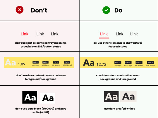
Light/Dark Modes
There’s a myth that dark mode is good for accessibility, because it improves text readability. (Personally, I’m a big fan of dark mode, as white/bright screens may trigger migraines). However, as everything in ux, the answer to ‘is it black or white’ is that it depends. As mentioned before, a good rule of thumb is not to generalise and provide flexibility.
When using light and dark mode, make sure the colour contrast ratio passes on both modes. Here’s a few tips for designing for dark mode (according to atmos article attached at the end of this):
Use tints (less saturated colours). Saturated colours can cause eye strain and will be hard to pass accessibility standards.
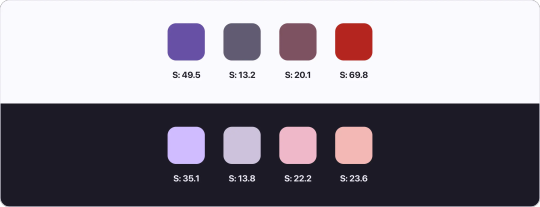
Image from Atmos website
Avoid pure black. Please. Pure black and pure white when used together might be the default instinct, but the contrast when used together is so strong it becomes hard to look at. Choose dark greys and off-whites/light grey when possible.
Be patient with your colour palette, inverting colours won’t make it necessarily good. Take your time to build a palette that will be suitable for both.
Target Sizes
First, what is this? This refers to the dimensions of interactive elements such as links, buttons, icons or touch targets. Basically, anything you can interact/click.
WCAG 2.2 established a minimum for pointer inputs to be 24x24. This is the space that should be provided for a clickable area.
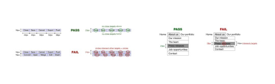
Image from W3 website
There's a number of exceptions and guidelines which I won't get into too much detail. It's important to think about the area which people are clicking into these elements. Also remember that this may be quite useful for users that are using the forum in their mobiles - so this is quite important (don't you hate when you can't click somewhere because you haven't clicked the EXACT area needed?)
In short:
Make sure target sizes are at least 24px
Make sure buttons look like buttons, anything that is clickable and interactive LOOKS like they are interactive
Make sure links are underlined (again, as an extra visual sign that they are clickable)
THAT'S IT!!
For part 01 at least. This is just the tip of the iceberg though. If you'd like to dive deeper into this, I highly recommend Stephanie Walter's content, as well as the Extra Bold book read. I'm attaching a few more articles and resources here too! If you've read all of this, you are a champ, I know this is longer than usual.
Please like and share this content, let's get it out there!
Articles:
Designers Guide to Documenting Accessibility
Dark mode ui best practices
Dark mode best practices
Accessibility annotation examples
Colour accessibility tools
Inclusive components design
Accessible design in 60s
Target size minimum
Resources
Accessible colours
Accessible colour palette builder
22 notes
·
View notes
Text
Universal Design

Designing for Inclusivity: Best Practices for Accessible Web Design
The internet has become such an integral part of most people’s lives. It is the go-to resource for recipes, shopping, jobs, homes, travel, or maintaining contact with loved ones. However, did you ever realize that not everyone has equal online experiences? Yes, there are now at least one billion people across the world experiencing some form of inability. And in their case, connectivity and website access are not as easy as they should be.
And it is why creating accessible websites would be a priority for any business with an online presence. It is not only morally right, but increased web accessibility means increased traffic and more business. Besides, an accessibility design will not affect your product’s UX or UI if performed by professionals like us at ADA Site Compliance. We have a team of accessibility experts ready to handle all your website’s compliance needs.
What is an inclusive web design?
Inclusive and accessible web design goes hand in hand. While an all-inclusive design process ensures no group of people’s needs or concerns are overlooked, maintaining accessibility strategies helps keep this in mind. However, what’s most important while designing an inclusive design is remembering that not every user accesses or interacts with the website similarly. An inclusive design helps remove bias and assumptions from your website so that no user feels excluded.
How to create an inclusive web design persona
Web designers often come up with a persona while designing their projects. It helps them understand how the user will engage with the site. Similarly, there is a persona to follow while designing an inclusive web design which is broken down into:
Name
Goals
Motivations
Demographics
Personality
Fears
Frustrations
It also includes the persona:
Ability where you assess how some users will be physically and cognitively restricted on using and engaging with the website.
Aptitude, as some users may not be digitally literate. In this case, deviating from basic layouts and not providing sufficient context will not help.
Attitude as some users may perceive a website to be unsafe because of privacy issues or the risk of encountering malware. You can address these fears through recognized and trusted safety and privacy features.
Some users may not have internet connectivity at home but have alternatives. They can head to the cafe or library, where connectivity, location, hardware, and software can impact access.
Localization as it is unsafe to assume that every user lives in the same country or comes from the same culture, or speaks your language. Address these differences in your inclusive user persona.
16 ways to make your website more accessible and inclusive
The following tips will go a long way in helping ensure your website is more accessible and inclusive:
1. Proper content structure
It does not matter how great your website content is if your prospects cannot read them. And this is very likely to happen because 253 million people worldwide suffer from some form of visual disability. You thus risk missing out on connecting with them. There are various steps to make your content easy to read for users with visual, language, and cognitive disabilities. You can break up the content into smaller sections with headers and subheaders, properly contrast the background and content, and avoid using decorative font.
2. Use the right text size and fonts
A practically microscopic or curly font can be difficult for anyone to decipher. These fonts should be avoided, and only the appropriate ones in an inclusive design process. The right text size and font size enhance your site’s overall aesthetics and make it accessible to a broader audience. It is safe to use a font like Verdana that is clean, easy to read, and of at least 12pt.
3. Proper language and tone of voice
The website’s tone of voice and language is essential for an accessible and inclusive website. Sites with words like ‘wheelchair-bound’ negatively impact people with disabilities. ‘Wheelchair user’ is a better option. Similar websites with complex vocabulary and syntax make it difficult for those with learning disabilities and visual impairments to understand your web content.
4. Proper content mark-up
In addition to proper content structure, you must use the correct HTML markup to denote things like a button on a page. Also, use heading tags like H1, H2, etc., through the content to create a visual hierarchy in the front end and a proper code structure in the backend. It also gives context to HTML elements that screen readers and the visually impaired use while browsing.
5. Keyboard navigation
Keyboard accessibility is sufficient in an inclusive design. The visually impaired and those with visual disabilities or with motor disabilities may depend on keyboards to navigate websites. In this case, they use the tab key to select interactive elements on a webpage.
6. Useable focus states
The blue outline you occasionally see around links or buttons is called the focus state. They help people use keyboards to navigate websites by highlighting the selected page elements.
7. Images with alt text
Incorporating alt text into images makes your site more accessible. Alt text is a short text describing the image which screen readers read, making it easier for the visually impaired to understand the image information. The alt text should provide a clear and relevant image description or be too long. Screen readers find reading overly complicated and repetitive descriptions challenging. Conversely, purely decorative images are marked using an empty <alt> attribute to tell screen readers to skip the image.
8. Form fields with descriptive labels
Your marketing and sales depend on forms, so ensure they are accessible by using descriptive labels in form fields. It is better than using placeholder text as labels, as they typically disappear once you start filling out the form. This is difficult for the visually impaired to read and to remember what the field was for. You can also ensure users know what to do while filling out forms by using small helper text above the form field.
9. Simple copywriting
Keeping your copy and content clear, plain, and simple without unnecessary jargon helps you reach a larger audience. If you use acronyms or anything technical, provide a glossary of terms or a plain English alternative. It also helps to use the expanded version of the acronym for the first use and use more lists.
10. Proper color contrast
Many tend to overlook a website’s color contrast. While most are not affected by text blocks on differently colored backgrounds, reading the text can be a nightmare for those with vision impairments. The World Wide Web Consortium (W3C) stipulates that the typical color contrast ratio between text and background be at least 4.5:1. This ensures even those with limited color vision easily read the text. Also, ensure the colors of buttons, links, and other interactive elements stand out from the rest of the content.
11. Know your target audience
Conduct thorough research about your target audience for a deeper understanding of your audience and to design a more inclusive design. You can use your CRM and audience surveys and study website behavior trends to learn more about your target audience.
12. Proper representation
Audience research helps you understand your customers’ backgrounds, perspectives, and identities. You can accordingly present your digital content in the best way possible using the following:
Photos and videos
Testimonials
Blog posts
Your target audience tends to learn more about you once they see themselves represented in your web content.
13. Adhere to accessibility guidelines
Unfortunately, more than 97% of home pages of top websites have accessibility issues. But the good news is that you can rectify the problem by following the Web Content Accessibility Guidelines. You end up with a more accessible and inclusive website that resonates best with your target audience.
14. Avoid using color to display vital info
Never use color as the only visual cue to relay important information to website users. Visually impaired users or those color blind may find differentiating colors challenging. Using elements like labels and patterns with colors helps make the data easier to differentiate.
15. Avoid flashing animation
Avoid using flashing animations on your website as there is a risk of the flashing lights triggering the serious condition of epilepsy.
16. Useful tools and resources for accessible and inclusive designs
In addition to the tips mentioned above, many tools with complex ideas and resources will help you build an accessible and inclusive design. The most important is W3C, accessibility standards, and guidelines followed with tools like WebAccessibilty and WebAIM Color Contrast Checker.
6 Principles of Inclusive Web Design
The following principles will help ensure you end up with a universal design and an inclusive web design:
Flexibility
This means being ready to add extra features to the US if you feel it will help bridge the gap between different users’ experiences.
2. Be simple
A simple web design creates a visually pleasing interface while paving the way for a more intuitive design. This is best achieved by treating the website like a minimum viable product with minimal features and adding extra features only where and if needed.
3. Perception
Always consider how visitors prefer engaging with websites while designing yours. All web content would be a healthy mix of texts and images as some visitors prefer text more while some images.
4. Equity
Web design equity refers to equitable outcomes, meaning every visitor should complete tasks. Knowing your user’s input first-hand helps create friction-free user interaction and a user journey everyone prefers.
5. Prevention
Creating websites with inclusive designs helps prevent human errors by providing tolerating and helpful responses to errors. This helps reduce the frustration of making errors with visitors and builds trust. This means designing large buttons that are easily seen and clicked and displaying error messages in contact forms so everyone can see them.
6. Accommodation
With web ties deemed as ‘places of public accommodation’, They are now subject to more accessibility requirements and lawsuits. An inclusively designed website ensures everyone can read, navigate and engage with the website and guarantees some comfort like ample space or predictable layouts to visitors.
Conclusion
In short, an inclusive web design includes various disciplines like UX and accessible and responsive designs. The only difference is that inclusive designs ensure a top-end, universally accessible user experience, and a well-received website. However, it is not easy to create websites with an inclusive design. You must correctly and thoroughly understand people’s challenges while engaging with websites.
All it takes are simple changes like the proper use of language and tone of voice while incorporating alt text into images and the proper selection of fonts. This way, visitors with and without disabilities have a positive experience. Website accessibility helps boost your SEO efforts while helping you create an inclusive space for all visitors who need only a few minutes to think.
These benefits are related to creating accessible products and having enough money to survive and not invest. Most web designers and marketers have the power and responsibility to ensure everyone sees what they create. So to ensure nothing of the sort happens, we have a team of professional web designers and developers at ADA Site Compliance to audit and rectify your website so everyone can easily access it!
#https://adasitecompliance.com/designing-inclusivity-best-practices-accessible-web-design/#designing inclusivity#best practices for accessible web design#accessible web design#inclusive website design#web accessibility guidelines#ADA compliance for websites#creating inclusive digital experiences#accessibility in web design#user-friendly web design#universal design principles#inclusive design techniques#web accessibility standards#WCAG guidelines#user experience and accessibility#inclusivity in website development#ada website compliance#ada compliance services#ada website accessibility#ada compliant websites#website accessibility compliance#ada compliance audits#ada compliance solutions#accessibility for disabled#ada web accessibility#website accessibility services#ada compliance guidelines#ada compliance checklist#ada accessibility guidelines#ada compliance consulting
0 notes
Note
3rd person jumping into the link conversation. You can find accessible linking guidelines at WCAG (web content accesibility guidelines)
Ironically, tumblr mobile isn't letting me hyperlink the above (WCAG) so I have to paste the raw link as it is
Oh wow it won't even let me do that, some kind of "not supported" message. Ok the article is called "Understanding SC 2.4.4: Link Purpose (In Context) (Level A)"
The start is a bit dense and aimed at web developers and such, and I find it helps to skip to the Examples section and read those to get a feel for it, then go back up to read the guidelines.
"Level A" in the title just means lowest level of accessibility (WCAG) with "AA" and "AAA" being accessible for more people (how WCAG defines it)
thanks for the suggestion! I've just taken a look at the article. From what I've gathered, the options that are better than just 'source' would be either to be more specfic, or to embed the source directly in the quote. I'm going to give two examples below, and then a poll to see which people prefer.
Option 1:
From BBC article 'US Congress avoids government shutdown in last-minute deal'': 'A bill ensuring funding until 17 November received overwhelming support, and was signed into law by President Joe Biden minutes before a deadline.
Option 2:
'A bill ensuring funding until 17 November received overwhelming support, and was signed into law by President Joe Biden minutes before a deadline.'
If anyone has any further suggestions or feedback on accessibility, feel free to comment below.
64 notes
·
View notes
Text
Guidelines & Best Practices for Exceptional Web Design - Lode Palle
Creating exceptional web design involves following guidelines and best practices to ensure your website is visually appealing, user-friendly, and effective in achieving its goals. Here are some key guidelines and best practices for exceptional web designexplained by Lode Palle:
Understand Your Audience: Start by understanding your target audience, their needs, preferences, and behaviors. Tailor your design to appeal to your specific user demographic.
Mobile-First Design: Design your website with a mobile-first approach, ensuring it looks and functions well on various screen sizes and devices. Responsive design is essential for a seamless user experience.
Clear and Intuitive Navigation: Keep navigation menus simple, organized, and easily accessible. Use clear labels and hierarchical structures to help users find information quickly.
Consistent Branding: Maintain a consistent visual identity, including colors, typography, and logo placement, to reinforce your brand's recognition and trustworthiness.
Whitespace: Use whitespace effectively to improve readability and create a sense of balance in your design. Don't overcrowd pages with content and elements.
Typography: Choose legible fonts and maintain consistent typography throughout your website. Use headings, subheadings, and body text appropriately to structure content.
Color Harmony: Create a harmonious color palette that aligns with your brand and evokes the right emotions. Ensure sufficient contrast between text and background for readability.
High-Quality Images: Use high-resolution, relevant images and graphics to enhance visual appeal. Optimize images for web to improve loading times.
Fast Loading Speed: Optimize your website's performance for fast loading times. Minimize HTTP requests, use compressed images, and enable browser caching.
Content Hierarchy: Organize content with a clear hierarchy, emphasizing important information using headings, bullet points, and visual cues. Make use of whitespace to separate content sections.
Call-to-Action (CTA): Create compelling CTAs that stand out and encourage users to take desired actions. Use action-oriented language and place CTAs strategically.
Accessibility: Ensure your website is accessible to individuals with disabilities. Follow WCAG (Web Content Accessibility Guidelines) to provide alternatives for multimedia and ensure keyboard navigation is possible.
Browser Compatibility: Test your website on various browsers and devices to ensure compatibility and a consistent experience across platforms.
SEO-Friendly Design: Incorporate SEO best practices into your design, including using descriptive URLs, optimizing images, and structuring content with appropriate headings.
Content Management: Use a user-friendly content management system (CMS) to make it easy to update and maintain your website. WordPress, for example, is a popular choice.
Security: Implement security measures to protect user data and your website from cyber threats. Keep software and plugins up to date and use secure hosting.
User Testing: Conduct usability testing to gather feedback from real users and make improvements based on their experiences.
Analytics: Install web analytics tools (e.g., Google Analytics) to monitor user behavior, track goals, and make data-driven improvements to your website.
Regular Updates: Keep your website updated with fresh content, new features, and design improvements to stay relevant and engaging.
Legal Compliance: Ensure your website complies with legal requirements, such as GDPR for data privacy or copyright laws for content usage.
Exceptional web design is an ongoing process that involves continuous improvement and adaptation to changing user needs and technologies. By adhering to these guidelines and best practices, you can create a website that not only looks great but also delivers a superior user experience and achieves its intended objectives.
8 notes
·
View notes
Last Seen Blogs

hquinzel-blog
She's got the Jack


ordinarysparkplug
#1 millipede stan

onlxone
ѕ н a d o w ѕ

akranick-author
Amanda Kranick