#about drawings which use lineart as a crutch
Text
ITS ETHO DAY YIPPEE!!!! etho day!!!!! (redstone break)
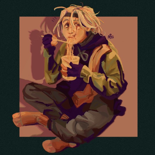
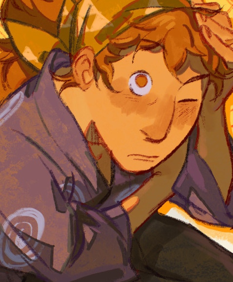
#my friend and i recently had a conversation#about drawings which use lineart as a crutch#my friend said using shapes to portray ideas rather than lines is important#i've been thinking about that and so i tried out coloring lineless#lots fun highly recommend#but yeah experimental piece#would have more etho but alas this is barely on time and i draw etho plenty he'll be ok#etho#art#fanart#digital art#mcyt#digital drawing#hermitcraft#ethoslab#hermitcraft fanart#hermitaday#etho tag#ethos lab#ath art
2K notes
·
View notes
Text
rules: post your first ever hockey art, your latest hockey art, and your favourite hockey art, then tag three hockey artists.
tagged by @18minutemajor <33 the main reason I got into hockey (shoutout to the motorsport x hockey series)
tagging some of my favourite talented people @krakenbait @wymgreenteam @lilyrizzy @andreisvechnikov !
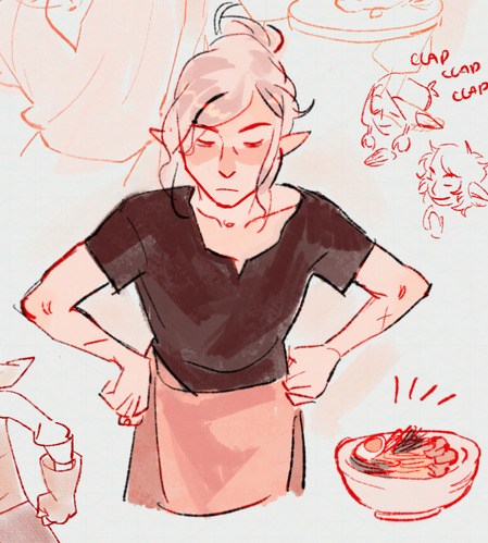
first ever hockey art: legally it was joel farabee cheese pull from 2021 that never saw the light of day. i had so little confidence in my lineart back then that most of the art is just kind of blocky and mishapen and So different from what i do now
still using film grain and textures as a crutch, still winging it lmao


latest hockey art: mx game changer gritty! no profound revelation attached to this one i finished it over an evening and i learn the virtues of patience every time i look at it because there're a million things i want to fix but he does look crazed which is a lowercase w


favourite hockey art: i don't know if i can pick favourites but there's a few i'm proud of!
i always love doing the ensemble devils graphic-y art, drawing the equipment is a pain but i'm so fond of these two in particular for how fun they were to render and also futzing with layouts and typography


the recent portraits i've done have been v fun process-wise, borrowing and learning and experimenting off of the ways some of my favourite artists go about colouring and inking to see what works for me
also just learning to be okay with inconsistency, the next thing i draw will probably have a completely different vibe and sometimes i can't recreate what i liked in the past but that's also a cool thing on it's own!


#going through my art folder like damn girl you lived like this#just me a broken huion and clip studio against the world#even looking at these i don't know if i'll ever settle on a 'style' but hey maybe that'll be a good thing#.tagged
15 notes
·
View notes
Note
how do you get your colors to look so nice and your lineart so red and vibrant? i love it
omg anon thank you!! 😭 im going 2 be honest I am Not Great with color theory... but i like having my sketch pages look cohesive to me...
BUCKLE UP this is going to need a readmore bc i like talking.
I always sketch in neon colors it's a habit i picked up from an old teacher but I'll think of a color usually on a whim and draw with that. and then if i want to draw something else ill pick another color that i think goes well with the page. usually most of my color schemes r analogous (colors right next to each other on the wheel)

yanked this from recent dunmesh post; i kept most of my colors within the pink/red/orange range.
i wouldn't recommend doing everything in monochrome or analogous palettes though because it's sort of a guilty crutch of mine XD.
sometimes when im coloring ill change the layer mode of the sketch. color burn gets you either very very bright or very very deep colors depending on the color of the flats underneath. multiply and linear burn do the same thing but they're a lot tamer and generally always return darker colors. im sure there's some technical bits behind this though. ill either color my lineart afterward to compliment the color of the flats, leave it as is, or mess with layer modes if i feel like it. my favorite trick is color burn + linear burn + some combination of two lineart layers and just fiddling until i get a nice burn effect.
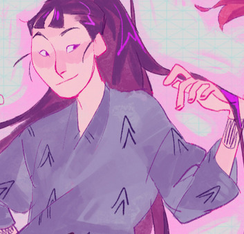
mithrun was done with crimson red on color burn.
coloring... like 999% of this is relative color which is like. kind of the idea that colors look different when placed next to each other. if you eyeball it a bit it's pretty noticeable.

what i used to do a bit ago was i would fill in the area i wanted to color with one big mask of color, make a new layer that has a clipping mask down to the flat layer of color, and then draw my actual flat colors. the color of the mask helped me pick my flat colors bc if I picked a color i think stood out too much next to the mask i could kind of just adjust it until it looked a little more cohesive.

old ish drawing next 2 a canon reference. i ignore local color a lot...mea culpa....but my overall color palette here was a light pink, so the shirt here is actually a desaturated pink? or violet i believe. if you shift sort of that purple color far enough into the gray area of your color wheel it can take on a blueish or even greenish hue. it being next to a lot of warm pinks/fuschias helps.
a neat thing that kind of helps is that if you desaturate or saturate certain colors they can kind of take on a certain hue? not sure if this makes sense. sort of how orange here turns tealish blue the grayer it gets. so if im drawing something that's predominantly orange and i have a blue color i can just take an orange color and desaturate it until i get a color that sort of looks like blue. and that way it kind of looks more harmonious? at least to me XD
shading. i don't apply serious lighting to a lot of my drawings, but a helpful bit is that the shadows tend to be the opposite of whatever color the lighting is? i try to think first about the "mood" or the main color i want to go for in the drawing and then i pick a shadow color opposite of that. so for here, i wanted the lighting to be a coolish magenta so the shadows r lime green. if there's anything off i fiddle around until i get something i like. the shadows on the skin here were too green initially so i shifted them a little more orange.
there's a "band" of color going on between the transition of the shadows to the light. generally this could be for a lot of reasons and i tend to use it differently (core shadow? overexposure? etc etc). but this is a color post so ill try not to go too off track.
but generally digital doesn't "mix" colors the same way traditional colors do if you use RGB (cmyk is a bit better with this but is kind of a pain to get used to), so to make blending a little less muddy, i sometimes add an intermediate color to smooth things out a little. for example, mixing digitally blue n yellow tends to get you gray, but generally, blue + yellow makes green, so if im making a blue->yellow transition ill slap some green color in the middle so it flows a little better.
I do a lot more cel shading nowadays. if you've been on here for a while earlier this year i have another style of coloring but it's not really accurate to how shadows really work so i wouldn't recommend looking at it. it's mostly to add zest and texture to the underlying flat colors.
coloring your lineart does a TON to helping your colors look vibrant, though its like the garnish on a dish to me (same with shadows). i think it's good to try and play with your flat colors and try to make sure those look in order first before adding flourishes. usually ill leave it a dark, saturated color that again matches my overall palette but sometimes i go in and color them by alpha locking my lineart layer and picking a color that matches the flat colors underneath? not sure how to explain it properly.

i used a darkish purple for shuro's ponytail to match the dull red of the flat colors (more relative color! trying to simulate a black/brown while keeping the pink palette there) but a lighter crimson for laios's blond. the light was this super intense like blush pink so i thought it might be cool to add this neon salmon red in the areas of that light to really give off that vibe of a very bright intense rim light.
sometimes you could also tweak with gradient maps or color balance, which adjusts hue based on how light or dark a color is. these r fun to mess with as a final touch but i need to watch using them because they can become crutches real fast XD but those are also just tools to help you. in the end just developing a good sense of how color works and how you want to use it is the best place to start.
LONGASS ramble but yeah. tldr just kind of train ur eye for color and look at what you like best. which is unhelpful and a little sucky but it really is just observation and practice and maybe some personal zest.
happy drawing!
#SORRY THIS IS THE SIZE OF CANADA I YAP A LOT#i like being thorough when explaining myself a lot XD but i think the easiest way to get good with this is just repeat practice n observing#and figuring out how stuff behaves in certain situations and what you like to do and blahblahblah#if you have artists u like that do this well looking at how they use color might be cool#...i feel this entire post is just putting my entire thought process on blast LOLLL.#“eyeball it out” -> study some actual fundamental stuff and or intake new info or art -> apply it back to just eyeballing it out#i dont think i have a natural sense for some basics#but i dont think im naturally one of those people who grind out studies all the time and breakdowns either#i guess i just kind of like knowing the mechanations behind why to do a certain thing or how stuff works and then figuring out#how that translates into what i know nerd emoji#james gurney has a good book on color and light#if you like reading. but its very informative!#quirinahscreams#ask#anon#this is mostly just me talking about how i draw i dont think this is meant to be educational or informative XD um
12 notes
·
View notes
Text
Someone commented on an old video recently asking me (genuinely) if one of my speed paints was AI because 1) it was broken up into highlights for TikTok, and 2) I have a very unorthodox sketching process. So, I have decided to show the entire ass backwards way I sketch out the nearly incomprehensible nonsense that my mush brain spits out at me.
To preface, I use Ibis paint x on a cell phone.
I do not have a fancy program like procreate or clip studio, or even a tablet and a lot of how I work has evolved from what I have found works the best for drawing on my tiny, little, shitty phone screen.
That being said....
A speed paint video
To begin, I rarely map faces more than just very basic shapes. (Though, I will admit the structures can get more complex the less comfortable I am with drawing the face.) I usually start with a very basic framework that I implement half from just years of practice in drawing faces and becoming more comfortable with those base shapes, as well as the fact that I'm already aware I will inevitably be over using the liquify pen. Now, I would like to say this is a crutch and I just do it because it's easy, but unfortunately it's actually just because I have fat fingers and a tiny screen (sometimes I can place lines better with my pen but it's still a really small surface to work with) and it's just less of a headache to address the lines with liquify than redoing them a million times or zooming in so close that I lose the rest of the picture.
I will often start with faces because they tend to have the most small details. From there, I will then usually shrink the drawing down and place it about where I think it'll need to be to draw the next part, all while less than strategically erasing the piss poor guidelines I had originally given myself.
SOMETIMES I will save my guides of a second layer in case I might need them later, but that's about as far as I ever plan ahead to be honest...
And we can see that in the next part where after scribbling in a few vague marks for their hair I then IMMEDIATELY regret erasing my head guides and hastily sketch them back in so I can proceed to poorly map out their bodies (most of which I will inevitably be covering up anyway, which I KNEW was going to happen with this one and I cursed myself the entire time). I then fill in where I want all the glorious hair, which fills up the rest of the blank space in the art with fun and interesting shapes and conveys the lore of the AU.
After this, and to take this from a sketch to actual lineart, I will clean up some of the lines on a second layer and keep some of the original sketch features where I like them. This helps me keep the life of the original sketch while also allowing me to clean up the more scratchy lines, which usually produces a pretty nice, clean looking line work.
Should I do a lore drop for my AU next??
Kinda want to...
7 notes
·
View notes
Note
Hello. I’ve been meaning to ask. Where have you learned to draw and do these manga/comic pages? It’s always been a struggle for me and no matter what I do, it has always looked either a mess and not clean.
hi! i'm sooo sorry for how late this reply is, but i'm also not sure how helpful this may be.
the basic answer is that i learned by 1) reading a lot of comics and deciding hey that looks cool i want to try executing something like that, and 2) getting a sense of what works and what doesn't work for me by drawing a lot of em. my general advice is just that it comes with a lot of practice, but practice with intent. making the destiny lore comics has been a lot of fun personally because it lets me mess around with different styles and narrative tones (which set the visuals) depending on the lore card.
i think "clean" can be a very subjective term; it could mean a lot of different things. if you're referring to having clean inks, it's just tied to what's comfortable for my drawing hand in terms of how i do lineart. i love inking, i like simple BW values and hatching and using spot black as a crutch so this is just where my style ended up. tbh i tend to feel like my lines are too stiff and i'm always trying to loosen up and be messier! depending on what you're struggling on, using 3d models and photo references can also help fill in the gaps where things aren't looking quite right to your eyes. i have zero concept of perspective and absolutely no 3d mental map so i rely heavily on 3d bg refs. if a panel just isn't working out, think about how you can adjust the composition to something that works better for your hand but still conveys the same visual idea.
also on a sillier level, my canvas defaults to fairly large resolutions because i got used to drawing at those sizes and when i shrink it down to post it, it inevitably helps smooth things out a bit lol. here's an example at 100%:

i hope this answers your question, sort of...?!
#asks#sorry i don't know if this was what you were looking for! but good luck with comicking!!#talking about style is a whole other can of worms
28 notes
·
View notes
Note
as an artist, are there any super simple art tips that you know that improve a persons art a lot when they start using it? like, my teacher once told me to always have the corner of the mouth in line with the corner of the eye when drawing faces, and that's stuck with me for years, but i really want to know if theres any other nifty little tricks like that.
BUT OBVIOUSLY YOU DONT NEED TO ANSWER im only asking because i really like your art and your lineart is really sharp in a way id like to one day be able to do some much simpler version of

Let me just preface this by saying I squealed with JOY when I realized I'd been sent an ask not about my writing, but about my VISUAL ART. My BFA was in painting and what I teach at university is connected to the creation of visual art. So I just get SO happy to think someone else cares about my stuff enough to ask how I make it! Please don't ever be sorry or shy to reach out! <3
Aside doing an actual video (which I could try, one of these days, if you want, but I'm trad only so it'll be clunky lol), here are some thoughts that pop into my sleep-deprived brain:
--It's FINE to use a reference. In order to master line variation and, especially form and movement, you will want NOT to let tracing be a crutch. But unless you have plans to be a sequential artist who has to have a mental "shorthand" of how-to's with various features and body parts, it is ENTIRELY ok to use a live or photographed model. Whoever started the rumor that this is cheating was being dumb.
--Become fluent in various softnesses (and therefore values) of graphite, Conte crayon, and charcoal. Yes, even if you're a computer artist. Learn the relationship between line thickness, perspective, and depth of form. I can go into this more if need be. Your H pencil is going to be hard and pale, and your B pencil is going to be soft and dark. Both have their uses.
--True to a bigger point: Just like in Doctor Who you don't skip Nine, don't skip trad art design fundamentals. You don't have to stay there forever, but let it be your foundational training. You don't have to go to university for this if you're unable. There are free online courses called MOOCs.
--Don't start stylized. Copying things like anime or comic book styles is a valid way to warm up, but you are filtering your work through someone else's eyes. Try to start with the original subject (be it a still like or a portrait) and develop your own unique mannerisms from that point.
--Don't be afraid to stop and toss it, and start over.
--Hardest one: Don't be afraid to erase and redo the part you love best if it doesn't have a correct relationship to the other parts in the drawing, painting, etc. I guarantee you can make something as good as that passage again. It's not gone forever. Don't be afraid to rework.
--Walk away for at least 3 hours and come back. Is it all still resolved or do you need to work on something?
--When choosing a color palette, it can be helpful to already have a neutral midtone established. Also, don't be me and get too ambitious about your colors. Pick like three tops and just do variations of those.
--Do NOT draw a human subject and think of the parts by their names WHILE rendering them. Reduce them to design principles: not "this is the eye," but "this is the dark round shape surrounded by a lighter space." If you think "this is the eye," you will stop really closely looking at what makes this eye unique and just kind of "plug in" stock eye features. This is the biggest enemy of capturing a likeness.
--You can absolutely rework anything in any medium. There are just different methods for doing so, between say watercolors and oils.
--Work with white noise or music. A playlist that keeps you in the zone, undistracted but also calm, is the playlist that you want.
--Know when to quit. 'I rarely feel like my work is "done" but if I keep going, I over work and ruin it.
I hope this helped as a start! <3 I'd love to see your work!
0 notes
Note
do you have any drawing tips for digital artists??im suffering please (i have an ipad gen 5 and a stylus) but its the art which is hard like my lineart always sucks and- sorry if it was any trouble, i just wanna improve
love your drawing btw, they made me stan the red lotus while my cousin screams "HOW COULD YOU LOVE THEM" and i scream back "THEY ARE LOVEABLE"
LMAOOOOO THATS SO FUNNY its u & me vs ur cousins 😎😤
i have an art tutorial tag u can browse through, but also, let me tell you something: if you hate lineart, YOU DONT NEED TO DO IT!! here are some alternatives!
1. clean up your sketch & use it as lineart.
probably the simplest option to try out. & after you’ve practiced drawing digitally for a while, you’ll find it gets easier to make clean(ish) sketches right off the bat!
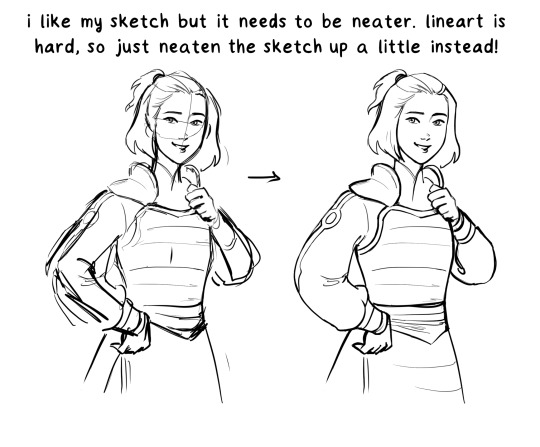
2. use a traditional sketch.
if you have an easier time making traditional sketches/linearts, it’s TOTALLY okay to just use one of those instead of digital lineart. it’s not a “crutch” or whatever that will hinder your development as an artist, it’s just a way of making art more fun and natural.
in this example, i draw a little on top of the sketch to adjust it, but if you had a neater sketch you totally wouldn’t need to.

3. make your sketch, color it, merge the layers, and paint.
this is the method i use. this video here is just a wip but i hope it can show you how the process works—for me, i love coloring and i’m SO impatient about getting to it. so i merge my layers and, as i’m doing things like making shadows and highlights, i’m also smoothing everything out, adjusting shapes, and turning the sketchy lines into neat ones. it’s the most organic process for me.
86 notes
·
View notes
Last Seen Blogs

getsetrankerz-blog
Untitled

mifrmzm-blog
Miframzam

geraskierbigbang
Geraskier Big Bang
linkingnightvale
Linking Together Night Vale