#access to Width of Text Frames
Explore tagged Tumblr posts
Visit Tumblr Blog
Explore Tumblr blogs with no restrictions, modern design and the best experience.
Last Seen Tumblr Blogs


Fun Fact
The total number of visits Tumblr.com received during January 2021 is 327 million.
Text
Index of Enhanced Edition Con Videos
I'll maintain this index in a pinned post for easy reference. Click the links to go to the YouTube videos, or click here for a more readable Google Docs table which includes these links plus a tab noting which events I skipped, temporarily or permanently, and why.
Link to my YouTube channel. Playlist in chronological order by panel.
The below list is in the order I published them so you can easily see what's new.
2007-11-11, Chicago - J2 Breakfast (00:23:42)
2007-11-11, Chicago - Jensen Solo (00:21:55)
2007-11-11, Chicago - Jared Solo (00:29:44)
2007-11-11, Chicago - J2 Main Panel (00:38:24)
2008-07-27, San Diego Comic Con - SPN Panel (00:50:52)
2008-11-16, Chicago - J2 Breakfast (00:26:16)
2008-11-16, Chicago - Jared Solo (00:26:20)
2008-11-16, Chicago - J2 Main Panel (00:35:04)
2008-11-16, Chicago - Jensen Solo (00:34:36)
2009-08-30, Vancouver - J3 Breakfast (00:31:53)
2009-08-30, Vancouver - Jensen Solo (00:27:17)
2009-08-30, Vancouver - J2 Main Panel (00:30:25)
2009-11-15, Chicago - J2 Breakfast (00:32:24)
2009-11-15, Chicago - J2 Main Panel (01:08:50)
2010-10-10, Chicago - Mishalecki Breakfast (00:32:48)
2010-10-10, Chicago - Misha Solo Panel (00:24:22)
2010-10-10, Chicago - Mishalecki Main Panel (00:29:33)
2010-10-10, Chicago - J2M Main Panel (00:29:07)
2011-08-27, Vancouver - Misha Solo Panel (00:54:47)
2011-08-28, Vancouver - J2 Breakfast (00:30:40)
2011-08-28, Vancouver - J2 Main Panel (01:03:46)
2007-08-28, San Diego Comic Con - SPN Panel (00:41:09)
2008-01-19, Fangoria (Austin) - Jared Panel (00:42:55)
2008-03-30, Los Angeles - J2 Breakfast (00:25:42)
I'm now working on Jared's solo panel from LACON 2008.
Thank you to everyone who has shown an interest in these videos. The reblogs and likes all made me very happy, and I especially appreciated the kind comments some of you left in your reblog text and tags. I'm unsure of the proper Tumblr way to respond directly to that in a way that won't annoy people, but I've definitely noticed and appreciated it!
An explanation of this project and my plans for it are listed below the break. A lot of it will be familiar if you've read my earlier posts, but it's more detailed -- and excessively long! There's also some info on how you can help, especially if you have any old videos or audio files that you'd be willing to contribute.
Why Do You Call These "Enhanced Editions"?
The videos I'm using are not my own, but I've spent many hours adding enhancements to them. My goal is to make these the most watchable and accessible versions of these older convention panels published to date. Credit and links to the original videos are in the video descriptions. These are the typical enhancements you'll see:
When possible, I'm upscaling the videos. This doesn't always work, especially on videos that are lower quality to begin with, but sometimes it makes a significant improvement in video quality.
When necessary, I'm correcting colors on the videos to try to make them look more natural and consistent. I'm very inexperienced in this area, and I don't consider it to be one of my strengths, but I'm learning.
The original videos are usually in multiple parts, but I'm editing them together into a single video as cohesively as possible. I may use videos from multiple sources to provide the most complete video possible, and I'll select the ones with the highest video quality and/or the best view of the action available. Sometimes I have to make difficult choices between the video with the best view (meaning a clear view of their actions and/or facial expressions) and the video with the best quality. I usually lean toward the one with the best view in those cases. I also choose the clearest audio I can find, so the audio you hear didn't always come from the video you're watching.
I'm adding extra content to help clarify references people make during the panels. The videos I've worked with so far don't take up the full width of a modern video frame, so I've taken advantage of that extra space to display the extra content to the side where it's less obtrusive. There are explanations for obscure references that are way funnier when you understand what they mean, plus episode references to help jog the memory for those of us who haven't rewatched the show a million times. In rare cases where I think it will enhance understanding, I'll insert brief episode clips that highlight what they're talking about.
I'm putting a LOT of time into adding good, color-coded English subtitles that can be turned on and off with YouTube's CC button. These videos can be frustrating to understand because the audience often drowns them out and Jared and Jensen tend to talk at the same time when they're together. I can't always figure everything out, but it's far better than the crazy, auto-generated nonsense that many videos have. YouTube can then translate my English subtitles into other languages, so this improves their accessibility. The color-coding helps with telling who's saying what: red for Jared, blue for Jensen, green for the general audience, yellow for the current fan at the microphone, and white for other people such as staff.
If there's missing footage that I can't find anywhere, then if I can find a source that seems to have reliable details about what was discussed, I'll add static images with a brief summary and a link to my source in the video description.
What Conventions Do You Plan to Enhance?
I don't want to make grand promises that I'll enhance videos for every old convention, although I definitely love the idea of doing so. How far I go with this will depend on how much sustained interest there is from other people and how much spare time I have myself.
My main focus is the panels with Jared and/or Jensen. They're the ones I'm most interested in and it takes a certain level of obsession to spend this many hours watching the same video over and over as part of the editing process! If I obtain any mostly-complete videos of Misha's solo panels that upscale well, I may also do some of those. I have done a couple of his already. He will also of course be included if he's in a panel with Jared and/or Jensen.
I haven't quantified exactly what "old" is, so I can't tell you I plan to work on all videos up through a specific year and then stop. For now I'm just plowing my way through with blinders on until one of four things happen: 1) I don't feel like I'm adding any value any more, 2) I no longer have the time or energy for the project, 3) everybody else has lost interest in the project and nobody's watching anymore, or 4) I've reached cons that are recent enough that the original video takers don't want their videos used for this project.
Can I Help?
If you have any old convention videos or audio files that you're willing to contribute, please message me! Maybe I can use them, maybe I can't, but the more I have to work with, the better chance I have of creating something more complete. If I do use your material, I'll credit you in whatever manner you prefer.
Even if your videos are on YouTube, it would save me a lot of angst if you could reach out to me and let me know about your channel in case I haven't found it already and confirm if you'd be ok with my using your videos. If you have videos that you don't want me to use, please let me know that too and I will respect that. I spend a good amount of time trying to track people down before I use their videos. If I can find a way to reach them, then I request permission first. I've managed to make contact with several very generous people, but a lot of people have also fallen off the face of the earth. If I can't find an active account for someone, then I go ahead and use their videos, but always with some trepidation that I might eventually piss someone off. Many of the older videos have already been republished by other people without credit, and I do always credit my sources, even if I only use a second or two of audio from their video.
If you send me videos that I'm able to upscale and/or color correct, then I'd be happy to send those updated versions back to you for your collection regardless of whether or not I use them.)
Even if your video looks terrible, you might just have a missing piece of footage that I couldn't find anywhere else, or your video might upscale more easily than another. Some of the footage I've gotten the most excited about has been audio-only footage or very low quality video footage that captured a few seconds from a panel that nobody else captured. If nothing else, I might be able to hear something in the audio that will help me fill in a subtitle I couldn't figure out.
I've greatly appreciated everyone who has contributed to this project by freely sharing their recordings. I also appreciate everyone who has watched my videos and especially those who have taken the time to let me know that you're enjoying them or benefitting from them in some way. Thank you!
#enhanced edition con video#j2#jared padalecki#jensen ackles#sam winchester#dean winchester#supernatural#index
145 notes
·
View notes
Text
Alice in Wonderland Printable Pictures.
Alice in Wonderland Printable Pictures body { font-family: Arial, sans-serif; line-height: 1.6; margin: 0; padding: 0; background-color: #f9f9f9; } header { background: #4a90e2; color: white; padding: 10px 20px; text-align: center; } h1, h2, h3 { color: #333; } article { max-width: 800px; margin: 20px auto; padding: 20px; background: white; border-radius: 5px; box-shadow: 0 2px 10px rgba(0, 0, 0, 0.1); } ul { margin: 10px 0; padding-left: 20px; } footer { text-align: center; padding: 10px 0; background: #4a90e2; color: white; position: relative; bottom: 0; width: 100%; } @media (max-width: 600px) { article { padding: 10px; } }
Alice in Wonderland Printable Pictures
Bring Wonderland to Life
In a world where digital screens dominate, there's something magical about bringing stories to life through tangible, printable pictures. Whether you're a parent, teacher, or simply a fan of Lewis Carroll's timeless classic, Alice in Wonderland printable pictures offer a gateway to creativity, learning, and decoration.
Why Choose Alice in Wonderland Printable Pictures?
Timeless appeal: The story resonates with all ages, making it perfect for diverse settings.
Rich visual elements: From the Cheshire Cat to the Mad Hatter's tea party, the story is filled with iconic imagery.
Versatility: These pictures can be used for decoration, education, crafts, and more.
Accessibility: Printable pictures are often more affordable and customizable than store-bought decorations.
Types of Alice in Wonderland Printable Pictures
1. Character Portraits
Bring the residents of Wonderland to your walls with character portraits:
Alice in various scenes and outfits
The White Rabbit with his pocket watch
The grinning Cheshire Cat
The Mad Hatter in all his eccentric glory
The formidable Queen of Hearts
2. Scene Illustrations
Capture the magic of Wonderland's most memorable moments:
The tea party in full swing
Alice's encounter with the Caterpillar
The garden of talking flowers
The croquet game with flamingo mallets
The trial scene in the Queen's court
3. Quote Posters
Words have power, especially when they come from Wonderland:
"We're all mad here." - Cheshire Cat
"Curiouser and curiouser!" - Alice
"I'm late, I'm late, for a very important date!" - White Rabbit
"Off with their heads!" - Queen of Hearts
"Why, sometimes I've believed as many as six impossible things before breakfast." - The White Queen
4. Coloring Pages
For those who prefer to add their own touch:
Simple outlines for young children
Intricate designs for older kids and adults
Themed coloring pages (e.g., tea party elements, Wonderland creatures)
Mandala-style patterns incorporating Alice in Wonderland motifs
5. Educational Printables
Turn learning into an adventure with:
Alphabet cards featuring Wonderland characters
Number cards with themed illustrations
Labeled diagrams of story elements (e.g., parts of the Hatter's hat)
Maps of Wonderland for geography lessons
Timeline of events in the story
How to Use Alice in Wonderland Printable Pictures
Wall Decor: Frame your favorite scenes or characters to create a Wonderland-themed room or reading nook.
Party Decorations: Use the printables to set the scene for an unforgettable Alice in Wonderland party.
Classroom Displays: Teachers can create engaging bulletin boards or learning centers with these printables.
Craft Projects: Incorporate the pictures into scrapbooking, card making, or decoupage projects.
Gift Wrapping: Use the printables to create unique gift tags, cards, or wrapping paper.
Temporary Tattoos: With the right paper, turn some of the simpler designs into fun, temporary tattoos.
Bookmarks: Trim character portraits or quote posters into bookmarks for a themed reading experience.
Playtime Props: Use the character printables to create masks or puppets for imaginative play.
Where to Find Alice in Wonderland Printable Pictures
Search specific terms like "Alice in Wonderland character portraits printable" or "Wonderland scene coloring pages".
Check reputable craft and education websites, which often have free printable sections.
Explore digital marketplaces for both free and paid options, often offering higher quality or more unique designs.
Look for artist communities where creators share or sell their Alice-inspired printables.
Don't overlook public domain resources, as many early Alice illustrations are now copyright-free.
Printing Tips for Perfect Results
Choose the right paper: Use high-quality photo paper for art prints, cardstock for sturdier applications, or specialty papers for unique projects.
Check your printer settings: Adjust for best quality, especially for color-rich images.
Consider professional printing: For large prints or high-quality results, local print shops can be a great option.
Test before committing: Print a small section or in draft quality to check colors and sizing before using expensive materials.
Protect your prints: Use UV-resistant inks and consider laminating or framing to preserve your printables.
DIY Projects Using Alice in Wonderland Printable Pictures
Decoupage Furniture: Transform an old table into a Wonderland scene using printable pictures and decoupage techniques.
Custom Lampshade: Create a whimsical lampshade by adhering printable scenes to a plain shade.
Wonderland Clock: Use character printables to create a unique clock face, perfect for a child's room or themed space.
Story Stones: Print and transfer small character images onto stones for imaginative storytelling.
Magnetic Poetry: Turn quote printables into magnetic words for refrigerator poetry with a Wonderland twist.
Incorporating Alice in Wonderland Printables into Home Decor
Gallery Wall: Mix framed character portraits, scene illustrations, and quote posters for an eclectic display.
Reading Nook: Use printables to designate a cozy corner for diving into favorite books.
Bathroom Whimsy: Waterproof some smaller printables to add character to a bathroom without overwhelming the space.
Kitchen Tea Party: Bring the Mad Hatter's tea party to life with strategically placed printables in your kitchen or dining area.
Office Inspiration: Add a touch of Wonderland magic to your workspace with framed quote posters or small character prints.
Conclusion: Your Wonderland Awaits
Alice in Wonderland printable pictures offer a world of possibilities for decoration, education, and creation. Whether you're looking to add a touch of whimsy to your home, engage students in learning, or dive into a new craft project, these versatile printables provide the perfect starting point.
As the Cheshire Cat would say, "Every adventure requires a first step." Your first step into the world of Alice in Wonderland printable pictures could be the beginning of a beautiful, whimsical journey. Happy printing!
© 2024 Wonderland Printables
0 notes
Text
Salient Corporate Creative – The Ultimate Multipurpose WordPress Theme v16.0.5
https://themesfores.com/product/salient-corporate-creative-the-ultimate-multipurpose-wordpress-theme/ Salient Corporate Creative – The Ultimate Multipurpose WordPress Theme v16.0.5 Salient is a multipurpose WordPress theme and is one of the most popular WordPress themes on Themeforest. It is one of those, what we can call “mega themes”. It is responsive and can be used to create any kind of website, easily. Whether it is a business website, an eCommerce website, or an online portfolio, Salient can be used for everything. The best thing about Salient is the number of demos and page/section templates that you can include in your website and get a quick start. It is thoroughly customizable and very easy to use. Salient is also one of the best-selling themes on Themeforest with over 93,000 sales to date. It is updated regularly with new features and templates. Salient is performance-optimized and beautiful. Main features: Many Available Demos – Salient provides ultra high-quality demos all available to import with one click. Whether you’re a photographer, agency or anything in between, Salient has will take your online presence to a new level. Exclusive Sliders – Get access to multiple sliders custom tailored/created just for Salient. You’ll enjoy exclusive features such as smooth parallax scrolling, image/video backgrounds & awesome functionality such as having each of your slides alter the header navigation coloring from light to dark. Page Transitions – Choose between multiple page transitions available for a beautiful & fluid user experience or turn them off altogether if desired. 4 Icon Packs – Salient has one of the most complete icon sets available on all of ThemeForest. Available families include: Iconminds ($59 value), FontAwesome, Steadysets & Linea. Multi-Layer Mouse Based Parallax – Wow your users by creating an astonishing parallax scene that is animated via the user's mouse movement. Silky smooth performance & works on mobile as well based on tilting the device. Masonry Image Galleries – Create beautiful galleries with ease! Enjoy all of the styles available for portfolio items, but with drag & drop ordering & easy bulk uploading. Megamenu Built-In – No need to rely on plugins. Choose your columns and display your megamenu full width or boxed within the site container. Fullscreen Rows – An extraordinarily powerful & exclusive feature that transforms your page builder rows into an exciting story in one click. Animated between your rows with high-performance transitions that also work on mobile. Off-Canvas Menu – Salient provides a powerful off canvas menu option with 4 different styles that can be used on desktop/mobile displays High-Performance Animations – Say goodbye to outdated choppy animations. Take note of the frame rate at which the theme animations display at – your users will appreciate the time spent on performance optimization. It’s silky smooth. Advanced Typography – Currently offering over 700 font families all with precision options available such as line height, letter spacing, font weight, font style, font size & text transform. Live font previews are also available right in the options panel. Multiple Blog Styles – Salient offers tons of blog layouts to choose from. Each of the styles seen below can also be displayed full width or with a sidebar. Masonry Enhanced Masonry Classic Masonry Metro Minimal List Classic List Multiple Single Post Layouts – Choose from one of the three single post headers available that’s most appropriate for your website. Classic Fullscreen Minimal Truly Customizable Portfolio – Salient offers 7 project styles and unlimited layouts for each one. Fine-tune Masonry layouts, project grid spacing, coloring, custom content in project grid & much more! Take a look at the styles below and various layouts! Classic Meta Overlaid Meta Overlaid With Zoom Zoom Mouse Movement Custom Content Grid Meta From Bottom Parallax Infinite Scroll option for Blog & Portfolio – Among the many pagination options, the infinite scroll allows your users to load the next page of items while scrolling down for a seamless browsing experience. Graphically Intuitive Shortcode Generator – Even though a powerful visual page builder is included, sometimes shortcodes still come in handy. The shortcode generator included in Salient offers an easy-to-use interface with powerful options for all elements and usable in both visual & text tabs! AJAX Search – Optionally give your users a helpful selection of the top search results for their search terms as they’re typing Extensive Theme Options – Salient features an exceptionally organized/designed options panel that provides you with hundreds of options in an intuitive manner. Currently, there are 17 different option panels and subcategories within them. HD Video Tutorial Series Support Ticket System Extensively Written User Guide Unlimited Color Options – Easily create color schemes for your website with unlimited options. Oh, did we mention color gradients are supported for tons of our elements as well? Powerful Lightboxes – Pretty Photo & Magnific are available for you to choose from. Custom elements in Salient such as the Video lightbox, image galleries & sliders are all integrated with them. Valid HTML5 – Because the insides are just as important as what the user sees. Extensive WooCommerce Support – Multiple product styles & single product layouts available, AJAX shopping cart, Single page product zoom gallery, page builder available on single product pages & more! Exclusive HTML5 Particle System – Upload images to create an interactive particle design with ease. Only available in Salient, view a demo here! Boxed & Wide layouts – Salient offers a global setting that can change your website from the default wide display to a boxed setup where you can set a background image/color to display behind the boxed container. Sortable Portfolio – Set up filters for your portfolio instances from categories you create which will sort through the projects without delay. Built-in “love” system – Provides a way to track what projects/posts are most loved on your website. Can be optionally used. Custom social sharing buttons – Allow you to share the current page with various social services. Footer Column Options – Control your footer widget area by selecting the available column (layouts offered range from 2-4 columns) SEO Optimized – Care was taken when coding Salient and search engines will appreciate it. Translation-Ready – Salient includes the .po/.mo files and is ready to be translated into your desired language. Salient Corporate Creative – The Ultimate Multipurpose WordPress Theme Please note that any digital products presented on this website do not contain malicious code, viruses or advertising. https://themesfores.com/product/salient-corporate-creative-the-ultimate-multipurpose-wordpress-theme/ #Multi-PurposeThemes #WordpressTheme
0 notes
Text
Screenshot above is of Sims 4 base game only build. It is just a clip of a short height wall in one room with what appears to be the only reasonably priced and large height and width wall decoration that does not require you to adjust its size.
It also is very bright and colorful and done in a very specific style and has no other swatches, not even for the frame color.
<steps on soapbox>
WHY ARE THERE ALMOST ZERO NON-EXPENSIVE BUT LARGE WALL DECORATIONS (OF ANY TYPE) IN THE BASE GAME?
</steps off soapbox>
I even gave in and tried to check debug and live edit objects.
Rant over.
NOTE: As always there is alt-text for the image for accessibility reasons.
0 notes
Text
How to Create a Coloring Book in CANVA | Earn $2000 Monthly by Creating Coloring Books with CANVA
**HTML Headings** In today's tutorial: Creating a Heat Coloring Book in 3 Simple Steps and Earning $2,000 to $5,000 per Month Step 1: Creating the Image for the Coloring Book Using Leonardo AI First, we'll start by creating the image for the coloring book. I'll be using Leonardo AI, a free software. To access the dashboard, go to the Leonard website (link provided in the description) and create an account using your Gmail or email account. Once you've created an account, click on the "Launch App" button to access the dashboard. On the left-hand side of the dashboard, you'll find the "Image Generation" option. I have tried different prompts, but the best result came from a specific prompt that I'll include in the description. You'll need to keep the entire prompt the same, except for the main character. Feel free to change it to anything you want. Leave the negative prompt unchanged. After making the necessary changes, go to the "Finetuned Model" section. Among the different finetuned models, I found that Leonardo Diffusion Excel gave me the best results. On the left-hand side, you can choose up to four images. I'm choosing two here. Make sure "Alchemy Dogle" is turned on and select an aspect ratio of 3:4. Finally, click on the "Generate" button. If you're satisfied with any of the generated images, you can use the "Smooth Upscaling" option to enhance the image quality. Note that this option requires 5 to 8 tokens. Once the image is upscaled, you can download it by clicking on the "Download Image" option. Step 2: Creating the Coloring Page Using Leonardo AI Next, we'll move on to creating the black and white sketch for the coloring page. Again, I have tried multiple prompts, but the best result came from a specific prompt that I'll provide in the description. Paste the chosen prompt and make sure the aspect ratio remains the same (3:4). Out of the different results obtained from trying various prompts, select the image that looks most satisfactory to you. You can upscale the image from the Leonardo AI platform and download it according to the instructions provided earlier. Step 3: Designing the Book Cover and Interior Illustrations Using Canva Now, we'll design the book cover and interior illustrations. To begin, we need to register with Amazon KDP, so click on the provided link and create a KDP account using your name, email ID, and password. After agreeing to the terms and conditions, navigate to the "Help" section and select "Format Your Paperback." In the "Cover Template" option, choose "Paperback," "Black and White," and "White Paper." Set the dimensions to 8.5 inches for width and 11 inches for trim height. Enter a minimum of 24 pages, but it can be more if you prefer. Click on "Calculate" and download the template. To create the book cover, we'll use Canva. If you don't have a Canva Pro subscription, use the link provided in the description to get a free 30-day trial. Once you're on Canva's website, go to "Custom Size" and enter the dimensions 17.43 by 11.25 inches for the cover. Upload the template file that you downloaded from Amazon KDP. In the "Elements" section, select a shape and place it on the cover to frame the design. Adjust the shape's position to cover the desired area. To enhance the image, go to the "Edit" section and apply a filter or make further adjustments using the available options. To add text to the cover, go to the "Text" section and choose a suitable font. You can either use the provided Carson Script font or explore free Disney fonts available on fonts.com. If necessary, upload a font by selecting the "Upload Font" option. To add a Disney princess or other relevant illustrations, use the "Edit Photo" and "Magic Grab" features, if available. Adjust the position of the illustrations and use the "Color" section to modify their appearance. You can also add additional elements to enhance the design. Once the cover design is complete, save the file as a PDF by going to the "Share" option, selecting "Download," and choosing the PDF print format. Now, let's move on to creating the interior illustrations. For the interior illustrations, set the custom size to 8.625 by 11.25 inches and create a new design. Import the previously created designs and position them on the pages. Apply filters and adjustments, if desired, to improve the quality of the illustrations. Save the interior illustrations as a PDF by following the same steps as before. Congratulations! The design process for the heating coloring book is now complete. To publish the book on Amazon KDP, please refer to the official Amazon website for a detailed step-by-step guide. Publishing a book on Amazon KDP involves a series of simple five processes that you need to complete. Now, let's explore an additional way to monetize your skills and earn more from creating coloring books. Many companies outsource the creation of coloring books because they lack the time and resources to do it themselves. By creating coloring books for other companies, you can generate income that can be further used to promote your own books on Amazon KDP. Platforms like Fiverr offer opportunities to sell your services as a book cover or interior illustration designer. Many sellers on Fiverr charge different prices based on the complexity of the designs and the number of pages required. By utilizing this trick, you can earn $2,000 to $5,000 per month by designing coloring books for other companies while also promoting your own books on Amazon KDP. If you're interested in learning about different AI models and tools, visit our website ww.wacpmedia.in. We offer a comprehensive course that covers various AI tools and techniques, and we currently have an early bird offer available. If you enjoyed this tutorial, please consider subscribing to my channel and giving this video a like. I would greatly appreciate it if you shared my content with your friends and family, helping me reach a wider audience. Stay tuned for future tutorials and stay safe. Thank you for your support! Thank you so much for taking the time to read this article. I genuinely appreciate your interest and support. If you enjoyed reading this article and would like to stay updated with similar content, I kindly request you to follow our blog. You can do so by subscribing to our email list, joining our Facebook fanpage, or subscribing to our YouTube channel. By doing so, you will never miss out on any valuable information, updates, or new articles that we share. Thank you again for your time, and I hope to connect with you through our blog's email list, Facebook fanpage, or YouTube channel. **Frequently Asked Questions:** **1. How can I create a Heats coloring book for free?** To create a Heats coloring book for free, you can follow the tutorial mentioned in the passage. It provides step-by-step instructions on using Leonardo AI and Canva to create the book. **2. How can I earn $2 to $5,000 per month using this trick?** The passage mentions that there are two different ways to earn money with this trick. One way is by publishing your own book on Amazon KDP and earning royalties from sales. The other way is by designing coloring books for other companies and charging a fee for your services. **3. Where can I find the necessary tools for creating a coloring book?** For image generation, you can use Leonardo AI, which is a free software. Canva can be used for designing the cover and interior illustrations. Links to these tools are provided in the description of the passage. **4. Do I need to have a paid license for using Canva commercially?** Yes, a paid license (Canva Pro) is required for using Canva commercially. However, the passage provides a link that offers a 30-day free trial of Canva Pro. **5. What are the steps to publish a book on Amazon KDP?** The passage mentions that publishing a book on Amazon KDP involves several steps. However, due to time constraints, the steps are not provided in the passage. Instead, a link to Amazon's official website is provided where you can find the step-by-step process for publishing a book on Amazon KDP. Read the full article
0 notes
Text
Always Up-to-Date Guide to Social Media Video Specs
Always Guide to Social Media Video Specs
Last Updated: August 30, 2023 Staying relevant and capturing your audience’s attention is a constant challenge for marketers. And now that brands rely on video content more than ever, it’s critical to use the correct social media video specs and advertising video sizes. However, we couldn’t find all the correct social video sizes in one place. So we decided to create a complete guide of every single social media video spec and advertising video dimension. Before we start, here are some additional resources to help you keep the information in once place: Learn how to develop and implement your Instagram marketing strategy today. Get the Guide

Always Guide to Social Media Video Specs
Social Media Video Specs & Ad Sizes Per Network
We’ve gathered a plethora of information on each social network’s specific video sizes and specs. Simply click the links below to jump to your desired network: Collaborative Publishing Made Easy with Sprout Visually appealing content can often be found at the heart of successful social posts. Whether it’s a video, image or text, Sprout’s Asset Library serves as the central hub, making accessibility, organization and collaboration easier than ever. Experience how easy asset management can be when you get started with a free trial today.
Facebook Video Specs
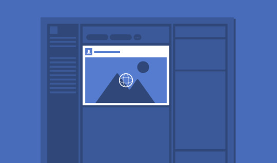
Facebook video is consumed at higher rates each year, so it’s no wonder why so many marketers search for the correct Facebook video specs. The challenge for marketers is that there are simply so many types of videos you can share on Facebook and the platform updates its design frequently. Each video format has different dimensions and specs, which can make it confusing to know whether or not you’re uploading the correct format for organic or paid posts. Follow the specs below to optimize your posts. Shared Post Video (Landscape & Portrait)
Always Guide to Social Media Video Specs Easily the most common type of video on Facebook comes from shared posts. This type of video lives in your Facebook feed, and can be shared by brands or your friends. While it’s not as easy to get organic reach on Facebook, it’s still a viable way to share video. You can choose between two video orientations: Landscape and Portrait. Here’s a look at the video specs for both. Always Guide to Social Media Video Specs Video Guidelines - Recommended video dimensions 1280 x 720 for Landscape and Portrait. - Minimum width is 1200 pixels (length depends on aspect ratio) for Landscape and Portrait. - Landscape aspect ratio is 16:9. - Portrait aspect ratio is 9:16 (if video includes link, aspect ratio is 16:9). - Mobile renders both video types to aspect ratio 2:3. - Max file size is 4GB (3 GB maximum in Sprout). - Recommended video formats are .MP4 and .MOV. - Video length max is 240 minutes (45 minutes if uploading in Sprout). - Video max frames 30fps. 360 Video
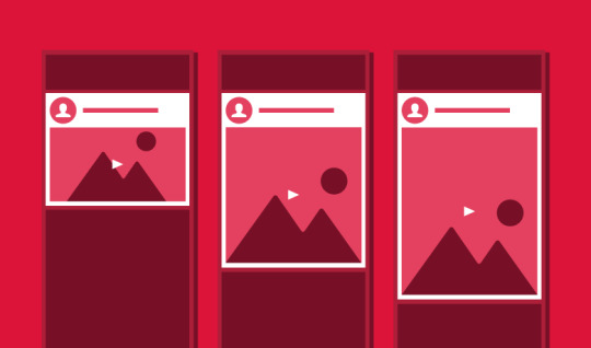
Always Guide to Social Media Video Specs Facebook’s 360 Video allows users to get a complete 360-degree view by scrolling with a cursor on web, by touch or turning the device on mobile. Video Guidelines - The resolution and aspect ratio depends on the type of content: - Monoscopic: 5120 x 2560 maximum, aspect ratio 2:1 - Stereoscopic: 5120 x 5120 maximum, aspect ratio 1:1 - Recommended max file size is 10GB. - Recommended video formats are .MP4 and .MOV. - Video length maximum is 30 minutes. - Recommended framerate is 30 fps. Facebook Reels The convenience of cross-posting your Instagram Reels to Facebook expands the viewership and reach of your videos. This format appears organically in feeds, but often gets “priority” on Facebook feeds. Always Guide to Social Media Video Specs - Recommended video formats are MP4 and MOV - Allowed Frame Rate: 23 FPS minimum - Allowed Duration: 4 seconds – 90 seconds - Allowed File Size: No file size limit - Resolution: 540 x 960 (540p) minimum (1080×1920 or greater recommended) - Allowed Aspect Ratio: 9:16

Always Guide to Social Media Video Specs
Facebook Video Ad Specs
In-Feed Video Ads
Always Guide to Social Media Video Specs These ads are the sponsored equivalent of in-feed posts and follow similar guidelines. Video guidelines - Recommended to upload the highest resolution video possible. - Recommended resolution: 1080×1080. - Recommended aspect ratio is between 9:16 to 16:9 (Horizontal: 16:9, Square: 1:1, Vertical: 4:5 or 2:3 and Full Portrait: 9:16). - Recommended video formats are .MP4 and .MOV (see full list here). - Max video file size is 4GB. - Video length max is 240 minutes. Character limits - Primary text: 125 characters. - Link description: 30 characters. - Headline: 40 characters. There are more than 5 million advertisers now on Facebook and having the right specs for your ads can be tricky. Each type of Facebook video ad is different, so let’s go ahead and break down the specs for each type of video you can produce. Carousel Video Ads

Always Guide to Social Media Video Specs Facebook Carousel Video ads allow brands to showcase multiple videos (or images) and a link within a user’s Facebook feed. It has grown in popularity because its unique scrolling feature allows users to see more content before clicking a link. In fact, Digiday estimated Carousel Ads to be 10 times more effective than standard social media ads. Always Guide to Social Media Video Specs Video Guidelines - Recommended video resolution 1080 x 1080. - Aspect ratio is 1:1. - Max video file size is 4 GB. - Recommended video formats are .MP4 and .MOV. - Video duration range is 1 second to 240 minutes. - Video max frames 30fps. Collection Video Ads (Mobile)

Always Guide to Social Media Video Specs The Facebook Collection ads showcases multiple images and a main video above it. This is perfect for displaying multiple products (or various colors of a single product) and a video as well. The ad type has been popular so far with retailers and clothing companies. How to build a Facebook business Page that attracts customers Video Guidelines - Recommended video resolution 1080×1080. - Square aspect ratio is 1:1. - Max video file size is 4GB. - Recommended video formats are .MP4 and .MOV. - Video length max is 120 minutes. - Video max frames 30 fps. Character Limits - Primary text: 125 characters. - Headline max: 40 characters. - Landing page URL required. Instant Experience Video Ads

Always Guide to Social Media Video Specs Facebook Instant Experience ads open up a full-screen experience after the first click, which can be further customized with a variety of interactive features. This can include multiple video experiences, including features to auto-play on loop. Always Guide to Social Media Video Specs Video Guidelines - Minimum resolution: 720p - Portrait aspect ratio of 9:16 with pillarboxing for all others uploaded. - Max video file size is 4GB. - Recommended video formats are .MP4 and .MOV. - Maximum length of all video content must be 2 minutes combined. - Video max frames 30fps. Slideshow Video Ad

Always Guide to Social Media Video Specs Facebook’s Slideshow videos were built for advertisers wanting to reach audiences with slower internet connections. Instead of a regular video, slideshows are just that–a slideshow of images or video in an ad display. Video Guidelines - Recommended video resolution 1200 x 720. - Aspect ratios available are landscape (16:9), vertical (4:5) and square (1:1) - Recommended video formats are .MP4 and .MOV. - Slideshow duration max is 15 seconds. Facebook Stories (Ads & Organic Posts)

Facebook has also added the Stories feature, disappearing short photo or video updates that are only available for 24 hours. In addition to user-generated organic posts, Stories ads that run in between sets of user stories are also available. While most users will be sharing immediate & organic updates from their phone’s camera without worrying too much about their video specs, the guidelines for this format are similar for paid & organic posts. Video Guidelines - Recommended resolution 1080×1080 - Aspect ratios: 1.91 to 9:16, with colored gradient bars rendered above and below videos under 9:16. The text field will also be placed under below videos smaller than this aspect ratio. - Max video file size is 4GB - Duration is 1 second to 2 minutes - Recommended video formats are .MP4 and .MOV. Character Limits - Primary text: 125 characters - Headline: 40 characters For more information on the video specs for Facebook, visit the Facebook Help Center.
Always Guide to Social Media Video Specs
Instagram Video Specs
Instagram launched video capabilities in 2013 and quickly saw enough success to start advertising on the platform in 2015. Since then, video only continues to grow as an engaging social format. So needless to say, Instagram videos are absolutely worth the investment. In-Feed Video (Landscape, Square & Vertical)
Always Guide to Social Media Video Specs Since 2015, Instagram crafted its videos formats to allow three different styles: landscape, square and vertical. The predominantly-mobile social network is perfect to share videos of any size organically to reach your audience. Video Guidelines - Minimum resolution for all formats is 1080 x 1080 - Recommended horizontal pixel resolution is 1920 - Multiple aspect ratios are supported: Landscape aspect ratio is 16:9, square aspect ratio is 1:1, vertical aspect ratio is 4:5. - Max file size for all formats is 4GB (*100MB maximum for Sprout Direct Publishing and 512MB maximum for Sprout Mobile App Flow Publishing). - Recommended video formats are .MP4 and .MOV. - Video length is 3 to 60 seconds. - Recommended frame rate is 23 to 60 FPS. - Recommended data rate/bitrate: 25 Mbps (megabits per second) Character Limits - Primary text recommendation: 125 characters. - Maximum number of hashtags: 30 Instagram Reels Introduced in 2020, Instagram Reels are another option for your video strategy on Instagram. These short-form, easily digestible videos are becoming the preferred type of content in Instagram feeds. Fortunately for social content creators looking to easily generate a lot of content for Instagram, most of the video specs for Instagram Reels are fairly similar to other formats on the platform, with the main differences being the short length and the ease of editing in-app to add effects and sound. As Instagram has started to add separate tabs for different content types, thumbnails will be cropped differently on each view. If the viewer is on the first tab that has all content types, the thumbnail will be cropped to the traditional square post size of 1:1–center your subjects and plan to avoid undesirable vertical cropping. - Allowed file extensions: .MP4 or .MOV - Allowed Frame Rate: 23-60 FPS - Allowed Duration: 3 seconds – 15 minutes - Allowed File Size: 4 GB max (1 GB or less in Sprout) - Allowed horizontal pixels: 1920 - Allowed maximum bitrate: 25 Mbps - Allowed aspect ratio: 0.01:1-10:1 (9:16 Read the full article
0 notes
Text
Even better, most of the common JRPGs that were fan-translated will not work properly on modern emulators or the actual real hardware, because the translators only tested it on ZSNES.
My theory on the Final Insect text screen blanking is actually why those fan-translated games would break: they'd try to write to video RAM during active display. That's when the PPU has near-exclusive access to VRAM — the game code is supposed to write to it between frames, during VBlank.
Drawing text on the screen in a fixed width font is easy, where each character glyph is one or two tiles in size, or four if it's Japanese. But variable width fonts are harder to work with, and if you have a screen full of text, all of it variable width? You're gonna run out of time and write new character data during active display. Or maybe it's just a dialogue box's worth of text, but there's a lot of special effects happening taking up most of VBlank time.
There's a reason the official translations for Final Fantasy VI and Chrono Trigger use 8x8 font graphics in their menus, with at best a dialogue box's worth of VWF, and that's it.
Relatedly, there's the echo buffer in the SPC-700 sound chip. A great many Super Mario World hacks use a tool called addmusic to change the soundtrack. But the earlier versions of that tool didn't account for the fact that the echo buffer is still part of the SPC-700's limited internal RAM (only 64 KiB of it!) and set the buffer length to an out of range value. ZSNES being ZSNES just ran with it, but original hardware and any emulator that properly implements the echo buffer would trample other parts of that 64 KiB. As such, there are hundreds of well-crafted, interesting SMW hacks that you simply can't play on modern emulators, or on hardware with an SD2SNES unit, any more than you can play Pretty Soldier Sailor Moon - Another Story.

Ya gotta love early SNES demo/homebrew productions. Improperly initialized OAM, failure to set object sizes correctly so bad it flickers, disregard for objects-per-line limits on top, improper blanking of tilemaps (I think it hit active display around halfway through and further writes were blocked until it hit vblank again)...

I dunno about you but I love this shit.
"Final Insect" by Taurus is not a Super NES demo. This is a ZSNES demo. It'll only run correctly on incorrect emulators.
120 notes
·
View notes
Photo
💜 HOW TO MAKE A GIF WITH PHOTOPEA 💜
Hey everyone! I recently got asked to do a tutorial on how I make my gifs. I know that many people (such as myself) don’t have access to Photoshop for various reasons but they’d like to get into gif making. When I started making gifs, I only had a free trial of Photoshop, but when that ran out, I had to find another way to make gifs. Enter Photopea! A free, web-based software that you can use anywhere and that works just like Photoshop!
In this tutorial, I’ll teach you how to make a basic gif like the one I did above. I use a macbook air, but it should be doable on a regular pc too!
If you found this helpful, feel free to share it with your friends! The tutorial can be found under the cut below 💜
THINGS YOU’LL NEED
A browser (I switch between Safari and Chrome, more about this later)
A screencapping software (like MPlayer OSX Extended) or, alternatively, a presentation program like Keynote or Powerpoint.
A program to screenrecord or a program that let’s you download from YouTube
Lots of patience bc gifs are annoying little shits <3
1. GETTING A VIDEO BY SCREENRECORDING
First things first, you need to have the clip you want make a gif out of. There are plenty of ways that you can get them. I’ve seen some gifmakers say that they torrent entire movies and gif from that. The way I do is I screenrecord the part I want to gif directly from where I’m watching the movie or show (like Disney+ or Netflix [or something like 123movies if you’re a pirate 🏴☠��)]). That way, I don’t have to download the entire movie and I have just the part that I want.
To screenrecord, I use my macbook’s built-in program called Screenshot.
Open the program by pressing ctrl + command + 5 on your keyboard and you get these funny little buttons.
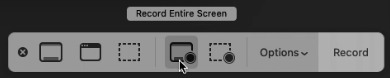
Click on the button that says record entire screen. The program is now recording your screen. Play the scene and make sure you expand the video into full screen so you get a full resolution. When you’re done, click the stop button that is at the top right of your screen (next to the wifi and battery symbols.)

If you don’t have Mac, I suggest you look into how to screenrecord on your computer, as I don’t know how other operating systems work. Sorry!
1B. GETTING A VIDEO FROM YOUTUBE WITH CLIPGRAB
Another way you can get videos is from Youtube. I use a program called ClipGrab for this. Download and open the program. You’ll get this window
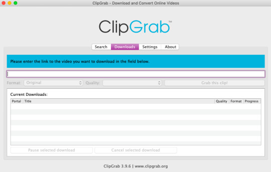
Simply paste the link and chose the highest quality, then click ‘grab this clip!’. Done!
2. SCREENCAPPING
After we’ve obtained the clip we wanted, we can do this two ways. The first way is to use the program MPlayer OSX Extended. Here’s a tutorial on how to set it up, make sure you do this if it’s your first time using the program. Make sure that you have a special screenshot folder!
Open MPlayer, then go to file > open and find the video of the scene you screenrecorded or downloaded. MPlayer will now play the video. Use the left and right keys (< and >) to go go backwards or forwards 1 minute, but try not to move around too much because the software crashes if you do. If that happens, just click the reopen button when the popup comes on, and reload the video again.
When you’ve gotten to the point you want in the video, press the command + shift + s buttons at the same time and the program will now take a screencap of every single frame until you stop.
If everything goes smoothly, you should find all your frames in your screenshot folder that you’ve made before when setting up the program!
2B. USING A PRESENTATION SOFTWARE TO MAKE A GIF
If you want to skip the screencapping part and you want to have a fully completed gif, you can do the second option. That’s what I used to do before I got MPlayer. In my experience, it’s a really fast way to make a gif, but the quality isn’t really good.
Here’s a tutorial on how to turn a slide into a gif in Keynote.
Here’s a similar tutorial on how to make a gif on PowerPoint.
Basically, you make sure that the size of your presentation is the same as your video, and that you make sure to export one slide into a gif. Also make sure that you export in the highest quality!
3. LOADING THE FRAMES IN PHOTOPEA
Finally, we can start giffing! As I said at the start, Photopea can be used anywhere, but I switch between Safari and Chrome. The reason why is that if I upload the frames in Chrome, the frames will be out of order. In Safari, that doesn’t happen, but the downside is that once I start editing, Safari will reload the page because it takes up too much memory.
So, first I go to photopea.com on Safari. I click New Project and put in the same dimensions as the screencaps (in my case, they are 1440x900 px). You’ll get an empty project.
Then click file > open & place and select your screenshots. Wait until Photopea has loaded all the frames, then, at the speed of light, quickly click file > save as psd before Safari reloads! You’ll find it in your folder where all your downloads are.
Next, I open Chrome (I use the incognito window because I have adblock on my usual Chrome, the program won’t work as usual if you have it enabled) and I click Open From Computer, locate your saved .psd file that you saved from Safari.
Now, you’ll see all the frames as individual layers. Select everything by clicking on the first layer, then golding the shift button and clicking on the last layer. Press command + G to group the frames into a folder. Here’s how everything should look after you’ve grouped the layers.
^^ See how Agnes approves! Agnes things you’re going a great job!
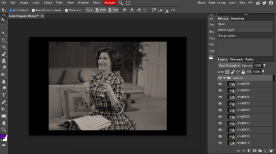
Now, it’s time to crop the gif and get rid of the black borders. Making sure that the folder is selected, click on the crop tool (or press C) and click on Fixed Size
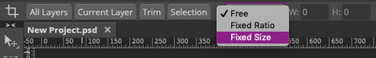
W is Width and H is Height, write in your sizing here. Tumblr’s max width is 540, so I put the width as such. For the height, I use 405. Then you just drag the corners until you’ve selected the part that you want, like this
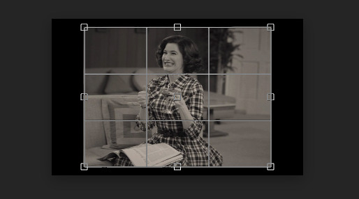
Press enter and the image will be sized down 540x405 px.
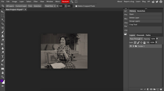
Now, our gif looks like this after cropping!
Open the folder so you can see all the layers. Select all your layers and right click on them, then click rasterize.
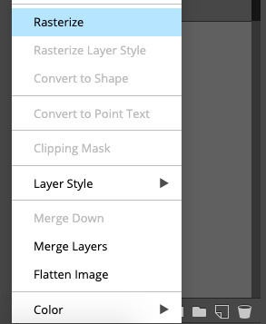
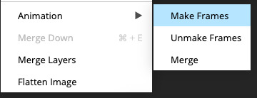
Then, go to layer > animation > make frames. You’ll now see that each layer begins with _a_ - this is crucial because this is how Photopea knows that the layers are part of a gif. If your layers don’t begin with _a_, then it will not play as a gif
If you instead already have a gif done, all you have to do instead is simply click open from computer when you first open Photopea and load your already finished gif and it’ll have the _a_ at the start of every layer. You won’t have to go through the steps of loading your frames into a new project to make your gif as it’s already done and in a folder :) Just start cropping once you load it
You can preview your work by going to file > export as > gif. Make sure to change the speed in the preview window until your gif plays the way you want it! I put my speed at 500%
4. SHARPENING
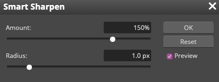
Hooray, we now have our gif! But to make it look a little nicer, it’s good to sharpen it. I always use Smart Sharpen when I sharpen my gifs, and many other gifmakers use that too. It’s really good :D
To sharpen your gif, again, make sure that all your layers are selected. Go to filter > sharpen > smart sharpen. I use two different settings for my gifs, it really depends on the gif.
Setting 1 (which is the default setting)
Setting 2
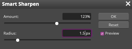
Again, it depends on the gif, play around until it looks good to you!
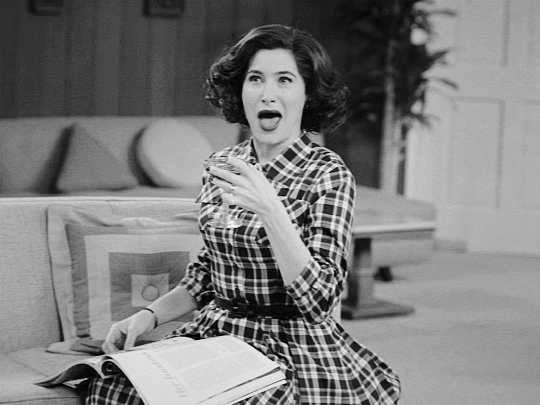
Here’s our gif after sharpening it
I ended up deleting the last few layers as the gif got bigger than 10mb (that’s Tumblr’s file limit, it your file is bigger than 10mb, it won’t upload). I also added a gradient map and it made the file size smaller, more about that in the next segment!
5. COLORING
Here’s the fun part! Now we get to play around with the gif, making it brighter and look Extra Nice™! Since this is a black and white scene, I make sure that the blacks and the whites really pop.
Notice how in the original scene it’s not actually b&w, it has a slight sepia tint to it. I want to remove this, so I add a gradient map by clicking on the white square with a black circle (I want to point out that we’ll be clicking on this button a lot in this step)
and I change the blending mode to Saturation
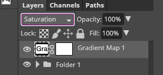
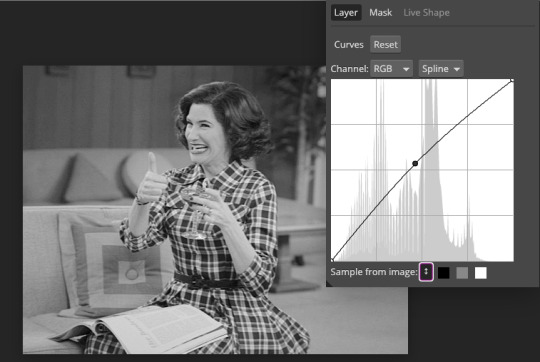
Then I add a curves layer using these settings
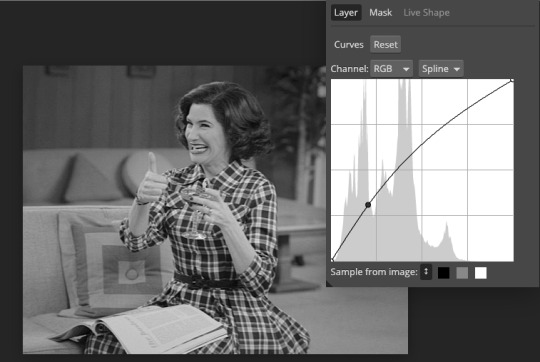
Then a second curves layer
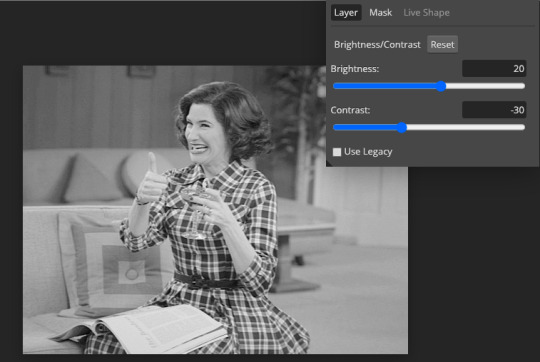
Brightness/contrast
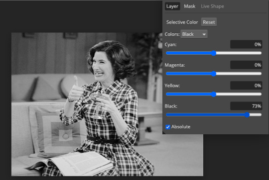
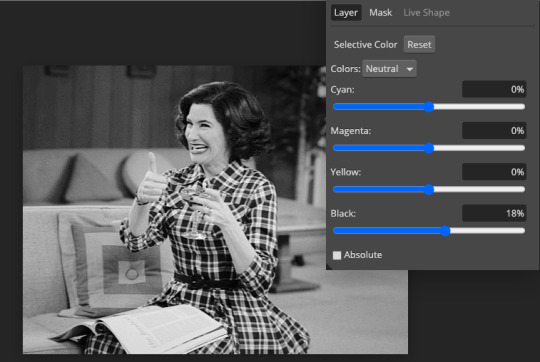
Then my favourite! Selective color! First layer, I deepen up the blacks
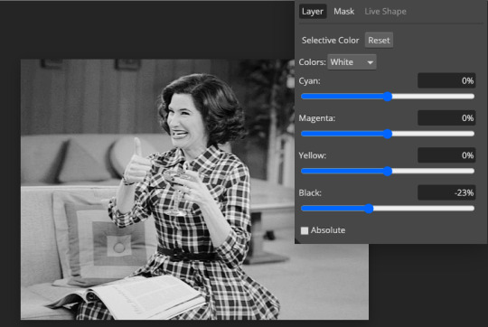
Then another selective color layer, this time the whites
Lastly the neutrals
Here we have the final results!
Wasn’t this a gas! I hope this helped you out, let me know if you want to know anything else about gifmaking, I’m happy to help! Also, sorry if I wasn’t very clear, I’m bad at explaining 🙈
MORE RESOURCES:
Here are some other tutorials that are really helpful in making gifs. These users use Photoshop, but you can still use their tips most of the time in Photopea too, you just need to play around and see what works for you!
Gifmaking for beginners by @chloezhao (this one saved my life)
Pale coloring tutorial by @itsphotoshop
Two-Toned Gif Background by @clubgif
Text with white outline tutorial by @anya-chalotra
#resources#tutorial#gif tutorial#photopea#photoshop tutorial#photopea tutorial#tuserfran#userlaur#userlaura#usermirna#(tagging mutuals if you wanna share :P)#my tutorials
1K notes
·
View notes
Text
Word Labels
Working at NoRedInk, I have the opportunity to work on such a variety of challenges and puzzles! It's a pleasure to figure out how to build ambitious and highly custom components and applications.
Recently, I built a component that will primarily be used for labeling sentences with parts of speech.
This component was supposed to show "labels" over words while guaranteeing that the labels wouldn't cover meaningful content (including other labels). This required labels to be programmatically and dynamically repositioned to keep content readable:
It takes some CSS and some measuring of rendered content to avoid overlaps:
All meaningful content needs to be accessible to users, so it's vital that content not be obscured.
In this post, I'm going to go through a simplified version of the Elm, CSS, and HTML I used to accomplish this goal. I'm going to focus primarily on the positioning styles, since they're particularly tricky!
Balloon
The first piece we need is a way to render the label in a little box with an arrow. To avoid confusion over HTML labels, we'll call this little component "Balloon."
balloon : String -> Html msg balloon label = span [ css [ Css.display Css.inlineFlex , Css.flexDirection Css.column , Css.alignItems Css.center ] ] [ balloonLabel label , balloonArrow initialArrowSize ] balloonLabel : String -> Html msg balloonLabel label = span [ css [ Css.backgroundColor black , Css.color white , Css.border3 (Css.px 1) Css.solid black , Css.margin Css.zero , Css.padding (Css.px 4) , Css.maxWidth (Css.px 175) , Css.property "width" "max-content" ] ] [ text label ] initialArrowSize : Float initialArrowSize = 10 balloonArrow : Float -> Html msg balloonArrow arrowHeight = span [ attribute "data-description" "balloon-arrow" , css [ Css.borderStyle Css.solid -- Make a triangle , Css.borderTopWidth (Css.px arrowHeight) , Css.borderRightWidth (Css.px initialArrowSize) , Css.borderBottomWidth Css.zero , Css.borderLeftWidth (Css.px initialArrowSize) -- Colors: , Css.borderTopColor black , Css.borderRightColor Css.transparent , Css.borderBottomColor Css.transparent , Css.borderLeftColor Css.transparent ] ] []
Ellie balloon example
Positioning a Balloon over a Word
Next, we want to be able to center a balloon over a particular word, so that it appears that the balloon is labelling the word.
This is where an extremely useful CSS trick can come into play: position styles don't have the same frame of reference as transform styles.
position styles apply with respect to the relative parent container
transform translations apply with respect to the element itself
This means that we can combine position styles and transform translations in order to center an arbitrary-width balloon over an arbitary-width word.
Adding the following styles to the balloon container:
, Css.position Css.absolute , Css.left (Css.pct 50) , Css.transforms [ Css.translateX (Css.pct -50), Css.translateY (Css.pct -100) ]
and rendering the balloon in the same position-relative container as the word itself:
word : String -> Maybe String -> Html msg word word_ maybeLabel = span [ css [ Css.position Css.relative , Css.whiteSpace Css.preWrap ] ] (case maybeLabel of Just label -> [ balloon label, text word_ ] Nothing -> [ text word_ ] )
handles our centering!
Ellie centering-a-balloon example
Conveying the balloon meaning without styles
It's important to note that while our styles do a solid job of associating the balloon with the word, not all users of our site will see our styles. We need to make sure we're writing semantic HTML that will be understandable by all users, including users who aren't experiencing our CSS.
For the purposes of the NoRedInk project that the component that I'm describing here will be used for, we decided to use a mark element with ::before and ::after pseudo-elements to semantically communicate the meaning of the balloon to assistive technology users. Then we marked the balloon itself as hidden, so that the user wouldn't experience annoying redundant information.
Since this post is primarily focused on CSS, I'm not going to expand on this more. Please read "Tweaking Text Level Styles" by Adrian Roselli to better understand the technique we're using.
Ellie improving the balloon-word relationship
Fixing horizontal Balloon overlaps
Balloons on the same line can potentially overlap each other on their left and right edges. Since we want users to be able to adjust font size preferences and to use magnification as much as they want, we can't guarantee anything about the size of the labels or where line breaks occur in the text.
This means we need to measure the DOM and reposition labels dynamically. For development purposes, it's convenient to add a button to measure and reposition the labels on demand. For production uses, labels should be measured and repositioned on page load, when the window changes sizes, or when anything else might happen to change the reflow.
To measure the element, we can use Browser.Dom.getElement, which takes an html id and runs a task to measure the element on the page.
type alias Model = Dict.Dict String Dom.Element update : Msg -> Model -> ( Model, Cmd Msg ) update msg model = case msg of GetMeasurements -> ( model, Cmd.batch (List.map measure allIds) ) GotMeasurements balloonId (Ok measurements) -> ( Dict.insert balloonId measurements model , Cmd.none ) GotMeasurements balloonId (Err measurements) -> -- in a real application, handle errors gracefully with reporting ( model, Cmd.none ) measure : String -> Cmd Msg measure balloonId = Task.attempt (GotMeasurements balloonId) (Dom.getElement balloonId)
Then we can do some logic (optimized for clarity rather than performance, since we're not expecting many balloons at once) to figure out how far the balloons need to be offset based on these measurements:
arrowHeights : Dict.Dict String Dom.Element -> Dict.Dict String Float arrowHeights model = let bottomY { element } = element.y + element.height in model |> Dict.toList -- -- first, we sort & group by line, so that we're only looking for horizontal overlaps between -- balloons on the same line of text |> List.sortBy (Tuple.second >> bottomY) |> List.Extra.groupWhile (\( _, a ) ( _, b ) -> bottomY a == bottomY b) |> List.map (\( first, rem ) -> first :: rem) -- -- for each line,we find horizontal overlaps |> List.concatMap (\line -> line |> List.sortBy (Tuple.second >> .element >> .x) |> List.Extra.groupWhile (\( _, a ) ( _, b ) -> (a.element.x + a.element.width) >= b.element.x) |> List.map (\( first, rem ) -> first :: rem) ) -- -- now we have our overlaps and our singletons! |> List.concatMap (\overlappingBalloons -> overlappingBalloons -- -- we sort each overlapping group by width: we want the widest balloon on top -- (why? the wide balloons might overlap multiple other balloons. Putting the widest balloon on top is a step towards a maximally-compact solution.) |> List.sortBy (Tuple.second >> .element >> .width) -- then we iterate over the overlaps and account for the previous balloon's height |> List.foldl (\( idString, e ) ( index, height, acc ) -> ( index + 1 , height + e.element.height , ( idString, height ) :: acc ) ) ( 0, initialArrowSize, [] ) |> (\( _, _, v ) -> v) ) |> Dict.fromList
Then we thread the offset we get all the way through to the balloon's arrow so that it can expand in height appropriately.
This works!
We can reposition from:
to:
Ellie initial repositioning example
Fixing Balloons overlapping content above them
Our balloons are no longer overlapping each other, but they still might overlap content above them. They haven't been overlapping content above them in the examples so far because I sneakily added a lot of margin on top of their containing paragraph tag. If we remove this margin:
This seems like a challenging problem: how can we make an absolutely-positioned item take up space in normal inline flow? We can't! But what we can do is make our normal inline words take up more space to account for the absolutely positioned balloon.
When we have a label, we are now going to wrap the word in a span with display: inline-block and with some top padding. This will guarantee that's there's always sufficient space for the balloon after we finish measuring.
I've added a border around this span to make it more clear what's happening in the screenshots:
This approach also works when the content flows on to multiple lines:
{-| The height of the arrow and the total height are different, so now we need to calculate 2 different values based on our measurements. -} type alias Position = { arrowHeight : Float , totalHeight : Float } word : String -> Maybe { label : String, id : String, position : Maybe Position } -> Html msg word word_ maybeLabel = let styles = [ Css.position Css.relative , Css.whiteSpace Css.preWrap ] in case maybeLabel of Just ({ label, position } as balloonDetails) -> mark [ css (styles ++ [ Css.before [ Css.property "content" ("\" start " ++ label ++ " highlight \"") , invisibleStyle ] , Css.after [ Css.property "content" ("\" end " ++ label ++ " \"") , invisibleStyle ] ] ) ] [ span [ css [ Css.display Css.inlineBlock , Css.border3 (Css.px 2) Css.solid (Css.rgb 0 0 255) , Maybe.map (Css.paddingTop << Css.px << .totalHeight) position |> Maybe.withDefault (Css.batch []) ] ] [ balloon balloonDetails , text word_ ] ] Nothing -> span [ css styles ] [ text word_ ]
Ellie avoiding top overlaps
Fixing multiple repositions logic
Alright! So we've prevented top overlaps and we've prevented balloons from overlapping each other on the sides.
There is still a repositioning problem though! We need to reposition the labels again based on window events like resizing. Right now, we're measuring the height of the entire balloon including the arrow, and then using that height to calculate how tall a neighboring balloon's arrow needs to be. This means that subsequent remeasures can make the arrows far taller than they need to be!
We're measuring the entire rendered balloon when we check for overlaps and figure out our repositioning, but we should really only be taking into consideration whether balloons overlap when in their starting positions.
Essentially, we need to disregard the measured height of the arrow entirely when calculating new arrow heights. A straightforward way to do this is to measure the content within the balloon separately from the overall balloon measurement.
We add a new id to the balloon content:
balloonContentId : String -> String balloonContentId baseId = baseId ++ "-content" balloonLabel : { config | label : String, id : String } -> Html msg balloonLabel config = p [ css [ Css.backgroundColor black , Css.color white , Css.border3 (Css.px 1) Css.solid black , Css.margin Css.zero , Css.padding (Css.px 4) , Css.maxWidth (Css.px 175) , Css.property "width" "max-content" ] , id (balloonContentId config.id) ] [ text config.label ]
and measure the balloon content when we measure the total balloon:
measure : String -> Cmd Msg measure balloonId = Task.map2 (\balloon_ balloonContent -> { balloon = balloon_, balloonContent = balloonContent }) (Dom.getElement balloonId) (Dom.getElement (balloonContentId balloonId)) |> Task.attempt (GotMeasurements balloonId)
We also change our position calculation helper from:
positions : Dict.Dict String Dom.Element -> Dict.Dict String Position positions model = ... -- then we iterate over the overlaps and account for the previous balloon's height |> List.foldl (\( idString, e ) ( index, height, acc ) -> ( index + 1 , height + e.element.height , ( idString , { totalHeight = height + e.element.height - initialArrowSize , arrowHeight = height } ) :: acc ) ) ( 0, initialArrowSize, [] ) ...
to
positions : Dict.Dict String { balloon : Dom.Element, balloonContent : Dom.Element } -> Dict.Dict String Position positions model = ... -- then we iterate over the overlaps and account for the previous balloon's height |> List.foldl (\( idString, e ) ( index, height, acc ) -> ( index + 1 , height + e.balloonContent.element.height , ( idString , { totalHeight = height + e.balloonContent.element.height , arrowHeight = height } ) :: acc ) ) ( 0, initialArrowSize, [] ) ...
Ellie with fixed multiple repositioning logic
Fixing overlaps with the arrow
I claimed previously that we fixed overlaps between the balloons. This is true-ish: we actually only fixed overlaps between pieces of balloon content. A meaningful piece of balloon content can actually still overlap another balloon's arrow! And, since the content stacks from left to right, there's a chance that meangingful content might be obscured by an arrow:
Ellie showing the balloon and arrow overlap problem
There are two problems here:
The balloons need a clearer indication of their edges when they're close together.
The left-to-right stacking context won't work. We need to put the bottom balloon on top of the stacking context so that balloon content is never obscured.
The first problem is improved by adding white borders to the balloon content and shifting the balloon arrow up a corresponding amount.
Ellie where each balloon has a white border around its content
The second part of the problem can be fixed by adding a zIndex to the balloon based on position in the overlapping rows, so that arrows never cover label content:
positions : Dict.Dict String { balloon : Dom.Element, balloonContent : Dom.Element } -> Dict.Dict String Position positions model = ... -- now we have our overlaps and our singletons! |> List.concatMap (\overlappingBalloons -> let maxOverlappingBalloonsIndex = List.length overlappingBalloons - 1 in overlappingBalloons -- -- we sort each overlapping group by width: we want the widest balloon on top |> List.sortBy (Tuple.second >> .balloon >> .element >> .width) -- then we iterate over the overlaps and account for the previous balloon's height |> List.foldl (\( idString, e ) ( index, height, acc ) -> ( index + 1 , height + e.balloonContent.element.height , ( idString , { totalHeight = height + e.balloonContent.element.height , arrowHeight = height , zIndex = maxOverlappingBalloonsIndex - index } ) :: acc ) ) ( 0, initialArrowSize, [] ) ...
Ellie with the zIndex logic applied
Fixing content extending beyond the viewport
We're almost done with ways that the balloons can overlap content!
For our purposes, we expect words marked with a balloon to be the only meaningful content showing in a line. That is, we're not worried about the balloon overlapping something meaningful to its right or left because we know how the component will be used. This is great, since it really simplifies the overlap problem for us: it means we only need to worry about the viewport edges cutting off balloons.
Browser.Dom.getElement also returns information about the viewport, which we can use to adjust our position logic to get the amount that a given balloon is "cut off" on the horizontal edges. Once we have this xOffset, using CSS to scootch a balloon over is nice and straightforward:
balloonLabel : { label : String, id : String, position : Maybe Position } -> Html msg balloonLabel config = p [ css [ Css.backgroundColor black , Css.color white , Css.border3 (Css.px 2) Css.solid white , Css.margin Css.zero , Css.padding (Css.px 4) , Css.maxWidth (Css.px 175) , Css.property "width" "max-content" , Css.transform (Css.translateX (Css.px (Maybe.map .xOffset config.position |> Maybe.withDefault 0))) ] , id (balloonContentId config.id) ] [ text config.label ]
Ellie with x-offset logic
Please note that when elements are pushed to the right of the viewport edge, by default, the browser will give you a scrollbar to get over to see the content.
Ellie demoing right-scroll when an element is translated off the right edge of the viewport.
You may want to hide overflow in the x direction to prevent the scrollbar from appearing/your mobile styles from getting messed up.
That's (mostly) it!
You might notice that the solution isn't maximally compact:
This is where our MVP line was. If it turns out that our content ends up taking up too much vertical space, and we want to go for the maximally compact version, we'll revisit the implementation. Since the logic is all in one easily-testable Elm function, improving the algorithm should be pretty straightfoward.
Additionally, this post didn't get into high-contrast mode styles. The way that the balloon is styled currently is utterly inaccessible in high contrast mode! Anytime you're changing background color and font color, it's important to check in high-contrast mode to see how the styles are being coerced. I've written a couple of previous posts talking about color considerations (Custom Focus Rings, Presenting Styleguide Colors) so I don't want to dig into how to fix this problem in this post. Please be aware that while the positioning styles in this post are fairly solid, the rest of the styles are not production ready.
Thanks for reading along! I had a great time working on this project and I'm quite pleased with how it came out. I'm looking forward to sharing the next interesting project I work on with you!
Tessa Kelly @t_kelly9
2 notes
·
View notes
Text
Scheduling Work in Swift using `NSTimer`
NSTimer can be used to perform scheduled work in Swift. Sometimes it is simpler than other options like GCD (Grand Central Dispatch) or NSOperationQueue, particularly if what you are scheduling needs to run on the main UI thread to access UIView instances anyway. There are also more options coming in the future such as Actors.
Here is an example of using NSTimer running a block of code five times, one second apart:
import Foundation import PlaygroundSupport import UIKit let maxRepeats = 5 var currentRepeats = 0 let blockTimerWith5Runs = Timer.scheduledTimer(withTimeInterval: 1.0, repeats: true) { timer in currentRepeats += 1 print("Block ran \(currentRepeats) times(s)!") if (currentRepeats >= maxRepeats) { timer.invalidate() } }
In an iOS app, RunLoop.main will already be running. In XCode playgrounds you also need:
RunLoop.main.run(until: Date(timeIntervalSinceNow: 6))
Output:
Block ran 1 times(s)! Block ran 2 times(s)! Block ran 3 times(s)! Block ran 4 times(s)! Block ran 5 times(s)!
It can also be used to run a function:
class FunctionTimerExample { init() { Timer.scheduledTimer(timeInterval: 1.0, target: self, selector: #selector(self.peep), userInfo: nil, repeats: false) } @objc func peep() { print("Function ran once!") } } let functionTimerExample = FunctionTimerExample() RunLoop.main.run(until: Date(timeIntervalSinceNow: 2))
Output:
Function ran once!
The function can optionally receive the Timer itself as an argument with some user info attached:
class Counter { var count : Int init(_ count: Int) { self.count = count } } class FunctionTimerWithArgExample { init() { let userInfo = Counter(0) Timer.scheduledTimer(timeInterval: 1.0, target: self, selector: #selector(self.peepArg), userInfo: userInfo, repeats: true) } @objc func peepArg(timer: Timer) { guard let userInfo = timer.userInfo as? Counter else { return } userInfo.count += 1 print("Function with arg ran \(userInfo.count) time(s)!") if (userInfo.count >= maxRepeats) { timer.invalidate() } } } let functionTimerWithArgExample = FunctionTimerWithArgExample() RunLoop.main.run(until: Date(timeIntervalSinceNow: 6))
Output:
Function with arg ran 1 time(s)! Function with arg ran 2 time(s)! Function with arg ran 3 time(s)! Function with arg ran 4 time(s)! Function with arg ran 5 time(s)!
An example use case is debouncing a search input
class DebouncedSearchViewController: UIViewController { var textField = UITextField(frame: CGRect(x: 20, y: 20, width: 200, height: 24)) var timer : Timer? override func viewDidLoad() { super.viewDidLoad() view.addSubview(textField) textField.placeholder = "Enter search" textField.backgroundColor = .green self.textField.addTarget( self, action: #selector(self.textFieldDidChange(textField:)), for: .editingChanged); } @objc func textFieldDidChange(textField: UITextField){ print("Text changed: " + textField.text!) timer?.invalidate() timer = Timer.scheduledTimer(withTimeInterval: 2.0, repeats: false, block: { _ in guard let text = textField.text else { return } print("Submit debounced search query for: \(text)") }) } } let vc = DebouncedSearchViewController() vc.view.frame = CGRect(x: 0, y: 0, width: 300, height: 300) PlaygroundPage.current.needsIndefiniteExecution = true PlaygroundPage.current.liveView = vc.view
Demo of typing `ABC` quickly followed by `Z` after waiting for a second:

At one company I worked at, we found having a 500ms debounce instead of 200ms reduced the number of network calls, and thus reduced operational costs, without impacting user engagement. So there are debounce values you can use that will save things like cost, network bandwidth, and battery life without hurting user experience.
Warning: If doing some blocking operation like networking or file IO, make sure to start the timer off the main thread, or create a different run loop and add it to that run loop manually. Everything above runs on the main UI thread, so could lock up the user interface on the user if blocking operations were added.
2 notes
·
View notes
Note
Would you mind sharing how you bring SATIM comics to life for us? ^_^
Ha, ha, I've been waiting for question like that. Okay... *stretches the clasped hands, you can hear the crash of knuckles* Here we go.
--------------------------
First of all, at the very beginning I would like to point out that each comic I make has a completely different method of creation. I draw a comic strip othey way (like SATIM), than comic page (like Kuro and Ninja or Before Henry). The former are characterized by great chaos, while the latter do not often differ from the final versions.
But let's focus now only on the comic strip for SATIM.
It all starts with an idea. I usually come up with ideas when I'm away from home and beyond the ability to save an idea, so many of them, unfortunately, are lost forever (sometimes I compe up with them again). However, if the idea is not forgotten and I return home, depending on whether I have time to draw or not - I either start sketching it right away in the form of comic frames or just writing the idea on a piece of paper. Apart from single exceptions (e.g. Radio strip), I do not write a script for a comic but I draw it straight away. The sketch is my scenario XD
For this reason, sketches can be very chaotic - sometimes the frames are completely out of sequence. I rarely sketch backgrounds at this stage (I rarely sketch them at all XD) - they are created only in the final stage of making the lineart. Let's see it on the example of Bacon Soup, part 1.

Sketches are often very simplified, I do not play with details (e.g. stripes on Sammy's harness). In addition, I draw comic strips without dividing them into individual parts at first - so on one A4 page there can be frames from two different parts of a given strip (like here).
I also use what I call recycling, i.e. reusing a frame - when I know that the frames will not differ too much, I very often draw only those differences...

The second point in creating the strip is rewriting the texts from it. Since I draw in English, often without access to a dictionary, my sketches are often very linguistically incorrect. At this stage, therefore, I initially correct dialogues, vocabulary, grammar - and then send the rewritten text to one of my English proofreaders. Each strip goes through two people - they are usually Titatotrix and Ozio, but sometimes when either of them has no time, I turn to my husband. Discussions about dialogues are very often carried out here, sometimes it leads to minor changes in the structure (e.g. adding a frame or removing it) or dialogues.
Above you can see corrected text of strip.

After linguistic proofreading, it's finally time for the lineart. This is probably the most important stage, though not the most time-consuming. I correct the sketches I made previously, usually starting with the speech bubbles and adding backgrounds to them. For this purpose, I use my UniPin fineliners, which have been proven for years and do not smear when using an eraser. Each part of the frame has its own fineliner - for example, speech bubbles are made with 2-thick fineliners, the foreground is 1-thick, but further plans and sometimes the background is 0.5 mm thick.
When the lineart is ready, there are two steps that I honestly hate - wiping the pencil lines with an eraser and scanning. Scanning a single page can take up to an hour, 'cause if it turns out that the lines that should be perfectly horizontal aren't that in relation to the edge of the sheet, the fun of arranging the sheet on the scanner begins. I honestly hate it.
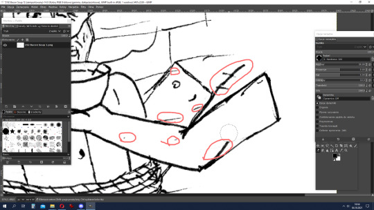
After scanning, we have the stage of cleaning the lineart in the computer. I'm only human, you know, I make mistakes and errors. But since I process the strips on my computer, I can afford it. The graphics program I'm using is GIMP. I start by reducing the brightness and increasing the contrast and of course the desaturation. Then I erase all the unnecessary lines, correct mistakes (all red loops on screen above), and sometimes add in pieces that I have forgotten (e.g., I always forgotten about the patch on Sammy's trousers).

Next comes what often takes the most time - that is, arranging and placing frames. It sounds simple, but it is not. Frames must look aesthetically pleasing, the comic book must have internal symmetry - or just express controlled chaos. Setting the width of the frames, arranging them, creating recycled frames, adding backgrounds (if they were drawn separately), sometimes moving the speech bubbles... it can take up to several hours!
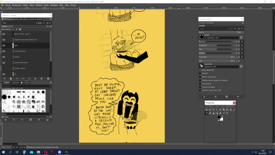
The next stage is my favourite - colouring. In the case of SATIM, where I really only color black and sometimes the shining elements light yellow or darker ones in dark yellow, this is also the shortest step in making the strip.
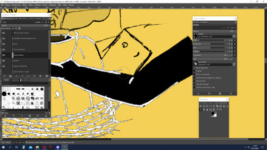
Usually, at the end, I leave myself to make bright contours on a black background. Working on them mainly involves manipulating the eraser tool, and then change colour to the background's. After this stage, sometimes there is play with details - light effects, Bendy's spots, etc.
When the strip is ready, there is only one thing to do - importing to a graphic file and zooming out (I work on a high resolution, which is inconvenient to read). Et voila!
--------------------------
I hope you'll enjoy this "secret of SATIM's strips making". I've wanted to do something like this for a long time, but I didn't feel like doing it myself, so thank you for asking, @sobercupcake ^ ^
6 notes
·
View notes
Text
gifmaking tutorial
As requested, here's a tutorial on how I make my gifs. Everyone's process is a little different, and mine changes from time to time, so it'll take some experimenting to find the settings that you like best. I’ll also link this tutorial here by Em, who is way more thorough than I’ll probably be, so check that out! The tutorial will be found in the read more below (apologies if it doesn’t work on mobile - this is a screenshot heavy piece of text).
My process uses Vapoursynth and Photoshop CS5 (I’m ancient I know!!). Avisynth is also another popular option if you already have that, but it’s been a while since I’ve used it. After the frames have been loaded into Photoshop, I then sharpen and colour my gifs before exporting. Some people will also use Topaz to clean up their gifs, but unfortunately that does not work well on my laptop. I use a Windows computer, so things may look slightly different if you’re using a Mac.
STEP ONE ⤅ Downloading your video
To start off, find the highest quality possible of the video that you want to gif from. If it’s a stage, I highly recommend using ts files, which are much better quality than the versions you’ll find on Youtube. Ts files can be found on a variety of website such as 4sashi, kpop24hours (requires membership) and on Twitter. Here is an additional resource for finding ts files and downloading videos. For non-stages, 1080p will work best, though 2k and 4k are absolutely lovely and I would highly recommend those if they’re available.
STEP TWO ⤅ Run your video through Vapoursynth
You can install Vapoursynth following this tutorial. Vapousynth is essentially a program that will crop and compress your video files without losing any quality. It also has built-in sharpen and denoise functions that can take over the functions of Topaz.
To start the process, you’ll drag your video onto the vapourscript and see a pop-up from Command Prompt. It will prompt you to enter two numbers: the first is the timestamp on the video for the start time for your gif (mine was at 3 min, 27 seconds). After pressing enter, it will then prompt you to enter the duration of the moment you want to gif (mine is 3 seconds). If you’re using Avisynth, the second prompt will be the second time stop (when you want the moment to end). I find that sometimes adding an extra second will help me capture the entire moment, but it’s up to your own discretion.
Once you press enter a third time, the command prompt will run and then a pop-up will appear on your browser. You can then adjust several settings, including gif size, preprocessor, denoise filters and sharpening. There’s a lot of freedom here to choose what you’d like to do.
In terms of gif size, you can pick any height that you think looks good but the widths that are optimized on Tumblr go as follows:
1 gif per row: 540px width
2 gifs per row: 268px width (I tend to use the default 350px for height when making these)
3 gifs per row: 178px width (it’s funky here because the middle gif is 178px while the two on the side are 177px each, so you have to crop off a pixel later)
For the purposes of this tutorial, I’ll be making 178px gifs. The next option is preprocessor. This option will alter how the video renders. There are two main options - 30 or 60 - and this will refer the number of frames per second you’ll obtain. For live performance gifs, qtgmc 60 slow is generally the option I choose as it gives better quality frames (especially with a lot of movement) but you may find that qtgmc 30 slow is sufficient. For non ts files, I typically do not use any preprocessor settings.
Most of the time, I don’t use denoise or sharpening filters as I prefer to do my sharpening and denoise in Photoshop. When I do choose to use denoise and sharpening, these are the settings I use. I don’t have a particular reason, but just that I like the way the gifs look. You can experiment with the settings to see what you like, and it can also vary with the gif.

The difference between having those sharpening/denoise settings vs. doing it in Photoshop vs. no sharpening/denoise can also be seen with the three gifs below (note that I've coloured them, which we’ll get into a bit later). As you can probably tell, there’s not a HUGE difference in quality between the three because ts files tend to be already be very high quality but I would always recommend sharpening as it can make a very big difference in the quality of your gifs!

After choosing the settings you want, you’ll then paste them into the VapouSynth Editor (which should’ve automatically popped up at the same time as the browser setting adjuster). For the purposes of this tutorial, I have chosen not to sharpen and denoise. You will copy paste the code from the browser (found at the right side) into the editor. My code was 4 lines and goes in between the code from the 11th line and 22nd line (yours should as well, though the line numbers may not match up - just make sure they say the same thing!)

You’ll then want to hover on the script on the top bar and click on “Encode video”.
Once you click encode video, another box will pop up. Here, you’ll want to make one adjustment (shown in purple), before pressing start. At the header bar, you’ll want to exchange the preset “No header” for the Y4M option. After you’ve done that, you can press start found below (also highlighted in purple).
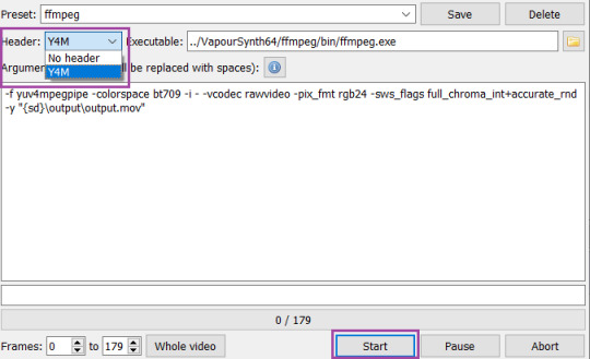
Congrats! You’ve finally finished processing your video!
STEP THREE ⤅ Make the gif in Photoshop
To important the frames into Photoshop, you’ll click File (top bar) > import > video frames to layers. Your output file from vapousynth should be found in the VapourSynth64Portable folder (based on where you first saved it) > gifs > output. Finally, click on the output.mov file to select it. You will then get a pop-up that looks like the following. I always keep these settings, though sometimes people will use limit to every 2 frames, but I find that will make your gifs look choppy.
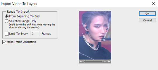
Based on the way your Photoshop layout is set up, the following steps may be found in different places than they’re found on my screen. You’ll want to have animation turned on (can be turned on under the windows dropdown menu, and just click on animation to turn on the frame view). If your bar is on the bottom of the screen, in the bottom right corner, you should press on the button (convert to timeline animation). I’ve highlighted the button in blue.
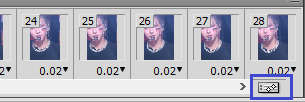
After converting to timeline, I select all the frames in the layers window (can also be turned on in the windows dropdown menu and selecting layers). Then, right click and and press convert to smart object. This will turn all your layers into a single object so you can edit all the layers at once rather than having to edit each layer separately.
After your smart object is created, I like to sharpen. I have an action, but to recreate the same effect, you will need to (1) duplicate the smart object (right click on the smart object > duplicate layer) (2) smart sharpen both smart objects with the following settings and then (3) put a gaussian blur only on the top layer with 1.0px. Both smart sharpen and gaussian blur can be found under the filter dropdown menu (filter > sharpen > smart sharpen or filter > blur > gaussian blur).

Depending on the quality of the video, if I find the sharpening too strong, I will sometimes change the radius to 0.3 or 0.2 (a higher number = more sharpening). Finally, set the top layer to 50% opacity (I go anywhere from 35% to 50% depending on how “soft” I want the sharpening to look. A higher opacity for the top layer will create a softer look). When I finish this step, my layers will usually look like this. And good news: your basic gif is done!
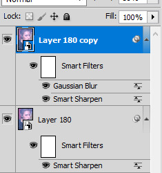
STEP FOUR ⤅ Colouring
Before you save the gif, you may want to colour the gif to make the colours look the way you want. This step is super subjective and every CC will colour differently - it’s why it’s so fun to see multiple sets of the same moment giffed, because each CC will colour a little differently!
I’m not a colouring expert at all, but I’ll put a basic skeleton of the way I colour below and show you the difference between no colouring, a basic colouring, and a more complex colouring. Another fun thing about colouring is that it can also make your gif look much sharper and higher quality depending on what you do.
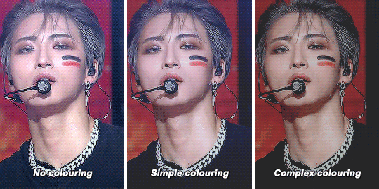
To access the possibilities for colouring, you’ll want to go the adjustments window (once again can be accessed in the window dropdown menu and selecting adjustments). As you can tell, there’s a ton of adjustment options, which may seem overwhelming. You should definitely experiment to find that looks best to you! I usually go in the following order: curves (red), colour balance (orange), hue/saturation (yellow), selective colour (green), levels (blue) and finally exposure (purple). I won’t attempt to explain what each one does (there’s tons of tutorials out there!), but note that sometimes you’ll want to use an adjustment more than once to get the effect you desire. Layering of multiple of these adjustment layers is what will create a more complex colouring that you will find you like more. I also haven’t mentioned some of the other options, but definitely explore them all to figure out what you like!
STEP FIVE⤅ Saving your gif!
We finally made it to the end! To save your gif, head into the file dropdown menu and select save for web and devices. There’s a lot settings you can fiddle around with here in order to save the best possible gif, but these are typically the settings I go with. The most important to note in the top right corner with selective and pattern selected (play around with those as you may find that the other settings will look better based on the gif!). Also make sure colors is at 256 (maximum) as having less than 256 colours can make your gif look patchy. At the bottom right, make sure you’ve selected looping options: forever to make sure the gif will loop. Finally, at the bottom left, you can see the size of the gif in megabytes. Note that Tumblr will allow gifs up to 10mb to be uploaded, but gifs will typically look best when under 3mb (though debatable).

Press save and you’re done! Note that sometimes after you’ve saved, the timing of the gif will be either too fast or slow. You may need to reopen the gif again and adjust the timing. I find that if you’re using 60fps, 0.02-0.03s generally looks best, while 0.04-0.05 will look best when using 30fps or with a preprocessor. Try them out and see what looks right to you.
Congrats on making it through this tutorial and taking the time to make gifs. Making gifs you find nice won’t always come easily or with the first try, but keep going and you’ll eventually find a way that works for you that you’ll be happy with. As always, if you have any questions, feel free to stop by and ask me and I’ll do my best to help. Almost every CC will be happy to share tips and advice as well, so don’t be afraid to reach out to the people whose gifs you love.
#gif tutorial#tutorial#mine#*tutorial#omg this took so long i hope this helps though anon!!#if there are any mistakes or grammar issues please let me know i'm too tired to read this over again LMAO#again everyone has different processes so this may not be something that works for you
144 notes
·
View notes
Text
How to gif without photoshop
Hello! By popular demand (of like 4 people) I am going to write out a tutorial of how I make gifs when I’m on my personal laptop and don’t have access to photoshop. There is another method I use with a different software that is a bit more complicated and if people are interested, I will make a tutorial of that method as well. I’ll do my best to keep this concise, so let’s get started.
Warning that this is VERY text and image heavy because I know how frustrating it can be when a tutorial feels like it’s skipping steps and I want this to be as clear as possible. Also please read this on desktop, tumblr mobile kills the quality of gifs inside text posts.
This is the video I will be giffing and here is the gif I will be making!

What you need:
A video to gif
For the best results, I recommend a video that is either 720p or 1080p (basically the higher the quality, the better). Videos with good lighting and bright colors also turn out the best. Unfortunately for me, I gif the TV show Prodigal Son a lot and that show has neither of those things, which is why my gif example is from that show; if you can make a scene with zero lighting or vibrancy look even somewhat decent, you can make anything else look good.
A video downloader or screen recorder
This is the video downloader I use and this is the screen recorder but basically any youtube video download website or screen recorder program works. Keep in mind that ezgif has a pretty low upload limit for videos, so if you want to gif something longer than like ~4 minutes, cut the video down to the specific parts you want first on a website like this one.
ezgif
A very straight forward website that anyone can access. You don’t need to download anything, it’s all online.
Bonus: Online Image Editor (not required, but I use this website to add text to gifs)
1. Making the gif:
Once you have a video downloaded, you go to ezgif.com and go to the section video to gif. Click choose a file, scroll to your downloaded video, and hit upload video. Your screen should look like this now.
There are two ways to pull out the sections of the video you want to gif. You can either write in the start and end time in the little sections (you have to convert them to seconds: for example, if my gif started at 1:16 and ended at 1:20, it would be 76 seconds and 80 seconds respectively). Or you can do the method that I feel is easier, where you go to the section you want it to start on, hit pause, and hit the blue button that says “use current position” then let the video play until it hits your stopping point, hit pause again, and click on the second “use current position” button.
Once you have the start and end time recorded, scroll down to the next part of the screen with the size options. For size, select “540xAUTO (for Tumblr)” since tumblr gif sizes start at 540p and go down the more gifs are in a row. For frame rate, try to do either 20 or 25; the higher the frame rate, the smoother the gif will look. If you are trying to gif something in 540p that is longer, you might need to chose 10 to keep it under 5mb, which is the tumblr gif size limit. For method, leave it on FFMPEG. Then hit, convert to gif.

your gif will now look something like this!
Now, this gif is currently 5.7mb, which is above the size limit for tumblr (5mb or above gifs will still play if I recall, but the quality will be really bad when you post them). If I was planning on keeping the gif this size, I would go back and change the frame rate to either 20 or 10 to get the size down. However, I am going to resize the gif to 268p, so I don’t need to worry about it being to big.
Using the correct gif size for tumblr is one of the easiest ways to make sure the gif looks good! For gifs that take up a whole row, the size should be 540p wide. For two gifs in one row, the size is 268p each. For three gifs in one row, the sizes are 177p, 178p, and 177p in that order. Here is a visual of it.
The next step would normally be resizing the gif, but Prodigal Son youtube videos come with a black banner on the top and bottom that I need to crop out. You will see a menu full of options under your gif, and you want to click on “crop.”
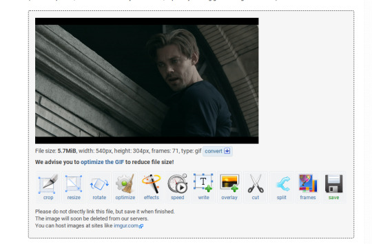
Cropping is pretty straight forward; you just move the little box over the part you want cropped, then hit the “crop image” button. Make sure width stays 540p!

Your gif now looks like this
Next, you look at the options under your gif again, and go to “resize.”
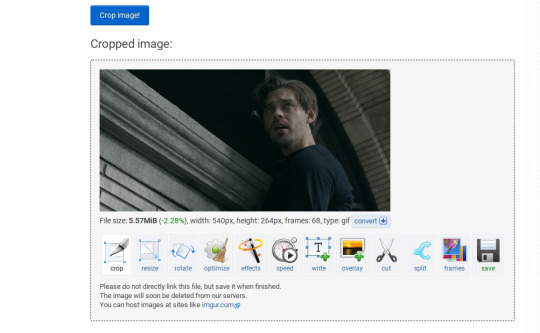
Again, resizing is pretty straight forward. I just put in 268 into the “width” section and leave the “height” section blank since the site will automatically resize the height. You can ignore the other menu options.
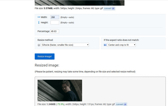
Your gif now looks like this

Next step is optional, but I usually do it. Once again, you go to the menu of options under your gif and select “speed.”

Speed is also super straight forward. I almost always reduce the speed of my gifs somewhere from 90% to 80% no matter what, just because I think it makes it look smoother. For gifs that are of short scenes that go really fast, I will reduce it to anywhere from 70% to 50%. You can try different speeds to test out what you think looks best. For this gif, I’m going to put it at 80%.
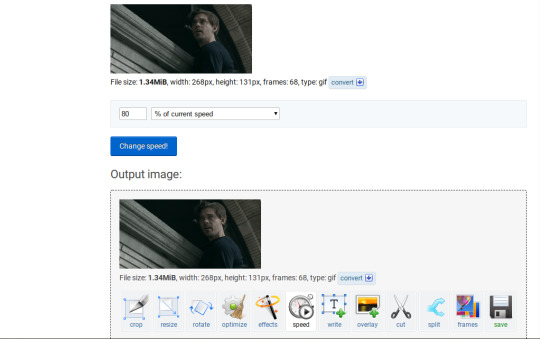
Here’s what we have so far. Congrats, you have made a gif!

Now for the fun part!
2. Coloring the gif
Go to the “effects” option, in the menu under your gif. You will see a LOT of options, but the panels I’m going to focus on are “colorize”, “brightness and contrast” and “color presets”. This section is going to vary a lot depending on what specific video you are giffing so remember to be flexible and try lots of different options out! It took me a while to get to a place where I can just eye a scene and know what settings to use. It’s super easy to go back and tweak a setting if the gif doesn’t look like how you want it the first time, but it’s a lot of trial and error.
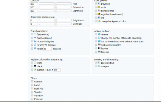
The main option I focus on in the “colorize” section, is “saturation.” This is what will make all the color in your gif pop out. The saturation I use varies a ton; for scenes that already are colorful/bright, I usually keep it around 120 to 150, since you don’t want it to be over saturated. If I’m making an edit that is supposed to look toned down or more grey/neutral tones, I’ll decreases the saturation in the range of like 90-40. For a show like Prodigal Son, where there is basically zero color vibrancy, I tend to go full out with saturation, usually in the 150-200 range. For this gif, I have it all the way up to 200.
Next is brightness and contrast. This also varies wildly, but a good rule of thumb is I always try to keep my contrast at least 5 points higher than whatever my brightness is, it just makes the lighting more even. You need to find a good balance; obviously, the darker the scene, the higher you want the brightness and contrast, but if you go too high, the gif with be staticy/grainy. For Prodigal Son, which has horrible lighting, my brightness is anywhere from 10-30 and my contrast is anywhere from 15-35. For this gif, my brightness is on the lower side since the scene is outside in natural light; brightness is 16, contrast is 26.

After you get those settings, I go over to “color presets” section and click on the “tint” option. It will pull up a color chart that looks like this
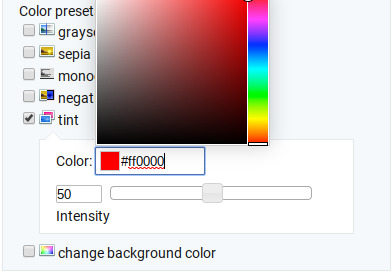
You ALWAYS want the intensity up to 100. This part is where the most trial and error occurs; there isn’t any one color option that works for every gif. The shade I use most often is light red/pink or light blue/light purple. For scenes that are lacking warm tones (which is almost all of Prodigal Son) I tend to go to the light reds, and for scenes that are lacking cool tones, I go to the light blues. The light reds are best for making characters skin tones look more...like actual skin tones and not totally washed out. To select a color, you just move your mouse around the chart. This is the range of color codes I tend to use.
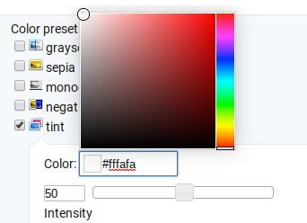
Again, intensity should be up to 100 (it automatically starts at 50 and I was too lazy to move it while getting screen shots :P).
For this gif, I actually used a new technique I’ve been trying out where I start with a light blue tint to even out the color tones, then once that gif is done, I go back to effects and add a layer of pink to make the colors brighter. Usually, one color works fine, but sometimes it’s hard to find a good balance (the red colors can get too red and the blue sometimes brings out too much of a yellow shade). For now, I have my color tint set at #eeebff.
Ultimately, this is what my effect settings look like and this is what the gif looks like now.
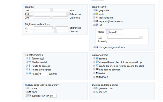

Now, like I said before, I added another layer of tint to this gif. All you have to do is go to the menu under your gif, and click on effects again.
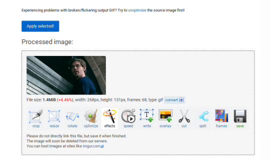
It will take you back to the panel you were just on, expect now your colored gif is on the top and all the settings are blank again. The only setting you need to use now is the tint option; go there, and select a light red shade. I used #fff0f0.

And here is the final gif! To save it, just right click and hit “save image as.”
I know it seems like a long process, but once you get a hang of it, it goes by super fast, especially if all your gifs are coming from the same video.
BONUS: Adding text
If you are trying to gif something with dialogue or you want a quote to put over your gif, you will want to put text over it. ezgif has a “text” option that you can use if you want, but I personally don’t really like their font options, so I use the website Online Image Editor.
This is what it looks like. You can either hit “upload an image” and upload your saved gif, or you can go back to ezgif, right click the gif, hit “copy image url” and paste that url into the “upload from url” option. The web page should now look like this.
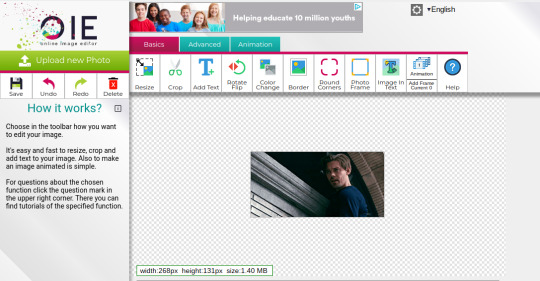
It’s pretty straight forward from here; click on the “add text” button and a menu will appear on the left hand with options for the text.
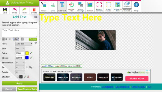
Type whatever you want the caption to be in the “type text here” box. This website has a ton of font options you can play around with, but when I just want to caption a gif, I stick with “Arial Bold Italic.” For a 268p gif, the font size should be 10-12, depending on how much writing you plan to put on each gif (if some gifs are going to have more writing than others, pick a smaller font size so it stays consistent!) When I make a 540p, the font goes up to 14-16. I use white for the color and black for the stroke. I make the strokewith 3 because it makes the caption stand out more. Once all these settings are selected, hit the “preview” button under the text box.
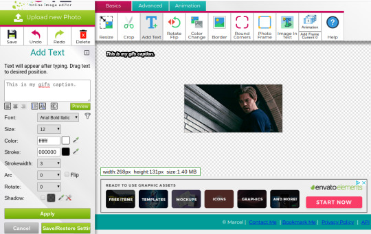
You can now drag your text anywhere you want on the image! The only bad thing about this website is that it doesn’t automatically center text, so you either have to eyeball it, or if you’re picky, like me, open up one of those online ruler applications and use it to measure out the center. For captions, I move the text just slightly above the bottom of the gif.
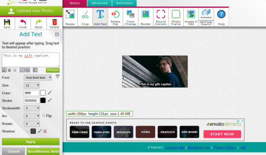
Finally, you hit apply. Once your gif has the text on it, all you have to do to save it is right click it and hit “save image as.” And here is the finished project!
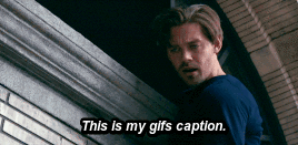
That got a lot longer than I thought it would, but I hope it was informative! If anything was unclear or if you have further questions, feel free to send me an ask. Thank you for reading.
#gif tutorial#giffing tutorial#giffing#gifmaking#mine#my gifs#long post#I hope this makes sense lol#pls rb if it helped!!!#also if mobile doesn't keep the read more...idek
424 notes
·
View notes
Text
Heya, folks! Welcome to the first in a series of tutorials I'll be making for gifs. Please note that I do not claim to be a professional, or even good at these--I'd just like to share my experience and process with you, so hopefully you can go forth and create whatever your heart desires!

If you'd like to learn how to make gifs straight from the Pokemon games using Adobe Photoshop, take a look under the cut!
PLEASE READ FIRST! First of all, I would like to note that I am using Adobe Photoshop 2020 as my image editing program. I've used CS5 and CS6 before, but unfortunately I don't have any experience with other programs. There may be similar ones to create the same kind of image!
Secondly, I am using an emulator at the time. The specific emulator I use in this tutorial is DeSmuME, linked here. However, the same process applies to GameBoy Advance and GameBoy (Color) games with the VBA emulator, linked here!
Lastly, I will not be linking any ROMs at the time. You can do some careful Googling and find some, though. ;)
Alright, let's get on with the tutorial!
☆ ☆ ☆
Have your ROM loaded up and at the point where you'd like to make a gif out of. For the sake of this tutorial, I will be playing Pokemon White 2, making a gif out of the Mareep that run around in Floccesy Ranch! The easiest way to start the process of this is to PAUSE your emulation at the point you would like your gif to start.
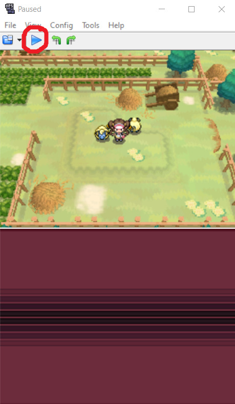
Excellent! Now, this is up to you, but to cut down on some editing, I like to make a mental note of where things started, especially if this is a looping gif (one that just goes on forever seamlessly). For this tutorial, I've made a note of the Mareep positions!
In the emulator, you'll want to go to File > Record AVI. You can choose wherever you'd like to save this recording. The recordings are generally smaller in size. Just save it to the easiest place you'll have access to.

You'll also get a popup about Video Compression. By default, it will be the full frames, uncompressed. Go ahead and hit 'OK.'
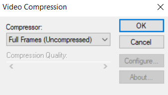
NOTE that your recording will technically not 'start' until you play the emulator again, which makes it great for cutting down on editing later on. I'll go ahead and hit play and record what I'd like.
Once you're satisfied, PAUSE the emulator again. Go to File > Stop AVI.

That's it on that end! Let's head to your image editor and let it work its magic.
Once again, I am using Adobe Photoshop 2020, and will be following the setup there.
You'll want to go to File > Import > Video Frames to Layers...
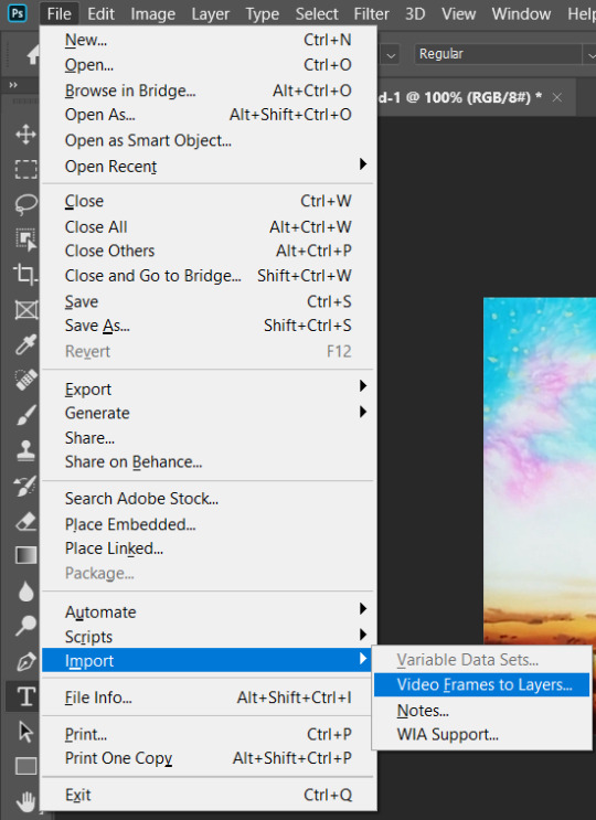
Navigate to where your AVI recording is, then click to open it.
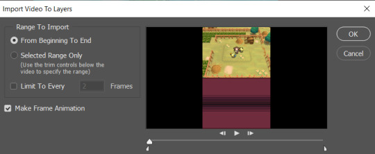
You'll now get this pop-up window. This is where you can mess around with the settings and how you'd like your gif to look/run. Since we recorded just the bit of the game we'd like to gif, we can go ahead and select From Beginning to End. This will make a gif of the entire video. You CAN do Selected Range Only if you want to tinker with it, but we can also edit the gif later on.
You may also Limit to Every ___ Frames. Once again, this is up to you and how you'd like your gif to look and run. If it's a shorter animation, I typically like to leave this unselected, and Photoshop will import every single frame from the video. This may take some time. If it's a longer gif, go ahead and mess around with the settings. As a tip, I do not personally recommend limiting it to more than two (2) frames. It may end up looking very choppy and not running as smoothly.
Lastly, make sure you already have Make Frame Animation selected. Then hit 'OK!'
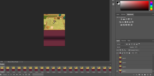
So now Photoshop has worked its magic! Technically, you can actually go ahead and export and save the gif from here, and it'll be fine. If that's the case, go ahead and skip 'till the end!
However, if you're not satisfied...
Let's go ahead and mess around with this image. Mostly what I do when I make these kinds of gifs is cropping and resizing, cutting out frames that I don't need, and coloring.
Cropping. Let's go ahead and select the Crop tool to edit our image to how we'd like it to appear. For example, I don't want the bottom screen of the DS to be in this gif, so I'm going to edit it down to just the top screen.

The Crop tool will work differently depending on your image editor. Don't be scared to mess around with it and find something you'd like!

I'm going to go ahead and crop the image to this, so just the top screen is the image.

Yay, it’s all cropped!
Resizing. Actually a very simple step, and not at all necessary, but I personally like it! Let’s go ahead and resize this image so it’s larger. Go ahead and go to Image > Image Size.


I went ahead and resized to 540px width. It should automatically adjust the height as well. If it does NOT, please make sure that Constrain Proportions is selected. In Adobe Photoshop 2020, you’ll be clicking on the little link icon to the left of Width/Height as seen below:
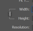
I personally think it’s also important to properly Resample your image. To get a crisp, clear image, much like how the original DS games look when properly enlarged, go ahead and select Nearest Neighbor (hard edges) from the drop down menu.
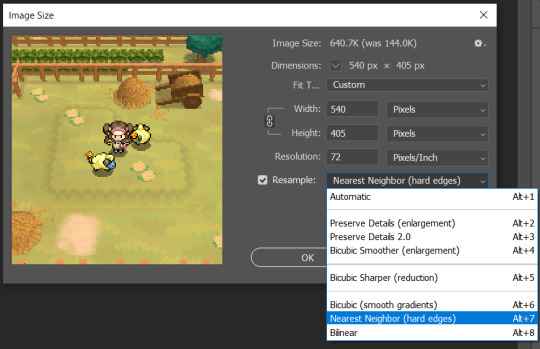
Go ahead and hit ‘OK.’ And now it’s nicely sized and looking crisp!
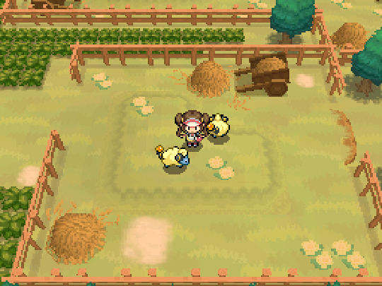
Editing. This is all depending on YOU! I’m going to keep it simple for tutorial’s sake. What I’m going to do is go through the frames of the gif down here--
--and make sure it all loops correctly and seamlessly! Delete layers by using the handy Trash button down at the bottom:
You can also select multiple layers by holding Shift and clicking on what you’d like to delete.
You may also change the timing of the gif. You can do this on an individual frame basis, or just change every frame at once. I won’t be doing it for this gif as I like the speed it plays at just fine, but for reference:

The button that I clicked on is the three lines right above Frame #20. Hit Select All Frames, then click on ANY frame’s timing here:

(It’s the arrow pointing DOWN next to the 0.02)
You most likely want to hit ‘Other...’ and set your own delay. The longer it is, the longer the frame will stay on the screen for (if that makes sense). This part is a bit difficult to explain over text, so hopefully I’ve made it clear!
Coloring. Absolutely NOT necessary--Pokemon games look amazing in their original colors, after all! But if you’d like a bit of added flair, you can always add a fun coloring PSD, mess with the Hues and Saturation, etc.
For this tutorial, we are actually going to SKIP the coloring step. If you’d like to see a more in-depth tutorial about it though, please let me know!
Assuming you’ve edited it down to what you’d like, we can now export and save the gif. Unfortunately, saving a gif isn’t very much like saving a still image at all. We’re going to head to File > Export > Save For Web (Legacy).
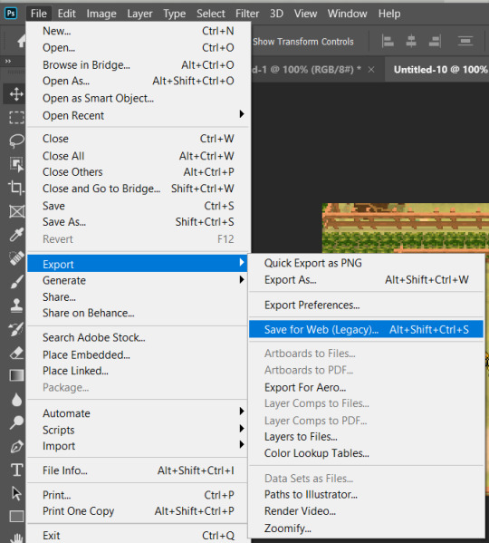
Next is the tricky part. You will get a pop-up that will look similar to this:

Typically, Pokemon gifs won’t have too many colors, so there shouldn’t be a whole lot of “bad”-looking parts! However, you can mess with the settings to the right in case there is something that you’re not satisfied with. Basically, you can only have so many colors in a gif--256 colors, I believe. (Please correct me on this if I’m wrong!) Because of this, your gif may not look like intended if there’s too many colors. I’m definitely no expert on the science of this, but I notice with brighter and more saturated colors, my gifs can look grainy and not what I want them to look like at all.

These are the settings you want to mess around with. For Pokemon game gifs, I do recommend trying to set the Dither % all the way down--I’ve noticed it helps in some situations. Again, I’m not an expert, nor will I pretend to be, but just try to mess around and see what you can come up with if you’re having any issues!
If everything looks good, there’s one more step before saving. Just double-check that your Looping Options are on ‘Forever’ instead of ‘Once.’ In the bottom right corner, you can change this.

And that’s it! Hit ‘Save’ and name your gif!
That’s really all there is to it, quite honestly! I’m sure there’s more in-depth steps, but this is the simplest way that I can find. If you have any questions, please feel free to ask! My ask box is always open, and I love talking about stuff like this! Have a great day, and happy gif making!
#gif tutorial#pokegraphic#hi i hope this helped some ppl ;w; i am planning on making some more tutorials!!!#if you would like a video for this please let me know! i just have a terrible voice lol#resources
9 notes
·
View notes
Text
Subtitle Workshop For Mac Free Download

Download subtitle workshop for mac for free. Audio & Video tools downloads - Subtitle Workshop XE by URUWorks and many more programs are available for instant and free download.
Subtitle Workshop. Free subtitle editor. Subtitle Workshop is a free application for creating, editing.
Subtitle Workshop, a free subtitle editor. Official website - download Subtitle Workshop and get Subtitle Workshop news and information. Subtitle Workshop is not available for Mac but there are a few alternatives that runs on macOS with similar functionality. The most popular Mac alternative is Aegisub, which is both free and Open Source. If that doesn't work for you, our users have ranked 23 alternatives to Subtitle Workshop, but unfortunately only two of them are available for.
Download subtitle workshop for mac for free. Audio & Video tools downloads - Subtitle Workshop XE by URUWorks and many more programs are available for instant and free download.

by Kayla Morrison • 2020-02-18 11:29:49 • Proven solutions
Have you ever seen some text script display on the bottom of a video as you watch a movie? The writing texts are known as subtitles, but you can also call them annotations or captions. They are printed translation of the dialogue of a film or video. The subtitles are displayed on the bottom of the video so that they do not interfere or obstruct what you are watching. The commonly used subtitle formats include ASS, SSA, and SRT. Various reasons necessitate the adding of subtitles to MKV. Some of the advantages include:
They are useful in translating foreign language in the movie or video.
It is multilingual thus you can add your native language.
Subtitles can be helpful in transcribing dialogues for easier understanding.
Subtitles can be added as story narrator, clip narrator and caption maker.
If you desire to add subtitles to a video, here we provide 2 tools for your selection-Wondershare UniConverter (originally Wondershare Video Converter Ultimate) and Apowersoft Video Converter Studio. To know the specific operations on how to add subtitles to MKV, read the information contained in this article.
Part 1. How to Add Subtitle to MKV on Mac/Windows Easily
Wondershare UniConverter (originally Wondershare Video Converter Ultimate)
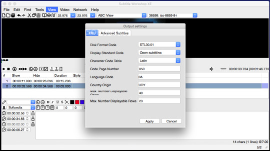
Your Complete Video Toolbox
Edit, enhance & personalize your MKV files
Versatile toolbox combines fix video metadata, GIF maker, cast video to TV, VR converter and screen recorder
Convert to 1000+ formats, like MKV, AVI, MOV, MP4, etc.
Convert to optimized preset for almost all of the devices
30X faster conversion speed than any conventional converters
Burn video to playable DVD with attractive free DVD template
Download or record videos from video sharing sites
Stream your videos from Windows or Mac to other devices, including Chromecast, Roku, Apple TV, Xbox 360 or PS3
Supported OS: Windows 10/8/7/XP/Vista, Mac OS 10.15 (Catalina), 10.14, 10.13, 10.12, 10.11, 10.10, 10.9, 10.8, 10.7, 10.6
Security Verified, 5,942,222 people have downloaded it
Wondershare UniConverter (Originally Wondershare Video Converter Ultimate) is available for both Windows and Mac users, which works perfectly with Windows 10/8/7/XP/Vista and Mac OS X 10.11 (El Capitan), 10.10, 10.9, 10.8, 10.7, 10.6. It's such an amazing tool to add subtitles to MKV that also permits video editing to your preferred adjustments and converts MKV to other 150+ output format for playback.
Step-by-Step Guide to Add Subtitles to MKV on Mac
The steps indicated below shows the procedure for using the Mac version to add subtitles to your MKV video.
Step 1 Import MKV Videos.
Run Wondershare UniConverter (originally Wondershare Video Converter Ultimate), and import your MKV files to the program. You can import files by dragging them and dropping them into the primary window. Alternatively, you can navigate to the top left side of the primary window and click the +Add Files. From there you can locate your MKV file from a browse window that will popup.
Step 2 Add Subtitle to MKV Video.
After you have successfully imported the MKV video that you want to insert the subtitles, click the icon as below to go to the editing window. Go to the top menu and then click the Subtitle tab. From there, you can load the subtitle you want to use such as the SRT, SSA, and ASS using the Triangle button.
Once the subtitle is loaded, you can see it on the MKV video. A preset style will be used by default. You can also customize the color, font, position, size, transparency and any other setting that you want to change in your subtitle. Once you finish making the changes, click the Save button to confirm the settings.
Step 3 Choose MKV output format.
You can stick the subtitle permanently to your MKV video. Just go to the Convert all tasks to and choose the MKV as your output format from the drop-down list. You can also select a device to save your MKV video and play in it directly. Such devices include iPhone, iPad, iPod, and Android smartphone.
Step 4 Start the MKV conversion.
When you have followed all the necessary steps, you can now click the Convert All button to begin the conversion. Once the process is complete, the subtitles will be exported permanently to the specified video format in the Converted section.
Part 2. Add Subtitle to MKV via Apowersoft Video Converter Studio
Apowersoft Video Converter Studio supports the addition of subtitles to MKV videos and allows for various subtitle formats such as SSA, STR, and ASS. The detailed steps are as follows.
Step 1: Install and run the Apowersoft Video Converter Studio on your PC.
Step 2: Add the MKV files by clicking the Add Files button.
Step 3: Edit your MKV video by clicking the Edit button, which will take you to an editing window.
Step 4: Hit the Subtitle icon to add your desired subtitles to MKV video.
Step 5: You can make some adjustments to the added subtitle. For instance, you can change the height, color, position and font.
Step 6: After you comfortable with the settings, you just need to click the OK button.
Step 7: Lastly you can click the ConvertKsp mod manager for mac. button to save the MKV videos with the subtitles.
After trying both tools to add subtitles to MKV video, we noticed that Wondershare UniConverter (originally Wondershare Video Converter Ultimate) works better as it ensures that the subtitles are added permanently without corrupting the quality of the video, whereas Apowersoft interferes with the quality of the final file.
Nothing will ruin a movie quicker than terrible subtitles. They could be totally out of sync or badly translated. Luckily, there is software out there to correct subtitles, such as Subtitle Workshop. If you are keen to edit subtitles, either as an act of personal heroism to share with fellow viewers, or perhaps as part of your job as a translator, editor or sound engineer, then you may already be familiar with this program. It is a nifty application that allows you to edit and create subtitles online. Given the increasing access to quality foreign language films and TV series, this could be a great tool.
Sterling subtitle software for beginners
The ultimate subtitle software for beginners and professionals
Subtitle Workshop is a cross-platform and open-source program for editing, creating and converting subtitles. When it comes to quick, easy and ultra-effective subtitle software, this program is pretty hard to beat. It runs on over 60 platforms, it is highly customizable and best of all, it has an exceptional Preview Mode. According to the developer it has an 'intuitive interface' and 'must have features'. They will say that though! Does it live up to the hype? We’ll take you through some of the highs and look for the lows of this software, to see if it is the best subtitle program for you.
First of all the technology itself. The latest version (SubtitleAPI version 1.05) supports around 56 formats for subtitling, and it can handle both time and frame-based text. You are behind the controls of the timing, thanks to the feature allowing you to upload plain text files. Formats including DVDSubtitle, SAMI, Sonic Scenarist, SubStation Alpha, SubViewer 1 & 2 and TMPlayer are supported. You can read and write various styles and fonts (Wingdings being a possible exception!) so you can have fun and personalize your subtitles.
Subtitle Workshop is known for its famously friendly and intuitive user interface. It was certainly a breeze to install and the in-built features are clear and easy to navigate. If you need to hone in on getting that accurate dialogue and correct spelling, then the Translator Mode gives you spell check with Microsoft Word’s engine (you will need to have Word installed) and you can toggle the 'Insert' and 'Delete' keys for speedy subtitle correcting.
Download Subtitles For Free
If you want to check your progress, simply fire up the Preview Mode, a great feature rare in these programs. In this mode, you can customize the subtitles down to the last 't' – choose the color, perfect the position and even the width of the shadow of the subtitles.
The stylistic corrections are made smooth by the powerful settings. Keep your edits a different color or font style to mark your changes. Browse the configurations and make your editing a walk in the park with the customizable automated checks. In a nutshell, this software will let you tailor make your subtitles down to the spacing, position, color font and more. It is simple, powerful and free. What is there not to like?
At the time of writing, Subtitle Workshop will not allow you to edit Chinese, Japanese or Korean subtitles (although Arabic has now been added).
Where can you run this program?
Subtitle Workshop is a cross-platform software. It is primarily used for Windows. With the trend towards mobile there is talk of developing a version for iOS and Android smartphones but this is still in the pipeline. As for the formats supported by Subtitle Workshop, it has to be handed to them that outside of the mega expensive programs used by companies this all-in-one package supports an impressive 60 plus subtitle formats.
Is there a better alternative?
While Subtitle Workshop is one of the best known and best-loved apps for efficient, highly configurable and (intuitive) editing, it is not the best. For lightning fast processing and feature-rich subtitle tools for your armory, then check out MovieCaptioner and FinalSub. They both have a commercial license, they run on Windows and MacOS and each one supports a variety of formats. Be prepared to pay the price however, these professional programs don’t come cheap. For budget alternatives, Oona Tools can be used for outsourcing your subtitles and translations for both professional and personal use. For a totally free option, check out fellow freeware N!kse.se Subtitle Edit. This is basically just like Subtitle Workshop but with more enhanced and complex features. Aegisub and Sublight also deserve honorable mentions.
Our take
With the giants of Netflix and others dominating our living rooms, unwinding in front of a movie or TV series is becoming a pretty cherished part of the evening. With access to cinema from around the world, bad subtitles are holding us back from some epic foreign language options. With Subtitle Workshop you can take ownership of the subtitles yourself. Creating subtitles is made easy, thanks to the automated timing corrections, in-built spell checker and the highly useful preview mode. Whether you are looking for software for personal or professional use, this is a great program for creating bespoke subtitles in a stream-lined and intuitive interface. Plus, you can share them with the world afterwards.
Should you download it?
Subtitle Workshop For Mac


Subtitle Workshop 6
Yes. If you are looking to create or edit subtitles for video, then Subtitle Workshop is a fantastic and comprehensive program. The controls are easy to use, and the user manual is a great guide for beginners. Professionals needing more complex features should look at alternatives like Subtitle Edit, but for the simple subtitle creation, this ticks all the boxes. Go ahead and download it and see for yourself.
6.0a
2 notes
·
View notes
Text
How to Create a Coloring Book in CANVA | Earn $2000 Monthly by Creating Coloring Books with CANVA

**HTML Headings** In today's tutorial: Creating a Heat Coloring Book in 3 Simple Steps and Earning $2,000 to $5,000 per Month Step 1: Creating the Image for the Coloring Book Using Leonardo AI First, we'll start by creating the image for the coloring book. I'll be using Leonardo AI, a free software. To access the dashboard, go to the Leonard website (link provided in the description) and create an account using your Gmail or email account. Once you've created an account, click on the "Launch App" button to access the dashboard. On the left-hand side of the dashboard, you'll find the "Image Generation" option. I have tried different prompts, but the best result came from a specific prompt that I'll include in the description. You'll need to keep the entire prompt the same, except for the main character. Feel free to change it to anything you want. Leave the negative prompt unchanged. After making the necessary changes, go to the "Finetuned Model" section. Among the different finetuned models, I found that Leonardo Diffusion Excel gave me the best results. On the left-hand side, you can choose up to four images. I'm choosing two here. Make sure "Alchemy Dogle" is turned on and select an aspect ratio of 3:4. Finally, click on the "Generate" button. If you're satisfied with any of the generated images, you can use the "Smooth Upscaling" option to enhance the image quality. Note that this option requires 5 to 8 tokens. Once the image is upscaled, you can download it by clicking on the "Download Image" option. Step 2: Creating the Coloring Page Using Leonardo AI Next, we'll move on to creating the black and white sketch for the coloring page. Again, I have tried multiple prompts, but the best result came from a specific prompt that I'll provide in the description. Paste the chosen prompt and make sure the aspect ratio remains the same (3:4). Out of the different results obtained from trying various prompts, select the image that looks most satisfactory to you. You can upscale the image from the Leonardo AI platform and download it according to the instructions provided earlier. Step 3: Designing the Book Cover and Interior Illustrations Using Canva Now, we'll design the book cover and interior illustrations. To begin, we need to register with Amazon KDP, so click on the provided link and create a KDP account using your name, email ID, and password. After agreeing to the terms and conditions, navigate to the "Help" section and select "Format Your Paperback." In the "Cover Template" option, choose "Paperback," "Black and White," and "White Paper." Set the dimensions to 8.5 inches for width and 11 inches for trim height. Enter a minimum of 24 pages, but it can be more if you prefer. Click on "Calculate" and download the template. To create the book cover, we'll use Canva. If you don't have a Canva Pro subscription, use the link provided in the description to get a free 30-day trial. Once you're on Canva's website, go to "Custom Size" and enter the dimensions 17.43 by 11.25 inches for the cover. Upload the template file that you downloaded from Amazon KDP. In the "Elements" section, select a shape and place it on the cover to frame the design. Adjust the shape's position to cover the desired area. To enhance the image, go to the "Edit" section and apply a filter or make further adjustments using the available options. To add text to the cover, go to the "Text" section and choose a suitable font. You can either use the provided Carson Script font or explore free Disney fonts available on fonts.com. If necessary, upload a font by selecting the "Upload Font" option. To add a Disney princess or other relevant illustrations, use the "Edit Photo" and "Magic Grab" features, if available. Adjust the position of the illustrations and use the "Color" section to modify their appearance. You can also add additional elements to enhance the design. Once the cover design is complete, save the file as a PDF by going to the "Share" option, selecting "Download," and choosing the PDF print format. Now, let's move on to creating the interior illustrations. For the interior illustrations, set the custom size to 8.625 by 11.25 inches and create a new design. Import the previously created designs and position them on the pages. Apply filters and adjustments, if desired, to improve the quality of the illustrations. Save the interior illustrations as a PDF by following the same steps as before. Congratulations! The design process for the heating coloring book is now complete. To publish the book on Amazon KDP, please refer to the official Amazon website for a detailed step-by-step guide. Publishing a book on Amazon KDP involves a series of simple five processes that you need to complete. Now, let's explore an additional way to monetize your skills and earn more from creating coloring books. Many companies outsource the creation of coloring books because they lack the time and resources to do it themselves. By creating coloring books for other companies, you can generate income that can be further used to promote your own books on Amazon KDP. Platforms like Fiverr offer opportunities to sell your services as a book cover or interior illustration designer. Many sellers on Fiverr charge different prices based on the complexity of the designs and the number of pages required. By utilizing this trick, you can earn $2,000 to $5,000 per month by designing coloring books for other companies while also promoting your own books on Amazon KDP. If you're interested in learning about different AI models and tools, visit our website ww.wacpmedia.in. We offer a comprehensive course that covers various AI tools and techniques, and we currently have an early bird offer available. If you enjoyed this tutorial, please consider subscribing to my channel and giving this video a like. I would greatly appreciate it if you shared my content with your friends and family, helping me reach a wider audience. Stay tuned for future tutorials and stay safe. Thank you for your support! Thank you so much for taking the time to read this article. I genuinely appreciate your interest and support. If you enjoyed reading this article and would like to stay updated with similar content, I kindly request you to follow our blog. You can do so by subscribing to our email list, joining our Facebook fanpage, or subscribing to our YouTube channel. By doing so, you will never miss out on any valuable information, updates, or new articles that we share. Thank you again for your time, and I hope to connect with you through our blog's email list, Facebook fanpage, or YouTube channel. **Frequently Asked Questions:** **1. How can I create a Heats coloring book for free?** To create a Heats coloring book for free, you can follow the tutorial mentioned in the passage. It provides step-by-step instructions on using Leonardo AI and Canva to create the book. **2. How can I earn $2 to $5,000 per month using this trick?** The passage mentions that there are two different ways to earn money with this trick. One way is by publishing your own book on Amazon KDP and earning royalties from sales. The other way is by designing coloring books for other companies and charging a fee for your services. **3. Where can I find the necessary tools for creating a coloring book?** For image generation, you can use Leonardo AI, which is a free software. Canva can be used for designing the cover and interior illustrations. Links to these tools are provided in the description of the passage. **4. Do I need to have a paid license for using Canva commercially?** Yes, a paid license (Canva Pro) is required for using Canva commercially. However, the passage provides a link that offers a 30-day free trial of Canva Pro. **5. What are the steps to publish a book on Amazon KDP?** The passage mentions that publishing a book on Amazon KDP involves several steps. However, due to time constraints, the steps are not provided in the passage. Instead, a link to Amazon's official website is provided where you can find the step-by-step process for publishing a book on Amazon KDP. Read the full article
0 notes