#add neon lights in photoshop
Note
How do you get such pretty lighting in your photos? Is it relight? Would you ever do a mini tut? 🤞
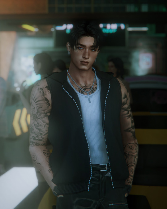
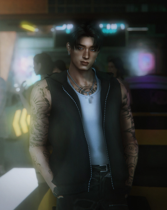
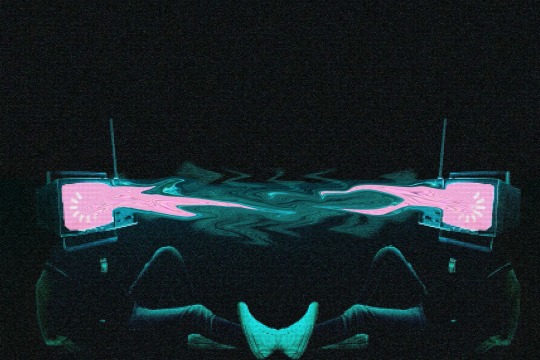
halloooo! i would say relight helps elevate the lighting a bunch, i do also utilize these lights (i find that ts4 neon lighting is missing vibrancy, so these are amazing!) as well as these (i love the shadow/spotlight one if i need to add in a harsh shadow to help make things look like flash photography in a dark room). i like to mess around with contrast and color mixer in camera raw filter (for photoshop however, reshade maybe gshade has a lightroom shader and that's awesome as well!) as for like a tutorial, i can give you some pointers!
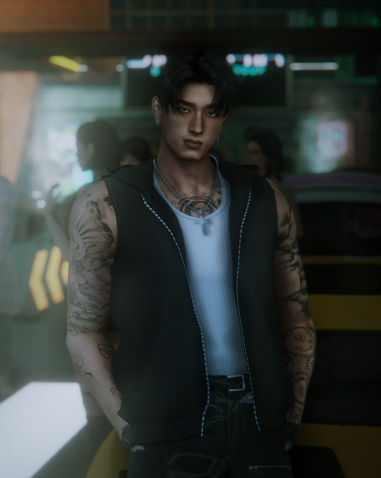
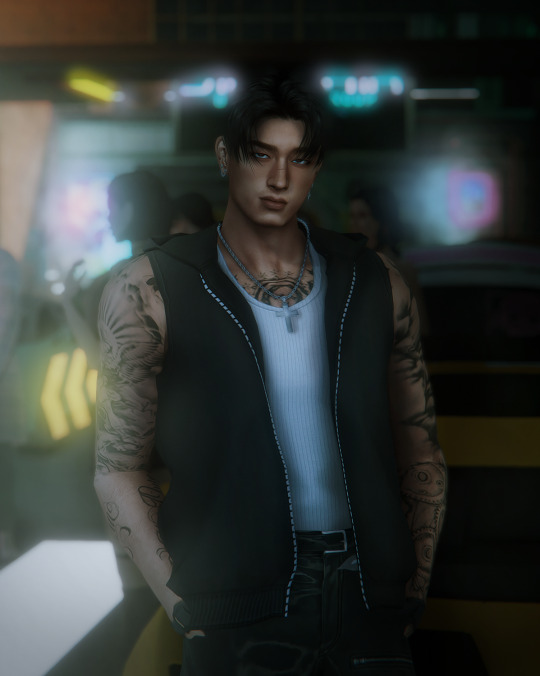
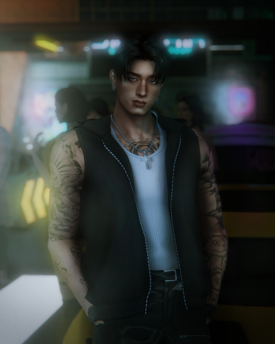
when working with relight, sometimes it helps a bunch to have a low-lit room, it seems a bit counterintuitive, but i find that the photo can get easily overexposed. (i show example below of photo before and after with relight). relight is sometimes a bit tricky because certain angles don't work well, like GAWD i was having trouble with one of the photos from the photoset yesterday, but i literally just moved the camera a little to the left and for some reason it worked ._. SO don't be afraid to try weird angles!
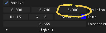
^ also this little dude, super awesome, move it adjust it a bunch to see what you like! as you can see, i set my intensity pretty high, a lot of the times i max it out if i can ._.

i wanted to add with relight, add it to the top of your order so you can avoid things looking murky/washed out!
LMAO sorry if this was all over the place, lighting is an extensive process for me sometimes, but i find that layering details is key. i do like to study lighting in cinematography and photography, i especially love street photographers that have like really cool photos with neon lighting! i find that this helps me have a better understanding too! :)
22 notes
·
View notes
Note
How do you get your lighting so scrumptious in edits?
Lighting tutorial under the cut (it's long lol) I use photoshop + topaz clean btw :)
This will be our starting pic!! I use @hazelminesims photoshop action (all in one) to get the smoothening and overall base done first.
First step to colograding is using the 'Camera Raw Filter' in photoshop and adjusting the tint and curves tools. I generally like a greener, more cool toned color for pictures.
2. Now for the shadows on the sim! I make a new layer, set to 'Multiply' and use a soft brush at around 25-40% opacity with the color Black. I generally will add shadows to the parts of the body that are being 'covered' (neck, side of the nose, forehead, insides of arms and clothes). *If you use reshade/ gshade and have the mxao filter on, mimic where that filter adds shadows and either enhance it or add it in photoshop!*

3. In a new 'Multiply' layer, I do the same thing with the background. I darken the elements in the back to emphasize that my sim is in the forefront of the shot. TIP: don't add shadow to the light sources (neon signs, lights in the background) ! We actually want to enhance those.
4. Make a new layer, set to 'Pin light' at 100%. Grab a soft brush and highlight those light sources in the back. You can go crazy here, just take the Eyedropper tool to color match the highlights you want to emphasize. It might look a bit much right now, but we can tone this down by decreasing the layer opacity, Gaussian blurring the layer, and erasing any excess highlights if we want.
5. Now we add highlights to the sim. I make a new layer, set to 'Soft light' at 100% opacity, and with the white color, I highlight the sims body and clothes. (Now we want to add light to the 'raised areas' such as the center of the forehead, nose bridge, chin, chest, and arms). I also like to highlight any jewelry (necklace and belt buckle).
On a separate new layer, set to 'Vivid Light', I changed the brush colors to the ones in the background light sources (I used blue, yellow, and purple.) I'll go over the outlines of the sim's body with these colors (shoulders and arms, hair, side of face and neck.)
If you ever feel like you've gone overboard, just lower the opacity of the highlight layers and Gaussian blur them!
6. After you've messed around with the highlights, add the finishing touches. Usually once I merged all the layers I would go over with the Dodge and Burn tools to enhance the contrasts even more. I also recommend downloading and using LUTs for photoshop (I just use any free ones I find online).
84 notes
·
View notes
Note
Hi, you would have more knowledge in this bc I’ve seen people say the color changes in LO are a result of the books being printed in CMYK and Rachel is trying to avoid the misprint colors in later editions, but that can’t be right, right? that feels like giving her more credit that she’s actually due. Bc the books are now post the colors changing to the current neon and they still look bad in print. Is there any actual reason for the colors getting this way, or is it really just laziness?
potential bonus question: what art tips would you give to achieve that early LO look, with the texture and lights and all that? Love Lore Rekindled btw <3
Honestly, I really don't think it has to do with the books. I think some of it does have to do with the TV show deal (like they're trying to give it a cleaner 'animated' look) but when it comes to the books, most of its issues is less of the color expression and more just the composition of panels. I mean, it's kind of a given considering how big of a pain in the ass it is to turn a vertical webtoon into a print book (which is why it's kind of bitter irony now that Webtoons is turning back on their whole "phone format is the future" mantra from way back when when they realized they weren't making any money off that LOL) but man you can tell they're struggling to just make the books work.
When it comes to the actual oversaturation of colors over the course of the series, I feel like it comes down to several other things that aren't related to the books:
1.) Rachel's stated in interviews that she got criticism (pointless criticism from non-fans I'll add) about how the colors were 'too bright' back in LO, so she went "nah make them BRIGHTER" as a way to get back at those critics. Which is just absurd because it's resulted in her shooting herself in the foot with uglier art that's turning off even the fans.
2.) She and her assistants aren't unified across software. Some panels are drawn in Clip Studio, some are drawn in Procreate, some in Photoshop, it's a mess. And the real kicker is that all of these software have different color bitrates so some of them literally don't have as many colors as others (ex. Clip Studio is able to express about 16 million different colors, vs. Photoshop which can express up to 281 trillion, which is obv WAY better for print, but meanwhile Rachel can be seen working in both Procreate and Clip Studio).
3.) Rachel doesn't have her assistants using a shared color palette. They're literally just eyedropping colors. You may as well be playing a game of telephone at that point, where the original message gets more and more twisted as its passed down the line, but in this case, it's with colors (which is especially problematic when you're eyedropping panels that haver texture overlays which will automatically distort the colors, AND when you're using multiple different software which come with different color bitrates). That one definitely falls under laziness IMO.
All of this is VERY silly to me btw because Rachel started off with Photoshop, like I'm fairly certain most of her work prior to LO was done with Photoshop. Clip Studio is the generally recommended software for people making webcomics as it comes with way more support for them (such as panel rulers and speech bubble pens) but it doesn't have the same color expression that Photoshop does which I feel would be way more beneficial for LO, it's not like it's working with the same color palettes that most traditional webtoons using CSP are using.
But a lot of it is also Rachel just shooting herself in the foot by not maintaining any sort of consistency between herself and her teammates. Which is even MORE absurd because Clip Studio LITERALLY comes with teamwork support, I use it with Banshriek on Rekindled where we can literally share files, with the addition of a Google Drive folder we can both access that has files for color palettes, references, model sheets, etc. and with none of the incompatibility issues of working between two different software because we both use CSP and know how to use it.
To answer your bonus question as simply as I can, the biggest thing I've found with trying to replicate that old LO style is just... not caring, if that makes sense LOL like I've recreated multiple of Rachel's old panels just for the sake of research and I've learned that she REALLY didn't know what she was doing back then, there's NEVER been consistency in LO but back in S1 it was obvious she actually still cared. So when it comes to recreating that style, it's sort of difficult to pin it down to any one "method" because she really has none, she just treats every panel as its own individual painting (esp back in S1).
So get loose, don't be too strict on yourself (like I am, sigh) and mess around with gouache brushes, they're definitely her go-to. Prioritize lineart in places where shadows would cast (such as under the neck, limb bends, etc.) and then in post-production, slap a canvas texture on top.
I can definitely give a more in-depth tutorial at some point, but again, it's REALLY difficult to perfectly mimic her 'style' because it relied on her winging it every time without any real standardization LOL Which makes it tricky because I'm someone who REALLY relies on that standardization, so even I still look at Rekindled art and go "yeah, it's nice, but it's not LO" because I'm following too many 'rules'. People seem to like it anyways tho, so I'm not gonna go feeling bad over it LOL
#lore olympus critical#lo critical#antiloreolympus#anti lore olympus#ama#ask me anything#anon ask me anything#anon ama#lore rekindled#lore rekindled comic
46 notes
·
View notes
Note
I've been trying to make recolors of the Plutonium Rod neon - would you be willing to share your PSD/template if you have it? If not, no worries.
I didn't use a PSD but I can walk you through it real quick
I used Dot's white recolor as a base, you can get it here.
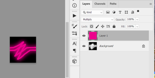
Extract the textures, there are 3: Lit, Unlit, and Glow. Open each in Photoshop, add a new transparent layer and set it to Multiply in the dropdown on the right, then just colorfill the new layer
I can't wait to see your recolors, it's always nice to have more options for this light!
15 notes
·
View notes
Note
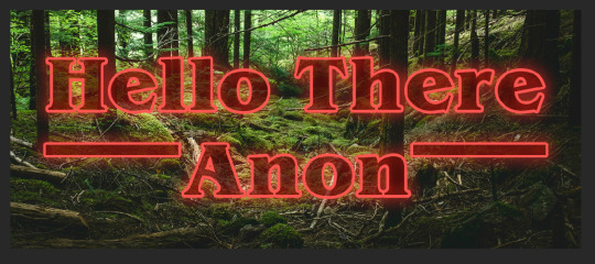
Okay, the real question is HOW did you get the ‘Inside Out’ Title to look like the Stranger Things title???
Oh for sure! 💕 Well, the easiest way is to go to this site and type in whatever you want. This works if you just want text on a blue background, the way I have it in my chapter snippets. But you might be looking to put it over your own image or edit, like my story cover. If you're looking to do it in Photoshop, it's a little more involved.
Quick tutorial under the cut!
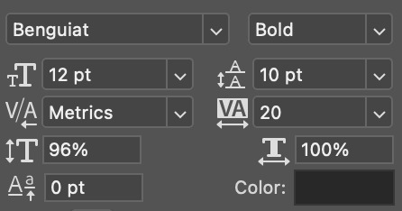
So this will take a couple different layers. First thing you’ll need is the Stranger Things font, which is called Benguiat. I’m pretty sure it’s free with Adobe, and they even use a Stranger Things background as one of the examples. You want the font to be black to start.
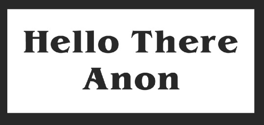
Generally, you want to put the longer text on top and then shorter text centered on the bottom. Once you’re happy with your text, you’re gonna add the two rectangles on either side, also in black.
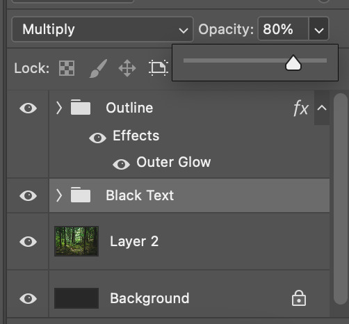
At this point, I suggest compiling them into one group. Then you want to duplicate that group, retitle it something that will make sense to your brain, and then turn the original folder off for now. (Don’t delete it just yet.)
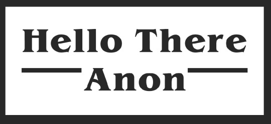
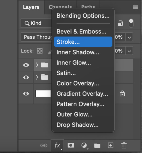
The next thing you want to do is add a stroke effect to the layer. (If you haven’t used it before, you’ll see this menu pop up when you click the “fx” icon under your layer column.) You’ll want to do this on each individual layer. You can adjust the stroke width and color to your liking depending on your psd. Because of the way neon lights work, I generally go for a dark, saturated pink rather than a pure saturated red, but that’s entirely up to you.
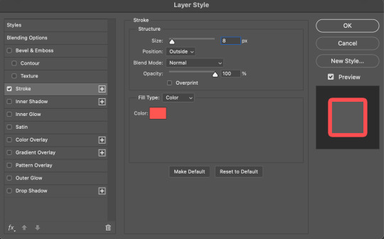
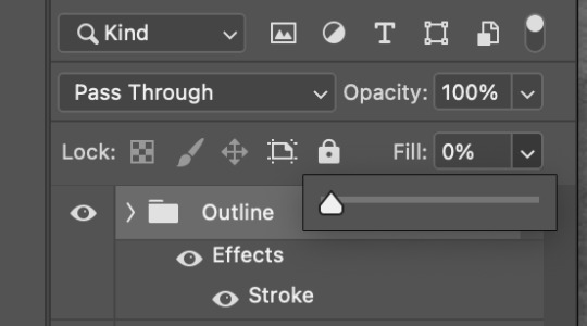
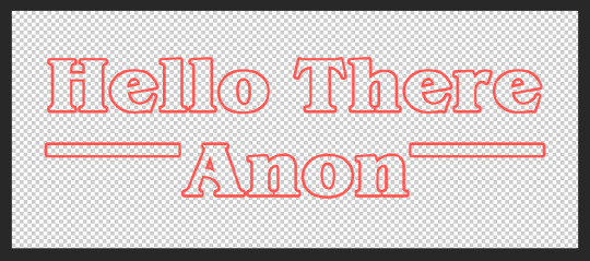
Next, go to the sidebar and bring the fill of each layer down to 0%. The fill, not the opacity. The opacity will affect the layer as a whole, while the fill will only affect the data in the layer, not the effects added to it. Once you have the fill of all layers ay 0% and your initial group turned off, you should be left with just the red outline of your graphic.
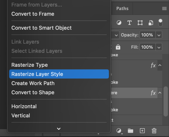
The next thing you’re going to do is rasterize each of your working layers. Basically, Photoshop is focused on the pixels inside the letters, and is adding some pixels to outline it. By rasterizing the layer, we tell Photoshop just to focus on those outlining pixels.
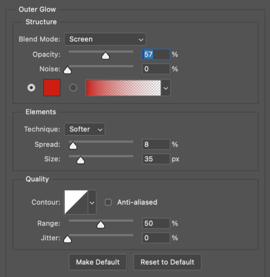
If you haven’t already, now is a good time to put your working layers into one folder. Once you have them all together, we’re going to to back to the layer style tab on the bottom and select outer glow.
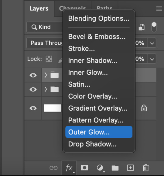
Because we rasterized the layer, the glow will show up on both sides of the outline. If you haven’t rasterized the layer, you’ll only see the glowing effect on the outside of the letters.
This is a menu that you might just want to play around with. Photoshop has some built in color gradients to mimic neon colored lights, or you can just use one solid color like pure red. You’ll be able to set the size, spread, and opacity, and then I also suggest playing around with your blend mode. Depending on what kind of background you’re working on, different things might look best. I usually go with either “Screen” or “Hard Light” depending on how harsh I want the color to look.
So at this point, you could pretty much stop, if you’re looking for either a transparent png or a solid color background. But a lot of us are using this for story covers and edits and the like, in which case you probably have a more complicated background.
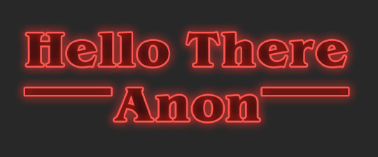
If you’re adding a photo to the back, or you already have one that’s there, I’d suggest turning on the original group of shapes that you made in black, which should be under the neon effect. Change the blend mode to Multiply and then play with the opacity until you’re happy. This will help the words pop without getting lost in the detail of your background image.
And that’s about all I’ve got! I hope this was helpful and made sense. I don’t consider myself to be a PS expert, so there might well be an easier way to do this, but this is what I’ve got haha.
35 notes
·
View notes
Photo
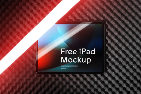
Free iPad Pro Mockup
Customize every detail, including neon lights and background. Add your design in seconds in Photoshop or an online editor on our website.
⚡️ Download Freebie
#brand#branding#mockup#mockupcloud#free#stationery#identity#freebie#mockup cloud#template#showcase#print#psd#download#inspiration#portfolio#cards#envelope#graphics#assets#scene#paper#advertising#creative#business card#texture#ipad#UI UX
4 notes
·
View notes
Text
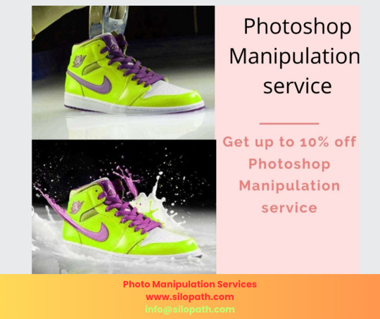
What is creative photo manipulation?
Photo manipulation entails digitally modifying photographs to create innovative images that appear realistic. With modern software, dramatic manipulation can be achieved by imaginatively blending, reconstructing and embellishing photo elements.
The article below defines creative Photo Manipulation Services and explores their popular techniques, uses, and advantages:
Defining Creative Photo Manipulation Creative photo manipulation implies digitally altering an existing photo to represent a fictional scene and story that depicts something novel, innovative, and visually fascinating. It involves combining and transforming various photographic elements to conjure up new composites that stimulate viewers’ emotions and intrigue their senses.
Manipulating with Photoshop and other editing software includes imaginatively modifying colors, shapes, lighting, backgrounds, textures and more that were missing from the source material to build a stunning final composition. The creative license enables creating scenes that are surreal, dramatic, dreamy or even whimsical in essence.
Common Manipulation Techniques
Various clever techniques come into play for transforming photos during creative manipulation processes. These include:
Blending - Seamlessly merging elements like subjects, textures, objects, backgrounds etc. from multiple photo sources to appear as one cohesive realistic final image. Effective for compositing a scene that did not originally exist.
Compositing -Strategically assembling components photographed separately like models, products, environments etc. into a single image studio shot. Allows setting up shots and subjects dynamically for endless combinations.
Retouching -Digitally smoothening or editing visuals to look strikingly enhanced e.g removing wrinkles, whitening teeth, shaping features, intensifying colors etc. Great for getting flawless subjects.
Lighting Effects -Intensifying image dynamism using lens flares, light leaks, neon Signs, sparkles, bokeh, etc. Adds palpable mood, depth, and vibrance.
Text / Graphics Integration - Embedding eye-catching typography designs, stickers, logos, icons, etc. to amplify context or emotions within the photo narrative.
Double Exposure -Blending overlapping imagery with varying transparency levels for captivating visual impact. Creates intriguing artsy representations.
Mirror Effects - Introducing kaleidoscopic reflections or symmetrical dual imagery for added depth and surrealism.
Background Modification -Substituting backgrounds completely using cutouts to change scenery context e.g. drab office interior to vibrant beach sunset.
Assembling Elements -Throwing together eclectic objects like aquatic elements, cosmic objects, futuristic components, etc. photographed individually that would be impossible to capture live in one shot. This allows the creation of abstract sci-fi or fantasy scenes.
Popular Uses of Creative Photo Manipulation Creative photo manipulation enables endless possibilities for building visually stimulating graphics with the following and more uses:
Surreal Artwork - Blending disparate elements into modern digital art pieces with strong emotional appeal.
Conceptual Photography - Communicating stories and symbolism beyond technical limitations of the camera. Conveying intangible ideas through photo composites.
Fantasy Illustration - Crafting majestic scenes with ethereal qualities beyond the mundane real world for magazine covers, movie posters, album art etc.
Product Marketing - Composite assembling showcasing branded items in aspirational settings e.g luxury watch ad with island resort background.
Fashion / Glamour Photography - Creatively transform photos to convey latest trends through retouching tools like face-shaping, relighting, filters etc.
Special Effects - Add paranormal touches like ghosts, UFOs, demons etc. integrated seamlessly into original shots using clever selection and masking.
Matte Painting - Digitally illustrate stunning environmental concepts, landscapes or backdrops that would be expensive or impossible to physically construct on live sets.
Advantages of Creative Photo Manipulation Creative digital manipulation offers even amateur photographers unlimited potential for achieving professional vision and aesthetics through the following merits:
Complete Creative Freedom – Manipulate all image aspects from colors, shapes, placement uncompromised by physical constraints unlike live shoots.
Budget Friendliness - Save extensively on expensive equipment rentals, crew hiring, location costs etc. required for elaborate natural set ups.
Time Savings - Easily test creative ideas and iterate quickly rather than invest hours building intricate backgrounds or sets for one shot.
Limitless Options- Endless choices for graphics elements allows persistently elevating concepts instead of being limited by finite physical resources.
Post Production Control - Continually refine the image after principal photography as opposed to relying entirely on in-camera capture skills.
Conclusion
As evident, creative photo manipulation offers exciting possibilities for photographers to materialize fantastic visions leveraging imaging software’s extensive tools. With practice, anyone can transport viewers to surreal realms and experiences transcending mundane reality through innovative composites and visual storytelling. So unlock unique potential for translating imagination into striking graphics via these versatile techniques!
#photoediting#carphotoediting#image clipping service#clipping path company#clippingpathservice#photoeditcompany#graphic design#graphic design services gold coast#photoshop#photoshop edit#photographer#design#art#retouching#RetouchUP
0 notes
Text
youtube
📺 Kaleidoscope Visuals Short Cinematic Music Emotional Symphonic Orchestra Strings Ambient Neon Lights
Digital kaleidoscope art is a unique and beautiful art form that is sure to capture the imagination of viewers.
It is a great way to add a touch of whimsy and magic to any space, and it can also be used to relax and de-stress.
Digital kaleidoscope art is a relatively new art form, but it has quickly become popular due to its unique and visually appealing style.
It can be created using a variety of different software programs, but some of the most popular include Adobe Photoshop, GIMP, and Kaleidoscope Painter.
#symphonic music#orchestra#string music#cinematic music#emotional music#youtube video#Youtube#kaleidoscopeart#kaleidoscope#kaleidoscopevisuals#kaleidoscope visuals#万華鏡#symmetricart#art#abstractart#kaleidoscope art video#motion graphic#symmetry art#abstract#digital art#kaleidoscope video#art video#video art#motion graphics#kaleidoscope image#kaleidoscope images#music#music video#video#kaleidoscope with music
1 note
·
View note
Text
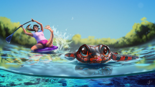
Nostalgia and Memory
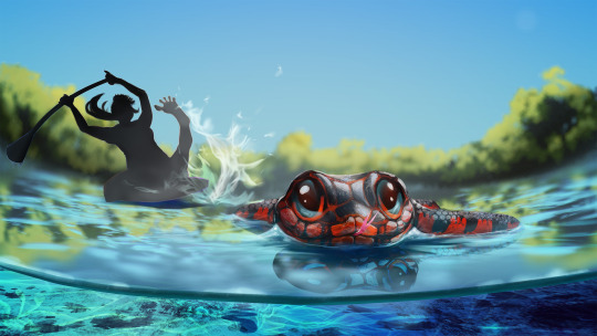
Final
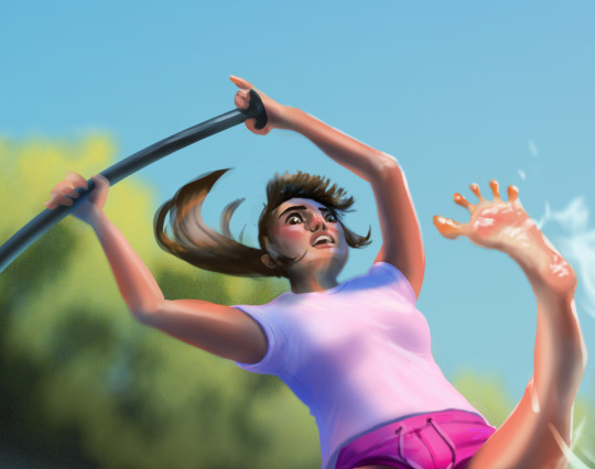
I wanted to choose a positive memory for this piece from a holiday adventure to Crystal River in Florida. I have a fear of snakes and my encounter with this particular mud snake helped overcome that a little. I was paddling along the river, my partner and our tour guide further upstream, when a large black and vivid red snake passed close to my leg. I immediately thought of the age-old advice that brightly coloured creatures are often poisonous, which I learned was mostly false when I frantically researched it later. I stayed perfectly still in my panic, but as the snake passed, I noticed that it was happily minding its own business, just going about its day quite confidently and happy to share the space with a large floating biped. Still, when the snake had passed a safe distance, I hurriedly took my legs from the water just in case anything else crept up on me.
Research
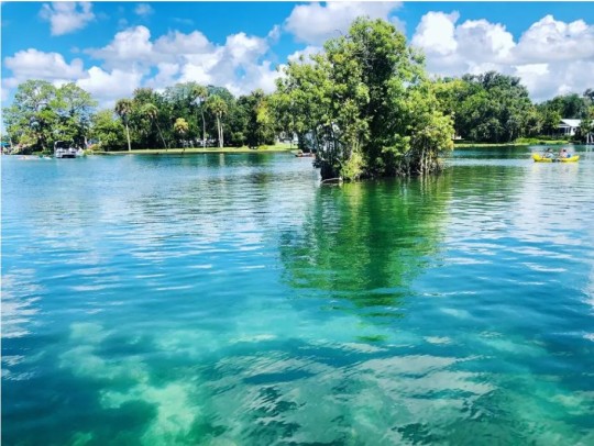
Crystal river is a fresh water river with stunningly clear waters that wouldn't feel out of place in the Caribbean. I wanted to capture the colour and clarity of the water in my piece. The colour itself lends to the welcoming and holidaying vibe of this memory.
I chose emulate Disney/Pixar rendering and colour style for this memory as memory doesn't always appear in the mind as realistic, and Pixar has a marvelous and very scientific way of eliciting emotion through its colour use (ROGERS, 2021). Most of the Pixar colours seem to be neon pastels, this style gives space for capturing the colours of crystal river and even enhancing them as memory can.
Examples of Pixar pallets:


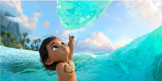
In Moana, the neon color of the water entity enhances the feeling of wonder and magic.
My memory does not accurately recall details, for example, when I think back to that event, I do not see the Smaug-like eyes of the snake pictured below, but rather a more caricature version where the snake has cute shiny, button eyes. Pixar has a wonderful stylisation of real life that will lend to the feelings I'm trying to convey.
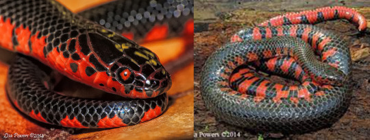
I wanted to be accurate in my colours when presenting the snake, but also stylise its features to come across as cute, confident, and oblivious to the alarm it caused!

A key style cue for Pixar animals is large eyes that don't seem to anatomically fit in the head, bright colours, expressive eyebrows and a big smile.
Process
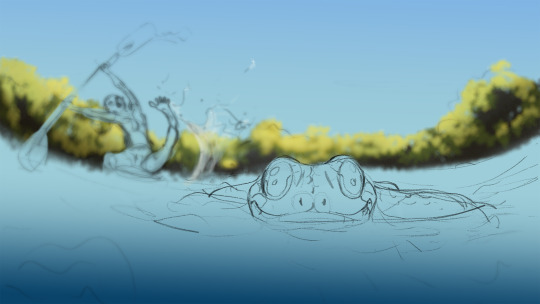
As I began my rough thumbnail sketching, I was struggling to show the snakes face, which would need to be a key focal feature in order to show his cuteness. I realised that I needed to for-go the strict recollection form the first person and adjust the angle to make it all about the snake, but still capturing the aftermath of his passage. I tried a lower angle with a wide-angle lens distortion to capture the micro-elements. The distorted curve helped add drama and a dynamic flair to a simple composition.

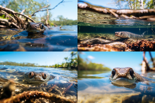
As I was pleased with the direction, and to get a more relevant photo-reference, used the prompt: "looking down at a very cute mud snake swimming ontop of the crystal river in florida with depth-of-field mangrove roots in the background and blue water underneath. --ar 3:2". This was a great realistic reference for rendering.
I had chosen to go with a depth of field with a shallow focal range, this meant most of my assets would be blurred. I was able to work quickly and efficiently by using Photoshop's powerful blurring filters to achieve a realistic result.

After roughly painting out the forms with a foliage brush, I ran it through the Lens Blur filter in Photoshop.
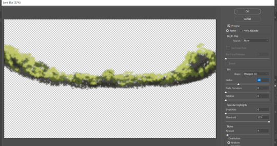
I also used a Photoshop filter to blur the undulating water effects which were painted using a water specular concept brush. To match the shallow depth of field, I used the Tilt Shift blur filter which lets you control the depth of field (1), focal range (2), and focal point (3).

I duplicated the water effect layer twice to create the light refraction. The first layer is the primary layer that shows the colour of the water beneath the surface. The second layer is a deeper and darker blue moved just a couple of pixels above to create a core shadow, and the third layer, in white, moved just a couple of pixels above the last, creates the specular. I adjusted the opacity of each until accurate.

Crystal River underwater reference image:

The water beneath the surface was relatively easy to achieve with a pretty realistic result. The most valuable players being the rocky textured brush and the perspective transformation tool.
In image one I created the water line against the lens and painted in the vibrant colours that captured the Crystal River.
In image 2 I used the texture of the brush to add in some debris and then manipulated it into perspective.
In image three I used another concept brush for ground rocks.
In image 4 I used a rectangular brush with fall-off to create the caustics, which I also warped into perspective. The shadow of the snake helps emphasise its length and size and the trail of caustics is a cute detail to show motion.

I wanted to spend time detailing the caricature of myself even though it was going to be blurred. I wanted to capture the fear in my eyes and have my focus be on the snake. Sadly, I think this feature is a little lost, but if this were to be animated, a change in focus, or a close-up of the character's face would help sell the emotion beyond the large movement of the limbs. The splayed toes are another cue to the emotion which I think is pretty cute and funny.
I wanted to have more control of how the character was blurred, so I created a depth map where pale is foreground and dark is further away, this would have to be inverted later to be applied using the Photoshop filter.
The filter requires the depth map to be applied as a layer mask (unlined or later deleted so opacity is not affected). I copied the depth map and pasted is directly in situ into the layer mask (alt+lft click to select) and inverted the entire layer.
In the Lens Blur filter, I selected "Layer Mask" as the source for my depth map and adjusted the sliders to where I was happy with the blur amount.

It was a little late, but because my assets were painted independently to the rest of the scene, I was able to move the character and snake into positions better suited to the composition.
I am really pleased with the way this piece turned out, the colours and characters match the style I decided to pursue. The main critique from my peer review, on which I agree, is the movement of the character; pushing the dynamic element of the pose and positioning. I struggled a little with the angle of the person, and the movement seems to create some confusion as to whether this person is falling in the water or dramatically pulling their leg from it, I will need to work on the clarity of my story telling!
References:
ROGERS, A. (2021). How Pixar Uses Hyper-Colors to Hack Your Brain. [Online]. Wired. Available at: https://www.wired.com/story/how-pixar-uses-hyper-colors-to-hack-your-brain/ [Accessed 25 October 2023].
Image References:
DISNEY. (2016). Moana. [Photograph]. Burbank: The Walt Disney Company.
GRANT, C., SAUNDERS, M. (2023). Waterways of Crystal River, Florida. [Photograph]. [Online]. Available at: https://www.outsideonline.com/adventure-travel/destinations/north-america/explore-the-waterways-of-crystal-river-florida/ [Accessed 25 October 2023]
MIDJOURNEY, (2023). Looking down at a very cute mud snake swimming ontop of the crystal river in florida with depth-of-field mangrove roots in the background and blue water underneath. --ar 3:2. [AI Generated Photo].
PIXAR. (2016). Finding Dory. [Photograph]. Burbank: The Walt Disney Company.
POWERS, L. (2014). Red-bellied Mudsnake 01. [Photograph]. [Online]. Available at: https://kysnakes.ca.uky.edu/snake/farancia-abacura [Accessed 25 October 2023].
POWERS, L. (2014). Red-bellied Mudsnake 04. [Photograph]. [Online]. Available at: https://kysnakes.ca.uky.edu/snake/farancia-abacura [Accessed 25 October 2023].
QUALITY LOGO PRODUCTS BLOG. (2023). 8 Color Schemes from the Pixar Universe. [Online]. Quality Logo Products. Available at: https://www.qualitylogoproducts.com/blog/pixar-color-schemes/ [Accessed 25 October 2023].
WAKE AND WANDER MEDIA. (2020). Crystal River, Florida. [Photograph]. [Online]. Available at: https://www.forbes.com/sites/willmcgough/2020/08/20/road-trip-florida-5-insider-tips-for-visiting-crystal-river/ [Accessed 25 October 2023]
0 notes
Text
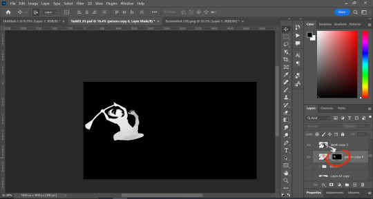
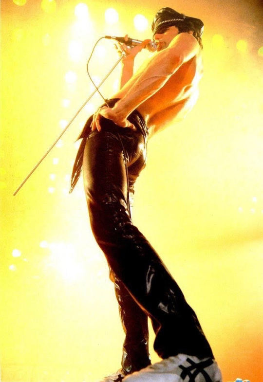
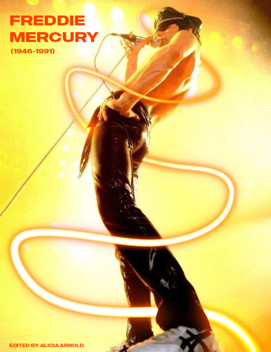
Neon Light Effect in Photoshop?! ✨🪄
I scrolled on YouTube for some time looking for something to practice in Photoshop when I came across a neon light effect!! It immediately caught my eye. Since the video was so short, I wanted to try something new and different. So, as a tribute to my favorite music artist, Freddie Mercury, I utilized this tutorial and edited a picture of him. Honestly, I got carried away and strayed from the tutorial quite a bit... One of the big noticeable things I did was add line weight to the neon tube by checking the "Simulate Pressure" box when you go to create the tube from Pen selection. Then I just added text & some blur. This was a fun & easy tutorial to follow, I recommend this to everyone just starting Photoshop!
RIP Freddie Mercury ❤️
Neon Light Effect Video:
youtube
0 notes
Text
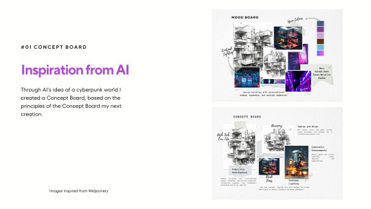
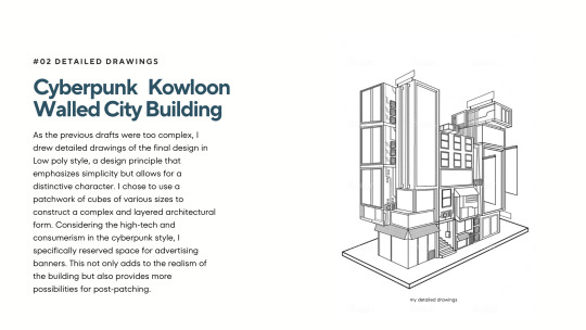
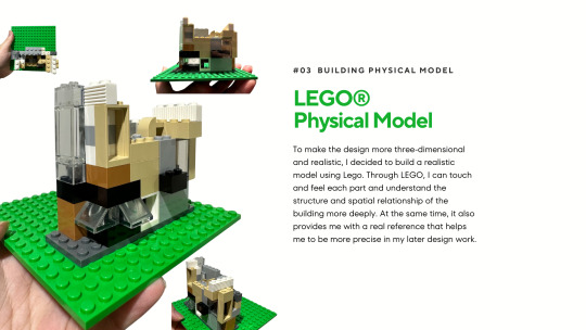
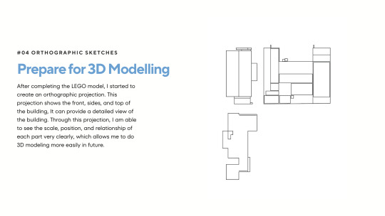
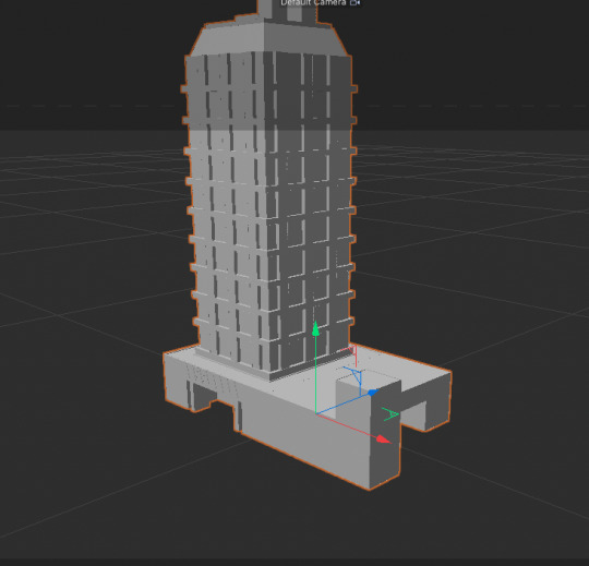
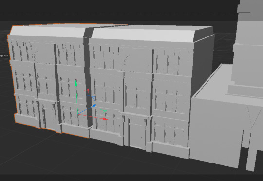
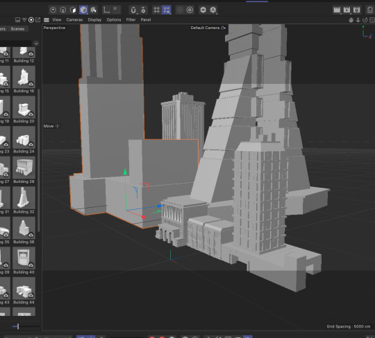
⛽Strategies & Steps to Finish My Projects
Try to view my building from different viewpoints to make sure it looks good from all angles, I will start with making a details sketch, orthographic sketches, and a physical LEGO model.
In Maya, I am planning to start with the basic structure of the building, such as floors, windows, and basic shapes. Use Maya's Reference Images feature to import my sketches and then use Maya's Polygon tool to create the base model.
youtube
✨For more digital modeling techniques, please refer to other techniques post
After that, I am going to use Maya's Extrude and Bevel tools to help me add details such as balconies, ventilation systems, neon lights, and other cyberpunk features.
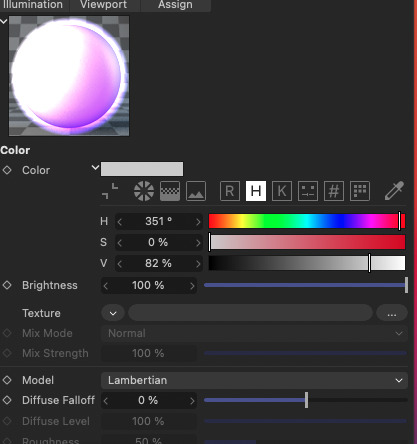
Regarding the Color & Lighting part: my color choice is neon colors, and Maya's Hypershade tool allows me to create and distribute materials. Cyberpunk styles often have a nocturnal, colorful lighting style, therefore I will us Maya's Area Lights and Spot Lights, and consider using some light blue or purple lights.
🌈If possible I want to make some post effects like neon glow in Photoshop or After Effects.
0 notes
Text
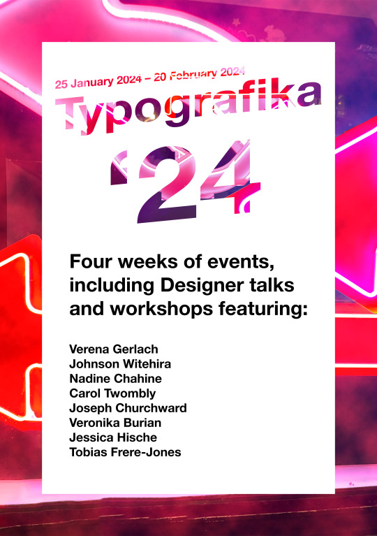
Poster side concepts and iteration
After receiving feedback from George pertaining to the poster side of my brochure it was made clear that I couldn't just slap the type of the speakers in a black colour on this.
To keep in line with the rest of the neon-theme/modern aesthetic that the rest of my poster (and layout by extension) contains. My first concept of the poster was putting the Typografika '24 name over a white rectangle that uses a shallow knockout effect to reveal the neon light background I had captured here in Auckland City. The "24" is large to communicate the year the event takes place but also to signify the importance of the year. The date above the Typografika name shares the same perspective angle with the title however is smaller and less imposing. The neon lights behind provide a natural colouring and shading on the knocked out text.
I used a clouds filter on top of the neon lights background and applied a linear dodge (add) effect to the clouds, making them blend easily into the work. I then colourised them and changed their hue to make with the rest of my colour palette before masking them in my poster. Creating a subtle modern feeling when looking at the poster.
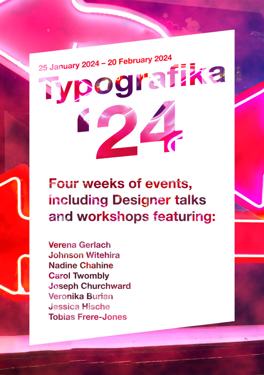
The black text feels out of place and without purpose, with that I knew I had to iterate it.
In this iteration I decided to use my knock-out effect on the remaining black text, this creates consistency throughout the poster while also remaining legible as the background used on this smaller type was darkened. It still has the hints of the neon lights that I've commit to but is dark enough to be read easily.
As per feedback with George, I used the angle of the perspective used on the type to cut away the bottom and top of the white rectangle containing the type. This was done to give the poster a more modern and futuristic feel. I feel that the work looks more attention-grabbing now as the geometric form isn't something commonly used.
Furthermore George suggested I could reduce the kerning between the "Typografika" and the "24" since the distance make the text look awkward and out of place. As a result I reduced the kerning and the header now flows much better.
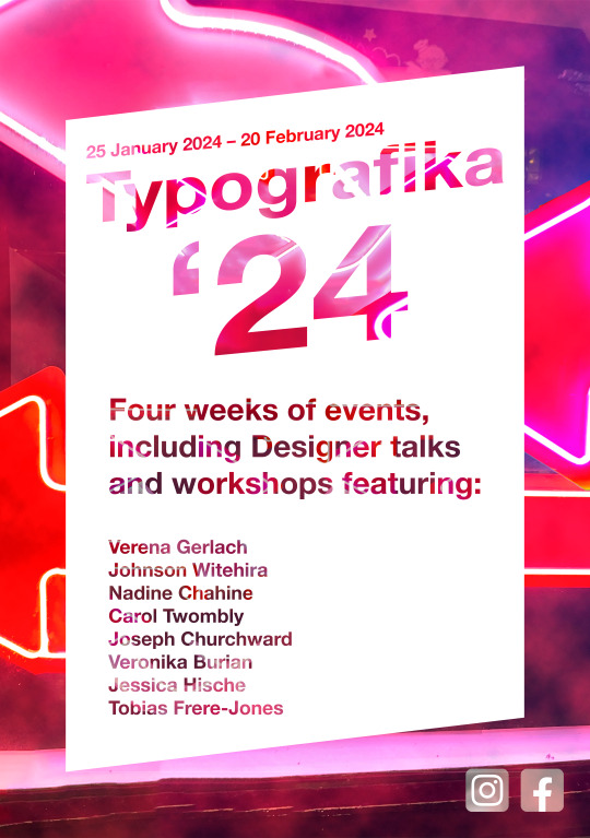
I also noticed that the inner neon lights on my Typografika header revealed sharp edges from when I was scaling the inner images to create a nice effect on the work and so I used the content-aware tool combined with a freehand lasso tool to fix several errors. Which is when I realised I could take this into it's third iteration.
The third and most resolved poster (to date) uses the context aware tool to fill all of the inner text on the header. I felt that having some parts reveals while others not didn't create the consistency I was trying to communicate and therefore is why I decided to go down this route. I do like the contrast between the bright header and the slightly darkened information dump in the lower half of the work.
I also added a Facebook and Instagram icon as per the requirements of the brief. I took the icons and brought them into photoshop before desaturating them both. I desaturated them so that they don't break my colour palette. They we both edited on a 500x500px canvas as so their resolution remains the same. I put them under my colourised smoke layer so that they gain a little bit of colour and also gain some perspective.
Overall I think this poster communicates my intentions and themes well, a modern, neon light themed poster with reds, whites and blacks making up my colour palette.
1 note
·
View note
Text
Project proposal...
The Oceana Blood Gate...
Rotational: First project was about creating voxel art background for our digital Photoshop characters, mine was a slime so I made it a bog, a simple small landscape with Lilly pads, damp tree bark, fireflies, running water and long spindly bits of foliage. Second project was creating the backs to cards on illustrator, to be honest illustrator really sucked and I didn't like using it as it never went how I wanted my artwork to go so I just went with simple geometric shapes with low opacities and a border to make it look fancy. I missed the day when we were making a chair in cinema 4D so I can't comment. We manipulated text made in Photoshop in cinema 4D by extruding it or bending it to make bubbly text. After that it was making a video game scene that had neon lighting, making our cities look all fogged up and cool with global illumination inspired by Andreas Levers. My knowledge of these programs has increased by a fraction where as my skills in Photoshop have drastically increased I now understand how to use the tools to manipulate images and shading plus lighting.
Project concept: 3D Voxel work, creating an underwater mountain terrain (256 256 256) with a giant sea gate, with pillars glowing portal effects flying in the air for lighting and seaweed rising from the surface of the ocean, from previous lessons of voxel art I would just build a base for my mountain using simple 15 by 15 blocks and work on a simple foundation for the background mountain, then using a smaller 3D sphere I would start to lay in the topography of the cliffside making them more detailed. I might make one of the mountains into an underwater volcano just for extra ambient red lighting. After that I will add the first half of the broken gate plus pillars, again building it up in simple blocks and erasing or adding tiny blocks from it, create the pillars and staircase leading up to it with small statues either side of it... When the main portal gate has been finished I will add small building or settlements with sea weed spiralling out of the ground making the end bulb bits light up for more background lighting. In final rendering give the landscape a dark gravely texture with the lights sources very bright since working on highest scale. In the end I will hope to produce a abundantly lighted underwater area with high mountains and tall sea weed with ancient stone pillars that create a portal gate to a forgotten city.
This will all be created in the Mac room L1.03 using the entirety of Mondays lesson to construct the portal scene into the lost kingdom...One disadvantage of working in voxel is that everything is in blocks so when you would want to add finer details that give some backstory it's a little frustrating but Voxel is easier to use than cinema 4D

My mountains would look more like this one with the spikes reaching towards the surface and a few deep valleys to add a better topography, I also need to make sure that I build up the surface that leads up to a mountain rather than just putting a spiky mountain in a flat field.

I will make the sea weed like this, more coral like with a few swirling pieces reaching the surface, also I would make sure that some of the sea weed bulbs that sprouted off had a coloured light so that most of the area is lighted up and looks fairly colourful. Most of my research during after college would be done at the library for up to an hour minimum looking at research material such as textures for my mountains and sea weed, cool lighting of effects used on voxel and colour combinations that would mix well together.
Evaluation: I will reflect on my work with sharing it with my fellow youths and taking into account third party opinions, making sure that I utilise the help of Josh and Chris in the Mac rooms as they are one of my primary resources that I can use whenever I need help or inspiration, I will also during the projects production I will continuously upload research and up to date work onto Tumblr whilst explaining what I have achieved in that lesson. The project may even be written down on paper as I find writing easier than digital typing as it's just faster and I get dyslexic whenever I looka at a screen. (Yeah that totally makes sense)
0 notes
Text
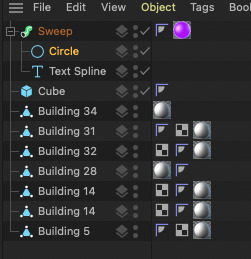
Cinema 4D Neon Sign Process
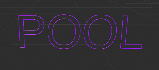
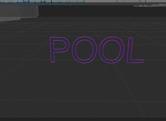
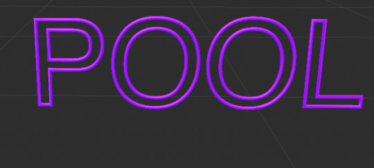

This week we continued the theme of neon signs. The goal was to create any kind of urban setting with a florescent light of some sort. For example it could be a: petrol station, a steel way, apartment buildings literally any kind of urban structure that would have lights of some sort.
I started by generating a sky scraper from the pre-made structures. At this stage I really didn’t have any idea what I wanted to create. I continued to add more and more buildings until I had a scene I was happy with.
Next I moved onto the florescent sign. I really didn’t have any idea what it should say or how if I was meant to relate it to my project. In all honesty I thought that this was just a test and that it didn’t matter what the sign actually said. With that out the way let me explain the next part of the process. By using the text tool I decided to go with the word “pool” I figured it would be cool to make a florescent sign out the front of a bar to advertise the fact there is a pool table inside. I’ve seen this idea done before so I figured I’d play it safe.
Once I had adjusted the word to size I moved onto the final steps. I dragged a circle in to the text spline, this made the 2D text turn into a sort of circular tube. The idea was to make it look like those florescent signs with writing. I also used a sweep, I believe this allowed me to then add colour to my sign. When it came to adding colour and and rendering my sign I had to get Chris’s help as I was way out of my depth.
Overall I found the entire process rather tedious and hard to understand. I was able to follow up until it came to adding colour and rendering my sign. That part required Chris’s help. Digital work has never been my favourite thing. I have grown to enjoy drawing with Photoshop. However I’ve yet to get that same feeling from Cinema 4D, Illustrator and Magic Voxel.
0 notes
Text
Internet Culture work in progress:
MODERN CONNECTION
When choosing the theme of my piece, I thought about all of the different things I hate about our society when it comes to the internet. The one that I decided to go with was the concept of how people are so glued to their devices that they basically live sleep and breath through them. I also wanted to display how people make connections now primarily through social media platforms. With all of this in mind. I decided to portray two people sitting across from each-other in a dark room, however, they have tv's for heads and they are loading because they are transmitting their information to one another. I utilized photoshop to make this idea come to life. Using unsplash, I found the pictures of the things I needed in order to complete this idea. Afterwards, I had to cut out the specific things from each of the images that I was going to be using. After doing this I had to edit the color and brightness of the different pieces so they looked as if they were in the same room with the same lighting. The last touches I made were using the drag tool to make the emissions from the TV's flow towards each other and the added a patchwork filter that makes the whole thing look like it was pixelated like in a tv screen.
For the final piece I want to work more on the lighting perhaps and then add on the top of the piece a big neon type that reads "modern love" in a glitching and altering way. The final piece would be a GIF because I want the text that will go on top to seem as if it is live on a tv screen.
0 notes
Text
Save separate layers photo image editor pixelstyle

Save separate layers photo image editor pixelstyle for mac#
Save separate layers photo image editor pixelstyle mac os x#
Save separate layers photo image editor pixelstyle full#
Save separate layers photo image editor pixelstyle mac#
Hide, duplicate and merge layers easily.- Select several layers at one time and freely align, flip and transform (move, rotate, skew, affine) the layers.- Your file could be saved as a project - you can edit them next time.- Work with all popular formats like TIFF, JPEG, PNG, GIF, BMP, etc.- Add text layer effects like shadows, strokes, inner glow, outer glow, or fills.- Half Circle Text Tool: Quickly and easily place your text on a half-circle to create logos and other useful text designs. With faster speed, more precise selection tools, a variety of dazzling effects, and much more, from retouching to restoring to creative composites, the only limit is your imagination.- More than 100 built-in drawing brushes (pencil, airbrush, watercolor brush, chalk, charcoal, neon pens.) for oil painting, sketch, texture painting.- Create custom brushes and use different brush sizes, shapes, hardness, and blending modes.- Fill in the object with texture and color.- Support for a variety of gradient modes including symmetrical, rotate, clockwise and counterclockwise.- Easily add non-destructive layer effects like shadows, fills, inner glow, outer glow, or strokes.- Support over 50 different filter effects and blending mode options.- Resize layers without any loss of quality.
Save separate layers photo image editor pixelstyle mac#
This Mac Photo Editor's functionality is similar to what you can do with Photoshop on Mac.
Save separate layers photo image editor pixelstyle for mac#
This best photo editing software for mac even lets you lay in text over your images, along with multiple drawing tools so you can add shapes and objects to your heart's content, including vector-based objects.In short, PixelStyle Mac Photo Editor version has many of the requisite features you'll need to get your photos looking better, plus a lot of other stuff besides. It's very quick, sports features like layer support and non-destructive filters, curves and levels.
Save separate layers photo image editor pixelstyle mac os x#
VersionDate ReleasedRelease Notes3.5.11.App stability improvement.3.3.5Bug fixed.3.301.Allow of deleting points when drawing with the pen tool.2.A layer can be filled with transparent color.3.Correct the falsely displayed name of text layer.4.The angle can be changed when shapes are filled with gradient colors.5.Add background autosave feature.6.Support Chinese version.2.801.Copy the selected shapes.2.Red eye remove tool:reduce the effect of red eye caused by your camera flash.3.Basic SVG support! You can now import SVG files.4.Beautify the UI of toolbar.5.Fix some other small bugs.2.40New Release.MAC Photo Editor PixelStyle Photo Editing Software for Mac PixelStyle Photo Editor for Mac is an all-in-one photo editing and graphic design software, providing professional high-quality photo processing tools to edit the photos, enhance and touch up photos on Mac OS X Mac Photo Editor PixelStyle comes with a huge range of high-end filters including lighting, blurs, distortions, tilt-shift, shadows, glows and many more.EffectMatrix developed PixelStyle Photo Editor for Mac as an easier-to-use alternative to some of the more expensive and complex apps out there (like Adobe's Photoshop). Support regular, retina and multi-monitor set ups.PixelStyle Photo Editor for Mac is an excellent and all-in-one photo editing and graphic design software which built in a lot of functionalities that are similar to what you can do with Photoshop on Mac to make your photos look a whole lot better. Fully optimized for 64-bit and multi-core processors. Use the Touch trackpad to paint with pressure sensitivity.
Save separate layers photo image editor pixelstyle full#
Designed exclusively for Mac - Takes full advantage of the latest OS X technologies.
0 notes
Last Seen Blogs
thppiestgrl
maju

rollo-rolls
(☞゚ヮ゚)☞

mmtread
Untitled

gina-r-aus
Untitled

punnyadt-goreny
Punnyadt Goreny