#also I color picked for the background and foreground to make it easier to just plop down shapes and stuff
Text
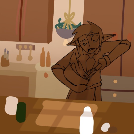
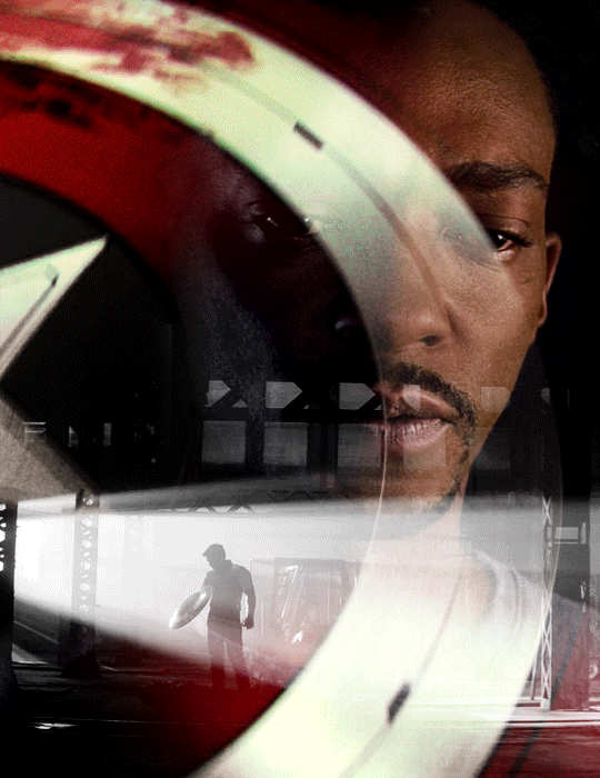
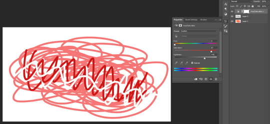
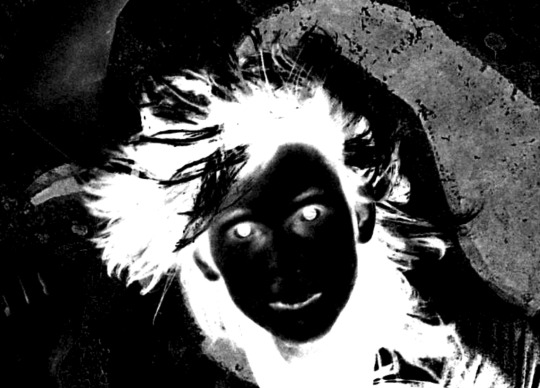
wip of The Chain’s Cafe AU ditys. Thought it would be neat to share what my first drafts of my drawings can look like
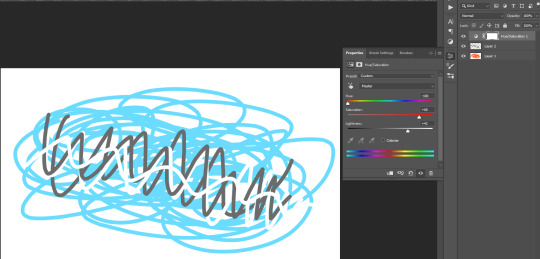
#fever in progress#love tilting things to give an extra layer of chaos#also don’t know whether of not I should draw legend’s hair like how isa does or like how I do it. I do like the frazzled look tho#also I color picked for the background and foreground to make it easier to just plop down shapes and stuff#I also heavily use the liquify tool for the sketch just to get things to go where I want#I also rearranged a few things in the foreground to add a bit more depth because there is more focus there. I kept the placement of items#the same in the background because detail there isn’t as important. But I did give the oven and stove a top for slightly more depth#of and the cabinet has a bit more depth as well. I think that’s all the notes I have on this piece for now#ditys#the chains cafe#yeah I’ll tag it why not. I’ll even main tag this#linked universe#linked universe au#lu legend#anyways I’ll probably finish this in like. two weeks or something it’s gonna be a while
21 notes
·
View notes
Note
can you please make a tutorial for your santa gift graphics? i'm not totally new to photoshop but i could use some help <3
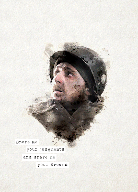
Ohh okay, this will be a bit long, so bear with me, dear Anon.
I'm going to use this one as an example:
You'll need three new documents: one for creating the watercolour portrait, one for the watercolour elements in the background, and a third one for the final edit.

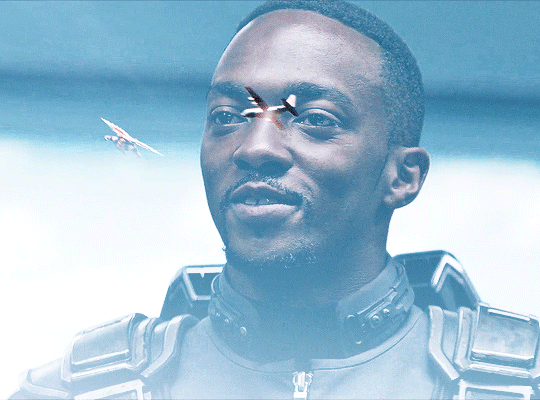
Let's start with the portrait. I'm using a free photoshop action for the watercolour effect, which you can download here with a complete tutorial. After using the action, you'll need to make some adjustments, but it's still faster this way. Change the blend mode of the "watercolor artist" group to screen and slightly turn down the opacity if needed to make the details more visible

In the second document, use the watercolour action the same way again to create the red elements in the background. You can download the photo I used here. I highly recommend using Unsplash, they offer plenty of free high-resolution stock photos, and unlike on Pinterest, the photographers are actually credited.
Create the third document; mine is 540x750. I used an ivory paper as a background, but it should work with a canvas texture or even a simple white/light layer. Pick whatever you like.
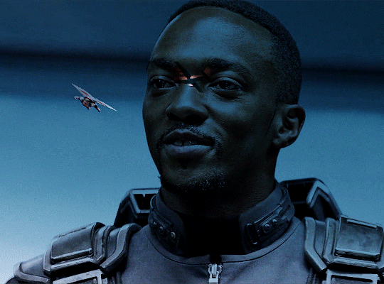
After you're done with the watercolour actions, paste the portrait into your third document. Adjust the size and position, then change the blend mode to multiply. Name the layer "portrait."
Next, paste the background elements too, and also change the blend mode to multiply. I changed the saturation and vibrance to make the red pop more, but it's optional. Name the layer "background elements."
Now that you see everything together, you can play around with different adjustment layers, contrast, colouring, etc.
Now, open the video you'd like to use for the animation, in a separate document. I used this one, but there are other similar free videos on this website, pick what you like the most. If you want to make the process quicker, pick one that's already a high-contrast black and white.
After you've opened it, you can use the timeline to cut out the part you'd like to use, adjust the speed, etc. In this case, I just doubled the speed which you can do by clicking on that little triangle, and used the full video.

Create a video timeline in the third document. Go to Window -> Timeline -> Create Video Timeline. It's an important step, don't forget about it. Once it's done, copy and paste the video layer into the third document, and name the layer "video." Make sure the "video" layer is right above the "background elements" layer because you're going to need to create a clipping mask. You can do that by right-clicking on the "video" layer and choosing create clipping mask, or you can hold down the alt key and left-click between the two layers. When it's done, you can adjust the size of the "video" layer, rotate it, flip it, etc., depending on how you want your animation to look
After that, set the blend mode of the video layer to screen. If you've done everything correctly, you should have your animation now.
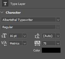
It's time to add the text. I used this font, size 16. I divided the text into 4 lines for easier adjustment of the position.
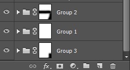
Once you're happy with the layout, create the white stripes, each on a different layer. This way, you can move them around separately if you'd like to change the position of the text. I like to make the text and stripe layers into a group so the layers are less chaotic, but you can skip this step.
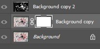
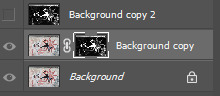
The only thing left in the editing part is the invisible frame. Click on the "background elements" layer and add a layer mask. Select the brush tool, 50px, 100% hardness, and set the foreground color to black. Now, draw a line from corner to corner. Holding down the Shift key, click on one corner using the brush, then click on the next one, and repeat until you're done with all four sides. Your layers should look something like this now.

Before saving, make sure that all the layers on the timeline are the same length and start/finish at the same time.

If you're done, go to File -> Export -> Save for Web (Legacy). These are the settings I used for this particular edit, but feel free to experiment and use what you like the best.

I tried not to complicate it too much, but it's difficult to explain everything in writing, so if you have any questions, I'm always available :)
16 notes
·
View notes
Photo

Some of my lovely friends asked to show how I do my blending, so here is a very long tutorial! I will explain how to:
Blend GIFs with lots of movement
Blend three or more GIFs on one canvas
You will need:
Any version of Photoshop with a timeline
Basic-intermediate knowledge of GIF making (including cropping, how to use adjustment layers for color correction, applying layer masks, and placing multiple GIFs on one canvas)
Since the way I blend depends on the footage I'm able to work with, I often end up going in a different direction than I first planned. So this isn't a strict step-by-step guide that can be applied to everything you make. These are just some tips!
Read the rest under the cut.
TERMINOLOGY:
(Pretty sure you already know this but I will be repeating these a lot here, so just in case!)
Highlights & Shadows - The highlights are the brightest parts of the image. The shadows are the darkest parts. Remember that just because it's bright doesn't mean it's actually white, and just because it's dark doesn't mean it's actually black!
Negative Space - This refers to empty space around your subject. When there's negative space, it's easier to spot the focal point of the image.
BLENDING GIFS WITH LOTS OF MOVEMENT
Number of GIFs: 2
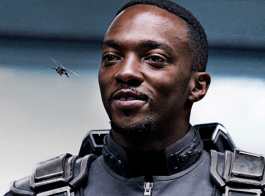
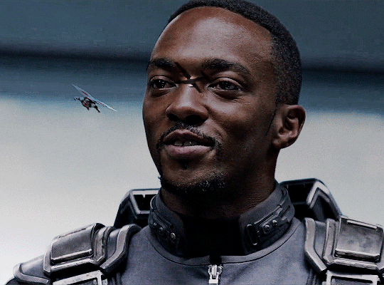
Main GIF: Closeup of Sam (“big!Sam”)
Secondary GIF: Sam flying (“flying!Sam”)
STEP 1: Find the right scenes
Since the subject of the secondary GIF is much smaller and basically cuts across the frame, it’s important (but not always essential!) that the main GIF has less movement and a decent amount of negative space.
STEP 2: Make your individual GIFs
Make your GIFs like how you usually do (Important: Remember that your GIFs need to have the same number of frames). When it’s time to crop, it’s best to have the two files opened in Photoshop at the same time so you can compare them against each other. It’s absolutely fine for them to overlap because that’s the whole point! The secondary GIF has Sam flying in from the top left to the bottom right, so I cropped the main GIF with him off-center so there would be space to see flying!Sam.
Now we have these two GIFs:


STEP 3: Combine your GIFs
Place the secondary GIF over the main one and adjust the blend mode. Setting the blend mode to Screen usually works, but in this case, this is how it looks:
As you can see, the highlights in the main GIF are obscuring flying!Sam in the first frames. You can only see him clearly when he’s flying over big!Sam’s face. This is because the shadows on the top GIF will lighten and/or disappear against the highlights of the bottom GIF when set to Screen. It would be too complicated to fix this with a brush (which we will get to later) because of the movement in the secondary GIF, so instead I set the blending mode to Multiply, which is the opposite of Screen. Now here is the GIF:
We can now see flying!Sam. But the blue of the sky is now a pseudo-filter over big!Sam’s face up until the last frames. So I applied a Hue/Saturation adjustment layer over the secondary GIF to remove those colors. The sky in the GIF is made up of cyans and blues, so I dragged those sliders down to -100. Here is how it looks now:
STEP 4: Erase the bits you don’t want
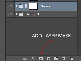
So that big!Sam’s face isn’t covered by flying!Sam’s wings and that pesky airplane up top, we have to use a brush to erase those parts. In the Layers panel, make sure your GIF layers (in this case, groups/folders) are selected and click the Add Layer Mask button. A little rectangle next to the layer/group name will show up like so:
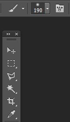
Then in the Tools panel, click the Brush tool, pick a soft brush and set the size to around 180-210px. The larger the brush, the softer the look. I learned this from Becca (@inejz-ghafa) who made an amazing tutorial a while back (will link it in the source at the bottom)! Adjust the brush size if you have to.
Now click on the little rectangle layer mask of the group you want to erase (in this case, the secondary GIF). When you do this, the Foreground and Background Colors buttons in the Tools panel will revert to the default black and white.

Painting with black will erase and painting with white will undo the erasure. So I erased the airplane and the bits of the wings covering his face. I didn’t erase the parts that overlap with his uniform, just to keep the effect of flying!Sam zooming across the GIF. And here is our finished product:

BLENDING THREE OR MORE GIFS ON ONE CANVAS
We will be working with these two GIFs since they use different techniques:

STEP 1: Compose your image
Find the scenes you want to put in your GIF and choose which of those is the most important. Once you've decided on that, you can build the rest of the elements around it.
Sam's GIF: Multiple Exposure Effect
Number of GIFs: 3
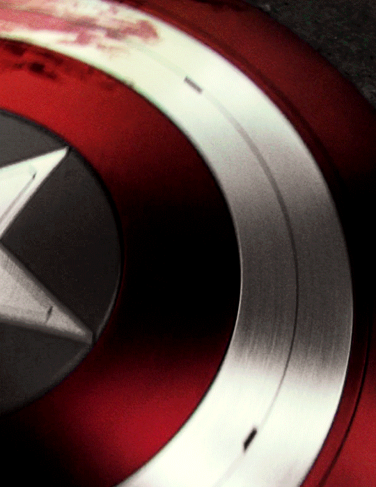
Main GIF: Bloodied shield
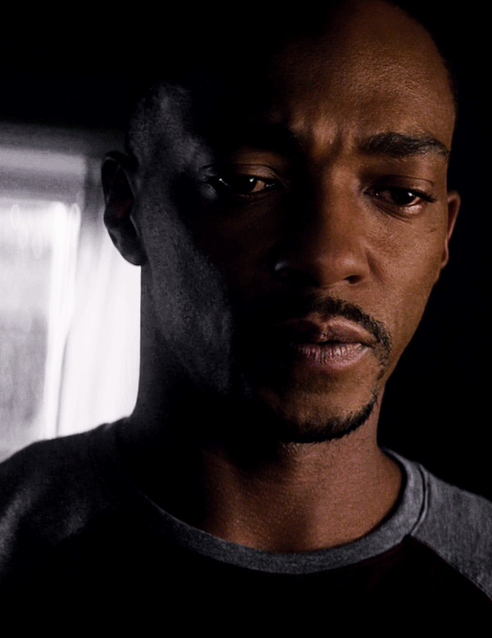
Secondary GIF: Closeup of Sam
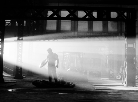
Tertiary GIF: Bucky with the shield
STEP 2: Make your individual GIFs
Since the shield is the most important part, I made it the largest GIF and cropped it close to emphasize the star and the blood. I made Sam's GIF the same size, but cropped it with his face off-center so that the star wouldn't completely cover his face. Again, it's totally fine for the images to overlap! The tertiary GIF is the least important so I cropped it smaller. To determine the size of that GIF compared to the shield, I made the Rulers visible (View > Rulers; or Ctrl+R) then clicked the top ruler and dragged down to create a guide to where I wanted the smaller GIF to end. Then I measured from the bottom of the GIF up to the guide to determine the height of the smaller GIF. (Tip: It's better to make the tertiary GIF too large than too small. That way, you have more to work with. So size it larger than it will appear on the final GIF.)
This is only a stylistic choice for this particular set, but I removed the blue from the shield and set the tertiary GIF to black and white, so that the only notable colors in the GIF are red, black and white. Varying up the coloring of each GIF (i.e. color vs. monochrome) adds some spice to the image, so play around with these different styles if you like!
Here are our three GIFs:
STEP 3: Combine your GIFs
At first, I made the main GIF of the shield the bottom GIF. Then I placed the secondary GIF over it and set the blend mode to Screen, but found that it lacked depth. So I switched them and made the Sam GIF the bottom GIF (blend mode: Pass Through) and placed the shield GIF (blend mode: Screen) over it. And this is what I got:

Notice how the window behind Sam on the left side is distracting? It also partially obscures the star. So I went back to Sam’s GIF, created a New Layer and painted over the window with a black brush. Now here is our GIF:
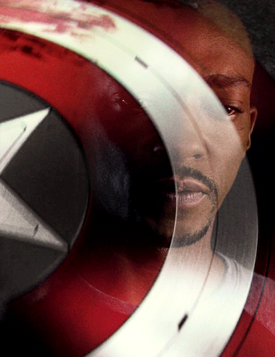
This is just my personal preference, but I wanted the area around the star to be a solid black rather than gray, so this time I created a New Layer over the shield GIF and applied a layer of black with the Paint Bucket tool, setting the blend mode to Soft Light. Now we’re done with the main and secondary GIFs:

Now let’s add the last GIF:
STEP 4: Erase the bits you don’t want
Lastly, I erased the warehouse rafters over Sam’s face and a bit of his shirt and the warehouse floor on the bottom right corner using Layer Masks and a soft brush (like in the first tutorial). And we’re done!

Bucky's GIF: Silhouette Effect
Number of GIFs: 3
Main GIF: Bucky holding the notebook
Secondary GIF: View of the sunrise from the boat
Tertiary GIF: Sam and Bucky walking away
STEP 2: Make your individual GIFs
To achieve this silhouette effect, the main GIF needs to have a clear focal point, which means it’s better to have negative space around the subject and for there to be minimal movement. In this case, the subject is made up of Bucky’s hands, notebook, and part of his shirt; and there’s some movement but we can still work with that. The other two GIFs will then be placed “inside” the subject. Because the negative space in the main GIF consists of highlights, I chose a secondary GIF which emphasized the shadows. For the smallest GIF, I used a guide like in the previous tutorial to measure its size.
We have these three GIFs:


STEP 3: Combine your GIFs
Place the secondary GIF over the main one. In my case, I didn’t measure it right so I had to nudge the top GIF a bit to the right to fit it inside the silhouette. The important thing is that the edge of the secondary GIF should not overlap with the silhouette itself, or else the illusion “breaks.”
Now let’s add the third GIF:
STEP 4: Erase the bits you don’t want
For this GIF, there’s a lot we need to erase! Using Layer Masks and a soft brush again, erase the parts of the secondary GIF that extend beyond the silhouette. It’s entirely based on personal preference if you want to keep some parts of the secondary GIF outside the silhouette (like I did here) or if you want them completely removed. And for the small GIF, erase the edges for it to blend with the secondary GIF while also staying within the silhouette of the main one.
Now here is our finished GIF:

And that’s it! If you’ve made it this far, thank you for reading. I hope this was useful! Remember, there is no definitive way to blend GIFs, so keep experimenting. And don’t be afraid to make mistakes either, because we learn a lot from those. Happy Photoshop-ing!
- Elle
#completeresources#allresources#blending tutorial#photoshop tutorial#userpavi#tusergabriela#usersae#userrex#usertk#supervalcsi#usernums#userringo#userkraina#usersmile#tuserlouise#usersof#mine#my tutorials
2K notes
·
View notes
Text
Making Normal Channels in GIMP (with njob)
Hello everyone! I was explaining how to do this in the Sims of History discord server and realized how much of this process I learned through trial and error. There isn’t really a good step-by-step tutorial about how to do this in GIMP, only in Photoshop (at least no text-based tutorials). While I use both Photoshop and GIMP for various things, I prefer to make my normal channels in GIMP. This tutorial will walk you through the process and hopefully demystify normal channels in GIMP.
Normal channels (bump maps) add additional depth beyond your mesh, which is useful for things like folds, painted on pockets, and buttons.
This tutorial is particularly for how to make Create-a-Sim items, not objects, but a lot of steps should be transferable.
You will need (all free programs):
GIMP
njob
Sims4Studio and/or CAS Tools

First, open your diffuse texture in GIMP. I often try to use the light/base texture rather than one I have colored already, but if you have already colored it and didn’t save a base, don’t worry, it doesn’t make much of a difference. Don’t use an image which has a pattern applied to it, as that will create a bump on the pattern and appear like applique or something along those lines (unless that is your goal).
I recommend doing this step after you have tested your diffuse texture image and mesh (if applicable) in the game. If you have any last minute changes to either of these, you will probably need to re-do your normal from scratch.
If your image is in layers for recoloring, or not, choose to flatten the image. Transparency isn’t helpful in making normal channels, so get rid of it so you won’t have to worry about it later.
Once you have flattened it, the background usually turns either black or white. It doesn’t really matter which one, it won’t make much of a difference in njob.
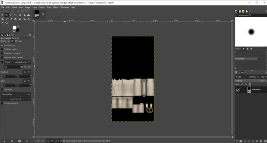
Now, select the crop tool. You can see the current dimensions of the image in the “aspect ratio” box. For a CAS items, the original will be 1024:2048, which is 1 x 2. We will need to crop the image into a 1 x 1, or perfect square.
To have your normal channel as high quality as possible, you should use 1024:1024. This will work for clothing items like full body outfits, tops, bottoms, gloves, socks, and tights (basically anything mapped in this bottom portion of the UV map). For all of these items, you must use a square and cannot crop it to be smaller. For shoes, this means a very large blank area.
For accessory items like jewelry and hats, the cropping is different. For instance, a hat would be 512:256. If you are unsure of the dimensions to use, export the normal channel on the maxis item and copy its dimensions. The following instructions will assume you are making a clothing item and not an accessory item.
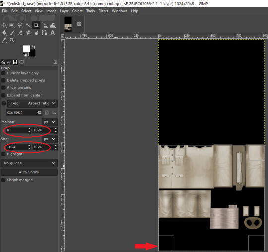
Click anywhere on the image while you have the crop tool active, then adjust your dimensions in the box to the left. You can manually type it in or drag the box and follow the size in the box as you drag.
The box should be perfectly aligned with the bottom and have no space below. If you have space below, just drag it as far to the bottom as you can. GIMP will stop you from dragging it outside of your current dimensions. If a little is sticking out at the top, that is okay. Nothing can be mapped outside of the 1024:1024 dimensions, so it is probably just bleed over or space filler that you are cropping off.
Press “Enter” on your keyboard to complete the crop.
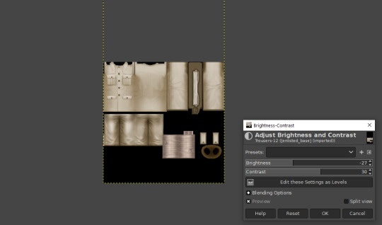
Optional Step: If you desire, you may want to decrease the brightness and increase the contrast on your image so there will be more for njob to pick up. If you already have a lot of contrast, you may not need to do this.
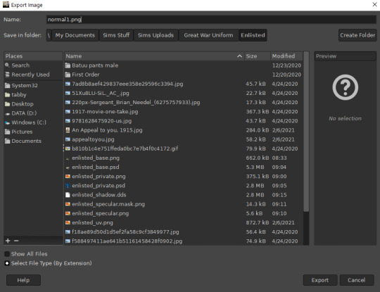
Next, export your image as a PNG or BMP. Be sure to not overwrite your original diffuse texture.
You can now close GIMP, though you will need to open it again later.
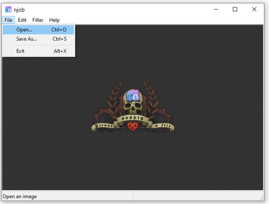
Open njob, then your saved, cropped image.
Maximize your screen so you can see what you’re doing.

Go to Filter > Diffusemap > Heightmap and select that option.
The screen will pause to load for a bit before opening up a new box.

Your image will convert to black and white and may look a bit strange. The first step is to change your “Course Detail” setting to the lowest (or close to the lowest) setting and your “Fine Detail” to the highest setting. I generally play around with the “Mid Detail” and “Scale” until I get what I want. Try to have what you want to be visible stand out, while folds should be soft and fuzzy but still somewhat distinguishable.
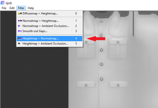
Once you have what you need, click OK and go to Filter > Heightmap > Normalmap

There are two settings, “Scale” and “Blur Radius.” Neither of them have “ideal” settings, so you will need to adjust as you need. “Scale” controls the depth of the contrast and “Blur Radius” impacts the softness of the image. If your edges are too harsh, your normal map may look odd in game.
You will probably also have lines in areas in no texture. This is normal, and I will go over how to remove those later.
Once you are satisfied with how things look, save the image as a bitmap.
Now, open your bitmap image in GIMP. It is time to clean up the image and get rid of the artifacts. Unfortunately, unlike a specular, a normal map doesn’t have a mask to prevent bleed over onto skin or other textures. The unused areas need to be a midrange, solid grey. It is easier to edit at this step before you create your transparency.
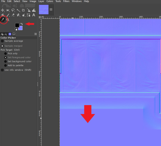
Select a midrange blue color from one of the blank areas with your color selector and make it your background color by using the arrow button between the foreground and background colors.

Select the areas that should be blank and delete them, which will replace the lines with a solid blue color. This would be areas around the neck, wrists and ankles, and also places like the filler beneath skirts and tops that doesn’t need texturing. Be sure to select the odd lines around the image, which are usually a bright teal or hot pink color. Those can be very visible.
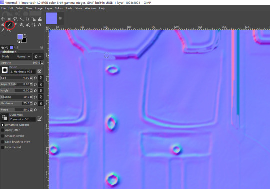
Sometimes, you may need to take your paintbrush and clean up the artifacts if they are in curved or very small areas. If anything looks too sharp, you can also use the smudge brush to smooth it out (very lightly). But don’t move anything around too much.
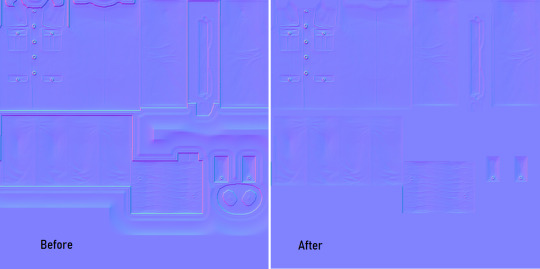
Once you have cleaned up your image, export it again as a bitmap. This is just so you can go back to it if you make a mistake later or need to modify it. Usually I save it as a new image, but you can overwrite the old one if you are feeling confident.
I have to point out that sometimes you can get away with not cleaning the artifacts from your image. But I have had too many issues with it in the past to skip this step.
Now it is time to make the normal map. Finally!

In the layers area, right click on your single layer and add an alpha channel to it. There is also a small button at the bottom you can use to add an alpha channel. You will need this transparency for the next step.
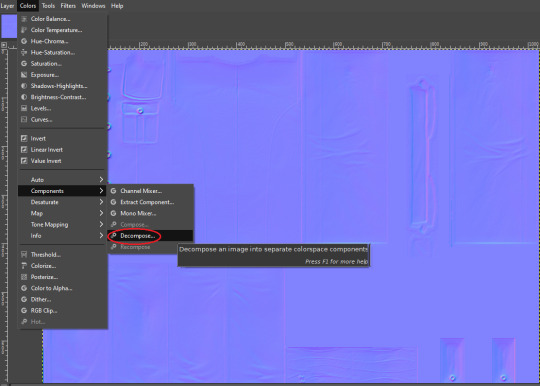
Next, go to Colors > Components > Decompose.

A small box will open up. Change your color model from RGB to RGBA to enable the alpha channel as a separate channel (layer).

Now, a new image will open that is your bitmap but greyscale. You will see four layers on the side called red, green, blue and alpha.
Select the red layer and click CTRL + A on your keyboard to select the entire layer. Then, click CTRL + C to copy the layer. (If you don’t have a keyboard, you can do “Select all” and “Copy” but this takes longer).
Now, go to your layer named alpha and press CTRL + V (paste) and CTRL + H (to anchor the layer). Now, you have replaced the alpha channel with the red channel.
Next, go to the green layer and select and copy it. Paste and anchor it into the red and blue layers, just as you did before with the red layer and alpha layer.

Your image won’t look too much different right now, it will just look like the green alpha channel rather than the visible red alpha channel when you opened it. Go back to the top bar and choose Colors > Components > Recompose. This will alter your original image, so the one you have open in layers will stay open. Go back up to the top and select the original image to go back to it, or close your layered image.

Now, your image should have changed from mostly blue to a transparent, mid-range gray with only a few elements visible. This is how it is supposed to look. If you don’t have transparency or it looks very different, then you probably messed up somewhere. Generally, I find it easier to go back to the original cleaned up bitmap (that you saved for future use) and start from scratch rather than trying to figure out where I messed up. That is usually faster.
Next, export your single-layer image as a PNG or DDS file (your preference). You will need a DDS plugin to save DDS files.
Open your item in Sims4Studio and import your new image file in the normal texture category. You will see a small preview in the box, which will probably show more details than you were able to see in GIMP. If it looks correct, save it and go to check it in game or in CASTools (which has a feature for previewing bumpmaps that can help you check for alignment problems). CASTools can be particularly useful if your computer doesn’t open the Sims quickly and you want to preview multiple bumpmaps. The only issue with CASTools is that it doesn’t really look much like it will look in game.
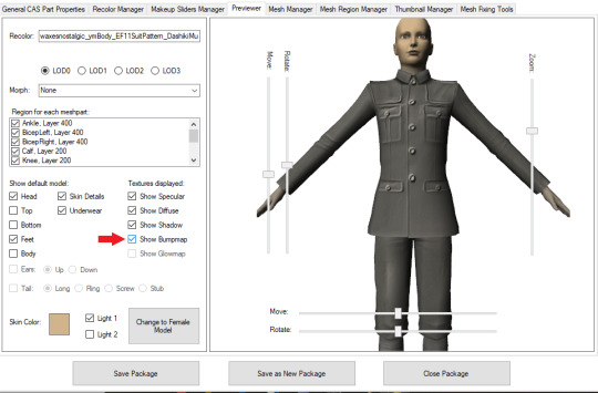
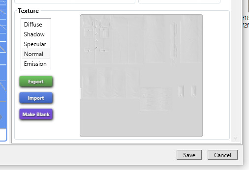
In CASTools. You have to select to see the bumpmap in the Previewer tab.
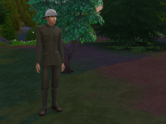
In game.
As I have only been making normal channels for a few months now, it’s possible I have missed some things, so if you know an easier or better way let me know and I can update the tutorial. I hope this is useful to you!
93 notes
·
View notes
Text
Log 6
Last lesson before the mid semester break was pretty fun and helpful.
Photoshop tips and tricks


By pressing ‘X’ the foreground color will swap to the background color and vice versa, this shortcut is very handy for quick art.
Here I’m going to use adjustment layers to change this color.
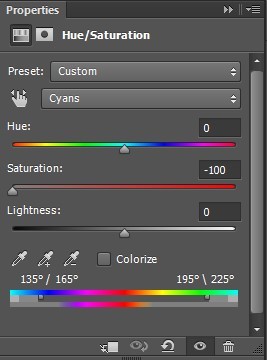
When adjusting hue and saturation, ‘Colorize’ will put every layer onto the same hue.
To better explain this is the result if you don’t tick colorize.
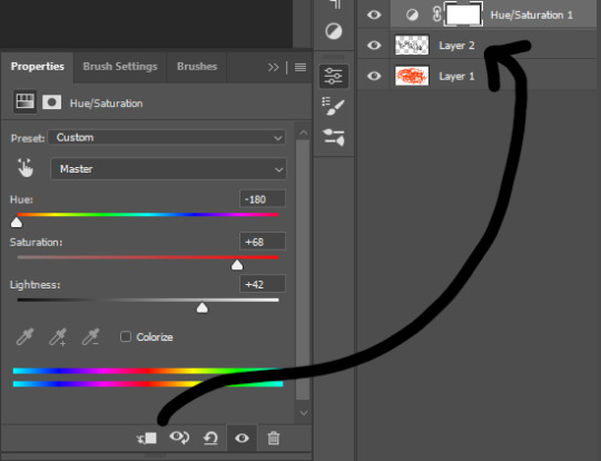
Another tip when using adjustment layers is that you can click that button to have the adjustments only apply a specific layer, which will be the layer below the adjustment layer. This helps when you don’t want to adjust every layer
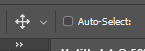

Here I am making a rectangle selection over my sketch. A quality of life tip is that you should keep ‘auto-select’ off. This is because it feels more natural to select what you want through the layers tab instead of clicking on the artboard. It’s much more efficient as you won’t accidentally select the wrong layer as much as you would with auto-select on.
Handy reminders:
- Moving a selection outside of the selected area will move the entire layer rather than what’s inside the selected area.
- Moving a selection inside the selected will move what is selected as to be expected.
- While holding ‘Alt’ when moving a selection it will keep the original selection in place and instead you will be moving a duplicate of the selection on the same layer.
- While holding ‘Shift’ when moving a selection your movement will be constrained to the horizontal and vertical axis.
- With a selection you can do the shortcut ‘Command + J’ and that will make a layer containing what you have selected.

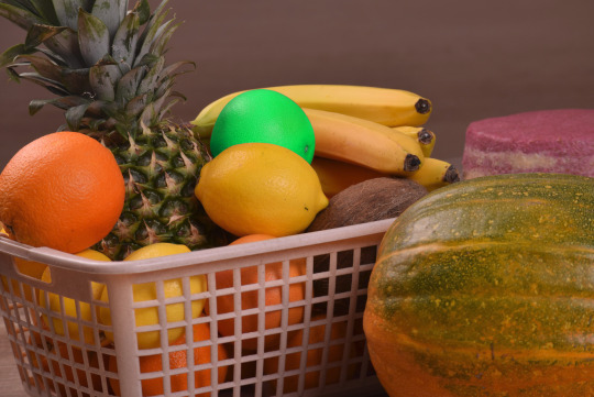
As a quick refresher we are going back to this image and recoloring different fruit
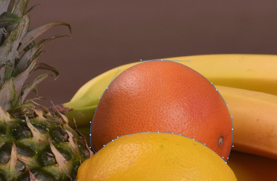
I’ve selected this orange with the pen tool and refined my path with the direct selection tool.
(Using alt to break the anchor points is very helpful)
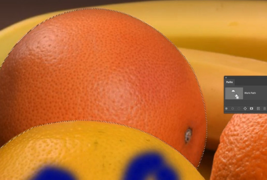
With the paths tab I’ve turned it into a selection.
After that we can mask it, make sure that there is a copied background layer.
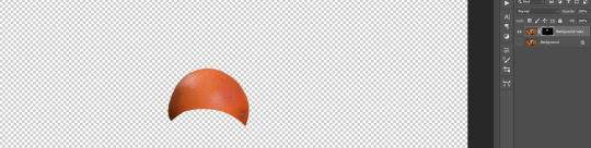
All that’s left is using an adjustment layer onto the orange and now we got a lime green orange :)
(or you could just call it a lime green)
Summary of first exercise
Essentially what was practiced was our skills in:
Selection tools, Masking, Layer management
Exercise 2

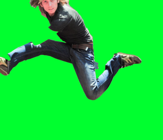
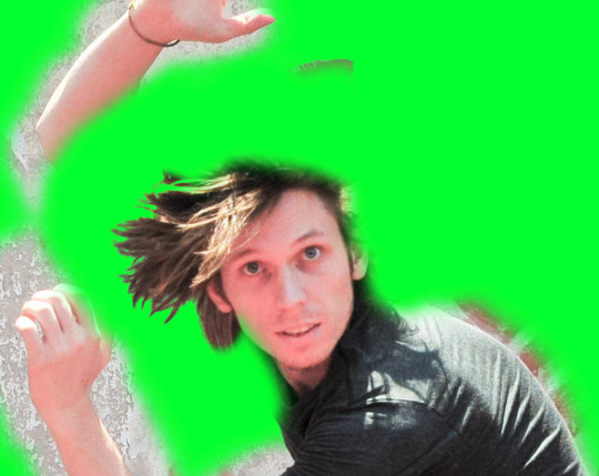
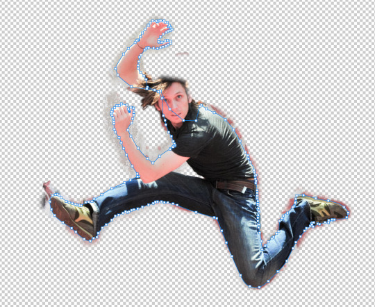
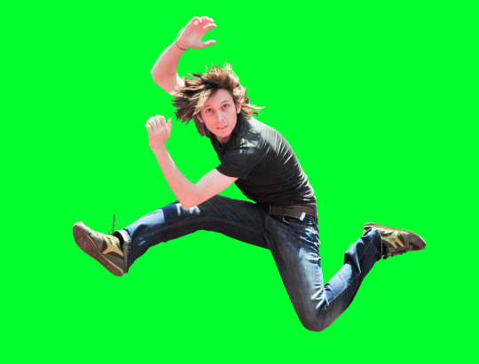
Here we have an image of a person jumping in a funny position. We are going to learn how to utilize smart objects so that we can combine the features of photoshop and illustrator.
First things first we will of course duplicate the background layer as we will be cutting out the jumping guy.

We are going to use the object selection tool as a starter to get somewhat of a shape. There are plenty other methods to do this however this feels the easiest.
I found that doing this sort of editing in photoshop is a matter of working smarter not harder.
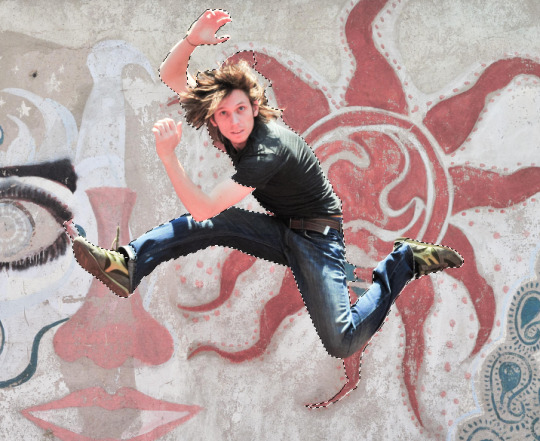
This is the selection... It’s not that good but it’s a good start to refine.
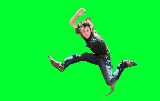
We have masked the selection and put it behind a very distinctly colored background to make it easier to see the edges.
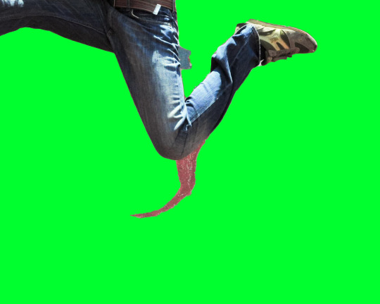
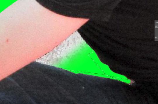
Lets start cutting of this weird part.
To be quick and efficient, we’re using the polygonal tool.


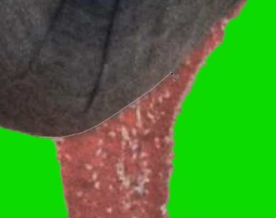
Note that when the black and white mask is selected, your two colors will change to black and white. To put it simply think of black to remove from the selection and white to add to the selection.
So with black as my foreground we “draw” (erase) the shadow away from the selection.
(I’m only using a small brush size for example)
Much nicer.
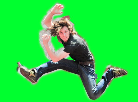
With that in mind we can also reveal what has been taken out of the selection with the white color. So here we are revealing everything that has been picked out by the auto select.
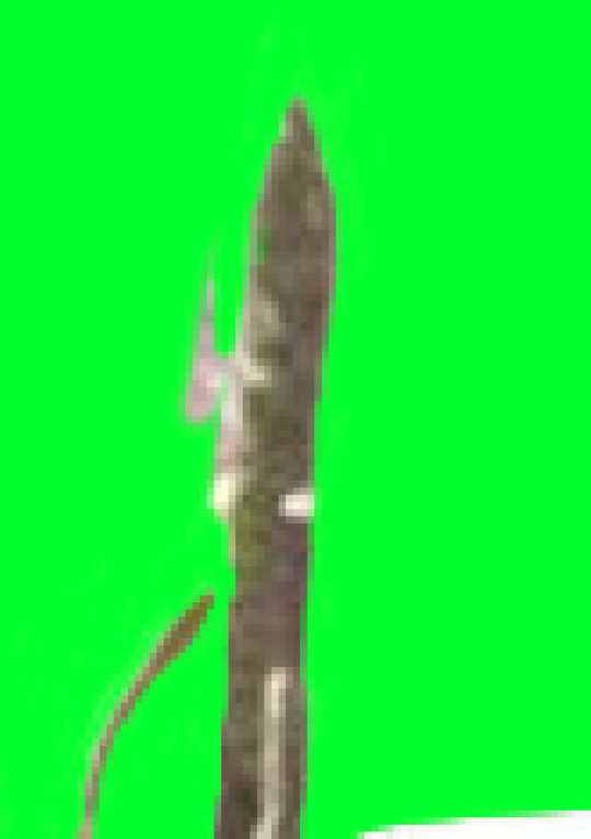
However the hair of this guy will be the hardest to extract. So I will use this helpful and special method.

To start we’re gonna take 2 more copies of the background.
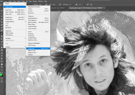
On that top background layer we will desaturate it with an adjustment. (It can be layer adjustment however this is just a one time adjustment)

Then with control + M we can bring up the curves adjustment. What we want is to make the hair very bold so that we can easily pick up on the edges.
Then with control + I we are gonna invert it. And then copy that layer (control + c)
(make sure the whole image is selected when copied)
After that hide the layer and then move onto the next one down.
With the next layer we will create a mask and then...
Paste it into the mask.

With just that layer showing this is what part of our hair selection looks like.
It’s another great starting point for getting the hair done.
After that apply the layer mask then create another one on that same layer with instead of white in the mask invert it to black.

With playing with brush tool this is our result, though it is only one segment of the hair it is good progress.
Another lesson when doing this work is that it often works together in steps that eventually build to the final result.
With file organizing this is how our photoshop project will look.
I’ve done a cut of the entire edge of the body.

Selection and then invert selection.

For the less noticeable parts I’ll just be using the polygonal tool.
Here I went with the brush tool method to get rid of the very very tiny details.
After some time (especially on the hair), this is the final extract.
Moving to Illustrator
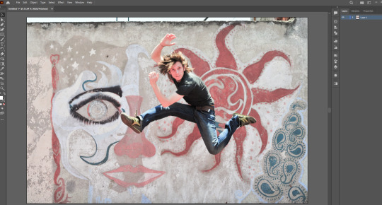
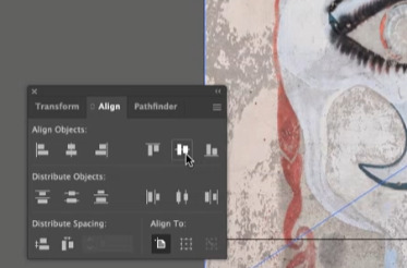
Tip: to make sure the image is aligned properly you can use the align tab.
Here I’ve dimmed the photo so that we can draw over it with clear vision.
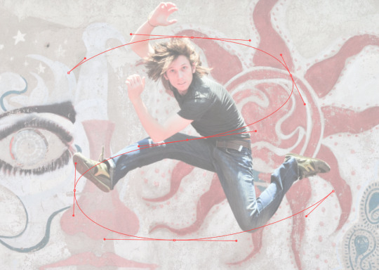
This is going to be the line that swerves around the guy to give a cool effect.
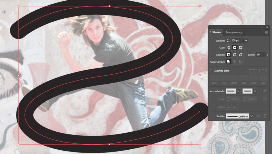
Added a thicker stroke and caps at the end to make it look more flowing.

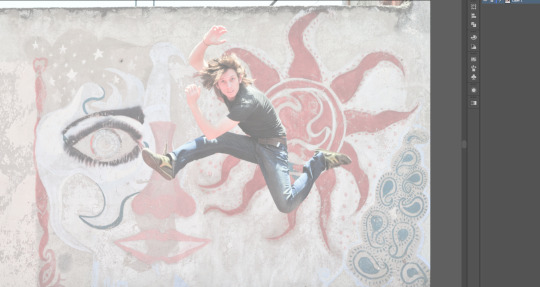
Save as an illustrator file.
And then back on photoshop you should place linked instead of embedded.
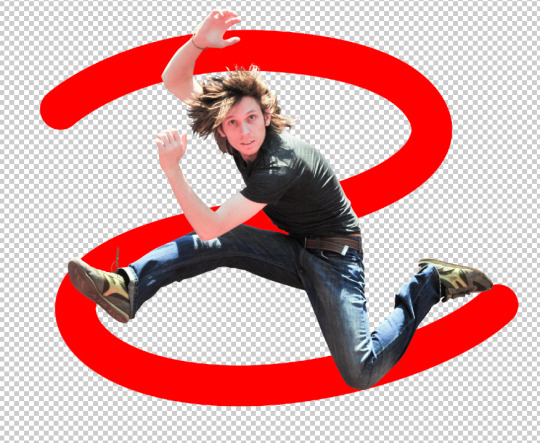

Make a copy of the squiggle and select which parts you want to remain in front of the guy. Then mask.

Looking good so far :)

This is my final result.. Super proud of it :)
Reflection
This lesson was pretty fun. Though I knew most of the techniques I was still surprised by some of the little skills that I learnt. I feel more understanding of bridging illustrator and photoshop together and I definitely feel like I can use this vital skill in the future.
2 notes
·
View notes
Photo
So this is the full breakdown of my mug submission on fan forge.
If you have an account with forfansbyfans please consider scrolling through the fanforge submission page cause there are some pretty cute designs on there
https://community.forfansbyfans.com/m/fan-forge/designs/Homestuck-Fan-Forge
And if you wanna throw down a vote on mine, thank you so much
https://community.forfansbyfans.com/m/fan-forge/designs/Homestuck-Fan-Forge/list/id-12195
I am a sucker for a neat looking novelty mug and I wanted a mug line for the trolls as well, but like there’s only so much we can do if we stuck to the same face mug design as we got for all 4 beta kids
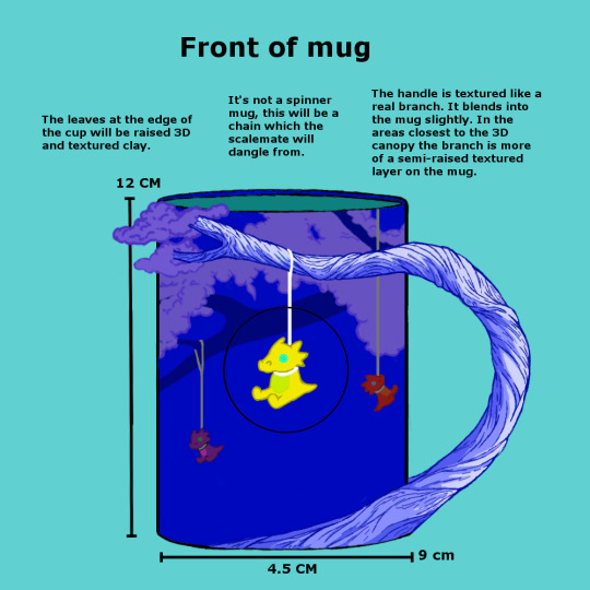
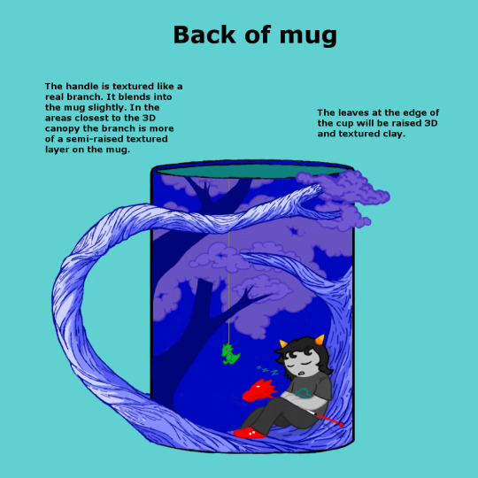
I wanted a mug that was more fun, that gave me an idea of the character it was representing, so I went for something more textured, adding colors from a few comic panels for accuracy, and just having fun with it
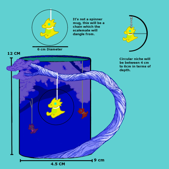
The handle will be textured like a real gnarled tree branch, the leaves hanging off the edge will be a small canopy of sculpted clay, and the ropes holding the scalemates, the branch TZ is sitting on, as well as TZ will be raised on the surface [like suggesting 3D but not actuually 3D].
The larger yellow scalemate on the front will be a small clay sculpt. I really like spinner mugs [where there’s this little thing in the center that we can spin around and fidget with while drinking coffee]. I don’t know if that’s the correct term for that kind of mug, but I’ve got nothing better to call it.

But I didn’t feel a spinner was good enough, for lack of better words. So instead in the little niche pressed into the mug we’ll have a dangle and a chain attached to the Scalemate so he can swing back and forth while you drink.
At least that’s what I want the mug to be.
If it ever does get picked up for production, I’m almost positive that we’d have to adjust the colors of the leaves in the foreground, and maybe lighten up the blue of the background, like I know THAT will be a thing that happens.
But hopefully no major changes past color adjustments, cause I think giving it some texture and a scalemate that’s actually hanging makes it more interesting but also makes it more representative of the character and their surroundings.
The texture and dangle does make it one of those hand wash only, non-microwaves safe kind of mugs, but most novelty mugs are like that. Anyone that collects novelty mugs [myself included] has probably succumbed to hand washing most of their drinkware by now. I mean we might be able to put it in the dishwasher if we make the scalemate dangle removable, but that would be a very small crab claw and I don’t know if people are willing to deal with something so tiny just so they don’t have to hand wash a mug.
But hey you don’t actually have to drink out of it if you don’t wanna wash it, you can also just display it or have it hold your pencils/other stationary desk junk, it’s what I do with most of my mugs at this point [cause there is NO room].
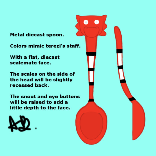
I COMPLETELY understand if the spoon is not your favorite design for a spoon, cause it feels like it doesn’t go with the color and design of the mug itself. I get it, I get what you’re putting down. I wasn’t happy with the branch design I was working with for the matching spoon, but that doesn’t mean a proper matching spoon isn’t being worked on.
As a replacement, I wanted to do a metal spoon instead of a ceramic spoon [they’re easier to mill cause you have a mold, but also I didn’t think that a set of novelty spoons would be something the fans are interested in, but I still want a cool spoon SO] and make it with the coloration of Terezi’s walking staff including the little scalemate head on top.
I originally wanted the scalemate head to be sculpted and facing the correct direction, but I realize that is a LOT of sculpting and it might not be very comfortable to hold, so I simplified it down.
All in all I had a lot of fun with the design, and I hope that if I ever get to make this mug that people enjoy it.
#Homestuck#Terezi Pyrope#Terezi#TZ#Troll#Mug#Mug Design#Contest Design#Fan Forge#fanforge#For Fans By Fans#forfansbyfans#FFBF#contest#go vote#it doesn't have to be for mine#but go vote for something#novelty mug#dangle#scalemate
57 notes
·
View notes
Note
Do you have anymore oil painting tips? For actual oil painting, not digital.
Hi Anon! 🎨
Ahhh, oil paint. To this day, I still get a hit of dopamine whenever I smell paint and mineral spirits. Oops.
My (Mod SugarQuill’s) art degree concentration was traditional oil painting. Note that some of these tips might come down to personal preference and school of thought. Some folks might not agree with everything I say, and that’s okay.
Maxim #1: Color theory is VITAL
Color in oil painting is a lot different than digital art. You can’t just slap on a hue/saturation or overlay layer and call it good. You need to learn your colors so you can apply them directly.
Here is an excellent tutorial on color theory. Here is another one.
All colors in your painting relate to each other. All that color is is the way light reflects off your subject. I don’t care what color that light is–yellow, blue, green, etc. That’s going to affect what color your background and foreground will be.
Complementary (opposite) colors are your friend! Just make sure you balance them out with the same levels of saturation and value.
The ‘balancing’ above is called color bias, and can create harmony in your painting.
Experiment with mixing an opaque pigment/paint with a translucent paint. A good tube of paint will tell you its transparency level.
MIX YOUR OWN DARN COLORS WHENEVER POSSIBLE!
Unless you can justify it for your idea, Do. Not. Use. Black. To. Shade. Some potential alternatives include a burnt umber, dioxazine purple or magenta, green, blue, or the complement of your base color. (This is not to say that black doesn’t have its uses, just seek other options first.)
Maxim #2: THE BACKGROUND IS JUST AS IMPORTANT AS THE FOREGROUND.
I already hear your whining. Back in the day, I did too. But soon enough backgrounds will become your friend. See the above about color.
Build the background up along with your foreground. This way, your painting will feel holistic and ALIVE, darn it.
In general, it’s easier to build from dark to light.
Maxim #3: Build up the whole painting together. Don’t let me catch you over-rendering one tiny part while the rest is practically blank.
This is how you make anatomy, perspective, lighting, etc. mistakes. You need to address each part of the painting and physically back up often to make sure it all works together.
If you’ve ever wondered why different elements of your painting don’t seem to “fit” together (ie, your subject doesn’t look like it fits in its environment), this is probably why.
This is also how you got yelled at a lot from your professors, if you were me. I used to over-obsess and then screw up my painting because of it.
Maxim #4: Try to hold your brush from the end, NOT like a pencil. Try to sit at least 1-3 feet from your easel.
On this note, unless you don’t have access to an easel, oil painting with the canvas down on a table is really ill-advised. You’re more likely to screw up your perspective.
I make it a point to only ever hold it like a pencil if I’m doing really brief detail work.
Maxim #5: Vary your brushstrokes!
Maybe some marks are thinner, some are thicker. Pick where you want the viewer’s eye to go and make your brushstrokes different from the rest in that spot.
Think about what the brushstrokes mean to you. For example, I did a painting where I thought about how I would physically touch the subject of my work. If my hand would start a little firmer then lighten up to a softer brush, I’d replicate the pressure with my brush/paint. It guided my marks.
Don’t be afraid to let your foreground and background subjects fade in and out of each other! It creates depth.
Maxim #6: Use a medium
Generally speaking, if all you use is oil paint + paint thinner, your work is more likely to appear kinda thin and flat.
There are lots of different mediums that do different things. I personally use Liquin, a product from Winsor and Newton (most of my paints are from either W+N or Gamblin, if anyone’s curious. Many of which I nicked from the school because I paid good money to go there.)
Liquin makes paint dry faster, appear glossier, and can thicken or thin out your paint. It’s also good for glazing, building up layers, and mixing paints.
Linseed oil can extend your drying time.
Maxim #7: Choose an emphasis
This goes along with #5. Don’t just make every part the same levels of rendering, color value/saturation, brush thickness.
IT IS OKAY TO LEAVE SOME AREAS LOOKING LESS FINISHED THAN OTHERS! In fact, I’d encourage this! The more refined parts will be the emphasized section that the eye first darts to.
Heck, is every single thing in your field of vision 100% in focus 100% of the time? No. And the eye doctor says my vision is perfect, so you can trust me.
Miscellaneous Maxims
Work from life whenever possible.
Don’t put your coffee/tea/etc right next to your turp jar :(
Don’t hold your brush in your mouth; I used to until I found out it’s an easy way to ingest toxic paint.
Acquire a product called The Master’s Brush Cleaner and Preserver. It will save you so much time and money, you’re welcome. Miracle product. Pure magic.
A professor once told me, “If you’re not painting, you’re not thinking.” It really stuck with me.
Anyway, I’m no master but I hope this helps. Let me know if you guys have more specific questions. Note that a lot of this can translate to digital painting. But I do adore the buttery feel of paint swooshing across my canvas.
–– Mod SugarQuill ⚡ ko-fi | Instagram
610 notes
·
View notes
Text
V5 Corebook, no gloves review P.1
Y’all know me, it had to be coming. Sorry it took me so long. Part 1 is about the physical aspect of the PDF (I don’t have the physical book at hand yet), Part 2 is going to be about mechanics and “content”, since I’m still testing that out.
So first and foremost, the small Mature Content Warning that was added last minute to the PDF. It has been published online on its own so I have no issues posting it here:
Mature Content Warning
For the past several decades, Vampire: The Masquerade has addressed the
darkness in the real world through horror stories: it has talked about
AIDS, capitalist exploitation, sexual predation, the resurgence of far-right
political extremism, religious fanaticism, state and private surveillance,
and many other issues. This version of the game does not shy away from
any of the above, and we believe exploration of subjects like these is as
valid in roleplaying games as it is in other media. Including a problematic
subject in a Storytelling game is not the same as glorifying it, and if you
take the chance to explore it critically, it can be the exact opposite. If we
understand the problems facing us, we are better armed to fight them.
V5 includes in-world references and expressions of the following:
sexual violence, political extremism, physical violence and gore, mind
control, torture, abuse, imprisonment and kidnapping, racism, sexism,
and homophobia, to name a few. It’s a game about monsters.
“Why are you telling me this?” you might be saying.
Someone at your table is not familiar with this game. Someone at your
table has dealt with some of these issues in real life. Someone at your table
wants to know that you read this warning and know you will be considerate
to them as players, while putting their character through the wringer.
In the Appendix, you will find concrete techniques on how to handle
difficult subjects in your game in a manner that is respectful to your players
and their experiences. Calibrate beforehand which techniques your
group wants to use. People have different needs and not every method
works for every person.
This is a game about monsters. But it is only a game.
Don’t use it as an excuse to be a monster yourself.
This is something I consider good (that last sentence is more necessary than I’d like to know), considering the rest of the contents of the game, but I wish they had taken a far more respectful approach to the mature themes instead of name-dropping horrors without meaning.
Now, the PDF itself has MAJOR issues in terms of book-making. The bookmarks are terrible, they integrate stuff from the side boxes that just make no sense, there’s little to no proper hierarchy, some are even missing, the internal links don’t work very well, it’s just poor, poor design.
Seriously look at this:
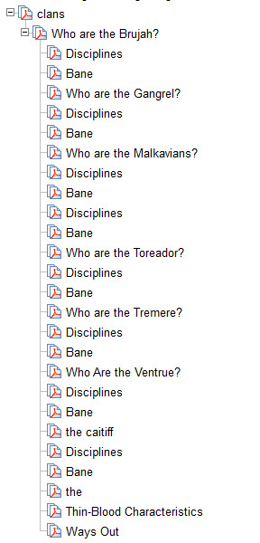
How can I navigate this? Like seriously ? I know there’s a table of contents, but it should be in the navigation bar as well, that’s how PDFs work.
(The Nossies are missing, it makes me laugh because it’s the Nossies, but they’re there, that’s why Malks seem to have two sections about Disciplines and Banes)
Now, the layout itself isn’t the worst I’ve ever seen, and some parts of what I’m going to be saying may fall upon “personal taste”, but I’ve been editing PhD thesis for long enough to recognize bad layout when I see one :p
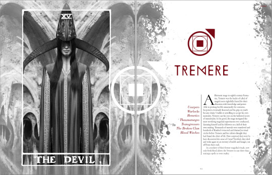
Like, this is fine, I really like the new Tremere Clan Symbol (all the clan symbols are pretty neat tbh, and the Disciplines symbols are the VTES ones so that makes me extra happy), and they’ve used beautiful fonts, even if we disregard that they couldn’t be bothered to spell HERMETIC correctly...
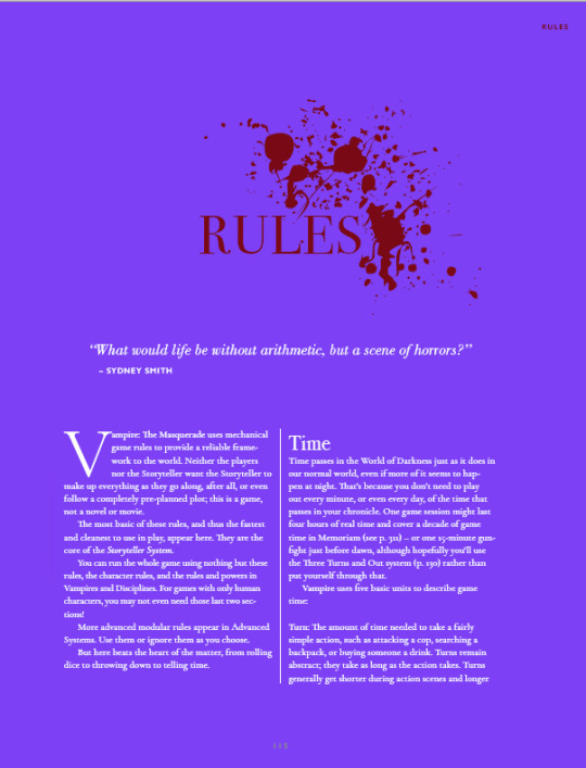
However there are two major issues with the book layout as it stands, as you flip through the pages. First, the text isn’t justified (aka aligned left and right), and second, the text is sometimes in two columns, sometimes in three. Quite often, the titles are at the end of a column (see here “The Anarchs”) and some paragraphs have poor lonely lines in the precedent page or column and it just looks bad. I screenshot some pages with low res: the text itself does not matter so it’s ok if you can’t read it ;) But notice how “Relationship” is hyphened because of the three columns there...


Then, you have plenty of pages which have either black background or colorful background. That would be fine if some of the pages weren’t the kind of pages you’d want to print out to give as handouts to players...
My poor eyes.
These four pages would be far more useful with black on white, even if plenty of us like reading white on black because it’s easier on the eyes on a tabler, but this isn’t printer friendly when you sell a pdf... This should have been in the Appendix with a printer friendly version.
Sometimes the placement of elements is just weird or off putting in certain pages:
This image touches the bottom of the page, but there’s three meters of white space above. There are examples of the exact opposite (the image touching the top of the image with extra space at the bottom).

This chart should be centered, I think.

Something’s wrong here, isn’t there something missing above the first page? And that block alone on the second column, it’s very common across the book.
Now, on a tablet or phone, it’s easy to double tap and match the column length, and the fact that the text isn’t justified isn’t much of an issue when reading plain text, but I find that the text not being justified in any of the pages is just Bad Design.
I did like the separations, the small lines between the columns and all, they looked great, the change of fonts in between “boxes”, “quotations”, “examples” and so on was also well made.
Now, the Art.
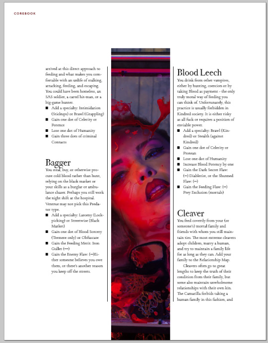
Some of the art is old WWP art, some of it is WoD MMO art, some of the art is newly commissioned illustrations, and some of the art is photography with (or without) filters.
Old WWP Art is clearly to link back. The old Helena art is there. Theo Bell got new art (I think it’s new?), but Helena didn’t.

They also reused MET By Night Studios photography for Jeanette and Therese, and cropped the photo, taking away the key composition of the original. Did Bradstreet give the rights to alter his work with such cropping?

Note that I personally dislike this picture, cropped or not, a lot, simply because being a Bloodlines fan I don’t think it represents either Therese or Jeanette properly. Jeanette wouldn’t be caught with a power stance and serious face like that, Therese wouldn’t be caught with such a non imposing, reserved pose, and coming from Bradstreet, I am VERY disappointed, because he has done official art for Jeanette for the video game before and it was far better representative of her; the model from the OG picture looks far closer to the Jeanette we meet in the game, but this is truly a matter of personal taste and opinion so I won’t scream again about it.
The MMO art is overall great quality, and sometimes it’s even used in a very smart, beautiful way:

(I’d have put this image on the Embrace and not on Predators, tbh...)
They also used the fashion spreads looks for the MMO in the corebook, some of it is plain silly, and I’m very much afraid they’re used literally as how PCs look like. Here’s the Gangrel Fashion splat:
I consider the art to be good, and to be great concept art for a MMO, and great fashion shots, but.. in VtM? this is not Masquerade Friendly. Also these types of art (as well as the Investigator image you can see on the first few pages I pasted above) are all 20 something model-like people, and yes that involves the Nosferatu, because they’re fashion drawings. Fashion drawings have stupid proportions and no realism, since they’re meant to show the clothes, not the model. And for a book about characters, well, why? This was suitable for the MMO because MMOs have transmogs and such and such.
I just find them to have completely missed the “Punk and Gothic Aesthetic of the World” and just stacked as much weird clothing as they could to look “hype and modern”. Hipster Instagram Fashion that’s unwearable.
Yes, vampires are marginal by nature, but please, their goal is to blend in, not be noticed, and considering how long they’re effectively inactive, and how age affects your will to stay on trend... Eh.
The New commissioned illustrations are hit and miss, and some of this criticism does fall on “personal taste”, but here I ranted about one of those art pieces (which was the page for the Vault, but it’s in the book). They’re all a little bit like this, some having a far better composition even if they all seem to be this saturated. They’re all overall good and I like most of them.

This one is “look at my butt” kind of situation. I’d have rather have this picture just without this foreground couple, it would have been a perfect street look example, and the two jumping above the roofs guys would have had the attention they deserved. I love the fog, the graffity, the textures are nice, i just hate the butt.
And finally, the big chunk, the Photography Art.
I understand how they made it so that most people would be able to “make their own art” (photography being now more accessible to the masses than illustration), and that is something I nod to, appreciate and completely understand. HOWEVER, Photography IS art and not everyone can be a Photographer with a snap of their fingers (or a click of the camera :p).
What’s good with photography art is that they picked diverse looking models of all sorts, and they put them in interesting and somewhat telling situations. What’s bad is that “suddenly” all “positions of power” are held by middle-aged (so plain old 60yo) looking vampires and all Anarchs Rebels looks like they’re in their twenties.
This goes against VtM. Older vampires tend to look younger because being a King or Queen at age 14 wasn’t uncommon until the 1800s. Embracing people right at the end of their teenage years, at their prime, at their best, as they’re “perfect” is the best a vampire could do (remember Dark Ages have rules against embracing the young, the elderly, the crippled, the insane...).
It’s only after WWII that embracing people over 40 wasn’t uncommon.
I’d have LOVED to see a 60yo looking Punk, and have the Dominating Prince on Their Throne look like, 15. And own the place.
Now there are plenty of issues with some of the photography art, and here’s one (page 232) that I’ve screamed at for like, two weeks now.
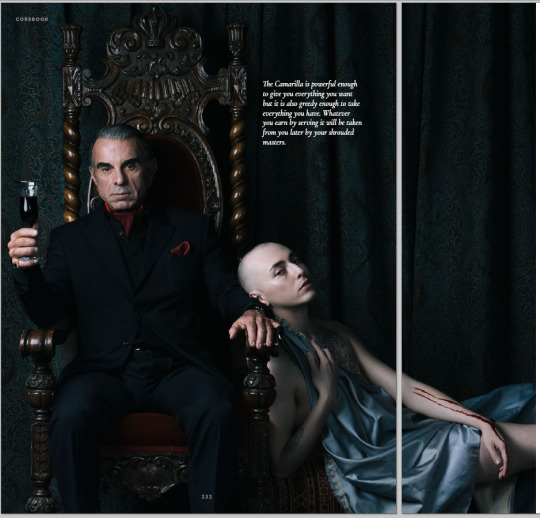
This picture had one of the best compositions, the diagonal works great, the leaning away, the androgyny of the chalice (despite them still having a personality and free will...). How he filled the glass with the blood from the chalice through this.. pinky finger condom thing, okay, sure, weird af but why not. Does’t explain why the chalice has two marks on their forearm but okay. Sure. Also, FINALLY a photography in VtM of a dude wearing a suit that’s actually his size? Great. And it doesn’t come out of a Goth Store (tm). Great! Amazing!
But there are in this picture TWO things I just cannot forgive.
First, the guy has his jacket buttoned. When you Suit 101, when you sit, you unbutton. You button up when you stand up. Now this is supposed to be The Ventrue (tm), this is just wrong.
Second, his fucking zipper is down. YES HIS FLY IS DOWN. How the hell did this not get photoshopped in like two seconds? Because of the jacket, I know this is an accident; the model just isn’t used to suit etiquette. You could explain this away by saying he’s a pervert or something, but in that case you’d have needed to add slightly more eroticism to the guy (jacket and maybe shirt open, no glass, slight smile, leaning towards the chalice and not away from them?).
Some of the photography-manipulated art is just beautiful, let’s be honest, this is the splat before Disciplines:
I’m not a fan of the orange (simply because I’m not a fan of orange in general), but this works just so well, the composition, the lines of sight, the shadows, the mirroring, just, top notch choice here, who did this??
But then you have post apo band :p
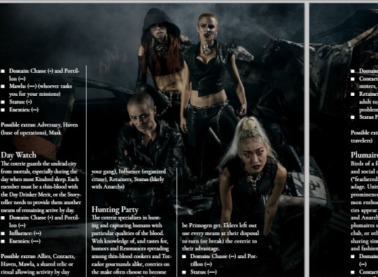
I mean I like this group shot, it’s very classical, it looks like a fine coterie with a specific turf.. But is this Mad Max? I know Gehenna happened, and I do know some people actually dress like that, but if you’re being tracked down and hunted into oblivion by the Second Inquisition, you.. just don’t do this.
Most of the photography is like this; marginal overdressed looks. Now this is personal taste again, I just wish we had more.. normal looking people. People who are exceptional, but not through their looks or clothing style. The back of the book claims “A Storytelling game of personal and political horror.” and I see little of it in the pictures and illustrations.
Anyway, want more Art Rants? click here
Stay tuned for part 2!
50 notes
·
View notes
Text
Coloring in grey scale
So, hey, this is somewhat of a tutorial for those curious about some of my coloring and blending. I made this especially for anyone younger than me and is exploring digital art, but this is also for others who are curious about what I do. I love reading other artist’s comments and looking at their WIPs, so why not.
Another reminder: if you’re looking for my artwork, please follow @rainbow-illness and not this blog. All of my finished stuff goes there; usually, my works in progress (WIPs) or Angry Doodle Corner go here. Sometimes I use this blog to repost my art, but that is my official art blog, no this one. Not unless you like nonsensical posting and metal, then have at it. If you have any questions, don’t be afraid to hit me up, I love talking about art.
So I can’t always sit down and talk about my processes and how I go about doing them, but I was able to sit down and take some screencaps while I was working on my iPad Pro. Using the iPad is actually my first choice to draw on because of the convenience of carrying it around like a sketchbook, whereas my laptop isn’t always easy to carry around--it’s a big laptop. While I use my iPad, I also like to go back and correct things, recolor, re-proportion, or spend more time privately working on a drawing. I have my iPad with me, all the time, so I’m out in places usually like Starbucks doing this. I also struggle with pretty bad PTSD and agoraphobia, so having my iPad out with my headphones on gives me an excuse to put my mind elsewhere to calm down. My family just usually looks at me and goes “oh, she’s working on her art again”; I did this as a kid, too, only with sketchbooks.
I do not have a Cintiq either, though I would absolutely love one. This laptop is capable of using a stylus, but I think I need a better one to do it with. All I’m using is a cheap Wacom Bamboo tablet that I’ve had for five years, that’s it. Everything I’ve done on this blog has been on a small surface. So if you’re just dabbling into art, don’t beat yourself up for having the small stuff, I’ve worked with small stuff and still do. The only thing I have that’s not small is, well, the space and processor on my laptop are much faster than any other laptop I’ve owned, bought especially for graphic design classes and my artwork.
So, that being said lemme just forewarn some of you guys. My artwork is all done in two to three layers! Yes, you read that right! Why? When I was 16, I didn’t have a Wacom tablet to mess with, so I had to use a mouse and learned from there. When I turned 18, I got my first Wacom tablet while working my first official job and the family computer didn’t have a good processor. So when I got my first official laptop, it was basic and not made to run anything beyond the web browser and such, it could barely handle Photoshop. It did, however, run Paint Tool SAI with no issue (which is why I still prefer it over anything I use), it just couldn’t handle more than five layers. After losing my drawings constantly and not being able to do anything in the prized software I’ve been eyeing since my Sophmore year of high school, I found a workaround with it.
And that’s what I’m going to write about here. With that in mind, no, you do not have to limit your layers! I’ve taken traditional art classes so my first instinct is to literally paint over my stuff like I would on a canvas. If you don’t want to do that, you don’t have to! Yes, I am nuts.
That being said, let's do this.
If you haven’t taken traditional art classes, that’s cool! I’m going to be using some art terms you haven’t heard of, but you definitely will when you take your first ever drawing class. These terms are foreground, value, negative space, contour, and weighted line (I’ve seen it called line weight too). For the more experienced art students who are likely groaning over that stupid contour practice from that book “Drawing on the Right Side of the Brain”, I’m sorry, guys. Newbies, you are going to know this.
And you are going to hate it. While I still hate it and, yeah, my eyes are rolling into my skull right now just even talking about it, there are some useful practices in here that I... actually use. Who would have thought? At least we’re not talking about still lives.
Anyway, here’s what I’M going to say that some art teachers will not tell you but I want anyone to read this to know:
- Do not obsess over your drawing to look exactly like your reference. Just don’t. Forget this completely, worry about it later or don’t even worry about it at all. This is your style, your interpretation.
- Digital art is hard. Art is hard! Practice makes perfect and you learn over time just by studying (looking at) other pieces of art. It took me like well over 10 years to find my own little niche and I’m still playing around with coloring styles. I have a lot.
- If you’re just starting to draw with a tablet of any kind, play around with it. My first official program was a cheaper version of Paint Shop Pro and when I first got it when I was 14, I sat around and experimented on layers to see what it would look like. Explore!
- When you start drawing figures or faces, try not to think of it as, well, face or a figure. Reduce it to basic shapes, like squares, triangles, and circles.
Greyscale can establish light source, value, scale, and negative space.
I don’t always use greyscale for my art, but when I do, I appreciate it because it makes my life easier. For example, Alphonse Mucha’s pieces here from his “Slav Epic”.
Chances are, you’ve seen Mucha’s art nouveau on prints, fanart, fabrics, and all of that. But Mucha did so much more and he is a huge influence on me for a reason. By the greyscale we see here, we can see foreground/subject with each illustration. Mucha is using value (that’s shadow) to emphasize this, in addition to negative space (background) to draw you in, just by using black and white. Notice how the other subjects don’t have such a powerful contrast and light source versus the other, especially the woman on the left. Mucha made his art pop by his understanding of contrast.
For this first part of this entry, I’m going to be using Papa Emeritus II from “Ghost”... who is a good example of how to draw faces, too. Huh. Regardless of what drawing program you’re using, keep your opacity low, at 50%.
Simplicity at its finest
Instead of focusing a lot on Emeritus’ face, I’m going to focus on the negative space behind him. I’m using this to define his figure. This is a good picture because of the stark contrast, though, it’s a little tricky because it is really contrasted and you can’t see where the light source really is. But that is okay! I am going in and just using this negative space, the contour of his head and torso. Before I even think of a face, I want to softly go in and use black (or grey) to fill up that negative space. Keep it simple and work your way up.
After I lightly fill in the negative space around him, I can start lightly going in and establish his face by blocks of shadow. And this is why Emeritus II is such a good example for this kind of work. I don’t usually start going in and drawing eyes, I rely on the shadows of the face to see where their eyes, ears, lips, and such lie.
Here’s another example (though, it’s old):
This is in my maroon style underpaint, which is what I post most of the time. For their faces, I just used basically eye sockets to start working on their faces, like Papa Emeritus II down below. Again, this dude is a great example.
Here is where it may get a little funky. I created a new layer and set that layer to Multiply, still keeping that opacity low. Since I have no light source and I just want to create a really dramatic lighting, I made a vignette with a simple airbrush tool.
With that little vignette, you can create a new layer (unless you’re me, I just merge it down because of that constant fear of nonexistent software crashing) and I’m using the color pick tool to go back and forth to start using greys to really get into Emeritus’ face, especially his wrinkles. I’m painting over it constantly, switching back and forth between a paintbrush tool and color pick tool to blend. Again, keep your opacity low... unless you’re me and you’re feeling adventurous. You’ll also notice here that I have more than one photo reference. I use several for a lot of my art, so I encourage you to do the same. I had no idea what his jaw looked like, so I grabbed a second photo. Now that I have a better idea of where his hat ends on his forehead and how his nose looks, I start doing a weighted line.
Weighted line and Contour
Now is the dreaded talk. Of contour.

Welcome to Drawing I hell. This cursed image is from the book “How to Draw on the Right Side of the Brain” and if your teacher does not talk about this in your first drawing class, I am going to eat my hat... I have a hat lying around here somewhere. ANYWAY, the contour line exercise is basically you just using a neverending line for a drawing. I don’t know who drew this (and tbh, thanks a lot for every single boring assignment I’ve done in drawing classes), but this guy used contour lines for his drawing. I’m having war flashbacks over here, but I managed to find an art teacher’s page talking about different types of contour. My god, they are evolving.
Going back to our dear friend Papa Emeritus II, I used weighted line to start adding in little shadows to his face. Weighted line goes hand in hand with contour; it is a great technique to not only add details, but add little bits of shadows.

This is a simple example; the thicker line is adding to the shadow of the apple, giving it value!
Papa Emeritus II is such a good reference... I used him as inspiration for King Melwas here.
Gwenhwyfar is also a good example of weighted line. Gwen is essentially a very, very pale character. In contrast to Melwas, who is in darker clothing, Gwen is soft, she is the focal point in this drawing. For the little pieces of her hair, the corner of her lips, eyelashes, and her fingertips, I used a weighted line to establish these things, otherwise, Gwen is so pale, she’ll easily be washed out completely.
This drawing of Alice, which I’m still messing around with, is another example of how effective a weighted line can be with depth. The lines I added into her face, eyelashes, creases, hair, and fingers add those little details since everything I’ve done before like Papa Emeritus II was so soft with a low opacity on the brush settings.
Layer masks and curves
There are two ways you can color greyscale images.
You can do this by going into Layer > Adjustment Layer > Curves (this is how it looks like in Procreate).
This gives you a neat ol’ base color! I am playing around in the blues, adding soft hues of blue in their figures and the white in this picture can either turn blue, cream, or even green. You don’t have to use Blue, you can use any of the other colors. For me, I’m always drawn to blues. Another cool thing to play around with is Color Balance, which is underneath the same function as Curves.
But if you don’t have any of these, you can add a new layer, and do Multiply.
The only drawback to this, of course, is how destaturated (the lack of color) it looks. And yes, that’s an issue you will have and I did run into this while doing this. How I combat this is using additional layer masks. Believe it or not, Alice here was once at a grey scale, looking even more desaturated than Gwen.
For Alice’s face, I went in and use:
- Soft Light because she needed more peach and roses in her skin. Omri’s original drawing gave her a light rose blush so I wanted to do the same.
- Overlay to mask out the black lines from the greyscale I had.
- Lighten which I used to make her lips pinker, her apron’s shadows lighter, and parts of her hair brown.
The same went for Gwen, who is, again, very pale. But while she’s supposed to be pale, I didn’t wash her out completely. To add more saturation, I used a combination of Soft Light over my Multiply layer and Overlay to start working at the highlights on her hair, nose, and shoulder.
This little walkthrough isn’t as visual as I like, but with limited software like Fire Alpaca, GIMP, or Paint Tool SAI that don’t have the abilities of Photoshop in terms of color correction and playing around with colors, I really encourage you, readers, to play around with these tools. Using the color picker back and forth, especially after using layer masks, gives you an ability to mix and blend colors. The reason why I work with greyscale or a maroon under paint is that you can create brilliant colors and make a new palette; the trick is to constantly mess around with them. I never go in and flat out color anything, with the exception of things like “angry doodle corner” which is basically what I call my lazy drawings, drawings where I’m just honestly goofing off with.
So in summation...! Or me trying to summarize this.
Experiment and explore with layer masks and adjustments. Whoever says that using these tools isn’t real art, they’re wrong. And please don’t ever be afraid of using references of any sort! Alphonse Mucha is saved ten times over on this computer.
#my art#tutorial#i think#an attempt was made#digital art#procreate#ipad drawing#ipad pro#Alice madness returns#alice liddell#american mcgee's alice#alice asylum
7 notes
·
View notes
Text
vanya verse extra
i was going to do this a while back when i reached 50 followers, but now i’m at well over 100 so uh let’s just pretend this is in celebration of 100 instead
if you follow my main you’ve probably seen that i’ve been bitching complaining about being sick (both body and brain) since december, so i thought maybe writing this would help me feel better. spoiler: it didn’t, but i had fun working on this anyway! i’ve missed this version of these two dorks more than i thought.
set a couple years after vanya’s family ❤️
Sidney stops by the grocery store on his way home from the shop, trying to remember the ingredients he needs for the soup he’s planning on making. He’d made a list that morning, but somehow it ended up lost between making sure Anatoly and Geno were ready and settled and then leaving home for the shop. The most important ingredients, the chicken and the broth and the noodles, he already has at home, he knows that much, so it’s just a matter of picking out which vegetables he wants.
By the time he gets home, grocery bags in hand, the house is eerily quiet. There’s something playing on the TV in the living room, but Sidney heads to the kitchen first, unloading the bags and putting everything away where it belongs.
He’d also picked up some Clorox wipes, because even if the rest of the house is covered in germs, he’s not going to end up sick any time soon. He’ll make sure of that.
Sidney gives the kitchen a wipe-down, especially focusing on the fridge door handles, and then heads into the living room.
The TV is certainly on, although it’s not nearly as loud as what they usually keep the volume at. The Rangers are playing the Flyers—and winning, thankfully—but the commentators are only just a notch above being on mute.
Which explains the sofa.
Geno’s passed out and sprawled out on his back, one arm dangling off the seat edge. His legs are stretched out, and, because the sofa’s always been too short for him, his feet are hanging well past the far armrest. He’s wearing sweats, one leg hiked midway up his calf, and a white t-shirt with mysterious stains in different colors down the front.
And, asleep on Geno’s stomach, is Anatoly, his tiny little hand grabbing a fistful of Geno’s shirt. He’s been changed at some point—he’s not still in the onesie Sidney had put him in before he left that morning, which could be the result of a multitude of things. But his new one is clean, and when Sidney puts the back of his hand against Tolya’s forehead, it’s warmer than he’d expected.
Not as hot as he’d been before Sidney left to go to work, though, so that’s progress. Anatoly’s sinuses must be more clear now, too, because his little snores are back, sounding more like the soft purr of a kitten.
Geno’s snores, though… well, they sound like Geno’s snores, congested or not.
It isn’t until Sidney turns toward the coffee table, though, that Sidney realizes just what kind of havoc they’ve been wreaking.
There’s balled-up tissues everywhere—on the sofa around Geno, on the floor, on the coffee table. Sidney can see at least one empty Kleenex box, and another that looks like it’s getting close to the bottom of the box. Anatoly’s bulb syringe is on the coffee table, though whether it’s been used or not, Sidney can’t tell. It’d been given to them by Tolya’s doctor when they’d gone to his office on the first day of his cold, probably looking the part of brand-new parents overly concerned about a head cold. But the syringe did its job to help clear out all the mucus so Anatoly could breathe easier, and if they had to embarrass themselves to get some help, well, Sidney’s okay with that.
The sheet of paper they’re using as a time table of Anatoly’s medication and temperature is there, too, and although Geno had told Sidney that he can remember when to give Tolya his medication, Sidney notices that Geno has kept up with it, even writing his own times and temperatures next to Anatoly’s. Both of their medications—Tolya’s syrup and Geno’s maximum-strength pills—are scattered across the table, destroyed foil sheets of pills amongst all the tissues. Somewhere in there are both the adult and baby thermometers—Sidney can see the edges of both sticking out from underneath all the mess—and there’s a tall stack of baby books near the corner of the table, some in Russian, others in English.
There’s one thing that stands out, though, and all the cold debris is carefully kept away from it—Anatoly’s baby book.
When Sidney had first suggested it, not long after they’d finished setting up the nursery, Sidney wasn’t sure Geno knew what he’d meant. He’d guessed it just wasn’t something Geno’s parents had done for him, but as soon as Sidney explained it as ‘a book of stuff about your baby,’ Geno had insisted that he would take the reins on it.
Thus, the baby book.
It doesn’t look like much from the outside, just a large sketchbook covered in a black cloth cover, but the inside’s what really matters. Each page is a different drawing Geno’s done of Anatoly, some colored, some just a pencil sketch. Geno always writes a few sentences in Russian in the blank space around the picture, a note for Tolya when he’s old enough to look through the book himself, and when a page is finished, Geno gives it to Sidney to write a few things, too.
The book never fails to make Sidney emotional every time Geno brings it to him, and it’s always a little difficult to find the right words to put on each page, but he knows it’ll all be worth it when they can give it to Tolya, every page complete.
Sidney flips toward the most recent drawings: one of Anatoly’s first smile, his first meeting with his Russian grandparents, his first pair of real shoes—Geno’s idea, of course.
There’s a new one, though, one that Sidney hasn’t seen yet, and it’s clear that it’s from today. It’s still in the early sketching phase, all pencil lines that look more like scribbles to Sidney on first glance, but it’s clear enough what it’s supposed to be. There’s a rectangle with tiny stick-like figures in the background, center ice marked out in a light gray. The foreground is a little harder to make out, but once it clicks for him, it makes Sidney’s heart melt.
It’s a drawing of Anatoly as he is now, sleeping on Geno’s chest, from Geno’s perspective. Tolya’s big baby head; his tiny fist holding onto Geno’s shirt; Geno’s huge hand on Anatoly’s little back, holding him in place, wedding band on his finger—Sidney can suddenly see exactly how beautiful the drawing will look when Geno finishes it.
Geno stirs then, his head turning from side to side, and Sidney tries to close the book and put it back before he wakes, but ultimately Geno falls back asleep. Sidney cards his fingers through Geno’s hair—his curls are growing out again, and Sidney would do just about anything for him to keep his hair the way it is now. Geno’s forehead is hot, though not too worryingly so, and when Geno shudders, Sidney reaches for the soft blanket draped over the back of the sofa, making sure they’re both covered from Geno’s toes up to Anatoly’s back.
Sidney kisses the top of Tolya’s head as softly as he can.
And then it’s time for soup.
84 notes
·
View notes
Text
Week 9 Photography in London
Activity 1 - Cropping
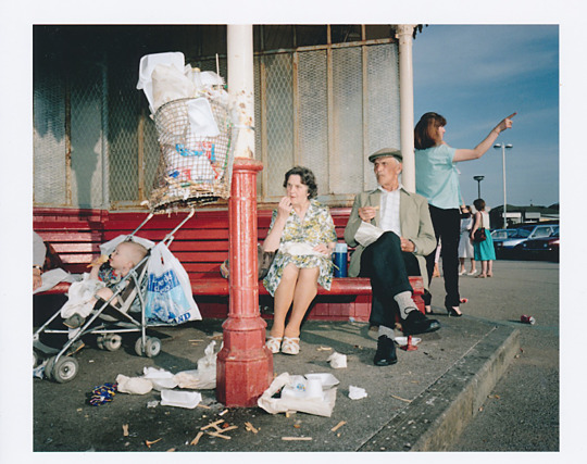
Before Cropping
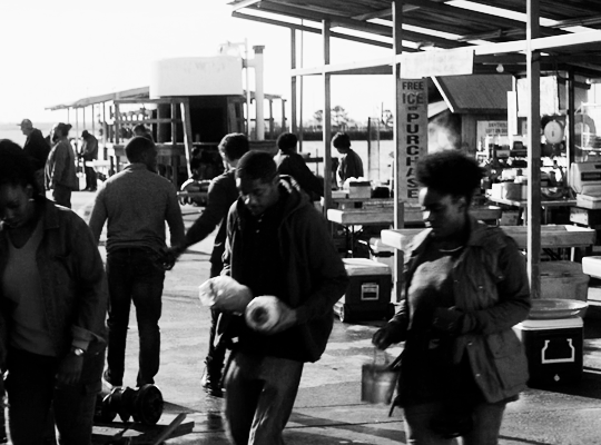
There is a lot going on in this photo. There is the baby in the stroller, the couple on the bench, the trash all over, and the woman on the right pointing to something. Everyone seems to be emotional, alarmed, or somewhat upset based on their face. For example, the baby is crying, the couple is looking at something with a disturbed look on their face, and the woman on the right appears to be on the phone and pointing at something. Although it is hard to tell what they are thinking about, they give the sense that something is wrong. It makes the viewer more curious about what is going on.
This photo could be about anything. The scene appears to be something similar to a bus stop of some sort. It looks like there is three or four groups of people that don’t know each other, which is typical at a public bus stop. The old couple look to be annoyed by the baby and the parent who is cut out from the photo because the baby’s face looks like he/she’s crying. The woman on the right appears to be on the phone, maybe waiting for someone to pick her up. There’s also a group of people in the background circling up together which, in my opinion, gives the impression, they are discussing whatever is going on. The trash in the foreground brings the scene together because it makes it all look messy and no one wants to be there.
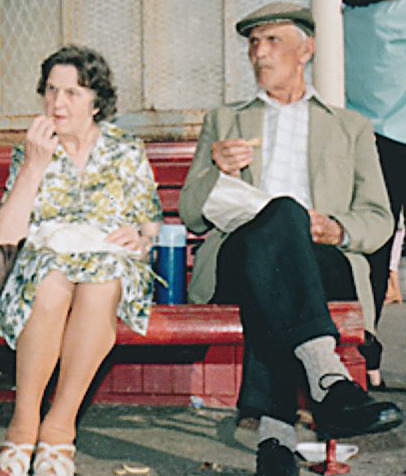
After Cropping
After cropping this photo, it focuses in on one subject: the old couple on the bench. Without previously seeing the original image, there is less to think about. The only question that remains is, what are they staring at? There is no longer trash on the ground or a baby crying so it is easier on the eyes to know what to look at. Even though it is stereotypical to assume that elderly people are upset and annoyed often, that is exactly what this photo shows. It appears to be a sunny day based on the shadows and the natural light of the sun is shining directly on them. You can tell they are older people because of the way that they dress and their faces.
They seem to be calmly enjoying their food, but have abruptly been distracted by something. They seem to be comfortable and keeping to themselves because of the fact that they are eating food on a bench outside. When you look at their faces up close, they look more bewildered than they do upset. This couple is old-fashioned and minding their own business, but something grabbed their attention.
Activity 2 - Captions
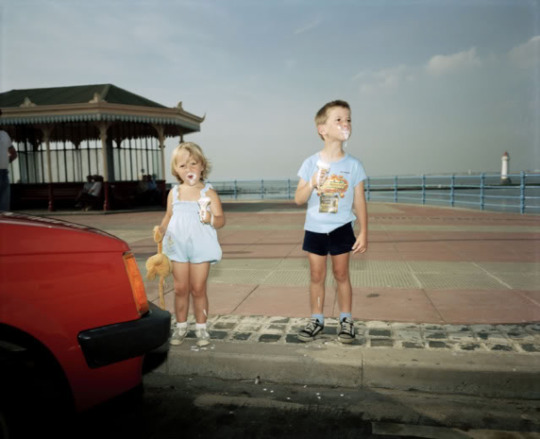
1. Ellie and Jacob on vacation in Florida, 2004.
This caption makes it look like two cute young children are near a pier on the ocean and are on a family vacation. You would assume it was taken by one of their parents to record memories from their childhood.
2. Messy isn’t always a bad thing.
The two children look to be enjoying their ice cream as it falls down their face. Even though they are messy, they seem to be enjoying the ice cream. The caption emphasizes the ice cream.
3. Keep your loved ones close.
From one perspective, it looks like the car is about to hit them. This caption puts attention to the car before the kids get hit by it.
4. Look both ways.
This caption makes sense because they are both nearing the street. The caption puts emphasis on the boy as he looks to the side before he crosses with his little sister.
1. Dozing off into space.
This photo could be about the boy who works at the laundromat who is bored out of his mind. “Dozing off” in the caption makes the viewer look at the boy’s posture and facial expression.
2. Just hanging on.
This caption references the boy’s attitude and posture, as well as the socks hanging from above. Which one is it about? The artist leaves it up to the viewer to decide.
3. Chores
Laundry is a common chore done by kids/teenagers so it gives the feel that the boy is just waiting for his laundry to be done. It makes you notice the laundry basket next to the guy and think back to your own personal chores that you had as a kid.
4. All red, everything.
This caption makes you look at everything that is red in the photo and realize that the boy’s entire outfit is featuring red.
Gallery Activity
Mohamed Bourouissa
1. The main message of his work is to convey the societal differences in society and to make people recognize that marginalized people are not given the same attention as others. The premise on most of his work is that these people are not bad, they’re just different. His photos are inspired by a lot of previous art in history.
2. Depending on the photo, there are various techniques that he applies. In most of them, light is a key tool that he uses to create the mood. In the photo of the man getting arrested, he uses hard light, which looks that appears to be glaring in the window from a sunrise, to make it more dramatic. From my perspective, it looks like the man was sleeping and the cops broke in and arrested him. He looks scared and undeserving of this action which ties into the theme. Also, I really like the one where the light from the sun is shining in, but on the other side of the photo it is raining. I would assume it is making a connection between the happiness of the city and the dullness of the banlieues (suburbs). The shadows in this photo do a great job of separating the two sides from one another. Also, he purposely dressed those two guys in all white outfits to show the contrast between their skin colors and outfits. They’re smiling to show that they are good people that aren’t given a chance. In the last photo from the website, he uses the hard light from the sun shining on the man’s face to show the contrasting skin color as well.
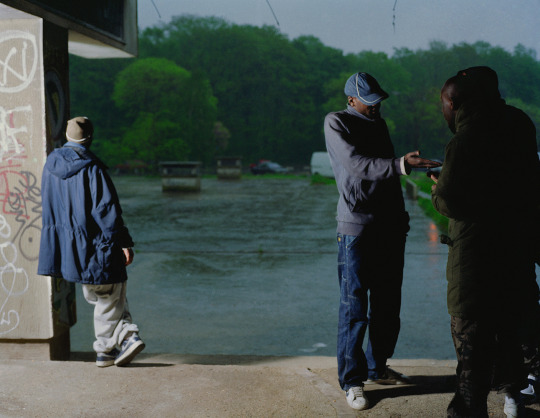
This photo by Bourouissa has focus on the entire photo. It is more blurry in the background, but still easy to tell what is shown. The contrast between the sunny day and dreary dark rainy day is unique and is appealing to look at. The light and shadows are the most important part of the photo. The natural hard light from the left creates shadows that separate the dry warm setting from the rainy, dark one. It also separates the one guy from the other group of guys. You would probably need to read the exhibition text to understand the underlying message that Bourouissa is trying to convey. This type of photo really intrigued me because I had seen nothing like it before so I thought it was genius.
Anton Kusters
1. The message that Kusters is trying to convey is the difficulty of representing trauma and sorrow. In The Blue Skies Project, there is a lot of contextual meaning that goes along with the series of photos. He is trying to document the history of the death camps and his personal connection with his grandfather who was a victim of the Holocaust.
2. When you look at the series of photos, you can see how each photo is subtly different. This makes each one unique and makes it aesthetically pleasing to look at as a collection. There is a lot of context behind each photo. For example, the collection is made up of 1078 photos from each last-known location of concentration camps that existed throughout Europe. Also, each one has individuality by using the blind-stamping process and GPS coordinates attached. As far as each photo, I think that he was able to capture a lot of different tones of blue in the sky by taking them at different times of day, slightly different angles, and various shutter speeds. Even though the sky is beautiful in most of them, I think using the color blue represents sadness and dullness, which is what most people feel when thinking about a death camp. The fact that there are so many photos also makes the viewer realize the impact that genocide had on the world and that group of people.
The focus in this photo seems to be inconsistent throughout. Some of them show clear cloud shapes, while others show just a more hazy color of blue. the light influences the mood in each photo. It represents different weather and different times of day. The darker, the more melancholy. The lighter, the more happier. But, when you attach meaning to the work, none of it seems happy. The consistent shape and colors from this piece make it all form as one. The separation by the white lines are essential to individualize one another. You would probably need to read the exhibition text to understand the message and the title doesn’t help the audience understand any better. I feel like I have seen this style done before, but this is unique because there are so many.
Mark Neville
1. The purpose of Neville’s work from this project is to document the town of Guipgang. He was amazed by this small town and the community that lives within it. He states that the town is famous for football and farming and so he incorporates this theme clearly with almost every photo in the project. In an interview, he discusses how photography should have a social ambition
2. He conveys this by putting this collection in a photobook, targeting non-art audiences. He likes the notion of community and he uses many different parts of the community other than football and farming which they are most famous for. He was drawn to the baton twirlers, nuns, beauty pageants, and simple families on an ordinary day that all make up the community. By taking photos of other photos in front of the football stadium and showing community members on the farm in their natural environment, he is touching on all aspects on the community. By having his subjects pose, it makes it more dramatic and appealing to the eye. As they look into the lens of the camera with a straight face, it gives the feeling that the surrounding area is theirs, which draws back to the sense of community.
This photo by Neville is a good representation of the series. The techniques used were probably thought out carefully. The light is coming from the sky, probably behind the camera towards the man’s face and also from the right. You can tell because the right side of the man’s face is lighter than the other side. The contrast between the grey sky and the green trees make the trees appear darker. The foreground seems to be a lot lighter than the background, making the audience focus on what is happening in the foreground. The man’s posture and the fact that he is centered is a great way to make it clear that he is the subject. Also, the angle at which it is taken gives the feeling that all of the land is his. The lines on the fence and the lines between the dirt and green grass separate one another. The audience would need to read the exhibition text and the title does not help anyone understand. The word “parade” seems like it has nothing to do what is going on in this photo. It reminds me of other photos, but not one in particular.
Clare Strand
1. The message behind Strand’s work is to represent the failure of communication and misinformation that occurs between people. She used a complicated method to work on this piece, which adds to the meaning of it. The work is meant to show her personal struggle with interpreting information and to display the struggles that the audience can relate to. This poor quality of communication leads to confusion and issues between two parties; some of which are miniscule, while others are significant.
2. She conveys this by the way in which she did this work. She made the process complicated on purpose to show how she can relate to the audience and to show how everyone experiences miscommunication. It would be hard to understand the meaning behind this if it were not explained. It is, however, easy to understand the different tones of colors that are put together to create one image. ‘1′ being the lightest tone and ‘10′ being the darkest.
This photo by Strand is done very carefully with different tones. The black and white gives the feel that it is from an older time and the fact that the subject is someone taking a photo circles back around to the message that she is trying to convey. You would probably not know by the title or individual photo what her message is, but after reading the exhibition text, you could understand easily. The red numbers make the photo look raw and natural and bring some color to the black and white. There seems to be a lot of shadow and especially darkness in the background, making the audience’s eyes shift to the woman. The black and white create contrast that separate the pale white woman from the background. Everything is in focus, but the subject is clearly the woman and there doesn’t seem to be anything else going on in the photo. It sort of reminds me of the blue skies photo by Bourouissa because how each little piece on the grid is uniquely different and has a special number, similar to how he stamped numbers on each photo representing the location of the camp that the photo was taken at.
Who should win?
Each of these artists showed incredible works, but I believe that Aston Kusters should win. The way that he was able to capture a photo from 1078 different sites and compile them into one piece of work shows determination and commitment to something he is passionate about. He organized the work very well by making every shot symmetrical to one another and the same size. It is visually appealing to see the different tones of blue from each site and the context behind the work is purposeful and something that everyone is familiar with. Not everyone has a special connection to the Holocaust, but everyone knows the impact that it had on the world. Lastly, using so many photographs is a key approach to conveying the impact that this incident had.
Personal photo about something important
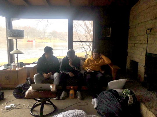
Captions:
1. Friendship
2. Coronavirus quarantine, 2020
3. Get outside!

The captions can drastically change the emphasis on the photo. For the first caption, Friendship, the audience focuses on the three guys and their relationship, gestures, and facial expression toward one another. For the second one, Coronavirus quarantine, 2020, I think about looking back on this photo years from now and thinking about how we all stayed inside to prevent the virus from spreading. The third caption, Get outside!, changes the meaning because it looks like a nice sunny day out with the river in the background and these idiots are sitting on the couch!
I chose to crop the photo like this because I think that it emphasizes the interaction that they are having with one another. The two on the end appear to be smiling and talking about something while the other has his head down and sucking on his e-cig. Before cropping it, you can tell he isn’t being antisocial or upset, he is just watching something on the laptop in front of him. After cropping it, he looks more antisocial because it looks like he just has his head down. Cropping this photo also erases the huge mess that they’ve made in the living room and therefore there are no assumptions that people can make about their lifestyle and how messy that they are. They just look like they are enjoying themselves rather than camping out in the living room for days. I think when you have a photo like this that is up close, it makes the audience think about each person’s personality and what they are like.
0 notes
Text
Top 12 Web-Based Color Tools for Web Designers
Picking the perfect color scheme shouldn’t be a miserable task. All you need are the right tools for the job and an eye for design.
I can’t help develop your eye for picking colors, but I can share a bunch of handy color tools that’ll likely improve your eye as you use them.
These tools are all 100% free, so they’re easy to bookmark and reuse time & time again. They can also work for web, mobile, print, or any other medium that needs incredible colors.
1. ColorHexa
Recently I was browsing the web and stumbled onto ColorHexa. It’s by far one of the coolest color tools I’ve ever seen.
This isn’t technically a color generator or a scheme design tool. Instead, it’s an information library on all colors with suggested gradient ideas, related shades, and dozens of color codes(ex: hex, RGB, CMYK, CIE-LAB, HSL and more).
You’ll never find a more complete list of information on color. This is super useful for all designers, including web designers, and it’s a great place to start researching colors for your projects.
2. Colors.css
If you do some research into color psychology you’ll learn how different colors stack together & what sort of mood they give. This plays into contrast for certain types of colors and how they work together.
Every browser comes with default colors that are often too harsh. Colors.css fixes that.
It’s a free CSS library that restyles the default color palette. This means you can use color names like “blue” and “red” with totally different values.
They even have an entire accessibility page full of ideas for matching color schemes that’ll improve readability on your site.
3. ColorPick Eyedropper Extension
How often do you find a site with a beautiful color scheme? I find amazing sites all the time and it’s difficult to export those colors from the stylesheet.
You can use Chrome DevTools but this requires digging around in the code to pick out the hex colors. Instead you can use the ColorPick Eyedropper extension made exclusively for Google Chrome.
You just click the toggle window in the extensions panel, then hover any color you want to study. This gives you the full hex code along with a “copy” link to copy the exact color to your clipboard.
Pretty cool right? And it’s a free plugin, so there’s nothing to lose by trying it out.
4. Coolors
The Coolors site is a large color scheme generator. You can find dozens of generators on the web, but this one’s a little different since it supports Adobe programs with its own add-on.
You can also get this as a Chrome extension or even as a custom iOS app for your phone.
Really the true value is in the browser webapp that auto-generates color schemes on the fly. You can then mix & match colors, change settings, adjust for color blindness, and randomize your own schemes based on certain criteria.
It’s a great application, but it comes with a small learning curve. Shouldn’t take you more than 15-20 minutes to figure out how it all works.
5. Ambiance
Ambiance is another color scheme site but it works a little differently. This one pulls color palettes from ColourLovers and displays them in an easy-to-consume style.
This means you’ll need to check the original link on Color Lovers to find more data about any particular scheme.
I still think Ambiance is a handy site to bookmark only because of its usability. This app is way more straightforward to use than Colour Lovers so it’s easier to pair colors together and get them working.
6. Material UI Colors
With a quick Google search you’ll find a bunch of sweet material design tools on the web. They seem never-ending and many of them rely on the color styles typically found in Android apps.
With the Material UI Colors webapp you can find perfect color schemes that match with Google’s material guidelines.
Easily change the tint of all colors with the slider in the top-left corner of the screen. Or randomize your selections to match an existing site’s color choices.
You can also switch between hex and RGB depending on whatever format you want. A great app for material design lovers.
7. Color Supply
The Color Supply website is pretty unique but also very strange. It gives you a bunch of interesting color tools for matching color schemes, picking the foregrounds & backgrounds, plus different ways to compare how those colors would look on a page.
But this doesn’t have any guide or specific purpose. It acts like a color scheme generator that you have to just kind of learn as you go.
It will output different colors with hex codes near the bottom of the page to copy. Plus it’ll show you how those colors work in a gradient, in icons, and with text. Nice tool but it comes with an awkward learning curve.
8. Color Safe
The WCAG works hard towards a more accessible web. Color is one of the easiest ways to build your accessibility without losing time testing.
Color Safe is a free webapp that can test your color choices. You pick from a small set of fonts & sizes, then pick whatever colors you want for your foreground & background.
From there you’ll get an accessibility rating along with suggestions on how to improve your color choices(if needed).
Really great tool for anyone concerned about accessibility on the web.
9. Color Hunt
For a user-curated gallery of color schemes take a look at Color Hunt.
This free project was launched a couple of years back and continues to be a source of design inspiration. People submit their own color schemes into the site, then others vote on those color schemes.
You can sort by newest or by most popular and even vote on your favorites. Pretty cool right?
It’s an extremely simple web app so don’t expect too many features. It’s just a neat way to visually browse through many different color patterns at once.
10. Open Color
Looking for something a little more web-friendly? Then check out the Open Color library.
This is a massive open source collection of color choices built around accessibility and browser support. Each color has been optimized for easy matching regardless of your layout’s design.
Check out the GitHub repo for more info and to download a copy of the styles.
11. HTML Color Codes
HTML Color Codes is another info-focused color webapp.
This lets you pull all forms of HTML/CSS code for your color choices right from the app. You can search for any color you want, or go by their recommendations. Plus this even has a tool for generating color palettes that you can download as Adobe Swatch files.
Don’t let the name fool you: this app is for more than just HTML color.
It’s a brilliant tool for digital designers of all types who want easy access to color codes and reusable palettes.
12. Adobe Color CC
I can’t pass over the incredible Adobe Color CC webapp.
This free tool used to be called Adobe Kuler but it’s gone through a few iterations over the years. It’s still a free color picker but the interface has changed to make it easier for designers to build & save color schemes.
If you’re an Adobe user this tool is worth bookmarking. It supports up to 5 different colors in one scheme, and you can even upload images to pull dynamic color schemes automatically.
from Web Designing Tips https://1stwebdesigner.com/web-based-color-tools/
1 note
·
View note
Text
iPhone X Review: Gorgeous, pricey, and worth it
yahoo
If you have any interest in Apple’s (AAPL) hotly anticipated, $999, 10th-anniversary iPhone X (pronounced “ten”), then there are four dates to keep in mind:
September 12, 2017, when Apple first unveiled it to the public.
Tuesday, October 31, when most of the professional reviews appear.
November 3, when the phone is supposed to be available to buy.
The day when you can actually get one. These phones are difficult to manufacture and massively back-ordered, so if you order now, you might get one before the end of the year.
The price, the delays, and the popularity all tell you one thing, loud and clear: There’s an unbelievable amount of advanced technology in this thing.
The iPhone X is gorgeous, powerful, and expensive.
The Headline: Big Screen, Small Body
Everybody talks about the iPhone X price ($999 for 64 gigs of storage, $1,149 for 256 gigs). Or they talk about its face-recognition feature, but the best thing about the iPhone X is its size.
It’s a standard-size phone, only a hair bigger than an iPhone 7 or 8, and therefore easy to wrap your fingers around without growing extra knuckles. Yet the X has the screen size of the iPhone Plus models! By lopping off all the blank margins that usually surround an iPhone’s screen, Apple has found a much sweeter spot on the screen/body tradeoff spectrum. It’s all screen, much like recent Samsung smartphones.
The iPhone X has about the same screen size as an iPhone Plus—in the body about the same size as a standard iPhone.
And what a screen it is. It’s Apple’s first OLED screen, meaning it’s got much darker darks and brighter brights than what’s come before—a million-to-one contrast ratio, Apple says. Unfortunately, there’s no way to see it except in person, because whatever screen you’re now reading on can’t display the X’s stunning range of color. But you see it right away, and it’s glorious to look at, no matter what app you’re running.
The phone is also very fast. Apple says that its processor is “the most powerful and smartest chip ever in a smartphone,” and that it has “four efficiency cores”—clearly, that’s better than three efficiency cores, right?
In practice, all of this means that opening apps happen a fraction of a second faster than the iPhone 8, and saving video files or performing other intensive operations saves you a second or two. Speed leaps over the iPhone 7 or 6, of course, are even more dramatic.
Yet somehow, Apple maintains that the iPhone X gets two hours more life per battery charge than the iPhone 7 and 8. Bizarrely, Apple gave most reviewers only 24 hours with the iPhone X before posting their reviews (not a week or two, as in the past 10 years), so nobody can really say what battery life is like in real-world scenarios. I’ll update this review once I’ve had a chance to live with it.
Facial Recognition
OK, so Apple made this phone all screen. In that case, where’s the Home button?
It’s gone. On the iPhone X, there is no Home button.
Wait, what? Every smartphone has a Home button!
On the iPhone, we use it to open the Home screen, trigger Siri, switch apps, pay with Apple Pay, take screenshots, turn on the screen magnifier, force quit an app, force-restart the whole phone when it gets locked up, and so on. Without a Home button, what happens to all of that?
You have to re-learn new techniques. Apple has come up with replacement gestures for all of them.
To return to the Home screen, you swipe up from the bottom of the screen. This can be a tiny swipe, even a quarter of an inch upward; it quickly becomes quick and instinctive. (Until, that is, you try to do it on someone’s iPad and feel like an idiot.)
To open the app switcher, you make the same swipe up, but then stop with your finger in the center. The app “cards” now appear.
(Infuriatingly, Apple has changed the way you quit programs from the app switcher. You can’t just swipe them up off the top of the screen anymore. Instead, you have to hold your finger on one of the app “cards,” wait until a red Delete button appears on each card, and then swipe up. That’s a change without a purpose.)
You trigger Siri using the Sleep switch on the right side, which Apple now calls the Side switch.
Here’s a complete list of the old Home-button functions—and how Apple’s rethought them on the iPhone X.
OK, fine. But what about the fingerprint reader?
It’s gone, too. Instead, Apple says it’s come up with something better: Face ID.
Face ID
When you get your phone, you train it to recognize your face in Settings. It’s a very cool process (you can see it in my video above): you roll your head around as though doing a relaxation exercise for your neck. Twice.

You train Face ID by letting it scan your head twice.
Now the iPhone knows the exact contours of your face. After that, just looking at the phone unlocks it—so fast, you may not even realize what’s happened. There are only two clues that the phone is unlocked: a tiny padlock icon opens, and any notification banners (“Message from: Robin”) expand to reveal their potentially embarrassing contents (“Hey! I picked up that cream for your armpit rash”).
Unlocking the phone doesn’t take you all the way to the Home screen, which would be cool. You still have to do a little up-swipe afterunlocking.
In any case, you can’t fool Face ID with a photo, or a mask, or even a 3-D model of your head; I tried. (And what about that Bloomberg article that said that Apple substituted a less accurate camera to make manufacturing easier? “Completely false,” Apple said in a statement. “The quality and accuracy of Face ID haven’t changed. It continues to be 1 in a million probability of a random person unlocking your iPhone with Face ID.”)
You’ll use Face ID wherever you used to use your fingerprint: Triggering Apple Pay, for example, or logging into apps. Any app that was ever unlocked by your fingerprint automatically works with Face ID, without needing to be rewritten.
True Depth
So how does the front-facing camera recognize your face? Using a mass of sensors Apple calls True Depth.
When you lift the phone to wake it, an infrared lamp blasts invisible light forward to see if a face is in range. If so, a tiny projector blasts 30,000 pinpoints of infrared light onto your face, and a camera reads the distortion of their spacing and shape to find the contours of your face.
The True Depth camera is an array of sensors.
(Samsung’s Galaxy phones, of course, had face unlocking first. But Apple’s depth camera system is far more reliable.)
I tried to fool the True Depth camera by putting on wigs, a fake mustache, a fake unibrow, and glasses. I even invited a Yahoo Studios makeup artist to turn me into a zombie, with full face makeup. None of it fooled Face ID.

I tried to fool the Face ID in various ways. Only the beard freaked it out.
I finally got it to fail by applying a full beard that covered half my face. At that point, it didn’t recognize me and didn’t unlock.
Of course, very few people sprout that much hair overnight. Ordinarily, Face ID continues to fine-tune its mathematical model of your face every time you use it, so things like slow hair growth (and wrinkle growth) won’t fool it. If you do do something radical (like shaving off your beard), you just re-train.
Anything new freaks people out, so here are some FAQs about Face ID:
What if I want to unlock the phone at night? Since it uses infrared light, Face ID even works in the dark.
What if I’m in a car accident? As long as your eyes, nose, and mouth are essentially unchanged, it’ll work. If not, you can always use your password, which is required even if you turn on Face ID. (Your password is also needed after any restart, or after someone’s tried five times to unlock the phone with his face.)
What if I’m wearing a scarf or a hat? As long as your eyes, nose, and mouth are uncovered, it’ll work.
Can two different people register their faces? For now, it’s one person at a time.
What about sunglasses? Face ID works through sunglasses if infrared signals can penetrate them. Some do, some don’t.
What if a cop forces me to look at my phone? You can quickly disable Face ID by squeezing the buttons on both sides of the phone, or by pressing the Side switch five times.
What if I have plastic surgery? You can retrain Face ID to recognize the New You.
What about identical twins? They can fool Face ID. If you’re worried, use the password instead.
What if someone tries to unlock my phone by pointing it at my face while I’m asleep? No good. Face ID doesn’t work unless your eyes are open and looking at the phone.
What if I don’t have eyeballs? You can turn off that requirement.
What if somebody decapitates me and then tries to use my severed head to unlock my phone? Now you’re just being silly.
Beyond Face ID
The depth camera does more than just recognize your face. Because it can tell the difference between the foreground and the background, the iPhone X can, for the first time, take front-facing Portrait-mode photos, which means beautifully blurry backgrounds. (On recent iPhone Plus models, two lenses on the back can tell the difference between the subject and the background—and to softly blur the background, as in professional photos. See my story here.)

The iPhone X can create artificially (but convincingly) blurred backgrounds, now with either the back OR front camera.
The iPhone X can also create what Apple calls Animoji—a choice of 12 animated cartoon faces whose expressions follow and mimic your expressions in real time, by tracking the motion of 50 different muscles in your face. Happy, sad, wink, frown, laugh, mouth open, eyebrows up, whatever—your little cartoon-animal avatar does the same. You can record yourself saying something and then send the resulting animation via the Messages app. Suddenly, you’re Warner Brothers.
youtube
Software companies can write apps that exploit the depth camera, too. Already, Snapchat is testing a version whose fun superimposed-face filters (masks, glasses, and so on) use real-time lighting information for realistic reflections and shadows. And Apple has built a new Scenes feature into its free Clips video-recording app that replaces your background, greenscreen style, in real time. You can shoot yourself with a new background of your choosing, like an artsy linescape, on the bridge of the “Star Wars” Millennium Falcon, and so on.

The upcoming version of Apple’s Clips app creates real-time, live greenscreen effects, transporting you into other worlds.
Apple hasn’t said much about the Settings option called Attention Aware Features, but it’s also very cool. The True Depth camera will prevent the screen from turning off while you’re looking at it—and it will make your morning alarm sound quieter if you’re looking at it.
The Notch
Apple packs all of those depth-sensing components into an inch-wide area at the top of the screen that people are calling the Notch. It’s causing some consternation, because it creates a gap in the status bar. It’s there in most of your apps, looking like a clunky missing chunk.
Fortunately, the notch does not intrude upon photos or videos (unless you manually zoom into them).

The notch (the black gap) appears in many apps–and in photos or videos you’ve zoomed into.
It doesn’t take long to get used to the Notch. But it is a kind of weird design decision. It winds up dividing the menu bar into two “ears” and leaving no room for your cell carrier’s name or battery percentage.
The rest of the package
Like the iPhone 8, the iPhone X is waterproof—it can tolerate 30 minutes 3 feet underwater. The glass front and back are, Apple says, 50% stronger. The speakers are louder. There’s still no headphone jack. (As always, a two-inch adapter for existing headphones comes in the box, along with a set of Apple earbuds that plugs into the charging jack. But really, wireless earbuds are the way to go.)
The cameras are even better, especially in low light. The flash now has four LEDs in two different colors, for better flesh tones. Like recent Plus models, the back has two lenses—standard, and 2X zoom—but for the first time, the zoom lens is optically stabilized, too. It makes a huge difference in video stability.
You can charge the iPhone X on a special charging pad. We can thank Apple for adopting the same charging-pad standard that Samsung and other companies use, called Qi (pronounced “chee”). In other words, you don’t have to buy Apple’s charging pad; you can use any company’s. They cost about $12 on Amazon.
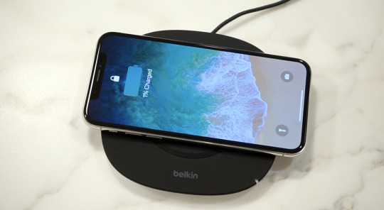
You can charge the iPhone X either with its traditional Lightning cable or on a Qi charging pad.
Next year, Apple will sell its own charging pad, called AirPower, capable of charging three Apple devices at once. Meantime, Apple intends to throw its weight behind the Qi charging standard. It’s talking to hotels, airports, and car makers, in hopes of both making charging surfaces available everywhere you want to be.
And the iPhone X runs iOS 11, of course—with a few special tweaks just for Xers. For example, the Flashlight on/off switch is now right there on the Lock screen, not even hiding on the Control Center anymore. And you can now move among open apps just by dragging your finger along the bottom edge of the screen, without even opening the app switcher first. It’s pretty great.

The Lock screen now has a flashlight button at lower left. (Also: See that horizontal line at the bottom? It appears in most apps. It’s meant to remind you: “Swipe up here to go Home.”)
A new realm
Apple intends for the iPhone X to strike you as a masterpiece, as a vision of the future. It probably doesn’t intend for the iPhone X to remind you of recent Samsung phones, which also have features like all-screen designs, wireless charging, and prices around $1,000.
In the Apple ecosystem, though, the iPhone X represents a far more exciting leap than the incremental upgrades we’ve seen in recent iPhone models. The X’s cameras are fantastic, the screen is the best you’ve ever seen, the depth camera will unlock a whole new realm of apps, the Face ID works.
Above all, you’re carrying around a Plus-size screen in a normal-size body. There may be some unbelievably sophisticated technology in this phone—but maybe the most winning feature of all is how little space it takes up in your hand.
More from David Pogue:
Inside the Amazon company that’s even bigger than Amazon
The $50 Google Home Mini vs. the $50 Amazon Echo Dot — who wins?
The Fitbit Ionic doesn’t quite deserve the term ‘smartwatch’
Augmented reality? Pogue checks out 7 of the first iPhone AR apps
How Apple’s iPhone has improved since its 2007 debut
Gulliver’s Gate is a $40 million world of miniatures in Times Square
Samsung’s Bixby voice assistant is ambitious, powerful, and half-baked
Is through-the-air charging a hoax?
David Pogue, tech columnist for Yahoo Finance, is the author of “iPhone: The Missing Manual.” He welcomes nontoxic comments in the comments section below. On the web, he’s davidpogue.com. On Twitter, he’s @pogue. On email, he’s [email protected]. You can read all his articles here, or you can sign up to get his columns by email.
#Tech#David Pogue#Pogue#_lmsid:a077000000BAh3wAAD#_revsp:yahoofinance.com#$AAPL#_author:David Pogue#_uuid:e631cdee-245c-30d7-9745-27c1be1cab69
2 notes
·
View notes
Photo

New Post has been published on https://magzoso.com/tech/snapchat-spectacles-3-review-pretty-pricey/
Snapchat Spectacles 3 review: Pretty, pricey
No one’s going to pay $380 for decent point-of-view video glasses and some trippy filters. But that’s kind of the point of Snapchat Spectacles 3. They’re merely a stepping stone towards true augmented reality eyewear — a public hardware beta for the Snap Lab R&D team that Apple and Facebook aren’t getting as they tinker in their bunkers.
Still, I hoped for something that could at least unlock the talents of forward-thinking video creators. Yet the unpredictable and uncontrollable AR effects sadly fail to make use of Spectacles‘ fashionable form factor in premium steel. The clunky software requires clips be uploaded for processing and then re-downloaded before you can apply the 10 starter effects like a rainbow landscape filter or a shimmering fantasy falcon. This all makes producing AR content a chore instead of a joy for something only briefly novel.
Spectacles 3 go on sale today for $380 in black ‘Carbon’ or rose gold-ish ‘Mineral’ color schemes on Spectacles.com, Neiman Marcus, and Ron Robinson in the UK, shipping in a week. Announced in August, they’re sunglasses with two stereoscopic lenses capable of capturing depth to produce “3D” photos, and videos you can add AR effects to on your phone. You also get a very nice folds-flat leather USB-C charging case that powers up the glasses four times, and a Google Cardboard-style VR viewer.
“Spectacles 3 is a limited production run. We’re not looking for massive sales here. We’re targeting people who are excited about these effects — creative storytellers” says Matt Hanover of the Snap Lab team.
Gen 1 featured a “toy-like design to get people used to wearing tech on their face”, while Gen 2 and 2.1 had a more subdued look abandoning the coral color schemes to push mainstream adoption. What Gen 3 can’t do is force a $40 million write-off due to poor sales, as V1 did after only shipping 220,000 with hundreds of thousands more gathering dust somewhere. Snap is already losing $227 million per quarter as it scrambles to break even.
So it seems with Spectacles 3 that Snap is gathering data and biding its time, trying to avoid burning too much cash until it can build a version that overlays effects atop a user’s view through the glasses. “We’re still able to get feedback from the customer and inform the future of Spectacles. That’s really the goal for us” Hanover confirms.
His CEO Evan Spiegel agrees, telling me on stage at TechCrunch Disrupt that it would be 10 years until we see augmented reality glasses worthy of mainstream consumer adoption. That’s a long time for an unprofitable company to spend competing to invest in R&D versus cash-rich companies like Facebook and Apple.
tl;dr
Spectacles could be worth the steep $380 if you’re a videographer for a living, perhaps making futuristic social media clips like Karen X Cheng, a creator Snap hired to demonstrate the device’s potential. They’re cool enough looking that you could wear them around Cannes or Coachella without people getting weirded out like they did with Google Glass. And as Snap’s Lens Studio lets anyone build 3D effects for Spectacles 3, perhaps we’ll see some filters and imaginary characters that are more than just a momentary gimmick.
[embedded content]
But for those simply seeking first-person camera glasses, I’d still recommend the Spectacles 2 at $150 to $200 depending on style. The 3D features don’t carry the weight of paying double the price for Spec 3s. And at least the 2nd-gen Specs are waterproof, which make them great for ocean play with fun underwater shooting when you don’t want to risk losing or fizzling your phone.
“We’re testing the price point and the premium aesthetic to see if it lands with this demographic” Hanover says. But Snap’s Director Of Communications Liz Markman notes that “there isn’t this perfect one-to-one overlap with the core Snap users.”
The result is that Spectacles 3 are really more for Snap’s benefit than yours.
Slick Eyewear, Now Where’s The AR?
The Spectacles 3 software is disappointing, but you’ll be delighted when you open the box. Slick black packaging reveal sturdily built metal sunglasses with a luxury matte finish. As they magnetically dislodge from their charging case, you definitely get they sense you’re trying on something futuristic.
The style concurs, with a flat black bar at the top connecting the round lenses with a camera on both corners. Unlike the old Specs that sat right on your nose, feeling heavy at times, Spectacles 3 offers adjustable acetate non-slip nose tips to keep the weight off. All the tech is built discreetly into the hinges and temples without appearing too chunky.
Tap the button either arm, and LED light swooshes in a circle to let people know you’re recording a video for 10 seconds, with multiple presses growing that to up to 60. Tap and hold to shoot a photo, and the light blinks. There’s no obnoxious yellow rubber ring to shout “these are cameras”, and the defused LEDs are more subtle than Gen 2’s dots while remaining an obvious enough signal to passersby so they’re not creepy.
One charge powers up to 70 captures and transfers to your phone over a combined Bluetooth built-in Wifi connection. The 4 gigabyte storage holds up to 100 videos or 1200 photos, and Spectacles 3 even have GPS and GLOSNASS on-board. A 4-mic array picks up audio from others and your own voice, though they’re susceptible to windshear if you’re biking or running.
The magnetically-sealing folding leather USB-C charging case is my favorite part. I wish I could get an even flatter one without a battery in it for my other sunglasses. It’s a huge improvement on the unpocketable bulky triangular case of the previous versions.
A Toy Not Fun Enough For The Price
So far so good, right? But then it comes time to actually see and augment what you shot.
Pairing and syncing is much easier than Gen 1. The glasses forge a Bluetooth connection, then spawn a WiFi network for getting media to your phone faster.
If you just want to share to Snapchat, you’re in luck. Spectacles content posts to Stories or messages in its cool circular format that lets viewers tilt their phones around while always staying full-screen to reveal the edges of your shots. Otherwise, you still have to go through the chore of exporting from Snapchat to your camera roll. Spectacles can at least now export in a variety of croppings for better sharing on Instagram and elsewhere.
What’s new are the 3D photos and videos. They utilize the space between the stereoscopic cameras in the corners of Spectacles employ parallax to sense the depth of a scene. After tapping the 3D button on a photo, you can wiggle the perspective of the image around to almost see around the edges of what you’re looking at. Spectacles will automatically pan back and forth for you, and export 3D photos as short Boomerang-esque six-second videos.
Unfortunately, I found that I didn’t get much sense of depth from most of the 3D photos I shot or saw. It takes a very particular kind of three-dimensional object from the right angle in the right light to much sense of movement from the wiggle. Snapchat’s algorithms also had a bad habit of mistakenly assigning bits of the foreground and background to each other, breaking the illusion. Occasionally you’ll have someone’s ear or their hair left behind and disembodied by the 3D effect.
Don’t expect these to flood social media or convince prospective Spectacles buyers. The 3D selfies you can shoot on Snapchat for free look better anyways.
The biggest problem comes with the delay when playing with 3D videos. Snapchat has to do the depth processing on its servers, so you have to wait for your video to upload, get scanned, and be re-downloaded before you can apply the 3D AR filters. On WiFi that takes about 35 seconds per 10 second video, which is quite a bore. It takes forever over a mobile connection. That means you often won’t be able to apply the filters and see how they look until you’re home and unable to reshoot anything.
The filter set is also limited and haphazard. You can add a 3D bird or balloons around you, wander through golden snow or neon arcs, overlay flower projections or rainbow waves, or sprinkle on sparkles and light-bending blobs. While the bird is cute, and the rainbows and flowers are remarkably psychedelic, none of them are more than briefly entertaining.
The 3D objects often glitch through real pieces of scenery, and you can’t control them at all. No summoning the bird mid-video. My favorite trick, learned from Karen X Cheng, was to export unedited and filtered versions of a video and splice them together on my computer as scene in my demo video above. You can’t actually do that from within Snapchat.
Snap will have to build a lot cooler filters with interactivity if they’re going to compel creators to fork over $380 for Spectacles 3. It could hope to rely on its Lens Studio community platform, but so few developers or users will have the glasses that most will stick to making and using filters for phones.
Spectacles 3 are too expensive to be a toy, but don’t excel at being much more. Videography influencers might enjoy having a pair in their tool bag. But it’s hard to imagine anyone not sharing content professionally paying for the gadget.
[embedded content]
Iteration vs Ideation
“We’re now pushing to elevate the technology and the design to master depth technically” Hanover tells me. “Holing ourselves up within an R&D center for years and years? That’s not our approach. It’s important to meet the customer where they are today and continue to iterate and get that feedback.”
But this iteration doesn’t feel like Snap meeting the customer where they are. That raises the question of whether Snapchat is really getting enough data out of the whole endeavor to justify publicly releasing Spectacles at all. The company will have to hope that testing short-term is worth thinking short-term, when it’s trying to win the long-term war in augmented reality eyewear.
0 notes
Text
Sony Xperia 1 with camera review

Sony Xperia 1 with camera review, People buy flagship phones as much for the cameras as for any other feature. Nearly every premium device from the likes of Huawei, LG, and Samsung has stepped up the game to include not one or two, but three cameras. The standard configuration for a modern flagship is now a high-quality primary lens, an optical telephoto lens, and a wide-angle lens. This applies to the Sony Xperia 1, which the electronics company is just now getting to market.
If you’re interested in learning everything there is to know about the Sony Xperia 1, check out our full review here. The purpose of this article is to dive deep into the camera situation and assess whether or not Sony can keep up.
Camera app


Sony’s camera app is powerful but perplexing. It contains the vast majority of advanced features flagship phone buyers expect, yet there are some glaring omissions.
Let’s start with the dedicated camera button. Yes, the Xperia 1 has a physical shutter key, located where you expect to find it on the top right corner (when holding the phone sideways.) The button is a subtle two-stage key. Press it very lightly and the camera will focus on the subject. Press it all the way to fire off a shot. The difference between pressing the button gently and all the way is minimal. You can easily just smash the key down all the way when you intend to focus first.
Alternately, you can do what we’re all using to do at this point: touch the screen where you want the camera to focus and then tap the software shutter button.
Sony’s AI Cam is enabled by default. You can only ditch it by shifting to manual mode. What I find most frustrating is the lack of control over HDR. HDR functions automatically in AI Cam mode, which is to say you never know whether it is being used or not. The only way to take direct control over HDR is in manual mode. From my perspective, HDR should always be an easy-to-find feature.
A basic on-screen toggle lets you switch between photo and video modes, while a series of controls line the opposite edge for functions such as aspect ratio, bokeh, flash, timer, and settings. Some of these could be easier to grasp. The bokeh tool, for example, is represented by one circle placed behind another. What the what? How does that equate “bokeh”?
On the whole, the camera app could be simplified quite a lot.
Jumping from one lens to another should be easier. The camera always launches with the standard/primary camera lens active. A small circle with a “1x” appears on the far right side. Tap it once to switch to the telephoto lens. The small circle then displays a “2x” inside. Tap once more to get to the wide-angle “w” lens. If you press the “1x” for a second, a slider bar appears for zooming between 1x and 2x, and on through to 10x (digitally). No matter what, you have to press the “w” to get to the wide-angle camera, and it pauses for a second before switching. It’s a confusing and inconsistent system. LG’s camera app is much simpler to decipher in this respect.
A small button under the shutter button lets you access the advanced modes. These include portrait selfie, Google Lens, slow motion, AR effect, manual, creative effect, and panorama. Pick one, and then a little symbol pops up in the corner to tell you which you’re using. There’s no time-lapse mode, nor is there a dedicated portrait mode or even a night mode, which is both frustrating and puzzling.
On the whole, the camera could be simplified and improved quite a lot.
Daylight

Any and every camera should excel at daylight shooting when the most light is available. It’s therefore amazing how poorly some perform.
The Xperia 1 is all over the place in daylight situations. All four of these samples have bright and dark regions that aren’t particularly well balanced. What we notice most is the loss of detail in the darker spots, such as the trees in the first image, the sides of the buildings in the second and third images, and the pillars in the fourth. I’m glad the sky isn’t blown out in any of the images.
These are passable shots, but not fantastic ones.
Focus is mostly sharp, and colors are mostly accurate if a bit muted. For example, the yellow and red shades in the second image were brighter in real life.
There isn’t too much noise, nor are compression artifacts obviously visible. These are passable shots, but not fantastic ones.
Color

Obtaining good color relies on a mix of things, including proper exposure and white balance. If one or the other is off, colors suffer. Some phone makers, such as Samsung, make up for this by boosting colors in the end results. Sony does not.
Here we see the Xperia 1 at its best. The top two images turned out spectacularly well with rich, bright, accurate colors. There is no banding, and the transitions between shades are smooth. These images look exactly like what I remember seeing on the streets of New York City. Color me impressed (pun intended).
You can see all the color, it’s just not as impressive as the real thing.
The bottom two images are the Sony Xperia 1 camera at its most average. Both appear muted in terms of color tones and exposure. The fourth image is particularly frustrating because the tile mural was well lit and I was standing only a few feet away. You can see all the color, it’s just not as impressive as the real thing.
It’s the inconsistency here that I don’t care for.
Detail

Preserving details relies on focus, resolution, and maintaining control over compression and noise.
Once again we’re faced with inconsistency from the Sony Xperia 1 camera. In the top two images, the detail is clear enough that you can read the text in the images, there’s no doubt of that. Too bad neither is properly exposed.
The images with the brushes in the foreground is terrible. Much of the detail in the leaves is lost on close inspection, with the green foliage blending together. It was much easier to tell the individual plants apart in person. The third image also has lots of noise in the sky.
In the last picture, all the parts of the electric meters stand out and you can even tell where the gauges are pointed on the closer units. Here everything comes together, the exposure is on point, and there’s no noise at all.
Landscape


When shooting land- or cityscapes, focus and balance are generally what you seek. Three of these images provide those, one does not.
What I like about image 1 is that the green looks rich, the sky is still blue, you can read the text on the sign, and even the darker areas have some detail. Image 2 shows sharp lines, accurate colors, and relatively good detail. Both these images are a bit on the noisy side, with compression artifacts here and there.
Image 3 is a disaster. The phone’s HDR tool completely failed here. The sky is overblown and yet nearly all the detail on the statue is lost because it is underexposed. At least the foliage is green.
The last image turned out fairly well. Despite the strong shadow, there’s lots of texture visible on the right wall compared to the fully sunlit left wall. You can see all the bricks and the sky is blue. There is still far too much noise.
Portrait


Fancy, effects-laden portrait shooting is all the rage these days. Many of today’s flagships include modes specifically for taking artful shots of our friends and family.
In order to take portrait images such as these, you need to use the Xperia 1’s bokeh shooting tool. It’s not called “Portrait Mode” and there aren’t advanced tools such as studio lighting — another shortcoming of the camera app when compared to Samsung, Huawei, and others.
The phone did do a decent job of outlining my profile cleanly and blurring out the background. I like that you can select the amount of background blur. In images 1 and 3, however, I look like I was artificially added to the pictures via PhotoShop. The second and fourth images look more natural. Exposure in all these shots is good, and I don’t see too much noise.
I’m flummoxed that there’s no actual portrait mode, which might make capturing these a touch easier.
HDR


HDR shots generally blend several exposures to create a balanced whole, with detail visible in both bright and dark regions. The Xperia 1 struggles with HDR across the board.
Images 1 and 4 are total failures of HDR. In the first, all the detail in the trees behind the fountain is lost due to underexposure. In the fourth, the top half of the image should have been bright with daylight and is instead dark and dreary. What is going on here, Sony?
It's evident that Sony's HDR algorithms need more tuning.
The second and third images are more balanced. They are each noisy, but at least the light and dark regions are better preserved. The second shot is particularly challenging because it has natural and artificial light mixed in a dark indoor environment. Some detail is lost on the second level, but this exposure is still fairly accurate. In the third pic, I appreciate that the blue sky is visible in the windows at all and that there’s some shading to the wooden roof far above the staircase.
In all, however, it’s evident that Sony’s HDR algorithms need more tuning.
Low light


One of the biggest omissions of the Sony Xperia 1 camera is any sort of night mode. Sure, the AI Cam senses low light situations and takes steps to mitigate the exposure, but there isn’t a dedicated mode for shooting in the near dark. That’s a serious boo-boo considering phones such as the Huawei P30 Pro can practically see in pitch black night.
All four of these images were taken post-sunset. The first, just after sunset, has a reasonable amount of detail in the trees, but the sky is overblown. The colors are about right. The second image actually turned out pretty well, and was true to the scene. Shame about the noise. The third image may be accurate, but is soft.
The last image is clearly a stinker. For this, the camera took several seconds to capture the shot and we can still barely see what’s going on. The subject stands out, but the darker portions of the background are completely gone.
Without an explicit low-light or night mode, the Xperia 1 trails the competition. The Google Pixel 3a XL, which costs half as much, delivers far superior results.
Selfie


All the Xperia 1’s portrait powers are found under the purview of the selfie camera. You can add effects, dial-in skin correction, make your eyes larger or your face thinner, and adjust the lighting. I captured these samples under a variety of conditions, including bright sunlight, indoors, and at nighttime. The results speak for themselves.
The first two images, which were aided by sunlight, turned out well. The focus is good, colors are accurate, and things look pretty much as they did when the photos were taken.
Things are a bit different in the third and fourth images. You can see that my face is a bit softer in the third image and the brick wall behind me looks a bit washed out. The last picture is a mess. Though it wasn’t that dark out, the Xperia 1 used the screen flash to light me up. While my face is properly exposed, the background is almost lost completely. Moreover, my face looks incredibly soft.
On a whole, I’d call these average selfie shots at best.
Video
Flagship phones need to be able to capture 4K video, full stop. While we’d prefer to see 60fps, we can deal with 30fps which is where the Xperia 1 camera tops out.
I captured a variety of video with the Xperia 1 in 4K and Full HD (the latter in 60fps). It may be hard for your eyes to really see the difference between the two, but the 4K footage from Sony impressed. I was pleased with the way the phone captured motion smoothly, despite the fact that I was moving around. Moreover, the phone’s sensors are better able to adapt to changes in lighting when recording video.
Here, the Xperia 1 matches the competition.
Conclusion
As I said in my full Sony Xperia 1 review, I’m stunned at how poorly the Xperia 1’s camera performs. Not only is it not up to snuff when compared to other flagships, such as the Samsung Galaxy S10, Huawei P30 Pro, and Google Pixel 3 XL, it doesn’t even compare to the budget Google Pixel 3a XL. It’s hard to recommend a $949 phone when a $479 phone beats the snot out of it in the core category of photography.
The bottom line, if you thought Sony’s adoption of the triple-camera setup would lead to a dramatic improvement in imaging quality, I’m here to tell you that’s not the case.
Read the full article
0 notes
Text

Hello! Today I want to show you a fun beginner project you can do to practice blending colors with watercolor paints and markers. If you are a complete beginner to color mixing, it is easiest to stick to either all warm colors (red, yellow, pink, orange …) or all cool colors like I did (blue, green, violet …). Some colors when blended together turn into “mud”, making a neutral like brown or gray. This is where understanding the color wheel comes in handy! For more about the color wheel, visit my earlier post Colors Aren’t Scary :). For this project, we will try out both flat brushes and round brushes. Round brushes have a teardrop shaped bristle that comes to a point at the end, and flat brushes have rectangular shaped bristles that are, well, flat on the end. Pretty easy to remember! It’s good to have a variety of sizes of each. Your brush size depends on the size of the area you are filling in. If your brush is too big, you risk getting paint where you don’t want it but if your brush is too small, you will see all the little strokes and the paint won’t cover evenly.

I started first with an outline, drawing my design in pencil on watercolor paper and then tracing over it with a waterproof black fine-liner pen (Sharpie fine points will work – You do not necessarily need a fancy art pen, though my preference when I do watercolor and ink work are these bad boys by Staedler.). You can draw your design however you want, or if you want to practice this technique without the added pressure of drawing, feel free to print this outline out and use graphite paper to transfer it right onto a piece of watercolor paper (Don’t have graphite paper on hand? Just shade over the back of your printout with a pencil, lay it on top of your watercolor paper, and trace over the lines and it will work the same way, though a bit more labor intensive.).
With watercolor, you want to start with the background and move to the foreground, and you always want to work lightest to darkest. It’s all about layering and building up colors since the paints themselves are translucent. In this more simplified project, we will be focusing just on blending this time, not layering. Still, working with the background first ensures that if any background color does find its way into the waves, which it inevitably will, we can just work right over it later and you won’t even notice by the end. Starting with the background, you want to choose a couple of colors (I used a cornflower blue and a cerulean blue.) and water them down so that they are consisting of mainly water with a small amount of pigment. Then you want to use a larger round brush and start filling in the space using circular motions. This will give our background wash a bit of texture, so that it has a hazy, cloud-like appearance rather than just flat streaks. I applied the cornflower blue on the bottom half of my sky and the cerulean on the top. Because both colors are wet, they should bleed into each other and blend together in a pretty seamless gradation. Be sure to overlap the two colors slightly where they meet. If they aren’t blending enough, you may also rinse off your brush and using the same circular motion run over the line where they touch with your damp brush to work them together further.
Color blending is one of the foundation skills of painting with watercolors, but it takes a lot of practice. Good thing you are about to get a lot of it! We did a textured blend for the background, but within an individual space inside our waves, we are now going to practice some flat blending with the goal of getting our colors to merge into as smooth of a gradation as possible. Now we are going to use a medium sized flat brush. A flat brush will be perfect for the smooth effect we need and will also be easier to keep inside the edges of our geometric shapes. You can tilt the brush so you are only using the tip rather than the whole side for narrower areas. Pick 2 different colors, and start painting one color on one end until you’ve gotten to about halfway across. Rinse your brush, and paint in another color starting on the opposite end, overlapping in the middle. A unique quality watercolor has is that when one color touches another while it is still wet, they WILL bleed into each other. In this case, that is a good thing as using wet-on-wet color with watercolors makes for some pretty low-effort, seamless blending. Still, watercolor can be finicky and things don’t always go as planned. I purposely filled the shape in so that there are darker, patchy areas and a harsh transition between the two colors. This happens sometimes, but can be easily rectified by going back over the uneven area with a damp brush. Be sure to always paint in the same direction, following the length of your shape.
Blending with watercolor markers is a similar process, but you need to be a bit more controlled with your water application so that you don’t completely lose the effect of the ink. I love watercolor markers because you can get such bold contrast, but a little bit of ink goes a long way, and with too much water your separate colors will just swim all together into one mass. I cannot emphasize enough, quality also matters. If you get cheap markers, chances are they won’t blend nicely no matter how skillful the artist. They don’t need to be officially called “watercolor markers”, they just need to be water soluble so they will run when wet. I love using Tombow’s water soluble brush markers. You also need to think about the values of the markers you are using. Deeper colors will spread a lot farther than paler colors, and can overpower. I have started with a darker color, a royal blue, and a lighter more muted color, a sage green. Start by scribbling a bit of each color on opposite ends of your shape. You do NOT want to shade the entire area in. Again, a little bit of ink goes a long way when water is added. Then, still using a flat brush you want to dip your brush in some water, tapping off the extra on a nearby paper towel. Wet the ink on one side and work it into the middle of the shape. Rinse off your brush, and wet the ink on the other side, again working towards the middle where they will meet. The wet colors will again, flow together and seamlessly blend pretty much on their own once they meet, staying darkest where you first laid down the ink. You can see above that a gradation is apparent, but the blue has pretty much taken over as the main color you see.
Trying the process again using the same 2 colors, but shading in only a tiny bit of blue and more of the green, you can see we get a more balanced effect where the pure green color is still highly visible.
You can also create a gradation with only one color. The beauty of watercolor is the depth of value that can be captured from one single hue, simply by adjusting the amount of water added. To do this you would apply a bit of the same color on each end in a darker or medium value (mixing less water with your paint). Then, rinsing off your brush, add some water to the edge of the area of color on each side, again spreading towards the center from each end. The color will remain most saturated at the ends, and will be the lightest (most watered down) in the center.
If at any point you add too much water, your gradation is in danger of all just running together into one flat tone. If this happens, you can blot the area with a paper towel to lift the excess water (and some of the pigment), and then blend right over again. You don’t want to see any “puddles” pooling on your paper … that is a sign there is too much water being used. Also keep in mind damp is ok, but if you are filling in a new area next to an old one that is still very wet, the colors will bleed together over your lines. Sometimes it helps to use a blow-dryer to speed along the drying process. Or, you could just work on filling in areas that aren’t touching each other until each spot dries. The paint air dries pretty quick.
Here is a reminder of the final image! It is the same blending process for each section, which is what makes it good practice. I filled in some spaces using the markers, and some with paint. I kept lighter colors on the crests of the waves, and alternated medium and dark tones throughout the body of water, making sure not to fill in too many of the same colors right next to each other. It always feels good to still have some sort of finished product after practicing techniques, and I guarantee you will start to see a difference in the first couple spaces you fill in versus the last! Remember, it’s all about playing with color. Have fun!
Blending With Watercolors – Stained Glass Ocean Project Hello! Today I want to show you a fun beginner project you can do to practice blending colors with watercolor paints and markers.
#art#art education#art practice#color#color blending#color mixing#lesson#ocean#painting#project#seascape#simple art project#stained glass#step by step#tutorial#visual learning#watercolor#waves
0 notes
Last Seen Blogs
lovesugar714
Love's Photo in Tokyo

morphious
Javier Martinez
only-a-user
Secret

fitnfreshconcessions-blog
FitnFresh Concessions

rosiehrs
☆ kai!