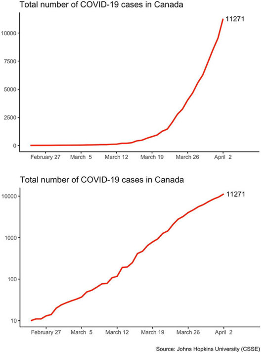
#also are we using linear or logarithmic scaling here?
Explore tagged Tumblr posts
Visit Tumblr Blog
Explore Tumblr blogs with no restrictions, modern design and the best experience.
Last Seen Tumblr Blogs


Fun Fact
After the announcement of the deal with Yahoo!, there were 170K signatures of unhappy Tumblr users petitioning to prevent the sale in 2013.
Text
Turns out pure methanol is stuffing her already insane bust with molecular sieves which she somehow fits into her incredibly sexy outfit (because the poisonous alcohols are 'evil' and therefore hotter of course).
Also for the chest sizes can we go up to Z² please? I'd like to see some real heckin badonkers here.
Anime where the girls are anthropomorphic personifications of different types of liquor (their chest sizes correlating with their alcohol content, obviously) and all the episodes are about mixing cocktails (they fuck).
#also are we using linear or logarithmic scaling here?#i think logarithmic would provide the clearest distinctions between the girls#non-brewed condiment (cheap vinegar) would be flat a s a board.#kombucha would be like A or B cup#Beer would be C cup#her big sister bourbon barrel beer would be E cup#wine would be like D cup#etc#meanwhile pure methanol would be so fuckin sexed up it would be insane; like her whole body would have to be censored in the TV broadcast#you'd have to get the blu rays to behold the insane glory of her debaucherous girly form
6 notes
·
View notes
Text
Music Theory notes (for science bitches) part 3: what if. there were more notes. what if they were friends.
Hello again, welcome back to this series where I try and teach myself music from first principles! I've been making lots of progress on zhonghu in the meantime, but a lot of it is mechanical/technical stuff about like... how you hold the instrument, recognising pitches
In the first part I broke down the basic ideas of tonal music and ways you might go about tuning it in the 12-tone system, particularly its 'equal temperament' variant [12TET]. The second part was a brief survey of the scales and tuning systems used in a selection of music systems around the world, from klezmer to gamelan - many of them compatible with 12TET, but not all.
So, as we said in the first article, a scale might be your 'palette' - the set of notes you use to build music. But a palette is not a picture. And hell, in painting, colour implies structure: relationships of value, saturation, hue, texture and so on which create contrast and therefore meaning.
So let's start trying to understand how notes can sit side by side and create meaning - sequentially in time, or simultaneously as chords! But there are still many foundations to lay. Still, I have a go at composing something at the end of this post! Something very basic, but something.
Anatomy of a chord
I discussed this very briefly in the first post, but a chord is when you play two or more notes at the same time. A lot of types of tonal musical will create a progression of chords over the course of a song, either on a single instrument or by harmonising multiple instruments in an ensemble. Since any or all of the individual notes in a chord can change, there's an enormous variety of possible ways to go from one chord to another.

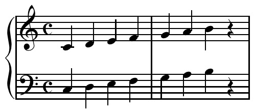
But we're getting ahead of ourselves. First of all I wanna take a look at what a chord actually is. Look, pretty picture! Read on to see what it means ;)
So here is a C Minor chord, consisting of C, D# and G, played by a simulated string quartet:
(In this post there's gonna be sound clips. These are generated using Ableton, but nothing I talk about should be specific to any one DAW [Digital Audio Workstation]. Ardour appears to be the most popular open source DAW, though I've not used it. Audacity is an excellent open source audio editor.)

Above, I've plotted the frequency spectrum of this chord (the Fourier transform) calculated by Audacity. The volume is in decibels, which is a logarithmic scale of energy in a wave. So this is essentially a linear-log plot.
OK, hard to tell what's going on in there right? The left three tall spikes are the fundamental frequencies of C4 (262Hz), D♯4 (310Hz), and G4 (393Hz). Then, we have a series of overtones of each note, layered on top of each other. It's obviously hard to tell which overtone 'belongs to' which note. Some of the voices may in fact share overtones! But we can look at the spectra of the indivudal notes to compare. Here's the C4 on its own. (Oddly, Ableton considered this a C3, not a C4. as far as I can tell the usual convention is that C4 is 261.626Hz, so I think C4 is 'correct'.)
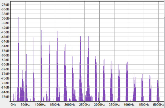
Here, the strongest peaks are all at integer multiples of the fundamental frequency, so they look evenly spaced in linear frequency-space. These are not all C. The first overtone is an octave above (C5), then we have three times the frequency of C4 - which means it's 1.5 times the frequency of C5, i.e. a perfect fifth above it! This makes it a G. So our first two overtones are in fact the octave and the fifth (plus an octave). Then we get another C (C6), then in the next octave we have frequencies pretty close to E6, G6 and A♯6 - respectively, intervals of a major third, a perfect fifth, and minor 7th relative to the root (modulo octaves).
However, there are also some weaker peaks. Notably, in between the first and second octave is a cluster of peaks around 397-404Hz, which is close to G4 - another perfect fifth! However, it's much much weaker than the overtones we discussed previously.
The extra frequencies and phase relationships give the timbre of the note, its particular sound - in this case you could say the sense of 'softness' in the sound compared to, for example, a sine wave, or a perfect triangle wave which would also have harmonics at all integer frequencies.
Perhaps in seeing all these overtones, we can get an intuitive impression of why chords sound 'consonant'. If the frequencies of a given note are already present in the overtones, they will reinforce each other, and (in extremely vague and unscientific terms) the brain gets really tickled by things happening in sync. However, it's not nearly that simple. Even in this case, we can see that frequencies do not have to be present in the overtone spectrum to create a pleasing sense of consonance.
Incidentally, this may help explain why we consider two notes whose frequencies differ by a factor of 2 to be 'equivalent'. The lower note contains all of the frequencies of the higher note as overtones, plus a bunch of extra 'inbetween' frequencies. e.g. if I have a note with fundamental frequency f, and a note with frequency 2f, then f's overtones are 2f, 3f, 4f, 5f, 6f... while 2f's overtones are 2f, 4f, 6f, 8f. There's so much overlap! So if I play a C, you're also hearing a little bit of the next C up from that, the G above that, the C above that and so on.
For comparison, if we have a note with frequency 3f, i.e. going up by a perfect fifth from the second note, the frequencies we get are 3f, 6f, 9f, 12f. Still fully contained in the overtones of the first note, but not quite as many hits.
Of course, the difference between each of these spectra is the amplitudes. The spectrum of the lower octave may contain the frequencies of the higher octave, but much quieter than when we play that note, and falling off in a different way.
(Note that a difference of ten decibels is very large: it's a logarithmic scale, so 10 decibels means 10 times the energy. A straight line in this linear-log plot indicates a power-law relationship between frequency and energy, similar to the inverse-square relationship of a triangle wave, where the first overtone has a quarter of the power, the second has a ninth of the power, and so on.)
So, here is the frequency spectrum of the single C note overlaid onto the spectrum of the C minor chord:
Some of the overtones of C line up with the overtones of the other notes (the D# and G), but a great many do not. Each note is contributing a bunch of new overtones to the pile. Still, because all these frequencies relate back to the base note, they feel 'related' - we are drawn to interpret the sounds together as a group rather than individually.
Our ears and aural system respond to these frequencies at a speed faster than thought. With a little effort, you can pick out individual voices in a layered composition - but we don't usually pick up on individual overtones, rather the texture created by all of them together.
I'm not gonna take the Fourier analysis much further, but I wanted to have a look at what happens when you crack open a chord and poke around inside.
However...
In Western music theory terms, we don't really think about all these different frequency spikes, just the fundamental notes. (The rest provides timbre). We give chords names based on the notes of the voices that comprise them. Chord notation can get... quite complicated; there are also multiple ways to write a given chord, so you have a degree of choice, especially once you factor in octave equivalence! Here's a rapid-fire video breakdown:
youtube
Because you have all these different notes interacting with each other, you further get multiple interactions of consonance and dissonance happening simultaneously. This means there's a huge amount of nuance. To repeat my rough working model, we can speak of chords being 'stable' (meaning they contain mostly 'consonant' relations like fifths and thirds) or 'unstable' (featuring 'dissonant' relations like semitones or tritones), with the latter setting up 'tension' and the former resolving it.
However, that's so far from being useful. To get a bit closer to composing music, it would likely help to go a bit deeper, build up more foundations and so on.
In this post and subsequent ones, I'm going to be taking things a little slower, trying to understand a bit more explicitly how chords are deployed.
An apology to Western music notation
In my first post in this series, I was a bit dismissive of 'goofy' Western music notation. What I was missing is that the purpose of Western music notation is not to clearly show the mathematical relationships between notes (something that's useful for learning!)... but to act as a reference to use while performing music. So it's optimising for two things: compactness, and legibility of musical constructs like phrasing. Pedagogy is secondary.
Youtuber Tantacrul, lead developer of the MuseScore software, recently made a video running over a brief history of music notation and various proposed alternative notation schemes - some reasonable, others very goofy. Having seen his arguments, he makes a pretty good case for why the current notation system is actually a reasonable compromise... for representing tonal music on the 12TET system, which is what it's designed for.
So with that in mind, let me try and give a better explanation of the why of Western music notation.
In contrast to 'piano roll' style notation where you represent every possible note in an absolute way, here each line of the stave (staff if you're American) represents a scale degree of a diatonic scale. The key signature locates you in a particular scale, and all the notes that aren't on that scale are omitted for compactness (since space is at an absolute premium when you have to turn pages during a performance!). If you're doing something funky and including a note outside the scale, well that's a special case and you give it a special-case symbol.
It's a similar principle to file compression: if things are as-expected, you omit them. If things are surprising, you have to put something there.
However, unlike the 简谱 jiǎnpǔ system which I've been learning in my erhu lessons, it's not a free-floating system which can attach to any scale. Instead, with a given clef, each line and space of the stave has one of three possible notes it could represent. This works, because - as we'll discuss momentarily - the diatonic scales can all be related to each other by shifting certain scale degrees up or down in semitones. So by indicating which scale degrees need to be shifted, you can lock in to any diatonic scale. Naisuu.
This approach, which lightly links positions to specific notes, keeps things reasonably simple for performers to remember. In theory, the system of key signatures helps keep things organised, without requiring significant thought while performing.
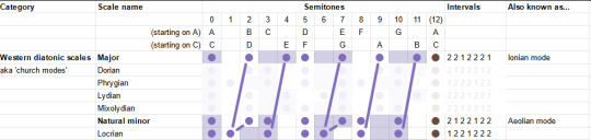
That is why have to arbitrarily pick a certain scale to be the 'default'; in this case, history has chosen C major/A minor. From that point, we can construct the rest of the diatonic scales as key signatures using a cute mathematical construct called the 'circle of fifths'.
How key signatures work (that damn circle)
So, let's say you have a diatonic major scale. In piano roll style notation, this looks like (taking C as our base note)...
And on the big sheet of scales, like this:
Now, let's write another diatonic major scale, a fifth up from the first. This is called transposition. For example, we could transpose from C major to G major.

Thanks to octave equivalency, we can wrap these notes back into the same octave as our original scale. (In other words, we've added 7 semitones to every note in our original scale, and then taken each one modulo 12 semitones.) Here, I duplicate the pattern down an octave.

Now, if we look at what notes we have in both scales, over the range of the original major scale.

Well, they're almost exactly the same... but the fourth note (scale degree) is shifted up by one semitone.
In fact, we've seen this set of notes before - it is after all nothing more than a cyclic permutation of the major scale. We've landed on the 'Lydian mode', one of the seven 'modes' of the diatonic major scale we discussed in previous posts. We've just found out that the Lydian mode has the same notes as a major scale starting a fifth higher. In general, whether we think of it as a 'mode' or as a 'different major scale' is a matter of where we start (the base note). I'm going to have more to say about modes in a little bit.
With this trick in mind, we produce a series of major scales starting a fifth higher each time. It just so happens that, since the fifth is 7 semitones, which is coprime with the 12 semitones of 12TET, this procedure will lead us through every single possible starting note in 12TET (up to octave equivalency).
So, each time we go up a fifth, we add a sharp on the fourth degree of the previous scale. This means that every single major scale in 12TET can be identified by a unique set of sharps. Once you have gone up 12 fifths, you end up with the original set of notes.
This leads us to a cute diagram called the "circle of fifths".
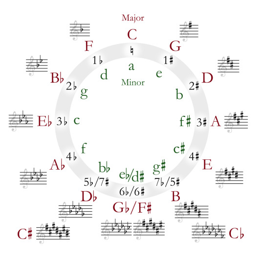
Because going up a fifth is octave-equivalent to going down a fourth, we can also look back one step on the circle to find out which note needs to be made sharper. So, from C major to G major, we have to sharpen F - the previous note on the circle from C. From G major to D major, we have to sharpen C. From D major to A major, we have to sharpen G. And so on.
By convention, when we write a key signature to define the particular scale we're using, we write the sharps out in circle-of-fifths order like this. The point of this is to make it easy to tell at a glance what scale you're in... assuming you know the scales already, anyway. This is another place where the aim of the notation scheme is for a compact representation for performers rather than something that makes the logical structure evident to beginners.
Also by convention, key signatures don't include the other octaves of each note. So if F is sharp in your key signature, then every F is sharp, not just the one we've written on the stave.
This makes it less noisy, but it does mean you don't have a convenient visual reminder that the other Fs are also sharp. We could imagine an alternative approach where we include the sharps for every visible note, e.g. if we duplicate every sharp down an octave for C♯ major...
...but maybe it's evident why this would probably be more confusing than helpful!
So, our procedure returns the major scales in order of increasing sharps. Eventually you have added seven sharps, meaning every scale degree of the original starting scale (in this case, C Major) is sharpened.
What would it mean to keep going past this point? Let's hop in after F♯ Major, at the bottom of the Circle of Fifths; next you would go to C♯ Major by sharpening B. So far so good. At this point we have sharps everywhere, so the notes in your scale go... C♯ D♯ E♯ F♯ G♯ A♯ B♯ C♯ ...except that E♯ is the same as F, and B♯ is the same as C, so we could write that as C♯ D♯ F F♯ G♯ A♯ C C♯
But then to get to 'G♯ Major', you would need to sharpen... F♯? That's not on the original C-major scale we started with ! You could say, well, essentially this adds up to two sharps on F, so it's like F♯♯, taking you to G. So now you have...
G♯ A♯ C C♯ D♯ F G G♯
...and the line of the stave that you would normally use for F now represents a G. You could carry on in this way, eventually landing all the way back at the original set of notes in C Major (bold showing the note that just got sharpened in each case):
D♯ F G G♯ A♯ C D D♯ A♯ C D D♯ F G A A♯ F G A A♯ C D E F C D E F G A B C
But that sounds super confusing - how would you even represent the double sharps on the key signature? It would break the convention that each line of the stave can only represent three possible notes. Luckily there's a way out. We can work backwards, going around the circle the other way and flattening notes. This will hit the exact same scales in the opposite order, but we think of their relation to the 'base' scale differently.
So, let's try starting with the major scale and going down a fifth. We could reason about this algebraically to work out that sharpening the fourth while you go up means flattening the seventh when you go down... but I can also just put another animation. I like animations.

So: you flatten the seventh scale degree in order to go down a fifth in major scales. By iterating this process, we can go back around the circle of fifths. For whatever reason, going down this way we use flats instead of sharps in the names of the scale. So instead of A♯ major we call it B♭ major. Same notes in the same order, but we think of it as down a rung from F major.
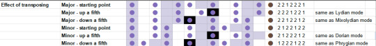
In terms of modes, this shows that the major scale a fifth down from a given root note has the same set of notes as the "mixolydian mode" on the original root note. ...don't worry, you don't gotta memorise this, there is not a test! Rather, the point of mentioning these modes is to underline that whether you're in a major key, minor key, or one of the various other modes is all relative to the note you start on. We'll see in a moment a way to think about modes other than 'cyclic permutation'.
Let's try the same trick on the minor key.

Looks like this time, to go up we need to sharpen the sixth degree, and to go down we need to flatten the second degree. As algebra demands, this gives us the exact same sequence of sharps and flats as the sequence of major scales we derived above. After all, every major scale has a 'relative minor' which can be achieved by cyclically permuting its notes.
Going up a fifth shares the same notes with the 'Dorian mode' of the original base note, and going down a fifth shares the same notes with the 'Phrygian mode'.
Here's a summary of movement around the circle of fifths. The black background indicates the root note of the new scale.
Another angle on modes
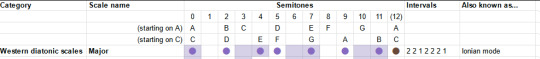
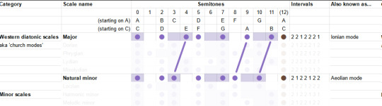
In my first two articles, I discussed the modes of the diatonic scale. Leaping straight for the mathematically simplest definition (hi Kolmogorov), I defined the seven 'church modes' as simply being cyclic permutations of the intervals of the major scale. Which they are... but I'm told that's not really how musicians think of them.
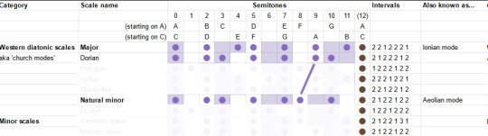
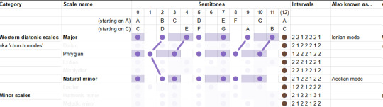
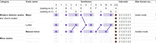
Let's grab the chart of modes again. (Here's the link to the spreadsheet).
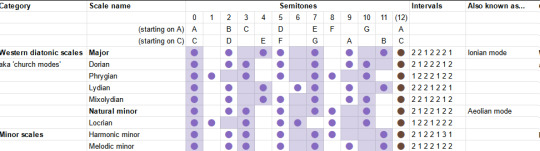
We can get to these modes by cyclically permuting the others, but we can also get to them by making a small adjustment of one to a few particular scale degrees. When you listen to a piece of music, you're not really doing cyclic permutations - you're building up a feeling for the pattern of notes based on your lifelong experience of hearing music that's composed in this system. So the modes will feel something like 'major until, owo what's this, the seventh is not where I thought it would be'.
Since the majority of music is composed using major and minor modes, it's useful therefore to look at the 'deltas' relative to these particular modes.
To begin with, what's the difference between major and minor? To go from major to natural minor, you shift the third, sixth and seventh scale degrees down by one semitone.
So those are our two starting points. For the others, I'm going to be consulting the most reliable music theory source (some guy on youtube) to give suggestions of the emotional connotations these can bring. The Greek names are not important, but I am trying to build a toolbox of elements here, so we can try our hand at composition. So!
The "Dorian mode" is like the natural minor, but the sixth is back up a semitone. It's described as a versatile mode which can be mysterious, heroic or playful. I guess that kinda makes sense, it's like in between the major and minor?
The "Phrygian mode" is natural minor but you also lower the 2nd - basically put everything as low as you can go within the diatonic modes. It is described as bestowing an ominous, threatening feeling.
The "Lydian mode" is like the major scale, but you shift the fourth up a semitone, landing on the infamous tritone. It is described as... uh well actually the guy doesn't really give a nice soundbitey description of what this mode sounds like, besides 'the brighest' of the seven, this video's kinda more generally about composition, whatever. But generally it's pretty big and upbeat I think.
The "Mixolydian" mode is the major, but with the seventh down a semitone. So it's like... a teeny little bit minor. It's described as goofy and lighthearted.
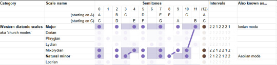
We've already covered the Aeolian/Natural Minor, so that leaves only the "Locrian". This one's kinda the opposite of the Lydian: just about everything in the major scale is flattened a bit. Even from the minor it flattens two things, and gives you lots of dissonance. This one is described as stereotypically spooky, but not necessarily. "One of the least useful", oof.
Having run along the catalogue, we may notice something interesting. In each case, we always either only sharpen notes, or only flatten notes relative to the major and minor scales. All those little lines are parallel.
Indeed, it turns out that each scale degree has one of two positions it can occupy. We can sort the diatonic modes according to whether those degrees are in the 'sharp' or 'flat' position.
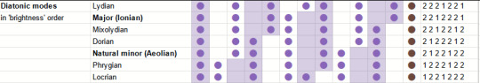
This is I believe the 'brightness' mentioned above, and I suppose it's sort of like 'majorness'. So perhaps we can think of modes as sliding gradually from the ultra-minor to the infra-major? I need to experiment and find out.
What have we learned...?
Scale degrees are a big deal! The focus of all this has been looking at how different collections of notes relate to each other. We sort our notes into little sets and sequences, and we compare the sets by looking at 'equivalent' positions in some other set.
Which actually leads really naturally into the subject of chord progressions.
So, musical structure. A piece of tonal music as a whole has a "palette" which is the scale - but within that, specific sections of that piece of music will pick a smaller subset of the scale, or something related to the scale, to harmonise.
The way this goes is typically like this: you have some instruments that are playing chords, which gives the overall sort of harmonic 'context', and you have a single-voiced melody or lead line, which stands out from the rest, often with more complex rhythms. This latter part is typically what you would hum or sing if you're asked 'how a song goes'. Within that melody, the notes at any given point are chosen to harmonise with the chords being played at the same time.
The way this is often notated is to write the melody line on the stave, and to write the names of chords above the stave. This may indicate that another hand or another instrument should play those chords - or it may just be an indication for someone analysing the piece which chord is providing the notes for a given section.
So, you typically have a sequence of chords for a piece of music. This is known as a chord progression. There are various analytical tools for cracking open chord progressions, and while I can't hope to carry out a full survey, let me see if I can at least figure out my basic waypoints.
Firstly, there are the chords constructed directly from scales - the 'triad' chords, on top of which can be piled yet more bonus intervals like sevenths and ninths. Starting from a scale, and taking any given scale degree as the root note, you can construct a chord by taking every other subsequent note.
So, the major scale interval pattern goes 2 2 1 2 2 2 1. We can add these up two at a time, starting from each position, to get the chords. For each scale degree we therefore get the following intervals relative to the base note of the chord...
I. 0 4 7 - major
ii. 0 3 7 - minor
iii. 0 3 7 - minor
IV. 0 4 7 - major
V. 0 4 7 - major
vi. 0 3 7 - minor
viiᵒ. 0 3 6 - diminished
Now hold on a minute, where'd those fuckin Roman numerals come from? I mentioned this briefly in the first post, but this is Roman numeral analysis, which is used to talk about chord progressions in a scale-independent way.
Here, a capital Roman numeral represents a major triad; a lowercase Roman numeral represents a minor triad; a superscript 'o' represents a dimished triad (minor but you lower the fifth down to the tritone); a superscript '+' represents an augmented triad (major but you boost the fifth up to the major sixth).
So while regular chord notation starts with the pitch of the base note, the Roman numeral notation starts with a scale degree. This way you can recognise the 'same' chord progression in songs that are in quite different keys.
OK, let's do the same for the minor scale... 2 1 2 2 1 2 2. Again, adding them up two at a time...
i. 0 3 7 - minor
iiᵒ. 0 3 6 - diminished
III. 0 4 7 - major
iv. 0 3 7 - minor
v. 0 3 4 - minor
VI. 0 4 7 - major
VII. 0 4 7 - major
Would you look at that, it's a cyclic permutation of the major scale. Shocker.
So, both scales have three major chords, three minor chords and a diminished chord in them. The significance of each of these positions will have to be left to another day though.
What does it mean to progress?
So, you play a chord, and then you play another chord. One or more of the voices in the chord change. Repeat. That's all a chord progression is.
You can think of a chord progression as three (or more) melodies played as once. Only, there is an ambiguity here.
Let's say, idk, I threw together this series of chords, it ended up sounding like it would be something you'd hear in an old JRPG dungeon, though maybe that's just 'cos it's midi lmao...
I emphasise at this point that I have no idea what I'm doing, I'm just pushing notes around until they sound good to me. Maybe I would know how to make them sound better if I knew more music theory! But also at some point you gotta stop theorising and try writing music.
So this chord progression ended up consisting of...
Csus2 - Bm - D♯m - A♯m - Gm - Am - F♯m - Fm - D - Bm
Or, sorted into alphabetical order, I used...
Am, A♯m, Bm, Csus2, D, D♯m, Fm, F♯m, Gm
Is that too many minor chords? idk! Should all of these technically be counted as part of the 'progression' instead of transitional bits that don't count? I also dk! Maybe I'll find out soon.
I did not even try to stick to a scale on this, and accordingly I'm hitting just about every semitone at some point lmao. Since I end on a B minor chord, we might guess that the key ought to be B minor? In that case, we can consult the circle of fifths and determine that F and C would be sharp. This gives the following chords:
Bm, C♯dim, D, Em, F♯m, G, A
As an additional check, the notes in the scale:
B, C♯, D, E, F, G♯, A
Well, uh. I used. Some of those? Would it sound better if I stuck to the 'scale-derived' chords? Know the rules before you break them and all that. Well, we can try it actually. I can map each chord in the original to the corresponding chord in B minor.
This version definitely sounds 'cleaner', but it's also... less tense I feel like. The more dissonant choices in the first one made it 'spicier'. Still, it's interesting to hear the comparison! Maybe I could reintroduce the suspended chord and some other stuff and get a bit of 'best of both worlds'? But honestly I'm pretty happy with the first version. I suppose the real question would be which one would be easier to fit a lead over...
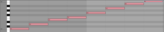
Anyway, for the sake of argument, suppose you wanted to divide this into three melodies. One way to do it would be to slice it into low, central and high parts. These would respectively go...
Since these chords mostly move around in parallel, they all have roughly the same shape. But equally you could pick out three totally different pathways through this. You could have a part that just jumps to the nearest note it can (until the end where there wasn't an obvious place to go so I decided to dive)...
Those successive relationships between notes also exist in this track. Indeed, when two successive chords share a note, it's a whole thing (read: it gets mentioned sometimes in music theory videos). You could draw all sorts of crazy lines through the notes here if you wanted.
Nevertheless, the effects of movements between chords come in part from these relationships between successive notes. This can give the feeling of chords going 'up' or 'down', depending on which parts go up and which parts go down.
I think at this point this post is long enough that trying to get into the nitty gritty of what possible movements can exist between chords would be a bit of a step too far, and also I'm yawning a lot but I want to get the post out the door, so I let's wrap things up here. Next time: we'll continue our chord research and try and figure out how to use that Roman numeral notation. Like, taking a particular Roman numeral chord progression and see what we can build with it.
Hope this has been interesting! I'm super grateful for the warm reception the last two articles got, and while I'm getting much further from the islands of 'stuff I can speak about with confidence', fingers crossed the process of learning is also interesting...
65 notes
·
View notes
Note
🌻
(Oh man, the mortifying ordeal of actually having to pick something to talk about when I have so many ideas...)
Uh, OK, I'm talking about galactic algorithms, I've decided! Also, there are some links peppered throughout this post with some extra reading, if any of my simplifications are confusing or you want to learn more. Finally, all logarithms in this post are base-2.
So, just to start from the basics, an algorithm is simply a set of instructions to follow in order to perform a larger task. For example, if you wanted to sort an array of numbers, one potential way of doing this would be to run through the entire list in order to find the largest element, swap it with the last element, and then run though again searching for the second-largest element, and swapping that with the second-to-last element, and so on until you eventually search for and find the smallest element. This is a pretty simplified explanation of the selection sort algorithm, as an example.
A common metric for measuring how well an algorithm performs is to measure how the time it takes to run changes with respect to the size of the input. This is called runtime. Runtime is reported using asymptotic notation; basically, a program's runtime is reported as the "simplest" function which is asymptotically equivalent. This usually involves taking the highest-ordered term and dropping its coefficient, and then reporting that. Again, as a basic example, suppose we have an algorithm which, for an input of size n, performs 7n³ + 9n² operations. Its runtime would be reported as Θ(n³). (Don't worry too much about the theta, anyone who's never seen this before. It has a specific meaning, but it's not important here.)
One notable flaw with asymptotic notation is that two different functions which have the same asymptotic runtime can (and do) have two different actual runtimes. For an example of this, let's look at merge sort and quick sort. Merge sort sorts an array of numbers by splitting the array into two, recursively sorting each half, and then merging the two sub-halves together. Merge sort has a runtime of Θ(nlogn). Quick sort picks a random pivot and then partitions the array such that items to the left of the pivot are smaller than it, and items to the right are greater than or equal to it. It then recursively does this same set of operations on each of the two "halves" (the sub-arrays are seldom of equal size). Quick sort has an average runtime of O(nlogn). (It also has a quadratic worst-case runtime, but don't worry about that.) On average, the two are asymptotically equivalent, but in practice, quick sort tends to sort faster than merge sort because merge sort has a higher hidden coefficient.
Lastly (before finally talking about galactic algorithms), it's also possible to have an algorithm with an asymptotically larger runtime than a second algorithm which still has a quicker actual runtime that the asymptotically faster one. Again, this comes down to the hidden coefficients. In practice, this usually means that the asymptotically greater algorithms perform better on smaller input sizes, and vice versa.
Now, ready to see this at its most extreme?
A galactic algorithm is an algorithm with a better asymptotic runtime than the commonly used algorithm, but is in practice never used because it doesn't achieve a faster actual runtime until the input size is so galactic in scale that humans have no such use for them. Here are a few examples:
Matrix multiplication. A matrix multiplication algorithm simply multiplies two matrices together and returns the result. The naive algorithm, which just follows the standard matrix multiplication formula you'd encounter in a linear algebra class, has a runtime of O(n³). In the 1960s, German mathematician Volker Strassen did some algebra (that I don't entirely understand) and found an algorithm with a runtime of O(n^(log7)), or roughly O(n^2.7). Strassen's algorithm is now the standard matrix multiplication algorithm which is used nowadays. Since then, the best discovered runtime (access to paper requires university subscription) of matrix multiplication is now down to about O(n^2.3) (which is a larger improvement than it looks! -- note that the absolute lowest possible bound is O(n²), which is theorized in the current literature to be possible), but such algorithms have such large coefficients that they're not practical.
Integer multiplication. For processors without a built-in multiplication algorithm, integer multiplication has a quadratic runtime. The best runtime which has been achieved by an algorithm for integer multiplication is O(nlogn) (I think access to this article is free for anyone, regardless of academic affiliation or lack thereof?). However, as noted in the linked paper, this algorithm is slower than the classical multiplication algorithm for input sizes less than n^(1729^12). Yeah.
Despite their impracticality, galactic algorithms are still useful within theoretical computer science, and could potentially one day have some pretty massive implications. P=NP is perhaps the largest unsolved problem in computer science, and it's one of the seven millennium problems. For reasons I won't get into right now (because it's getting late and I'm getting tired), a polynomial-time algorithm to solve the satisfiability problem, even if its power is absurdly large, would still solve P=NP by proving that the sets P and NP are equivalent.
Alright, I think that's enough for now. It has probably taken me over an hour to write this post lol.
5 notes
·
View notes
Text
Space, Time and Good Code
It's been some time since I last posted to the blog. I've completed my third year studying BsC Computing and IT (Software Engineering)🎉.
In my last post I discussed the Data Structures and Algorithms module (M269) which, as predicted, was a beast. It would be a shame not to cover this module that is so integral to computer science and is genuinely quite interesting (i think so).
What makes some code better than others?
Over the years of trawling through forums and stack overflow I'd heard the term "bad code" and "good code" but it seemed like a subjective distinction that only the minds of the fashionistas of the programming world could make. What makes my code good? Is it the way it looks, how difficult it is to understand? Perhaps I'm using arrays and their using sets, what about string interpolation isntead of concatenation? As it turns out there is a very robust method of measuring the quality of code and it comes in the form of Complexity Analysis.
Complexity analysis is a method used in computer science to evaluate the efficiency of algorithms. It helps determine how the performance of an algorithm scales with the size of the input. By analyzing time and space complexity, we can predict how long an algorithm will take to run and how much memory it will use. This ensures that algorithms are optimized for different hardware and software environments, making them more efficient and practical for real-world applications.
Big O and Theta
Complexity analysis has its roots in the early days of computer science, evolving from the need to evaluate algorithm efficiency. In the 1960s and 1970s, pioneers like Donald Knuth and Robert Tarjan formalized methods to analyze algorithm performance, focusing on time and space complexity. This period saw the development of Big O notation, which became a standard for describing algorithm efficiency. Complexity theory further expanded with the introduction of classes like P and NP, exploring the boundaries of computational feasibility.
Big O notation describes the worst-case scenario for an algorithm, showing the maximum time it could take to complete. Think of it as the upper limit of how slow an algorithm can be. For example, if an algorithm is O(n), its time to complete grows linearly with the input size.
Big Theta notation, on the other hand, gives a more precise measure. It describes both the upper and lower bounds, meaning it shows the average or typical case. If an algorithm is Θ(n), its time to complete grows linearly with the input size, both in the best and worst case.
In complexity analysis, there are several types of complexity to consider:
Time Complexity: This measures how the runtime of an algorithm changes with the size of the input. It’s often expressed using Big O notation (e.g., O(n), O(log n)).
Space Complexity: This evaluates the amount of memory an algorithm uses relative to the input size. Like time complexity, it’s also expressed using Big O notation.
Worst-Case Complexity: This describes the maximum time or space an algorithm will require, providing an upper bound on its performance.
Best-Case Complexity: This indicates the minimum time or space an algorithm will need, representing the most optimistic scenario.
Average-Case Complexity: This gives an expected time or space requirement, averaging over all possible inputs.
There are also several different complexities.
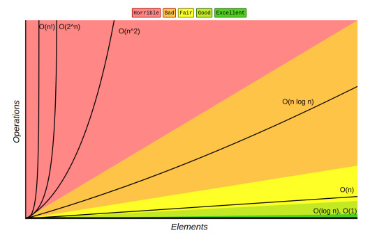
Here are some common types of Big O complexities:
O(1) - Constant Time: The algorithm’s runtime does not change with the input size. Example: Accessing an element in an array.
O(n) - Linear Time: The runtime grows linearly with the input size. Example: Iterating through an array.
O(log n) - Logarithmic Time: The runtime grows logarithmically with the input size. Example: Binary search.
O(n log n) - Linearithmic Time: The runtime grows in proportion to ( n \log n ). Example: Merge sort.
O(n^2) - Quadratic Time: The runtime grows quadratically with the input size. Example: Bubble sort.
O(2^n) - Exponential Time: The runtime doubles with each additional input element. Example: Solving the traveling salesman problem using brute force.
O(n!) - Factorial Time: The runtime grows factorially with the input size.
Here's a diagram that shows the change in runtime for the different complexities:
Data Structures to improve complexity
Throughout the M269 module you are introduced to a variety of data structures that help improve efficiency in several, very clever ways.
For example, suppose you have an array of numbers and you want to find a specific number. You would start at the beginning of the array and check each element one by one until you find the number or reach the end of the array. This process involves checking each element, so if the array has ( n ) elements, you might need to check up to ( n ) elements in the worst case.
Therefore, in its worse case scenario an array of 15 items will take 15 steps before realising that the value is not present in the array.
Here’s a simple code example in Python:
def linear_search(arr, target): for i in range(len(arr)): if arr[i] == target: return i return -1
You need to check each item in an array sequentially because the values at each index aren’t visible from the outside. Essentially, you have to look inside each “box” to see its value, which means manually opening each one in turn.
However, with a hash set, which creates key-value pairs for each element, the process becomes much more efficient!
A hash set is a data structure that stores unique elements using a mechanism called hashing. Each element is mapped to a unique hash code, which determines its position in the set. This allows for constant time complexity, O(1), for basic operations like add, remove, and contains, assuming a good hash function. This efficiency is because the hash code directly points to the location of the element, eliminating the need for a linear search. As a result, hash sets significantly improve search performance compared to arrays or lists, especially with large datasets.
This is just one of the many data structures that we learned can help improve complexity. Some others we look at are:
Stacks
Queues
Linked List
Trees
Graphs
Better Algorithms!
Yes, data structures can dramatically improve the efficiency of your algorithms but algorithm design is the other tool in your arsenal.
Algorithm design is crucial in improving efficiency because it directly impacts the performance and scalability of software systems. Well-designed algorithms ensure that tasks are completed in the shortest possible time and with minimal resource usage.
An example of algorithm design that dramatically improves efficiency is Binary Search.
Binary search is an efficient algorithm for finding a target value within a sorted array. It works by repeatedly dividing the search interval in half until the target value is found or the interval is empty.
Here’s how it works:
Start with the entire array: Identify the middle element.
Compare the middle element: If it matches the target value, the search is complete.
Adjust the search interval: If the target is smaller than the middle element, focus on the left half of the array. If it’s larger, focus on the right half.
Repeat: Continue this process until the target is found or the interval is empty.
Example: Suppose you have a sorted array ([2, 5, 8, 12, 16, 23, 38, 56, 72, 91]) and you want to find the number 23. Start by comparing 23 with the middle element (23). Since they match, the search ends successfully.
Here is an image of a Binary Search algorithm being applied to a Rooted Tree (a graph with a root node):
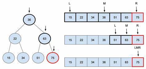
Complexity Improvement: Binary search significantly improves search efficiency compared to linear search. While linear search has a time complexity of O(n), binary search has a time complexity of O(log n). This logarithmic growth means that even for large datasets, the number of comparisons needed is relatively small. For example, in an array of 1,000,000 elements, binary search would require at most about 20 comparisons, whereas linear search might need up to 1,000,000 comparisons.
What on earth am i going on about?
Like I said, last year I wouldn't have been able to discern good code from bad code. Now I can analyse the complexity of a piece of code and determine its efficiency, especially as its input grows. I can also see if the programmer has used efficient data structures in their code, rather than bog standard arrays (arrays are amazing btw, no hate).
Ultimately, I feel like this module has definitely made me a better programmer.
0 notes
Note
Hello! I really like your blog and it somehow makes me feel good and safe, your notes are really pretty! When I look at them they seem so interesting and I wish to understand them but the problem is I haven't even started university (I have just finished high school) and I'm kind of scared thinking it would be too difficult for me to grasp. It is just so different from high school math but at the same much more fascinating. Do you perhaps have any advice on how to introduce myself to it, where to start? Or should I just wait for the classes to start and then study?Best wishes to you!! Thank you
Hey @dantesdream !
I just want you to know that mathematics is difficult at the University level but it is not more difficult than any other university course.It is just different.📚
So how is mathematics different and why you shouldn't get discouraged by it?
There is an entire book written on it.It is called 'Alex's Adventures in Numberland' written by Alex Bellos.There is one particular page that I really like.It talks about how are brain perceives the world around us on a logarithmic scale but mathematics is linear and that is why we have to put the extra effort into it (To convert logarithmic to linear) but according to me this extra effort is far less than wading through hundreds of textbooks often contradicting each other that many other university courses require. Here is the cover page of the book I recommended if you would like to read it.

Apart from having a positive attitude towards it I think it'll be great if you could start studying it before your university begins.
So from where should you start?
If you know where you'll be going for your university studies then you can check if your university has uploaded their notes online and start accordingly.Some old students also usually post their notes,so see if you can get your hands on them.If these two options fail then there are two more.Oxford university has made all their mathematics notes avalilable.You can start with their Introduction to mathematics and complex numbers course (I'll put the link at the end).A student from Cambridge University named Dexter Chua also has made his notes available.You can start with Numbers and sets if you use his notes (Again I'll put the link at the end).
Oxford notes:
https://courses.maths.ox.ac.uk/overview/undergraduate
Dexter's notes:
https://dec41.user.srcf.net/notes/
You should be fine with these but the beginning steps into mathematics needs a little more help.You can use the book called as 'How to prove it:A structured approach' by Daniel J. Velleman.If you can read this with the first course that you are taking (your university notes or Oxbridge notes) then I think you'll enjoy the course more just like I did.Here is the image of the book

If you want to know more then I'm just a message away so feel free to ask your doubts.
And thank you for all your compliments hehe ^_^
#studying with thoughtss#problematicprocrastinator#heysaher#heypat#chicanastudies#heyvan#heyvenustudy#myhoneststudyblr#jeonchemstudy#apalsant#studhe#heycazz#mathematics#mymessystudyblr#einstetic#heythoughtss#heysprouht
89 notes
·
View notes
Text
AO3 stats project: basic questions
Post 2 in my series of posts on statistics of works posted on the Archive of Our Own. The previous post described how I got the data. This one is basic content questions: broad characteristics of the posted works.
The Data | Basic Questions | Fandoms | Tags | Correlations | Kudos | Fun Stuff
Thanks to @eloiserummaging for beta reading these posts; any remaining errors are my own. A Python notebook showing the code I used to make these plots can be found here.
My total dataset includes 4,337,545 works, with a collective hit total of 5,959,490,736 hits, and a collective word count of 28,543,023,393 words. That's equivalent to over 26,000 entire Harry Potter series of words. And the number of hits is an underestimate--anything posted before 2015 or so has the number of hits it had when I first grabbed the data in 2015, missing out on 3-4 years of collecting extra hits.
Let's start by looking at when works on the Archive were posted. (Remember, this only shows the most recent chapter of any work because of how I downloaded the data--so this should underestimate the number of works posted on any given day.) Here's a smoothed graph showing the number of works posted per day over time:

It increases over time, as you'd expect, since the number of people using the Archive is growing. Cool.
How does the number of works posted vary throughout the year? We have to take out that increasing trend, or we'll always show more works posted in December than January--not because individual authors prefer December, but because more people joined over the course of the year. So I'm going to plot the difference between the number of works posted on an individual day and the number of works that would have been posted if the plot I just showed was a straight increasing line from Nov. 15, 2009 until today. (It isn't, but all the stuff that isn't a straight line is the interesting part!) Here's a heatmap of posting days:
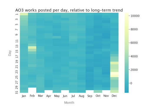
On light-colored days, there were many more works posted than you would have expected if nobody had any preferences for day of posting. You can see Yuletide pretty clearly (and other winter-break fests), and also Valentine's Day! And, to a lesser extent, Halloween. There seems to be a little less activity in September through November, though that might be an artifact of my simple “linear increase” model, but other than that there aren't particular posting days, averaged over the whole Archive.
Do creators post more on certain days of the week? (Unlike the heatmap above, the colors aren’t important in bar charts like this--I’m just trying to make them look pretty. :) )
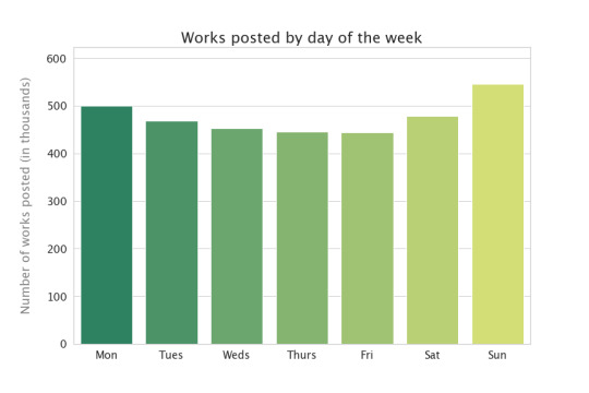
Wow, yeah! About 20% more works posted on Sunday than on Friday, the least-popular day of the week for posting.
Is reader behavior the same? Since the default display is reverse chronological order, people are more likely to view works posted on the day they visited the Archive than works posted earlier, so we can look at the total number of hits for fics posted on the different days:
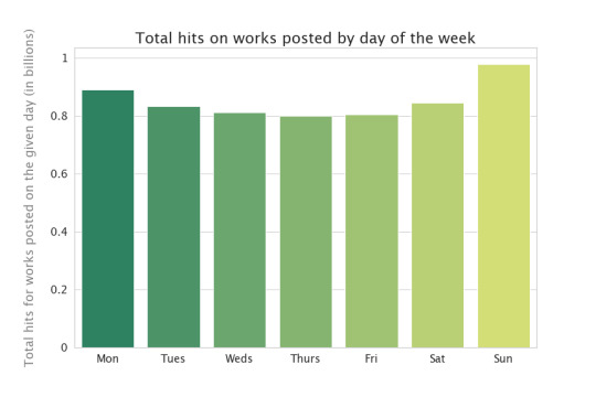
This is basically the same as the previous chart, except Thursday just edges Friday as the lowest day of the week. That means that, on average, you’ll get the same number of hits regardless of which day you post. In the past, I’ve sometimes tried to post on a day I think lots of readers will be around to read it, but apparently that wasn’t necessary--readers will find my stuff anyway! Useful to know.
Works aren't tagged with their work type as one of the default pieces of information (unlike, say, word count), but people who post things other than fanfiction can choose to tag their works. The most common non-fanfiction things are podfic (audiobooks), fanart (art), and fanvids (film/video art): how many works get tagged with those tags?
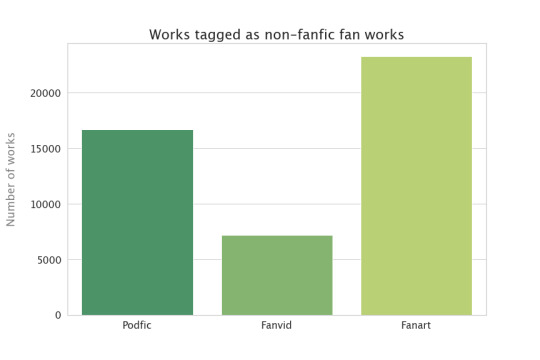
Again, that's probably an undercount because not everybody tags, and I may have missed some of the relevant tags. This adds up to between 1 and 2% of the total works count in this dataset.
Not everything on the Archive is in English--here are the top ten languages...

Very dominated by English. Still, I wouldn’t have guessed some of those languages--Bahasa Indonesia in particular, but I also wouldn’t have put Italian or Polish that high.
How are the works distributed among ratings and categories? (Note that works can have multiple categories, but only one rating.)

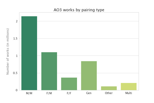
I had no idea the ratings distribution looked like that! But I’m not surprised that M/M is dominating the categories. I suspect that looks different at other fic archives like Wattpad and ff.net--the Archive caters to an older and queerer audience, if I remember my fan studies articles properly. Although it might be conventional wisdom more than actual research that makes me think this, so maybe they would look the same.
Users can post complete works to AO3, or they can update works a chapter at a time (often called a “WiP”, or a work in progress). What fraction of the works on AO3 are currently in progress?
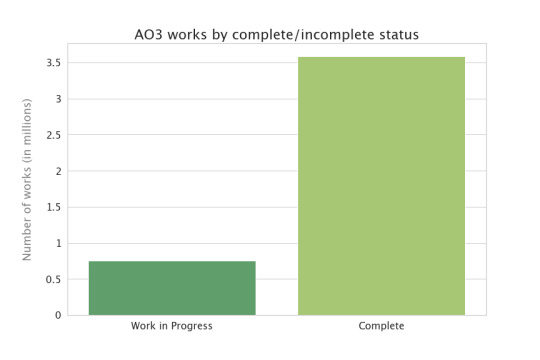
I would have thought the number of works in progress would be higher than that. But I suppose a number of the completed works are former works in progress, now completed. Does this look different if we restrict to the last year or so?
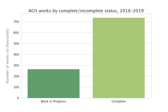
The bars are much closer in height--there are more works in progress, as a fraction of everything that was posted, in the last couple of years. So, assuming the desire to post WiPs hasn't grown appreciably over time--assuming about ¼ of the fics that get posted start out as WiPs, in 2010 as well as 2019--then the only way to explain the fact that less than ⅕ of works are WiPs now is that they used to be WiPs but now they’re completed. Cool! And good news for people who are reading WiPs--they get finished. :)
Some more basic questions: how long are the works on the Archive?

Hmm. Okay. So the longest work on the AO3 is over 3 million words. That makes this plot kinda hard to read, because that giant bar on the left includes everything up to about 60,000 words! So I’m going to use a different kind of plot, where I mess with the scale on the bottom so we can see things more clearly--this is called a “log plot” (for logarithm). Now, instead of the vertical lines being every 500,000 words, they indicate factors of 10:
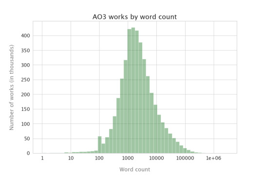
Ah, now we can see more clearly: the most common wordcount on the Archive is somewhere between 1,000 and 3,000 words, and almost all the works have at least 100 words. That most common wordcount of just a couple of thousand is pretty surprising to me, actually; I thought it would be far longer. But I’m also surprised at just how many 100,000+ word works there are as well.
What about chapter counts?

That’s fewer chaptered works than I expected, by quite a bit. On the other hand, I was also surprised by how short most works are, so I guess that makes sense: no need to make a 1000-word fic chaptered, in general.
And indeed, as you'd expect, the average number of chapters goes up with word count:

Though I don't have a pretty plot, I can also tell you that 24% of the works posted on the Archive are a part of a series!
Most of that was about creator behavior. What does reader engagement look like? I’m going to keep using those plots with the power-of-10 x-axis, just so we can see things a little better.

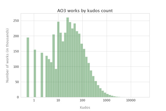


Lots of things get 10-100 kudos, which is nice for authors. Bookmarks and comment counts are much less common than kudos, though they track with each other pretty well. Note that more things have 2 comments (the tallest bar between 1 and 10) than 1 comment--I guess that means most authors are better than me at responding to comments. :)
Next up: fandoms!
25 notes
·
View notes
Text
20210123
I’m going to do something a little different today: having a look at the current state of the broad stock market (USA) and each of its major sectors. I apologize for linear rather than logarithmic scale on each of these, but Thinkorswim still hasn’t fixed the bug they introduced the other year where going to log scale gives you axes that are constantly spaced on the screen, and therefore at completely unhelpful random-looking price values, instead of keeping constant price intervals (therefore at shrinking pixel counts as price rises) like every single other stock chart platform does it. And all this despite my once exchanging emails with them about it many months ago, complete with screencaps and everything.

So first up is S&P 500. The trend has been undeniably up since the beginning of November, and while volume on the recent legs of the rally hasn’t been stellar, there’s nothing on the bear side to indicate growing supply either. (The volume spike in December was the last Friday before Christmas, which I’ve since come to realize always has abnormally high volume, every year, just like the last week of the year always has abnormally low volume, so we can’t read anything into it.) If the current pullback goes a bit deeper, and especially if volume drops off simultaneously, we may have a setup for a gap fill buy signal.

Next up is basic materials ($DJUSBM). The current corrective selloff still looks of normal proportions without any huge selling pressure evident, and we’ve basically filled the gap left by the volume spike of January 6, so this sector looks set to resume its rally as long as it can find support here fairly soon.

Now to consumer services ($DJUSCY). This one doesn’t look so clear-cut, as the volume so far in January is clearly not measuring up to November and December; note especially the huge rally on January 20 with no volume behind it -- such a huge disconnect between effort and results is highly suspicious and may signal the end of a move. While there’s yet no evidence of distribution, it seems clear from the two sessions since that demand is stalling out.
Within this sector, Comcast (CMCSA) might be worth a closer look:

The multiple top that it broke down from on January 15, with volume and a gap, and volume during the multiple top formation following just the pattern you would expect (heavy on selloffs and weak on all rallies past the initial peak), would seem to indicate downside to at least the 46 area, or right around the low of November 10, in the vicinity of a big as-yet-unfilled gap. If you prefer the 1-point P&F chart, then the downside target is even lower, at 44. Note also that the higher volume of January 21 still wasn’t enough to get back into the gap: not a bullish sign.

The next sector up is energy, and by that I mean oil and gas ($DJUSEN). The low volume on the latest top was begging for a correction, which we got, but (kind of like in the broad market) there isn’t much evidence of selling pressure to make me think a deeper decline is in order. If yesterday’s hammer candlestick gets confirmed to the upside (and not far from the uptrend support line, not shown because I didn’t think to draw one before I took this screencap), then the rally should resume to new highs without much fuss.

Now we come to financials ($DJUSFN), whose chart looks so much like the broad market’s that there’s very little to add. A resumption of the rally would normally be expected pretty soon, with the pullback at about halfway and the uptrend support line coming soon.

Next is health care ($DJUSHC). Unlike basic materials, energy, or financials, this sector’s steep rally at the outset of the year didn’t have strong volume behind it. Nevertheless, bears haven’t been able to get anything done here, and the notable shrinkage of both spread and volume in yesterday’s session would indicate that a resumption of the rally is likely. However, since the pullback didn’t get us close to any decent danger point (obvious support), the risk/reward situation isn’t as good here as with some of the sectors above.

This chart’s of industrials ($DJUSIN), and it’s basically the same story as basic materials and financials, but arguably even better because of the clear volume shrinkage in yesterday’s session, along with meeting support just above the congestion zone of December. The case is compelling for a rally. Perhaps a play in an ETF like VIS, or maybe Caterpillar (CAT)?

Next up we have consumer goods ($DJUSNC). Here, for the first time, we have a clearly uptrending sector with what could be considered evidence of distribution, in the January 21st volume spike on a selloff. If the selloff fizzles quickly, as yesterday’s session suggests it might, then it may not end up meaning anything; but it’s clearly a more bearish sign than most of the other strong sectors showed.
The sector may also be working itself into an apex; if it does, then the evidence so far would have to favor an eventual break to the downside -- volume didn’t shrink over the course of January’s consolidation like it normally should, plus of course the 1/21 volume spike.

Our next sector is real estate ($DJUSRE). I don’t know if I can take anything meaningful away from this one. The manner in which the early January selloff was conducted, ending in two high-volume but low-spread days followed by a thrust lower on even lower volume, would seem to be bullish... but the bulls failed to run with that, putting no significant volume behind the ensuing rally. It’s an inconclusive market, and it’s just coming into resistance again, so the best bet might just be to trade the range until we see something change.

Retail ($DJUSRT) is our next chart; this index is actually a subset of the one I used for consumer services. Can we trust this recent high? My instinct is no: much like in consumer services, the run-up of this week was abrupt and not supported by commensurate volume, and the last two days seem to indicate that demand is exhausted for the moment; so a pullback would be expected. I just can’t find an ETF or individual issue that looks enough like this to take advantage of it.

The next chart is technology ($DJUSTC), and honestly this is starting to look really familiar now. Is this the clearest example yet of a rally on January 20th that was not at all justified by the volume (which in this case was actually clearly lower than on either of the adjacent days)? Surely that gap’s getting filled soon, right? An ETF like QQQ or XLK might be a good candidate for a quick short here.

We move on to telecommunications ($DJUSTL). I can’t think of anything interesting to say about this one, except to note that November’s gap has now been filled. I don’t see any obvious evidence for either a bullish or a bearish stance on this one, so I must remain neutral until we get a clearer sign one way or the other.

And lastly, we come to utilities ($DJUSUT). Just like with telecommunications, this is a chart I simply cannot get excited about, because I have no idea what it is telling me.
Well, that was fun, though it also took almost two hours...
0 notes
Text
Explainer: What are logarithms and exponents?
When COVID-19 hit the United States, the numbers just seemed to explode. First, there were only one or two cases. Then there were 10. Then 100. Then thousands and then hundreds of thousands. Increases like this are hard to understand. But exponents and logarithms can help make sense of those dramatic increases.
Scientists often describe trends that increase very dramatically as being exponential. It means that things don’t increase (or decrease) at a steady pace or rate. It means the rate changes at some increasing pace.
An example is the decibel scale, which measures sound pressure level. It is one way to describe the strength of a sound wave. It’s not quite the same thing as loudness, in terms of human hearing, but it’s close. For every 10 decibel increase, the sound pressure increases 10 times. So a 20 decibel sound has not twice the sound pressure of 10 decibels, but 10 times that level. And the sound pressure level of a 50 decibel noise is 10,000 times greater than a 10-decibel whisper (because you’ve multiplied 10 x 10 x 10 x 10).
An exponent is a number that tells you how many times to multiply some base number by itself. In that example above, the base is 10. So using exponents, you could say that 50 decibels is 104 times as loud as 10 decibels. Exponents are shown as a superscript — a little number to the upper right of the base number. And that little 4 means you’re to multiply 10 times itself four times. Again, it’s 10 x 10 x 10 x 10 (or 10,000).
Logarithms are the inverse of exponents. A logarithm (or log) is the mathematical expression used to answer the question: How many times must one “base” number be multiplied by itself to get some other particular number?
For instance, how many times must a base of 10 be multiplied by itself to get 1,000? The answer is 3 (1,000 = 10 × 10 × 10). So the logarithm base 10 of 1,000 is 3. It’s written using a subscript (small number) to the lower right of the base number. So the statement would be log10(1,000) = 3.
At first, the idea of a logarithm might seem unfamiliar. But you probably already think logarithmically about numbers. You just don’t realize it.
Let’s think about how many digits a number has. The number 100 is 10 times as big as the number 10, but it only has one more digit. The number 1,000,000 is 100,000 times as big as 10, but it only has five more digits. The number of digits a number has grows logarithmically. And thinking about numbers also shows why logarithms can be useful for displaying data. Can you imagine if every time you wrote the number 1,000,000 you had to write down a million tally marks? You’d be there all week! But the “place value system” we use allows us to write down numbers in a much more efficient way.
Why describe things as logs and exponents?
Log scales can be useful because some types of human perception are logarithmic. In the case of sound, we perceive a conversation in a noisy room (60 dB) to be just a bit louder than a conversation in a quiet room (50 dB). Yet the sound pressure level of voices in the noisy room might be 10 times higher.
These graphs plot the same information, but show it somewhat differently. The plot at left is linear, the one at right is logarithmic. The steep curve in the left plot looks flatter on the right plot.Canadian Journal of Political Science, Apr. 14, 2020, pp.1–6/ (CC BY 4.0)
Another reason to use a log scale is that it allows scientists to show data easily. It would be hard to fit the 10 million lines on a sheet of graph paper that would be needed to plot the differences from a quiet whisper (30 decibels) to the sound of a jackhammer (100 decibels). But they’ll easily fit on a page using a scale that’s logarithmic. It’s also an easy way to see and understand big changes such as rates of growth (for a puppy, a tree or a country’s economy). Any time you see the phrase “order of magnitude,” you’re seeing a reference to a logarithm.
Logarithms have many uses in science. pH — the measure of how acidic or basic a solution is — is logarithmic. So is the Richter scale for measuring earthquake strength.
In 2020, the term logarithmic became best known to the public for its use in describing the spread of the new pandemic coronavirus (SARS-CoV-2). As long as each person who got infected spread the virus to no more than one other person, the size of the infection would stay the same or die out. But if the number was more than 1, it would increase “exponentially” — which means that a logarithmic scale could be useful to graph it.
Basic bases
The base number of a logarithm can be almost any number. But there are three bases which are especially common for science and other uses.
Binary logarithm: This is a logarithm where the base number is two. Binary logarithms are the basis for the binary numeral system, which allows people to count using only the numbers zero and one. Binary logarithms are important in computer science. They’re also used in music theory. A binary logarithm describes the number of octaves between two musical notes.
Natural logarithm: A so-called “natural” logarithm — written ln — is used in many areas of math and science. Here the base number is an irrational number referred to as e, or Euler’s number. (The mathematician Leonhard Euler did not intend to name it after himself. He was writing a math paper using letters to represent numbers and happened to use e for this number.) That e is about 2.72 (though you can never write it down completely in decimals). The number e has some very special mathematical properties that make it useful in many areas of math and science, including chemistry, economics (the study of wealth) and statistics. Researchers also have used the natural logarithm to define the curve that describes how a dog’s age relates to a human one.
Common logarithm: This is a logarithm where the base number is 10. This is the logarithm used in measurements for sound, pH, electricity and light.
Explainer: What are logarithms and exponents? published first on https://triviaqaweb.tumblr.com/
0 notes
Text
Data Quality and Accuracy
This is simply my Facebook post from 9th April
Introduction
When I first saw the government strategy for dealing with the Coronavirus epidemic I was deeply concerned. Why? Because the concepts of “flattening the curve” and “herd immunity” and the numbers within the time-scales they were talking about just didn’t stack up.
Those two features are mutually incompatible goals within a short-term timescale. “Flattening the curve” means DECREASING the number of infections in the population whilst “herd immunity” implies INCREASING the number of infections and therefore, by implication, the number of deaths. I couldn’t believe that they were even contemplating “herd immunity” as a strategy - effectively it means “do nothing” and let the virus just rip through the population.
So I decided to build a model of the spread of the disease to get to the bottom of what was going on. The model was based on early research reports on the spread of the disease in China and calibrated against the early figures being published by Public Health England. I have been running the model since the middle of March and posting results and comments. The model was tracking what was actually happening from 31st January to around 24th March and then started to diverge. There was no obvious reason for this so I suspected there was something wrong with the underlying data.
This post is a commentary on initial analysis I have done of data quality and accuracy from official sources.
Data Sources
Before I lay into the official statistics let me recommend a report recently published by the Intensive Care National Audit & Research Centre. It seems to be a thorough and comprehensive analysis of Coronavirus cases who have gone through ICU. Here’s the link: https://www.icnarc.org/About/Latest-News/2020/04/04/Report-On-2249-Patients-Critically-Ill-With-Covid-19
But we go from that to the chaos of official statistics. There are three main sources of data which present differing and sometimes apparently contradictory data which is also limited in some way- Public Health England, The Office of National Statistics and the datasets presented at the daily Press Conference (which you can download).
The main statistics published regularly by Public Health England early on were “cases” and “deaths”. Since they were the only information available at the time I used these to calibrate the model.
Cases.
“Cases” are people who have tested positive for the virus. There was limited testing at the beginning, and probably through to around 20th March. So in this period “cases” were effectively people tested who would be admitted to hospital - I.e. the more serious cases and therefore were a suitable proxy for the model and during this period (through to about 24th March) the model accurately tracked those.
But the testing regime then changed and ramped up so the “case”, although useful for medical purposes, became meaningless as a statistic because testing has never been random and is totally biassed by the population being tested. If you increase testing you will inevitably increase the number of cases so using the “case” as a statistic to assess growth or decrease of the disease is meaningless until testing is randomised and applied to the general population. Yet they continue to show this daily in the press conference.
The more meaningful statistic, which should have been used from the outset, is hospital admissions. These have only been released recently. Why not sooner? There’s no clear reason or explanation - admissions are routinely collected.
Admissions are now being released as part of the Press Conference dataset, but they only cover England and Wales. So I have scaled these up to include Scotland and Northern Ireland. Then I ran the model (unchanged) with both the cases and admissions data.

The results are in Chart 12 which shows:
1. The chaotic nature of the “cases” statistic (blue line)
2. The admissions (purple line) is obviously going through daily ups and down but is vaguely following the same pattern as the model but below it

We can smooth these curves to remove some of the day-to-day variation by using 5-day moving averages. These give Chart 12a instead which shows more clearly:
1. The similarity between the model and admissions but with the model predicting higher results.
2. The model reaching a peak on 1st April and the admissions data possibly peaking at around the same time
3. At the peak time the model is about 60% above the admissions data.
Why the difference in figures at the peak time?
The model originally was never designed for “hospital” cases, it was looking at “serious” cases though I assumed originally that serious cases would inevitably be hospital cases … but it turns out that’s not necessarily true and that serious cases were occurring in the community.
What has recently come to light is that the government has NOT been publishing the true number of deaths and is still not doing this in its press conferences - it is only presenting hospital deaths and not including deaths in the community. So let’s look at that now.
Deaths
The Office of National Statistics publishes information about the number of deaths as actually recorded on the death registers. These reports are produced weekly and are also a week behind so the most recent report is only upto 27th March but the statistics make interesting reading because they are very different from the hospital figures. See Chart 4b for the comparison.

This shows:
1. The blue line of hospital deaths is running well below the model;
2. The ONS figures for deaths after 27th March are just projections based on scaling up from the hospital admissions (they are running about 70% higher). But with the scaling up they match the model very closely.
The daily variation can be smoothed out again using 5-day rolling averages as shown in chart 4c which shows a peak being reached on 10th April, although statistically this could vary by a day or so.

The ONS figures should be the most accurate and the difference has been attributed to deaths in the community. If that is the case you have to ask why people in serious condition are not being admitted into hospital.
The more you look at the data the more questions it throws up …..
In summary, related to what is being presented at the press conferences:
1. “New Cases” is a spurious statistic and yet is still being presented and used to comment on whether the spread of the disease is changing
2. The true figures for the number of deaths is not being shown
3. The model, and the behaviour of the “admissions” curve suggest that we have passed the peak of hospitalisation unless something else changes (e.g. if social isolation actally started later or didn’t reach its target)
4. The model and the behaviour of the “ONS deaths” curve suggest that we are now close to the peak of deaths.
5. On other data presentation issues you may have noticed that the “global” presentation has been changed from a logarithmic to a linear scale, which changes the shape of the curves and could be misread by anyone not familiar with how this scaling works.
Currently the model is predicting around 25000 deaths in total with the epidemic petering out at the end of May although again this is all dependent on whether the government makes any other changes to its attempts at controlling the disease.
Cross-reference
See post on Data Quality of 1st May
About Me
Don’t forget you can check my post on “Background and Credentials” if you want to find out more about me and what I am posting. You can get to that and other posts as I add them via the Index to posts. Click here: Index to Blog Posts
0 notes
Text
How to Read the Coronavirus Graphs
The notion of “flattening the curve” has become the popular way that people have come to understand quarantine measures. The idea is that the curve depicting coronavirus infections is rising sharply, but that if we socially distance and quarantine ourselves, we can flatten the peak of that curve and prevent the medical system from being overwhelmed.
But this idea is being plotted in two different ways: linearly and logarithmically. Logarithmic graphs make more sense for exponential curves like coronavirus cases and deaths, but they also must also be read differently than linear graphs.
In the early narratives, the “curve” depicted the number of cases versus time, presented on linear scales. The height of each point on this curve simply reflects something like the number of new cases per day. A peak twice as high represents twice as many cases.
In a worst case scenario, the curve jumps up sharply, beyond the medical system’s capacity, and then drops down just as quickly as the virus runs out of new people to infect. With social distancing, people can’t get infected as fast, reducing the height of the curve at its peak, albeit stretching it longer in time, as the population takes longer to develop immunity. “Flatten the curve” as most commonly been associated with these graphs, which look like this:

Image: Stephanie King / University of Michigan
But more recently, different, logarithmic graphs have become more widely shared. These curves, being plotted on popular graphs by the 91-Divoc and Johns Hopkins University, use logarithmic (log) scales, which reflect exponential growth over longer periods of time. These curves represent a totally different measurement: the cumulative number of deaths versus time. Because deaths and number of cases are a fixed number (dead people cannot come back to life; if you're infected with coronavirus, you will still have had it even if you recover), as the chart moves right along the x-axis, the point plotted on the vertical axis will never decrease.
The important thing to note about log plots (specifically, log-linear plots, where the y-axis is logarithmic and the x-axis is linear) is that the log scale is not linear, meaning the height of a point on a curve is not directly proportional to its value along the vertical axis. The values on the scale go up exponentially with increasing height, by orders of magnitude—factors of 10.
For example, here's what a logarithmic coronavirus graph looks like:

A logarithmic graph by 91-Divoc.
And here's what that same data looks like on a linear graph:

Image: 91-Divoc
Exponential behavior is fundamental in mathematics and science. Early on in the disease spreading timeline, exponentials pop up in everything, most notably illnesses and deaths.
The easiest way to think about an exponential growth of something like infections is to imagine the number of infections constantly doubling. Intuitively, what happens is that each infected person carries their infection to someone new, so the more infections you have, the faster the rate of infection. Exponential growth can go incredibly fast.
Quantities that grow exponentially, when depicted on a linear scale, look like curves that bend sharply upward, with the curve getting constantly steeper. On a log scale, exponentially growing values can be depicted with straight diagonal lines.
That’s the beauty of plotting things on log scales. Plots are meant to make things easy to understand, and we humans are much more adept at understanding linear, straight-line behavior. Log plots enable us to grasp exponential behavior by transferring the complexity of constantly steepening curves into the simplicity of an exponentially increasing scale.

A Johns Hopkins University logarithmic coronavirus graph
The issue, though, is that if you aren’t used to looking at logarithmic plots and don’t pay close attention to the scales, you might think that deaths are leveling off or slowing down, while they’re still increasing exponentially.
Either on a log plot or a linear plot, the curve for the total number of deaths will never go down, since people can't come back to life. To flatten the curve of the total number of deaths, all you can do is make the rising curve trend more and more horizontal.
But on a log scale, this flattening of the curve can be misleading. If the curve is ever straight diagonal, no matter how small the slope (the angle it makes above horizontal), then it still reflects exponential growth in the number of deaths. It can look like the curve is mostly flat, but because the scale is so drastic, huge numbers of deaths can still be occurring.
On a log scale, we want to constantly be making the line more and more horizontal. The general concept of “flattening” is still a good one, but it’s never going to curve down.
How to Read the Coronavirus Graphs syndicated from https://triviaqaweb.wordpress.com/feed/
0 notes
Text
An Empirical Regression Approach to Estimating Blood Pressure Components- Juniper Publishers

Abstract
In this paper, a log-linear regression model called log-beta modified weighted Wei bull regression model is constructed from Beta modified weighted Wei bull distribution through transformation (method of parameterized). The statistical properties including; moments, generating function, skewness and kurtosis were derived for the proposed model. The performance of the proposed model was determined using blood pressure components data and the maximum likelihood estimate of the model parameters was investigated by considering blood pressure components. The empirical results show that the proposed regression model provides better fit and is very useful to the analysis of real data.
Keywords: Log-beta; Log-linear regression; weighted wei bull; Regression model; Skewness; Kurtosis
Introduction
Regression models are used to predict one variable or more other variables, it provides researcher with a powerful tool, allowing predictions about past, present, or future events to be made with information about past or present events. Regression models can also be proposed in different forms in survival analysis; for instance the location-scale regression model which is frequently used in clinical trials. In this study, we propose a location-scale regression model, which will referred to as log-beta modified weighted Wei bull regression model based on a recently continuous distribution proposed by [1]. An extension of the beta weighted Wei bull distribution and some other distributions. In the last decade, in the last decade, new classes of distributions were developed based on extensions of the Wei bull distribution such as the modified Wei bull the beta Wei bull (BW) the generalized modified Wei bull distributions, the beta weighted Wei bull distribution, Some Statistical Properties of Exponentiated Weighted Wei bull Distribution, the Beta Weighted Exponential Distribution to mention but few.
The paper is divided into sections: Section 2, presented the beta modified weighted Wei bull distribution, the propose log-beta modified weighted Wei bull distribution with some of its properties and the log beta modified weighted Wei bull regression model of location-scale form. We estimation the model parameters using the method of maximum likelihood and the observed information matrix are presented in Section 3. Then, section 4 contains the application of the proposed model to blood pressure data from Army Hospital, Yaba, Lagos and compared with beta modified weighted Wei bull regression model using model selection criteria: the AIC, BIC and CAIC and finally conclusion is in section 5.
The Log-Beta Modified Weighted Wei bull (LBWMM) Distribution
The Log-Beta Modified Weighted Wei bull (LBMWW) distribution is an extension of beta modified weighted Wei bull (BMWW) distribution introduced by while the BMWW is developed from Modified Weighted Wei bull (MWW) distribution proposed by [2]. Where by both the density and it’s corresponding distribution function are given as follows:
Where, λ is scale parameter, β shape parameter, α and γ are shape parameters.
Meanwhile, the density and cumulative distribution function of BMWW are also given by
And
where, k >0, f (k)= d/dk F(k)andu >0,w >0 are shape parameters in addition to the existing one in the baseline (MWW) distribution, is the beta function, B(u,w) = Γ(u)Γ(w) / Γ(u + w)
Ik=(u,w)=Bk(u,w)/B(u,w) is the incomplete beta function ratio and
is the incomplete beta function.
However, the LBMWW distribution is defined by logarithm of the BMWW random variable to give a better fitting of survival data. The MWW density function in (1) with parameters (β ,γ ,α ,λ ) > zero can be re-written in a simplified version of Wei bull as follows:
Now, we used transformation method in (5) to obtain the Log-Modified Weighted Wei bull (LMWW) distribution by setting Y =log(k)i.e.k ey ,α= 1/σ and μ log(β )i.e.β eμ and by substituting the transformation in (5), we have
Expression (6) becomes the pdf of the LMWW distribution; and can also be written as the BMWW distribution by convoluting the beta function in equation (6) which gives
y ~ BMWW(u,w,β ,γ ,α ,λ ) Distribution, where γ is the weight parameter, α is the scale parameter, β β and λ are existing shape parameters and, u and w are shape parameters added to the existing MWW distribution; equation (7) becomes BMWW distribution.
If K is a random variable having the BMWW density function (3). Some properties of the proposed (LBMWW) distribution were obtained, and defined the random variable Y = log(k) [1, 3]. Therefore, the density function of Y had been transformed in (5). Hence, the density function of Y is defined as
where −∞ < y < ∞,σ > 0and −∞ < μ
Equation (8) is the Log-beta modified weighted Wei bull distribution; where,μ is the location parameter, σ is a dispersion parameter, λ is the weighted parameter, β is the shape parameter and u and w are shape parameters. However, Y = log(X ) ~ LBWMM(u,w,λ,β ,μ,σ ) .
The corresponding reliability function to (8) is given by
Where,
Moments and generating function
The rth ordinary moment of the LBMWW distribution is defined as
(10) leads to the moments of the LBMWW distribution; and the measures are mainly controlled by the additional shape parameters of u and w.
The moment generating function (MGF) of S, such that is M(t) = E(ets ) given by
Hence, the first-four moments, the skewness and kurtosis of the LBMWW distribution were derived using the rth ordinary moment of the LBMWW as expressed in (10).
where,
where,
Furthermore, the 1st to 4th non-central momentsμr’ by substituting for r = 1, 2, 3 and 4 respectively in equation (13) it’s resulted as given below:
The first moment of the LBMWW is obtained from (14). Therefore, the mean, second, third and fourth moments of the LBMWW distribution are given as
Where
Meanwhile, measures of Skewness τ1 and excess kurtosis, τ2 are given below respectively
The Log-Beta Modified Weighted Wei bull Regression Model.
Here, we linked the response variable y_iand vector XiT=(xi1,.............,xip) of explanatory variables x; following location-scale regression model as given below
The mode has been used in literature, for example, [1,4,5,6] among others where the random error s_ihas density function
with parameters
are unknown parameters. The parameter
is the location of y
i
. The location parameter vector
is represented by a model μ = X
T
β where X=(X
1
,.....X
n
)
T
is a known model matrix. The LBMWW regression model (8) allows and opens now possibilities for fitting many difficult and non-normal data.
Estimation of Model Parameter
We also consider a sample (y1,x1),...,(yn,xn) of n independent observations, where each random response is defined yi=min{log( ti), log(ci)} by We assume noninformative censoring such that the observed lifetimes and censoring times are independent. Let F and C be the sets of individuals for which is the log-life time and log-censoring, respectively. We can then apply conventional likelihood estimation techniques here. The likelihood function for the vector of parameters
where h is the number of uncensored observations (failures) and
The MLE ϕ ∧ of the vector ϕ of unknown parameters can be computed by maximising the likelihood function in (23), and fitted LBMWW model gives the estimated survival function of Y for any individual with explanatory vector x
Let l(ϕ )=E[L(ϕ )] is the observed information matrix I −1(ϕ ) and the asymptotic covariance matrix of φ ̂and can be approximated by the inverse of (m+4)(m+4) observed information matrix.
Application to Blood Pressure Data
The proposed regression model was applied to blood pressure data extracted from a student project but collected from medical record department of 68 Nigerian Army reference hospital Yaba, (NARHY) Lagos. The data is referring to systolic and diastolic blood pressure for 20 patients who are diagnosed with high blood pressure and admitted. The data includes explanatory variables age, total body cholesterol and pulse rate were used for the analysis. These variables are, age during the diagnose (x1 ) (1 for 50 – 59 and 2 for 60 – 69), Total Body Cholesterol during the diagnose (x2 ) (1 for 170 – 179, 2 for 180 – 189, 3 for 190 – 199 and 4 for 200 - 209], Pulse rate during diagnos (x3 ) 1 for 80 – 89 and 2 for 90 - 99]. The model
where the variable yi=log(ti) follow the log BMWW distribution given in (8), and the random errors s_ihas the density function (21), i =1,..........., 20 . For MLEs, we used the procedure NL Mixed in SAS and R code to compute model parameters and data exploratory analysis. Iterative maximization of the logarithm of the likelihood function (23) starts with initial values for β ,λ and σ taken from the fit of the LMWW regression model with u =W =1 .
Conclusion
A new log-beta modified weighted Wei bull (LBMWW) distribution and some of it properties were properly derived. We extend the LBMWW to regression model using location-scale regression model method. Then, we discussed and obtained the estimation procedure by the method of maximum likelihood (MLEs) and information matrix. The model was applied to a cancer of the heart data and the values of AIC, AICc and BIC in the proposed Log-Beta Modified Weighted Wei bull Regression Model were respectively less than log modified weighted Wei bull regression models. Therefore, the developed LBMWW regression model provided a better fit than and has lowest AICc, AIC and BIC respectively. Therefore, Log-Beta Modified Weighted Wei bull Regression Model is more flexible and performs more efficient than Log Modified Weighted Wei bull Regressions Models.
For more Open access journals please visit our site: Juniper Publishers
For more articles please click on Journal of Cell Science & Molecular Biology
0 notes
Text
How to Use Domain Authority for SEO – Whiteboard Friday
Posted by Cyrus-Shepard
Domain Authority is an incredibly well-known metric throughout the SEO industry, but what exactly is the right way to use it? In this week’s edition of Whiteboard Friday, we’re delighted to welcome Cyrus Shepard as he explains both what’s new with the new Domain Authority 2.0 update, and how to best harness its power for your own SEO success.
https://fast.wistia.net/embed/iframe/8pzrkjiir6?seo=false&videoFoam=true
https://fast.wistia.net/assets/external/E-v1.js
Click on the whiteboard image above to open a high resolution version in a new tab!
Video Transcription
Howdy, SEO fans. Welcome to a very special edition of Whiteboard Friday. I’m Cyrus Shepard. I’m honored to be here today with Moz to talk about the new Domain Authority. I want to talk about how to use Domain Authority to do actual SEO.
What is Domain Authority?
Let’s start with a definition of what Domain Authority actually is because there’s a lot of confusion out there. A Domain Authority is a metric, from 1 to 100, which predicts how well a domain will rank in Google. Now let’s break that down a little bit and talk about some of the myths of Domain Authority.
Is Domain Authority a ranking factor? No, Domain Authority is not a ranking factor. Does Google use Domain Authority in its algorithm? No, Google does not use Domain Authority in its algorithm. Now Google may use some domain-like metrics based on links similar to Domain Authority, but they do not use Domain Authority itself. In fact, it’s best if you don’t bring it up with them. They don’t tend to like that very much.
So if it’s not a ranking factor, if Google doesn’t use it, what does Domain Authority actually do? It does one thing very, very well. It predicts rankings. That’s what it was built to do. That’s what it was designed to do, and it does that job very, very well. And because of that, we can use it for SEO in a lot of different ways. So Domain Authority has been around since 2010, about 8 years now, and since then it’s become a very popular metric, used and abused in different ways.
What’s New With Domain Authority 2.0?
So what’s new about the new Domain Authority that makes it so great and less likely to be abused and gives it so many more uses? Before I go into this, a big shout-out to two of the guys who helped develop this — Russ Jones and Neil Martinsen-Burrell — and many other smart people at Moz. Some of our search scientists did a tremendous job of updating this metric for 2019.
1. Bigger Link Index
So the first thing is the new Domain Authority is based on a new, bigger link index, and that is Link Explorer, which was released last year. It contains 35 trillion links. There are different ways of judging index sizes, but that is one of the biggest or if not the biggest link indexes publicly available that we know of.

Thirty-five trillion links, to give you an idea of how big that is, if you were to count one link per second, you would be counting for 1.1 million years. That’s a lot of links, and that’s how many links are in the index that the new Domain Authority is based upon. Second of all, it uses a new machine learning model. Now part of Domain Authority looks at Google rankings and uses machine learning to try to fit the model in to predict how those rankings are stacked.
2. New Machine Learning Model
Now the new Domain Authority not only looks at what’s winning in Google search, but it’s also looking at what’s not ranking in Google search. The old model used to just look at the winners. This makes it much more accurate at determining where you might fall or where any domain or URL might fall within that prediction.
3. Spam Score Incorporation
Next the new Domain Authority incorporates spam detection.
Spam Score is a proprietary Moz metric that looks at a bunch of on-page factors, and those have been incorporated into the new metric, which makes it much more reliable.
4. Detects Link Manipulation
It also, and this is very important, the new Domain Authority detects link manipulation. This is people that are buying and selling links, PBNs, things like that.
It’s much better. In fact, Russ Jones, in a recent webinar, said that link buyers with the new Domain Authority will drop an average of 11 points. So the new Domain Authority is much better at rooting out this link manipulation, just like Google is attempting to do. So it much more closely resembles what Google is attempting.
5. Daily Updates
Lastly, the new Domain Authority is updated daily. This is a huge improvement. The old Domain Authority used to update about approximately every month or so.* The new Domain Authority is constantly being updated, and our search scientists are constantly adding improvements as they come along.
So it’s being updated much more frequently and improved much more frequently. So what does this mean? The new Domain Authority is the most accurate domain-level metric to predict Google search results that we know of. When you look at ranking factors that we know of, like title tags or even generally backlinks, they predict a certain amount of rankings. But Domain Authority blows those out of the water in its ranking potential.
*Note: Our former link research tool, Open Site Explorer, updated on a monthly cadence, resulting in monthly updates to DA scores. With the launch of Link Explorer in April 2018, Domain Authority scores moved to a daily update cadence. This remains true with the new underlying algorithm, Domain Authority 2.0.
How to Use Domain Authority for SEO
So the question is how do we actually use this? We have this tremendous power with Domain Authority that can predict rankings to a certain degree. How do we use this for SEO? So I want to go over some general tips for success.
The first tip, never use Domain Authority in isolation. You always want to use it with other metrics and in context, because it can only tell you so much.
It’s a powerful tool, but it’s limited. For example, when you’re looking at rankings on-page, you’re going to want to look at the keyword targeting. You’re going to want to look at the on-page content, the domain history, other things like that. So never use Domain Authority by itself. That’s a key tip.
Second, you want to keep in mind that the scale of Domain Authority is roughly logarithmic.
It’s not linear. Now what does this mean? It’s fairly easy to move from a zero Domain Authority or a one Domain Authority to a ten Domain Authority. You can get a handful of links, and that works pretty well. But moving from like a 70 to an 80 is much, much harder. It gets harder as you get higher. So a DA 40 is not twice a DA 20.
It’s actually much, much bigger because as you go higher and higher and higher, until you get to 100, it gets much harder. Sites like Google and Facebook, they’re near the 100 range, and everything else comes into it. It’s almost like a funnel.
Next, keep in mind that DA is a relative metric. When you’re using DA, you always want to compare between competitors or your past scores.
Having a DA 50 doesn’t really tell you much unless you’re comparing it to other DA scores. So if you’re looking in Google and a site has a DA of 50, it doesn’t make much sense unless you put it in the context of “what do the other sites have?” Are they 40? Are they 60? In that regard, when you’re looking at your own DA, you can compare against past performance or competitors.
So if I have a 50 this month and a 40 last month, that might tell me that my ability to rank in Google has increased in that time period.
1. Evaluate Potential Value of a Link
So talking about SEO use cases, we have this. We understand how to use it. What are some practical ways to use Domain Authority? Well, a very popular one with the old DA as well is judging the potential value of a link.
For instance, you have 1,000 outreach targets that you’re thinking about asking for a link, but you only have time for 100 because you want to spend your time wisely and it’s not worth it to ask all 1,000. So you might use DA as a filter to find the most valuable link targets. A DA 90 might be more valuable than a DA 5 or a 10.

But again, you do not want to use it in isolation. You’d be looking at other metrics as well, such as Page Authority, relevance, and traffic. But still DA might be a valuable metric to add to that experience.
2. Judging Keyword Difficulty
Judging keyword difficulty, judging when you look at SERPs and see what is my potential of ranking for this SERP with this particular keyword?
If you look at a SERP and everybody has a DA 95, it’s going to be pretty hard to rank in that SERP. But if everybody has a lower DA, you might have a chance. But again, you’re going to want to look at other metrics, such as Page Authority, keyword volume, on-page targeting. You can use Moz’s Keyword Difficulty Score to run these calculations as well.
3. Campaign Performance
Very popular in the agency world is link campaign performance or campaign performance in general, and this kind of makes sense. If you’re building links for a client and you want to show progress, a common way of doing this is showing Domain Authority, meaning that we built these links for you and now your potential to rank is higher.
It’s a good metric, but it’s not the only metric I would report. I would definitely report rankings for targeted keywords. I would report traffic and conversions, because ranking potential is one thing, but I’d actually like to show that those links actually did something. So I’d be more inclined to show the other things. But DA is perfectly fine to report for campaign performance as long as you show it in context.

4. Purchasing Existing Domains
A popular one on the marketplaces is buying existing domains. Sites like Flippa often show DA or some similar metric like that. Again, the new Domain Authority is going to be much better at rooting out link manipulation, so these scores might be a little more trustworthy in this sense. But again, never buy a domain just on Domain Authority alone.
You’re going to want to look at a lot of factors, such as the content, the traffic, the domain history, things like that. But Domain Authority might be a good first-line filter for you.
How to Find Domain Authority Metrics
So where can you find the new Domain Authority? It is available right now. You can go to Link Explorer. It’s available through the Moz API.
The free MozBar, you can download the MozBar for free and turn on SERP overlay, and it will show you the DA of everything as you browse through Google.

It’s available in Moz Campaigns and also Keyword Explorer. I hope this gives you some ideas about how to use Domain Authority. Please share your ideas and thoughts in the comments below. If you like this video, please share.
Thanks a lot, everybody. Have a great day.
Video transcription by Speechpad.com
Sign up for The Moz Top 10, a semimonthly mailer updating you on the top ten hottest pieces of SEO news, tips, and rad links uncovered by the Moz team. Think of it as your exclusive digest of stuff you don’t have time to hunt down but want to read!
from https://dentistry01.wordpress.com/2019/03/08/how-to-use-domain-authority-for-seo-whiteboard-friday/
0 notes
Note
Have you noticed any interesting correlations between demographics and the two political questions in your survey? The "catgirl effect" or anything else?
So, the first thing to note is that my political questions were set up as basically a political compass. They were social and economic freedom axes, and they were on a scale of 1 to 5, with 1 being furthest left and 5 furthest right (because English speakers read ordered lists left to right).
The first question was social freedom and had an answer of 1 being “The government should keep out of one's private affairs” and 5 being “The government should regulate proper social and moral standards”. The second question was economic freedom and had an answer of 1 being “The government should have strong control over the economy” and 5 being “The government should avoid interfering with the economy”. Answers from 2 to 4 were taken as intermediate.
An interesting fact about the data as a whole: From just a glance at the bar graph for the social freedom question, it’s obvious that my readership leans socially liberal really hard. The most common answer was 1, and 1 and 2 together account for 89% of my responses. Which is... wow. Like, I’m not surprised, but I’m also definitely not appealing to conservatives.
Meanwhile, the data on economic freedom was way more balanced. Since it was only a 5 point scale, I can’t really be sure, but it certainly looks normally distributed about a point only slightly right of centre. The modal and median answers are both ‘3′, while the mean is 3.33. My readership is only a little bit more conservative economically than one might expect by pure chance. Apparently, I have very broad appeal on this side.
So, what correlations to perform? Obviously, the first one is: Does support for social freedom correlate with support for economic freedom? The answer, of course, is no. Left/Right split continues to exist, as evidenced by the correlation coefficient being -0.251. However, the fact that it’s not much higher does prove that there are some general-libertarians or general-authoritarians about. Let’s go find them!
Firstly, we want to define what these things mean. For the purpose of this test, I defined someone as being on the Left if they answered between 1 and 2 for both social and economic freedom, as these were the two left-leaning answers. I defined someone as Right if they answered between 4 and 5 for both. I defined someone as Libertarian if they answered between 1 and 2 for social freedom and between 4 and 5 for economic freedom. I defined someone as Authoritarian if they answered between 4 and 5 for social freedom and between 1 and 2 for economic freedom. I defined everyone who answered 3 for one question and 2-4 for another as a Dirty Centrist. All else were uncounted.
When I actually ran the numbers, I found 3 Authoritarians and 0 actual Conservatives. Pretty much everyone is either a liberal, libertarian, or centrist - as could be expected based on how everyone is super into social freedom. After looking at that, I decided that I would simply run correlations on support for economic freedom, as that’s the only thing with notable variance.
Now, for the demographics! Here I had a little trouble finding groups large enough to find out meaningful information. However, I was able to get useful information from the following demographics:
Age: Basically what it says on the tin, but with the actual calculations being done using ages estimated as the expected middle of the age range selected on the survey.
How long they’ve followed me: Similarly to age, this one was given as a range, but I’m picking an arbitrary midpoint for calculatory reasons.
Log of time they’ve followed me: Natural log of the above, in case any effects are logarithmic.
How much they like the blog: Simple 1-5 scale. Easiest correlation.
Gender: Broken into Cisfemale, Cismale, Transfemale, Transmale, AFAB Other, and AMAB Other.
Nationality: Americans vs literally everyone else. (”Americans” is still bigger)
Religion 1: Atheists-and-agnostics vs Theists
Religion 2: Jews (religious and non-), ex- and current-Christians, and Others.
As only age, length of following, and blog-enjoyment are scalar, only those three will be reported as a correlation. Everyone else will just have their average value reported.
This is being done with a sample of 250-260 (based on what people did and didn’t skip) in Google Sheets. Using this, I can calculate Pearson’s r, but I can’t figure out the p values. I’m going to talk about results over 0.1 as if they matter and under 0.1 as if they don’t, but this is so not how that should be done. If anyone wants to help me do Real Statistics to this stuff, hit me up!
Finally, the results:
Firstly, there is no correlation among my readers between age and economic liberty. The Pearson’s r between the two is 0.038, which is literally nothing. (Social liberty had a moderate negative correlation (in keeping with stereotypes) of -0.197, but everyone was super into social liberty, so it basically doesn’t count.)
The correlation between people liking my blog and supporting economic liberty is also very weak (0.090). I wouldn’t read much into it. The weakness means that I suppose people who disagree with me really like hearing what I have to say anyway?
The amount of time people have spent following my blog has a more significant effect. The r here is 0.162 for linear time and 0.177 for log time, so I suppose the effect is relatively linear? Of course, what that effect is is uncertain. It could be that long term exposure to me helps turn people libertarian, or that libertarians are more likely to stick around long term. Whatever it is, it’s minor enough that I doubt it’s worth worrying about.
Now, the thing this ask focused on: Gender! For gender, we have the following values for average level of economic freedom support: Cisfemale = 3.0, Cismale = 3.5, Transfemale = 3.8, Transmale = 3.1, AFAB Other = 3.0, and AMAB Other = 3.3.
So, yes! The Libertarian Transgirl stereotype is supported by the data! Being a transwoman is a +0.8 to economic freedom preference over being a ciswoman. Another intriguing result is that, while degree of economic freedom support varies about half a point by gender among AMABs, AFABs of all genders are pretty solidly centrist. All of these groups were within one point of each other, though, because the overall distribution is clustered near the centre.
Americans have an economic freedom preference of 3.3, while non-Americans have one of 3.4, which fits with the average of 3.33. I feel tempted to make a jab about America not being the land of the free anymore but, honestly, the numbers are so close that this is probably just noise. It does mean that my non-American followers aren’t significantly more left-wing, though - despite what you might expect for a bunch of Europeans and Australians :p
Theistic followers have an economic freedom preference of 3.2, while non-Theistic followers have on of 3.4. Again, pretty close to each other. Because religion has historically been a battle ground for social issues, I checked for differences in opinion there. However, among my followers, there seems to be complete agreement on social issues: Both theists and non- are at 1.7 (1.3 points to the left) on average.
People of a Christian background are at 3.3 for economic freedom; people of a Jewish background are at 3.3; and people of all other backgrounds are also at 3.3. Similarly, on social issues, everyone looks exactly the same.
Anyway, what the results show is that basically nothing matters. There is a moderate correlation between following my blog for a long time and being libertarian, and between being a transwoman and being a libertarian. But, otherwise, nothing of much importance is going on. My followers cluster hard near the centre for economic freedom and at the left for social freedom, and variance from that point is minimal and has little relationship with group-membership.
(If you want to take this survey and contribute to all the ~cool science~, you can do so here.)
32 notes
·
View notes
Text
Pre-Calculus, Rigor and Identities
Our department is working on some curricular projects involving both developmental algebra and pre-calculus. This work has involved some discussion of what “rigor” means, and has increased the level of conversation about algebra in general. I’ve posted before about pre-calculus College Algebra is Not Pre-Calculus, and Neither is Pre-calc and College Algebra is Still Not Pre-Calculus for example, so this post will not be a repeat of that content. This post will deal with algebraic identities.
So, our faculty offices are in an “open style”; you might call them cubicles. The walls include white board space, and we have spaces for collaboration and other work. Next to my office is a separate table, which one of my colleagues uses routinely for grading exams and projects. Recently, he was grading pre-calculus exams … since he is heavily invested in calculus, he was especially concerned about errors students were making in their algebra. Whether out of frustration or creative analysis, he wrote on the white board next to the table. Here is the ‘blog post’ he made:
This picture is not very readable, but you can probably see the title “Teach algebraic identities”, followed by “Example: Which of the following are true for all a, b ∈ ℜ. In our conversation, my colleague suggested that some (perhaps all) of these identities should be part of a developmental algebra course. The mathematician part of my brain said “of course!”, and we had a great conversation about the reasons some of the non-identities on the list are so resistant to correction and learning.
Here are images of each column in the post:
When we use the word “identities” in early college mathematics, most of us expect the qualifier to be “trig” … not “algebraic”. I think we focus way too much on trig identities in preparation for calculus and not enough on algebraic identities. The two are, of course, connected to the extent that algebraic identities are sometimes used to prove or derive a trig identity. We can not develop rigor in our students, including sound mathematical reasoning, without some attention to algebraic identities.
I think this work with algebraic identities begins in developmental algebra. Within my own classes, I will frequently tell my students:
It is better for you to not do something you could … than to make the mistake of doing something ‘bad’ (erroneous reasoning).
Although I’ve not used the word identities when I say this, I could easily phrase it that way: “Avoid violating algebraic identities.” Obviously, few students know specifically what I mean at the time I make these statements (though I try to push the conversation in class to uncover ‘bad’, and use that to help them understand what is meant). The issue I need to deal with is “How formal should I make our work with algebraic identities?” in my class.
I hope you take a few minutes to look at the 10 ‘identities’ in those pictures. You’ve seen them before — both the ones that are true, and the ones that students tend to use in spite of being false. They are all forms of distributing one operation over another. When my colleague and I were discussing this, my analysis was that these identities were related to the precedence of operations, and that students get in to trouble because they depend on “PEMDAS” instead of understanding precedence (see PEMDAS and other lies and More on the Evils of PEMDAS! ). In cognitive science research on mathematics, the these non-identities are labeled “universal linearity” where the basic distributive identity (linear) is generalized to the universe of situations with two operations of different precedence.
How do we balance the theory (such as identities) with the procedural (computation)? We certainly don’t want any mathematics course to be exclusively one or the other. I’m envisioning a two-dimensional space, where the horizontal axis if procedural and the vertical axis is theory. All math courses should be in quadrant one (both values positive); my worry is that some course are in quadrant IV (negative on theory). I don’t know how we would quantify the concepts on these axes, so imagine that the ordered pairs are in the form (p, t) where p has domain [-10, 10] and t has range [-10, 10]. Recognizing that we have limited resources in classes, we might even impose a constraint on the sum … say 15.
With that in mind, here are sample ordered pairs for this curricular space:
Developmental algebra = (8, 3) Some rigor, but more emphasis on procedure and computation
Pre-calculus = (6, 8) More rigor, with almost equal balance … slightly higher on theory
Calculus I to III = (5, 10) Stronger on rigor and theory, with less emphasis on computation
Here is my assessment of traditional mathematics courses:
Developmental algebra … (9, -2) Exclusively procedure and computation, negative impact on theory and rigor
Pre-calculus … (10, 1) Procedure and computation, ‘theory’ seen as a way to weed out ‘unprepared’ students
Calculus I to III … (10, 3) A bit more rigor, often implemented to weed out students who are not yet prepared to be engineers
Don’t misunderstand me … I don’t think we need to “halve” our procedural work in calculus; perhaps this scale is logarithmic … perhaps some other non-linear scale. I don’t intend to suggest that the measures are “ratio” (in the terminology of statistics; see http://bit.ly/2UTkXwR https://www.questionpro.com/blog/ratio-scale/ ). Consider the measurement scales to be ordinal in nature.
I think it is our use of the ‘theory dimension’ that hurts students; we tend to either not help students with theory or to use theory as a way to prevent students from passing mathematics. The tragedy is that a higher emphasis on theory could enable a larger and more diverse set of students to succeed in mathematics, as ‘rigor’ allows other cognitive strengths to help a student succeed. The procedural emphasis favors novice students who can remember sequences of steps and appropriate clues for when to use them … a theory emphasis favors students who can think conceptually and have verbal skills; this shift towards higher levels of rigor also serves our own interests in retaining more students in the STEM pipeline.
from Developmental Mathematics Revival! http://bit.ly/2ZKVrOk from Blogger http://bit.ly/2GTxpJu
0 notes
Text
Low-Depth Optical Neural Networks. (arXiv:1904.02165v1 [physics.optics])
Optical neural network (ONN) is emerging as an attractive proposal for machine-learning applications, enabling high-speed computation with low-energy consumption. However, there are several challenges in applying ONN for industrial applications, including the realization of activation functions and maintaining stability. In particular, the stability of ONNs decrease with the circuit depth, limiting the scalability of the ONNs for practical uses. Here we demonstrate how to compress the circuit depth of ONN to scale only logarithmically, leading to an exponential gain in terms of noise robustness. Our low-depth (LD) ONN is based on an architecture, called Optical CompuTing Of dot-Product UnitS (OCTOPUS), which can also be applied individually as a linear perceptron for solving classification problems. Using the standard data set of Letter Recognition, we present numerical evidence showing that LD-ONN can exhibit a significant gain in noise robustness, compared with a previous ONN proposal based on singular-value decomposition [Nature Photonics 11, 441 (2017)].
— cs.LG updates on arXiv.org
#cs.LG updates on arXiv.org#Low-Depth Optical Neural Networks. (arXiv:1904.02165v1 [physics.optics])
0 notes
Text
How to Use Domain Authority 2.0 for SEO - Whiteboard Friday
New Post has been published on http://miamiwebdesignbyniva.com/index.php/2019/03/19/how-to-use-domain-authority-2-0-for-seo-whiteboard-friday/
How to Use Domain Authority 2.0 for SEO - Whiteboard Friday
Domain Authority is an incredibly well-known metric throughout the SEO industry, but what exactly is the right way to use it? In this week’s edition of Whiteboard Friday, we’re delighted to welcome Cyrus Shepard as he explains both what’s new with the new Domain Authority 2.0 update, and how to best harness its power for your own SEO success.
Click on the whiteboard image above to open a high resolution version in a new tab!
Video Transcription
Howdy, SEO fans. Welcome to a very special edition of Whiteboard Friday. I’m Cyrus Shepard. I’m honored to be here today with Moz to talk about the new Domain Authority. I want to talk about how to use Domain Authority to do actual SEO.
What is Domain Authority?
Let’s start with a definition of what Domain Authority actually is because there’s a lot of confusion out there. A Domain Authority is a metric, from 1 to 100, which predicts how well a domain will rank in Google. Now let’s break that down a little bit and talk about some of the myths of Domain Authority.
Is Domain Authority a ranking factor? No, Domain Authority is not a ranking factor. Does Google use Domain Authority in its algorithm? No, Google does not use Domain Authority in its algorithm. Now Google may use some domain-like metrics based on links similar to Domain Authority, but they do not use Domain Authority itself. In fact, it’s best if you don’t bring it up with them. They don’t tend to like that very much.
So if it’s not a ranking factor, if Google doesn’t use it, what does Domain Authority actually do? It does one thing very, very well. It predicts rankings. That’s what it was built to do. That’s what it was designed to do, and it does that job very, very well. And because of that, we can use it for SEO in a lot of different ways. So Domain Authority has been around since 2010, about 8 years now, and since then it’s become a very popular metric, used and abused in different ways.
What’s New With Domain Authority 2.0?
So what’s new about the new Domain Authority that makes it so great and less likely to be abused and gives it so many more uses? Before I go into this, a big shout-out to two of the guys who helped develop this — Russ Jones and Neil Martinsen-Burrell — and many other smart people at Moz. Some of our search scientists did a tremendous job of updating this metric for 2019.
1. Bigger Link Index
So the first thing is the new Domain Authority is based on a new, bigger link index, and that is Link Explorer, which was released last year. It contains 35 trillion links. There are different ways of judging index sizes, but that is one of the biggest or if not the biggest link indexes publicly available that we know of.
Thirty-five trillion links, to give you an idea of how big that is, if you were to count one link per second, you would be counting for 1.1 million years. That’s a lot of links, and that’s how many links are in the index that the new Domain Authority is based upon. Second of all, it uses a new machine learning model. Now part of Domain Authority looks at Google rankings and uses machine learning to try to fit the model in to predict how those rankings are stacked.
2. New Machine Learning Model
Now the new Domain Authority not only looks at what’s winning in Google search, but it’s also looking at what’s not ranking in Google search. The old model used to just look at the winners. This makes it much more accurate at determining where you might fall or where any domain or URL might fall within that prediction.
3. Spam Score Incorporation
Next the new Domain Authority incorporates spam detection.
Spam Score is a proprietary Moz metric that looks at a bunch of on-page factors, and those have been incorporated into the new metric, which makes it much more reliable.
4. Detects Link Manipulation
It also, and this is very important, the new Domain Authority detects link manipulation. This is people that are buying and selling links, PBNs, things like that.
It’s much better. In fact, Russ Jones, in a recent webinar, said that link buyers with the new Domain Authority will drop an average of 11 points. So the new Domain Authority is much better at rooting out this link manipulation, just like Google is attempting to do. So it much more closely resembles what Google is attempting.
5. Daily Updates
Lastly, the new Domain Authority is updated daily. This is a huge improvement. The old Domain Authority used to update about approximately every month or so.* The new Domain Authority is constantly being updated, and our search scientists are constantly adding improvements as they come along.
So it’s being updated much more frequently and improved much more frequently. So what does this mean? The new Domain Authority is the most accurate domain-level metric to predict Google search results that we know of. When you look at ranking factors that we know of, like title tags or even generally backlinks, they predict a certain amount of rankings. But Domain Authority blows those out of the water in its ranking potential.
*Note: Our former link research tool, Open Site Explorer, updated on a monthly cadence, resulting in monthly updates to DA scores. With the launch of Link Explorer in April 2018, Domain Authority scores moved to a daily update cadence. This remains true with the new underlying algorithm, Domain Authority 2.0.
How to Use Domain Authority for SEO
So the question is how do we actually use this? We have this tremendous power with Domain Authority that can predict rankings to a certain degree. How do we use this for SEO? So I want to go over some general tips for success.
The first tip, never use Domain Authority in isolation. You always want to use it with other metrics and in context, because it can only tell you so much.
It’s a powerful tool, but it’s limited. For example, when you’re looking at rankings on-page, you’re going to want to look at the keyword targeting. You’re going to want to look at the on-page content, the domain history, other things like that. So never use Domain Authority by itself. That’s a key tip.
Second, you want to keep in mind that the scale of Domain Authority is roughly logarithmic.
It’s not linear. Now what does this mean? It’s fairly easy to move from a zero Domain Authority or a one Domain Authority to a ten Domain Authority. You can get a handful of links, and that works pretty well. But moving from like a 70 to an 80 is much, much harder. It gets harder as you get higher. So a DA 40 is not twice a DA 20.
It’s actually much, much bigger because as you go higher and higher and higher, until you get to 100, it gets much harder. Sites like Google and Facebook, they’re near the 100 range, and everything else comes into it. It’s almost like a funnel.
Next, keep in mind that DA is a relative metric. When you’re using DA, you always want to compare between competitors or your past scores.
Having a DA 50 doesn’t really tell you much unless you’re comparing it to other DA scores. So if you’re looking in Google and a site has a DA of 50, it doesn’t make much sense unless you put it in the context of “what do the other sites have?” Are they 40? Are they 60? In that regard, when you’re looking at your own DA, you can compare against past performance or competitors.
So if I have a 50 this month and a 40 last month, that might tell me that my ability to rank in Google has increased in that time period.
1. Evaluate Potential Value of a Link
So talking about SEO use cases, we have this. We understand how to use it. What are some practical ways to use Domain Authority? Well, a very popular one with the old DA as well is judging the potential value of a link.
For instance, you have 1,000 outreach targets that you’re thinking about asking for a link, but you only have time for 100 because you want to spend your time wisely and it’s not worth it to ask all 1,000. So you might use DA as a filter to find the most valuable link targets. A DA 90 might be more valuable than a DA 5 or a 10.
But again, you do not want to use it in isolation. You’d be looking at other metrics as well, such as Page Authority, relevance, and traffic. But still DA might be a valuable metric to add to that experience.
2. Judging Keyword Difficulty
Judging keyword difficulty, judging when you look at SERPs and see what is my potential of ranking for this SERP with this particular keyword?
If you look at a SERP and everybody has a DA 95, it’s going to be pretty hard to rank in that SERP. But if everybody has a lower DA, you might have a chance. But again, you’re going to want to look at other metrics, such as Page Authority, keyword volume, on-page targeting. You can use Moz’s Keyword Difficulty Score to run these calculations as well.
3. Campaign Performance
Very popular in the agency world is link campaign performance or campaign performance in general, and this kind of makes sense. If you’re building links for a client and you want to show progress, a common way of doing this is showing Domain Authority, meaning that we built these links for you and now your potential to rank is higher.
It’s a good metric, but it’s not the only metric I would report. I would definitely report rankings for targeted keywords. I would report traffic and conversions, because ranking potential is one thing, but I’d actually like to show that those links actually did something. So I’d be more inclined to show the other things. But DA is perfectly fine to report for campaign performance as long as you show it in context.
4. Purchasing Existing Domains
A popular one on the marketplaces is buying existing domains. Sites like Flippa often show DA or some similar metric like that. Again, the new Domain Authority is going to be much better at rooting out link manipulation, so these scores might be a little more trustworthy in this sense. But again, never buy a domain just on Domain Authority alone.
You’re going to want to look at a lot of factors, such as the content, the traffic, the domain history, things like that. But Domain Authority might be a good first-line filter for you.
How to Find Domain Authority Metrics
So where can you find the new Domain Authority? It is available right now. You can go to Link Explorer. It’s available through the Moz API.
The free MozBar, you can download the MozBar for free and turn on SERP overlay, and it will show you the DA of everything as you browse through Google.
It’s available in Moz Campaigns and also Keyword Explorer. I hope this gives you some ideas about how to use Domain Authority. Please share your ideas and thoughts in the comments below. If you like this video, please share.
Thanks a lot, everybody. Have a great day.
Video transcription by Speechpad.com
Source link
0 notes