#and i also just wanted to try some new things in photoshop
Photo
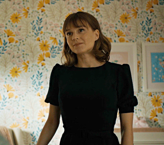
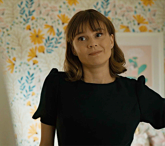
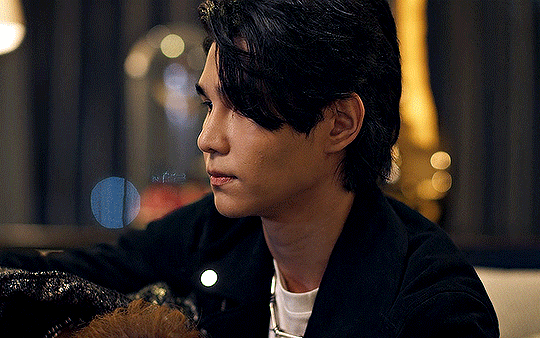
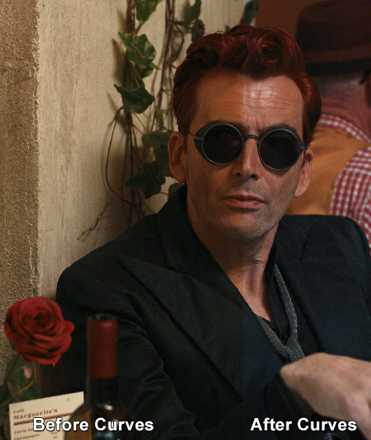
Kristen Bouchard
EVIL 3x08
#evil#eviledit#evil cbs#evil paramount#kristen bouchard#katja herbers#dailywomen#womendaily#tvfilmsource#femaledaily#tvfilmedit#evil gifs#there's no reason for this other than she looks So Cute here#and i also just wanted to try some new things in photoshop#i think no matter what my gifs are always going to look like garbage compared to everyone elses fjdkfjds ITS FINE#*mine
157 notes
·
View notes
Text
Just a bunch of Useful websites - Updated for 2023
Removed/checked all links to make sure everything is working (03/03/23). Hope they help!
Sejda - Free online PDF editor.
Supercook - Have ingredients but no idea what to make? Put them in here and it'll give you recipe ideas.
Still Tasty - Trying the above but unsure about whether that sauce in the fridge is still edible? Check here first.
Archive.ph - Paywall bypass. Like 12ft below but appears to work far better and across more sites in my testing. I'd recommend trying this one first as I had more success with it.
12ft – Hate paywalls? Try this site out.
Where Is This - Want to know where a picture was taken, this site can help.
TOS/DR - Terms of service, didn't read. Gives you a summary of terms of service plus gives each site a privacy rating.
OneLook - Reverse dictionary for when you know the description of the word but can't for the life of you remember the actual word.
My Abandonware - Brilliant site for free, legal games. Has games from 1978 up to present day across pc and console. You'll be surprised by some of the games on there, some absolute gems.
Project Gutenberg – Always ends up on these type of lists and for very good reason. All works that are copyright free in one place.
Ninite – New PC? Install all of your programs in one go with no bloat or unnecessary crap.
PatchMyPC - Alternative to ninite with over 300 app options to keep upto date. Free for home users.
Unchecky – Tired of software trying to install additional unwanted programs? This will stop it completely by unchecking the necessary boxes when you install.
Sci-Hub – Research papers galore! Check here before shelling out money. And if it’s not here, try the next link in our list.
LibGen – Lots of free PDFs relate primarily to the sciences.
Zotero – A free and easy to use program to collect, organize, cite and share research.
Car Complaints – Buying a used car? Check out what other owners of the same model have to say about it first.
CamelCamelCamel – Check the historical prices of items on Amazon and set alerts for when prices drop.
Have I Been Pawned – Still the king when it comes to checking if your online accounts have been released in a data breach. Also able to sign up for email alerts if you’ve ever a victim of a breach.
I Have No TV - A collection of documentaries for you to while away the time. Completely free.
Radio Garden – Think Google Earth but wherever you zoom, you get the radio station of that place.
Just The Recipe – Paste in the url and get just the recipe as a result. No life story or adverts.
Tineye – An Amazing reverse image search tool.
My 90s TV – Simulates 90’s TV using YouTube videos. Also has My80sTV, My70sTV, My60sTV and for the younger ones out there, My00sTV. Lose yourself in nostalgia.
Foto Forensics – Free image analysis tools.
Old Games Download – A repository of games from the 90’s and early 2000’s. Get your fix of nostalgia here.
Online OCR – Convert pictures of text into actual text and output it in the format you need.
Remove Background – An amazingly quick and accurate way to remove backgrounds from your pictures.
Twoseven – Allows you to sync videos from providers such as Netflix, Youtube, Disney+ etc and watch them with your friends. Ad free and also has the ability to do real time video and text chat.
Terms of Service, Didn’t Read – Get a quick summary of Terms of service plus a privacy rating.
Coolors – Struggling to get a good combination of colors? This site will generate color palettes for you.
This To That – Need to glue two things together? This’ll help.
Photopea – A free online alternative to Adobe Photoshop. Does everything in your browser.
BitWarden – Free open source password manager.
Just Beam It - Peer to peer file transfer. Drop the file in on one end, click create link and send to whoever. Leave your pc on that page while they download. Because of how it works there are no file limits. It's genuinely amazing. Best file transfer system I have ever used.
Atlas Obscura – Travelling to a new place? Find out the hidden treasures you should go to with Atlas Obscura.
ID Ransomware – Ever get ransomware on your computer? Use this to see if the virus infecting your pc has been cracked yet or not. Potentially saving you money. You can also sign up for email notifications if your particular problem hasn’t been cracked yet.
Way Back Machine – The Internet Archive is a non-profit library of millions of free books, movies, software, music, websites and loads more.
Rome2Rio – Directions from anywhere to anywhere by bus, train, plane, car and ferry.
Splitter – Seperate different audio tracks audio. Allowing you to split out music from the words for example.
myNoise – Gives you beautiful noises to match your mood. Increase your productivity, calm down and need help sleeping? All here for you.
DeepL – Best language translation tool on the web.
Forvo – Alternatively, if you need to hear a local speaking a word, this is the site for you.
For even more useful sites, there is an expanded list that can be found here.
77K notes
·
View notes
Text
Bear with me here because I might end up torturing this particular metaphor, but when it comes to trying to get the image of a scene onto the page in the form of descriptive narrative, it might be useful to approach it like a visual artist.
If you've ever watched an artist do their thing (or if you're an artist yourself), you know that they don't just start at the top left corner of the page and draw the entire scene in all its detail, all in one go. I'm going to use an example of digital drawing with the use of software like Photoshop here because I have no idea if this metaphor will work with pencil and paper.
You have an image in your head. It might be super clear. It might be more vague. When you're starting to describe it, just sketch it in. Create a layer of broad strokes information like what the location is, how many people are in it, and what activity is happening.
Then add in a layer - whichever one is easiest. Let's pretend it's the location. Read through the sketch that you currently have and see where you have opportunities to describe the location. You don't have to front load everything at the top of the chapter, for example. You can add in details about the location as the characters move through it.
Add another layer. Are the characters' appearances different from what they previous were? Are you just establishing them at the start of the story? Do they have a "uniform" that they wear in canon that you've opted not to change? You can add in whatever details here you want, and again don't feel like you have to put it all in the same place. You can talk about a ponytail falling loose partway through an action. Or wait until someone else comments on a character's new pair of shoes.
Add another layer. What are the characters doing? How are they moving? Interacting?
Another layer. What are they saying? How do they sound?
Another layer. What other sounds are in the room? What smells? Do these change? Appear or disappear?
Keep going back and forth, toggling your way through your layers, adding things in here and removing them there. Every artist knows that sometimes a line just doesn't go in the right place and you have to erase it and draw it again.
Remember that no amount of work will give your reader a perfect representation of the vision in your mind, but also please know that that's okay.
By the time you finish your scene, some of those early layers might not exist anymore, and that's okay too. They were the sketch that started your verbal drawing. The base you used to guide your inks. Your final render won't have every line or brush stroke in it, and it'll be all the better for it in the end.
#someone added tags asking how to do this#and it got me thinking about how I approach it#on the rare occasions when I want my characters in something other than a blank room.
3K notes
·
View notes
Text
Chiho Saito’s 1999 Revolutionary Girl Utena Original Illustration Collection
IT’S HERE. IT’S DONE. IT’S FINISHED. NOW…IT’S YOURS. Happy Holidays, my friends.
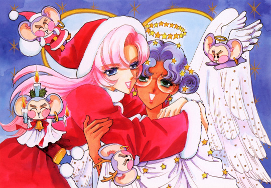
Vanna here! I have posted some already about this project, and the responses I got, public and otherwise, have been absolutely incredible. Y’all have been reblogging and hyping this before it even finished…I haven’t felt so encouraged about an Utena project since the musicals! (Yes, streams soon, I promise.) You can read the other post to get more details, and catch my post here with more details about the process if you’re interested. The long and short of it?
This is the first artbook I ever scanned. I did it in 2001. In Photoshop, using multiple scans per page that took hours to process. But it was 2001. A half megabyte file that was 1250px wide was considered extremely hardcore and impressive. That’s just always been the business I’m in when it comes to Utena art, you know?
It’s now the latest artbook I’ve scanned, and so much of the process, and effort involved, is unchanged. What has changed, is the result. Welcome to your new desktop background. Your new phone background. Your new poster print.
What I’ve done here is attempt to create definitive digitized images of Chiho Saito’s work as offered by this book--I have removed the print moiré of the original scans, and used my literal decades of experience to try and tease out as much information from them as possible. Without being physically in front of the original artwork (which is a thing I’ve had the great fortune to get to do) this is The Most Chiho Saito you are ever going to get. I’ve tried my best to make sure there is a way to get it that works for everyone:
Do you just wanna scope 'em out? Look at some disaster gays? Grab your favorite one or two? This is the path for you! Check out the ‘compressed’ (not very) 10k ‘web friendly’ (not really) copy at the Bibliothèque, the media archiving wing of the Something Eternal forums at Empty Movement*. All the following links are also available from here.
Do you want these copies? All of them? Don't just grab them individually, friend. This batch is 375MB and can be downloaded as a zip of the individual files here on our Google Drive.
Do you like digital archiving? Are you looking for a copy that preserves the archival quality of the effort but sits nice and comfy in a single file? This is for you. A minimally compressed 10k, 513MB version worked into a PDF is now up, shiny and chrome, on the Internet Archive.
Do you like the idea of the minimal compression, but want the individual files in a zip? Yep I did that too, here's the drive link.
Are you looking to print these in a larger size? This is probably the only reason on Earth you’d ever want them, and yet a bunch of you are going to go straight for these. Here are the zero-compression JPG full size copies, most of them are 15k across, like simply a ridiculous size. Pick your fave and download it from our Google Drive!
I am genuinely really proud of this work.** I was able to tease out so much new detail from these…her incredible layering techniques, the faintest brush of her highlights, and the full range of her delicate hand at whites and blacks… details commonly lost in digitization. I sincerely hope you find something here that you’re looking for, as an artist looking for inspiration, as a weeb looking for a desktop, as an archiver excited to see incredible 90s manga artwork saved forever in the digital realm. I feel like I have already said so much about them, and could keep going, but you know what? This work speaks for itself. Enjoy, use, explore, and definitely tell us what you think!
We love y’all. ~ Vanna & Yasha
* AHEM ASTERISK AHEM
You might be wondering what any of that is. Something Eternal? Biblewhatawhat??? EmptyMovement.com? You might even have done a double take at the word ‘forum.’ And you should!!!
I have a confession. This artbook was my ‘side project’ as I worked on this, *the main project.* For a couple years I’ve been banging around with a new domain, and originally I had other plans for it, but Elon Musk ruined my Twitter and Discord is well along on its way to enshittification, and well….we joke on the Discord a lot about ‘reject modernity, embrace forums’ and you know what? We’re right. So Yasha and I are putting our money where our mouths are once again, and doing something insane. We are launching, in 2023, a website forum. Obviously, this is not the official ‘launch’ per se, but I cannot announce the artbook without directing you to the forum, since it sits on the attached very cool gallery system. Oops! Told on myself. Another post more focused on the forum will be forthcoming, but if you are just that motivated to get in right away, you absolutely can! (This will help stagger new arrivals anyway, which is good for us!) If you would rather wait for the ‘official’ launch, by all means that’s coming, including a lengthy screed about how and why we’re doing this. In either case, remember: this is a couple weebs trying to make internet magic happen, we are not website developers by trade. Give us grace as we iron things out and grow into this cool new website thingie…hopefully along with some of you! :D
If you do join up, naturally, there is a thread about this project!
** If you like this kind of content, consider helping us pay for it! We do have a Patreon! If you’re wanting to use these in some public-facing distributive way, all we ask is for credit back to Empty Movement (ohtori.nu or emptymovement.com, either will work.)
I would like to say ‘don’t just slap these files on RedBubble to get easy money’ but I know that saying this won’t effectively prevent it. Y’all that do that suck, but you’re not worth letting it rain on the rest of this parade. :)
#revolutionary girl utena#utena#rgu#sku#empty movement#chiho saito#90s manga#digital archives#manga aesthetic#shoujo kakumei utena#utena art
2K notes
·
View notes
Text
Let's talk about vintage lenses.
Here is your cool samurai show with modern lenses.
Here is your cool samurai show with vintage lenses.
Hollywood is no stranger to fads.
We are currently in the middle of a "make everything too dark" fad. But that fad is starting to overlap with "let's use really old lenses on ridiculously high resolution cameras."
This is Zack Snyder with a Red Monstro 8K camera.
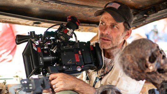
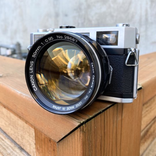
He is using a "rehoused" vintage 50mm f/0.95 Canon "Dream Lens" which was first manufactured in 1961.
This old lens is put inside a fancy new body that can fit onto modern cameras.
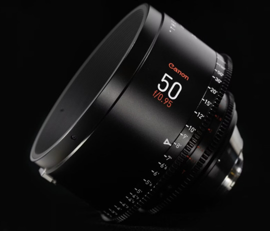
Which means Zack is getting nowhere near 8K worth of detail. These lenses are not even close to being sharp. Which is fine. I think the obsession with detail can get a bit silly and sometimes things can be "too sharp."
But it is a funny juxtaposition.
The dream lens is a cool lens. It has character. It has certain aberrations and defects that can actually be beneficial to making a cool photograph. It's a bit like vinyl records for photography.
[ Peter Thoeny ]
It has vignetting and distortion and a very strange swirly background blur.
[ Gabriel Binder ]
Optical engineers have been spending the last 60 years trying to eliminate these defects. And I sometimes wonder if they are confused by this fad.
"I WORKED 70 HOURS PER WEEK TO GET PERFECT CORNER SHARPNESS!"
And whether you prefer to work with a perfect optic or a vintage one... it is a valid aesthetic decision either way. I think vintage glass can really suit candid natural light photography. You can almost get abstract with these lenses.
[ Peter Theony ]
Personally I like to start with as close to perfect as possible and then add the character in later. That way I can dial in the effect and tweak how much of it I want. But even with modern image editing tools, some of these aberrations are difficult to recreate authentically.
That said, it can be very easy for the "character" of these lenses to become distracting. And just like when someone first finds the lens flares in Photoshop, it can be easy for people to overdo things.
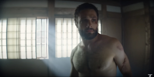
Zack Snyder decided to be his own cameraman and used only vintage glass in his recent movies and it has led to some complaints about the imagery.
I mean, Zack Snyder overdoing something? I can't even imagine it.
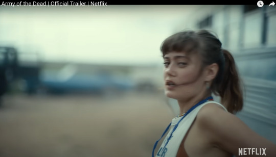
Non camera people felt Army of the Dead was blurry and a bit weird but they couldn't quite explain why it felt that way.
The dream lens has a very wide aperture and it lets in a lot of light. But it also has a very very shallow depth of field. Which means it is very difficult to nail focus.
[ Peter Thoeny ]
Her near eye is in focus and her far eye is soft. You literally can't get an entire face in focus.
There is no reason you have to use the dream lens at f/0.95 at all times. But just like those irresistible lens flares, Zack couldn't help himself.
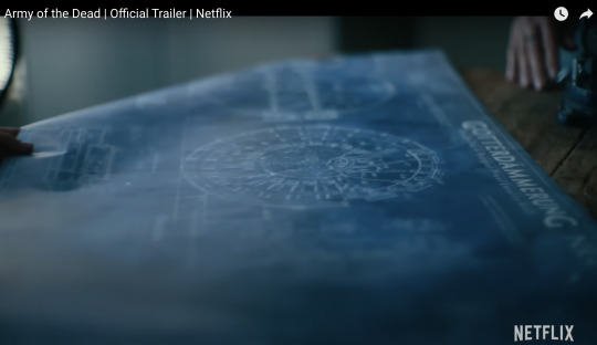
Here is a blueprint that you can't really see.
Extreme close ups of faces without autofocus at f/0.95 is nearly impossible to pull critical focus on.
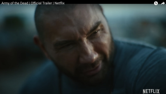
Looks like Zack nailed the area just above the eyebrow here.
Let's try to find the point of focus in this one.
Ummmm... she is just... blurry. Missed focus completely.
But Zack isn't the only one going vintage. I've been seeing this a lot recently.
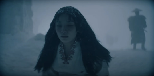
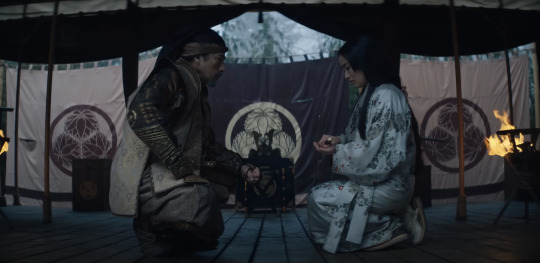
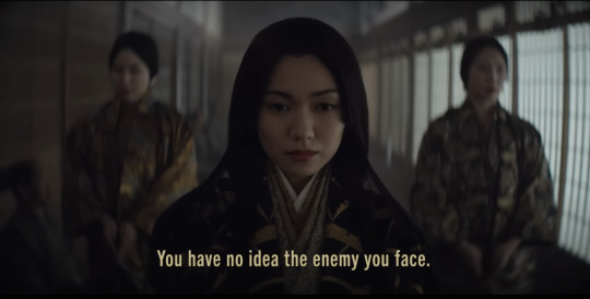
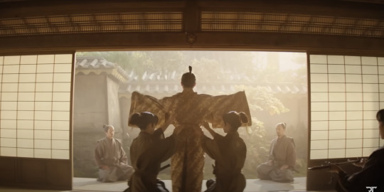
Shogun is a beautiful show. And for the most part, I really enjoyed the cinematography. But they went the vintage lens route and it kept going from gorgeous to "I can't not see it" distracting. And perhaps because I am familiar with these lens defects I am more prone to noticing. But I do think it hurt the imagery in a few spots.
Vingetting is a darkening of the corners of the frame.
Light rays in the corners are much harder to control. A lot of modern lenses still have this problem, but they create software corrections to eliminate the issue. Some cameras do it automatically as you are recording the image.
Vintage lenses were built before lens corrections where a thing—before software was a thing. So you either have to live with them, try to remove them with VFX, or crop into your image and lose some resolution.
It's possible this is the aesthetic they wanted. They felt the vignetting added something to the image. But I just found my eyes darting to the corners and not focusing on the composition.
And then you have distortion.
In this case, barrel distortion.
This is mostly prominent in wide angle lenses. In order to get that wider field of view the lens has to accept light from some very steep angles. And that can be quite difficult to correct. So you kind have to sacrifice any straight lines.
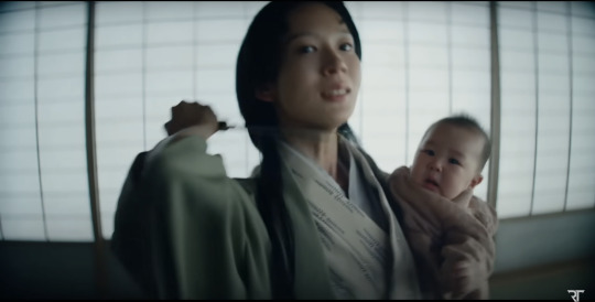
And sometimes this was a positive contribution to the image.
I thought the curved lines matched the way they were sitting here.
But most of the time I just felt like I was looking at feudal Japan through a fish's eye.
It's a bit more tolerable as a still, but when all of these verticals are bowing in motion, I start to feel like I am developing tunnel vision.
I love that this is a tool that is available. Rehousing lenses is a really neat process and I'm glad this old glass is getting new life.
This documentary shows how lens rehousing is done and is quite fascinating if you are in to that sort of thing.
youtube
But I think we are in a "too much of a good thing" phase when it comes to these lenses. I think a balance between old and new can be found.
And I also think maybe Zack should see what f/2.8 looks like. He might like having more than an eyebrow in focus.
413 notes
·
View notes
Text
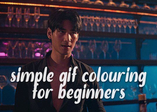
✨ Simple Gif Colouring for Beginners ✨
I wrote up my basic gif colouring process for a friend recently, but a couple of people here mentioned they'd also find it helpful! so, as requested, this is a beginner-friendly walkthrough of the way I colour my gifs :) it's aimed at brand new gif makers with no prior experience with photoshop or photo editing.
when I first started gif making I found colouring and photoshop in general suuuper daunting, so I've tried to simplify everything here as much as possible. hopefully this will be relatively easy to follow and not too intimidating!
a couple of things to begin with:
I'm only talking about colouring here - this is not a full gif making tutorial. I've linked to some of my favourites of those here!
I personally like to make bright, 'clean' looking gifs with vibrant but natural colours, so that is the style of colouring this tutorial is geared towards. most of gif colouring is subjective and about personal taste - the only thing that I'd say is possible to get wrong is skin tones, which I talk about a lot in this guide.
as I mostly gif Thai dramas, most of the advice is geared towards colouring for East Asian/South East Asian skin tones - but the techniques should be fairly universally applicable (and here are some tutorials that talk about gif colouring for other skin tones).
I'm not an expert! I'm not claiming this is the best or the only way to colour gifs - it's just how I do it.
this post is very image-heavy. if the images aren't loading (or the gifs are running slowly or cutting/looping weirdly), then try viewing the post in its own tab (rather than on the your dash or someone's blog) and refreshing the page.
okay, full walkthrough beneath the cut!
contents:
1. intro
a. natural gif colouring goals
b. very very basic colour theory
2. super simple colouring (the essentials)
a. curves
b. selective colour (and skin tone correction)
c. hue/saturation
d. saving and reusing colouring
e. another simple colouring example
3. other adjustment layers
a. brightness/contrast
b. levels
c. vibrance
d. colour balance
e. channel mixer
4. troubleshooting
a. curves
b. saturation
5. fin!
1. intro
the colouring part of gif making can be super overwhelming, especially if (like me when I first started!) you're completely new to photoshop and/or have no experience with colour theory or photo/video editing.
if you're opening photoshop and making gifs for the first time, I highly recommend getting used to making a few basic, uncoloured gifs to begin with. just to practice, rather than post anywhere (though you can always come back and colour them later if you want) - but it'll make the rest of the process much easier if you're already beginning to get used to working in timeline mode of photoshop. give yourself a bit of time to practice and get a feel for things like how many frames you tend to like in a gif, where you like to crop them for the best loop, what kind of aspect ratio you like etc* - so that you're not trying to navigate all of that for the first time on top of everything else!
* frames: for me between 60-90 frames is ideal, but 40-120 frames is the absolute min-max I'd personally use in a normal gifset
loops: for the smoothest loops, try to avoid cutting someone off mid-movement or mid-word if possible.
aspect ratio: for full-size (540px) gifs, I tend to go for either 8:5 (slightly 'skinnier' gifs), 7:5, or 5:4 (particularly big, thick gifs lmao)
✨ natural gif colouring goals
part of what can be so daunting about starting gif making is not knowing where to start or what you want to achieve. this is definitely something that gets easier with practice - the more gifs you make, the more you'll get a feel for what kind of look you like and the more instinctively you'll know how to get there. it also helps to see if any gif makers you like have made "before and after colouring" posts - these can help with getting a sense of the kinds of changes made through gif colouring. here's one I made!
in general, I like to make my gifs bright and 'clean' looking, with vibrant but natural colours. these are the things I'm usually hoping to achieve with colouring:
brighten dark scenes
remove muddy, yellowish lighting or filters
saturate colours
correct any skin lightening filters or overexposure
make lighting and colours as consistent as possible between gifs within a single gifset, especially gifsets featuring gifs from multiple scenes/episodes/videos
this guide is focusing on natural colouring, but of course there are many cool ways to make stylised/unnaturally coloured gifs. imo you'll need to master these basics first, but if you want to learn how to do things like change the background colour of gifs or use gradients or other cool effects, then @usergif's resource directory has loads of super helpful tutorials!
✨ very very basic colour theory
[disclaimer! I don't know shit about fuck. I do not study light or art. this is just an explanation that makes sense to me exclusively for the purposes of gif making.]
the primary colours for light/digital screens are red, blue, and green. having all three colours in equal measures neutralises them (represented by the white section in the middle of the diagram).
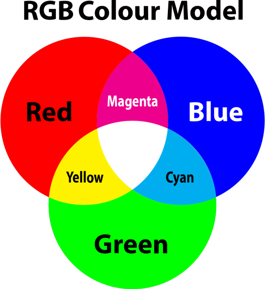
so to neutralise a colour within a gif, you need to add more of the colour(s) that are lacking.
in practice this usually means: the scene you want to gif is very yellow! yellow is made of red and green light, so to neutralise it you need to add more blue into your gif.
it can also mean the reverse: if you desaturate the yellow tones in a gif, it will look much more blue.
looking at the colour balance sliders on photoshop can make it easier to visualise:
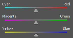
so making a gif more red also means making it less cyan.
removing green from a gif means adding magenta.
taking yellow out of a gif will make it more blue.
tl;dr:
neutralise yellows by adding blue (and vice versa)
neutralise reds by adding cyan (and vice versa)
neutralise green by adding magenta (and vice versa)
2. super simple colouring (the essentials)
starting with a nice sharpened gif in photoshop in timeline mode. (these are the sharpening settings I use!)
some scenes are much harder to colour than others - it helps to start out practising with scenes that are bright/well-lit and that don't have harsh unnaturally coloured lights/filters on. scenes with a lot of brown/orange also tend to be harder.
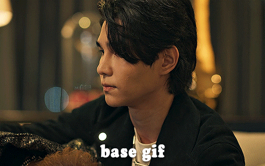
I usually save a base copy of my gif before I start colouring just in case I end up hating it, or find out later that it doesn't quite fit right into a set and need to redo it etc.
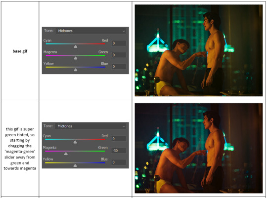
so here is my base gif!

it's an okay gif, but it has a bit of a yellow tint to it that I want to reduce.
colouring is easiest to do in adjustment layers, which can be found under layer -> new adjustment layer - or for me they are here:
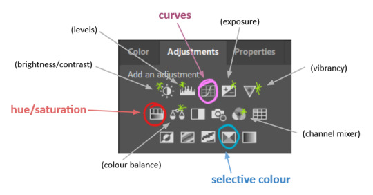
there are lots of different types of adjustment layers that do lots of different things - but for me the absolute essentials for colouring are curves, selective colour, and hue/saturation.
I also use brightness/contrast, levels, exposure, vibrance, colour balance, and channel mixer sometimes, depending on the gif - but I use curves, selective colour, and hue/saturation on every single gif.
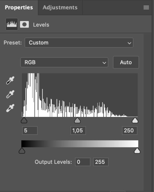
✨ curves layer
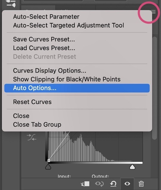
the first thing I always do is a curves layer. when you first open one it will look like this:
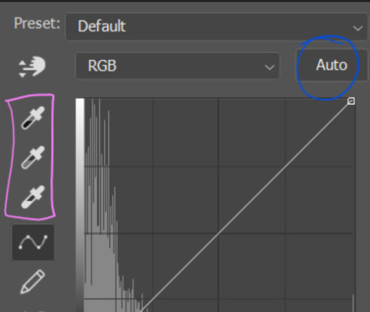
first I usually click the ‘auto’ button, just to see what happens. sometimes it makes a big difference (it usually brightens the gif a lot) - but on this gif it didn’t do much.
if it had made the gif look nicer then I would have kept it and added a second curves layer on top to do the rest of these steps.
the next step is selecting the white and black points with the little eyedropper tools.
the bottom eyedropper lets you pick a white point for the gif. click somewhere super light on the gif to see what happens - for this gif, I clicked on the lampshade on the left. if it looks weird, I just undo it and try somewhere else - it usually takes a few goes to find something that looks good.
here's what that did to the gif:

then I pick the top eyedropper and use it to pick a black point by clicking somewhere really dark, again playing around until I find a black point that looks good.
here's what the gif looks like after picking the white and black points:

this can take some experimenting, but you can make super easy drastic changes to your gif just with this. in this case, the curves layer took out a lot of that yellowy tint.
and this is what the curves graph looks like now:
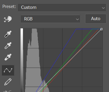
you can click and drag those lines to make further changes if you want - I usually leave them alone though. the colours of the lines indicate which colours have been changed in the gif - for example, you can see from that steep blue line on the graph that blue has been added to neutralise those yellows.
next I usually do another curves layer and just press the ‘auto’ button again to see what happens. usually it brightens the gif a bit more, which I like.
‼️if nothing is working: usually with a bit of fucking about a curves layer works well - but sometimes you can’t find a good white and black point anywhere, and instead your gif turns wacky colours and nothing looks good. this happens more often with very heavily colour tinted scenes :( the troubleshooting section at the end goes over some options, including starting with a levels layer instead.
✨ selective colour (and skin tone correction)
skin tones are made up of a mixture of yellow and red.
removing yellow (or adding blue or red) to a gif will make the skin-tones too red - and removing red (or adding cyan or yellow) to a gif will make the skin-tones too yellow.
adding blue to this gif with the curves layer took out the yellowy tint, which I wanted - but it also took the yellows out of Kim's skin tone, which I don’t want. so I need to put yellow back into the skin tones specifically - without putting it back into the rest of the gif.
selective colour layers let you select an individual colour and adjust the levels of other colours within that colour. you can change how yellow the green shades are, or how much cyan is in the blues, for example.
I need to add yellow back into the red tones to correct the skin tones on this gif. this is the case for most gifs in my experience - the vast majority of the time, unless a scene is very heavily tinted in another colour, a curves layer will add blue/remove yellow.
in the 'colors' dropdown, select the 'reds' section and drag the 'yellow' slider higher - this will add more yellow into just the red shades within the gif.

the amount of yellow you need to add back into the reds depends on how much yellow was taken out of the gif initially - I just play around with the slider until it looks right. if you're not sure, it helps to have some neutrally-coloured (not white-washed!) reference photos of the people in your gif to compare to.
here's the result. Kim's skin is a lot less pink toned and much more natural looking:
✨ hue/saturation
this adjustment layer lets you adjust the hue and saturation of the gif as a whole, and also of each colour individually.
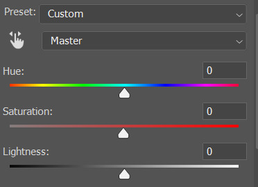
I don't use the hue or lightness sliders unless I'm trying to do something more complicated with the colouring.
clicking the dropdown menu that says 'master' lets you edit the saturation of each colour individually. this is useful if your gif is still super tinted in one colour.
I thought the yellows on this gif were still slightly too bright, so I switched to the yellow channel and desaturated them slightly. (remember if you do this then you need to go back to selective colour and add more yellow into the red skin tones to balance out the desaturation!)
then I increased the 'master' saturation of all the colours to +5:
I usually find the right amount of saturation is somewhere between +5 and +12, but it depends on the gif.
‼️if the gif feels undersaturated, but the saturation slider isn't helping/is making the colours worse, try a vibrance layer instead.
done!
✨ saving and reusing colouring
you can copy and paste adjustment layers between gifs to make your colouring even across each of your gifs for one scene - so if you're making a set of multiple gifs of the same scene, or you think you might want to gif the same scene again in the future, you can save it as a psd so you can reuse the colouring again later.
each gif's colouring will then still need tweaking - different cameras/angles/shots of the same scene can still start out with slightly different colouring.
I recommend uploading the gifs as a draft post on tumblr so you can see what they all look like next to each other and catch any inconsistencies.
✨ another one! (speedrun!)
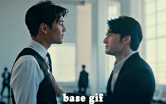
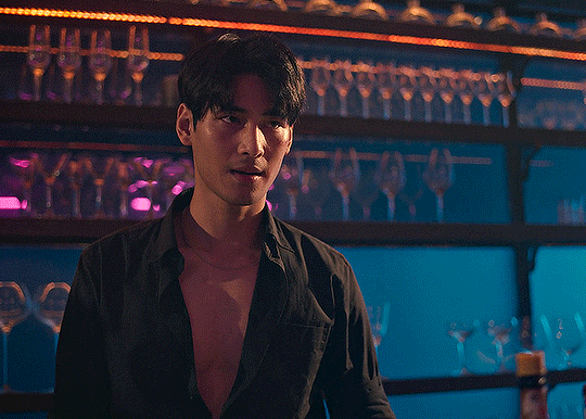
HI KEN!
the white point for the curves layer was in the window behind them.
the curves layer removes the muddy yellow tint, but again it makes their skin tones (especially Ken's) very red toned, which is adjusted by the selective colour layer.
3. other adjustment layers
imo many many gifs can be coloured really nicely with just those three adjustment layers, but some need different adjustments.
✨ brightness/contrast
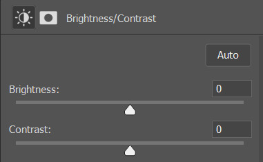
pretty self explanatory!
I personally usually avoid using the 'brightness' slider because I rarely like the effect - I only tend to use the 'contrast' one.
the 'auto' button is sometimes useful though, especially if you’re struggling with the curves layer.
✨ levels

levels alters the white and black points of the gif, like curves - but unlike curves it doesn't also alter other colours.
use the sliders beneath the graph to alter how dark/light the gif is. you can slide the black slider further to the right to make the blacks darker, and the white slider to the left to make the whites lighter.
levels is a good place to start if your curves layer isn't working.
(I'm going to hit the image limit for this post lol so here are some screenshots of a table I made to demonstrate this rather than actual gifs. sorry!)
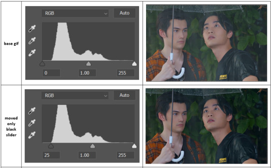

on both sides, I dragged the sliders up to where the big jumps are on the graph - this is usually a good place to start!
✨ vibrance
vibrance... makes the colours more vibrant. it's more subtle than saturation.
it's really helpful for gifs that feel grey. sometimes adjusting saturation just makes the greys kind of weirdly tinted, but a vibrance layer can fix that.
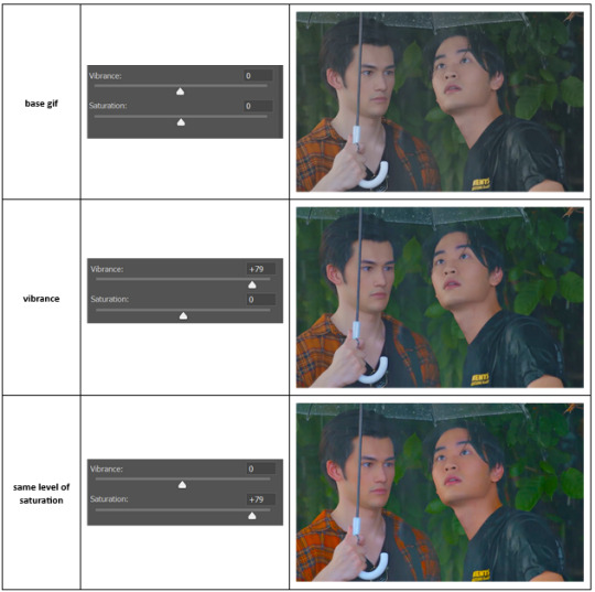
vibrance is much more subtle!
✨ colour balance
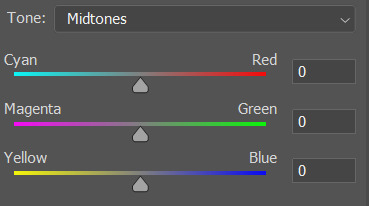
colour balance affects the overall balance of colours within a gif.
it's good for scenes with heavy tints.
I tend to stick to the 'midtones' dropdown, but you can also alter the colour balance within the shadows and highlights if you want.

✨ channel mixer
I avoided channel mixer for such a long time because it scared me. but it's great for scenes that are very heavily tinted in one colour.
basically, it works with the levels of red, green, and blue within a gif. you select an output colour and then play around with the levels of the colour you selected within each other colour.
kind of the reverse of selective colour?
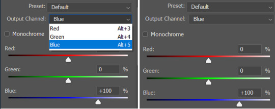
so in the 'blue' channel, the levels of blue are at 100%, and the levels of red and green are at 0% - but you can impact how much blue is in the reds and greens and blues.
this tutorial explains it well - but imo the best way to get to grips with channel mixer is just to play around with it a bit (sorry)
(when I made this guide for my friend, I also made a slightly more complicated gif colouring walk-through that included using channel mixer. there isn't space to include it within this post, but if anyone is interested I could always upload it as an 'intermediate' gif colouring tutorial - lmk!)
4. troubleshooting
‼️curves
usually with a bit of fucking about a curves layer works well - but sometimes you can’t find a good white and black point anywhere, and instead your gif turns wacky colours and nothing looks good. this happens more often with very heavily colour tinted scenes :(
for example, with this base gif:
using many of the brightest points as a white point turn it wacky colours, like this:

yikes :(
some options for these cases:
try brightening the gif first with the 'auto' button on the curves layer or with a levels layer. having a brighter gif to start with can give you better options for picking a white point.
try finding an alternate, whiter/brighter white point. look for places the light reflects - on this gif, using the light on Porsche's cheekbone works well as the white point. it also helps to find places that would be white if the scene wasn't tinted - the lightest part of a white shirt is often a good place to start, for example.
skip the curves layer, and instead use a levels layer to alter your white/black points, and colour balance or channel mixer to balance the colours.
‼️over/undersaturation
if your gif (especially the skintones) is looking a little washed out or lifeless, it might be undersaturated. boost that saturation - or if that's not working, try a vibrance layer.
oversaturation is often easiest to spot in the mouths and ears of any people in a gif. if the mouths are looking unnaturally, vibrantly red, then you've gone too far with the saturation.
5. fin!
and done! I hope this was coherent helpful to somebody.
if there's anything that I've missed or that doesn't make sense pls feel free to shoot me an ask or a message and I'll do my best to help! I've also collated a bunch of additional reading/resources below.
happy gifmaking 🥰
✨ some links!
photoshop basics by @selenapastel
gifmaking for beginners by @hayaosmiyazaki
gifmaking guide for beginners by @saw-x
dreamy's gif tutorial by @scoupsy-remade (includes instructions on how to blur out burned-on subtitles or annoying video graphics)
beginner's guide to channel mixer by @aubrey-plaza
how to fix orange-washed characters by aubrey-plaza
colour correcting and fixing dark scenes by @kylos
does resampling matter? by usergif
how to put multiple gifs on one canvas by @fictionalheroine
watermarking using actions by @wonwooridul
resource directory by @usergif
#i got a couple of asks about this so i figured i'd type it up as a post#it's been sitting in my drafts for a while now though i'm so sorry omg.#i had to replace my laptop and it took me a while to get round to downloading photoshop on the new one#but i hope this is helpful!!#gif making#tutorial#photoshop tutorial#colouring tutorial#coloring tutorial#gif colouring#gif coloring#photoshop resources#gif tutorial#gif resources#userbunn#uservik#darcey.txt#darcey.gif#usergif
457 notes
·
View notes
Text

Advice on how to achieve aesthetically pleasing gameplay photos!
UPDATED: 4/22/2024
I made this post earlier today and people were interested in the comments! Which made me more excited to make this post~
this is just some advice from me! this isnt a tutorial or anything of that sort, but I will be linking some things that could be helpful for editing gameplay! :D
First things first, I want to say that I use a graphics overhaul, lighting mods check my resources page for what reshade i use if ur interested.
I use these lighting mods & graphics override specifically:
sunblind
graphics overhaul
Lotharihoe's ootd* curseforge download :)
Northern siberia winds in-game better lighting mod (bright base)
these are some other lighting mods you can try out as well!
Luumia's NoBlu & NoGlo
these are some other lighting mods like sunblind
how to install lighting mod
I just wanted to add these things in since we're talking screenshots + I wanted to share for the no reshade ppl <3
Now we can move on to the advice!

I love the simple style of gameplay editing so much, but for me I love creating an ambience with my posts and put the audience inside of my gameplay. I also enjoy storytelling with gameplay more than just the "usual" gameplay post (when it comes to me). I am currently playing the globetrotter challenge with my sim Daichi. I really went all out with the editing for that gameplay. For this one its very much a virtual collage of my sim doing things. Trying new things and getting inspired by others is always fun and cool! Remember when u do take inspo: link to the inspiration and @ the simmer that inspired u!!

In my other save (my cozy save) I also take creative liberties there.


its more of a cozy vibe & silent story-telling (storytelling w/o the dialogue). for my cozy save i take inspiration from @/stellarfalls. er gameplay really helped me find my niche thing in the way i play the game tbh!
Angles/Screenshots
When you're taking your screenshots, angles are important. Depending on the shot, you're putting emphasis on a specific thing. This post is very helpful and talks about different types of angles/shots and what they mean. Check it out especially if you want to play around with the way you take screenshots!
Here’s some editing tips from @stellarfalls !!
simmingstars editing tips
Reshade
If I want to create a moody or dreamy ambience I can use reshade. Looking for a reshade that will fit the overall vibe is a must or you can make your own~
i know not everyone is able to use reshade because they're not on windows. I highly recommend using photoshop actions to create that ambience you're looking for.
*These can be used in photopea, but it cant read topaz clean. If you want to achieve topaz clean in photopea, check this post out! just something i'd like to add in case people are new to all of this + dont use photoshop. Lastly, I want to say if you decide to edit photos on photopea, it does tend to crash if you upload a big number of photos and slows down. I usually upload like 6 or 8 and then save and repeat the process. Its kinda annoying, but ive been using photopea for a while now so im used to it. My mac users, use early-grapes butter action if you want things to look cleaner and less harsh!! + the other ps actions down below. I used these a lot when I was a mac user. Of course, that comes with extra steps, but I feel its worth it in the end.
I like these photoshop action packs bc theres tons of stuff in here that can help create a reshade like look:
intramoon's ps action dump
wooldawn's ps acton dump
smubuh's photoshop actions
early-grape's butter action
hazelminesims's ps actions
Templates!
I loveeeeeee templates so much!! theres so many out there to use for gameplay. It really adds more to gameplay posts! This can be dust/dirt, film burn, that cute camera template etc etc. templates are really fun to use and play around with~
I usually go on deviantart to find templates to use! if you want to check out my deviantart account you can find it here! I favorite a lot of things I can use for gameplay screenies.
Gifs
making gifs is cool because it brings the gameplay "to life" ~
EZgif is a free website that converts videos to gifs. You'll need a recording program like OBS (which is also free).
i like making gifs when i want to capture a (cute) moment (kisses, hugs, cooking etc etc). Its also cool to capture the weather in game like when its snowing or raining.
Little details
Some people really go all out on editing gameplay posts like adding hair strands and adding more details to sims faces (catchlights, tears, blushing, etc). You dont really have to do this, but I want to mention it anyways! I want to try doing this at some point because I enjoy editing my gameplay posts/photos in general and adding tiny details is fun to me lol. It adds realism to posts, but it isnt necessary!
Procreate is a really good program that you can get if you have an ipad. its 10$ and thats, that. You dont have to make any payments. You can also animate on procreate too if you're down for that!
Find inspiration in other simmers!
the sims community on tumblr is filled with such talented people! Theres lots of gameplay simmers who dont do your typical gameplay posts that you can check out and learn from!!! Ive always struggled with getting the right angles when taking screenies. I looked at other simmers and how they take screenshots & it was really helpful for me since I noticed I would take too many over the shoulder photos on my sims lol.
I think thats all the advice I have! I hope this was helpful and if you have any questions please send me an ask or dm! :D
330 notes
·
View notes
Text

Thank you @cobbbvanth for asking me for this; I’ve never been more flattered! ☺️ I’ve only been making gifs for a little more than 2 years, so I’m really still only figuring Photoshop out, and my colouring owes everything to other people’s tutorials (some of which can be found here). To be honest, I was only asked some tips, but I have no clue what to include and what to leave out; so, here’s my complete (if random) colouring process.
NOTE: This is a colouring tutorial, not a gif-making one. The tutorial that taught me everything I know about that (and to which I am eternally grateful) is this one by @hayaosmiyazaki.
I. SHARPENING
My standard sharpening settings are:
One Smart Sharpen filter set to Amount: 500 | Radius: 0,4
A second Smart Sharpen filter set to Amount: 10 | Radius: 10
One Gaussian Blur filter set to Radius: 1,0 and Opacity: 30%
One Add Noise filter set to Amount 0,5 | Distribution: Gaussian
II. BASIC COLOURING
This is the part where I add most of the adjustment layers available and just play around with them. Obviously different settings work for different scenes, but I do have some standard ones.
Brightness/Contrast
I usually up the Brightness to +10-30, and the Contrast to about +10.
Curves
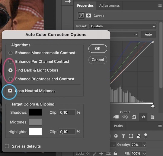
For the first Curves layer I go to Auto Options > Enhance Brightness and Contrast, and then adjust the opacity until I’m happy.
I might repeat the above step if the gif still looks too dark to me.
I add another Curves layer, I go to Auto Options and this time I pick either Find Dark & Light Colors or Enhance Per Channel Contrast, and check or uncheck the Snap Neutral Midtones option, until I see something I like. I will then adjust the opacity.
Levels
I add a Levels layer that usually looks something like this:
Exposure
I add an Exposure layer, where I usually set the Offset to around -0,0010.
Selective Color
To make the faces look okay, I create a Selective Color layer, select the Reds and usually add some Cyan (+10-20%) and play around a little (±5%) with Magenta and Yellow too. I might also add another layer, select the Yellows and make slight tweaks there too.
III. FUN COLOURING
About colour manipulation: PiXimperfect just uploaded a tutorial that explains everything so much better than I ever could, so I highly recommend you go watch it. It’s made for static images though, and things are more complicated with moving images, so I also recommend @elizascarlets’s tutorial.
The reason I usually go for a softer colouring is that a more vivid one requires a lot of patience and precision, and I honestly can’t be bothered. Instead, I try to tweak the colous only a little, so that the edges can be a little rough without it looking too wrong.
One thing to remember is that each gif is different, and there isn’t one foolproof way to do this, so you will need to use a different technique depending on the gif you’re working with.
Okay, so, after I’ve decided what colour I want my background to be:
1. I create a Hue/Saturation layer and change the greens, cyans, blues and magentas to that colour. That’s easy enough, since it doesn’t mess with the face colour. I then set the blending mode to Color. If your background doesn’t include any yellow or red, you might be done here, like in the case bellow:
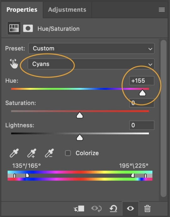
2. To change the yellows and reds, I create a new Hue/Saturation layer, select the yellows/reds, move Saturation to 100 (temporarily) and then play around with the sliders until the face colour isn’t affected. I then change it to whatever I’ve chosen and change the blending mode to Color.
3. If for whatever reason step 3 doesn’t work (the background is white or black for example, or just too red), I might create a Solid Color layer set to whatever colour I want, set the blending mode to Color and then select the layer mask and carefully paint with a soft, black brush over the people’s faces/bodies. I will then lower the Opacity, to whatever looks smooth enough. If there’s a lot of movement in your gif, you might have to use keyframes (see elizascarlets’s tutorial linked above). However, my main goal is to avoid using those; that’s why I try my hardest to tweak around as many Hue/Saturation layers as needed and not have to create a solid color layer.
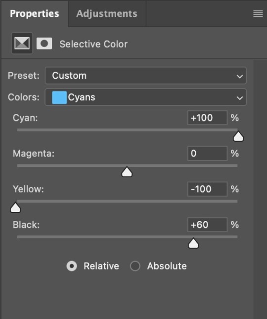
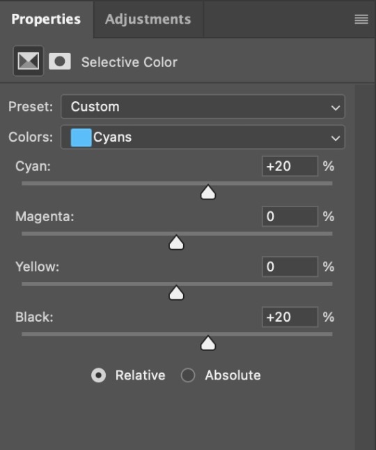
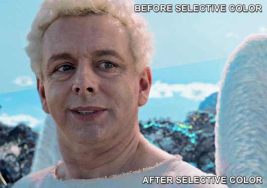
4. Once my background looks the colour I want it, I might add a Selective Color layer that matches my background color and then try to make it look more vibrant. For this Aziraphale gif below for example, I’ve selected the Cyans and then set Cyan to +100%, Yellow to -100% and Black to +60, then created another one, selected the Cyans again and then set Cyan to +20 and Black to +20.
5. If the gif has a white area, I create a Solid Color layer with a colour that matches the rest of the background and then set the Opacity low. I might also create a Selective Color layer, increase the Black and then play around with the colours.
IV. FINISHING TOUCHES
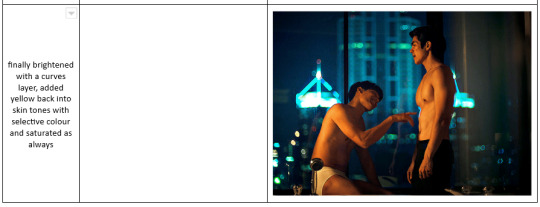
I create a Vibrance layer and set the Vibrance to around +30 and the Saturation to about +5.
I create a black and white Gradient Map layer (with black on the left end of the spectrum and white on the right), set the blending to Luminosity and the Opacity to about 20-30%.
AAAND that’s about it I think! This ended up way too long and perhaps a little incoherent. I tried to make it as general as possible, so you might have to mix and match for best results. Feel free to ask me for further explanations about any one of these steps, and please tell me if you want me to go through the colouring of a specific gifset (although, as I said, I'm by no means an expert). Happy gifmaking!
#gif tutorial#allresources#completeresources#dailyresources#photoshop tutorial#chaoticresources#uservivaldi#userdanahscott#usersanshou#userfanni#userbuckleys#userrobin#tuserjen#userdavid#userzaynab#tusermimi#thingschanged#tuserju#usertj#userhallie#tutorial#minee
295 notes
·
View notes
Text
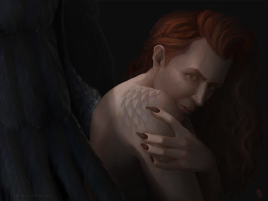
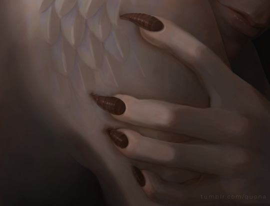
blood of a reptile, just underneath the skin
--------------------------
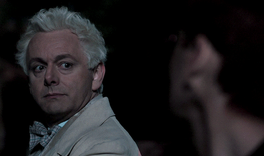
DRAMA!CROWLEY, ACTIVATE!
So we meet here again, in front of another flaming-as-anything-ginger Crowley. We can't keep doing this, you know. People will talk.
More info and hi res under the jumpppppppppppp.
I wanted to try my hand at a standalone portrait of Crowley before I jump back into what will inevitably be another Aziracrow portrait---I'm thinking 1920s theme. Flapper Crowley & Aziraphale? But that's for another time.

I wanted to try grey scale under-painting in digital art. A success, I hope? I'm pretty happy with the portrait (for now, give it a week and I'll hate everything about this painting, happens every time!)
I struggled a bit on the eyes in this piece. I normally paint straight color to canvas, so I have a method to my madness with painting eyes. Not so, here! This was new territory. I'm not 100% satisfied, but that just means I need more practice.
ALSO, GOLGOTHA HAIR WITH A BRAID WHAT WHAAAAAT

And because I learned how to paint snake scales for the last portrait, I decide to reprise that theme and torture myself again keep practicing them, this time with iridescence. I wanted to keep the scales low-key, though, almost as if they're just emerging or maybe the viewer caught a momentary glimpse of scales through the veil to an ethereal occult plane. Additionally, I wanted some good creepy claw hands with long fingernails (big fan of creepy, me) for a proper demonic manicure.
About: All digital, all Photoshop. Orig. 7200 x 5400 px. ~1 week of off-and-on painting. Title is taken from Reptile by Nine Inch Nails because I guess I'm still naming art after 30 year old albums? Is this a thing I do, now?
...and if so, can you imagine what I'll have to draw to use lyrics from Hurt in the title?
#good omens fanart#crowley#anthony janthony crowley#snek crowley#demon crowley#good omens#gomens#artists on tumblr#digital art#portrait#somebody send help I can't stop drawing David Tennant#my art
338 notes
·
View notes
Text
The silent art of gif making
The gif above has 32 layers plus 6 that aren't shown because this is part of a larger edit. I wanted to share it to give everyone a glimpse of the art of gif making and how long it usually takes for me to make something like this. This one took me about an hour and a half but only because I couldn't get the shade of blue right.
I use Adobe Photoshop 2021 and my computer doesn't have a large memory space (I don't know what to call it) so usually most of psds get deleted because I'm too lazy to get a hard drive. It doesn't really bother me that much because I like the art so when it's done, it's done. Off to somewhere else it goes.
Here are the layers:

Everything is neat and organized in folders because I like it that way. I prefer to edit it in timeline but others edit each frame. There's a layer not shown (Layer 4 is not visible) and it's the vector art. Here it is:
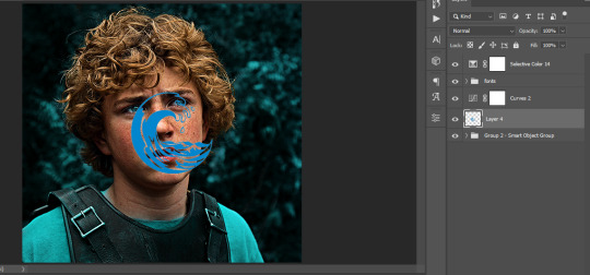
Now it is visible. I don't plan to make this a tutorial, but if you're interested I'd love to share a few tricks about it. I'm pretty new to the colors in gifmaking but the rest is simple to understand. Here, I just want to show how much work it takes to make it.
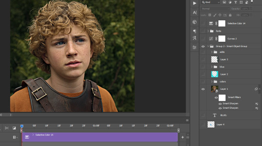
I opened Group 2 and here's the base gif. I already sharpened and sized it correctly but that's about it. Let's open the base coloring next.
Yay! Now it looks pretty! The edits are in Portuguese but it doesn't matter. There's a silent art of adding layers depending on how you want the gif to look but you get used to it. The order matters and you can add multiple layers of the same thing (for eg. multiple layers of levels or curves or exposure).
This was pretty much my first experiment with coloring so I don't know what I'm doing (this happens a lot with any art form but gifmaking exceeds in DIYing your way to the finished product) but I didn't want to mess up his hair, that's why the blue color is like that. Blue is easy to work with because there's little on the skin (different from red and yellow but that's color theory). I painted the layers like that and put it on screen, now let's correct how the rest looks.
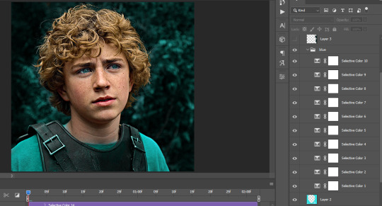
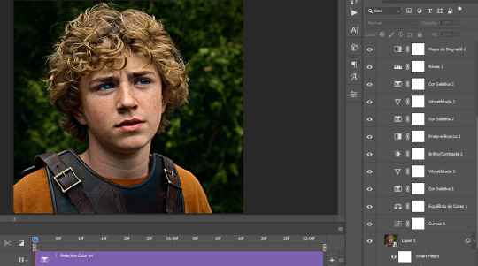
I was stuck trying to get the right teal shade of blue so yes, those are 10 layers of selective color mostly on cyan blue. We fixed his hair (yay!) we could've probably fixed the blue on his neck too but I was lazy. This is close to what I wanted so let's roll with that.
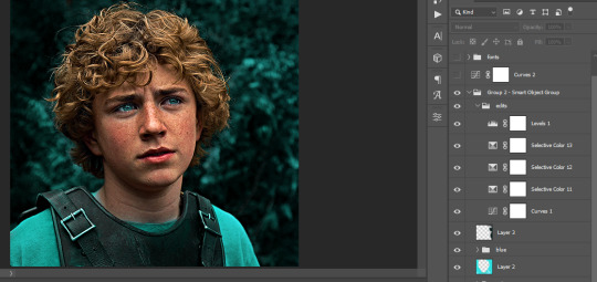
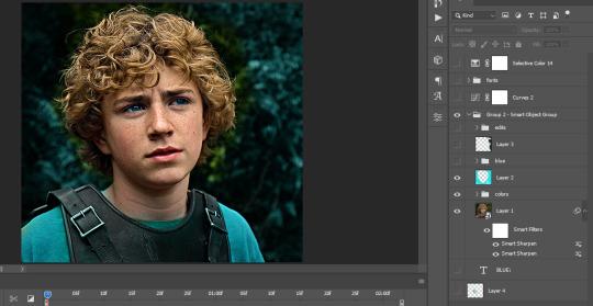
BUT I wanted his freckles to show, so let's edit a little bit more. Now his hair is more vibrant and his skin has red tones, which accentuates the blues and his eyes (exactly what I wanted!). That lost Layer 2 was me trying to fix some shadows in the background but in the end, it didn't make such a difference.
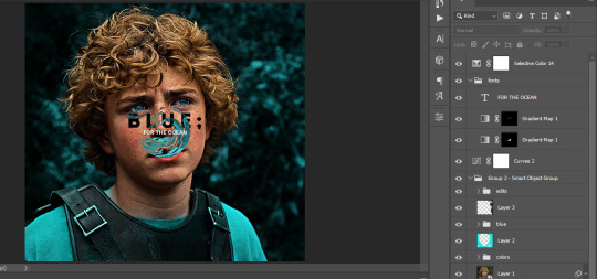
This was part of an edit, so let's add the graphics and also edit them so they're the right shade of blue and the correct size. A few gradient maps and a dozen font tests later, it appears to be done! Here it is:
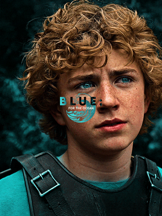
Please reblog gifsets on tumblr. We gifmakers really enjoy doing what we do (otherwise we wouldn't be here) but it takes so long, you wouldn't imagine. Tumblr is the main website used for gif making and honestly, we have nowhere to go but share our art here. This was only to show how long it takes but if you're new and want to get into the art of gif making, there are a lot of really cool resource blogs in here. And my ask box is always open! Sending gifmakers all my love.
#gif making#gif tutorial#resources#completeresources#y'know what that post yesterday got me into this#i love creativity so i send all my love to gifmakers#this is HARD#my tutorials#tutorials
376 notes
·
View notes
Note
Hey, so I really love Lore Rekindled, and the art is one of my favorite parts! The style, the coloring, the background, all of it is just so… smooth! I don’t really know how to describe it. Recently, I’ve been trying to replicate it, and I was hoping you would give me a few pointers. What brushes do you use for line art? How do you decided what to line, and what to leave blank? What about coloring brushes? Do you use smudge brushes? Whats, like, the step by step process? You don’t have to answer if you don’t want to! But any tips or answers would be great!
Ah thanks so much!!!
Here are the brushes! They're .abr brushes, so they should work in Photoshop, Clip Studio and Procreate :) (they don't work in Krita or other software that utilizes PNG brushes though, sorry ; ; )
There's also a tutorial included with that file that breaks down my process layer by layer! That said, there are a couple things that have changed in my process since doing that tutorial:
I mostly use the Hard Square Pastel brush now for all of that 'crispy' lighting that often happens along the edges of characters' shoulders and heads, such as seen here:

I now do an extra step of applying a 'blur' layer, where I essentially merge all the layers into a new layer on top of everything, set it to Overlay, and then Gaussian Blur by about 60%. This is how I get that 'dreamy' look that's been present in a lot of the more recent episodes!
It's subtle, but really effective in making the glow effects and deeper colors really pop!
As for the more nuanced stuff like lineart, it's kinda just something I do by feel! Sometimes I'll shade something in and realize the lineart doesn't need to be there, so then I'll go in and erase, other times I have to be a bit more excessive with it esp if two similar colors are up against each other. I'm actually trying to use less lineart going forward to get more of that authentic LO look but it's hard, I'm very used to doing lineart-heavy drawings so it's forcing me to draw in a way that I'm not used to! 😆 I usually always start with flat colors first though, meaning I start by 'shaping' out the character poses and then lining them in afterwards!
You can see an example of this process in my END OF PERSEPHONE time lapse here:
youtube
I also usually stream work sessions of Rekindled over on my Twitch, but I'm currently on hiatus from streaming due to technical difficulties (OBS just... decided it was gonna stop working, sigh). Go give it a follow anyways tho so you can be notified when I start streaming again! I'm thinking in the meantime until I can get my Twitch going again I might start doing some screen sharing sessions in Discord. So keep your eyes peeled for that if you ever wanna catch me working! I'm always happy to talk about and demystify the process <3
77 notes
·
View notes
Note
What advice would you give beginner artists?
it's fine to want to do more stylized art, but nothing will help you improve quickly like studying from life. even if you want to draw very stylized figures, life drawing is still going to help you understand how the human body works and then you can build your stylization off of that understanding. I also recommend studying specifically things you're looking to improve--if you feel like your poses aren't dynamic, ask your model to do some quick (1-2 min) dynamic poses and work on getting the gesture down. if you're looking for anatomy, ask for longer, more static poses and really study the contours of the body. this also applies for portraiture and character art--my expressions and facial structure improved like CRAZY when i started doing portrait studies from life! (note: i know live model sessions aren't accessible for everyone. i'm a huge advocate for nude models, if you can find a studio nearby that's affordable to you that offers sessions, that's the best you're gonna get. however, there are sites that will give you photos of nude models to draw from, too, or you can even just ask friends or family to pose for you when they aren't busy, that's what i did before i started getting model sessions from my school!)
materials are not everything but sometimes a good material can make a difference. it's important to know what's worth it and what isn't for your skill level. invest in some decent-quality supplies or a good art program, but understand that you're still going to need to work to understand your materials and use them to their fullest potential. (if you're a digital artist buy csp. trust me on this. get it on sale. it will change your life. also do not fucking use photoshop)
tracing is ok. listen to me. TRACING. IS. OK. tracing is how you learn. don't trace other people's art and pass it off as your own, obviously, but there is literally no problem with tracing real-life reference photos. I routinely trace references for backgrounds and the like. there is no reason for you to kill yourself trying to make complex perspective and shit up from your head when you can very easily just overlay a photo and get what you need.
in that same vein, USE REFERENCE PHOTOS. find pics online or take pics of yourself and USE THEM to see how your poses work. it makes it SO SO SO much easier. the understanding that you need to create a pose out of nowhere will come with time but you're not going to get that skill unless you have a foundation of understanding how the real human body works, and the easiest way to get that understanding is by copying photos of real people.
last but not least, there's generally a sort of 'rulebook' that new artists are expected to go by, especially online, when it comes to digital art. when i was first learning, it was all about lineart and cell shading, two things that I didn't really like. Nowadays it seems to be all about rendering. the single most important thing i can tell you is if it sucks you don't have to do it. if you hate lineart just color your sketches. if you hate shading don't shade, or find a different way to shade that you enjoy more. if rendering is annoying or difficult for you DON'T BOTHER!! art is supposed to be fun. if part of your process is annoying or upsetting to you, cut it the fuck out. don't torture yourself just to do art the "right" way. i guarantee your art will look better when you're having fun making it anyway!
#asks#ALSO don't go in expecting to monetize your social media presence/go viral as an artist. make art for YOU and make what you want to make.#if your art has passion behind it then attention will come naturally!
328 notes
·
View notes
Note
what is good sharpening vs oversharpening? im sorry if i have oversharpened anything i am to new to this
It's a great question! There are a lot of reasons that oversharpening is a problem and just one is that it causes intense colorwashing. Oversharpening introduces excess graininess that skews skin tones and accentuates stray highlights that can wash out a gif.
I want to preface this post with this: I am not here to shame anyone who is oversharpening.
The most important part of this answer is to bring awareness of why these basic steps of gifmaking are so important to the whole process.
Each of these gif pairs are uncolored, unedited, and has the same save settings. The only difference is the sharpening settings that are listed on each gif. The left side has my usual sharpening filters, and the right side has the filters that usually lead to oversharpening.
(Kate Sharma, Bridgerton, 2022, 1080p footage live action)
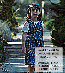
(Matilda, 1996, 1080p footage live action)

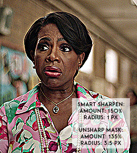
(Barbara Howard, Abbott Elementary, 2022, 1080p footage live action)
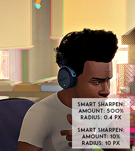

(Miles Morales, Into the Spider-verse, 2018, 1080p footage animated)
It's not a crime to oversharpen your gifs, but it does lead to the slippery slope of colorwashing (even for white people).
Look for the halo: If you look at the oversharpened gif of Barbara, you can see a yellow outline around her hair. That is an obvious indicator of going too far.
Use a layer mask to see what the colors were before sharpening: you can see in most of the oversharpened gifs above that there is a huge difference in the colors shown vs. in the less sharpened gif.
If you're working with older footage: don't try to overcorrect the graininess of the media. It's okay if some of it comes through!
Try to get the highest quality footage you can: I primarily work in 1080p files because my poor laptop starts to sound like a plane taking off when I try to screencap 4K files. If you're like me, look for larger file sizes. That will reduce the graininess of the gif.
Here are some links to different sharpening actions and guides:
daenerys-stormborn action
anyataylorjoy action
anya-chalotra sharpening guide
These are great to use if you are starting out in Photoshop! (psst if you need a hookup lmk) I know some people don't use PS, and for them, I put my sharpening settings on this post. I think both of the action sets I linked above have similar if not the same settings.
Also, one thing I noticed when making the gif pairs is that the less sharpened gif was always a smaller size. Fixing sharpening settings might help people who are trying their best to keep things under the 10mb limit.
I hope this answered your question, anon. If anyone has any questions or would like other resources, let me know!
#resources#allresources#completeresources#chaoticresources#gif help#ps help#photoshop#usernik#usermarsy#usershreyu#uservivaldi#useralison#userannalise#useryoshi#userk8#gif resources#tagged: ps help#nanda answers#userelio
490 notes
·
View notes
Text
Updating... The Tattooer (ver. 3.4)!
Finally! Took me a while, huh. This is the updated version of the Tattooer project. It skips some steps, making the workflow much, much faster! Huge thanks to @applewatersugar for his
suggestion on how to bake textures while preserving the transparency. This is kind of a repost of the original Tattooer post, but it actually has some new stuff and a few changes here and there, so please take a look if you want to learn how to use this new version.
This is a series of Blender template files already set up to quickly bake textures from The Sims 4 to The Sims 2. The different Blender files will allow you to:
-Bake body textures from TS4 to TS2 (Female)
-Bake body textures from TS4 to TS2 (Male)
-Bake body textures from TS4 (Female) to TS2 (Male)
-Bake body textures from TS2 (Female) to TS2 (Male) [Bonus!]
-New! Bake face textures from TS4 to TS2 (Unisex) [Bonus!]
-Bake head textures from TS4 to TS2 (Face + Scalp) (Unisex) [Still experimental]
Check the file names to see which one is which, and the resolution of the baked texture it will give.
Everything you see in the render above was 100% converted using those Blender files.
Download here! SFS / GD
Update: Version 3.4.1 (27/08/2023) Fixed some issues on the shoulders for the AF-body-4t2-1024 and AF-body-4t2-2048 templates. Now the top straps on most converted underwear/swimwear should look right.
Update: Same version (13/12/2023) As requested, added a new spanish version of the included pdf guide!
These templates were made mainly to bake and convert tattoos, but there’s more you can do with them if you get creative. I have to say, these are NOT perfect. Results may vary depending on what you are trying to convert, so! With that in mind, this is all the stuff you will be able to convert almost seamlessly from TS4 to TS2:
-Tattoos.
-Other body details such as body hair, scars, freckles, supernatural/occult details…
-Body painted underwear and swimwear, as well as some other clothing that’s mostly painted on the body.
-Socks, stockings and maybe leggings.
-Even skintones! In some areas they will look weird, so I recommend editing and blending them with other existing TS2 skins.
-Makeup, eyebrows and beards. In the old version this was just a proof of concept, but now I’ve added a new Face file template which gives some pretty decent results!
-Hair scalps. Very useful when converting some hairs! Although keep in mind part of that texture might also need to be baked on the face mesh, you know, that hairline makeup stuff.
Got your attention? Nice! Editing some of the textures from TS4 to match the UV mapping in TS2 using a 2D editing program can be incredibly hard. That’s where texture baking in Blender comes to the rescue!
You will need to download Blender, at least version 3.4, but you could always use a newer version. It is only incompatible with versions older than 3.4.
-You can download Blender for free here.
-You will also need Sims 4 Studio to extract the original Sims 4 CC textures you want.
In the first version of these Blender files, there was a necessary step using Photoshop, but that’s no longer needed. However, there’s still a tiny extra step which requires resizing the newly baked texture on some of the high resolution templates, so you might need a 2D editing program like Photoshop. More on that later.
So, before we begin, let’s clear out some questions you might have. What the heck is this texture baking thing and what does it do? Well, let’s imagine you have a video projector and point an image into a blank wall. Then you pick up some brushes and start painting and copying that projected image in that wall. Texture baking is kinda like that when it comes to 3D models. You align two models and match them as closely as you can in shape and form, and once you adjust some parameters and values, Blender does the rest for you: it will give you a new texture for a new model with a different UV map. These files I’m sharing have everything already set up, so it’s a matter of plopping in that Sims 4 texture and you will get that new texture for TS2 in just a few clicks.
This tutorial assumes you know literally nothing about how to use Blender, so if you feel uncomfortable with it, worry no more! This will guide you with pictures showing where you need to click and explaining what is happening. For Sims 4 Studio and Photoshop the process might be a bit less detailed, but still this should be pretty beginner friendly. For this tutorial, I will use some tattoos as an example (properly credited at the end of the post). Alright, enough with the rambling. Let’s get started!
·EXTRACTING TEXTURES IN SIMS 4 STUDIO:
First things first, you will need to extract as pngs all the textures you want to convert from TS4 using Sims 4 Studio. It should be pretty straightforward. Just open the packages and export the Diffuse textures. Keep them organized in a folder for easy access.
·BAKING THE TEXTURES IN BLENDER:
PRELIMINARY STEP 1: CONFIGURING BLENDER’S GRAPHICS SETTINGS:
Open your preferred Blender file depending on what you’re going to bake and the desired resolution (in this example I’m going to use the AF-body-4t2-1024 file). Before we start messing around in Blender, there’s one thing you should set up. It is a onetime step, and once it’s done, you won’t need to do it again. So, does your computer have a dedicated graphics card? If you don’t know or you’re not sure, just skip to the next step. Configuring Blender so it uses your graphics card instead of your CPU will make the baking render much faster, so it is recommended you set it up correctly.
If your computer has a dedicated graphics card, click File (1) > Preferences (2) > and on the window that pops up click System (3) > and select CUDA and make sure your graphics card is there and tick it (4). I have an Nvidia Graphics card but your case may vary. Once you’re done, click on the tiny button on the bottom left corner and Save Preferences (5).
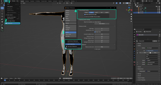
PRELIMINARY STEP 2: CHOOSING THE RENDERING DEVICE:
Click on the tiny camera button on the right, called Render Properties (1), and on Device (2) select GPU Compute if it’s not already selected. If you’re not sure if you have a graphics card or not, just select CPU. Then select the Material Properties tab (3) and Save your changes, either by pressing Ctrl + S, or clicking File (4) > Save (5). You might need to do this second step with the other Blender files, but once you have it done and saved, you won’t need to do this again. Okay, time to get into the good stuff!
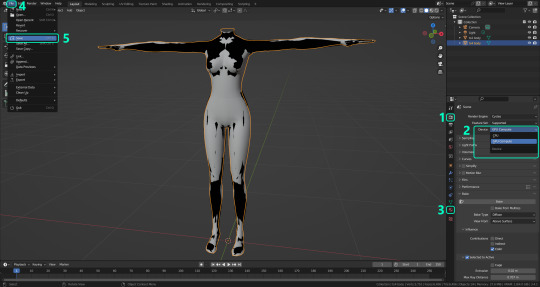
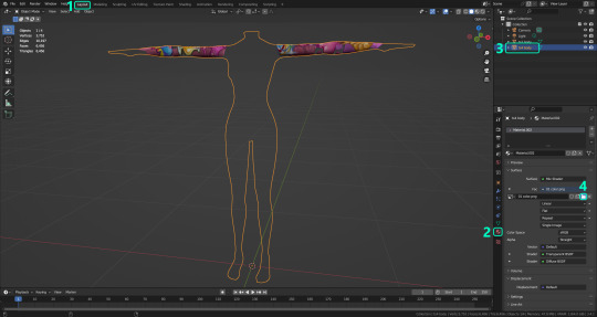
·STEP 1: LOADING YOUR TS4 BASE TEXTURE:
In the Material Properties tab, click the folder icon that says Open (1) and on the window that pops up, navigate through your folders and select your first texture. To navigate easily, the 3 buttons on the top right (2) are for the display mode. They will show your files in list mode, vertical and horizontal, and the one on the right will display the file thumbnails, pretty useful if you want to easily preview your textures here. The icons on the left side (3) will let you go one folder back and forward, go to the parent directory, and refresh the folder in case you just dropped something new in there. Double click on the image you need and that will load the texture into the Sims 4 body model, named “ts4 body”.
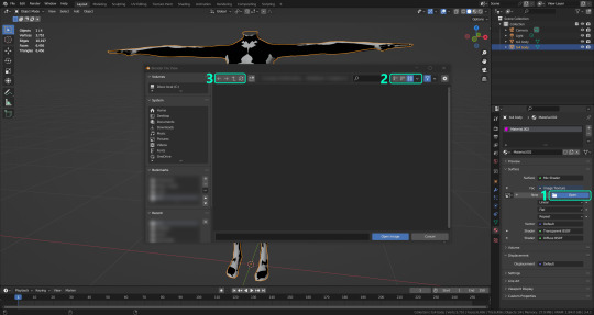
·STEP 2: SETTING UP YOUR SELECTION AND BAKING THE TEXTURE:
On the top right of the screen, you will see the names of the 2 models in the scene. Hold the Ctrl key in your keyboard and left click on the “ts2 body” model (1). If you did it correctly, you should see “ts2 body” in a yellowish orange color, and right down below, “ts4 body” should look more like a red orange. If not, try again by clicking first on ts4 body, and then while holding Ctrl click again on ts2 body. Then switch to the Render Properties tab by clicking the tiny camera icon (2) and click Bake (3). Depending on your screen resolution, you might need to scroll down a bit with your mouse to see the Bake button. Wait a few seconds for it to finish. You will see the progress percentage down on the bottom of your screen. Don’t panic if you notice your computer fans start ramping up, that’s completely normal! As I said in the beginning, using your GPU will bake the textures much faster than the CPU.

·STEP 3: SAVING YOUR NEW TS2 TEXTURE:
Once it’s finished, switch to the UV Editing Mode by clicking “UV Editing” on the top of your screen. And there it is: your new texture! You might have to scroll up your mouse wheel a bit to zoom in and see it in all its glory on the left side of the screen. We’re still not done yet though. You need to save it to yet another new folder (always try to keep your stuff organized!).
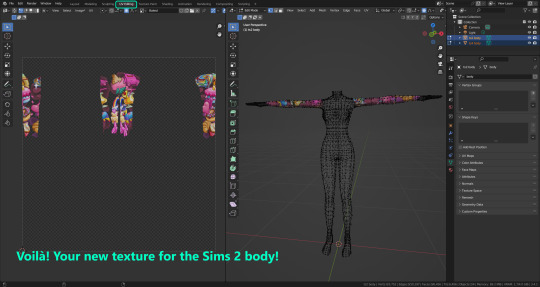
You can save it by pressing Shift + Alt + S, or clicking on Image* (1) and then Save As… (2). That will pop a window where you’ll need to navigate again and save it somewhere. Give it a proper name (3) and hit Enter to save it… well, Enter doesn’t always work for me for some reason, so if that happens just click Save As Image (4). And that’s it! You’ve successfully converted your baked texture. Congrats!
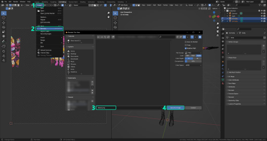
·STEP 4: GOING BACK TO STEP 1:
Alright! If you’re done with your textures, you can close Blender without saving and call it a day. But let’s say you want to keep baking other swatches. In order to go back to step 1 and start the process once again, click Layout (1), go back to the Material Properties tab (2), select “ts4 body” (3) and click on the folder icon (4) to open and load your next swatch.
Then it’s just a matter of repeating the process from step 2. When you’re ready to move on, close Blender without saving. If you see a small check telling you it will save some images, make sure you uncheck it, so you will be able to use it again in the future from the starting point with no issues. I don’t think it really matters if you accidentally save your progress in these files, but I like to keep it clean and fresh so I can do the process where I left it from the beginning next time I open it. And in case you mess up and save somewhere, you can always just delete the .blend file and download the template files again.
In case you’d like a video tutorial on how to use these files, the amazing @platinumaspiration recorded this fantastic video showcasing the process! You can watch it here.
One final note: some of the baking .blend files save the textures with a resolution of 2048x2048 pixels, as clearly stated at the end of their file name. That’s way too overkill, because TS2 only properly supports up to 1024x1024 for most of its textures and you should always resize your final product to that max resolution (or lower if needed). I just made those 2048 versions because there might be some really tiny and slim details on some tattoos that might look a little too blurry when baked into a 1024 resolution texture, so for those cases use that if you want and then resize them using your 2D editing software of choice.
In Photoshop, in the Resample mode of the Image Size menu, there are a few options to choose. For the fine details, I like the Nearest Neighbor (hard edges) option, which, even if it looks a bit pixelated, it still preserves most of the texture and quality.

For anything else, I would just directly bake them using the 1024 versions in Blender (512 for the face and scalp).
And for the folks who feel comfortable playing around in Blender, this is just the beginning! Texture baking opens a LOT of possibilities, so feel free to move stuff around and edit the models to your liking! If you notice the baked textures look warped or stretched somewhere, or don’t like where some textures are placed in the S2 body, poke around that area moving stuff and then give it another try. The main objective of the baking process is keeping both overlapping models as close in shape as possible. You may also edit and save new copies of the templates, or make new ones from scratch using mine as a reference (keep a close look on those Baking settings and values, I think they work pretty well) and share them if you want to. Go ham, do whatever you want with them! I still have plans on making templates to convert body textures from Sims 3 to Sims 2, but for now it’s not on my priorities, so we’ll see when that happens.
Whew! Hope none of this was too confusing. Need help or have any issues with these? Please ask/message me here and I’ll be glad to help when I’m able to!
Credits for the CC used in the render demonstration:
-Skin by Sims3Melancholic.
-Eyes by Northern Siberia Winds.
-Eyebrows by PeachyFaerie.
-Tattoos by xtc.
-Top by SerenityCC.
And the Tattoo I used for the tutorial can be found here, by ValhallanSim.
Last but not least, a huge thanks to all the people who somehow contributed to make this project and update possible, either by doing initial testing, finding issues to fix, or teaching me new Blender tricks to make the workflow way faster and easier. So thanks again to @elvisgrace @moyokeansimblr and @applewatersugar on Tumblr! <3
And thank you for reading! Hope you have fun playing with this (not so) new toy hehe.
#tattooer project#tattooer update#ts2 tutorial#ts2 resources#ts2 blender#ts2 overlays#ts2 texture baking#4t2 conversion tutorial#this took me so LONG to update#im really sorry for the delay :(
301 notes
·
View notes
Text
How To Get Your Character Models Out Of A Game: Tips And Tricks For Bitches That Have Never Used Blender
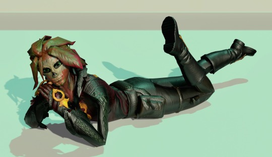
(it's me, i'm bitches)
(also ignore how messy that lighting is it's 1am and i should have been asleep hours ago. he's there for proof of concept 💕)
a couple people (specifically @forsaken-constellation and @ratasum) asked for a tutorial on how to rip models out of the game. this is not that, but it is a compilation of resources i used to learn about ripping, blender, and 3d modeling in general. i desperately wanted a post like this to exist when i was trying to figure this out, so here we go! all the resources below are completely free, with the exception of a link to the patreon of the person that created ninjaripper.
disclaimers:
there are probably more efficient ways to do the things i am doing. i watched a tutorial to learn shortcuts and then skipped to character models. if you have tips to add, corrections to make, or other thoughts, please feel free to share! i'll link to your post here. ^^
i do not know if any of this will get your account banned. i've ripped several models, so i'm going to assume it's fine as long as you don't try to make money off of it. use your best judgment, be an adult, etc etc etc
last updated: april 2, 2023
PROGRAMS & WEBSITES
ninjaripper 1.7.1 - there's a newer version on the creator's patreon, presumably with support for newer versions of blender and fewer bugs, but i haven't tried that
blender 2.79 - the import addon that comes with ninjaripper 1.7.1 is outdated for the current version of blender (3.5 as of this post), so 2.79 is needed to combine the .RIP files into a .BLEND (blender) file
noesis - ninjaripper saves your textures as .DDS files, noesis lets you view them and export them as .PNGs
blender 3.5 (optional?) - i just like it better than 2.79. if you're completely new it might not matter to you. all of the tutorials linked later are for later versions, though.
mixamo (optional) - rigs your character for you and lets you put them in Situations (like my guy above.) there's a whole library of free animations and poses you can try!
TUTORIALS
how to use ninjaripper - most of what you need to know about actually ripping the files and using ninjaripper is covered here. do not skip this one.
how to use blender 3.5 - full disclosure i haven't finished this series because it's uhhhh many hours long. but if you are a complete newbie to blender, i do recommend at least the first few videos; you'll learn about shortcuts that will make your life easier, how to unfuck your model when it fucks itself for no reason, and different terms that will help you google things you don't know later on. possibly he even covers some of the things i'm about to link! anyway.
what's a uv map?
how to apply textures
how to apply bump maps (note: for our purposes, you wouldn't add a color ramp node, you would add an image node with your bump map, and attach it to the bump node as the person does in the video)
there should be stuff here about weight painting, cloth physics, emission maps (makes your sylvari glow), and other stuff, but um. i haven't figured those out <3
TIPS
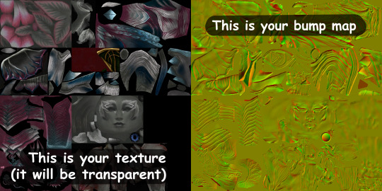
TURN UP YOUR GRAPHICS BEFORE YOU RIP - if you don't, you might end up missing certain textures/glows/etc. HOWEVER, you should turn animations down, because apparently high animation can make your meshes misplace themselves
rip from the character select screen, rather than an instance, because you will have 100 meshes to sort through instead of 1400. i am not exaggerating either of those numbers. if you are new to blender, please love yourself and start with character select.
your textures will be fucked up the first time you try to apply them. this is because the UV maps (the things that tell your textures where to go) of your models are flipped upside down in relation to the texture image. you can flip them back over manually, ooooor you can just flip the entire texture file in something like CSP or photoshop.
for some reason all eyes are red in the texture files. i have not figured out why. i recommend editing the .PNG to have the correct eye color before applying the texture.
mixamo only works for humanoid characters with tight clothing (or without clothing at all). if you try to use it to rig a charr or asura, or someone with a skirt or big sleeves, you will most likely be disappointed.
that's all i can think of for now - if you have other questions, feel free to shoot them my way, although i can't promise i'll have a straight answer ^^;;
information from bookahlogy about character proportions, fixing normals, and other fun tips
446 notes
·
View notes
Text

005 :: GREEN with ENVY

:: hello! notice a difference? a change, maybe? to my overall blog, how'd you like it? my blog is no longer thesaintofmisery but rather saintofmisery. this isn't necessarily a big rebrand, but i also hope you noticed the change in my docs naming system! it's finally more cohesive, and i'm sure you'll see more of it soon. 🥰
and now to the doc: green with envy. it's a very natural, colorful, and scrapbook-esque three page doc. i wanted to try something new, so i went out of my comfort zone this time to provide you guys a doc that's easy to edit and modify.
big big thanks to gorgeous gorgeous doc creator @lemondaydream for teaching me a couple of things during the creation of this doc! couldn't have done it without you.
how to edit :
— go to file & make a copy.
— likes and reblogs are greatly appreciated if you decide to use the template.
— do not modify or remove the credit.
— intended for personal use only, don't distribute or call it as your own.
— message me on saintlucifer#4147 or [email protected] if you have any questions.
— you will need two images approx of your character, and six optional spaces for aesthetic images. to replace them: right click & replace image.
— all elements of the doc are editable through drawings. just double click / right click > edit to change the images inside of them.
— the doc is formatted around the text amount, so anything over than was given than the filler may change some things. however, you can move elements as you'd like to make / reduce space.
— all images are edited through photoshop, however: you can replace them with anything.
— this doc is intended for desktop / print view.
LINK HERE.
— song in this doc is without you by lana del rey.
#docs template#google doc template#rp resources#rp template#google docs#indie rp#roleplay#rp#indie rph#google docs template#muse template#templates#google doc#discord rp#discord rp template#doc template#thesaintofmisery#saintofmisery
2K notes
·
View notes
Last Seen Blogs

