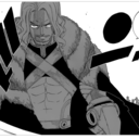
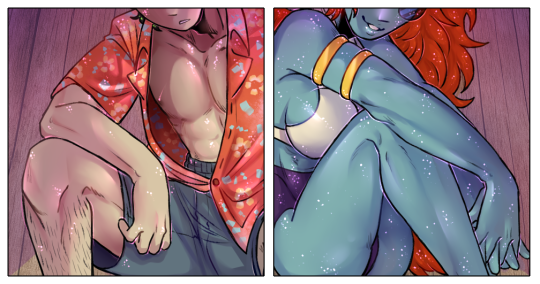
#and my effect layers- those are always a lot of fun
Explore tagged Tumblr posts


Photo

Beach pinups (Patreon)
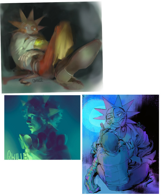
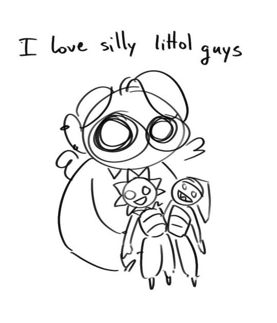
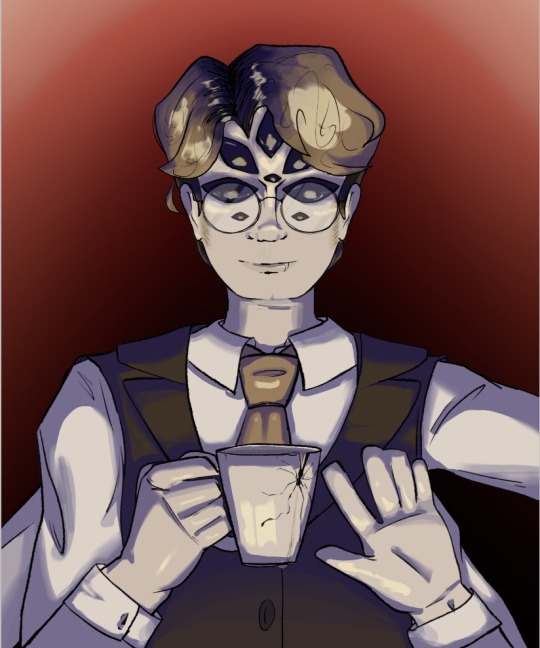
#My art#Helix#Dexter Favin#SCII#Jocasta#Hello may I offer you some bi panic#Oh no they're hot#I've just really been wanting to draw them in beachy clothes for like two months and Finally got the chance to aghhghhh <3#Fun fun - turned out much sparklier than I thought! I didn't come into this with sparkles even in mind! Not that I'm complaining hehe#Maybe they're drying off from playing in the ocean :)#I could see Syreen skin being sparkly naturally...#Is that why I made Jocasta sparklier than Dex? Sure lol#I kinda just did whatever I wanted with the muscle shadows lol are they accurate? Ehhh close enough lol#I love both of them just being effortlessly very attractive ♥#Fun to put them in different clothes too! :D#Dex is giving Daisuke Mouthwashing I think lol that wasn't my intention but hmm#It was a lot of fun making his Hawaiian shirt tho hehe <3 Simple effect of splatter-gradienting and got to use a couple unusual brushes!#Gives a kind of confetti look hehe#And Jocasta ahhh <3 Her skin-dips around her top and armlets are probably my favourites#Funny enough I actually wanted to draw them in swimsuit-esque stuff separately but in short order to each other#For Jocasta is was because I was looking at some of her art with Sarah and she looked like she was wearing a high-waist in one! Cute!!!#For Dex hm ♪ Hopefully there'll be more but mostly I just wanted to see him in a state of partial undress lol#He's always so layered-up! Socially acceptable half-dressed hehe#All those muscles under there and for what! Lol#Hmm much fun ♪
6 notes
·
View notes
Text
some tips on how to make bosses easier if youre feeling theyre too hard:
play a ranged physical dps class. that way you can hang back to keep an eye on the arena and what the boss is doing without having to worry about needing to stand still long enough to complete an induction
on that note, inductions are considered finished before the bar is full. you can usually move right before it fills and still have it go off, but it takes some trial and error to figure out how close you can cut it
move your ui around. my own life was made immeasurably easier when i put the target right above my hotbar so i wouldnt have to pay attention to both the top and bottom of the screen at the same time, but try stuff out and see what works best for you
the best time to mitigate an attack is right before the boss finishes casting it. the second best time is as soon as the mit becomes available, every time it becomes available
use addle and feint. you almost never see these used in casual content and it's a waste because they really are extremely useful skills at any level
use arm's length and surecast. there are some knockbacks they dont work on but those are rare. if you know youre gonna get pushed, use these and you probably won't get pushed
take advantage of duty support. the npcs know the mechanics. watch them and let them teach you
particle effects cant hurt you (usually). with the exception of puddles that stay on the ground for a while or layered stacks like akh morn, as long as youre not standing on the marker when it disappears (or are if it's a stack), you're in the clear. feel free to move through the animation if necessary. more and more mechanics require you to do so to be in position for the next one in time
it's usually fine to let spread markers overlap. just, yknow, make sure another person isnt in yours (though its the responsibility of anyone without a spread to keep themselves out of harms way)
when in doubt, ask your party members. it's extremely rare to match with a group of randos and have everyone be a first-timer. most players are happy to help, and the ones that know the mechanics but are bad at explaining them will usually just stick a marker on themselves (usually a triangle) for you to follow
read your tool tips. boss fights are as much a test of how well you know your class as they are your ability to read and react to mechanics. unless youre playing a healer or paladin, youre going to use your entire kit, so make sure you know what everything does
on that note, freecure is a scam. once you get cure ii/benefic ii, you will never need cure or benefic again. keep them on your hotbar for when you get synced content if you wish, but otherwise you do not need them. do not use them
if you play multiple classes, try to keep skills that do the same/similar things at the same spot on your hotbar. this isn't always possible bc despite what some may claim, not all classes of the same type are actually identical, but it will save you a lot of headaches
entirely new and unique mechanics are rare to the point of being nigh nonexistent. everything is a remix of something else and practicing in lower level content can actually be a big help
look up guides. the internet is full of them in pretty much whatever form works best for you (though they can be of admittedly variable quality)
turn down party effects. theyre on one of the tabs under character configuration > controls. if you put them on minimum you can still see heals and such but you wont have your screen constantly full of explosions
turn on target health percentage. this one is under character configuration > ui. it lets you better see how close the boss is to going down
make summons smaller. we all love titan's ass but not when it's the only thing you can see. "/petsize all small" will make this problem go away
relax and have fun. panicking leads to mistakes, which can lead to worse mistakes. if you need to take a second to breathe, do so. your party members probably wont mind waiting a minute or two between pulls
570 notes
·
View notes
Note
Every now and then I find an artwork that I just can't help but adore. I absolutely adore your Chara drawing. I'm also an artist myself, though I'm unsure how to draw the stuff that I actually like. Do you perhaps have any tips or advice, some resources I could take a look at...? I mean it's fine if you don't, I know not everyone is able to always explain their artistic process, but I still have to ask, heh.
thank you so much!!! im really glad you liked that drawing. and its no trouble at all, artists should try to help each other out ehehe. you're right that it might be difficult to explain my resources, but maybe since you specifically asked abt the chara one i can explain the process.
this piece i drew it like its most traditional to, the last pieces (the p5 ones and kris) were all sketched out and rendered heavily using lasso fill. this time i just started sketching some charas to take a break from another drawing.. as u can see i had two doodles originally but i felt like i wanted the viewers eye to travel through more focal points, so i started rearranging the composition. i wanted a mix of cuteness with underlying intensity/terror, so i already knew the geno chara would be a bit more "faded out". thats all i did for composition.
now in terms of the actual drawing and coloring process, i always do a mix of lineart and lineless (for this both the lineart and coloring layer are at some point merged so i can "sculpt" and shape the forms and colors easier). this is a lot of trial and error to see what parts really do require lines and make it more eyecatching, especially if you are strategic with the line weight. with lineart you run into the possibility of making a drawing more detailed than you had envisioned, lately ive been trying to go for "less is more", so i forewent a lot of the details and instead i REALLY focused on making these doodles as "shaped" as possible, for better examples of this id cite my previous two drawings because the lasso tool lets me explore that more (less constrictive than simply drawing the shapes yourself).
and the colors? with chara its easy, they have a very restrictive palette so after i lay down the colors i try and find a color for the lines which plays off of said colors (blue seemed interesting this time). thats also a thing with me, i like when the color contrast isnt subtle, i go a bit crazier sometimes (feel free to check my older art out on insta, those deltarune ones are the best example of this). to explore color in a piece, layer effects are your best friend, and tonal/color editing settings. i cited this example on an insta story some weeks ago for my last drawing with how i left it originally and what i modified once i came back after a bit:

the decisions you make in regards to what focal points and colors you use genuinely and solely depends on your artstyle and what you like to draw. but experimenting is always fun, and id say necessary :]
i think this is good for now, if you have more questions feel free to ask!
61 notes
·
View notes
Note
Oh uh forgot to ask in the previous ask (the one with the digital piece of candy and scurrying and stuff)
How do you draw art so good
Like
Is there a method you use or is that just the style you've gotten over time?
you've activated my trap card
I'm just gonna preface that this tutorial is from someone who was not professionally trained and didn't have a lot of free time for art, so a lot of the tips I have is short cuts I use to get the best results quickly
If you genuinely want to get better at art then please look at references and practice that is always the best
However if you are like me and only really do art for fun but want to go faster then these are for you pfppt
Overall I'd say my style is influenced by speedpaints I would watch when I was younger, I like analyzing how people do things and what makes something look "good" to me
I always recommend watching them because they will often have techniques you've never seen before or do things a certain way that you can try out yourself
I consume good art, it feeds me
but seriously it can be super helpful when developing your own methodology, or just generally trying something new
Usually it starts with me pulling some references from artists I really admire and sort of sketching out how they do the things I like
For example 8um8le has like super good anatomy and poses so I focused on trying to replicate how they do that
venemous-qwille is super good at color and pulling focus so that's what I focused on in my study of them
In general I'd say my process is sketch -> silhouette -> color -> shading -> render
I really don't like doing lineart lol

I'd say for the sketch the most important part is using references and just kind of fudging it until it looks correct anatomically/physically
General rule of thumb is spend time on areas of interest, and keep non important areas light (like the stitching on his pants)
I don't do lineart because I think its unnecessary for most paintings I do
I naturally tend to put more time and focus on areas of interest (like hands and feet) and if you use a brush with opacity for the sketch, those areas are naturally going to be darker in the final sketch
Of course this is gonna be different for everyone but it's what works for me
Sometimes I do a really really sketchy layer underneath my sketch/lineart, just so I know where everything is going
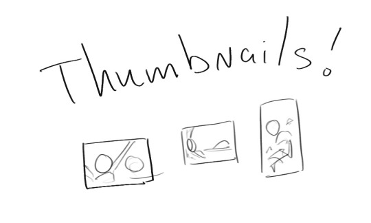
Use thumbnails! They are great to help figure out the general layout of things and what pose I wanna do
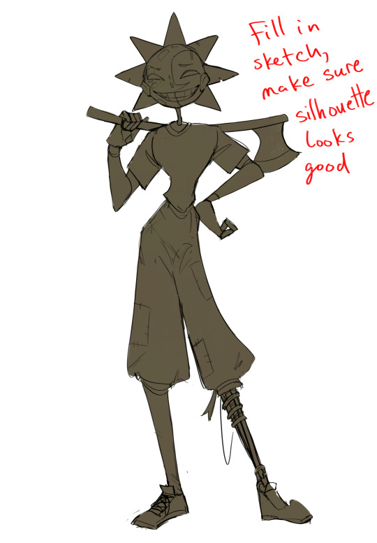
Next is what I call the "silhouette" layer
This is super important for me cause it helps me refine the figure and make sure the pose/anatomy looks correct, also depending on what color I choose for the silhouette helps guide what colors I'm going to use on top
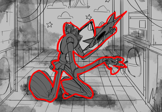
This piece is a good example of how it works. The silhouette shows me how the figure interacts with the background, how the pose looks and if its any good
The silhouette layer doesn't have to be super clean, as long as it follows the sketch decently well and shows where the figure is then its fine
I also sometimes make the silhouette layer multiple colors to help guide shading and vibe
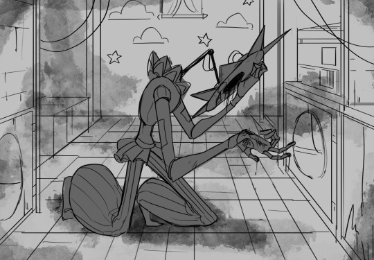
Next is the coloring layer. I usually make this a clipping layer on top of the silhouette layer, or I change the silhouette layer to alpha lock, either way it saves me time on coloring everything in

Sometimes I am super rough with the coloring too, using like an airbrush or my fav watercolor brush just to generically block in color where I want it
Works out cause most objects have like a bounce light to them from surrounding objects, so this is sort of a cheat I use to get that effect without all the work lol
Also don't be afraid to have the lower silhouette layer shining through, having multiple colors sort of subtly shining through the piece helps lots
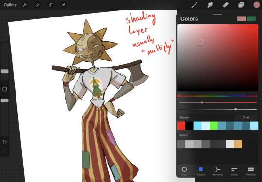
Next is the shading layer, this is usually another clipping layer, usually set to "multiply"
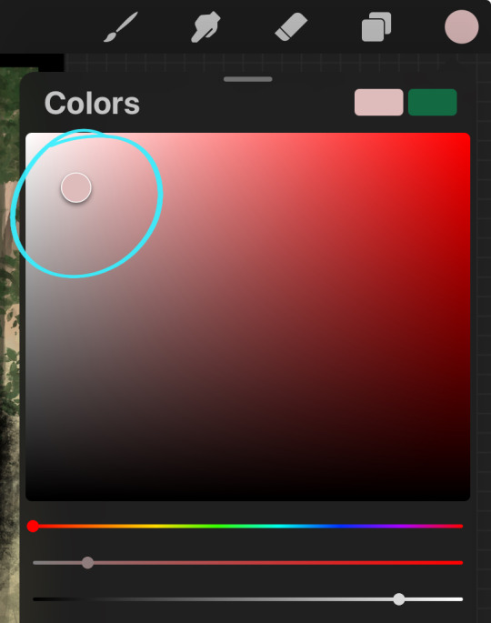
The colors I pick here is usually within this range, any color works, just depends on the piece and vibes.
Since this piece is set in a sunset forest I choose a more desaturated orange for the shading layer
I know there's a whole thing about multiply layer being a crutch (and it kind of it) but it is a useful tool when you just want some darker values across the piece but don't want to go through the process of color picking every single darker shade
Also in my opinion it looks better than picking a darker color and setting it to a lower opacity, idk I just think the color has more "depth"
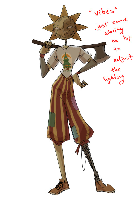
Next is the hardest to explain, sort of the vibes layer
Usually its just a layer of more concentrated color on top of the normal color and I fudge with the settings and values until I get a result I like
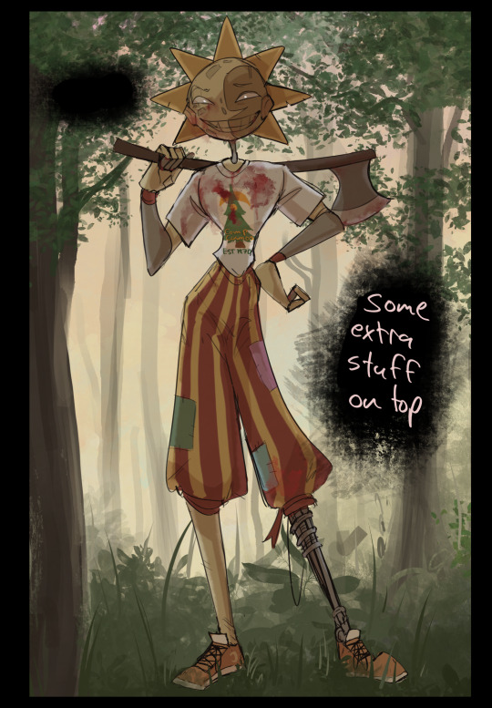
Next is the longest step, is the "extra" or the render stage.
Usually I add a background before this step so that if I need to merge the figure better with the background I can
If I render with a white background but he's supposed to be in a dark forest, its going to mess with the lighting severely
Also this is when I add more "vibe" layers on top to get the figure to match the background better
Backgrounds in general I recommend checking out @/derekdomnicdsouza on instagram he's got lots of great tutorials for breaking down backgrounds simply

I'd say general rule for the rendering layer is to focus on the areas of interest and spend less time on areas you don't care about
I even blur stuff out on the edges I don't want people to see, partially to save time on fixing mistakes in areas I dont care about (oop), but mainly to help draw the eye to the areas I do want people to focus on

Theoretically parts of the background should like mesh with the characters, parrallel lines are a no no unless they are directing a viewer to look somewhere, things that are perpendicular help bring things together
tbh I'm still not the best at layout and probably need more practice, but overall this is what I like doing
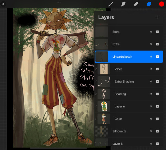
Overall this is what my layer set up ends up being
Sort of a sandwich with the lineart/sketch as the "meat" lol
Color and basic shading below the sketch, clean-up and rendering on top
I like this method cause it's super flexible if I ever want to try something different or try to replicate someone's style
I can make each step less or more messy depending on the end result and can add a lineart layer if need be. Also if there's a part that is straight up not working or needs to be removed its super easy to do cause I can just paint over it on the "extras" layer, color picking from the surrounding area to get the same vibe
Generally rule of thumb for my style is: get the initial layout of colors, form and shading to look good, then the rendering should be smooth sailing
Really the best advice I can give to get better at art is to enjoy what you're doing and become very very obsessed with drawing a silly little guy
You'll eventually get very good at drawing them pfptpf
#sundrop#moondrop#long post#art tutorial#fnaf sun#fnaf moon#I draw them way too much holy guac#ask#this is for you asker#idk if anyone else is interested in this kind of stuff#i apologize for ranting lol#also me struggling to spell silhouette like 15 times
119 notes
·
View notes
Note
My knee-jerk reaction to seeing winged humanoid anatomy is I always feel like the wings coming before the human arms or over the top would mess up the mobility of both the arms(not being able to go up) and the wings(having something obstructing downward movement and less room for muscle attachment as there needs to be a hole for the human arms) and that the wings should go beneath the human arms instead to fix those issues, but is that actually anatomically correct or am I crazy?
there are definitely a lot of factors to consider with the addition of wings to a humanoid figure! unfortunately we don't have any real world animals with a similar six limbed body structure to rely on for reference, so a lot of the design inevitably relies on "well, I think it looks functional, so I guess that will do"
this post I reblogged a while back does a good job of showing potential musculature:
now, personally I put the "human" arm much farther forward on the side of the body, while that post leaves it towards the back. but it does show off the way muscles layer over each other, and it gets the wing muscles accurate to real birds! so no, I don't think having a "hole" between the muscles for the arm is a problem, really. there are just a lot of layers in there.
as for placement, as I said I prefer the arm to be more on the side of the body, forward and a little bit down, almost like the foreleg of a quadrupedal animal. it gives a lot more space for the wing to move without bumping the arm so much. putting the wings lower than the arms would necessitate having one's arms stretched over the head every single time they needed to fly, which is fine if you're going for that superman pose!
but in practice I think it would be tiring, so having the arms below the wings and placed forward on the body is, to me, a better option. that way, the arms can just relax into a folded pose, like how birds hold their legs in flight. classic "raptor hands", if you will. loosely folded, hands by the chest. no extra muscle strain interrupting the wing motion.

(image description: sketches of two winged humanoids. the first is "arms above wings" showing a figure with their arms stretched overhead so the wings lower down can flap freely. the second figure is "wings above arms", with the arms lower and more forward on the body, being held with the hands curled by the chest while the wings flap. end description.)
obviously you get more flashy poses when the arms are above the wings and stretched out like that, so they're fun to draw. but the arms being all curled up and situated below the wings feels a little more natural to me, and certainly more effective for long distance flight. the more the limbs just openly dangle in the air, the more drag they create and the heavier they can feel. so it makes sense to me that the arms would just be held closer to the body, which works better when they're below the wings.
88 notes
·
View notes
Text
Web!Martin
Because it's unreasonable how much he's been on my mind

117: “It felt good, weaving my own little web”
158: “Honestly, I mostly just said what I thought you wanted to hear.”
186: “I can be a real manipulative prick, you know that?”
196: “Because you always managed to get what you wanted through smiles and shrugs and stammerings that weren’t nearly as awkward as they seemed.”
Self-indulgent process and ramblings under the cut
I did initially try to do some research into spider anatomy for this, especially their eyes and where they sit. I still know nothing about eye arrangements, but I do now possess a lot more knowledge on how haemocyanin works.
So nothing about the anatomy makes sense, but it looks nice. That's... fine, right?

This isn't really how I imagine Martin, but who am I to go against the wishes of the Mother? Blame it on his spider-y-ness.
He only got further from how I imagine him as I went along. (It's kind of hard to tell.)
It would probably have been a good idea to actually figure out what I wanted him to look like before going straight in with a full illustration, but this was supposed to be a "figuring out" drawing. Well. What can you do.
It's been a while since I've done anything in colour, so I figured I'd try doing the flats in greyscale and then using a uniting overlay, which worked surprisingly well.
We all ignore the hands. We all ignore the hands. We all ignore the hands. We
Rendering! Shadows! Highlights! I so rarely have time for a full drawing that I never get to render, and I forget every time just how fun it is, even if I always think I have no clue what I'm doing.
Not planning a light source never helps, but I think the dramatic high-contrast slightly-below lighting worked well enough. Though, looking back... some rim lighting wouldn't have hurt...
It was at this stage that I finally did something about the colour-shaped elephant in the room and gave a) his waistcoat, and b) his hair some life, in the form of some extra red.

And then it was just tinkering and sub-surface scattering (my favorite! especially when it shouldn't be there! little saturated barriers between light and shadow, my beloved! I insist on using it literally wherever possible).
And, a lot of increasing the contrast when I started to notice it was kiiind of washed out.
And apparently at some stage I made it look like he was wearing eyeshadow and highlighter. Whoops?
The philtrum. Does one draw it? How does one draw it? How does one not make it look strange?? Should I just let it loose? Is it dead? Is it a bastard? It has such a visceral effect on me—
I like wasting my time on tiny details, like his little fang, or putting two concentric circles in the middle of each of his eyes, or using my left hand to draw the spiderwebs so the lines are less even, or the drop of tea leaking out of the crack, or making the crack as spider-shaped as possible...
Then it was just fixing details that annoyed me, shoving together all the overlays, reaching out to my best friends noise and chromatic aberration, resisting the temptation to add progressively less noticeable filter layers, and there we go.
Just over 8 hours, and a piece I can confidently say that I am proud of. It's one of those things where I look at it and think "did I really do that? How did that come from my hands?"
Worth it.
#my art#this was supposed to be a quick design sketch#what happened#art#tma#the magnus archives#martin blackwood#web!martin#ibispaintx#digital art#tw spiders
24 notes
·
View notes
Note
i hope this hasn't been asked before. what size do you make your canvas? and do you crop it to fit other socials (like Instagram for example)? i hear that 300 dpi is standard. i never know if it's good to make my canvas big or not.
hi i think this ask is like at least 4 months old but i was scanning my sketchbooks from last year and i abruptly remembered i had gotten this ask because i had made a little chart in my sketchbook trying to figure out how to answer it
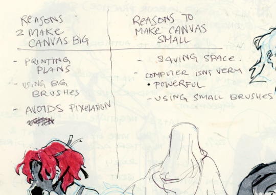
anyways theres pros and cons. and the size of your canvas is really going to depend on personal needs + preference. how good ur computer is, how complicated ur art style, how comfortable drawing feels, how much disk space you have to spare, what youre gonna end up using the art for in the end...300dpi is standard for PRINTING specifically, if you only plan to ever post things online then 72dpi works great and will save you space (fun fact a lot of professional animation files i deal with are 72dpi. and those eventually go on your tv screen). but personally i make everything i draw 300dpi because i am always printing stuff for cons, zines, etc and its nice to have the option even if i dont end up printing.
when I was a teen I used to draw on a rly shitty laptop and i made everything 800x800px 300dpi because big canvases would cause a lot of lag and also the resolution on this laptop was pretty small so 800px was a lot of the screen already. now i have a slightly better laptop with a bigger resolution and i sketch on giant 10000px-40000px canvases with the hard round brush and no shape dynamics or transfer whatsoever to minimize lag. when it comes to making a final illustration when i know ill be using a bunch of layer effects/blending modes/colors/mixing brushes etc etc ill generally crop the canvas down to the 6000px range. most illustrations i try to make sure are comfortably printable on tabloid size paper so thats pretty much anything hovering around or above 3000x5000px w 300dpi (so 11x17in). HOPE THIS HELPS?
EDIT: OH ALSO re: socials. i always ALWAYS size down my art to post on the internet. i think its crazy when other artists dont. because why would i ever let the internet have my hi-res file for free. also in general i think it looks better if you do the resizing yourself because if you don't then many social media sites will compress your file for you! a lot of people will post a hi-res file to twitter and then go "Wow twitter killed the quality of this img!!!" UH YEAH because they have an automatic image compressor. because they need to save space too lol and they dont want your image to take 248263895 years to load. same with instagram and to a lesser extent tumblr. when i post anything on social media i resize it down to 1200px-1600px on the longest side... its a little arbitrary but im kind of basing it on the smallest resolution of widely available screens. mostly because i think it looks stupid when u open up an image file fullsize and u have to scroll to see the whole thing... also iirc instagram only takes images up to 1080px before it resizes them? granted if you upload something smaller than that itll also resize it up which will look worse so I think bumping the numbers just over 1080px is pretty safe.
I should really be bringing the dpi down to 72 too when i post online but often im too lazy to do that. but it will technically help ur image load faster and stuff. and make it less likely for people to yoink it off the web and print it themselves.
148 notes
·
View notes
Text
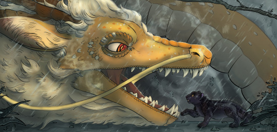
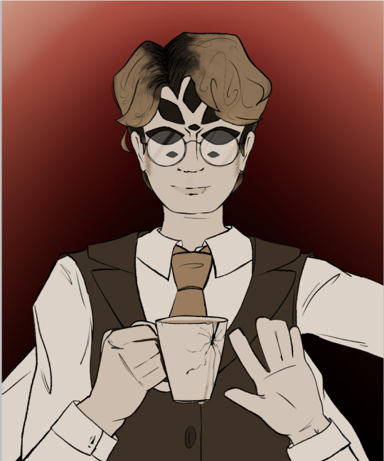
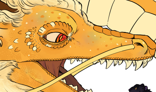
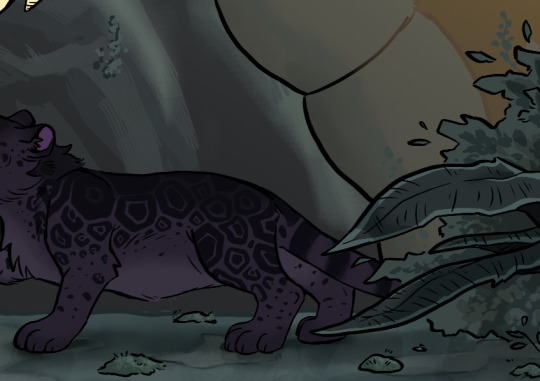
Howdy ho! I'm very excited to finally be able to share this illustration I worked on as part of this year's @bumblebybigbang for @tahnex's lovely and super fun fic (with no pain attached whatsoever), "Of Dragons and Panthers," which you can read here! As soon as I read the original notes on it this scene captured me so much I had to do something dramatic for it. It's been such a pleasure watching the whole collab come together, tysm for having me!
First time joining an event like this, and I'd love to again if the opportunity comes around hehe. Still a few postings to go on this one, the pieces before us this year have knocked it out of the park and I'm super excited to see the rest once they come around!
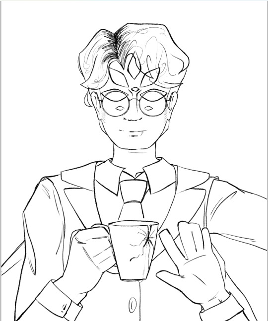
Made a few process cuts just for fun, which I left under the cut!
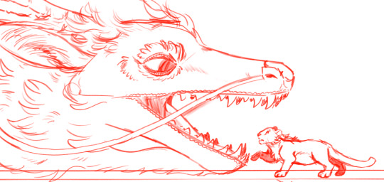
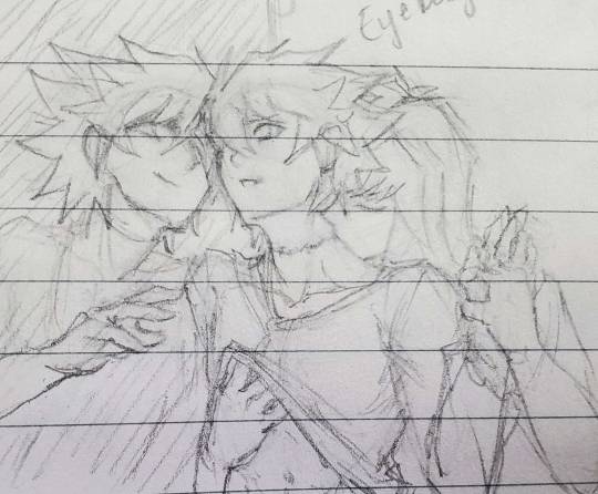
I did do a few sketches roughly before I started out, especially based on other parts of the chapter, but this particular composition was so fixed in my mind that I ended up just sticking with it. In retrospect, I would've loved to go back and do some more thorough exploration for it. Here are a few of the sketches I managed to fish back up:


I also was thinking of trying a few other doodles/another big piece, but ended up not really having the time between other obligations :')
And the sketch I finally settled on:
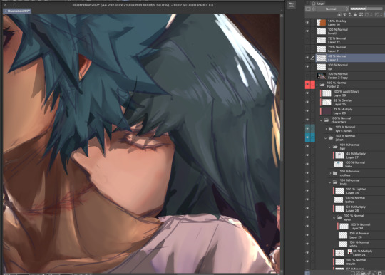
Inking was SUCH a fun process on this piece in particular. I'm a huge fan of how dragon!Yang's mane turned out, especially, and all the detailing on the head and around Blake's fur and such. Feel like I'm really satisfied w the particular way the line weight variations came out, and it's where the piece shines the most imo.

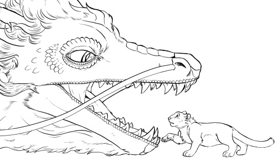
Panther!Blake, too. Oh gosh. I feel like it took me a lot of reworking to get her structure to a point where she felt very leopard-like, rather than any other type of big cat- especially around the head.
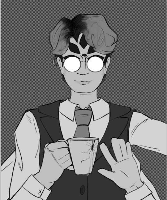
Colours were such a challenging part. There was a big feeling I had for that glow coming off dragon!Yang in the middle of the heavy rain- I love seeing that sort of effect in real life so that's something I'm really hoping to work to capture better as I practice. Trying to get dragon!Yang's slight iridescence in there and to balance out the lighting on panther!Blake's fur each took a long time, too- I'm only a pinch sad that a good chunk of it is covered by other lighting effects XD
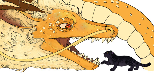
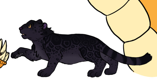
Blake's rosettes were SO fun. Augguhugg.
In terms of backgrounds. HOO boy I was going through a strange patch in life while working on the background and final polish for this piece, which is why (at least I feel like) it looks kinda rushed. I have been practicing natural landscapes and doing some observational studies but still struggling to get those rock shapes quite right, which I think is a big make or break point of something like this. I did really enjoy toying around with inking on the foliage and foreground layers of the ground, though! And in the end, lighting and effects ended up masking a lot of the big weak spots :D

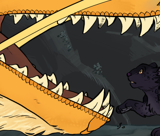
I think natural effects like smoke/steam, and rain, are big things that I got to practice more of in this piece, but also really would like to get better at in future. Esp since I feel like it's been a great opportunity to mess around with different colours and brushes that I use way less, which I'm always grateful for w painting. I think just layering the rain on its own ended up being about 10 odd layers?


I think the only other thing I would have loved to improve is to just help the piece feel more Bumbleby™ in the final look. I think I like the cool colours of the lighting for this particular outcome, but I also would have probably tried to have made things much clearer (ahem at the very least switch to yellow/purple) in the long run in terms of representation and resemblance. Ik that at least for me it is fairly easy to associate the two characters with dragons and panthers since I'm more familiar w the fandom lingo around these two, but esp for outsiders I feel like it's probably not great at conveying who they are, and why they are potentially in this situation.
I'd also love to try and find a shading style that still has a painterly quality but compliments the inking a bit better, rather than overpowering it.
I think that, on the whole, I am pretty satisfied with the piece and had a great time working with Tahnex on the whole collab! And I've also has a fun time reading his work and notes in return, and thank you so much for being so so patient with me even as my updates were slow n rocky at points :'D
That's about all I got, have a great day y'all! Still a few big bang postings to go, so very excited for those once they come around!
#riinkun art stuff#my art#digital art#bumbleby big bang#bbb2023#rwby#YIPPEEEE#very very happy to finally be able to show this off aaaaahugghh!!!!#it's been v cool working on this collab- tysm for having me again! :'D
237 notes
·
View notes
Text
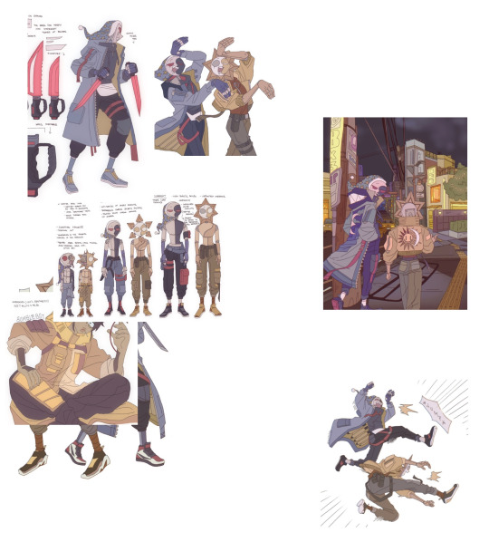
Silly Step By Step Process - Mega Miku
Hi everyone! I’m starting a series of blog posts on Tumblr and Ko-Fi where I explain my art process for some artwork I’ve done. This first blog post will be about the piece I made for this year’s Miku Day!

MegaMiku takes heavy inspiration from the design elements of the MegaMan franchise, particularly the MegaMan Zero series (with the fashion of her clothes, particularly the boots and headset) and the MegaMan Battle Network series (with her twin tails and the stage she’s set on). Considering she’s a digital singer, I figured a MegaMan-esque would suit her.
Confession, I designed MegaMiku last year intended to post her for that corresponding Miku Day but could not post it on time. All I had was just a concept sketch design and a clean lineart of that unfinished piece.


I decided to use that lineart as a reference to create a sketch for the new piece. I made sure to emphasize the shapes and figures when drawing so that I know where to line it.

On Clip Studio Paint, I always use the Pen Tool (G-Pen) and Bezier Curve Tool on Vector layers to line her as well as simplify the details from the original lineart to make it fun to draw her. Then I use the Correct Line tools to add line variation (Adjust line width) and delete any control points (Control Point) to make it easier to manipulate the vector line.

Since this is a flat color piece, I go straight to the coloring instead of going into the shading. I did not have an initial color palette, so I built one from the ground up. I made sure to keep the colors on the cooler side to match the cybernetic environment she is in.


I wanted to push more Battle Network influence, so I added a digitized aura surrounding her. I drew a cylindrical shape and erased a lot of rectangles and then added an outline in a different layer for those rectangles. To add texture, I used Layer Properties to apply the Manga Tone effect and made the tones cross shaped.

I added a contrasting dark teal behind her against the purple tiled floor and then added cross comic tones to give them texture.


I added a contrasting dark teal behind her against the purple tiled floor and then added cross comic tones to give them texture.

To make MegaMiku stand out from the background as well as push for the cybernetic vibes, I outlined her body with a cool neon lilac and her twintails with a cool bright lavender.

And I finalized it with my signature and a noise filter for MegaMiku.
And she is COMPLETE! Thanks for reading!
#art process#art#hatsune miku#mega miku#miku day#megaman#artists on tumblr#illustration#silly-fly#wanna try to do these more often :>
22 notes
·
View notes
Text
It’s gone midnight and I’m thinking about Six of Crows so y’all know what that means: it’s time for a long rambling thought process that will hopefully have some interesting insights into the books in it.
I want to talk about the animal, mostly bird, symbolism of these books because although it’s obviously something we’re very aware of I also think it’s something that runs a lot deeper than we necessarily always realise/talk about. Even when people aren’t being directly involved in bird metaphors (crows, pigeons, peacocks) they are often described as “squawking”, “flapping”, or with other phrases that further this semantic field.
Now the crows is obviously the main source of the symbolism, and it’s openly talked about in the book with the speech on how the recognise human faces and how they support each other. I’ve also seen a few people online talking about the Crows in conjunction with a poem/nursery rhyme about crows (it’s one of those that has many different versions spun of it, some know it was counting magpies rather than crows) wherein 6 crows symbolises gold, of course greatly linked to the plot of the novels as well as their anti-extreme capitalism message. It’s also key to mention that crows are massively underestimated birds in the general public view; they’re far ‘smarter’ animals than we would typically expect. Crows have a very high brain to body mass ratio, I believe the highest of any birds but don’t quote me on that, and although we understand very little about the brain the size ratio is currently considered a very good indicator for the general intelligence level of the animal. Crows can make tools, hide their food, mate for life, and - VERY interestingly for this book analysis - have even been suspected to hold funerals. Now I want to be clear I’m working on a mix of random knowledge and the first helpful looking website that came up when I googled ‘fun facts about crows’ so I am by no means an expert here, but to my understanding the practice that was initially considered to be a ‘crow funeral’ is actually a process wherein crows will gather around a dead crow to look for potential danger. So I feel like the links I’m establishing here are relatively obvious, the point is that, like the birds themselves, the Crows are undervalued, underestimated, and unexpectedly successful. But the symbol of the crow in these books arguably goes even further.
The crow-headed handle of Kaz’s cane represents everything about the crow I’ve already mentioned on top of his own symbolic layering to the cane as a sign that no part of him has not been broken, and no part him is not better for having been broken. So in Chapter 27 of Crooked Kingdom, when Kaz returns to the Slat and fights the Dregs before leading a coup against Per Haskell, the cane with the fake crow’s head that Haskell has contrived to mock him effectively represents the failing of everything the Dregs represent. They’re last, the remnants, the people with nowhere else to go: they are the people who have been broken and have made something new for themselves. Except Haskell. So the sheer ridiculousness of him mocking Kaz’s cane, something he clearly thought would win him favour and success, in the end becomes one of the biggest aspects of his downfall. Inej describes the moment when the Dregs begin to support Kaz, the way the look at Per Haskell with discomfort - “the feathers in his hat, the canes in his hands” (and then she goes on to highlight how they’ve seen Kaz use his cane in fights, “wielded with such precision”, whereas Haskell is washed-up, pathetic, never could have taken the fight Kaz did and walked out the other side). Of course they realise, then, how completely and utterly wrong all of this was. Because when they’re confronted with both of those canes they realise something. They know what Kaz’s cane represents; it’s power and strength in spite of a world that has that has scorned him, it’s taking something that was broken and not fixing it but emphasising it and making it into a threat, into a symbol, into a strength. They know that, even though they don’t know what happens in Kaz’s head, because they see themselves in that. The Dregs; the literal bottom of the Barrel, who have been broken and who have clawed their way to survival. They cannot see themselves in Haskell’s mockery cane. Haskell is not a man who reflects what the Dregs are at their core, but Kaz is. The emphasis on the feathers is also really interesting, because I think it’s implying a sort of gaudy, colourful feathering that (despite fitting in with the style of the Barrel) does not represent the symbol of the crow; it is not something shadowed, something half hidden that could have an unexpected bite. It’s almost more akin to Heleen’s gaudy peacock feathers than it is to anything the Dregs understand, or represent through being Crows.
The pigeons I don’t really see anyone talking about, but I think it’s pretty interesting. The idea of ‘the pigeon’ is the same as ‘the mark’; they’re the victim, the fool who’s easy to swindle. I think the imagery of the fools being pigeons, ie being everywhere and massively populating big cities, is really clever to show a divide between the few, the Crows, and the many, the pigeons. However, it’s not only the Crows who remark on others being ‘pigeons’, but other gangs as well. When Kaz confronts Pekka about the scam he ran on him and Jordie, he says “you were just two pigeons, and I happened to be the one who plucked you”. I’m not gonna lie to you guys I’m losing my point slightly, but I just googled ‘crows and pigeons’ and the first thing that came up was about how crows sometimes eat pigeons so I reckon that’s pretty relevant.
Ok I’m really tired and I feel like I’m clutching at straws here, so I dunno I guess if this does well then I’ll cover peacocks, lions, and the general semantic field of birds in another post. I hope at least some of this made sense, thanks for reading it if you bothered to get this far
#grishaverse#leigh bardugo#six of crows#crooked kingdom#inej ghafa#nina zenik#kaz brekker#jesper fahey#matthias helvar#wylan van eck#kanej#wesper#helnik#crows#soc#fantasy analysis#fantasy books#book analysis#assorted analysis - grishaverse
343 notes
·
View notes
Note
Sorry to come out of nowhere but I just wanted to say that your art is so warm and so colorful and so ROUND in all the best ways and your style really captures my favorite things about Kirby! I've always found it really inspirational!
Also, I love the way your line art looks?! I have to ask (you don't have to answer though) is there a specific brush or technique you use to get that soft, multi-layered effect?
Either way, wishing you a wonderful day!
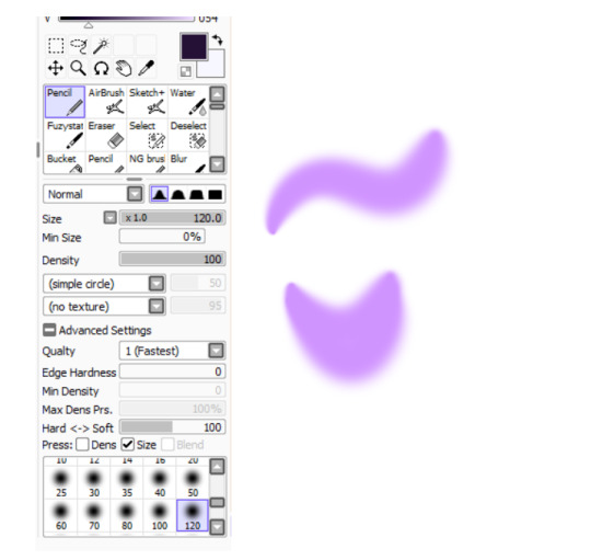
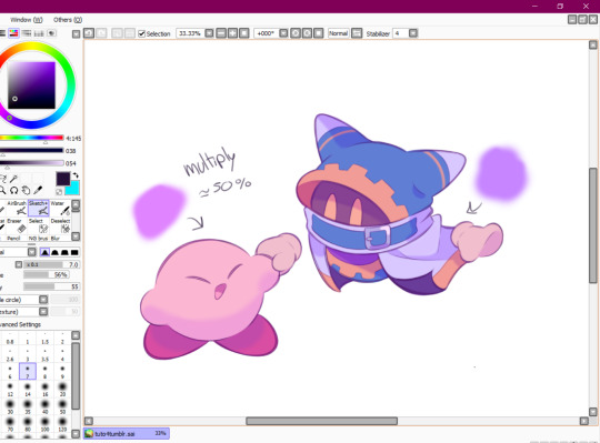
Thank you so much for your nice message, it means a lot!! I've been wanting to make a small tutorial about how I make my Kirby art, so I guess your question came right on time hehe ^^ As I'll be explaining all of my process, I'll also answer your question about my line art! Btw my art program is Paint Tool SAI and I'll also be showing the brushes I use as well as their settings (i made up most of them a long time tho).
So first here's the brush that I use for basically anything, whether sketch or lineart!
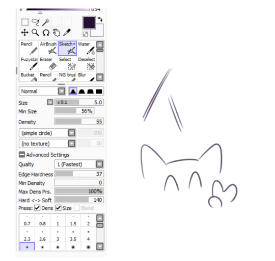
It took me a while to understand what you meant by multi-layered effect, but no the brush doesn't do that, that's actually my way of doing "lineart" (ig it's not really lineart cus I just do sketches that I clean later on).
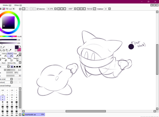
I then clean up everything, add the details and block by using a grey color.
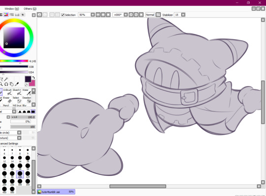
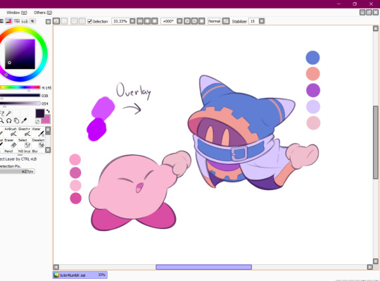
Afterwards I add the flat colors! I already have my own made up color palette, but otherwise I always use a purple color as overlay.
And I also use that same shade to color the lineart!

Next comes the fun part, shading! Here's THE brush that gives that soft effect to all of my drawings ^^ It's the same setting as my eraser too!
And yeah I also shade with light purple lol
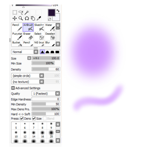
There's also some other brushes that I use for more effects, like the airbrush! (I don't think I've touched the settings that much) I mostly use this one for lighting effects.
And finally the water brush! I sometimes use it for blending or for quick backgrounds,
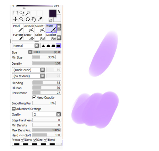
but you can also see that when put it to "Spread" it also becomes the one that I use for my blushes hehe
Aaand I believe that's all of the brushes I use for my art! I do have more, but I only use those for other specific stuff like animation or pixel art.
Adding some details AND VOILÀ!!

Now you know how I make my Kirby art! (but this also applies for all of my art) I sometimes redraw on the contours to give that "pop up effect" a bit like what they did in rtdldx lol ^^
I really hope it was easy for everyone to understand cus this is my first time making a tutorial! And to Desultory Novice, I hope I managed to answer your question too!!
Thanks again and have a great day :D
265 notes
·
View notes
Text
So I have a stupid iski idea...
this idea has been stuck in my head for the past few days, and refuses to leave me alone, so here's something for the writers out there who need/want a spicy + comedy iski prompt (assuming my humor isn't too far off the mark lol)
idk how many people read dom/sub doujinshi's here, but something that just recently occurred to me bc i've started reading raws is that the dom voice lines/commands are often in English (or some foreign language) while normal speech is Japanese (e.g. 'Kiss' instead of 'キスして', 'Stay' instead of '待って', 'Look' instead of '見って', etc.).
anyway, the idea (v stupid & v cliche, i'm super aware):
basically iski have an established dom/sub relationship
when it started, Isagi barely knew any English or German, beyond small phrases of command or praise (like, 'Come', 'Speak', 'Stop', 'Gut' (German - good), 'Süß' (German - cute/sweet), etc.) that he uses in intimate moments (could be sexual, or just comfort) with Kaiser
note: he does this because he's aware that Kaiser needs the extra layer of delineation between their normal interactions and their dom/sub moments/scenes
Isagi's accent is kind of heavy when he uses his dom voice
outside of those moments, they usually just communicate with the Mikage translators on, which smooths out a lot of Isagi's voice & sounds very different from his dom voice
Kaiser kind of gets Pavlov'd into associating Isagi speaking English and German is reserved for when his guard is down / when he's safe / when he doesn't have to be all... 'God's Chosen Emperor'
as the Japan team progresses through the U20 World Cup, Isagi, along with the rest of the Blue Lockers, per Ego's insistence, starts learning to speak English more fluently, and makes Kaiser help him study
Kaiser agrees (all begrudging 'fine. i can't let you be an embarrassment to my image. you need to be able to at least talk to people without the translators as crutches')
soon, he realizes what a mistake he's made by agreeing to this because hearing Isagi actually speak English, as opposed to the translators filtering his voice, to him has a huge effect on him he never noticed before (because he was always already in a vulnerable state of mind when Isagi used it before)
he doesn't ever address this with Isagi because he doesn't want Isagi making fun of him or taking advantage of this knowledge (in the 'i want to be in full control of myself at all times'/'i'm not entirely ready to open up about everything yet'/'i don't wanna seem weak' kind of way, not implying that Isagi would actually manipulate him in any way)
over the years, Isagi and Kaiser grow closer, they learn each other's idiosyncrasies, and they even broach the topic of 'Kaiser's past', but Kaiser still never tells Isagi about the dom voice language thing, especially since he slowly got used to English thing and doesn't react to it as much anymore
then, Isagi signs a contract with BM (or any German team really) and has to, obviously, move to Germany
so, of course, he asks Kaiser to help him with his German
Kaiser, realizing what would happen to him if he were to agree, says something along the lines of 'absolutely fucking not. u can stay helpless babe around here. i'll say shit for you if really need it, because i'm so magnanimous, as long as i get to tease you for it lots'
Isagi, not at all realizing what Kaiser's refusal is about and thinking that he just wants to see him flounder, is just like 'fine. asshole' and never mentions it to Kaiser again
Kaiser breathes a sigh of relief, kind of assuming that Isagi will just leave it be, despite it making no sense that Isagi would just back down that easily
Isagi starts learning German in his own time, mostly so that when he doesn't have someone to help him communicate, he can still get by
he even gets help from Ness for a little bit (mainly bc Ness, no longer a full-time Kaiser glazer and fully aware of why Kaiser said no, is channeling his inner little shit and can't wait to see it all come crashing down on Kaiser. yes, he gets along quite well with Hiori now; Hiori denies all allegations of being a bad influence)
he still lets Kaiser speak for him most of the time when they're outside, getting groceries, having dinner, visiting places, etc. because he can tell that Kaiser is happy when he does it, and during interviews, he can usually get by with just English
eventually, somebody manages to dig up Kaiser's criminal record and it gets blown up in the media
Kaiser doesn't really care about the whole thing because he's already worked through that part of his past, but the media needs to be appeased so that it can move on to the next big thing, so BM arranges a press conference to deal with the situation, and Isagi is there, watching from the side
at first, it's going well, or well as it could, given the topic and nature of the media, but some rude tabloid writer/paparazzo has to ruin it
basically, he breaks code and starts deviating from the preapproved questions, as well as calling Kaiser all sorts of names, in German, of course
Kaiser is used to this plenty, he's called himself all those things plenty, heard it from many more people, but Isagi is incensed at the scene, his German atp good enough to understand every word
he immediately gets up from where he's leaning against the wall, finds his place beside Kaiser, and gets on his Slursagi bag IN GERMAN
again, Kaiser couldn't care less about the paparazzo, and was already signaling security to pull the dude out for disrupting the press conference when Isagi was making his way onstage, before, well, Slursagi engaged, locked and loaded with all the slurs he could remember and plenty more he made up in the five seconds it took him to get to the center of the room, giving zero fucks about his own reputation as golden boy, heart of Blue Lock, whatever
now, while this dude is basically peeing his pants from the verbal lashing Isagi is giving him, plus the legal action he's threatening, Kaiser is in true crisis mode, bc 'omfg, this is why i didn't want u to learn German. save me from this menace of man. scratch that, i'm right where i'm meant to be. but did he really have to do this in front of everyone? did this really have to be the way i found out? ness, i'm gonna kill you. i know you knew about this and you didn't fucking warn me. how dare you. i cannot be going into subspace during a fucking press conference. plz plz plz let this be over soon. i'm dying rn. omg, omg, omg, he's so fucking hot, his voice is so pretty and gravel-y, his accent is so smooth, save me. Yoichi, i'm gonna kill you for doing this to me in public. fuck that, let's seriously gtfo of here. like, rn'
luckily for Kaiser, that is basically the end of the press conference because their pr manager is like, 'even if it's for a teammate, we cannot have someone flying off the handle at the media like this'
so Kaiser and Isagi get to go off alone, at which point Isagi notices that Kaiser is unusually quiet, and is like 'what's wrong? if it's about what that dimwit said, obviously he's fucking wrong, he doesn't know anything about you and certainly has no right to be accusing you of shit when he can't even get his facts straight. actually, this whole media circus is just plain ridiculous. you were framed, like what the fuck? & u didn't that awful sperm donor of yours get arrested right then and there for literally hitting a child right in front of the police????' and he keeps going on this tangent, all still in German
Kaiser's still quiet, hoping Isagi will just shut up already because the German is really getting to him, when he finally can't take it anymore and whines, fucking whines, immediately stopping Isagi in his tracks
Isagi's all like, 'shit, i got too caught up in getting pissed with the situation, i gotta be paying attention to my sub. babe, what's wrong? do you wanna go back home?' (yes, Isagi moved in immediately when he got to Germany, Kaiser insisted)
Kaiser nods, and they race back
Isagi sets Kaiser on the couch and goes to fetch him water and a weighted blanket, still thinking that he's bothered by the paparazzo poking at old scars
instead, when Isagi gets back, he hears Kaiser muttering under his breath 'i knew this was gonna happen. shit. i knew this was gonna happen. i should've told him beforehand. so fucking embarrassing. and in public, too. no, actually, fuck Ness for never telling me about this. i know for a fact he knew. and that cyan ultra-sadist asshole. i'm sure he was in on it too. i'm gonna kill them both, then everyone else, then Yoichi, then myself. stupid, stupid, stupid body, getting conditioned on his stupid voice, what the fuck is wrong with me? his voice? are you kidding? no, no, no, this cannot be real. Michael, get a grip, you can't seriously just drop like this. not because of Yoichi's stupid, stupid voice-' before breaking off when he realizes that Isagi has come back, 'SHIT'
Isagi's like, 'wait, what do you mean my voice?' still ever so infuriatingly in German
'THAT, you fucking idiot!! stop it! stop talking in German! i fucking knew this was gonna happen, stupid, stupid Yoichi getting me conditioned to your stupid voice!!!' Kaiser spits out, his voice getting louder as he feels increasingly embarrassed by the situation he's found himself in.
'stop talking... in German? what's wrong with my German?' finally flipping back to English, and Isagi finally gets the memo, a sly smirk spreading on his face, 'Oooh. I see someone likes me speaking in German, is that what? is that why u didn't want me learning it? because i turned u on, because i made u feel safe? you should've told me, Mihya'
'AS fucking IF!!! clearly, my opinion or not, you'd learn the language. if i had told you, you'd only do that faster and use it against me! i know you, you asshole! you stupid dom!' Kaiser flusters
'of course, i would' Isagi responds smoothly, 'but i'd also make you feel so much better, wouldn't i?'
Kaiser gapes at his audacity, blustering a 'you- you fucking- shut up! no way! you stupid dom! what are you on about?! there's no w-'
'want to test that, baby? komm her, mein schöner Kaiser' (come here, my lovely emperor/beautiful Kaiser)
or, alternative ending (the original one, before i sat down and typed out the idea):
Kaiser immediately flushes when Isagi starts speaking German in the press conference room, shoots a quick glare at their PR manager to clean up this mess, and drags Isagi out of the room by the ear
'ow, ow, ow. what's up with that, Kaiser? i was just getting to the good part. he fucking deserved that for-' Isagi immediately switches back into Japanese, still ranting
'shut up! u dumb dom! what do u think u were doing out there?' Kaiser grills, slowly recovering from the shock of hearing Isagi's German
'huh? that dude was a fucking asshole; he needed a talking to!' Isagi insisted, not at all understanding what the issue was.
'not that! the German! what was up with that? when did u learn German behind my back??' Kaiser fumes
'huh, the German? oh, i just thought i might need it if no one was around to help me speak. what's wrong?' Isagi answers, still entirely oblivious
Kaiser drags a hand down his face as he tries to compose himself again. he opens his mouth, 'what's wrong? WHAT'S WRONG???? what's wrong is i nearly dropped in subspace because of it, you asshole!!'
'you- what? wait, because i spoke German?' Isagi burst out laughing 'no fucking way, is that why you didn't want to help me with it? because you knew how you'd react?'
'shut up! you trained my body into this, u fucking idiot! this is all because of you! it was already bad enough when you started learning English, you just had to go and learn German, too!' Kaiser twisted Isagi's ear harder
'ow, ow, ow. alright, alright. i'll stop teasing you, just stop being mad at me. lass es mich wiedergutmachen, ja?' Isagi purrs, pulling Kaiser in by the waist. (let me make it up to you, yeah?)
omake:
the following morning, before training:
Kaiser and Isagi walk into the locker room. them pulling off their shirts reveal a battleground, like they had been mauled by dogs
Hiori snorts, 'so what did it, hmm?' elbowing Isagi's side, eyebrows raising and smile widening in a knowing look 'was it the defending his honor, or the German?'
'wait! you knew?' Isagi shakes his head 'no, of course, you did. i just don't know how.'
Hiori smiles wider, waiting for him to continue
'the German, of course, though i don't know how you knew when i only just found out.'
Hiori giggles, and responds 'oh, Ness told me! apparently, Kaiser had the same reaction when we all started learning English!'
In the background:
'oh, shit! gotta run!!! how could you throw me under the bus like that, you ultra-sadist!'
'NNNEEEEEEEESSSSSSSSSSSSSSSSSSSSS!!! i'm gonna kill you!!!!'
Hiori whistles, 'what a great day today is. i'm gonna be raking in the cash today.'
#blue lock#michael kaiser#bllk michael kaiser#isagi yoichi#bllk isagi yoichi#iski#kaisagi#kiis#d/s#i'm not actually sure how to tag this#this came to me at 2am#and i haven't been able to get it out of mind since#now u may all share in my brainrot#will probably crosspost on ao3 in a little bit--just need the courage lol
14 notes
·
View notes
Note
I got some assorted headcanons for Nightmare's henchmen because I've been thinking about how many chronic issues those guys are bound to have non-stop lately...
Killer:
He doesn't take care of himself properly, even after he starts taking care of the others. Meaning my guy is most likely gonna have some issues with chronic dehydration, which, in my experience, leads to "fun" things like: long-term and short-term memory issues, struggles with focus, difficulties regulating emotions (meaning, the longer this goes on the more often he might flip between different stages), difficulties sleeping, frequent headaches, chronic fatigue, dizziness and vision blacking out when he gets up from a sitting position, and joint pains.
Being dehydrated also generally makes pre-existent mental issues worse. So the struggles with guilt, self-hatred and all that stuff that is very present at Stage 1 are probably all accentuated by his lack of proper self-care.
Horror:
His skull and empty eye socket both cause him pain often. Especially with switches in temperature or humidity. Because of the positioning of those wounds, that often leads to debilitating headaches and often teeth pain too. He pulls on his bones to try and alleviate the pain because the pressure does help in the moment, but the strain he puts on them always leaves him far more sore after.
The years of starvation also left his bones far more brittle and prone to breakage. He's gonna be extra careful even while doing things like getting out of the shower or sitting down. He would benefit from getting braces and several different kinds of mobility aids, but it's not like he's got access to any of that either in his world or at the castle, so he learns to make do without.
Dust:
Because he's got a high LV and yet his soul is still inside of his body, he experiences a lot of side effects from that. Things like: chest pains, frequent headaches, auditory and visual hallucinations, memory problems, frequent blackouts, disorientation, and bone fragility (though, unlike Horror, his bones aren't more prone to breaking, they're more prone to dusting).
The thin layer of dust that constantly covers his bones causes frequent rashes and irritation. It's not unusual to see red blotches on his bones. Massaging his bones with oil or cremes would help relieve some of his discomfort and I'm sure that Killer does his best to find and steal some for him, but their resources are still limited and his access to it is only temporary. Also, that scarf he always wears doesn't help, what with it being covered in dust. And having his hood always up doesn't help either, since fabric rubbing against his already sensitive and irritated bones is probably Hell. Wearing some lighter and breezy clothing would do wonders for him. (Yes, this is part of my propaganda to put all my faves in pretty dresses. It would look cute and it makes sense, I swear).
Cross:
Old badly healed fractures from his time in the military probably cause him a lot of general pain he's grown used to in the years. But, by far, the worst of his problems come from his and XChara's unusual soul situation. Sharing a soul cannot be easy, and it probably leads to a great deal of disorientation and confusion around their memories and identities.
Not knowing where one ends and the other begins makes social interactions with outsiders to their bond rather difficult. It most likely led Cross to develop a great deal of social anxiety which is why he often tends to isolate himself and suppress most of his emotions. Truly, he tries to minimize the amount of meaningful social interactions he gets because the panic attacks afterward are just not worth it
All skeletons should immediately be put in loose pretty dresses /hj
But honestly I love these very much, they seem very probable. And I can honestly relate to Killer’s dehydration and Horror’s teeth problems, those things suck. (For me tho it’s often because water is a boring drink.)
Also do you think that whenever Killer decides to take the others on his responsibility, does he do things like help Dust rub the cream on his bones, especially with those hard to reach places or extra painful spots? Maybe this is something they’d have to work up to, as doing something like that is a rather vulnerable thing, requiring trust.
I think itd be a cute image though, and maybe if we go with the headcanon that horror is or grows to be a little bigger or taller than Murder and Killer, he offers Murder some of his clothes since they’re bigger and looser. I’d imagine that Killer would have to frequently steal and horde painkillers and numbing medications for the gang, and perhaps manage it all carefully to avoid overuse.
And Dust probably wouldn’t want to wash his scarf, but I wonder if he’d accept a cleaner version of a scarf that looks just like it and just keep the old one as a comfort somewhere in his room.
And I’d imagine that Dust and Horror would have to frequently remind both Killer and Cross/XChara of who they are, where they are, the time and the year.
And very likely have to remind Killer about things multiple times either because he forgot something, or because he was asked to do something but didn’t realize if that experience was real or not. Perhaps they create a little system of asking if they can hold Killer’s hand (or let him hold their hand), to anchor him in reality whenever it seems like he’s not really present or sure.
{ @stellocchia }
Honestly id love to hear more about all of your headcanons. They’re all so detailed.
#howlsasks#stellocchia#utmv headcanons#utmv#sans au#sans aus#killer sans#killer!sans#killertale#bad sanses#bad sans gang#nightmare’s gang#murder time trio#horror!sans#dust!sans#murder!sans#cross!sans#x!chara#xtale#xchara#xtale cross#killertale sans#something new sans#undertale something new#dustale sans#dusttale sans#horrortale sans#xtale sans#xtale chara#horror sans
34 notes
·
View notes
Text
utilities included: the faq
ahead of the utilities included finale, i shared my retrospring on here & twitter, and i invited anyone to ask questions about the story. you can find the answers to those questions below the cut, and i'll be updating this post as any additional questions come in!
why did you choose an alpha/alpha pairing?
i think i was drawn to that dynamic specifically because it felt the most accurate to how i interpret their canon dynamic. it also gave me a vehicle to explore sanji's identity (and queerness), which was a lot of fun.
why did you choose sanji's limited POV?
limited POV in a romance story creates an interesting layer of narrative tension ("how does the other character feel?") that i love. i also knew early on that i wanted sanji to be a chronic overthinker in contrast to zoro's more simple, straightforward approach to life, and i knew that i wanted that contrast in their personalities to be the root of the story's "conflict." so it was easy to decide that i needed to plant myself in sanji's headspace for the story—that's where all the conflict is!
why did i decide to remove sanji's ability to sense pheromones?
when i was first outlining the story, sanji was actually going to move into the apartment as a favor to his friend luffy, who was begging him to take over his lease. but when i sat down to write this, it didn't really feel like luffy to me, so i pivoted to story so luffy has already run off and nami's trying to find a total stranger to take over his lease. this is what you see at the very beginning of chapter one. however, i quickly realized a plot hole in this: if sanji could sense pheromones, he'd immediately know the place wasn't nami's, and he might not even step foot in the apartment to begin with (because i was always going to write him not liking or trusting other alphas). so. uh. i nixed his ability to smell pheromones. and that spur of the moment decision ended up becoming the cornerstone of sanji's characterization and a major part of his internal conflict. i actually forgot until i sat down to answer this question why this became part of the story because it was a decision made so early in the process that it's funny to think there was ever a version of utilities included in my mind that didn't have it!
which part of utilities included did i enjoy creating the most?
chapter 10 is my favorite chapter overall, but the pool scene at the end of chapter 3 is really special to me. it's the first time sanji realizes these people are thinking of him as a friend, and it's also the strawhats (and friends) being petty criminals in a modern AU. honestly, any of the group scenes (with 4+ characters) i had a blast writing. i love the chaos and the silliness and also being able to push myself to make every character sound distinct from one another on the page. but the pool scene is just extra special for me.
while writing sanji POV, did i think of what zoro's POV would be each scene?
generally speaking: no. when i first started writing fanfiction, i had this compulsion to cram every detail i had thought about into my exposition instead of letting the details come up naturally through conversation or character observation. there are different ways you can get out of this trap as a writer (or lean into it, if you want to), but for me the most effective method was the most simple: if you don't need it, just don't think about it! so unless zoro's state of mind was directly contributing to the plot (because of what he was saying or how he was acting), i simply did not think about it. i like to think that gives sanji's spiraling thoughts some degree of authenticity because while sanji was thinking "how does zoro feel about this?" i was also thinking "hm. i wonder how zoro feels about all this." well. to an extent. i knew that zoro was going to be into sanji from the first moment they met (he likes blades. sanji threw a blade. simple.) and i knew that their first kiss was going to be zoro's "little garden" moment where he'd suddenly go from neutrally annoying sanji to actively stoking the fires of sanji's competitive spirit (and sexuality). and i knew that when the "define the relationship" conversation inevitably came to pass, zoro was going to be just as Not Bothered about it as sanji was Bothered. that's it, that's all i planned for zoro's perspective (with the obvious exception of the epilogue). i'm a big fan of working smarter, not harder with this stuff ☺️
what did sanji first smell like to zoro?
i kind of touch on this in the epilogue, but i'll expand a bit here. for sanji's pheromones, i wanted them to reflect the duality of his canon personality: both harsh and kind. so i wrote his pheromones as being both sweet and a little burnt. when i was thinking of how pheromones "work" i was loosely using the formula of "imagine you smelled a subtle scent ONCE, then ten years later your brain had to recreate that scent from memory." so zoro's brain does something like sweet + burned = caramel / sake, another character's brain might do something like sweet + burned = tobacco. it's less about a 1:1 scent and more about what their brain associates with that scent, if that makes sense? and if it doesn't make sense, you can see why i enjoyed writing a 100k story from the POV of the one character who can't understand this crap ☺️ as for their first impressions: when zoro first walked into the apartment, sanji had been contently cooking, so the room was probably very sweet at first. then there was a sudden, sharp burst of that burnt smell when sanji's anxiety kicked in.
was zoro into sanji from their first meeting? did he have an "oh" moment?
i wouldn't call it love at first death threat, but zoro was definitely interested in sanji from their first meeting. nothing like a little adrenaline to jumpstart zoro's attraction. i don't think zoro had an "oh" moment in the traditional sense, just because i think he goes with the flow so well that he's less likely to get bowled over by a sudden surge of feeling? if that makes sense? i think he'd be much more like "damn, i was right all along" than "oh" but that's just my take on him 🙃 as for when he fell in love, i personally like to think it was watching sanji's ddr match against koby. but i'm open to all other interpretations too ☺️
how did zoro feel seeing sanji cuddling with his friends for the first time in chapter three?
this is an interesting question. i didn't really think about it much while writing the scene, but i think zoro would probably not have lingered on the moment very much. i think, to him, it's obvious that sanji would be integrated into (and loved by) the people closest to zoro. if sanji was the sort of person zoro's friends wouldn't love, zoro would never have pursued anything more with him to begin with, and they would have just stayed contentious roommates forever. but zoro knew from early on how much his friends liked sanji, so seeing them all cuddled up together like that was probably just confirming what he already assumed.
we know what happened to sanji, but what happened this siblings?
i haven't thought too much about this because, again, i don't think sanji thinks too much about what happened to them. he was isolated from his siblings as a child—at first for judge's fear that whatever was wrong with him might be communicable, then later as a sort of carrot-and-stick measure (if sanji got better, he could play with his siblings; as long as he didn't get better, they were allowed to bully him). if i had dug into the vinsmoke siblings more, i'd probably have characterized them as people still adhering to the same reductive beliefs judge tried to instill in sanji early in life. they wouldn't have been exposed to the same medical trauma, but they would have been fed a lot of misinformation about alpha dominance and what it means to be the "right kind" of alpha in this society.
are there any canon side ships in utilities included's universe? are luffy and law an item?
i think the only confirmed ships besides sanji & zoro are robin/franky, nami/vivi, and usopp/kaya. luffy and law definitely have something going on, but what that something is is never confirmed. i'm happy to leave everything about them open to interpretation!
#utilities included#faq#by me#strawhattery#i'll continue to update this with more questions as i get them!
54 notes
·
View notes
Text
As promised, here's the process video for my YGO Rare Pairs Mini Bang piece. I feel like this event always gets me to push myself beyond my limits (or maybe it's Tealshipping ;-P). A lot of attention and care went into this piece, so I want to talk about it a bit.
(Extensive yapping under cut)
As with many of my works, it started with a song. Pretty much the entire aesthetic direction of this piece was inspired by it, specifically this lyrics video.
youtube
I started with a thumbnail with pencil on paper because I'm astonishingly near-sighted and can only determine a good composition at a very specific size.
Fun fact: This thumbnail was very likely jotted down on company time :D
Then I traced it onto CSP and started with the values sketch. Since the song/lyrics video provided a very clear vision, I worked out the light sources pretty quickly. Some things I kept in mind:
The elements in this piece should suggest that we are looking at this scene through Johan's eyes. That's why Ryo's eyes are closed, and Johan's seeing a different version of "himself" in the mirror.
Because of this, the lighting scenarios for the outside world and the mirror world are completely different: the outside world is hazy, sensual, the mirror world is stark and eerie. "Yami" Johan has sharper features than "normal" Johan, and he's cast in colder light. The "real" world, on the other hand, would have warmer tones. (I feel like I didn't push this enough tbh).
The main light source comes from windows off-screen. I was very particular about the way it hits Johan's face and cast most of it in shadow. In contrast, l wanted most of Ryo to be in the light. It's kinda unrealistic, but ¯\_(ツ)_/¯
The light from the windows also helps illuminate the background. Specifically it reveals the one piece of furniture necessary to deduce the rest of the story ( ͈ര ̫ര ͈) ⊹`𓈒
There is a rim light from a lamp hidden behind Ryo. This helps sets the characters apart from the dark background and suggest more depth, especially in the areas of darkest shadow.
The process I currently use is one I adapted from kuroshiro's, with a few tweaks. First, I separated the piece into parts, and coloured them on separate layers with their base colours. Then, I added new clipped layers to each part, set to Multiply or Overlay as necessary, and rendered on those layers. This workflow helps me think clearly about what I need to do next, and easily come back to fix mistakes later on. It also allows me to pause at certain points and play with different lighting/colour schemes, just to make sure I like the direction I'm going in. It's a labour-intensive way of working, with a lot of cognitive power expended on pre-planning and layer management, but it's very effective if you like to problem-solve on the fly.
This scar on Johan's neck has a lot of symbolic significance in the story of this piece (read the accompanying fic to find out why), and so does Ryo kissing it. I wanted to make sure the way I posed the characters + arranged the lighting would give it that prominence in the composition. I based it on ref photos of real electrocution wounds. (And that makes the second time I've put marks on Johan's skin for this event lol).
Occasionally, I'd screencap the image and save it on Discord, so that I could look back at it the next day and immediately notice anything major I needed to fix.
Fun fact: In my vision, the light-cast-from-window thing was mandatory, but I'd never drawn anything like that before. Reference photos were helpful for inspo, but I needed to observe how it works directly. So (after much procrastination) I decided to turn off the lights in my room and stood for a good half an hour watching the way the light hit my wall in the dark, brainstorming how to recreate this on CSP.
(The most painful part of this piece might be looking up hotel room interior refs and trying to design a bg that looks legit but not with the muted color schemes that seem to dominate luxury hotels use nowadays).
The mirror frame was one of the last pieces to be added, and then I exported the image and imported it onto a different CSP canvas. I added a layer on top the image to paint over any remaining mistakes . I also added some special effects (such as air-brushing Johan's breath). Lastly, I signed the piece.
Fun fact: The "pressed against the mirror" thing was another big challenge, for which ref photos weren't gonna be enough help because I had such a specific idea with the pose + lighting. One day, while I was wandering in a new bookstore and about to leave, the employee told me "We also have a secret room, would you like to discover it?" and she DEADASS pulled open a bookshelf to reveal a hidden chamber??? And inside were obvs more bookshelves but most importantly there was a large mirror on the wall EXACTLY like I needed. So I spent a good while in there taking reference photos using myself as a model hehehe. Thinking back on this experience now, I become more firmly convinced that the universe arranged things so that I could bring this Tealshipping image to the world. *^w^b
Overall, this piece took me literal months to complete (most of which was spent agonizing over whether I could pull off all of the aforementioned goals). I'm noticing some pretty big mistakes now that I'm looking back at it lol but it felt pretty rewarding to finish it at last. Do you think I managed to achieve my intentions?
#i forgot i said i was gonna do this lol#art by neeko#art process#yugioh gx#yugioh#jesse anderson#tealshipping#johan andersen#ryo marufuji#zane truesdale#yubel johan#work in process#fanart#ygo gx#yugioh fanart
10 notes
·
View notes
Note
If you don't mind me asking, how do you go about finding references for the clothes etc. for the game?
Oooh that's such a good question!
I've done a lot of comics set in different time periods but generally pre-1600, and my advice with those was always to find resources and patterns created by historical re-enactors. They tended to consolidate a lot of more academic research taken from paintings and extant garments, and give an idea of layers and how clothes work together, and often consider things like hairstyles.
For example, here's a character who lives in Renaissance Denmark!

But for Beekeeper's Picnic I was a little more relaxed - it's only set 100 years ago, I feel like I have a few more cultural touchstones to know what people might be wearing, and we have actual photographs of people wearing those clothes!
So I felt a little better about just going on somewhere like Pinterest and looking up "1920s women's dresses"
That requires a little discernment, though. I know enough to see something like this and think "Lol no that's not what people actually wore that skirt is ABOVE the KNEE are you KIDDING"
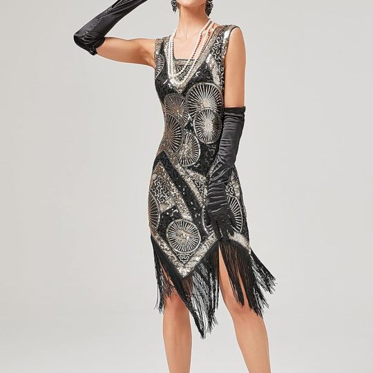
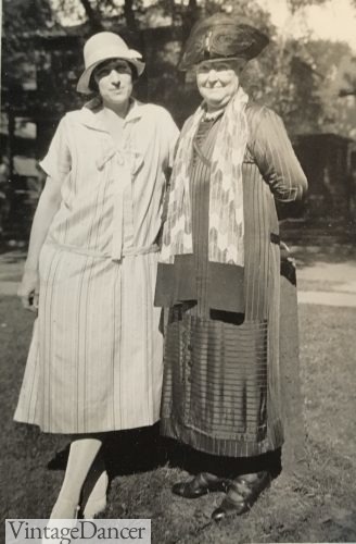
And then if your characters are just everyday folks, it's also generally good to find photographs that are of ordinary people rather than pin-ups and glamour shots - so less this...
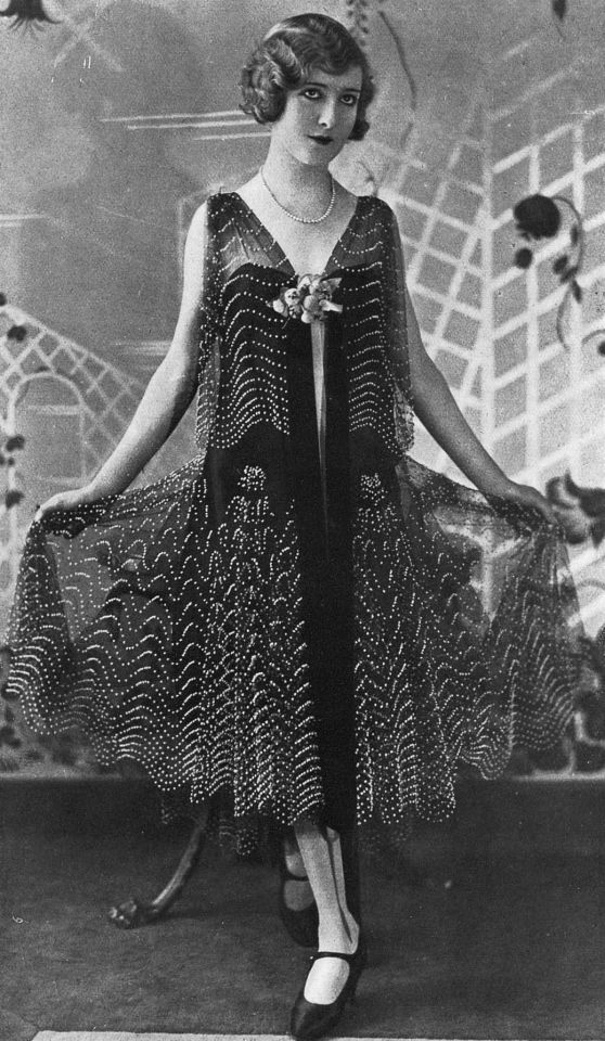
and more this!
And last but not least I am actually kind of un-inventive and will default back on things I actually own if at all possible. This has the fun side effect that if anyone ever wants me to cosplay as Holmes from the game, I can probably do it.
56 notes
·
View notes