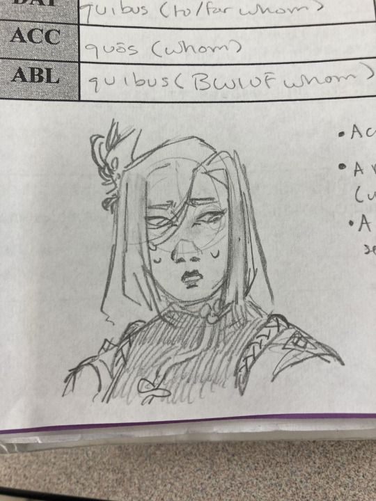
#and the others too but those are just some of the ones ive played
Text
i just really love pacthesis' games a lot
#pacthesis#chrono days sim date#wonderland days sim date#kingdom days sim date#number days sim date#xolga and mr. toko#memory days sim date#and the others too but those are just some of the ones ive played
2 notes
·
View notes
Text

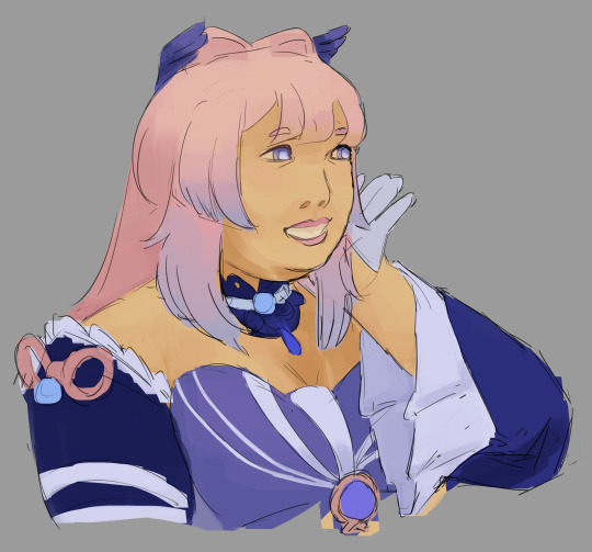
lots of doodles because i forget to post art here most of the time
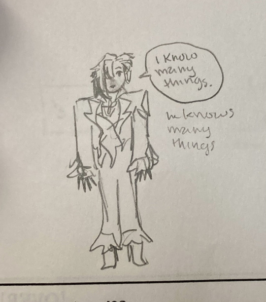
#lila art#genshin#clorinde#shenhe#kokomi#not tagging arlecchino because that does Not count as an arlecchino drawing LMFAO#He Knows Many Things.#dunmeshi#falin touden#laios touden#sorry that that siblings drawing is so blurry im too lazy to retake it#it has the lyrics to the siblings song below it bc i got it stuck in my head while drawing them#siblings! siblings! siblings! siblings! this is my sister! this is my brother! we are siblings and we care for each other! what we have! we#always share! cuz we are siblings and we have the same hair!!! dun dundun dun dun dun dun dun dundundundundun dun dun dundundun#im actually. rlly proud of those falin drawings on top#and also the clorinde one but i just drew that an hr ago so im probably going to come back to it tmrw and realize its super wonky but wtv#also the kokomi was a request from twt!!!!!#i have. a lot of those to do still#i will do them at some point i just dont have free time a lot#this is the first time ive had to draw in like two weeks i think#and my friends birthday passed and i promised to draw him hkvh so thats my priority#the clorinde was just supposed to be a warmuo#except he called me while i was drawing and we ended up playing sdv#so it was a warmup to nothing#anyway i had fun and i need to go to bed now bye#ALSO i forgot to mention that those shenhe perspectives are meant to look ugly i was trying to draw those perspectives from memory#because i was. in class.#the top down perspective is kindof cute tbh but the Other One.#its ok i love making my faves look dumb and uncomfortable on purpose
44 notes
·
View notes
Text
i am actually so tired of the way westerners treat eastern europeans
#fair warning for. a very very long ramble and rant in the tags. apologies#westerner or russian. no other option#westerner because the only thought they ever have is 'but they had universal housing so if you oppose ussr you oppose that'#(which is stupid becuse you can believe in that WITHOUT WANTING LIKE 6 COUNTRIES TO BE FORCED TO BE RULED OVER BY RUSSIA)#(SORRY FOR WANTING TO LIVE IN MY COUNTRY WITH MY HISTORY AND MY CULTURE AND NOT RUSSIA!!) (poland was a sattelite state but GOD)#or russian because they have a victim complex and are convinced that they deserve to rule over the entire damn world#'well you had universal housing so you had it easy' right yeah. okay. forget about like. everything else that happened#to eastern europeans during that time#forget about the things that are STILL issues all these years later not only in poland but like the more eastern countries too#its not about. the fact that the houses 'didnt have 3 bedrooms and a jacuzzi' in them. you DUMB SACK OF SHIT#god sorry. sorry. i also know so very little but like god damn i fucking live here. i didnt sit thru all that modern history#for some dumbfuck to say that 'ohhh only rich and american middle class people are happy the ussr was dissolved'#'oooh the dissolving of the ussr was illegal and the countries within it actually liked being there'#im just so fucking tired man i need to. i need to start killing people#and this is all not to mention that theyll say this stupid shit and then deny eastern europeans the things they actually did that were good#FUCK french people for trying to claim maria skłodowska. fuck americans for trying to claim the witcher as their own fantasy world#fuck the way the west is allowed to claim and destroy eastern european culture without any consequence because we dont matter enough#vaguely related but ill throw this in here since anyone finding it is unlikely and im scared of having this opinion#i think one underappreciated aspect of DE (which might be underappreciated because its not actually there and im stupid)#is that its pro-communist while still also giving some criticism to how it was handled and acknowledging that its still not perfect#which makes the writers much better communists than any self-proclaimed one ive ever met in my life who just worships the idea#perhaps its because the writers of the game were not white upper middle-class americans living in the suburbs. among other things#idk de is a game for people far smarter than me and i only played it once and im sure anyone who played it well can clock me as a bad perso#horrible horrible person even which is why im scared of mentioning it. but its an interesting thing. to me#the main thing is that im just not. im not far left enough i suppose. i agree communism in theory is a great idea. as far as i know it#(which isnt very far)#but chances of implementing it correctly in a way that doesnt take away from peoples happiness in other areas is. low. very low#i wrote a short essay about how utopias are inherently contradictory ideas once it wasnt very deep or good but like#you cant have universal happiness without restricting certain freedoms. and when those freedoms are resticted not everyone#will be happy. and then theyre unhappy they will have to be somehow removed or ignored
13 notes
·
View notes
Text
Tangentially related to some of the discussion i posted earlier but quiet literally the first RW Art Month i participated I did it completely on whim like, one day before it started. And I mostly did it because I hadn't drawn a ton of rain world and wanted to draw more. Fandom presence was a lot smaller than and I was one of a handful of artists who did the entire thing. Fast forward and I still do Art Month and I've gotten to work with VC directly.
But it was quite literally something I decided to do completely on whim that set the ball rolling, and for something a lil more niche and certainly with a lot more dev/fandom art involvement than most. It's really random how and why you might get noticed more than usual, especially with the "toss it into the search and hope it pays out' mechanism of Socmed
#t.extpost#and im hardly the fanciest art month artist out there so it wasnt even about being a jaw droppingly talented artist or whatever#and while artmonth for rw is still given a huge focus its also a much much bigger thing now with a much bigger number of participants#which is cool! its awesome how many people i saw do most if not all of last art month! and VC is really good about not just repping the#most popular artists or fanciest pieces#but theres So Much More there now and while its great for finding artists its also impossible to get Everyone in there you know?#Although they absolutely try#And this is like. one of the most fanartist involved devs ive ever seen in terms of both celebrating the art their fans make and actively#bringing those fans in to contribute#and its /still/ hard to get going just because thats how Posting is#i used to be more of a hk artist which is both a huge fandom and riddled with stunning artists but theres So Many#and niche fandoms are niche so youre more likely to connect with people but less likely to see a ton of engagement regularly -#probably best example i have for that was being briefly fixated on patapon.#Its just messy to try and find the hack that sets you up#just have fun and jump around and make what you like#get a sense of feeling for your style and some people will stick around for that vs. strictly the subject matter#others will look up the thing you switched too and some wont engage#you cant really control it#so have fun and draw that thing you randomly thought about at 2 am that doesnt match your blog#draw for that forgotten rpg you liked when you were 15 or draw for the 70 player max steam game you played for this week#you never really know what will happen#but its not really worth worrying about what will happen either
38 notes
·
View notes
Note
If you had to give Garth a new friend group who would it be?
that's rough.....
because honestly part of his charm is that he's extremely maidenless... well not maidenless he Is pulling hot babes left and right but friends?? ooh boy,,,
i wouldn't want to take away the fab five from him, despite how poorly they treat him at times. However, i do think it would've been really cool to see him with the new teen titans! i completely understand why he wasn't with them at that point, like i get it. but just from a character relations perspective, i do think this would've been a natural next step if he wasn't so self-deprecating (and busy in atlantis). dick and donna were consistently the nicest to him out of the fab five so he gets to keep some of that previous dynamic. wally is also there but,, roy isn't!!! no offense to roy i like him on his own but he was a big reason why garth left in the first place so. yknow.
but anyway, garth does have good relationships with kori, garfield, and victor. and i guess raven too but we don't really see that,, like ever. he's obviously not close to them, but they're not mean to him. which is a big thing for garth! kori seems to hold him in high regard too, at least after he becomes tempest, so it would've been nice to see their relationship actually progress to the point where she trusts him like that. like in the titans (1999) issue 19 where she says she trusts him with her life. like. what the fuck!! there are also multiple issues where garth and garfield have a little friendship going on (that one panel where garfield yells at arthur gives me so much life adghlj). and there are a few cute moments between garth and victor.
i really don't think he'd become like,, besties or family with any of them, but if i really had to give him More friends, i think they would've been the safest bet.
within the confines of underwater,,, letifos Should come back. idc if they're dating or not, but she should just always be there. for Me, personally <3 i think it'd be hilarious if tula and dolphin also came back at the same time. it'd never happen but who cares. the four of them can be in some weird polycule together aldhg
my second hot take is that garth and koryak should've become besties
#that one issue is so good like not only did she just Say that but this was an entire war between her people and some other aliens#like thats huge!! and we should get to see them interact more!!#or the titans issue 14.. they were so cute in that one!#answered#if youre asking for like entirely new people i dont know what to say tbh...#ive pondered the idea of him having some magic friends but im not sure how that would play out#but anyway garth and koryak should talk shit about arthur right behind his back perfectly in earshot#and he should be so exasperated but deal with it because those are his sons and what else can he do#and he's too tired to punch both of them#aldhglj
7 notes
·
View notes
Text
i dont think i ever felt more annoyed at commercials than when those mean girls walmart ads were playing a few months ago or whenever that was
#i think it's mostly bc i thought mean girls was like. an okay movie. a fine movie? i think i liked it#but like. i saw it once. i have no nostalgia for it bc i saw it way later/not when it originally came out#and god the way people are so into it. i mean that is great like i dont wanna be a hater for people enjoying things#but me personally. i do not understand why it's a cult classic or whatever klsjfkdlsfj i hear people quote it all the time and im like. 🧍#so having those quotes i already dont care about re contextualized to try to sell me walmart. god. the worst experience jkfsdjfklJFDKLSJF#tbh maybe it woudlve been worse if i liked the movie but i saw comments saying those commercials were funny so WHATEVER#i feel like it's also the same w/like. vocaloid kfsjdflksjgh like i dont dislike it!! i enjoy some songs#but i never had a vocaloid phase when i was younger. i feel so very neutral about miku#ppl on the internet feel so strongly positive and again thats great and i objectively get it#ive been shown vocaloid songs and some are really catchy#but it is one of those instances where im like man. a level of hype i dont fully understand LOL#miku vocaloid stuff is at least endearing tho. i get.... tired... w/mean girls quotes......... ksljfsljfl#It's Always The Same Ones and i just dont think theyre very funny FKJLDSJFDKLSJF maybe i am a hater damn#jk i do think i liked the movie? god i dont remember i watched it like. i dont even know when. college at the earliest i think#but whatever thats just a case of people having different interests just cuz i didnt care about a thing doesnt man its bad other ppl like i#also tho i think bc the mean girls overquoted bits remind me of like. rae dunn ceramics LOL jkfskfjsekht#or like idk live laugh love stuff. yknow like. dont talk to me until ive had my coffee has same energy as on wednesdays we wear pink. to me#it's facebook wine mom humor.... bc it is people roughly my age that were/are really into it and they are now mom age i guess lwpfhewhfp#god i need to go to bed im tired and it's making me a cranky complainer about stuff that doesnt matter!!!!#went 2 my dash in a dif tab and immediately saw a miku post is she gonna get me for not having strong feelings about her#im sorry miku i just . i dont get it JKFLJDSKLFJKSLD#ur music is fun i just dont proportionately understand. i feel like im missing context w/this one girl maybe thats my bad idk#or maybe it's just i found u too late idk. i will jam to the bops tho#that endless/everlasting/whatever nights thing w/like the 4 alt storyline songs is soooo fun i love those#dont ask me the names of the ppl in them tho i dont fuckin know besides like. 3 of them. one is miku LOL#and those yellow twin kids. len and ren. or rin? len and rin? i dont remember and i dont care enough to look it up sorry small children#theres that blue haired guy that was in the one prsk route i played but i forgot his name again#i dont know if hes in those songs i was talkin about tho i only remember what he looks like in his youthful wonderland alt loll#i talk in the tags bc i get scared it feels safe in my burrow here underground#also im calling mean girls mid and saying i dont have miku hype so i feel like that does warrant going into hiding
2 notes
·
View notes
Text
"ohh this sonic game copied this mario game" "this sonic game copied this zelda game" Shut up super mario odyssey is literally just sonic unleashed in a different font
#i Like mario odyssey btw and im not saying nintendo copied sonic unleashed#but my point is sonic isnt the only big series that just. happpens to sometimes use ideas that other games have done too#so i dont get why sonic is the only one getting hate for ''copying'' or whatever#also im not really much of a zelda person so idk what happens in those games story wise#but when i see people say that sonic unleashed is a twilight princess copy or that sonic frontiers is a breath of the wild copy#im just like. do you guys seriously think nintendo invented werewolves and running around in big grassy fields. because they didnt#again ive only played a couple of the earlier zelda games so idk what happens in those#but people saying sonic is copying zelda based on the werehog existing and the opem zone stuff alone. its so.#also ive seen people say that sonic lost world is a mario galaxy clone but i dont remember enough about either of those games#to confirm or deny#but i think some people only say that because of the bright colors and the planet stuff .#ACTUALLY i remember seeing a list of reasons that sonic lost world is a mario galaxy ripoff#and one of their reasons was just ''theres a desert/beach level'' LMFAO. sonic had done desert and beach levels way before then
22 notes
·
View notes
Text
Man....I hate having a job.
#Like I really hate it#Or maybe I just hate my job#But yeah not a fan#On the one hand : I have money; I'm independant; I got some cool coworkers and nice customers#On the other I have way way way way way less time for myself; i constantly feel too tired to do things I enjoy#and I have to deal with shitty coworkers and shitty customers#also like; been at this job for two years and it's been a constant mess#and we're understaffed as fuck right now#Wanna leave so bad but can't find another job#sorry sorry i just felt like ranting#but yeah god i hate it#I wanna be able to live free and independant while still not having to work every day of my life godamnit#I wanna do stuff!!! I wanna go out and see friends!! I wanna go to the pool !! I want to bicycle! I wanna play video games!! I wanna draw!!#Literally had an ''interview''' with my boss and while she is nice and definitely better than the shitty boss from 6 months ago#she gently reproached me to ''only work for money'' LIKE??? MA'AM YES#WHY ELSE WOULD I BE WORKING#YOU GUYS ARE PART OF A MULTI NATIONAL OF HOTELS WHO HAVE MORE THAN ENOUGH MONEY TO HAVE MORE EMPLOYEES#YET INSIST ON UNDERSTAFFING TO SAVE MONEY#ALSO IVE BEEN HERE 2 YEARS#AND HAD 4 DIFFERENT BOSS IN THOSE 2 YEARS#ONE NEW BOSS EVERY SIX MONTHS#WHY WOULD I FEEL MOTIVATED#AAAAAAAAAAAAAAAAAAAAAAAAAAAAAAAAAAAAAAAAAAAAAAAAAAAAAAAAAAAAAAAAAAAAAAAAAAAAAAAAAAAAAAAAAAAAAAAAAAAAAAAAAAAAAAAAAAAAAA#okay im done
4 notes
·
View notes
Text
Watching a video essay on equestria girls dolls atm and man i want a trixie doll so badly
#they never did release a pony figure of trixie did they... or maybe they did but iirc she had more equestria girls dolls than pony ones#the one w the fancy outfit she wears near end of the movie is so gorgeous ough#and also her other rainbow rocks one...#man when i was younger i used to stare for hours at the amazon listings for the eqg dolls and never manage to work up the courage#to ask my parents to order them for me#im wondering how much these sell for secondhand these days... im not a doll collector so i wont get em if theyre sought after#but. man. i hope they aren't. i want to make younger me happy#actually now that i think abt it. i do have a set of rainbow and sci twi dolls from i think the friendship games era#they had like the lil medal thingis you could scan for the mobile game...#im kinda sad they almost never updated it i used to play it constantly#i also have minis of applejack and rainbow dash. they're really cute but very much top heavy and one of ajs legs broke off :((#but other than that they were pretty nice. im glad they gave they had later ones come with stands they really needed those#anyway. nostalgia moment. im gonna try to find some of the dolls ive wanted secondhand someday and just. hope they're not too sought after#roseflower.txt
2 notes
·
View notes
Text
I'm staring to think that my phone is just anti-me at this point. Is it the name ya dipshit? Do you not like the name Puffy? Or did you decide to embody that and just wanna puff outta existence?
I've had 3 phones before this. All samsung phones, unfortunately can't remember their models but 2 are dead (they're very old tbf cant get em to start up anymore. in fact i dont remember where i put their corpses at but theyre in a box) Named em Pinkie and Polka.
1 is still alive and kicking, older than the current piece of shit that I have and yet it's alive, well, and functional with barely no problems, didn't even had to send it to repairs that one (it's currently my mom's phone now) Named that one Pearl.
And ofc my current one is giving me the most problems. The problem child of the family, I'll be introducing my phones and just, these are my children, Pinkie, Polka, and Pearl. And this is their sibling, Puffy. I'd disown Puffy if I could, but alas, I'm too broke to buy a new phone.
#aria rants#also lemme just say the older models are so much better#ive accidentally dropped pinkie and polka so much back then and yet they lived#with barely any scratch on their screens THAT DOESNT EVEN HAVE TEMPERED GLASS#pearl had a strange position of being a new model at that time (it has built-in battery) but its an old model now#and like the thing bout me is im a bit of a heavy-ish gamer#couldnt game that much on polka cuz its too weak to handle the games i wanted#but pearl managed to handle some of those so i played a lot on it before being given to my mom#its battery isnt the best now and my mom used to play a lil more on it back then#she only uses it for tiktok and video calls now and i think the years my mom gave it rest healed a bit of its battery#NOW PUFFY... i babied this shit for the first few years id had it#like i was SOOO CAREFUL with it. made sure to not let its battery go past 15%#id game for around 2 hours. let it rest for a bit. continue again#but its battery port broke. and it was sent for repairs. after that i was only semi-careful but i was still careful with it.#BUT THEN ITS SCREEN BROKE#and i was like: ok ya lil shit. im done babying you.#lemme just tell ya that of 4 phones. puffy was the one i babied the most AND IT STILL BROKE MORE THAN THE OTHERS
3 notes
·
View notes
Text
good news: ive chosen a pokemon form for all 8 travelers. bad news: there is an overwhelming amount of grass types among them for some godforsaken reason
#ITS NOT MY FAULT I SWEAR .#Therions base form is a Floragato bc thats the reason i started this whole thing (it reminded me of him)#H'aanit is a Decidueye bc thats the most fitting one for her#Primroses base form is Hisuian Lilligant bc. Yeah#and Alphyn is a Bayleef but honestly theres a number of pokemon he could be. BUT THEYD ALL BE GRASS TYPES#4 of them!!!!!! are grass!!!!!!! theres 8 total!!!!!!! half of the entire team are grass types!!!!!!!!!#thats like the only type anyone has in common too. except for ghost theres 2 of those but thats nothing compared to 4#it bothers me Souch but ive made my decisions already. made the bed now im laying in it. but mildly frustrated#welp. onto all 170+ side characters or whatever#after checking that list theres a few who arent actually important enough to warrant giving a pokemon form for the pmd au but#theres still A Lot#its cool tho i love making pokemon sets. genuinely one of my favorite passtimes its why i keep doing this to myself#hm. thinking back i could technically alter Therions typing bc he is a hybrid of several cat pkmn (Floragato + Espurr line n Purrloin line)#so he could be like. pure dark. or psychic dark but i dont rly see him being a psychic type#im aware Floragato isnt even dark type but since Meowscarada is and the Purrloin line is i have him set as Dark/Grass rn#so yknow.#but he does still benefit from the Grass type in some ways both thematically and w his moveset..#tho ig his base form is Floragato regardless so it doesnt matter much w his moveset. dont have to change that#hes the only one i could even change bc the other 3 im just. too adamant abt and they arent hybrids so i cant play around w types n stuff#ftr the other 4 are Tressa as an Eevee. Olberic as a Corviknight. Ophilia as an Alolan Vulpix. n Cyrus as a Mismagius#i think theyre neat. and hilariously different in size#ive also got Erhardt as a Ceruledge :] very fitting.. perhaps with the colors of Armarouge would be more fitting..#trying to come up w excuses for why everyone is relatively the same color palette as canon is. both hard n surprisingly easy#the only one im still not sold on in that regard is Cyrus.. what could make a black n gold Mismagius..#hm. i need to sleep actually#so yeah this is what ive been doing 👍
2 notes
·
View notes
Text
no pls it's literally so embarrassing to explain like no im not christian no no im just a gen z who accidentally got influenced by instagram fashion trend im so sorryyy
#like. whatever it makes me feel hot lmao i like this fashion trend thing#once this aunty asked me why im wearing just One dangly cross earring nd i was in hell that time#a) fashion b) i broke the other pair its fun to play with the cross 😮💨#i want a new pair i also did not shop 4 winter clothes this year#so im kinda excited to go this particular sector market nd get those really sexy oversized sweater/vests omg#ive been eyeing some online but eh too overpriced#but i do have that black white diamond pattern sweater similar to that of what key wore for shinee's dont call me promotions in my mind#ah im itching to buy pretty sweaters#life update
5 notes
·
View notes
Text
I've been passively watching an isat playthrough while twiddling my thumbs in my current oni save as I wait for my new power systems to be done and hey guys. I think one of these bitches is aromantic. Why did no one tell me one of these bitches is aromantic I would have played the game myself if I knew that
#rat rambles#ok tbf I still theoretically Could but I dont think Id survive playing through the like first 6 hours of the stuff Ive already seen#anyways current review is that it's rly well written so far and I like how well the worldbuilding is implemented naturally in the dialogue#having odile be a presumably anthropologist or smth along those lines does wonders for this ofc but even with that its amazing how#natural the party feels when discussing their different cultures#and ofc I am staring at mirabelle hard. this game is clearly not shying away in the slightest from queer topics so. blinks oh so sweetly#I am sooooo fucking desperate for canonically aro characters who are actually written to be aro if she talks abt it at all I Will cry#honestly real con of this is that its making me conceptualize an eternal gales au which is not what I should be thinking abt this early#also its a problem because Im pretty dead set on the idea that aris would be sif and that means tali is off limits#which is unfortunate because I think itd be funny to make her mirabelle on the sole basis of her maybe being aro#otherwise the assignments are pretty easy even if some of them would be looser fits than others based on my current knowledge#mase would be odile fydd would be bonnie and sier would be iz#for mira Im thinking if I wanted to get funky with it then maybe bloom? it doesnt effect sier too much since I can just make it so his mom#was the one frozen in time or smth#now bloom is rly only in the running because of the leftover human kids shes somehow the best choice despite being 9 years old lol#dodie is off the table since I try to practice restraint when using dodie in aus#and the snake triplets are well. the snake triplets.#they have about a billion things that makes them hard to fit into any au#now I could use a stalien instead but thats a Really hard choice for me to make given the rest of the selected cast#plus none of them actually fit that much better than bloom would tbh?#like to be clear basically the only thing keeping bloom from being an easy pick is that shes 9#like I could just do it anyways but I should probably wait a lil bit to make sure mira doesnt pull out some crazy shit to change my mind#based on what I do know the only one thats rly a bit of a stretch is sier but Im ok with that I can just slap a different character arc in#rly most fucked up thing abt this cast is that aris our sif is second tallest#which feels deeply wrong to me especially once you consider the hat#her siouette is going to be all fucked up and different from sif's shes going to be so big compared to them#shes not even That tall shes like 5'8 thats just tall compared to most of her companions#in canon shes the third tallest of the friend group and second tallest not counting dodie#so its mase then her and in this hypothetical au the rest of the garden gnome squad#sier is 5'1 fydd is 5 flat and bloom is 4'9 if Im remembering correctly
0 notes
Text
Will never forget being a kid and telling someone i was south african only to have them ask:
"Did you have clothes in africa?"
"Had you ever had a bath before coming to Australia?"
"Did you live in a house with walls and bricks?"
Like. Yeah, I guess we were 8... But also i feel like a lot of people's understanding of "Africa" has never really progressed past that point.
#its why i get so like... tetchy about generalisations regarding africa#like. its one thing if people are like. have you ever seen a lion in the wild. cos like. for aussies you do just see the wildlife loose#but some people 100% uncritically view africa as a backwater with everyone living in tribal societies#like we dont have skyscrapers too#like the poorest countries in the world have high rises and skyscrapers...#like yeah there is abject poverty too. and its poor person poverty not white person poverty. like poverty poverty#but that doesnt mean that the people arent.... human...?? yknow?#idk ive just dealt with a lot of very dehumanising attitudes#also im white so i had a very priveliged upbringing but when kids asked those questions i was IMMEDIATELY intimately aware that they saw me#as lesser#i wasnt a peer to them. i was beneath them. i probably hunted my own food and didnt know what a supermarket was#but yeah. being “from africa” brings interesting baggage i tell ya#lets just say that your parents playing the “kids starving in africa” card is *a lot* more effective#esp in my case bc my family was very poor in ZAR and food was always a bit of a touchy subject#when ur parents are skipping meals so you can eat and you have the misfortune of being a bit fussy... yeah...#yeah. you dont really get to have sensory issues with food. like my parents relented and let me skip peas and corn bc they would make me#have astronomical meltdowns. but like. other foods i had problems with too but they were 6/10 bad instead of 10/10 bad#so i just had to learn to eat them anyway and mask my emotional reactions.#im still trying to unlearn this. i still feel so guilty when i struggle with a texture and leave food on my plate.#and im still learning to be okay with having certain foods be like absolute no-go's without feeling foolish or childish about it#didnt even realise i had the coriander soap gene at first cos i am not unfamiliar with eating things even if my body says NOOO#anyway. long tangent. but the whole “you could be living in poverty right now” thing instead is... its like the parent nuke#i remember i got so offended once when my friend said that he hated being Australian and complained about what was bad with it#and like. he had points. Australias not perfect. but i have Immigrant Baggage and so complaining about Australia is also like...#idk like. i could be living in south africa. im pretty stoked to be here..#so my brain cant be normal about it. and im also paranoid about people thinking im a bad immigrant for having problems with Australia etc
1 note
·
View note
Text
everyone at work this morning was telling the head manager their problems with swiftie manager bc she wasnt here today 💀💀💀💀 she was 12 minutes late yesterday with her big ass starbucks drink! and didnt turn on the deep fryer for me so i was also 15 minutes behind even tho i come in half an hour after them. so we were allll behind bc she wanted her pink drink
and the opening cashier this morning was only on the prep team for like a week bc she doesnt like working with swiftie manager and she told the head manager that lol. the prep team is always needing more people bc people dont like working with her, we just lost another girl bc they got in a verbal fight(which i saw the beginning of, manager was being a massive bitch and i say that as a bitch myself. that was bitch behavior and she deserved to get cussed out). like they asked ME if i wanted to be on prep even though finding someone to take my job is hard bc no one likes it but me
and that cashier told me the other day that everyone knows about the whole situation with me getting written up, and everyone thinks it was dumb. so i think everyone at work aside from like two girls dont like that manager 💀 GOOD!! SHE SUCKS!! i literally have not liked her since i got hired last july, and i didnt start working with her until i became a cook in october. so im glad people are doing something about how fed up they are with her, and i think part of that was from me talking to our boss about her trying to write me up(this was like a week before she wrote me up). she doesnt have a ton of power over us bc shes just a prep manager which is a step under being an actual manager. but she uses every ounce of what power shes got to get people she doesnt like in trouble so that she can have her perfect little job. and its fucking with the rest of us. so idk what will come of today but i hope something changes, bc none of us can stand her anymore
#ive started making fun of her tswift songs too bc that 1830s without the racists line is so fucking awful#i laugh every time. im gonna start escalating it lol. 'without all the racists except her boyfriends'#and i have a timer that i leave beeping for a while if shes got one of those songs on. if we have to suffer then so does she#like literally one other person on the team likes that music and shes rarely there. so im doing community service ig#anything to get her to maybe play some good music. although ive had to listen to a bunch of her playlists bc she doesnt let anyone else use#the speaker. and her music taste is atrocious...i listen to a lot of different music and i will admit i do like some weird unappealing stuf#but like she exclusively listens to the most mid radio music from 2006-2015. it blows my mind that none of her music exists outside of that#except for the swift albums that come out every six months of course#i just. i dont like that manager at all and i never have and it doesnt surprise me that im older than her bc she acts like a high schooler#like our 19 year old manager in the same position as her is so much better#i dont get it. but she sucks and i hope the constant complaints finally make her treat us like people instead of side characters
0 notes
Text
My Favorite Cheap Art Trick: Gradient Maps and Blending Modes
i get questions on occasion regarding my coloring process, so i thought i would do a bit of a write up on my "secret technique." i don't think it really is that much of a secret, but i hope it can be helpful to someone. to that end:

this is one of my favorite tags ive ever gotten on my art. i think of it often. the pieces in question are all monochrome - sort of.

the left version is the final version, the right version is technically the original. in the final version, to me, the blues are pretty stark, while the greens and magentas are less so. there is some color theory thing going on here that i dont have a good cerebral understanding of and i wont pretend otherwise. i think i watched a youtube video on it once but it went in one ear and out the other. i just pick whatever colors look nicest based on whatever vibe im going for.

this one is more subtle, i think. can you tell the difference? there's nothing wrong with 100% greyscale art, but i like the depth that adding just a hint of color can bring.
i'll note that the examples i'll be using in this post all began as purely greyscale, but this is a process i use for just about every piece of art i make, including the full color ones. i'll use the recent mithrun art i made to demonstrate. additionally, i use clip studio paint, but the general concept should be transferable to other art programs.


for fun let's just start with Making The Picture. i've been thinking of making this writeup for a while and had it in mind while drawing this piece. beyond that, i didn't really have much of a plan for this outside of "mithrun looks down and hair goes woosh." i also really like all of the vertical lines in the canary uniform so i wanted to include those too but like. gone a little hog wild. that is the extent of my "concept." i do not remember why i had the thought of integrating a shattered mirror type of theme. i think i wanted to distract a bit from the awkward pose and cover it up some LOL but anyway. this lack of planning or thought will come into play later.
note 1: the textured marker brush i specifically use is the "bordered light marker" from daub. it is one of my favorite brushes in the history of forever and the daub mega brush pack is one of the best purchases ive ever made. highly recommend!!!
note 2: "what do you mean by exclusion and difference?" they are layer blending modes and not important to the overall lesson of this post but for transparency i wanted to say how i got these "effects." anyway!
with the background figured out, this is the point at which i generally merge all of my layers, duplicate said merged layer, and Then i begin experimenting with gradient maps. what are gradient maps?
the basic gist is that gradient maps replace the colors of an image based on their value.

so, with this particular gradient map, black will be replaced with that orangey red tone, white will be replaced with the seafoamy green tone, etc. this particular gradient map i'm using as an example is very bright and saturated, but the colors can be literally anything.

these two sets are the ones i use most. they can be downloaded for free here and here if you have csp. there are many gradient map sets out there. and you can make your own!
you can apply a gradient map directly onto a specific layer in csp by going to edit>tonal correction>gradient map. to apply one indirectly, you can use a correction layer through layer>new correction layer>gradient map. honestly, correction layers are probably the better way to go, because you can adjust your gradient map whenever you want after creating the layer, whereas if you directly apply a gradient map to a layer thats like. it. it's done. if you want to make changes to the applied gradient map, you have to undo it and then reapply it. i don't use correction layers because i am old and stuck in my ways, but it's good to know what your options are.

this is what a correction layer looks like. it sits on top and applies the gradient map to the layers underneath it, so you can also change the layers beneath however and whenever you want. you can adjust the gradient map by double clicking the layer. there are also correction layers for tone curves, brightness/contrast, etc. many such useful things in this program.
let's see how mithrun looks when we apply that first gradient map we looked at.

gadzooks. apologies for eyestrain. we have turned mithrun into a neon hellscape, which might work for some pieces, but not this one. we can fix that by changing the layer blending mode, aka this laundry list of words:

some of them are self explanatory, like darken and lighten, while some of them i genuinely don't understand how they are meant to work and couldn't explain them to you, even if i do use them. i'm sure someone out there has written out an explanation for each and every one of them, but i've learned primarily by clicking on them to see what they do.
for the topic of this post, the blending mode of interest is soft light. so let's take hotline miamithrun and change the layer blending mode to soft light.

here it is at 100% opacity. this is the point at which i'd like to explain why i like using textured brushes so much - it makes it very easy to get subtle color variation when i use this Secret Technique. look at the striation in the upper right background! so tasty. however, to me, these colors are still a bit "much." so let's lower the opacity.

i think thats a lot nicer to look at, personally, but i dont really like these colors together. how about we try some other ones?

i like both of these a lot more. the palettes give the piece different vibes, at which point i have to ask myself: What Are The Vibes, Actually? well, to be honest i didn't really have a great answer because again, i didn't plan this out very much at all. however. i knew in my heart that there was too much color contrast going on and it was detracting from the two other contrasts in here: the light and dark values and the sharp and soft shapes. i wanted mithrun's head to be the main focal point. for a different illustration, colors like this might work great, but this is not that hypothetical illustration, so let's bring the opacity down again.

yippee!! that's getting closer to what my heart wants. for fun, let's see what this looks like if we change the blending mode to color.

i do like how these look but in the end they do not align with my heart. oh well. fun to experiment with though! good to keep in mind for a different piece, maybe! i often change blending modes just to see what happens, and sometimes it works, sometimes it doesn't. i very much cannot stress enough that much of my artistic process is clicking buttons i only sort of understand. for fun.
i ended up choosing the gradient map on the right because i liked that it was close to the actual canary uniform colors (sorta). it's at an even lower opacity though because there was Still too much color for my dear heart.

the actual process for this looks like me setting my merged layer to soft light at around 20% opacity and then clicking every single gradient map in my collection and seeing which one Works. sometimes i will do this multiple times and have multiple soft light and/or color layers combined.
typically at this point i merge everything again and do minor contrast adjustments using tone curves, which is another tool i find very fun to play around with. then for this piece in particular i did some finishing touches and decided that the white border was distracting so i cropped it. and then it's done!!! yay!!!!!
this process is a very simple and "fast" way to add more depth and visual interest to a piece without being overbearing. well, it's fast if you aren't indecisive like me, or if you are better at planning.

let's do another comparison. personally i feel that the hint of color on the left version makes mithrun look just a bit more unwell (this is a positive thing) and it makes the contrast on his arm a lot more pleasing to look at. someone who understands color theory better than i do might have more to say on the specifics, but that's honestly all i got.

just dont look at my layers too hard. ok?
2K notes
·
View notes
Last Seen Blogs
owl-house-incorrectly
Owl-house-incorrectly

ossielv
Ossiel V

princess-peach-aesthetics
Welcome To My Aesthetic Blog!

zooycbo-blog
Untitled

chicokfc
chico