#and then opening all the image links in there in new tabs to see what they were until i found the one i wanted
Text
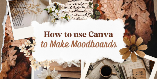
—HOW TO USE CANVA TO MAKE MOODBOARDS

I got a kind message asking how I make moodboards in Canva, so I wanted to do a little tutorial! Canva is a free graphic design app/website, and I use it for everything.
To start - open the app/page and use the search bar at the top to search for a template. I usually use: photo collage, scrapbook, aesthetic moodboard - all of these will pull up pre-made templates for you to use.
[I have a couple linked below that I’ve used and liked, or have bookmarked to try:]
one | two | three | four | five | six | seven | eight
Anything with a crown is for Canva Pro members - you used to be able to use the templates as a free member (just not the paid assets) but that changed recently. The linked templates above are all free ones that you can use right away.
PHOTOS:
Once you’re in the template, you can press the + in the bottom corner to bring up the menus. The Elements tab have items you can add in (more on that later) - for now you want to go to Uploads, and add the photos you want to use. I mostly get mine from Pinterest and Google Images.
[If you are writing an x reader fic and are looking for tips for creating an inclusive moodboard, there are some awesome resources here: one | two !]
After that, go back to your template and click on the different photo frames, and use the Replace button in the toolbar - it will let you replace the template photos with your own. Double tap to move and resize your image within the frame, (and there are also filters you can use if you want!)
When working on moodboards, I like to move things around. You can replace the frames they use by clicking on the item and then clicking the Trashcan. Then go back to the + menu, and then Elements, and scroll down to Frames. You can scroll through them all, but my fave keywords to use in the search bar is: polaroid, torn, and ripped.
Once they’re added, you can move them wherever you want. There’s a button on the toolbar that says Position, and you can shift the object forward/back between the items around it.
DETAILS:
Once you add your photos, then comes the details! You can change the background color and add/change the fonts (or upload your fave font to use!) Try out all the tools on the toolbar to see what you can do, there’s a lot of options.
I love love layering with my moodboard, so I will go back to the + / Elements tab, and then search for things to layer in. My fave searches for Graphics recently are: ripped paper, grunge patterns (to use in the background), star patterns, dried flowers, and dried leaves.
You can use the Position tool on them to fit them in-between or in front of your photos. I usually use them to hide harsh edges or in places that look a little empty.
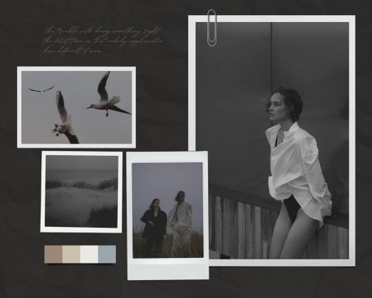
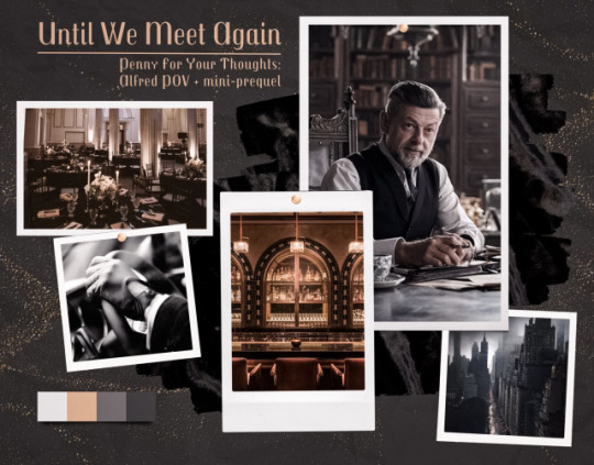
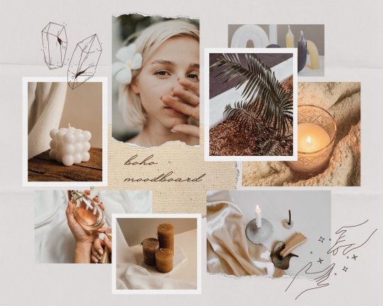
I also like adding fabric texture to the backgrounds, to fill the space between the photo frames. There isn’t an easy way to do this - the best way I figured out is to find an image of the texture you want, and then to add a photo frame with a torn or jagged edge in the very back (and then use your new texture there). You can duplicate and move it, to cover the space (you can see some examples below - the beige flower pattern in the Din one, the black velvet for Alfred).
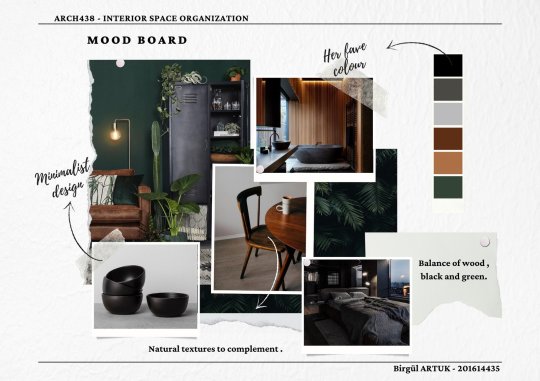
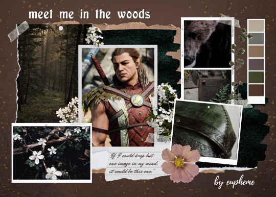
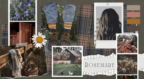
Here are some examples of the original templates, and then what my finished ones look like. You can see what I swapped out, moved, and added:
original image | my moodboard

EDITING:
Once I am happy with the design I download it, and then edit. I love this part - pop it into your fave editing app, and play around with the exposure/contrast/hues/sharpness. I will mess with the color balance & vibrancy as well - this can really take a moodboard I like, to one I love.
Here’s some gifs I made showing before /after editing - both are pretty before but I think the after has an oomph that I really appreciate.

[When you finish with one and want to use the same template, you can click Make a Copy, and it will duplicate it. I began with templates but everything I do now are copies of heavily/edited templates or ones I’ve made from scratch. But for starting off, I think a template is the way to go!]
And that’s it!! I would really suggest just opening it up and seeing what you can do. Not all of mine turn out great, but each time I think I get a better handle on all the different options and what my moodboard style is.
I really hope this helps! And feel free to tag me if you post any you make, I’d love to see them (or drop me an ask if you have any questions!) 💖💕
#please give this a reblog if it was helpful! 💖#and just a note the 4th example is an OC x Character fic moodboard#moodboards#graphics#tutorials#aesthetic moodboard#resources#fic moodboard#fan fic meta#fic writing#writing resources
668 notes
·
View notes
Text
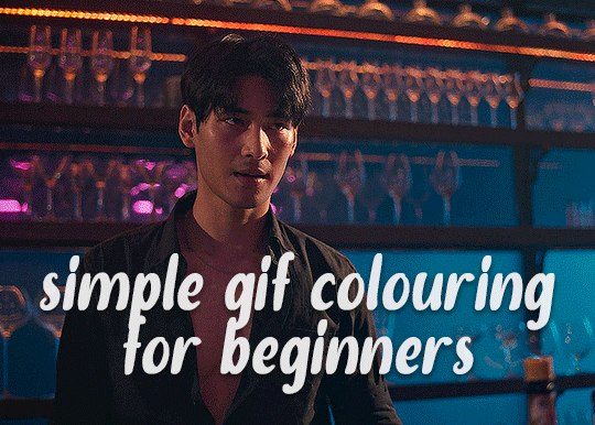
✨ Simple Gif Colouring for Beginners ✨
I wrote up my basic gif colouring process for a friend recently, but a couple of people here mentioned they'd also find it helpful! so, as requested, this is a beginner-friendly walkthrough of the way I colour my gifs :) it's aimed at brand new gif makers with no prior experience with photoshop or photo editing.
when I first started gif making I found colouring and photoshop in general suuuper daunting, so I've tried to simplify everything here as much as possible. hopefully this will be relatively easy to follow and not too intimidating!
a couple of things to begin with:
I'm only talking about colouring here - this is not a full gif making tutorial. I've linked to some of my favourites of those here!
I personally like to make bright, 'clean' looking gifs with vibrant but natural colours, so that is the style of colouring this tutorial is geared towards. most of gif colouring is subjective and about personal taste - the only thing that I'd say is possible to get wrong is skin tones, which I talk about a lot in this guide.
as I mostly gif Thai dramas, most of the advice is geared towards colouring for East Asian/South East Asian skin tones - but the techniques should be fairly universally applicable (and here are some tutorials that talk about gif colouring for other skin tones).
I'm not an expert! I'm not claiming this is the best or the only way to colour gifs - it's just how I do it.
this post is very image-heavy. if the images aren't loading (or the gifs are running slowly or cutting/looping weirdly), then try viewing the post in its own tab (rather than on the your dash or someone's blog) and refreshing the page.
okay, full walkthrough beneath the cut!
contents:
1. intro
a. natural gif colouring goals
b. very very basic colour theory
2. super simple colouring (the essentials)
a. curves
b. selective colour (and skin tone correction)
c. hue/saturation
d. saving and reusing colouring
e. another simple colouring example
3. other adjustment layers
a. brightness/contrast
b. levels
c. vibrance
d. colour balance
e. channel mixer
4. troubleshooting
a. curves
b. saturation
5. fin!
1. intro
the colouring part of gif making can be super overwhelming, especially if (like me when I first started!) you're completely new to photoshop and/or have no experience with colour theory or photo/video editing.
if you're opening photoshop and making gifs for the first time, I highly recommend getting used to making a few basic, uncoloured gifs to begin with. just to practice, rather than post anywhere (though you can always come back and colour them later if you want) - but it'll make the rest of the process much easier if you're already beginning to get used to working in timeline mode of photoshop. give yourself a bit of time to practice and get a feel for things like how many frames you tend to like in a gif, where you like to crop them for the best loop, what kind of aspect ratio you like etc* - so that you're not trying to navigate all of that for the first time on top of everything else!
* frames: for me between 60-90 frames is ideal, but 40-120 frames is the absolute min-max I'd personally use in a normal gifset
loops: for the smoothest loops, try to avoid cutting someone off mid-movement or mid-word if possible.
aspect ratio: for full-size (540px) gifs, I tend to go for either 8:5 (slightly 'skinnier' gifs), 7:5, or 5:4 (particularly big, thick gifs lmao)
✨ natural gif colouring goals
part of what can be so daunting about starting gif making is not knowing where to start or what you want to achieve. this is definitely something that gets easier with practice - the more gifs you make, the more you'll get a feel for what kind of look you like and the more instinctively you'll know how to get there. it also helps to see if any gif makers you like have made "before and after colouring" posts - these can help with getting a sense of the kinds of changes made through gif colouring. here's one I made!
in general, I like to make my gifs bright and 'clean' looking, with vibrant but natural colours. these are the things I'm usually hoping to achieve with colouring:
brighten dark scenes
remove muddy, yellowish lighting or filters
saturate colours
correct any skin lightening filters or overexposure
make lighting and colours as consistent as possible between gifs within a single gifset, especially gifsets featuring gifs from multiple scenes/episodes/videos
this guide is focusing on natural colouring, but of course there are many cool ways to make stylised/unnaturally coloured gifs. imo you'll need to master these basics first, but if you want to learn how to do things like change the background colour of gifs or use gradients or other cool effects, then @usergif's resource directory has loads of super helpful tutorials!
✨ very very basic colour theory
[disclaimer! I don't know shit about fuck. I do not study light or art. this is just an explanation that makes sense to me exclusively for the purposes of gif making.]
the primary colours for light/digital screens are red, blue, and green. having all three colours in equal measures neutralises them (represented by the white section in the middle of the diagram).
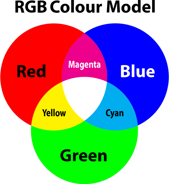
so to neutralise a colour within a gif, you need to add more of the colour(s) that are lacking.
in practice this usually means: the scene you want to gif is very yellow! yellow is made of red and green light, so to neutralise it you need to add more blue into your gif.
it can also mean the reverse: if you desaturate the yellow tones in a gif, it will look much more blue.
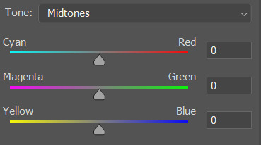
looking at the colour balance sliders on photoshop can make it easier to visualise:
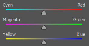
so making a gif more red also means making it less cyan.
removing green from a gif means adding magenta.
taking yellow out of a gif will make it more blue.
tl;dr:
neutralise yellows by adding blue (and vice versa)
neutralise reds by adding cyan (and vice versa)
neutralise green by adding magenta (and vice versa)
2. super simple colouring (the essentials)
starting with a nice sharpened gif in photoshop in timeline mode. (these are the sharpening settings I use!)
some scenes are much harder to colour than others - it helps to start out practising with scenes that are bright/well-lit and that don't have harsh unnaturally coloured lights/filters on. scenes with a lot of brown/orange also tend to be harder.
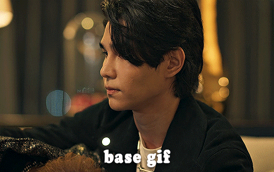
I usually save a base copy of my gif before I start colouring just in case I end up hating it, or find out later that it doesn't quite fit right into a set and need to redo it etc.
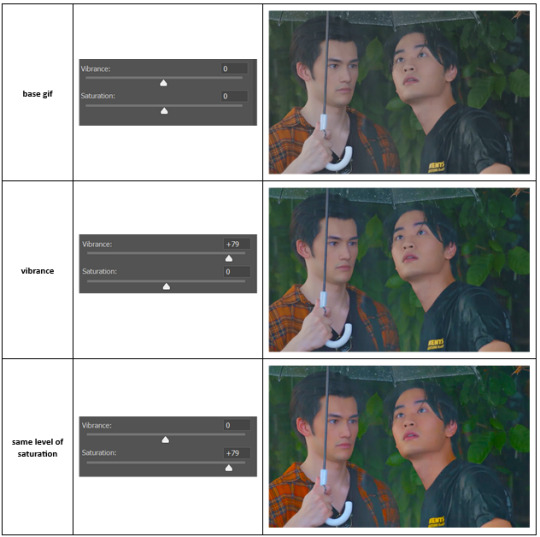
so here is my base gif!

it's an okay gif, but it has a bit of a yellow tint to it that I want to reduce.
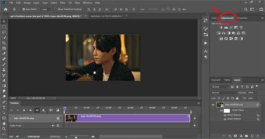
colouring is easiest to do in adjustment layers, which can be found under layer -> new adjustment layer - or for me they are here:
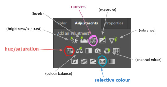
there are lots of different types of adjustment layers that do lots of different things - but for me the absolute essentials for colouring are curves, selective colour, and hue/saturation.
I also use brightness/contrast, levels, exposure, vibrance, colour balance, and channel mixer sometimes, depending on the gif - but I use curves, selective colour, and hue/saturation on every single gif.
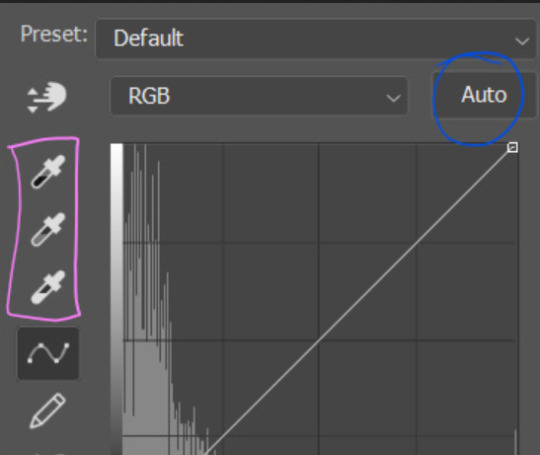
✨ curves layer
the first thing I always do is a curves layer. when you first open one it will look like this:
first I usually click the ‘auto’ button, just to see what happens. sometimes it makes a big difference (it usually brightens the gif a lot) - but on this gif it didn’t do much.
if it had made the gif look nicer then I would have kept it and added a second curves layer on top to do the rest of these steps.
the next step is selecting the white and black points with the little eyedropper tools.
the bottom eyedropper lets you pick a white point for the gif. click somewhere super light on the gif to see what happens - for this gif, I clicked on the lampshade on the left. if it looks weird, I just undo it and try somewhere else - it usually takes a few goes to find something that looks good.
here's what that did to the gif:

then I pick the top eyedropper and use it to pick a black point by clicking somewhere really dark, again playing around until I find a black point that looks good.
here's what the gif looks like after picking the white and black points:

this can take some experimenting, but you can make super easy drastic changes to your gif just with this. in this case, the curves layer took out a lot of that yellowy tint.
and this is what the curves graph looks like now:
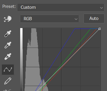
you can click and drag those lines to make further changes if you want - I usually leave them alone though. the colours of the lines indicate which colours have been changed in the gif - for example, you can see from that steep blue line on the graph that blue has been added to neutralise those yellows.
next I usually do another curves layer and just press the ‘auto’ button again to see what happens. usually it brightens the gif a bit more, which I like.
‼️if nothing is working: usually with a bit of fucking about a curves layer works well - but sometimes you can’t find a good white and black point anywhere, and instead your gif turns wacky colours and nothing looks good. this happens more often with very heavily colour tinted scenes :( the troubleshooting section at the end goes over some options, including starting with a levels layer instead.
✨ selective colour (and skin tone correction)
skin tones are made up of a mixture of yellow and red.
removing yellow (or adding blue or red) to a gif will make the skin-tones too red - and removing red (or adding cyan or yellow) to a gif will make the skin-tones too yellow.
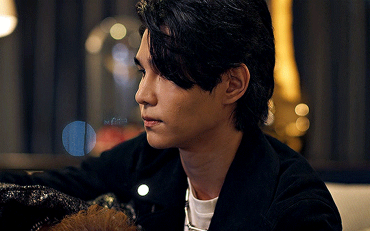
adding blue to this gif with the curves layer took out the yellowy tint, which I wanted - but it also took the yellows out of Kim's skin tone, which I don’t want. so I need to put yellow back into the skin tones specifically - without putting it back into the rest of the gif.
selective colour layers let you select an individual colour and adjust the levels of other colours within that colour. you can change how yellow the green shades are, or how much cyan is in the blues, for example.
I need to add yellow back into the red tones to correct the skin tones on this gif. this is the case for most gifs in my experience - the vast majority of the time, unless a scene is very heavily tinted in another colour, a curves layer will add blue/remove yellow.
in the 'colors' dropdown, select the 'reds' section and drag the 'yellow' slider higher - this will add more yellow into just the red shades within the gif.

the amount of yellow you need to add back into the reds depends on how much yellow was taken out of the gif initially - I just play around with the slider until it looks right. if you're not sure, it helps to have some neutrally-coloured (not white-washed!) reference photos of the people in your gif to compare to.
here's the result. Kim's skin is a lot less pink toned and much more natural looking:
✨ hue/saturation
this adjustment layer lets you adjust the hue and saturation of the gif as a whole, and also of each colour individually.
I don't use the hue or lightness sliders unless I'm trying to do something more complicated with the colouring.
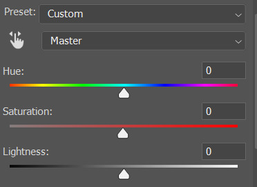
clicking the dropdown menu that says 'master' lets you edit the saturation of each colour individually. this is useful if your gif is still super tinted in one colour.
I thought the yellows on this gif were still slightly too bright, so I switched to the yellow channel and desaturated them slightly. (remember if you do this then you need to go back to selective colour and add more yellow into the red skin tones to balance out the desaturation!)
then I increased the 'master' saturation of all the colours to +5:
I usually find the right amount of saturation is somewhere between +5 and +12, but it depends on the gif.
‼️if the gif feels undersaturated, but the saturation slider isn't helping/is making the colours worse, try a vibrance layer instead.
done!
✨ saving and reusing colouring
you can copy and paste adjustment layers between gifs to make your colouring even across each of your gifs for one scene - so if you're making a set of multiple gifs of the same scene, or you think you might want to gif the same scene again in the future, you can save it as a psd so you can reuse the colouring again later.
each gif's colouring will then still need tweaking - different cameras/angles/shots of the same scene can still start out with slightly different colouring.
I recommend uploading the gifs as a draft post on tumblr so you can see what they all look like next to each other and catch any inconsistencies.
✨ another one! (speedrun!)
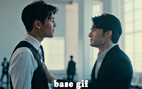
HI KEN!
the white point for the curves layer was in the window behind them.
the curves layer removes the muddy yellow tint, but again it makes their skin tones (especially Ken's) very red toned, which is adjusted by the selective colour layer.
3. other adjustment layers
imo many many gifs can be coloured really nicely with just those three adjustment layers, but some need different adjustments.
✨ brightness/contrast
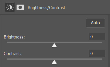
pretty self explanatory!
I personally usually avoid using the 'brightness' slider because I rarely like the effect - I only tend to use the 'contrast' one.
the 'auto' button is sometimes useful though, especially if you’re struggling with the curves layer.
✨ levels

levels alters the white and black points of the gif, like curves - but unlike curves it doesn't also alter other colours.
use the sliders beneath the graph to alter how dark/light the gif is. you can slide the black slider further to the right to make the blacks darker, and the white slider to the left to make the whites lighter.
levels is a good place to start if your curves layer isn't working.
(I'm going to hit the image limit for this post lol so here are some screenshots of a table I made to demonstrate this rather than actual gifs. sorry!)
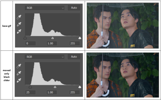

on both sides, I dragged the sliders up to where the big jumps are on the graph - this is usually a good place to start!
✨ vibrance
vibrance... makes the colours more vibrant. it's more subtle than saturation.
it's really helpful for gifs that feel grey. sometimes adjusting saturation just makes the greys kind of weirdly tinted, but a vibrance layer can fix that.
vibrance is much more subtle!
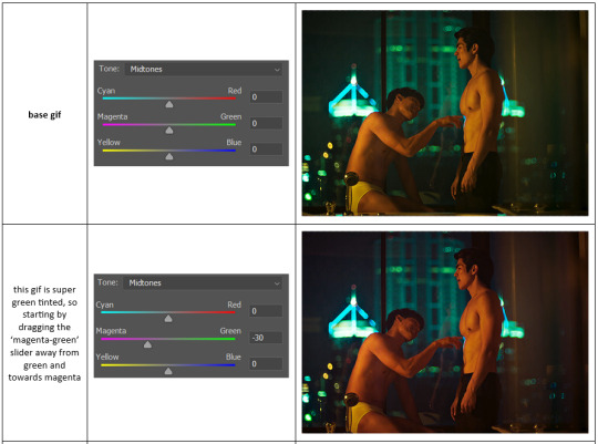
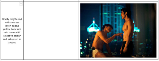
✨ colour balance
colour balance affects the overall balance of colours within a gif.
it's good for scenes with heavy tints.
I tend to stick to the 'midtones' dropdown, but you can also alter the colour balance within the shadows and highlights if you want.

✨ channel mixer
I avoided channel mixer for such a long time because it scared me. but it's great for scenes that are very heavily tinted in one colour.
basically, it works with the levels of red, green, and blue within a gif. you select an output colour and then play around with the levels of the colour you selected within each other colour.
kind of the reverse of selective colour?
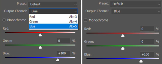
so in the 'blue' channel, the levels of blue are at 100%, and the levels of red and green are at 0% - but you can impact how much blue is in the reds and greens and blues.
this tutorial explains it well - but imo the best way to get to grips with channel mixer is just to play around with it a bit (sorry)
(when I made this guide for my friend, I also made a slightly more complicated gif colouring walk-through that included using channel mixer. there isn't space to include it within this post, but if anyone is interested I could always upload it as an 'intermediate' gif colouring tutorial - lmk!)
4. troubleshooting
‼️curves
usually with a bit of fucking about a curves layer works well - but sometimes you can’t find a good white and black point anywhere, and instead your gif turns wacky colours and nothing looks good. this happens more often with very heavily colour tinted scenes :(
for example, with this base gif:
using many of the brightest points as a white point turn it wacky colours, like this:

yikes :(
some options for these cases:
try brightening the gif first with the 'auto' button on the curves layer or with a levels layer. having a brighter gif to start with can give you better options for picking a white point.
try finding an alternate, whiter/brighter white point. look for places the light reflects - on this gif, using the light on Porsche's cheekbone works well as the white point. it also helps to find places that would be white if the scene wasn't tinted - the lightest part of a white shirt is often a good place to start, for example.
skip the curves layer, and instead use a levels layer to alter your white/black points, and colour balance or channel mixer to balance the colours.
‼️over/undersaturation
if your gif (especially the skintones) is looking a little washed out or lifeless, it might be undersaturated. boost that saturation - or if that's not working, try a vibrance layer.
oversaturation is often easiest to spot in the mouths and ears of any people in a gif. if the mouths are looking unnaturally, vibrantly red, then you've gone too far with the saturation.
5. fin!
and done! I hope this was coherent helpful to somebody.
if there's anything that I've missed or that doesn't make sense pls feel free to shoot me an ask or a message and I'll do my best to help! I've also collated a bunch of additional reading/resources below.
happy gifmaking 🥰
✨ some links!
photoshop basics by @selenapastel
gifmaking for beginners by @hayaosmiyazaki
gifmaking guide for beginners by @saw-x
dreamy's gif tutorial by @scoupsy-remade (includes instructions on how to blur out burned-on subtitles or annoying video graphics)
beginner's guide to channel mixer by @aubrey-plaza
how to fix orange-washed characters by aubrey-plaza
colour correcting and fixing dark scenes by @kylos
does resampling matter? by usergif
how to put multiple gifs on one canvas by @fictionalheroine
watermarking using actions by @wonwooridul
resource directory by @usergif
#i got a couple of asks about this so i figured i'd type it up as a post#it's been sitting in my drafts for a while now though i'm so sorry omg.#i had to replace my laptop and it took me a while to get round to downloading photoshop on the new one#but i hope this is helpful!!#gif making#tutorial#photoshop tutorial#colouring tutorial#coloring tutorial#gif colouring#gif coloring#photoshop resources#gif tutorial#gif resources#userbunn#uservik#darcey.txt#darcey.gif#usergif
316 notes
·
View notes
Text
alright, guess we're complaining now.
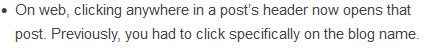

[Image ID: First image: A cropped screenshot of Tumblr's Friday, May 26th, 2023 changelog which reads, "On web, clicking anywhere in a post’s header now opens that post. Previously, you had to click specifically on the blog name."
Second image: A cropped screenshot of Tumblr's Tuesday, May 30th, 2023 changelog which reads, "To clarify a point made in last Friday’s post: on web, clicking the reblogged-from blog name in a reblog’s post header now takes you to that blog, not their reblog. Clicking in the empty space in the post’s header, and in the header of each reblog trail item, now takes you to that specific post in the blog view popup. This is one of a series of updates we’re making to the reblog consumption experience across all platforms, to make it more intuitive and consistent, especially for new users." End ID.]
Tumblr, this change is bad. A lot of other people have already shared their own complaints for this new and awful system, but it's time for me to properly throw my hat in the ring instead of at-ing you directly due to user error. Whoops.
[UPDATE 6/11/2023] HORRIBLE NEWS, EVERYONE! This change has hit mobile. There is no longer any way to access the previous version of a post except through theme reblog chaining on desktop. I've added some extra fun comments both as an edit to this post and as a reblog so nobody misses out.
All my complaints are in the read more because this got LONG.
TL;DR- This change breaks a major signifier used across the site, removes post functionality only to replace it with redundant blog links, and completely destroys a primary mode of social interaction that's been used on Tumblr for over a decade. Here's the Tumblr Staff support link so you can give feedback on how bad this change is.
Part One: Signifiers and Consistency
This is my biggest point, so it will be a bit of a doozy. Strap in.
This change is about making Tumblr operation 'intuitive and consistent' by unifying behavior between like-designed parts of the site. Now on the face that's not a bad reason to do things, and making sure users are able to intuit what a button does based on its properties is good design. I'll give an example:
Hearts symbolize the 'Like' function on Tumblr. The heart button on a post adds it to your Likes, the Likes option on your account is accompanied by that same heart, and Likes show up in post notes with that heart. This heart, then, becomes a consistent and reliable signifier. If you see a heart button on Tumblr, then whatever it's attached to probably has something to do with Likes.
So, back to the change. This change relates to the signifier of the 'Tumblr blog url link'. The idea is thus- on other parts of the site, such as the Search tab on mobile and on a blog in the dashboard tray, you will see related or similar blog suggestions like these:

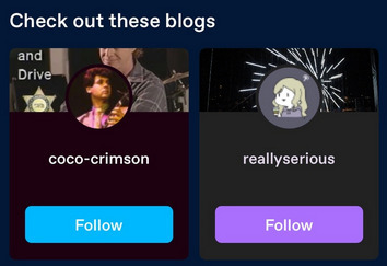
[Image ID: First image: A cropped screenshot of Tumblr's Getting Started help page. It shows an example blog with the 'Blogs like this one' tray visible, populated with four example blogs.
Second image: A second cropped screenshot of Tumblr's Getting Started help page. It shows an example of the Search page on mobile with the 'Check out these blogs' feature highlighted, where two example blog cards are shown. End ID.]
These suggestions are Tumblr blog urls paired with their icon and a little bit of their blog, either the title or some recent posts of theirs. If you click on that url title, the link follows through to that blog. So there's the signifier: click on the url, go to the blog.
But now we have a bit of a snag. What about these?
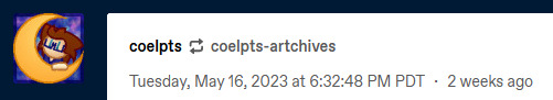
[Image ID: A cropped reblog screenshot. The crop shows the Tumblr urls of the reblogger @coelpts and reblogged @coelpts-artchives with the reblog symbol between them, the rebloggers icon, and the date that this reblog was posted. End ID.]
Well, these LOOK like Tumblr blog url links. They're styled in the same way. In fact, the reblogger even has a blog icon next to it! So all signs point to these url links pointing directly to a Tumblr blog if clicked on. After this change, that's exactly what they do- so, like, no problem, right?
But, hold on. There's another signifier here! These aren't JUST Tumblr blog url links! This is…


[Image ID: First image: The former image of a cropped reblog screenshot, focused on the urls and reblog icon.
Second image: The Tumblr reblog icon. End ID.]
Our good friend, the Reblog button! That's another classic Tumblr signifier, and it sits right next to the Like button I pontificated about. Reblogs are an integral part of Tumblr, and on top of every single reblogged post you will see that icon. And would you look at that- it's even the same color as the second url link!
Those url links that established the 'url link' signifier that we talked about before, in the search page and on the dashboard tray, aren't attached to any posts. But this url is, and the reblog symbol is right next to it. The reblog signifier modifies the url link signifier. This link should go to the reblog from this user. Right? Because it is a reblog FROM that url link- so that's where it should go! And that's where it used to go, before this update.
[EDIT] I came back to fix some typos I noticed but while I was away I tested mobile to see if this change hit the app yet. It has not, but what I saw instead confirmed the above point- on mobile, selecting the reblogged's url ALSO highlights the reblog icon next to it! These two signifiers are connected, and should be read together.
By changing the url links to be more 'consistent' with other url links across the site, a major signifier that keeps the site together has been broken entirely. What should lead to a reblog- something that is clearly shown through use of a recognizable, consistent symbol- no longer does.
Part Two: Redundant Redundancy
Okay, so that's not all this change does. It also adds a brand new functionality to the post header- the white space is now clickable and serves as a replacement for the original 'to this post' link on the reblogger's side of things. These headers also generate for anyone who adds to the post, and you can click through OP too.
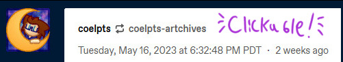
[Image ID: The cropped reblog screenshot from before, but with the word 'Clickable!' written in purple in the blank space above the date. End ID.]
This is also part of that design unity thing; on mobile tapping anywhere on the post header takes you to the post, and you can only tap on the blog url of the person the reblogger reblogged from. That makes sense, since on mobile you're maneuvering your fingers on a small screen and tapping a tiny url next to another tiny url is bound to cause problems.
I don't necessarily have a problem with this on the base of it. I have opinions about mobile and desktop parity that aren't really important here, but it does nicely showcase an issue I DO have- most of the changes made to reblogged posts are completely redundant and unnecessary.
---
[UPDATE] This change has hit mobile now, and it's added a fun new complaint about desktop-mobile parity that is now very suddenly a problem; the headers generated from reblogs with content don't have any responsive feedback for tapping them on mobile. OPs does, but any old Joes doesn't. This is not true on desktop, where on-hover a post header will change color; on mobile they stay completely white and plain with no on-tap color change. On top of that, the new headers are actually harder to see on mobile! There's no clear way to actually see where the header starts and the post continues! Tapping a header was deeply confusing because I got no confirmation I did anything of value until I was wisked away to a post- there's no signifier on mobile that this is a thing you can press.
This is what I was talking about in regards to desktop and mobile parity that wasn't important at the time- what's good for mobile isn't always good for desktop and vice versa. Having a post header be tappable on mobile instead of op's url link, where you have less fine motor control and there's a lot of small buttons clustered together, makes sense; but making all post headers into buttons on desktop isn't a good idea because they aren't 'buttons' and it's very hard to make it clear they are. I mentioned signifiers above and that applies to this change- there just aren't enough signs that show these are all buttons now and where they go. The fact that they're completely unresponsive on mobile really is the cherry on top, because you do not KNOW it's a button unless you tap it accidentally or already know from desktop that all headers link to reblogged posts. The design has been made more confusing; what was a functional affordance on mobile has been applied to desktop without limits or concern, making the original mobile affordance more confusing and producing a poor signifier.
Alright, that's enough from future me. Let's get back to the original post, about how this change that introduces a bad signifier is also redundant.
---
First of all, it's not like clicking the link url just threw you into a post abyss when you clicked it. Clicking through to a reblog…still took you to that blog, both on mobile and on desktop. On mobile all you need to look through the blog proper is to pull down and refresh; on desktop it's even easier, because following a link pulls up the dashboard tray for that blog with the blogs url immediately below their icon.

[Image ID: A screenshot of the previously cropped reblog, now shown on the blog @coelpts. The post is on the left, and the user info card is on the right. End ID.]
This change then removes one step to get to the front of a blogs page, and puts the original longer path on the new clickable header. They go to the same place, the first is just exactly one click faster. You could do the exact same thing by clicking the user icon instead.
But wait! We can get even more redundant! You know what else is standard Tumblr functionality on desktop? The hover card!
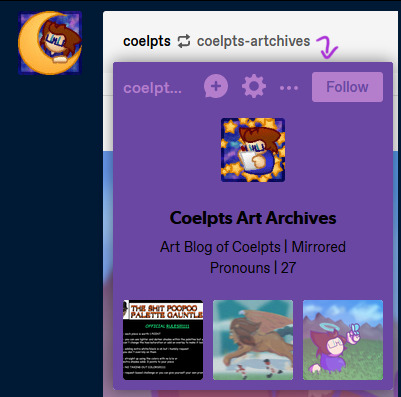
[Image ID: A screenshot of the previously cropped reblog, now showing the card for @coelpts-artchives below the icon. It has the blog title and description alongside three popular posts. A purple arrow points to it from the url. End ID.]
If you hover over any url link for about a second, a card for that blog will pop up. This tray lets you follow a blog, send asks, report them, check their popular posts and do a bunch of stuff straight from the dashboard. It also takes you directly to their blog if you click the url link on the card itself! That's right, there was already a way to go directly to the blog the previous user reblogged from! And every single blog url link does this, too- not just on post headers, but even in the text of a post itself.
So before this change, you had five ways of interacting on a post:
Click the reblogger's url > Reblogger's post.
Click the reblogged's url > Reblogged's post.
Click the reblogger's icon > Reblogger's blog.
Hover on the reblogger's url > Reblogger's blog.
Hover on the reblogged's url > Reblogged's blog.
One of these is redundant, but that's fine- it's just how url links work, and it's better that all urls can do that. Signifiers, we talked about this. But every other link goes to a different place, including the previous version of the post.
After this change, there's six, with changes in bold:
Click the reblogger's url > Reblogger's blog.
Click the reblogged's url > Reblogged's blog.
Click the reblogger's icon > Reblogger's blog.
Hover on the reblogger's url > Reblogger's blog.
Hover on the reblogged's url > Reblogged's blog.
Click the white space header next to a user > User's post.
We now have three ways of getting to the blog of the person who reblogged this post, two ways to get to the blog of the person they reblogged from, ONE way to get to the post, and ONLY if someone added to it!
This change removes functionality and replaces it with needless redundancy. As I said near the top of this section, we could already get to the blog through a reblog link- so all this does is remove getting to previous post iterations.
Part Three: Broken Chains
And hey, let's talk about previous post iterations. Y'know, something that's super important on Tumblr? Different versions of a post float around the site for years- some have been around for a decade or more. And some are only available for one post.
As I'm sure everyone knows, unless a group of tags are peer reviewed and added to the body of the post itself or are appended to the next reblog in the chain, they only exist on that version of the post. This means every iteration of a post is functionally unique, and long before we were given the ability to check the tags on a reblog directly, the only way you could check the tags for a post was by checking every iteration. This practice still exists today with 'prev tags'- users still find it useful to gesture to a previous version of a post and show what other people were thinking or add their own thoughts.
Remember the new redundant links? All that means you can't get to a previous version of a post anymore. Those tags are functionally lost now, unless you dig through that persons blog or through all the notes of a specific post. Sure that may not be a problem for a post with 300 notes or so- but what about 27,000? What about a post that was reblogged three weeks ago? If you're trying to wrangle Tumblr's dodgy search function on the blog itself, what if the post has no text to search for, or if the blog has it's search function turned off? Any post tagged with prev tags now directs to literally nothing. Anyone arguing or conversing in the tags is now speaking at air to everyone else.
There is still one way to trace reblogs. You can access the blog itself- not the dashboard tray, but the actual url.tumblr.com blog- by using a hidden link in the meatball menu off the side of the post.
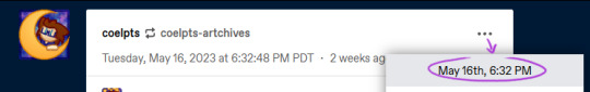
[Image ID: A screenshot of the previously cropped reblog, now showing the meatballs menu accessed. The first option, showing the date of the reblog, is highlighted. A purple arrow points to this option from the meatballs menu icon and a circle is drawn around it. End ID.]
From there, you can track a post backwards through proper blogs. The reblogged posts will have a 'via Blog' note on them, and you can follow that trail all the way up a chain.
…Unless someone doesn't have a theme enabled. Without a theme, a user won't have a url.tumblr.com domain and it will redirect to the dashboard tray, breaking the chain. And, as of an older update, blogs by default do not have themes enabled- so any and all new users suddenly roadblock this process. Oops.
All of this means that what was once a convenient social aspect of Tumblr has been completely severed with little to no alternative. Trying to wade through hundreds upon hundreds of notes to find the one you're looking for is tedious, time consuming, and potentially impossible if the post is large enough.
Finale: What Now?
Right, so- this sucks. I didn't even go into how this makes it tough to find and block cr/pt/t/rfs if a post passes into their hateful space, or how this makes it harder to copy post links without tracking shit because it's in a different menu now, or how it's now more difficult to access a previous post for reporting purposes. All that shit's also true, but they're side effects of the big three problems the changes introduce.
This change is ultimately user-hostile and seems to follow the worrying trend of 'other sites are doing it, so let's do it too!' Tumblr's been kicking about recently. Tumblr Live, the new change to images and videos, gating viewing posts behind making an account, and attempted algorithm feeds through 'Best Stuff First' and 'Based On Your Likes' are what immediately come to mind. Tumblr's defining, driving aspect for it's continued existence has and always will be its uniqueness. Pretending to be Instagram and TikTok and fucking Twitter will do it absolutely no favors- all it does is undermine what actually makes this site, as a social platform, interesting and vibrant.
But it's one thing to just complain and it's another entirely to provide feedback. Here's a link to the Tumblr Staff support page. They've walked back on new features before when we've made a ruckus- the Shop icon replacement is on the forefront of my mind right now- so it's time to make another.
TL;DR 2- This change makes browsing Tumblr more difficult than it needs to be. It breaks previously established signifiers and removes vital social functions only to add redundant and empty features to cater to a new userbase instead of actually improving the site for the users they already have. It's not a good change.
Thanks for reading ✌️
#tumblr update#staff#support#i highly doubt i'm the only person whose thrown its hat into the ring#but the more posts we have on this bullfuckery the better i say!#at the very least my dear mutuals will be able to see it#and honestly i needed to get this off my chest. it ruined my sleep last night
338 notes
·
View notes
Text
Dealing with images on Dreamwidth
Okay, one more Dreamwidth post!
DW is geared around text posts and currently handles images rather awkwardly. But it does actually have image hosting capabilities, though the space isn't unlimited (I've never come near to maxing it out). I was thinking about that and figured I could make a post over here about how I back up images to Dreamwidth, and then post them using the Rich Text Editor.
I tried to explain what I do as clearly as I could, but the detail might make it sound more complex and difficult than it really is. I'm sorry if so! But here goes:
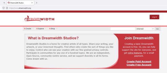
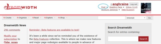
Step 1: Go to the main page at www.dreamwidth.org. It should look something like this:
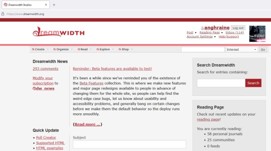
Step 2: Click the red button in the upper-right to log in. Once you do, the main page should look something like this:
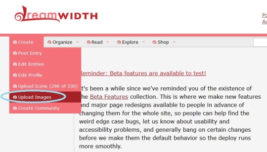
Step 3: If you look below the Dreamwidth logo, you'll see five categories of things you can do. You want the first category, "Create." Click on it and select "Upload Images" from the drop-down list. I've put a blue circle around it in the picture below:
Step 4: Upload your picture!
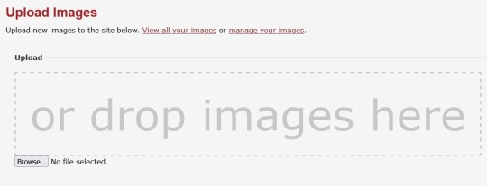
The picture above is the standard "Upload Images" screen. From here, you can click the link to "View all your images" to see everything you've uploaded, and I think "manage your images" lets you adjust titles and descriptions of the images and such. But what you want is the "Browse" button. It'll take you to your computer files and you can upload the picture or pictures you want.
Let's suppose I want to upload two pictures from Baldur's Gate 3:
and
Okay. So after I click "Browse", find the right folder on my computer, and use CTRL+click to select both of these pictures (you can also upload pictures one-by-one if you wish), the space below the "Browse" button will show the pictures you've uploaded. It should look something like this:
There they are! You can give the pictures names in the "Title" boxes, but if you want the file names saved, make sure you click the "Save descriptions" button below the pictures (circled in blue below):
At this point (much faster than it sounds like), you've uploaded the pictures to your account where you can look at every picture or file you've ever uploaded to Dreamwidth. That's cool, but they're not actually in a post yet.
Step 5: Make a new post.
In a new tab, open Dreamwidth (www.dreamwidth.org) again. It's important that this is in a different tab and you don't navigate away from the one your pictures are showing on.
You should see the "Post" button in the upper right of the main page, below your username. I've circled it in blue here:
Click on "Post."
That'll take you to the Create Post page where you actually put things on your blog.
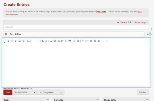
I'm currently trying out the beta version of this page that's going to get applied pretty soon, so the style looks a little different here than in standard Dreamwidth. I figured I'd use the beta version because a) it's what people will see in the future, and b) we're going to use the old Rich Text Editor that is the same in both styles.
The Rich Text Editor has a blue rectangle around it and a blue arrow pointing at it in the picture above.
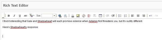
Let's narrow in on the Rich Text Editor. Like in any post, you can just start typing into the Rich Text Editor, if you want words at all. So here I typed a little explanation for the BG3 pictures and put the cursor where I want the pictures to show up.
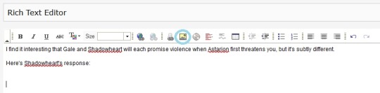
You can see that there's a bar of options above what I've typed, with buttons that let you bold, italicize, underline, etc. We want a button further on—the square button with a yellow background that looks like a tiny landscape of mountains and sunshine. I've put a blue circle around it on the screenshot below:
Step 6: Add your pictures!
Clicking on the little landscape button will open a box where you can paste the URL of any image you want to put in your Dreamwidth post. The image doesn't have to be hosted on Dreamwidth—you could paste a link to a picture on Tumblr or whatever—but it'll be more stable if it is, so that's what we're doing.
It looks like this:
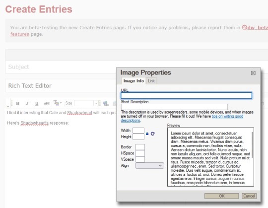
Since we already uploaded our pictures to Dreamwidth in the earlier steps, we just need the URLs for the pictures. There's a pretty easy way to see what it is.
Step 7: Copy-paste the URL.
Click back to the tab with your newly uploaded pictures. There will be a code at the bottom of each one. In our case, it looks like this:
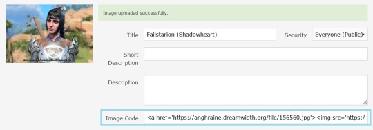
It might look a bit intimidating if you're not used to code, but you can ignore the most of it. You just want that little part that begins with https and ends with .jpg.
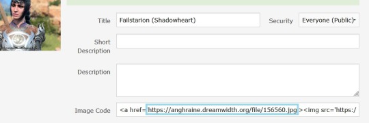
Copy the URL (I've put a blue box around it above) and click back to the Create Post tab. The "Image Properties" box from Step 6 should still be up.
Paste the URL into the top box that says "URL." I've surrounded the correct box with a red rectangle in this picture:
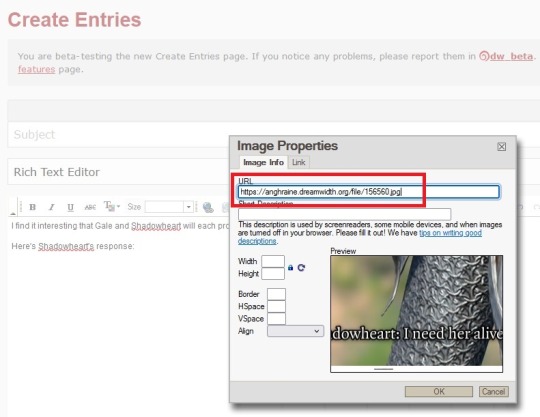
Hit the "OK" button at the bottom and:
You'll see tiny boxes around the frame. Those will go away if you click anywhere other than the picture; they're for adjusting the size.
Step 8: Adjust the picture if you want
You know how Tumblr automatically stretches/shrinks pictures to make them fit? Dreamwidth just leaves them the way they are, so if your original picture is very big, it will look very big, and if it's small, it will look small. But you can adjust the picture yourself.
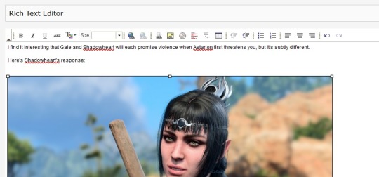
Maybe my picture of Shadowheart seems really big compared to the text and I want it smaller. I'll click on the tiny box in the upper-left corner of the picture (that one simply because it's the most convenient) and drag it inwards until the picture is the size I want.
And there she is!
BTW: No matter what size you make a picture look in your post, once it is posted, you can always right-click with your mouse and say "open image in new tab" to see it in its real size.
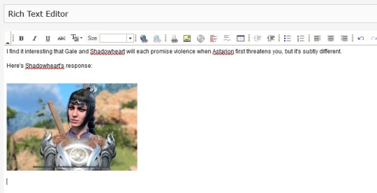
Here's a real post I made with a picture of Shadowheart I'd slightly shrunk in the Dreamwidth editor:
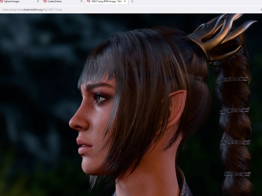
But if I right-click on the image and tell it to open in another tab, you can see that the saved picture is actually full-size:
So feel free to adjust your picture in the post however you want; it won't change the version you originally uploaded to Dreamwidth.
I'm sure there are other ways to do this, but that's how I get images uploaded to Dreamwidth and then embedded in Dreamwidth posts!
#there's been talk of a proper image upload function within Create Post but they've had more urgent updates so ... maybe#for now this works though#anghraine babbles#dreamwidth#long post#anghraine's pics
54 notes
·
View notes
Note
Have you found a way to get the assets from new gen? I'm kinda lost rn
!!!Warning! Long-ass post incoming!!!
Hi,
Yes, I did manage to get some and there's how and why I can't get it all.
First, some words before we proceed. The reason I can't download all of the clothes is because some are made from 2 pieces. I don't know if you remember whenever the site came out and there was a section where you can see previews of clothes from the game.
There were front and back pieces. And I believe clothes have that too and I think that's why I can't save them.
But let's see how I found out.
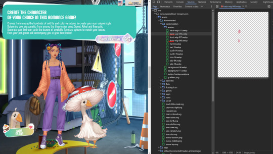
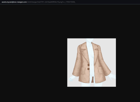
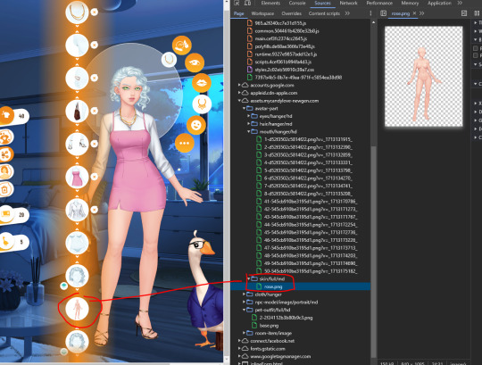
So, you go to the closet where are the clothes are and then press F12 or right-click, and then inspect element. Now, go to sources and look for "assets,mycandylove-newgen.com". Here you can find other subcategories but what interests us is "cloth/hanger/hd".

Here you can see all the clothes from the closet but in this format. But that's ok. Like in the last game, we have to change some parts from the URL of the specific clothes. Now, Let's say you want this top from the image. You right-click on it and open it in a new tab.
Look in the URL for this part "hanger":

And swap what's between the lines with "full":

And then voilà:
Now you can save it.
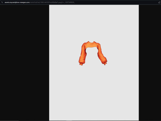
You'll say "so, I can do that to anything that I find, no?" No. Like I said, the ones that are made from 2 pieces won't work.
For example:
This. I tried doing it with this as well but it won't work because, if you look closely, there is a small piece at the back that won't show on the avatar if you use a dress or something that goes over that part:

And what I have in the "hanger" version is the full piece, not the pieces separately which are in the actual game. I hope you understand what I mean. So, things that seem made from 2 pieces won't work.
I feel like the accessories might work because it's composed mostly of one piece.
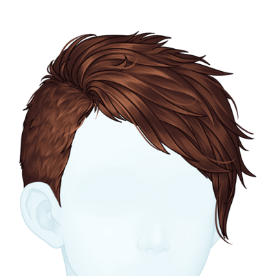
What about eyes, hair, mouth?
I could only save mostly short hairs like these ones:

I did manage to find the base. If you go to "item order" in the game and then look at the sources at "skin/full/md" you will find the skin there:
You can open that in a new tab and, in the URL you can change "md" with "hd" (those are image sizes) and of course "hanger" with "full". It doesn't have a nose, eye, or mouth, but... yeah.
But again, I'm no expert. I only found out about it because the goose outfit had this in the URL:

Plus, this word was used before in the other games. But if I find another way I will reblog this post with my findings.
If you want the avatar parts that were taken from the preview candy before launching there's this post that has a link with all the things you need.
I hope this helps!
21 notes
·
View notes
Photo
HOW TO: Make an Animated Sound Wave Overlay
In this tutorial, I’ll show you a quick and easy way to get this animated sound wave effect that’s unique to any song you choose! (You can check out a similar effect in my Obi-Wan Kenobi and Miles Morales gifsets too.) Disclaimer: This tutorial assumes you have a basic understanding of gif-making in Photoshop.
PHASE 1: Make Sound Waves Using VEED.IO
You can do this using several methods like downloading sound wave videos on YouTube and making them into gifs (which I’ve done before too!). But I’m going to show you how to make sound waves specific to the song of your choice using a free site called VEED.IO
1.1 – Upload a YouTube link of your song to VEED.IO
Open VEED.IO and click Choose Video! Try to find a studio recording if you can, instead of a clip of the film/tv scene which might have distracting background audio that could influence the sound waves.

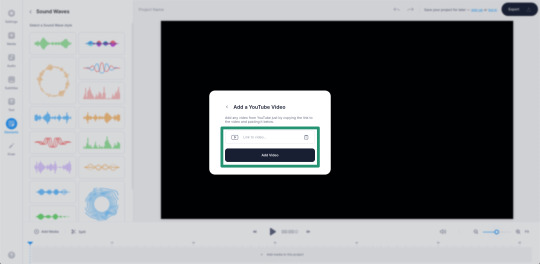
UPDATE 09/17/23: At the time of writing this tutorial, VEED.IO allowed you to upload a YouTube link directly. However, I’ve been made aware that this doesn’t always work with the new version of VEED.IO. As an alternative, you can instead download the YouTube video using any video downloader and use the “Upload a File” method instead!
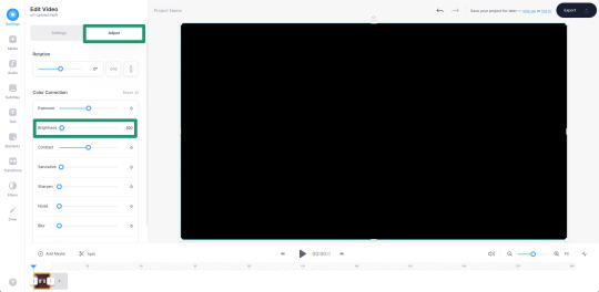
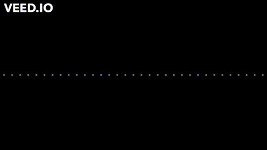
1.2 – Make the video a black screen.
If the video you used isn’t already fully black, click on your media in the timeline and toggle over to the Adjust tab. Pull the Brightness slider all the way down to -100 until the screen is completely black. This black background is key to getting a seamless blend on your gif later!
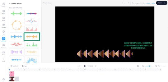
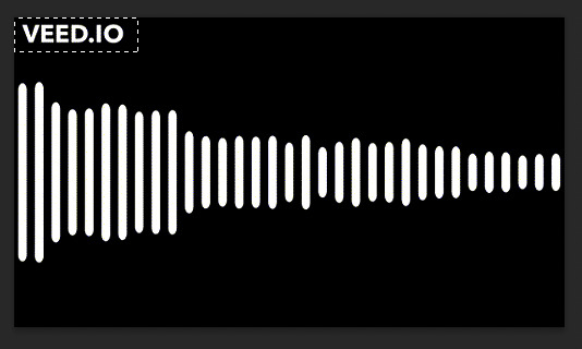
1.3 – Insert sound waves.
Click Elements in the left sidebar and navigate to Sound Waves. Select any sound wave design you prefer! I like the vertical, rounded orange bars. Don’t worry about the color when you choose, we’re going to change it to white later!
1.4 – Trim your audio clip.
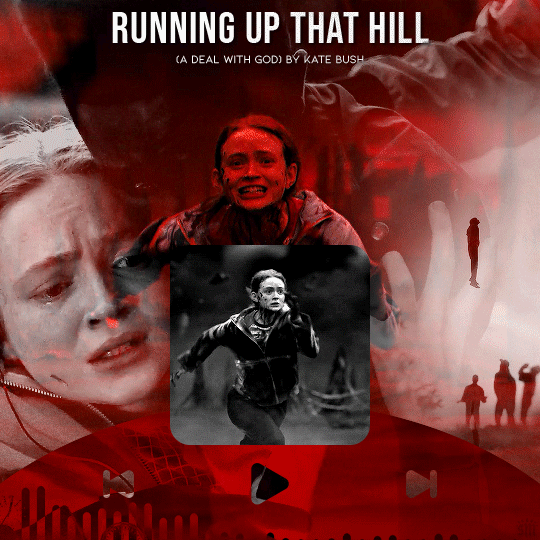
It’ll depend on the amount of frames in your gif, but you shouldn’t need more than 10 seconds of your song. You can choose to trim based on the scene of your gif, the lyrics you’re going to type on the gif, or even just choose a section where the music goes wild and the sound waves move a lot. In this Max gif, I took a clip toward the end where the lyrics are: “I’d be running up that road, running up that hill, with no problems” because it matched the main clip I giffed.
Use the white parallel lines to drag the clip where you want it to start and end:

1.5 – Adjust the audio decibel controls.
(Disclaimer: As with most things, I know almost nothing about what I’m doing here. 🤡) I just know that I don’t want the bars of my sound wave to be clipped like they are below, so I have to change the decibel range so the loudest part of my audio doesn’t go “outside the lines.”
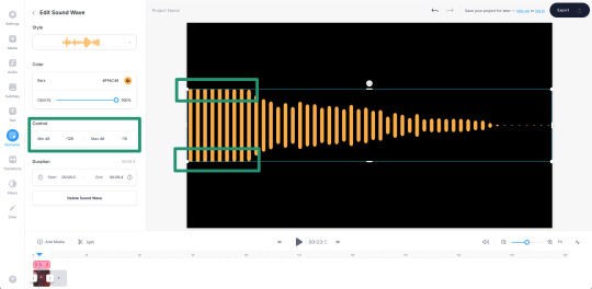
I changed my minimum to -100 and my maximum to 25:
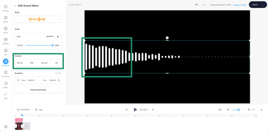
1.6 – Make your sound wave white.
Still in the Edit Sound Wave window, change the color of the bars to white. It doesn’t matter what color you want your sound wave to be in your final gif — we’ll change it later! White is the best base for any color, especially if you want the gradient/exclusion effect in the overlay.

1.7 – Resize the sound wave to your liking.
Use the corner sliders to enlarge the sound waves. I always prefer making a big gif smaller than trying to make a small gif bigger (and grappling with a low quality image). So I like to resize my sound wave as big as possible, cutting out any bars that don’t move so I can have a high-quality animation in the end. :)

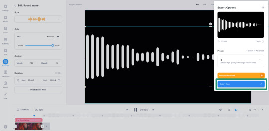
1.8 – Export as a gif.
One of the most convenient things about VEED.IO is that you can export the sound wave as a GIF! So you don’t have to screencap it yourself. Click the export button in the top right corner, select Export Video, and then download it as a GIF.
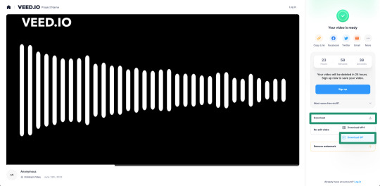
And here’s the sound wave gif I got:
Don’t worry about the watermark, we’ll take care of that in Phase 2. :)
PHASE 2: Overlay Sound Waves On Your Gif
Note: I’ll be working in Video Timeline for the most part of this section! If you want to see my process in Video Timeline, here’s my step-by-step gif-making tutorial.
2.1 – Make your base gif.
This is all up to you and your style! I like to make my sound wave gifs color-focused and I think blending adds a nice touch. Also, my gif is 540x540px.
Now, one of the most important things to remember is this: make sure your frame delay starts out at 0.05 seconds, even if you work in Video Timeline like me. This is crucial to make sure you don’t get duplicate frames when adding the sound wave gif.
2.2 – Import your sound wave gif.
Create a new file by opening the gif you exported from VEED.IO. Change the gif’s frame delay to 0.05. This is to match the base gif so that when you convert to Timeline, you don’t get duplicate frames! (Note: I also deleted the first frame of mine because all of the waves weren’t moving.)
2.3 – Resize the VEED.IO gif and convert to Video Timeline.
For my gif, I resized the sound waves to 505px width and then I used the Sharper action in this action pack to convert to Video Timeline. (You can read more about how I use these actions in the gif tutorial I linked above!) You can also remove the sharpen filters if you feel you don’t need them!
2.4 – Hide the watermark.
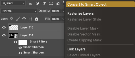
Create a layer on top of the gif layer and use the Marquee tool to make a box around the watermark. Use the Paint Bucket tool to fill that box with black so the watermark disappears.
Select both layers (the black box layer and your gif layer), right-click, and select Convert to Smart Object to merge the layers together.
2.5 – Drag/duplicate the sound wave gif over to your base gif.
Either click and drag the sound wave layer into the tab with your base gif OR right-click the layer, select Duplicate Layer, and choose the document you want to paste the gif to! Make sure the sound wave layer is above your base gif!
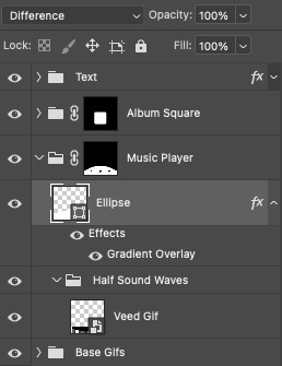
2.6 – *OPTIONAL* Create a music player overlay.
This is just a style I came up with because I’m currently obsessed with rounded shapes. But you don’t need to have the semi-circle music player for the sound waves! I just like how it looks. For my design, I just made a white ellipse, created my own shapes for the play and skip buttons and masked them out, set the blending mode to difference, and added a gradient overlay.
I won’t go into my design in a lot of detail here because this is a style choice that’ll be unique to how you want your gifs to look. Plus, this is just a tutorial on how to make animated sound waves. But if you have specific questions about my gif style for these kinds of sets, feel free to ask me at my main @sith-maul :)
2.7 – Set the blend modes.
Put your sound wave gif in a folder and set the folder’s blend mode to Exclusion. Put that folder inside another folder, and set this folder’s blend mode to Pass Through (it should do this by default). Here’s a screenshot that hopefully explains this clearer:

Now, your sound waves should have gone from looking like this:
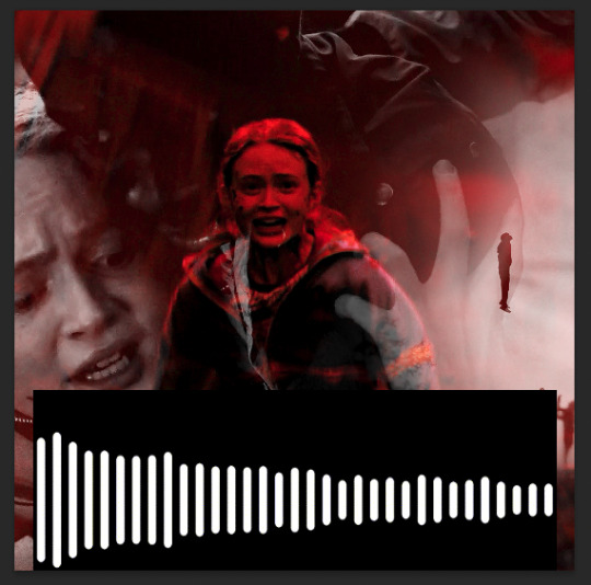
To this:

You can totally stop here if you like this look! But I want my sound waves’ color to match the rest of my gif, so...
2.8 – Add a gradient map.
Within the sound wave gif folder (the one set to Exclusion), add a Gradient Map layer above the sound wave gif:

I recommend going for a Black to Color gradient because the black will help the background of the sound waves stay dark and fully blended with the rest of your gif. I went with this Black to Red gradient:
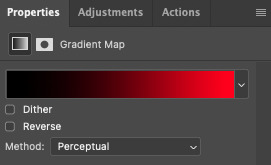
Now my sound wave gif looks like this:

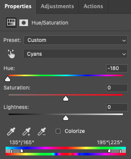
But I don’t like how there’s now some cyan peeking through where the bars touch the lighter gray parts of my gif. So, let’s add one more adjustment layer.
2.9 – Add a Hue/Saturation layer.
In the outer folder (the one set to Pass Through), add a Hue/Saturation layer so it’s above the other Exclusion folder:

Decide what color you want to get rid of (in my case, cyan), go to that color channel, and adjust the hue slider until that color matches your main color as best as possible!
PHASE 3: Export Your Gif!
As always, when you convert your gif back to frames, do a quick double-check that you didn’t end up with any duplicate frames before saving your gif. Again, you can read more about how I do these steps in my gif tutorial here.
Finally, with just a little extra nudging layers around, my gif looks like this now:
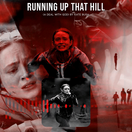
Of course, for my actual gif, I created a music player design — so I decided to only use the upper half of my sound waves to fit inside the half circle.
I’m sure you know how I did this already, but in case you don’t, just move the sound wave gif down the canvas to your liking until only half of the waves are visible! I like using this method where my sound wave gif is under a gradient overlay because of how dark it makes the sound wave bars and how I don’t have to get rid of any cyan colors:
But that’s it! I hope you found this tutorial helpful and easy to follow! If you have any questions, my main inbox is open @sith-maul. If you decide to try out this effect, feel free to tag me with #usernik or tag us with #usergif ! Thanks for reading :)
#gif tutorial#completeresources#userkosmos#usershreyu#uservalentina#useralison#usernums#tuserkay#usercim#userannalise#useryoshi#userelio#tuserabbie#uservivaldi#userstar#usernorah#usersole#*usergif#*tutorial#by nik#stranger things spoilers#flashing gif
445 notes
·
View notes
Text
Tumblr Cosmetic Customization Tutorial
You there! New Tumblr User with a default icon and header, no description, no custom URL, and not wanting to be mistaken for a bot--you just want to maybe figure out this weird hellsite and follow some people without being blocked, right?
Maybe you've been around for a little while, or are returning from that other hellsite, and don't know what the heck folks mean by enabling the custom URL and why are so many blogs opening on the dash instead of in a new tab?!
Let's sort this mess out below the cut with a screencap-laden tutorial, starting on mobile app (since Most new blogs start there these days, and many people use mobile more, or exclusively) and then moving to web browser for some other features that aren't available in the app (as of 1/27/23 anyway).
This is just going to be about cosmetic customization and accessing the correct blog URL and archive; Tumblr's many other settings and features for how you want to see your Dashboard and how much Privacy control you decide on are for your exploration (or another day and another tutorial, this one's long enough).
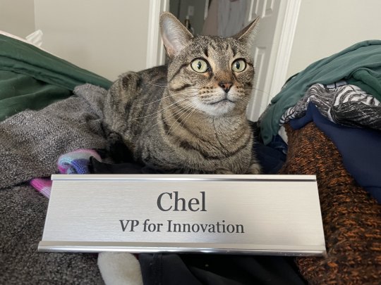
The tutorial blog itself literally took me well under 5 minutes to set up, and Tumblr guided me to customizing immediately. Taking the screenshots added a few seconds to the time; it's taken longer to write the first part of this post out. If you didn't customize the blog right away, don't fret! You can always tap the little art palette and cogwheel icons at the top of your blog to sort it out.
Now go below the link to see written instructions with image examples, including a few more with my cat:
TO BEGIN: In the mobile app, I make a new blog. For me, it's a sideblog under my main and existing sides, but otherwise this is all the same info. The following process also isn't actually all that different in web browser.
Now, you can change your URL later on if you want; a lot of folks do over time. Just be aware: changing your URL breaks any and all previous links to your blog, including any posts others have reblogged under "Read More" cuts, with the same result as if the blog was deactivated; the URL no longer exists, so Tumblr doesn't count it as "there" anymore.
Now that's out of the way, once I make a blog it immediately takes me to the Customization screen:
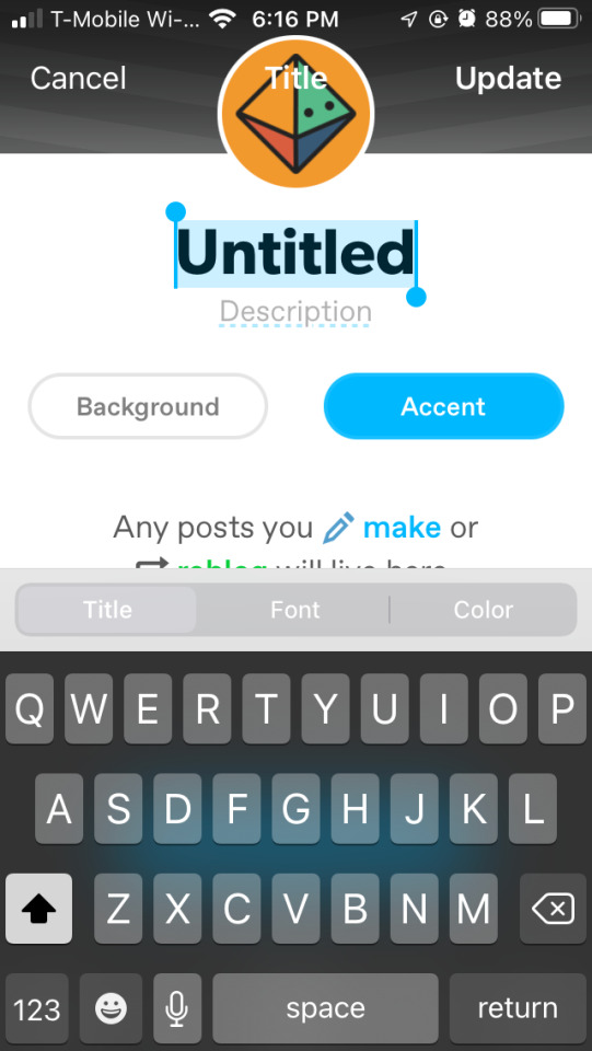
I can--and should!--give my blog a name and a description. Doesn't have to be long or fancy, and can always be changed later with no risk to your links.
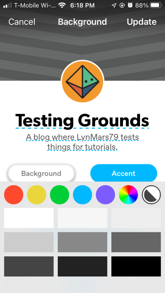
I can tap the "Background" and "Accent" buttons to change the default colors, too. Let's go for something easy on the eyes by tapping on the colored circles to find some default options, or the wheel to grab a random custom one. I'm going to go to purple and find a nice shade there.
Next I will tap on the little default icon to choose an avatar photo. I can choose not to show it on my blog, and if I do, whether I want it to be square or circle.

I can also tap to choose a header image if I like. I'm just grabbing some images from my phone. I did have to redo the avatar as it didn't want to stay after selecting a header pic for some reason.
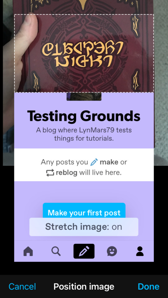
And then I made a quick post and pinned it, to let folks know that I am human and what the purpose of this blog is (lurking for now? A main blog for following while sideblogs get the content? In this case, a tutorial).
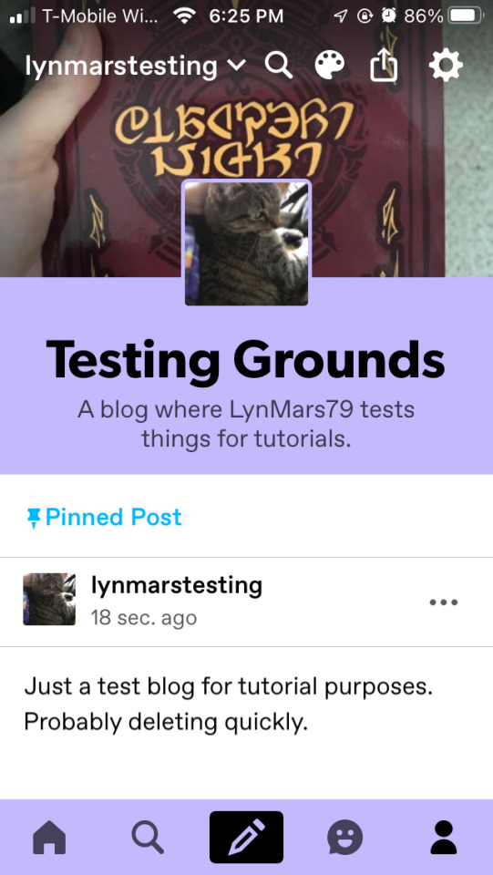
OK, so my cat for an icon, my copy of the fanzine I worked on as a header, a quick title and description, and a short post. Even if I post nothing else to this blog (and if it were a main blog; sideblogs can't follow others, nor send asks or replies), people will be fairly certain I am not a bot, hooray! And if I want to change anything, I can tap on the icons at the top of the blog and get back to these customization screens.
I CAN STOP HERE IF I WANT TO
...BUT WHAT IF I, or buddies, try to open my blog in a browser and it opens a dash panel? What if I (or others) want to access my Archive? Unfortunately, I cannot find the correct option in the mobile app at this point, so onto a web browser we go (on my phone or my tablet, or my computer).
I am using a generic default web browser where I don't have many extensions/plugins/addons enabled (though apparently I did set dark mode). When I tap/hover over my icon, it still shows my color option and everything I selected in app setup.
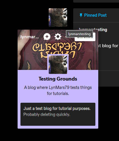
Here is where I am going to direct you to the side bar and the "Edit Appearance" button so I can point out some Very Important Things, even if you don't customize anything else ever.
When I open my blog's appearance tab, right away it's going to tell me some interesting things I have circled and pointed at on the below screenshot:
In RED I have circled my blog's URL: www.tumblr.com/lynmarstesting. This is why a blog opens in a dash panel instead of going to an actual blog. This is the new Default URL, I cannot access an Archive or other blog features like this.
The ORANGE arrow points to the feature we want, right below the "Blog name" and URL: "Custom Theme". When I swipe this feature to active, it tells me my URL is updated.
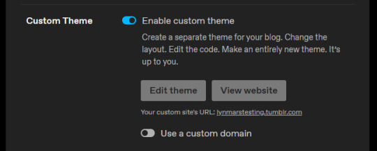
When I go to my blog, the URL in my browser shows the proper https://lynmarstesting.tumblr.com link.

And the blog looks...well, bare bones and empty, but a proper weblog page. And I (and anyone else) have access to my Archive! When, y'know, I have enough posts to make that a thing on this blog.
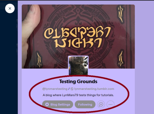
Now, if I or anyone else opens the blog by clicking my username or icon, it'll open a dash panel...but also show my actual @ and my proper URL link, so they can go to the blog itself that way if they want. Everyone wins!
I CAN STOP HERE IF I WANT TO;
there's no need from this point to keep messing around in a browser, we've done everything to 1) make ourselves look human and 2) make our blog properly linkable/accessible.
BUT WHAT IF...??
Once again, the little art palette icon at the top is our clicky-buddy, boxed below in orange:

This opens an "Edit Theme" sidebar panel where one can customize the blog. Each theme has different options, and Tumblr's default theme is honestly really modular; change colors, fonts, have multiple columns, add some pages (I've a whole other tutorial on that), etc.
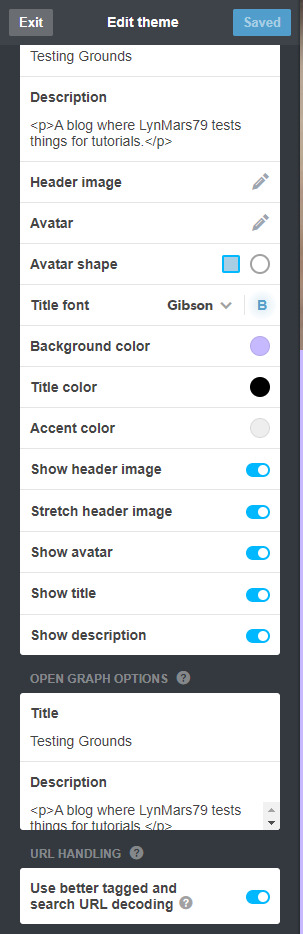
There's also an "Advanced" pane, where you can mess with some other settings (the little ? icon on each line tells you what it does) and, if you're knowledgeable--or just bold--this is where you can add some Custom CSS.
Say the Default Tumblr Official isn't doing it, though; at the top of the Edit Theme pane it tells you your current theme, and there's a handy "Browse Themes" link.
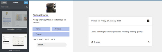
This opens a drop down with multiple sorting options. I don't want to spend money on a premium blog theme at the moment, and the others are a mix, so let's check out the Free Themes options.

There's a lot of options here! Some new ones, some are sponsored, lots of variety. Even the "Accessible" theme I mainly use is there, in its barren glory, compared to what you can see I've made of it on browser (see that previous tutorial I linked above):
Again: Different Themes have Different Levels of Customization.
Some will let you change every color, the fonts, the frames, and so on. Some let you add links everywhere. Some barely let you touch anything. You can tap "Use" at the top to preview, and the "Advanced" pane will let you preview random pretend posts if you don't have many/any of your own to see how they'd look. If you don't like how something's turning out, just click back on "Free Themes" and look for another one.

PLEASE KEEP IN MIND READABILITY!!
When people follow links to your blog--like a Read More cut--they will see the post on your blog's theme and in your blog's colors. Even on mobile app, especially if you override the default mobile theme, your color choices will have an impact! Aesthetic is all well and good, but frames, fonts, colors, and so on, should be legible and readable to most people, especially if you mean to share a lot of text posts.
Another thing to note: Your theme will NOT appear on mobile app. It defaults to a basic setup in the app, keeping maybe only your colors. Any custom links won't show, and cosmetic site options and access are limited in a lot of ways. The site is usable on a mobile web browser, and will have those features there. I get around the app's inability to show my theme's links by adding them all to my informative Pinned Posts on each blog, but that's me.
And there you have it! How to cosmetically customize a Tumblr, in mobile app and browser, to seem like a real person and access the correct URL and features of your blog. Whether you're new or been here awhile, hopefully this helps answer some really basic questions about how and why to do some of these things.
Have a final full-sized silly Chel pic to say goodbye.
133 notes
·
View notes
Text
Punchdrunk as hypertext
I am in the greenhouse room, and I clutch at my heart. What I see before me is a person in black latex receiving a drug on their tongue like holy communion. There are only two characters in the room: Kampe, and their dealer. But what I experience is much greater, because I can hear the music echoing: the music signalling that on the other side of the city, a city has fallen and a princess is dead, hanging up above, bare-chested and bloodied for all to see.
I remember her. It was her birthday, we danced with her, she stumbled into the arms of her lover.
I know this from an hour ago, before time reset.
I am in the flower shop, and I gasp. A tango is playing through the tinny speaker of the radio. The shopkeeper picks up a bouquet - her bouquet - and he twirls around, holding it in his arms, dancing a tango with a prop that is the start of Persephone's story, to the music that is the near-climax of her story.
I know this from months before, because I have been here before but it was different. It's different every time. There's so much to take in, and I have to choose who I see and what I focus on, and the context I bring with me is constantly developing.
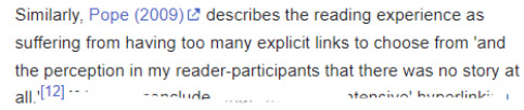
That's a familiar criticism. Too many choices, no coherent story.
But Pope (2009) isn't a criticism of a Punchdrunk masked show - it's a criticism of a HTML novella, These Waves of Girls, hypertext, a story that you wade into by clicking through links. A story that leads you down many different paths, depending on how you choose to follow them.
Don't worry if you get lost - you're already lost.
Embrace your curiosity. Turn your fear into desire. Fortune favours the bold.
The link is the most important new form of punctuation since the comma... Links make manifest the way texts relate to other texts, the way they structure themselves, and the way they restructure our thinking.
A reference to another scene, a repeated movement hearkens back to something you witnessed minutes ago, hours ago, weeks ago. A prop moves across buildings, touched by many hands along the way. Characters intersect, and you take a different path, thrown into another story before you reunite for a finale.
You ever gone down a Wikipedia rabbit hole? Clicking link after link, opening up a dozen new tabs, somehow finding your way from Scooby-Doo to Leukemia to learning the Yupik word for bread?
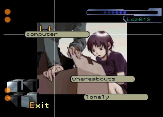
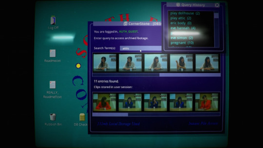
Her Story is an FMV video game where you uncover the story by searching a database of video clips for keywords. As you search for clues, things that don't make sense stick in your mind, because they might be important later. A new piece of information can cast something you've already seen in a completely new light.
You can stay with one thread, or you can let your curiosity guide you, bouncing around from one storyline to the next. It might not make sense at first, seeing everything out of order - but then as you make sense of it, you will form those connections, perhaps even more strongly than you would have done if you had watched a linear story that you didn't have to work for.
...the spaces of reading and writing shift in a hypertextual environment and the reader is required to adopt a mode of engagement in terms of an unstable textual terrain, which involves them in productive and creative processes as well as receptive ones...
"Because everything is constructed, everything becomes significant, in the artistic context everything ordinary becomes extraordinary."
- Sam Booth
Uncle Buddy's Phantom Funhouse is a collection of digital and physical ephemera - notes, photos, lyrics, scribbles, all telling the story of this man you knew as Uncle Buddy, who has now died. You leaf through them, choosing what to pay attention to, taking away what you deem significant, building an image based on what he left behind.
It does have an option to spell out the answer to the riddle if you want to skip that, but the significance might be lost in the process. ...
Description of Tamara, an example of theatre dubbed 'hyperdrama', theatrical hypertext.
"Punchdrunk's Sleep No More is an astonishing production that does nearly everything I had imagined hyperdrama could achieve, and much that I had assumed it could not." ...
"The experience works here, but it is going to be different for everyone. How many people get to see Mrs. DeWinter’s scene? Of those, how many are in the bar when the band strikes up Paper Moon ? How many get the Woyzeck allusion the next day, or ever? This is the nature of the medium."
Seriously, read this article by Mark Bernstein.
It’s not a game. Nothing you (or they) can do can prevent the fall of Troy or its terrible aftermath. Yet your choices (and chance) matter, and your reading of Those Trojan Girls is likely to differ from any other reading.
(hypertext is also, sadly, ephemeral, linked to its time and place. The above linked work is less than a decade old but I doubt I'd find what I need to read it, the right software and the right hardware of the right version with all the right features. Digital rot everywhere. Who has a floppy drive anymore? Who has Flash anymore? Just like nobody will experience The Burnt City anymore. Just like, soon, nobody will experience the McKittrick Hotel anymore.)
My first show: I see a man swinging upside down, hanging from the ceiling. The image haunts me. I do not know him, nor do I know the two onlookers. But it stays with me.
Many months later, I see him again, and he is an old friend - his name is Laocoön, a seer, and he is burdened with a prophecy from Apollo. Cassandra looks on, distraught, while the vengeful god puppets him. He is showing her the fate of her sister.
I remember her. It was her birthday. We danced with her. I watched her die, over and over and over. I remember every moment, every branching path, every intersection, and she isn't here, but she's all around us.
"There is no longer one author but two, as reader joins the author in the making of the text" - Jay David Bolter, "Literature in the Electronic Writing Space"
"Go back into the light. Remember what you've seen... We love you so deeply. It's nothing without you." - Lily Jo Ockwell as Persephone, September 24, 2023
Lily photo by @rhianbwatts
#punchdrunk#sleep no more#the burnt city#the drowned man#hypertext#hypermedia#interactive fiction#twine interactive fiction#ergodic literature#cybertext#immersive theatre
17 notes
·
View notes
Note
first off, i just want to say that i love your art, you are a huge inspiration to me and i love how expressive your characters are! would you have any tips for someone trying to grow a following from their art? specifically within the furry community ideally. im just not sure where to start
i hope youre having a great day!
thank you so much!!
okay i gotta preface this with: i have been doing commissions for over a decade. everything i say here i've been doing since roughly 2014, but my career as an artist didn't really Take Off and become reliable until 2019. success isn't immediate. some artists will grow faster or slower than others, not every tactic is going to apply / work for every artist; and that's okay. just keep pushing yourself and adapting and figuring out what works for You!
i’m putting this under a readmore as it got a bit long. every time someone asks me for advice on professional Anything i always write up a five page essay despite trying to bulletpoint it oof
post on multiple platforms and keep them all updated. i’m putting this one in bold because it is possibly the Most Important thing. we’re all watching twitter sinking over there, and many of my mutuals there were floundering because they hadn’t established themselves on any other social media site. i strongly recommend three or four socials minimum. my main four sites are tumblr, deviantart, twitter and toyhouse. furaffinity is also good. inkblot and artfol are new and i use them frequently as well. if you don’t like posting manually to every site each and every time you post art, Postybirb exists and is what i use to crosspost all my art to most of my socials at once.
avoid venting a lot on main. we all have frustrating days where our art isn’t getting the recognition we hoped, or we’re feeling petty about a controversial topic or the latest drama. it happens! it’s okay! however, many people just don’t like seeing dozens of negative posts on their feed. most people will sympathize, but if your negative vents are constantly clogging their dashboard they’re not gonna stick around.
shamelessly self promote yourself. reblog your own art. retweet it again. repost it. mention your other socials. we live in a world of timezones! when you post art, only a fraction of your audience is going to see it. i recommend reblogging / retweeting one to four individual pieces periodically over the course of a day and change it up each day. you can also repost your own work into photosets and title it “recent commissions” or the something like that.
don’t hide your linktrees and carrds. seriously! the amount of times on twitter i went to try and follow someone on another platform only to find they had no carrd or linktree link,, it is infuriating. put your socials link in your bio or pinned or SOMEWHERE readily at the top of your profile that’s easy to spot.
if you’re offering commissions, make a telegram channel or discord server for your announcements / openings.
post regularly. this one is a lot harder for artists that don’t make a lot of content, but posting even a status update once or twice a day can go a long way - especially if you’re on twitter with that platform’s hideous algorithm. alternatively as i said earlier, just retweet/reblog your work a few times a day and you should be good.
art trends are cool and fun and an easy way to get your work seen by others. see a “draw your sona in this outfit” meme? go, have fun with it. this one’s a bit tricky as timing is everything when it comes to ~trending~ content, so try and draw quick. that said, it’s never outdated to drawover reaction memes with your fursona.
try not to clog your socials with memes and shitposty images. this one is directed at twitter specifically. with twitter moments now gone, your media tab is the last way for people to hope to find your work organically on your profile without having to use the twitter search. they can’t get invested in your work if they can’t find it!
it’s okay to change course if you’re not vibing with where you’re headed. if you want to move onto a new aesthetic - that’s fine! you may lose some followers if they don’t click with your new vibe, but you’ll inevitably gain some new ones.
avoid frequent name changes. so many of the artists i follow have changed their brands / urls over the years that i don’t recognize them anymore.
tag your work properly. on tumblr, the first five tags on the original post are the tags your work will pop up in in the search feature. make those first five tags the Most important ones; example: #furry, #anthro, #art #fursona etc. twitter’s algo seems flip-flop if it likes tags or hates them. if you see a tag trending, repost your art in a photoset with the hashtag in the post [example: if #pokemon is trending, repost some of your pokemon fanart with the hashtag in the post body]. if the tag isn’t trending,,, i’ll be honest it’s a gamble if twitter likes your post or not at that point. i have no advice for that hell algorithm.
hosting raffles or doing a mini art request event [example: “leave a ref and i might draw your oc”] is good for traction while simultaneously giving back to the community + your audience a little!
try and reply to / like comments on your work. it’s not required per se, but it’s good to express gratitude.
engage with other members of the community. comment on other peoples work. like it. retweet it. follow other people. obviously don’t be disingenuous about it, but this is what the professionals call ~networking~
don’t compare yourself to others. this one is one you have got to keep in mind constantly. you’re going to find 17 year olds with huge followings and 30 year olds that are doing professional industry work whose level feels alien and almost out of reach. if you’re not doing as well, don’t let yourself get discouraged. we all gotta start somewhere!
related to the above point: be nice to your followers. venting on main about not having the same audience volume as others can come off as a huge middle finger to the audience you already have.
gaining a following takes time. unless you get a really lucky break, it’s going to take a lot of work and self promotion to build up your brand.
slap your name on everything. i mean it. any art you do - sign it. watermark it. people can and will share art in telegram channels and discord servers, and if the art interests someone they can easily source it back to you if your name is on it.
you can buy adspace. if you’re catering to a furry audience specifically, you can buy adspace on furaffinity pretty easily. inkblot i believe also offers adspace for artists though i haven’t looked too deep into it. this is really a “if you’re okay burning money” situation, as the huge chunkk of internet users have adblockers now and it’s a gamble if people will see or even click on your ad.
just have fun and do your own thing. you can hop on trends and draw art that caters to your audience’s tastes, but don’t forget to draw what YOU want and what YOU’RE about. Draw what makes YOU happy.
hope these help!! ;w;
58 notes
·
View notes
Text
I wrote out this list of instructions/recommendations for making Firefox your default browser, and setting up some extensions I recommend. This is all my personal preference - I’m no expert, but I made these instructions for some friends and family, so I figured I’d share here, too! All the extensions are linked for convenience.
1. Download Firefox, pin to dock of computer, set as default browser
Why Firefox? Mozilla is a non-profit organization, so unlike Google, they aren’t looking to continually turn a profit, and is an open-source project, meaning you can check the code at any time. Firefox and Safari are independent browsers, but others like Chrome, Brave, and Microsoft Edge all run on Chromium - meaning they’re essentially all Google. The downside to using them is that if your entire internet access is connected to Google, then Google is going to collect data on everything (and then turn around and sell it all over the place).
2. Add DuckDuckGo, set as default search engine for Firefox
Why DuckDuckGo? Unlike Google, DuckDuckGo doesn't collect data from users, and allows IP addresses to remain hidden/protected. Doesn’t use cookies to track activity. Doesn’t share IP address, search terms, etc. with sites you visit (Google, Yahoo, and Bing all share this data). I find that the search results are more “clean” and I usually find what I’m looking for faster, and with fewer “listicles”/bullshit SEO-filled nonsense.
Downsides: Some complex searches may not work (niche content can be missed, but pretty much everything else is good) - so if searching for academic sources, I recommend using Google Scholar instead. Also uses Apple Maps instead of Google, which I don’t like as much, but isn’t a huge problem on the desktop. I have some privacy-centric extensions listed below, which help protect me when I do need to turn to Google.
3. Import browser data from old browser.
4. Set homepage/new tab defaults → Settings.
5. Download Firefox on phone, follow instructions to sync to computer desktop.
6. Install extensions! Improve internet browsing experience! Check out my list of recommendations below.
7. When installing extensions, take a look at the “themes” and customize the look of your browser.
Ad Blockers
Adblocker Ultimate (blocks ads)
uBlock Origin (also blocks ads)
AdGuard Adblocker (guess what this is.)
AdBlock for Firefox (I just really hate ads and want to cover my bases)
Privacy extensions
Privacy Possum (interferes with data collection by sites, helps prevent tracking)
Don’t track me Google (speeds up search results, removes Google tracking feature)
I still don’t care about cookies (allows cookies for sites/prevents pop ups - use with cookie auto delete for privacy)
Cookie autodelete (automatically deletes cookie info from sites, pairs well with above)
Youtube extensions
Return Youtube Dislike (shows the number of dislikes on Youtube - Youtube removed this feature in 2021 for no good reason)
DeRound Youtube (personal preference - makes Youtube thumbnails “sharp”. I think it looks nicer like this.)
Youtube NonStop (prevents “are you still watching” prompts)
SponsorBlock (removes embedded sponsor promotions within Youtube videos)
Other helpful stuff
Unpaywall (checks database of 16 million legal, open-access articles when you view a paywalled scholarly article to see if there’s an open version available)
Don’t Accept image/webp (lets Firefox tell sites webp formats don’t work - enables easier access to downloadable jpeg/png formats on search results)
Absolute Enable Right Click and Copy (some sites block the right click copy/paste option, this extension restores that ability - this seemed to interfere with my use of Google Docs so I disabled it for the site, but it may be coincidental. Need to investigate - this extension is newer to me.)
Facebook Container (prevents Facebook/Meta from tracking all your web activity)
LeechBlock NG (can be enabled to prevent you from using certain sites in a certain timeframe - good for productivity)
Recommended extensions for Tumblr users
Shinigami Eyes (works on other sites too, but highlights trans-friendly people/orgs/etcs green, highlights anti-trans in red. Very useful for Tumblr - makes identifying and blocking hateful users easier)
XKit Rewritten (Tumblr XKit! OG XKit doesn’t work anymore, but I’ve had success with this one. Helps customize the site, sometimes can be used to get rid of/override stupid UI updates)
My personal XKit recommendations:
Toggle on:
Anti-Capitalism (hides ads)
Mutual Checker (notes who your mutuals are, useful if you follow a lot of people/have a lot of followers and want to know who your “friends” are - especially helpful if you have friends who often change icons/urls)
No Recommended (gets rid of recommended stuff - I clicked “hide” for all the options - I only want to see things posted/reblogged by the people I follow, or things I search for specifically. Clears up the homepage, too.)
Quick Reblog (I personally love this feature - I have it set up “above the reblog button” and checked “yes” for showing the blog selector (useful if you have multiple blogs on the same account), and the “show tags” field. With Quick Reblog, when you hover over the “reblog” button, it pops up a little box that lets me quickly select what blog (defaults to main), add tags, then reblog, queue, or save the post as a draft. I don’t usually add a comment, and never using Quick Reblog, so I didn’t enable that field. You can add more settings, but this is how I like to use it!)
Tweaks (I clicked “Restore links to individual posts in the post header”, “Remove the coloured shadow from focused posts”, “Hide the ‘blaze’ and ‘tip’ button labels”, “Hide my follower count where possible”, “Hide the ‘’Now, where were we?’ button”, and “Hide the Tumblr Live carousel” (I also “snooze” Tumblr Live weekly, but still). Again, these are all personal preferences! This is just how I like the site set up).
18 notes
·
View notes
Note
hi. writing here because of your privacy settings, sorry.
from what i’ve seen you’re doing supporting for fundraisers, and i wanted to ask for your help.
i’ve had a person submit an ask to me saying they’re from gaza and need donations. i’ve never had experience with anything like this, but i’m trying to ask questions. they don’t share much info about themselves. their link leads to a something something linktree where you can donate with paypal. they sent me a photo per request, upon looking it up in google it leads to a gofundme https://www.gofundme.com/f/help-the-aqlain-family-evacuate-gaza?modal=donations&tab=all
can’t open it because of the country i live in, but the date is set to 16 feb. the name there doesn’t match name in their link, or the name they’ve sent me per my request.
:•( i’m getting a fishy vibe, but i’m worried it could be a person new to tumblr or eng speaking social media in general.
hi! sorry for responding so late. you did everything correctly and those are all definitely signs of it being a scam. i just talked w a friend about this (ill copy and paste my tips below).
i completely understand the worry. many of these red flags aren't outright indicators that every single blog that fits them is a scam, but the combination of things is what really makes the case. it's unfortunate but, a big red flag generally is if a new blog sends you an ask about donations. it's a common scam tactic from before this nakba. the scammers are just exploiting palestinians' genocide instead of the other issues they typically exploit.
obviously not all of these tips are absolute indicators of a scam and some are already things youve considered! but my general tips:
1. is the blog just new?
if the icon is of a real person, is it their image? (you can reverse google image search! w mobile you'll have to save the image first and find a site for it. i typically use labnol but i can help you find alternatives if youd like!)
are the posts they're reblogging related to the things that you post? (consider: how did they find you)
are the posts they're reblogging coming from an actual dashboard rather than the recommendation page? (indicates that they're reblogging popular posts without any rhyme or reason to look like a real blog)
is their first post a donation post and was it just made? (dates the blog. you can look in their archives to see the date of their earliest post)
2. where are they linking to?
im not sure if your device has an option to preview a link url before sending you to the page but if it does, i would use that here just to be safe.
do the names of the accounts match? (note that in this case, of course, many fundraisers are being raised by people outside of palestine. but if the blog claims to be the account owner, do their names seem to match? if theres a description, do the names match the ones the blog gives?)
does it lead to a paypal instead of a gofundme?
heavily stressing that this obv doesnt mean every request from someone using paypal is a scam, esp w the way gfm has been screwing over some palestinians, BUT paypal is often what scammers would use.
gofundme is generally reliable and every fundraiser is donation protected, meaning its possible to get a refund from gofundme in the rare case that the fundraiser is a scam.
3. verifying gfm's can be a lot harder bc my go to options aren't always available.
generally what i do is to look at through the organizer's updates, the fundraiser's description <- which obv you should always do anyways, and the fundraisers photos to see if theres anymore information about social media accounts related to the fundraiser.
sometimes people will link twitter profiles, sometimes people will link instagram profiles. its just the same process of scrolling back as far as you can and seeing if you can identify the same face(s) from before more people started exploiting these traumas to scam others, seeing when the profile was made, checking if the images are truly from the profile's owners and not stolen, etc.
the biggest indicators imo are the stolen photos since the originals almost always link back to a name that doesn't match the blog.
6 notes
·
View notes
Text
okay i'm back again with good news on the "search for accessibility extensions or other methods of making the internet accessible for you lovely angels" front!
now this is the link to the website where i found all this information, and honestly it seems far more concise and neat and tidy to provide this link and the information within rather than providing a gigantic list of extensions organized in terms of which browser they work on!
but just in case, i'll do my best to explain what the link contains.
so it has ways of increasing and decreasing the font size for all websites accessed on chrome, firefox, microsoft edge and opera (which i'd never heard of before now, so we're all learning!)
INCREASING FONT SIZE IN CHROME
so up in the TOP RIGHT HAND CORNER of your screen, directly below the "X", is a vertical column of three dots, like this ":" but with another dot in the middle.
you click on the three vertical dots, and select SETTINGS (this is the third option from the bottom!)
this opens a new tab, and on the LEFT side of this tab, is a list of categories. you'll want to scroll down to the FIFTH category, which says "APPEARANCE". clicking it will bring you to a list of options!
at the BOTTOM of the list of options there are three options of interest: FONT SIZE (it's automatically at a medium size, but you can make it large, very large, or small, very small!)
BUT there is also an option called PAGE ZOOM that allows you to increase the size of EVERYTHING on your screen, so font, images, everything!
there's also CUSTOMIZE FONT which is quite useful but i think the other two cover things very nicely!
INCREASING FONT SIZE IN FIREFOX
go back to the TOP RIGHT HAND CORNER of the screen, directly below the "X", and you'll see a small icon that has three horizontal lines in it (the website called it a hamburger, which was very cute but maybe a little confusing!)
click the three horizontal lines, and then go down to settings (which is fourth from the bottom of the list!) and click it
this brings you into the "GENERAL SETTINGS", and that's exactly where you need to be!
scroll down a little bit until you see the title "LANGUAGE AND APPEARANCE"
here you can adjust the overall view of the websites (i.e. light or dark) or adjust the font size, adjust the colors of the screen, and adjust the default zoom of the overall screen!
INCREASING FONT SIZE IN MICROSOFT EDGE
we're back at the TOP RIGHT HAND CORNER of the screen again! this time click the "..." button that's under the "X" button, but a little bit to the left.
select "SETTINGS" which should be THIRD from the bottom.
on the LEFT, there's a list of options, and you need to click the THIRD option, "APPEARANCE".
now, if you scroll ALL the way to the very bottom, you'll see FONT SIZE, but at the top you can adjust the overall appearance (light or dark) and even the colouring of the windows if you want, but right below the themes, there's the ZOOM setting option, and you can adjust the overall zoom of the entire screen from there!
INCREASING FONT SIZE IN OPERA
fair warning, i do not have access to the opera browser, i'm just going from what i see on the link posted at the top of this post!
launch the browser and click the "EASY SETUP" icon in the TOP-RIGHT CORNER.
select "GO TO FULL BROWSER SETTINGS" from the menu.
once you enter that tab, scroll down to the APPEARANCE section.
there, you should be able to adjust the font size and appearance accordingly to your hearts content!
12 notes
·
View notes
Note
Would love to hear your review of Artfol once you've settled in a bit! (Probably wouldn't hurt for me to have a more presentable art archive somewhere either, so I'm curious about the alternatives)
of course!! after using artfol for about a week, i do like it! it's still very new, so i wasn't expecting too much off rip from it but it definitely has some good potential if it gets successful!
putting this under a read more because, as per usual, this got long.
to start: the good stuff!
good, robust organization thus far for artists. all the art you post gets automatically put in its own separate tab on your profile called gallery in chronological order and any other art and text posts that you share as well as your own art and text posts get put into another tab called feed. the feed is in chronological order from newest to oldest and it's suuuuper nice being able to have an easy place that contains all your original work people can go to without the hassle of punching in specific tags in a search bar (or inputting them into the website url) and hoping for the best. the feed can then be further organized between posts and art, art submitted to challenges, art submitted to submissions and reshares of other peoples stuff.
you can also make collections for your own gallery, so you can have all your fan art in one collection, ocs in another, etc. this isn't just for personal organization either; your separate collections are displayed under the about section on your profile or, if you've got them, links section! i honestly like this a lot. most of my experience of running an art blog comes from tumblr and getting separate pages set up on your blog, while not horribly difficult, does require a bit of knowledge regarding html and manually inputting website urls where you want the links to go. having all of this steam lined is much better. all of this is relatively easy to figure out as long as you're open to just clicking buttons on the website to see what they do, as far as i could find there's no official tutorial available. you can only have a limited number of these without a premium subscription but i haven't a clue as to what that limit even is.
you can also effectively pin certain art pieces that you're proud of to the top of your gallery by putting them in a featured selection. no idea how to do this yet but i do think this in of itself is neat.
customization is light but they cover the basics well. they've got a nice bio and announcement/secondary heading type feature under your username that you can customize, as well as a nice big space for an icon and a big ol' banner you can put your art in. other than that, you can choose a 'theme color' as artfol calls it but it just determines the color of the bar under your banner as far as i can tell on the website version. they also have a separate area for links that automatically turn into the websites icon you're linking back to.
custom warning tags!!! these fully blur the image and you can put as many words to warn others about the content of the art as you want to clarify what someone's getting into if they click show. at first i was worried i could only put one custom warning on an image but nope, it lets you write multiple warnings on the censored image if the NSFW and Gore filters aren't cutting it for the art.
speaking of which; artfol allows NSFW! in places where online spaces have been getting progressively sanitized because big corporations and google ad sense are the ones who can pay the bills of hosting thousands of images and videos on servers, it's nice to see that.
the challenges! other artists can issue challenges to others to either draw their characters in certain outfits, as certain creatures, drawing a piece of art in your style, etc. think some of the various art memes floating around on twitter, except this time they have their own dedicated category! i haven't done any challenges yet but this seems like a great way to socialize with other artists on artfol, as well as stretch your own art skills.
AI art is explicitly banned.
there is an algorithm however it prioritizes art made recently, so artists of all skill level and mediums get a shot at being seen on the front page which is nice! as far as i can tell, your home feed (which is very similar to tumblr's) is in chronological order and doesn't put in any suggested or recommended posts in the middle of the posts of the people you've chosen to follow. the like and share options are easily accessible and when you share someone else's art, it notifies them by telling them that you've pinged them which is... odd to me, but the website doesn't seem to auto credit them any other way in reshares (in contrast, tumblr keeps the OP's username and icon at the top of their own original post when it gets reblogged). i'm also something of a tumblr hermit so this could be a common reshare (reblog?) format else where for all i know and i'm just griping about nothing.
there is a premium subscription you can sign up for as i mentioned earlier. you get stuff like no ads (which you also get if you've got an adblocker on your browser), more collections can be made, you can upload cover art (icons, i think?) for your collections and the art you post, you can have custom profile theme colors (i guess they let you use the color wheel or a hex code instead of the pre seleced colors they already have?) you get more layouts for your featured art on your profile and you don't have to wait 60 days to change your username. oh, and you can make groups that people can join based around one particular thing, however i haven't touched any groups yet because none of them are all that appealing to me.
honestly, a lot of the premium subscription perks are very inconsequential to the core functionality of artfol which is a huuuuge bonus to the devs in my eyes. they easily could have paywalled commission pages or collections all together and them just giving you some extra customization perks instead shows me that the devs are actually focused on making an artist friendly website and app.
over all, artfol is relatively easy to navigate and upload your art to! the base features are solid however the website does have some downsides.
the bad:
the most egregious thing is that I haven't been able to and currently can't access the content guidelines or privacy policy pages. when I first signed up, artfol gave me a link to what the website claimed was the content guidelines however it just linked me to the news page and that really didn't sit well with me.
because the artfol website is so new, I am going to give them a chance and interpret this in the best faith possible and assume that it seems like this is just an issue of certain pages crashing, seeing as I used to be able to access the News page on artfol and now it's just gone like the other pages. on top of that, it seems like every link except for their twitter, android and apple download links, instagram and discord links at the bottom of the artfol website page is broken in the same way. out of all pages eating themselves the content guidelines and privacy policy ones feel like the worse ones to lose. I haven't been able to access the guidelines from the jump and it's been really frustrating. I just got done sending an e-mail to their contact e-mail, so hopefully something good comes from that. in the mean time i've also downloaded the app to try to see if i can find the guidelines and privacy policy on there. I've noticed people complaining about crashing pages in the mobile app reviews so hopefully this is just a case of a website page accidentally eating itself and it's just very unfortunate coincidence that it happens to be some very important pages affected by the crashes.
other than that, the other downsides are that the website takes like a minute and a half to load, clicking on a censored image to view it on your home feed takes you to the individual post and has you un-censor it there rather than directly from your home feed and some features are currently only available to mobile accounts such as commissions tabs, however i'm sure that will eventually be made available to the website version as well in due time. also, while uploading art, not including the custom censor tag or NSFW or gore filters, you can only put 5 tags on your art. these are all only minor annoyances and i'm sure they'll eventually be fixed in upcoming patches.
over all: asides from some concerning hiccups with missing pages, artfol seems very promising for a relatively new, bare bones website! the developers have very much taken a mobile app first, website later approach which at least to me isn't the end of the world, seeing how the website is already doing okay all things considered. the community seems nice and i'm planning on trying out some challenges soon to get more experience using it!
#pristine-starlight#hi hello thank you very much for the question! enjoy this wall of text in return <3#if i missed anything i'll probably make another post later
4 notes
·
View notes
Text
Tips For Running A Successful Web Design Business
Knowledge of web design is quite helpful these days. If moderneskuvodj.hu interests you, then you are in the right place. The following article will teach you all you need to know to build a successful website.
It is always good to add a favicon to your website. The favicon is a 16x16 image file in the .Ico format. This image is the one you see next to the URL bar, next to the title of the page on an opened tab and is also visible on your bookmarks tab if you choose to bookmark a page. The favicon will help users quickly recognize your page in their browser without reading any text or directly viewing the page.
Make sure all of your webpages actually have titles, and make sure they are descriptive. A surprising number of webpages out there are called "untitled document" or "new document". This not only denies visitors a useful piece of information to remember your site, but also absolutely destroys your SEO, since search engines weight page titles heavily when ranking sites.
Design web pages to not take up too much space. Not every person using Internet has a high-speed connection, so if a site takes longer to load, they won't be as interested in it. If your viewers are sitting waiting for the site to load, they may just go elsewhere to find what they need.
To help your visitors be able to easily read your site, you should design it using contrasting colors. If you use colors that contrast, it makes the text stand out. If you have black text with a black background you will not be able to see the information, but if you have black text with a white background it becomes simple to read.
If you want to build a website fast without having to learn a computer language, use a code generator. Using a code generator allows you to quickly build a site and prevents you from making a mistake when you have no idea what computer programming is. modern esküvői dj are not only fast, but you will be able to learn a lot too.
When designing a website with a lot of text, choose your fonts wisely. While serif text will work well for a title or headline, the body of the text should be in a serif font, which is easier to read on a computer screen. Try to use common computer fonts such as Times New Roman and Ariel.
Watch the amount of flashy multimedia that is on your site. Don't overdo it with a bunch of "extras". Flash graphics and multimedia may appear enticing, but these may make it difficult for visitors to find the desired information from the site, particularly if they're viewing your site from a non-Flash compatible device.
Try to make sure that any music or pictures that you're linking to is hosted on your own web server. Do not hotlink to any other website images. This can be construed as bandwidth theft and it could put you in violation of a copyright too. It's not worth the risk.
You want to ensure that your site is capable of being viewed on all types of operating systems and programs, ranging from browsers such as internet explorer to firefox. You also want to be sure that your site works on both windows and mac operating systems so as many users as possible can view your content.
Use a layout for your site that you can work with and that is basic so that you understand the fundamentals of web design first. By starting with the basics and slowly increasing the complexity, you ensure that you develop solid fundamentals, which will give you a solid grasp of the fundamentals.
When designing a website, you want to keep the privacy of your customer's information in mind. Set up proper encryption for submitting data, and never store customer passwords and such in a text document. Make sure you set up your website properly so that your customers know that visiting and interacting with your site is safe.
With https://moderneskuvodj.hu , you can have financial success through web design. The key is to remember that there are several ways to generate income through website building and depending on your goals, you should constantly be seeking different ways to capitalize on your abilities.
2 notes
·
View notes
Text
Custom Mouse Cursor Installation, how to on Windows 10:
There are certainly better people to explain this than me, and I'll add a link to a site for a more in depth explanation, however some people don't wanna go to external sites, and as I am the owner of this blog, I gotta explain it. Y'know, since I am making those little ani and cur files that some of you may want to use, I know one or two things, even if I'm inexperienced.
This is a long one, so everything important is under read more. :>
Explanation on what a custom mouse cursor even is:
A custom mouse cursor can either be one of two data file types, on Windows at least: .ani or .cur.
Basically ani files are animated cursor files, so those are what you need if you want an animated cursor, and cur are static cursor files, if you want a non animated cursor, this is the file type you need.
Each ani and cur file has an assigned hot spot, these may differ depending on what cursor role it takes on, but the hotspot is embedded into the file itself. (As an example: An ani/cur file that is intended for text selection, will have a different hot spot than let's say, the normal link select cursor.)
Note for the next part: My operating system is in German, and the settings names are roughly translated, I try to explain where to find the options in addition to their names. Thank you for understanding.
Okay, but how do I install those little files?:
You don't install them, you simply add file that you need in the mouse control panel in windows. Let me explain how to get there:
You first open Windows settings, there are multiple ways to do this, but I like going to the notification side bar, and click on all settings. However if you don't have that bar, you can click on the windows icon on the windows icon, and it should be right above above your power (ON/OFF) settings.
Next, you go to the devices setting that handles Bluetooth, printers and mouses. (It should be right next to System settings, and is the second option below the search bar.)
There you will want to go to the mouse tab (3rd from the top) and click on the Additional Mouse Options. (It should be found in related settings, as the second option.)
Now a window should have opened called Mouse Properties. To change the cursor image, you need to go to the second tab, called Pointers.
Now you can begin replacing images. Be cautious of moving the ani and cur files after this point, because if you change where they are placed on your pc, you will need to set them again even if you set them as a preset /more on that later/.
To change an a cursor image, simply double click the one you want to change, or use the button under "Use as Standard", to look for it on your pc.
Now you simply need to search for the cursor images on your pc, and add them to each slot. I try to name my cursor files according to what they are called in the small description to the left of each mouse cursor role, so just try to follow that and it should be alright.
I recommend making a new scheme, or preset after adding all the ani or cur files you want to add. You can do this by setting your preset to none before you add all of them, and / or simply pressing save as, give it a fitting name. Voila, now you can set them again without much hassle, unless you moved the files.
Mouse cursor images reset when changing the cursor size, so presets are pretty useful for that, or when you have a bunch of ani and cur files you want to switch between without much trouble.
Changing mouse cursor size:
Speaking of changing cursor size, if you like your mouse cursor images to be a bit bigger, so it's clearer to see, you can do that fairly easily as well, simply go to the mouse settings again, and there you will want to click on "Change Mouse & Cursor Size" (should be the first / top option in related settings.)
Once at the next page, you simply need to adjust the pointer size (it should be the first slider on that page) and re apply the preset you made of the cursor files you chose.
I exported the files in 24bit colour depth, so it shouldn't blur when upscaled. Feel free to experiment with what feels comfortable for you, and be sure to give it some time.
A new cursor size needs some time to get adjusted to.
Additional Links:
A website that goes into more detail, and has images:
If you want to get more custom mouse cursors RW Designer's gallery tab, and cursor sub tags, also have a lot of neat ones.
This should be it, if anything else needs to be added, I will reblog this post with more information.
3 notes
·
View notes
Last Seen Blogs
meademalove
Meadema Love
wendychacon2308-blog
Sin título
sir-klauz
Musings of a Misfortunate Artist

jalaks-posts
Jalak
xdesireee
Just Because