#and there's multiple layers of nostalgia linked to it for me
Explore tagged Tumblr posts
Visit Tumblr Blog
Explore Tumblr blogs with no restrictions, modern design and the best experience.
Last Seen Tumblr Blogs


Fun Fact
There were a total of 171.5 billion posts on Tumblr in 2019.
Text
okay yes i am happy in every single way that someone once talked sense into russell & adviced him to get into acting rather than music, but dammit i have been listening to his work quite a lot at my job and..... i unironically am very much in love with this particular song at the very moment
#text#i love him <3#some of the songs are either lyrically or musically a mess but this one is nice#yes it is very middle of the road but :) it works#it's catchy#i like how it slowly builds up and layers around you as a listener in a way#it's very nice to drift off to#and there's multiple layers of nostalgia linked to it for me#the most obvious being that i listened to his songs A Lot 10 years ago
4 notes
·
View notes
Text

Galleryyuhself - Opinion seen on Facebook from Teocah Arieal Ainka Dove
REVIEWING THE ELECTIONS FROM A COMMUNICATIONS PERSPECTIVE
Over the last few weeks, I made it a point to tune in to every major party meeting, every nightly newscast (both CNC3 and TV6), and all the key radio discussions. I watched/listened it all, not just as a citizen, but through the lens of communications strategy. YOU ALL KNOW ME - I AM A STUDENT OF International Relations and Political Science... this is a JOY! Much to the annoyance of my husband and our movie-watching time, lol!
ANYWAY!!!
This analysis focuses strictly on the communications rollout, not the policies or manifestos, and aims to offer an impartial review of the communications strategies employed.
This isn’t about who you supported or didn’t support; it’s a simple look at the communications campaigns of the two main parties.
THE UNC
Irrespective of personal views on their policies or leadership, it must be acknowledged: the UNC ran one of the most tactical, cohesive and strategic communications campaigns I’ve seen in a while.
Several notable elements stood out:
Colour Psychology:
Many questioned the use of blue — a deviation from their traditional colours. This was no accident; it was an application of colour science. Blue evokes trust and dependability. Subtly, this served as a rebranding tool, psychologically recalibrating public perception.
Signature Song:
Their anthem cleverly recalled a narrative that during their governance, "everyone got a lil kakada" — tapping into nostalgia and anchoring their leadership to past economic benefits, despite criticisms. Strategic emotional anchoring
Split-Screen Messaging:
Having KPB speak on one side while key graphics rolled out beside her was smart. It allowed people to absorb two streams of messaging at once, what she said and what was visually reinforced.
Advertising Saturation:
Even before the official campaign date was announced, the UNC saturated prime-time news slots, social media, google and youtube ads and popular radio.. on TV averaging seven ads per half-hour during news. Their proactive dominance of the airwaves built familiarity, visibility, and message penetration early.
Influencer Strategy:
They brought in influencers to reach broader demographics usually untapped. Some choices were great, others a bit questionable — but overall, it added layers to their communications outreach. Personally, I found the use of the comedy crew GHEEEEDOOOOO and an INSULT to sensible people... a wrinkle in an otherwise flawless execution.
AGAIN. I am not debating truth, lies, policies, or whether we have the money to achieve what was promised. I am discussing communications!
The PNM
In contrast, the PNM’s communications rollout appeared reactive rather than pre-emptive.
Late Start:
Their first television ad aired on 2 April — a puzzling delay, especially after the early announcement of the election date.
Inconsistent Messaging:
While the UNC maintained the singular theme "When UNC Wins, Everybody Wins," the PNM cycled through multiple slogans . "A New Chapter," "All In," "Red, Ready and Responsible," and "Platform to Policy." This shifting narrative diluted message recall and coherence. Constant shifts confuse people, and fragmented messaging doesn't build momentum.
Missed Storytelling Moments:
Given that the PNM entered with the advantage of incumbency, I genuinely expected a more militant, layered campaign from the PNM.
I thought we’d see:
-A strong roll-out positioning Stuart Young as the next generation leader.
-A clear narrative of "A New Chapter" broken down into weekly, digestible themes.
- Multi-ministry messaging, linking past achievements to the tangible daily lives of citizens, while articulating bold strategies to confront global uncertainties.
Instead, we got ads for infrastructure projects with no voiceover, just instrumentals. When we did get voice, I'm sorry but the tone of the ads were not befitting of the polished institution we know the PNM to be! I kept asking who approved this voicing approach! Why are they speaking this way? The ads had PNM branding, but the script read as though it was another entity doing the ads, "this is why we paid for this ad".. I guess they meant it to be conversational, but it came across as rough and unpolished. The ads with SY were great, but could have benefited from the same split-screen approach, as his words, while poignant, didn't stick or resonate..
Platform vs. Mass Reach:
While strong thematic messages were delivered on political platforms, how many undecided voters, or those outside of the party base, were consistently tuned in? Without a strong, dynamic communications push across mainstream channels, those key undecideds may have been left unmoved.
Overall, it often felt like the PNM was playing catch-up to the UNC’s earlier, louder, and more consistent messaging.
Campaign Messaging & Economic Reality:
I genuinely applaud the PNM for maintaining a level of honesty in their campaign messaging. While the UNC advanced many enticing and ambitious policy proposals, the PNM, with the advantage of incumbency and a deeper understanding of the global economic realities at hand, chose to anchor their promises in what our treasury can realistically fulfil.
Think about it! They could have easily joined the race to promise the world and more to counter the UNC's momentum, but they didn’t.
And that, in itself, tells us something important about the realities facing us. It also made me appreciate even more why their messaging was framed around being RED. READY. RESPONSIBLE. It was a subtle but important signal: managing expectations while reaffirming readiness and stewardship in uncertain times.
AGAIN… Just want to add.
This is not a partisan critique; it is a communications analysis.
In every election, beyond lived experiences and party loyalty, messaging matters.
It moves hearts. It shapes perceptions. It compels action.
Tonight and in the days ahead, we will see which narrative resonated most with the people of Trinidad and Tobago.
OK ah ready for the election night analysis!! All TVs and devices UP!
#galleryyuhself/analysis on political trademarks#galleryyuhself/UNC/PNM/TPP#galleryyuhself/trademark design#tumblr/UNC/PNM analysis of design#design analysis#trademarks#UNC/PNM
0 notes
Text
Blog 3:Intertextuality: Shared Narratives in Gaming Universes
Unity is a defining element of the game narratives, allowing the blending of the different worlds and the stories for creating the deeper, interconnected the experiences. Julia Kristeva’s theory of the intertextuality underlines how the media texts derive the additional meaning through the references to some other works. The phenomenon in gaming is majorly seen in titles such as Kingdom Hearts and the Assassin's Creed Franchise (Jenkins, 2020).
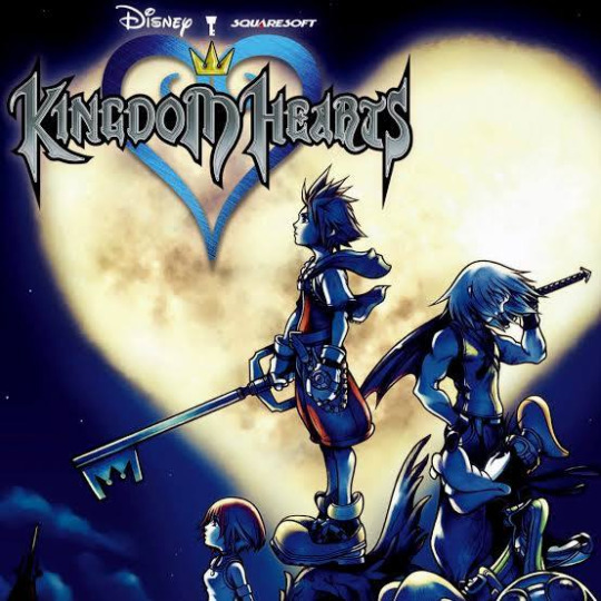
The Kingdom Hearts exemplifies the intertextuality by the blending of characters and the settings from the Disney’s broad catalog by the fantasy worlds of the Square’s Enix’s Final Fantasy series. The players can fight with the Goofy and Donald’s while also exploring some places like Agrabah or Hollow Bastion, all within the overarching the storyline uniquely to the series. A blend of friendly and newly creates an rich tapestry of the narrative layers, the appealing of fans of both the Disney and Final Fantasy, and generating empotional connections rooted in the nostalgia. It bridges these stories together in shared universe around which Kingdom Hearts draws players in through these connections.

But the Assassin’s Creed franchise blends its fictional story with historical events and real-world figures. Assassin’s Creed II will takes place in the Renaissance Italy, as having the player interacts with well-known figures like the Leonardo da Vinci, while uncovering a hidden plot within the Brotherhood of Assassins. The interplay between fiction and history results in an immersive experience with a heavy dose of history, and a good story.
Intertextuality in gaming reflects the ability to combine art forms and fill the cultural gaps. Games like Kingdom Hearts and Assassin’s Creed show how intertextual storytelling can deepen player engagement by connecting all narratives and getting into the emotional power of nostalgia and popularity. This phenomenon also highlights the rise of transmedia storytelling, where interconnected narratives distance between multiple platforms and digital media.
As games continue to evolve, intertextuality will play a more significant role in shaping their narratives and creating experiences that reflect on both personal and cultural levels.
Conclusion
So, this exploration of intertextuality in gaming is rather profitable because of how multilayer storytelling is developed easily. Through the infusion of familiar concepts into new worlds as well as emotional through-lines, games can not only create emotional connections to disparate audiences but also explore previously unexplored connections. Understanding this is a very relevant part of my growing as a creative practitioner as well — because it is a strong reminder to me that nothing comes out of thin air, that everything is built on something else, and that I should take as great inspiration in my own work. From here onwards, I can use this analysis to borrow intertextual elements into my own work by including cultural points or linking disparate narratives with each other for compelling multidimensional stories.
References
Jenkins, H. (2020). Revisiting convergence culture in games: Intertextual storytelling and shared universes. International Journal of Digital Media, 28(3), pp. 204–218.
Robert and RagnarokAngel (2022, April 4). ‘Wow, that Escalated Quickly: Goonhammer Reviews Kingdom Hearts’, Goonhammer. Available at: https://www.goonhammer.com/wow-that-escalated-quickly-goonhammer-reviews-kingdom-hearts/ (Accessed: [1 November 2024]).
0 notes
Text
FAS3000: Secondary Artist (for digital print)
Peter Blake
For my digital print workshop I have chosen Peter Blake’s work to inspire my future samples. Blake uses vibrant coloured images from pop culture and collages it with fine art to illustrate modernity and nostalgia within his digital prints. The images he uses are vintage and nostalgic to collage them together with some illustration for the background to show the blend and relation of nostalgia and modernity (where things constantly change). I am inspired by his layering of small cut out images on top of a big image/illustration, which serves a canvas for layering and tell his narrative.
He also uses contrasting vibrant colors to represent nostalgia and modernity and so I felt like it would suit my theme of the coexistence of plants and buildings. Peter Blake was born in Dartford, Kent and went to Gravesend Technical College school of arts and the Royal college of arts. I chose Blake to inspire my digital prints as he uses some illustrations for the background, whilst, using vibrant coloured images on top to show contrast, and thus this technique will help me visually communicate mu narratives of the coexistence of plants and buildings by using my primary images and cut out coloured shapes to show contrast. I will use this technique as an inspiration in my sample, except perhaps making my primary image as the background (illustration) and then cut out shapes like rectangles (as reflected in the primary images with the shape of the bricks and pattern) and put on top to show the juxtaposition between them. The colored blocks and leaves would become more vibrant when heat pressed as there won’t be multiple colours or patterns on top to stop the concentrated area of the color, compared to an image where there are a lot of colours and patterns and so would end up less vibrant and than just a block of colour as there is a lot going on in the image, and so this would show contrast and visually communicate the coexistence of plants and buildings. Peter Blake also could relate to my narrative as he uses collages of illustration and images in his work to visually communicate his story, and so this links to the collage prints that I want to do in print workshop where I combine my primary images and previous samples together. 
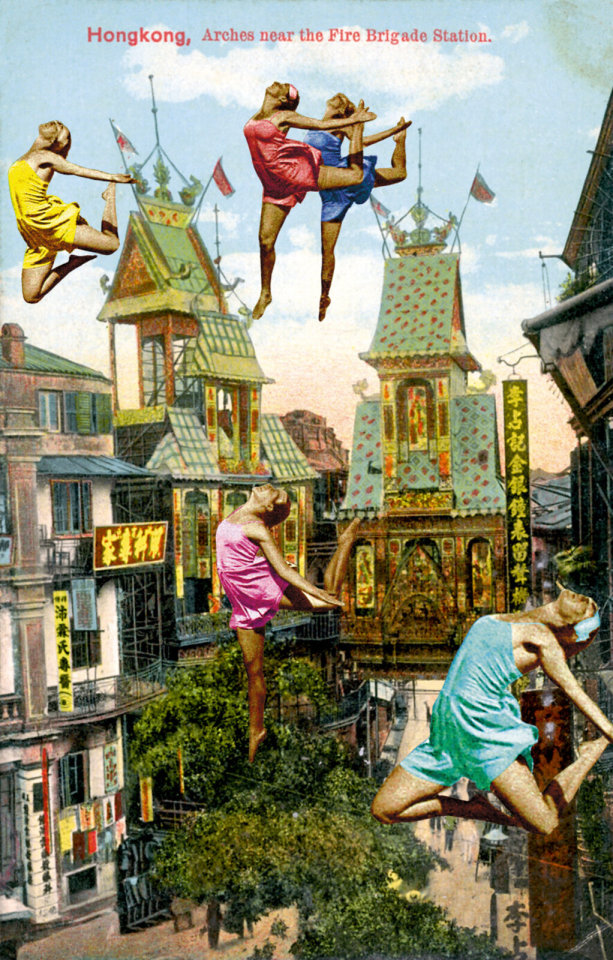
Peter Blake. (2011) Dancing Over Hong Kong. Digital Print with Silkscreen Glaze. 39 x 28 x 2/5 in 99 x 71 x 1 cm. Edition of 88. Available at: https://www.artsy.net/artwork/peter-blake-dancing-over-hong-kong [accessed 25 October 2023]

Peter Blake. (2010). Paris- Man Up. silkscreen on somerset tub size 410 gsm. Image size 38 x 21.5cm, 22 × 14 3/5 in | 56 × 37 cm. Edition of 100. Available at: https://www.artsy.net/artwork/peter-blake-paris-10-man-up [Accessed 25 October 2023]

Peter Blake. (2010). Paris- Butterflies II. Image size: 38 x 21.5 cm, 21 1/2 × 14 3/5 in | 54.5 × 37 cm. Edition of 100. Available at: https://www.artsy.net/artwork/peter-blake-paris-butterflies-ii [accessed 25 October 2023]
0 notes
Text
enjoy limitless possibilities here in celestire islands, will byers ( stranger things ), where you can start the new life you've always longed for. make sure you read the checklist, as we'll be sending the discord link through ims! enjoy your new dream, ziggy!

( Stranger Things, dupes not allowed. Chella Man, he/him, transmasc. ) ——- hey, is that ( Will Byers) hanging around (Clawmania)? i wonder what life is like for them, balancing working as a (twenty-four) year old ( art major/college student )and (Reading Comics)? they’re notorious for being ( honest ) yet ( guilty ), and i always seem to hear (Fourth of July) by (Fall Out Boy) playing whenever they walk past. they’re known around the islands for ( always sketching underneath a tree during the summer ), and they’re associated with (the colour yellow, finding peace in bonfires and music, flannel and multiple layers, creating things that reflect their emotions, quiet but their presence is warm, escaping into fantasy worlds, walkie-talkies, and staying up late due to childhood nostalgia marathons). last we spoke, they were telling me about a vision they had… something about their biggest regret being ( vulnerable to get taken away into the upside down. ), but it must have just been a bad dream. // — [ ziggy, 23/est, they/them. ]
0 notes
Text
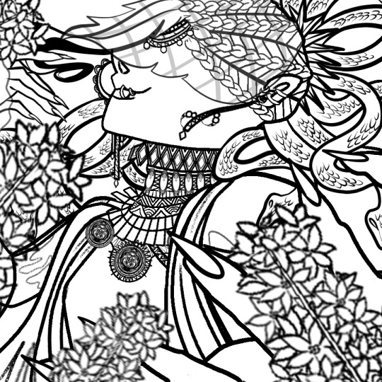
Hyacinthus Art Process! (Part One)
ART PROCESS BELOW!!! (forgive me if I’m salty, I was looking for the link for Step One for almost HALF AN HOUR)
Also end and forgive me I made the bunning Hyacinthus PURPLE. Luckily I change it but S T I L L I’m ANGRY ABOUT IT
Step One - Rough Draft

Okay! So I started this album around October 20th, 2020 on a Tuesday (lol).
When I was thinking of the song (while doing the covers of the last two), I really wanted to show that power and desperateness of Jamil (and how he indulges and relishes in it). I remembering see this pose by yama_kome and I really liked how they represented Jamil’s overblot.
Ever since I saw this incredible piece of art, I wanted it to be done in this kind of way. Now, since I’m releasing covers of Scarabia (Mystique and Cardenalia), I decided to do it this time for his overblot.
Besides, I wanted to change things up a little bit!
This took me a while to get (almost a day I believe?), but when there’s a will - there’s way.
Just to let you know: I was originally going to name the song Hyacinth but if you say all the Scarabia Trilogy’s Tracks in order - it wouldn’t sound right. So that’s why I changed it to Hyacinthus.
Secondly, I feel like if you say a flower’s scientific name than its common name - it gives that effect of a beginning, of a source and of an origin. I feel like the Overblots are a representation of their true feelings and emotions (in this case, Twisted Wonderland) so that’s partly the reason why I changed it as well.
Step Two - Rough Lineart

This dang lineart took me till Thursday, October 22nd. Here’s why.
1. I COULDN’T WING IT THIS TIME - there was a lot going through my head as well as references about what I wanted him to wear. Other ideas popped into my head such as, “Should I add some blot there?” or “What should I do for the shirt?”.
So many ideas, but few were added.
2. The DESIGNS. - So many interpretations and stuff were everywhere, and they all looked good. But the problem was the amount of time to put such beautiful details. That killed me.
To sum up one and two, my brain for ideas went brrrrrrrrrrrrrrrrrrrrrrrr-
Steps of Lineart (at the top of my head - yes. I don’t write this in the time I’m doing it because it slows me down lol):
1. Face (was done already) - more specifically the side profile to the neck
2. Nose Piercing (yE-)
3. Mouth Piercing (hOt-)
*4. Braided Hair (*dies*)
*5. Veil on Face (then the pattern waaaaaay after)
*6. Dazzling-Jewelry-Neck (more sure about doing the neck first, but #6 and #7 can be interchangeable)
*7. Snakes (only the right of the art piece though/snakes nearest to braids or plaits)
8. Upper Body
9. Robes
*10. Chest
11. Shoulders
12. Right Hand - Fingers
13. Right Hand - Fingernails
14. Right Hand - Palm
15. Left Hand - Fingers
16. Left Hand - Fingernails
17. Veil on Body
18. Ear (YUP, I FORGOT THE BUNNING EAR-)
*19. Snakes (left of Jamil and his beautiful hair strand)
20. Right Earring
21. Left Earring
22. Thing on his head (nope, don’t know the name and I ain’t bothering)
*For numbers 4, 5, 6,7,10, 17 and 19 in particular, I had to do multiple layers to make the detail. I would say:
#4 - Two layers: One for the plaits and one for the line...thingy...
#5 - Six layers: It’s technically two, but I had made multiple to get the pattern I wanted. Sadly, I didn’t achieve it so I decided to stick with the one above.
#6 - Six layers: THE FULL DANG TRUTH. The diamonds were first (1), then the line separating the pearl and diamonds (2), Later the designs of the pearls + rectangular thingies (3), The triangle into multiple triangle thingies were next (4), Soon after was the circles into multiple circles + Two triangles overlapping each other (5) and then that last bit at the end of the neck (6).
There’s actually more due to the designs of the diamonds and pearls, but I’m not going that far into memory lane.
#7 - Eight layers: If you count them, that’s how much layers I had to go through.
#10 - Four layers (without counting the two (or three) patterns that you see up there): That darn pattern (1), Them s p i k e s (2), That thing it’s being held up in (3), that pattern near the spiky pattern (4).
#17 - Four layers: Just count, please. Going up and down with my eyeballs is killing me.
#19 - Seven layers: Not as bad (because it’s pretty small), but whatever. (1 - 3) First three ear piercings you see (you may see two though), that tail, long thingy (4) that crap Bubbles wear...them circles (5 & 6), and that diamond. (hehe cATER DIAMOND)
HI!!!
You better read that crap. I took a good while writing it. If you did, you earn my biggest respect and time in the inbox.
Step Two and a Half: Cleanup WITHOUT the Background

Ah. The nostalgia. That feeling when you forgot the flower you were supposed to be working on...
Words, text and speech can not even compare to the feeling I had when I rEALiZED, I foRGOT the BUNNING FLOWER-
Step Three: COMPLETE Cleanup
Perfection. Isn’t that nice?
Step Four: Coloring
October 22nd, 2020 at 11:03 AM...
Immediately when I thought of Jamil I immediately wanted to give him that w h i t e s c h e m e
The reason why I wanted to was because he hard more darker colors in his normal design, and besides - his power has something related to the meaning of white ;). Anyways, I made sure that the ivory (celestial?) theme continued to flow through the whole art piece. Basically, making this smol boy a goddess-
Also, I was thinking that this Overblot scheme would be his true form or something, but he kept it locked away maybe due to how much it takes up his health. Consider this idea though as 100% “Not-Fully-Developed-But-Getting-There” Idea.
I really wanted them snakes to be white. Sorry not sorry.
Plus, I wanted that veil black instead of white, but I was way too into it to ever think of that apparently. In particular, them f i n g e r n a i l s. I absolutely wanted Jamil to have that light peach color and all that so I did it! Makes my heart go UwU-
<>
Annnnnnnd cut! That’s Part One for you.
Hyacinthus [ Art Process - Part Two ] here!
Thank you for your continuous support!
#just#please#end me here and now cause I'm just like ://///////////////#it's easy to fix though so anyways-#TWSTxDAL art process#TWSTxDAL overblot#TWSTxDAL#twisted wonderland#date a live#scarabia#kalim al asim#jamil viper#twst kalim#twst jamil#this is the final one...:(((((#at least original Jamil's back again!#Requests are open - including Overblot Jamil HEHEH-#finally I queued this! Thank goodness...#now you guys don't have to wait! YAY!#but dang#ever since I've made music for scarabia I've started to love the characters in them espECIALLY JaMIL-#YE#UwU
4 notes
·
View notes
Text
Q&A with Dan Chiasson

M: How would you describe the arc of The Math Campers, and what was the process like shaping the collection?
D: It came together in two intervals of intense concentration, both informed by place. I stayed for a few weeks in the James Merrill Apartment in Stonington, Connecticut, as their Merrill fellow. This was the Fall of '17. I took with me maybe a dozen finished poems, hoping to write more. The experience of being in Merrill's home, among his books and objects, was, for me, deeply strange, almost frightening. All of these objects, paint colors, wallpaper, the light itself--these were things I knew from Merrill's work. It was like a sustained dream or deja vu.
I've never been able to fully unbelieve in the occult. I'm just totally drawn to the ambience of the supernatural. I always have been. As a kid I had satanic books, artifacts, a copy of the Necronomicon which I bought at Waldenbooks in the Burlington Square Mall, in the aisle with the calendars and thermoses.
Merrill's home is full of presences, ghosts. His ouija sessions were held right there in the dining room. The voices in his great long poem, “The Changing Light at Sandover,” do not feel like brilliant confections. They feel real. I felt his presence as real. That's one source for the eerie call and response format I use in the book. There were also literal calls and responses. I pulled down from one of Merrill's shelves a book by Frank Bidart, inscribed to Merrill. I then, while sitting at Merrill's desk, wrote an email to Frank, who wrote back. It's all quoted in the book! Then in the Spring of '19, when I thought the book was finished, I had another intense spate of working. I was home in Vermont a lot that spring, driving around in the mountains. It was too cool to swim, but I drove out to Greensboro, the most beautiful town in Vermont, my favorite place, and looked at Lake Caspian. A vision of civic rectitude, hope, trust, citizenship came to me. There's a circus camp in that town. I thought about teenagers, misfits, artsy kids, queer kids, about the dangers of life skidding off the tracks when you're that age if you're not appropriately supported. We have teenage sons, so I thought about them. I wrote most of the title poem in that period, and it's really very simple, what it's about: Vermont. (It's also about the joke that is the meritocracy, and about the climate emergency...) M: The finely layered atmosphere and nostalgia of Bicentennial is palpable in parts of the Math Campers; likewise, the concern with how memory informs meaning. How do you see the two books speaking to one another?
D: Thank you! The Math Campers begins by casting back to Bicentennial. They are linked in so many ways. Both are about the falsified or forged or forfeited vision of America, which we see, every day, exposed as a delusion. But I'm delusional, so I buy it more than I really should. Maybe, again, it's because I believe in the occult, or almost believe, or don't not believe. Both are about fathers and sons, and about the threat that toxicity will emerge between them, the necessity of abiding and imagining that relationship properly, so we don't get more violence or loneliness. I'm working through my life almost chronologically. Bicentennial is about my early childhood, which came back to me when my father died in 2009. In The Math Campers we pick up around high school. Parties, drinking, drugs, driving. Some of the best parties, the biggest parties, were in fields, so it's also about the stars and the mountains and the lake. One family had become very rich by selling bull semen. They're in the book. I had a job as a breakfast cook in high school. That's in there too. All of it cast as very sad and vanished now. M: I love the idea that the books are slowly chronicling your life in this way. Can you talk a bit about your relationship to form, and how you settle on some of the more so-called "experimental" modes you've worked in? Did you set out to write versions of plays, or did the poems naturally guide you to that more dynamic form?
D: In this book, I wanted to show the process of composition that gets effaced when a poem is finished. Dreams, drafts, errors, all of it. I have several "poems" in the book that aren't poems, more like attempts at poems, things I might not sign my own name to; they're written by a poet who is both me and not me. I also wanted to show the process of reception: how a poem relies on readers, how it takes shapes in a stranger's mind and life. The arc of a poem from conception to reception, and on and on. I wanted to show both the hidden unconscious life of the poem and its social life, its existence in the real world. The play allowed me to write "verse" as distinct from poetry, if that makes sense. Lines of poetry I wouldn't write, but that a character might speak. And to distribute my feelings about Big Themes--love, betrayal, passing time--across multiple perspectives and motives. You can do that in a play; it's harder to do in the univocal space of a lyric poem.
M: I usually end by asking "Are there any particular texts or works of art with which you feel the book is in conversation?" but I suppose, on some level, that question/answer is enacted throughout the Math Campers. Nevertheless, is there anything you found yourself returning to as you wrote and shaped the book that might be pulsing beneath the more visible invocations?
D: As you say, the book wears its influences on its sleeve! Not just books and poets. Fleetwood Mac's record Tusk; A Clockwork Orange; Crazy Train by Ozzy Osbourne; Lawrence Welk; they're all there. And there's no high/low distinction in my poems or in my life. What's better, "East Coker" by T.S. Eliot or "Think About Me" by Fleetwood Mac? Who knows, who cares. The truest autobiography of an artist is what they love, the songs and movies and lines of poetry they carry around in their heads. My work is autobiographical in many senses, but that's the truest and most powerful meaning of the word to me.
4 notes
·
View notes
Text
Monthly Media Roundup (June-July 2019)
Well, I neglected doing a post last month, and now another has passed. I haven’t done too much, about three games each month and not anything else media-wise, so let’s get it all done right now!
Little Nightmares (PC/Steam):
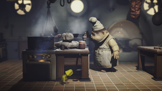
These types of spooky “cinematic platformers”, like LIMBO and INSIDE, never really scare me or fill me with dread. Part of this may be that due to the trappings of cinematic platformers. Checkpoints are very fair, and nothing is too difficult because priority is on delivering the story. Little side challenges exist, like trying to light all the candles or break all the porcelain dolls in the short 3-hour run of the game, but these are also pretty reasonable, even if you’re in a chase sequence. I’m reminded of a youtuber I briefly followed who talked about how horror games aren’t scary anymore, and somewhat unintentionally delivered the point that as you become accustomed to the limits of a medium, and therefore are less likely to be surprised by it, you’re also much less likely to be scared by it. It’s a somewhat unfortunate and inevitable trade-off to becoming more invested in a hobby. When I was a kid, all games held infinite possibility, and so an NPC in Harvest Moon telling me that wild dogs came out at night led me to think that night time held the possibility of ENEMIES in a game without combat. What the NPC meant was that you should build fences. As an adult who has spent my life playing games, I can tell you that a game is almost never going to put you in a situation without the means to deal with it. If there’s going to be combat, you’re going to know how combat works before an ambush. If there’s an escape sequence, you’re going to be in an area that facilitates your escape (often a narrow space that leads you in a direction while also making it as harrowing as possible). Games are theme park rides, and while learning that can make seemingly difficult games more manageable and enjoyable, it also gradually disillusions you. Thankfully, there are always new things to learn if you keep an open mind.
The Legend of Zelda: Ocarina of Time 3D (3DS):
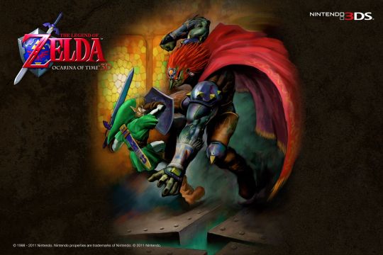
2019 has been about thoroughly enjoying the games that I considered overrated in my young adulthood. I joked on twitter that 70% of my personality was disliking Final Fantasy VII and Ocarina of Time, and honestly, it might as well have been. I earned a lot of undeserved respect in college through arrogantly spouting hot takes about “objectively good art”, and a lot of people reasonably assumed this must mean I know exactly what I’m talking about. The way I process art and media is much looser and more personal than it used to be, partially due to burning out and becoming too exhausted to deal with other arrogant people. I think a lot about how tiring I had to be for other people to talk to. Watching Tim Rogers bleed his personal trauma into his video series on the subtleties of FF7’s japanese script was the most instrumental in turning me back toward the game. When Square Enix revealed gameplay footage of the remake at E3 this year, I was hooting and hollering with the longtime fans.
But, this is about Zelda, not Final Fantasy. I had already played through OoT, as hurriedly as possible, just to say I had done it. It was the better part of a decade ago, at the urging of a then-girlfriend who had nostalgia for it. Frustrations with the Water Temple in the original version are valid despite it being largely well designed, due to some minor shortsighted-ness that blows up into nagging issues, but I think I had put myself in the headspace to dislike it from the get-go. Similarly, I didn’t want to do any collecting in the game as a whole. I had convinced myself that there was no joy to be found in collecting in games (a take bereft of nuance). When the point of Zelda games is to inspire the player to explore every nook and cranny in search of rewards, going in as a player and stubbornly trying to avoid any of that ensures that you’ll miss the point of the whole experience. I’m not sure what it was that made me want to go back. It might be that I wanted to prove my younger, cockier self wrong, and pave over my old evaluations with more nuance.
It certainly worked out that way, as several previous opinions changed entirely. Ruto used to be annoying to me, but was now one of my favorite characters. Doing all the little minigames felt rewarding in itself, and in turn I was unexpectedly rewarded with important items (they really did bet everything on the entire world they’d made). The Water Temple, now tweaked for a bit more convenience in the 3DS version, was extremely interesting. The side quest to acquire the Biggoron Sword was easily doable, whereas I had grown up assuming it impossible. And the story which had never appealed to me (because I wouldn’t let it) now felt relatable in a way I hadn’t expected. Link intends to do good, but through unfortunate circumstances and honest mistakes becomes unable to take part in the world, and it spirals downward for years as he remains trapped in a room, aging but inactive. Something about that mirrors my own experiences with depression. Sure, Link, can travel back to his younger self at any time, but there’s still a powerlessness in the inability to affect the seven year gap. You can flash back, but you can’t change what you’ve lost.
Banjo-Kazooie (N64):
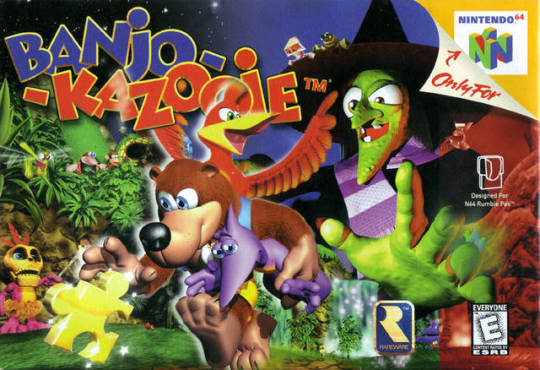
You know, as a kid I probably would have just accepted that Grunty was evil, but as an adult it’s hard not to see her as a product of her environment. Obsessed with asking her cauldron who the objectively prettiest in the world is, she seeks out and kidnaps the younger girl given the title in an attempt to steal her youth. Every character in the game describes Grunty as ugly, rather than evil, and even her own sister shows up in every area to tell you how gross she is and how terrible her lifestyle is. I ended up sympathizing with her more than anyone else. I’ve only played half an hour of Banjo-Tooie, but it was a relief in multiple ways to see her pivot to straight up murder after rising from the dead.
Despite playing Donkey Kong Country multiple times growing up, I’d never really grown to love Rare’s in-house aesthetic of big-eyed cartoony animals. It might be hypocritical, but Smash Ultimate’s reveals for both King K. Rool and Banjo (and) Kazooie made me see the charm in these characters. Something about how Smash canonizes characters as essential pieces of game history always causes me to drop any negative pretense and adopt them as favorites. It’s a little intellectually hypocritical, but I can’t help liking what I like. After the trailer for B-K in Smash, I immediately started up the original game in Retroarch. Thankfully the core I used was advanced enough to play the game without issues (the same cannot be said for Tooie), as other alternatives were expensive or hard to get a hold of. While the slightly-mean humor and talking animate objects took a bit of getting used to, I get it now. I get the children’s show aesthetic they were aiming for, and I appreciate the feel of the physics and control of the interspecies friendship of the protagonists working in tandem with each other, even if the game is at times quite difficult.
Dragon Quest I, II, & III (SNES):
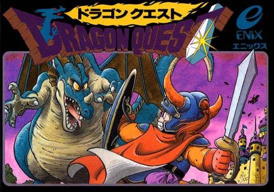
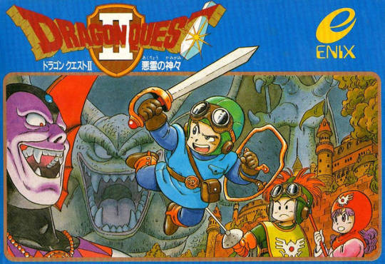
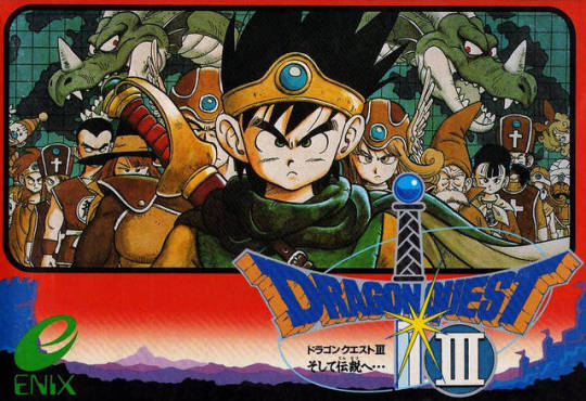
Yes, I did play through three JRPGs in a row! And yes, you might notice that the hero of Dragon Quest XI (and VIII, and IV, and III) was also announced for Smash Ultimate. They recently released, as of this writing! A lot of what I’ve been playing has been influenced by outside forces, whether it be Nintendo news or friends, but I’m not bothered at all when otherwise I might not have the energy to play anything. The games I’ve been playing are also ones I’ve intended to play for a while, so the excuses have been convenient for me. Though, actually, this decision had less to do with the Smash announcement and more to do with the upcoming re-release of DQXI, which seems to be related to the original three games, known as The Erdrick Trilogy. I had heard that you can play XI on its own, but that there is an extra layer of appreciation to be had if you’ve played the original trilogy. Me being me, I naturally queued them up. I chose the older fan translations of the SNES remakes, and though I did finish them, I can tell you that they have their fair share of bugs (DQII even has a game breaking glitch I had to finagle through using save states across multiple versions, phew). Besides that, those old translations lack the modern localizations of the games, so if they namedrop something in XI, there’s a chance it’ll go over my head. Oops! If you want to play these games, the best versions are currently on mobile phones.
Around a decade ago I was in early college, with no friends except for those still in high school or at another university. I was very lonely and nervous. I started playing Dragon Quest V purely by chance, and it served as the perfect salve for that loneliness, with its lonely child protagonist traveling around the world accumulating found family. It’s one of the more poignant and cathartic JRPGs I’ve ever played, and for the next decade I would actually be bothered that the rest of the games didn’t live up to the catharsis of DQV.
In revisiting the roots of the series, and playing it through to see how it develops from title to title, it finally clicked with me, and continues to click with me, as I keep learning more about the series. Rather than comparing every entry to DQV, I should have been comparing them in order. This might sound obvious, but it really did make a world of difference to see that V’s narrative is placed on top of the foundation the previous games set, rather than a singular case of lightning in a bottle. And the games have always featured loneliness, but in differing contexts, and to different degrees. The hero of DQI is almost entirely alone through the full game. In DQII, the princess comes from lonely circumstances, and one of the princes comes down with a sickness that leaves him temporarily unable to help his friends. In DQIII you can make as many team members as you want, but you grow up with an absent father, and your own good deeds receive bittersweet resolution. They are all games built on simple settings and followed through with empathy. The series is at times disarmingly heavy, which is part of what makes the games as memorable as they are. You’re never quite as prepared for Dragon Quest as you think you are.
As of this writing I’m currently half-way through a replay of Dragon Quest IV, and I’m enjoying it a lot more. I’m looking forward to replaying V. I have no idea what VI will be like. I’ve heard it’s a lower point in the series, but that’s what I heard about II as well, and I ended up loving it, so who knows. Dragon Quest is good.
---
Well, I managed to catch up. I didn’t get into the finer details of the DQ playthroughs, but DQIII is honestly so good I don’t want to spoil it for anyone (you should play these games). Maybe in August I’ll actually get back to watching and reading things. Maybe I’ll try to keep these things to a single paragraph per item, to make it more manageable to read. Let me know what you think, if you think.
#monthly post#curry plays games#dragon quest#banjo kazooie#little nightmares#ocarina of time#dragon quest ii#dragon quest iii
4 notes
·
View notes
Text
Spider-Verse, Mary Poppins, and Utilizing Legacy
I saw both Spider-Verse and Mary Poppins Returns this week. Some spoiler-free thoughts:
Both movies rely heavily on the fact that we know who its main character is. Both are capitalizing on this and want to make a movie that is both familiar and novel. There's recognizable story beats that hearken back to previous films, but the movies freshen it up with new characters, new presentation, and a new story that even newcomers to the franchise can understand. Now... In terms of working with a very popular legacy, I believe that Spider-Verse does it WAAAAAAAAAY better.
Most everyone (and especially someone who goes to see the film) knows who Spider-Man is. It's in the first few lines: Hi, I'm Spider-Man, you know who I am by now. Spider-Verse is now the FOURTH popular cinematic iteration of the friendly neighborhood web-slinger.
You’re gonna have some recognizable moments, not just for Spider-Man movies, but for the massive titan that is Superhero Movies in general:
- Ordinary person gets powers, reaction to powers, training time.
-Important people die. Power and responsibility are discussed.
-Big final fight in a cinematically impressive locale. Good guys win. (Except in Infinity War OH SNAP.)
You know all of these beats are coming, but Spider-Verse does this well for multiple reasons:
- The focus on Miles Morales means we’re not getting another Peter Parker story (although this version of Peter Parker is, again, both recognizable and a new twist on the classic which makes him just as engaging to watch as Miles).
- Dat presentation. We’ve never seen a Spider-Man film (and again, a superhero movie of which there are a fuckton) presented in this particular way. Spider-Verse owns this. Give this movie awards, damn it.
- The beats serve the story and character arcs. It never feels like something was shoved in to get people to remember “oh yeah, I’m watching Spider-Man.” Even the callbacks (”With great power...”) don’t seem forced because of how Spider-Man is so well established in the world. We get not only a fresh perspective on familiar beats from Miles, but the varied Spider-People’s responses to them provide even more layers.
Now, let’s look at Poppins.
Don’t get me wrong, I found the movie very enjoyable and would suggest it to anyone who wants a fun afternoon at the movies. I’m not going to criticize Emily Blunt as being “Not Julie Andrews-” even for a legacy character like Poppins, it’s useless to do this. We’ve seen enough James Bonds (and, well, Spider-Men) to know that another actor’s performance doesn’t need to be inherently linked to the others who have played the character.
While watching both movies, I got a sense of nostalgia. Spider-Verse was more “this feels like it fits into what I know.” Poppins was “this feels...really, really familiar. Too familiar.” Let me explain.
Part of Poppins’ issue is that it’s a musical. I love musicals, and I wish there were more of them. The problem is, with such an iconic score in the 1964 original, the sequel tries to make new while still relying heavily on the old. And, musicals being musicals, the songs make up a majority of the movie’s beats. With a few exceptions (Mr. Banks misses his dead wife and Mary Poppins does...Vaudeville?), both movies feature in roughly the same order:
- The “OY LOOKIT MOI IFFY BRITISH ACCENT, IT’S LONDON IT IS” song
- The “let’s tidy up while Mary Poppins tells you about fun” song
- The “animated animals with obvious tongue-twistery lyrics” song
- The “it’s time for bedtime children / emotional moment” song
- The “I’m an eccentric individual with weird magic powers” song
- The “fun nighttime romp with the male cleaning folks featuring lots of choreo” song
- The “what a lovely day for some whimsical moments in a park” song
You might think I’m being too specific, but if you’ve seen the film you know exactly what songs I’m talking about.
Obviously this was not done unintentionally- the filmmakers and songwriters wanted it to feel like the original. Thing is, the (not as catchy or memorable) new songs are drawing SO much on the old ones that all it did was make me go “oh so this is the new version of _________.” The beats are done because that’s how the old one did them, almost to the letter. When I watched Spider-Verse, I never had that feeling-- even when there were literally moments that were “oh, so this is the Spider-Verse version of _________.”
The focus was, again, on Poppins, the Banks children, and Bert Jack. This makes narrative sense, but I also feel like it holds the movie back. Poppins’ perspective never changes, and the Banks children don’t provide anything different aside from being a bit more grown-up (that goes away as soon as the dolphins pop up). You know what’s going to happen as soon as the clouds part and Poppins flies in on a kite. (WHICH IS NOT TO SAY IT’S BAD, but it begs the question of “why do the same thing again?” money what money)
Again, I think a lot of this lies on the fact that the presentation was done through song. I wish the songs (and therefore the plot) were less tied down to the original. Like Spider-Man, we know who Mary Poppins is. If they had done more of a twist or a cheerful nod to the old movie (and therefore the plot, like in Spider-Verse), “Mary Poppins Returns” could have come out as much more memorable and enjoyable in its own right.
I’m actually very curious to hear what people think of the movie if they have not seen the original, seeing as how innately connected to it the sequel is. Maybe that colors peoples’ opinion of it differently.
But hey, they’ll probably prove me wrong when they release “The Last Poppins” in the next few years and throw all of that familiarity out the window.
(Also, Dick Van Dyke is a national treasure and his cameo was perfect fight me)
#spider-man#spiderverse#mary poppins#mary poppins returns#movies#legacy characters#emily blunt#lin-manuel miranda#musicals
30 notes
·
View notes
Video
youtube
With its fey atmospherics and ethereal performances, there’s a fairytale quality about ‘The Unfamiliar.’ The accompanying video shows Anna Wolf and Pop Morrison performing, interspersed with clips from the film, appearing like spectral presences outside the narrative.
Anna’s voice here recalls the otherworldly aesthetics of Kate Bush and Joanna Newsom as the track plays around with the dynamics of loud and quiet, bright and dark, with subtly layered intricacy. Pop Morrison’s production is replete with screaming banshee guitar leads and hauntingly mixed reverberating backing vocals. The sum of all this is a haunting and memorable performance that finds beauty amidst the occult psychodrama of the film.

Anna Wolf is a singer-songwriter and holder of multiple awards for her piquant, poignant and highly idiosyncratic music. Pop Morrison is the alias of Jamie Morrison, currently the drummer of Stereophonics, and under this moniker, an explosive madcap music producer in his own right. Before writing, the duo was sent a private link of The Unfamiliar to discuss the song’s direction with the film’s director and co-writer Henk Pretorius. Anna says: “We took a metaphorical approach with it to convey the forever-building eerie tone of the film. The lyrically-driven song is also a homage to the nostalgia that the film evoked in me as a fan of The Shining and Hitchcock’s Psycho.” The final result lived up to the vision of its filmmakers, with Henk Pretorius saying of it: ““Anna Wolf and Pop Morrison’s music dreamily conveys the dark lure of The Unfamiliar. I got emotional when I heard what they created.”
The Unfamiliar is an independent horror film, set in the UK and Hawaii, showcasing a melting pot of rising British, European and South African crew and cast members. Directed by Henk Pretorius and produced by Llewelynn Greeff and Barend Kruger, the Anglo-French Jemima West (Indian Summer, The Mortal Instruments) stars as British Army doctor Elizabeth ‘Izzy’ Cormack, returned from war to rekindle her relationship with her estranged family.
Alarmed by the numerous inexplicable activities around the house, Izzy seeks ineffectual professional help before confiding in her husband. He believes that she is going through PTSD and advises her to rest and recuperate in Hawaii. It’s there that she gets sucked into the underworld of Hawaiian mythology, as she attempts to piece together the elaborate and elegant puzzle to reveal an ancient and terrifying spiritual presence haunting her family.
https://www.facebook.com/RealAnnaWolf https://twitter.com/realannawolf https://www.instagram.com/realannawolf https://open.spotify.com/artist/0DpjMYzcA7lY3DawON9HP0
0 notes
Text
Journal Update #14 APR - Spider-Man
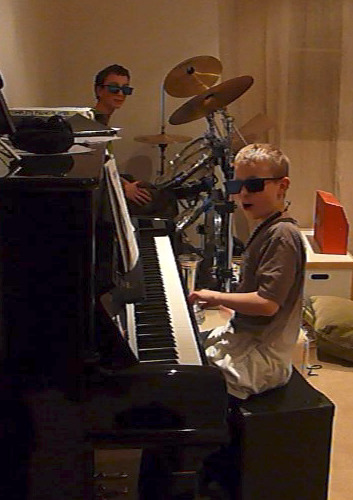
I arranged a session with my cousin Callum who brought a few of my uncle's old synths to the studio. Specifically the Arp Odyssey and Roland Jupiter MKS80, we worked for around two days creating new material for the tape.
It was cool to get him involved and this particular collaboration linked in with the themes of family connections and relationships explored on The Tape. My family has a lot to do with my early musical influence and my memories of jamming with my cousins are happy times. As we grew up and both started to specialise in different areas of music but we continued these ‘jam’ sessions usually me on drums and cal on keys, (see pic below) but usually for fun or when the time allowed. So it was great to actually collaborate for a project that will be released.
Callum is a talented multi-instrumentalist and all-round nice guy who specialises in piano (he currently teaches piano at a school). Cal has a great understanding of jazz, and I was able to learn from his knowledge on the keys and record multiple parts of him playing melodies and chords on synths. He contributed to the tracks Kick About, TOAST OF PARIS, Drink it Up and Spidey.
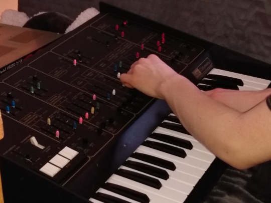
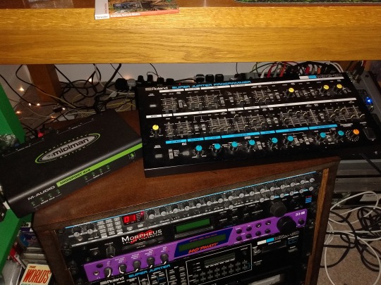
(Pictured above is the Arp Odyssey and the Super Jupiter MKS-80)
It was great that he bought these two of my uncles synths along, because they produced solidly fat, analogue, retro sounds and fed into the idea of nostalgia. Adding analogue ‘warmth’ to the beats was something that was important for me because I love the concept of noise and in particular I am a fan of Lo-Fi Hip-Hop. Although I would not describe the beats on The Tape as Lo-Fi Hip-Hop there are certainly some elements of the genre included like my use of the SP-404 effects and tape hiss. The Roland Jupiter’s “great sound is due in part to the classic analog Roland technology in its filters, modulation capabilities and a thick cluster of 16 analog oscillators at 2 per voice.” (Vintage Synth Explorer, 2017). The Arp Odyssey is a revolutionary analogue synth and I am glad to say it has featured on The Tape. The Odyssey is a “duophonic unit with two VCOs, most notable for its sharp sound and the versatile sound-creating possibilities” not easily available on other small synths of the time. With functions and modulation options such as oscillator sync, sample & hold, pulse width modulation, high-pass filter, and two types of envelope generator, it featured a rich array of sound-generating potential. The Arp Odyssey's signal path had a major impact on synth manufacturers that followed. It became the standard for subsequent eras, influencing even the polyphonic and digital synthesisers that were to come later. The Arp Odyssey was used by many great musicians including Herbie Hancock, George Duke and Kraftwerk (ARP, 2015).
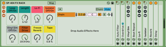
I made a special SP-404 emulation effects rack for use in live performances to market and create hype for Easy The Tape (pictured below)
What went well:
We created quite a few new ideas and also recorded multiple parts on more than one of my beats, which gave me a lot to work with and choose from. It was also good to learn from Cals knowledge on the keys. And because we knew each other creativity flowed and the session was productive.
What didn’t go so well:
Didn’t get as much done as I could have due to having too much fun in the sessions and getting distracted listening to music, playing Gamecube and watching old TV and films... to find samples though, all of which you can hear in the beat ‘Spidey’.
The Artwork for the track is pictured below.
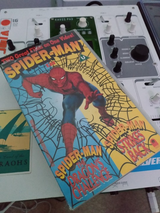
The main sample on Spidey is recorded directly from the original VHS of one of my favourite spider-man films when I was a kid (pictured below)
The use of sampling directly from VHS references not only the sample itself but the sonic characteristic it carries with it. This piece of technology is obsolete now and only used in a nostalgia inspired visual art or music, and sometimes as an effect for music videos that reference the nostalgic and ‘Lo-Fi’ aesthetic. Hopefully incorporating samples like this will evoke a nostalgic response in the listener with realising. In addition Multiple samples from vintage spider man cartoons of my childhood were recorded from Lo-Fi (obsolete technology, such as VHS and DVD). I remember being so excited to wake up on Saturday morning and sit in front of the massive flickering box in the front room with my cheerios for double bills of Spider-Man: The Animated Series. When I think about it now it brings back happy memories and it has a lot to do with that ‘Lo-Fi’ aesthetic, the flicker of the CRT screen which always seemed giant compared to little me and the crunchy nature of the sound coming out of the low budget TV speakers... simpler times. Hopefully listeners will get these same feelings when listening to the beat.
Once I’d finished a first mix on Spidey I showed the track in one of our production showcases for feedback
Feedback on the first mix of ‘Spidey’ from the peer review session:
Nick (tutor): The use of samples is great and the elements all work together and communicate well with each other. The stereo image is a little strange however. The snare feels too wide and leaves a gap in the centre. The kick is central and acts as an anchor to a point but there isn’t any central information in the mid range, which is needed. It’s ok to have the wide information with the snare but consider layering this with a mono version of the snare to give focus whilst also sounding wide. I also think the distorted bass sound should be in mono and the piano sample should be more central. Overall the mix seems lopsided towards the right, so some attention towards balancing out your panning is necessary.
Nice placement of all the elements of the track sounds tight and professional, although feel parts are possibly a little dry and could move about a little more to fill spaces that sometimes feel a bit empty, vocals are cool!
Production sounds great, the structure is all there, maybe the backing sample (horns and keys) could come up in the mix a bit more?
Real nice stereo spreadage, could even play with that as the track develops? Really like the subtle pad in the second half. Real nice velocity control on the drums and stuff, sounds smooth as a babies bum. Mix sounds pretty tasty too.
NY/Parallel compress those intro vocals. Beat is nice and breathy though.
This is ace. Really great use of the chosen samples. Maybe spread out a bit too much.
Kick is really punchy and clean! Maybe some saturation and stereo spread of the hats. Overall sounds really nice, good mix.
Drums sound really nice, the stereo spread on the snare works well although there could be a layer in mono.
This track reminds me of some of the songs included in the Baz Luhrmann production of Great Gatsby - mainly "No Church in the Wild" and "Ni**as in Paris" by Jay-Z. Not sure if he's an influence but it might be interesting listening to some of the production techniques he uses to enhance the mix of this track.
I think it's great and has a strong foundation.
Really great track! Love the way you’ve played with the stereo field although the hard pan of the piano sample feels a bit extreme for me. Texturally it sounds great and got me rockin’!
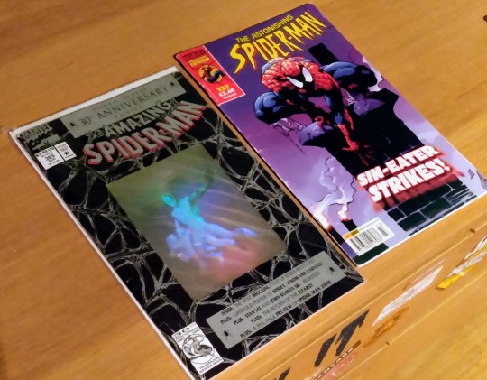
Above is a picture of just an excerpt of my large spidey comics collection. I started collecting around 2006/07, and if I remember correctly the right comic is the first issue I ever bought, the left is probably my most prized comic in that collection, 30th anniversary edition... nerd...
References:
Vintage Synth Explorer. (2017). Roland MKS-80. Retrieved 2020, from Vintagesynth.com website: http://www.vintagesynth.com/roland/mks80.php
ARP. (2015). ABOUT | ARP. Retrieved 2020, from ARP - The Legendary Analog Synthesizer website: http://www.arpsynth.com/en/about/
#family#work#beats#studio#arp odessy#synth#synths#jazz#the tape#spider-man#spidey#beat#easy#easy green#tape#comics#production#session#feedback
0 notes
Text
Artists & Artworks
Below are the artists and artworks I have viewed as key informants for my work this year.
(Note: The NightMind link(s) is/are included with several of the works as he has created explanation videos for those works that are interactive, online and hold mystery within them. I have included these as they are often what introduced me to the works or have helped me understand the works in a different perspective. If the work interests you I suggest viewing it and then the NightMind video.)
It is upon compiling the artists and works I have looked at over this year that I have found the correlation of the uncanny and a representation of real, public life within all of the works and how this influenced my own work.
Please click ‘keep reading’ to view all of the information.
Alan Resnick (and Wham City Comedy) (This House Has People In It + Sculptor’s Clayground, Unedited Footage Of A Bear, AlanTutorial, Live Forever As You Are Now, Children Of The Mirror) Links: 1 2 3 4 5 6 7 8 NightMind 1 2 3 4
Alan Resnick and Wham City Comedy create complete alternate universes within their works. Resnick started with AlanTutorial, a youtube and twitter based immersive art work that left viewers questioning whether Alan and his problems were real. This invasion of the suspended disbelief a viewer enters is present in all of the works listed above, and bar AlanTutorial, use this and the innate curiosity of a person to created a twisted narrative that comments upon society and its controlling aspects on the viewer.
It is the aspects of discovery that I have brought into my work, with the websites for UFOAB, THHPII and COTM all have between 20 minutes and 2 hours worth of extra footage and hidden text that does not leave the narrative it is creating or reverts to the “artist’s voice”.
UFOAB is film and website that follows a mother as she goes insane and pushes the fake medicine of Claridryl and can see to be commenting upon Big Pharma and our reliance on medications that cause more problems than what we are medicating for.
THHPII is a huge mass of information behind the initial video. Using security camera footage and logs we view the family, the newly connected family with the children being one of each parents and the baby being both of the parents’ child. After digging into all of the information with Sculptor’s Clayground it can be suggested that the work could be commenting on society and advertising pressures. The family are concerned about the contraction of a fake disease which is put into their brains by the media they consume and may be finally represented by Madison and the non-family members sinking into the ground.
The expanding sense of discomfort and confusion upon viewing just the videos is heightened when viewed in their original time slot (again bar AlanTutorial) at 3am on the American channel Adult Swim as part of their infomercial series (see below). However there is an understanding that all of these works do not have a definitive and absolute explanation and reasoning behind and within them and it is the viewer’s interpretation that creates the narrative also.
Also discussed in my dissertation.
Joe Pelling & Rebecca Sloan (Don’t Hug Me I’m Scared) Links 1 2 3 4 5 6 NightMind
Another video works that comments upon society, becomes chaotic and has many easter eggs within each video. DHMIS is the first work I viewed that informs my vein of work this year. First seen online July 2015 and also viewed at the cinema screening at Dismaland, we as a viewer are transported to a set like a children’s television show, and in each ‘episode’ we are given a barely graspable idea - Time, Creativity, Love, Internet, Health - that is introduced to children early in life and then something goes awry and we are greeted with a horror version of the show.
Nostalgia lulls the view into a false sense of security in the first video, the bright colours, puppets that are reminiscent of the Muppets or the Tweenies and the bright colours and simple set falls into the tpye cast of children’s TV show. The obnoxious lies that are then presented with these visuals jar against each other.
There are any interpretations of what DHMIS means, such as a comment on society and its use of control through advertising, the brainwashing of children through television and brand influence on presentation of individuals. It is the multiplicity of meaning that I have aimed to use in my work and the false sense of security and nostalgia of the child like appearance that is used in parts of all the installation-intervention works I have created.
Jeffrey Cranor & Joseph Fink (Welcome To Night Vale, Alice Isn’t Dead) Links 1 2 3 NightMind
WTNV is a podcast which developed into a touring show and several books that then lead to other podcasts such as AID. A fictional town described as “if Stephen King and Neil Gaiman created a town in The Sims and left it running”, Night Vale is a faux radio show hosted by Cecil Palmer giving out community information and news, which can be both ordinary and extraordinary for the viewer but treated as normal by Cecil and the townspeople.
WTNV’s use of just audio to create such a vivid mental image for the viewer is incredibly inspiring. Disparition and the voices selected for the characters create a perfect combination that created a universe that the viewer can easily fall into until the odd happenings question the ease in which you enter the town.
This has influenced some of the creepier comments and aspects in my work, loosely created the basis for the eye logo. Night Vale is one of the overarching background influences for my work as well as a piece I thoroughly enjoy itself.
EverymanHYBRID Links 1 2 NightMind Playlist
EverymanHYBRID is a ARG work, part of the lore that has created Slenderman. Filmed and presented in a documentary/real life style drawing the viewer into the narrative it weaves. Multiple inputs and links from around the web as well as real life events that can be found on the web (the trials).
Aspicio Omniam Links 1 NightMind
An audio-visual piece that uses sound well to create an atmosphere, visit the apartments from hell, with ‘educational videos’ that explore the apartment in relation to the sound track with it.
Spectacular Organic Links 1 2 3 4 NightMind
A faux company that offers you a product that you never truly know what it is or recieve. This work holds the chipper and over exaggerated ‘happiness’ that I have emulated in the audio piece for Artist (i)nformation and in several of the posters in ETB.
The Modular Body Links 1 2 NightMind
A website and advert that shows the latest creation in biology. A creature that you can build.
The production value of the video is high and the technical aspects of creating a machine that can emulate the idea of a biological creature is interesting to be but the suspended disbelief is broken on the website however.
Abstractions Links 1 NightMind
I did not view this work much/for long, but the use of images and layering (the subtitles, the contrast and such) is intriguing and the act of having to search for meaning in an image or work is something I have used within my work just to a different degree.
Infochammel Links 1 NightMind
An over-exaggerated mockery of infomercials and advertising. A channel that can actually be streamed to television which on the surface seems like it can make sense but viewing the individual videos gives the sensation of your brain being fried but no knowledge being contained within them.
Adult Swim’s Informercials Links 1 2 3 4 5 6
Adult Swim has commissioned a variety of artists to create 11 minute long videos to be shown at 3am. Many of these videos parody a form of popular entertainment and showings typical of the 3am time slot - Too Many Cooks parodies the 80′s television themes and casting, Icelandic Blue and Miracle Man parody the style and content of infomercials, religious or consumer (Alan Resnick’s work was shown as part of this section as well) - and imply that these infomercials are not fake and are truly part of our universe and society.
The15Experience Links 1 2 NightMind
The15Experience plays with what is true and what is not and what is live and what is prerecorded and created. The viewer is given access to 15 cameras in an abandoned house, told by the creator/installer to be viewing a haunting. We are then privy to a group breaking in to the house and a demonic possession occurs.
The blending of true and fiction is important to me and my work and the horror aspect interests me.
Darren Cullen Links 1
Cullen’s key work for myself is Pocket Money Loans. It is a faux shop from that displays loans for children in return for their pocket money, mocking the loan shark culture of the work and the destruction of Romantic childhood ideals. His play in the space between real life and art is interesting to myself and the realisation of my work. The outcry he had in response to PML as people found the work either too realistic (therefore believing it) or too hard on the point it is putting across is something I wish to emulate in the future with my own work.
Also discussed/Discussed further in my dissertation.
Dismaland
Dismaland is a key exhibition/art work that has influenced my works this year. Showing several of the works on this list (Wasted Rita, Darren Cullen, DHMIS) Dismaland creates/reflects the overbearing ‘Big Brother’ state that I have emulated as the corporation of ‘(i)nformation H(eye)ghway’ . The merchandise and atmosphere is recreated and influential on the stickers and business cards in Elder Tour(i)sm Board.
Yet another work that asks the viewer to suspend disbelief and enter the world it creates, Dismaland uses images we recognise and ones we don’t and manipulates them into a realistic but uncanny valley portrayal of theme parks, advertising and consumerism.
Also discussed/Discussed further in my dissertation.
Janice Kerbel
Kerbel uses language, wording, typography and staging to create art pieces. Nominated for the 2015 Turner Prize for DOUG, Kerbel subverts the tradition presentation of storytelling.
Her works comprise of audio, print and performance which as elements I have used within my own work.
Joëlle Tuerlinckx Links 1 2 3
While last year Tuerlinckx’s work was incredibly important to the creation of my own, this year her influence has lessened.
Her use of language and manipulation of language has influenced the duality I have created in my work, whether explicitly through the language - Expens(iv)es being a combination of expensive and expenses and how the reading and pronunciation of the word effects how the written piece is read - and the manipulation of thoughts and interpretations of the viewer themselves.
He combination of gallery and studio spaces in the exhibiting of her works has also helped with my realisation of the presentation of ETB.
Also discussed/Discussed further in my dissertation.
Johan Deckmann Links 1 2
Deckmann paints short statements onto book covers which hold somewhat private thoughts or information. The covers are then framed and photographed and aired to the world.
Katrina Palmer
It was Palmer’s work that cemented for me that writing and longer form writings can be art. Statement artists such as Wasted Rita, Lawrence Weiner, Johan Deckmann and Seamus Gallagher all told me that short but precisely focused statements can be presented as art outside of the literary sense of words, but Palmer’s works such as Geraldine The Goat presented ‘story-telling’ as an art form outside of the traditional view of the narrative.
Lars Laumann Berlinmuren Links 1
With Berlinmuren being a mockumentary of sorts following the true stories of two women in love with the Berlin wall.
The oddity of real events is something I want to replicate within my work while combining it with mundanity and ‘true’ extraordinary ideas.
Lauren Wolcott Some of The Lied I Have Told Links 1
The use of own thoughts and hidden feelings helped in creating the graffiti in all of my installation-intervention works.
Lawrence Weiner
Weiner has been a heavy influence upon myself, many through his discussion of what is art and how it is created or perceived or situated with Siegelaub and the others (see notes on the Siegelaub interview and the Lawrence Weiner book).
However I did not come to his work until late into this year, but his use of text as art to create a dynamic between thought and space is incredibly interesting to myself, and with a quick google search is apparently so with a mass of artists worldwide.
Mark Wallinger Link 1
Richard Littler Links 1 2 3
Littler is the creator of Scarfolk, the blog, youtube channel and book that shows the town of Scarfolk that is stuck in the decade of the 1970s.
Scarfolk is a major influence for me: ‘for more information’, the use of posters to imply information without actually giving any, the over arching power of the town council and how they control the output of the town.
With the book it is presented as a found document of writings by a father who is searching for his missing sons in Scarfolk. The legitimacy of Scarfolk is pushed by the printed document and its layout of the book makes it feel like a real guide to Scarfolk and his history as well as a documented search.
Littler makes the works look relevant to the time they are supposedly from while referencing current events as well (such as the election of Trump). The posters and audio-visual works on the youtube are convincing enough some people state that they remember them from their childhood in the 1970s, even though they were not created until 2009-now.
Also discussed/Discussed further in my dissertation.
Richard Prince Links 1 2
Prince’s ideas on appropriate in art/as art have always been a point of contention for me. The copying exactly of a piece (in his sense redeveloping an image) does not create a new art piece, or an art piece you can apply your own name to, but using ‘found’ images to create different works in a major part of my work. Such as using the idea of bubblegum broccoli from McDonalds or the image of Apple’s Macbook.
Samuel Beckett Links 1
The performance an execution of Not I aided the production of the script and performance of (I)nformation H(eye)ghway. Beckett demanded perfect speech of the script but a continuous babble of words becoming unable to be understood, while the actress is strapped into a harness and suspended above the ground for the entire performance. Her endurance is part of the performance and the only object the viewer is given is the gaping mouth.
Seamus Gallagher Links 1 2
I discovered Gallagher’s work on instagram mid-November, and the worry became that the work I was producing at the time was too similar to his (the classifieds).
However both of us have developed down different avenues from a similar starting point over he same span of time.
His work has shown me how the ideas I have can work through a different aesthetic and process and has influenced some of the book covers made for A(I) and ETB.
Wasted Rita Links 1
Her fly-posters were the most interesting to me at Dismaland. The miminalistic images she creates through the use of private-made-public statements on faded papers are incredibly pleasing to me.
Also discussed/Discussed further in my dissertation.
2 notes
·
View notes
Text
Blog Task 6
Peter Mitchell
Peter Mitchell is a British documentary photographer, known for documenting Leeds and the surrounding area for 40 years. Mitchell’s photographs have been published in three monographs of his own and his work was exhibited in Impressions Gallery in 1979 and nearly thirty years later was included in major survey exhibitions throughout the UK including Tate Britain, Media Space in London and National Media Museum in Bradford.
In particular, I researched the Mitchell’s work named ‘Strangely Familiar’. This was created in the 1970s by Mitchell while he was a truck driver working in Leeds; he photographed the city during his rounds. This work depicts the factories and small shop owners of Leeds, all photographed, with the aid of a step ladder, in a formal manner. In 1979, the photographs were shown at Mitchell’s one-person exhibition at Impressions Gallery in York; this was the first landmark colour photography exhibition in the UK. His work was later included in the seminal exhibition ‘How we are: Photographing Britain’ at Tate Britain in 2007.
Although his project isn’t specifically linking to the theme of Nostalgia, due to him photographing Leeds in the 70s, a time of decline, his images show rapid change of Leeds, for example this is see in the image below where a building has clearly been pulled down (next to the newsagents) as an attempt to redevelop the area. Also due to the images being taken in the 1970s and only becoming well known around 30 years later, the viewer is able to clearly see the comparisons between Leeds today and Leeds in the 70s and this could create a sense of nostalgia for some viewers who grew up or knew Leeds during the time that the images were actually taken. This is something I find extremely interesting as I spent a lot of my childhood living in quite a rundown area and therefore this inspired me to do a photoshoot in Morecambe as I feel that structure and building photography is fascinating due to compositional features as well as colour contrast and also simply the small details of buildings especially with run down or derelict buildings due to how worn away and decaying the structures are. This therefore inspired my work and enabled me to develop it further as I visited a place which reintroduced the feeling of nostalgia to me and therefore this allowed me to develop my project into more depth of my own personal feelings.

I also took inspiration from the compositional features of Mitchell’s work as his images often use the rule of thirds or have the building directly in the middle of the framing of his images which is effective as it allows the subject of the image to be seen clearly without being too close to the camera and this allows the image to have a lot of space and reduces the risk of the image being too busy and distracting from the actual subject matter. In all of his images, the colour is often concentrated in the middle of the image which is beneficial as again, it draws attention into the subject matter of the image and therefore his concept is portrayed clearly without being hidden. This is something I tried to apply while doing my Morecambe photoshoot, as while photographing I paid close attention to compositional features while including colour contrast and also experimenting with different angles, however I also experimented with the zoom and photographing buildings close up in order to capture the details effectively. I also like the certain aspects of vibrant colour in Mitchell’s images due to the majority of the surroundings being quite dull. This allows the image to be increasingly interesting as the colour stands out clearly and is something which is significant to other photographer’s work.


Sarah Amy Fishlock
Sarah Amy Fishlock is an artist and educator working in Glasgow and is a graduate of the Glasgow School of Art, working with her own photography alongside found images. Through different projects, she explores the relationship between the individual and wider social, historical and political realities, the tension between national and familial identity and the problematic nature of memory. In particular, I studied her project named ‘Beloved Curve’ which examines the transitory nature of human life in relation to the cyclical and constantly regenerating natural world. She used double exposure in this project in order to create a dialogue between her fathers documented past and her own immediate unknowable present. This is something I took inspiration from as her project clearly portrays a message through using old images as well as new images and I feel that this is effective for my project as it explores the concept of Nostalgia extremely well due to the juxtaposition of past and present and it also explores memories which are often replaced by new memories or are forgotten.
In particular, I have taken a lot of inspiration from the kind of images that she layers. For example I like how she uses old images from the past of her father and her as I feel that it portrays the concept of memories and nostalgia very well and this is something that made me want to use old photos of my siblings and I. I also feel that this allows me to develop my own personal feelings of nostalgia and therefore I can show this through my project which will in turn develop my ideas and I feel that this can be projected well onto the viewer and they can relate as they also have their own interpretation of nostalgia. I also like that Fishlock specifically uses photographs of the natural world as I feel that this allows her images to coincide well, firstly in technical ways such as through colour contrast and compositional features but also in conceptual aspects as the images layered over images of her father create a message and portray a lot of symbolisations. Fishlock states: “Using double exposure techniques to create a dialogue between my father’s documented past and my immediate, unknowable present, the work attempts to reconcile the two realities that grief creates”.


I also like the fact that Fishlock photographs places that have personal relevance to her and her father such as the image below; an image of her father and her mother as a young couple in Sunderland, with a rush of birds flying like a chance of hope, off the roof of the York Art Gallery, a place he showed her before they got married. This further, portrays the message which is intended and is increasingly conceptually effective as Fishlock goes into depth of her father’s life and the precious moments of his life showing how important this project is to her. This is something that I took a lot of inspiration from because although, in my project I am studying my childhood and memories rather than death, I decided to do a photoshoot in Morecambe which is where I remember a large quantity of my childhood being and this allowed me to really go into depth of my memories. This also allowed me to develop my own feelings of nostalgia as I hadn’t visited there since I had lived there and therefore this enabled me to reflect these feelings of nostalgia into my project making it more conceptually effective. I have also done a lot of textures shoot in York which is the place I live which allows my images to explore both the past and the present.


Tierney Gearon
Tierney Gearon is an influential American photographer who typically focus’ on photographing her children and her family including projects such as “The Mother Project” and “Explosure”. She started her career firstly studying ballet in Utah and then was recognised by a modelling agency for which she then started modelling for. During this time she explored photography, starting off as a fashion photographer and in the early 2000s developing more into documentary photography and photographing her family. She has presented her work in many galleries however has received multiple complaints for the controversy of her pieces. Regardless of this, I feel that Gearon’s work has influenced the development of my project and I have taken a lot of inspiration from her project: ‘Explosure’.
In this project she photographs using a film camera however creates the double exposure inside the camera, using one film, saving it and then photographing over the top of them in order to create the effectiveness of her images. As she states “Two boring images suddenly become more interesting than a regular photograph” ; all of her images have close attention to compositional features such as ensuring that each subject in each image is in a certain place of the frame in order for the two images to layer well on top of each other without being too busy. Her images also include a lot of vibrant colours and they also reflect exactly what her project aims to do as she photographs moments in time which on one hand are extremely well put together in terms of technical aspects, but on the other hand also are informal, natural and extremely candid due to her photographing her children at times when they are doing what any child would and in their natural environment.
Specifically, I have taken a lot of inspiration from the compositional features which she uses as I feel that while layering images, it is exceptionally important to pay close attention to the positions of each image and how you layer them because otherwise they can look too busy and rather than the images coinciding, they become distracting which therefore makes it more difficult to focus on and portray the concept/message which is intended. While layering images, especially where I layered 3 images, I paid close attention to the positions of each image on top of each other in order to ensure that I don’t make this mistake and I feel that this has allowed me to develop my project further both technically and conceptually. This is seen in the image below as with this image, I experimented with layering 3 images, two of which were old images from an old photo album. These two images included people in them and therefore I decided to position the image specifically so that the people in both images were beside each other rather than over the top of one another as this ensured that the image wasn’t too distracting and it also allowed each subject to be seen clearly.


I have also taken inspiration from her work due to the vibrant colours in each of her images. This is something that I wanted to include into my project and therefore through looking at Gearon’s work, firstly while photographing textures, I paid close attention to photographing textures with vibrant colours such as flowers. I also considered each individual photograph from the photo album of me and my siblings and what kind of textures and colours would go well with the different images so that when it came to layering the multiple images on top of one another, they’d coincide nicely and therefore allow the images to be aesthetically pleasing as well as conceptually effective.

0 notes
Text
Documentary Photography - Brief 3 pt. 2 - Evaluation
-“Because The Internet.” – LEWIS SWAN
I decided to focus my brief around the theme of vinyls being a “recycled fashion” as they have slowly crept back into fashion having become very popular with all generations in the recent years. I was fascinated with all the vinyls displayed around Old Street Record’s. I had multiple conversations with the owners about why they actually had the vinyls displayed and if they had actually picked certain vinyls to be displayed. I was told that the vinyls weren't actually used and it’s a shame that they’re not. They were all from his friend who collected vinyls and had a load unused in a storage unit. They decided to display the vinyls as artwork, but he said they now have plans to use them as vinyls are slowly becoming fashionable again. I thought it would be interesting to do a project on vinyls being a “Recycled Trend”. As someone who collects vinyls and has always been surrounded by vinyls as my fathers is a collector, I thought it would be interesting to document how vinyls have come back into fashion and are frequently used by all generations. Why has the trend of using and collecting vinyls become fashionable again? Why has this trend been recycled?
I gathered all my findings before starting to shoot for this project as I wanted to research how and why the trend of vinyls died and has been resurrected through both primary and secondary research. I found that there were multiple reasons for people collecting records in this modern day. In the past records were the only way of listening to music other than listening to the radio, you would have to own a vinyl player to be able to listen to music. As technology progressed cassettes and CD’s became available and people were able to listen to music on the go. Eventually the internet killed off these technologies as people were able to download mp3’s and access music streaming websites such as Spotify, ITunes and Tidal. There were a variety of reasons for people collecting vinyls in this modern day. From my own experiences and from talking to my friends I found that a lot of people collected vinyls or liked the idea of having records to display them like artwork, being able to display their favourite albums. Places like Old Street Records used records as a form of artwork around their bar. They used the vintage vibe to attract people into have a drink as all these “vintage” trends are popular at the moment. The younger generation also liked collecting certain types such as “limited edition” vinyls, as it was nice having a certain item other people didn’t have. It was a way of showing off in a sense.
My first shoot for my project was at multiple record stores I visited in Oxford Circus, I wanted to visit the record stores I’d normally stumble upon and capture candid shots. I also wanted interview some of the workers in the record stores, but no one seemed up for having an interview with me. I took some candid photographs during my time in Oxford Circus, but none of them spoke to me, the photographs didn’t appeal to the artistic ideas I had imagined.
I decided to try and take a more studio approach to the shoot. I wanted to create a scene with multiple vinyls and other props such as a record player and old over ear headphones to create a modern vintage scene. I decided to use boxes of multiple records as a chair and table. I also decide to spread loads of vinyls out on the floor to make it look like my model had been sat listening to all these records. Unlike streaming websites, you’d have to physically go through your collection by hand in the past to find something you wanted to listen to. I used both my own vinyls I’ve collected over the years such as my Childish Gambino, Frank Ocean and Led Zeppelin albums, and my father’s vinyls he’s collected for years such as his David Bowie and Iggy Pop records as I wanted to display how a variety of generations are all part of the recycled trend. The older generation such as my father grew up with vinyls, it was the norm to him. I used my vinyl to show a much more modern approach, people like myself use vinyls more for artwork than actually listening to them. That’s why I decided to showcase my vinyl wall as a backdrop for the shoot. I tried to create quite a hoarding type vibe to the shoot. I wanted to make it look messy, but I wanted the audience to visibly see the vinyls, the record player and headphones. I wanted all the reasons for people to collect vinyls I gathered through research, to be visible in the shoot to display my findings e.g. For artwork, for listening, as collector’s items and for also nostalgia.
I decided to use my friend Ella as the model for my shoot as to me, she was the typical “hipster” who rejuvenated the trend. As she said in my interview with her, she doesn’t collect vinyls herself, but she liked the idea of them. She’s always been into the music scene and fashion trends around the scene so I thought she’d be the perfect person to incorporate in my shoot. I decide to dress her in just an oversized t shirt to make the scene look comfortable, to make it seem as if she’s just chilling at home listening to her records. Again, this created quite a hipster look to the photographs as the idea of collecting vinyls is seen as a “hipster” thing to do in this modern day. I used makeshift lighting to add to the vintage look. I used a gold reflector and my iPhone torch to create a shimmering gold coating on my model. The golden lighting with her tanned skin created a beautiful effect upon her skin, made her glisten in a sense.
For this shoot I shot in quite dark conditions and then used my iPhone as lighting with a reflector and also a clip-on flash for my DSLR. As I shot in low light conditions I had to use a high ISO, this created a bit of grain, but I liked it because It added to the vintage aesthetic. As I wanted a big depth of field I used a high F number (f20) to keep the background and subject in focus.
I decided from an early on stage that I wanted to display my work as posters, as it linked well with the trend I was trying to portray. I didn’t want to create a poster that advertised anything like all the artists I researched, but create a poster that would just create attention or turn heads to the trend, the new fashion. I went through many ways of displaying my outcomes in forms of poster, but couldn’t find a way of presenting my work that spoke to me. I knew I wanted them to be colourful. I decided to use printing onto coloured cardboard as my starting point. I went through multiple techniques such as layering and printing techniques. I eventually came upon an idea that I liked. I decided to print all my outcomes onto coloured cardboards, scan them onto my computer then layer them upon each other so the colours were half and half. I then used Photoshop, as I knew I wanted writing upon my outcomes. I chose the title “Because The Internet” typed the title out and then layered it multiple times over the side of my outcomes. I used quite a jumbled-up approach as I wanted the audience to have to really pay attention and focus their attention to be able to read the writing on the side. I think this added more character to my work. The title also linked back to all the information I documented about the revival around the records scene. It especially linked to the way the internet killed and revived the scene.
I decided to display my posters in various locations around to see what kind of acknowledgement I’d get from passing public, but to also see what they look like in certain scenes around London. I didn’t want them to be seen as advertisements, but to make people aware with actually how popular the vinyl scene is in the modern day. I decided to print out my posters as one outcome, I edited all my outcomes to make them look like a strip. I planted them in multiple locations around Brixton as I thought Brixton was the perfect location as it is seen as quite a hipster location but also has a lot of history, the perfect place to showcase my final outcomes. From trying this I realized that my posters looked much better when blown up to A3 rather than smaller.
If I were to try this project again I would try to take a more documentary approach. I took quite an arty approach to my outcomes which I really liked, but I could have a done a mini movie series to go along with the outcomes to show a more in depth look at the recycled trend. Featuring multiple interview and shots in and around the record store scene which could have been interesting. Saying this, I am pleased with how my work came out. I really liked the poster style I went for, even though the alternative covers idea didn’t work out, I still think the idea behind them was interesting. This could be something I could also work on again to see if I could create a better three-piece series with alternative styles.
0 notes
Text
Issue #9: Ole Pihl
What if a bridge does not merely connect two riverbanks that already exist? What if the banks emerge as separate pieces of land only as the bridge crosses the stream? Ole Pihls new book “Bridge in Berlin” offers a fresh take on the fundamental Heideggerian question. The exquisitely designed graphic novel tells the story of the banks of the Spree river as they emerge through the crossing of the emblematic Friedrichsbrücke. A book changes how we approach places, it imagines an intriguing Berlin, composed equally of past and future, of fiction and reality. It is a masterpiece of visual storytelling that blends the city’s architectural history with the author’s life journey.

Peter Koval: Your path from illustration to architecture and back doesn’t look like a straight line.
Ole Pihl: I was always shifting between drawing, sketching, painting, teaching and doing architecture one way or another. My father had a company for building houses, so from a very early age, I was creating scale models for him. I was a very quiet boy and I loved making these models. He often came to me and asked me if I could make a model of a certain house in 1:50 scale or so. Then the next day, he would bring it to the customers and show it to them so they could imagine the house and see all the details. That was a great challenge for a kid – to do something “real” – and I loved that. So, in a sense, I grew up with making models and thinking about architecture.
When I grew up, I moved to Copenhagen. It was on the cutting edge of a great wave of the French comic books. If it was Asterix or Blueberry I was absolutely crazy about them! I even went to Paris trying to sell some of my own comics. I didn’t speak a single word of French and the people I met didn’t want to speak English. I think they didn’t really like what I was showing to them. However, it was fun just doing it.
PK: Copenhagen must have been a great place to be in the 1970s.
OP: I’m member of the 1968 generation. When I moved to Copenhagen, I moved into great collective where many people were living together for many years. We did a lot of political activism, we had a band in the house. We occupied an old factory which we converted into a theatre and music venue that we ran for many years. We had a lot of fun. I got used to the idea that when you want to do something, you just have to go for it. But it was a different time then. Everybody was on drugs and everybody was reading Marx and talking about the revolution. We put big posters of Mao Tse Tung on walls in the collective, and we thought that the RAF was cool. But we didn’t really understand what was actually happening. We were quite naive… It’s very difficult to look back and realize that we had been fascinated by something that can only be recognized today as straight terror. But how could we have known? Every member was having some meeting with strange Russian guys from the embassy. Even I did some comic books criticizing capitalism but I couldn’t understand why the Russian cultural attaché wanted to talk that much with me about our ideas about revolution, the system, being critical and being an artist. It sounds weird, but now I know that he was just doing his job.
Later, I studied architecture by Henning Larsen but I continued to be fascinated by storytelling. I’m very curious about which story belongs to which city and what makes it special. It’s a different kind of contextuality. You can talk about the context on many levels. You can talk about the physical context: the buildings and the materials, the area, the weather, the sun, all these kinds of things. But there is also another context which is rather imaginary. When you move towards the genius loci, towards the spirit of the place, then suddenly, the storytelling and the spirituality take over the definitional powers of a place.
PK: How do you approach places?
OP: I love to approach places by chance; by getting lost. I enjoy walking in Berlin and being aware that I do not know where I am. It’s like walking on untouched ground. The insecurity that comes with moving into unknown terrain is so vital. Because it makes us really aware of what happens to us and to our environment. So that’s always one of my favorite activities: Getting lost. And then I try to gather some information and read about places and their history. I can also sit for hours just looking at maps. I have a total obsession with maps.
PK: How would you say all maps are linked? When it comes to physical structure, drawn maps, people, stories, spirituality – is it a jigsaw puzzle? Or is there a bridge connecting them?
OP: There should be a bridge. But it depends on you. Walking on Friedrichsbrücke can be so different from day to day, depending very much on your mental condition. For example, one day you could just walk in snow and watch your footprints on the ground and experience the contrast between the white snow and the blackness of the Spree river. Another day, you pass the bridge, there is a Roma girl playing accordion and her three cousins standing at the other side, watching her, waiting for tourists to give her tips so they can have a drink afterwards. I remember one day there was an opening ceremony of the then freshly renovated Friedrichsbrücke where the mayor was cutting the ribbon with big scissors and suddenly it was filled with all these photographers with constantly flashing cameras. The bridge became a ceremonial space, temporarily halting the constant flow of tourists and their guides. All of these happenings connect the layers and at the same time shift the reality of the place. I often return to the bridge because it’s so symbolic and metaphorical and it has a structure very open for storytelling.
But we can also think of its form; the bend, for example. The new curve on the Friedrichsbrücke is much stronger than the curves on all the other bridges that connect Museumsinsel. That actually creates some kind of density and excitement. Because when you start walking on the bridge, you cannot see what’s happening on the other side. It’s a transition – slowly moving up and moving down. There are many interesting things happening when you pass a bridge.
PK: What is something unexpected that you found out about the bridge?
OP: I was very surprised when I learned about its various incarnations through history: beginning with the Große Pommeranzbrücke leading to the Orangerie and its change from brick to cast iron and to stone again, then its replacement by a temporary wooden bridge after the Second World War and its reconstruction in concrete in the 1980s. In this perspective, the actual bridge appears to carry – or let’s say to “bridge” – a multitude of bridges.
PK: Is there another genius loci besides the Berlin bridges you are irresistably drawn to?
OP: At the moment, it’s the Kyoto station. It’s so strange, almost like a monster that cuts the city in two.
PK: What triggers your imagination?
OP: For me, everything starts when I move from the verbal to the non-verbal, from text to image. That opens my eyes and all my senses. I start drawing and sketching and, at least for a moment, I’m alone. It’s all about forgetting yourself. If you forget yourself – your thoughts about what you’re going to buy next and what she said to that guy or what would I say to this girl or whatever; all this kind of ordinary fuzz between human beings in everyday life – suddenly, you become curious about the world. Thinking too much about yourself is a limitation, it blurs your vision. The moment you forget yourself is, of course, a shock because suddenly anything becomes possible; anything you can think of, anything you can imagine. It’s a moment when you can experience a rare moment of freedom. I think that’s why I also became very fond of David Lynch’s ideas on meditation and creativity, and started transcendental meditation about twenty years ago.
**PK: Can you tell us about the making of The Bridge in Berlin book? **
OP: I remember reading Borges’ “Garden of forking paths” back in the 1990s as a prediction of all the new role-playing games and computer games that just emerged. It’s a beautiful short story about the contingency of our lives. It renders the question of what would happen if we decided to go the other way in life, bringing all the multiplicity of the virtual worlds into our consciousness. I read the story but I never thought of my life as a garden of forking paths. But one day something happened. I was in Berlin. I was walking over the Friedrichsbrücke, when I suddenly saw an image of myself in the past and in the future at the same time. Sparked by the images, I asked myself: What if I am able to reconcile with the past and the future? Would I get a more holistic sense of my life? Or maybe I must accept that such an simultaneous encounter of the self in different timelines doesn’t exist, just diverse points in the development of a personality with no link between what I did when I was young and what I will do as I grow older. So the structure of the book shifts between dream and some kind of present, maybe today, maybe tomorrow and all the images are based on inspiration. You can recognize some original places, some of them are half real, half imaginary. The text is about longing, nostalgia, time, and forgetting. If I lose my memory what would I do?
PK: Does black and white have a special meaning for you?
OP: I feel that colour is a distraction that prevents me from experiencing and revealing the true form of an object or place. Drawing in black and white is drawing with light. The light creates the form. It is a special form for truth-seeking that architects and artists enjoy. It’s like going to the bones, taking X-ray images and finding the true form of the world and its inhabitants behind the kaleidoscopic spectacle of colour.
Monochromatic aesthetics is a spatially minimalistic meditation on the deep relationship between form, space and light. In all my meditations and daydreams, colour is secondary; it is, instead, the form and light that I seek. It doesn’t mean that I don’t like working in colour. I am very fascinated by the German Expressionists who actually collapsed form and light into a pure psychological landscape based on emotions. Because actually, colour is joy, fear, cold, warm, anything that speaks and awakens our psychological sensory experiences. Actually, the black-and-white images and poetry of the German Expressionists have been a great inspiration to me. You could say that French Impressionism just works as a nice tablet of valium and German Expressionism is a wake-up call to the true world of wonder and fear. I hope that explains why my book “Bridge in Berlin” is in black and white.


CATCH A GLIMPSE:
Credits Interview and photo: Peter Koval Sample images: © Ole Pihl English editor: Elle Peril
Did you know that you can support Lineatura Magazine by buying the very original Lineatura notebooks? Get the same notebooks that all our interviewees use for their creative ideas and read more inspiring interviews in the future!
0 notes
Text
Blog Task 5

So far in my project I feel that I have developed my concept of nostalgia quite well; I have explored multiple ways of approaching this concept and different people’s perceptions of it. Although I had trouble with a few of my initial ideas, I feel that this has allowed me to develop my ideas and generate new ideas in order to approach the concept effectively. Firstly through looking at documentary photography, with inspiration from the photographer Julian Germain who photographed an elderly man and his house, I explored other people’s nostalgia by going to individual’s houses and photographing objects in their house as well as them, however I felt as if this was quite a limited approach and hard to access. I branched out to explore items which would reflect individuals memories such as photo albums. I also explored nostalgia by photographing charity shops and antique stores as this allowed me to look more into the past of items and the future; the fact that items are constantly passed along as they once belonged to one owner and meant something to one individual however will mean something different to another. I also looked at the nostalgia of teen hood by photographing my friends in a natural environment while focussing on composition and colour contrast in order to allow the viewer to relate to the images well.

Through exploring my chosen theme, I decided that the most effective way for me to explore the concept is to look into my own idea of nostalgia and therefore make it more personal to me. Taking inspiration from ex-student, Alice Bates’ work as well as researching other artists, I decided to photograph old photo albums which my mum has collected over the years of my siblings and I growing up. I also did a photo-shoot in Morecambe which is the place which I remember from my childhood. This enabled me to explore a more personal aspect of the theme of nostalgia as it allowed me to include my own memories, which I can therefore develop into my project in order to explore my theme a lot more sufficiently. I also took inspiration from the work of Sarah Amy Fishlock as well as the work of Elisabeth Blanchet who both explored the concept of nostalgia through layering images in different ways to portray a message to the viewer. I find this interesting as their work pays close attention to the technical aspects of the two images such as the composition as well as colour and how different colours contrast. Additionally, they also pay attention to portraying the message which is intended, for example with Sarah Amy Fishlock, she uses specific images of the natural world which symbolise certain things to layer on top of old images of her father which therefore makes the two images link together well and also portrays the theme which she is exploring.


Through looking at these two artists work, I decided to look more into the layering of my images using photoshop. I therefore combined images from the photo albums shoot as well as the Morecambe shoot in order to do this. Using the Magnetic Lasso Tool on photoshop, I experimented with cutting out certain parts of an image and then using another image as a background in order to cut out and fit the layer into the image. I found that this was effective as it looks quite unusual and abstract and therefore gave my images an interesting look, however I felt that this technique of layering isn’t the most effective way in which I can explore my concept of nostalgia. I also experimented with simply layering one image over the other and changing the Opacity in photoshop in order to be able to see both of the images effectively. Similar to Fishlock and Blanchet’s work, this allowed me to pay close attention to the composition and colour contrast of the two images however I’d like to do a photo-shoot on textures of the natural world such as flowers in order to develop this further.

In terms of outcomes, I decided to make a series of block mounts with a vertical sequence as I found that this was an effective way to present my work however I don’t feel as if I used my most effective pieces of work, due to it being quite early on in my project. I’ve also explored making books such as Zines and Japanese FourHole books and this is something I’d like to explore further and it links to the idea of albums and documenting time. Further more I’d like to experiment with making outcomes onto different materials such as acetate and using projection, as this would allow me to layer my images effectively.
0 notes