#artprocessing
Explore tagged Tumblr posts
Visit Tumblr Blog
Explore Tumblr blogs with no restrictions, modern design and the best experience.
Last Seen Tumblr Blogs


Fun Fact
130K people were victims of a chain letter scam that affected Tumblr in May 2011.
Text
Here are some of process snapshots of this piece of Astarion in Baldur's Gate.

I am a messy painter and I often adjust and change the designs as I paint. (Mostly because I don't have the patience to do proper line art haha)
I start out with a rough sketch, I usually sketch ideas out on my ipad and move to my cintiq to work with colors.

Next I block in rough color thumbnail. I keep this part messy as I just want to figure out the value structure and the overall mood.
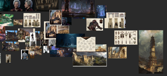
At this point, I have collected a myriad of screenshots and reference images from the game, pinterest, and also from artists work that inspires me.
With the references on one screen, I start to paint the details, I work from foreground to midground to background. (Sometimes I'll bounce between the depth when I get bored from painting one thing for too long)
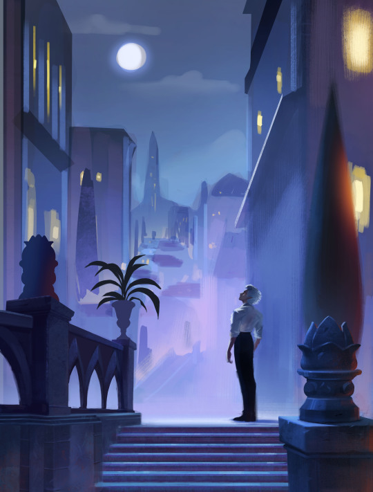
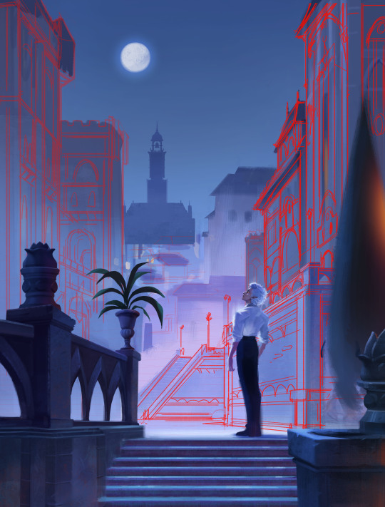
Sometimes after I block in the colors I'll make adjustments. I didn't like how warped the perspective was getting on the building on the screen right side, so I adjusted the vanishing point and added more tiers to the design. I went back into the game and looked at more how the stairs were designed and figured it out more thoroughly with a sketch on on top.
I think sitting down and doing the details is the most time consuming part. I still want the focus to be on the character despite all the detail going on the background. At this point I'm toggling on black & white filters constantly to check the value, grouping everything in the background together, making sure the lighting frames the subject in focus. At this point I realized, I forgot to paint Astarion's hair LOL, and that the bg was getting a bit too detailed, so I used a more textured brush and painted away some of the edge details of bg buildings.

Last, I make final adjustments, and I make a overall lighting/fx adjustment folder. Adding in some noise, adjusting the contrast, color balance, and lighting over all and call it done!
Link to Print shop!
#astarion#astarionfanart#bg3#baldurs gate astarion#baldur's gate 3#artprocesses#art tutorial#astarionpainting#bg3art#bg3fanart#art process#artists on tumblr
8K notes
·
View notes
Video
tumblr
Fluid Acrylics art
601 notes
·
View notes
Text


Making process of one of my last commissions :D
77 notes
·
View notes
Text

Starscream (Transformers One fanart)
Should I keep the classic colors or give it a unique twist? Opinions in comments! 👇 :]
#starscreamtfone#starscream#decepticons#seekertrine#tfone#tfo#transformersone#tfonemovie#cybertron#lineart#digitalinking#fanarts#artprocess#wip#starscream fanart#transformers#treansformersFanart
19 notes
·
View notes
Text
Here's my process for this Jinx piece. It took almost 20 hours. Nuts!
#procreate#arcane#fanart#art#Jinx#arcanefanart#color#like#digitalart#render#reels#leagueoflegends#artprocess#artist#picoftheday#artoftheday#beautiful#love#artists on tumblr#art on tumblr
20 notes
·
View notes
Text
youtube
Process video of he Halcyon Days cover artwork!
88 notes
·
View notes
Text
Just a glimpse! This Igris speedpaint is part of a much bigger piece. Can you guess who else is in it? Stay tuned!
11 notes
·
View notes
Text

✨ Chaotic freedom ✨ This sketch was created in 2023, and it was one of those moments where I let myself draw without any plan or expectations. I just poured my energy into the process, and this red-skinned guy unexpectedly became one of my most popular works! 😳
Honestly, I was surprised because it’s so messy and raw—definitely not what I usually share. But your love for it encouraged me to bring more expression and freedom into my art, even though I’m still careful with how much chaos I let in.
What do you think? Should I experiment more like this?
💬 Let me know in the comments!
#fantasyart#illustration#digitalart#characterdesign#fantasycharacter#sketchart#artprocess#expressiveart#digitalpainting#conceptart#creativefreedom#fantasyillustration#artwork#animeart#procreateartist
10 notes
·
View notes
Text
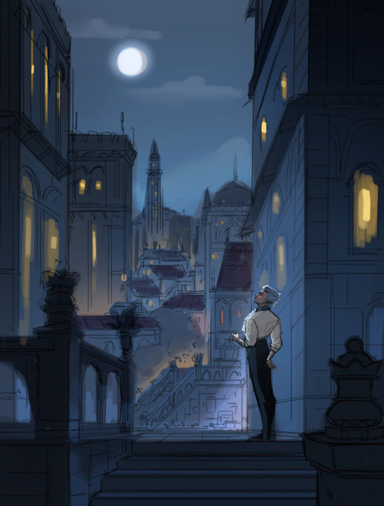
Here are some process shots for this one of Raphael from BG3! That magnificent bastard...

So I started out with a sketch of Raphael. He's got such a charismatic swagger doing the whole "What's better than the Devil you don't know? The devil you do" scene. I just wanted to do a caricature study and have a bit of fun.
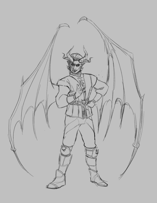
Moving from rough sketch to clean line art is always challenging for me as I often get bored or what was originally loose and fun can become stiff.
I had to redo the linework twice because I didn't like how the first one turned out! Second time is always the charm.
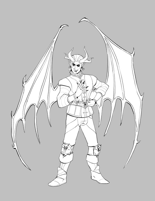
I initially only planned to draw the character but I love the design of House of Hope too much, so I went back into the game and took a bunch of screen shots and sketched out the rough bg.
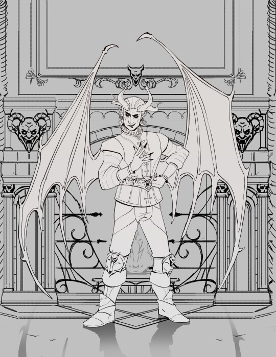
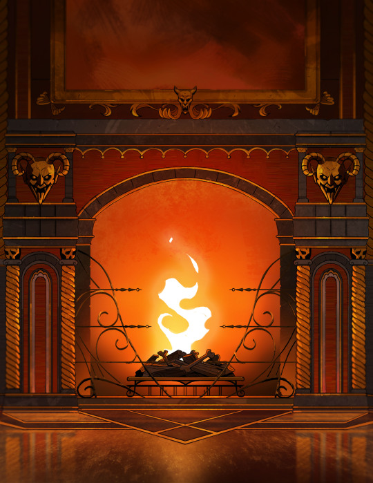
Then I went ahead and cleaned up the bg. At this point is when I group the layers properly, so there is a clear separation between foreground, and background as well setting up the layers for animation. (Making sure the fireplace guards overlaps the walls behind it.)
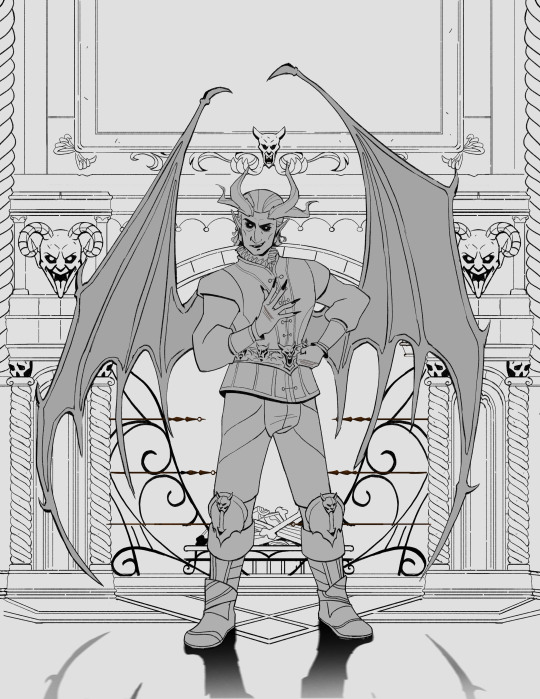
At the next stage I adding in the flat colors. I wanted to keep the style treatment of this piece more on the cell shaded/cartoony instead of super painterly. So I keep the color treatment fairly flat with a small amount of texture with the intention to add lighting as a fx overlapping treatment instead of painted in.
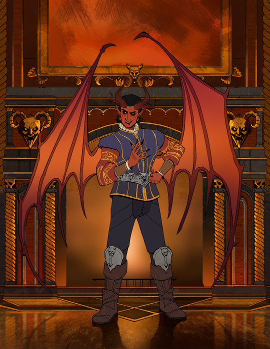
I work on the characters and the bgs at the same time to keep the values and color temp consistant, constantly adjusting as I go. From habit from work, I always paint the entire BG JUST incase I need to make changes or make adjustments to subject in from. Here is the bg all done, with fire painted in as a place holder.
And finally, adding the final lighting layers added on Raphael. I keep it simple here, just a redish/purple multiply player with the areas in the light masked out, and inverse mask on an orange/red overlay layer of the areas in the light.
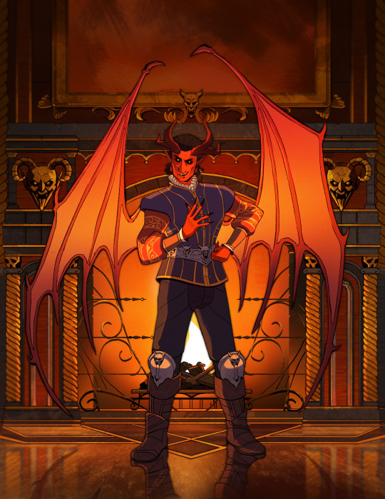
Animating the fire took ironically the longest, the animation tools in photoshop is clunky and I haven't animated since school days. I looked up a lot of references and tutorials! It's not perfect but good enough for me!
#raphael bg3#raphael baldur's gate 3#bg3 animation#bg3#badlurs gate 3#bg3 fanart#artists on tumblr#sketches#drawing#art#artprocesses#art tutorial#bg3 art#art process#art style#animation#bg3 spoilers
155 notes
·
View notes
Text
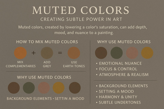
🎨 Muted Colors: Creating Subtle Power in Art
Understanding how to use desaturated tones to craft emotionally rich and visually sophisticated works.
Muted colors are often overlooked by beginners who are drawn to vivid hues, but in professional and fine art practices, muted palettes hold a unique strength. These tones — created by mixing complementary colors, adding grey, or adjusting saturation — can convey subtlety, depth, emotion, and atmosphere far more effectively than overly bright colors.
🧠 Why Muted Colors Matter:
Emotional Nuance: Muted tones suggest introspection, calm, nostalgia, melancholy, and subtle tension.
Focus & Control: With less visual “noise,” muted palettes direct the viewer’s eye with greater intentionality.
Atmosphere & Realism: In nature and classical art, most colors are inherently muted. Using these helps your art feel grounded and believable.
🎨 How to Create Muted Colors:
Mix with Complementary Hues: Red + green, blue + orange, etc., create complex, muted results.
Add Grey (Chromatic Grey): Dulls the intensity without shifting the hue too far.
Use Earth Tones: Ochres, siennas, umbers—naturally muted and emotionally rich.
🧩 When to Use Muted Colors:
In background elements to support focal points.
To set a specific mood without overwhelming the viewer.
To create harmony and unity in compositions.
When you want to guide emotional undertones without obvious storytelling.
🛠️ Try This:
Create a painting using only muted versions of primary and secondary colors. Observe how the emotional impact changes — and how narrative or ambiance becomes more introspective or dreamlike.
#artists on tumblr#artwork#visual arts#traditionalart#oil painting#artprocess#artistontumblr#art#art education#digital art#art understanding#education#learning#art tips#artisits on tumblr#art is important#artis impact#color theory#contrast#value#creativejourney
7 notes
·
View notes
Text
Stone Sculpture of Patrick – No Paint Used
Watch as Patrick comes to life—carved entirely from stone with no paint or color added. Every detail is meticulously shaped by hand, showcasing incredible craftsmanship and precision.
#nature#artwork#talent#skills#sculpture#ceramic art#StoneCarving#SculptureArt#HandCarved#StoneSculpture#ArtProcess#CarvingArt#Craftsmanship#TimelapseArt
8 notes
·
View notes
Text
“Artist’s room”, digital line art (progress)
I made a three point perspective drawing of my own room.
I’m proud of the details in this line art :). Also, shout out to you if you recognize the lp’s and cd’s on the shelves.

I started off with drawing the floor plan. Then I warped this floor plan into perspective and began sketching the furniture on top of it. The progress:


The reference is used loosely:

At the moment, I’m working on coloring this piece. I'm doing this from imagination:

#digitalart#lineart#lineartwork#artprocess#artist#clipstudiopaint#interior#interiordrawing#threepointperspective#art#drawing#digitaldrawing#birdeyeview#artistroom#myart#mine#verajasmijnart#illustration#artwork#digital art#digital painting#digital illustration#digital drawing#conceptart
14 notes
·
View notes
Text
#OCArt#OriginalCharacter#ArtistOnTikTok#DigitalArt#TraditionalArt#CharacterDesign#ArtProcess#CreativeArt#DrawingChallenge#OCShowcase#MyArt#ArtInspiration#CharacterConcept#FantasyArt#ArtCommunity#ArtProgress#SketchToFinal#AnimeArt#ArtTutorial#Illustration#ArtReel#FanArt#OCChallenge#ArtGlowUp#NewOC#OriginalArtwork#CreativeProcess#ArtisticExpression#CustomCharacter#DrawingOC
32 notes
·
View notes
Text

I used some refs, kept it simple, and fought through the “this fold looks like a worm” panic every 5 minutes 😂
#clothstudy#fabricstudy#draperystudy#clothingfolds#artstudy#digitalclothstudy#artstruggles#learningtodraw#sketchbook#digitalart#drawingpractice#artprocess#sketchstudy#wip#artoftheday#behindthesketch#illustrationdaily#referencestudy#drawingchallenge#studysketch#fabricfails#wipwednesday#foldsandwrinkles#chiro arta#gora park#manhwa#anime outfits
15 notes
·
View notes
Text

youtube
youtube
#Art#Painting#Grapes#Light#Fruit#PaintingFruit#PaintingGrapes#Shorts#Video#YouTube#Aesthetic#ArtProcess#HowtoPaint#ArtTutorial#DigitalArt#DigitalPainting#Reflection#StillLife#Timelapse
18 notes
·
View notes
Text
The speedpaint for my recent Star Trek piece! If you'd like to see a still shot of the work you can find a link to the original under the cut.
(Side note: The little censor flashes over Picard's guts are for when I sent WIPS to friends. Some of them don't exactly rock with extreme gore.)
As always, thank you for your support! I'm so happy that this piece has had such positive reception (and its fair share of visceral reactions in the reblogs)!
#myart#digital art#illustration#digital artist#digital illustration#art on tumblr#artist#art#artists on tumblr#my artwork#star trek#star trek fanart#star trek tng#tng#q star trek#picard star trek#q#picard#speedpaint#speedpainting#angst#qcard#drawing#drawingprocess#artprocess
28 notes
·
View notes