#bitmap menu
Explore tagged Tumblr posts
Visit Tumblr Blog
Explore Tumblr blogs with no restrictions, modern design and the best experience.
Last Seen Tumblr Blogs

Fun Fact
Hackers stole 65M passwords from Tumblr in 2013.
Text

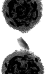


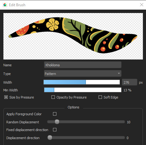
Rake Brushes for firealpaca !
i made these recently as a way to get more texturing into my art, you can see the PNGs in the middle of this post , you can use my firealpaca/medibang settings for em by adding em on the brush menu -> add bitmap brush (file) . But you can probably also add em to CSP or procreate and fiddle around with the settings, watercolor settings recommended ! have fun :)
68 notes
·
View notes
Text
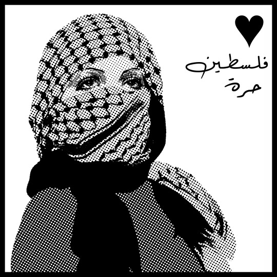
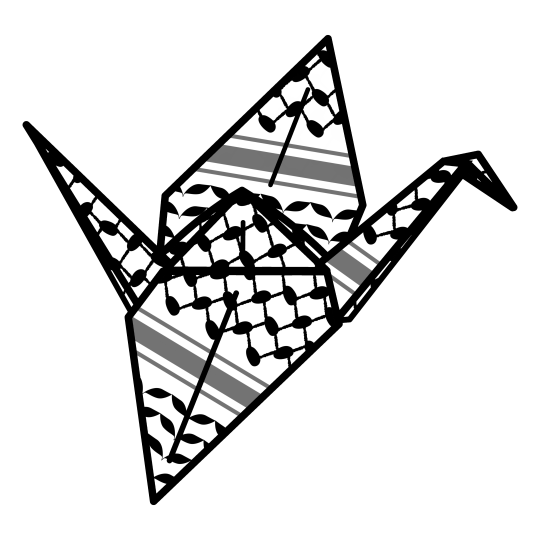
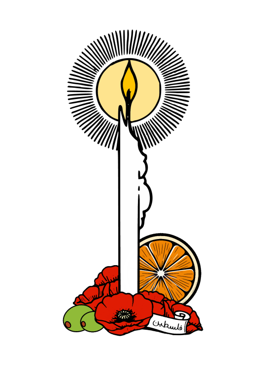
A new version of this design is now in my fundraiser shop, with a bitmap filter and "فلسطين حرة" (roughly "free Palestine").
EVERYTHING I EARN from my shop is for my best friend, a Palestinian grad student living in America. The money is sent home to support his friends and family in Palestine and around the rest of the Levant who are being hurt directly and/or financially by the attacks on Gaza, the raids and economic devastation in the West Bank and the collateral damage in surrounding countries. For example a recent month's worth of sales went to a relative of his in Lebanon who is helping feed and shelter displaced people.
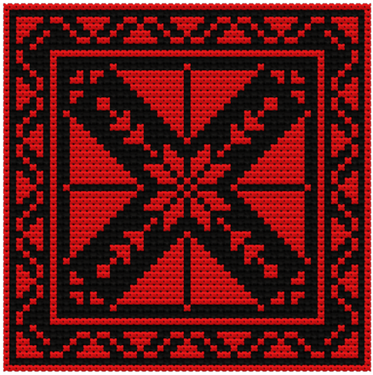
This design uses a keffiyeh from an open source photo with eyes from a vintage illustrated movie poster. You can find it here on a variety of products (stickers, clothes, prints, etc). Here are some examples of products with this design:


You can find all of my work in my shop HERE. You can filter by product with the menu on the left side of the page or go here to browse by design. Here is a sample of my other work:
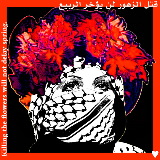
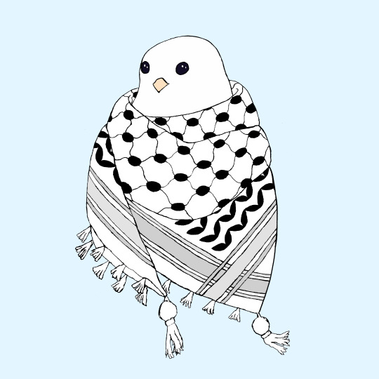


Thank you so much to everyone who has helped out! We really appreciate the support.
#palestine#free palestine#gaza#free gaza#art for palestine#artists for palestine#artists on tumblr#art fundraiser#gaza strip#fundraiser shop#save palestine#ceasefire#palestine fundraiser#keffiyeh#social justice#فلسطين#فلسطين حرة#fundraising#stickers#sticker shop
25 notes
·
View notes
Note
Wait, how do you make brushes in medibang? I've used it for quite a while and couldn't really figure it out as it seemed to limit me to only making replicas of existing preset brushes.
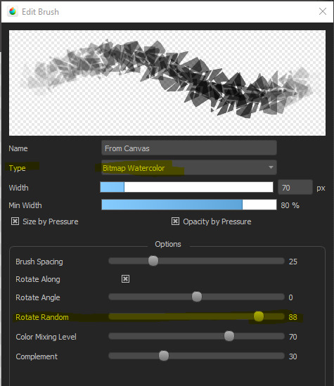
It's true that MediBang is not nearly as customizable with their brushes as, say, CSP, but you can do a lot by messing with the settings in the Add Brush or Edit Brush menu!
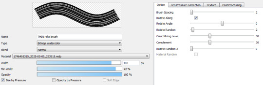
For example, this is a brush I created using a simple random shape, without adjusting the setting at all:


But if I set it to Watercolor Bitmap and adjust the Rotate Random setting, I can get a neat little scatter pattern going that's very edgy.
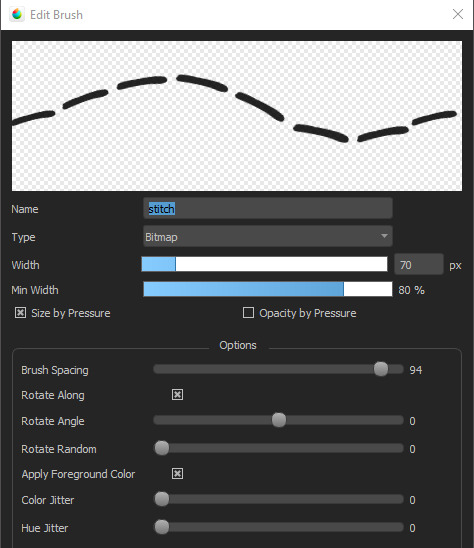
For example, I made this stitch pattern brush by messing with the brush spacing on a single line.
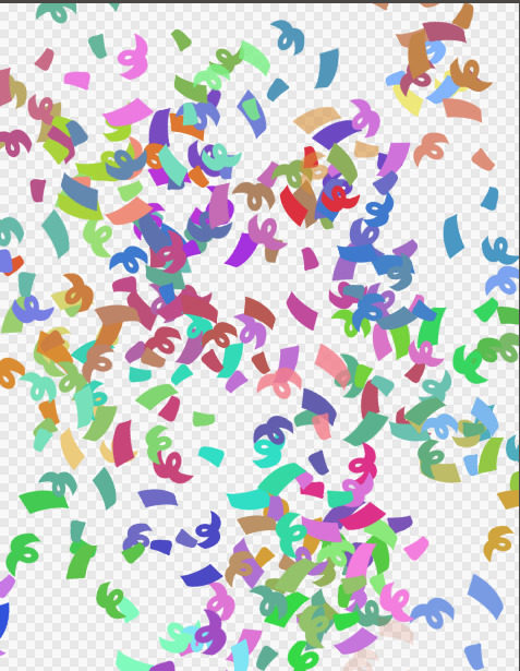
I also have a brush called CONFETTI which is just some swirls and lines with the Randomness turned up and the Color Jitter and Hue Jitter maxed out.

which, when used with a color setting, looks like this:
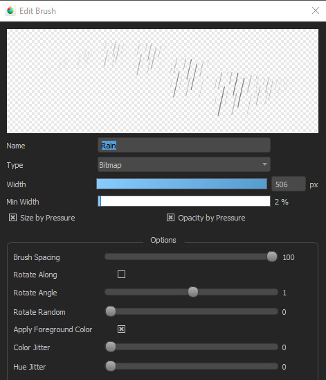
You can even do rain effects!
And this brush called Fuzzy, that I use for very fuzzy sweaters, started out as a single multi-pointed star.

And if you know how to do seamless patterns, you can also slap down patterns!
Anyway, MediBang is actually pretty great! It just takes a lot of trial and error to see what works.
371 notes
·
View notes
Note
Hello :) I was wondering, has any effort been made (as far as youre aware) to datamine finfin? I'm assuming some datamining has already been done by you to translate the 6 worlds version, but was just curious if anybody has looked through the files yet. If not; any advice/insights you could give to someone who might try to? (I'm afraid I don't have the skills to try it myself sadly, but I am still very curious) thanks in advance <3
I have done some work in terms of datamining, though it has mostly been for the translation. I do not know if anyone else has done any work in terms of data mining outside the author of the custom German 6 worlds made back in 2010. But here is what I do know!
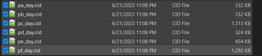
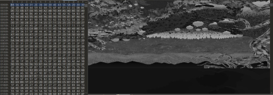
All the menu graphics are stored in the game file "map_XXX.db" where the "XXX" is the language, in the case of my translation, "map_eng.db". These images are stored in the form of raw bitmaps without the headers or palettes
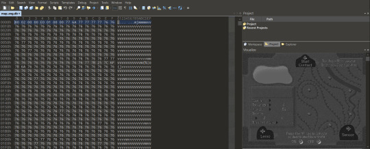
This can be seen here in this program, 010 editor, which has a byte visualizer. This also contains all the text, and is what I had to edit for the translation.
However, by exporting the bytes to a raw image and adding a header in photoshop, you can actually recreate the original, though to reinsert it back into the file it has to be stripped back to its raw bytes again. This header can be obtained by extracting it from a .bmp, which in turn needs to be extracted from the main game executable with a resource viewer.
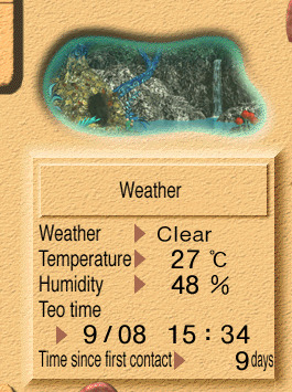
Here was a little test I did while messing around, changing the text for the nest to just say "Weather"
I have also found the backgrounds for all the levels, which are stored in these files, with one for each level respectively

The way these are setup is not uniform across the board, and varies depending on what is needed for each world.
However, from what I can tell the way they generally work outside of any level specifics is through palette shifting to change the colors based on time and weather. This information is almost definitely stored in the file "color.db", which just outside the name seems to be made up of many color palettes
The rest of the sprites and animations are almost definitely stored in the file "film.db", but I really have not put much time into trying to datamine this as outside of it likely being more complex, I in all honesty I don't want to completely dissect the game. A lot of what makes it special to me is the strangeness and mystery that surrounds fin fin, and having everything laid bare doesn't interest me.
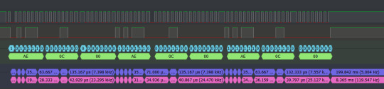
On a somewhat related note I have also done work on reverse engineering certain parts of the game code for modifications, and work on analyzing and replicating the Smart Sensor. Here is a photo of a the signals it sends out when working!
I'm pretty unfamiliar with it myself, but if you want advice the best I could give is to familiarize yourself with reading and editing binary / hex data and research file headers
10 notes
·
View notes
Text
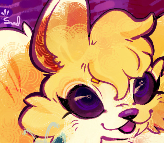
drew a blurger today
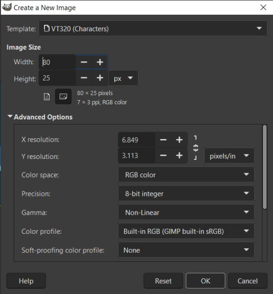
so actually, I've been playing with non-square pixels a lot lately bc I wanna do art on my VT320 serial terminal, so this week I did some calculating and some number crunching and set myself up with a GNU Image Manipulation Program template that would serve me well:
My bf challenged me to draw a burger with a specific palette bc I've been drawing some practice burgers to learn to draw, so I figured I'd do so in the domain I've already been playing with: terminal art!
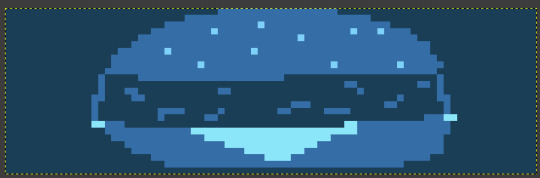
when viewed with square pixels the entire drawing appears squashed. but when we turn *off* dot-for-dot mode in GNU Image Manipulation Program,

our blurger bursts to life :D
(also if your menu options are different than mine, I'm actually using preview builds for version 3.0 because older versions of GNU Image Manipulation Program use a version of GTK that doesn't support my tablet pen 😭)
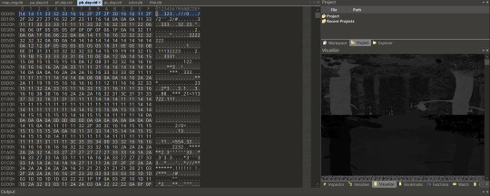
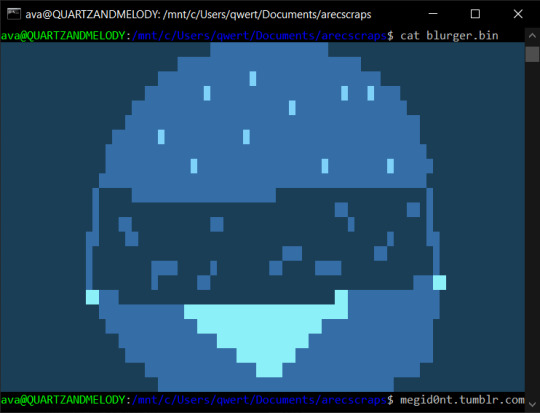
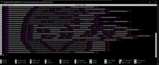
But. getting the blurger where we want it was harder. See, I haven't yet written a tool to automatically process an image to a series of characters, so I instead had to do it the old fashioned way: paletted bitmaps!
With a paletted bitmap, we can reduce the bitrate of the image to let each pixel only take up half a byte! And then, with our handy dandy hex editor, we can see the raw data:
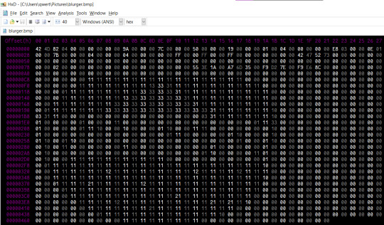
We take out a few header rows, and...
we get our burger, aligned properly and upside down! Funnily enough, bitmap images are stored bottom up but not left-to-right, and this is not the first time I've run into this.
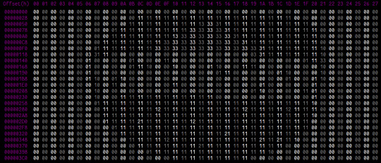
A few more steps!
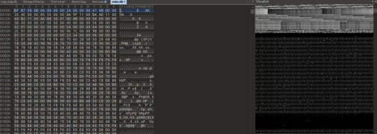
We copy each line from the hex editor, starting at the bottom (top of the burger) and work our way to the top (bottom of the burger), into a separate text document so we get our burger as numbers.
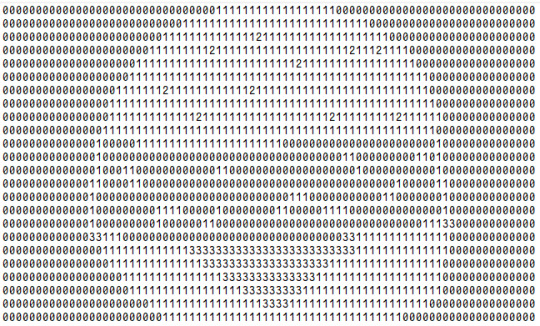
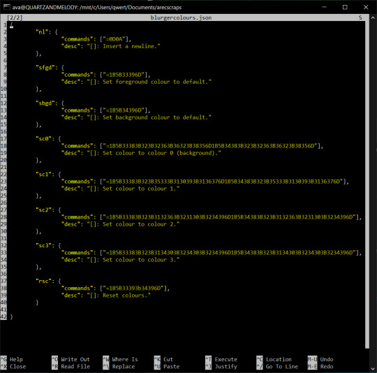
I am a fan of receipt printers and serial communication, and I have occasionally run myself into some situations in which I need to type a bunch of untypeable data or generate a stream of bytes real quick to do a specific task, so from here I actually had a tool on hand to make this a fuck of a lot easier: my markup language, aml! First I put the original at the top in comments so I had a template to work against...
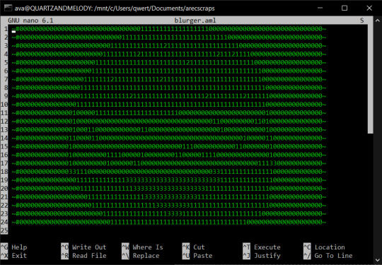
and then we make a copy to which we add our colour information!
Each one of those tags (except the ones at the end of the lines, which are for new lines) is actually a macro for my markup language that I made specifically for this task to encode the ANSI control code for each of the colours:
and once all that was done and prepared, it was the simple task of running my interpreter over it (ami.py -u blurgercolours.json -i blurger.aml -o blurger.bin) and I had a binary file that I can send to a terminal that has ANSI 24 bit colour support and show off my blurger.
I hope you enjoyed blurger hour with ava, and here's one more thing before I go:
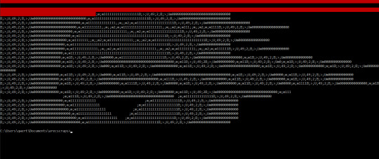
be careful not to spill kechp.
#oh huh I actually want people to see this one and now I don't know how to legitimately tag it uhhh#dumb terminal#rs-232#vt320#blurger
5 notes
·
View notes
Text


Some aesthetic shots of my Mavica.
The "rec mode" menu options are interesting. Normal is JPG, email is two JPGs (one very small for late '90s email), bitmap is bitmap (one pic per floppy!).
Multi is interesting though, it takes multiple shots in quick succession (2 or 3 per second in good light) and saves them as a single file which can be viewed on the camera. Apparently they're saved as some form of jpeg but I haven't checked them out on a computer yet to see what's happening under the hood.
4 notes
·
View notes
Text
Mastering CorelDRAW: A Beginner's Guide to Navigating the Basics
Are you a newcomer to the world of graphic design, tentatively dipping your toes into the vast expanse of CorelDRAW? If so, fear not, for you've stumbled upon just the right guide to set you on the path to proficiency. In this article, we'll embark on a journey through the fundamental features of CorelDRAW, ensuring that you not only understand the layout of the software but also gain insight into its essential functions.
Before we delve into the nitty-gritty, make sure to hit that subscribe button to stay updated with all the latest tutorials and tips. Now, let's dive straight into business.
Welcome to CorelDRAW! As you launch the software, the first thing that greets you is the user interface. Familiarizing yourself with this interface is key to navigating CorelDRAW efficiently. Let's break it down:
Menu Bar: This is your control center, housing various dropdown menus such as File, Edit, View, Layout, Object, Effect, Bitmap, Text, Table, Tools, Window, and Help.
Standard Bar: Next in line, the Standard Bar provides quick access to commonly used tools and functions.
Property Bar: Situated conveniently below the Standard Bar, the Property Bar displays contextual options and settings based on the selected tool or object.
Tools Bar: Located to the left of the workspace, the Tools Bar is where you'll find an array of tools for creating and editing your designs.
Status Bar: Lastly, at the bottom of the interface, the Status Bar offers valuable information and updates on your current workspace and tasks.
Now, let's shift our focus to the right side of the interface:
Color Palettes: Here lies a spectrum of colors, ready to breathe life into your creations.
Workspace: The blank canvas before you is your workspace, where imagination meets reality.
Now that we've acquainted ourselves with the layout, let's explore some essential functions:
File Menu: Starting with the basics, the File menu offers options such as New (Ctrl + N) for creating a new document. Customize your document settings, including page size, orientation, and color mode, to suit your project requirements.
Page Sizing and Resolution: Select from a range of standard page sizes or customize your dimensions. Ensure optimal resolution for high-quality output, typically set at 300 DPI (dots per inch).
Color Modes: Choose between CMYK and RGB color modes depending on your intended output, whether for print or digital media.
Orientation: Decide between landscape and portrait orientations to best showcase your designs.
Resolution: Maintain a high resolution (300 DPI) for crisp and clear images, especially for print projects.
By mastering these fundamental functions, you're well on your way to unleashing your creativity within the realm of CorelDRAW. Remember, practice makes perfect, so don't hesitate to experiment and explore the myriad possibilities that this powerful software offers.
Stay tuned for more tutorials and advanced tips to elevate your CorelDRAW skills to new heights. Until next time, happy designing!
🌸 Attention all creatives and designers! 🌸
Are you ready to take your designs to the next level? I've got something special just for you: a collection of over 1000+ beautifully crafted floral elements in CorelDRAW format, absolutely FREE! 🎨💐
Imagine the endless possibilities: use them to enhance your logos, create stunning graphics, or add a touch of elegance to your projects. These florals are versatile, customizable, and ready to elevate your designs to new heights.
But here's the catch: to get your hands on this exclusive collection, all you need to do is subscribe to my channel, give this post a like, and share it with your fellow designers. It's that simple!
Don't miss out on this incredible opportunity to supercharge your creativity. Subscribe, like, and share now to unlock your access to over 100 florals in CorelDRAW format. Let's blossom together! 🌼✨ #DesignInspiration #FreebieAlert #CreativeCommunity
Get over 1000+ beautifully crafted floral elements in CorelDRAW format, absolutely FREE!
2 notes
·
View notes
Text
Adobe Illustrator Classroom in a Book Chapter 13 & 14 Exercises - VCDM Visual Literacy: Elements of Design, Color and Typography
Chapter 13 Review Questions
How do you add a second fill or stroke to artwork?
2. Name two ways to apply an effect to an object.
3. When you apply a Photoshop (raster) effect to vector artwork, what happens to the artwork?
4. Where can you access the options for effects applied to an object?
5. What's the difference between applying a graphic style to a layer versus applying it to selected artwork?
My Responses
To add a second fill or stroke to artwork, click the Add New Stroke button or Add New Fill button at the bottom of the Appearance panel. We didn't cover this in the lesson, but you can also choose Add New Stroke/Add New Fill from the Appearance panel menu. A stroke is added to the top of the appearance list. It has the same color and stroke weight as the original.
2. You can apply an effect to an object by selecting the object and then choosing the effect from the Effect menu. You can also apply an effect by selecting the object, clicking the Choose An Effect button (fx.) in the Properties panel or the Add New Effect button (fx) at the bottom of the Appearance panel, and then choosing the effect from the menu that appears.
3. Applying a Photoshop effect to artwork generates pixels rather than vector data. Photoshop effects include all of the effects in the bottom portion of the Effect menu and the Drop Shadow, Inner Glow, Outer Glow, and Feather commands in the Effect > Stylize submenu. You can apply them to either vector or bitmap objects.
4. You can edit effects applied to selected artwork by clicking the effect link in the Properties panel or Appearance panel to access the effect options.
5. When a graphic style is applied to a single object, other objects on that layer are not affected. For example, if a triangle object has a Roughen effect applied to its path and you move it to another layer, it retains the Roughen effect.
After a graphic style is applied to a layer, everything you add to the layer has that style applied to it. For example, if you create a circle on Layer 1 and then move that circle to Layer 2, which has a Drop Shadow effect applied, the circle adopts that effect.
Chapter 14 Review Questions
What are three benefits of using symbols?
2. How do you edit an existing symbol?
3. What is a dynamic symbol?
4. In Illustrator, what type of content can you save in a library?
5. Explain how to embed a linked library graphic asset.
My Responses
Three benefits of using symbols are as follows:
You can edit one symbol to update all instances.
Using symbols reduces file size.
It is much faster to apply symbol instances.
2. To update an existing symbol, double-click the symbol icon in the Symbols panel, double-click an instance of the symbol on the artboard, or select the instance on the artboard, and then click the Edit Symbol button in the Properties panel. Then you can make edits in Isolation mode.
3. When a symbol is saved as dynamic, you can change certain appearance properties of instances using the Direct Selection tool without editing the original symbol.
4. Currently in Illustrator, you can save colors (fill and stroke), type objects, graphic assets, and type formatting.
5. By default, when a graphic asset is dragged from the Libraries panel into a document, a link is created to the original library asset. To embed a graphic asset, select the asset in the document and click Embed in the Properties panel. Once embedded, the graphic will no longer update if the original library asset is edited.
1 note
·
View note
Text
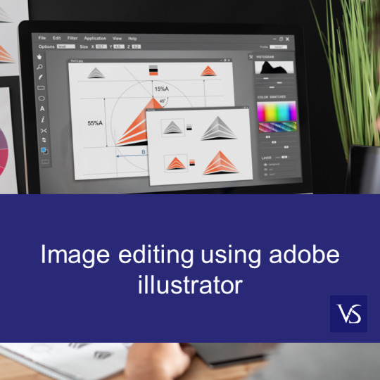
Mastering the Image Trace Feature in Illustrator
Image editing using adobe illustrator: Top Questions Answered
1.Can you make a JPEG editable in adobe Illustrator?
Yes, JPEG can be made editable in Adobe Illustrator using Image Trace. Open JPEG in Illustrator. Select image, go to "Window" > "Image Trace." Choose preset/adjust settings to trace image into vector paths. Click "Expand" to finalize vectorization for editing like vector artwork. Note: Edit quality depends on JPEG complexity.
2. Can I edit images in adobe Illustrator?
You can edit images in Adobe Illustrator. Illustrator is a vector graphics editor, but you can import raster images (JPEGs and PNGs) and do basic edits like resize, crop, or apply effects. You can also trace raster images to create editable vector artwork. For advanced raster image editing, Adobe Photoshop is more suitable due to its comprehensive bitmap editing capabilities.
3. Is Adobe Illustrator an image editing software?
No, Adobe Illustrator is not primarily an image editing software; it is a vector graphic design tool. While it can manipulate images, its main focus is creating and editing vector graphics, such as logos, illustrations, and typography. For raster image editing, Adobe Photoshop is the preferred software.
4. How do I convert an image to adobe Illustrator?
To convert an image to Adobe Illustrator, open Illustrator and create a new document. Then, go to File > Place to import your image. Select the image and click "Embed" in the control panel to ensure it's part of the document. Use the "Image Trace" feature to convert the raster image into vector art. Adjust the trace settings for desired detail and then click "Expand" to finalize the vectorization. You can then edit and manipulate the vector paths as needed. Finally, save your work in the desired format.
5. Can you replace a picture in adobe Illustrator?
Yes, you can replace a picture in Adobe Illustrator. To do this, select the image you want to replace, then go to the "File" menu and choose "Place." Navigate to the new image you want to use, select it, and click "Place." The new image will replace the selected one while maintaining its original size and position. You can also use the "Relink" option in the Links panel to update the image with a new file while keeping the original settings intact.
Visit: VS Website See: VS Portfolio
0 notes
Text
Assignment 3 Development #11
Week 11 came with the first developing prototype of our group project "The Way Home" - to start we had a title screen and level select.

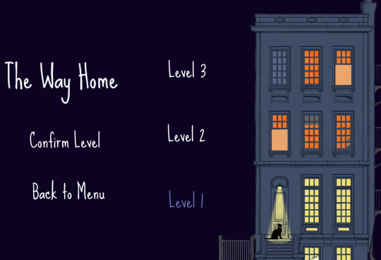
Designing this was a unique test, as I hadn't previously done any prior work with menus. While not complex to delve into, I ran into an unexpected issue with the font - we had been wanting to use the Sue Ellen Francisco font for it's homey style, but the typical text of Gdevelop couldn't properly display it. The font was too tall for Gdevelop's display boxes, leading to the use of a free converter to turn the font into variously colored BitMaps for use in the game. Once this was settled, the main meat of the 1st level was created. We had decided on Beans - the new name of our feline protagonist - needing to explore the side of the building to find a way inside.
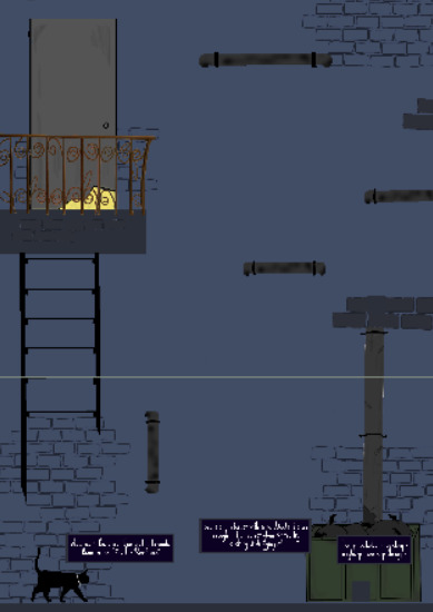
To do this, we used a couple of gently guided puzzles (a movable bin and a climbable drain pipe) to introduce the player to the game and it's fairly standard platformer movement.
Making this process, one of the more tedious parts was having to construct dialogue bubbles and text, which reduced and decreased in opacity depending on play distance. This proved time consuming given Gdevelop's lack of functions, but was ultimately simple. Moving forward into the next week, the group plans to finish constructing level 2 (with our first and only enemy, no less!). We intended this one to be a more difficult level with less handholding and a more substantial challenge for players.
0 notes
Text
Version 572
youtube
windows
zip
exe
macOS
app
linux
tar.zst
I had a good simple week mostly doing just one thing: overhauling the 'share' menu.
Note: If you are updating from v570 or earlier and you use the Windows or Linux .zip or .tar.zst 'Extract' releases, you have to do a clean install one time to get v571 or later! (https://github.com/hydrusnetwork/hydrus/releases/tag/v571, https://hydrusnetwork.github.io/hydrus/getting_started_installing.html#clean_installs). If you are a Windows installer/macOS App/source user, you do not need to do a clean install to get over the v570->v571 bump; just update as normal.
full changelog
share menu
Like the 'open' menu a couple of weeks ago, the 'share' submenu you see off of the thumbnail or media viewer right-click menu has been given a full pass. The layout is clearer, and exactly the same in all locations, and everything it does is now mappable in the shortcuts system.
Also, you can now copy files' thumbnails as bitmaps from this menu. Should let you do saucenao style lookups on unusual filetypes that have a thumb but no normal image.
The shortcuts here are a bit smarter, too--like with the 'open similar files in a new page', I collapsed the four 'copy xxx hashes' commands down to one command with a dropdown (which has options for blurhash/pixel_hash, if you need them); and the three 'copy xxx bitmap' commands are now one with a dropdown that also has the new 'copy thumbnail bitmap' option. Most of the shortcuts also have a choice between 'do the focused file' vs 'do all selected files', if that is important (existing shortcuts will default to the latter, which was previous behaviour for stuff like 'copy sha256 hashes').
Note: I have removed the 'share on the local booru' command. The Local Booru (an optional way to share files with friends using hydrus) was a fun experiment, but I have decided to finally retire it. I never found enough time to dev it properly (I don't think I've touched it in at least five years), and there are many better ways to share files online, be that a third-party host you simply drag and drop to or a clever Client API solution. So, it is gone from the menu today, and I'll slowly dismantle it over the next few weeks until it is completely removed.
couple other things
There's a new checkbox under ''options->files and trash'' that adjusts the 'remove processed files after an archive/delete filter' to also remove the stuff you skipped.
Also, thanks to a user, there's a new 'e621' themed stylesheet under ''options->style''. Users who run from source who want to try this probably have an extra step to make sure this works--check the changelog/options panel help text.
next week
I've been thinking of adding a new tab to the autocomplete dropdown that will show children of the current context (e.g. you are looking at something with 'evangelion', in that tab you'll see 'asuka', 'rei', etc.. for quick selection). I think I will play with that idea and do some more misc small jobs.
1 note
·
View note
Text
Photoshop: Covert File for Screen Print > Steps!
Create a blank high resolution canvas at 300 dpi . Mine is at 4 x 6 inch at 300 dpi . image >place image adjust image to fit in canvas box. flatten image : Layer > Flatten Image Image : Mode > Grayscale Image> Mode> Bitmap Bitmap : change menu : Method > halftone Frequency : 35 / Angle : 45 > Elipse

View On WordPress
0 notes
Text
Practice 1_Weekly Projects
80.lv assignment
Blog 1
Adding stickers to textures in Substance Painter is a powerful way to enhance the realism and detail of your 3D models. In this comprehensive guide, we'll walk through the process of seamlessly incorporating stickers onto textures using Substance Painter and subsequently exporting the textured model to Unreal Engine. Whether you're a seasoned artist or a beginner, this step-by-step tutorial will empower you to elevate your creations to new heights.
Step 1: Importing Your 3D Model into Substance Painter Open Substance Painter and create a new project. Import your 3D model into Substance Painter. Ensure that your model is UV-mapped to facilitate proper sticker placement. Step 2: Applying Base Materials Select the desired materials for your model's base layers. Apply them to the respective channels (Base Color, Roughness, Normal, etc.) in Substance Painter. Step 3: Creating a New Fill Layer for Stickers Add a new fill layer for your stickers by clicking on the "Add Fill Layer" button. In the Layers menu, rename the fill layer to "Stickers" for organization. Step 4: Importing Sticker Resources In Substance Painter, navigate to the "Layers" shelf. Click on the "Add a New Resource" button and choose "Import Resources." Select the sticker images or textures you want to use and import them into your project. Step 5: Placing Stickers on the Model In the "Stickers" fill layer, click on the "Add a Mask" button. Choose "Bitmap Mask" and select the sticker texture you imported. Adjust the mask settings to control the placement, rotation, and scale of the stickers on your model. Step 6: Customizing Sticker Appearance Fine-tune the appearance of your stickers using the various adjustment options in the "Stickers" fill layer. Utilize parameters like color adjustment, wear, and roughness to integrate the stickers realistically into the base material. Step 7: Exporting Textures for Unreal Engine Once satisfied with the sticker placement, go to "File" and select "Export Textures." Choose the desired configuration for Unreal Engine, such as Metallic/Roughness or Specular/Gloss. Click "Export" to generate the texture maps. Step 8: Importing Textures into Unreal Engine Open Unreal Engine and create a new project or use an existing one. Import your model and the exported texture maps. Apply the materials to your model, ensuring the sticker details are visible. Step 9: Fine-Tuning in Unreal Engine In the Unreal Engine Material Editor, adjust material settings like roughness, metallic, and normal maps to achieve the desired look. Utilize the UV mapping to control sticker placement and orientation on your model. Step 10: Preview and Refine Place your model in the scene and preview the stickers in different lighting conditions. Make any necessary adjustments in Substance Painter or Unreal Engine to achieve the desired visual result.

0 notes
Text
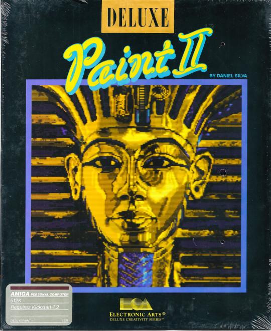
Electronic Art's "Deluxe Paint II" for the Amiga computer
Introduced in 1985 by Electronic Arts, Deluxe Paint (often referred to as DPaint) became one of the most influential graphics editing programs of its time, particularly with its later iteration, Deluxe Paint II, released in 1987. Designed for the Commodore Amiga, a computer known for its advanced multimedia capabilities, Deluxe Paint II not only showcased the Amiga's graphical prowess but also set a standard for bitmap graphics editing that would influence software design for years to come.
Technological and Historical Context
The Amiga computer was ahead of its time, boasting features such as a pre-emptive multitasking operating system and dedicated graphics and sound co-processors. These features made it an ideal platform for graphic design and animation, a niche that Deluxe Paint II aimed to fill. The program was developed by Dan Silva, who initially created it as a simple image manipulation program to help with his own software development tasks at Electronic Arts.
Capabilities and Innovations
Deluxe Paint II introduced a variety of features that were revolutionary for the time:
User Interface (UI): Deluxe Paint II featured a highly intuitive user interface that was accessible to both beginners and professional artists. Its menu and toolbox were thoughtfully designed to facilitate easy access to its wide array of tools, which was a departure from the more cumbersome interfaces common in software of the era.
Graphics Techniques: The program supported up to 32 colors from a palette of 4096 (on the OCS chipset), a significant capability given the hardware limitations of the time. This allowed for the creation of rich, vibrant images that were particularly suited for the burgeoning video game and multimedia industries.
Animation Features: Perhaps one of the most significant innovations of Deluxe Paint II was its animation features. The software allowed users to create and edit frame-by-frame animations, which was an invaluable tool for game developers and animators. This feature was complemented by the ability to preview animations, adjust playback speed, and loop sequences, all within the program.
Advanced Tools: Deluxe Paint II included various advanced drawing and painting tools, such as custom brushes, fill patterns, and gradient fills. Users could also manipulate images with tools for flipping, rotating, and scaling, and it provided powerful effects like "smear" and "shade" modes that added depth to graphic design projects.
Impact on the Industry
Deluxe Paint II's influence extended far beyond the Amiga community. It became a standard tool in video game development during the late 1980s and early 1990s. Many graphic artists and game developers created sprites, backgrounds, and other game assets using Deluxe Paint II, appreciating its ease of use and powerful features. The software's ability to handle detailed pixel art made it particularly popular among developers of 2D games.
Moreover, Deluxe Paint II was used in professional video production, especially in titling and special effects work. Its ability to export graphics in formats that were compatible with other systems helped bridge the gap between Amiga and more dominant platforms like the PC and Macintosh.
Legacy
Deluxe Paint II left a lasting legacy in the world of graphic design software. It influenced the development of future graphic software, particularly in terms of user interface design and the integration of animation tools. Programs like Adobe Photoshop and Corel Paint Shop owe some of their intuitive design elements and functionality to the groundwork laid by Deluxe Paint II.
Conclusion
Deluxe Paint II was more than just software; it was a pivotal moment in computer graphics history. It helped democratize graphic design by providing powerful tools in an accessible manner at a time when such technology was just emerging. For many artists and developers, Deluxe Paint II was the gateway into digital arts, marking it as a cornerstone in both the history of the Amiga and multimedia development.
0 notes
Text
CST3135 Week-to-Week Blog activities
Week 1: Introduction to Digital media
We began the course by converting images files in the formats of “Png, Jpeg, Jpg” to bitmap- “bmp” for a more higher file size to be used for editing and other important contents, and we did this using the software “Gimp,”
Lab work:
Converting an image (Jpeg) to bitmap file format (bmp) and comparing the difference in the file sizes.
LW1:
Original image file size (4284x5712) 2.8Mb.
Image after conversion file size (4284x5712) 70.0mb.
Lab work:
After converting said image to bitmap we then experimented with converting images to audio using the software “Audacity” then we altered the sound to produce echoes. And finally, we converted the sound back into an image then we noticed the image had some distortion in the middle of it because of the altering that was done when the image was a sound file.
LW2:
Image converted.
Image converted back original media type and the distortion from the effect applied when in audio format.
Week 2: Sampling Theory and Compression Theory
We had several tasks to do during this week these included.
Lab work:
Extracting the contents of a zipped file and find the difference between the different states of the file.
Image Compression: This involved getting an image, saving it as a bitmap and comparing the size to the original file and then finding the compression ratio.
Sound compression: This task involved getting an audio file and converting it into a “.WAV” file and comparing the sizes and calculating the compression ratio and then converting it back to “.MP3” file with the highest compression ratio and testing out the sound quality.
Unexpected: This task involved compressing an ".AVI" file into a YouTube MP4 file and then decompressing it with adobe premier and discussing the results.
LW1:
Compressed size: 169kb.
Uncompressed size: 200kb, the difference between them is 31kb.
Compression ratio: 1.18kb.
LW2:
Original size:
Bitmap size:
Compression ratio:
LW3:
Original Size:
.Wav file size: _, the difference between them is_.
Compression ratio:
Highest quality MP3 size:
LW4:
.Avi file size (Original):
.Avi file size (YT Compressed):
.Avi file size (uncompressed):
Week 3&4: Stenography
This week was about "Stenography" which is the act of hiding messages inside images and audio, but we focused primarily on images this week.
Lab work:
Using Gimp to change the file type: To begin we got an image from the web, and we then converted it into bitmap file type either by changing the file extension or using “Gimp.”

Hiding a text inside an image: We then used an already provided software “Winhip_en” to hide the message in the picture by launching the software and opening the image with the software and selecting the option hide file which will allow us to implant an already created text file into the image and it will be then secured with password and if we want to retrieve the file we will input the password and open the file.
Extracting the information from the image: To extract the information that was hidden in the file we use the software to select the image, and then we select the retrieve file option in the menu and input the password use to secure the text file and extract the file.

Implications:
With hiding of heavier files is causes disruption in the image
File size does not change with the embedding of the text file
Continuous embedding of files to the image causes the quality of image the lowered.
Image with hidden information.
Week 5: Haas and Anaglyph
3D sounds and Images: Can our perception of images and sounds cause us to see and hear when special effects have been added to it? The answer is yes, and we can test this with basic activities like.
Holding a finger to the nose and without blinking or losing focus close one eye and alternate between each eye the result is that your finger looks like it is moving while it is not,
OR,
Play music and cover one ear at a time and notice how the sounds different when it comes into different ears. Thus, we can come up with the conclusion that we experience sounds through our bodies, then to the ears and finally to our head (Brain).
Lab work:
Week 6&7: Audio Synthesis
For this week we focused on creating a synthesizer- which is a electronic machine that generates audio signals using waveforms
Week 8: Image Synthesis
This week we focused on image generation with the software - “TerraGen” which is a scenery generating software used for rendering and animating of landscapes we used it to generate an image of a landscape and by playing around with the software I was able to generate the following images.
Lab work:

My first generated image using TerraGen.
And it was generated using the following settings:
First after opening the software, I used the landscape menu to specify the features of the terrain I wanted to generate. By using the “Perlin noise” feature, I set the Cannonism to 59% and the Glacerism to 29%
I added water by increasing the water level to –20m.
I used the 3d feature to help me position the terrain so I will be able to get the position that I needed for my image.
I also fiddled with the cloud settings to increase the cloud density and the cloud color.
I changed the surface color to white to give the image effect of snow.
Lastly, I changed the position of the sun.


My second generated Image with TerraGen.
My second image was generated a bit differently from the first image in these settings I used “Perlin noise “and reduced cannonism and increased the glacerism to give the image the effect of a land surrounded by sea
And I positioned the camera with the 3d feature to get it from aa wider perspective
I increased the cloud density to give a heavier feel in the image
The landscape was color was changed to green to represent a vegetative land setting
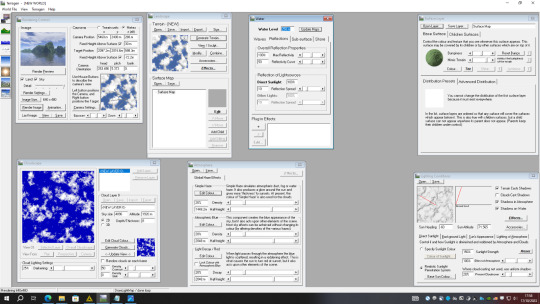

My Third generated image using TerraGen.
For my third image I still made use of “Perlin noise” to set the canyonism and the glaciation
I changed the background color and added a child feature to the surface to give the grains of sand effect
I adjusted the sun for a noon effect
I made some adjustment to the clouds to reduce it

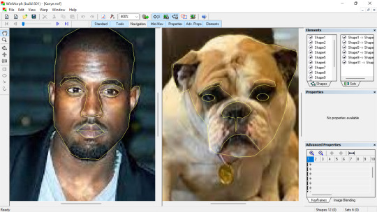
Week 9: Morphing
Morphing is the processing of changing something or someone from a state to another gradually and in image morphing this is changing of an image to another and with certain software's we can demonstrate the transitioning between the two Images.
Lab Work:
First, we selected two images that where to be used for the editing and we opened the software “Win morph” clicked on create new morph and we started highlighting certain features of the first image and trying to trace it on the second image to create the transitioning effect.
LW1:
For the first morphing I had an issue with the tracing in the first image and it gave me a distorted transitioning video, so I had to clear all the tracing and did it from the beginning and this is what came out.

youtube
LW2:
For the second video I decided to transition a human to a creature.
Week 10: Image Filter
Filters are used for image editing, and helps for image sharpening, noise reduction, and color correction and so on.
Lab work:
open photoshop, insert image, click on filter, other, custom and make changes to values in the kernel.
Original image
First image (Edge detection)
Second image (Gaussian blur)
Third image (Sharpen)
Using Filter forge to create filter.
open filter forge, select filter, click on new filter.
Original Image
Image after applying first filter.
Original Image
Image after applying second filter.
Original image
Image after applying third filter.
Week 11: Visual Jockey
This week we are focusing on the visual effects and displays.
Lab Work:
Open up the software visual jockey and begin by selecting generic resource and picking an effect to use with the selected generic resource and also working with Mavrick to use the effects for
LW1:


Week 12: Arduino And Processing
Week 23: Sonification
1 note
·
View note
Text
ADOBE PHOTOSHOP
Adobe Photoshop atau biasa dikenal sebagai Photoshop, merupakan software atau perangkat lunak pengolah citra atau gambar yang diproduksi dan dibuat oleh Adobe Syastem. Perangkat lunak ini banyak digunakan oleh fotografer digital dan juga perusahaan-perusahaan iklan dikarenakan keunggulannya serta dijadikan produk terbaik yang dimiliki oleh Adobe System.Dengan menggunakan perangkat lunak Photoshop, banyak hal yang bisa dilakukan pada sebuah objek gambar digital berbasis bitmap. Photoshop mampu memanipulasi gambar, memberikan efek gambar, bahkan bisa digunakan untuk logo, sketsa web, dan lain sebagainya.Pada Photoshop ada beberapa bagian yang memiliki fungsi masing-masing. Bagian-bagian pada Photoshop memiliki fungsi tersendiri. Sebagai contoh toolbar yang memiliki fungsi sebagai alat yang berinteraksi langsung pada lembar kerja, contohnya membuat objek, mennyeleksi, sampai merubah warna.
Menu Bar. Tampilan Photoshop Bagian yang berisi menu daftar perintah, yaitu File, Edit, Image, Layer, Select, Filter, View, Window, dan Help.
Option Bar. Bagian ini menampilkan ikon pengaturan tambahan/khusus dari tool pada toolbox yang dipilih atau aktif, jadi isi Option Bar dapat berubah-ubah.
Document Window Bar. Merupakan fitur baru dimulai dari Photoshop CS3, dimana pada bagian ini akan ditampilkan seluruh dokumen yang sedang dibuka dalam bentuk tab.
Application Bar. Merupakan fitur baru pada Photoshop CS3 yang terletak di samping Menu Bar. Bagian ini cukup mempermudah untuk mengakses beberapa fitur yang umum digunakan, alat dan pilihan. Misalnya, ikon pertama di sebelah kiri dengan cepat akan membuka Adobe Bridge.
Workspace. Berisi pilihan untuk mengatur pengaturan panel yang berbeda, menu dan bahkan shortcut keyboard untuk tugas yang berbeda.
Panel. (disebut juga sebagai Palette)Panel memberi kita akses ke semua jenis perintah dan pilihan untuk bekerja pada gambar, seperti pengorganisasian layer dan melihat channel warna individual untuk pemilihan warna, melangkah mundur melalui history, melihat informasi tentang gambar kita, dsb.
Toolbox/Tool Panel. Merupakan palet yang berisi tombol-tombol perintah untuk membuat dan memanipulasi gambar atau teks. Toolbox dikenal sebagai Tool Palette, namun istilah palette pada Photo- shop CS4 diganti dengan sebutan Panel, sehingga toolbox pada Photoshop CS4 disebut Tools Panel.
Information Bar. Menampilkan informasi dokumen yang aktif.
Document Window. Merupakan tempat ditampilkannya gambar/teks dan tempat dimana kita melakukan semua pengolahan gambar atau teks.
Scrollbar. Terdiri dari Vertical Scrollbar dan Horizontal Scrollbar yang digunakan untuk menggeser tampilan Document Window secara horizontal atau vertical.
0 notes