#but there will be no new tickets
Text


JUNKFOODCINEMAS PRESENTS
SO BAD IT'S GOOD JUNK: PART 2
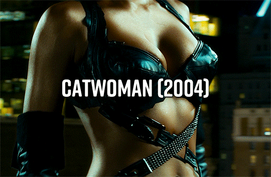
Catwoman (2004) dir. Pitof
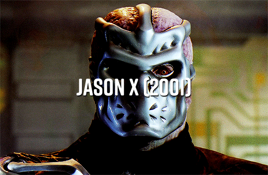
Jason X (2001) dir. James Isaac
Halloween: Resurrection (2002) dir. Rick Rosenthal
New York Ninja (2021*) dir. John Liu, Kurtis M. Spieler
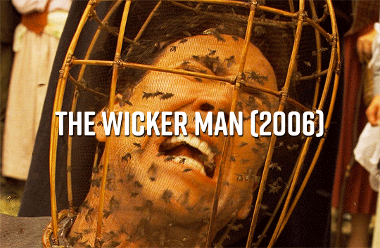
The Wicker Man (2006) dir. Neil LaBute
Undefeatable (1993) dir. Godfrey Hall
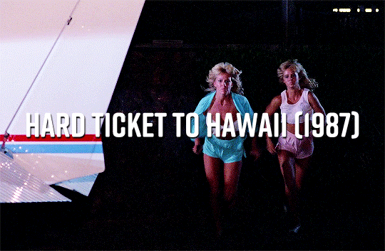
Hard Ticket to Hawaii (1987) dir. Andy Sidaris
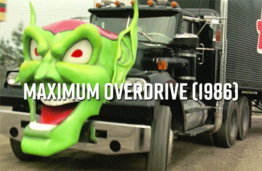
Maximum Overdrive (1986) dir. Stephen King
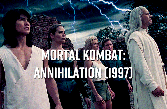
Mortal Kombat: Annihilation (1997) dir. John R. Leonetti
Suburban Commando (1991) dir. Burt Kennedy
#catwoman#jason x#halloween resurrection#new york ninja#the wicker man#undefeatable#hard ticket to hawaii#maximum overdrive#mortal kombat annihilation#suburban commando#80s#90s#00s#20s#gifs#kane52630#filmedit#filmgifs#doyouevenfilm#fyeahmovies#userbrittany#usergal#userrobin#userlera#tuserdana#mikaeled#useroptional#bblecher#chewieblog
1K notes
·
View notes
Text
why is there a place right next to new york called 'newark' 😭 knock off ass name 😭😭
#liliths mind#extreme 'we have new york at home' energy#u dont know how many times ive almost accidentally bought a ticket to penn station newark instead of penn station new york 😭
949 notes
·
View notes
Text
I think humans have an innate ability to recognize The Creature because today, when I had to replace my 4.5 year old phone whose battery life was finally shot to shit, it was a slightly annoying process, but it was just a process. Just a device. Old device transferred. New device set up.
But last month when my 5.5 year old bike was stolen and I needed to replace it, it was nowhere near the same, because the bike was a Creature and the Creature was taken from me and it's somewhere out there, alone, maybe chopped for parts. And I have a new bike now and it's a perfectly fine Creature by its own regard, but it is not the same Creature. My old bike was a living thing, and the living thing doesn't stop being the living thing just because it was replaced. Because it was Creature-shaped and Creature-sized and so it was a Creature. Something in my genes knows this.
#meta point: rip to my Fucking credit card statement buying a new bike and a new iphone in the same month#and plane tickets. which were SUPPOSED to be the splurge of the month#cest la vie#chrissy speaks
621 notes
·
View notes
Text
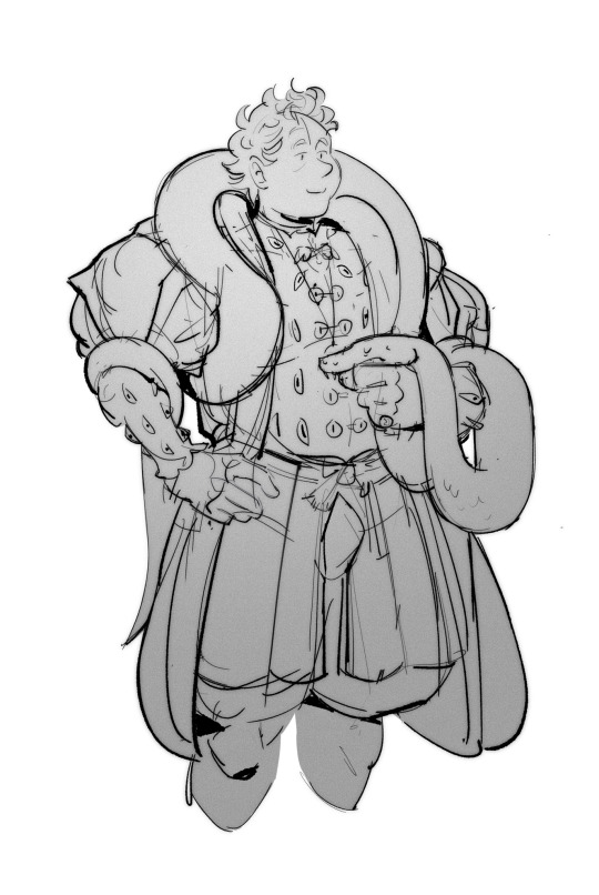
renaissance!Aziraphale (and Crowley). yeah, codpiece and snake and all. accessorized as hell. you know he would serve
#good omens#aziraphale#renaissance fashion#anyway the LIRR ticket taker who saw me drawing this asked if it was Bleach?? funniest /is that anime/ moment of my life#I had to tell someone#I didn’t realize there was a new Bleach anime last year so you can imagine my confusion at his assumption that this#was fanart of an anime that finished when I was still in high school
2K notes
·
View notes
Text
New Desktop Dash, No Bueno
Okay so, new dash layout on desktop.
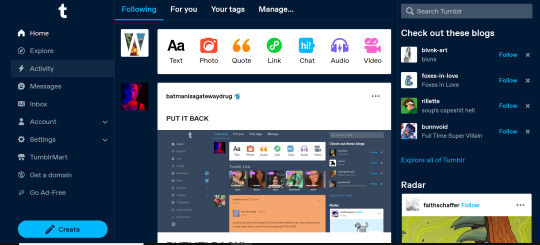
As seems to be a common reaction: not a fan.
Let's talk about some of the issues:
1. Really visually cluttered
The new sidebar crowds out the dashboard content and the bright blue popup notifications (now at the side AND top) and create-post bar pull your eyes in different directions. There is no space for the eye to rest on anymore - it's all noise. The end result is that everything flattens - there's no focal point anymore.
It's also pretty overwhelming - even for someone like me - so I can't imagine it would be very user-friendly to someone who was photosensitive or struggled with visual overload (especially when paired with the high-contrast 'true blue' default site palette and animated icons for the changes-on-tumblr/staff-picks/trending buttons).
2. The activity pop-up now covers dashboard content
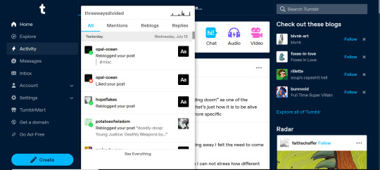
This is really bad from a usability standpoint. In the old layout the activity pop-up used to drop down over the recommended blogs sidebar. Now it actively gets in the way of looking at core content. The dash is why we are here, burying it like this is baffling.
The search bar now drops down over the recommended blogs banner instead, but where the old design had non-critical space on each side of the dashboard to visually allow both features to pop in, this new layout is way worse for efficiency. And for what? Having a rarely-used former drop-down menu now permanently active? The old banner with quick-links for the key use-features (notes, messages, askbox) made much more design sense.
It also means that the activity pop-up gets now completely covered by the blog pop-up that opens when you click the notification, so double demerit there. 0/10.
3. It's harder to navigate to the activity page, and the new page-stretch means you can't see new notes without scrolling down
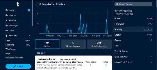
That first bit is kind of a nitpick but cramming the 'See everything' link down at the bottom of a browser window isn't a great navigation choice. (Again, the visual signifiers and eye-direction in this new design are incredibly poor.)
That the main activity page now requires you to scroll to even see the top note due to the new display ratio is really egregious. It makes another key site feature just slightly less convenient and accessible in a very irritating way. Bad choice.
4. The new ratio pushes the Radar and Main Sponsored slot completely off-screen
This one is directed the tumblr staff: that's also a bad choice, guys. That's your main ad-slot for people loading into Tumblr so hiding it is going to hurt both your ad-impressions and your ability to promote the ad-free option. The new layout ratio also means that the in-dash ads are going to be a lot more invasively screen-filling - and let's be real most users will either add-block or leave before purchasing ad-free. I have no idea what the new layout is trying to achieve but if ad optimisation is the goal then this ain't it, chief.
To be honest I cannot comprehend the rationale for this change. I guess it's visually a bit more like Twitter... but that site is currently being demolished from the inside by poor management decisions so maybe it's not the best aesthetic to be aping.
Well then, what do?
Okay so, new dash bad. And so, in true Tumblr spirit: we complain. However, to get results we must deploy the art of kvetching productively.
If you want the old dash back (or at least, a better new-dash design that corrects some of these big weaknesses) what you should do is head over to https://www.tumblr.com/support and lodge a feedback ticket pointing out the problems. The more users who do that, the more likely you are to see an effective response.
Remember, tagging @staff and @support in posts won't fix this. There's no guarantee they'll see it among the notes barrage.
Also: please don't be rude or abusive when you lodge tickets. Whoever is manning those blogs and inboxes probably isn't the person who forced through this change. Save an intern, be polite.
Go forth in disgruntlement to keep this hellhole a hellhome.
#tumblr#tumblr problems#new dashboard#yes it's bad#but there is a way#I've already lodged tickets about it
1K notes
·
View notes
Text
Can’t believe these two ghouls were on my local news this morning! If the YouTube thing doesn’t work out, it’s clear they can be weathermen. I think these screenshots prove that. @wearewatcher

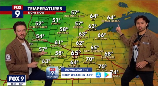
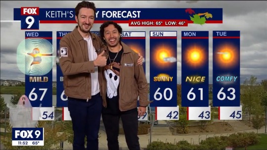
#we are watcher#shane and ryan#ryan bergara#shane madej#minnesota#ghost files#puppet history#local news#was not expecting that#clearly experts#best weather forecast ever#idk what else to tag#made my day#they are in Minnesota tonight for a show#tickets available?#watcher
947 notes
·
View notes
Text

Edward Hopper, a native New Yorker, was an avid theater-goer. These are some ticket stubs he saved between 1925 and 1936, with the names of the plays written on the back: Hamlet with Gielgud, Strange Interlude, Green Pastures, The Doctor's Dilemma, and six others. And the priciest was for Gielgud—$3.30 to sit in the orchestra.
Photo: Whitney Museum of American Art
#New York#NYC#vintage New York#1920s#1930s#theater#Broadway#Edward Hopper#ticket stubs#vintage theater
5K notes
·
View notes
Text
crying in the corner because my checkmarks are boring and lame now
#rainbow and blue checkmarks are separate now#and because i bought them before rainbow was introduced i got banished to the blue realm in the new update#but i had the perfect amount for a double rainbow :( im sad#i sent a support ticket and all they could do was give me a discount#punished for being too cool (read: fiscally irresponsible) too soon (read: before website got gayer)#not ml
2K notes
·
View notes
Text
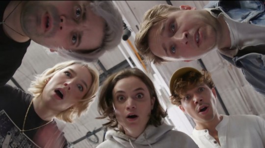
pov you posted something cringe
#new reaction image boys#actually excited. will buy a ticket#damien haas#angela giarratana#shayne topp#chanse mccrary#courtney miller#smosh
344 notes
·
View notes
Text
honestly I really just think the only bad guys in the fight for eras tickets are the scalpers reselling tickets and the scammers tricking money out of people. that is it. not the fans going to more than one show, not the "locals" just wanting to go have a good night at a fun show. like if you're gonna be mad at anyone during all this at least make it the people profiting at others' expense!
#saw a video yesterday of a girl going to all three nashville shows and she clearly had a great time in costume each night#and the comments were FULL of hate and people blaming her personally for them not having tickets#and then today with the new dates the multiple show discourse is here again#and people bringing up how terrible it is that local/casual fans might dare attend#like. these are not the enemy!#talking#taylor swift
651 notes
·
View notes
Text
wonderful
#there is a ranboo that goes withthis but i didn't like how he was looking imma restart from scratch tmrw😭😭#ctubbo#michael beloved#ctubbo fanart#Guys you have no idea what i went through today like it wa fucking crazy i need to share this#so i went to the mall after school right and im going home at like 8 on the train with my friend bc i was supposed to be picked up ay her#stop right but then im told to just go to my stop and take the bus and im like ok sure but the problem is my phone is on SEVEN PERCENT and w#hen i get to the stop my moms like u have money for the bus right and im like ueah and i check and i have NO MONEY#BUT I DIDNT TELL HER ANUTHING BC I DIDNT WANT HER TI GET MAD BC I KNEW SHE WOUDKNT WANT ME TO WALK ALL THE WAY HOME AT NIGHT (FOURTY BLOCKS#So im like ok im getting on the bus now my phone is on four percent i have to WALK HOME allll that way and there's this crazy ass upward hi#ll that's like ten blocks long ITS NOT EVEN THAT BAD but like my mom thinks im on the bus so im trying to speed walk as fast as i can and i#RAWDOGGED it too because MU PHONE WAS GOING TO IDE!!!!#I made it home at two percent U guys i was so proud of myself thank u for listening#IM SO MAD IT WOUKDVE BEEN OKAY IF I WASNT IN A RUSH And also if i had music uggghhh Whatever#I bought this really cute skirt at garage hold on let me find it#lexi pleated skort color Navy blue ITS SOOOO CUTE got some new leg warmers too yesss....#I NEED TO DOWNLOAD THE TRANSIT APP i woukdve been able to attach my apple pay and buy the stupid ticket if my phonewasnnt#too dead to do al that...#Guys always make sure u carry cash with yiu goodbye
151 notes
·
View notes
Text
Movie Problems
After enduring weeks of comments from his friends, Danny decided to watch Barbie, unlike Jason who was quite interested in Openhaimer, both met by chance in the middle of the movie theater after being informed that both movies would be delayed.
That was fine, until they walked into their respective theaters and the movies were switched, and shortly after they failed. The cinema manager couldn't help but chuckle as he looked at the boy dressed in pink next to the acclaimed Crime Lord of Gotham. He explained to them that both movies would be repeated one after the other, and that the failures were due to minions of the Joker ruining the projectors.
Danny, tired of wasting time, dragged the Crime Lord to see Barbie and promised to see Openhaimer with him later. Before entering the room he made sure to knock out the clown's goons, so Jason couldn't say anything as he was dragged away. At least the tickets were free after so many failures.
#dpxdc#Danny and Jason met in the movie theater#Danny traveled to New Jersey to watch Barbie#mainly because he didn't want to put up with the teasing of Sam and Tucker#they watched the movie earlier and he refused their invitations out of shame#Jason bought movie tickets as Red Hood#Danny doesn't care#dp x dc#dc x dp#Danny doesn't even know who Red Hood is#just that he's as unlucky as he is#Jason rented half of the movie theater for himself#Danny was simply the only one to speak for those who watched Barbie#Jason fall for the boy that knocked out the Joker goons#dead on main#deadonmain
681 notes
·
View notes
Text
"We need more weird art" you can't even handle musicals because the story is told through music and dance
#there's quite a lot of talk in musical discussion spaces about the new trend for movie producers and marketing teams to make a movie#adaptation of a musical (that was done on stage) or even directly an original musical movie and market it as if it's not musical#because they've seen that people won't go watch musicals if they know they're musicals because general idea is that it's too weird#and the numbers are showing that this marketing trend works. they're selling so many more tickets by hiding that it's a musical. and having#many people in the audience find out it is once the movie has started!#so some musical fans don't go because they might not even have realised that was a musical and the people who go might not like it#sure there will be people who are close minded and wouldn't have gone to see a musical but once they're there will enjoy it. but other won'#I hope they make polls of audience satisfaction not only tickets sold. i want to know more.#💬#musicals#broadway
165 notes
·
View notes
Text
question for ghost fans who were there for the transition from terzo - copia (or before), how did you. deal with that. because i've only been a fan while popia has been around and i think when he dies/moves on i'm going to be genuinely emotionally devastated
#ramble#ghost#ghost bc#since he announced that it was actually his last show i've been like. preparing myself#which sounds stupid but ghost is so special to me#like the butterfly effect that happened bc i started listening to ghost is crazy#listen to ghost -> buy festival tickets Just to see ghost -> start listening to other bands on the setlist -> find my favourite bands ever#-> make new friends and go to a LOT of gigs -> go a little batshit and start dressing exactly how i want to -> become happier with myself??#wack#idk ghost is one of those bands who makes me understand why girls in the 80s threw their bras at the stage and fought eachother for tickets
120 notes
·
View notes
Text
I don't know if this has been talked about on here yet but this is very important to my US peeps looking to buy tickets.
TLDR: Tickets for the Teeth of God tour will be mobile only and non-transferrable. Aka Sleep Token said "Fuck Scalpers😡🤬" like the absolute kings they are.
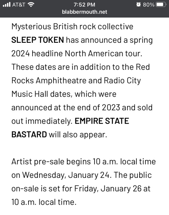
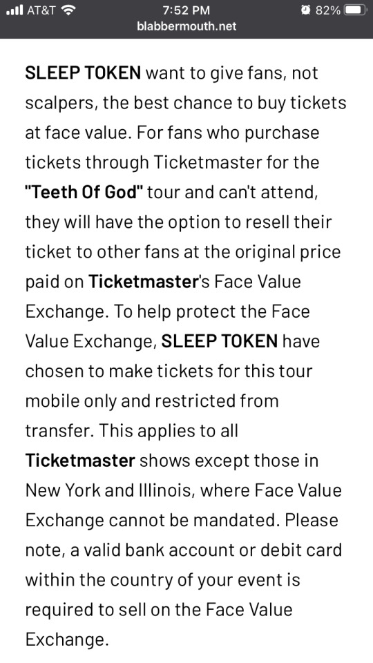
#sleep token#vessel sleep token#ii sleep token#iii sleep token#iv sleep token#vessel#ii#iii#iv#teeth of god tour#bless these kings#oh my god#because rcmh and rr were hell to try and get tickets for#i hope this makes it easier for fans to get tickets to the ritual they want#but this also means i'm not going to two of the new dates#just one 🥲 unless people can't go#(i say as if i'm not going to see them at sick new world and red rocks lmao)
163 notes
·
View notes
Text
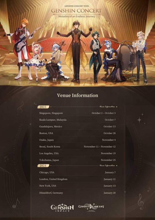
GENSHIN CONCERT TOUR - GENSHIN CONCERT - MELODIES OF AN ENDLESS JOURNEY

Dear Travelers, Melodies of an Endless Journey will soon resound once more! This is your chance to hear the music of Teyvat, live and in-person! Here's some Genshin Impact concert venue and ticket sales information for you.
For more details about the event, please see the event's official web page.
https://hoyo.link/evL4EIAL

#genshin impact#genshin impact updates#genshin impact news#official#genshin impact concert#oh shit i could actually go to chicago#like that's a long drive but it's more doable than any other irl event they've done#maybe... if the tickets aren't absurdly expensive...
244 notes
·
View notes
Last Seen Blogs

sparklyeyedhimbo
toodels gaymers
dukexietyweek
Dukexiety Week 2024
bride-of-dracaenca
Draca from Tuca & Bertie is super hot.

omkishanti
नुपुर 🥀