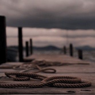
#can you layer acrylic paint on canvas
Note
Patch making tutorials?
and here i am once again, with a patch making tutorial
how to make stenciled patches:
i'll post a part two in the future which will cover freehanding and stamping ur patches
-
first some general info that might be useful:
i get my patch design inspo from pinterest, etsy, and tumblr. if sell your patches make sure you arent ripping off another artists patch design when using etsy for inspo. anarchostencilism also has tons of stencils both on deviantart and reddit which are free to use.
i use acrylic paint for my patches, but if you can afford it id advise fabric paint. to seal paint into the fabric iron the patches, it helps em last longer. some acrylic paint survives very well in the washing machine, but wash your stuff by hand the first time to see how well it holds up.
if you make your patches multiple colors, dont first make the whole patch one color and then paint over it with the other colors. if the paint starts cracking the base color will show through. (if you like that however then dont mind this)
i paint my patches on jean fabric, cause it makes the patches sturdy yet flexible. but shirt fabric or canvas both work very well too. anything except really plasticy/slippery or textured fabric can be used
i pin my patches down with pins onto multiple layers of taped together cartboard, to prevent the fabric from moving around and distorting the print
-
there's two ways in which i make my stencils
1. with paper covered in tape
2. with the plastic folder you put in your binders
-
option 1:
draw out your design onto some paper, make sure there arent any "loose" parts in the design that will get lost when cutting out the stencil

cover the paper in tape front and back, make sure you can still see your design through the tape
cut out your design, i use scissors and an exacto knife
-
option 2:
draw out your design (you can also draw the design directly onto the plastic folder)
cut a piece of plastic out of the folder big enough to cover your drawing and tape it down.
trace the design onto the plastic with pen or marker (any mistakes can be wiped out)
cut out your stencil
-
continuation from both option 1 and 2
after finishing your stencil you can pin them down on some fabric
dap on your paint with the point of a big brush or a sponge, depending on the paint it'll take 2-3 layers.
make sure your previous layer dried completely before adding the next one
after the paint has fully dried you can carefully take off your stencil.
!!dont unpin the patch before it fully dried, or the drying paint may cause the fabric to warp!!

thats it, questions are always welcome, now go and make stuff!!
#punk diy#diy fashion#punk#queer punk#diy punk#punk clothes#punk style#punk patches#patches#tutorial#my stuff
2K notes
·
View notes
Text
here's some punk diy tips and ideas
[other than crusty pants and battle jacket, although we still love those greatly.]
why should you diy, when you can just find decorated items everywhere, you can ask. what if you are clumsy at painting or anything?
firstly, good questions. we diy so we don't give credit to the big companies who rule the world. we diy to get more independent from the system we dislike. we diy so to save money. to express uniqueness, recognize eachother and be recognized. and especially to have fun and feel cool. diy is not only about clothing, but anything you can set your mind on. of course, one cannot make EVERYTHING for themselves, there isn't enough time and energy. but making at least small steps are already a statement and more than nothing. also, helping small artists by buying their products is also pretty punk.
that being said, i provide you with some tips of mine, all gained from experience:
anything you drew/painted on, you will WANT TO protect. acrylic paint/markers + acrylic paint varnish/transparent nail polish/textile medium are your best friends. read after anything that's new to you.
i highly recommend working with old clothing or thrift shop finds when it comes to textiles, as it is environmentally friendly and you will stay in budget. Anyways, always make sure that the material you use isn't gonna be problematic. for example, if you want to do some patchwork, the material shouldn't decay easily (if it does, it will come off so quickly.). if you want to paint on it, it shouldn't be rugged.
you can not only draw/paint on your canvas shoes, but can also sew, embroidery (just make sure to use a thimble, plus floss instead of thread could make your work more durable), and add beads and trinkets to your shoelaces. in the case of shoes, never use glue (neither hot nor instant glue) – it will come off quickly. for some inspiration, i'll show you my shoes!
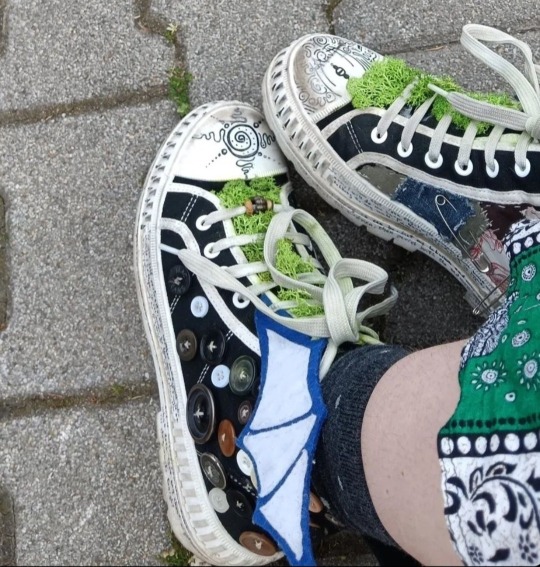
(the fake moss is literally unstoppable from falling off or getting dirty. risky idea.)
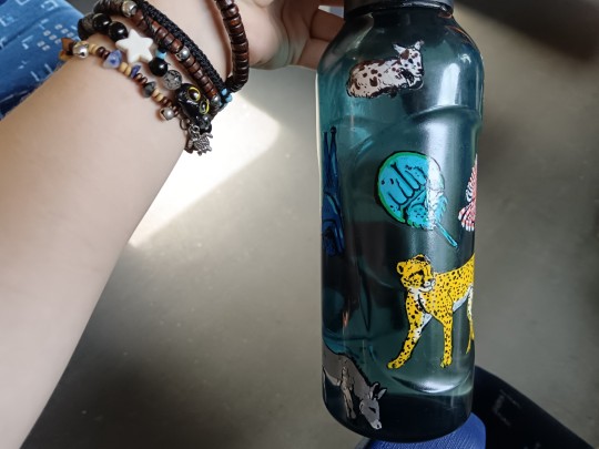
it's good to carry around water and food!! you don't even have to pay for decorative water bottles and food boxes, as you can draw on glass and plastic just fine with acrylic markers. just don't forget to paint transparent nail polish all over your drawing. in at least two layers. don't be lazy or laid-back. even posca comes off while washing the dishes. and you WANT TO save your reference pictures/final designs, as the case of emergency is likely. but after all, my water bottle is exactly fine after six months, with no accuring problem.
if your current best option to get stickers from is aliexpress or overpriced decor stores, search for local artists and shops on instagram and tiktok, as it may be their most efficent way of getting you to know them. if it seems like you have no chance, you may can still find a print shop with the option of printing on self-adhesive sheets (at least in hungary, those are pretty cheap). and if you want drawings to print out as stickers, you may use your own or –ONLY IF YOU GET PERMISSION– other artist's work. not only good for decorations for like, headphones, but for vandalism too. WAIT WAIT who said that. who said it. not me. no never
(in case that's also impossible, you can create stickers by printing out/drawing a picture, cover it up in transparent adhesive tape, and then put some two-sided adhesive tape on the white side of the pic. it won't be that durable, but it functions.)
if you want to bleach-paint clothing, get some plastic brushes!! any other brush dissolves. draw your design first with chalk!! never forget to put cardboard inside the clothing, and to wash the finished work in a washing machine before you'd put it on. prepare to be patient with the process. and it's not dangerous to touch 5%-9% household bleach, just wash your hands soon after.
if you want your crusty pants to last veryyy long, wax them. look up on youtube jeans waxing.
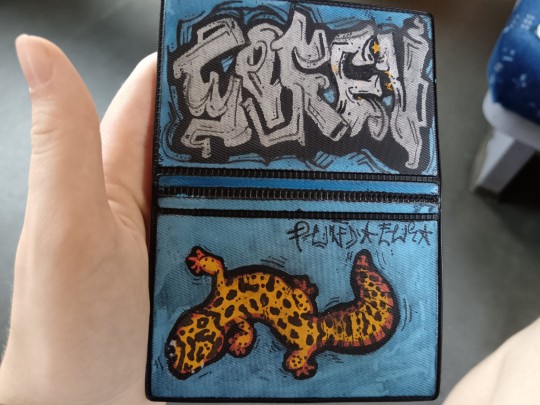
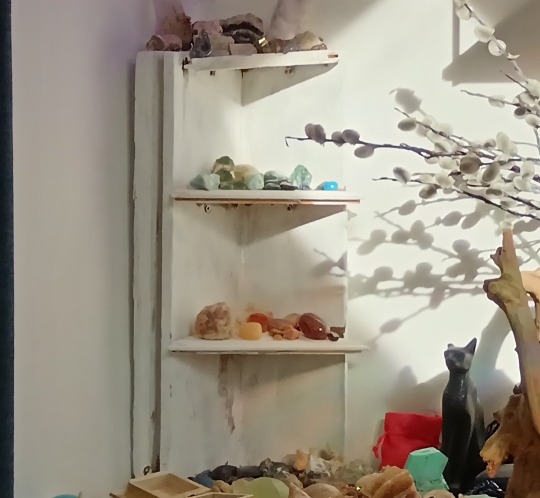
some more things i made for myself so to give you some inspiration: totebag with pockets, a small crystal holder cabinet, badges, and i decorated some t-shirts, button-ups, an id card case, phonecase, laptop.
theoretically speaking, there is nothing that an individual would be unable to learn how to make, when it comes to diy. you can't imagine how easy it is to bake bread at home. consuming-focused media makes people believe that it's hard to make anything. of course, everyone has to decide about their own priorities, i don't want to convince or change anyone in here. and if you have any questions, send an ask!! i hope i had been helpful.
#punk diy#tips#tutorial#clothes painting#do it yourself#bleaching#alternative clothing#soren's hoard of words#i hope you'll have fun with this#stay safe and drink water
160 notes
·
View notes
Text
The Depths 1

Warnings: non/dubcon, stalking and other dark elements. My username actually says you never asked for any of this.
My warnings are not exhaustive but be aware this is a dark fic and may include potentially triggering topics. Please use your common sense when consuming content. I am not responsible for your decisions.
Character: fisherman!Geralt of Rivia x artist!reader
Summary: your sleepy existence is thrown into chaos by a mysterious man.
As usual, I would appreciate any and all feedback. I’m happy to once more go on this adventure with all of you! Thank you in advance for your comments and for reblogging ❤️
The water crashes onto the coast. The sound is dulled by the distance of your perch. The sky melds into the lake's surface as the sun hides behind a swathe of clouds.
You lean in to squint at the strokes on the canvas, sweeping your brush in repetition of the rippled horizon. You use the wnd of the brush to scratch your cheek.
Almost...
You peek above the easel and watch the small speck growing larger as it moves across the water. The fishing boat is there so often that you've added its silhouette to the acrylic tides. A stalwart to your early mornings and listless afternoons.
Day after day is layered before you in shades of cerulean, slate, and lavender. The grey sky with a tinge of golden sunlight, the waters stirring in sparkling shades of aquamarine and pearl, the coast rippled in fawn and umber. Another eye might see it and deem it finished but not you.
You step back to let the paint dry and rinse your brushes in the jar. Hmm. You're out of clean water.
You close up the easel and hook the canvas on the backside, carrying it like a briefcase as you pick up your canvas bag with your roll of brushes and pots of paint, your palette around your index finger.
You make a slow descent down the cliffside and curl around towards the shore. You veer away from the dock and head down into the silt. You put your stuff on a flat rock. You take the used brushes and palette to rinse in the shallows.
The water laps over your sandals as you linger in the soothing cool foam. The approach of evening skews the water with emerald and jade. You shake it all off and step back to dry it with a paint-blotted cloth.
You rearrange the bag so it all fits and hook it over your shoulder. You look down at the your linen apron. You can recall where every splotch and streak came from.
You take your easel and canvas and head back up along the dock. As you reach the post, the fishing boat knocks against the other end. You peer over at the man that lays a board across the spanse between.
You see him every night. You couldn't forget a man with snow white hair and golden eyes. His age is less than his locks might suggest and his eyes seem to look through you, not at you.
You smile, like you do every night. He doesn't react. Just like every other time.
The smell of fish wafts in the boat as he drags his net across the wooden ramp. You turn and press on. He's much to busy for you. It doesn't bother you. You came out here to get away from people.
Your feet leave divets in the dirt as the rock of the boat knocks in a rhythm against the dock. The man's toil adds to thunks and thuds and they fade behind you. The peace here is immaculate, you wouldn't want to ruin it for anyone else.
Past the seaside houses left vacant in the colder seasons and the smaller basins of the lake, between the rocky ridges and grassy knolls, you return to your little house.The cornflower paint chips from the wooden siding and the stairs are worn in the middle from the tramp of feet. A bench stands on the other side of the white railing between a plinthed flowerpot and folding table with a book forgotten on its slats. Home.
The spindly wreath on the front door rattles as you push through and the screen door snaps behind you. The evening breezs drifts in through the mesh as you set your easel down and rest the canvas on crate just beside the mat. You put your bag in front of the wooden stand and bask in the calm.
You hang your wicker hat and untie your apron. Your hands are covered in paint. You'll wash them before you eat. You leave your wet sandals at the door.
You pull out the pot of chowder you made two nights past from the fridge. You put it over a burner and wait for it to warm. The fare lasts you near a week when you take the time to put it together. Every ingredient must be used to its last, especially when it is so far to market. And expensive.
You scoop out a bowl and eat it on the front porch. Your eyes are too tired to read. When you finish, you recline on the bench and yawn. You lay in the dimming hue of the evening as the stars wink down at you.
A whistle carries on the wind. You sit up and look for the culprit. They are close enough to hear but that could still be far. It could even be a bird.
You take the empty bowl inside and rinse it. You retreat to the bedroom and change
You open the window to let the night in. Around here, you can do that. Not like the city and its grated windows.
You laze in the dusk shade and drift slowly into yourself. Sleep enshrines you atop the cushy bed, the water stirring from afar, the loons calling into the dark. Tomorrow you'll figure out the exact right colour for the undertow.
You're more than due to sell a new piece. You need to if you want to stay in paradise.
#geralt of rivia#dark geralt of rivia#dark!geralt of rivia#geralt of rivia x reader#the witcher#au#series#drabble#the depths
182 notes
·
View notes
Text
Been thinking about Rafayel and how he shows his love (especially after his newest card trailer).
On the surface, Rafayel seems like he's an open book. He's witty, affectionate, chatty ect ect
But once you dig deeper you realise that he's that way...but only with the person he loves. He's actually quite reserved and doesn't enjoy being the center of attention, even going so far to say his job is a thing of self expression rather than something he actively strives to make money off of.
With the upcoming new 5* card of Rafayel's, I wasn't shocked that we didn't have a kiss or one where he tried to kiss us (and tbh his sweeter form of affection in wanting to cuddle us and snuggle into our neck made my tummy do flips and had me having a near breakdown from how much it made me gooey)
I feel like Rafayel is a yearner to his core, even his interviewer noted as much that he gave an air of 'romance' to him.
The best way I can describe it is; His love is like his profession and his EVOL.
Art takes time, it takes an observant eye and mind. I've grown up with artists my entire life and to make a painting is much more than slapping some acrylics onto a board and calling it a day. It takes tempering, to prepare the board, to build up layers upon the canvas to correct any mistakes without an eraser or undo button.
It's gentle, tending to the whims of the canvas to make a happy compromise of your own.
Onto his EVOL, Rafayel treats a relationship like a firepit. He wants it to have longevity, keeping himself and the fire alight. So instead of chucking a log onto the firepit he nourishes it with kindling, giving it a poke here and here to check on its status while being warmed by the flames.
Rafayel is also horrifically traumatised from previous encounters with love.
Think of it this way;
He was a Prince. Set to be throned as a King and live with his beloved forever.
He set out to find a devout follower to sacrifice their heart to him in turn found himself giving them his own heart and betraying everything because he wouldn't let a pre-destined prophecy rule himself or his beloved.
When he got his love back, in another timeline they were brainwashed and ended up killing him. The absolute agony you must go through, to be maliciously murdered and know that it's by the person you love but not their intention to do so and in your last breath you grant them mercy to die alongside you by singing them to death.
Moving onto Abysswalker Rafayel, the weight of being told you have to kill your love to resurrect your hometown, taking the love of your life on a wondrous journey to know you have to kill them in the end and instead erasing their memories of you permanently to protect them and keep them alive, rewriting a tome for their sake and thus dooming his beloved kingdom and people to be tormented for eternity of his peoples damned screams of death and agony.
Do you ever wonder if he has sat with himself and laminated over this horrifying fall from grace?
Yet he still does it, for them.
After ruminating over this; I wouldn't be as forward as the other LI either.
I think Rafayel is immaculately brave and loyal for even trying again, for still searching for his beloved over years and years.
He has his insecurities, they show when he gets bratty or needy. Quipping at his beloved for not having their sole attention on him, he's meant to be worshipped after all, doted on, praised for having put in so much effort.
Alas, his love doesn't remember, doesn't see the accumulation of sacrifices and things hes done for them.
So he hints, he prods and pokes gently and he starts having them warm up to him again. Braving a tender word here, a lovingly gentle touch there and moving up and forward until he can see that his beloved has fallen in love with him again.
Rafayel is a love that doesn't burn bright, it burns with stability, it burns with loyalty, it burns with truth and gentle care. He would never want to scorch his love.
Rafayel makes accommodations for them, weaving them into his life in any way, if that may be employing them to inviting them on little excursions. Even keeping a watchful eye over them, noticing when they're in need, hurt or just simply making his presence known as a comfortable 'You can come to me'.
He's a gentleman, a romantic...with a little edge (Rafayel audios I'm looking at you, hard)
Anyways, I should not drink copious amounts of caffeine within a short allotment of time. I hope my ramblings have been enjoyable 🤍🪽
#love and deepspace#rafayel#love and deepspace rafayel#rafayel love and deepspace#love & deepspace#rafayel girlie#lads rafayel#mc love and deepspace#mc x rafayel#rafayel x mc
375 notes
·
View notes
Text
talking about rebelle

TLDR: it's really good
Too Long DID read: in the niche it occupies, it's the best program I've used. This isn't a sponsored post, nothing like that, no affiliate links. Just pure sweet fat of the hog.
Rebelle Paint is a painting software designed around imitating physical mediums. Watercolour, gouache, acrylic, oils, pastels, and so on. It might be better to think of it as a physics software that happens to have a bunch of art tools inside, for better or for worse. Let me give you an example.

These two blobs represent an area of the canvas I've made wet through the watercolour tools. This is where the physics sim comes into it. The backgrounds aren't just static paper textures, the paint disperses and interacts with the grain of the 'paper', or the canvas, or whatever you have selected.

If you're already good with watercolours, you're set. If not, like me, you're in for a steep, steep learning curve, because they're hard to control. I can't call that a fault, real watercolours aren't exactly famed for being easy to use. But if you do this across a few layers, that means Rebelle is simulating a bunch of things at once, which means that your computer is gonna CHUG. Seriously, if you have a laptop, get the demo before you even think about buying it. I'm using a solid desktop and can't go beyond five layers without my processor screaming for mercy. This is only with the watercolours, however, for things like ink/markers, I got up to about 30 layers with that comic. Deploy the pomegranate.

Circling back to that canvas being a physics object thing...

Here's what comes with the software, enough to cover any of the mediums you'll use in it. If you want more, however, you have to buy them in the store, and if you wanted all of them, for whatever reason, that represents about 150 dollarydoos, and individual sets (cold pressed watercolour etc) coming out to about 10 each. I might pick one up in the future if I really want one, but so far I haven't felt the need. You aren't being deprived of options, is what I'm saying.
The biggest compliment I can give the software is that it feels like they either take direct feedback from its user base, or are so good at pre-empting what you might need that it makes other software like this (Corel, CSP) seem clunky. Let me give you an example. Like most art software, there's a reference panel.

Unlike most art software, that panel comes with tools already in it that are very useful. Say I just wanted to practice painting in colour, and the likeness of this model isn't what I'm focusing on. You have two options: half-assing it, or tracing and then painting yourself. Rebelle lets you place guidelines on the reference, which are then projected onto the canvas. If you toggle greyscale mode on to check your values, then colour-pick, you don't pick up the desaturated tone, you'll always pick the true colour underneath. That might sound like a small thing, but when you get used to working around that in other software, it adds up.
Pros:
One-time Purchase
Very very strong tools. They're a joy to use.
Almost no learning curve regarding the software itself, even if you're moving over from another programs
All tools are able to interact with one another. Want to drench your acrylic paint in water? Go for it! A lot of traditional imitation software locks the tools you can use to certain layer types (Corel, Realistic Paint Studio), but not here.
Liquify, transform tools, adjustment layers, all the normal stuff you'd want in digital is all here.
Brush customisation engine is excellent
Cons:
Two tiers of purchase (standard and pro). I bought standard, and honestly I'm thinking about upgrading because the image scaling is locked behind pro. Standard shakes out to about ninety bucks, pro one-fifty, and in this economy that's a big ask. Saying that, there is a sale on right now. If you just want digital tools that mimic traditional, and don't need any of the extras, consider Artrage Lite at one third the price.
Resource HUNGRY. Way, way more than any other art program I've used.
Anything involving water requires juggling in a way real watercolour doesn't. It's very very easy to keep painting, look back, and realise something 5 layers ago is still soaked and leaked into everything else.
Prone to crashing.
Overall, I'm really happy with it. I don't think it's great for anything very detailed, like that comic I did the other day, and for general use Clip Studio Paint is a better purchase, but this is a great supplement.
#text post#rochedotpng#rebelle paint#just my luck to buy it days before the sale...#featuring some old man from a candid picture of a county fair
27 notes
·
View notes
Note
enemies to lovers with sean? 🫶🫶
I am going to be really honest this was fucking hard. I love enemies to lovers but it is so difficult to really bring out the tension in a short drabble like this.
But still thank you so so much for the req and I hope you like what I did here :)

Canvas of Conflicts
The sun hung low over the Seattle skyline, casting long shadows through the windows of the art department at Blackwell University. Sean Diaz stood in front of a large canvas, his hands stained with a mix of acrylics. He was deep in his zone, creating a piece that blended surrealism with street art—a signature of his evolving style.
Across the room, you sat hunched over your laptop, typing furiously. Your focus was on an in-depth analysis of Baroque art for your Art History presentation. The sharp clacking of keys was the only sound that could rival the scratch of Sean's brush on the canvas.
The class was a melting pot of creative minds, and your professor often encouraged debates. But when it came to you and Sean, these debates often turned into heated arguments.
“Diaz, you can't just slap some paint on a canvas and call it art,” you snapped, glancing up from your screen. “There's no substance, no historical context!”
Sean paused, turning to face you with a smirk. “And you can't just analyze art to death, Y/N. Sometimes it's about feeling, not just thinking.”
The tension between you two was palpable, sparking almost every class. It wasn't just a clash of specializations—it was personal. You both carried an undercurrent of competition that bled into every interaction, whether it was a classroom debate or a chance encounter at a campus party.
One evening, the head of the department, Professor Henderson, called both of you into her office. Her stern expression was enough to make you both fall silent.
“I’m assigning you two to work together on the upcoming art exhibition,” she announced, her tone leaving no room for argument. “Your task is to combine your skills—Sean’s fine art and Y/N’s historical analysis—to create a cohesive presentation. I expect nothing less than excellence.”
The news hit like a bombshell. As you exited her office, you and Sean exchanged a look of mutual disbelief and dread.
“Great,” Sean muttered sarcastically. “Just what I needed.”
“Trust me, the feeling is mutual,” you replied, rolling your eyes.
The next few days were filled with awkward meetings and forced politeness as you brainstormed ideas. It was clear neither of you were thrilled about the partnership. However, as the deadline loomed, the gravity of the task began to sink in.
One late night in the studio, surrounded by sketches and notes, a breakthrough finally came. Sean was experimenting with a new technique, layering colors in a way that seemed chaotic yet intentional. You watched, intrigued despite yourself.
“Try using a bit of chiaroscuro,” you suggested cautiously, stepping closer. “It might help highlight the depth.”
To your surprise, Sean didn’t snap back. Instead, he nodded, adding a darker hue to the canvas. The effect was immediate, adding a new dimension to his work.
“Not bad, Y/N,” he admitted, a hint of admiration in his voice.
You smiled slightly, feeling the ice between you begin to thaw. “Thanks. And I have to admit, your work has a certain raw energy that’s hard to ignore.”
As nights turned into early mornings, the studio became a place of shared ideas and mutual respect. You found yourself laughing at Sean’s jokes, and he began to listen to your critiques without defensiveness. The friction that once defined your interactions gave way to a synergy that neither of you had anticipated.
One night, as you both sat on the floor amidst scattered sketches, Sean handed you a cup of coffee. “You know, I’ve been thinking,” he said, his tone unusually serious. “Maybe we’re not so different after all. We both want to understand art, just in our own ways.”
You nodded, meeting his gaze. “Yeah, I guess we do. And maybe… just maybe, we can learn from each other.”
The final days before the exhibition were a blur of activity. You and Sean worked tirelessly, fine-tuning every detail. The end result was a stunning fusion of artistic expression and historical context, each element enhancing the other.
On the night of the exhibition, as you stood side by side in front of your collaborative masterpiece, the applause from the crowd felt like a distant echo. You turned to Sean, your heart pounding.
“We did it,” you whispered, a smile spreading across your face.
Sean’s eyes softened as he looked at you. “Yeah, we did.”
In that moment, the competitive tension that had defined your relationship melted away, replaced by something warmer, something more profound. As the evening wore on, you found yourselves gravitating closer, the unspoken feelings finally surfacing.
Later, as you walked together under the soft glow of the campus lights, Sean reached for your hand. “You know, Y/N, I’ve grown to really appreciate your perspective. And… well, I’ve grown to appreciate you.”
You squeezed his hand, your heart swelling with affection. “Same here, Sean.”
And as the night enveloped you both, the journey from rivals to partners, and finally to something more, felt like the most beautiful piece of art either of you had ever created.
#life is strange 2#sean diaz#lis2#lis2 sean#lis2 sean diaz#sean diaz x reader#enemies to friends to lovers#enemies to lovers#enemies to friends trope#lis2 headcanons
23 notes
·
View notes
Text
SET SEVEN - ROUND ONE - MATCH EIGHT
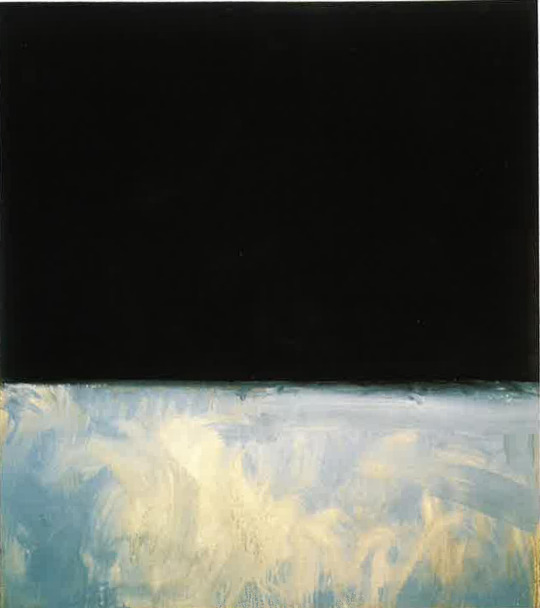

“Untitled (Black and Gray)” (1969 - Mark Rothko) / "NAMES Project AIDS Memorial Quilt" (1985-present)
UNTITLED (BLACK AND GRAY): there’s something about this painting that deeply, deeply resonates and kind of fucks with you, especially since no other painting in this series has the kind of sky-look layering. the top half is dark and deep and has a void like pull to it, almost as if you could fall directly into its abyss and just never re-emerge. the bottom half looks almost joyful, simple, not exactly clean and precise and hard like it’s other half, but carefree and child-like. there’s an essence of freedom there mixing with the blues, yellows, and whites, and only a hint of gray despite the series name. the balance of stark black against this world-view mish-mash of color just strikes within you something like hope, a kind of fervent thought like “everything is going to be okay, you can look up and at the void, but just remember there is something good to see below it as well” this is all honestly my own interpretation of this particular rothko painting, but as soon as i saw the description of this tournament, this was the first painting that came to my mind. it may not fuck me up in a monstrous way, but the feelings it evokes in me feel big and like the kind i could scream forever about (@bluegarners)
NAMES PROJECT AIDS MEMORIAL QUILT: fucks me up bc so many people died and so many people suffered and their partners didn’t have legal rights as next of kin and so many had been disowned by their parents and had to be held by a stranger while they were dying and if i could resurrect anyone in the world i’d dig up either reagan or thatcher and kill them again (@jaskierx)
("Untitled (Black and Gray)" is an acrylic on canvas painting by Mark Rothko. Rothko did a series of black and gray paintings in 1969 and 1970. One is visible at the Guggenheim Museum in New York City and another is found at the Museum of Contemporary Art in Los Angeles.
The "NAMES Project AIDS Memorial Quilt" is an ongoing community art project honoring people who passed away due to AIDS-related causes. It consists of approximately 50,000 panels of 3 by 6 feet (0.91 m × 1.83 m) panels, which is an estimated 54 tons of material. It is currently housed in San Francisco, but is often displayed in various places in the United States.)
114 notes
·
View notes
Note
okay but tell me more about your process with soft pastels because i love working with them but i have no technique no understanding no nothing and i never like how what i do turns out. what surfaces do you draw on? is there a way to seal your work? also you hooked me even harder on using soft pastels by drawing an eye because i always scribble and doodle eyes! XD
Thanks! I'm far from an expert; I tend to use chalk pastels mostly for quick work, often painting ideas, because you can get down a lot of color very quickly.
Chalk pastels are one of those things you just learn by doing. They blend beautifully, but because they're so dusty the blending causes the colors to dull, so you want to layer your colors--put color down, blend, put more color on top, and continue as needed. You can use a paint brush to get more precision with your blending, or even to apply the chalk. It's almost like working with eyeshadow.
I often draw on canvas, sometimes already painted with acrylic, sometimes with bare gesso. I do paper also (newsprint, often, because again, usually just rough ideas). You can seal and protect it with pastel fixatives, or, in a pinch, you can use hairspray. It's not as good but if you're just getting started it's better than nothing.
116 notes
·
View notes
Note
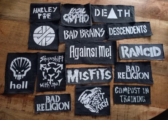
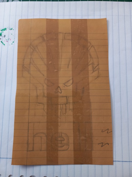
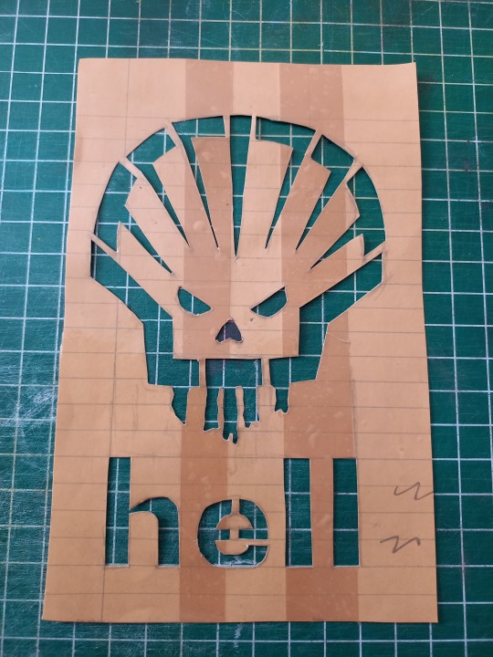
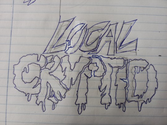
Hellooo! How do i make patches? I want to make some very badly but I have no idea how to make them
the only things you really need are scissors and fabric! other things like glue, tape, thread/floss, needles, hardware (any kind of chains, safety pins, added objects) are great but optional.
i start by cutting the shape i want from my fabric. this can be any scrap fabric; canvas and denim are good if painting on a flimsy layer bothers you, but a thinner or silkier fabric may help you achieve more detail and a cleaner look. depending on your fabric, you may need to seal edges with glue so they don’t fray.
i use masking tape to secure the fabric to a surface as i paint it, and then freehand my design. you can also sketch out more complicated patterns with a white jelly roll pen, but i am lazy and usually don’t. i do touchups with black acrylic paint since my fabric is black.
hope this helps :)
123 notes
·
View notes
Text
tips for traditional artists (mostly painters)
so while i primarily post doodles and such on this blog, my true passion is traditional art. :) i see a lot of tips for digital artists but rarely for traditional ones, so this is just my own experience (before anyone goes like "oP tHaT iS nOt UnIvErSaL eXpErIenCe" (i know this site well enough lol) if the advice doesnt sit well with you feel free to ignore it because i am def not an end it know it all. and nobody is because art is so broad and there is no right way to do it.
EQUIPMENT
so, first of all, in my language we have a saying "the tools dont make a master", meaning a true master could create with anything. i mean, sure, to a point, tools wont replace your ability to conceptualize art, but cmon.
equipment matters, especially when painting. i mostly work with acryllics and markers. lets talk about acryllics.
paints
its important to get at least okay quality paints. the stuff i use is not insanely expensive - croatia has limited offers, and i am poor. however, i tried paints for like 1€ from tedi and they are far inferior to goya's paints i use (3-4€ cca per 100ml. and those 100ml are going to last you a very looong time if you work on small scale paintings, and i even managed to fit in large ones).
ESPECIALLY THE WHITE PAINT. i cannot stress this enough. if youre gonna buy cheaply, buy everything cheap except for the white. make sure the white is good. it will serve as a thickener for other colours and good white can even do a good job of covering up the black paint.
brushes: get good brushes. if you paint frequently with bad brushes (like the ones i get from muller; they seem fine but ehhh im constantly changing them) you will be spending more in longer run than you would if you invested in something better. im not talking about 100€ packs made of donkey tail strands or whatever, i mean normal brushes, but look at reviews a bit. i once ordered like 10€ pack of brushes from amazon and they performed muller ones by far (and were cheaper); they left thicker paint and didnt get ruined after five uses.
markers
now see, i dont have any advice here, but i wanted to contrast it with my previous talk about how i purposefully buy good paint. well, i purposefully buy bad markers. really bad ones. because equipment often depends on what style you are after. i use flomasters, and they do what i want: and thats a cheap and trashy look.
canvases and papers
if youre gonna invest into something, invest into paints rather than canvases. you can trick a bad canvas by putting on multiple colour layers, you cant trick bad paints. but there are differences to bad and good canvases, of course. however, if youre just starting out, just go get a bad one; i take most of mine from tedi, or order online. you dont gotta spend billion of euros on them.
paper is also important. i am a painter and i bought a Leuchtturm1917 though unfit one, and was annoyed as to why everyone thought it was great. then i bought the one with specific sketchbook paper and it works fantastic. if youre painting, you need appropriate paper.
learn colour theory and some art history
yes i know this sounds boring. but its not. draw inspiration from your predecessors. there are people making oil paintings of modern things. you heard "dont shade with black" (and thats my personal mantra too) but chiaroscuro was a valid art movement. if you take a look at my own art you will most likely say: oh, thats pop art! and you would be right. i am inspired by roy lichtenstein, andy warhol, and other pop artists. but thats just the surface. my use of colour is inspired by the impressionist takes on it; i dont shade with darker colours, i shade with different ones. i shade red with blue, yellow with purple or red, and so on. if you look at the topics and subjects of my art, you will find surrealism. if you look at my approach to art itself, you might find influences of croatian naive. learn about actual philosophies behind art movements you like; you might find something for you.
ok these are just some general thoughts i had, id probably have more lol but thats it for now
14 notes
·
View notes
Note
seeing you make oil paintings of elim garak has changed something about the way i perceive art, both in what others make but also in what i am capable of making.
it’s probably due to learning mostly euro-centric art history, but i’ve always thought of oil paintings as like the peak of painting ability? like, it’s fancy and it takes a while so i thought that it must be the best (ignoring the fact that my artistic field is mostly in acrylic paints and 3D sculpting and yet i still consider it very good). and i’m still working on disproving this sort of mentality that there are mediums inherently better than others, because it’s incredibly limiting to my creativity to impose a higharchy, and also it feels kind of xenophobic.
i digress a bit. point is, i’ve viewed oil paintings as a medium only deserving of gallery-type realistic portrait stuff, which is very much not what i do. i don’t make the sorts of fancy art rich people would pay for- the type of art i thought oils were for. i make paintings of comic book characters and sculptures of my personal heroes, i make jewelry and clothes and stuffed animals. stuff that i enjoy. which is good!
but still somewhere lurking in my brain was this voice telling me that on some level my works weren’t as meaningful or creative because they were fan works or made from materials i’m not an expert in or because the only people i draw and paint and sculpt are queer and trans, like me. that because my art was self-indulgent, on some level i suppose i thought it lesser.
but then i see your art. and holy shit! you’re work is INCREDIBLE! at first i was excited because, hey, i’m a big star trek fan, and garak is one of my favorite characters. i love coming across fan art of him, and it always manages to strike a chord with me. but then. as i looked at it closer, i realized it was on canvas. as i scrolled down i realize it was oil on canvas.
before, i’d pretty much only seen fanart as sketches on paper or digital drawings. one that is really only meant art-wise for quick sketches or planning of what will become “real” works, and one that doesn’t actually take up any physical space in our world, and is stored away in a little digital file.
but oil on canvas? that’s not meant to be thrown away, it’s meant to be held in gloved hands, as it is precious, and it’s not meant to be hidden away in the “files” on a laptop. no, those hang on the walls of museums or houses, meant to be displayed with pride for all to see.
and with those too colliding thoughts, that of fan works as some lesser form of art but oil paintings being the art of the rich and talented… well i realized that both were wrong. fan works are not in any way shape or form lesser than original works. what makes my layered ink painting of dream of the endless any less important than my painting of the ocean during a storm? nothing! they’re both good works. and on the other side, there is nothing that makes my oil paintings more important than my acrylic paintings or my sculpture or my knitting. it’s all art, lovely art, in the end. and the only thing that really matters is that i enjoy it.
seeing your art has helped me break some (minor) yet harmful thoughts i didn’t really even realize i had. so thank you for that. also your garak art is fucking good, and it really makes me think about what sort of life he would have after ds9. anyways, thank you. that’s what i’ve been meaning to say (that’s what this whole thing is). thanks for changing my vision for the better.
Oh wow!
You know, it is very important and gratifying to know that results of your work make person rearrange their thoughts and views on something. Thank you for your sincerity!
Now back to subject. I personally believe that fan work can be something fine and vice versa something fine can be a fan work. One thing that is very important to remember and remind yourself is that most of fine art that you've mentioned - gallery and most famous works (at least in european tradition) - are, well, derivative. Of Bible, of ancient myths. Yes. All this stuff can be considered maybe not fanart - but it is a subject for discussion - but illustration at least. And it is still fine art. Book illustrations - oh well. Sometimes I want to hang them on the wall, especially old ones. So - why not? Fan work always has a connotation of something derivative, and it certainly is... But just as well as most of the most prominent works. Dixi :D
So that's the matter. Medium of course matters but medium does not always define the subject of art (except for common sense), as you've said. It's just maybe the cost of medium (some watercolor brushes for some reason cost... ehm. Too much :D) that defines its price, but not necessarily.
I like thinking about this issue and discussing it... Plenty room for ideas. Thank you!
#star trek#art#fanart#artwork#my art#fanwork#oil painting#oil on canvas#art mediums#painting#graphics
44 notes
·
View notes
Text
art tips
here's some traditional art tips from me:
acrylic painting:
different brands do different things with their paint and one of them has to do with pigment characteristics versus consistency. For example, most of Liquitex’s paints are the same texture and consistency because they adjust their formula to act as such, whereas Golden Acrylics doesn’t and the pigments characteristics are allowed to shine through. Learning about specific pigments can be a pain but it can also help you make sure your painting ends up how you wanted it to.
if you’re doing a layered painting “proper painting”- THIN LAYERS. THIN THIN LAYERS. acrylic loves to clump up on itself like nail Polish. Go slow and pay attention to how it dries.
acrylic paint appears lighter than how it will dry. If you’re planning a color scheme, get some paper or a sketch page and swatch your colors and let them completely dry. They will also appear a lot lighter if you dilute them with water.
one note of the characteristic of acrylic paint is that it doesn’t tend to have the depth or luminosity of oil paint. If you get the right paints, you can do it. Some paints are more transparent and they work great for this. Work in thin layers, layer and layer and layer, and add opaque paints to add definitive layers so once the painting is done, there is depth. Phthalo paints work great for this.
when mixing colors, the paint can start to look foggy, and a lot of times this is from air being whipped into the paint. If you’re worried that this foggy paint won’t look how you wanted it to, swatch it and let it dry. In my experience, it applies and dries fine.
oil painting:
this is for really people who had terrible instructors or self taught: fat over lean does matter. fat over lean is the concept that the oilier paint should be for the final layers while the thinned out paint, or lean paint, is for the first layers. this helps to prevent cracking on both traditional oils and water mixable oils. so your leanest paint is for your under painting while your fattest paint is your final layers. this isn’t really a “learn the rules to break them” concept, it’s more of a “you want your painting to survive more than 5 years” concept.
oil paint appears the same color it will dry as if it is at normal opacity. This gets effected by diluting or fattening the paint, however.
if you’re gonna paint on paper with oil paint, use thick paper. I mean at least 300g/140 lb paper. If you can, prime it with gesso. And it’ll work great.
Water mixable oil paints work the same as traditional oil paints without the need for solvents or mineral spirits.
watercolor & colored pencils:
colored pencils: treat these like newborns. gentle. the pigment can break easily, like pencil graphite can. use circles to blend and lay down a more opaque layer. sharpen them gently. i have a whole separate, manual sharpener for my colored pencils.
watercolor paintings: use cotton paper or paper with cotton in it. trust me it works better. the paper warps less and you can add more water than just normal paper. cotton paper is more expensive though. kinda like using wood board instead of canvas for an oil painting.
Watercolor: take care of your brushes like they are your one and only begotten son, okay? You can paint with a messed up brush in acrylic or oil but watercolor depends on the brush a lot of times.
general art tips:
Get a heavyweight paper sketchbook if you want to sketch out paintings or swatch paint and keep them for future reference.
Paint in general: PAY ATTENTION TO THE LIGHTFASTNESS ! This is very important if you ever intend to have your art in galleries or for sale. Lightfastness just means how long the pigments in your paint stay the same as when they were packaged as when they are on your painting. Improved lightfastness pigments are normally marked with “permanent” in their names, like “permanent alizarin crimson”.
General safety: PICK UP YOUR PAINT WATER OR SEAL IT IF YOU HAVE PETS!! Even if they won’t get fatally sick, it won’t make them feel good, and in my experience they don’t care if the water is bright red.
Painting: have a designated paint water cup. Do not drink Out of this cup. Learn it is a paint water cup. Then you will Not drink out of paint water cup.
GET SOME BRUSH SOAP!! Get it!! I promise you it makes a difference. If you can’t invest in any, use something like Dawn or Mrs. Meyers dish soap but keep an eye on how dry the brushes are if they are natural hair. The paint soap I use is the Masters brush cleaner and preserver and I got a massive tub of it for $20 at my local art store.
find a local art store if you are able! And I do not mean Michael’s or Hobby Lobby. I mean local. A lot of times they’re competing with these stores and they have cheaper prices and some even have student/professor discounts. The one I go to has a lot of stuff under MSRP and I get a discount. And they don’t sell any bad quality items.
if you’re struggling with a concept, find a book on it. Internet Archive as a library with a lot of art books, some stores sell art books. Art books are useful insight; even if you don’t agree with the author, it can help you realize what you’re trying to achieve. However, if you’re buying it, make sure to skim it and see if it’s actually useful for you. I have a lot of DK published art books.
if you feel stagnant in your art, look at art. I mean it. Look at photography, painting, fashion, sculpture, jewelry— look at things. This is how I ended up painting fish. And guess what? I freaking love painting fish. I again have a library of books just so I can look at them For inspiration.
General art: if you want to be able to travel with your supplies but don’t know how to do so, let me give you some tips in this tip:
Get a massive bag. I mean a big ole canvas bag. I got one from Aldi for $8 that works great. If you already have one, even better.
If you have a big enough backpack, you can use that too.
Get a palette that can cover. You can DIY one, probably, or you can buy one. Then if you have any wet paint, you don’t have to throw it out or risk getting it everywhere. If this isn’t a concern of yours, no worries.
Use a hair tie or scrunchie to bundle your brushes together. This keeps them from going everywhere.
Situate your paints so they won’t be crushed if you’re taking tubes.
Bring a small amount of brush cleaner with you. I reused a skincare jar for mine.
Bring what you’re going to paint on.
General art: reuse jars. I mean it. I have some skincare jars that I’ve reused to hold paint oil and brush cleaner and I use old pasta sauce jars for brush cups. They work great.
here’s how to wash off different paints from your skin- oil paints— get a true soap. Dish soap works too. Acrylic paint— let it dry and you can brush it off with a nail brush or old toothbrush. watercolor paint- wipe it off with a wet wipe or a dampened paper towel/hand towel. If you’re going to use a hand towel, have a designated towel since it can stain.
Stretched canvas; if you’ve damaged or pierced your canvas, you can probably fix it with gesso and acrylic paint, or just acrylic paint. You can also sew the canvas back if you really want to save it.
Here’s some art stuff I like and use but you don’t need it:
Masterson oil palette
Pentalic Nature Sketch 25% cotton sketchbook
Winsor & Newton Artisan Water Mixable oil Colour
Golden Professional acrylic heavy body paints
The Masters Brush cleanser and preserver
Liquitex palette knives
#art#art tips#art help#art advice#art process#artist on tumblr#artists on tumblr#oil painting#acrylic painting#watercolor painting#traditional art#🖤 art tag
22 notes
·
View notes
Note
How do u paint shirts in a way that stays on
If you mix cheap acrylic paint with fabric softener, it acts very similarly to fabric paint! Alternatively you could just use fabric paint, but I don’t like the way it dries all glossy and stiff. The more canvas-y the fabric, the better your DIY paint will stick— anything too soft, fuzzy or elastic won’t take to the paint quite as well. I touch up the things I make from time to time, they can fade overtime, but considering how cheap the method is… I don’t mind the occasional upkeep :3
You wanna really work the brush bristles into the fabric, and build up colour opacity in thin layers, with plenty of time to dry in between!!! I am number one fan of painting on everything, I highly encourage it >:3
17 notes
·
View notes
Note
thinking about bea painting mary, again and again across the years, the change in bea's skill and in mary's demeanour easily allowing an observer to organize the pieces. bea learning blending and edge control, learning how to vary brush strokes and layer colours to add light and shadow, to give pieces dimension. mary's eyes softening, the tension ebbing from her shoulders, from her jaw, laugh lines pulling at a mouth that had been set grim for so long
she paints her in the aftermath. clumsy, at first, talking through her first few paintings while the brush is still resisting her, when the colors don’t wash together. a disharmony of hues, brushstrokes too blunt, too treacherously thin.
and, by some miracle, she’s not talking to herself. she feels ava sidle up behind her, hands slipping up under her shirt, taking a familiar path over a blunt crescent of scar tissue on her abdomen. linking her fingers loosely at bea’s midriff, up on the tips of her toes to see over her shoulder.
‘okay, talk me through it.’
this punctuated with a kiss to the nape of her neck, ava’s breath falling down past the collar of her shirt.
‘i’m’ - she loses herself a little in ava’s hands - ‘i’m trying to learn edge handling. it’s somewhat mathematical, i suppose, in that it’s about the relation between edges. you have to understand not only where you want to draw the eye, but also how. with the right technique, you can make some edges harder, sharper, or you can blur their boundaries.’
she’s working from sketches. precise, but lacking in flare. they’re spread out on the desk, drinking in the sunlight.
sketches of mary from so many angles. with her chin tilted up, eyes searching for sunset out the convent window. cleaning her shotguns or standing in a store sifting through tubes of paint.
(distracted then by a memory of ava sneaking her between rows of shelves while the owner stared grumpily at mary. whisper-hissing what are you doing?! as ava took down one of the acrylics and unscrewed the lid.
ava’s eyes dancing as she dabbed the barest drop of it onto beatrice’s nose. she could have dodged anyone else but this was ava, who is always and forever her weakness.
sighing, drifting in for an exasperated kiss. ava’s mouth tasted faintly of butter and honey, and beatrice pulled away without her breath, gasping. ‘we’re going to get into trouble.’
‘so? i like trouble.’)
beatrice takes out her canvas and she paints mary, trying to ignore the grief she keeps at the edge of her mouth - a shadow so razor-thin you can’t see it except in the washed-out light of sunset or the soft-footedness of dawn.
when beatrice sketches mary she finds herself drawing out each line in relation to something missing; an absence in the space beside mary, around which her body curves.
sometimes she’s halfway through painting a bruise onto the landscape before she stops. alway, then, the brushstrokes are certain. dynamic, drawing the eye in towards that blurry mass of half-remembered things.
ava tells her to keep going, when she finds her staring at another ruined canvas with the brush near to cracking in her fist.
stepping dainty through the apartment in her bare feet and an oversized t-shirt (lilith’s), stopping at bea’s easel. tracing her fingers over the dull purples that have blossomed as an aside from mary.
‘i don’t know bea. a bruise is just something that happens after an injury, and then it changes color. maybe you need to let it happen.’
so she does. layering dark blues under broken purples. using everything, to see what doesn’t work. oils, because she likes the thought of unearthing things layer by layer. the edges are all very sharp, only softening at the boundary line between mary and everything else.
phthalo blue and green, dioxazine purple with little hints of alizarin crimson inside. and maybe there is a second shape inside the cloud that rises up off of mary’s outline.
she’s imprecise, at first, more of an impression set against her sadness, but over weeks beatrice thins the layers and goes back again and again, adding and adding until ava drifts by one day, waits for bea to lower her brush before she takes her by the jaw.
they kiss so often but it’s always a dizzy thing, like the first daring stroke of color onto canvas.
and there she is, opened like a wound against the backdrop of her grief.
‘hi mary,’ ava says, speaking to the painting like it’s alive.
she reaches out, her hand a shape beatrice has learned to worship - that, the splay of ava’s fingers, the way her veins work over the back of her hand. the pad of her thumb and the heel of her palm. beatrice could paint her in the dark.
later she finds herself sitting at the kitchen table, staring at flecks of drying paint on her knuckles. a stripe of alizarin crimson following the soreness of overworked joints.
and there, a spot of blue that doesn’t brighten as ava comes over with a mug of cocoa and a bag of tiny marshmallows, dropping them one by one into bea’s cup. trying to coax language back out of her, and beatrice watches for one, two, three, four, five before she reaches out and finds the slender inside of ava’s wrist, thumb trailing over her scaphoid.
‘i love you.’ and from ava it’s a promise as much as a reminder.
beatrice makes a noise, manages to turn it into words.
‘love you too.’
ava gives herself a hot chocolate mustache and then, when they’ve settled into silence, when she’s watched bea tease marshmallows out of the mug with her tongue, she says, ‘i didn’t really understand what mary lost, what you lost in shannon. for a while it was just guilt. i didn’t want to understand, because then i’d have to feel bad about it.’
‘you don’t-’
‘no, i know. i’m just saying that the painting… it’s a good thing.’
mary cries when she sees it, ava phasing through the wall when the first tear falls, letting mary turn into beatrice’s arms.
she’s captured mary as she was years ago, leaning into shannon on the warm roof tiles. at peace, aglow, shielded by a dim halo of light. face upraised against a storm of bruise-blues threaded with that off-shade phthalo. silver shards and red strands and graying edges.
they miss her, together, and beatrice tells mary that the oil is only touch-dry, and it occurs to her that a painting is a bit like a wound. as with oils it’s a thing that opens and closes, building layers that have to fall away. like watercolour it feels out of control at first, but then beauty falls out of the disorder. sometimes the wayward drips only feel accidental.
sometimes the flaws are necessary.
and she does paint mary, again and again and again. consulting shannon’s old sketches, but painting always from memory. and gradually there’s the blending of colors and those soft and hard edges. that’s love, too, beatrice learns. bruising kisses and featherlight touch.
she learns, and one day there’s a painting of mary that they look at together. mugs of hot chocolate and mary joking ‘ah, she’s been training you’ when she watches bea flick a marshmallow out with the flat of her tongue.
blushing, and the painting sitting there as mary frowns and says, ‘why’d you never let me pose for you?’
beatrice, pausing with her whole body in that way that reminds mary of shannon.
‘i wanted to be good at painting from memory.’
‘why?’
and instead of answering immediately, beatrice leads mary into the spare room they’ve given over to storage. and there, lying along the far wall, are a dozen paintings of shannon.
dozing with her head in mary’s lap, or standing in the garden with dew dusting her ankles, painted mid-movement with her bō an umber blur.
'oh.' mary stands silhouetted against each scene. older now, and different, and still in love.
beatrice, aware that she's probing a wound, stepping up beside her. 'i just... i wanted to paint her.’
and memory is all that's left
mary turns, presses a kiss to bea's forehead, and they stand together surrounded by all that they've shared, and all that they've lost.
50 notes
·
View notes
Text


Cover construction for The silent isle imbowers, July-Aug 2023.
Finished binding here.
Materials shown: metallic gold and matte black heat transfer vinyl with cricut-cut designs, cricut-cut paper stencil, acrylic paint, bookcloth made of cotton + drawing paper backing + Lineco PVA glue. Calligraphy by quillingwords, flower art and cover construction by me.
————-General tips on how to make smth like this:
Steps in order were (1) have bookcloth, (2) cut and paint stencil, (3) cut and weed both HTV layers, (4) apply black HTV, (5) apply gold HTV, (6) add paint detail with paintbrush over the vinyl, (7) apply bookcloth to cover board.
This is not a beginner-friendly design LOL. Be like me and try most of the steps by themselves on other projects first.
I drew this design knowing how the sections would be layered, and which materials (and therefore colors) would go with each layer. Achieving a similar result with a premade design will likely require editing in a digital art program.
Test how your materials will layer before committing to a complex design. In this case I discovered that the type of bookcloth I made actually helps conceal the adhesive spread under the black HTV.
Layering HTV over small sections of acrylic paint works! Cannot confirm the result if you were to use large painted sections.
PSA This black layer with many very small pointy bits is at the extreme limit of what I think is possible to weed from machine-cut HTV. A different material might work better, and I got a lot faster at weeding the second copy than the first one, but some of this is just a technical limit. The gold section worked great but I would not recommend this for the black.
Layering HTV is much easier to do uniformly with a heat press! Check if your local library or maybe an art class studio has one you can use before doing smth like this with your iron.
Paper stencils are easy to make with the cricut but don’t try to use them for anything with small details. The above example is pushing it despite being very simple shapes. Stick-on stencils are better.
Tiny HTV design tip: designs with jagged sections and very thin lines are hardest to weed successfully. Smooth curves are much easier.
Scale all pieces of a stacked design on the same drawing program and within the same canvas in cricut so they layer precisely.
Cut tiny HTV designs with the washi paper setting on a cricut. I did not find this out myself but I can confirm the results! Using the HTV setting will cause the blade to catch on and pull up small sections of the design while cutting, ruining parts of the design.
—————-Tiny HTV design weeding tips:
For the love of cheese do not try anything this complicated the first time you use a cricut. or the second. you will cry
Seriously consider trying both HTV and cricut stencils before doing anything complicated like this. I wish I had at least attempted the black layer as a stick-on stencil.
This isn't a weeding tip but again you better cut this with a washi setting.
Use a very sharp weeding tool, good lighting, and consider a magnifying glass
Be prepared for this to take several hours, especially if you have never done a tiny piece before.
Important! The cricut does not perfectly cut out designs, leaving very small connected sections around the design at various locations. This is almost unnoticeable on large designs but can ruin tiny designs very easily. Be prepared to hold down the “keep” sections of the design with tweezers or a fingertip while pulling or trimming off some of the “remove” negative space.
Do NOT attempt to pull off all the negative space in a single piece. Either add dividing lines to your design for the machine to cut, or use a sharp tool to scrape them yourself. You are much less likely to accidentally remove part of your design if you weed the design in distinct sections.
#my art#bookbinding#work in progress#fanbinding#art tips#artists on tumblr#here there be fandom#long post#weeding the black layer was so. lol. I started the first one and was like I may have made a terrible mistake#renegade chat lighting candles for me#worth it!! also would hopefully come up with a more efficient stencil strategy instead next time!!#I normally post wip stuff on my side blog but figured this might be worth going on main#also the first wip photo looks neat so#only the vision of this fic being a Really Hecking Badass Book could sustain me thru 12 hours of weeding those black layers#my Learn Bookbinding Skills strategy is basically to choose an extremely ambitious project that excites me enough to keep me motivated#and then to just work on it for months because I am stubborn as all hell and genuinely find this fun instead of frustrating :D#tailfeather binding#id in alt text#described#update I have added ids!
45 notes
·
View notes
Text
Ziggy's Beginner Oil Painting Tips (Part 1)
Despite being far from a master oil painter, I'd like to do what I can to try and make this amazing medium easier to access for all artists in the wake of AI, NFTs and the current culture of art being seen as "content" rather than something timeless.
I'm far from a spiritual person in any sense, but there is something completely unique about holding an oil painting you created in your own hands. I've yet to be lucky enough to see any of the old master's paintings in person so all I've seen are my own but despite my inexperience there's a depth to my oil paintings that my digital art can't begin to compare with.
Disclaimer: I take a very relaxed approach to oil painting and have never sold a painting before nor do I have any intention to start selling them any time soon so if you want to create museum quality pieces this is not the guide for you.
This is a guide to help people start experimenting with oil paints and putting paint to paper/canvas.
Contents:
Paints
Gesso
Mediums
Paints
I'm primarily a portrait painter so the palletes I recommend will mostly be useful for painting people.
My favourite pallete:
Titanium white
Yellow ochre
Dusty pink (optional, I just got it for quickly mixing skin tones but burnt sienna and white will do the same; provide a base which you can then cool down/darken/hue shift as you want
Vermillion hue
Burnt sienna
Burnt umber
ultramarine blue
Basically it's the Zorn pallete with a bit of customization, but that means if you want some tips for painting with this pallete you can just search "painting with the zorn pallete" and find a lot of helpful resources.
(Note: You may note there is no lamp black or Ivory black, that is because I prefer to mix burnt umber and ultramarine blue. This dries faster in my experience and also lets me cool it down or warm it up as I want.)
Budget pallete:
Titanium white
Yellow ochre
Vermillion hue
Alizarin crimson
Viridian hue
(Note: in this pallete alizarin crimson and viridian hue can be used to mix a grey/black)
Gesso
Despite my laziness in nearly all aspects of life I do like to gesso my painting surfaces even when they are pre-primed (if you are using a surface that hasn't been primed already such as paper priming is very important).
Usually I buy packs of cheap canvases for around $6 AUD so I feel as though the least I can do is add a few extra layers of gesso to them to help stop the paint from sinking right in and beginning to look dull and matte.
Honestly I don't have a brand to recommend, I have used the liquitex gesso and it's good but despite paying a lot for it I only had enough for a few canvases so for the most part I use the type you can get at craft stores for less than $10, so I say go for whatever is within your budget.
Mediums
I avoid solvents completely in my painting, sacrificing my health any more than I already do by leading the Sedentary Artist Life (tm) isn't worth it in my opinion.
I use Liquin primarily but I also enjoyed using Gamlin's solvent free fluid until I stopped being able to open the cap...
Linseed oil is probably the best medium but you will wait weeks for your painting to dry between layers verses the day, maybe 2 days you will wait using Liquin.
Brushes
There's really no reason to buy super expensive brushes, at least not for me, I paint in a way that's very loose so they don't have the longest life span. I still use brushes that have lost their shape for loose hairs and interesting textures though.
You'll note there's usually "oil painting" brushes in art supply stores, these are good for starting a painting and scrubbing paint onto the canvas when you are trying to work lean over fat (as in layers with more oil on top as they dry slower, this helps the painting to not end up looking cracked).
However, water colour paint brushes serve me well for details as well as acrylic painting brushes.
It's all up to experimentation on you, the artist's part.
As for washing your brushes, as long as you don't leave them lying around with paint on them for so long that it drys completely using a bar of soap will do, or if you can afford it buying some brush cleaner/ restorer is great, solvents like turpentine are not necessary at all.
#art#oil painting#artists resources#painting#tips#resources#painting on a budget#expert oil painters will probably disagree with all of this but this is advice from someone with adhd and not a lot of money haha#just trying to have fun here yo
26 notes
·
View notes
Last Seen Blogs
ingravinoveritas
Prithee, Do Not Ask for Love

emerald-version
dIRT GENERATOR

shardreach
An odd place to sleep

lizziebellemusic
LizzieBelle

fantasticmusicengineer
Untitled