#color palette trend
Text
38 notes
·
View notes
Text
I think 90% of my gripes with how modern anime looks comes down to flat color design/palettes.
Non-cohesive, washed-out color palettes can destroy lineart quality. I see this all the time when comparing an anime's lineart/layout to its colored/post-processed final product and it's heartbreaking. Compare this pre-color vs. final frame from Dungeon Meshi's OP.


So much sharpness and detail and weight gets washed out and flattened by 'meh' color design. I LOVE the flow and thickness and shadows in the fabrics on the left. The white against pastel really brings it out. Check out all the detail in their hair, the highlights in Rin's, the different hues to denote hair color, the blue tint in the clothes' shadows, and how all of that just gets... lost. It works, but it's not particularly good and does a disservice to the line-artist.
I'm using Dungeon Meshi as an example not because it's bad, I'm just especially disappointed because this is Studio Trigger we're talking about. The character animation is fantastic, but the color design is usually much more exciting. We're not seeing Trigger at their full potential, so I'm focusing on them.
Here's a very quick and messy color correct. Not meant to be taken seriously, just to provide comparison to see why colors can feel "washed out." Top is edit, bottom is original.
You can really see how desaturated and "white fluorescent lighting" the original color palettes are.
[Remember: the easiest way to make your colors more lively is to choose a warm or cool tint. From there, you can play around with bringing out complementary colors for a cohesive palette (I warmed Marcille's skintone and hair but made sure to bring out her deep blue clothes). Avoid using too many blend mode layers; hand-picking colors will really help you build your innate color sense and find a color style. Try using saturated colors in unexpected places! If you're coloring a night scene, try using deep blues or greens or magentas. You see these deep colors used all the time in older anime because they couldn't rely on a lightness scale to make colors darker, they had to use darker paints with specific hues. Don't overthink it, simpler is better!]
#not art#dungeon meshi#rant#i'm someone who can get obsessive over colors in my own art#will stare at the screen adjusting hues/saturation for hours#luckily i've gotten faster at color picking#but yeah modern anime's color design is saddening to me. the general trend leans towards white/grey desaturated palettes#simply because they're easier to pick digitally#this is not the colorists fault mind you. the anime industry's problems are also labor problems. artists are severely underpaid#and overworked. colorists literally aren't paid enough to do their best#there isn't a “creative drought” in the anime industry. this trend is widespread across studios purely BECAUSE it's not up to individuals#until work conditions improve anime will unfortunately continue to miss its fullest potential visually#don't even GET ME STARTED ON THE USE OF POST-PROCESSING FILTERS AND LIGHTING IN ANIME THOUGH#SOMEONE HOLD ME BACK. I HATE LENS FLARES I HATE GRADIENT SHADING I HATE CHROMATIC ABBERATION AND BLUR
2K notes
·
View notes
Text

Glass Gem Corn seeds color wheel
(the set from my Pantone color matches)
When I found out about this fascinating corn variety a couple of years ago, I’ve been wanting to take color match photos of the stunning multicolor kernels.
Its origin traces back to Carl Barnes, a part-Cherokee farmer living in Oklahoma. Barnes had an uncanny knack for corn breeding. More specifically, he excelled at selecting and saving seed from those cobs that exhibited vivid, translucent colors. After many years, his painstaking efforts created this wondrous corn cultivar called Glass Gem Corn.
So glad I’m finally able to match their colors! See my page to see the Pantone color matches 😊
2K notes
·
View notes
Text
Ironic how the least high fashion and out of place fit of the lux couture line is the one the fandom likes the most
#“OMG THESE OUTFITS ARE SO UGLY AND THE COLORS—”#SHUT UP ITS NOT MY FAULT U HAVE NO TASTE 💅#but legitness as someone whos been following high and runway fashion trends for a while...#ace's outfit is so tacky....#get with the times acey boy bedazled boleros are so early 2000s#high fashion trends rn are returning to the loose boxy shape#which we see in azul and jamil#vils fit is actually much simpler than what i expected though#but does hold some of the newer trends rn like playing with pleats/folds and layering different fabrics#aces silhouette sticks out like a sore thumb#so i had yuu also get a cropped coat to balance it out#once is a mistake twice is a choice 🤓☝️#twisted wonderland#twst#ALSO I find it funny that people say the color combination is ugly bc 1. they used the huntsman's palette is an obvious reference#2. THATS LITERALLY GUCCI'S PALETTE JDBCSJXKXKA
28 notes
·
View notes
Text


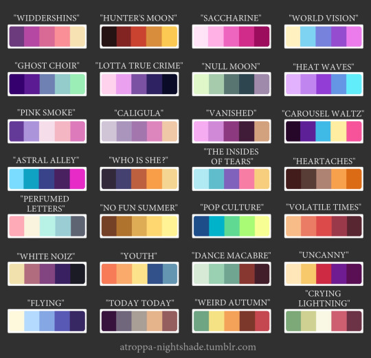
Color palettes by @artfight
I really liked them and wanted to so some color palette challenges.
#foryou#phandom#danny phantom#trending#viral#art#top trends#digital art#artwork#fyp#fypage#color palette#color palette challenge#dp vlad plasmius#vlad plasmius#danny phantom oc#shadow vlad#the ghost syndicate of evil#artist#artists on tumblr#nicktoons unite#nicktoons unite the animated series#digital illustration#foryoupage#nicktoons unite the animated series in progress
15 notes
·
View notes
Text
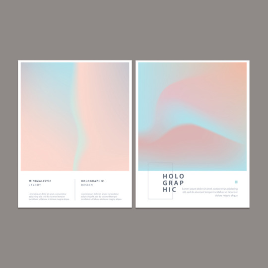
Top Color Palettes to Watch in 2024: A Look at Emerging Trends
More here.
Follow WE AND THE COLOR on:
Facebook I Twitter I Pinterest I YouTube I Instagram I Reddit
12 notes
·
View notes
Text
Thing from last year that I never posted bc I’m cringe
#yes this was when the cn color palette trend was a thing#and yes this is an au but i don’t have a name for it yet augh#<- edit: wrong#glitched up signal au#chann draws#the amazing world of gumball#retro tag#eyestrain cw#i remember i had cartoon network by black dresses on repeat while drawing this
17 notes
·
View notes
Text
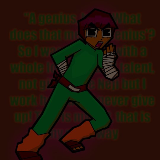
THAT'S HIS NINDO! HIS NINJA WAY!
#my art#did that evil art style trend hehe#basically: dark colors. angles and sharp shapes. and a weird color palette#somehow i made the palette work#rock lee#naruto#naruto fanart
11 notes
·
View notes
Text
PALETTE TREND WITH BUGZI (@/cricketzcorner on twt) :3
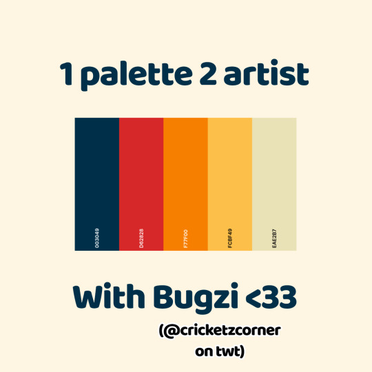
Bugzi's:
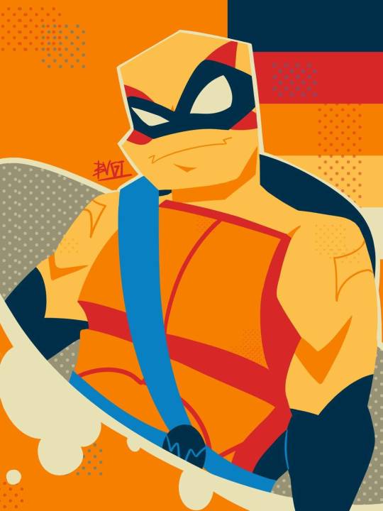
Mine:
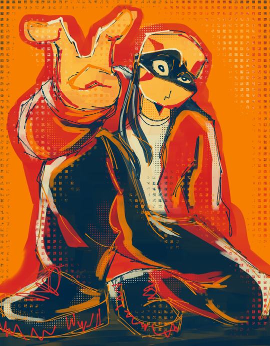
#rottmnt#rise of the tmnt#tmnt#save rise of the tmnt#rottmnt leo#unpause rottmnt#rise leo#leonardo hamato#leonardo#leo#fanart#art#rise of the teenage mutant ninja turtles#teenage mutant ninja turtles fanart#art trend#art collab#color palette#palette challenge
26 notes
·
View notes
Text
Starting a new color palette trend where people can just,, screenshot a color palette (not a photo, an actual palette, mind you) and then put them in your inbox along with a prompt. No ‘ask meme’ with a few palettes listed, people can just find them on Pinterest or @color-palettes. Go wild, pass it on.
7 notes
·
View notes
Text
Is Ariem confirmed to be a female ram? I see ppl calling them a ram (and also she even tho I don't remember them being referred to with any pronouns in promotional material) I mean they look like a ram but idk if that's what they are canonically
If that's true then. Ariem transgender??
#ramblings#i've seen posts comparing their color palette to the trans flag and. yeah they have trans flag colors#and like. i think it's safe to assume they're a girl bc of general design trends. guys rarely have lashes as long as theirs#but they're also not as long as most girl characters. in fact the lash length is more like starline's#am i overanalyzing this?? idk#it'd be really cool of they were canonically trans but i doubt they'd do that#they wouldn't say it overtly at least
9 notes
·
View notes
Text
opened greywaren to look for descriptions of niall and found a niall/mór passage and 🧎
#i’m drawing from an ask from july 2022 😭 from a color palette trend 😭#deciding whether i wanna draw niall alone#with declan#ORRRR with mór hehe
11 notes
·
View notes
Text
sometimes i feel like nankidai picks his color palettes by just throwing darts at a color wheel
#to be clear i am saying this with great admiration#i adore his designs especially as someone who also loves bright clashy colors#so of course i have to continue this trend in any of my own design variations#have yall noticed that ytr shin’s palette is quite possibly even worse than regular shin’s
10 notes
·
View notes
Text
easily the most annoying thing about beethoven 9 is that the finale really actually is as good as everyone makes it out to be.
#sasha speaks#caught a bit of this one on the radio on the way home tonight#gd damnit. but the finale is so good. why does it have to be so good#the rest of the symphony is honestly just fine. like i think it's still quite good in the scheme of symphonies as a whole#but among beethoven's symphonies i think it's on the mid side#and good lord the grip this stupid piece had on every composer ever for the next hundred years.#i won't say it's a net negative for composition because it objectively is not but some of the Trends it kicked off do annoy me#and that fucking theme. it SHOULD be annoying it SHOULD be boring. it's so simple and trite#it certainly is in the shitmillion covers and quotations and commercial underscores it shows up in#and yet when it's Actually Beethoven. my gd. it's brilliant. it's Glorious#speaks to the man's fantastic grasp of orchestration i suppose#but like. how the fuck does he do it.#the repetition is just like schubert.#tchaikovsky has a broader palette of colors in his orchestrations.#bach or mendelssohn could've written circles around him with counterpoint.#and yet. and YET#it's crap when other people try. but by gd. beethoven makes it work. it's incredible
9 notes
·
View notes
Text
Spring-Summer 2024 trends
This season, it would seem that youth and adult age are talking the same visual language when it comes to trends.
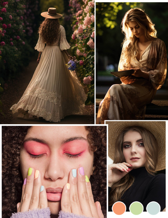
Two of the most noticeable trends seen were, in fact, the continuity of previous cultural movements. The first is Soft Romantism, a softened, more casual, and more grown-up approach to pastel and earthy trends such as Coquette, Soft Girl and Cottagecore. Do not hesitate to try a Victorian or Edwardian blouse, or a large straw hat. The second is a logical transition between extreme Minimalism and the new Maximalism trend… without throwing everything into the garbage container. Clearly, a smooth, budget-friendly transition will be required for most people.
The main colour palette is comprised of peach or abricot, with soft pastel green and a light blue.
Finally, when it comes to makeup, focus on enhancing the eyes. Draw attention and light to the inner corner of the eyes, add pink eyeshadow, and finish the curves of the eyes with drama by adding long half falsies, for a slightly retro screen siren look.
In any case, is is true that this year seems to mark the end of brutal Minimalism. Embrace the change!
#the bespoke magazine#magazine#online magazine#new magazine#new#novelty#inspiration#2024#interior design#makeup#color palette#colour palette#2024 color palette#2024 colour palette#spring 2024#Summer 2024#Spring-Summer 2024#trends#interior design trends#makeup trends#fashion#fashion trends#coquette#coquette aesthetic#soft girl#soft girl aesthetic#cottagecore#cottagecore aesthetic#soft romantism#soft romantism aesthetic
5 notes
·
View notes
Text
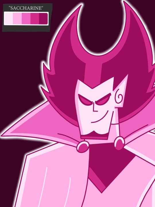
Chosen Warrior and Vlad Plasimus color palette challenge ( I love these challenges!)
Beautiful color palettes by @atroppa-nightshade
#foryou#phandom#danny phantom#trending#viral#art#top trends#digital art#artwork#fyp#digital illustration#fypage#vlad plasmius#nicktoons unite#nicktoons unite the animated series#danny phantom oc#foryoupage#jordan dp oc#nicktoons unite the animated series in progress#color palette challenge#dp vlad plasmius#artist#artists on tumblr#procreate
9 notes
·
View notes
Last Seen Blogs
ticketticket
ticket ticket

hblogistics
HB Logistics
zeeckz
Mello Floyd
txt-dari-lu
incorrect linked universe indo quotes