#comparing hands
Text

we'll do fine.
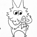
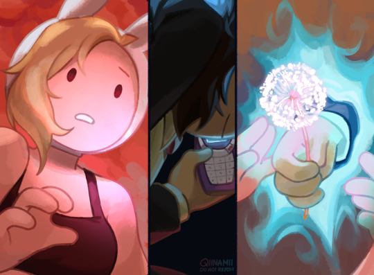
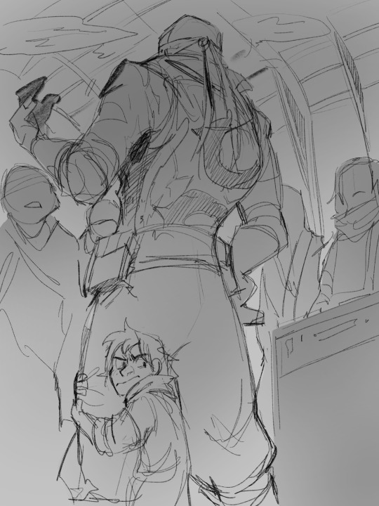
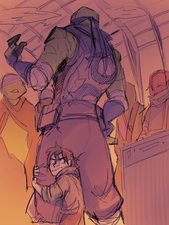
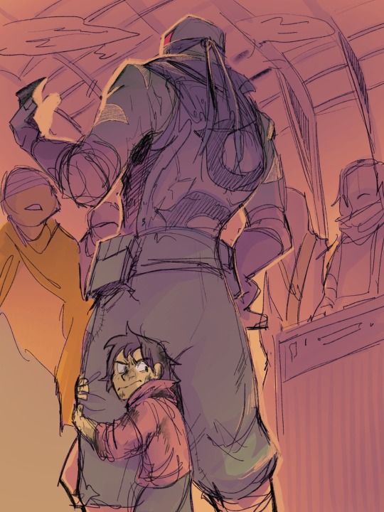
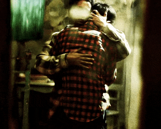
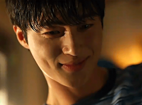
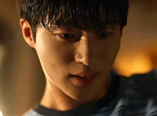
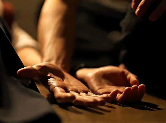
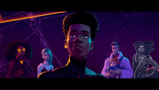
#fionna and cake spoilers#what hits me a little is how similar fionna and simon's stories are in the case of finding nuance in their lives#when both have gone through their separate but still valid pain no matter the extent it had been#and its that they met each other they get to see how it compares and they're no less worth of the peace and fun they dreamed of#even in the form of simplicity and just being normal#“i wouldn't have met THE fionna and cake” “we wouldn't have met THE simon petrikov”#it hits me harder that after the dandelion scene would've been their last time seeing each other physically#and how assuring simon sounded when fionna didn't know what to do with the literal world in her hands#tho im sure prismo isnt that much of a rule jerk lol i still drew out the revelation anyway with this tiniest addition#also the fact fionna's world is influenced by simon's thought processes and conditions so now things are a little better for both of them#fionna the human#fionna campbell#simon petrikov#qiiarts#the lil flashback of#betty grof#fionna and cake#adventure time
35K notes
·
View notes
Text

The FNAF Mikes talk about their extended family..
#myart#chloesimagination#comic#fnaf#five nights at freddy's#michael afton#mike schmidt#henry emily#aunt jane#fnaf movie#fnaf pizzeria simulator#fnaf fanart#AUNT JANE FINALLY MENTIOMED 🔥🔥#tbh I didn’t mean for it to take this long just to draw Jane but here we are#I still got a handful of fnaf movie characters I still gotta draw BAHA#one day I’ll do em all#THIS IS a lil joke of comparing Michael and Mike’s extended family relationships#it’s actually kinda interesting we don’t get much insight into Michael and Henry#but I always kinda assumed Henry was close enough to the family to be considered family#so to Michael Henry is his uncle#and they have a complicated relationship in their later years#WHILE MIKE knows aunt Jane and doesn’t like her BAHAH#she did keep trying to bank off Abby#and sent a crew to vandalize his work to get him fired#SO YEAH UNDERSTANDABLE they don’t have the strongest relationship 💀💀#the differences are pretty funny though.. ones angsty and the other is almost comedic#no shade to aunt Jane btw we love awful women here 🙏🏾
6K notes
·
View notes
Text
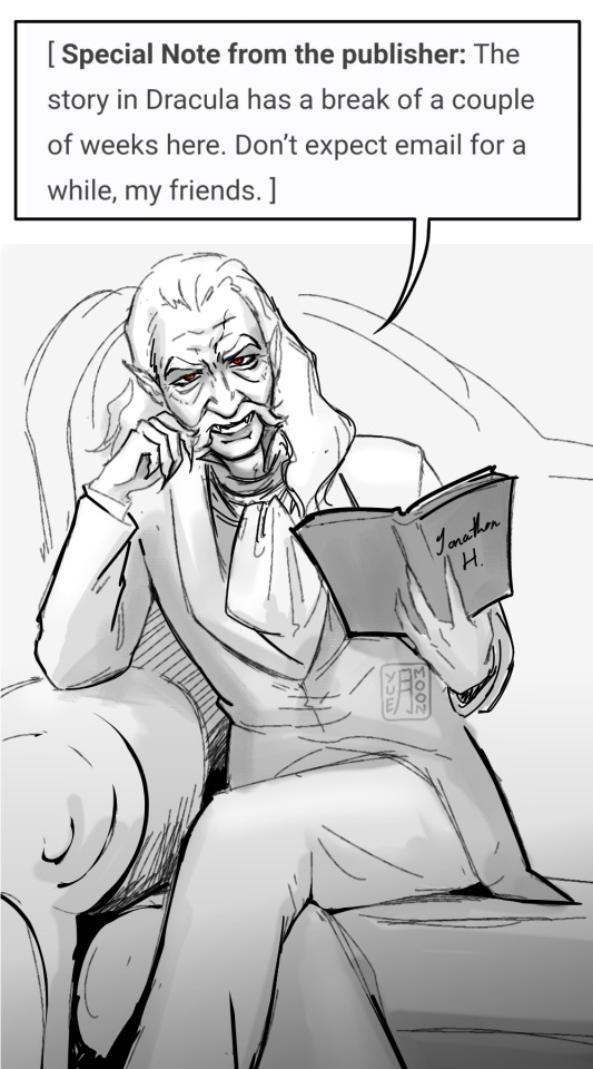
5 June - The Dracula Drought begins
a redraw of this art from DD2023!
#my art#dracula#dracula daily#re: dracula#note to self: dd2024#rushed this in like 40mins im rusty ough#i wanna open up commissions soon but need to finish work first#i should make this a yearly thing just to compare my art progress#an alt version i was considering was having Jonathan read it this time while drac has his hand on his shoulder to showcase the gradual#invasion of his narrative voice by the count and thus role reversal powerplay but mm wanted to keep it consistent#imagining drac drinking 'wine' while his hand's on jons shoulder all ventriloquist esque slaps though
2K notes
·
View notes
Text
that one image of the mom beating the mario level. you know the one
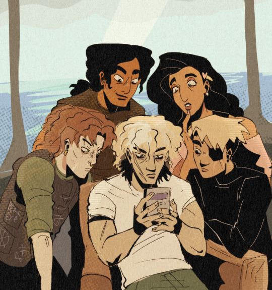
#someone compared them to ducklings in the titans army server. 10/10#luke is the expert of being handed a gameboy and smoking a hard mario level when asked#titans army#luke castellan#alabaster torrington#alabaster c torrington#ethan nakamura#chris rodriguez#silena beauregard#percy jackson#percy jackon and the olympians#percy jackson and the olympians#heroes of olympus#riordanverse#hoo#my art
1K notes
·
View notes
Text

My brain literally would not let me rest until I got this out of my system, so here we are.
Okay, so - Future Donnie's canon design sure is a thing.
I actually love the concept, mechanic aesthetic is great for Don, but I'm not crazy about the all-black waders/overalls they're just...they're a choice. Definitely a choice.
So I figured it was time to update those old Future Donnie designs I made awhile back (which, surprisingly, weren't too far-off? I got the pants pockets right at least, lol)
Here are some of my own takes on the new look.
I challenged myself to try and stay as close to the canon design's over-all (haha) vibe as I could, so they don't differ too drastically. Just a few alternative ways to do basically the same concept. For funsies.
***Zero disrespect intended towards Andy, for the record. He's giving us the content we've all been craving and he's the realest one for that!
(Also, the overalls aren't that bad, tbh? I think it's just the all-black inking that makes them look kinda off in the preview image.) Still super excited for the full comic to finally be released AAAAAAAA!!
#And yes I will always draw future Donnie with the chin spot you can pry that headcanon out of my cold dead hands. It suits him.#Also wow - comparing these to the old ones it's very apparent how much more comfortable I am drawing in the Rise style now. Neat!#rottmnt#rottmnt donnie#rise donnie#donatello hamato#future donnie#rottmnt future donnie#rise future donnie#rise of the tmnt#rise of the teenage mutant ninja turtles#fanart#character redesign#concept art#chiscribbs
2K notes
·
View notes
Text

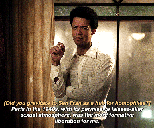

#iwtv#interview with the vampire#iwtv amc#daniel molloy#louis de pointe du lac#jonah macon#iwtvedit#tvedit#*#i couldn't think of a caption lol#anyway the dots have already been connected a million times over but ive been thinking about how the show has brought up#queerness being more accepted in paris/europe compared to america a couple times#along with the hand holding comment
820 notes
·
View notes
Text
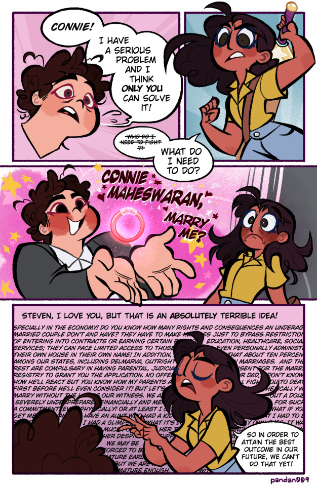
Just a silly guy, with silly silly thoughts.
@glowweek Day 2
Casual | Surprise
A casual surprise?😬😬😬
#Hooooo boiii this lad is about to get funky.#He was internally screaming the whole time.#It's in my core memory as a connverse fan. I'm never truly going to let this up I believe. haha#Our boy really one day went out there wanting to get married as a teen like a true classic Disney princess. 😭#It was honestly endearing but sad and also pretty embarrassing. 😔#Secondhand embarrassment aside. Steven is pretty much lucky in the romance department. Which. Deserved by the way. With all the other#crap he had to deal with.#connverse#Steven Quartz Universe#Connie Maheswaran#SU#my shiz#comic#SU comic#glowweek#connverse week#I have no idea if whatever Connie is spouting are actuallt true in real life. Good thing this can be chalked off as just a thing in their#fictional world.#Also I'm glad part of that was covered by Connie's body because I had to take a few notes from chat GPT to add in her enumerated rambling.#I had to make the glow bracelet float like that because I couldn't draw his hand holding it quiet right in that angle.#And yea that size difference is no error. That's how small Connie's wrist is compared to his hands. Or at least something like that.#teal
1K notes
·
View notes
Text
I hadn't planned on doing anything more complicated than a sketch, but here we are…
#Okay you know wHAt#their size difference kills me#Do you remember how Raphael could hold Splinter in one hand?#same vibe here#And Leo??#And Leo grew a hell of a lot bigger in the future#My brain does somersaults when I try to imagine his height compared to a human baby#rise of the tmnt#riseofthetmnt#leonardo#future leonardo#mutant ninja midlife crisis#and#odd man out#of course#These two fics feed me so I can feed the tumblr
8K notes
·
View notes
Text


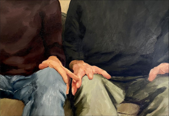


tumblr / happy together dir. wong kar wai / june by florence and the machine / x / tumblr / the thrill, the fear, the hope / blade runner 2049 dir. denis villeneuve / dirt and desire, the phenomenology of female pollution in antiquity by anne carson / tumblr / it takes two by steve mccury / jim butcher / e.e. cummings
#comparatives#web weaving#paralells#poetry#quotes#wong kar wai#florence welch#anne carson#books#dark academia#intimacy#hands#humanity#peoplehood#on love#tenderness#yearning#lgbt media
3K notes
·
View notes
Text

Ancients and Iterators
Text (if you can't read it):
Panel 1: "Not that anyone has asked, but..."
Panel 2: "If you were wondering about the scale of iterators in comparison to us ancients,"
Panel 3: "We call them "puppets"" "As in-"
Panel 4: "Hand Puppets."
#coa#rain world#rw ancients#rain world ancients#rain world fanart#i like the idea that ancients were about the size of the murals or the echoes#so a lantern mouse is comparatively#the size of a mouse#a lizard the size of a lizard. etc#and the “puppets” of the iterators are either#finger puppets or hand puppets#they already look super cutesy of course
532 notes
·
View notes
Text
The good timeline be like

#ok they did fight after this but still this is progress compared to every other timeline. them having a little tea party before throwing#hands#tokyo revengers#tokrev#tokyo rev#tokyo revengers spoilers
808 notes
·
View notes
Text
“callum, you’re quite a unit” full clip 🤗
#mota cast#callum turner#austin butler#backstage right after this austin had them compare hand sizes#like#’’stooooop babe your hands are so big look!!! 🤭’’
396 notes
·
View notes
Text


She's having a deep sleep.
LOVELY RUNNER (2024) | Ep 4
#HE'S COMPARING HAND SIZES!!!!#lovely runner#dailyasiandramas#asiandramasource#kdramadaily#kdramaedit#kdramasource#kdrama#byeon woo seok#kim hye yoon#k:lovely runner#he is such a loser in love#i am obsessed#the quality is not giving
1K notes
·
View notes
Note
Do yoy like their silly little dance
the inside of my brain at any given moment:

#twisted wonderland#twisted wonderland spoilers#stage in playful land#stage in playfulland#gif warning#gifs that bop along to your music warning#gidel is SO little#look at him compared to everyone else!#three apples tall!#i could put him in my pocket and still have space to pack him a lunch#this rhythmic is so silly. i love when we get a cutesy upbeat rhythmic right before everything goes straight to shit.#fellow and gidel: (dance around all cutely and throw confetti)#fellow and gidel: anyway now it's time to sell you#just the most adorable little kidnappers 🩷#so glad they made an official gidel chibi because otherwise i would have tried to and it would not have ended well#i'm trying to do a meleanor right now and she is giving me enough trouble. she doesn't even have any STRIPES.#do you think the riggers got handed the designs for this event with all the stripes and swirlies and patches and patterns#and just had to go stare at a wall for an hour or two#'okay look people are going to see this on a small screen with a rhythm game going on in the foreground'#'nobody is going to take a high-res screen recording and then go through it frame-by-frame to scrutinize our rigging breakdowns'#'what kind of HUGE NERD do you think plays this stupid game'#(shifty eyes)
1K notes
·
View notes
Text


happy father's day to the emilys
#god why is it so hard drawing my favs like what is THIS#i swear drawing your favorites is so hard compared to drawing anyone else AOIJSDIJOASD IM GONNA SCREAM#anyway maybe someday they'll have the art they deserve to have </3#need to draw them more happy more but that'll be for someday#i love them to pieces can you tell#henry emily#charlie emily#charlotte emily#hidden hands au#fnaf henry emily#fnaf charlie emily#fnaf charlotte emily#fnaf au#fnaf fanart#fnaf#my art
404 notes
·
View notes
Text
Compilation of EVERY single time they changed Hobie's filter in the digital version:
Left: Theatrical release Right: Digital release


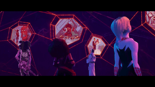

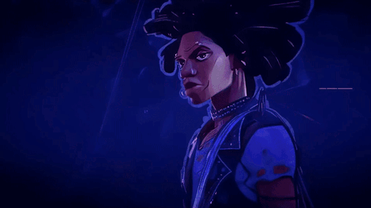
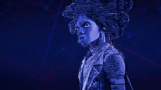

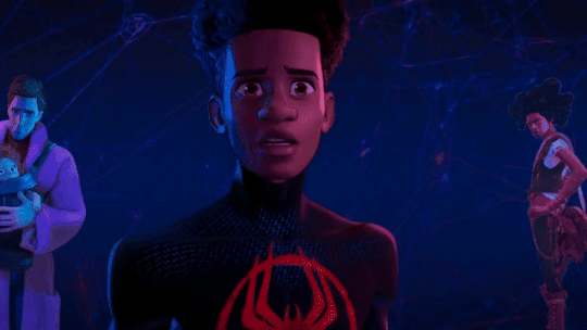

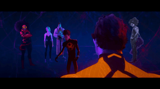

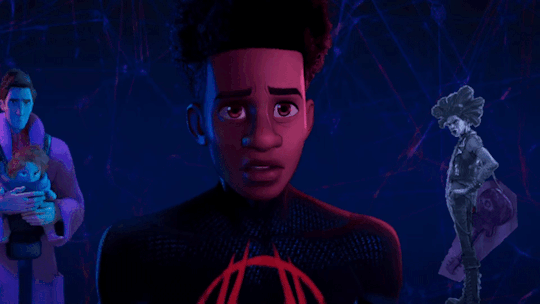
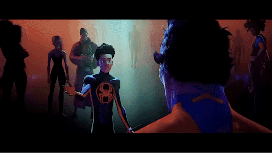
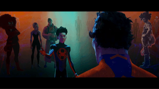
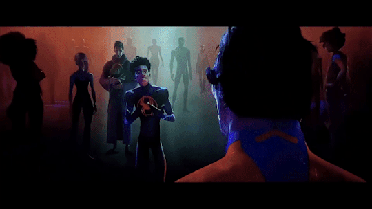
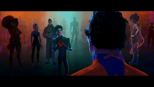

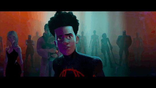
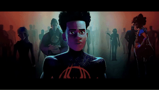
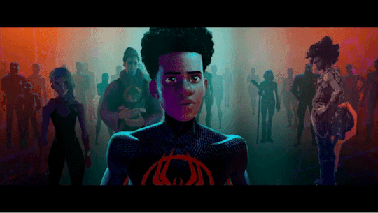

You might have to click on some of them to get a better look at Hobie, sadly I don't have a video editor that allows me to make better edits than these :')
#This took so long to make lol#cause I had to edit every scene with Hobie from both versions so I could watch them right after one another to compare them#I did this with ALL the scenes he's in also the ones where he's on screen as spider-punk#but they only changed his filters in these scenes so it was a waste of time :')#sidenote: no it wasn't it's never a waste of time to look at hobie I just couldn't use it for my GIFset lol#I also made a bouns one but I'm not allowed to post more than 30 GIFs in one post apparently so I guess I just won't add it then...#but Hobie was basically filterless during all these scenes in the theatrical version#I like that they gave him more different filters in the digital version#the only change I don't like is in the first GIFs#cause like that one post pointed out it looks like they removed his lipstick for some reason#also really wish I had a better video editor so we could get a closer look at Hobie but I did my best with what I had#also slowed some of them down to get a better look at them#been having this idea for a while and now I finally finished it!#which means I can go back to working on my fics now#hopefully lol#also lemme know if there are some other scens you guys want me to make comparisons of#cause I have both versions#the theatrical release isn't the highest quality though so if you know where I can get my hands on a better version lemme know ;)#hobie brown#spider punk#miles morales#spider man#peter b parker#jess drew#miguel o'hara#spider man across the spider verse#across the spider verse#across the spiderverse#atsv#theatrical version
1K notes
·
View notes
Last Seen Blogs