#css circular progress bar animation
Explore tagged Tumblr posts
Visit Tumblr Blog
Explore Tumblr blogs with no restrictions, modern design and the best experience.
Last Seen Tumblr Blogs


Fun Fact
Tumblr.com is the 103rd most visited website in the world.
Text

CSS Circular Progress Bar Animation
#css circular progress bar animation#css progress bar#animated progress bar#html css#learn to code#code#frontenddevelopment#divinectorweb#css3#html#css#css animation examples#css animation
0 notes
Text
Create a Circular Progress Bar with HTML, CSS, and JavaScript
Hello everyone, today in this video we will be circular progress bar that will having a loading animation or a progress bar, but it will animate circularly. So if you want to learn how to build this please stick around to the end :)
Create a Circular Progress Bar with HTML, CSS, and JavaScript
Visit us :-
youtube
0 notes
Text
0 notes
Text
Discover 35+ CSS Progress Bars

Welcome to CSS Monster, your go-to hub for exploring 35+ CSS progress bars! Immerse yourself in this meticulously curated compilation, featuring a diverse selection of free HTML and CSS progress bar code examples sourced from reputable platforms like CodePen, GitHub, and other valuable resources. In our April 2023 update, we're excited to unveil ten new additions to our collection, ensuring you stay ahead with the latest and most innovative progress bar designs. Progress bars play a crucial role in visually representing completion status, whether it's a task, process, or loading time. They offer users a clear indication of progress, significantly enhancing the overall user experience. Each progress bar example in our collection highlights the potent capabilities of CSS in creating visually appealing and interactive designs. From simple and minimalistic progress bars to more intricate and dynamic ones, our collection provides a wide spectrum of options catering to various design preferences and project requirements. Embark on your exploration now and uncover creative ways to visually communicate progress, engaging your users with captivating CSS progress bars. CSS Monster is your gateway to the world of innovative progress bar designs! Author Morteza November 14, 2022 Links Just Get The Demo Link How To Download - Article How To Download - Video Made with HTML / CSS About a code 3D CIRCULAR PROGRESS BAR Compatible browsers:Chrome, Edge, Firefox, Opera, Safari Responsive:no Dependencies:- Author Josetxu September 16, 2022 Links Just Get The Demo Link How To Download - Article How To Download - Video Made with HTML / CSS About a code ANIMATED SKILL METER Compatible browsers:Chrome, Edge, Firefox, Opera, Safari Responsive:yes Dependencies:- Author Manz July 1, 2022 Links Just Get The Demo Link How To Download - Article How To Download - Video Made with HTML / CSS About a code PROGRESS BAR Compatible browsers:Chrome, Edge, Firefox, Opera, Safari Responsive:no Dependencies:-

Author Michelle Barker June 28, 2022 Links Just Get The Demo Link How To Download - Article How To Download - Video Made with HTML / CSS About a code CUSTOM PROPERTIES STEP PROGRESS INDICATOR Compatible browsers:Chrome, Edge, Firefox, Opera, Safari Responsive:yes Dependencies:- Author Max May 31, 2022 Links Just Get The Demo Link How To Download - Article How To Download - Video Made with HTML / CSS (SCSS) About a code GLITCHY PROGRESS DISPLAY Compatible browsers:Chrome, Edge, Firefox, Opera, Safari Responsive:yes Dependencies:-

Author Eva Wythien January 11, 2022 Links Just Get The Demo Link How To Download - Article How To Download - Video Made with HTML / CSS (SCSS) About a code PROGRESS BAR ANIMATION #2 Compatible browsers:Chrome, Edge, Firefox, Opera, Safari Responsive:no Dependencies:-

Author Alvaro Montoro December 6, 2021 Links Just Get The Demo Link How To Download - Article How To Download - Video Made with HTML / CSS About a code CIRCULAR PROGRESS BAR Compatible browsers:Chrome, Edge, Firefox, Opera, Safari Responsive:no Dependencies:-

Author Ana Tudor November 26, 2021 Links Just Get The Demo Link How To Download - Article How To Download - Video Made with HTML / CSS (SCSS) About a code PROGRESS BARS Compatible browsers:Chrome, Edge, Firefox, Opera, Safari Responsive:yes Dependencies:-

Author Brandon McConnell June 5, 2021 Links Just Get The Demo Link How To Download - Article How To Download - Video Made with HTML / CSS (SCSS) About a code CSS-ONLY ANIMATED PROGRESS BARS Compatible browsers:Chrome, Edge, Firefox, Opera, Safari Responsive:yes Dependencies:- Author Temani Afif May 12, 2021 Links Just Get The Demo Link How To Download - Article How To Download - Video Made with HTML / CSS About a code THE PROGRESS Compatible browsers:Chrome, Edge, Firefox, Opera, Safari Responsive:no Dependencies:- Author Ychnightder-both October 25, 2020 Links Just Get The Demo Link How To Download - Article How To Download - Video Made with HTML / CSS About a code PROGRESS Compatible browsers:Chrome, Edge, Firefox, Opera, Safari Responsive:no Dependencies:- Author Jasper October 9, 2020 Links Just Get The Demo Link How To Download - Article How To Download - Video Made with HTML / CSS (SCSS) About a code PURPLE PROGRESS BAR Compatible browsers:Chrome, Edge, Firefox, Opera, Safari Responsive:no Dependencies:- Author Ruben A Sanchez October 6, 2020 Links Just Get The Demo Link How To Download - Article How To Download - Video Made with HTML / CSS About a code PIXEL PROGRESS BAR Compatible browsers:Chrome, Edge, Firefox, Opera, Safari Responsive:yes Dependencies:- Author rachelmckean September 26, 2020 Links Just Get The Demo Link How To Download - Article How To Download - Video Made with HTML / CSS About a code COLOR CHANGING LOADING PROGRESS BAR Compatible browsers:Chrome, Edge, Firefox, Opera, Safari Responsive:yes Dependencies:-

Author Ekta maurya August 22, 2020 Links Just Get The Demo Link How To Download - Article How To Download - Video Made with HTML / CSS About a code SVG CIRCLE PROGRESS BAR Compatible browsers:Chrome, Edge, Opera, Safari Responsive:no Dependencies:-

Author Ekta maurya August 22, 2020 Links Just Get The Demo Link How To Download - Article How To Download - Video Made with HTML / CSS About a code SVG CIRCLE PROGRESS BAR Compatible browsers:Chrome, Edge, Opera, Safari Responsive:no Dependencies:- Author Mattia Astorino July 16, 2020 Links Just Get The Demo Link How To Download - Article How To Download - Video Made with HTML / CSS (PostCSS) About a code CSS CIRCULAR PROGRESS Compatible browsers:Chrome, Edge, Firefox, Opera, Safari Responsive:yes Dependencies:- Author Morgan April 10, 2020 Links Just Get The Demo Link How To Download - Article How To Download - Video Made with HTML / CSS (SCSS) About a code WARNING BAR Compatible browsers:Chrome, Edge, Firefox, Opera, Safari Responsive:yes Dependencies:- Author Myk March 14, 2020 Links Just Get The Demo Link How To Download - Article How To Download - Video Made with HTML / CSS (SCSS) About a code PROGRESS SCROLLBAR CSS ONLY Compatible browsers:Chrome, Edge, Opera, Safari Responsive:yes Dependencies:- Author Traf July 23, 2019 Links Just Get The Demo Link How To Download - Article How To Download - Video Made with HTML / CSS About a code SIMPLE PROGRESS BAR Compatible browsers:Chrome, Edge, Firefox, Opera, Safari Responsive:yes Dependencies:- Author Tobias Glaus December 20, 2018 Links Just Get The Demo Link Read the full article
0 notes
Photo

We spent the day researching javascript and css solutions to build the circular progress bars we want to use to display the health, mana, and experience amounts. @delightedcrow found a great medium article (medium.com/@pppped/how-to-code-a-responsive-circular-percentage-chart-with-svg-and-css-3632f8cd7705) that draws these circles the same way that our Sketch mockup did, and so we quickly added some to our MagicMirror module to test drawing them at different values. We aren’t sure if we want to include the animation in our module, but it looks cool so here is a brief look at what it looks like against the default black MagicMirror theme.
15 notes
·
View notes
Text
Animated Circular Progress Bar Using Html CSS Only

Circular Progress Bar with Animation Using Only HTML and CSS
0 notes
Text
Represent Percentage In A SVG Circle - Circular Progress Bar
Represent Percentage In A SVG Circle – Circular Progress Bar
Yet another radial progress bar plugin to display a percentage value as an animated SVG circle.
See Also:
Top 10 JavaScript & CSS Progress Bar Components
10 Best Circular/Radial Progress Bar JavaScript Plugins
How to use it:
Download and place the JavaScript progress.js in the html document.
http://progress.js
Create a new circular progress bar.
const pb = new Progress()
Append the circular…
View On WordPress
1 note
·
View note
Text
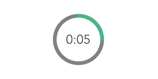
How to Create an Animated Countdown Timer With HTML, CSS and JavaScript
Have you ever needed a countdown timer on a project? For something like that, it might be natural to reach for a plugin, but it’s actually a lot more straightforward to make one than you might think and only requires the trifecta of HTML, CSS and JavaScript. Let’s make one together!
This is what we’re aiming for:
CodePen Embed Fallback
Here are a few things the timer does that we’ll be covering in this post:
Displays the initial time remaining
Converts the time value to a MM:SS format
Calculates the difference between the initial time remaining and how much time has passed
Changes color as the time remaining nears zero
Displays the progress of time remaining as an animated ring
OK, that’s what we want, so let’s make it happen!
Step 1: Start with the basic markup and styles
Let’s start with creating a basic template for our timer. We will add an svg with a circle element inside to draw a timer ring that will indicate the passing time and add a span to show the remaining time value. Note that we’re writing the HTML in JavaScript and injecting into the DOM by targeting the #app element. Sure, we could move a lot of it into an HTML file, if that's more your thing.
document.getElementById("app").innerHTML = ` <div class="base-timer"> <svg class="base-timer__svg" viewBox="0 0 100 100" xmlns="http://www.w3.org/2000/svg"> <g class="base-timer__circle"> <circle class="base-timer__path-elapsed" cx="50" cy="50" r="45" /> </g> </svg> <span> <!-- Remaining time label --> </span> </div> `;
Now that we have some markup to work with, let’s style it up a bit so we have a good visual to start with. Specifically, we’re going to:
Set the timer’s size
Remove the fill and stroke from the circle wrapper element so we get the shape but let the elapsed time show through
Set the ring’s width and color
/* Sets the containers height and width */ .base-timer { position: relative; height: 300px; width: 300px; } /* Removes SVG styling that would hide the time label */ .base-timer__circle { fill: none; stroke: none; } /* The SVG path that displays the timer's progress */ .base-timer__path-elapsed { stroke-width: 7px; stroke: grey; }
Having that done we end up with a basic template that looks like this.
Step 2: Setting up the time label
As you probably noticed, the template includes an empty <span> that’s going to hold the time remaining. We will fill that place with a proper value. We said earlier that the time will be in MM:SS format. To do that we will create a method called formatTimeLeft:
function formatTimeLeft(time) { // The largest round integer less than or equal to the result of time divided being by 60. const minutes = Math.floor(time / 60); // Seconds are the remainder of the time divided by 60 (modulus operator) let seconds = time % 60; // If the value of seconds is less than 10, then display seconds with a leading zero if (seconds < 10) { seconds = `0${seconds}`; } // The output in MM:SS format return `${minutes}:${seconds}`; }
Then we will use our method in the template:
document.getElementById("app").innerHTML = ` <div class="base-timer"> <svg class="base-timer__svg" viewBox="0 0 100 100" xmlns="http://www.w3.org/2000/svg"> <g class="base-timer__circle"> <circle class="base-timer__path-elapsed" cx="50" cy="50" r="45"></circle> </g> </svg> <span id="base-timer-label" class="base-timer__label"> ${formatTime(timeLeft)} </span> </div> `
To show the value inside the ring we need to update our styles a bit.
.base-timer__label { position: absolute; /* Size should match the parent container */ width: 300px; height: 300px; /* Keep the label aligned to the top */ top: 0; /* Create a flexible box that centers content vertically and horizontally */ display: flex; align-items: center; justify-content: center; /* Sort of an arbitrary number; adjust to your liking */ font-size: 48px; }
OK, we are ready to play with the timeLeft value, but the value doesn’t exist yet. Let’s create it and set the initial value to our time limit.
// Start with an initial value of 20 seconds const TIME_LIMIT = 20; // Initially, no time has passed, but this will count up // and subtract from the TIME_LIMIT let timePassed = 0; let timeLeft = TIME_LIMIT;
And we are one step closer.

Right on! Now we have a timer that starts at 20 seconds… but it doesn't do any counting just yet. Let’s bring it to life so it counts down to zero seconds.
Step 3: Counting down
Let’s think about what we need to count down the time. Right now, we have a timeLimit value that represents our initial time, and a timePassed value that indicates how much time has passed once the countdown starts.
What we need to do is increase the value of timePassed by one unit per second and recompute the timeLeft value based on the new timePassed value. We can achieve that using the setInterval function.
Let’s implement a method called startTimer that will:
Set counter interval
Increment the timePassed value each second
Recompute the new value of timeLeft
Update the label value in the template
We also need to keep the reference to that interval object to clear it when needed — that’s why we will create a timerInterval variable.
let timerInterval = null; document.getElementById("app").innerHTML = `...` function startTimer() { timerInterval = setInterval(() => { // The amount of time passed increments by one timePassed = timePassed += 1; timeLeft = TIME_LIMIT - timePassed; // The time left label is updated document.getElementById("base-timer-label").innerHTML = formatTime(timeLeft); }, 1000); }
We have a method that starts the timer but we do not call it anywhere. Let’s start our timer immediately on load.
document.getElementById("app").innerHTML = `...` startTimer();
That’s it! Our timer will now count down the time. While that’s great and all, it would be nicer if we could add some color to the ring around the time label and change the color at different time values.

Step 4: Cover the timer ring with another ring
To visualize time passing, we need to add a second layer to our ring that handles the animation. What we’re doing is essentially stacking a new green ring on top of the original gray ring so that the green ring animates to reveal the gray ring as time passes, like a progress bar.
Let’s first add a path element in our SVG element.
document.getElementById("app").innerHTML = ` <div class="base-timer"> <svg class="base-timer__svg" viewBox="0 0 100 100" xmlns="http://www.w3.org/2000/svg"> <g class="base-timer__circle"> <circle class="base-timer__path-elapsed" cx="50" cy="50" r="45"></circle> <path id="base-timer-path-remaining" stroke-dasharray="283" class="base-timer__path-remaining ${remainingPathColor}" d=" M 50, 50 m -45, 0 a 45,45 0 1,0 90,0 a 45,45 0 1,0 -90,0 " ></path> </g> </svg> <span id="base-timer-label" class="base-timer__label"> ${formatTime(timeLeft)} </span> </div> `;
Next, let’s create an initial color for the remaining time path.
const COLOR_CODES = { info: { color: "green" } }; let remainingPathColor = COLOR_CODES.info.color;
Finally, let’s add few styles to make the circular path look like our original gray ring. The important thing here is to make sure the stroke-width is the same size as the original ring and that the duration of the transition is set to one second so that it animates smoothly and corresponds with the time remaining in the time label.
.base-timer__path-remaining { /* Just as thick as the original ring */ stroke-width: 7px; /* Rounds the line endings to create a seamless circle */ stroke-linecap: round; /* Makes sure the animation starts at the top of the circle */ transform: rotate(90deg); transform-origin: center; /* One second aligns with the speed of the countdown timer */ transition: 1s linear all; /* Allows the ring to change color when the color value updates */ stroke: currentColor; } .base-timer__svg { /* Flips the svg and makes the animation to move left-to-right */ transform: scaleX(-1); }
This will output a stroke that covers the timer ring like it should, but it doesn’t animate just yet to reveal the timer ring as time passes.

To animate the length of the remaining time line we are going to use the stroke-dasharray property. Chris explains how it’s used to create the illusion of an element “drawing” itself. And there’s more detail about the property and examples of it in the CSS-Tricks almanac.
Step 5: Animate the progress ring
Let’s see how our ring will look like with different stroke-dasharray values:

What we can see is that the value of stroke-dasharray is actually cutting our remaining time ring into equal-length sections, where the length is the time remaining value. That is happening when we set the value of stroke-dasharray to a single-digit number (i.e. 1-9).
The name dasharray suggests that we can set multiple values as an array. Let’s see how it will behave if we set two numbers instead of one; in this case, those values are 10 and 30.

stroke-dasharray: 10 30
That sets the first section (remaining time) length to 10 and the second section (passed time) to 30. We can use that in our timer with a little trick. What we need initially is for the ring to cover the full length of the circle, meaning the remaining time equals the length of our ring.
What’s that length? Get out your old geometry textbook, because we can calculate the length an arc with some math:
Length = 2πr = 2 * π * 45 = 282,6
That’s the value we want to use when the ring initially mounted. Let’s see how it looks.
stroke-dasharray: 283 283
That works!
OK, the first value in the array is our remaining time, and the second marks how much time has passed. What we need to do now is to manipulate the first value. Let’s see below what we can expect when we change the first value.

We will create two methods, one responsible for calculating what fraction of the initial time is left, and one responsible for calculating the stroke-dasharray value and updating the <path> element that represents our remaining time.
// Divides time left by the defined time limit. function calculateTimeFraction() { return timeLeft / TIME_LIMIT; } // Update the dasharray value as time passes, starting with 283 function setCircleDasharray() { const circleDasharray = `${( calculateTimeFraction() * FULL_DASH_ARRAY ).toFixed(0)} 283`; document .getElementById("base-timer-path-remaining") .setAttribute("stroke-dasharray", circleDasharray); }
We also need to update our path each second that passes. That means we need to call the newly created setCircleDasharray method inside our timerInterval.
function startTimer() { timerInterval = setInterval(() => { timePassed = timePassed += 1; timeLeft = TIME_LIMIT - timePassed; document.getElementById("base-timer-label").innerHTML = formatTime(timeLeft); setCircleDasharray(); }, 1000); }
Now we can see things moving!

Woohoo, it works… but… look closely, especially at the end. It looks like our animation is lagging by one second. When we reach 0 a small piece of the ring is still visible.

This is due to the animation’s duration being set to one second. When the value of remaining time is set to zero, it still takes one second to actually animate the ring to zero. We can get rid of that by reducing the length of the ring gradually during the countdown. We do that in our calculateTimeFraction method.
function calculateTimeFraction() { const rawTimeFraction = timeLeft / TIME_LIMIT; return rawTimeFraction - (1 / TIME_LIMIT) * (1 - rawTimeFraction); }
There we go!

Oops… there is one more thing. We said we wanted to change the color of the progress indicator when when the time remaining reaches certain points — sort of like letting the user know that time is almost up.
Step 6: Change the progress color at certain points of time
First, we need to add two thresholds that will indicate when we should change to the warning and alert states and add colors for each of that states. We’re starting with green, then go to orange as a warning, followed by red when time is nearly up.
// Warning occurs at 10s const WARNING_THRESHOLD = 10; // Alert occurs at 5s const ALERT_THRESHOLD = 5; const COLOR_CODES = { info: { color: "green" }, warning: { color: "orange", threshold: WARNING_THRESHOLD }, alert: { color: "red", threshold: ALERT_THRESHOLD } };
Now, let’s create a method that’s responsible for checking if the threshold exceeded and changing the progress color when that happens.
function setRemainingPathColor(timeLeft) { const { alert, warning, info } = COLOR_CODES; // If the remaining time is less than or equal to 5, remove the "warning" class and apply the "alert" class. if (timeLeft <= alert.threshold) { document .getElementById("base-timer-path-remaining") .classList.remove(warning.color); document .getElementById("base-timer-path-remaining") .classList.add(alert.color); // If the remaining time is less than or equal to 10, remove the base color and apply the "warning" class. } else if (timeLeft <= warning.threshold) { document .getElementById("base-timer-path-remaining") .classList.remove(info.color); document .getElementById("base-timer-path-remaining") .classList.add(warning.color); } }
So, we’re basically removing one CSS class when the timer reaches a point and adding another one in its place. We’re going to need to define those classes.
.base-timer__path-remaining.green { color: rgb(65, 184, 131); } .base-timer__path-remaining.orange { color: orange; } .base-timer__path-remaining.red { color: red; }
Voilà, there we have it. Here’s the demo again with everything put together.
CodePen Embed Fallback
The post How to Create an Animated Countdown Timer With HTML, CSS and JavaScript appeared first on CSS-Tricks.
via CSS-Tricks https://ift.tt/2vK8ZyR
0 notes
Text
How to Create an Animated Countdown Timer With HTML, CSS and JavaScript
Have you ever needed a countdown timer on a project? For something like that, it might be natural to reach for a plugin, but it’s actually a lot more straightforward to make one than you might think and only requires the trifecta of HTML, CSS and JavaScript. Let’s make one together!
This is what we’re aiming for:
CodePen Embed Fallback
Here are a few things the timer does that we’ll be covering in this post:
Displays the initial time remaining
Converts the time value to a MM:SS format
Calculates the difference between the initial time remaining and how much time has passed
Changes color as the time remaining nears zero
Displays the progress of time remaining as an animated ring
OK, that’s what we want, so let’s make it happen!
Step 1: Start with the basic markup and styles
Let’s start with creating a basic template for our timer. We will add an svg with a circle element inside to draw a timer ring that will indicate the passing time and add a span to show the remaining time value. Note that we’re writing the HTML in JavaScript and injecting into the DOM by targeting the #app element. Sure, we could move a lot of it into an HTML file, if that's more your thing.
document.getElementById("app").innerHTML = ` <div class="base-timer"> <svg class="base-timer__svg" viewBox="0 0 100 100" xmlns="http://www.w3.org/2000/svg"> <g class="base-timer__circle"> <circle class="base-timer__path-elapsed" cx="50" cy="50" r="45" /> </g> </svg> <span> <!-- Remaining time label --> </span> </div> `;
Now that we have some markup to work with, let’s style it up a bit so we have a good visual to start with. Specifically, we’re going to:
Set the timer’s size
Remove the fill and stroke from the circle wrapper element so we get the shape but let the elapsed time show through
Set the ring’s width and color
/* Sets the containers height and width */ .base-timer { position: relative; height: 300px; width: 300px; } /* Removes SVG styling that would hide the time label */ .base-timer__circle { fill: none; stroke: none; } /* The SVG path that displays the timer's progress */ .base-timer__path-elapsed { stroke-width: 7px; stroke: grey; }
Having that done we end up with a basic template that looks like this.

Step 2: Setting up the time label
As you probably noticed, the template includes an empty <span> that’s going to hold the time remaining. We will fill that place with a proper value. We said earlier that the time will be in MM:SS format. To do that we will create a method called formatTimeLeft:
function formatTimeLeft(time) { // The largest round integer less than or equal to the result of time divided being by 60. const minutes = Math.floor(time / 60); // Seconds are the remainder of the time divided by 60 (modulus operator) let seconds = time % 60; // If the value of seconds is less than 10, then display seconds with a leading zero if (seconds < 10) { seconds = `0${seconds}`; } // The output in MM:SS format return `${minutes}:${seconds}`; }
Then we will use our method in the template:
document.getElementById("app").innerHTML = ` <div class="base-timer"> <svg class="base-timer__svg" viewBox="0 0 100 100" xmlns="http://www.w3.org/2000/svg"> <g class="base-timer__circle"> <circle class="base-timer__path-elapsed" cx="50" cy="50" r="45"></circle> </g> </svg> <span id="base-timer-label" class="base-timer__label"> ${formatTime(timeLeft)} </span> </div> `
To show the value inside the ring we need to update our styles a bit.
.base-timer__label { position: absolute; /* Size should match the parent container */ width: 300px; height: 300px; /* Keep the label aligned to the top */ top: 0; /* Create a flexible box that centers content vertically and horizontally */ display: flex; align-items: center; justify-content: center; /* Sort of an arbitrary number; adjust to your liking */ font-size: 48px; }
OK, we are ready to play with the timeLeft value, but the value doesn’t exist yet. Let’s create it and set the initial value to our time limit.
// Start with an initial value of 20 seconds const TIME_LIMIT = 20; // Initially, no time has passed, but this will count up // and subtract from the TIME_LIMIT let timePassed = 0; let timeLeft = TIME_LIMIT;
And we are one step closer.

Right on! Now we have a timer that starts at 20 seconds… but it doesn't do any counting just yet. Let’s bring it to life so it counts down to zero seconds.
Step 3: Counting down
Let’s think about what we need to count down the time. Right now, we have a timeLimit value that represents our initial time, and a timePassed value that indicates how much time has passed once the countdown starts.
What we need to do is increase the value of timePassed by one unit per second and recompute the timeLeft value based on the new timePassed value. We can achieve that using the setInterval function.
Let’s implement a method called startTimer that will:
Set counter interval
Increment the timePassed value each second
Recompute the new value of timeLeft
Update the label value in the template
We also need to keep the reference to that interval object to clear it when needed — that’s why we will create a timerInterval variable.
let timerInterval = null; document.getElementById("app").innerHTML = `...` function startTimer() { timerInterval = setInterval(() => { // The amount of time passed increments by one timePassed = timePassed += 1; timeLeft = TIME_LIMIT - timePassed; // The time left label is updated document.getElementById("base-timer-label").innerHTML = formatTime(timeLeft); }, 1000); }
We have a method that starts the timer but we do not call it anywhere. Let’s start our timer immediately on load.
document.getElementById("app").innerHTML = `...` startTimer();
That’s it! Our timer will now count down the time. While that’s great and all, it would be nicer if we could add some color to the ring around the time label and change the color at different time values.

Step 4: Cover the timer ring with another ring
To visualize time passing, we need to add a second layer to our ring that handles the animation. What we’re doing is essentially stacking a new green ring on top of the original gray ring so that the green ring animates to reveal the gray ring as time passes, like a progress bar.
Let’s first add a path element in our SVG element.
document.getElementById("app").innerHTML = ` <div class="base-timer"> <svg class="base-timer__svg" viewBox="0 0 100 100" xmlns="http://www.w3.org/2000/svg"> <g class="base-timer__circle"> <circle class="base-timer__path-elapsed" cx="50" cy="50" r="45"></circle> <path id="base-timer-path-remaining" stroke-dasharray="283" class="base-timer__path-remaining ${remainingPathColor}" d=" M 50, 50 m -45, 0 a 45,45 0 1,0 90,0 a 45,45 0 1,0 -90,0 " ></path> </g> </svg> <span id="base-timer-label" class="base-timer__label"> ${formatTime(timeLeft)} </span> </div> `;
Next, let’s create an initial color for the remaining time path.
const COLOR_CODES = { info: { color: "green" } }; let remainingPathColor = COLOR_CODES.info.color;
Finally, let’s add few styles to make the circular path look like our original gray ring. The important thing here is to make sure the stroke-width is the same size as the original ring and that the duration of the transition is set to one second so that it animates smoothly and corresponds with the time remaining in the time label.
.base-timer__path-remaining { /* Just as thick as the original ring */ stroke-width: 7px; /* Rounds the line endings to create a seamless circle */ stroke-linecap: round; /* Makes sure the animation starts at the top of the circle */ transform: rotate(90deg); transform-origin: center; /* One second aligns with the speed of the countdown timer */ transition: 1s linear all; /* Allows the ring to change color when the color value updates */ stroke: currentColor; } .base-timer__svg { /* Flips the svg and makes the animation to move left-to-right */ transform: scaleX(-1); }
This will output a stroke that covers the timer ring like it should, but it doesn’t animate just yet to reveal the timer ring as time passes.

To animate the length of the remaining time line we are going to use the stroke-dasharray property. Chris explains how it’s used to create the illusion of an element “drawing” itself. And there’s more detail about the property and examples of it in the CSS-Tricks almanac.
Step 5: Animate the progress ring
Let’s see how our ring will look like with different stroke-dasharray values:

What we can see is that the value of stroke-dasharray is actually cutting our remaining time ring into equal-length sections, where the length is the time remaining value. That is happening when we set the value of stroke-dasharray to a single-digit number (i.e. 1-9).
The name dasharray suggests that we can set multiple values as an array. Let’s see how it will behave if we set two numbers instead of one; in this case, those values are 10 and 30.

stroke-dasharray: 10 30
That sets the first section (remaining time) length to 10 and the second section (passed time) to 30. We can use that in our timer with a little trick. What we need initially is for the ring to cover the full length of the circle, meaning the remaining time equals the length of our ring.
What’s that length? Get out your old geometry textbook, because we can calculate the length an arc with some math:
Length = 2πr = 2 * π * 45 = 282,6
That’s the value we want to use when the ring initially mounted. Let’s see how it looks.
stroke-dasharray: 283 283
That works!
OK, the first value in the array is our remaining time, and the second marks how much time has passed. What we need to do now is to manipulate the first value. Let’s see below what we can expect when we change the first value.

We will create two methods, one responsible for calculating what fraction of the initial time is left, and one responsible for calculating the stroke-dasharray value and updating the <path> element that represents our remaining time.
// Divides time left by the defined time limit. function calculateTimeFraction() { return timeLeft / TIME_LIMIT; } // Update the dasharray value as time passes, starting with 283 function setCircleDasharray() { const circleDasharray = `${( calculateTimeFraction() * FULL_DASH_ARRAY ).toFixed(0)} 283`; document .getElementById("base-timer-path-remaining") .setAttribute("stroke-dasharray", circleDasharray); }
We also need to update our path each second that passes. That means we need to call the newly created setCircleDasharray method inside our timerInterval.
function startTimer() { timerInterval = setInterval(() => { timePassed = timePassed += 1; timeLeft = TIME_LIMIT - timePassed; document.getElementById("base-timer-label").innerHTML = formatTime(timeLeft); setCircleDasharray(); }, 1000); }
Now we can see things moving!

Woohoo, it works… but… look closely, especially at the end. It looks like our animation is lagging by one second. When we reach 0 a small piece of the ring is still visible.

This is due to the animation’s duration being set to one second. When the value of remaining time is set to zero, it still takes one second to actually animate the ring to zero. We can get rid of that by reducing the length of the ring gradually during the countdown. We do that in our calculateTimeFraction method.
function calculateTimeFraction() { const rawTimeFraction = timeLeft / TIME_LIMIT; return rawTimeFraction - (1 / TIME_LIMIT) * (1 - rawTimeFraction); }
There we go!
Oops… there is one more thing. We said we wanted to change the color of the progress indicator when when the time remaining reaches certain points — sort of like letting the user know that time is almost up.
Step 6: Change the progress color at certain points of time
First, we need to add two thresholds that will indicate when we should change to the warning and alert states and add colors for each of that states. We’re starting with green, then go to orange as a warning, followed by red when time is nearly up.
// Warning occurs at 10s const WARNING_THRESHOLD = 10; // Alert occurs at 5s const ALERT_THRESHOLD = 5; const COLOR_CODES = { info: { color: "green" }, warning: { color: "orange", threshold: WARNING_THRESHOLD }, alert: { color: "red", threshold: ALERT_THRESHOLD } };
Now, let’s create a method that’s responsible for checking if the threshold exceeded and changing the progress color when that happens.
function setRemainingPathColor(timeLeft) { const { alert, warning, info } = COLOR_CODES; // If the remaining time is less than or equal to 5, remove the "warning" class and apply the "alert" class. if (timeLeft <= alert.threshold) { document .getElementById("base-timer-path-remaining") .classList.remove(warning.color); document .getElementById("base-timer-path-remaining") .classList.add(alert.color); // If the remaining time is less than or equal to 10, remove the base color and apply the "warning" class. } else if (timeLeft <= warning.threshold) { document .getElementById("base-timer-path-remaining") .classList.remove(info.color); document .getElementById("base-timer-path-remaining") .classList.add(warning.color); } }
So, we’re basically removing one CSS class when the timer reaches a point and adding another one in its place. We’re going to need to define those classes.
.base-timer__path-remaining.green { color: rgb(65, 184, 131); } .base-timer__path-remaining.orange { color: orange; } .base-timer__path-remaining.red { color: red; }
Voilà, there we have it. Here’s the demo again with everything put together.
CodePen Embed Fallback
The post How to Create an Animated Countdown Timer With HTML, CSS and JavaScript appeared first on CSS-Tricks.
How to Create an Animated Countdown Timer With HTML, CSS and JavaScript published first on https://deskbysnafu.tumblr.com/
0 notes
Photo

New Post has been published on https://travelonlinetips.com/10-of-the-best-reasons-to-go-to-honeymoon-island/
10 of the best reasons to go to Honeymoon Island
A honeymoon, generally speaking, is a sure thing. And for beach lovers, the same goes for Honeymoon Island, a small but striking strand just north of Clearwater Beach.
Its calm Gulf waters come in every shade of blue imaginable, spread out over four miles of coast so lovely it consistently ranks atop the list of Florida’s most visited state parks. You’ll fall in love with the place – and here are 10 reasons why.
Get beached
Honeymoon Island’s beaches are natural and beautiful – and relatively expansive, too. Don’t mind a hike? Head to the northernmost strand but don’t camp out near the entrance. Walk up some and you’ll likely find some space to breathe.
It can get crowded here, particularly on weekends, so come early – before traffic on the Dunedin Causeway starts to slow up.
Get hitched
Wedding ceremonies are almost as regular as sunsets — Photo courtesy of A.D. Thompson
Couples headed off on their own honeymoons often set the stage here – by tying the knot on the beach. Weddings are a regular thing on Honeymoon Island; you’ll often see signs guiding guests to the right ceremony or chairs being set up for the event. You may even catch one in progress. Tres romantique!
So.much.nature.
The island flora is unique, lush, delicate and exquisite — Photo courtesy of A.D. Thompson
The ecosystem here is unique, particularly if you’re visiting from another state. To learn more about Honeymoon’s native flora and fauna, visit the nature center, where exhibits showcasing shells, geology and more – and a small outdoor garden with indigenous plants and flowers – inspire visitors to explore more than just the beaches.
Eyes on the skies
Bald eagles “honeymoon” here, too – it’s a nesting ground — Photo courtesy of VISIT FLORIDA
Honeymoon Island’s three-mile Osprey Trail isn’t just a perfect place to spy these impressive fish hawks. We spied a great horned owl on a recent visit and watched, transfixed, as bald eagles soared overhead. As many as 10 nesting pairs were reported here during the 2017-18 season.
Down to earth
Birding is certainly ample on Honeymoon Island. The aforementioned get most of the glory, but plovers, ibises, sandpipers, pelicans, gulls and many, many more call this atoll home, but so, too, does ground-dwelling wildlife. Armadillos, gopher tortoises, raccoons and more live here, as well, and are oft spotted on the trails and beyond.
Bring your own
The armadillos may sometimes get close enough to touch, but that’s against the law – so if it’s four-legged company you’re craving, just bring your own. Honeymoon Island has something rare and prized among locals: a dog beach!
Pups must remain on a six-foot leash, but can happily dig, romp and swim to their heart’s content whether simply walking the beach or setting up for the day with their people. Be sure to bring water and shade (for everyone) if you’re staying awhile and keep pets safely on the beach trail while walking out – the sand spurs can be brutal.
While the park provides bag stations so owners can keep the beach and trail clean, it’s advisable to bring your own in case they’re empty. A bathing station by the parking lot allows for post-beach baths, so Rover doesn’t bring the whole beach home with you.
Island hopping
Neighboring Caladesi Island is consistently ranked among the world’s most incredible beaches — Photo courtesy of VISIT FLORIDA
About 100 years ago, the atoll today called Honeymoon was considerably bigger, but in 1921 a massive hurricane tore the barrier island in two, thereby creating Caladesi Island. Caladesi’s blinding-white sands, warm Gulf swells and beachy hiking trails are just a 15-minute ride away.
All aboard
Hop the ferry at the south end for a beautiful ride to Caladesi Island — Photo courtesy of Caladesi Island Ferry
…on the Caladesi Island Ferry, which you can grab at Honeymoon Island. The relaxing and wonderfully scenic ride is short on time and long on rewards, which often include playful dolphins leaping in the craft’s wake. And save Thanksgiving and Christmas, it runs every day, on the half-hour or hour depending on the season.
Round-trips: $14/adults, $7 (kids 6-12), 5 and under ride free.
The only other way to get to Caladesi is to walk north from Clearwater Beach, or…
Sail Honeymoon
From Dunedin Causeway, folks truck in their own kayaks, stand-up paddleboards and small sailboats to journey across beautiful St. Joseph Sound themselves. Or you can hit up Sail Honeymoon, which rents all of the above by the hour or day.
The quick journey across is rife with opportunities to see dolphins, manatees, breaching rays and more as you navigate the crystalline waters, exploring the edges of the mangroves or pulling up on the western beach of Caladesi and either camping out awhile or exploring on foot.
The outfitter’s thatched-roof bar, the High & Dry Grill, is an ideal spot – perhaps even on the way back from Honeymoon Island, to enjoy a shave ice, snack or Sailor’s Spiced Rum Punch from a shady spot while the sun glints off the sound’s peaceful waters.
Stay late
The nightly farewell ceremony for the sun is legendary on the Gulf coast — Photo courtesy of Wikimedia/jonathan c. wheeler
The sunsets at Honeymoon Island are as epic as any you’ll find on Florida’s Gulf coast – pinks, purples, blues and oranges swell and fade like breathing watercolors as the blazing ball of sun descends. No filter necessary, we assure you.
var gci_10b = ; gci_10b.content_type="Article";
var googletag = googletag || ; googletag.cmd = googletag.cmd || []; (function() var gads = document.createElement('script'); gads.async = true; gads.type = 'text/javascript'; var useSSL = 'https:' == document.location.protocol; gads.src = (useSSL ? 'https:' : 'http:') + '//www.googletagservices.com/tag/js/gpt.js'; var node = document.getElementsByTagName('script')[0]; node.parentNode.insertBefore(gads, node); )();
window.fbAsyncInit = function() FB.init( appId : '213816218687991', xfbml : true, version : 'v2.0' ); ;
(function(d, s, id) var js, fjs = d.getElementsByTagName(s)[0]; if (d.getElementById(id)) return; js = d.createElement(s); js.id = id; js.src = "http://connect.facebook.net/en_US/sdk.js"; fjs.parentNode.insertBefore(js, fjs); (document, 'script', 'facebook-jssdk'));
$(document).ready(function()
$(".slidingDiv").hide(); $(".show_hide").show();
$('.show_hide').click(function() $(".slidingDiv").slideToggle(); );
);
$(window).scroll(function() var scroll_top = $(this).scrollTop(); // get scroll position top var height_element_parent = $(".vert-social-sharing-bar").parent().outerHeight(); //get high parent element var height_element = $(".vert-social-sharing-bar").height(); //get high of elemeneto var position_fixed_max = height_element_parent - height_element; // get the maximum position of the elemen var position_fixed = scroll_top < 30 ? 30 - scroll_top : position_fixed_max > scroll_top ? 0 : position_fixed_max - scroll_top ; $(".vert-social-sharing-bar").css("top",position_fixed); );
/* ----- Begin Step 1 ----- */ //Load the APS JavaScript Library !function(a9,a,p,s,t,A,g)if(a[a9])return;function q(c,r)a[a9]._Q.push([c,r])a[a9]=init:function() q("i",arguments),fetchBids:function()q("f",arguments),setDisplayBids:function() ,targetingKeys:function()return[],_Q:[];A=p.createElement(s);A .async=!0;A.src=t;g=p.getElementsByTagName(s)[0];g.parentNode.insertBefore(A,g) ("apstag",window,document,"script","//c.amazon-adsystem.com/aax2/apstag.js"); //Initialize the Library apstag.init( pubID: '3090', adServer: 'googletag' ); /* ----- End Step 1 ----- */
$(function() $(".th-slide").jCarouselLite( btnNext: ".next", btnPrev: ".prev", scroll: 1, circular: false ); );
$(document).ready(function()
$(".scrollToTop").hide();
//Check to see if the window is top if not then display button $(window).scroll(function() if ($(this).scrollTop() > 100) $('.scrollToTop').fadeIn(); else $('.scrollToTop').fadeOut(); );
//Click event to scroll to top $('.scrollToTop').click(function() $('html, body').animate(scrollTop : 0,800); return false; );
);
Source link
0 notes
Text
Design Circle Progress indicator using Jquery, HTML and CSS3
In this tutorial, we are going to discuss how to create circle progress indicator using Jquery and CSS3. Circle progress indicator bar you can use it during ajax call and it's make simple loading animation effect during the request processing time.
Progress Circle is a simple jQuery plugin that utilizes CSS3 transforms and transitions to draw a circular progress bar/indicator with percent text display.This awesome jQuery plugin is developed by iammary. Steps to use this existing Jquery plugins : 1. Include the latest jQuery javascript library on your web page.
<script type="text/javascript" src="https://ajax.googleapis.com/ajax/libs/jquery/1.11.0/jquery.min.js"></script>
2. Include the jQuery progress circle plugin after jQuery library.
<link href="circle.css" rel="stylesheet" type="text/css"> <script src="progress-circle.js"></script>
3. mention the below HTML tag to display circle loading bar.
<div id="circle"> </div>
4. Initialize the plugin and update the values using javascipt as follows.
$('#circle').progressCircle({ nPercent : 70, showPercentText : true, circleSize : 100, thickness : 6 });
nPercent : Display the percentage loading showPercentText : Show percentage when true, otherwise set it to false. circleSize : Set the circle size thickness : Thickness of border Lets see the complete source with example, This will help you to build more understanding on progress loading indicator : index.html
<html> <head> <script type="text/javascript" src="https://ajax.googleapis.com/ajax/libs/jquery/1.11.0/jquery.min.js"></script> <link href="circle.css" rel="stylesheet" type="text/css"> <script src="progress-circle.js"></script> <style> body { background-color: #f1f1f1; } .main-container { width: 500px; height: 140px; margin: 0px auto; background:white; padding:10px; } .main-container:after { content: "."; display: block; height: 0; clear: both; visibility: hidden; } </style> <script type="text/javascript"> $(document).ready(function() { // Display loader on first load... $('#circle1').progressCircle({ nPercent: 50, showPercentText: true, circleSize: 120, thickness: 6 }); // Display loader on first load... $('#circle2').progressCircle({ nPercent: 30, showPercentText: true, circleSize: 99, thickness: 6 }); // Display loader on first load... $('#circle3').progressCircle({ nPercent: 90, showPercentText: true, circleSize: 70, thickness: 6 }); }); </script> </head> <body> <div class="main-container"> <div id="circle1"></div> <div id="circle2"></div> <div id="circle3"></div> </div> </html>
Output: Download Link : https://github.com/skptricks/php-Tutorials/tree/master/design%20circle%20progress%20bar%20using%20jquery Demo Link : https://skptricks.github.io/learncoding/Design%20Circle%20Progress%20indicator%20using%20Jquery,%20HTML%20and%20CSS3/index.html.html This is all about circle loading progress bar using jquery. Please do comment in comment box below in case of any issues.
via Blogger http://ift.tt/2ERBiMh
0 notes
Text
8 Awesome Web Animation Techniques

Functional and delightful, animation is one of the staples of modern web design. Details of interaction design is what makes a fundamental difference on modern websites. Animation can communicate status, guide the users attention, help the user see the results of their actions and even influence behavior.
Here are just a few examples to illustrate places where you can add some animations in your website to improve the experience:
Progression
Loading Animation
One of the most common uses of animation for the web is to distract the user from loading times. Loading animation influences your users’ perception of time, making it seem less than it actually is.
You should always try to make the wait more pleasant if you can’t shorten the line

Loading animation are best when they are simple. Any extra effects such as sound aren’t necessary. Also good loading animation is engaging. When your users have something interesting or fun to watch while they wait, they less focus on loading time.
Progress Animation
Animation can show you your progression through a linear sequence. A classic “loading bar” is the most common example of such animation.

But you can also consider using progress animation for multi-step linear process.

Skeleton screens
A skeleton screen is essentially a blank version of a page into which information is gradually loaded. Such action creates the sense that things are happening immediately as information is incrementally displayed on the screen. Almost any site can utilize a skeleton screen together with a subtle animation when loading it’s content to keep users engaged.

Visual Feedback
Animated response to user’s action
Good interaction design provides feedback, which communicates the results of any interaction, making it visible and understandable. When a site visitor doesn’t know which items are interactive, or what interactions to expect, this lead to confusion. Combat this confusion by thoughtfully designing interactions to be clear and understandable.
Hover Animation for Destkop / Elevation for Mobile

As a means to show an element is interactive, hover effects are one of the most common examples of visual feedback.
However, hover effects won’t work on mobile devices because there’s no mouse cursor. This means that your buttons and other interactive elements should have visual signifers that suggest that elements are interactive before user tap them and provide immediate feedback after the interaction. Such feedback indicates to a user that their actions have triggered a response, like button in example below that appear to depress when activated.

Attracting Attention
It’s well known fact that human eye is attracted to motion. This makes animation the perfect tool for drawing attention and reinforcing the actions a user is preforming.
For example, form entry can be greatly enhanced with some animation. If correct data has been entered, a simple ‘nod’ animation can be introduced upon completion. Whereas a horizontal shake can be used when denying the input. When users notice such animation they instantly understand the action.

Navigation
Relationship and transition
A recent trend is hidden navigation menus that reveal themselves upon clicking on buttons like the hamburger icon. Animation is essential in establishing a connection between the two states, and preventing a jarring transition. A well-designed transition enables the user to clearly understand where their attention should be focused.

Below is an example of Brian Hoff Design website. When user clicks on the circular arrow button, an oversized menu box pops out from the right. The “pop out” animation makes the menu appear as if it slides in from offscreen and makes the whole interaction run smoothly.

State Change Without Hard Cuts
Transitions are invaluable for indicating changes of state. In his article Smart Transitions In User Experience Design Adrian Zumbrunnen provides a great example on how animation can help user maintain context when they click on a link that lead to the different section on the same page.
Just compare this static instant change which feels like a hard cut:

With an animated behavior:

Later example of the navigation uses subtle animations to help the user see where they are in the article in relationship to the other sections.
Creative Effects
Creative animation can make your user experience truly delightful and memorable. They bring entertainment value to the interface.
Storytelling Long Scrolling
Not too long ago, the rule of above the fold was indisputable. Designers focused most of their attention on making this area full of valuable information. Luckily, we now know that ‘above the fold’ rule isn’t absolute true. In fact, “66% of attention on a normal media page is spent below the fold.” The shift of focus from above the scroll to below makes scrolling an essential element of interaction design.
Animations breathe life and fun into the scroll
The storytelling potential of animations can add an emotional connection to an otherwise dull interface. Instead of the parallax animations which is very common, opt for something subtler. Consider breaking up your site into scrollable “chunks.” Within each chunk, you can introduce the content through animations. Animations in example below make the content “come alive” by animating simple art illustrations.

Tools and Tutorials
15 UI Animation Tutorials. A guide on web animation for beginners.
Web Animations. Advanced guide from W3 to synchronization and timing for animation in web pages and APIs.
CSS3 Animation Cheat Sheet. A useful collection of ready-made animations that lets you apply CSS classes to any element you wish.
Tools To Create Animation With. A list and analysis of 16 popular animation tools.
Conclusion
Design is more than just about visual presentation. Design is about interaction. Animation is critical to communication. We need to embrace the interactive nature of the web from the very beginning and think of it as natural part of design.
0 notes
Text
Animated Circular Speedometer In Vanilla JavaScript
Animated Circular Speedometer In Vanilla JavaScript
A Vanilla JS & CSS powered animated circular speedometer (progress bar) designed to show the percentage completion of a task. How to use it: 1. Create a container to hold the progress bar. <div class="progress"></div> 2. The necessary CSS styles. .progress { width: 200px; height: 200px; border-radius: 50%; display: flex; justify-content: center; align-items: center; position:…

View On WordPress
1 note
·
View note
Text
Create Circular Progress Bars Using JavaScript And SVG
Create Circular Progress Bars Using JavaScript And SVG
A lightweight JavaScript library to help developers to draw animated, cross-browser, highly customizable progress circles using SVG and plain JavaScript.
See also:
Best Circular/Radial Progress Bar JavaScript Plugins
Best JavaScript & CSS Progress Bar Components
How to use it:
Import the main JavaScript file circularProgressBar.js into the html document.
http://./circularProgressBar.js
Create a…
View On WordPress
0 notes
Text
Animated Radial Progress Bar In JavaScript - ToxProgress.js
Animated Radial Progress Bar In JavaScript – ToxProgress.js
ToxProgress.js is a lightweight JavaScript library which makes use of plain HTML/CSS to create animated circular (radial) progress bars with several useful customization options. How to use it: Load the JavaScript ‘ToxProgress.js’ and CSS ‘ToxProgress.css’ in the html file. http://js/tox-progress.js Create the html structure and config the radial progress bar using ‘data’ attributes as these:…
View On WordPress
0 notes