#css compression
Explore tagged Tumblr posts
Visit Tumblr Blog
Explore Tumblr blogs with no restrictions, modern design and the best experience.
Last Seen Tumblr Blogs


Fun Fact
28.6 is the average number of monthly visits per US mobile user.
Text
Better website performance with css compression
CSS compression is one of the most crucial stages in website optimization, aimed at reducing the size of CSS code. CSS, a styling language used to design websites, plays a fundamental role in any web project. The more efficient and compact the CSS code, the faster the website loads, leading to an enhanced user experience(...)
Read More>

#css compression#css compression online#performance with css compression#website performance with css compression
1 note
·
View note
Note
Hii will you give us your Psychocuties headcannons? I must know! - @psychokyutie
Sure! This isn't a complete list (because, like a fool, I don't write shit down fjsjjs </3) but here's what I can remember!
Masacrik:
His tights are compression tights! I'll have to look a bit more into POTS but basically I wanna headcanon him with that
He's bisexual with a pathetic homophobic aura

^ from this ehehe
His life can be summed up as "and now I've found I've grown into a tall child" and he despises it
Probably has a lot of self hatred issues ngl
He gets incredibly irritated under harsh lights like the one in his lab or in hospitals, but doesn't realize and just thinks he's entering his "mad scientist mode" when he's under them hsjshdjdh
To build off the canon "doesn't know how to adult and take care of himself and ushka" he refuses to actively learn because not only is it disinteresting, but it's incredibly embarrassing for him that he doesn't know things that his peers already know.
Episode two basically confirmed this one hskshsk but he ofc sings songs at ushka like any pet owner does. Has at least one song that calls her a Franken-kitten
He sometimes contemplates making ushka a friend, but he's so jealous and possessive (and afraid of losing her affections) that he swats the idea away.
^ a lot of his self worth lies in being perceived as this intelligent person who's above others (think how people often perceive Tamakuz as this all-knowing, mysterious person who makes things for their favorite show rather than a person sharing her personal project with the internet). In reality, he struggles to appear suave and cool like he'd like, often stumbling over his words, so he'll push ushka away in hopes she'll see him as such rather than just her owner (and it kinda works! But he's also not the best at the manipulation tactics that require this, certainly not as good as some other characters probably are)
Rakes his nails up and down his flesh when he's irritated or anxious
Ushka:
She tries to perch like a cat, but due to poor balance slips off of whatever she perches on more often than not
Her entire self worth relies on masacrik, so in the early days of her revival she followed him around a lot and mewled for attention. As it became clear though that he'd only give attention when he felt like it, she retreated into her own imaginary world that he has to snap her out of
She seeks out a lot more items than just masacrik's jacket to smell. I imagine she observes him very carefully when he's around the house, and grabs little things from him to put in a stash she has behind the couch. Masacrik isn't aware of the stash because he doesn't clean, but he's definitely noticed ushka nabbing some of his things.
Picks at her stitches, usually when she's anxious, but sometimes just so masacrik will fix her and touch her
Just. Longs for masacrik in both horny and non-horny ways. She wants his touch so bad, whether to get her off or to just show her that she's loved and desired. (But like masacrik's afraid of intimacy so sucks for her <//3)
Strawberry:
I don't have much for her yet, but I think she'd be a css wizard. Girlypop would love using stuff like neocities (but she'd probably hate the current state of the internet, but who doesn't). She'd probably have some really cool site skins for ao3 and her spacehey would be so awesome
There's fashion places around the city that she frequents and has made lots of friends in those places. I imagine she's picked up a lot of gay slang and aave from her friends at these places, and in turn uses them in her everyday vocabulary. Some of which has probably seeped into buttercup's and masacrik's vocabulary now hsjsjs
Buttercup:
The barbie movie exists in this universe just so he can kin Ken, and he's worn his "I am Kenough" hoodie to his job at least once hsjsbdjbd
In his obsession to appear normal, he places masacrik as the peak idea of abnormal, not realizing a lot of his behavior can still come off as strange and weird. Just in a different way than masacrik because of their different motives
Wolf man:
Assuming he's masacrik's father
Probably owns masacrik's and ushka's home, or at least some of the furniture in the home came from him (there's a chest with wolves on it at the end of episode 1)
Even though masacrik hates him he keeps finding ways to infiltrate his son's life
Views masacrik as an object that he owns rather than a person (I imagine it's similar with masacrik's mom)
I think that's all I've got for now. Thank you for asking!
[Grimm made this post. Please use vae/vaer pronouns.]
#now playing ▹ get it up by msi#p0ppys33dmuff1n's psychocuties headcanons#психоняшки#psychonyashki#psycho cuties#psychocuties#doctor masacrik#dr masacrik#психоняшки ушко#ушко#масакрик#psychocuties strawberry#psychocuties buttercup#ushka psychocuties#ushka#psychocuties masacrik#psychocuties wolf man#wolf man psychocuties
40 notes
·
View notes
Text

NEW EDITOR 101: A GUIDE FOR GIFMAKERS by v @shangs
Hi friends! I know I said I would do this way back in April/May when this change was announced but I've been massively busy lately so thank you all for being patient with me :)
Based on the results of this poll, I will be trying my level best to help make a guide for gifmakers to best deal with any problems that have been present with the new editor. However, it's worth noting that I have personally not experienced any of these problems myself and I have no record of any problems from other people that I could send to staff and get guidance on, so for some of these issues I will unfortunately be a broken record.
That being said, I have been using the new editor for a few months now and it hasn't been too bad. So don't be discouraged by the new editor if you still love to make gifs and share them. You may need to adapt a bit, but it's doable!
This is meant to be comprehensive and will be explanation and image heavy. Full guide under the cut.
CONTENTS:
What is the new editor?
Steps to take before posting
Making a post
Troubleshooting
01. WHAT IS THE NEW EDITOR?
Some of you may be asking yourselves what the point of the new editor even is and why it's being implemented in the first place when we already had a (mostly) functional editor. My very limited understanding of it as a CS student is app compatibility and flexibility. I'm not totally clear on the details nor am I 100% certain this is the case, but NPF posts (basically, posts made with the "new editor") first started with the mobile app. I'm unsure if the different post types were simply too unwieldy to transfer to the app - having to make a whole bunch of post types when with the new editor you can now have posts with any elements you want without the rigidity of a set post type - or if it was simply not able to be implemented, but the apps have always used NPF. The majority of Tumblr users are coming from the mobile apps. Then it became a case of having the legacy editor for the web users (which were fewer in number) and the new NPF editor for everyone else. That takes resources to keep around and it's pretty inefficient. Naturally the older editor that was used by less people was going to get the axe, especially since you couldn't tell on mobile that there was even a difference between NPF or legacy posts.
So now here we are and the posts are NPF. This means they're in "Neue Post Format." Basically, every post you make is by default a text post, containing "blocks" of other media - as gifmakers we will primarily be dealing with photos.
I understand that it's frustrating to many to see "our gifs are now rendered as text posts" and ask WHY it's happening when photos should logically be rendered as photo posts - but the fact is, there's now no real delineation between a "text post" and a "photo post." The reason NPF posts are now "text posts" is because that's how they are rendered for desktop themes, not because everyone is going to see your post as text and your gifs are going to be compressed into the quality of a potato (though I know some have seen this issue - more on that later.)
02. STEPS TO TAKE BEFORE POSTING
The long and short of it is that you may have to update your theme. More detail here for those who are interested, but check that your theme supports "new editor posts" or "NPF posts" AND that this is true for original posts (you can read more about why in this ask and, although this may be a bit time-consuming, test it out on your blog). I can say with certainty that my second theme Cygnus supports original NPF posts. This is NOT true of my first theme, though.
You can try to add the NPF Fix by @glenthemes to your own theme (beware if you don't know HTML/CSS) or try this tip by @burningblake for original posts.
Feel free to add theme makers with fully NPF-compatible themes in the notes! I have been happily using my own theme so I can't say to what degree others' themes are NPF-friendly.
03. MAKING A POST
If you're sticking around to post on the new editor and you have trouble ordering your gifs around, here's a little guide on how to post.
If I click on "Photo" from web and open up the editor, here's how it looks:
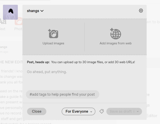
I went ahead and added three full-width gifs and the editor put them in like so:

You'll most likely also have to order your gifs around in the way you want them. You can go ahead and hover over your gifs to see the button to orient them (the four dots in the top left corner) and the button for an image description (the three dots in the bottom right corner). I've attached images of all three below:


If you hold the orientation button, move your gif around until you see the blue line that shows where your gif will end up in the spot that you want it. For example, I wanted to move the second gif below the first one, so I oriented it so that the blue line would show the marker between the two gifs:

Now my gifs are oriented nicely! Of course, this is a simpler layout, but the principles still hold.
If you save your gifs as a draft and reopen them or you just notice a large gap like this in between your gifs when you're in the editor, don't worry.

This will not show up in dash view or on a desktop theme that supports original NPF posts. For example, this is how the gifs' gap (without modification) looked in my desktop theme:

With your gifs ordered, the final step is to add alt text. You can read more about alt text and why you should use it here. (Feel free to ignore the sections about the captions on the legacy editor since it is no longer relevant. It's also unnecessary to clearly mark descriptions if they're not in the caption of your post because they will clearly show up under "ALT" on Tumblr.)
If you click the three dots in the bottom right corner as seen above, and click "update image description:"

You can add the description you like and click "update." Your photos' alt text will show up under the "ALT" bubble on Tumblr. This is generally a good practice to get into to make your content more accessible, so I hope you guys will consider using alt text regularly :)
Also, I've noticed that in the editor, if you go back and edit something it will take some time to show up. You may have to refresh the page or load it again after some time, but your edits should be there. I would not go back and edit posts again if you see your posts haven't shown up. I also advise against editing your posts on mobile because it's easier to make a mistake.
And there you go, you've successfully made a post with the new editor!
04. TROUBLESHOOTING
I'm sure you've all been waiting for this. Unfortunately I am probably going to be extremely unhelpful if the editor hasn't been refined in the last few months for those experiencing issues. I'm going to go in the categories that I listed out in my original poll, but keep in mind that I haven't personally seen any of these issues on my end so I haven't been able to contact staff with any evidence that this happened other than my poll.
Dashboard view quality issues: I haven't noticed this issue. I'm not sure if this has been fixed since the original poll was posted. If you're experiencing this issue, this is not something I know how to fix so I would contact staff with screenshots of the issue.
Desktop theme side padding: As noted before, this is a theme issue. If you change themes to something that is NPF-compatible with original posts, there shouldn't be any more issues here.
Small gifs on mobile: In my experience this was happening regardless of what editor was used; it's a bug that seems to have been fixed since this poll was created. If you're still experiencing it, at the risk of sounding like a broken record, I would advise contacting staff.
New editor doesn't accept gifs of size 9.8MB < x < 10MB: I haven't experienced this issue so I would say the only workaround would be to either trim the size of your gif so that it is under 9.8MB or whatever threshold seems to be the cutoff or contact staff (I am so sorry for constantly having to suggest this 😭 unfortunately there's no trick I can offer because the new editor has been taking all my gifs just fine)
Logistical issues ordering gifsets: I hope this guide has been able to answer the majority of questions and shed some light on some of the more buggy behaviors of the new editor, but if you have any more specific questions you can feel free to shoot me an ask!
HTML issues / colored text: Unfortunately it seems colored text may be deprecated entirely? This could be for accessibility purposes because I believe screen readers would read out every single letter of gradient text in captions which I imagine can get quite frustrating for users of this technology. I recommend just using the normal rich text editor. If you want small text, you can highlight and click the <s> button!
Other: If it seems like something I may be able to answer, please feel free to ask me. Otherwise... hound staff 😭
Here's where you can hound staff, btw. If you're having major issues I would advise you guys to submit support tickets. That way if there are any widespread bugs, staff will hopefully be able to fix them.
I hope this guide was helpful to you guys in dealing with the new editor, and happy giffing <3
#gif tutorial#new editor tutorial#completeresources#userphotoshop#resourcemarket#userrobin#userbells#arthurpendragonns#ughmerlin#userbecca#usersameera#usermarsy#alielook#tuserlucie#tutorial
561 notes
·
View notes
Note
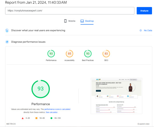
Can we mention and call attention to how their website looks now? They don't seem to check the final work at all. Some items like Gummy Eye, Shell Pot, and Inchsect are larger than the rest of the items, which makes them stick out of the line, which is just ugly.
Also now the images for forest and grassland locations have just a huge weight, which makes the foraging page take an unreasonable amount of time to load. Guys, I just want to make a couple clicks and go about my business again, why should I have to wait for the site to load because your images weigh so much?
And continuing with the artist thing. Items are drawn in different styles and it seems like the current owners don't think about how things end up looking at all. And I just don't understand why? I thought the new owners were more interested in the quality of the species, but it looks like I was wrong.
This all goes to show that the moderation doesn't seem to check at all how certain pages are displayed and working.
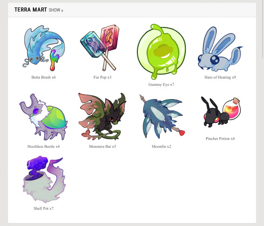
the item sizes thing i remember being way more egregious than this (or maybe it has to do with the fact im on mobile), but the funny thing about lorekeeper is that the size of items and awards and stuff is determined by the size of the image. im pretty sure you have to edit the css if you want the site to automatically resize the images.
the heavy images issue is also something ive noticed, they NEED to compress the images for the foraging locations because if it loads like shit now, imagine what itll be like when they all have insanely large image files to boot up when people just wanna do 3 clicks. its incredibly easy to compress images, you can do it right from your browser and usually theres no way to even tell the difference between a compressed image and a non-compressed (at least when its been resized like the foraging locations are). the same issue comes up with the items, inventories take forever to load now and i think the problem is because EVERY NEW ITEM IS ON A 1000x1000 CANVAS. for reference, lorekeeper recommends 100x100 for items. you do NOT need a canvas that big, and it shows they dont really know how to make items.
listen, i dont mean to hate on terra artists or whatever, just gonna point out examples
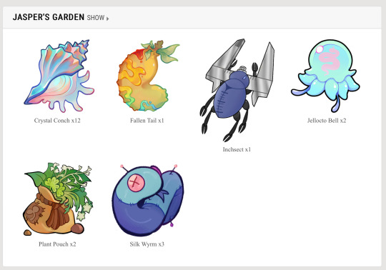
the problem with using such a big canvas for items is that you create a lot of tiny details that arent needed for an item icon. think of items in video games, you want to make something visually appealing and recognizable with as little detail as possible. the pincher potion, gummy eye, and silk wyrm are good examples of this, limited palettes, strong linework, and enough contrast/strong silhouette to be recognized from far away. i think the fur pop, shell pot, and moonfin are examples of how not to do items. the fur pop is too overly rendered, and the linework is very thin and small within the actual lollipop. the moonfin and shell pot both have small details (ie. the tassel on the moonfin’s arrow + the bits of fur on the shell pot) and the rendering issue from before. reminder that these are eventually going to be used as emojis on the discord, theyll be incredibly hard to read at such a small size plus incredibly unrecognizable to users familiar with the old items. in addition, the shell pot lacks direction in design, it reads more as an item that would grant a tail trait or a mist trait, not shell/exoskeleton. fallen tail, monstera bat, and horseshoe beetle also have these issues, but theyre similar enough to the old items that people will probably still recognize them.
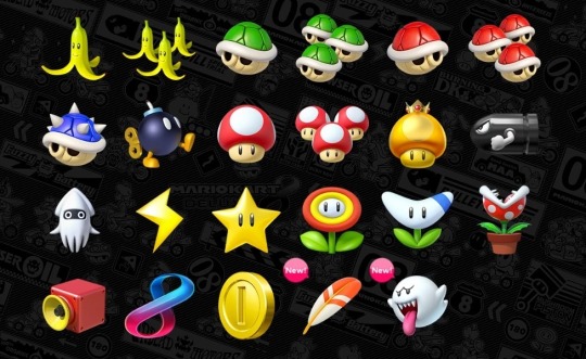
like, look at these iconic items. they are so popular because theyre simple and recognizable from a distance, you can make them as big or as small as you want, you can see it from 10 feet away and still know what it is. THATS good item design.
i think this goes back to “mods hiring their friends,” you just pick people on a personal bias and dont consider the level of skill in making specific items because item design is not the same as making fully finished rendered art. it takes a different eye and you need to think of different principles than you would when making a full piece.
and heres the thing, that doesnt even necessarily mean the art is bad. the fur pop for example, has a very distinct and eye catching style; however, the issue is that theres no uniformity WHATSOEVER. these dont look like theyre all part of the same world, if all the items were done in the same gritty rendered style of the fur pop i would say its a great set, its the fact that you have some items that are incredibly simple, some that are “gritty,” and some that are just silly.
if nothing else, at the very least PLEASE make your canvas smaller and compress your images, youre making the site painful to use (and thats especially an issue when your site has so little functionality anyways)
6 notes
·
View notes
Text
How to Speed Up Your WordPress Site for Better Rankings
A fast-loading website is essential for better SEO, improved user experience, and higher conversions. If your WordPress site is slow, you’re likely losing both visitors and ranking opportunities. Here’s how you can fix that.
Choose the Right Hosting
Your hosting provider sets the foundation for your website’s speed. Shared hosting may be affordable, but it often leads to slow performance. Instead, go for managed WordPress hosting or cloud-based options. Many professional website development services include high-performance hosting setup as part of their package.
Use a Lightweight Theme
A bulky, feature-heavy theme can slow your site down significantly. Switch to a lightweight and optimized theme like Astra, Neve, or GeneratePress to improve load time without compromising design.
Optimize Images
Images are often the biggest contributors to page size. Compress them using tools like ShortPixel or Smush, and use next-gen formats like WebP for faster delivery.
Install a Caching Plugin
Caching helps by storing static versions of your site, reducing the server load. Plugins like WP Rocket or W3 Total Cache can make a noticeable difference in performance.
Minify and Combine Files
Reduce the size of your CSS, JS, and HTML files by minifying them. This removes unnecessary characters and spaces to speed up load time. Tools like Autoptimize make this easy.
Use a CDN
A Content Delivery Network (CDN) distributes your content across multiple servers globally, ensuring faster access no matter where your visitors are located.
Clean Up Unused Plugins and Database
Too many plugins can slow your site and affect performance. Remove what you don’t use and regularly clean your database using WP-Optimize or similar tools.
Final Thoughts
Speed is a major factor in how users and search engines interact with your site. If you’re unsure where to start, partnering with expert website development services can help you optimize every technical aspect for maximum performance and SEO benefits.
Read more -https://www.janbaskdigitaldesign.com/wordpress-website-design-and-development
2 notes
·
View notes
Text
3 notes
·
View notes
Text
Common Web Design Mistakes and How to Avoid Them
Designing a website is a critical step in establishing a strong online presence. However, even the most well-intentioned efforts can result in mistakes that impact usability, performance, and SEO. In this article, we’ll highlight common web design mistakes and provide actionable solutions to avoid them. By addressing these pitfalls, you can ensure your website achieves its full potential and stands out in a competitive digital landscape.
1. Ignoring Mobile Responsiveness
The Mistake: Many websites still lack proper mobile optimization, leading to poor user experience on smartphones and tablets.
How to Avoid It: Prioritize responsive web design services to ensure your website adapts seamlessly to all devices. Partnering with a leading website development company in Jaipur can help you create a mobile-friendly website.
2. Overloading with Visual Elements
The Mistake: Using excessive images, animations, or design elements can slow down your site and confuse users.
How to Avoid It: Focus on simplicity and functionality. Balance visuals with clean layouts that enhance user navigation without sacrificing speed.
3. Poor Navigation Structure
The Mistake: Complicated menus or lack of a clear navigation path frustrates users and increases bounce rates.
How to Avoid It: Use intuitive navigation menus and ensure every page is easily accessible. Collaborate with web design experts who specialize in creating user-friendly interfaces.
4. Neglecting SEO Basics
The Mistake: Forgetting to optimize meta tags, headers, and images for search engines can harm your website’s visibility.
How to Avoid It: Work with SEO-savvy web developers who ensure your website is optimized for keywords like “best website development company in Jaipur” and “web design services.”
5. Slow Loading Speeds
The Mistake: Websites that take too long to load risk losing visitors before they even see the content.
How to Avoid It: Use tools to compress images, minimize CSS/JavaScript, and optimize your hosting. Regular performance checks by professional developers are essential.
6. Inconsistent Design Elements
The Mistake: Mismatched fonts, colors, and layouts create a lack of brand identity and professionalism.
How to Avoid It: Maintain a consistent design theme throughout your website. Utilize brand colors and typography to enhance recognition and trust.
7. Failing to Include a Call-to-Action (CTA)
The Mistake: A lack of clear CTAs results in missed opportunities to convert visitors into customers.
How to Avoid It: Add compelling CTAs on every key page, guiding users toward desired actions like signing up or making a purchase.
8. Ignoring Accessibility
The Mistake: Not designing for accessibility excludes a significant portion of users with disabilities.
How to Avoid It: Implement features like alt text for images, keyboard navigation, and proper contrast ratios.
Reach Out to the Best Website Development Company in Jaipur — Webpino Software
Webpino Software is a leading web development and digital marketing company in India. Our expert team specializes in creating cutting-edge websites, intuitive mobile apps, tailored SEO strategies, and responsive web design services to meet your unique business needs. With over a decade of experience and a proven track record of successfully delivering innovative solutions, we are dedicated to helping your business thrive online.
If you’re ready to bring your digital vision to life, let the best website development company in Jaipur, Webpino Software, transform your ideas into reality. Contact us today to explore how we can elevate your online presence!
#website development#web design#wordpress development#website design#web developers#digital marketing#seo#website#seo friendlly website#business website solutions#custom website design#website optimization#web hosting#wordpress#website design in jaipur#best website development company in jaipur
2 notes
·
View notes
Text
How to Create Mobile-Friendly Websites with Responsive Design
In today’s digital era, where mobile devices dominate web traffic, creating mobile-friendly websites has become more important than ever. As users increasingly access the internet through smartphones and tablets, businesses must ensure their websites are optimized for a seamless mobile experience. This is where responsive design comes into play. At Nividaweb, a leading responsive web design agency in Vadodara, we specialize in crafting websites that look and perform flawlessly on any device.

Here is a comprehensive guide on how to create mobile-friendly websites with responsive design:
What is Responsive Design?
Responsive web design is a design approach that ensures a website's layout and content adapt dynamically to different screen sizes and resolutions. Whether your users are browsing on a desktop, tablet, or smartphone, a responsive website delivers a consistent and user-friendly experience. This adaptability is essential for improving user engagement, reducing bounce rates, and enhancing overall website performance.
Why Responsive Design Matters?
Before diving into the how-to, let us understand why responsive design is crucial:
Improved User Experience: A responsive website ensures that users can navigate and interact with your site effortlessly, regardless of their device.
Higher Search Engine Rankings: Search engines like Google prioritize mobile-friendly websites in their rankings, making responsive design a key factor in SEO.
Increased Conversion Rates: With a user-friendly interface, responsive websites encourage visitors to stay longer and take action, boosting conversions.
Cost-Effective Maintenance: Instead of maintaining separate websites for desktop and mobile users, a responsive design simplifies updates and reduces costs.
Steps to Create a Mobile-Friendly Website with Responsive Design
1. Start with a Mobile-First Approach
The mobile-first approach involves designing the website for smaller screens first and then scaling up for larger devices. This method ensures that the core elements are optimized for mobile users. A responsive web design company in Vadodara like Nividaweb emphasizes this approach to ensure a seamless user experience on all devices.
2. Use a Flexible Grid Layout
A flexible grid layout is the foundation of responsive design. It allows website elements to adjust proportionally based on the screen size. Instead of fixed-width layouts, use percentages and relative units like ems or rems to define dimensions. This ensures that your website adapts smoothly to different screen resolutions.
3. Optimize Images and Media
Large images and media files can slow down your website, especially on mobile devices. To enhance performance:
Use responsive images that scale according to screen size.
Implement modern image formats like WebP for better compression.
Use CSS media queries to serve appropriate image sizes based on the user’s device.
At Nividaweb, a trusted responsive website design company in Gujarat, we leverage advanced tools to optimize images and improve loading times.
4. Implement CSS Media Queries
CSS media queries are essential for responsive design. They enable you to apply specific styles based on the device’s characteristics, such as screen width, height, or resolution.
5. Prioritize Touch-Friendly Navigation
Mobile users interact with websites using touch gestures, so it is essential to design navigation that is easy to use. Key considerations include:
Larger buttons and clickable areas.
Simplified menus with collapsible options for smaller screens.
Avoiding hover-dependent features, as they do not work well on touch devices.
6. Test on Multiple Devices and Browsers
Testing is a critical step in creating a mobile-friendly website. Use tools like Google’s Mobile-Friendly Test and browser developer tools to simulate various devices and screen sizes. Additionally, test your website on physical devices to identify and resolve any usability issues.
7. Ensure Fast Loading Times
Mobile users expect websites to load quickly. A slow-loading site can lead to higher bounce rates and lost opportunities. To optimize loading times:
Minimize HTTP requests by combining CSS and JavaScript files.
Enable browser caching and compression.
Use a Content Delivery Network (CDN) to deliver content faster.
As a responsive web design company in Vadodara, Nividaweb employs performance optimization techniques to ensure your website loads swiftly across all devices.
8. Leverage Responsive Typography
Typography plays a crucial role in readability and user experience. Use scalable fonts that adapt to screen sizes and maintain legibility on smaller devices. Tools like CSS’s viewport units (e.g., vw, vh) can help create fluid typography that adjusts dynamically.
9. Incorporate Mobile-Friendly Features
Enhance your website's usability by integrating features tailored for mobile users:
Click-to-call buttons for quick communication.
Location-based services like maps.
Fast and secure payment options for e-commerce websites.
10. Work with Experts in Responsive Design
Creating a truly responsive and mobile-friendly website requires expertise and experience. Partnering with a reputable responsive web design agency in Vadodara, like Nividaweb, ensures that your website meets the highest standards of design and functionality.
Why Choose Nividaweb for Responsive Website Design
Nividaweb is a leading responsive website design company in Gujarat, dedicated to transforming your online presence. Here is why businesses trust us:
Tailored Solutions: We understand that every business is unique. Our team works closely with clients to deliver customized designs that align with their brand identity and goals.
Cutting-Edge Technologies: We stay ahead of industry trends and utilize the latest tools and techniques to create responsive websites.
Experienced Team: Our skilled designers and developers have extensive experience in crafting mobile-friendly websites across diverse industries.
End-to-End Services: From design and development to testing and optimization, we provide comprehensive solutions for all your web design needs.
The Future of Mobile-Friendly Websites
As technology evolves, so do user expectations. Emerging trends like voice search, augmented reality, and progressive web apps are reshaping the way users interact with websites. At Nividaweb, we are committed to staying at the forefront of these developments, ensuring our clients remain ahead of the curve.
Conclusion
Creating a mobile-friendly website with responsive design is no longer optional; it is a necessity. By following the steps outlined in this guide and partnering with a reliable responsive web design agency in Vadodara, you can create a website that delivers exceptional user experiences, drives engagement, and boosts conversions.
Ready to take your website to the next level? Contact Nividaweb, the trusted responsive website design company in Gujarat, and let us help you create a website that stands out in today’s competitive digital landscape.
#Responsive web design agency in Vadodara#Responsive web design company in Vadodara#Gujarat#Responsive website design company in Gujarat#Vadodara#Website design and development company in Gujarat#India#Web design and development agency in Gujarat#Website design and development company in Vadodara#eCommerce web design in Vadodara#eCommerce website developer in Gujarat#eCommerce website developer in Vadodara#Best web design agencies in Vadodara#Web design company in Vadodara#Best website design company in Vadodara
5 notes
·
View notes
Text
Page Optimization Best Practices: A Blueprint for Online Growth
Page optimization is an essential system in virtual advertising and net development that ensures websites are person-friendly, functional, and aligned with seek engine tips. It encompasses quite a few techniques and practices aimed at improving a website's performance, visibility, and general user revel in (UX). By optimizing a page, companies and content creators can achieve better search engine ratings, force organic visitors, and ultimately enhance conversion costs. This complete manual explores the facets of page optimization, from its technical factors to consumer-centered techniques.

On-Page Optimization
The Importance of Page Optimization
In the state-of-the-art competitive digital landscape, merely having an internet site is inadequate. Users anticipate rapid-loading, cellular-friendly, and easily navigable pages. Moreover, serps like Google prioritize web sites that supply value through optimized overall performance. Here’s why page optimization is essential:
Enhanced User Experience: Optimized pages load quickly, are visually appealing and provide intuitive navigation. This maintains users engaged and decreases bounce costs.
Higher Search Engine Rankings: Search engines reward optimized pages with better ratings, growing visibility, and natural reach.
Increased Conversions: A properly optimized web page encourages customers to take desired movements, including creating a purchase, signing up for a publication, or downloading content.
Better Accessibility: Optimization guarantees your content is on the market to all customers, such as people with disabilities, through features like alt textual content and proper structure.
Cost Efficiency: Pages optimized for speed and overall performance lessen server load and bandwidth utilization, reducing hosting expenses.
Key Elements of Page Optimization
Page optimization is multi-faceted, involving each technical and content-associated components. Below, we delve into its middle elements:
Page Speed Optimization
Page speed refers to how quickly a webpage masses its content. It's a crucial rating issue for search engines like Google and Yahoo and significantly affects consumer retention. A postponement of even a 2nd can bring about massive drops in personal engagement and conversions.
Minimize HTTP Requests: Reduce the number of factors like photographs, scripts, and CSS documents.
Compress Images: Use equipment like TinyPNG or ImageOptim to lessen image sizes without compromising quality.
Enable Browser Caching: Cache static files so returning site visitors don’t need to reload all factors.
Use a Content Delivery Network (CDN): Distribute content across more than one server to reduce latency.
Optimize Code: Minify CSS, JavaScript, and HTML to put off unnecessary characters.
Mobile-Friendliness
With over half of internet traffic coming from cellular gadgets, ensuring a web page is cell-pleasant is non-negotiable.
Responsive Design: Use CSS frameworks like Bootstrap to ensure the page adapts to specific screen sizes.
Viewport Settings: Define the viewport for your HTML to govern how your website is displayed on cell devices.
Clickable Elements: Ensure buttons and hyperlinks are properly sized and spaced for touchscreens.
Content Optimization
Content is at the heart of any website. Optimizing content for relevance, readability, and engagement is crucial.
Keyword Research: Identify and use goal key phrases naturally in your content.
Structured Data: Use schema markup to help serps recognize your content material.
Readability: Use brief paragraphs, subheadings, and bullet points to make content material scannable.
Engaging Visuals: Incorporate great images, movies, and infographics to complement textual content.
On-page search engine marketing
On-page search engine marketing entails optimizing character internet pages to rank better in seek engine results.
Title Tags: Create compelling and keyword-rich titles within 50-60 characters.
Meta Descriptions: Write concise descriptions that summarize the page content material and consist of target keywords.
Header Tags (H1, H2, and so forth.): Use headers to shape content material logically and improve readability.
Internal Linking: Link to different applicable pages in your website to enhance navigation and search engine optimization.
Technical Optimization
Technical optimization makes a specialty of backend upgrades to beautify overall performance and seek engine crawlability.
Robots.Txt File: Guide engines like Google on which pages to crawl or ignore.
Canonical Tags: Avoid duplicate content material problems by specifying the favored version of a website.
SSL Certificate: Secure your website online with HTTPS to reinforce consideration and ratings.
404 Error Pages: Create consumer-friendly error pages to guide users to lower back to practical parts of your website online.
Tools for Page Optimization
Several tools can simplify and streamline the optimization manner:
Google PageSpeed Insights: Analyzes web page speed and affords actionable guidelines.
GTmetrix: Offers insights into website performance and areas for development.
Ahrefs/Semrush: Helps with keyword studies, content optimization, and search engine marketing monitoring.
Hotjar: Tracks user behavior via heatmaps and session recordings.
Strategies for Effective Page Optimization
To reap meaningful effects, you want a well-rounded strategy. Here’s a step-by-step approach:
Conduct an Audit
Before enforcing modifications, conduct a comprehensive audit to identify existing troubles. Tools like Screaming Frog or Google Analytics can reveal overall performance bottlenecks, broken hyperlinks, and content gaps.
Prioritize User Intent
Understand your target market's wishes and design pages that cope with them. Whether users are seeking data, products, or services, make certain your content aligns with their intent.
Focus on Core Web Vitals
Google’s Core Web Vitals — Largest Contentful Paint (LCP), First Input Delay (FID), and Cumulative Layout Shift (CLS) — are crucial for web page optimization. Aim to meet their benchmarks for stepped forward user revel in and scores.
Test and Iterate
Optimization is an ongoing system. Use A/B checking out to experiment with web page layouts, calls-to-movement (CTAs), and different elements. Monitor overall performance and refine based on results.
Keep Up with Trends
The digital landscape evolves swiftly. Stay knowledgeable about updates to look engine algorithms, layout developments, and emerging technologies.
Common Challenges and Solutions
While web page optimization gives huge advantages, it also affords challenges:
Balancing Speed and Functionality: Advanced capabilities like animations can sluggish down your website online. Use light-weight libraries and green coding to strike stability.
Content Overload: Too a whole lot of content material can crush users. Focus on turning in concise, cost-driven information.
Managing Multiple Platforms: Ensuring steady overall performance across desktop, cell, and drugs requires thorough testing and responsive design.
The Future of Page Optimization
As technology advances, web page optimization will keep evolving. Emerging tendencies like voice seek, AI-pushed personalization, and augmented truth (AR) integration will redefine consumer expectations. Websites will want to leverage these improvements at the same time as adhering to foundational optimization ideas.
Additionally, the rise of privacy policies emphasizes the want for transparent facts practices. Optimized pages will not only perform nicely but additionally build acceptance as true through secure and ethical dealing with of personal records.
2 notes
·
View notes
Text
Super-Small Stardust Saga, Prologue
Hey there! You're reading an archived, imperfect version of a post originally from my Cohost!! Rest in peace to the best website. This version of the story will be missing some essential formatting aspects. Otherwise, I'll do my best to archive everything textwise and image-wise. Anyway, the text originally read:
~~~
I'm hosting chapters on this second page so as to avoid clogging up my main page with chapters AND allow folks to follow specifically the CYOA if they're so inclined!
This will be a unique Interactive fiction project in my micro-oriented sci-fi kink setting, the Punyverse! I'm going to be hosting it here on Cohost, and taking advantage of css and Cohost's unique page layout in order to try and create something that I couldn't really fit on other sites like Twitter or Tumblr or what have you.
Most importantly, while I'm certainly planning to be writing most of it myself, I'm going to leave "unwritten" paths and branches down the Choose-Your-Own-Adventure path as "open" slots, so that collaborators can contribute in a way similar to Writing.com Interactives (though obviously with a stronger grip on quality control than WDC!) I encourage folks to reach out and DM me in the future if you're interested. You can reach me on Twitter, Discord, and Tumblr.
Before we start, be aware that while this prologue is tame, future chapters can and will contain kink/fetish content, including but not limited to macro/micro, nano/giga, furry, anthro, non-anthro (quadrupedal, serpentine, etc), genitals/sexual content, situations of ambiguous consent, feet/paws, butt, vore, dom/sub, humiliation, boobs, peril/destruction, and more.
As with all stories of mine involving non-human characters, all parties pass the Harkness test, being of human-level intelligence, 18+ or equivalent sexual & mental maturity for their species, and involving themselves of their own free will.
This first part is simple scene-setting. As always, if you notice a formatting error, typo, or other problem, please let me know!
Hope you enjoy, and thanks for reading!
Year 2212. Also known as Collective Calendar 3-42-15-8999.
With the Earth giving out in terms of resources, humanity decided to leave its nest into the wider universe. That’s the simple version of that bit of history. The fleet, carrying just over 9 billion people, made quick tracks out of the solar system. Once past the Kuiper Belt, the ESS Bifrost activated the wormhole gate, and humanity entered, to be taken faster than light to the next place they would call home.
In retrospect, they could probably have remained on Earth a few more decades to test wormholes with some extra rigor.
Humanity emerged on the opposite side of their galactic neighborhood with no viable route back, no idea where they were, and, of course, lest any of us forget: pulled through a pocket of spatial compression that effectively reduced the size of their entire fleet and everyone in it to 1/12000th scale. Humans that were once 5 foot 11 inches were now 5 thou and 11 subthou tall, .15mm tall. Paltry. Microscopic. Blissfully Ignorant of just how small and in need they all now were. The fleet would rapidly have depleted all of its power and resources in no time at all, had it not immediately been intercepted by the Interstellar Collective.
Integration was tough those first few years.1 But eventually, humanity was able to carve out some small – very small – niche within the pangalactic community. And despite all the new difficulties of this new frontier, at this new size, humanity climbs ever further.
That’s where You come in. You’ve spent the last several years achieving the credentials necessary to become a ship captain. It wasn’t easy – especially making boot camp at the size of a fleck. Even getting approval to pursue a spot aboard Academy Station took a few favors. But today, at last, is the day you graduate and become one of only four or six-ish human captains of a multi-member vessel to exist!
Your itinerary for today is quite simple. First, you need to meet with Academy Station’s Director, to complete the final steps of ceremony and receive your badge (very important!). Second, a Lieutenant-Captain whose name eludes you (temporarily!) wanted to meet to requisition your leadership aboard a cruiser. Third, you would then have to go down to the Large Vessels Lot and introduce yourself to the crew and vessel, and then presumably tomorrow morning you would leave on that vessel for a grand adventure through the galaxy.
You look over your graduation documentation once more to verify that everything is in order. At the top is your basic personal information. It reads…
Option 1: Fem Captain At the top, in neat print, the document reads:
Name: Justine Sieva Skylor Species: Human (Sellan) Dimorphism: Female DOB: 3-38-04-9001. (1/29/2217) Mass: 0.2 micrograms* (See Addendum) Height: .144mm* (See Addendum)
Followed by copies of that same information in a few other formats. Near the bottom of the page are a few addendums and notes explaining the conditions of humanity's size issues.
Since this information is accurate, you decide to head off to go visit the Director and get yourself recognized! Yup, this is me! {To Prologue Part 2.}
At the top, in neat print, the document reads:
Name: Septem Vel Septendecim Lis (Preferred Name: Sep) Species: Viable Hybrid (Human / Soldrakanoid) Dimorphism: Male DOB: 3-38-04-9001. (1/29/2217) Mass: 0.24 micrograms* (See Addendum) Height: .150mm* (See Addendum)
Followed by copies of that same information in a few other formats. Near the bottom of the page are a few addendums and notes explaining the conditions of humanity's size issues.
...Yup, looks correct, you think. You decide to head off to go visit the Director and get yourself your badge.
{Note: This chapter wasn't written/complete yet at time of Cohost's shutdown}
Footnotes
Joining the Collective was easy enough – their extraterrestrial neighbors were more than happy to offer humans shelter and assistance. A lot more than happy, to put it gently. Aliens meeting each other in groups tend to experience a wave of social and emotional euphoria – that is to say, aliens naturally develop crushes on other species at first sight. And humanity, as the smallest species in space and the newest member of the Collective, was quite a hot topic for months. Many, many species met humanity during that initial acclimation to the cosmic lifestyle – and almost as many saw humanity as playmates, toys, objects of affection, pets... and so on. To this day, the wormhole research project that is the primary lead on possibly fixing humanity’s size drags at a snail’s pace due to just how much the other species assisting the project ‘love’ their human coworkers. To say nothing of the Collective’s nickname for humanity – the Sellans – or the numerous “research projects” with massive embarrassment for mankind as primary consequence. Many new prospective city-type colonies have been relocated to humiliating circumstances in the care of relative giants.
2 notes
·
View notes
Text
Proven Techniques for Ranking Higher on Google

Google is a powerful search engine, and seeking ways to place one's website at the top is important for enhancing the website's visibility, attracting more traffic, as well as the success of the online presence. At the digital marketing agency, we recognize that optimization is vital as there are millions of sites competing for the first places. Therefore, it is possible to use effective methods which cut across Google’s successful methods. In this article, we present systems that have been tested and proven to improve your google ranking and more traffic to your website.
1.Do a proper keyword research
Keyword research is the most important part of an SEO strategy. It is because by knowing what the intended audience is searching for you will be able to develop content that cuts across.
Action Steps:
Use Keyword Tools: Use high traffic specific keywords’ search volume tools like Google Keyword planner, Ahref, SEM rush etc. to search for keywords with low competition.
Analyze Competitors: Look at the keywords that are working for your competitors and narrow dow n on the related ones.
Focus on Long-Tail Keywords: The phrases are less competitive in nature and since they are more specific they lead to higher conversions.
2. Better the On-Page SEO Optimization
On page SEO Optimization is the process of editing and facilitating changes on the pages of a web document in order to make them rank well and fit to the targeted audience. Such changes may involve content optimization of the webpage, markup optimization improvement of the HTML source code.
Action Steps:
Rewriting and Optimization Strategy Title Tags and Meta Descriptions: Always ensure you note your page title and all the meta area as it has been promised to the readers and throughout the website.
Header Tags: Help cluster words and enhance comprehension by assigning H1 tags for the headline as the highest, H2, H3, etc for the subtitles.
URL Structure: Lines should be simple and moderate but include powerful words that are in line with what you are targeting.
Internal Linking: Where necessary links are created to other pages which are relevant to the current page being viewed by users and helps to spread out the link equity within the site.
3. Create High-Quality Content
Content is a very important element of SEO. Content, when properly designed, well written and is valuable and informative, will drive visitors, retain them and help establish credibility on a given niche.
Action Steps: Write for Your Audience: Use Solutions oriented approach where every word helps to eliminate audience problems.
Incorporate Keywords Naturally: Avoid abrupt keyword inclusion or excess use of keywords in the content.
Use Multimedia: Use of multimedia such as, images, animations, values etc to assist in a more appealing manner and also hold attention.
4.Enhance User Experience (UX)
The most important aspect with any Google ranking of the website is the user experience. Along with other factors, page speed, mobile usability, and site hierarchy are considerable for rankings.
Action Steps:
Improve Page Speed: It is possible to analyze why their site is slow through the use of Google PageSpeed and rectify the site’s speed. Spelling out some issues – Image compression, browser caching, CSS and javascript files minification.
Mobile-friendly Site Design: Create a website that is responsive to any device and that offers the same level of interaction regardless of the device used. With Google focusing on mobile first indexing, this becomes self-explanatory.
Utilize simple Structure: Website usability should be observed through the enabling of a better navigation structure and size of the website. This enables the website content to be easily accessed reducing the levels of bouncing.
5. Improve Quality of Backlinks
Links are an essential component of the parameters used in the Google algorithm, page rank among them. Backlinks from other websites with high reputation which are also relevant to the topic covered by a site will in most cases optimize the site.
Action Steps:
Develop Great Content: Write content that will drive people to share it, persuasive contents such as how to guides and case studies, original research.
Advertising through blogs: Write articles as a guest for reputable blogs in the niche and ensure to include a link to one’s site in the author information or within the article text.
6. Geo-targeting
For businesses that are into a certain geographic perspective, optimizing local search can get them local patrons and also enhance the local ranking.
Action Steps:
Claim Your Google My Business Listing: Your Google My Business profile must have all relevant details about your ventures such as addresses and business hours.
Social Media – Add Local Clientele Keywords: Identify local phrases and use them when generating content, title tags and meta descriptions.
Encouraging Reviews: Actively ask clients to review your services on Google and any other outlets and respond to them if possible, as good reviews will help boost your visibility in local search results.
7.Review and Performance metrics
It allows you to keep track of and evaluate your performance in line with search engine optimization. Bring out the strengths and weaknesses by utilizing the right tools.
Action Steps:
Google Analytics: Establish and analyze google analytical for effective tracking of such elements as the frequency of visitors, viewership and even exit of visitors.
Google Search Console: Use the GSC to see how well your web page performs, fixes, and submits the sitemap of your web page.
Finesse your strategies: With the use of prior or primary researches, refine any of your current seo methods. Adequate emphasis should be placed on aspects with some room for growth as well as recent developments on global search engine behaviors.
8. Follow New SEO Trends
SEO, as any other discipline, is dynamic, thus, it is important for the SEO professionals to go on top of the new developments and any new releases in a bid to keep their positions and even enhance them.
Action Steps:
Follow Industry Blogs: Sign up to popular and authoritative SEO blog sites and forums as fresh content and relevant changes are posted.
Participate in Webinars and Conferences: Join the SEO web-based presentations and conferences to listen to the views from other relevant fields.
Adapt to Algorithm Changes: Many changes concerning the Google algorithm are commonplace. This means these things are happening in a constant rush and therefore SEO strategies had to be altered with the changes.
Conclusion
Achieving a good rank on Google is a process that requires effective execution of multiple strategies like keyword research, website on-page and off page optimization, content writing and technical enhancement, etc. Downham Digital Marketing is dedicated to assist companies who wish to adopt these tested approaches to increase their online exposures. Keep in mind that SEO is not a one-time thing; it requires persistent revisions and improvements for the strategies to survive the competitive scene. For further assistance with your SEO efforts, be sure to contact our team of experts at SS TECH SERVICES as they employ state-of-the-art strategies and approaches.
#SEOtips#fromchallengetosuccess#innovationunleashed#transformwithUs#boostyourtraffic#SEO#PPC#contentcreation#localSEO#onlinegrowth#emptyroadsfullpotential#websiteredesign#techtransformation#sstechservices#websitedesign#businessboost#moderndesign#professionalwebsite#elevateyourbrand#webdesign#salesboost#digitalsuccess#websitedevelopment#digitaljourney#businessgrowth
2 notes
·
View notes
Text
Speed Up Your Website: Essential Optimization Tips! 🌐✨
Is your website feeling a bit sluggish? A fast website is crucial for keeping your visitors happy and improving your SEO. Here are some essential tips to boost your site’s speed and performance! ⚡ With Speedy Serp.
1. Trim the Fat: Minimize HTTP Requests 🔪 Each element on your page (images, scripts, stylesheets) creates a new request. Combine files where possible and remove unnecessary elements to speed things up.
2. Compress for Success 🗜️ Enable Gzip or Brotli compression to shrink your HTML, CSS, and JavaScript files. Smaller files mean faster load times.
3. Picture Perfect: Optimize Images 📸 Ensure your images are in the right format (JPEG for photos, PNG for graphics) and compressed. Tools like TinyPNG or ImageOptim can help reduce image sizes without sacrificing quality.
4. Cache In: Use Browser Caching 🧠 Set up browser caching to store some files in your visitors' browsers. This way, repeat visitors don't have to download everything again, making subsequent visits faster.
5. Clean Up Your Code: Minify CSS, JavaScript, and HTML 🧹 Remove unnecessary characters from your code, like spaces and commas, to improve load times. Minification tools can automate this for you.
6. Fast Servers = Fast Websites 🏎️ Choose a reliable web host and keep your server optimized. A speedy server is the backbone of a fast website.
7. Globally Fast: Implement a CDN 🌍 CDNs store copies of your site in multiple data centers worldwide, serving content from the location closest to your visitor. This reduces latency and speeds up load times.
8. Lazy Load for the Win 💤 Lazy loading delays the loading of images and other elements until they’re needed (i.e., when they come into view). This makes your initial page load much faster.
9. Above-the-Fold Focus 📰 Prioritize loading the critical content first, so visitors can start engaging with your site while the rest loads in the background.
10. Regular Audits: Keep Testing 🔍 Use tools like Google PageSpeed Insights, GTmetrix, or Lighthouse to identify improvement areas. Regular testing and optimization are key to maintaining a fast site.
Speed optimization is an ongoing journey, but the rewards in user satisfaction and SEO are well worth it. Start implementing these tips today and watch your website soar! 🌟✨
What are your go-to speed optimization techniques? Share your thoughts below! 💬
#WebDev #SpeedOptimization #WebsiteTips #TechSavvy # #WebDesign #DigitalMarketing #TumblrTech
2 notes
·
View notes
Text
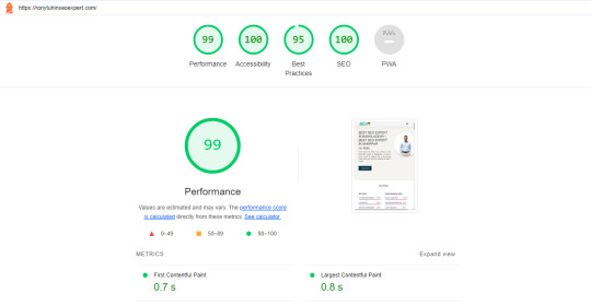
A Step-by-Step Guide: How to Optimize Your Website Speed for a Perfect 99/100 Score
🚀 Boost Your Website Speed with This Step-by-Step Guide! 🚀Hey everyone! Are you ready to supercharge your website? 🌐 In today's digital world, having a lightning-fast website is crucial for success. That's why I'm excited to share a step-by-step guide on optimizing your website speed and achieving a perfect 99/100 score! 📈
1. Start with a Speed Test: Use tools like Google PageSpeed Insights or GTmetrix to analyze your website's current speed performance. This will give you a baseline to work from.
2. Optimize photos: To minimize file size without compromising quality, compress and resize photos. This may have a major effect on loading times.
3. Minify JavaScript and CSS: To minimize file sizes, eliminate extraneous characters and spaces from your code. This might enhance user experience and speed up the loading of your website.
4. Turn on Browser Caching: Use browser caching to save static files, including CSS and graphics, so that a visitor to your site doesn't have to reload them.
5. Content Delivery Network (CDN): Consider using a CDN to distribute your website's files across multiple servers worldwide. This can dramatically decrease load times for users across different locations.
6. Make Use of Accelerated Mobile Pages (AMP): AMP may be used to make mobile-friendly versions of your website that load more quickly, increasing both user engagement and overall speed.
7. Reduce Server Response Time: Optimize your server's performance and eliminate any bottlenecks that could slow down your website.
8. Monitor and Test Regularly: Monitor your website's speed performance and adjust as needed. Testing and continuous optimization are vital to maintaining a fast-loading website.
By taking these simple measures, you can dramatically increase the speed of your website and give users a flawless surfing experience. Recall that a quicker website can improve your search engine rankings and increase user satisfaction! 🌼
So, what are you waiting for? Let's optimize those websites and aim for that perfect 99/100 speed score! Feel free to share your tips and experiences in the comments below. Together, let's speed up the web!
#seo optimization#off page seo#local seo#seo expert#seo company#seo marketing#seo agency#digital marketing#seo services#seo
2 notes
·
View notes
Text
How To Boost The Indexability Of A New Website 🔥
🔥 Skyrocket your website's indexability and conquer the search engine rankings! 🌟 Buckle up, folks, because I've got some insider secrets and juicy tips that'll turbocharge your site's visibility. Let's dive in! 💪
1️⃣ Speed is 🔑: Did you know that a slow website can make spiders crawl slo-mo? ⌛ Yup, search engines love speedy sites! Optimize loading times by compressing images, minifying CSS/JavaScript, and leveraging caching techniques. ⚡️ Slow websites ain't got no time for rankings!
2️⃣ XML Sitemaps for the Win 🗺️: A well-crafted XML sitemap is the magic 🔮 that helps search engines understand your website structure. Create and submit one to Google Search Console, Include all your pages, prioritize 'em, and watch as the bots scuttle through your content. 🕷️
3️⃣ Mobile-Friendly FTW 📱: it's a no-brainer to know that mobile searches surpasses desktop searches. Ensure your site is responsive and looks fab on all devices. Mobile-friendly sites win bonus points with the search bots and get blessed with better indexability. 🙌
4️⃣ Link Juice Matters 💪🧃: Internal linking is like a power-packed energy drink for your SEO efforts. 🥤 Pass that link juice around by interlinking your pages with relevant anchor texts. Search engines adore such connected websites, and it helps them find all your cool content.
5️⃣ Clear the Dead Ends ☠️: Broken links are like ghosts haunting your website. 👻 Sweep 'em away, my friend! Regularly audit your site for 404 errors and redirect 'em to relevant pages. Goodbye dead ends, hello smooth and indexable pathways! 🛠️
6️⃣ Hail the Hierarchy 🏰: A well-structured website hierarchy is a superhero cape for indexability. 🦸♂️ Use clear headings, subheadings, and semantic HTML to organize your content. It helps search engines understand the context better and boost your chances of claiming that top spot. 🥇
7️⃣ Snacks for Spiders 🍴🕷️: Meta tags bring all the spiders to the yard! Craft compelling meta titles and descriptions that entice users and search engines alike. Use relevant keywords, be concise, and ooze that click-worthy appeal. 🤩 Meta tags are the snacks search bots love to munch on!
⚠️ Hold up, folks! This is just a taste of the SEO buffet I've got for you. For a full-on feast of technical SEO expertise, check out my guide, "Unlock the Secrets of Technical SEO" 📚🔓. It's packed with even more insider info to supercharge your website's indexability and beyond! 🚀🎉
#SEO #TechnicalSEO #Indexability #SearchTraffic #WebOptimization #HustleHard #onpageseo #intetnallinks #internallinking #boosttraffic #organictraffic #freetraffic #searchengineoptimization #onpageoptimization #indexability #sitemaps #metatags #websitespeed #seomarketing #seosecrets #seostrategy #makemoneyonline #earnmoneyonline #workfromhome #homebusiness #onlinebusiness #onlinemarketing #internetmarketing #digitalmarketing #contentmarketing #digitalmarketer #affiliatemarketing
#make money online#work from home#affiliate marketing#make money with affiliate marketing#marketing#online business#home business#digital marketing#online marketing#blogger#on page seo#seo tutorial#seo services#seo#seo tips#socialmediamarketing#seo marketing#emailmarketing#on page optimization#technical seo
4 notes
·
View notes
Text
Navigating the Mobile-First Indexing Revolution in 2023: You’re Definitive Guide

The digital landscape is an ever-evolving realm, and in 2023, one thing is abundantly clear – mobile is king. With the advent of Mobile-First Indexing, the way websites are ranked by search engines has undergone a profound transformation. In this comprehensive guide, we'll explore the Mobile-First Indexing landscape, provide you with a "mobile-first indexing checklist," delve into "mobile SEO best practices," and uncover the critical "mobile ranking factors." Along the way, we'll add a dash of human touch to help you truly grasp the significance of this seismic shift.
The Mobile-First Indexing Revolution
What is Mobile-First Indexing?
Mobile-First Indexing is Google's response to the mobile-centric digital age. Traditionally, Google primarily crawled and indexed desktop versions of websites, using that data to determine rankings for both desktop and mobile searches. However, the rise of mobile usage led to a fundamental change – Google began prioritizing the mobile version of a website for indexing and ranking. This means that a website's mobile version now takes precedence in search results, making mobile optimization more critical than ever.
Why Does Mobile-First Indexing Matter?
Mobile-First Indexing matters for several compelling reasons:
User-Centric Approach: It aligns with the user-centric trend, as more people access the internet via mobile devices than ever before.
Improved User Experience: Mobile-First Indexing encourages website owners to enhance the mobile experience, resulting in faster-loading pages and improved usability.
Better Rankings: Websites that perform well on mobile devices are more likely to rank higher in search results, increasing organic traffic.
Mobile-First Indexing Checklist
Embarking on a Mobile-First Indexing journey requires a meticulous approach. Here's a checklist to help you navigate this transformative process:
1. Mobile-Friendly Design:
Ensure your website employs a responsive design that adapts seamlessly to various screen sizes, from smartphones to tablets.
2. Speed Matters:
Optimize your site's loading speed on mobile devices. Compress images, minify CSS and JavaScript, and leverage browser caching to reduce load times.
3. Mobile SEO Best Practices:
Implement on-page SEO techniques tailored for mobile devices, including optimizing title tags, meta descriptions, and headers for mobile users.
4. Mobile Content:
Make sure your mobile site contains the same valuable content as the desktop version, including text, images, videos, and infographics.
5. Structured Data:
Use schema markup to provide search engines with structured data, helping them understand your content and display rich snippets.
6. Test on Mobile Devices:
Regularly test your website's performance on various mobile devices and browsers to identify and rectify any issues promptly.
7. Mobile Sitemaps:
Create and submit a mobile sitemap to Google Search Console to ensure all mobile pages are indexed correctly.
8. Optimize for Local Search:
If you have a physical location, optimize your site for local search, ensuring mobile users can easily find your business.
9. Monitor Mobile Usability:
Keep a close eye on Google Search Console for mobile usability issues and resolve them promptly.
Mobile SEO Best Practices
To excel in the era of Mobile-First Indexing, you need to embrace these Mobile SEO best practices:
1. Mobile-Responsive Design:
Invest in a mobile-responsive design that automatically adjusts to different screen sizes. This ensures a consistent user experience across devices.
2. AMP (Accelerated Mobile Pages):
Consider implementing Accelerated Mobile Pages to create faster-loading, streamlined versions of your content, ideal for mobile users.
3. Optimize Images:
Compress and optimize images for mobile devices to reduce page load times without compromising quality.
4. Mobile-Friendly Navigation:
Simplify navigation menus and use mobile-friendly navigation elements, such as hamburger menus, to enhance user experience.
5. Local SEO Optimization:
If you have a physical business presence, optimize your website for local search by including location-specific keywords and information.
6. Voice Search Optimization:
As voice search becomes more prevalent, optimize your content for natural language queries and long-tail keywords.
7. User Experience Matters:
Prioritize a seamless user experience on mobile devices. Ensure that buttons are easily clickable, fonts are legible, and pop-ups are minimal.
Critical Mobile Ranking Factors
Understanding the key factors that influence mobile rankings is essential. Here are some critical mobile ranking factors to consider:
1. Page Speed:
Fast-loading pages are paramount. Google prioritizes websites that load quickly on mobile devices to improve user experience.
2. Mobile-Friendly Design:
Websites with responsive designs that adapt to different screen sizes are favored by search engines.
3. Mobile Usability:
User-friendly mobile experiences, including easy navigation and legible text, contribute to better rankings.
4. Quality Content:
High-quality, relevant content that satisfies user intent is crucial for mobile rankings.
5. Mobile-Friendly Pop-Ups:
Avoid intrusive pop-ups that can disrupt the user experience on mobile devices.
6. Mobile Crawlability:
Ensure that Googlebot can crawl your mobile website without issues, including access to CSS and JavaScript files.
7. Mobile Interstitials:
Limit the use of interstitials or pop-ups that cover the main content, as these can negatively impact rankings.
As we delve into the intricacies of Mobile-First Indexing, it's vital to remember that behind the algorithms and data points are real people – your audience. The shift towards mobile-centric indexing is driven by the evolving habits and preferences of users who rely on mobile devices for information, entertainment, and connection.
Imagine a user on a busy morning commute, searching for a nearby coffee shop to grab a quick cup of joe. Your website, optimized for Mobile-First Indexing, loads swiftly, provides clear directions, and displays enticing images of steaming coffee cups. In this scenario, Mobile-First Indexing isn't just an algorithmic change; it's an opportunity to connect with users when they need you the most.
In 2023, your website's success hinges on its mobile performance. By following the Mobile-First Indexing checklist, embracing Mobile SEO best practices, and understanding the critical mobile ranking factors, you can position your site at the forefront of the mobile revolution. It's not just about appeasing algorithms; it's about delivering an exceptional mobile experience to the people who matter most – your audience. So, get ready to conquer Mobile-First Indexing, and let your website shine in the mobile spotlight!
4 notes
·
View notes
Text
Page Speed Optimization: Why It’s Critical for Conversions and SEO

In today’s fast-paced digital environment, page-speed-optimization-for-seo-and-conversions is not just an added benefit but a crucial necessity for any business striving to thrive online. A website’s speed has a direct impact on how users perceive your brand. Slow load times can frustrate visitors, leading to higher bounce rates and missed opportunities for engagement. Research shows that a one-second delay in page load time can cause a significant drop in conversions, as customers are less likely to complete actions like making a purchase or filling out a form. This makes page-speed-optimization-for-seo-and-conversions critical for maintaining a seamless user experience and maximizing your ROI.
From an SEO perspective, Google’s ranking algorithms prioritize websites that load quickly, making page-speed-optimization-for-seo-and-conversions essential for improving search engine rankings. A slow website can push you down the search results, making it difficult for your target audience to find you. Moreover, with Google’s emphasis on mobile-first indexing, optimizing for speed across all devices—especially smartphones and tablets—becomes even more critical. Websites that load quickly on mobile not only rank higher but also cater to the growing segment of users who browse on the go.
Implementing page-speed-optimization-for-seo-and-conversions involves multiple technical adjustments, including compressing images, minifying CSS and JavaScript, leveraging browser caching, and using Content Delivery Networks (CDNs). These improvements reduce server response times, streamline code, and eliminate unnecessary elements that can slow down your site. Faster websites lead to more satisfied users, which in turn boosts your credibility and increases the likelihood of repeat visits. Additionally, a well-optimized site reduces the strain on server resources, lowering maintenance costs and improving site reliability.
In essence, investing in page-speed-optimization-for-seo-and-conversions is a long-term strategy that not only enhances user satisfaction but also strengthens your overall digital presence. Whether you are looking to improve your search visibility, attract more organic traffic, or convert more visitors into customers, focusing on page speed can provide the competitive edge your business needs. At Webpino Softwares, we specialize in implementing effective page speed optimization techniques that align with your business goals, helping you deliver faster, more engaging, and conversion-friendly websites that stand out in a crowded digital marketplace.
2 notes
·
View notes