#css image distortion
Explore tagged Tumblr posts
Visit Tumblr Blog
Explore Tumblr blogs with no restrictions, modern design and the best experience.
Last Seen Tumblr Blogs


Fun Fact
Tumblr has been banned in Indonesia for providing people with access to pornographic content.
Text

CSS Image Liquid Distortion Animation
#css image distortion#image distortion effect#css animation tutorial#css animation examples#html css#codenewbies#frontenddevelopment#code#css#pure css animation#html5 css3#css animation#html#html5#learn css animation#learn css
1 note
·
View note
Text
Responsive Web Design and Development: Creating a Seamless User Experience

In today's digital age, where mobile devices dominate the online landscape, responsive web design and development have become paramount for businesses and organizations. With a plethora of different screen sizes and resolutions, it's crucial to ensure that your website provides a seamless user experience across all devices. In this article, we will explore the concept of responsive web design and development and its importance in creating a successful online presence.
Understanding Responsive Web Design
Responsive web design is an approach to web development that focuses on building websites that adapt and respond to various screen sizes, orientations, and platforms. The goal is to create a fluid and flexible layout that adjusts seamlessly to provide optimal user experience, regardless of whether the site is accessed on a desktop, laptop, tablet, or smartphone.
Traditional web design techniques often involved creating separate versions of a website for different devices, leading to higher development and maintenance costs. Responsive design eliminates the need for multiple versions by utilizing a single codebase that intelligently rearranges and resizes content based on the user's device.
The Key Elements of Responsive Web Design
Responsive web design relies on a few key elements to ensure that websites look and function flawlessly across devices:
Flexible Grids and Layouts:
Responsive websites use flexible grids that adapt to different screen sizes. By employing relative units like percentages or ems instead of fixed pixels, elements on the page can resize and reposition fluidly. This allows content to adapt and fit into the available space, providing an optimal viewing experience.
Media Queries:
Media queries are CSS rules that apply different styles based on the characteristics of the user's device, such as screen size, resolution, and orientation. By using media queries, developers can create specific layouts and styles for each device type, ensuring that the website adapts accordingly.
Flexible Images and Media:
Images and media elements, such as videos and audio players, need to be flexible as well. Responsive web design utilizes techniques like CSS max-width property and fluid images to ensure that media content scales proportionally to fit the screen without distorting or overflowing.
Mobile-First Approach:
With the majority of web traffic coming from mobile devices, adopting a mobile-first approach has become a best practice in responsive web design. Starting with the mobile layout and progressively enhancing it for larger screens ensures that the core content and functionality are prioritized for smaller devices, resulting in a more efficient and user-friendly experience.
The Benefits of Responsive Web Design
Implementing responsive web design and development strategies can offer numerous advantages:
Enhanced User Experience:
A responsive website adjusts seamlessly to different devices, providing an optimal browsing experience for users. Content is easy to read, navigation is intuitive, and interactions are smooth, regardless of the screen size or platform used.
Improved SEO Performance:
Search engines like Google highly value responsive design, as it eliminates the need for separate URLs or duplicate content. A single, responsive website consolidates all your site's traffic onto one URL, making it easier for search engines to crawl and index your pages, leading to better search rankings.
Cost and Time Efficiency:
By adopting a responsive approach, you only need to develop and maintain a single website, reducing costs and saving time compared to creating multiple versions for different devices. Changes and updates can be applied universally, simplifying the maintenance process.
Future-Proofing Your Website:
Responsive design ensures that your website is ready for the future, as new devices with varying screen sizes and resolutions continue to emerge. By building a flexible and adaptable website, you can easily accommodate new technologies and ensure your online presence remains relevant and accessible.
Conclusion
Responsive web design and development is no longer optional but essential for creating a successful online presence. By adopting this approach, businesses and organizations can provide a seamless user experience across devices, enhance their SEO performance, and save time and resources. As technology continues to evolve, responsive design ensures that your website remains user-friendly and adaptable, enabling you to stay ahead of the curve in an ever-changing digital landscape.
Source
#AppDevelopment#WebDevelopment#MobileApps#WebApps#SoftwareDevelopment#UIUXDesign#MobileDevelopment#WebDesign#CodeLife#TechSolutions#AppDesign#MobileTech#WebDev#DigitalTransformation#ResponsiveDesign#Innovation#TechIndustry#AppSolutions#WebSolutions#CodeNerds
19 notes
·
View notes
Text
Responsive Web Applications: Designing for All Devices

In today’s digital age, users access web applications from an array of devices—smartphones, tablets, laptops, desktops, and even smart TVs. For businesses seeking to stay competitive, investing in web application development services that prioritize responsive design has become essential. Responsive web applications automatically adapt their layout and functionality to fit any screen size, ensuring a seamless user experience regardless of the device being used.Why Responsive Design MattersWith mobile internet usage surpassing desktop in recent years, a web application that looks great and functions well only on a desktop will miss out on a huge portion of potential users. Responsive design eliminates the frustration of awkward scrolling, zooming, or broken layouts that can deter users and increase bounce rates. Moreover, search engines like Google prioritize mobile-friendly sites in their rankings, so responsive applications also boost your SEO performance.Key Principles of Responsive Web Application DesignFluid Grids: Instead of fixed-width layouts, fluid grids use relative units like percentages, allowing the content to resize dynamically across different screen widths.Flexible Images and Media: Images and videos must scale within their containing elements to avoid overflow or distortion, maintaining visual integrity on all devices.Media Queries: CSS media queries apply different styling rules depending on device characteristics such as screen size, resolution, and orientation, enabling tailored designs.Touch-Friendly Interfaces: Buttons and interactive elements should be sized and spaced to accommodate touch inputs, ensuring usability on phones and tablets.Performance Optimization: Responsive design isn’t just about looks; fast loading times are crucial, especially on mobile networks where bandwidth may be limited.Final ThoughtsCreating a responsive web application is no longer a luxury—it's a necessity. It ensures your app reaches the widest audience possible, delivering a consistent, enjoyable experience everywhere. Partnering with a skilled web application development company can help you harness the best design practices and technologies to build applications that truly perform across all devices.
#web development services#web application development company#custom web application development company
0 notes
Text
Why Responsive Website Development Matters for Businesses in 2025

In today’s tech-driven world, a business without a strong online presence risks falling behind. But simply being online isn't enough. With users accessing websites through a wide range of devicessuch as smartphones, tablets, laptops, and even smart TVsit’s crucial that websites work flawlessly across all screen sizes. This is where responsive website development becomes a key factor.
In this post, we’ll break down what responsive design means, explore its growing importance in 2025, and highlight how it can give businesses a competitive edge in the digital marketplace.
What Is Responsive Website Development?
Responsive website development involves building websites that automatically reshape and adjust based on the screen size and device being used. Whether someone accesses the site on a smartphone, tablet, or desktop, the content should display clearly, remain easy to navigate, and provide a consistent user experience.
This is achieved by implementing adaptable grid systems, flexible images, and CSS media queries that tailor the design layout to each screen. Instead of creating different versions of a website for various devices, a responsive design ensures one site performs well across all platforms, making it more efficient and accessible.
Rising Mobile Browsing and Why Responsive Design Matters
As smartphones become the preferred method for accessing the internet, more users are visiting websites on compact screens rather than on desktop computers. This shift makes it vital for companies to ensure their websites display and function smoothly on mobile devices. Without mobile-friendly design, sites may appear cluttered, load improperly, or be difficult to navigate causing visitors to leave quickly.
Responsive design resolves these issues by dynamically adjusting the website’s layout to fit various screen dimensions. This creates a user-friendly experience, encouraging visitors to explore more and engage with the content, which can lead to higher conversions and sales.
Key Advantages of Responsive Web Design
Superior User Experience Websites that adapt fluidly to various devices offer a more seamless and comfortable experience. Visitors find it easier to browse, read without needing to zoom, and access menus smoothly, which encourages them to stay longer and explore more content.
Enhanced Search Engine Rankings Sites optimized for mobile devices are favored by search engines. Responsive design aligns with Google’s mobile-first indexing, helping your site rank higher and attract increased organic traffic.
Better Conversion Opportunities A site that functions well on all devices makes it easier for visitors to take meaningful actions like joining a mailing list, filling out a contact form, or completing a purchase. By offering a smooth and accessible experience, responsive websites keep users engaged and help lower the chances of them leaving quickly.
Enhanced Speed Across Devices Responsive design focuses on efficient performance, allowing pages to load quickly whether on phones, tablets, or desktops. Fast-loading content meets user expectations, encourages continued browsing, and improves overall satisfaction.
Key Elements of a Responsive Website
To achieve full responsiveness, a website should include:
Flexible grids and layouts: Content sections adjust based on screen dimensions.
Scalable images: Images resize appropriately without distortion or overflow.
Responsive typography: Text remains readable and well-aligned on all screens.
Adaptive navigation: Menus convert into mobile-friendly formats like hamburger menus.
Device testing: The site should be tested across multiple browsers and screen sizes before launch.
Real-World Business Impact
Consider a business that updates its outdated static website to a responsive format. After the redesign, the site begins to perform better on search engines. Mobile users can easily find products or services, leading to a significant increase in traffic. Over time, this results in more leads, better customer retention, and increased sales.
Such examples show how technical improvements like responsiveness can directly impact a company’s bottom line.
Future-Proofing Your Website
With the constant evolution of digital devices like smartwatches, foldable screens, and voice-controlled browsers it's essential for websites to be adaptable. A responsive design allows your site to function well across both current and emerging technologies without the need for major overhauls. By choosing a responsive approach, you're setting your website up for long-term success keeping it accessible, modern, and competitive in an ever-changing digital world.
Responsive website development is no longer just a design trend it's a necessity. It enhances user experience, improves search visibility, and leads to higher engagement. It’s a smart investment for businesses that want to grow and stay visible in today’s mobile-first world.
If you're planning to upgrade your online presence or build a new website that works flawlessly across all devices, SoftLoom Responsive Website Development offers expert solutions tailored to meet modern business needs. A responsive website can make all the difference and the time to act is now.
0 notes
Text
Learn Responsive Web Design – TCCI Coaching

Introduction
In the current world of digitalization, websites must be accessible and adaptable to different devices and screen sizes. Learn Responsive Web Design at TCCI Coaching to master the skills needed for seamless performance across desktops, tablets, and smartphones. At TCCI-Tririd Computer Coaching Institute, our expert trainers provide hands-on mentorship to help you develop modern, flexible websites.
What is Responsive Web Design?
It is a method of making a website able to automatically fit and perform well on different screen sizes. Unlike static designs offering fixed pixels, responsive websites include flexible site layouts, media queries, and scalable images combined to provide a seamless-user experience on any device.
Key Principles of Responsive Design
1. Fluid Grids
Fluid grids do not provide fixed pixel-based layouts but relative units such as percentages for ensuring adaptability.
2. Flexible Images
The scaling of images is in accordance to the screen size to avoid any distortion and also the enhancement in load times.
3. Media Queries
Media queries in CSS allow the application of different styles based upon the various screen widths of devices.
4. Mobile-First Approach
Designing in favor of mobile devices first assures the light weight and optimization of a website before going on into larger scales.
Why Responsive Web Design is Important?
Increasing Mobile Users: Most of the users access the web using mobile devices.
SEO Benefits: Google prioritizes the websites in search rankings which are mobile-friendly.
Improved User Experience: It guarantees that navigation is unobstructed and much readable in every type of device.
Technologies Which Are Essential to Responsive Web Design
HTML5: Structuring web pages
CSS3: Styling and Layout
JavaScript: Add interactivity to the site
Bootstrap: A well-known framework for responding design
How to Start with Responsive Web Design?
Learning the basics of HTML & CSS
Knowing the view port meta tags
Experimenting with media queries
Testing in various devices
Best Practices in Responsive Web Design
Using relative units such as %, em, rem
Optimizing images for better performance
Implement Flexbox and CSS Grid
Avoid fixed-width layouts
Popular Frameworks For Responsive Web Design
Bootstrap: Pre-designed components and grid system
Foundation: Advanced responsive design features
Tailwind CSS: Utility-first framework for flexibility
Tools for Testing Responsiveness
Google Mobile-Friendly Test
Chrome Developer Tools
BrowserStack
Common Mistake in Responsive Web Design
Ignoring the Touchscreen Users: Make sure all buttons and links are very easy to tap.
Too Much Breakpoint Overload: Only keep the few most important.
Not Testing on Actual Devices: Emulator is helpful but not always accurate.
Why Train Instead of Other Providers?
TCCI basically provides you with:
Expert Faculty having Industry experience
Live Projects for Practical Hands-on Learning
Flexible Learning Modes (Online & Offline)
Cost effective Fees along with quality Learning
Career Future After Learning Responsive Web Design
Web Developer
Frontend Developer
UI/UX Designer
Freelancing & Entrepreneurship
Conclusion
In the present digital age, it is a compulsion to master the art of responsive web designing. At TCCI-Tririd Computer Coaching Institute, we have provided skilled training from experts to create modern, flexible websites. Start learning today and begin your journey to becoming a successful web developer!
Location: Bopal & Iskon-Ambli Ahmedabad, Gujarat
Call now on +91 9825618292
Get information from: https://tccicomputercoaching.wordpress.com/
0 notes
Text
Why Your Website Isn’t Mobile-Friendly (And How to Fix It!)
In today's digital era, having a mobile friendly website is no longer optional; it's a necessity. If your website isn't optimized for mobile devices, you're losing traffic, frustrating users, and hurting your search engine rankings. But why exactly is your website not mobile-friendly, and how can you fix it? Let's dive into the key reasons and solutions.
Why Mobile Friendliness Matters
A mobile friendly website ensures a seamless user experience across different devices, improves SEO rankings, and boosts engagement. With over 60% of web traffic coming from mobile users, businesses that ignore mobile optimization risk falling behind.
Signs Your Website Isn’t Mobile-Friendly
Users must zoom in or scroll horizontally to read content.
Slow loading times on mobile devices.
Unresponsive design elements.
Buttons and links are too small or too close together.
Poor navigation leading to high bounce rates.
Reasons Why Your Website Isn’t Mobile-Friendly
1. Your Website Lacks a Responsive Design
A responsive website automatically adjusts its layout based on the screen size. If your site isn't using a responsive design, mobile users will struggle with distorted images and unreadable text.
Solution: Opt for a Website Designing approach that includes responsive design frameworks like Bootstrap or CSS media queries.
2. Slow Page Loading Speed
Mobile users expect pages to load within 3 seconds. If your site is slow, visitors will leave before it even loads.
How to Fix It:
Compress images without losing quality.
Use browser caching to speed up repeat visits.
Optimize code and remove unnecessary plugins.
Enable lazy loading for images and videos.
3. Poor Navigation Structure
A cluttered menu and unorganized navigation make it difficult for mobile users to browse your site.
Solution:
Implement a mobile-first navigation design.
Use a hamburger menu for easy access.
Keep the number of menu items minimal.
4. Touch Elements Are Too Small
If buttons and links are too tiny or too close together, users may struggle to click them accurately.
How to Fix It:
Increase the button size to at least 48px by 48px.
Ensure proper spacing between clickable elements.
5. Flash and Non-Mobile Compatible Elements
Flash-based content doesn’t work on most mobile browsers, making your site inaccessible.
Solution:
Replace Flash with HTML5 or JavaScript.
Use mobile-friendly formats like SVG for animations.
6. Intrusive Pop-Ups and Ads
Full-screen pop-ups or excessive ads ruin the mobile experience and increase bounce rates.
How to Fix It:
Use smaller, non-intrusive pop-ups.
Provide a clear and visible exit option.
Ensure ads do not cover essential content.
7. Not Using Accelerated Mobile Pages (AMP)
AMP helps pages load instantly on mobile, enhancing user experience and improving rankings.
Solution: Implement AMP for your website to improve speed and engagement.
How to Make the Website Mobile Friendly
If you're wondering how to make the website mobile friendly, follow these best practices:
Use a Responsive Website Design: Ensure your website adapts to different screen sizes effortlessly.
Optimize Images and Content: Compress images and use readable fonts.
Improve Page Speed: Leverage caching, CDN, and optimized code.
Ensure Easy Navigation: Keep the layout intuitive and user-friendly.
Test Across Devices: Regularly test your website using Google’s Mobile-Friendly Test.
Need a Mobile-Friendly Website? We Can Help!
At Arrowpace, we specialize in Website Design Services that ensure your website is not only visually appealing but also optimized for mobile users. Whether you need a redesign or a brand-new mobile-friendly site, our website design and development services have you covered.
Get a High-Performing Mobile-Friendly Website Today!
Partner with Arrowpace to transform your website into a mobile-optimized, high-converting powerhouse. Contact us now to get started!
0 notes
Text
Responsive Web Design: How to Build Websites That Work Across All Devices – Akhilagnait
In today’s digital age, where mobile devices have become the primary source of internet traffic, ensuring that your website functions properly across all devices is more important than ever. This is where responsive web design comes into play. Responsive design ensures that a website’s layout and content adjust seamlessly to the screen size of the device being used, providing an optimal browsing experience whether on a desktop, tablet, or smartphone. In this article, we will discuss the importance of responsive web design, the techniques used to achieve it, and how Akhilagnait integrates responsive design into its web development strategy to create visually appealing and highly functional websites.
The Importance of Responsive Web Design
With mobile internet usage surpassing desktop usage in recent years, websites that are not mobile-friendly can lose a significant amount of traffic and potential business. Visitors who land on a website that isn’t optimized for their device may experience slow load times, poor navigation, and images that don’t scale properly. This leads to frustration and ultimately drives them away, increasing the bounce rate.
Responsive web design is essential because it provides a consistent and enjoyable user experience across all devices. It eliminates the need for a separate mobile site, saving both time and resources. Moreover, Google’s mobile-first indexing prioritizes mobile-friendly websites, making responsive design a key factor in improving search engine rankings.
Key Techniques for Implementing Responsive Design
1. Fluid Grids and Layouts
Traditional fixed-width designs can’t adapt to varying screen sizes. In contrast, a fluid grid layout uses percentage-based widths to ensure that the content expands or contracts based on the screen size. This ensures that elements such as text, images, and videos adjust proportionally without distortion.
2. Flexible Images and Media
In responsive design, images and media elements are also designed to scale according to the screen size. Using CSS (Cascading Style Sheets) properties like max-width: 100% ensures that images shrink and expand fluidly, maintaining the visual integrity of the site on all devices. Additionally, techniques such as the use of picture tags can serve different image sizes based on the device’s resolution.
3. Media Queries
Media queries are a core component of responsive web design. They allow designers to apply specific styles based on the characteristics of the device, such as its width, height, and resolution. For example, a media query can be used to change the layout of a website on smaller screens, stacking columns vertically instead of horizontally, or adjusting the font size for easier readability on a phone or tablet.
4. Mobile-First Approach
The mobile-first approach is a design philosophy that prioritizes designing for smaller screens first, then scaling up the design for larger devices like tablets and desktops. This ensures that the website is optimized for the primary mode of access (mobile) and prevents the need for redesigning when the website is adapted to larger screens.
5. Touch-Friendly Features
On mobile devices, users interact with websites via touch, rather than a mouse or keyboard. Therefore, elements such as buttons, navigation links, and forms should be optimized for touch interaction. Larger buttons, swipeable carousels, and collapsible menus can enhance the mobile user experience.
How Akhilagnait Incorporates Responsive Design
At Akhilagnait, we understand the significance of responsive web design in today’s mobile-driven world. Our team uses the latest web development technologies and frameworks to ensure that websites are fully responsive and adapt seamlessly to any screen size or device. We start by adopting a mobile-first approach, ensuring that the mobile version of the website is optimized before scaling it up for larger devices.
Our designs focus on creating a smooth user experience, from easy navigation to fast loading times and clear visuals. We utilize fluid grid layouts, flexible images, and CSS media queries to create websites that are not only functional but also aesthetically pleasing on all devices.
Moreover, we work closely with our clients to ensure that their branding and messaging are consistent across all screen sizes, while also prioritizing user-friendly features that enhance the customer journey. By combining our expertise in web design with a focus on responsive techniques, Akhilagnait delivers websites that meet both aesthetic goals and functional needs, ensuring that your business stays competitive in today’s mobile-first environment.
Conclusion: Why Responsive Design Matters for Your Business
In conclusion, responsive web design is no longer an option but a necessity in today’s digital world. With the increasing reliance on mobile devices for internet browsing, having a responsive website ensures that your business remains accessible, user-friendly, and competitive. At Akhilagnait, we specialize in designing responsive websites that provide a seamless experience across all devices. Whether you’re looking to revamp your existing website or build a new one from scratch, our team is dedicated to helping you create a site that not only looks great but also works perfectly on any screen size. Trust Akhilagnait.com to build a website that adapts to your users’ needs and drives results for your business.
0 notes
Text

Why Non-Tech CEOs Must Understand Responsive Website Design?
In today’s digital age, your website is your company’s first impression. Non-technical CEOs may find it difficult to assess the effectiveness of a website. However, one critical factor that should not be disregarded is responsive design. A website that effortlessly adjusts to different devices greatly impacts user engagement, SEO rankings, and overall business performance. But what precisely is responsive design, and why should a non-technical CEO care? Let’s dive in and find out everything you need to know.
What is Responsive Design?
Responsive design is a web development method that guarantees a website’s layout, pictures, and content change easily to different screen sizes, ranging from PCs and tablets to smartphones. Rather than producing distinct versions for each device, responsive design allows a single website to provide an optimal experience across all devices.
Key Features of Responsive Design:
Fluid Grids: Layouts that scale proportionally based on the screen size.
Flexible Images: Images that resize without distortion.
Media Queries: CSS techniques that apply different styles depending on the device’s characteristics.
Mobile-First Approach: Designing for smaller screens first and scaling up.
Why Responsive Design Matters for Business Success
1. Enhancing User Experience
A well-designed responsive website ensures that users can easily navigate and interact with your site, regardless of their device. For example:
Improved Readability: No zooming or horizontal scrolling is required.
Faster Loading Times: Optimized for mobile performance.
Seamless Navigation: Intuitive menus and buttons.
A positive user experience directly translates to higher engagement and customer satisfaction.
2. Boosting SEO Performance
Search engines like Google prioritise mobile-friendly and responsive websites. Benefits include:
Higher Rankings: Responsive design is a ranking factor in Google’s algorithm.
Reduced Bounce Rates: Mobile-friendly sites keep users engaged.
Improved Crawl Efficiency: One responsive site is easier for search engines to index.
Keywords like “web design and development” and “website development services” play a crucial role in optimizing your website for search engines.
3. Adapting to Mobile-First Trends
With over 60% of web traffic coming from mobile devices, a mobile-first strategy is no longer optional. Responsive design helps businesses:
Reach a Broader Audience: Cater to users on smartphones, tablets, and more.
Stay Competitive: Align with industry trends and consumer behaviour.
4. Improving Conversion Rates
A responsive website removes barriers for potential customers, leading to:
Simpler Checkout Processes: For eCommerce websites, responsive design ensures smooth transactions on any device.
Better Lead Generation: Intuitive forms and calls-to-action are more effective.
Increased Trust: Professional, polished websites instil confidence in visitors.
How 8 Tech Labs Can Help
At 8 Tech Labs, we understand the challenges businesses face in creating impactful websites. Here’s how we can help you leverage responsive design to drive growth:
1. Custom Website Development
Our expert team of web developers specializes in creating responsive websites tailored to your business needs. Whether you’re building an eCommerce platform or a corporate site, we deliver solutions that prioritize functionality and aesthetics.
2. End-to-End Web Design and Development
We offer comprehensive services, from planning and designing to deploying and maintaining your website. Our focus areas include:
Web App Development
Website Design Websites
Mobile-Friendly Interfaces
3. Digital Transformation Consulting
We provide strategic guidance to help your business embrace digital transformation. Our experts ensure your website aligns with your broader goals, enhancing operational efficiency and customer engagement.
4. SEO Optimization
Responsive design is just one part of the puzzle. Our SEO specialists optimize your website to rank higher and attract quality traffic. Keywords like “website development service” and “web design websites” are seamlessly integrated into our strategy.
By partnering with 8 Tech Labs, you gain access to cutting-edge technology solutions and expert advice to stay ahead of the curve.
Read More
#website development#website development company#website development company in us#website development company near me#website development service#web designing company#web developer#website design company#web design agency#website developers near me#website developers#web developers near me#web development services#website design for small business#web design and development#build ecommerce website#web development agency#web app development#website design company near me#web development companies near me#web design services near me#web design websites#website design websites
0 notes
Text
CSS 13 💻 image orientation, image rendering, object fit and object position properties
New Post has been published on https://tuts.kandz.me/css-13-%f0%9f%92%bb-image-orientation-image-rendering-object-fit-and-object-position-properties/
CSS 13 💻 image orientation, image rendering, object fit and object position properties

youtube
image-orientation → specifies the orientation of an image values → none, from-image and global values example → sets the orientation from the image EXIF data image-rendering → controls how browsers render images values → auto, crisp-edges, pixelated and global values example 1 → this value forces the image to be rendered with pixelated edges example 2 → ensures that the image has sharp edges object-fit → specifies how the content of an image and video will be resized to fit its container values → contain, fill, cover, none, scale-down it has no effect to other replaced elements such as iframe, embed and fencedframe example 1 → scales the image to fit within the container without distorting its aspect ratio example 2 → scales and crops the image to fill the entire container while maintaining its aspect ratio fill → fills its container and even changes the aspect ratio none → not resized scale-down → like none or contain, to the smallest version object-position → sets the alignment of an image, video element within its container values → top, bottom, left, rights, center, percentage, length values and... offset values like bottom 20px right 30px example 1 → positions the image's top left corner at the top left of the container example 2 → this centers the image both horizontally and vertically within the container example 3 → positions the image's bottom right corner at the bottom right of the container
0 notes
Text
Responsive Design: Best Practices for Mobile-First Web Development

As mobile device usage continues to grow, prioritizing mobile-first web development is essential for delivering an optimal user experience. Responsive design is a key component of this strategy, enabling websites to adapt seamlessly to various screen sizes and devices. Implementing best practices in responsive design ensures that websites are accessible, efficient, and visually appealing across all platforms.
A foundational element of responsive design is the use of fluid grids. Unlike fixed-width layouts, fluid grids utilize relative units like percentages to create flexible layouts that adjust proportionally to different screen sizes. This flexibility allows the design to maintain a consistent appearance, regardless of the device. To ensure the layout does not become overly stretched on larger screens, it’s crucial to set a maximum width, preserving visual balance and usability.
Flexible images and media are also vital in responsive design. Images should scale within their containers while maintaining their aspect ratio, preventing distortion on various devices. The max-width: 100%; CSS property is commonly used to prevent images from exceeding their container's width. Additionally, using responsive images through the srcset attribute or the picture element allows the delivery of appropriately sized images based on the device's resolution. This practice optimizes loading times and ensures high-quality visuals across all screens.
Media queries are essential for adapting the layout and style of a website to different devices. They enable developers to apply specific styles based on characteristics like screen width and orientation. Adopting a mobile-first approach, where base styles are designed for smaller screens and enhanced for larger screens, ensures that mobile usability is prioritized. This approach typically results in a more streamlined and efficient design.
Designing for touch interactions is crucial in a mobile-first context. Mobile users interact with websites through touch, so interactive elements like buttons and links must be easily tappable. Ensuring adequate spacing between these elements and making them sufficiently large—at least 44x44 pixels—is important for preventing accidental taps and enhancing usability.
Optimizing navigation for mobile users is another key consideration. Traditional desktop navigation menus can be cumbersome on small screens. Alternatives such as hamburger menus or collapsible menus are more suitable, saving space and simplifying navigation. Streamlining the number of menu items and focusing on the most essential links can further improve the user experience by reducing complexity and making navigation more intuitive.
Loading speed is a critical factor in mobile-first website development. Mobile users may have slower internet connections, so optimizing page load times is essential. Techniques like lazy loading, which delays loading non-critical resources until they are needed, can improve initial load times. Additionally, compressing images, minifying CSS and JavaScript, and using efficient caching strategies help enhance site performance.
Typography must be carefully considered to ensure readability across different devices. Using relative units like em or rem for font sizes allows text to scale appropriately with the user's device settings, ensuring legibility. Limiting the number of fonts and avoiding overly decorative typefaces can also improve readability and reduce loading times.
Finally, comprehensive testing across a wide range of devices and browsers is essential to ensure consistency and functionality. Tools like browser developer tools and online services like BrowserStack can simulate different environments, but real-world testing on actual devices is invaluable. This testing helps identify and resolve issues, ensuring a smooth and consistent experience for all users.
By following these best practices, developers can create responsive, mobile-first websites that provide a seamless experience for users regardless of the device they are using. This approach not only improves user satisfaction but also enhances accessibility and performance, key factors in achieving success in today's digital landscape. Partnering with a reputable web development company in India can be an excellent choice for businesses looking to leverage expertise in these areas, ensuring their websites meet the highest standards of design and functionality.
#web development company in india#website development company in india#best web development company in india#website developer in india
0 notes
Text
Great trick for making an image "responsive" so that the most important part of the image is displayed even when the screen is smaller. We use something like <img style="object-fit: cover;object-position: 50% 25%;" ...> -
cover means to completely cover the area of container (the img's parent), showing as much of the image as possible but without distorting it
position then determine which part of the image to focus on when the whole of it does not fit - here the point at 50% horizontal and 25% vertical of the image will be aligned with the 50/25 point of the container (See details & an example at MDN.)
Notice that background-(size|position) on a div work the same as object-(fit|position) in an img. We could have used a div with a background-image but using an actual img is nicer.
(Originally inspired by 🇳🇴 https://parenteser.mattilsynet.io/responsive-bilder/.)
0 notes
Text
Responsive Design: Optimizing Websites and Apps for Multiple Devices
Responsive design has become a cornerstone of modern web and app development, allowing designers and developers to create digital experiences that adapt seamlessly to various screen sizes and devices. With the proliferation of smartphones, tablets, and other connected devices, it's essential for websites and apps to provide consistent and user-friendly experiences across different platforms. In this article, we'll explore the concept of responsive design and its importance in optimizing digital experiences for multiple devices.
What is Responsive Design?
Responsive design is an approach to web and app development that enables content to adjust dynamically based on the device's screen size, orientation, and resolution. Rather than creating separate designs for desktops, tablets, and smartphones, responsive design uses flexible layouts, fluid grids, and media queries to ensure that websites and apps render appropriately on any device. This adaptability ensures a consistent and optimized user experience across a wide range of devices.
Key Principles of Responsive Design
Flexible Grids: Responsive design utilizes fluid grids that automatically adjust to accommodate different screen sizes. Grid-based layouts ensure that content remains organized and visually appealing, regardless of the device used to access it.
Fluid Images and Media: Images and media elements within responsive designs are scaled proportionally to fit the width of the viewport. This prevents images from appearing cropped or distorted on smaller screens and ensures a seamless visual experience.
Media Queries: Media queries are CSS techniques that allow developers to apply different styles based on the characteristics of the device, such as screen width, resolution, and orientation. By using media queries, designers can create layouts that adapt to specific device parameters, optimizing the user experience accordingly.
Progressive Enhancement: Responsive design follows the principle of progressive enhancement, starting with a basic layout that works on all devices and progressively adding advanced features and enhancements for devices that support them. This ensures that all users receive a functional and accessible experience, regardless of their device capabilities.
Importance of Responsive Design
Enhanced User Experience: Responsive design ensures that users can access and interact with content seamlessly across all devices, leading to a positive user experience and increased engagement.
Improved SEO Performance: Responsive websites and apps tend to perform better in search engine rankings, as search engines like Google prioritize mobile-friendly content in their algorithms.
Cost Efficiency: Rather than developing separate websites or apps for different devices, responsive design allows developers to create a single solution that works across all platforms, reducing development time and costs.
Future-Proofing: With the rapid evolution of technology and the proliferation of new devices, responsive design future-proofs websites and apps by ensuring they remain accessible and functional on emerging platforms.
Challenges and Considerations
While responsive design offers numerous benefits, it also presents challenges that designers and developers must address:
Performance Optimization: Responsive designs can sometimes suffer from performance issues, such as slow load times and excessive resource consumption, especially on mobile devices with limited bandwidth and processing power.
Complexity: Designing and developing responsive websites and apps requires additional planning and implementation compared to traditional fixed-layout designs, as developers must consider a wide range of device factors and screen sizes.
Testing and Compatibility: Ensuring compatibility across various devices and browsers can be challenging, requiring extensive testing and optimization to identify and address potential issues.
Conclusion
Responsive design is essential for optimizing websites and apps for the diverse array of devices used by today's users. By embracing flexible layouts, fluid grids, and media queries, designers and developers can create digital experiences that provide a consistent and user-friendly experience across desktops, tablets, smartphones, and other connected devices. With the continued proliferation of new devices and technologies, responsive design will remain a critical aspect of modern web and app development, ensuring that digital experiences remain accessible and engaging for users worldwide.
source:
تصميم تطبيقات الجوال
شركة تصميم مواقع
0 notes
Text
5 Udemy Paid Courses for Free with Certification. (Limited Time for Enrollment)

1. Essential Photoshop Course for Beginner to Advanced
Learn Photoshop Layer, Image Color Adjustment, Retouching, Text Style, Shape, Symbol, Content-Aware
What you'll learn
Interface and Tools
Retouching
Masking
Layer
Shape and Symbol
Shadow
Transform, Warp & Distort
Export
Color and Adjustment
Content-Aware & Cropping
Gradient Stroke & Bevel
Blur & Filters
Take This Course
👇👇👇👇👇👇👇
5 Udemy Paid Courses for Free with Certification. (Limited Time for Enrollment)
2. Web Design Course for Beginners to Intermediate
Learn the Basics of HTML, CSS, and WordPress and get Started with Web Design
What you'll learn
Tag Element Attributes
Choosing Editor
Visual Studio Setup
Structure and Title
Text and Heading
Text, Font, Background Color
Text Formatting
Page Link and Hyperlink
Adding and Resizing the Image
Take This Course
👇👇👇👇👇👇👇
5 Udemy Paid Courses for Free with Certification. (Limited Time for Enrollment)
3. Google Ads 2024: How to Drive Sales With PPC!
Get started with Google Ads and launch effective PPC advertising campaigns to reach new customers and grow your business
What you'll learn
How Google Ads (Adwords) works, its pros, and cons
About the different types of PPC ads, including search, display, and social media ads, and how to create effective campaigns for each
How to create a Google Ads account and contact Google Ads Support
How to launch and optimize successful Google Ads Campaigns
Creating Google Ads Bidding Strategies
Setting up the campaign budget, bidding strategy, Ad rotation, and geo-targeting
How to write an ad and ad extensions
How to conduct keywords research and group keywords
How to determine a budget based on your keyword research
Working with Google Ads Editor
How to use Google Trends to understand your search demand seasonality
Setting up Google Analytics account and goals
How to list your macro and micro conversions
Installing Google Tag Manager, and Google Analytics tracking code
How to launch remarketing ads campaign to convert, up-sell, and retain customers
How to conversion tracking to get the most out of your advertising budget
Take This Course
👇👇👇👇👇👇👇
5 Udemy Paid Courses for Free with Certification. (Limited Time for Enrollment)
4. Facebook Ads MasterClass - All Campaign Creations & Features
Learn How To Create Campaigns, Pixel Setup, Facebook Retargeting, Custom Audience Targeting, A/B Testing
What you'll learn
Bring Sales, Leads & Website Traffic To Your Online Business
Get In-Depth Knowledge Of Facebook Ads To Grow Your Online Business
Learn To Create Sales Campaigns, Lead Gen Campaigns, Brand Campaigns, Traffic Campaigns
Setup Facebook Pixel To Boost Sales Of Your Online Business
Build Retargeting Campaigns To Follow Users On Facebook
Show Your Ads On Two Of The Biggest Social Network In The World - Facebook & Instagram
Target Different Types Of Audiences, Demographics, Behaviours To Reach Your Customers
Learn How To Do In-Depth Campaign Optimisations In Facebook Ads
Get Hands On Experience Of How To Use Automation In Facebook Ads
Take This Course
👇👇👇👇👇👇👇
5 Udemy Paid Courses for Free with Certification. (Limited Time for Enrollment)
5. 300+ Python Exercises (Simple, Intermediate & Complex)
Python Programming | 300+ Python Exercises to solve Exercises (Simple, Intermediate & Complex) with Source Code.
What you'll learn
After this course, your Python Programming Skill will Improve.
You will get in this course Simple, Intermediate and Complex Tasks with proper Algorithm and Support
After this course you will be able to Learn Properly as Artificial intelligence, Data Science, Web Development, Data Analytics etc.
This course will CLEAR 100% your weak Python Concepts
You will get Solution for each Problem with its Algorithm, PPT Notes, Special Support and Assignment
Ability to solve complex programming problems using Python.
Understanding of Python data structures (List, Tuple, Dictionary and SET)
Proficiency in Python syntax and control structures.
Ability to write efficient and optimized code in Python.
Understanding of object-oriented programming concepts in Python.
After this course, Ability to develop Python-based applications, including web applications and Desktop applications
Understanding of various Python libraries and frameworks.
Ability to design and implement Python-based data structures.
Familiarity with Python best practices and coding standards.
Ability to work with Python libraries for data analysis like numpy, pandas etc
Understanding of Python security practices and techniques.
Ability to write clean, efficient, and maintainable Python code.
Take This Course
👇👇👇👇👇👇👇
5 Udemy Paid Courses for Free with Certification. (Limited Time for Enrollment)
0 notes
Text
Top 10 Technical Issues In search engine optimization: And How To Fix Them
Introduction
Mastering the complexities of Search Engine Optimization (search engine marketing) is the important thing to unlocking on line achievement in the ever-converting domain of virtual presence. Every aspect of a website’s visibility and user enjoy is essential, from casting off replica content material worries to ensuring a secure internet connection. In this era of virtual domination, knowledge and making use of these search engine marketing fundamentals is the cornerstone for keeping ahead in the competitive on-line international. From Keywords to Conversions, We Fuel Your Success: Your Premier Search Engine Optimisation Bradford.

1. Page Speed Optimization
Large Image Files: High-resolution photos can substantially boom internet site load times.
Solution: Use picture compression software program together with JPEG Optimizer or TinyPNG to minimise document sizes without sacrificing best.
A. Slow Loading Pages: Excessive content or elements that need optimisation can result in not on time loading.
Solution: Identify and cope with the factors causing delays, such as big media files or hefty scripts.
B. Excessive Plugins: A website that has too many plugins can upload unnecessary weight to a website.
Solution: Evaluate and uninstall any undesirable plugins. When possible, pick out light-weight alternatives.
C. Unoptimised Code: Inefficient or unoptimised code would possibly reason internet site performance to go through.
Solution: Audit and optimise code regularly. To reduce record sizes, minify CSS and JavaScript files.
2. Mobile Responsiveness
Design Issue: Unresponsive
In the virtual age, in which smartphones dominate net get admission to, having a website that doesn’t adapt correctly to one of a kind display screen sizes is a giant trouble. Google values cell-pleasant experiences and rewards such web sites with better seek ranks. Pages that do not scale properly, textual content too small for cozy studying, and media belongings that appear distorted or unsuitable on cell monitors are all classic problems related with unresponsive design.
Optimisation Tips
Use responsive layout: Ensure internet site elements adapt seamlessly to a couple of screen widths. Responsive layout allows a smooth and user-friendly experience across diverse devices.
Text sizes must be optimised: Text sizes may be improved to improve clarity on smaller displays. Legible text enhances the user revel in, specifically on cell devices.
Ensure media elements compatibility: Ensure images, movies, and different media factors work on numerous gadgets. A seamless mobile revel in requires visual enchantment and proper functionality across many displays.
3. Crawl Errors and Broken Links
Crawl mistakes can hinder seek engine bots’ capacity to index and rank pages properly as they try to browse a site. These errors frequently take place as 404 pages, indicating that the asked page became now not located. Internal and external damaged links add to a bad consumer enjoy and negatively impact search engine marketing.
Regular audits: Conduct website audits to identify move slowly errors and broken links.
Use Google Search Console: Leverage equipment like Google Search Console to pinpoint pages with move slowly errors.
Implement 301 Redirects: Redirect pages that no longer exist with 301 redirects to manual users and engines like google.
Update or get rid of links: Actively update or cast off damaged links internally and externally.
Proactive Resolution: Enhance user enjoy and search engine marketing overall performance by way of proactively resolving issues.
4. XML Sitemap Issues
In the world of SEO, inadequate XML sitemap can pose tremendous demanding situations. The XML sitemap acts as a street map for search engines, directing them to key pages for your website. Issues which include a missing sitemap, incorrect formatting, or old content can save you seek engine bots from indexing your web page efficaciously. This can result in inadequate or deceptive search engine ratings, reducing the visibility of your content material.
Solution: Optimise XML Sitemaps
Create & publish: Develop a complete XML sitemap that includes all relevant pages. Submit the sitemap to serps like Google for indexing.
Ensure right formatting: Verify that the XML sitemap adheres to the ideal formatting standards. Proper formatting guarantees search engines like google and yahoo can interpret and utilise the facts effectively.
Regular updates: Update the XML sitemap often, specifically when including or doing away with pages. A present day sitemap ensures search engines like google and yahoo have the state-of-the-art facts approximately your website’s shape.
5. Duplicate Content
A key problem in search engine optimization (search engine optimization). When the same or extensively similar facts seems on more than one URLs or is duplicated from different websites, engines like google may additionally struggle to decide which version to prioritise, for that reason main to confusion and worse ranks. To overcome this difficulty, it's miles important to put into effect procedures that teach search engines on coping with reproduction content.
Solution: The use of canonical tags, which alert serps approximately the favored version of a web page, is one green option. Another effective method is to apply 301 redirects, which permanently switch visitors from one URL to another, solidifying the authority of the content.
6. SSL/HTTPS Implementation
Ensuring a comfy connection the use of SSL/HTTPS in nowadays’s digital landscape is essential. Google, specially, prioritises HTTPS-enabled web sites for better search engine ranks. The difficulty emerges whilst there are flaws with SSL/HTTPS implementation, ensuing in an unsecured connection. Navigate the Digital Landscape with Confidence: Unleash Your Business Potential with Our SEO company in Bradford.
Solution: Mixed content material, in which secure and non-secure parts coexist on a website, is a commonplace problem, as is faulty certificate installation, that may bring about safety alerts for site visitors. It is vital to relaxed SSL/HTTPS implementation to address those difficulties. This consists of addressing blended content issues by making sure that each one contents on a website are accurately served and methodically putting in SSL certificates to make sure that customers have a continuing and cozy surfing experience.
Also Read:
Why is micro-influencer advertising the pleasant influencer marketing approach?
Importance of Sentiment Analysis in Digital Marketing
0 notes
Text
A Comprehensive Guide to Responsive Web Design for Beginners

Embarking on the exciting journey of responsive web design can be both challenging and rewarding for beginners. In this comprehensive guide, we will explore the fundamental concepts and practical techniques to help you create websites that adapt seamlessly to various devices. For businesses seeking a Codeigniter development company in India for their website, Samosys Technologies Pvt. Ltd. offers expertise and tailored solutions. Recognizing the significance of responsive design is essential for crafting contemporary and user-friendly websites.
1. The Foundation of Web Design: Understanding the Basics
Web design is built on a foundation of key principles, including fluid grids, flexible images, and media queries. A fluid grid system ensures that page elements resize proportionally, adapting to different screen sizes. Flexible images scale with their containing elements, preventing distortion. Media queries, the heart of responsive web design, allow you to apply styles based on device characteristics. This section lays the groundwork for creating layouts that gracefully adjust to diverse screen dimensions.
2. CSS Magic: Styling Responsively for All Devices
Effective styling is crucial for reactive design. Dive into CSS techniques that empower you to craft visually appealing and reactive designs. Media queries in CSS enable you to conditionally apply styles, ensuring optimal display on various devices. Flexible styling techniques, such as relative units and percentages, allow your designs to adapt seamlessly to different screen sizes. This section provides insights into creating the best and most visually cohesive user interface.
3. Mobile-First Approach: Designing for Smaller Screens
Adopting a mobile-first approach is a fundamental strategy in reactive web design. Start with smaller screens and progressively enhance your designs for larger devices. This method ensures a streamlined user experience on mobile devices while allowing for additional features on larger screens. Learn how prioritising mobile design can lead to more efficient and user-friendly websites.
4. Tools of the Trade: Navigating the Best Design Frameworks
Explore popular website design frameworks like Bootstrap and Foundation that simplify the development process. These frameworks offer pre-built components and a grid system, streamlining the creation of accessible layouts. Understanding how to navigate these tools can significantly accelerate your workflow and help maintain a consistent design across various devices. For those looking to establish a strong online presence, especially in India, consider leveraging the expertise of a responsive web design company in India. These specialised firms can provide tailored solutions, ensuring your website not only meets global standards but also caters to the specific needs of the Indian audience, fostering an accessible and engaging user experience.
5. Testing and Debugging: Ensuring Cross-Device Compatibility
Testing is a critical step in ensuring your web designs work seamlessly across devices and browsers. Learn effective debugging techniques to address common issues and ensure a flawless user experience. From browser developer tools to online testing platforms, discover the tools that can help you identify and fix website design challenges.
6. Beyond the Basics: Optimising Performance and User Engagement
Explore advanced topics such as optimising images for responsiveness, lazy loading, and performance enhancement. Elevate your skills by implementing strategies that improve both the speed and user engagement of your websites. These optimizations are crucial for creating websites that not only look great but also provide a smooth and enjoyable user experience.
Conclusion
In concluding this comprehensive guide, proudly presented by Samosys Technologies Pvt. Ltd., we not only empower you with the knowledge to master responsive web design but also extend an invitation to explore the transformative services we offer. Samosys specialises in crafting tailor-made solutions that seamlessly integrate responsive design into your digital strategy, ensuring not only adherence to global standards but also addressing the specific needs of your target audience. By choosing our services, you foster an accessible and engaging user experience.
Whether you are aspiring to build a career in web development, we extend an invitation to explore opportunities within our team by visiting our careers page. We believe in fostering talent and providing a dynamic environment for professional growth. Join us on the journey of shaping the digital future, and discover how you can contribute to innovative projects and advance your career in the ever-evolving landscape of development.
#careers page#codeigniter development company in India#responsive web design company in India#United Kingdom#United States of America#Canada#Australia#Singapore#India
0 notes
Text
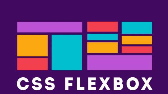
Creating Responsive Images with CSS Flexbox
Introduction to Responsive Design
Responsive design is an essential aspect of modern web development. It refers to the approach of designing and building websites to provide an optimal viewing and interaction experience across a wide range of devices and screen sizes, from large desktop monitors to small mobile phones. The primary goal of responsive design is to ensure that your website adapts seamlessly to different screen resolutions and orientations, allowing users to access your content without the need for excessive zooming or horizontal scrolling. This enhances user experience, improves accessibility, and can positively impact search engine rankings. Key principles of responsive design include: - Fluid Grid Layouts: Using relative units like percentages to create flexible grid systems that adjust to screen size. - Flexible Images: Scaling images proportionally to prevent distortion or overflow on smaller screens. - Media Queries: Employing CSS media queries to apply different styles and layouts based on the device's characteristics, such as screen width, height, or orientation. - Mobile-First Approach: Starting the design process with mobile devices in mind and progressively enhancing the design for larger screens. By embracing responsive design, you can reach a broader audience and ensure your website looks and functions well on various devices, ultimately improving user satisfaction and engagement.
Understanding the Issue: Image Alignment in Responsive Design
One of the common challenges in responsive web design is achieving consistent and pleasing image alignment as the screen size changes. In the scenario you've described, you have an image with a float: right property, and when you resize the page, the image remains on the right side of the content. However, you want it to move to the left as the screen size decreases.

The problem with using float: right for image alignment is that it's not inherently responsive. It positions the image to the right, but it doesn't adapt to different screen sizes effectively. This can lead to undesirable results, such as images overlapping text or becoming too small to see on small screens. Responsive design aims to resolve these issues by providing a flexible and adaptive layout that responds to the available screen space. To address image alignment in a responsive manner, we can use more modern CSS techniques like Flexbox, which allow for precise control over the positioning of elements without the need for explicit floats. In the upcoming sections, we will explore the benefits of using CSS Flexbox for image alignment and demonstrate how to make your images responsive while maintaining a visually pleasing layout across a variety of devices and screen sizes.
The Problem with Using Floats for Alignment
Floats have been a traditional method for aligning elements on webpages, including images. They were widely used in the past to make text wrap around images or to create multi-column layouts. However, using floats for alignment in responsive design presents several challenges:

- Lack of Predictability: Floats are not inherently responsive. When you float an element, it's removed from the normal flow of the document, which can lead to unpredictable behavior, especially on smaller screens or when the content changes. Images floated to the right, for example, tend to stay on the right side regardless of the available space, causing layout issues. - Clearing Floats: When you use floats, you often need to add clearing elements (e.g., clear: both;) to prevent subsequent content from flowing around the floated elements. This can result in extra markup and CSS, making the code less clean and maintainable. - Overlapping and Collapsing: Floats can cause elements to overlap or collapse in unexpected ways, especially when the screen size changes. This can lead to issues like text flowing underneath floated images or elements not aligning as intended. - Complexity and Fragility: Implementing complex layouts with floats can be challenging, and small changes to the content or styles may break the layout. This makes it harder to maintain and update your website over time. For these reasons, floats have become less suitable for creating responsive layouts. To address the challenges of image alignment in responsive design, it's advisable to explore more modern CSS techniques like Flexbox, which provide better control and flexibility while maintaining a responsive and predictable layout.
Introduction to CSS Flexbox
CSS Flexbox, short for "Flexible Box Layout," is a powerful layout model that provides a more efficient way to design complex web layouts with a high degree of control and flexibility. It was introduced to address the limitations and challenges associated with traditional methods like floats and positioning when creating responsive designs. Flexbox is designed to simplify the alignment and distribution of elements within a container, making it ideal for tasks like centering elements, creating equal-height columns, and achieving responsive image alignments. Key features and concepts of Flexbox include: - Container and Items: In Flexbox, you have a parent container and child items that you want to arrange. The container is often referred to as the "flex container," and the items are the "flex items." - Main Axis and Cross Axis: Flexbox operates along two axes, the main axis (usually horizontal) and the cross axis (usually vertical). You can control how items are arranged on both axes using Flexbox properties. - Flex Properties: CSS properties like display: flex;, justify-content, and align-items enable you to control the layout of items within the container, making it easy to center items or distribute them evenly. - Flexibility and Adaptability: One of the primary advantages of Flexbox is its inherent responsiveness. It adjusts the size and position of items based on the available space, making it an excellent choice for responsive web design. Throughout this tutorial, we will explore how to harness the power of Flexbox to create responsive and visually pleasing layouts, including addressing the issue of image alignment that you mentioned. By the end of this tutorial, you'll have a solid understanding of how Flexbox works and be equipped to use it in your web design projects to achieve modern and responsive layouts.
Applying Flexbox to Align Images Responsively
Step 1: Modifying the CSS for the Image Container CSSsection.QuemSou{ float: left; overflow-wrap: break-word; font-size: 1.3em; margin-top: 40px; margin-left: 5%; font-family: 'Century Gothic', sans-serif; } p#Quem_Sou{ line-height: 30px; } /* IMAGE */ div.divimgMAIN{ /* float: right; REMOVING FLOAT PROPERTY */ margin-top: 40px; margin-right: 10%; margin-bottom: 2%; display: flex; /* APPLYING FLEXBOX */ flex-direction: row; /* SETTING FLEX DIRECTION TO ROW */ justify-content: space-between; /* ADJUSTING ITEM SPACING */ align-items: center; /* ALIGNING ITEMS TO CENTER VERTICALLY */ } Step 2: Adjusting the Flexbox Properties for Responsive Behavior Now, to make the image responsive, you can adjust the flex properties to control the behavior of the image within the flex container. By fine-tuning the flex properties, you can ensure that the image adapts to different screen sizes while maintaining its alignment and proportions. In the upcoming section, we will integrate these changes into the provided HTML code to demonstrate how the modified CSS, combined with Flexbox properties, enables the image to align responsively and adapt to varying screen dimensions.
Implementing the Changes in the Provided HTML Code
Now, let's apply the changes to the HTML code to achieve responsive image alignment. We'll modify the 'divimgMAIN' class, remove the 'float: right' property, and add Flexbox properties for responsive alignment. Modifying the 'divimgMAIN' Class HTML In the HTML code, ensure that the 'divimgMAIN' class is applied to the container div that holds the image you want to align. This class will be used to apply the Flexbox properties for responsive alignment. Removing the 'float: right' Property CSSdiv.divimgMAIN{ /* float: right; REMOVING FLOAT PROPERTY */ margin-top: 40px; margin-right: 10%; margin-bottom: 2%; display: flex; /* APPLYING FLEXBOX */ flex-direction: row; /* SETTING FLEX DIRECTION TO ROW */ justify-content: space-between; /* ADJUSTING ITEM SPACING */ align-items: center; /* ALIGNING ITEMS TO CENTER VERTICALLY */ } As a responsive design strategy, remove the 'float: right' property from the 'divimgMAIN' class to allow the image to adapt to different screen sizes without being stuck to the right side. Adding Flexbox Properties for Responsive Alignment With the 'float: right' property removed, apply the following Flexbox properties to the 'divimgMAIN' class to achieve responsive image alignment: CSSdisplay: flex; /* APPLYING FLEXBOX */ flex-direction: row; /* SETTING FLEX DIRECTION TO ROW */ justify-content: space-between; /* ADJUSTING ITEM SPACING */ align-items: center; /* ALIGNING ITEMS TO CENTER VERTICALLY */ These Flexbox properties will help you create a layout where the image adjusts its position and spacing within the container to fit the available space while maintaining alignment with other content. With these modifications in place, you are well on your way to achieving responsive image alignment using CSS Flexbox. In the next section, we will test the changes to ensure that your design behaves as expected on various devices and screen sizes.
Testing the Changes and Responsive Behavior
After applying the Flexbox properties and making modifications to your HTML and CSS, it's crucial to test the design to ensure that it behaves as expected on various devices and screen sizes. Testing will help you confirm that the responsive image alignment is working effectively. Step 1: Resize the Browser Window Start by resizing the browser window to various dimensions, including both larger and smaller screen sizes. Observe how the image and text content within the 'divimgMAIN' container respond to changes in the available space. You should see the image adapting its position and spacing while maintaining alignment with the text. Step 2: Test on Different Devices For a more comprehensive test, view your web page on different devices, such as smartphones, tablets, and desktop computers. Ensure that the design remains visually appealing and functional across the entire spectrum of screen sizes. Step 3: Inspect for Anomalies Pay close attention to any anomalies or issues that may arise during testing. Check for any text overlapping the image, visual distortions, or unexpected behavior. If you encounter any problems, review your HTML and CSS code to identify and resolve the issues. By thoroughly testing your design, you can confirm that the changes you've made to achieve responsive image alignment are effective and that your web page looks and functions as intended on all devices. Responsive design aims to provide a seamless and optimal user experience, and testing is a critical step in achieving that goal. With successful testing and confirmation of responsive behavior, you can now confidently implement these techniques in your web design projects to create modern and adaptable layouts that cater to a wide range of devices and screen sizes.
Conclusion: Achieving Optimal Responsive Image Alignment
In this tutorial, we've explored the challenges of achieving responsive image alignment and the limitations of using traditional methods like 'floats.' We introduced the powerful CSS Flexbox layout model as a solution for creating responsive and visually pleasing designs. By following the steps outlined in this tutorial, you've learned how to: - Modify the CSS for the image container by adding Flexbox properties. - Remove the 'float: right' property to ensure that the image adapts to different screen sizes. - Apply Flexbox properties like 'display: flex,' 'flex-direction,' 'justify-content,' and 'align-items' to achieve responsive alignment. - Test the design on various devices and screen sizes to confirm its responsive behavior. By implementing these techniques, you've taken a significant step toward creating web designs that cater to a diverse audience using different devices. Responsive design not only enhances the user experience but also contributes to better accessibility, improved search engine ranking, and overall user satisfaction. As you continue to develop your web design skills, remember that responsive design is an ongoing process. Keep testing, refining, and adapting your designs to meet the ever-evolving landscape of web technologies and user expectations. With the knowledge gained from this tutorial, you can confidently create modern and responsive layouts that align images optimally across a wide range of devices, ensuring a seamless and engaging user experience. Thank you for joining us on this journey to achieve optimal responsive image alignment using CSS Flexbox. We hope you find this knowledge valuable in your web design endeavors.
Final Thoughts and Additional Resources
Congratulations on completing this tutorial on achieving optimal responsive image alignment using CSS Flexbox. You've gained valuable insights into creating web designs that adapt seamlessly to different devices and screen sizes. As you continue to explore the world of web development and design, here are some final thoughts and additional resources to guide you: Keep Learning and Experimenting Web design is a dynamic field, and there's always something new to learn. Stay curious and keep experimenting with different design techniques, layout models, and frameworks. The more you practice and explore, the more proficient you'll become in creating outstanding web experiences. Stay Updated with Web Standards Web standards and best practices evolve over time. Stay updated with the latest trends, technologies, and standards in web development. This will help you create designs that are not only responsive but also performant and accessible. Explore CSS Grid While Flexbox is excellent for certain layout tasks, you may also want to explore CSS Grid Layout, another powerful CSS layout system. CSS Grid can be especially useful for creating grid-based designs and complex layouts. Combining both Flexbox and CSS Grid in your projects can provide a comprehensive toolkit for handling various design challenges. Additional Resources Here are some additional resources to further enhance your web design skills: - MDN Web Docs: Flexbox - In-depth documentation and tutorials on CSS Flexbox. - MDN Web Docs: Grid Layout - Comprehensive guides on CSS Grid Layout. - A Complete Guide to Flexbox - A helpful resource by CSS-Tricks, offering a detailed guide to Flexbox. - Smashing Magazine - A valuable source for web design articles, tutorials, and best practices. Remember that web design is both an art and a science. It's a creative process that combines aesthetics with technical expertise. Keep exploring, learning, and pushing the boundaries of your skills to create remarkable web experiences that captivate and engage users. Thank you for choosing to expand your knowledge with us. We wish you all the best in your web design journey! Read the full article
0 notes