#css portrait
Explore tagged Tumblr posts
Visit Tumblr Blog
Explore Tumblr blogs with no restrictions, modern design and the best experience.
Last Seen Tumblr Blogs


Fun Fact
Total funding amounts to $125.3M.
Text


Disney's The Haunted Mansion | Ships on Fire at Night Changing Portrait (2003 Film Version)
Ships Aflame (or Ships on Fire at night), with Xanthus Russell Smith's depiction of C.S.S. Manassas & U.S.S. Hartford in New Orleans Harbor, a painting that was changed from Jean-François Hue's portrait of "View of Brest Harbor" (in French: "Vue de la rade de Brest, prise au bas de la batterie du château"), appears in the 2003 film version of Disney's The Haunted Mansion. That painting looks different than the "Flying Dutchman" painting from the ride.
#disney#the haunted mansion#the haunted mansion 2003#disney's the haunted mansion#movie#film#2003#2003 film#halloween#welcome foolish mortals#999 happy haunts#eddie murphy#changing portrait#ship on fire at night#ship on fire#css manassas & uss hartford in new orleans harbor#css pushing fire barge into uss hartford#xanthus russell smith#view of brest harbor#vue de la rade de brest prise au bas de la batterie du château#jean-françois hue
8 notes
·
View notes
Text
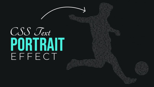
CSS text Portrait Effect
#css text portrait effect#css text effect#html and css#html css#codingflicks#code#learn to code#frontend#css#css3#html#frontenddevelopment
4 notes
·
View notes
Text
fun? update on my neocities i've been figuring out how to implement modals the way i want them which means a little pop-up post type thing ^ both for information about each individual piece that isn't utilising alt text (not what it's for) and also to separate the thumbnail image and modal's image to reduce loading time issues.
which means i've finally learnt css! initially i implemented the pop-ups solely using html but that doesn't work very well in the end ^^". significantly faster this way and different images simply use different class tags (? what is this called) to set them in correctly.
this whole thing has so much of me butting my head against little issues in the code and digging around for solutions (nightmare!) but it's a lot of fun. the modal itself needed adjusting the same way as the pop-up for it to sit in the centre of the viewport but that i sorted out first thankfully.
i still have to figure out how to get the images in the pop-up itself to sit centred and have them take into account the fact that none of the images are exactly the same which is... hopefully possible. it's also incredibly broken with any screen on portrait mode (or at least phones....) but there's not much i can do about that (for now?)
#gryph.txt#this might be the most amount of words i've written in a post bar like. one.#coding has turned into a fascinating interest of mine... using scraps of code and coding things entirely myself out here#fighting for my life trying to get things working the way i want#(ie. why the hell does neocities appear to ignore anything with right settings... why only left i don't want it there?)#coding is a nightmare but an incredibly fun nightmare#doing this with css was the best solution because it means i can use one card/pop-up and have tags for the img class to adjust those#which makes it faster because i only have to add the images text and whatever tag is needed (using portrait/landscape to indicate this)#whereas previously i had to manually adjust the entire card to get it to sit correctly at all. help#this took me like a month of going back and forth because. i coded it in toyhouse initially. decided there had to be a better way then used#cards instead. had to find script for neocities to actually display the cards correctly and open/close#implemented that. came back to it going hang on now i could do this is css like the modal so i don't have to adjust everything. set that up#Did Not Work especially on anything outside my laptop. went back through and fixed it all up to what it is now#< pretty much. probably missing things.#oh i have so much more to say but i won't
0 notes
Text

CSS Portrait Image Effect
#css portrait image effect#css effects#pure css effects#html css#codenewbies#frontenddevelopment#css#html5 css3#latest css effects#css tricks#html css tutorial#css filter
1 note
·
View note
Text
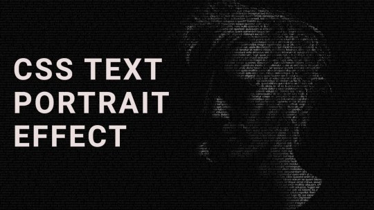
CSS Text Portrait Effects
#css text portrait effect#text portrait effect#css text effects#css tricks#html and css#html css#learn to code#code#frontenddevelopment#css#css3#html#divinector
1 note
·
View note
Text

Leonora is a UI template for use with the Sugarcube story format in Twine.
Inspired by an imaginary cathedral by the sea and the distorted, sacred devotions of a woman who was once a girl there.


Did this template need three stories for its demo? No, but here they are anyway: there's flash fiction, a petite novelette, and a branching interactive adventure to show off everything Leonora can do. All lovingly written, coded, and styled by hand.
Features:
Mannerism-inspired design
3 built-in themes (dark, light, sepia)
Customisable title screen
Matching settings & save menus
Optional built-in Character Profile
Annotated passage guide, CSS stylesheet, and Story Javascript for easy customisation
Responsive design for desktop, tablets, and mobile devices
Includes both portrait and landscape styling for small screens
Download + play the demo on itch:
#twine template#twine games#interactive fiction#indie game dev#writers on tumblr#writeblr#game assets#original fiction#short fiction#ok that's all my tag soup! i am very proud of these stories n the template i will not lie. all 32k words of em (only cried a little over js#i had a lot of fun making them and i learned a lot of cool new things >:3#project oblation#name reveal i suppose#jinx.exe#leonora template
363 notes
·
View notes
Text
Arknights fanfic community, i bring to you something new.

The Arknights Reader Ao3 Workskin
ever wanted to make a fake AK story? complete with backgrounds and character portraits? well now you can!
i spent an entire afternoon coding the css and html for this. i made it as... intuitive as possible.
here's the link to it! have fun:
327 notes
·
View notes
Text
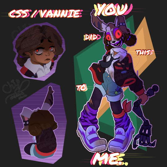
YOU DID THIS TO ME.
Little villain Cassie/Vannie/CSS design<3
Uses Mimics arm as a weapon, painted on the Vanny mask with any makeup she could find in the Glamrock Beauty Salon, used her sweater to patch herself up after the elevator crash, stole one of Roxys alt outfit jackets and socks, and is just a very silly and sad girl<33
Also CSS is supposed to be both like GGY and also the coding language
Unshaded under cut:
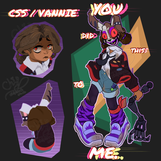
attempted replicating the cutout art style kinda from memory with the top left portrait A bit butchered but I'll do better next time<3
#my art#chipillustrates#Cassie fnaf#fnaf Cassie#fnaf Ruin Cassie#fnaf Vannie#fnaf Vanny#fnaf Vanny Cassie#fnaf RUIN Cassie#five nights at freddy's RUIN#five nights at freddy's#five nights at freddy's security breach#fnaf RUIN#fnaf RUIN Vannie#fnaf fanart#five nights at freddy's fanart#fnaf security breach RUIN#fnaf security breach#fnaf ruin vanny#fnaf security breach ruin#fnaf SB ruin#fnaf sb
575 notes
·
View notes
Text
PROGRESS

4 INSERT ILLUSTRATIONS left to refine, 16 PORTRAITS to line and color (not as bad as it sounds), ??? random scraps of UI artwork, like 5 tiny CSS/UI fixes, 1 bizarre issue with my scrollTo function, and 1 manual for me to rewrite.
WE ARE GETTING CLOSER!!
24 notes
·
View notes
Text
Captain Nemo, Freedom Fighter

There's a lot of historical and cultural significance in Twenty Thousand Leagues Under the Sea which is not widely known by modern audiences. Here some some facts I find very interesting:
-> In Verne’s original character notes, he was going to be a POLISH noble whose family was killed by Russians.
Verne’s publisher argued with him about that for a long time because of his large Russian fanbase. Verne reluctantly gave in, but eventually changed Nemo’s backstory to that of an Indian Prince whose family was killed by the British.
With that in mind, that makes the Soviet miniseries more interesting: A Polish revolutionary is actually mentioned by Captain Nemo in the second episode. Vladislav Dvorzhetsky, the actor portraying Nemo, was actually half-Polish himself!
-> Captain Nemo was written as a foil to Confederate Navy Captain Raphael Semmes.
Captain Raphael Semmes had portraits of General Robert E. Lee and the Confederate President Jefferson Davis on the cabin wall of the CSS Alabama, while Captain Nemo has portraits of Abraham Lincoln and the radical abolitionist John Brown in the cabin walls of the Nautilus.
Semmes was a supporter of slavery while Captain Nemo was an abolitionist.
Raphael Semmes stated that India should never be free from British rule, while Captain Nemo was an Indian who fought to be free from British rule.
A list of more comparisons between Jules Verne's "Twenty Thousand Leagues Under the Sea" and Raphael Semmes' "Memoirs of Service Afloat During the War Between the States" can be found on Wikipedia.
Thus, in Twenty Thousand Leagues Under the Sea, Jules Verne was trying to point fingers at the cruelty of the British towards India, the Russians towards the Polish, AND Americans towards people of color.
There are many fascinating rabbit trails to explore in regards to Jules Verne's literary masterpiece. Here are some sources:
#jules verne#20000 leagues under the sea#captain nemo#classic literature#twenty thousand leagues under the sea#tkluts#steampunk#french literature#history#literary history#Капитан Немо#Vladislav Dvorzhetsky#20kleaguesunderthefeed#20kluts#20k leagues#civil war#civil rights#european history
98 notes
·
View notes
Text
A Small Update
Word on the street is that dashingdon will be going away soon. Although this doesn't affect the most current demo of Ninelives, this does affect the old choicescript demo. Perhaps this doesn't need to be said, but, since I am building this game in Twine now instead of choicescript, I don't see the point in going through the steps to re-home the old demo. If you still want to read it for any reason, do so while you have the chance! Once dd is gone, the old version will no longer be accessible.
As for the state of Ninelives, I know it's been a very long time since anyone has seen anything new here. I've mentioned in a previous post that I have some lingering anxieties about this game and that's partially why I haven't had anything substantial to show for it in a long time.
But I've been doing some thinking lately, and I think part of my anxiety comes from the issue that I've been dealing with for a long time, and that's the fact that the game refuses to orient into portrait mode for mobile reading no matter what I seem to change.
I'm obviously missing a bit of code somewhere that's telling it to be in landscape mode. More to the point, it has become such a mountain out of an anthill kind of thing for me as I feel like I need to go with a different template entirely to solve this. This shouldn't be preventing me from working on the story, but somehow it does. (There are other anxieties too, but probably none as big as this one stupid thing.)
So that's my current plan: import Ninelives into a new template. This can be done on a basic level fairly easily, though it might take a bit longer to apply the same icons, backgrounds, and color schemes to whatever new template I decide to use. (As much as I would love to design my own template, I am simply not savvy enough with CSS to accomplish this without great difficulty.)
I'll try to keep you posted on my progress, but likely the next time you hear from me will be when the import is done.
Thanks to those who still follow me here despite how scarce I've been. And, remember, if you enjoy my writing, you can always find me on my other project, where I'm much more active.
23 notes
·
View notes
Text


I wanted to learn Twine and CSS so I wrote something simple and drew portraits to go along with it. I never got far into learning either, but I do still have the art, so inspect element mockup it is.
[June 17, 2020]
#fallen london#fallen london oc#raven advisor#fl: look to love always#I'm aware my art doesn't really look like fl art
57 notes
·
View notes
Text

Our task in web design class today was to create a "self portrait" out of CSS block elements.
11 notes
·
View notes
Text
Currently brainstorming several possible formats for isat fics…. it definitely will depend on the kind of fic I want methinks. So far I’ve got:
As close to game’s format as possible! So as much as possible in “text boxes” with stuff being either dialogue or siffrin’s narration. This does have a few limitations in trying to narrate certain things and I don’t have the portraits for expressions, but there are ways to work around that. plus, fun opportunities for css toys for visuals!
Similar to the second one, but with narration in between the “text boxes” for additional details / stuff siffrin might not narrate
Play transcript. Self explanatory.
And of course, just standard narration/prose! 2nd or 3rd person depending on mood.
i’m definitely going to be eyeing people’s formatting when I read through fics to see if they do anything cool with it hehehe
btw, if you know of any isat fics that do cool stuff with formatting, send them my way! I’m probably not reading fics right now, but it’ll be nice to have recs for when I do start! (Also I finished the game so dw about spoilers)
17 notes
·
View notes
Note
I know this is also going to sound dumb but when it comes to making game art what do you use or should I use code to draw it so to speak since its going be simple.
It depends on what you want and what you're envisioning. If you're going for icons and small graphics, there's a lot that can be accomplished with just CSS and an icon library like Font Awesome.
These icons were made with CSS; the map in background was made in Wonderdraft
If you want something more elaborate, you can make it yourself (Canva is a free option) or commission a graphic designer for design elements (this is what I did for the Wayfarer logo) or an artist if you want character portraits and cover art.
21 notes
·
View notes
Text
Made a little timeline showing where my fics fit into the canon Skibidi Toilet timeline. (If you've visited my website recently and this page looks like anus, do a hard refresh (Ctrl + F5 or something) to reload the stylesheet.)
Mostly I did this so I could play around with CSS grids. I love noodling around with HTML and CSS!
This looks best on a desktop, or at least on a mobile device in landscape mode; on a mobile phone screen in portrait alignment it'll go very long and skinny and look stupid. (You can still read it, I think; it just looks stupid.)
9 notes
·
View notes