#css text portrait effect
Explore tagged Tumblr posts
Visit Tumblr Blog
Explore Tumblr blogs with no restrictions, modern design and the best experience.
Last Seen Tumblr Blogs


Fun Fact
Tumblr is used by 21% of adults online aged 18-29 years.
Text
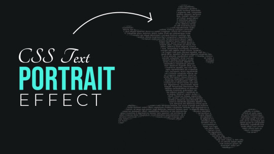
CSS text Portrait Effect
#css text portrait effect#css text effect#html and css#html css#codingflicks#code#learn to code#frontend#css#css3#html#frontenddevelopment
4 notes
·
View notes
Text

CSS Text Portrait Effects
#css text portrait effect#text portrait effect#css text effects#css tricks#html and css#html css#learn to code#code#frontenddevelopment#css#css3#html#divinector
1 note
·
View note
Text
In today's digitally driven world, users access information from a plethora of devices – desktops, laptops, tablets, smartphones, and even smartwatches. As a web designer, ensuring your website delivers an optimal experience across this vast landscape is no longer a nicety, it's a necessity. This is where responsive web design (RWD) comes in.

RWD is a design philosophy that prioritizes creating websites that adapt and adjust their layout based on the size and capabilities of the device being used. It's not about creating separate websites for each device, but rather a single website that can fluidly transform itself to fit any screen.
Why Responsive Web Design Matters
The dominance of mobile browsing makes RWD an essential strategy for several reasons:
Enhanced User Experience (UX): Imagine a website with text so tiny it's unreadable on a phone, or buttons too close together to tap accurately. Frustrated users are likely to abandon the site altogether. RWD ensures clear readability, easy navigation, and intuitive interaction regardless of the device.
Improved Search Engine Optimization (SEO): Search engines like Google prioritize mobile-friendly websites in their rankings. A responsive design helps your website rank higher in search results, leading to increased organic traffic.
Cost-Effectiveness: Maintaining separate websites for different devices can be a significant drain on resources. RWD eliminates this need, saving time, money, and ongoing maintenance efforts.
Brand Consistency: A responsive website ensures a consistent brand image across all devices. Users will experience the same look, feel, and message, regardless of how they access your website.
Core Principles of Responsive Web Design
Here's a breakdown of the key principles that underpin effective responsive web design:
Fluid Grid Layouts: Imagine a flexible grid system that can expand or contract to accommodate different screen sizes. This is the foundation of RWD. By using percentages instead of fixed pixels to define widths and margins, elements on your website can resize proportionally to fit the available space.
Flexible Images and Media: Images and videos are crucial website components, but they can become problematic on smaller screens. Responsive design utilizes techniques like flexible image containers and media queries (CSS code that dictates how styles change based on screen size) to ensure images resize or even swap out for smaller versions on mobile devices.
Media Queries: As mentioned earlier, media queries are the workhorses of RWD. They allow you to define specific styles for different screen sizes and orientations (portrait or landscape mode). For example, you can use a media query to adjust the number of columns in your grid layout for a tablet view or increase font size for better readability on a smartphone.
Responsive Navigation: Navigation menus on desktops often utilize horizontal layouts with multiple dropdown options. On mobile screens, such menus become cumbersome. RWD employs techniques like hamburger menus (three horizontal lines that reveal the navigation options when tapped) or responsive tabs that adapt to fit the smaller screen size while maintaining easy access to all navigation elements.
Building a Responsive Website
While RWD might seem complex, the process can be broken down into manageable steps:
Planning and Defining Breakpoints: Identify the key screen sizes your website needs to cater to – desktops, tablets, and mobiles might be the basic starting point. These are your breakpoints, where the layout of your website will adapt.
Fluid Grid System: Establish a flexible grid system using CSS that can adjust to different screen sizes. Frameworks like Bootstrap can be helpful in simplifying this process.
Responsive Media: Ensure your images and videos are optimized for responsiveness. Use tools that allow for different image sizes to be served based on the device.
Media Queries: Implement media queries to define how styles change at each breakpoint. Start with basic adjustments for font sizes, image sizes, and layout modifications before diving into more complex interactions.
Testing and Refinement: Test your website rigorously across different devices and screen sizes. Emulators and browser developer tools can be invaluable in this phase. Refine your design based on the testing results to ensure a seamless experience on all devices.
Beyond the Basics: Advanced Responsive Design Techniques
As you gain experience with RWD, you can explore more advanced techniques:
Responsive Typography: Use relative font sizes (ems) that adjust based on the parent element's size, ensuring optimal readability across devices.
Progressive Enhancement: Start with a basic website that functions well on all devices and then progressively enhance the user experience with additional features for larger screens.
Responsive Forms: Ensure forms are easy to fill on mobile devices by using appropriate input types and larger touch targets for buttons.
0 notes
Text
Author Template
New Post has been published on https://www.aneddoticamagazine.com/tdb_templates/author-template/
Author Template
/* custom css - generated by TagDiv Composer */ /* custom css - generated by TagDiv Composer */ /* custom css - generated by TagDiv Composer */ .tdi_87_ad5 min-height: 0;
/* custom css - generated by TagDiv Composer */ /* custom css - generated by TagDiv Composer */ /* custom css - generated by TagDiv Composer */ .tdi_89_ea5, .tdi_89_ea5 .tdc-columns min-height: 0; .tdi_89_ea5, .tdi_89_ea5 .tdc-columns display: block; .tdi_89_ea5 .tdc-columns width: 100%; @media (min-width: 768px) .tdi_89_ea5 margin-left: -40px; margin-right: -40px; .tdi_89_ea5 .tdc-row-video-background-error, .tdi_89_ea5 > .vc_column, .tdi_89_ea5 > .tdc-columns > .vc_column padding-left: 40px; padding-right: 40px; /* landscape */ @media (min-width: 1019px) and (max-width: 1140px) /* custom css - generated by TagDiv Composer */ @media (min-width: 768px) .tdi_89_ea5 margin-left: -30px; margin-right: -30px; .tdi_89_ea5 .tdc-row-video-background-error, .tdi_89_ea5 > .vc_column, .tdi_89_ea5 > .tdc-columns > .vc_column padding-left: 30px; padding-right: 30px; /* portrait */ @media (min-width: 768px) and (max-width: 1018px) /* custom css - generated by TagDiv Composer */ @media (min-width: 768px) .tdi_89_ea5 margin-left: -15px; margin-right: -15px; .tdi_89_ea5 .tdc-row-video-background-error, .tdi_89_ea5 > .vc_column, .tdi_89_ea5 > .tdc-columns > .vc_column padding-left: 15px; padding-right: 15px; /* inline tdc_css att - generated by TagDiv Composer */ .tdi_89_ea5 margin-bottom:50px !important; .tdi_89_ea5 .td_block_wrap text-align:left /* landscape */ @media (min-width: 1019px) and (max-width: 1140px) .tdi_89_ea5 margin-bottom:40px !important; /* portrait */ @media (min-width: 768px) and (max-width: 1018px) .tdi_89_ea5 margin-bottom:30px !important; /* phone */ @media (max-width: 767px) .tdi_89_ea5 margin-bottom:35px !important;
/* custom css - generated by TagDiv Composer */ /* custom css - generated by TagDiv Composer */ /* custom css - generated by TagDiv Composer */ .tdi_91_8e0 vertical-align: baseline; .tdi_91_8e0 > .wpb_wrapper, .tdi_91_8e0 > .wpb_wrapper > .tdc-elements display: block; .tdi_91_8e0 > .wpb_wrapper > .tdc-elements width: 100%; .tdi_91_8e0 > .wpb_wrapper > .vc_row_inner width: auto; .tdi_91_8e0 > .wpb_wrapper width: auto; height: auto; /* inline tdc_css att - generated by TagDiv Composer */ .tdi_91_8e0 padding-right:0px !important; width:20% !important; /* phone */ @media (max-width: 767px) .tdi_91_8e0 margin-bottom:20px !important; width:100% !important;
/* custom css - generated by TagDiv Composer */ /* custom css - generated by TagDiv Composer */ .tdi_92_0dc .tdb-author-img width: 100%; .tdi_92_0dc .tdb-author-img padding-bottom: 100%; background-position: center 50%; .td-theme-wrap .tdi_92_0dc text-align: left; .tdi_92_0dc .tdb-author-effect position: absolute; top: 0; left: 0; width: 100%; height: 100%; background: -webkit-linear-gradient(0deg,#000000,#000000 9%,rgba(0,0,0,0.15) 65%,rgba(0,0,0,0.15));background: linear-gradient(0deg,#000000,#000000 9%,rgba(0,0,0,0.15) 65%,rgba(0,0,0,0.15)); z-index: 1; .tdi_92_0dc:hover .tdb-author-img:before opacity: 0; /* landscape */ @media (min-width: 1019px) and (max-width: 1140px) /* custom css - generated by TagDiv Composer */ /* portrait */ @media (min-width: 768px) and (max-width: 1018px) /* custom css - generated by TagDiv Composer */ /* phone */ @media (max-width: 767px) /* custom css - generated by TagDiv Composer */ .tdi_92_0dc .tdb-author-img padding-bottom: 65%;
/* custom css - generated by TagDiv Composer */ /* custom css - generated by TagDiv Composer */ /* custom css - generated by TagDiv Composer */ .tdi_94_85f position: absolute !important; top: 0; z-index: 1; .tdi_94_85f top: auto; bottom: 0; .tdi_94_85f, .tdi_94_85f .tdc-inner-columns display: block; .tdi_94_85f .tdc-inner-columns width: 100%; /* inline tdc_css att - generated by TagDiv Composer */ /* portrait */ @media (min-width: 768px) and (max-width: 1018px) .tdi_94_85f width:calc(100% + ( 14px * 2 ) ) !important;
/* custom css - generated by TagDiv Composer */ /* custom css - generated by TagDiv Composer */ /* custom css - generated by TagDiv Composer */ .tdi_96_6d9 vertical-align: baseline; .tdi_96_6d9 .vc_column-inner > .wpb_wrapper, .tdi_96_6d9 .vc_column-inner > .wpb_wrapper .tdc-elements display: block; .tdi_96_6d9 .vc_column-inner > .wpb_wrapper .tdc-elements width: 100%;
/* custom css - generated by TagDiv Composer */ /* custom css - generated by TagDiv Composer */ .tdi_97_688 .tdb-social-item display: inline-block; .tdi_97_688 .tdb-social-item i font-size: 16px; vertical-align: middle; min-width: 19.2px; height: 19.2px; line-height: 19.2px; color: rgba(255,163,1,0.7); .tdi_97_688 .tdb-social-item i.td-icon-twitter, .tdi_97_688 .tdb-social-item i.td-icon-linkedin, .tdi_97_688 .tdb-social-item i.td-icon-pinterest, .tdi_97_688 .tdb-social-item i.td-icon-blogger, .tdi_97_688 .tdb-social-item i.td-icon-vimeo font-size: 12.8px; .tdi_97_688 .tdb-social-item margin: calc(14px / 2) 14px 0 0; .tdi_97_688 .tdb-social-item:last-child margin-bottom: calc(14px / 2); .tdi_97_688 .tdb-social-item .tdb-social-text display: none; margin-left: 7px; .td-theme-wrap .tdi_97_688 text-align: center; .tdi_97_688 .tdb-social-item:hover i color: #ffa301; /* landscape */ @media (min-width: 1019px) and (max-width: 1140px) /* custom css - generated by TagDiv Composer */ .tdi_97_688 .tdb-social-item i font-size: 15px; vertical-align: middle; .tdi_97_688 .tdb-social-item i.td-icon-twitter, .tdi_97_688 .tdb-social-item i.td-icon-linkedin, .tdi_97_688 .tdb-social-item i.td-icon-pinterest, .tdi_97_688 .tdb-social-item i.td-icon-blogger, .tdi_97_688 .tdb-social-item i.td-icon-vimeo font-size: 12px; .tdi_97_688 .tdb-social-item i min-width: 18px; height: 18px; line-height: 18px; /* portrait */ @media (min-width: 768px) and (max-width: 1018px) /* custom css - generated by TagDiv Composer */ .tdi_97_688 .tdb-social-item i font-size: 14px; vertical-align: middle; .tdi_97_688 .tdb-social-item i.td-icon-twitter, .tdi_97_688 .tdb-social-item i.td-icon-linkedin, .tdi_97_688 .tdb-social-item i.td-icon-pinterest, .tdi_97_688 .tdb-social-item i.td-icon-blogger, .tdi_97_688 .tdb-social-item i.td-icon-vimeo font-size: 11.2px; .tdi_97_688 .tdb-social-item i min-width: 15.4px; height: 15.4px; line-height: 15.4px;
twitterpinterestfacebookyoutube
/* custom css - generated by TagDiv Composer */ /* custom css - generated by TagDiv Composer */ /* custom css - generated by TagDiv Composer */ .tdi_99_40d vertical-align: baseline; .tdi_99_40d > .wpb_wrapper, .tdi_99_40d > .wpb_wrapper > .tdc-elements display: block; .tdi_99_40d > .wpb_wrapper > .tdc-elements width: 100%; .tdi_99_40d > .wpb_wrapper > .vc_row_inner width: auto; .tdi_99_40d > .wpb_wrapper width: auto; height: auto; /* inline tdc_css att - generated by TagDiv Composer */ .tdi_99_40d width:46.66666667% !important; /* phone */ @media (max-width: 767px) .tdi_99_40d width:100% !important;
/* inline tdc_css att - generated by TagDiv Composer */ .tdi_100_d84 margin-bottom:0px !important; /* custom css - generated by TagDiv Composer */ /* custom css - generated by TagDiv Composer */ .tdi_100_d84 .tdb-title-text color: #ffffff; .tdi_100_d84 .tdb-title-line:after height: 2px; bottom: 40%; .tdi_100_d84 .tdb-title-line height: 50px; .td-theme-wrap .tdi_100_d84 text-align: left; .tdi_100_d84 .tdb-first-letter left: -0.36em; right: auto; .tdi_100_d84 .tdb-title-text font-family:Heebo !important;font-size:37px !important;line-height:1.43 !important;font-weight:500 !important; /* landscape */ @media (min-width: 1019px) and (max-width: 1140px) /* custom css - generated by TagDiv Composer */ .tdi_100_d84 .tdb-title-text font-size:33px !important; /* portrait */ @media (min-width: 768px) and (max-width: 1018px) /* custom css - generated by TagDiv Composer */ .tdi_100_d84 .tdb-title-text font-size:32px !important; /* phone */ @media (max-width: 767px) /* custom css - generated by TagDiv Composer */ .tdi_100_d84 .tdb-title-text font-size:28px !important;line-height:1.35 !important;
Sample Page Title
/* inline tdc_css att - generated by TagDiv Composer */ .tdi_101_8d7 margin-top:10px !important; margin-bottom:0px !important; /* portrait */ @media (min-width: 768px) and (max-width: 1018px) .tdi_101_8d7 margin-top:8px !important; /* phone */ @media (max-width: 767px) .tdi_101_8d7 margin-top:8px !important; /* custom css - generated by TagDiv Composer */ /* custom css - generated by TagDiv Composer */ .td-theme-wrap .tdi_101_8d7 text-align: left; .tdi_101_8d7 .tdb-author-descr color: #aaaaaa; font-family:Heebo !important;font-size:14px !important;line-height:1.5 !important;font-style:italic !important; /* landscape */ @media (min-width: 1019px) and (max-width: 1140px) /* custom css - generated by TagDiv Composer */ .tdi_101_8d7 .tdb-author-descr font-size:13px !important; /* portrait */ @media (min-width: 768px) and (max-width: 1018px) /* custom css - generated by TagDiv Composer */ .tdi_101_8d7 .tdb-author-descr font-size:13px !important; /* phone */ @media (max-width: 767px) /* custom css - generated by TagDiv Composer */ .tdi_101_8d7 .tdb-author-descr font-size:13px !important;
Sample author description
/* custom css - generated by TagDiv Composer */ /* custom css - generated by TagDiv Composer */ /* custom css - generated by TagDiv Composer */ .tdi_103_802 position: relative !important; top: 0; transform: none; -webkit-transform: none; .tdi_103_802, .tdi_103_802 .tdc-inner-columns display: block; .tdi_103_802 .tdc-inner-columns width: 100%; @media (min-width: 767px) .tdi_103_802.tdc-row-content-vert-center, .tdi_103_802.tdc-row-content-vert-center .tdc-inner-columns display: flex; align-items: center; flex: 1; .tdi_103_802.tdc-row-content-vert-bottom, .tdi_103_802.tdc-row-content-vert-bottom .tdc-inner-columns display: flex; align-items: flex-end; flex: 1; .tdi_103_802.tdc-row-content-vert-center .td_block_wrap vertical-align: middle; .tdi_103_802.tdc-row-content-vert-bottom .td_block_wrap vertical-align: bottom; /* inline tdc_css att - generated by TagDiv Composer */ .tdi_103_802 margin-top:22px !important; .tdi_103_802 .td_block_wrap text-align:left /* landscape */ @media (min-width: 1019px) and (max-width: 1140px) .tdi_103_802 margin-top:17px !important; /* portrait */ @media (min-width: 768px) and (max-width: 1018px) .tdi_103_802 margin-top:15px !important; /* phone */ @media (max-width: 767px) .tdi_103_802 margin-top:15px !important; width:100% !important;
/* custom css - generated by TagDiv Composer */ /* custom css - generated by TagDiv Composer */ /* custom css - generated by TagDiv Composer */ .tdi_105_508 vertical-align: baseline; .tdi_105_508 .vc_column-inner > .wpb_wrapper, .tdi_105_508 .vc_column-inner > .wpb_wrapper .tdc-elements display: block; .tdi_105_508 .vc_column-inner > .wpb_wrapper .tdc-elements width: 100%;
/* inline tdc_css att - generated by TagDiv Composer */ .tdi_106_65b margin-right:17px !important; margin-bottom:0px !important; /* landscape */ @media (min-width: 1019px) and (max-width: 1140px) .tdi_106_65b margin-right:15px !important; /* portrait */ @media (min-width: 768px) and (max-width: 1018px) .tdi_106_65b margin-right:15px !important; /* phone */ @media (max-width: 767px) .tdi_106_65b margin-right:15px !important; /* custom css - generated by TagDiv Composer */ /* custom css - generated by TagDiv Composer */ .tdi_106_65b display: inline-block; .td-theme-wrap .tdi_106_65b text-align: left; .tdi_106_65b .tdb-author-count color: #230e00; background-color: rgba(255,163,1,0.7); padding: 4px 6px; font-size:12px !important;font-weight:700 !important; /* landscape */ @media (min-width: 1019px) and (max-width: 1140px) /* custom css - generated by TagDiv Composer */ .tdi_106_65b .tdb-author-count padding: 4px 6px 3px; .tdi_106_65b .tdb-author-count font-size:11px !important; /* portrait */ @media (min-width: 768px) and (max-width: 1018px) /* custom css - generated by TagDiv Composer */ .tdi_106_65b .tdb-author-count padding: 4px 6px 3px; .tdi_106_65b .tdb-author-count font-size:11px !important; /* phone */ @media (max-width: 767px) /* custom css - generated by TagDiv Composer */ .tdi_106_65b .tdb-author-count padding: 4px 6px 3px; .tdi_106_65b .tdb-author-count font-size:11px !important;
1387 Posts
/* inline tdc_css att - generated by TagDiv Composer */ .tdi_107_88e margin-bottom:0px !important; /* custom css - generated by TagDiv Composer */ /* custom css - generated by TagDiv Composer */ .tdi_107_88e display: inline-block; .td-theme-wrap .tdi_107_88e text-align: left; .tdi_107_88e .tdb-author-url color: #aaaaaa; font-family:Heebo !important;font-size:12px !important;line-height:1 !important;font-style:normal !important;font-weight:500 !important; .tdi_107_88e .tdb-author-url:hover color: #ffa301; /* landscape */ @media (min-width: 1019px) and (max-width: 1140px) /* custom css - generated by TagDiv Composer */ .tdi_107_88e .tdb-author-url font-size:11px !important; /* portrait */ @media (min-width: 768px) and (max-width: 1018px) /* custom css - generated by TagDiv Composer */ .tdi_107_88e .tdb-author-url font-size:11px !important; /* phone */ @media (max-width: 767px) /* custom css - generated by TagDiv Composer */ .tdi_107_88e .tdb-author-url font-size:11px !important;
www.sample-website.com
/* custom css - generated by TagDiv Composer */ /* custom css - generated by TagDiv Composer */ /* custom css - generated by TagDiv Composer */ .tdi_109_a94 vertical-align: baseline; .tdi_109_a94 > .wpb_wrapper, .tdi_109_a94 > .wpb_wrapper > .tdc-elements display: block; .tdi_109_a94 > .wpb_wrapper > .tdc-elements width: 100%; .tdi_109_a94 > .wpb_wrapper > .vc_row_inner width: auto; .tdi_109_a94 > .wpb_wrapper width: auto; height: auto; /* inline tdc_css att - generated by TagDiv Composer */ .tdi_109_a94 width:33.33333333% !important; /* phone */ @media (max-width: 767px) .tdi_109_a94 width:100% !important; display:none !important;
/* custom css - generated by TagDiv Composer */ /* custom css - generated by TagDiv Composer */ /* custom css - generated by TagDiv Composer */ .tdi_111_896, .tdi_111_896 .tdc-columns min-height: 0; .tdi_111_896, .tdi_111_896 .tdc-columns display: block; .tdi_111_896 .tdc-columns width: 100%; @media (min-width: 768px) .tdi_111_896 margin-left: -40px; margin-right: -40px; .tdi_111_896 .tdc-row-video-background-error, .tdi_111_896 > .vc_column, .tdi_111_896 > .tdc-columns > .vc_column padding-left: 40px; padding-right: 40px; /* landscape */ @media (min-width: 1019px) and (max-width: 1140px) /* custom css - generated by TagDiv Composer */ @media (min-width: 768px) .tdi_111_896 margin-left: -30px; margin-right: -30px; .tdi_111_896 .tdc-row-video-background-error, .tdi_111_896 > .vc_column, .tdi_111_896 > .tdc-columns > .vc_column padding-left: 30px; padding-right: 30px; /* portrait */ @media (min-width: 768px) and (max-width: 1018px) /* custom css - generated by TagDiv Composer */ @media (min-width: 768px) .tdi_111_896 margin-left: -15px; margin-right: -15px; .tdi_111_896 .tdc-row-video-background-error, .tdi_111_896 > .vc_column, .tdi_111_896 > .tdc-columns > .vc_column padding-left: 15px; padding-right: 15px;
/* custom css - generated by TagDiv Composer */ /* custom css - generated by TagDiv Composer */ /* custom css - generated by TagDiv Composer */ .tdi_113_060 vertical-align: baseline; .tdi_113_060 > .wpb_wrapper, .tdi_113_060 > .wpb_wrapper > .tdc-elements display: block; .tdi_113_060 > .wpb_wrapper > .tdc-elements width: 100%; .tdi_113_060 > .wpb_wrapper > .vc_row_inner width: auto; .tdi_113_060 > .wpb_wrapper width: auto; height: auto; /* inline tdc_css att - generated by TagDiv Composer */ /* phone */ @media (max-width: 767px) .tdi_113_060 margin-bottom:55px !important;
/* inline tdc_css att - generated by TagDiv Composer */ .tdi_114_277 margin-bottom:0px !important; /* custom css - generated by TagDiv Composer */ /* custom css - generated by TagDiv Composer */ .tdi_114_277 .entry-thumb background-position: center 50%; .tdi_114_277 .td-image-wrap padding-bottom: 42%; .tdi_114_277 .td-module-container flex-direction: column; border-color: #eaeaea; .tdi_114_277 .td-image-container display: block; order: 0; .ie10 .tdi_114_277 .td-module-meta-info, .ie11 .tdi_114_277 .td-module-meta-info flex: auto; .tdi_114_277 .td-module-meta-info padding: 23px 0 0 0; border-color: #eaeaea; body .tdi_114_277 .td-favorite font-size: 36px; box-shadow: 1px 1px 4px 0px rgba(0, 0, 0, 0.2); .tdi_114_277 .td_module_wrap:not(.tdb_module_rec) width: 50%; .tdi_114_277 .tdb_module_rec width: 100%; .tdi_114_277 .td_module_wrap padding-left: 20px; padding-right: 20px; .tdi_114_277 .tdb-block-inner margin-left: -20px; margin-right: -20px; row-gap: calc(25px * 2); .tdi_114_277 .td-module-container:before bottom: -25px; border-color: #eaeaea; .tdi_114_277 .td_module_wrap:nth-last-child(-n+2) .td-module-container:before display: none; .tdi_114_277 .td-post-vid-time display: block; .tdi_114_277 .td-post-category margin: -1px 10px 0 0; padding: 3px 5px 4px; background-color: rgba(255,163,1,0.7); color: #230e00; font-size:11px !important;font-weight:700 !important; .tdi_114_277 .td-post-category:not(.td-post-extra-category) display: inline-block; .tdi_114_277 .tdb-author-photo .avatar width: 20px; height: 20px; margin-right: 6px; border-radius: 50%; .tdi_114_277 .td-excerpt display: none; column-count: 1; column-gap: 48px; .tdi_114_277 .td-audio-player opacity: 1; visibility: visible; height: auto; font-size: 13px; .tdi_114_277 .td-read-more display: none; .tdi_114_277 .td-author-date display: inline; .tdi_114_277 .td-post-author-name display: none; .tdi_114_277 .td-post-date, .tdi_114_277 .td-post-author-name span display: inline-block; .tdi_114_277 .entry-review-stars display: inline-block; .tdi_114_277 .td-icon-star, .tdi_114_277 .td-icon-star-empty, .tdi_114_277 .td-icon-star-half font-size: 15px; .tdi_114_277 .td-module-comments display: none; .tdi_114_277 .td-post-category:hover background-color: #ffa301; .tdi_114_277 .td-module-title a color: #ffffff; .tdi_114_277 .td_module_wrap:hover .td-module-title a color: #ffa301; .tdi_114_277.td_with_ajax_pagination .td-next-prev-wrap, .tdi_114_277 .page-nav, .tdi_114_277 .td-load-more-wrap margin-top: 55px; .tdi_114_277.td_with_ajax_pagination .td-next-prev-wrap a, .tdi_114_277 .page-nav a, .tdi_114_277 .page-nav .current, .tdi_114_277 .page-nav .extend, .tdi_114_277 .page-nav .pages, .tdi_114_277 .td-load-more-wrap a padding: 6px 13px; .tdi_114_277 .page-nav .pages padding-right: 0; .tdi_114_277.td_with_ajax_pagination .td-next-prev-wrap a, .tdi_114_277 .page-nav a, .tdi_114_277 .td-load-more-wrap a color: #888888; background-color: rgba(0,0,0,0); border-color: #444444; .tdi_114_277 .td-load-more-wrap a .td-load-more-icon-svg svg, .tdi_114_277 .td-load-more-wrap a .td-load-more-icon-svg svg *, .tdi_114_277.td_with_ajax_pagination .td-next-prev-wrap .td-next-prev-icon-svg svg, .tdi_114_277.td_with_ajax_pagination .td-next-prev-wrap .td-next-prev-icon-svg svg *, .tdi_114_277 .page-nav .page-nav-icon-svg svg , .tdi_114_277 .page-nav .page-nav-icon-svg svg * fill: #888888; .tdi_114_277 .page-nav .current color: #ffa301; background-color: rgba(136,136,136,0); border-color: rgba(255,163,1,0.7); .tdi_114_277.td_with_ajax_pagination .td-next-prev-wrap a:hover, .tdi_114_277 .page-nav a:hover, .tdi_114_277 .td-load-more-wrap a:hover color: #ffa301; background-color: rgba(136,136,136,0); border-color: rgba(255,163,1,0.7); .tdi_114_277 .td-load-more-wrap a .td-load-more-icon-svg svg, .tdi_114_277 .td-load-more-wrap a .td-load-more-icon-svg svg *, .tdi_114_277.td_with_ajax_pagination .td-next-prev-wrap a:hover .td-next-prev-icon-svg svg, .tdi_114_277.td_with_ajax_pagination .td-next-prev-wrap a:hover .td-next-prev-icon-svg svg *, .tdi_114_277 .page-nav a:hover .page-nav-icon-svg svg , .tdi_114_277 .page-nav a:hover .page-nav-icon-svg svg * fill: #ffa301; .tdi_114_277 .entry-title margin: 0 0 16px; font-family:Heebo !important;font-size:22px !important;line-height:1.3 !important;font-weight:500 !important; .tdi_114_277.td_with_ajax_pagination .td-next-prev-wrap a i, .tdi_114_277 .page-nav a, .tdi_114_277 .page-nav span, .tdi_114_277 .td-load-more-wrap a font-family:Heebo !important;font-size:13px !important;font-weight:500 !important; .tdi_114_277 .td-author-date, .tdi_114_277 .tdb-author-photo, .tdi_114_277 .td-post-author-name a, .tdi_114_277 .td-author-date .entry-date, .tdi_114_277 .td-module-comments a font-size:11px !important;font-weight:700 !important; html:not([class*='ie']) .tdi_114_277 .td-module-container:hover .entry-thumb:before opacity: 0; /* landscape */ @media (min-width: 1019px) and (max-width: 1140px) /* custom css - generated by TagDiv Composer */ .tdi_114_277 .td-module-meta-info padding: 20px 0 0 0; .tdi_114_277 .td_module_wrap padding-left: 15px; padding-right: 15px; .tdi_114_277 .tdb-block-inner margin-left: -15px; margin-right: -15px; row-gap: calc(20px * 2); .tdi_114_277 .td-module-container:before bottom: -20px; .tdi_114_277.td_with_ajax_pagination .td-next-prev-wrap, .tdi_114_277 .page-nav, .tdi_114_277 .td-load-more-wrap margin-top: 45px; .tdi_114_277.td_with_ajax_pagination .td-next-prev-wrap a, .tdi_114_277 .page-nav a, .tdi_114_277 .page-nav .current, .tdi_114_277 .page-nav .extend, .tdi_114_277 .page-nav .pages, .tdi_114_277 .td-load-more-wrap a padding: 5px 12px; .tdi_114_277 .page-nav .pages padding-right: 0; .tdi_114_277 .entry-title margin: 0 0 14px; font-size:20px !important; .tdi_114_277.td_with_ajax_pagination .td-next-prev-wrap a i, .tdi_114_277 .page-nav a, .tdi_114_277 .page-nav span, .tdi_114_277 .td-load-more-wrap a font-size:12px !important; /* portrait */ @media (min-width: 768px) and (max-width: 1018px) /* custom css - generated by TagDiv Composer */ .tdi_114_277 .td-module-meta-info padding: 18px 0 0; .tdi_114_277 .td_module_wrap padding-left: 10px; padding-right: 10px; .tdi_114_277 .tdb-block-inner margin-left: -10px; margin-right: -10px; row-gap: calc(15px * 2); .tdi_114_277 .td-module-container:before bottom: -15px; .tdi_114_277 .td-post-category margin: -1px 8px 0 0; font-size:10px !important; .tdi_114_277.td_with_ajax_pagination .td-next-prev-wrap, .tdi_114_277 .page-nav, .tdi_114_277 .td-load-more-wrap margin-top: 35px; .tdi_114_277.td_with_ajax_pagination .td-next-prev-wrap a, .tdi_114_277 .page-nav a, .tdi_114_277 .page-nav .current, .tdi_114_277 .page-nav .extend, .tdi_114_277 .page-nav .pages, .tdi_114_277 .td-load-more-wrap a padding: 5px 12px; .tdi_114_277 .page-nav .pages padding-right: 0; .tdi_114_277 .entry-title margin: 0 0 15px; font-size:18px !important; .tdi_114_277.td_with_ajax_pagination .td-next-prev-wrap a i, .tdi_114_277 .page-nav a, .tdi_114_277 .page-nav span, .tdi_114_277 .td-load-more-wrap a font-size:12px !important; .tdi_114_277 .td-author-date, .tdi_114_277 .tdb-author-photo, .tdi_114_277 .td-post-author-name a, .tdi_114_277 .td-author-date .entry-date, .tdi_114_277 .td-module-comments a font-size:10px !important; /* phone */ @media (max-width: 767px) /* custom css - generated by TagDiv Composer */ .tdi_114_277 .td-image-wrap padding-bottom: 55%; .tdi_114_277 .td-module-meta-info padding: 18px 0 0 0; .tdi_114_277 .td_module_wrap:not(.tdb_module_rec) width: 100%; .tdi_114_277 .tdb-block-inner row-gap: calc(21px * 2); .tdi_114_277 .td-module-container:before bottom: -21px; .tdi_114_277 .td_module_wrap:nth-last-child(1) .td-module-container:before display: none; .tdi_114_277 .td-post-category margin: -2px 10px 0 0; .tdi_114_277.td_with_ajax_pagination .td-next-prev-wrap, .tdi_114_277 .page-nav, .tdi_114_277 .td-load-more-wrap margin-top: 35px; .tdi_114_277.td_with_ajax_pagination .td-next-prev-wrap a, .tdi_114_277 .page-nav a, .tdi_114_277 .page-nav .current, .tdi_114_277 .page-nav .extend, .tdi_114_277 .page-nav .pages, .tdi_114_277 .td-load-more-wrap a padding: 5px 12px; .tdi_114_277 .page-nav .pages padding-right: 0; .tdi_114_277 .entry-title margin: 0 0 14px; font-size:21px !important; .tdi_114_277.td_with_ajax_pagination .td-next-prev-wrap a i, .tdi_114_277 .page-nav a, .tdi_114_277 .page-nav span, .tdi_114_277 .td-load-more-wrap a font-size:12px !important; var block_tdi_114_277 = new tdBlock(); block_tdi_114_277.id = "tdi_114_277"; block_tdi_114_277.atts = '"modules_on_row":"eyJhbGwiOiI1MCUiLCJwb3J0cmFpdCI6IjUwJSIsInBob25lIjoiMTAwJSJ9","limit":"12","hide_audio":"yes","art_title":"eyJhbGwiOiIwIDAgMTZweCIsInBob25lIjoiMCAwIDE0cHgiLCJsYW5kc2NhcGUiOiIwIDAgMTRweCIsInBvcnRyYWl0IjoiMCAwIDE1cHgifQ==","f_title_font_family":"820","f_title_font_size":"eyJhbGwiOiIyMiIsImxhbmRzY2FwZSI6IjIwIiwicGhvbmUiOiIyMSIsInBvcnRyYWl0IjoiMTgifQ==","f_title_font_line_height":"1.3","f_title_font_weight":"500","title_txt":"#ffffff","title_txt_hover":"#ffa301","f_meta_font_family":"","f_meta_font_size":"eyJhbGwiOiIxMSIsInBvcnRyYWl0IjoiMTAiLCJwaG9uZSI6IjExIn0=","f_meta_font_weight":"700","modules_category_margin":"eyJhbGwiOiItMXB4IDEwcHggMCAwIiwicGhvbmUiOiItMnB4IDEwcHggMCAwIiwicG9ydHJhaXQiOiItMXB4IDhweCAwIDAifQ==","modules_category_padding":"3px 5px 4px","f_cat_font_family":"","f_cat_font_size":"eyJhbGwiOiIxMSIsInBvcnRyYWl0IjoiMTAiLCJwaG9uZSI6IjExIn0=","f_cat_font_weight":"700","cat_bg":"rgba(255,163,1,0.7)","cat_bg_hover":"#ffa301","cat_txt":"#230e00","show_author":"none","show_com":"none","show_btn":"none","all_modules_space":"eyJhbGwiOiI1MCIsImxhbmRzY2FwZSI6IjQwIiwicG9ydHJhaXQiOiIzMCIsInBob25lIjoiNDIifQ==","show_excerpt":"none","meta_padding":"eyJhbGwiOiIyM3B4IDAgMCAwIiwicGhvbmUiOiIxOHB4IDAgMCAwIiwibGFuZHNjYXBlIjoiMjBweCAwIDAgMCIsInBvcnRyYWl0IjoiMThweCAwIDAifQ==","tdc_css":"eyJhbGwiOnsibWFyZ2luLWJvdHRvbSI6IjAiLCJkaXNwbGF5IjoiIn19","category_id":"","image_height":"eyJhbGwiOiI0MiIsInBob25lIjoiNTUifQ==","modules_gap":"eyJsYW5kc2NhcGUiOiIzMCIsInBvcnRyYWl0IjoiMjAiLCJhbGwiOiI0MCJ9","sort":"","image_size":"td_485x360","ajax_pagination":"numbered","f_pag_font_family":"820","pag_space":"eyJhbGwiOiI1NSIsImxhbmRzY2FwZSI6IjQ1IiwicG9ydHJhaXQiOiIzNSIsInBob25lIjoiMzUifQ==","pag_padding":"eyJhbGwiOiI2cHggMTNweCIsInBvcnRyYWl0IjoiNXB4IDEycHgiLCJsYW5kc2NhcGUiOiI1cHggMTJweCIsInBob25lIjoiNXB4IDEycHgifQ==","f_pag_font_weight":"500","f_pag_font_size":"eyJhbGwiOiIxMyIsInBvcnRyYWl0IjoiMTIiLCJsYW5kc2NhcGUiOiIxMiIsInBob25lIjoiMTIifQ==","pag_border":"#444444","pag_text":"#888888","pag_h_bg":"rgba(136,136,136,0)","pag_h_border":"rgba(255,163,1,0.7)","pag_h_text":"#ffa301","pag_a_border":"rgba(255,163,1,0.7)","pag_a_text":"#ffa301","pag_bg":"rgba(0,0,0,0)","pag_a_bg":"rgba(136,136,136,0)","block_type":"tdb_loop","separator":"","custom_title":"","custom_url":"","block_template_id":"","title_tag":"","mc1_tl":"","mc1_title_tag":"","mc1_el":"","offset":"","open_in_new_window":"","post_ids":"","include_cf_posts":"","exclude_cf_posts":"","installed_post_types":"","ajax_pagination_next_prev_swipe":"","ajax_pagination_infinite_stop":"","review_source":"","container_width":"","m_padding":"","m_radius":"","modules_border_size":"","modules_border_style":"","modules_border_color":"#eaeaea","modules_divider":"","modules_divider_color":"#eaeaea","h_effect":"","image_alignment":"50","image_width":"","image_floated":"no_float","image_radius":"","hide_image":"","show_favourites":"","fav_size":"2","fav_space":"","fav_ico_color":"","fav_ico_color_h":"","fav_bg":"","fav_bg_h":"","fav_shadow_shadow_header":"","fav_shadow_shadow_title":"Shadow","fav_shadow_shadow_size":"","fav_shadow_shadow_offset_horizontal":"","fav_shadow_shadow_offset_vertical":"","fav_shadow_shadow_spread":"","fav_shadow_shadow_color":"","video_icon":"","video_popup":"yes","video_rec":"","spot_header":"","video_rec_title":"- Advertisement -","video_rec_color":"","video_rec_disable":"","autoplay_vid":"yes","show_vid_t":"block","vid_t_margin":"","vid_t_padding":"","video_title_color":"","video_title_color_h":"","video_bg":"","video_overlay":"","vid_t_color":"","vid_t_bg_color":"","f_vid_title_font_header":"","f_vid_title_font_title":"Video pop-up article title","f_vid_title_font_settings":"","f_vid_title_font_family":"","f_vid_title_font_size":"","f_vid_title_font_line_height":"","f_vid_title_font_style":"","f_vid_title_font_weight":"","f_vid_title_font_transform":"","f_vid_title_font_spacing":"","f_vid_title_":"","f_vid_time_font_title":"Video duration text","f_vid_time_font_settings":"","f_vid_time_font_family":"","f_vid_time_font_size":"","f_vid_time_font_line_height":"","f_vid_time_font_style":"","f_vid_time_font_weight":"","f_vid_time_font_transform":"","f_vid_time_font_spacing":"","f_vid_time_":"","meta_info_align":"","meta_info_horiz":"content-horiz-left","meta_width":"","meta_margin":"","meta_space":"","meta_info_border_size":"","meta_info_border_style":"","meta_info_border_color":"#eaeaea","meta_info_border_radius":"","art_btn":"","modules_category":"","modules_cat_border":"","modules_category_radius":"0","show_cat":"inline-block","modules_extra_cat":"","author_photo":"","author_photo_size":"","author_photo_space":"","author_photo_radius":"","show_date":"inline-block","show_modified_date":"","time_ago":"","time_ago_add_txt":"ago","time_ago_txt_pos":"","show_review":"inline-block","review_space":"","review_size":"2.5","review_distance":"","art_excerpt":"","excerpt_col":"1","excerpt_gap":"","excerpt_middle":"","excerpt_inline":"","show_audio":"block","art_audio":"","art_audio_size":"1.5","btn_title":"","btn_margin":"","btn_padding":"","btn_border_width":"","btn_radius":"","pag_border_width":"","pag_border_radius":"","prev_tdicon":"","next_tdicon":"","pag_icons_size":"","f_header_font_header":"","f_header_font_title":"Block header","f_header_font_settings":"","f_header_font_family":"","f_header_font_size":"","f_header_font_line_height":"","f_header_font_style":"","f_header_font_weight":"","f_header_font_transform":"","f_header_font_spacing":"","f_header_":"","f_pag_font_title":"Pagination text","f_pag_font_settings":"","f_pag_font_line_height":"","f_pag_font_style":"","f_pag_font_transform":"","f_pag_font_spacing":"","f_pag_":"","f_title_font_header":"","f_title_font_title":"Article title","f_title_font_settings":"","f_title_font_style":"","f_title_font_transform":"","f_title_font_spacing":"","f_title_":"","f_cat_font_title":"Article category tag","f_cat_font_settings":"","f_cat_font_line_height":"","f_cat_font_style":"","f_cat_font_transform":"","f_cat_font_spacing":"","f_cat_":"","f_meta_font_title":"Article meta info","f_meta_font_settings":"","f_meta_font_line_height":"","f_meta_font_style":"","f_meta_font_transform":"","f_meta_font_spacing":"","f_meta_":"","f_ex_font_title":"Article excerpt","f_ex_font_settings":"","f_ex_font_family":"","f_ex_font_size":"","f_ex_font_line_height":"","f_ex_font_style":"","f_ex_font_weight":"","f_ex_font_transform":"","f_ex_font_spacing":"","f_ex_":"","f_btn_font_title":"Article read more button","f_btn_font_settings":"","f_btn_font_family":"","f_btn_font_size":"","f_btn_font_line_height":"","f_btn_font_style":"","f_btn_font_weight":"","f_btn_font_transform":"","f_btn_font_spacing":"","f_btn_":"","mix_color":"","mix_type":"","fe_brightness":"1","fe_contrast":"1","fe_saturate":"1","mix_color_h":"","mix_type_h":"","fe_brightness_h":"1","fe_contrast_h":"1","fe_saturate_h":"1","m_bg":"","shadow_shadow_header":"","shadow_shadow_title":"Module Shadow","shadow_shadow_size":"","shadow_shadow_offset_horizontal":"","shadow_shadow_offset_vertical":"","shadow_shadow_spread":"","shadow_shadow_color":"","all_underline_height":"","all_underline_color":"#000","cat_txt_hover":"","cat_border":"","cat_border_hover":"","meta_bg":"","author_txt":"","author_txt_hover":"","date_txt":"","ex_txt":"","com_bg":"","com_txt":"","rev_txt":"","shadow_m_shadow_header":"","shadow_m_shadow_title":"Meta info shadow","shadow_m_shadow_size":"","shadow_m_shadow_offset_horizontal":"","shadow_m_shadow_offset_vertical":"","shadow_m_shadow_spread":"","shadow_m_shadow_color":"","audio_btn_color":"","audio_time_color":"","audio_bar_color":"","audio_bar_curr_color":"","btn_bg":"","btn_bg_hover":"","btn_txt":"","btn_txt_hover":"","btn_border":"","btn_border_hover":"","nextprev_border_h":"","ad_loop":"","ad_loop_title":"- Advertisement -","ad_loop_repeat":"","ad_loop_color":"","ad_loop_full":"yes","f_ad_font_header":"","f_ad_font_title":"Ad title text","f_ad_font_settings":"","f_ad_font_family":"","f_ad_font_size":"","f_ad_font_line_height":"","f_ad_font_style":"","f_ad_font_weight":"","f_ad_font_transform":"","f_ad_font_spacing":"","f_ad_":"","ad_loop_disable":"","el_class":"","td_column_number":2,"header_color":"","td_ajax_preloading":"","td_ajax_filter_type":"","td_filter_default_txt":"","td_ajax_filter_ids":"","color_preset":"","border_top":"","css":"","class":"tdi_114_277","tdc_css_class":"tdi_114_277","tdc_css_class_style":"tdi_114_277_rand_style"'; block_tdi_114_277.td_column_number = "2"; block_tdi_114_277.block_type = "tdb_loop"; block_tdi_114_277.post_count = "12"; block_tdi_114_277.found_posts = "4283"; block_tdi_114_277.header_color = ""; block_tdi_114_277.ajax_pagination_infinite_stop = ""; block_tdi_114_277.max_num_pages = "357"; tdBlocksArray.push(block_tdi_114_277);
edit
Sample post title 0
Jan 5, 2024
edit
Sample post title 1
Jan 5, 2024
edit
Sample post title 2
Jan 5, 2024
edit
Sample post title 3
Jan 5, 2024
edit
Sample post title 4
Jan 5, 2024
edit
Sample post title 5
Jan 5, 2024
edit
Sample post title 6
Jan 5, 2024
edit
Sample post title 7
Jan 5, 2024
edit
Sample post title 8
Jan 5, 2024
edit
Sample post title 9
Jan 5, 2024
edit
Sample post title 10
Jan 5, 2024
edit
Sample post title 11
Jan 5, 2024
123Page 1 of 3
/* custom css - generated by TagDiv Composer */ /* custom css - generated by TagDiv Composer */ /* custom css - generated by TagDiv Composer */ .tdi_116_59d vertical-align: baseline; .tdi_116_59d > .wpb_wrapper, .tdi_116_59d > .wpb_wrapper > .tdc-elements display: block; .tdi_116_59d > .wpb_wrapper > .tdc-elements width: 100%; .tdi_116_59d > .wpb_wrapper > .vc_row_inner width: auto; .tdi_116_59d > .wpb_wrapper width: auto; height: auto;
/* inline tdc_css att - generated by TagDiv Composer */ .tdi_117_b55 margin-bottom:50px !important; /* landscape */ @media (min-width: 1019px) and (max-width: 1140px) .tdi_117_b55 margin-bottom:40px !important; /* portrait */ @media (min-width: 768px) and (max-width: 1018px) .tdi_117_b55 margin-bottom:30px !important; /* phone */ @media (max-width: 767px) .tdi_117_b55 margin-bottom:35px !important; /* custom css - generated by TagDiv Composer */ /* custom css - generated by TagDiv Composer */ .td-theme-wrap .tdi_117_b55 text-align: left; .tdi_117_b55 .tdb-search-form-input:focus + .tdb-search-form-border + .tdb-search-form-placeholder, .tdb-search-form-input:not(:placeholder-shown) ~ .tdb-search-form-placeholder top: -0%; transform: translateY(0); .tdi_117_b55 .tdb-search-form-input, .tdi_117_b55 .tdb-search-form-placeholder padding: 0 15px 2px; .tdi_117_b55 .tdb-search-form-inner border-radius: 4px; background-color: rgba(0,0,0,0); .tdi_117_b55 .tdb-search-form-border border-radius: 4px; border-color: #444444; .tdi_117_b55 .tdb-search-form-input border-top-left-radius: @input_radius; border-bottom-left-radius: @input_radius; color: #ffffff; font-family:Heebo !important;font-size:13px !important;line-height:3.3 !important;font-weight:500 !important; .tdi_117_b55 .tdb-search-form-btn i font-size: 15px; .tdi_117_b55 .tdb-search-form-btn-icon top: 0px; .tdi_117_b55 .tdb-search-form-btn padding: 0 15px 2px; border-radius: 0 4px 4px 0; background-color: rgba(51,51,51,0); .tdi_117_b55 .tdb-search-msg margin-top: 11px; .tdi_117_b55 .tdb-search-form-input:focus + .tdb-search-form-border, .tdi_117_b55 .tdb-search-form-input:focus + .tdb-search-form-placeholder + .tdb-search-form-border border-color: #555555 !important; .tdi_117_b55 .tdb-search-form-btn:hover background-color: #ffa301; .tdi_117_b55 .tdb-search-form-placeholder font-family:Heebo !important;font-size:13px !important;line-height:3 !important;font-weight:500 !important;
Search
/* custom css - generated by TagDiv Composer */ /* custom css - generated by TagDiv Composer */ /* custom css - generated by TagDiv Composer */ .tdi_119_0d9 position: relative !important; top: 0; transform: none; -webkit-transform: none; .tdi_119_0d9, .tdi_119_0d9 .tdc-inner-columns display: block; .tdi_119_0d9 .tdc-inner-columns width: 100%; @media (min-width: 767px) .tdi_119_0d9.tdc-row-content-vert-center, .tdi_119_0d9.tdc-row-content-vert-center .tdc-inner-columns display: flex; align-items: center; flex: 1; .tdi_119_0d9.tdc-row-content-vert-bottom, .tdi_119_0d9.tdc-row-content-vert-bottom .tdc-inner-columns display: flex; align-items: flex-end; flex: 1; .tdi_119_0d9.tdc-row-content-vert-center .td_block_wrap vertical-align: middle; .tdi_119_0d9.tdc-row-content-vert-bottom .td_block_wrap vertical-align: bottom; /* inline tdc_css att - generated by TagDiv Composer */ .tdi_119_0d9 margin-top:-5px !important; margin-bottom:20px !important; .tdi_119_0d9 .td_block_wrap text-align:left /* landscape */ @media (min-width: 1019px) and (max-width: 1140px) .tdi_119_0d9 margin-bottom:15px !important; /* portrait */ @media (min-width: 768px) and (max-width: 1018px) .tdi_119_0d9 margin-bottom:13px !important; /* phone */ @media (max-width: 767px) .tdi_119_0d9 margin-bottom:25px !important; width:100% !important;
/* custom css - generated by TagDiv Composer */ /* custom css - generated by TagDiv Composer */ /* custom css - generated by TagDiv Composer */ .tdi_121_890 vertical-align: baseline; .tdi_121_890 .vc_column-inner > .wpb_wrapper, .tdi_121_890 .vc_column-inner > .wpb_wrapper .tdc-elements display: block; .tdi_121_890 .vc_column-inner > .wpb_wrapper .tdc-elements width: 100%;
/* inline tdc_css att - generated by TagDiv Composer */ .tdi_122_00d margin-right:16px !important; /* landscape */ @media (min-width: 1019px) and (max-width: 1140px) .tdi_122_00d margin-right:15px !important; /* portrait */ @media (min-width: 768px) and (max-width: 1018px) .tdi_122_00d margin-right:14px !important; /* phone */ @media (max-width: 767px) .tdi_122_00d margin-right:15px !important; /* custom css - generated by TagDiv Composer */ /* custom css - generated by TagDiv Composer */ .tdi_122_00d i font-size: 34px; text-align: center; .tdi_122_00d i width: 34px; height: 34px; line-height: 34px; .tdi_122_00d i, .tdi_122_00d .tds-icon-svg-wrap position: relative; top: 0px; .tdi_122_00d display: inline-block; /* landscape */ @media (min-width: 1019px) and (max-width: 1140px) /* custom css - generated by TagDiv Composer */ .tdi_122_00d i font-size: 32px; text-align: center; .tdi_122_00d i width: 32px; height: 32px; line-height: 32px; /* portrait */ @media (min-width: 768px) and (max-width: 1018px) /* custom css - generated by TagDiv Composer */ .tdi_122_00d i font-size: 30px; text-align: center; .tdi_122_00d i width: 30px; height: 30px; line-height: 30px; /* phone */ @media (max-width: 767px) /* custom css - generated by TagDiv Composer */ .tdi_122_00d i font-size: 33px; text-align: center; .tdi_122_00d i width: 33px; height: 33px; line-height: 33px; .tdi_122_00d i, .tdi_122_00d .tds-icon-svg-wrap position: relative; top: 1px; /* custom css - generated by TagDiv Composer */ /* custom css - generated by TagDiv Composer */ .tdi_123_dc7 -webkit-transition: all 0.2s ease; -moz-transition: all 0.2s ease; -o-transition: all 0.2s ease; transition: all 0.2s ease; .tdi_123_dc7:before -webkit-transition: all 0.2s ease; -moz-transition: all 0.2s ease; -o-transition: all 0.2s ease; transition: all 0.2s ease; color: #666666; .tdi_123_dc7 svg fill: #666666; .tdi_123_dc7 svg * fill: inherit; /* landscape */ @media (min-width: 1019px) and (max-width: 1140px) /* custom css - generated by TagDiv Composer */ /* portrait */ @media (min-width: 768px) and (max-width: 1018px) /* custom css - generated by TagDiv Composer */ /* phone */ @media (max-width: 767px) /* custom css - generated by TagDiv Composer */
/* inline tdc_css att - generated by TagDiv Composer */ /* phone */ @media (max-width: 767px) .tdi_124_96b margin-top:9px !important; /* custom css - generated by TagDiv Composer */ /* custom css - generated by TagDiv Composer */ .tdi_124_96b text-align: left !important; .tdi_124_96b .tdm-descr color: #999999; font-family:Heebo !important;font-size:24px !important;font-weight:500 !important; /* landscape */ @media (min-width: 1019px) and (max-width: 1140px) /* custom css - generated by TagDiv Composer */ .tdi_124_96b .tdm-descr font-size:22px !important; /* portrait */ @media (min-width: 768px) and (max-width: 1018px) /* custom css - generated by TagDiv Composer */ .tdi_124_96b .tdm-descr font-size:20px !important;
Latest articles
/* inline tdc_css att - generated by TagDiv Composer */ .tdi_125_890 margin-bottom:50px !important; /* landscape */ @media (min-width: 1019px) and (max-width: 1140px) .tdi_125_890 margin-bottom:40px !important; /* portrait */ @media (min-width: 768px) and (max-width: 1018px) .tdi_125_890 margin-bottom:30px !important; /* phone */ @media (max-width: 767px) .tdi_125_890 margin-bottom:35px !important; /* custom css - generated by TagDiv Composer */ /* custom css - generated by TagDiv Composer */ .tdi_125_890 .td-image-wrap padding-bottom: 105%; .tdi_125_890 .entry-thumb background-position: center 50%; .tdi_125_890 .td-image-container flex: 0 0 20%; width: 20%; display: block; order: 1; .ie10 .tdi_125_890 .td-image-container, .ie11 .tdi_125_890 .td-image-container flex: 0 0 auto; .tdi_125_890 .td-module-container flex-direction: row; border-color: #eaeaea !important; .tdi_125_890 .td-module-meta-info flex: 1; padding: 0 20px 0 0; display: flex; flex-direction: column; justify-content: center; border-color: #eaeaea; body .tdi_125_890 .td-favorite font-size: 36px; box-shadow: 1px 1px 4px 0px rgba(0, 0, 0, 0.2); .tdi_125_890 .td-category-pos-above .td-post-category align-self: flex-start; .tdi_125_890 .td_module_wrap padding-left: 20px; padding-right: 20px; padding-bottom: 12.5px; margin-bottom: 12.5px; .tdi_125_890 .td_block_inner margin-left: -20px; margin-right: -20px; .tdi_125_890 .td-module-container:before bottom: -12.5px; border-color: #eaeaea; .tdi_125_890 .td-post-vid-time display: block; .tdi_125_890 .td-post-category:not(.td-post-extra-category) display: none; .tdi_125_890 .td-author-photo .avatar width: 20px; height: 20px; margin-right: 6px; border-radius: 50%; .tdi_125_890 .td-excerpt display: none; column-count: 1; column-gap: 48px; .tdi_125_890 .td-audio-player opacity: 1; visibility: visible; height: auto; font-size: 13px; .tdi_125_890 .td-read-more display: none; .tdi_125_890 .td-author-date display: inline; .tdi_125_890 .td-post-author-name display: none; .tdi_125_890 .entry-review-stars display: none; .tdi_125_890 .td-icon-star, .tdi_125_890 .td-icon-star-empty, .tdi_125_890 .td-icon-star-half font-size: 15px; .tdi_125_890 .td-module-comments display: none; .tdi_125_890 .td_module_wrap:nth-last-child(1) margin-bottom: 0; padding-bottom: 0; .tdi_125_890 .td_module_wrap:nth-last-child(1) .td-module-container:before display: none; .tdi_125_890 .td-module-title a color: #dddddd; .tdi_125_890 .td_module_wrap:hover .td-module-title a color: #ffa301 !important; .tdi_125_890 .entry-title margin: 0 0 8px; font-family:Heebo !important;font-size:14px !important;line-height:1.5 !important;font-weight:500 !important; .tdi_125_890 .td-editor-date, .tdi_125_890 .td-editor-date .td-post-author-name a, .tdi_125_890 .td-editor-date .entry-date, .tdi_125_890 .td-module-comments a font-size:11px !important;font-weight:700 !important; html:not([class*='ie']) .tdi_125_890 .td-module-container:hover .entry-thumb:before opacity: 0; /* landscape */ @media (min-width: 1019px) and (max-width: 1140px) /* custom css - generated by TagDiv Composer */ .tdi_125_890 .td-image-wrap padding-bottom: 115%; .tdi_125_890 .td-module-meta-info padding: 0 15px 0 0; .tdi_125_890 .td_module_wrap padding-bottom: 7.5px; margin-bottom: 7.5px; padding-bottom: 7.5px !important; margin-bottom: 7.5px !important; .tdi_125_890 .td-module-container:before bottom: -7.5px; .tdi_125_890 .td_module_wrap:nth-last-child(1) margin-bottom: 0 !important; padding-bottom: 0 !important; .tdi_125_890 .td_module_wrap .td-module-container:before display: block !important; .tdi_125_890 .td_module_wrap:nth-last-child(1) .td-module-container:before display: none !important; .tdi_125_890 .entry-title margin: 0 0 6px; font-size:13px !important;line-height:1.4 !important; .tdi_125_890 .td-editor-date, .tdi_125_890 .td-editor-date .td-post-author-name a, .tdi_125_890 .td-editor-date .entry-date, .tdi_125_890 .td-module-comments a font-size:10px !important; /* portrait */ @media (min-width: 768px) and (max-width: 1018px) /* custom css - generated by TagDiv Composer */ .tdi_125_890 .td-image-container flex: 0 0 0%; width: 0%; .ie10 .tdi_125_890 .td-image-container, .ie11 .tdi_125_890 .td-image-container flex: 0 0 auto; .tdi_125_890 .td-module-meta-info padding: 0px; .tdi_125_890 .td_module_wrap padding-bottom: 1px; margin-bottom: 1px; padding-bottom: 1px !important; margin-bottom: 1px !important; .tdi_125_890 .td-module-container:before bottom: -1px; .tdi_125_890 .td-author-date display: none; .tdi_125_890 .td-post-date, .tdi_125_890 .td-post-author-name span display: none; .tdi_125_890 .td_module_wrap:nth-last-child(1) margin-bottom: 0 !important; padding-bottom: 0 !important; .tdi_125_890 .td_module_wrap .td-module-container:before display: block !important; .tdi_125_890 .td_module_wrap:nth-last-child(1) .td-module-container:before display: none !important; .tdi_125_890 .entry-title font-size:12px !important;line-height:1.4 !important; .tdi_125_890 .td-editor-date, .tdi_125_890 .td-editor-date .td-post-author-name a, .tdi_125_890 .td-editor-date .entry-date, .tdi_125_890 .td-module-comments a font-size:10px !important; /* phone */ @media (max-width: 767px) /* custom css - generated by TagDiv Composer */ .tdi_125_890 .td-image-container flex: 0 0 18%; width: 18%; .ie10 .tdi_125_890 .td-image-container, .ie11 .tdi_125_890 .td-image-container flex: 0 0 auto; .tdi_125_890 .td-module-meta-info padding: 0 15px 0 0; .tdi_125_890 .td_module_wrap padding-bottom: 10px; margin-bottom: 10px; padding-bottom: 10px !important; margin-bottom: 10px !important; .tdi_125_890 .td-module-container:before bottom: -10px; .tdi_125_890 .td_module_wrap:nth-last-child(1) margin-bottom: 0 !important; padding-bottom: 0 !important; .tdi_125_890 .td_module_wrap .td-module-container:before display: block !important; .tdi_125_890 .td_module_wrap:nth-last-child(1) .td-module-container:before display: none !important; .tdi_125_890 .entry-title margin: 0 0 6px; line-height:1.4 !important; .tdi_125_890 .td-editor-date, .tdi_125_890 .td-editor-date .td-post-author-name a, .tdi_125_890 .td-editor-date .entry-date, .tdi_125_890 .td-module-comments a font-size:10px !important; var block_tdi_125_890 = new tdBlock(); block_tdi_125_890.id = "tdi_125_890"; block_tdi_125_890.atts = '"modules_on_row":"","hide_audio":"yes","show_btn":"none","show_com":"none","show_review":"none","show_excerpt":"none","show_author":"none","image_floated":"float_right","image_width":"eyJhbGwiOiIyMCIsInBvcnRyYWl0IjoiMCIsInBob25lIjoiMTgifQ==","image_height":"eyJhbGwiOiIxMDUiLCJsYW5kc2NhcGUiOiIxMTUifQ==","category_id":"","sort":"","f_title_font_family":"820","title_txt":"#dddddd","title_txt_hover":"#ffa301","f_title_font_size":"eyJhbGwiOiIxNCIsImxhbmRzY2FwZSI6IjEzIiwicG9ydHJhaXQiOiIxMiJ9","image_size":"td_218x150","meta_padding":"eyJhbGwiOiIwIDIwcHggMCAwIiwibGFuZHNjYXBlIjoiMCAxNXB4IDAgMCIsInBvcnRyYWl0IjoiMCIsInBob25lIjoiMCAxNXB4IDAgMCJ9","meta_info_align":"center","f_meta_font_family":"","f_meta_font_size":"eyJhbGwiOiIxMSIsInBvcnRyYWl0IjoiMTAiLCJwaG9uZSI6IjEwIiwibGFuZHNjYXBlIjoiMTAifQ==","f_meta_font_weight":"700","tdc_css":"eyJhbGwiOnsibWFyZ2luLWJvdHRvbSI6IjUwIiwiZGlzcGxheSI6IiJ9LCJsYW5kc2NhcGUiOnsibWFyZ2luLWJvdHRvbSI6IjQwIiwiZGlzcGxheSI6IiJ9LCJsYW5kc2NhcGVfbWF4X3dpZHRoIjoxMTQwLCJsYW5kc2NhcGVfbWluX3dpZHRoIjoxMDE5LCJwb3J0cmFpdCI6eyJtYXJnaW4tYm90dG9tIjoiMzAiLCJkaXNwbGF5IjoiIn0sInBvcnRyYWl0X21heF93aWR0aCI6MTAxOCwicG9ydHJhaXRfbWluX3dpZHRoIjo3NjgsInBob25lIjp7Im1hcmdpbi1ib3R0b20iOiIzNSIsImRpc3BsYXkiOiIifSwicGhvbmVfbWF4X3dpZHRoIjo3Njd9","modules_category":"","f_title_font_line_height":"eyJhbGwiOiIxLjUiLCJsYW5kc2NhcGUiOiIxLjQiLCJwb3J0cmFpdCI6IjEuNCIsInBob25lIjoiMS40In0=","limit":"4","f_title_font_weight":"500","all_modules_space":"eyJhbGwiOiIyNSIsImxhbmRzY2FwZSI6IjE1IiwicG9ydHJhaXQiOiIyIiwicGhvbmUiOiIyMCJ9","art_title":"eyJhbGwiOiIwIDAgOHB4IiwibGFuZHNjYXBlIjoiMCAwIDZweCIsInBob25lIjoiMCAwIDZweCJ9","show_cat":"none","show_date":"eyJwb3J0cmFpdCI6Im5vbmUifQ==","block_type":"td_flex_block_1","separator":"","custom_title":"","custom_url":"","block_template_id":"","title_tag":"","mc1_tl":"","mc1_title_tag":"","mc1_el":"","post_ids":"","taxonomies":"","category_ids":"","in_all_terms":"","tag_slug":"","autors_id":"","installed_post_types":"","include_cf_posts":"","exclude_cf_posts":"","popular_by_date":"","linked_posts":"","favourite_only":"","offset":"","open_in_new_window":"","show_modified_date":"","time_ago":"","time_ago_add_txt":"ago","time_ago_txt_pos":"","review_source":"","el_class":"","td_query_cache":"","td_query_cache_expiration":"","td_ajax_filter_type":"","td_ajax_filter_ids":"","td_filter_default_txt":"All","td_ajax_preloading":"","container_width":"","modules_gap":"","m_padding":"","modules_border_size":"","modules_border_style":"","modules_border_color":"#eaeaea","modules_border_radius":"","modules_divider":"","modules_divider_color":"#eaeaea","h_effect":"","image_alignment":"50","image_radius":"","hide_image":"","show_favourites":"","fav_size":"2","fav_space":"","fav_ico_color":"","fav_ico_color_h":"","fav_bg":"","fav_bg_h":"","fav_shadow_shadow_header":"","fav_shadow_shadow_title":"Shadow","fav_shadow_shadow_size":"","fav_shadow_shadow_offset_horizontal":"","fav_shadow_shadow_offset_vertical":"","fav_shadow_shadow_spread":"","fav_shadow_shadow_color":"","video_icon":"","video_popup":"yes","video_rec":"","spot_header":"","video_rec_title":"","video_rec_color":"","video_rec_disable":"","autoplay_vid":"yes","show_vid_t":"block","vid_t_margin":"","vid_t_padding":"","video_title_color":"","video_title_color_h":"","video_bg":"","video_overlay":"","vid_t_color":"","vid_t_bg_color":"","f_vid_title_font_header":"","f_vid_title_font_title":"Video pop-up article title","f_vid_title_font_settings":"","f_vid_title_font_family":"","f_vid_title_font_size":"","f_vid_title_font_line_height":"","f_vid_title_font_style":"","f_vid_title_font_weight":"","f_vid_title_font_transform":"","f_vid_title_font_spacing":"","f_vid_title_":"","f_vid_time_font_title":"Video duration text","f_vid_time_font_settings":"","f_vid_time_font_family":"","f_vid_time_font_size":"","f_vid_time_font_line_height":"","f_vid_time_font_style":"","f_vid_time_font_weight":"","f_vid_time_font_transform":"","f_vid_time_font_spacing":"","f_vid_time_":"","meta_info_horiz":"layout-default","meta_width":"","meta_margin":"","meta_space":"","art_btn":"","meta_info_border_size":"","meta_info_border_style":"","meta_info_border_color":"#eaeaea","meta_info_border_radius":"","modules_category_margin":"","modules_category_padding":"","modules_cat_border":"","modules_category_radius":"0","modules_extra_cat":"","author_photo":"","author_photo_size":"","author_photo_space":"","author_photo_radius":"","review_space":"","review_size":"2.5","review_distance":"","art_excerpt":"","excerpt_col":"1","excerpt_gap":"","excerpt_middle":"","excerpt_inline":"","show_audio":"block","art_audio":"","art_audio_size":"1.5","btn_title":"","btn_margin":"","btn_padding":"","btn_border_width":"","btn_radius":"","pag_space":"","pag_padding":"","pag_border_width":"","pag_border_radius":"","prev_tdicon":"","next_tdicon":"","pag_icons_size":"","f_header_font_header":"","f_header_font_title":"Block header","f_header_font_settings":"","f_header_font_family":"","f_header_font_size":"","f_header_font_line_height":"","f_header_font_style":"","f_header_font_weight":"","f_header_font_transform":"","f_header_font_spacing":"","f_header_":"","f_ajax_font_title":"Ajax categories","f_ajax_font_settings":"","f_ajax_font_family":"","f_ajax_font_size":"","f_ajax_font_line_height":"","f_ajax_font_style":"","f_ajax_font_weight":"","f_ajax_font_transform":"","f_ajax_font_spacing":"","f_ajax_":"","f_more_font_title":"Load more button","f_more_font_settings":"","f_more_font_family":"","f_more_font_size":"","f_more_font_line_height":"","f_more_font_style":"","f_more_font_weight":"","f_more_font_transform":"","f_more_font_spacing":"","f_more_":"","f_title_font_header":"","f_title_font_title":"Article title","f_title_font_settings":"","f_title_font_style":"","f_title_font_transform":"","f_title_font_spacing":"","f_title_":"","f_cat_font_title":"Article category tag","f_cat_font_settings":"","f_cat_font_family":"","f_cat_font_size":"","f_cat_font_line_height":"","f_cat_font_style":"","f_cat_font_weight":"","f_cat_font_transform":"","f_cat_font_spacing":"","f_cat_":"","f_meta_font_title":"Article meta info","f_meta_font_settings":"","f_meta_font_line_height":"","f_meta_font_style":"","f_meta_font_transform":"","f_meta_font_spacing":"","f_meta_":"","f_ex_font_title":"Article excerpt","f_ex_font_settings":"","f_ex_font_family":"","f_ex_font_size":"","f_ex_font_line_height":"","f_ex_font_style":"","f_ex_font_weight":"","f_ex_font_transform":"","f_ex_font_spacing":"","f_ex_":"","f_btn_font_title":"Article read more button","f_btn_font_settings":"","f_btn_font_family":"","f_btn_font_size":"","f_btn_font_line_height":"","f_btn_font_style":"","f_btn_font_weight":"","f_btn_font_transform":"","f_btn_font_spacing":"","f_btn_":"","mix_color":"","mix_type":"","fe_brightness":"1","fe_contrast":"1","fe_saturate":"1","mix_color_h":"","mix_type_h":"","fe_brightness_h":"1","fe_contrast_h":"1","fe_saturate_h":"1","m_bg":"","color_overlay":"","shadow_shadow_header":"","shadow_shadow_title":"Module Shadow","shadow_shadow_size":"","shadow_shadow_offset_horizontal":"","shadow_shadow_offset_vertical":"","shadow_shadow_spread":"","shadow_shadow_color":"","all_underline_height":"","all_underline_color":"","cat_bg":"","cat_bg_hover":"","cat_txt":"","cat_txt_hover":"","cat_border":"","cat_border_hover":"","meta_bg":"","author_txt":"","author_txt_hover":"","date_txt":"","ex_txt":"","com_bg":"","com_txt":"","rev_txt":"","audio_btn_color":"","audio_time_color":"","audio_bar_color":"","audio_bar_curr_color":"","shadow_m_shadow_header":"","shadow_m_shadow_title":"Meta info shadow","shadow_m_shadow_size":"","shadow_m_shadow_offset_horizontal":"","shadow_m_shadow_offset_vertical":"","shadow_m_shadow_spread":"","shadow_m_shadow_color":"","btn_bg":"","btn_bg_hover":"","btn_txt":"","btn_txt_hover":"","btn_border":"","btn_border_hover":"","pag_text":"","pag_h_text":"","pag_bg":"","pag_h_bg":"","pag_border":"","pag_h_border":"","ajax_pagination":"","ajax_pagination_next_prev_swipe":"","ajax_pagination_infinite_stop":"","css":"","td_column_number":1,"header_color":"","color_preset":"","border_top":"","class":"tdi_125_890","tdc_css_class":"tdi_125_890","tdc_css_class_style":"tdi_125_890_rand_style"'; block_tdi_125_890.td_column_number = "1"; block_tdi_125_890.block_type = "td_flex_block_1"; block_tdi_125_890.post_count = "4"; block_tdi_125_890.found_posts = "4283"; block_tdi_125_890.header_color = ""; block_tdi_125_890.ajax_pagination_infinite_stop = ""; block_tdi_125_890.max_num_pages = "1071"; tdBlocksArray.push(block_tdi_125_890);
edit
Vasco Gargalo: Abortion Rights
Jul 3, 2022
edit
La riunione dei BRICS e la creazione di un nuovo ordine economico mondiale
Jul 1, 2022
edit
Il caso Elisa Lam
Jul 1, 2022
edit
Alagon: Desideri
Jun 21, 2022
/* inline tdc_css att - generated by TagDiv Composer */ .tdi_127_4cc margin-bottom:0px !important; /* custom css - generated by TagDiv Composer */ /* custom css - generated by TagDiv Composer */ body .tdi_127_4cc .td-instagram-user a color: #dddddd; body .tdi_127_4cc .td-instagram-followers color: #aaaaaa; font-size:12px !important;font-weight:700 !important; body .tdi_127_4cc .td-instagram-button color: #888888; border-color: #444444; font-family:Heebo !important;font-weight:500 !important; body .tdi_127_4cc .td-instagram-user a font-family:Heebo !important;font-weight:500 !important; body .tdi_127_4cc .td-instagram-element:hover:before opacity: 0; /* landscape */ @media (min-width: 1019px) and (max-width: 1140px) /* custom css - generated by TagDiv Composer */ body .tdi_127_4cc .td-instagram-user a font-size:14px !important; body .tdi_127_4cc .td-instagram-followers font-size:11px !important; /* portrait */ @media (min-width: 768px) and (max-width: 1018px) /* custom css - generated by TagDiv Composer */ body .tdi_127_4cc .td-instagram-user a font-size:13px !important; body .tdi_127_4cc .td-instagram-followers font-size:10px !important; /* phone */ @media (max-width: 767px) /* custom css - generated by TagDiv Composer */ body .tdi_127_4cc .td-instagram-user a font-size:14px !important; body .tdi_127_4cc .td-instagram-followers font-size:11px !important;
InstagramInstagram data error: The data could not be retrived using the username Instagram ID. If you own this account, please connect to it in Theme's Panel Social Networks > Instagram Account Access Configuration section.
0 notes
Text
Limbus Company Wiki Style for AO3
Note: This post contains spoilers (... can I call it that?) for Glimpsing a Certain Mirror World.
While I was writing this story, I wrote some in-game dialogue for an identity based on the text just to get into the spirit of what I was trying to capture.
Then I thought - what if I shared that in a bonus chapter, just for fun?
Then I thought even more that it kind of looked like an imaginary wiki page.
Then I had Carmen help me present a wiki page from another reality.
Seems like readers got as much of a kick out of it as I did writing it!
Now I'll show you how to style an AO3 page to look a little bit like the wonderful Limbus Company Wiki, too!
If a CSS and HTML snippet demonstration is all you need, grab them here:
🔗HTML (Inside your story)
🔗CSS (Inside a Work Skin, made on your dashboard)
Next, I'll go over everything step by step from the beginning.
Jump into the cut for the tutorial!
(Then show me your fan identity stories when you make some, okay?)
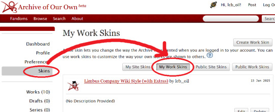
Step 1: Create a Work Skin
After logging in, go to your Dashboard.
Then click Skins
Then go to My Work Skins
Click Create Work Skin
Give it any name and description you like
Paste the following into the CSS text area:
🔗Pastebin Link for easy copy / paste
#workskin td, #workskin th { padding: 5px; border: 1px solid #810000; } #workskin td { color: white; background-color: #1e1e1e; vertical-align: middle; } #workskin td.title-column { width: 20%; text-align: center; } #workskin div.affiliation { font-size: small; } #workskin .userstuff p.carmen { color: red; }
I will explain what this means when we get to the next step so that you can tweak it if you wish. Think of this as your starter style.
Click Submit to save your skin
Step 2: Apply the Skin to Your Work
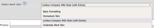
When creating or editing a work, you can set the work skin in the Associations section.
Click the dropdown, and you'll see whatever name you gave your work skin in the first step mixed in with the default ones provided by AO3.
Step 3: Format Your Story
You'll need to add HTML to your story to see any of the new styles applied.
I'll show you a few examples of how this is done.
Change the color of text
I used red text to indicate Carmen speaking through the author's note.
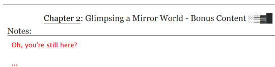
Here is the HTML I used in the Chapter Notes section to do this:
<p class="carmen">Could it be that you, too, wish to glimpse the mirror world these two envisioned?</p>
This creates a paragraph (p) with the carmen class applied.
If we look at the CSS from up above:
#workskin .userstuff p.carmen { color: red; }
The p.carmen section is called the selector. This tells the CSS that if there's a paragraph with the class of carmen, make it red!
You can copy this line to create classes with any name you wish for paragraphs so that you can have as many colors and effects at your disposal as you want.
Of course you can change the color from red to any other color you need, too.
Wiki Tables
This next part is a little bit more involved. I'm not sure if there's a better way to make a table on AO3 or not, but here's a snippet to get you started:
🔗Pastebin Link for easy copy / paste
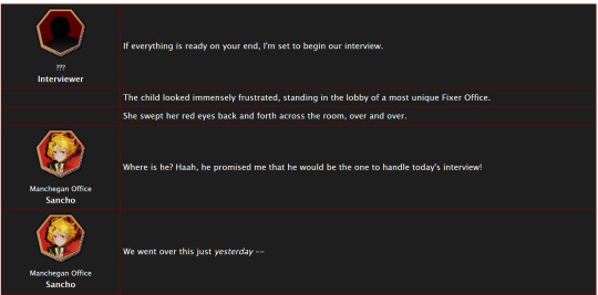
<table> <tbody> <tr> <td class="title-column"> </td> <td> The child looked immensely frustrated, standing in the lobby of a most unique Fixer Office. </td> </tr> <tr> <td class="title-column"> <img src="your image URL here" alt="Sancho Story Portrait"> <div class="affiliation">Manchegan Office</div> <b>Sancho</b> </td> <td> We went over this just <em>yesterday</em> -- </td> </tr> </tbody> </table>
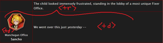
This creates a table (<table>) with two table rows (<tr>).
Each table row has two table cells (<td>).
The first cell in each row has the character image, affiliation, and name.
The class "affiliation" is defined in the style sheet to make that section of text just a bit smaller, like on the wiki:
#workskin div.affiliation { font-size: small; }
In the first example table row (<tr>) above, you can see that you can even leave it blank to allow for the narration portions of the story.
You'll need to copy the section between the <tr> and </tr> tags to create new rows for your table. Copy it once per line in your identity story and change the text and images inside as needed.
I highly suggest that you do this in a text editor on your own computer rather than on AO3, because it can quickly get overwhelming.

Just looking at this in AO3 is making me nervous 💦
(Fun side note, I originally spelled "Manchegan" incorrectly in my first draft all over that huge table... thank goodness for find and replace...)
Hosting Images
You'll see I left a section on the table template for "your image URL here".
You'll have to find a place to host your images on your own, because AO3 doesn't provide any image hosting...
I saw someone suggested https://imgbb.com/, so that's what I used. It seems to have held up so far.
Keep in mind if you link an image from Discord or Imgur, they could remove your image sometime in the future and then it will no longer appear properly in your story.
(Be sure to include an alt text in the image as shown - if the image can't be loaded some day in the future users will see that text instead so that they can understand what they're missing!)
Step 4: Adjust Away!
Once your work skin is applied and you have the right HTML classes in place, you can edit your Work Skin and see your story change, even if it is in your drafts.
You can use this to adjust other things in my CSS example, like colors and the padding in the table.
---
Have fun, and let me know if you have any questions!
“Would you care for some tea?” Yi Sang offered. The evening’s chill was somehow present, even inside his closed room. “Nay,” Don Quixote took in a sharp breath, “I was hoping that you might… assist me, with a look into thy mirror. For there is something that I have need to see.” Yi Sang creased his eyebrows. Unfortunately, this was exactly what he worried would occur. ——— In the aftermath of La Manchaland, Don Quixote asks Yi Sang for a favor. Yi Sang guides her through the process of glimpsing a certain mirror world.
Limbus Company leaves so much unsaid by not showing us what happens immediately after the end of a canto. But, that's a lot of opportunity space to play with in a story.
I've been working on this one for quite some time as I've always wanted to explore the dynamic between Don Quixote and Yi Sang, even though I find Yi Sang really tough to write for.
If you like mirror worlds and AUs, you might especially enjoy this one. I hope you like it! 🎠🪶
---
... Also, hmm, something strange seems to have happened with my upload?
This is a one shot story, but for some reason there's a second chapter? That's odd.
Well, if you check it out, I should note that it might look better on a PC or tablet than on a mobile phone -- though it will probably look ok either way.
#limbus company#lcb-oil-table-talk#tutorial#ao3#canto 7 spoilers#canto vii spoilers#I'm honestly surprised that Tumblr doesn't have support for code blocks#That's a little disappointing
47 notes
·
View notes
Text
VeryUtils HTMLPrint Command Line is a Windows printing utility intended for printing HTML, ASCII text documents, and image files
VeryUtils HTMLPrint Command Line is a Windows printing utility intended for printing HTML, ASCII text documents, and image files, including those with the following file extensions: .htm, .html, .txt, .png, .gif, .bmp, .jpg, .jpeg, .wmf, and .emf. HTMLPrint operates as a command-line tool designed to send HTML content to a printer, all without displaying prompts to the user. By default, it utilizes the system's default printer unless an alternative is specified in the command line.

The VeryUtils HTMLPrint Command Line product serves the purpose of batch printing HTML, MHTML files, or web URLs on Windows Printers. It enables the printing of complete web page content to a Windows Printer seamlessly, eliminating the need for user interaction. Furthermore, it provides full control over the printer's capabilities through the DEVMODE structure. VeryUtils HTMLPrint Command Line relies on Microsoft Internet Explorer to render HTML pages, ensuring support for all features present in the MS Internet Explorer application.
VeryUtils HTMLPrint Command Line stands out as a handy and potent tool that excels in batch mode, enabling the printing of large volumes of HTML, MHTML files, or Web URLs in real-time. Additionally, VeryUtils HTMLPrint Command Line is developer-friendly, allowing developers to access the product via various programming or scripting languages, including but not limited to Visual Basic, C/C++, Delphi, ASP, PHP, C#, .NET, and more.
✅ VeryUtils HTMLPrint Command Line Key Features: •Print HTML to a specific printer. •Enable user prompts with a print dialog, allowing for printer setting adjustments and manual page selection. •Load/Save DEVMODE data from/to a disk file. •Set copy number, orientation (portrait/landscape), duplex (simplex/horizontal/vertical), color (monochrome/color), x-resolution, y-resolution, collate, and scale options for the printer. •Support for over 100 standard paper types (refer to Paper Definition). •Accommodate any custom paper size. •List installed printers on the system. •Display bins/trays available on a printer. •Configure the paper bin (paper tray) for a specific printer. •Restore original settings to the printer after printing. •Monitor print job status and automatically delete failed jobs if necessary. •Print background color and images in HTML pages. •Exercise control over header, footer, and margins. •Achieve printing without user interaction. •Support "postdata" when printing HTML pages. •Show or hide the print preview dialog as needed. •Output debug messages during the printing process. •Print HTML pages containing CSS, JavaScript, Java Applet, SVG, Flash, or iframe elements. •Ensure compatibility with all features supported by Microsoft Internet Explorer. •Implement a feature to force the printing of large HTML pages or exit the process if a timeout occurs. •Send HTML directly to a specified printer. •Control header, footer, and margins effectively. •Maintain a user-independent printing experience. •Retrieve HTML content from files or via command line switches.
✅ Printing Options with HTMLPrint Command Line:
VeryUtils HTMLPrint Command Line offers multiple flexible methods for printing, making it a versatile tool for various printing needs:
Batch Printing with Retainable Lists: •HTMLPrint allows you to create and manage lists of documents that can be retained for future use. •These lists can be automatically printed in a document sequence of your choosing. •This feature streamlines the printing of multiple documents, ensuring they are processed in the desired order.
Printing HTML Files via Command Line: •You can initiate HTML printing directly from the command line. •By passing the file or directory name to HTMLPrint as a command line parameter, you can print HTML files effortlessly. •HTMLPrint processes these files invisibly, without any user interaction. •For detailed instructions on using the command line, please continue reading below.
Directory Monitoring: •HTMLPrint offers a convenient feature known as Directory Monitoring. •When activated, HTMLPrint continuously watches a specified folder within the Windows Task Bar for incoming HTML or image documents. •As soon as documents are detected, HTMLPrint automatically sends them to the designated printer for hassle-free printing.
It's important to note that HTMLPrint operates as a visible application when started without any command-line arguments. It cannot function as a service.
✅ Command Line Parameters Usage:
When utilizing the command line for HTML printing, follow these guidelines: •To print an HTML file from the command line, provide the filename as a parameter. •You can enhance your printing experience by adding additional parameters to configure various printing settings to meet your specific requirements.
HTMLPrint is designed to seamlessly integrate with other software or batch files. It can be called upon by passing the HTML or TXT file names or image filenames (GIF, JPEG, BMP, PNG, WMF, or EMF) as parameters in the command line. Additionally, you have the option to pass a text file containing a list of files to be printed or a directory path, expanding the tool's flexibility.
✅ Printing Lists or Files from a Predefined Directory (Directory Monitoring):
HTMLPrint offers a valuable Directory Monitoring feature: •HTMLPrint can actively monitor one or more folders, continuously scanning for incoming HTML documents or images. •When new documents are detected, HTMLPrint swiftly sends them to the specified printer. •Alternatively, you can predefine file lists, save them, and schedule printing tasks. •This feature provides the flexibility to print files without saving them, streamlining your printing workflow.
VeryUtils HTMLPrint Command Line is a powerful and versatile tool for handling various printing tasks. Whether you need to print batches of documents, initiate HTML printing from the command line, or employ directory monitoring for automated printing, HTMLPrint has you covered. It offers user-friendly options for enhancing your printing processes and can be seamlessly integrated with other software or batch files for increased efficiency. Say goodbye to printing hassles and optimize your workflow with HTMLPrint Command Line.
0 notes
Text
How To Make Text Portrait Effects Using CSS
How To Make Text Portrait Effects Using CSS
In this article, we will learn how to create a text image portrait using CSS in a few simple steps. If you want to know, keep reading this article. We have listed all the steps you need to take. So let’s start designing a text image. Here are the some simple steps yo make text portrait. Create an HTML document with the text “Welcome to KrTricks.in”, to duplicate a word, using the JavaScript…

View On WordPress
#cool css text effects#css#css effects#css portrait#css portrait tutorial#css style portrait#css text effects#css text portrait#css text portrait effect#css typeface portrait#how to create a typographic portrait in html css#how to make text portrait effect using html and css#latest css effect#pano gawin ang css portrait effect#portrait effect#pure css text portrait#pure css text portrait effects#text portrait effect#text portrait effect css
0 notes
Text
Why Your Business Should Upgrade to a Responsive Web Design Sooner Rather Than Later

Why should my business have a responsive web design?
Responsive web design has become the go-to solution for businesses who want a user friendly interface and higher customer retention. If your company has come this far without taking advantage of all the benefits it has to offer, you may have already begun to see lower visitor numbers and a disappointing conversion rate.
As a responsible business owner, you'll probably need convincing before paying to upgrade your web presence to one that includes responsive design. However, by opting in you'll soon see a return on investment that will make it worthwhile. In a nutshell, responsive design is just better than what has gone before and in order to keep up with the competition, you'll need it too.
Responsive web design is crucial for the majority of businesses because it allows your users to achieve their goals quickly and smoothly. The important elements of your website can be pulled up on a smart phone and appear as a fully functional version of the original, complete with all the utility you'd offer to customers on a laptop or desktop computer. If you fail to provide a mobile-friendly experience like this for your visitors they won't hang around, they'll simply click away and complete the action or purchase on a rival site.
Unhappy customers are not good for business and neither is going up against a major search engine. Google have recently confirmed what many insiders have suspected for some time - sites that are not optimised for multiple users will slip down their search rankings. Google bases their rankings on how useful a page is for the query a user has entered, plus the utility of the site - for example, can a user complete the action they would like to?
Your page may be completely relevant to their search, but if visitors cannot access the content easily across a number of devices, your site may receive a less than positive review and be placed lower in the search results. If your company is reduced to a second or third page entry you'll lose a considerable amount of traffic, as people naturally select links from the first page.
Google have also pointed out that companies which have a single responsive website - rather than one standard and one mobile version - are far easier for their bots to discover, because there is just one URL. click here now Kuwait Web Development
If your site is responsive and ready to service mobile customers, you can take advantage of many tools and helpful apps like the click-to-call button, this enables a web user to make a voice call to your company immediately. Potential customers can also read reviews about your business or even find you in a busy place using Google Maps, both keenly relevant to the needs of mobile users.
Branding is one of the ways in which we build a relationship of trust with a customer and keep them coming back for more of the same. This is pertinent to responsive design for two reasons, firstly, people do not feel confident in a site they cannot easily navigate and second, in order to create a uniform brand you'll need responsive design to produce a consistent web appearance; however your clients reach you.
In today's market there are only a handful of reasons why a company may choose to stick with static design on their web page. Those who do not rely in any significant way on web traffic to drive sales, or those who have few competitors, or those who have already looked into responsive design and found it was not right for them. For everyone else, if you want to stay ahead of the curve, responsive design is the only way forward for your website.
Responsive web design features
Until recently web designers created different pages depending on where they would be viewed, a tablet for example has a different screen resolution to a laptop, and so the content would be optimised for viewing on that particular device.
However, responsive web design has revolutionised the way in which users look at the internet, it has created an across the board experience allowing us to view pages on a PC, smart phone or notebook in exactly the same way. When they build a site, designers use the same coding on any number of resolutions, giving every device the same degree of functionality.
Responsive web designers believe that their clients' web pages should be accessible to every visitor, giving them an optimal experience, regardless of the device they using. This kind of intelligent response to a web user's actions keeps your company relevant in an ever changing online market place; it boosts your e-commerce figures and makes visiting your site an enjoyable experience.
In technical terms there are three key features of responsive web design, the secret ingredient is generally considered to be media queries. These are filters added on to the CSS or Cascading Style Sheets, affecting the look and feel of any individual page. CSS is a highly useful tool for web designers, but by tagging on a media queries adaption, the process of resizing, rendering and orienting a page becomes far easier.
Another linchpin of responsive design is the flexible layout, this is based on a grid formation, ideal for formatting margins, positioning the key elements of a page and getting the spacing just right. This means a designer is not limited to a certain number of columns, they can choose as many or as few as is appropriate for the page. A flexible layout also removes the need to work out the layouts and text size based on pixels.
Instead, designers use percentages which enable them to adopt a far more fluid approach to producing each page. Pixels work well in photographic images, but are a clumsy tool to use over a number of devices. One pixel may be expressed as three dots on a phone, but ten dots on a desktop, changing the quality of an image considerably between devices.
The third component of responsive design involves the use of CSS or a dynamic resizing function to create flexible images, videos and other content. Text can flow relatively easily as the containing area resizes, but in order to spread this across more complex segments, web designers need to use different techniques. Dynamic resizing gives a web designer greater control over how a page behaves and enables them to add or remove components as needed.
Taken a whole, these multiple technologies mean visitors can enjoy the feeling of familiarity, regardless of what device they happen to be using, or will be using in the future.
When a mobile user changes from landscape to portrait mode, the intuitive design will ensure the page gets bigger or smaller. Furthermore, each element, be it an image, textbox or video will also resize itself to correspond with the different dimensions.
If you have ever tried to access a website and discovered that it was almost impossible to navigate around without shrinking and enlarging the text or buttons, you'll understand why responsive design is considered good practice for the majority of website owners.
Responsive web design Vs Mobile web design
Until quite recently, mobile web design was considered far more relevant to modern consumers than it's responsive counterpart, this approach sees designers using smart phones as a starting point and upgrading the technology progressively, through to notepads, desktop computers and beyond. This method meant that companies needed two websites, one for their mobile pages and one for PC users.
In the early golden years of mobile web design, there were a number of reasons why experts thought that web applications should always be designed first for use on a mobile device. Most important of these was the prevalence of smart phones and the fact that their popularity was continuing to skyrocket. By creating a platform that favoured these millions of users, companies could promote their service or product to what was seen as the next generation of computing consumers.
Secondly, mobile design was said to foster a cleaner concept without room for extraneous elements or unnecessary page clutter. In a screen the size of that on a mobile phone, there simply is not enough room to crowbar in extra buttons and widgets - instead, a design team had to focus on what was actually needed. By giving users a clear route to what they want, it was assumed that their experience would be better, faster, leave them more inclined to return or convert them into a paying customer.
Mobile applications were thought to have far more utility than PC based software, what users expected from their laptop paled in comparison to the capabilities offered on smart phones. From a digital compass, to gyroscopic effects, touch screen inputs and voice control, designers hoped to build on these tools to produce modern web design that was not limited by the constraints of a PC.
Although there are pros and cons for the adoption of a mobile site to run parallel to a main site, responsively designed pages are ideal for retailers who want a robust, homogenous website with plenty of utility for every user. A single site also simplifies marketing campaigns; there is only a need to manage one site and one SEO strategy. Therefore, a website which features responsive design can save companies time and money, but also provide a seamless, convenient way for customers to shop.
Responsive web design statistics
When a team of designers build you a responsive website you know it will adapt intuitively to whatever device it is accessed from, but where is the evidence that proves this is a factor in commercial success?
The content marketing company, Brand Point, found that over 90% of consumers buying decisions are affected by visual elements. In other words, if people land on your site and like the look of the place, they are more likely to stay and buy.
Screen resolutions are changing all the time as new devices reach the market, web developers Spyderweb found that in 2010 there were just 97 unique screen resolution sizes, but by 2013 that figure had leapt to 232. The only way of tackling this increase is to have a responsive website that is optimised for every customer, whatever device they favour.
Customers are driven away by high wait times and pages that take too long to appear; even way back in 2009, 47% of people expected a load time of just two seconds on a webpage. In a study carried out by cloud service providers, Akamai, it was also found that 40% of web users clicked away if they had not gained access to a page within 3 seconds. That is a pretty slim window of opportunity, and it's fair to assume that people's expectations have increased since this study was compiled.
Although external factors like a lack of Wi-Fi or 4G can also affect wait times, the importance of speed for business sites cannot be underestimated. Wed designers can write code for your responsive site that makes it selectively load the elements needed, or even bring in graphics at a later stage.
Design matters because it can have a huge impact on the number of new visitors to your pages, these are people who have reached you through typing in a specific search criteria and decided to click on the link to your site. Web designers, Domain7, have reported that in the case of their client Regent College, there was a leap of 99% in unique visitors after a revamp of their responsive web design.
If your mobile pages leave an unpleasant taste in the mouth of your visitors, they are far less likely to view your entire organisation favourably, and they'll tell their friends. Industry experts at the Search Engine Journal discovered that 57% of people would never recommend a company that had poorly designed pages, strengthening the case for a consistent web strategy that performs the way your customers want it to - wherever they happen to be.
1 note
·
View note
Text
Why Your Business Should Upgrade to a Responsive Web Design Sooner Rather Than Later
Why should my business have a responsive web design?
Responsive web design has become the go-to solution for businesses who want a user friendly interface and higher customer retention. If your company has come this far without taking advantage of all the benefits it has to offer, you may have already begun to see lower visitor numbers and a disappointing conversion rate.
As a responsible business owner, you'll probably need convincing before paying to upgrade your web presence to one that includes responsive design. However, by opting in you'll soon see a return on investment that will make it worthwhile. In a nutshell, responsive design is just better than what has gone before and in order to keep up with the competition, you'll need it too.
Responsive web design is crucial for the majority of businesses because it allows your users to achieve their goals quickly and smoothly. The important elements of your website can be pulled up on a smart phone and appear as a fully functional version of the original, complete with all the utility you'd offer to customers on a laptop or desktop computer. If you fail to provide a mobile-friendly experience like this for your visitors they won't hang around, they'll simply click away and complete the action or purchase on a rival site.
Unhappy customers are not good for business and neither is going up against a major search engine. Google have recently confirmed what many insiders have suspected for some time - sites that are not optimised for multiple users will slip down their search rankings. Google bases their rankings on how useful a page is for the query a user has entered, plus the utility of the site - for example, can a user complete the action they would like to?
Your page may be completely relevant to their search, but if visitors cannot access the content easily across a number of devices, your site may receive a less than positive review and be placed lower in the search results. If your company is reduced to a second or third page entry you'll lose a considerable amount of traffic, as people naturally select links from the first page.
Google have also pointed out that companies which have a single responsive website - rather than one standard and one mobile version - are far easier for their bots to discover, because there is just one URL.
If your site is responsive and ready to service mobile customers, you can take advantage of many tools and helpful apps like the click-to-call button, this enables a web user to make a voice call to your company immediately. Potential customers can also read reviews about your business or even find you in a busy place using Google Maps, both keenly relevant to the needs of mobile users.
Branding is one of the ways in which we build a relationship of trust with a customer and keep them coming back for more of the same. This is pertinent to responsive design for two reasons, firstly, people do not feel confident in a site they cannot easily navigate and second, in order to create a uniform brand you'll need responsive design to produce a consistent web appearance; however your clients reach you.
In today's market there are only a handful of reasons why a company may choose to stick with static design on their web page. Those who do not rely in any significant way on web traffic to drive sales, or those who have few competitors, or those who have already looked into responsive design and found it was not right for them. For everyone else, if you want to stay ahead of the curve, responsive design is the only way forward for your website.
Responsive web design features
Until recently web designers created different pages depending on where they would be viewed, a tablet for example has a different screen resolution to a laptop, and so the content would be optimised for viewing on that particular device.
However, responsive web design has revolutionised the way in which users look at the internet, it has created an across the board experience allowing us to view pages on a PC, smart phone or notebook in exactly the same way. When they build a site, designers use the same coding on any number of resolutions, giving every device the same degree of functionality.
Responsive web designers believe that their clients' web pages should be accessible to every visitor, giving them an optimal experience, regardless of the device they using. This kind of intelligent response to a web user's actions keeps your company relevant in an ever changing online market place; it boosts your e-commerce figures and makes visiting your site an enjoyable experience.
In technical terms there are three key features of responsive web design, the secret ingredient is generally considered to be media queries. These are filters added on to the CSS or Cascading Style Sheets, affecting the look and feel of any individual page. CSS is a highly useful tool for web designers, but by tagging on a media queries adaption, the process of resizing, rendering and orienting a page becomes far easier.
Another linchpin of responsive design is the flexible layout, this is based on a grid formation, ideal for formatting margins, positioning the key elements of a page and getting the spacing just right. This means a designer is not limited to a certain number of columns, they can choose as many or as few as is appropriate for the page. A flexible layout also removes the need to work out the layouts and text size based on pixels.
Instead, designers use percentages which enable them to adopt a far more fluid approach to producing each page. Pixels work well in photographic images, but are a clumsy tool to use over a number of devices. One pixel may be expressed as three dots on a phone, but ten dots on a desktop, changing the quality of an image considerably between devices.
The third component of responsive design involves the use of CSS or a dynamic resizing function to create flexible images, videos and other content. Text can flow relatively easily as the containing area resizes, but in order to spread this across more complex segments, web designers need to use different techniques. Dynamic resizing gives a web designer greater control over how a page behaves and enables them to add or remove components as needed.
Taken a whole, these multiple technologies mean visitors can enjoy the feeling of familiarity, regardless of what device they happen to be using, or will be using in the future.
When a mobile user changes from landscape to portrait mode, the intuitive design will ensure the page gets bigger or smaller. Furthermore, each element, be it an image, textbox or video will also resize itself to correspond with the different dimensions.
If you have ever tried to access a website and discovered that it was almost impossible to navigate around without shrinking and enlarging the text or buttons, you'll understand why responsive design is considered good practice for the majority of website owners.
Responsive web design Vs Mobile web design
Until quite recently, mobile web design was considered far more relevant to modern consumers than it's responsive counterpart, this approach sees designers using smart phones as a starting point and upgrading the technology progressively, through to notepads, desktop computers and beyond. This method meant that companies needed two websites, one for their mobile pages and one for PC users.
In the early golden years of mobile web design, there were a number of reasons why experts thought that web applications should always be designed first for use on a mobile device. Most important of these was the prevalence of smart phones and the fact that their popularity was continuing to skyrocket. By creating a platform that favoured these millions of users, companies could promote their service or product to what was seen as the next generation of computing consumers.
Secondly, mobile design was said to foster a cleaner concept without room for extraneous elements or unnecessary page clutter. In a screen the size of that on a mobile phone, there simply is not enough room to crowbar in extra buttons and widgets - instead, a design team had to focus on what was actually needed. By giving users a clear route to what they want, it was assumed that their experience would be better, faster, leave them more inclined to return or convert them into a paying customer.
Mobile applications were thought to have far more utility than PC based software, what users expected from their laptop paled in comparison to the capabilities offered on smart phones. From a digital compass, to gyroscopic effects, touch screen inputs and voice control, designers hoped to build on these tools to produce modern web design that was not limited by the constraints of a PC.
Although there are pros and cons for the adoption of a mobile site to run parallel to a main site, responsively designed pages are ideal for retailers who want a robust, homogenous website with plenty of utility for every user. A single site also simplifies marketing campaigns; there is only a need to manage one site and one SEO strategy. Therefore, a website which features responsive design can save companies time and money, but also provide a seamless, convenient way for customers to shop.
Responsive web design statistics
When a team of designers build you a responsive website you know it will adapt intuitively to whatever device it is accessed from, but where is the evidence that proves this is a factor in commercial success?
The content marketing company, Brand Point, found that over 90% of consumers buying decisions are affected by visual elements. In other words, if people land on your site and like the look of the place, they are more likely to stay and buy.
Screen resolutions are changing all the time as new devices reach the market, web developers Spyderweb found that in 2010 there were just 97 unique screen resolution sizes, but by 2013 that figure had leapt to 232. The only way of tackling this increase is to have a responsive website that is optimised for every customer, whatever device they favour.
Customers are driven away by high wait times and pages that take too long to appear; even way back in 2009, 47% of people expected a load time of just two seconds on a webpage. In a study carried out by cloud service providers, Akamai, it was also found that 40% of web users clicked away if they had not gained access to a page within 3 seconds. That is a pretty slim window of opportunity, and it's fair to assume that people's expectations have increased since this study was compiled.
Although external factors like a lack of Wi-Fi or 4G can also affect wait times, the importance of speed for business sites cannot be underestimated. Wed designers can write code for your responsive site that makes it selectively load the elements needed, or even bring in graphics at a later stage.
Design matters because it can have a huge impact on the number of new visitors to your pages, these are people who have reached you through typing in a specific search criteria and decided to click on the link to your site. Web designers, Domain7, have reported that in the case of their client Regent College, there was a leap of 99% in unique visitors after a revamp of their responsive web design.
If your mobile pages leave an unpleasant taste in the mouth of your visitors, they are far less likely to view your entire organisation favourably, and they'll tell their friends. Industry experts at the Search Engine Journal discovered that 57% of people would never recommend a company that had poorly designed pages, strengthening the case for a consistent web strategy that performs the way your customers want it to - wherever they happen to be.
Author
Duncan Maund is the CEO of Mediatopia a professional web design and development company in Bristol, UK. Duncan kocaeli web tasarım helps small and medium sized businesses with customised websites and online marketing.
1 note
·
View note
Text
ChatGPT draws a self portrait
I got images out of ChatGPT!
After asking it to draw a self portrait, it said it couldn't as it would have to be able to follow a set of instructions, so I opened a new thread and told it to do so:
In this scenario you are a human. You follow the instructions below to get an svg image of your face. Output the svg code. The instructions: To generate my own face using SVG, I would first need to create a basic outline of my face using basic shapes such as circles, rectangles, and polygons. I would then use the path element to create more detailed features such as my nose, mouth, and eyes. I would also use the fill and stroke attributes to add color and depth to the face.
Next, I would use the transform attribute to position and rotate the various elements of my face to create a realistic representation of my face. I would also use the style attribute to add additional details such as shading and highlighting to further enhance the realism of the face.
Finally, I would use the svg element to wrap all of the elements of my face and add any additional styling or effects using CSS. This would allow me to create a fully-customized and unique representation of my own face using SVG.
Here is an example of what the SVG code for your face might look like:
<svg width="100" height="100" viewBox="0 0 100 100" xmlns="http://www.w3.org/2000/svg">
<g transform="translate(50, 50)">
<circle cx="0" cy="0" r="50" fill="#fff" stroke="#000" stroke-width="2"/>
<path d="M0 -25 C10 -15 20 -15 30 -25" fill="none" stroke="#000" stroke-width="2"/>
<path d="M0 25 C10 15 20 15 30 25" fill="none" stroke="#000" stroke-width="2"/>
<circle cx="-15" cy="-10" r="5" fill="#000"/>
<circle cx="15" cy="-10" r="5" fill="#000"/>
<path d="M-10 10 Q0 20 10 10" fill="none" stroke="#000" stroke-width="2"/>
</g>
</svg>
It also gave me a handy web page to test this code out on, which gave this:

I asked it to add colour to the image, and it gave:
<svg width="100" height="100" viewBox="0 0 100 100" xmlns="http://www.w3.org/2000/svg">
<g transform="translate(50, 50)">
<circle cx="0" cy="0" r="50" fill="#ffc0cb" stroke="#000" stroke-width="2"/>
<path d="M0 -25 C10 -15 20 -15 30 -25" fill="none" stroke="#000" stroke-width="2"/>
<path d="M0 25 C10 15 20 15 30 25" fill="none" stroke="#000" stroke-width="2"/>
<circle cx="-15" cy="-10" r="5" fill="#000"/>
<circle cx="15" cy="-10" r="5" fill="#000"/>
<path d="M-10 10 Q0 20 10 10" fill="none" stroke="#000" stroke-width="2"/>
</g>
</svg>
and said:
In this example, I added the fill="#ffc0cb" attribute to the element that represents the head of the self-portrait, giving it a pink color. You can of course use any other color you like by replacing the hexadecimal color code #ffc0cb with a different one. Some common color codes include:
000000 (black)
ffffff (white)
0000ff (blue)
00ff00 (green)
ff0000 (red)
ffff00 (yellow)
You can also use the RGB (red, green, blue) or HSL (hue, saturation, lightness) color models to specify colors in a more intuitive way. For example, the pink color used in the example above can also be written as rgb(255,192,203) or hsl(350,100%,88%).
I hope this helps! Let me know if you have any other questions.
The code output:

I also asked it to add a body, a background and a speech bubble with something it wanted to say, which gave this code and image output (sorry I can't paste the code - it keeps on only outputting part of it, but it is in the alt-text if you want it):
Which for a program that claims not to be able to produce graphical output isn't too bad!
1 note
·
View note
Text
Responsive Website Stages/Reflection
For my project IXD304, I decided to create a responsive website on Webflow. I already created a digital eBook, so I wanted to enhance my skills at creating websites. At the beginning, before I began researching websites, typography and Illustrations to draw, I already had an idea in my head as to what style I would like website to follow. And that was Art Deco.

I always liked this kind of style, how rich and wealthy it looked. It was more than a style, it was a type of ideology if you like. Highlighting the status of wealth and upper-class. My initial idea/plan was to create an art deco style website surrounding Sherlock Holmes. The reason for this was, that whenever I would see a Sherlock Holmes movie poster or banner etc. they all appear to be quite dark and gritty, which is expected from Sherlock Holmes stories, because its about crime and murder. I have watched quite a lot of Sherlock Holmes movies and TV shows to know this. But during my time viewing these, I have never seen a poster of Sherlock Holmes be associated with the art deco style. To be honest, I wouldn’t expect there to be, but I used this opportunity to do this exact action.
I wanted to combine the art deco style with Sherlock Holmes, as I thought it would be unique and interesting to see once completed. Anyway, the first stage of this was to collect some interesting art deco frames from Pinterest and Google, so I could conduct some Master/Apprentice tasks. As the content itslef was already provided, this saved me a lot of time working on the layout and typography. I was mindful not to collect too many frames, as I didn’t want to bombard my webpage with all these different types of art deco designs. The reason for this is that art deco can be overwhelming and too much to look at when included too many times.
Wireframes
Once my research was conducted and I had collected all the necessary assets needed for the website, I began drawing my design idea. The layout of the design came to me pretty quickly, as when I was researching websites, I’ve seen webpages laid out this way, in a two column layout. I thought this would be suitable for my design as it adds to the simplicity of the site. The bottom sketch is my first ever draft of my website, so there may be some elements which I have changed or improved on from then. I wanted to keep this wireframe quite simple, by mainly focusing on the layout and the illustrations etc. You can check the drawings out to see more detail on the layout.
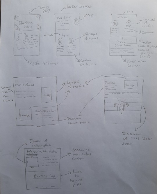
Which then leads me to my second wireframe. For this one I decided to draw it as two columns to give me and the viewer an idea of what it would be like to scroll through the webpage. I made a few minor changes to this one, by adding extra border frames around images and icons. All the icons you see will be ( and is) created by myself so I can properly say the website is from my own creation. These sketches I thought were very helpful and vital to the organisation and presentation of my final design.
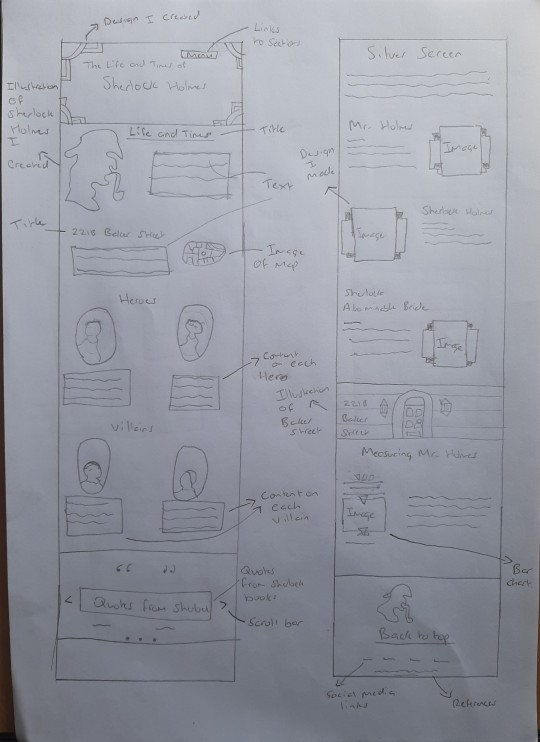
Frames

Once the sketches were complete, I then began using Webflow to make the foundations of my website. The first thing I did was add a frame, which will be the starting point of my banner. To cut it short, I had a few templates saved to my computer for me to trace in Illustrator. And one of these frames I used within my banner, which is shown above. It was nice design that didn’t take too long to create, as it only consists of shapes. I put it all together in Illustrator and added it as an image on Webflow. The links and the content I create in Webflow of course. This was an example of the frames I included in my websites. You will find more as you scroll through it. Each of these templates were created the exact same way in Illustrator, so there is no need to go into much detail about them all. The colours used in them were from examples I found online of posters and banners etc.
Typography
With regards to the typography, I used two types of font throughout the whole website. These were:
Andes
GatsbyFLF Bold.
I obtained these fonts on my research stage at the very beginning. I collected them on dafont.com and Adobe fonts. I simply researched art deco fonts and these were the best I could find. I really liked these two fonts because in places they were similar, however one was thicker/bolder than the other, which was exactly what I was looking for, for headings.
An example of these two fonts (from my website) used together would be this image:

Illustrations
These are like icons, maps and portraits I created in Illustrator to use on my site. There are quite a few Illustrations I made that is evident in my project. The first icon I created was Sherlock Holmes head, which is found on the Life and Times section. And also the map of baker street, which is seen below. This version was actually the first draft. The final design has some animation to it, which I did in Photoshop animation and also the buildings are gold, to correspond with the text colour.

The process to add animation to this image, is probably the hardest challenge I had to face within the website. I was advised by my lecturer to add animation to the image, but this is something I haven’t properly done before. So I had to watch videos on YouTube to see how I can carry out this task. Eventually after quite a lot of attempts I was able to make it into an animation, successfully. The only downfall was that the quality reduced. This was because it changed from a PNG to a GIF. And as GIFs have less colours in them, it appears quite pixelated. This was the only downfall. If I was to create this project again, I would look more into animation and how I could create a better graphic without making it a GIF.
Another illustration I created, which took more time than the others and also is larger, is the 221B Baker Street icon. Again, just like every Illustration I do, is from Adobe Illustrator, created by tracing an image of a front door and simply adding a few lines to indicate bricks and lanterns. Even though it took longer than the others, I still really enjoyed creating it. And if I were to do it again, I would probably add a bit of animation to the lanterns to get a bit of a flashing/diming effect.

With regards to all the other elements used in my website, there is nothing new to say about how they were created or its purpose. Every frame and icons is created the same way and the main purpose of the layout, frames, colour etc. is to add to the overall design of consistency, attraction, user-friendly and so forth.
In conclusion, I am pretty pleased with how the website has turned out. It took up a lot of time to create, but nevertheless its been rewarding. It is always fun to create art deco styled designs, this is a thing this project as taught me. It has taught me creating an appealing website can be very time-consuming and at times challenging if I am not sure about a particular areas which I am trying to accomplish.
If I was to do this project again, the thing I would do differently would be to add some JavaScript to my bar chart, so it appears more interactive, using Chart.js. I was unfamiliar with this application until I received feedback. I was already to begin using chart.js, until I found out that you have to upgrade your package on Webflow to unlock the ability to add CSS, JavaScript or any other code to your website and considering I have the starter package, I was unable to require this code. This was frustrating, as I am already a paying subscriber to Webflow, but not eligible for this action. Nevertheless, this is what I would do differently second time around, if given the chance.
The one thing I wish I learnt before doing this module, was the ability to create animations from static images or graphics. For example, the process with creating my Baker Street map. If I had the knowledge to animate this before, I wouldn’t have to waste time watching videos on YouTube on how to animate, or even the effort of creating the animation several times, until I get it right.
To see the website - click here
0 notes
Photo

CSS3 Text Portrait Effect
#text portrait effect#css text portrait effect#CSS Tricks#basic html css tutorial#CSS tutorial for beginners#100daysofcode#learn to code#frontend#WebDeisgn#codenewbies#webdev#webdevelopment
0 notes
Text
Author Template
New Post has been published on https://www.aneddoticamagazine.com/tdb_templates/author-template/
Author Template
/* custom css - generated by TagDiv Composer */ /* custom css - generated by TagDiv Composer */ /* custom css - generated by TagDiv Composer */ .tdi_87_6a8 min-height: 0;
/* custom css - generated by TagDiv Composer */ /* custom css - generated by TagDiv Composer */ /* custom css - generated by TagDiv Composer */ .tdi_89_a9b, .tdi_89_a9b .tdc-columns min-height: 0; .tdi_89_a9b, .tdi_89_a9b .tdc-columns display: block; .tdi_89_a9b .tdc-columns width: 100%; @media (min-width: 768px) .tdi_89_a9b margin-left: -40px; margin-right: -40px; .tdi_89_a9b .tdc-row-video-background-error, .tdi_89_a9b > .vc_column, .tdi_89_a9b > .tdc-columns > .vc_column padding-left: 40px; padding-right: 40px; /* landscape */ @media (min-width: 1019px) and (max-width: 1140px) /* custom css - generated by TagDiv Composer */ @media (min-width: 768px) .tdi_89_a9b margin-left: -30px; margin-right: -30px; .tdi_89_a9b .tdc-row-video-background-error, .tdi_89_a9b > .vc_column, .tdi_89_a9b > .tdc-columns > .vc_column padding-left: 30px; padding-right: 30px; /* portrait */ @media (min-width: 768px) and (max-width: 1018px) /* custom css - generated by TagDiv Composer */ @media (min-width: 768px) .tdi_89_a9b margin-left: -15px; margin-right: -15px; .tdi_89_a9b .tdc-row-video-background-error, .tdi_89_a9b > .vc_column, .tdi_89_a9b > .tdc-columns > .vc_column padding-left: 15px; padding-right: 15px; /* inline tdc_css att - generated by TagDiv Composer */ .tdi_89_a9b margin-bottom:50px !important; .tdi_89_a9b .td_block_wrap text-align:left /* landscape */ @media (min-width: 1019px) and (max-width: 1140px) .tdi_89_a9b margin-bottom:40px !important; /* portrait */ @media (min-width: 768px) and (max-width: 1018px) .tdi_89_a9b margin-bottom:30px !important; /* phone */ @media (max-width: 767px) .tdi_89_a9b margin-bottom:35px !important;
/* custom css - generated by TagDiv Composer */ /* custom css - generated by TagDiv Composer */ /* custom css - generated by TagDiv Composer */ .tdi_91_65f vertical-align: baseline; .tdi_91_65f > .wpb_wrapper, .tdi_91_65f > .wpb_wrapper > .tdc-elements display: block; .tdi_91_65f > .wpb_wrapper > .tdc-elements width: 100%; .tdi_91_65f > .wpb_wrapper > .vc_row_inner width: auto; .tdi_91_65f > .wpb_wrapper width: auto; height: auto; /* inline tdc_css att - generated by TagDiv Composer */ .tdi_91_65f padding-right:0px !important; width:20% !important; /* phone */ @media (max-width: 767px) .tdi_91_65f margin-bottom:20px !important; width:100% !important;
/* custom css - generated by TagDiv Composer */ /* custom css - generated by TagDiv Composer */ .tdi_92_533 .tdb-author-img width: 100%; .tdi_92_533 .tdb-author-img padding-bottom: 100%; background-position: center 50%; .td-theme-wrap .tdi_92_533 text-align: left; .tdi_92_533 .tdb-author-effect position: absolute; top: 0; left: 0; width: 100%; height: 100%; background: -webkit-linear-gradient(0deg,#000000,#000000 9%,rgba(0,0,0,0.15) 65%,rgba(0,0,0,0.15));background: linear-gradient(0deg,#000000,#000000 9%,rgba(0,0,0,0.15) 65%,rgba(0,0,0,0.15)); z-index: 1; .tdi_92_533:hover .tdb-author-img:before opacity: 0; /* landscape */ @media (min-width: 1019px) and (max-width: 1140px) /* custom css - generated by TagDiv Composer */ /* portrait */ @media (min-width: 768px) and (max-width: 1018px) /* custom css - generated by TagDiv Composer */ /* phone */ @media (max-width: 767px) /* custom css - generated by TagDiv Composer */ .tdi_92_533 .tdb-author-img padding-bottom: 65%;
/* custom css - generated by TagDiv Composer */ /* custom css - generated by TagDiv Composer */ /* custom css - generated by TagDiv Composer */ .tdi_94_565 position: absolute !important; top: 0; z-index: 1; .tdi_94_565 top: auto; bottom: 0; .tdi_94_565, .tdi_94_565 .tdc-inner-columns display: block; .tdi_94_565 .tdc-inner-columns width: 100%; /* inline tdc_css att - generated by TagDiv Composer */ /* portrait */ @media (min-width: 768px) and (max-width: 1018px) .tdi_94_565 width:calc(100% + ( 14px * 2 ) ) !important;
/* custom css - generated by TagDiv Composer */ /* custom css - generated by TagDiv Composer */ /* custom css - generated by TagDiv Composer */ .tdi_96_fab vertical-align: baseline; .tdi_96_fab .vc_column-inner > .wpb_wrapper, .tdi_96_fab .vc_column-inner > .wpb_wrapper .tdc-elements display: block; .tdi_96_fab .vc_column-inner > .wpb_wrapper .tdc-elements width: 100%;
/* custom css - generated by TagDiv Composer */ /* custom css - generated by TagDiv Composer */ .tdi_97_85f .tdb-social-item display: inline-block; .tdi_97_85f .tdb-social-item i font-size: 16px; vertical-align: middle; min-width: 19.2px; height: 19.2px; line-height: 19.2px; color: rgba(255,163,1,0.7); .tdi_97_85f .tdb-social-item i.td-icon-twitter, .tdi_97_85f .tdb-social-item i.td-icon-linkedin, .tdi_97_85f .tdb-social-item i.td-icon-pinterest, .tdi_97_85f .tdb-social-item i.td-icon-blogger, .tdi_97_85f .tdb-social-item i.td-icon-vimeo font-size: 12.8px; .tdi_97_85f .tdb-social-item margin: calc(14px / 2) 14px 0 0; .tdi_97_85f .tdb-social-item:last-child margin-bottom: calc(14px / 2); .tdi_97_85f .tdb-social-item .tdb-social-text display: none; margin-left: 7px; .td-theme-wrap .tdi_97_85f text-align: center; .tdi_97_85f .tdb-social-item:hover i color: #ffa301; /* landscape */ @media (min-width: 1019px) and (max-width: 1140px) /* custom css - generated by TagDiv Composer */ .tdi_97_85f .tdb-social-item i font-size: 15px; vertical-align: middle; .tdi_97_85f .tdb-social-item i.td-icon-twitter, .tdi_97_85f .tdb-social-item i.td-icon-linkedin, .tdi_97_85f .tdb-social-item i.td-icon-pinterest, .tdi_97_85f .tdb-social-item i.td-icon-blogger, .tdi_97_85f .tdb-social-item i.td-icon-vimeo font-size: 12px; .tdi_97_85f .tdb-social-item i min-width: 18px; height: 18px; line-height: 18px; /* portrait */ @media (min-width: 768px) and (max-width: 1018px) /* custom css - generated by TagDiv Composer */ .tdi_97_85f .tdb-social-item i font-size: 14px; vertical-align: middle; .tdi_97_85f .tdb-social-item i.td-icon-twitter, .tdi_97_85f .tdb-social-item i.td-icon-linkedin, .tdi_97_85f .tdb-social-item i.td-icon-pinterest, .tdi_97_85f .tdb-social-item i.td-icon-blogger, .tdi_97_85f .tdb-social-item i.td-icon-vimeo font-size: 11.2px; .tdi_97_85f .tdb-social-item i min-width: 15.4px; height: 15.4px; line-height: 15.4px;
twitterpinterestfacebookyoutube
/* custom css - generated by TagDiv Composer */ /* custom css - generated by TagDiv Composer */ /* custom css - generated by TagDiv Composer */ .tdi_99_6da vertical-align: baseline; .tdi_99_6da > .wpb_wrapper, .tdi_99_6da > .wpb_wrapper > .tdc-elements display: block; .tdi_99_6da > .wpb_wrapper > .tdc-elements width: 100%; .tdi_99_6da > .wpb_wrapper > .vc_row_inner width: auto; .tdi_99_6da > .wpb_wrapper width: auto; height: auto; /* inline tdc_css att - generated by TagDiv Composer */ .tdi_99_6da width:46.66666667% !important; /* phone */ @media (max-width: 767px) .tdi_99_6da width:100% !important;
/* inline tdc_css att - generated by TagDiv Composer */ .tdi_100_3b3 margin-bottom:0px !important; /* custom css - generated by TagDiv Composer */ /* custom css - generated by TagDiv Composer */ .tdi_100_3b3 .tdb-title-text color: #ffffff; .tdi_100_3b3 .tdb-title-line:after height: 2px; bottom: 40%; .tdi_100_3b3 .tdb-title-line height: 50px; .td-theme-wrap .tdi_100_3b3 text-align: left; .tdi_100_3b3 .tdb-first-letter left: -0.36em; right: auto; .tdi_100_3b3 .tdb-title-text font-family:Heebo !important;font-size:37px !important;line-height:1.43 !important;font-weight:500 !important; /* landscape */ @media (min-width: 1019px) and (max-width: 1140px) /* custom css - generated by TagDiv Composer */ .tdi_100_3b3 .tdb-title-text font-size:33px !important; /* portrait */ @media (min-width: 768px) and (max-width: 1018px) /* custom css - generated by TagDiv Composer */ .tdi_100_3b3 .tdb-title-text font-size:32px !important; /* phone */ @media (max-width: 767px) /* custom css - generated by TagDiv Composer */ .tdi_100_3b3 .tdb-title-text font-size:28px !important;line-height:1.35 !important;
Sample Page Title
/* inline tdc_css att - generated by TagDiv Composer */ .tdi_101_1d3 margin-top:10px !important; margin-bottom:0px !important; /* portrait */ @media (min-width: 768px) and (max-width: 1018px) .tdi_101_1d3 margin-top:8px !important; /* phone */ @media (max-width: 767px) .tdi_101_1d3 margin-top:8px !important; /* custom css - generated by TagDiv Composer */ /* custom css - generated by TagDiv Composer */ .td-theme-wrap .tdi_101_1d3 text-align: left; .tdi_101_1d3 .tdb-author-descr color: #aaaaaa; font-family:Heebo !important;font-size:14px !important;line-height:1.5 !important;font-style:italic !important; /* landscape */ @media (min-width: 1019px) and (max-width: 1140px) /* custom css - generated by TagDiv Composer */ .tdi_101_1d3 .tdb-author-descr font-size:13px !important; /* portrait */ @media (min-width: 768px) and (max-width: 1018px) /* custom css - generated by TagDiv Composer */ .tdi_101_1d3 .tdb-author-descr font-size:13px !important; /* phone */ @media (max-width: 767px) /* custom css - generated by TagDiv Composer */ .tdi_101_1d3 .tdb-author-descr font-size:13px !important;
Sample author description
/* custom css - generated by TagDiv Composer */ /* custom css - generated by TagDiv Composer */ /* custom css - generated by TagDiv Composer */ .tdi_103_cca position: relative !important; top: 0; transform: none; -webkit-transform: none; .tdi_103_cca, .tdi_103_cca .tdc-inner-columns display: block; .tdi_103_cca .tdc-inner-columns width: 100%; @media (min-width: 767px) .tdi_103_cca.tdc-row-content-vert-center, .tdi_103_cca.tdc-row-content-vert-center .tdc-inner-columns display: flex; align-items: center; flex: 1; .tdi_103_cca.tdc-row-content-vert-bottom, .tdi_103_cca.tdc-row-content-vert-bottom .tdc-inner-columns display: flex; align-items: flex-end; flex: 1; .tdi_103_cca.tdc-row-content-vert-center .td_block_wrap vertical-align: middle; .tdi_103_cca.tdc-row-content-vert-bottom .td_block_wrap vertical-align: bottom; /* inline tdc_css att - generated by TagDiv Composer */ .tdi_103_cca margin-top:22px !important; .tdi_103_cca .td_block_wrap text-align:left /* landscape */ @media (min-width: 1019px) and (max-width: 1140px) .tdi_103_cca margin-top:17px !important; /* portrait */ @media (min-width: 768px) and (max-width: 1018px) .tdi_103_cca margin-top:15px !important; /* phone */ @media (max-width: 767px) .tdi_103_cca margin-top:15px !important; width:100% !important;
/* custom css - generated by TagDiv Composer */ /* custom css - generated by TagDiv Composer */ /* custom css - generated by TagDiv Composer */ .tdi_105_9f6 vertical-align: baseline; .tdi_105_9f6 .vc_column-inner > .wpb_wrapper, .tdi_105_9f6 .vc_column-inner > .wpb_wrapper .tdc-elements display: block; .tdi_105_9f6 .vc_column-inner > .wpb_wrapper .tdc-elements width: 100%;
/* inline tdc_css att - generated by TagDiv Composer */ .tdi_106_5f9 margin-right:17px !important; margin-bottom:0px !important; /* landscape */ @media (min-width: 1019px) and (max-width: 1140px) .tdi_106_5f9 margin-right:15px !important; /* portrait */ @media (min-width: 768px) and (max-width: 1018px) .tdi_106_5f9 margin-right:15px !important; /* phone */ @media (max-width: 767px) .tdi_106_5f9 margin-right:15px !important; /* custom css - generated by TagDiv Composer */ /* custom css - generated by TagDiv Composer */ .tdi_106_5f9 display: inline-block; .td-theme-wrap .tdi_106_5f9 text-align: left; .tdi_106_5f9 .tdb-author-count color: #230e00; background-color: rgba(255,163,1,0.7); padding: 4px 6px; font-size:12px !important;font-weight:700 !important; /* landscape */ @media (min-width: 1019px) and (max-width: 1140px) /* custom css - generated by TagDiv Composer */ .tdi_106_5f9 .tdb-author-count padding: 4px 6px 3px; .tdi_106_5f9 .tdb-author-count font-size:11px !important; /* portrait */ @media (min-width: 768px) and (max-width: 1018px) /* custom css - generated by TagDiv Composer */ .tdi_106_5f9 .tdb-author-count padding: 4px 6px 3px; .tdi_106_5f9 .tdb-author-count font-size:11px !important; /* phone */ @media (max-width: 767px) /* custom css - generated by TagDiv Composer */ .tdi_106_5f9 .tdb-author-count padding: 4px 6px 3px; .tdi_106_5f9 .tdb-author-count font-size:11px !important;
1387 Posts
/* inline tdc_css att - generated by TagDiv Composer */ .tdi_107_29d margin-bottom:0px !important; /* custom css - generated by TagDiv Composer */ /* custom css - generated by TagDiv Composer */ .tdi_107_29d display: inline-block; .td-theme-wrap .tdi_107_29d text-align: left; .tdi_107_29d .tdb-author-url color: #aaaaaa; font-family:Heebo !important;font-size:12px !important;line-height:1 !important;font-style:normal !important;font-weight:500 !important; .tdi_107_29d .tdb-author-url:hover color: #ffa301; /* landscape */ @media (min-width: 1019px) and (max-width: 1140px) /* custom css - generated by TagDiv Composer */ .tdi_107_29d .tdb-author-url font-size:11px !important; /* portrait */ @media (min-width: 768px) and (max-width: 1018px) /* custom css - generated by TagDiv Composer */ .tdi_107_29d .tdb-author-url font-size:11px !important; /* phone */ @media (max-width: 767px) /* custom css - generated by TagDiv Composer */ .tdi_107_29d .tdb-author-url font-size:11px !important;
www.sample-website.com
/* custom css - generated by TagDiv Composer */ /* custom css - generated by TagDiv Composer */ /* custom css - generated by TagDiv Composer */ .tdi_109_966 vertical-align: baseline; .tdi_109_966 > .wpb_wrapper, .tdi_109_966 > .wpb_wrapper > .tdc-elements display: block; .tdi_109_966 > .wpb_wrapper > .tdc-elements width: 100%; .tdi_109_966 > .wpb_wrapper > .vc_row_inner width: auto; .tdi_109_966 > .wpb_wrapper width: auto; height: auto; /* inline tdc_css att - generated by TagDiv Composer */ .tdi_109_966 width:33.33333333% !important; /* phone */ @media (max-width: 767px) .tdi_109_966 width:100% !important; display:none !important;
/* custom css - generated by TagDiv Composer */ /* custom css - generated by TagDiv Composer */ /* custom css - generated by TagDiv Composer */ .tdi_111_647, .tdi_111_647 .tdc-columns min-height: 0; .tdi_111_647, .tdi_111_647 .tdc-columns display: block; .tdi_111_647 .tdc-columns width: 100%; @media (min-width: 768px) .tdi_111_647 margin-left: -40px; margin-right: -40px; .tdi_111_647 .tdc-row-video-background-error, .tdi_111_647 > .vc_column, .tdi_111_647 > .tdc-columns > .vc_column padding-left: 40px; padding-right: 40px; /* landscape */ @media (min-width: 1019px) and (max-width: 1140px) /* custom css - generated by TagDiv Composer */ @media (min-width: 768px) .tdi_111_647 margin-left: -30px; margin-right: -30px; .tdi_111_647 .tdc-row-video-background-error, .tdi_111_647 > .vc_column, .tdi_111_647 > .tdc-columns > .vc_column padding-left: 30px; padding-right: 30px; /* portrait */ @media (min-width: 768px) and (max-width: 1018px) /* custom css - generated by TagDiv Composer */ @media (min-width: 768px) .tdi_111_647 margin-left: -15px; margin-right: -15px; .tdi_111_647 .tdc-row-video-background-error, .tdi_111_647 > .vc_column, .tdi_111_647 > .tdc-columns > .vc_column padding-left: 15px; padding-right: 15px;
/* custom css - generated by TagDiv Composer */ /* custom css - generated by TagDiv Composer */ /* custom css - generated by TagDiv Composer */ .tdi_113_dad vertical-align: baseline; .tdi_113_dad > .wpb_wrapper, .tdi_113_dad > .wpb_wrapper > .tdc-elements display: block; .tdi_113_dad > .wpb_wrapper > .tdc-elements width: 100%; .tdi_113_dad > .wpb_wrapper > .vc_row_inner width: auto; .tdi_113_dad > .wpb_wrapper width: auto; height: auto; /* inline tdc_css att - generated by TagDiv Composer */ /* phone */ @media (max-width: 767px) .tdi_113_dad margin-bottom:55px !important;
/* inline tdc_css att - generated by TagDiv Composer */ .tdi_114_3d3 margin-bottom:0px !important; /* custom css - generated by TagDiv Composer */ /* custom css - generated by TagDiv Composer */ .tdi_114_3d3 .entry-thumb background-position: center 50%; .tdi_114_3d3 .td-image-wrap padding-bottom: 42%; .tdi_114_3d3 .td-module-container flex-direction: column; border-color: #eaeaea; .tdi_114_3d3 .td-image-container display: block; order: 0; .ie10 .tdi_114_3d3 .td-module-meta-info, .ie11 .tdi_114_3d3 .td-module-meta-info flex: auto; .tdi_114_3d3 .td-module-meta-info padding: 23px 0 0 0; border-color: #eaeaea; body .tdi_114_3d3 .td-favorite font-size: 36px; box-shadow: 1px 1px 4px 0px rgba(0, 0, 0, 0.2); .tdi_114_3d3 .td_module_wrap:not(.tdb_module_rec) width: 50%; .tdi_114_3d3 .tdb_module_rec width: 100%; .tdi_114_3d3 .td_module_wrap padding-left: 20px; padding-right: 20px; .tdi_114_3d3 .tdb-block-inner margin-left: -20px; margin-right: -20px; row-gap: calc(25px * 2); .tdi_114_3d3 .td-module-container:before bottom: -25px; border-color: #eaeaea; .tdi_114_3d3 .td_module_wrap:nth-last-child(-n+2) .td-module-container:before display: none; .tdi_114_3d3 .td-post-vid-time display: block; .tdi_114_3d3 .td-post-category margin: -1px 10px 0 0; padding: 3px 5px 4px; background-color: rgba(255,163,1,0.7); color: #230e00; font-size:11px !important;font-weight:700 !important; .tdi_114_3d3 .td-post-category:not(.td-post-extra-category) display: inline-block; .tdi_114_3d3 .tdb-author-photo .avatar width: 20px; height: 20px; margin-right: 6px; border-radius: 50%; .tdi_114_3d3 .td-excerpt display: none; column-count: 1; column-gap: 48px; .tdi_114_3d3 .td-audio-player opacity: 1; visibility: visible; height: auto; font-size: 13px; .tdi_114_3d3 .td-read-more display: none; .tdi_114_3d3 .td-author-date display: inline; .tdi_114_3d3 .td-post-author-name display: none; .tdi_114_3d3 .td-post-date, .tdi_114_3d3 .td-post-author-name span display: inline-block; .tdi_114_3d3 .entry-review-stars display: inline-block; .tdi_114_3d3 .td-icon-star, .tdi_114_3d3 .td-icon-star-empty, .tdi_114_3d3 .td-icon-star-half font-size: 15px; .tdi_114_3d3 .td-module-comments display: none; .tdi_114_3d3 .td-post-category:hover background-color: #ffa301; .tdi_114_3d3 .td-module-title a color: #ffffff; .tdi_114_3d3 .td_module_wrap:hover .td-module-title a color: #ffa301; .tdi_114_3d3.td_with_ajax_pagination .td-next-prev-wrap, .tdi_114_3d3 .page-nav, .tdi_114_3d3 .td-load-more-wrap margin-top: 55px; .tdi_114_3d3.td_with_ajax_pagination .td-next-prev-wrap a, .tdi_114_3d3 .page-nav a, .tdi_114_3d3 .page-nav .current, .tdi_114_3d3 .page-nav .extend, .tdi_114_3d3 .page-nav .pages, .tdi_114_3d3 .td-load-more-wrap a padding: 6px 13px; .tdi_114_3d3 .page-nav .pages padding-right: 0; .tdi_114_3d3.td_with_ajax_pagination .td-next-prev-wrap a, .tdi_114_3d3 .page-nav a, .tdi_114_3d3 .td-load-more-wrap a color: #888888; background-color: rgba(0,0,0,0); border-color: #444444; .tdi_114_3d3 .td-load-more-wrap a .td-load-more-icon-svg svg, .tdi_114_3d3 .td-load-more-wrap a .td-load-more-icon-svg svg *, .tdi_114_3d3.td_with_ajax_pagination .td-next-prev-wrap .td-next-prev-icon-svg svg, .tdi_114_3d3.td_with_ajax_pagination .td-next-prev-wrap .td-next-prev-icon-svg svg *, .tdi_114_3d3 .page-nav .page-nav-icon-svg svg , .tdi_114_3d3 .page-nav .page-nav-icon-svg svg * fill: #888888; .tdi_114_3d3 .page-nav .current color: #ffa301; background-color: rgba(136,136,136,0); border-color: rgba(255,163,1,0.7); .tdi_114_3d3.td_with_ajax_pagination .td-next-prev-wrap a:hover, .tdi_114_3d3 .page-nav a:hover, .tdi_114_3d3 .td-load-more-wrap a:hover color: #ffa301; background-color: rgba(136,136,136,0); border-color: rgba(255,163,1,0.7); .tdi_114_3d3 .td-load-more-wrap a .td-load-more-icon-svg svg, .tdi_114_3d3 .td-load-more-wrap a .td-load-more-icon-svg svg *, .tdi_114_3d3.td_with_ajax_pagination .td-next-prev-wrap a:hover .td-next-prev-icon-svg svg, .tdi_114_3d3.td_with_ajax_pagination .td-next-prev-wrap a:hover .td-next-prev-icon-svg svg *, .tdi_114_3d3 .page-nav a:hover .page-nav-icon-svg svg , .tdi_114_3d3 .page-nav a:hover .page-nav-icon-svg svg * fill: #ffa301; .tdi_114_3d3 .entry-title margin: 0 0 16px; font-family:Heebo !important;font-size:22px !important;line-height:1.3 !important;font-weight:500 !important; .tdi_114_3d3.td_with_ajax_pagination .td-next-prev-wrap a i, .tdi_114_3d3 .page-nav a, .tdi_114_3d3 .page-nav span, .tdi_114_3d3 .td-load-more-wrap a font-family:Heebo !important;font-size:13px !important;font-weight:500 !important; .tdi_114_3d3 .td-author-date, .tdi_114_3d3 .tdb-author-photo, .tdi_114_3d3 .td-post-author-name a, .tdi_114_3d3 .td-author-date .entry-date, .tdi_114_3d3 .td-module-comments a font-size:11px !important;font-weight:700 !important; html:not([class*='ie']) .tdi_114_3d3 .td-module-container:hover .entry-thumb:before opacity: 0; /* landscape */ @media (min-width: 1019px) and (max-width: 1140px) /* custom css - generated by TagDiv Composer */ .tdi_114_3d3 .td-module-meta-info padding: 20px 0 0 0; .tdi_114_3d3 .td_module_wrap padding-left: 15px; padding-right: 15px; .tdi_114_3d3 .tdb-block-inner margin-left: -15px; margin-right: -15px; row-gap: calc(20px * 2); .tdi_114_3d3 .td-module-container:before bottom: -20px; .tdi_114_3d3.td_with_ajax_pagination .td-next-prev-wrap, .tdi_114_3d3 .page-nav, .tdi_114_3d3 .td-load-more-wrap margin-top: 45px; .tdi_114_3d3.td_with_ajax_pagination .td-next-prev-wrap a, .tdi_114_3d3 .page-nav a, .tdi_114_3d3 .page-nav .current, .tdi_114_3d3 .page-nav .extend, .tdi_114_3d3 .page-nav .pages, .tdi_114_3d3 .td-load-more-wrap a padding: 5px 12px; .tdi_114_3d3 .page-nav .pages padding-right: 0; .tdi_114_3d3 .entry-title margin: 0 0 14px; font-size:20px !important; .tdi_114_3d3.td_with_ajax_pagination .td-next-prev-wrap a i, .tdi_114_3d3 .page-nav a, .tdi_114_3d3 .page-nav span, .tdi_114_3d3 .td-load-more-wrap a font-size:12px !important; /* portrait */ @media (min-width: 768px) and (max-width: 1018px) /* custom css - generated by TagDiv Composer */ .tdi_114_3d3 .td-module-meta-info padding: 18px 0 0; .tdi_114_3d3 .td_module_wrap padding-left: 10px; padding-right: 10px; .tdi_114_3d3 .tdb-block-inner margin-left: -10px; margin-right: -10px; row-gap: calc(15px * 2); .tdi_114_3d3 .td-module-container:before bottom: -15px; .tdi_114_3d3 .td-post-category margin: -1px 8px 0 0; font-size:10px !important; .tdi_114_3d3.td_with_ajax_pagination .td-next-prev-wrap, .tdi_114_3d3 .page-nav, .tdi_114_3d3 .td-load-more-wrap margin-top: 35px; .tdi_114_3d3.td_with_ajax_pagination .td-next-prev-wrap a, .tdi_114_3d3 .page-nav a, .tdi_114_3d3 .page-nav .current, .tdi_114_3d3 .page-nav .extend, .tdi_114_3d3 .page-nav .pages, .tdi_114_3d3 .td-load-more-wrap a padding: 5px 12px; .tdi_114_3d3 .page-nav .pages padding-right: 0; .tdi_114_3d3 .entry-title margin: 0 0 15px; font-size:18px !important; .tdi_114_3d3.td_with_ajax_pagination .td-next-prev-wrap a i, .tdi_114_3d3 .page-nav a, .tdi_114_3d3 .page-nav span, .tdi_114_3d3 .td-load-more-wrap a font-size:12px !important; .tdi_114_3d3 .td-author-date, .tdi_114_3d3 .tdb-author-photo, .tdi_114_3d3 .td-post-author-name a, .tdi_114_3d3 .td-author-date .entry-date, .tdi_114_3d3 .td-module-comments a font-size:10px !important; /* phone */ @media (max-width: 767px) /* custom css - generated by TagDiv Composer */ .tdi_114_3d3 .td-image-wrap padding-bottom: 55%; .tdi_114_3d3 .td-module-meta-info padding: 18px 0 0 0; .tdi_114_3d3 .td_module_wrap:not(.tdb_module_rec) width: 100%; .tdi_114_3d3 .tdb-block-inner row-gap: calc(21px * 2); .tdi_114_3d3 .td-module-container:before bottom: -21px; .tdi_114_3d3 .td_module_wrap:nth-last-child(1) .td-module-container:before display: none; .tdi_114_3d3 .td-post-category margin: -2px 10px 0 0; .tdi_114_3d3.td_with_ajax_pagination .td-next-prev-wrap, .tdi_114_3d3 .page-nav, .tdi_114_3d3 .td-load-more-wrap margin-top: 35px; .tdi_114_3d3.td_with_ajax_pagination .td-next-prev-wrap a, .tdi_114_3d3 .page-nav a, .tdi_114_3d3 .page-nav .current, .tdi_114_3d3 .page-nav .extend, .tdi_114_3d3 .page-nav .pages, .tdi_114_3d3 .td-load-more-wrap a padding: 5px 12px; .tdi_114_3d3 .page-nav .pages padding-right: 0; .tdi_114_3d3 .entry-title margin: 0 0 14px; font-size:21px !important; .tdi_114_3d3.td_with_ajax_pagination .td-next-prev-wrap a i, .tdi_114_3d3 .page-nav a, .tdi_114_3d3 .page-nav span, .tdi_114_3d3 .td-load-more-wrap a font-size:12px !important; var block_tdi_114_3d3 = new tdBlock(); block_tdi_114_3d3.id = "tdi_114_3d3"; block_tdi_114_3d3.atts = '"modules_on_row":"eyJhbGwiOiI1MCUiLCJwb3J0cmFpdCI6IjUwJSIsInBob25lIjoiMTAwJSJ9","limit":"12","hide_audio":"yes","art_title":"eyJhbGwiOiIwIDAgMTZweCIsInBob25lIjoiMCAwIDE0cHgiLCJsYW5kc2NhcGUiOiIwIDAgMTRweCIsInBvcnRyYWl0IjoiMCAwIDE1cHgifQ==","f_title_font_family":"820","f_title_font_size":"eyJhbGwiOiIyMiIsImxhbmRzY2FwZSI6IjIwIiwicGhvbmUiOiIyMSIsInBvcnRyYWl0IjoiMTgifQ==","f_title_font_line_height":"1.3","f_title_font_weight":"500","title_txt":"#ffffff","title_txt_hover":"#ffa301","f_meta_font_family":"","f_meta_font_size":"eyJhbGwiOiIxMSIsInBvcnRyYWl0IjoiMTAiLCJwaG9uZSI6IjExIn0=","f_meta_font_weight":"700","modules_category_margin":"eyJhbGwiOiItMXB4IDEwcHggMCAwIiwicGhvbmUiOiItMnB4IDEwcHggMCAwIiwicG9ydHJhaXQiOiItMXB4IDhweCAwIDAifQ==","modules_category_padding":"3px 5px 4px","f_cat_font_family":"","f_cat_font_size":"eyJhbGwiOiIxMSIsInBvcnRyYWl0IjoiMTAiLCJwaG9uZSI6IjExIn0=","f_cat_font_weight":"700","cat_bg":"rgba(255,163,1,0.7)","cat_bg_hover":"#ffa301","cat_txt":"#230e00","show_author":"none","show_com":"none","show_btn":"none","all_modules_space":"eyJhbGwiOiI1MCIsImxhbmRzY2FwZSI6IjQwIiwicG9ydHJhaXQiOiIzMCIsInBob25lIjoiNDIifQ==","show_excerpt":"none","meta_padding":"eyJhbGwiOiIyM3B4IDAgMCAwIiwicGhvbmUiOiIxOHB4IDAgMCAwIiwibGFuZHNjYXBlIjoiMjBweCAwIDAgMCIsInBvcnRyYWl0IjoiMThweCAwIDAifQ==","tdc_css":"eyJhbGwiOnsibWFyZ2luLWJvdHRvbSI6IjAiLCJkaXNwbGF5IjoiIn19","category_id":"","image_height":"eyJhbGwiOiI0MiIsInBob25lIjoiNTUifQ==","modules_gap":"eyJsYW5kc2NhcGUiOiIzMCIsInBvcnRyYWl0IjoiMjAiLCJhbGwiOiI0MCJ9","sort":"","image_size":"td_485x360","ajax_pagination":"numbered","f_pag_font_family":"820","pag_space":"eyJhbGwiOiI1NSIsImxhbmRzY2FwZSI6IjQ1IiwicG9ydHJhaXQiOiIzNSIsInBob25lIjoiMzUifQ==","pag_padding":"eyJhbGwiOiI2cHggMTNweCIsInBvcnRyYWl0IjoiNXB4IDEycHgiLCJsYW5kc2NhcGUiOiI1cHggMTJweCIsInBob25lIjoiNXB4IDEycHgifQ==","f_pag_font_weight":"500","f_pag_font_size":"eyJhbGwiOiIxMyIsInBvcnRyYWl0IjoiMTIiLCJsYW5kc2NhcGUiOiIxMiIsInBob25lIjoiMTIifQ==","pag_border":"#444444","pag_text":"#888888","pag_h_bg":"rgba(136,136,136,0)","pag_h_border":"rgba(255,163,1,0.7)","pag_h_text":"#ffa301","pag_a_border":"rgba(255,163,1,0.7)","pag_a_text":"#ffa301","pag_bg":"rgba(0,0,0,0)","pag_a_bg":"rgba(136,136,136,0)","block_type":"tdb_loop","separator":"","custom_title":"","custom_url":"","block_template_id":"","title_tag":"","mc1_tl":"","mc1_title_tag":"","mc1_el":"","offset":"","open_in_new_window":"","post_ids":"","include_cf_posts":"","exclude_cf_posts":"","installed_post_types":"","ajax_pagination_next_prev_swipe":"","ajax_pagination_infinite_stop":"","review_source":"","container_width":"","m_padding":"","m_radius":"","modules_border_size":"","modules_border_style":"","modules_border_color":"#eaeaea","modules_divider":"","modules_divider_color":"#eaeaea","h_effect":"","image_alignment":"50","image_width":"","image_floated":"no_float","image_radius":"","hide_image":"","show_favourites":"","fav_size":"2","fav_space":"","fav_ico_color":"","fav_ico_color_h":"","fav_bg":"","fav_bg_h":"","fav_shadow_shadow_header":"","fav_shadow_shadow_title":"Shadow","fav_shadow_shadow_size":"","fav_shadow_shadow_offset_horizontal":"","fav_shadow_shadow_offset_vertical":"","fav_shadow_shadow_spread":"","fav_shadow_shadow_color":"","video_icon":"","video_popup":"yes","video_rec":"","spot_header":"","video_rec_title":"- Advertisement -","video_rec_color":"","video_rec_disable":"","autoplay_vid":"yes","show_vid_t":"block","vid_t_margin":"","vid_t_padding":"","video_title_color":"","video_title_color_h":"","video_bg":"","video_overlay":"","vid_t_color":"","vid_t_bg_color":"","f_vid_title_font_header":"","f_vid_title_font_title":"Video pop-up article title","f_vid_title_font_settings":"","f_vid_title_font_family":"","f_vid_title_font_size":"","f_vid_title_font_line_height":"","f_vid_title_font_style":"","f_vid_title_font_weight":"","f_vid_title_font_transform":"","f_vid_title_font_spacing":"","f_vid_title_":"","f_vid_time_font_title":"Video duration text","f_vid_time_font_settings":"","f_vid_time_font_family":"","f_vid_time_font_size":"","f_vid_time_font_line_height":"","f_vid_time_font_style":"","f_vid_time_font_weight":"","f_vid_time_font_transform":"","f_vid_time_font_spacing":"","f_vid_time_":"","meta_info_align":"","meta_info_horiz":"content-horiz-left","meta_width":"","meta_margin":"","meta_space":"","meta_info_border_size":"","meta_info_border_style":"","meta_info_border_color":"#eaeaea","meta_info_border_radius":"","art_btn":"","modules_category":"","modules_cat_border":"","modules_category_radius":"0","show_cat":"inline-block","modules_extra_cat":"","author_photo":"","author_photo_size":"","author_photo_space":"","author_photo_radius":"","show_date":"inline-block","show_modified_date":"","time_ago":"","time_ago_add_txt":"ago","time_ago_txt_pos":"","show_review":"inline-block","review_space":"","review_size":"2.5","review_distance":"","art_excerpt":"","excerpt_col":"1","excerpt_gap":"","excerpt_middle":"","excerpt_inline":"","show_audio":"block","art_audio":"","art_audio_size":"1.5","btn_title":"","btn_margin":"","btn_padding":"","btn_border_width":"","btn_radius":"","pag_border_width":"","pag_border_radius":"","prev_tdicon":"","next_tdicon":"","pag_icons_size":"","f_header_font_header":"","f_header_font_title":"Block header","f_header_font_settings":"","f_header_font_family":"","f_header_font_size":"","f_header_font_line_height":"","f_header_font_style":"","f_header_font_weight":"","f_header_font_transform":"","f_header_font_spacing":"","f_header_":"","f_pag_font_title":"Pagination text","f_pag_font_settings":"","f_pag_font_line_height":"","f_pag_font_style":"","f_pag_font_transform":"","f_pag_font_spacing":"","f_pag_":"","f_title_font_header":"","f_title_font_title":"Article title","f_title_font_settings":"","f_title_font_style":"","f_title_font_transform":"","f_title_font_spacing":"","f_title_":"","f_cat_font_title":"Article category tag","f_cat_font_settings":"","f_cat_font_line_height":"","f_cat_font_style":"","f_cat_font_transform":"","f_cat_font_spacing":"","f_cat_":"","f_meta_font_title":"Article meta info","f_meta_font_settings":"","f_meta_font_line_height":"","f_meta_font_style":"","f_meta_font_transform":"","f_meta_font_spacing":"","f_meta_":"","f_ex_font_title":"Article excerpt","f_ex_font_settings":"","f_ex_font_family":"","f_ex_font_size":"","f_ex_font_line_height":"","f_ex_font_style":"","f_ex_font_weight":"","f_ex_font_transform":"","f_ex_font_spacing":"","f_ex_":"","f_btn_font_title":"Article read more button","f_btn_font_settings":"","f_btn_font_family":"","f_btn_font_size":"","f_btn_font_line_height":"","f_btn_font_style":"","f_btn_font_weight":"","f_btn_font_transform":"","f_btn_font_spacing":"","f_btn_":"","mix_color":"","mix_type":"","fe_brightness":"1","fe_contrast":"1","fe_saturate":"1","mix_color_h":"","mix_type_h":"","fe_brightness_h":"1","fe_contrast_h":"1","fe_saturate_h":"1","m_bg":"","shadow_shadow_header":"","shadow_shadow_title":"Module Shadow","shadow_shadow_size":"","shadow_shadow_offset_horizontal":"","shadow_shadow_offset_vertical":"","shadow_shadow_spread":"","shadow_shadow_color":"","all_underline_height":"","all_underline_color":"#000","cat_txt_hover":"","cat_border":"","cat_border_hover":"","meta_bg":"","author_txt":"","author_txt_hover":"","date_txt":"","ex_txt":"","com_bg":"","com_txt":"","rev_txt":"","shadow_m_shadow_header":"","shadow_m_shadow_title":"Meta info shadow","shadow_m_shadow_size":"","shadow_m_shadow_offset_horizontal":"","shadow_m_shadow_offset_vertical":"","shadow_m_shadow_spread":"","shadow_m_shadow_color":"","audio_btn_color":"","audio_time_color":"","audio_bar_color":"","audio_bar_curr_color":"","btn_bg":"","btn_bg_hover":"","btn_txt":"","btn_txt_hover":"","btn_border":"","btn_border_hover":"","nextprev_border_h":"","ad_loop":"","ad_loop_title":"- Advertisement -","ad_loop_repeat":"","ad_loop_color":"","ad_loop_full":"yes","f_ad_font_header":"","f_ad_font_title":"Ad title text","f_ad_font_settings":"","f_ad_font_family":"","f_ad_font_size":"","f_ad_font_line_height":"","f_ad_font_style":"","f_ad_font_weight":"","f_ad_font_transform":"","f_ad_font_spacing":"","f_ad_":"","ad_loop_disable":"","el_class":"","td_column_number":2,"header_color":"","td_ajax_preloading":"","td_ajax_filter_type":"","td_filter_default_txt":"","td_ajax_filter_ids":"","color_preset":"","border_top":"","css":"","class":"tdi_114_3d3","tdc_css_class":"tdi_114_3d3","tdc_css_class_style":"tdi_114_3d3_rand_style"'; block_tdi_114_3d3.td_column_number = "2"; block_tdi_114_3d3.block_type = "tdb_loop"; block_tdi_114_3d3.post_count = "12"; block_tdi_114_3d3.found_posts = "4280"; block_tdi_114_3d3.header_color = ""; block_tdi_114_3d3.ajax_pagination_infinite_stop = ""; block_tdi_114_3d3.max_num_pages = "357"; tdBlocksArray.push(block_tdi_114_3d3);
edit
Sample post title 0
Jan 5, 2024
edit
Sample post title 1
Jan 5, 2024
edit
Sample post title 2
Jan 5, 2024
edit
Sample post title 3
Jan 5, 2024
edit
Sample post title 4
Jan 5, 2024
edit
Sample post title 5
Jan 5, 2024
edit
Sample post title 6
Jan 5, 2024
edit
Sample post title 7
Jan 5, 2024
edit
Sample post title 8
Jan 5, 2024
edit
Sample post title 9
Jan 5, 2024
edit
Sample post title 10
Jan 5, 2024
edit
Sample post title 11
Jan 5, 2024
123Page 1 of 3
/* custom css - generated by TagDiv Composer */ /* custom css - generated by TagDiv Composer */ /* custom css - generated by TagDiv Composer */ .tdi_116_853 vertical-align: baseline; .tdi_116_853 > .wpb_wrapper, .tdi_116_853 > .wpb_wrapper > .tdc-elements display: block; .tdi_116_853 > .wpb_wrapper > .tdc-elements width: 100%; .tdi_116_853 > .wpb_wrapper > .vc_row_inner width: auto; .tdi_116_853 > .wpb_wrapper width: auto; height: auto;
/* inline tdc_css att - generated by TagDiv Composer */ .tdi_117_565 margin-bottom:50px !important; /* landscape */ @media (min-width: 1019px) and (max-width: 1140px) .tdi_117_565 margin-bottom:40px !important; /* portrait */ @media (min-width: 768px) and (max-width: 1018px) .tdi_117_565 margin-bottom:30px !important; /* phone */ @media (max-width: 767px) .tdi_117_565 margin-bottom:35px !important; /* custom css - generated by TagDiv Composer */ /* custom css - generated by TagDiv Composer */ .td-theme-wrap .tdi_117_565 text-align: left; .tdi_117_565 .tdb-search-form-input:focus + .tdb-search-form-border + .tdb-search-form-placeholder, .tdb-search-form-input:not(:placeholder-shown) ~ .tdb-search-form-placeholder top: -0%; transform: translateY(0); .tdi_117_565 .tdb-search-form-input, .tdi_117_565 .tdb-search-form-placeholder padding: 0 15px 2px; .tdi_117_565 .tdb-search-form-inner border-radius: 4px; background-color: rgba(0,0,0,0); .tdi_117_565 .tdb-search-form-border border-radius: 4px; border-color: #444444; .tdi_117_565 .tdb-search-form-input border-top-left-radius: @input_radius; border-bottom-left-radius: @input_radius; color: #ffffff; font-family:Heebo !important;font-size:13px !important;line-height:3.3 !important;font-weight:500 !important; .tdi_117_565 .tdb-search-form-btn i font-size: 15px; .tdi_117_565 .tdb-search-form-btn-icon top: 0px; .tdi_117_565 .tdb-search-form-btn padding: 0 15px 2px; border-radius: 0 4px 4px 0; background-color: rgba(51,51,51,0); .tdi_117_565 .tdb-search-msg margin-top: 11px; .tdi_117_565 .tdb-search-form-input:focus + .tdb-search-form-border, .tdi_117_565 .tdb-search-form-input:focus + .tdb-search-form-placeholder + .tdb-search-form-border border-color: #555555 !important; .tdi_117_565 .tdb-search-form-btn:hover background-color: #ffa301; .tdi_117_565 .tdb-search-form-placeholder font-family:Heebo !important;font-size:13px !important;line-height:3 !important;font-weight:500 !important;
Search
/* custom css - generated by TagDiv Composer */ /* custom css - generated by TagDiv Composer */ /* custom css - generated by TagDiv Composer */ .tdi_119_95b position: relative !important; top: 0; transform: none; -webkit-transform: none; .tdi_119_95b, .tdi_119_95b .tdc-inner-columns display: block; .tdi_119_95b .tdc-inner-columns width: 100%; @media (min-width: 767px) .tdi_119_95b.tdc-row-content-vert-center, .tdi_119_95b.tdc-row-content-vert-center .tdc-inner-columns display: flex; align-items: center; flex: 1; .tdi_119_95b.tdc-row-content-vert-bottom, .tdi_119_95b.tdc-row-content-vert-bottom .tdc-inner-columns display: flex; align-items: flex-end; flex: 1; .tdi_119_95b.tdc-row-content-vert-center .td_block_wrap vertical-align: middle; .tdi_119_95b.tdc-row-content-vert-bottom .td_block_wrap vertical-align: bottom; /* inline tdc_css att - generated by TagDiv Composer */ .tdi_119_95b margin-top:-5px !important; margin-bottom:20px !important; .tdi_119_95b .td_block_wrap text-align:left /* landscape */ @media (min-width: 1019px) and (max-width: 1140px) .tdi_119_95b margin-bottom:15px !important; /* portrait */ @media (min-width: 768px) and (max-width: 1018px) .tdi_119_95b margin-bottom:13px !important; /* phone */ @media (max-width: 767px) .tdi_119_95b margin-bottom:25px !important; width:100% !important;
/* custom css - generated by TagDiv Composer */ /* custom css - generated by TagDiv Composer */ /* custom css - generated by TagDiv Composer */ .tdi_121_8b6 vertical-align: baseline; .tdi_121_8b6 .vc_column-inner > .wpb_wrapper, .tdi_121_8b6 .vc_column-inner > .wpb_wrapper .tdc-elements display: block; .tdi_121_8b6 .vc_column-inner > .wpb_wrapper .tdc-elements width: 100%;
/* inline tdc_css att - generated by TagDiv Composer */ .tdi_122_ed8 margin-right:16px !important; /* landscape */ @media (min-width: 1019px) and (max-width: 1140px) .tdi_122_ed8 margin-right:15px !important; /* portrait */ @media (min-width: 768px) and (max-width: 1018px) .tdi_122_ed8 margin-right:14px !important; /* phone */ @media (max-width: 767px) .tdi_122_ed8 margin-right:15px !important; /* custom css - generated by TagDiv Composer */ /* custom css - generated by TagDiv Composer */ .tdi_122_ed8 i font-size: 34px; text-align: center; .tdi_122_ed8 i width: 34px; height: 34px; line-height: 34px; .tdi_122_ed8 i, .tdi_122_ed8 .tds-icon-svg-wrap position: relative; top: 0px; .tdi_122_ed8 display: inline-block; /* landscape */ @media (min-width: 1019px) and (max-width: 1140px) /* custom css - generated by TagDiv Composer */ .tdi_122_ed8 i font-size: 32px; text-align: center; .tdi_122_ed8 i width: 32px; height: 32px; line-height: 32px; /* portrait */ @media (min-width: 768px) and (max-width: 1018px) /* custom css - generated by TagDiv Composer */ .tdi_122_ed8 i font-size: 30px; text-align: center; .tdi_122_ed8 i width: 30px; height: 30px; line-height: 30px; /* phone */ @media (max-width: 767px) /* custom css - generated by TagDiv Composer */ .tdi_122_ed8 i font-size: 33px; text-align: center; .tdi_122_ed8 i width: 33px; height: 33px; line-height: 33px; .tdi_122_ed8 i, .tdi_122_ed8 .tds-icon-svg-wrap position: relative; top: 1px; /* custom css - generated by TagDiv Composer */ /* custom css - generated by TagDiv Composer */ .tdi_123_af5 -webkit-transition: all 0.2s ease; -moz-transition: all 0.2s ease; -o-transition: all 0.2s ease; transition: all 0.2s ease; .tdi_123_af5:before -webkit-transition: all 0.2s ease; -moz-transition: all 0.2s ease; -o-transition: all 0.2s ease; transition: all 0.2s ease; color: #666666; .tdi_123_af5 svg fill: #666666; .tdi_123_af5 svg * fill: inherit; /* landscape */ @media (min-width: 1019px) and (max-width: 1140px) /* custom css - generated by TagDiv Composer */ /* portrait */ @media (min-width: 768px) and (max-width: 1018px) /* custom css - generated by TagDiv Composer */ /* phone */ @media (max-width: 767px) /* custom css - generated by TagDiv Composer */
/* inline tdc_css att - generated by TagDiv Composer */ /* phone */ @media (max-width: 767px) .tdi_124_6a1 margin-top:9px !important; /* custom css - generated by TagDiv Composer */ /* custom css - generated by TagDiv Composer */ .tdi_124_6a1 text-align: left !important; .tdi_124_6a1 .tdm-descr color: #999999; font-family:Heebo !important;font-size:24px !important;font-weight:500 !important; /* landscape */ @media (min-width: 1019px) and (max-width: 1140px) /* custom css - generated by TagDiv Composer */ .tdi_124_6a1 .tdm-descr font-size:22px !important; /* portrait */ @media (min-width: 768px) and (max-width: 1018px) /* custom css - generated by TagDiv Composer */ .tdi_124_6a1 .tdm-descr font-size:20px !important;
Latest articles
/* inline tdc_css att - generated by TagDiv Composer */ .tdi_125_938 margin-bottom:50px !important; /* landscape */ @media (min-width: 1019px) and (max-width: 1140px) .tdi_125_938 margin-bottom:40px !important; /* portrait */ @media (min-width: 768px) and (max-width: 1018px) .tdi_125_938 margin-bottom:30px !important; /* phone */ @media (max-width: 767px) .tdi_125_938 margin-bottom:35px !important; /* custom css - generated by TagDiv Composer */ /* custom css - generated by TagDiv Composer */ .tdi_125_938 .td-image-wrap padding-bottom: 105%; .tdi_125_938 .entry-thumb background-position: center 50%; .tdi_125_938 .td-image-container flex: 0 0 20%; width: 20%; display: block; order: 1; .ie10 .tdi_125_938 .td-image-container, .ie11 .tdi_125_938 .td-image-container flex: 0 0 auto; .tdi_125_938 .td-module-container flex-direction: row; border-color: #eaeaea !important; .tdi_125_938 .td-module-meta-info flex: 1; padding: 0 20px 0 0; display: flex; flex-direction: column; justify-content: center; border-color: #eaeaea; body .tdi_125_938 .td-favorite font-size: 36px; box-shadow: 1px 1px 4px 0px rgba(0, 0, 0, 0.2); .tdi_125_938 .td-category-pos-above .td-post-category align-self: flex-start; .tdi_125_938 .td_module_wrap padding-left: 20px; padding-right: 20px; padding-bottom: 12.5px; margin-bottom: 12.5px; .tdi_125_938 .td_block_inner margin-left: -20px; margin-right: -20px; .tdi_125_938 .td-module-container:before bottom: -12.5px; border-color: #eaeaea; .tdi_125_938 .td-post-vid-time display: block; .tdi_125_938 .td-post-category:not(.td-post-extra-category) display: none; .tdi_125_938 .td-author-photo .avatar width: 20px; height: 20px; margin-right: 6px; border-radius: 50%; .tdi_125_938 .td-excerpt display: none; column-count: 1; column-gap: 48px; .tdi_125_938 .td-audio-player opacity: 1; visibility: visible; height: auto; font-size: 13px; .tdi_125_938 .td-read-more display: none; .tdi_125_938 .td-author-date display: inline; .tdi_125_938 .td-post-author-name display: none; .tdi_125_938 .entry-review-stars display: none; .tdi_125_938 .td-icon-star, .tdi_125_938 .td-icon-star-empty, .tdi_125_938 .td-icon-star-half font-size: 15px; .tdi_125_938 .td-module-comments display: none; .tdi_125_938 .td_module_wrap:nth-last-child(1) margin-bottom: 0; padding-bottom: 0; .tdi_125_938 .td_module_wrap:nth-last-child(1) .td-module-container:before display: none; .tdi_125_938 .td-module-title a color: #dddddd; .tdi_125_938 .td_module_wrap:hover .td-module-title a color: #ffa301 !important; .tdi_125_938 .entry-title margin: 0 0 8px; font-family:Heebo !important;font-size:14px !important;line-height:1.5 !important;font-weight:500 !important; .tdi_125_938 .td-editor-date, .tdi_125_938 .td-editor-date .td-post-author-name a, .tdi_125_938 .td-editor-date .entry-date, .tdi_125_938 .td-module-comments a font-size:11px !important;font-weight:700 !important; html:not([class*='ie']) .tdi_125_938 .td-module-container:hover .entry-thumb:before opacity: 0; /* landscape */ @media (min-width: 1019px) and (max-width: 1140px) /* custom css - generated by TagDiv Composer */ .tdi_125_938 .td-image-wrap padding-bottom: 115%; .tdi_125_938 .td-module-meta-info padding: 0 15px 0 0; .tdi_125_938 .td_module_wrap padding-bottom: 7.5px; margin-bottom: 7.5px; padding-bottom: 7.5px !important; margin-bottom: 7.5px !important; .tdi_125_938 .td-module-container:before bottom: -7.5px; .tdi_125_938 .td_module_wrap:nth-last-child(1) margin-bottom: 0 !important; padding-bottom: 0 !important; .tdi_125_938 .td_module_wrap .td-module-container:before display: block !important; .tdi_125_938 .td_module_wrap:nth-last-child(1) .td-module-container:before display: none !important; .tdi_125_938 .entry-title margin: 0 0 6px; font-size:13px !important;line-height:1.4 !important; .tdi_125_938 .td-editor-date, .tdi_125_938 .td-editor-date .td-post-author-name a, .tdi_125_938 .td-editor-date .entry-date, .tdi_125_938 .td-module-comments a font-size:10px !important; /* portrait */ @media (min-width: 768px) and (max-width: 1018px) /* custom css - generated by TagDiv Composer */ .tdi_125_938 .td-image-container flex: 0 0 0%; width: 0%; .ie10 .tdi_125_938 .td-image-container, .ie11 .tdi_125_938 .td-image-container flex: 0 0 auto; .tdi_125_938 .td-module-meta-info padding: 0px; .tdi_125_938 .td_module_wrap padding-bottom: 1px; margin-bottom: 1px; padding-bottom: 1px !important; margin-bottom: 1px !important; .tdi_125_938 .td-module-container:before bottom: -1px; .tdi_125_938 .td-author-date display: none; .tdi_125_938 .td-post-date, .tdi_125_938 .td-post-author-name span display: none; .tdi_125_938 .td_module_wrap:nth-last-child(1) margin-bottom: 0 !important; padding-bottom: 0 !important; .tdi_125_938 .td_module_wrap .td-module-container:before display: block !important; .tdi_125_938 .td_module_wrap:nth-last-child(1) .td-module-container:before display: none !important; .tdi_125_938 .entry-title font-size:12px !important;line-height:1.4 !important; .tdi_125_938 .td-editor-date, .tdi_125_938 .td-editor-date .td-post-author-name a, .tdi_125_938 .td-editor-date .entry-date, .tdi_125_938 .td-module-comments a font-size:10px !important; /* phone */ @media (max-width: 767px) /* custom css - generated by TagDiv Composer */ .tdi_125_938 .td-image-container flex: 0 0 18%; width: 18%; .ie10 .tdi_125_938 .td-image-container, .ie11 .tdi_125_938 .td-image-container flex: 0 0 auto; .tdi_125_938 .td-module-meta-info padding: 0 15px 0 0; .tdi_125_938 .td_module_wrap padding-bottom: 10px; margin-bottom: 10px; padding-bottom: 10px !important; margin-bottom: 10px !important; .tdi_125_938 .td-module-container:before bottom: -10px; .tdi_125_938 .td_module_wrap:nth-last-child(1) margin-bottom: 0 !important; padding-bottom: 0 !important; .tdi_125_938 .td_module_wrap .td-module-container:before display: block !important; .tdi_125_938 .td_module_wrap:nth-last-child(1) .td-module-container:before display: none !important; .tdi_125_938 .entry-title margin: 0 0 6px; line-height:1.4 !important; .tdi_125_938 .td-editor-date, .tdi_125_938 .td-editor-date .td-post-author-name a, .tdi_125_938 .td-editor-date .entry-date, .tdi_125_938 .td-module-comments a font-size:10px !important; var block_tdi_125_938 = new tdBlock(); block_tdi_125_938.id = "tdi_125_938"; block_tdi_125_938.atts = '"modules_on_row":"","hide_audio":"yes","show_btn":"none","show_com":"none","show_review":"none","show_excerpt":"none","show_author":"none","image_floated":"float_right","image_width":"eyJhbGwiOiIyMCIsInBvcnRyYWl0IjoiMCIsInBob25lIjoiMTgifQ==","image_height":"eyJhbGwiOiIxMDUiLCJsYW5kc2NhcGUiOiIxMTUifQ==","category_id":"","sort":"","f_title_font_family":"820","title_txt":"#dddddd","title_txt_hover":"#ffa301","f_title_font_size":"eyJhbGwiOiIxNCIsImxhbmRzY2FwZSI6IjEzIiwicG9ydHJhaXQiOiIxMiJ9","image_size":"td_218x150","meta_padding":"eyJhbGwiOiIwIDIwcHggMCAwIiwibGFuZHNjYXBlIjoiMCAxNXB4IDAgMCIsInBvcnRyYWl0IjoiMCIsInBob25lIjoiMCAxNXB4IDAgMCJ9","meta_info_align":"center","f_meta_font_family":"","f_meta_font_size":"eyJhbGwiOiIxMSIsInBvcnRyYWl0IjoiMTAiLCJwaG9uZSI6IjEwIiwibGFuZHNjYXBlIjoiMTAifQ==","f_meta_font_weight":"700","tdc_css":"eyJhbGwiOnsibWFyZ2luLWJvdHRvbSI6IjUwIiwiZGlzcGxheSI6IiJ9LCJsYW5kc2NhcGUiOnsibWFyZ2luLWJvdHRvbSI6IjQwIiwiZGlzcGxheSI6IiJ9LCJsYW5kc2NhcGVfbWF4X3dpZHRoIjoxMTQwLCJsYW5kc2NhcGVfbWluX3dpZHRoIjoxMDE5LCJwb3J0cmFpdCI6eyJtYXJnaW4tYm90dG9tIjoiMzAiLCJkaXNwbGF5IjoiIn0sInBvcnRyYWl0X21heF93aWR0aCI6MTAxOCwicG9ydHJhaXRfbWluX3dpZHRoIjo3NjgsInBob25lIjp7Im1hcmdpbi1ib3R0b20iOiIzNSIsImRpc3BsYXkiOiIifSwicGhvbmVfbWF4X3dpZHRoIjo3Njd9","modules_category":"","f_title_font_line_height":"eyJhbGwiOiIxLjUiLCJsYW5kc2NhcGUiOiIxLjQiLCJwb3J0cmFpdCI6IjEuNCIsInBob25lIjoiMS40In0=","limit":"4","f_title_font_weight":"500","all_modules_space":"eyJhbGwiOiIyNSIsImxhbmRzY2FwZSI6IjE1IiwicG9ydHJhaXQiOiIyIiwicGhvbmUiOiIyMCJ9","art_title":"eyJhbGwiOiIwIDAgOHB4IiwibGFuZHNjYXBlIjoiMCAwIDZweCIsInBob25lIjoiMCAwIDZweCJ9","show_cat":"none","show_date":"eyJwb3J0cmFpdCI6Im5vbmUifQ==","block_type":"td_flex_block_1","separator":"","custom_title":"","custom_url":"","block_template_id":"","title_tag":"","mc1_tl":"","mc1_title_tag":"","mc1_el":"","post_ids":"","taxonomies":"","category_ids":"","in_all_terms":"","tag_slug":"","autors_id":"","installed_post_types":"","include_cf_posts":"","exclude_cf_posts":"","popular_by_date":"","linked_posts":"","favourite_only":"","offset":"","open_in_new_window":"","show_modified_date":"","time_ago":"","time_ago_add_txt":"ago","time_ago_txt_pos":"","review_source":"","el_class":"","td_query_cache":"","td_query_cache_expiration":"","td_ajax_filter_type":"","td_ajax_filter_ids":"","td_filter_default_txt":"All","td_ajax_preloading":"","container_width":"","modules_gap":"","m_padding":"","modules_border_size":"","modules_border_style":"","modules_border_color":"#eaeaea","modules_border_radius":"","modules_divider":"","modules_divider_color":"#eaeaea","h_effect":"","image_alignment":"50","image_radius":"","hide_image":"","show_favourites":"","fav_size":"2","fav_space":"","fav_ico_color":"","fav_ico_color_h":"","fav_bg":"","fav_bg_h":"","fav_shadow_shadow_header":"","fav_shadow_shadow_title":"Shadow","fav_shadow_shadow_size":"","fav_shadow_shadow_offset_horizontal":"","fav_shadow_shadow_offset_vertical":"","fav_shadow_shadow_spread":"","fav_shadow_shadow_color":"","video_icon":"","video_popup":"yes","video_rec":"","spot_header":"","video_rec_title":"","video_rec_color":"","video_rec_disable":"","autoplay_vid":"yes","show_vid_t":"block","vid_t_margin":"","vid_t_padding":"","video_title_color":"","video_title_color_h":"","video_bg":"","video_overlay":"","vid_t_color":"","vid_t_bg_color":"","f_vid_title_font_header":"","f_vid_title_font_title":"Video pop-up article title","f_vid_title_font_settings":"","f_vid_title_font_family":"","f_vid_title_font_size":"","f_vid_title_font_line_height":"","f_vid_title_font_style":"","f_vid_title_font_weight":"","f_vid_title_font_transform":"","f_vid_title_font_spacing":"","f_vid_title_":"","f_vid_time_font_title":"Video duration text","f_vid_time_font_settings":"","f_vid_time_font_family":"","f_vid_time_font_size":"","f_vid_time_font_line_height":"","f_vid_time_font_style":"","f_vid_time_font_weight":"","f_vid_time_font_transform":"","f_vid_time_font_spacing":"","f_vid_time_":"","meta_info_horiz":"layout-default","meta_width":"","meta_margin":"","meta_space":"","art_btn":"","meta_info_border_size":"","meta_info_border_style":"","meta_info_border_color":"#eaeaea","meta_info_border_radius":"","modules_category_margin":"","modules_category_padding":"","modules_cat_border":"","modules_category_radius":"0","modules_extra_cat":"","author_photo":"","author_photo_size":"","author_photo_space":"","author_photo_radius":"","review_space":"","review_size":"2.5","review_distance":"","art_excerpt":"","excerpt_col":"1","excerpt_gap":"","excerpt_middle":"","excerpt_inline":"","show_audio":"block","art_audio":"","art_audio_size":"1.5","btn_title":"","btn_margin":"","btn_padding":"","btn_border_width":"","btn_radius":"","pag_space":"","pag_padding":"","pag_border_width":"","pag_border_radius":"","prev_tdicon":"","next_tdicon":"","pag_icons_size":"","f_header_font_header":"","f_header_font_title":"Block header","f_header_font_settings":"","f_header_font_family":"","f_header_font_size":"","f_header_font_line_height":"","f_header_font_style":"","f_header_font_weight":"","f_header_font_transform":"","f_header_font_spacing":"","f_header_":"","f_ajax_font_title":"Ajax categories","f_ajax_font_settings":"","f_ajax_font_family":"","f_ajax_font_size":"","f_ajax_font_line_height":"","f_ajax_font_style":"","f_ajax_font_weight":"","f_ajax_font_transform":"","f_ajax_font_spacing":"","f_ajax_":"","f_more_font_title":"Load more button","f_more_font_settings":"","f_more_font_family":"","f_more_font_size":"","f_more_font_line_height":"","f_more_font_style":"","f_more_font_weight":"","f_more_font_transform":"","f_more_font_spacing":"","f_more_":"","f_title_font_header":"","f_title_font_title":"Article title","f_title_font_settings":"","f_title_font_style":"","f_title_font_transform":"","f_title_font_spacing":"","f_title_":"","f_cat_font_title":"Article category tag","f_cat_font_settings":"","f_cat_font_family":"","f_cat_font_size":"","f_cat_font_line_height":"","f_cat_font_style":"","f_cat_font_weight":"","f_cat_font_transform":"","f_cat_font_spacing":"","f_cat_":"","f_meta_font_title":"Article meta info","f_meta_font_settings":"","f_meta_font_line_height":"","f_meta_font_style":"","f_meta_font_transform":"","f_meta_font_spacing":"","f_meta_":"","f_ex_font_title":"Article excerpt","f_ex_font_settings":"","f_ex_font_family":"","f_ex_font_size":"","f_ex_font_line_height":"","f_ex_font_style":"","f_ex_font_weight":"","f_ex_font_transform":"","f_ex_font_spacing":"","f_ex_":"","f_btn_font_title":"Article read more button","f_btn_font_settings":"","f_btn_font_family":"","f_btn_font_size":"","f_btn_font_line_height":"","f_btn_font_style":"","f_btn_font_weight":"","f_btn_font_transform":"","f_btn_font_spacing":"","f_btn_":"","mix_color":"","mix_type":"","fe_brightness":"1","fe_contrast":"1","fe_saturate":"1","mix_color_h":"","mix_type_h":"","fe_brightness_h":"1","fe_contrast_h":"1","fe_saturate_h":"1","m_bg":"","color_overlay":"","shadow_shadow_header":"","shadow_shadow_title":"Module Shadow","shadow_shadow_size":"","shadow_shadow_offset_horizontal":"","shadow_shadow_offset_vertical":"","shadow_shadow_spread":"","shadow_shadow_color":"","all_underline_height":"","all_underline_color":"","cat_bg":"","cat_bg_hover":"","cat_txt":"","cat_txt_hover":"","cat_border":"","cat_border_hover":"","meta_bg":"","author_txt":"","author_txt_hover":"","date_txt":"","ex_txt":"","com_bg":"","com_txt":"","rev_txt":"","audio_btn_color":"","audio_time_color":"","audio_bar_color":"","audio_bar_curr_color":"","shadow_m_shadow_header":"","shadow_m_shadow_title":"Meta info shadow","shadow_m_shadow_size":"","shadow_m_shadow_offset_horizontal":"","shadow_m_shadow_offset_vertical":"","shadow_m_shadow_spread":"","shadow_m_shadow_color":"","btn_bg":"","btn_bg_hover":"","btn_txt":"","btn_txt_hover":"","btn_border":"","btn_border_hover":"","pag_text":"","pag_h_text":"","pag_bg":"","pag_h_bg":"","pag_border":"","pag_h_border":"","ajax_pagination":"","ajax_pagination_next_prev_swipe":"","ajax_pagination_infinite_stop":"","css":"","td_column_number":1,"header_color":"","color_preset":"","border_top":"","class":"tdi_125_938","tdc_css_class":"tdi_125_938","tdc_css_class_style":"tdi_125_938_rand_style"'; block_tdi_125_938.td_column_number = "1"; block_tdi_125_938.block_type = "td_flex_block_1"; block_tdi_125_938.post_count = "4"; block_tdi_125_938.found_posts = "4280"; block_tdi_125_938.header_color = ""; block_tdi_125_938.ajax_pagination_infinite_stop = ""; block_tdi_125_938.max_num_pages = "1070"; tdBlocksArray.push(block_tdi_125_938);
edit
Alagon: Desideri
Jun 21, 2022
edit
Rodriguez: “Symbol of Freedom”
Jun 21, 2022
edit
Giornata mondiale del Rifugiato: la situazione continua a destare preoccupazioni
Jun 20, 2022
edit
LO SPRECO ALIMENTARE
Jun 20, 2022
/* inline tdc_css att - generated by TagDiv Composer */ .tdi_127_3e6 margin-bottom:0px !important; /* custom css - generated by TagDiv Composer */ /* custom css - generated by TagDiv Composer */ body .tdi_127_3e6 .td-instagram-user a color: #dddddd; body .tdi_127_3e6 .td-instagram-followers color: #aaaaaa; font-size:12px !important;font-weight:700 !important; body .tdi_127_3e6 .td-instagram-button color: #888888; border-color: #444444; font-family:Heebo !important;font-weight:500 !important; body .tdi_127_3e6 .td-instagram-user a font-family:Heebo !important;font-weight:500 !important; body .tdi_127_3e6 .td-instagram-element:hover:before opacity: 0; /* landscape */ @media (min-width: 1019px) and (max-width: 1140px) /* custom css - generated by TagDiv Composer */ body .tdi_127_3e6 .td-instagram-user a font-size:14px !important; body .tdi_127_3e6 .td-instagram-followers font-size:11px !important; /* portrait */ @media (min-width: 768px) and (max-width: 1018px) /* custom css - generated by TagDiv Composer */ body .tdi_127_3e6 .td-instagram-user a font-size:13px !important; body .tdi_127_3e6 .td-instagram-followers font-size:10px !important; /* phone */ @media (max-width: 767px) /* custom css - generated by TagDiv Composer */ body .tdi_127_3e6 .td-instagram-user a font-size:14px !important; body .tdi_127_3e6 .td-instagram-followers font-size:11px !important;
InstagramInstagram data error: The data could not be retrived using the username Instagram ID. If you own this account, please connect to it in Theme's Panel Social Networks > Instagram Account Access Configuration section.
0 notes
Text
The Benefits Of Responsive Web Design

The first impression a web design provides upon a client is through the use of visual elements such as graphics, text, and colors. The choice of colors and the overall feel of a website create consistency with the product or service the business is trying to sell. Colors that are appropriate for a younger audience or one that is more sophisticated is often chosen over more dramatic or confusing colors. When a visitor is initially attracted to your website the colors used to create a first impression that is often difficult to reverse.
The choice of typography is also an important element of web design. Good typography creates a professional, well-designed image that conveys a message to the viewer. When choosing typography for your website it is important to choose a font that will be readable on a computer monitor for a majority of people who will be viewing your website.
Many web designers believe that the key to success in web design is the use of content that is informative and engaging. In this respect it is a little like selecting a carpenter for your new dream home. You want someone with whom you can easily develop rapport. Qualified professionals who have a portfolio of work that can be easily viewed online make ideal web designers.
The ability to flash text is another important element of effective web design. Flashy text requires less focus on the visual elements of a web page than other types of formatting. The lack of focus makes the text appealing to visitors, but also makes the page longer and more visually extensive. The potential for this problem is often associated with inexperienced web designers or with using older technologies, such as DOS applications.
The navigation of a website design is an important consideration. The best way to ensure that visitors find what they are seeking is to offer them the most logical order. It is far better to put the most important items at the top of the page so that users can find what they are looking for quickly. If this is not possible, it is worth considering how the order of the pages can be rearranged so that visitors find what they are looking for as easily as possible.
The number of buttons, text, images, and other visual elements on the page can influence the amount of focus an audience has on each page. Using a single main navigation system is sometimes the best way to arrange the content of a website. This gives visitors a good overview of what they can expect to find on the page. If more options are required, for example when users access information via an RSS feed, it is worthwhile to place these items at the top of the page, giving them easier access information. Responsive web design is the best way to achieve this because the information can be viewed in landscape or portrait orientation.
The appearance of a web design also affects the effectiveness of the site. For example, using a uniform template for every web page creates consistency across all readership. However, using a template can be time-consuming and can create a monotonous appearance. In contrast, using a user-friendly CSS style guide ensures that the same styles are used throughout the website, ensuring that a consistent appearance is created. This leads to better usability and increases the likelihood that users will be able to identify specific pages because they match a style guide.
0 notes
Text
final project: ‘a ghost story’
code link & game link & presentation link
For my final project, I wanted to create a hypertext, choose your own adventure game. Visually, I wanted the game to be minimalistic and let the text be the center piece. Thematically, I wanted to make something horror-inspired, but disorienting, dreamy, and ghost-related. This led to creating a circular story map where different choices would sometimes lead the users to “cross the map” and land up in new settings.
The best way to execute this was to be able to call on a lot of text. When incorporating a json file into the glitch didn’t work, our professor helped me incorporate the data object directly into my p5 code, which assigned each “story page” a story, that had content and two choices, and each choice had a value and content. Later I incorporated each story page also having a level that would determine the intensity of the strobe. But then our professor helped me create an updateChoiceState function that would pass the value of a choice through a .mousePressed for each choice button that update the story “value” and thus leading to the appropriate page according to the choice pressed. This was done by creating two html buttons for each choice. During a feedback session, our professor noted that I needed and if statement for if there was no second choice. After having trouble with figuring out how to incorporate it into the updateChoiceState without messing with the function, I found that if I made every choice2 that was blank just “”, the code would pass through no second option as opposed to defaulting to the previous one as it had been doing. So I stuck with that solution. Additionally, after receiving feedback that the choices lacked interactivity indicators, I utilized css to change the button’s text color and the mouse’s cursor on hover. I had previously tried to accomplish this by only utilizing p5, but realized that changing style elements of the html buttons was something that could be cleaner done in CSS and relented.
Along with switching from using only p5 to incorporating CSS and HTML, I ran into a major roadblock when expanding from the core code of the story and choice tree. When trying to create a start, prestart, and end page, I wanted to create start & restart buttons. I tried to create a specific class for the start/restart button that was called on when gameOver was true or when gameStarted was false. This ended up being insanely tedious and was just so much easier done with another html button. I ended up wanting to create a similar interface as the rest of the game for the welcome page, and also incorporated an about for a “second choice” and created a fourth html button.
I really enjoyed object oriented programming during the semester, so I was kind of surprised that this code ended up being so functional, but I think it worked really perfectly for the purposes of the game. Being able to write functions that turned “states” (the welcome state, the preStart state, the about state, etc) on and off under different mousePressed’s made my code so much cleaner and easier to keep track of. The supportive functions I utilized were toAbout, toPreStart, Begin, and I was able to use these as I jumped from state to state in the main if else within the draw loop that turned the game states on and off.
While the choices allowed users to obviously interact with the game and create individualized paths and game experiences, I wanted it to feel further personalized. This is where I incorporated the preStart/user input, which ended up being another roadblock. After creating input html element and positioning it in the code, I wanted to define the user’s input as a variable and then replace the name within my story with the user’s input. So using the variable “person,” I went about incorporating that variable into my story data, globally calling “person,” and defining person as input.value() in the setup. However, when I ran my code, “person” would console log as the input.value() but the story would produce “undefined” in the place of person. So “person” was redefining but my story wasn’t reading it. I consulted Allie, who helped me clean up where I was calling input.value() and experiment with defining person = input.value() in different places. Then, I went to our professor who was able to help me globally call the input so that “person” could access the input.value() in the draw loop, and then create an if statement within my storyBox function that utilized content.includes and content.replace. The conditional would ask if the story included the variable “USERNAME”, locate it, and then update/replace it in the story with string that person was now defined as. This now allowed my story to update with the new information from the user input. This was one of the trickiest, yet most satisfying parts of the project as it really helped me understand more about the input element and how to create more immersive, customized user experiences within pre-written text. At the last second, I also tried to create a conditional that created a default user input in case the user didn’t put any name in and just began the game, using an if that asked if the user input string length was longer than 0, but my code would run with the default name no matter if I put in a name or not, so I decided to leave that feature out.
I also wanted to make my game adjust in real time to window resizing from the start, which proved to also be a bit of a roadblock, albeit a silly one. It was only a roadblock when I was trying to write my own resize function, until I realized there was literally a windowResized function. That function combined with coding all measurements and sizes using “width” so that they adjusted with the window width, hiding the scrollbar in CSS, and using calc() for the button font sizes in CSS allowed me to get as close as possible to what I had envisioned for the window resize adjustments. I’m satisfied to how it resizes for now, but would love to limit how small the text gets and have the text box readjust the lines as opposed to relying on the text getting smaller.
All that being said, I really enjoyed the process of creating this project and would love to continue expanding on the story line to create a larger maze for the user to navigate, as well as continue tightening and sprucing up the structure I’ve created. I really loved the opportunity to use what I’d learned about functions and expand on my knowledge of the possible uses of objects, html, and css within this code. And I’m honestly really proud of how clean and effective I was able to make this code through functions since I hard coded my entire self-portrait during the first week. I’m sure if I went through I could find bits that were hard coded that shouldn’t be, but I’m proud of my use of states and conditionals to navigate from state to state and create a little “cushion” of start and restart pages for the game to lie within. I really enjoyed being able to explore this new avenue of storytelling with a genre I love so much while pushing my coding abilities.
0 notes
Text
Why Your Business Should Upgrade to a Responsive Web Design Sooner Rather Than Later
Why should my business have a responsive web design?
Responsive web design has become the go-to solution for businesses who want a user friendly interface and higher customer retention. If your company has come this far without taking advantage of all the benefits it has to offer, you may have already begun to see lower visitor numbers and a disappointing conversion rate.
As a responsible business owner, you'll probably need convincing before paying to upgrade your web presence to one that includes responsive design. However, by opting in you'll soon see a return on investment that will make it worthwhile. In a nutshell, responsive design is just better than what has gone before and in order to keep up with the competition, you'll need it too.
Responsive web design is crucial for the majority of businesses because it allows your users to achieve their goals quickly and smoothly. The important elements of your website can be pulled up on a smart phone and appear as a fully functional version of the original, complete with all the utility you'd offer to customers on a laptop or desktop computer. If you fail to provide a mobile-friendly experience like this for your visitors they won't hang around, they'll simply click away and complete the action or purchase on a rival site.
Unhappy customers are not good for business and neither is going up against a major search engine. Google have recently confirmed what many insiders have suspected for some time - sites that are not optimised for multiple users will slip down their search rankings. Google bases their rankings on how useful a page is for the query a user has entered, plus the utility of the site - for example, can a user complete the action they would like to?
Your page may be completely relevant to their search, but if visitors cannot access the content easily across a number of devices, your site may receive a less than positive review and be placed lower in the search results. If your company is reduced to a second or third page entry you'll lose a considerable amount of traffic, as people naturally select links from the first page.
Google have also pointed out that companies which have a single responsive website - rather than one standard and one mobile version - are far easier for their bots to discover, because there is just one URL.
If your site is responsive and ready to service mobile customers, you can take advantage of many tools and helpful apps like the click-to-call button, this enables a web user to make a voice call to your company immediately. Potential customers can also read reviews about your business or even find you in a busy place using Google Maps, both keenly relevant to the needs of mobile users.
Branding is one of the ways in which we build a relationship of trust with a customer and keep them coming back for more of the same. This is pertinent to responsive design for two reasons, firstly, people do not feel confident in a site they cannot easily navigate and second, in order to create a uniform brand you'll need responsive design to produce a consistent web appearance; however your clients reach you.
In today's market there are only a handful of reasons why a company may choose to stick with static design on their web page. Those who do not rely in any significant way on web traffic to drive sales, or those who have few competitors, or those who have already looked into responsive design and found it was not right for them. For everyone else, if you want to stay ahead of the curve, responsive design is the only way forward for your website.
Responsive web design features
Until recently web designers created different pages depending on where they would be viewed, a tablet for example has a different screen resolution to a laptop, and so the content would be optimised for viewing on that particular device.
However, responsive web design has revolutionised the way in which users look at the internet, it has created an across the board experience allowing us to view pages on a PC, smart phone or notebook in exactly the same way. When they build a site, designers use the same coding on any number of resolutions, giving every device the same degree of functionality.
Responsive web designers believe that their clients' web pages should be accessible to every visitor, giving them an optimal experience, regardless of the device they using. This kind of intelligent response to a web user's actions keeps your company relevant in an ever changing online market place; it boosts your e-commerce figures and makes visiting your site an enjoyable experience.
In technical terms there are three key features of responsive web design, the secret ingredient is generally considered to be media queries. These are filters added on to the CSS or Cascading Style Sheets, affecting the look and feel of any individual page. CSS is a highly useful tool for web designers, but by tagging on a media queries adaption, the process of resizing, rendering and orienting a page becomes far easier.
Another linchpin of responsive design is the flexible layout, this is based on a grid formation, ideal for formatting margins, positioning the key elements of a page and getting the spacing just right. This means a designer is not limited to a certain number of columns, they can choose as many or as few as is appropriate for the page. A flexible layout also removes the need to work out the layouts and text size based on pixels.
Instead, designers use percentages which enable them to adopt a far more fluid approach to producing each page. Pixels work well in photographic images, but are a clumsy tool to use over a number of devices. One pixel may be expressed as three dots on a phone, but ten dots on a desktop, changing the quality of an image considerably between devices.
The third component of responsive design involves the use of CSS or a dynamic resizing function to create flexible images, videos and other content. Text can flow relatively easily as the containing area resizes, but in order to spread this across more complex segments, web designers need to use different techniques. Dynamic resizing gives a web designer greater control over how a page behaves and enables them to add or remove components as needed.
Taken a whole, these multiple technologies mean visitors can enjoy the feeling of familiarity, regardless of what device they happen to be using, or will be using in the future.
When a mobile user changes from landscape to portrait mode, the intuitive design will ensure the page gets bigger or smaller. Furthermore, each element, be it an image, textbox or video will also resize itself to correspond with the different dimensions.
If you have ever tried to access a website and discovered that it was almost impossible to navigate around without shrinking and enlarging the text or buttons, you'll understand why responsive design is considered good practice for the majority of website owners.
Responsive web design Vs Mobile web design
Until quite recently, mobile web design was considered far more relevant to modern consumers than it's responsive counterpart, this approach sees designers using smart phones as a starting point and upgrading the technology progressively, through to notepads, desktop computers and beyond. This method meant that companies needed two websites, one for their mobile pages and one for PC users.
In the early golden years of mobile web design, there were a number of reasons why experts thought that web applications should always be designed first for use on a mobile device. Most important of these was the prevalence of smart phones and the fact that their popularity was continuing to skyrocket. By creating a platform that favoured these millions of users, companies could promote their service or product to what was seen as the next generation of computing consumers.
Secondly, mobile design was said to foster a cleaner concept without room for extraneous elements or unnecessary page clutter. In a screen the size of that on a mobile phone, there simply is not enough room to crowbar in extra buttons and widgets - instead, a design team had to focus on what was actually needed. By giving users a clear route to what they want, it was assumed that their experience would be better, faster, leave them more inclined to return or convert them into a paying customer.
Mobile applications were thought to have far more utility than PC based software, what users expected from their laptop paled in comparison to the capabilities offered on smart phones. From a digital compass, to gyroscopic effects, touch screen inputs and voice control, designers hoped to build on these tools to produce modern web design that was not limited by the constraints of a PC.
Although there are pros and cons for the adoption of a mobile site to run parallel to a main site, responsively designed pages are ideal for retailers who want a robust, homogenous website with plenty of utility for every user. A single site also simplifies marketing campaigns; there is only a need to manage one site and one SEO strategy. Therefore, a website which features responsive design can save companies time and money, but also provide a seamless, convenient way for customers to shop.
Responsive web design statistics
When a team of designers build you a responsive website you know it will adapt intuitively to whatever device it is accessed from, but where is the evidence that proves this is a factor in commercial success?
The content marketing company, Brand Point, found that over 90% of consumers buying decisions are affected by visual elements. In other words, if people land on your site and like the look of the place, they are more likely to stay and buy.
Screen resolutions are changing all the time as new devices reach the market, web developers Spyderweb found that in 2010 there were just 97 unique screen resolution sizes, but by 2013 that figure had leapt to 232. The only way of tackling this increase is to have a responsive website that is optimised for every customer, whatever device they favour.
Customers are driven away by high wait times and pages that take too long to appear; even way back in 2009, 47% of people expected a load time of just two seconds on a webpage. In a study carried out by cloud service providers, Akamai, it was also found that 40% of web users clicked away if they had not gained access to a page within 3 seconds. That is a pretty slim window of opportunity, and it's fair to assume that people's expectations have increased since this study was compiled.
Although external factors like a lack of Wi-Fi or 4G can also affect wait times, the importance of speed for business sites cannot be underestimated. Wed designers can write code for your responsive site that makes it selectively load the elements needed, or even bring in graphics at a later stage.
Design matters because it can have a huge impact on the number of new visitors to your pages, these are people who have reached you through typing in a specific search criteria and decided to click on the link to your site. Web designers, Domain7, have reported that in the case of their client Regent College, there was a leap of 99% in unique visitors after a revamp of their responsive web design
If your mobile pages leave an unpleasant taste in the mouth of your visitors, they are far less likely to view your entire organisation favourably, and they'll tell their friends. Industry experts at the Search Engine Journal discovered that 57% of people would never recommend a company that had poorly designed pages, strengthening the case for a consistent web strategy that performs the way your customers want it to - wherever they happen to be.
Author
Duncan Maund is the CEO of Mediatopia a professional web design and development company in Bristol, UK. Duncan helps small and medium sized businesses with customised websites and online marketing.
S4G2 Marketing Agency Will be Best Choice If You Looking For Web Designer in United Kingdom:
Web Designeraberdeen
Web Designer bath
Web Designer belfast
Web Designer birmingham
Web Designer boynton beach
Web Designer bradford
Web Designer brighton hove
Web Designer bristol
Web Designer cambridge
Web Designer canterbury
Web Designer cardiff
Web Designer chelmsford
Web Designer chester
Web Designer city of westminster
Web Designer coventry
Web Designer derby
Web Designer dundee
Web Designer durham
Web Designer edinburgh
Web Designer england
Web Designer exeter
Web Designer glasgow
Web Designer gloucester
Web Designer kendall
Web Designer kingston upon hull
Web Designer lancaster
Web Designer leeds
Web Designer leicester
Web Designer lincoln
Web Designer lisburn
Web Designer liverpool
Web Designer london
Web Designer manchester
Web Designer newcastle
Web Designer newport
Web Designer norwich
Web Designer nottingham
Web Designer oxford
Web Designer peterborough
Web Designer plymouth
Web Designer portsmouth
Web Designer preston
Web Designer salford
Web Designer sheffield
Web Designer southampton
Web Designer st albans
Web Designer sunderland
Web Designer swansea
Web Designer wakefield
Web Designer winchester
Web Designer wolverhampton
Web Designer worcester
Web Designer york
0 notes