#css progress bar animation
Explore tagged Tumblr posts
Visit Tumblr Blog
Explore Tumblr blogs with no restrictions, modern design and the best experience.
Last Seen Tumblr Blogs


Fun Fact
25% of US internet users with an annual income of $80-100K use Tumblr.
Text

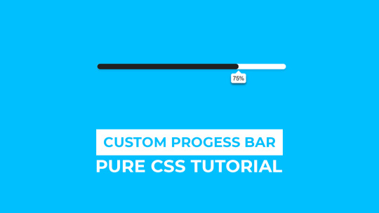
CSS Progress Bar Animation
#css progress bar animation#codenewbies#html css#frontenddevelopment#html5 css3#css animation examples#pure css animation#css animation tutorial#css#webdesign#code#html css animation#css progress bar
5 notes
·
View notes
Text
animated progress bar
#progress bar css#progress bar html css#codingflicks#html css#frontend#animated skill bar#css#html#css3#code#learn to code#frontenddevelopment
3 notes
·
View notes
Text

Animated Loading Progress Bar
#loading progress bar#progress bar animation#css animation tutorial#html css#css#divinectorweb#webdesign#html#css3#css animation examples
2 notes
·
View notes
Text
Animated Skill Meter: https://codepen.io/josetxu/pen/XWqMJpN More CSS progress bars: https://freefrontend.com/css-progress-bars/
6 notes
·
View notes
Text
Why Hiring a Web Designer in Bangalore Can Elevate Your Brand in 2025

In the digital-first economy, your website often makes the first impression—and in a competitive tech hub like Bangalore, that first impression can either fuel business growth or push potential clients away. A professional, well-crafted website is no longer optional; it’s a necessity. If you're searching for a trusted web designer in Bangalore, Hello Errors is a name you can count on.
From intuitive layouts to SEO-integrated builds, Hello Errors delivers websites that are not only beautiful but also functional, scalable, and built for performance.
Bangalore: A Hotspot for Digital-Driven Brands
Bangalore has earned its reputation as the Silicon Valley of India—a city teeming with startups, tech innovators, and fast-growing enterprises. With this digital boom comes intense competition. Businesses need a web presence that does more than just exist—it needs to impress, engage, and convert.
That’s why working with a skilled web designer in Bangalore like Hello Errors can be the differentiating factor for your brand’s success.
What Makes a Web Designer in Bangalore Truly Exceptional?
It’s not just about pretty pages and polished animations. A top-tier web designer brings together multiple dimensions of digital strategy:
🎯 Strategic Planning
A smart website starts with user research, competitor analysis, and a deep understanding of your business goals. At Hello Errors, every project begins with a strategic blueprint.
🖌️ Brand-Centric Visuals
Every brand has a story. Our team builds visuals that match your tone, industry, and audience—whether you’re a quirky D2C brand or a formal fintech company.
📲 Mobile-First Design
Over 70% of traffic in India comes from mobile devices. Our mobile-responsive designs ensure your website looks and functions flawlessly on smartphones and tablets.
🚀 Fast Load Times
No one sticks around for a slow-loading site. We optimize every image, script, and CSS file to ensure lightning-fast performance.
Why Hello Errors is the Preferred Web Designer in Bangalore
If you're wondering what makes Hello Errors different from other web design companies in Bangalore, here are key reasons:
1. Cross-Platform Expertise
Whether it’s a responsive corporate website, a progressive web app, or an eCommerce portal—Hello Errors delivers consistent performance across platforms and devices.
2. Growth-Focused Design
We build websites that serve business goals—be it lead generation, user engagement, or sales conversion. Our CTAs, UX flow, and messaging are built to drive results.
3. AI-Integrated Interfaces
As a forward-thinking web designer in Bangalore, Hello Errors incorporates AI elements like chatbots, recommendation engines, and intelligent search bars into modern website builds.
4. SEO Comes Built-In
We don’t treat SEO as an afterthought. Every Hello Errors project includes:
Meta tags and schema markup
Optimized headings and structure
Image compression and alt tags
Clean URL structuring
Sitemap and robot.txt integration
This makes it easier for Google to crawl and rank your site from day one.
Our Creative Stack: Beyond Just Web Design
Hello Errors isn’t just a web designer in Bangalore—we’re your end-to-end digital growth partner. Here’s a glimpse of our full stack of services:
🧩 Web Development
Built on frameworks like React, Angular, Laravel, and WordPress, our sites are modern, secure, and scalable.
📱 App Development
From native Android/iOS apps to hybrid Flutter builds, we help brands create seamless mobile experiences.
🎯 Search Engine Optimization
We offer ongoing SEO support with keyword tracking, technical audits, link-building, and content strategy.
🤖 AI & ML Integration
Need predictive analytics, chatbots, or AI-powered recommendation tools? We’ve got you covered.
🎨 UI/UX Design
We map out complete design systems with wireframes, journey flows, and design components for web and mobile platforms.
Examples of Our Impact (Generalized Case Insights)
🚀 Startup Boost:
A SaaS startup gained 250% more qualified leads after Hello Errors redesigned their landing pages with stronger CTAs and SEO-focused content flow.
🛒 eCommerce Success:
A local Bangalore D2C fashion brand saw their bounce rate drop from 60% to 20% and cart conversions rise by 40% post redesign.
🏢 Enterprise Upgrade:
An IT services firm improved its Google rankings and domain authority with a new SEO-optimized website developed by Hello Errors.
These examples underscore our capability as a leading web designer in Bangalore who delivers measurable growth.
Key Trends We Integrate as a Web Designer in Bangalore
Staying ahead of trends helps us build sites that feel modern and future-ready. Some design-forward elements we include:
Dark Mode Compatibility
Glassmorphism and Neumorphism Designs
Interactive Scroll-Based Animations
Sticky Navigation and Floating CTAs
Voice Search Optimization
As a cutting-edge web designer in Bangalore, Hello Errors stays updated with global web trends and aligns them with local market needs.
How to Choose the Right Web Designer in Bangalore: Quick Checklist
Before hiring a web design partner, keep this checklist handy:
✅ Does the company offer end-to-end solutions (design + development + SEO)? ✅ Can they show real business impact from previous projects? ✅ Are their websites responsive, SEO-friendly, and fast-loading? ✅ Do they understand your business goals—not just technical specs? ✅ Do they offer long-term support or maintenance?
With Hello Errors, the answer to all the above is a confident yes.
Take the Next Step with Hello Errors
Whether you’re an emerging startup, an established brand, or a growing agency—your website is your most powerful digital asset. Partner with Hello Errors, the most trusted web designer in Bangalore, to create a platform that’s bold, smart, and built for tomorrow.
👉 Get in touch with us today for a free discovery session. Let’s build something extraordinary together.
#WebDesignerInBangalore#HelloErrors#WebDesignIndia#ResponsiveDesign#UIUXDesign#SEOFriendlyWebsite#DigitalBranding#BangaloreStartups#AIWebDesign#AppDevelopmentIndia#WebDevelopmentExperts
0 notes
Text
Future-Proof Your Website: 5 Web Design Strategies That Will Dominate in 2025

Web design is no longer just about making a site look good.
In today’s digital world, your website acts as your brand's voice, your store, your customer service desk, and your sales team. With user behaviors changing fast and technology advancing even faster, your website must be ready to adapt.
That is why future-proofing your website is more important than ever before.
Let’s explore five major design strategies that are reshaping how websites are built and used in 2025. These strategies are not just trends. They are shifts in how we think about digital experiences.
Speed is the New Standard for Online Success
First impressions happen fast. Visitors decide in seconds whether they want to stay on your site or leave. If your page takes too long to load, they are likely to click away before they even see what you offer.
This is why speed is no longer just a bonus. It is a requirement.
In 2025, websites are being built with speed as a core priority. Developers are moving away from heavy frameworks and bloated designs. Instead, they are using lighter code, optimizing images using formats like WebP, and loading only the content that is needed at the moment.
Minimizing unused CSS and JavaScript, reducing the number of third-party scripts, and caching intelligently can all dramatically boost your load time.
Speed matters to users and to search engines. Google now considers page speed when ranking websites. So a faster website does not just improve the user experience. It can improve your visibility in search as well.
Make speed your foundation. It supports everything else you build.
Designing for the Eyes: The Rise of Dark Mode and Visual Comfort
More people are browsing the web at night or in low-light settings. This has made visual comfort an important factor in web design. One of the clearest signs of this shift is the growing popularity of dark mode.
Dark mode gives users an interface that uses darker backgrounds with lighter text. It reduces eye strain and looks more modern to many users. Some devices even switch to dark mode automatically at certain times of the day.
A good website in 2025 respects user comfort. That means giving them options. More and more designers are creating flexible themes where users can toggle between light and dark modes. This not only improves the experience but also gives users a sense of control.
But visual comfort goes beyond color themes. It includes avoiding harsh contrasts, using calm color palettes, and ensuring text is always easy to read. Typography, spacing, and line height all play a role in making sure your content is welcoming and effortless to consume.
A visually comfortable website encourages longer visits, repeat visits, and greater trust.
Micro-Interactions Make the Web Feel Human
We often focus on big elements like headers, layouts, and graphics. But sometimes the smallest touches have the biggest impact.
Micro-interactions are the tiny animations or responses that happen when a user performs an action. Think of a button that changes color when hovered. Or a subtle animation when a form is submitted successfully. These small movements provide feedback. They tell the user something happened.
In 2025, websites that feel alive and responsive are winning attention. Micro-interactions make a site feel more intuitive and engaging. They help users understand how things work without needing instructions.
For example, a progress bar that fills up as someone scrolls down a blog post encourages them to keep reading. A playful animation when a product is added to a shopping cart makes the process feel rewarding.
These touches are not just decoration. They create smoother experiences and help build a sense of flow as users move through your site.
The best micro-interactions are simple, fast, and purposeful. They make the digital feel more human.
Personalization Powered by AI Brings Better Experiences
A one-size-fits-all approach no longer works in web design. Today’s users expect personalized experiences. They want to feel like your website understands their needs.
With AI becoming more accessible, personalization is easier and more powerful than ever.
Websites in 2025 can analyze user behavior and adjust the experience in real time. They can show different headlines based on a visitor’s location. They can recommend products based on past purchases or browsing history. They can greet returning users with content that feels relevant instead of generic.
Smart content blocks, predictive search, and AI chat assistants are some of the ways personalization is being built into websites.
It is not about spying on users. It is about making the experience smoother, faster, and more helpful. When users feel understood, they are more likely to engage, stay longer, and return again.
Always remember to keep personalization subtle and respectful. It should feel helpful, not intrusive.
Accessibility First Means Designing for Everyone
One of the most powerful changes in modern web design is the shift toward inclusivity. Accessibility is no longer a feature. It is a foundation.
An accessible website ensures that everyone can use it, including people with disabilities. This might mean adding alt text to images so screen readers can describe them. It might involve using proper heading structure so the content is easy to follow. Or making sure buttons are large enough to tap and links are keyboard-friendly.
Designing with accessibility in mind helps people with visual, hearing, cognitive, or mobility challenges navigate your site with ease.
But accessibility benefits everyone. Clean, readable design helps all users focus. Keyboard navigation can improve site speed. And accessible sites often rank better in search engines because they are built with better structure and clarity.
More importantly, building accessible websites is the right thing to do. It shows that you care about your entire audience.
When you design for all, your reach and impact grow naturally.
Final Thoughts on Future-Proofing Your Website
Technology moves fast, but user expectations move even faster.
By focusing on speed, visual comfort, micro-interactions, personalization, and accessibility, you are not just chasing trends. You are building a digital experience that will last.
Websites in 2025 need to be fast, responsive, human-centered, and inclusive. That is what it means to be future-proof.
The best time to update your design was yesterday. The second-best time is now.Want more insights on where web design is heading? Explore our full blog: Top 5 Latest Web Design Trends in 2025 and Beyond
0 notes
Text
Estilo de Cabeçalho #03
A muito tempo atrás, direto do túnel do tempo, eu usei ele nesse theme (sdds silly-love-poems). Dai o João me lembrou dele e pediu para eu fazer o tutorial, como eu sou uma pessoa muito boa vou fazer u_u
~Preview~
Primeiro coloca isso no teu css:
.bar div {color: #c9c9c9;overflow: hidden; white-space: nowrap; padding:5px; animation: progress-bar 4;-webkit-animation: progress-bar 4s; -moz-animation: progress-bar 4s; text-align: center; margin-top:2px; text-transform:uppercase; font-family: Verdana, Geneva, sans-serif; font-size:14px; box-shadow:inset 0px 0px 10px #ccc; outline-offset: -3px; outline:1px dashed #fff; border-radius:5px;}@-webkit-keyframes progress-bar {0% { width: 0;}} @-moz-keyframes progress-bar {0% { width: 0; }}
Por favor não apague nada se não deforma!
E quando for usar usa isso:
<center><div class="bar"><div style="width: 95%; background:#f7f7f7;">Conteúdo<3</div></center>
Por favor não apague nada se não deforma!
0 notes
Text
Micro-Interactions: How Small Details Enhance User Experience
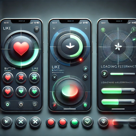
Micro-Interactions: How Small Details Enhance User Experience
Micro-interactions are subtle animations and feedback mechanisms that make digital experiences more engaging, intuitive, and user-friendly. These small details significantly impact usability, engagement, and delight without overwhelming users.
1. What Are Micro-Interactions?
A micro-interaction is a small, functional animation that occurs in response to a user’s action. They guide users, provide feedback, and improve the overall UX.
🔹 Examples: ✅ A “like” button that animates when clicked ❤️ ✅ A password strength meter while typing 🔒 ✅ A loading spinner when fetching data ⏳
💡 Micro-interactions improve UX by making interfaces feel alive, intuitive, and responsive.
2. Key Components of Micro-Interactions
Every micro-interaction consists of four key parts:
1️⃣ Trigger — The user action or system event that initiates the micro-interaction. 2️⃣ Rules — Define what happens once the interaction starts. 3️⃣ Feedback — Provides real-time response (e.g., animation, vibration). 4️⃣ Loop & Mode — Determines if the interaction repeats or adapts based on context.
🔹 Example: Toggle Button Animation
Trigger: User taps the toggle switch.
Rules: The toggle state changes from “Off” to “On.”
Feedback: The switch smoothly slides and changes color.
Loop & Mode: The toggle remains in its new state until changed.
3. Why Micro-Interactions Matter in UX Design
✅ Enhance User Engagement: Makes the UI more interactive and fun. ✅ Provide Instant Feedback: Shows the result of an action in real time. ✅ Improve Usability: Helps guide users intuitively. ✅ Add Personality to a Brand: Creates a more human and relatable experience.
4. Common Micro-Interaction Examples
🔹 Loading Animations
🔄 Prevent frustration by keeping users informed. Instead of a boring “Loading…” message, a creative animation can improve perceived performance.
✅ Example:
Spinning loader (⏳)
Skeleton screens (gradually load content)
Progress bars (indicate completion)
🔹 Button Feedback & Hover Effects
📍 Enhances interactions and confirms user actions.
✅ Example:
Buttons change color or size when hovered.
A ripple effect when clicking a button.
cssCopyEditbutton:active { transform: scale(0.95); }
🔹 Form Validations & Input Feedback
✍️ Makes form-filling easier and error-free.
✅ Example:
Inline validation messages (✅ or ❌).
Password strength indicators.
Shake animation for incorrect input.
javascriptif (password.length < 6) { inputField.classList.add("shake"); }
🔹 Like, Share, & Favorite Animations
❤️ Encourages engagement and interaction.
✅ Example:
Clicking a heart icon makes it pop & change color.
Social media reactions (e.g., Facebook’s Like button).
javascriptheartIcon.addEventListener("click", () => { heartIcon.classList.add("animate-heart"); });
🔹 Toggle Switch & Dark Mode
🌗 Smooth transitions improve experience.
✅ Example:
A toggle switch animates when switching between light and dark modes.
Background and elements smoothly transition between themes.
javascripttoggleButton.addEventListener("click", () => { document.body.classList.toggle("dark-mode"); });
5. Best Practices for Designing Micro-Interactions
🎯 Keep it Simple — Subtle animations work best; avoid overuse. ⚡ Make it Fast — Animations should be quick (0.2–0.5s). 🎨 Match the Brand Personality — Ensure animations align with the app’s tone. 🎯 Provide Feedback — Always let users know what’s happening. 📱 Ensure Accessibility — Avoid relying only on color; support screen readers.
6. Tools to Create Micro-Interactions
🚀 For UI Designers:
Figma, Adobe XD, Sketch — For prototyping animations.
Lottie (Airbnb) — Lightweight animated SVGs & JSON-based animations.
💻 For Developers:
CSS Animations & Transitions — For simple hover and click effects.
JavaScript & GSAP — For dynamic and interactive animations.
Framer Motion (React) — For smooth UI animations.
7. Conclusion
Micro-interactions may seem small, but they greatly enhance user experience by making interfaces more engaging, intuitive, and fun. When used effectively, they improve usability, reduce friction, and add a human touch to digital products.
WEBSITE: https://www.ficusoft.in/web-designing-training-in-chennai/
0 notes
Text
Top 10 Web Design & Development Strategies to Improve User Engagement
In today’s digital world, where competition is fierce and users have high expectations, engaging web design and development is essential for businesses. A well-crafted website not only attracts visitors but also keeps them interested, encouraging them to interact, return, and convert. Here, we’ll explore the top 10 web design and development strategies to enhance user engagement and make your website a valuable asset.

1. Prioritize Responsive Design
Why It Matters: Users access websites on various devices, from desktops to smartphones. A responsive design adjusts the website layout automatically to fit any screen size, providing a seamless experience.
How to Implement: Use flexible grids and images, and CSS media queries to ensure your website adapts to different devices. Test across devices to guarantee a consistent experience.
2. Optimize Page Load Speed
Why It Matters: Slow websites lead to high bounce rates. Users expect pages to load in under three seconds; otherwise, they may leave.
How to Implement: Compress images, minify CSS and JavaScript files, and leverage browser caching. Tools like Google PageSpeed Insights and GTmetrix can help identify speed issues and offer optimization suggestions.
3. Implement Clear and Intuitive Navigation
Why It Matters: If users can’t find what they’re looking for quickly, they’ll leave. Intuitive navigation helps them explore and understand your site easily.
How to Implement: Use a simple and logical menu structure, ensure clear labels, and keep the navigation bar consistent across all pages. Add a search function for enhanced usability, especially on large websites.
4. Use Visual Hierarchy to Guide Attention
Why It Matters: Visual hierarchy uses design elements like color, size, and positioning to direct users' attention to important information or CTAs (calls-to-action).
How to Implement: Highlight key elements with contrasting colors, larger fonts, or prominent placement. Use white space strategically to separate sections and avoid overwhelming users.
5. Enhance User Experience with Interactive Elements
Why It Matters: Interactive elements engage users and make their journey through the website more enjoyable.
How to Implement: Incorporate features like hover effects, animations, and clickable icons that respond to user actions. Keep animations subtle and purposeful to avoid distraction.
6. Focus on High-Quality, Relevant Content
Why It Matters: Valuable content keeps users engaged and encourages them to stay longer on your site. It also positions you as an industry expert.
How to Implement: Create content that addresses your audience's needs and interests, including blogs, infographics, and videos. Ensure all content is readable with clear headings, short paragraphs, and visuals.
7. Leverage Social Proof and Testimonials
Why It Matters: Social proof, like testimonials, reviews, and case studies, builds trust and credibility, encouraging users to engage and convert.
How to Implement: Place testimonials and reviews in visible areas, such as your homepage or product pages. Include client logos or case studies to further demonstrate your expertise and reliability.
8. Simplify Forms and Optimize for Conversion
Why It Matters: Forms are crucial for lead generation and user interactions. Overly complicated forms can discourage users from filling them out.
How to Implement: Keep forms short and ask only for essential information. Use clear labels and progress indicators for multi-step forms. Make form fields user-friendly by including autofill and input validation.
9. Utilize Calls-to-Action (CTAs) Strategically
Why It Matters: CTAs are vital for guiding users toward desired actions, such as signing up, purchasing, or contacting you. Placing CTAs strategically increases conversions.
How to Implement: Use persuasive, action-oriented language, like “Get Started” or “Contact Us.” Ensure that CTAs stand out with contrasting colors and are positioned where users naturally look, like the end of a blog post or the top of a product page.
10. Incorporate Data Analytics and A/B Testing
Why It Matters: Data analytics provide insights into user behavior, while A/B testing helps you experiment with different design and content options.
How to Implement: Use tools like Google Analytics to track user behavior metrics like bounce rate, page views, and average session duration. Conduct A/B tests on elements like headlines, colors, and CTA placement to determine what resonates best with your audience.
Conclusion
These web design and development strategies can significantly improve user engagement by enhancing usability, accessibility, and aesthetic appeal. By focusing on these areas, you can create a website that not only attracts visitors but also keeps them coming back. Remember, user engagement is an ongoing effort—continuously gather feedback, monitor performance, and make improvements to ensure your website remains relevant and effective.
0 notes
Text

CSS Progress Bar Animation
#css progress bar animation#css progress bar#css3#html css#codenewbies#css#css animation examples#pure css animation#css animation tutorial#html5 css3#frontend
2 notes
·
View notes
Text
CSS Progress Bar with Percentage
#css progress bar#progress bar#progress bar css#progress bar html css#css animation tutorial#pure css animation#html css#learn to code#frontend#css#html#css3#frontenddevelopment#code#animation#CSS Progress Bar with Percentage
3 notes
·
View notes
Text

CSS Circular Progress Bar Animation
#css circular progress bar animation#css progress bar#animated progress bar#html css#learn to code#code#frontenddevelopment#divinectorweb#css3#html#css#css animation examples#css animation
0 notes
Text
Create a Circular Progress Bar with HTML, CSS, and JavaScript
Hello everyone, today in this video we will be circular progress bar that will having a loading animation or a progress bar, but it will animate circularly. So if you want to learn how to build this please stick around to the end :)
Create a Circular Progress Bar with HTML, CSS, and JavaScript
Visit us :-
youtube
0 notes
Text
Porto Theme v7.1.14 – Multi-Purpose & WooCommerce Theme
https://themesfores.com/product/porto-theme-woocommerce-theme/ Porto Theme v7.1.14 – Multi-Purpose & WooCommerce Theme Porto v7.1.14 WordPress theme introduces a lot of new features and demos, we also enhanced our speed Optimization wizard and reached top performance scores in ThemeForest. Porto releases 5 wonderful features – Soft Mode, Merged JS and CSS, Critical CSS, Type Builder, Single, and Archive Builders. Porto improved performance by optimizing dynamic styles by about 30ms, using CSS variables, optimizing server response time by about 30ms, etc. Please check the changelog below for more details. Porto Multi-Purpose & Woocommerce Theme Main Features: Multipurpose design WordPress Multisite (WPMU) Tested and Approved Child Theme Ready Bunch of Useful Demos – Construction, Hotel, Restaurant, Law Firm, Digital Agency, Medical, Real-Estate, APP Landing, Resume etc Plenty of Widgets Multiple Page Styles Powerful Speed Optimization Tool Visual Composer is highly optimized One Page Template Social Sharing Features 33+ custom elements for Visual Composer (banners, carousels, tabs, toggles, accordions, buttons, quotes, table, alert boxes, tables, lists, forms, icons, glyphicons, progress bar, pricing tables, dropcaps, team members, call to action boxes, columns, etc) SEO Optimized (Rich snippets for breadcrumbs and reviews are built-in) Responsive Design Unlimited Colors & Layouts WooCommerce Compatible Wishlist, Ajax Search, Filtering & Sorting WPML Support RTL Ready FAST Support & Updates Cross-browser compatibility (IE9+, Chrome, Firefox, Safari, Opera, Edge) Valid HTML5 code 30 + unique homepage layouts: More amazing concepts are coming soon! 6 extra layouts of the slider area: Text and Form, Static image, Single Video; Mega menu and 3-level drop-down menu; 20+ different headers 5 different breadcrumbs 4 different portfolio types (total 19 pages) 4different blog types (total 6 pages) Grid / List view Shop pages Ajax filtering in shop and product archive pages Revolution Slider ($19 value) plugin Visual Composer ($34 value) Woocommerce Catalog Mode Powerful Page options Elegant animations 3 different contact page layouts Install Demo content with One-Click Wide / Full / Boxed Layout Typography page Switch on/off sticky header option Additional pages: About, Services, Team, Process, Careers, FAQ, 404 page, Sitemap, Contact us, etc. Lightbox Share icons on project and product pages Contact and newsletter forms Twitter Feed Widget Google web fonts Custom Font Control Documentation ? step by step Compatible with WordPress SEO plugin Compatible with WordPress Social Login plugin Compatible with WP Cache plugins such as WP Super Cache, W3 Total Cache plugins Compatible with Mailpoet newsletter plugin Compatible with Revolution Slider plugin Compatible with BBPress, BuddyPress plugins Compatible with Better WordPress Minify plugin Compatible with Nav Menu Roles plugin Compatible with Woocommerce Product Filter plugin Compatible with Post Views Counter plugin Compatible with GeoDirectory plugin Compatible with WooCommerce Multilingual plugin Compatible with Major multi-vendor plugins like Dokan, WC Vendors and Yith WooCommerce Multi-Vendor plugins Compatible with YITH WooCommerce Wishlist plugin Compatible with YITH WooCommerce Ajax Search plugin Compatible with YITH WooCommerce Badge Management plugin Compatible with WPML plugin Compatible with Polylang plugin Compatible with qTranslate X plugin Compatible with WooCommerce Currency Switcher plugin And much much more? Please note: that any digital products on this website do not contain malicious code, viruses, or advertising. https://themesfores.com/product/porto-theme-woocommerce-theme/ #WooCommerceTheme #WordpressTheme
0 notes
Text
Online Progress Bar Generator Free: Simplify Your Projects

In the digital landscape, progress bars serve as visual cues, guiding users through processes and indicating completion. A progress bar generator is a versatile tool that empowers developers and designers to create customized progress indicators tailored to specific needs. In this exploration, we delve into the intricacies of progress bar generation, unveiling the methodologies, functionalities, and potential applications of this invaluable tool.
At its core, a progress bar generator is a user-friendly interface that facilitates the creation of progress bars with varying styles, functionalities, and visual aesthetics. Whether for web development, software design, or multimedia projects, this tool empowers users to craft progress indicators that align with their design ethos and user experience objectives.
Functionality stands as a cornerstone of progress bar generation, encompassing a range of features and customization options. Users can specify the duration of the progress, set milestones or checkpoints, and define the visual appearance of the progress bar, including color schemes, shapes, and animations. Advanced functionalities may include real-time updates, interactive elements, and integration with external data sources.
Methodologies for progress bar generation vary depending on the specific requirements of the project and the preferences of the user. Some users may opt for a code-based approach, leveraging programming languages such as HTML, CSS, and JavaScript to manually craft progress bars with precise specifications. Others may prefer a visual editor or GUI (Graphical User Interface) tool, which provides an intuitive interface for customizing progress bars through drag-and-drop functionality and visual configuration settings.
The process of generating a progress bar typically begins with defining the parameters of the progress, such as the total duration, milestones, and desired visual style. Users then select or customize the visual elements of the progress bar, including colors, shapes, and animations. Finally, the progress bar generator generates the corresponding code or output, which can be seamlessly integrated into web pages, applications, or multimedia projects.
Customization lies at the heart of progress bar generation, allowing users to tailor progress indicators to suit their unique needs and design preferences. Users can choose from a variety of predefined templates or create custom designs from scratch, selecting from a palette of colors, gradients, and textures. Advanced customization options may include the ability to add custom icons, labels, or tooltips to the progress bar, enhancing its functionality and aesthetic appeal.
Applications of progress bar generators span a wide range of industries and disciplines, reflecting their versatility and utility in diverse contexts. In web development, progress bars are commonly used to indicate the loading status of web pages, file uploads, or form submissions, enhancing the user experience by providing real-time feedback on the progress of tasks. In software design, progress bars serve as visual indicators of installation progress, software updates, or data synchronization processes, helping users track the completion of complex operations. In multimedia projects, progress bars can be integrated into videos, animations, or interactive presentations, providing viewers with a visual timeline of the content and enabling them to navigate through the material at their own pace.
In conclusion, a progress bar generator is a powerful tool that empowers developers and designers to create customized progress indicators with ease and precision. By offering a range of features, customization options, and integration capabilities, this tool facilitates the creation of progress bars that enhance user experience, streamline workflows, and elevate the visual appeal of digital projects across industries and disciplines.
1 note
·
View note
Text
0 notes