#css zoom hover effect
Explore tagged Tumblr posts
Visit Tumblr Blog
Explore Tumblr blogs with no restrictions, modern design and the best experience.
Last Seen Tumblr Blogs


Fun Fact
In 2020, 27% of US Tumblr users had an annual household income of over $100,000.
Text
CSS Hover Image Zoom Animation
#css image hover overlay#zoom hover css#css animation#html css#codenewbies#frontenddevelopment#css animation examples#css#html5 css3#pure css animation#css animation tutorial#code#animation#css zoom hover effect
2 notes
·
View notes
Video
youtube
2 Must-Know Divi Tricks to Instantly Add Image Zoom on Hover!
Learn 2 ways to add an awesome image zoom effect to your Blurb Module in the Divi Theme using simple, lightweight CSS code! In this quick and effective tutorial, you'll discover how to enhance user interaction and make your Divi Blurb Module images stand out with smooth zoom-on-hover animations. No plugins, no bloat—just clean, elegant code to take your Divi designs to the next level.
0 notes
Text
Lightboxes
YAYINDA! https://mguzel.com.tr/lightboxes/
Lightboxes
Lightboxes Shortcodes
The lightboxes are driven by Visual Composer Single Image shortcodes.
Single Image
Simple popups with different styles.
DEFAULT
DEFAULT WITH BORDER
WITH ICON
HOVER EFFECT
Simple Image Gallery
Image gallery in the same row.
Zoom Image Gallery
Image gallery in the same row.
Zoom Image Gallery + Carousel
Dialog with CSS animation
Animations are added with simple CSS transitions, you can make them look however you wish.
Open with fade-zoom animation
Dialog example
This is dummy copy. It is not meant to be read. It has been placed here solely to demonstrate the look and feel of finished, typeset text. Only for show. He who searches for meaning here will be sorely disappointed.
Open with fade-slide animation
Dialog example
This is dummy copy. It is not meant to be read. It has been placed here solely to demonstrate the look and feel of finished, typeset text. Only for show. He who searches for meaning here will be sorely disappointed.
Popup with video or map
In this example lightboxes are automatically disabled on small screen size and default behavior of link is triggered.
Open YouTube Video
Open Vimeo Video
Open Google Map
Open YouTube Video
Open Vimeo Video
Open Google Map
Ajax
You have full control of what is displayed in popup, align it to any side via CSS, enable or disable scroll on right side of window.
Load Ajax Content
Form
Entered data is not lost if you open and close the popup or if you go to another page and then press back browser button.
Open Form
Hata: İletişim formu bulunamadı.
0 notes
Text
How to Optimize Your Website for Mobile: Key Steps for Better User Experience
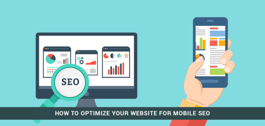
Why Mobile Optimization Matters
Mobile optimization refers to the process of ensuring your website is fully functional and aesthetically appealing on smartphones and tablets. When visitors land on your site from their mobile devices, they expect it to load quickly, be easy to navigate, and deliver a seamless user experience. Poor mobile optimization leads to frustrated users, higher bounce rates, and ultimately, lower conversions.

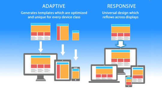
1. Implement a Responsive Design
Responsive design ensures that your website adapts to different screen sizes, whether it’s a smartphone, tablet, or desktop. Instead of creating separate mobile and desktop versions of your site, a responsive design automatically adjusts the layout based on the device being used.
This approach provides several benefits:
Consistent user experience: Users enjoy a seamless browsing experience regardless of the device they’re on.
Improved SEO: Google values responsive design, and it can boost your search engine rankings.
Faster updates: Since there’s only one version of the website to maintain, updates are simpler and faster to implement.
2. Optimize Your Page Load Speed
Mobile users are often on the go, so if your website takes too long to load, they won’t hesitate to leave. Research shows that even a one-second delay in page load time can result in a significant drop in conversions. To improve your mobile site’s load speed, consider the following steps:
Compress images: Large images can slow down your website. Use tools to compress images without sacrificing quality.
Minimize JavaScript and CSS: Streamlining code helps reduce loading times.
Use browser caching: This allows your site’s elements to be saved in the user’s browser, speeding up load times on subsequent visits.

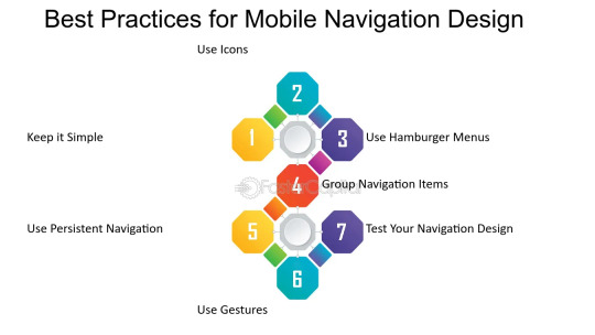
3. Simplify Navigation for Mobile
Mobile screens are smaller, so it’s crucial to simplify your website’s navigation. A complex or crowded menu can frustrate users. Focus on providing easy access to your most important pages and ensure that your menu is intuitive and easy to use. Consider the following best practices:
Use a hamburger menu: A hamburger menu (three horizontal lines) is a mobile-friendly option for hiding your navigation menu, saving valuable screen space.
Prioritize key pages: Limit the number of menu options and prioritize your most important pages, such as your contact page, products, or services.
Clickable buttons: Make sure buttons are large enough to be easily tapped on a mobile screen.
4. Make Text Easy to Read
When users visit your site on their mobile devices, it’s important that they don’t have to zoom in to read text. Ensure that the font size is large enough to be readable on small screens. Additionally:
Use high contrast colors: Ensure the text contrasts well with the background for readability, especially on mobile devices where lighting conditions can vary.
Avoid long paragraphs: Mobile users prefer scannable content. Break up your content into shorter paragraphs and use bullet points when appropriate.
5. Optimize for Touchscreen Interaction
Mobile devices rely on touchscreen navigation, which is different from the mouse or keyboard navigation used on desktops. To improve usability:
Ensure buttons are large enough: Make sure buttons are big enough for easy tapping, without accidental clicks.
Avoid hover effects: Since hover effects don’t work on touchscreens, ensure all important interactions are clickable and not reliant on hovering.
Test user interactions: Ensure that forms, buttons, and interactive elements work seamlessly on mobile devices.
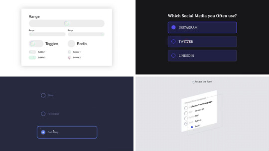
6. Mobile-Friendly Forms
Forms are essential on many websites, but filling them out on a mobile device can be challenging if not optimized. To improve mobile user experience:
Use smaller forms: Only ask for the most essential information, such as name, email, and phone number.
Enable auto-fill: This helps speed up the process and reduces errors.
Use large, clickable input fields: Ensure users can easily tap and fill in information without zooming.
7. Implement Mobile SEO Best Practices
Mobile SEO is critical for ensuring that your site performs well in search engine rankings on mobile devices. Some key tactics include:
Optimize for local searches: Many mobile users search for local businesses. Make sure your website is optimized for local SEO by including location-specific keywords and registering on Google My Business.
Use structured data: This helps search engines understand the content of your pages and can improve your visibility in search results.
8. Test Your Website Across Different Devices
Before launching your mobile-optimized site, it’s important to test it across multiple devices and browsers to ensure everything functions properly. There are several tools available to test your site’s mobile responsiveness and user experience.
Conclusion
Mobile optimization is no longer optional—it’s essential for providing a top-notch user experience and improving your SEO rankings. By implementing a responsive design, improving page load speed, simplifying navigation, and making your site touchscreen-friendly, you can enhance both user experience and mobile traffic.
At Nexgen Minds, we specialize in web design and SEO strategies that help businesses optimize their websites for mobile devices. Whether you need to redesign your website or improve your mobile traffic, our team can assist you in achieving the best results.
Stay connected with us on social media for more tips and updates! Follow us on @NexgenMinds and join our agency to take your business to the next level.
Let’s get your business optimized for mobile and grow your digital presence today!
Stay updated on the latest email marketing strategies and best practices by following Nexgen Minds on social media! Facebook: @NexGenMinds Linkedin: @NexGenMinds
Instagram: @NexGenMinds
Take the first step towards optimizing your digital marketing strategy with Nexgen Minds—where innovation meets results!
0 notes
Text
Building Dashboards with D3.js

D3.js is a powerful JavaScript library for creating interactive, data-driven dashboards. Unlike other charting libraries, D3 gives you full control over your visualizations, making it perfect for custom, interactive dashboards.
Getting Started:
Set Up: Include D3.js via CDN or npm.
Prepare Data: Load data from JSON, CSV, or APIs.
Create Visuals: Use D3 to build charts like bar charts, line graphs, or pie charts.
Add Interactivity: Implement features like tooltips, hover effects, and zoom.
Responsive Design: Make your dashboard adapt to different screen sizes using SVG and CSS.
D3.js may have a learning curve, but its flexibility allows you to create highly customized, dynamic dashboards. Start simple, then gradually add interactivity and polish as you go. Happy coding!
0 notes
Video
youtube
CSS Hover Image Zoom Animation | CSS Image Hover Overlay Effects
0 notes
Text
Removing Hover Effects in CSS: Simple Methods

Introduction
Hover effects in CSS add interactivity and enhance user experience by providing visual feedback when users interact with elements on a webpage. While these effects are commonly used to create engaging interfaces, there are instances where removing hover effects becomes necessary. This blog post explores the reasons behind removing hover effects and presents simple methods to achieve this, ensuring a more controlled and customized user experience.
1. Basic Concepts

Understanding the basic concepts of CSS hover effects is crucial for effectively managing and, if needed, removing them. Hover effects are CSS styles applied to elements when a user hovers over them with a cursor. These effects often include changes in color, size, or other visual attributes, providing feedback to the user about the interactive nature of the element. Key Components of Hover Effects: - Selectors: Specify which elements the hover effect should be applied to. - Properties: Define the visual changes when the element is hovered over. - Transitions: Control the smoothness of the effect over a specified duration. Example: Consider a button with a hover effect that changes the background color. The CSS for this might look like: CSS button:hover { background-color: #4CAF50; color: white; } Importance of Basic Concepts: A solid grasp of these concepts is essential when it comes to modifying or removing hover effects. It allows developers to pinpoint which elements are affected, what changes are applied, and how these changes contribute to the overall user experience. Without a clear understanding, unintended consequences or difficulties in customization may arise. Common Pitfalls: - Overuse: Applying hover effects excessively can lead to a cluttered and distracting interface. - Compatibility: Hover effects may not work consistently across all browsers or devices. - Accessibility: Ensure that hover-dependent content is accessible for users with different needs. Conclusion: Before delving into the methods of removing hover effects, a solid understanding of these basic concepts lays the foundation for effective CSS management. Developers can then make informed decisions based on the specific needs of their projects, ensuring a seamless and user-friendly web experience.
2. Common Hover Effects
Exploring popular hover effects provides insights into the diverse ways developers enhance the visual appeal of their websites. These effects not only capture user attention but also contribute to a more engaging user interface. Let's delve into some widely used hover effects and their implementations: 1. Color Changes: One of the simplest yet effective hover effects involves altering the color of an element. This could be a text color change, background color shift, or a combination of both. Developers often leverage this effect to highlight interactive elements like buttons or links. 2. Image Transitions: Hover effects on images can create dynamic and interactive content. Common implementations include zooming in, fading, or applying filters. These effects are frequently used in image galleries or portfolio sections to showcase visual content more dynamically. 3. Box Shadows and Borders: Adding shadows or adjusting borders on hover provides a sense of depth and dimensionality to elements. This effect is commonly used on cards, buttons, or other containers to simulate a three-dimensional interaction, enhancing the overall user experience. 4. Text Transformations: Text-based hover effects involve changes in font size, weight, or style. These effects are often applied to headers, links, or other textual elements to draw attention and signify interactivity. Bold text, italicization, or underline can be dynamically applied during hover. 5. Transition Delays: Introducing delays in the transition of hover effects can add a sense of anticipation and smoothness. Developers adjust transition durations to control the timing of visual changes, providing a polished and seamless user interaction. Implementing Hover Effects: Hover effects are typically implemented using CSS rules within style sheets. Developers define the specific style changes for the hover state of an element. The :hover pseudo-class is commonly used to target elements when users hover over them. Conclusion: Understanding these common hover effects equips developers with a toolkit to create visually appealing and interactive web interfaces. However, it's crucial to balance creativity with usability to ensure a positive user experience without sacrificing accessibility or website performance.
3. Why Remove Hover Effects?
While hover effects can greatly enhance user experience, there are scenarios where developers may find it necessary to remove them. Understanding the reasons behind removing hover effects is crucial for maintaining a clean and functional design. Let's explore the key motivations: 1. Accessibility Concerns: Some users may have accessibility needs or use devices that don't support hover interactions. Removing hover effects ensures that content and functionality remain accessible to a broader audience, including those with disabilities or using touch-based devices. 2. Streamlining User Interface: Excessive or overly complex hover effects can clutter the user interface and create a visually overwhelming experience. Removing certain hover effects helps streamline the design, focusing on essential elements and reducing unnecessary visual distractions. 3. Performance Optimization: Websites with numerous and intricate hover effects may experience performance issues, especially on low-powered devices or slower network connections. Removing or simplifying hover effects can contribute to better overall website performance and faster loading times. 4. Cross-Browser Compatibility: Not all browsers interpret CSS hover effects in the same way. Inconsistencies can lead to a lack of uniformity in the user experience. Removing or adjusting hover effects ensures a more consistent appearance across different browsers and devices. 5. User Preferences: Some users may prefer a more straightforward and static interface without dynamic hover effects. Providing options to disable or remove these effects allows users to customize their experience based on personal preferences. Methods of Removal: Developers can employ various methods to remove hover effects, including CSS modifications, JavaScript solutions, or utilizing media queries for responsive design. The choice of method depends on the specific needs and constraints of the project. Conclusion: Removing hover effects is a strategic decision that balances design creativity with practical considerations. By addressing accessibility, streamlining the interface, optimizing performance, ensuring cross-browser compatibility, and respecting user preferences, developers can create a more inclusive and user-friendly web experience.
4. Methods for Removing Hover Effects
When the decision is made to remove hover effects from a website, developers have several methods at their disposal. Each method has its own advantages and use cases, catering to different scenarios. Let's explore these methods in detail: 4.1 Disabling Hover with CSS: Disabling hover effects using CSS involves overriding or removing the styles applied to the :hover state. Developers can either reset the properties to their default values or explicitly set them to null. This method is straightforward and can be applied to specific elements or globally to the entire stylesheet. 4.2 JavaScript Solutions: JavaScript provides a dynamic way to control hover effects. Developers can use event listeners to detect when a user hovers over an element and then modify or remove the associated styles. This method offers greater flexibility, allowing for more complex logic or conditional removal based on user interactions. 4.3 Media Queries for Responsive Design: Media queries can be leveraged to apply or remove hover effects based on the device or screen size. This method is particularly useful for creating responsive designs that adapt to different viewing contexts. By adjusting hover effects for specific breakpoints, developers can optimize the user experience across devices. 4.4 !important Rule: The !important rule in CSS can be used to forcefully override hover effects. By applying this rule to styles, developers ensure that the specified styles take precedence over any conflicting hover styles. While caution should be exercised when using !important, it can be effective for quick and targeted removal of hover effects. Best Practices: - Target Specificity: When removing hover effects, ensure that the chosen method targets the specific elements or styles intended for modification. - Testing: Thoroughly test the removal of hover effects across various browsers and devices to ensure consistency and functionality. - Document Changes: Clearly document any modifications made to the CSS or JavaScript code to maintain code transparency and ease of future maintenance. Conclusion: Choosing the appropriate method for removing hover effects depends on the project's requirements and the desired level of customization. Whether through CSS adjustments, JavaScript interactivity, media queries, or the use of the !important rule, developers have a range of tools to effectively manage and tailor hover effects to enhance the overall user experience.
5. Best Practices
Efficiently managing hover effects is not only about their removal but also about implementing them judiciously to enhance user experience. The following best practices provide guidance on how to use and maintain hover effects for a balanced and user-friendly interface: 1. Purposeful Implementation: Apply hover effects with a clear purpose. Each effect should serve a functional or aesthetic goal, contributing positively to the overall user interface. Avoid excessive or gratuitous use of hover effects, which can lead to a cluttered and confusing design. 2. Consistency Across Elements: Maintain a consistent visual language for hover effects across different elements of the website. Users should have a predictable experience, understanding that certain elements will respond to hover interactions in a similar manner. 3. Responsiveness: Ensure that hover effects are responsive and adapt well to different screen sizes and devices. Use media queries to adjust the effects for optimal visibility and functionality on various platforms, including desktops, tablets, and mobile devices. 4. Accessibility Considerations: Pay attention to accessibility by providing alternative methods for users who may not interact with the website using a traditional cursor. This includes users with disabilities or those using touch-based devices. Test the website with accessibility tools to ensure a seamless experience for all users. 5. Performance Optimization: Optimize the performance of hover effects by minimizing unnecessary animations or transitions. Consider the impact on website loading times and ensure that the effects enhance rather than hinder the overall speed and responsiveness of the site. 6. User Feedback: Implement subtle visual cues during hover interactions to provide feedback to users. This helps in communicating the interactive nature of elements and enhances the overall usability of the website. 7. User Testing: Conduct user testing to gather feedback on the effectiveness and user-friendliness of hover effects. Understand how users interact with the website and make adjustments based on their preferences and behavior. Conclusion: Following these best practices ensures that hover effects contribute positively to the user experience without compromising accessibility or performance. By implementing hover effects purposefully, maintaining consistency, and prioritizing user feedback, developers can create a visually appealing and user-friendly interface that enhances overall website usability.
6. FAQ
Explore answers to frequently asked questions about removing hover effects in CSS to help address common queries and concerns. 6.1 Can hover effects be selectively removed? Yes, hover effects can be selectively removed based on specific elements or sections of a webpage. Developers can employ targeted CSS modifications or JavaScript solutions to achieve this level of customization. 6.2 How do I prevent hover effects on touch devices? To accommodate touch devices, it's advisable to use media queries to apply or remove hover effects selectively. By adjusting styles based on the device type, you can ensure a seamless experience for users interacting with touchscreens. 6.3 Are there any performance implications? Excessive or complex hover effects can impact website performance, particularly on devices with limited resources. It's crucial to optimize hover effects, minimize unnecessary animations, and test the website's performance across various devices to ensure a smooth user experience.
7. Conclusion
In conclusion, understanding and managing hover effects in CSS is a crucial aspect of web development, as these effects contribute significantly to the overall user experience. Whether enhancing interactivity or deciding to remove certain effects, developers must strike a balance between creativity and functionality. By following best practices, considering accessibility, and optimizing performance, developers can create websites that are visually appealing, user-friendly, and adaptable to diverse user needs. The methods discussed, including CSS adjustments, JavaScript solutions, media queries, and the use of the !important rule, provide a range of options for effectively managing hover effects based on specific project requirements. Remember to test thoroughly, document changes, and prioritize user feedback to ensure a seamless and enjoyable browsing experience for all users. Read the full article
0 notes
Text
Advanced Tricks and Tips of CSS
CSS, or Cascading Style Sheets, is a style sheet language used for describing the presentation of a document written in a markup language such as HTML or XML. The World Wide Web's foundational technologies, along with HTML and JavaScript, include CSS. CSS is used to control the appearance of a web page, including the layout, colors, fonts, and more. It can be used to create a wide variety of effects, from simple text formatting to complex animations. With the help of CSS, it is possible to design stunning and captivating websites. It is a relatively easy language to learn, and there are many resources available to help you get started. Benefits of Advanced CSS tricks There are many benefits to learning advanced CSS tricks. Some of the most significant ones are listed below: More control over your designs: Advanced CSS tricks allow you to have more control over the layout and appearance of your web pages. This can give you a competitive edge by allowing you to create more visually appealing and engaging designs. Improved performance: Advanced CSS tricks can help to improve the performance of your web pages. This is because they can help to reduce the amount of JavaScript that is needed to create complex layouts. More flexibility: Advanced CSS tricks can help to make your web pages more flexible and responsive. The ability to adjust to various screen sizes and devices is crucial in today's mobile-first environment. More creativity: Advanced CSS tricks can help you to express your creativity and create truly unique web pages. This can be a great way to stand out from the competition and attract more visitors to your site. These are just a few of the many advanced CSS tricks that are available. With a little effort, you can learn how to use these tricks to create stunning and engaging web pages. Increased job opportunities: As the demand for web developers continues to grow, employers are looking for developers who have a strong understanding of advanced CSS techniques. Learning these tricks can make you more marketable and help you land a better job. Improved career prospects: Advanced CSS skills can help you advance your career in web development. As you become more proficient in these techniques, you will be able to take on more challenging and rewarding projects. Greater satisfaction: Creating beautiful and functional web pages with advanced CSS can be very rewarding. It can give you a sense of accomplishment and satisfaction that is hard to find in other professions. Zoom on Hover: Zooming on hover is a popular CSS effect that allows you to zoom in on an image or other element when the user hovers over it. This can be a great way to give users a closer look at something they're interested in, or to make your website more visually appealing. To create a zoom on hover effect, you'll need to use the following CSS properties: transform: This property is used to transform the element, in this case zooming it in. transition: This property is used to create a smooth animation when the element is transformed. The code will create an image that is 100px wide and 100px high, with a black border. When the user hovers over the image, it will zoom in by 50%. The animation will take 0.5 seconds and use the ease-in-out timing function. You can use the same basic technique to create a zoom on hover effect for any type of element. Just make sure to set the width and height properties of the element to the desired size, and then use the transform property to zoom in on the element when the user hovers over it. If you are interested in learning more about advanced CSS tricks, there are a number of resources available online. You can find tutorials, articles, and even entire books on the subject. With a little effort, you can learn how to use these tricks to create stunning and engaging web pages. Truncate Strings: Here are some examples of how to use text truncation in CSS: To truncate the text in a navigation menu, you can use the text-overflow property on the nav element. To truncate the text in a table cell, you can use the text-overflow property on the td element. To truncate the text in a heading, you can use the text-overflow property on the h1 element. CSS is a powerful tool that can be used to create complex and beautiful layouts. By mastering the advanced tips and tricks of CSS, you can create websites that are both visually appealing and functional. Here are some of the most advanced tips and tricks of CSS: Use flexbox and grid layout: Flexbox and grid layout are two powerful layout systems that can be used to create complex layouts with ease. Use media queries: Media queries allow you to create different layouts for different screen sizes. This is essential for creating responsive websites that work well on all devices. Use pseudo-elements: Pseudo-elements allow you to add additional content to elements, such as borders, shadows, and text. Use animations and transitions: Animations and transitions can be used to add movement and interactivity to your website. Use custom properties: Custom properties allow you to store values that can be used throughout your website. This can help to make your code more reusable and maintainable. By mastering these advanced tips and tricks of CSS, you can create websites that are both visually appealing and functional. Read the full article
0 notes
Text
Download Now Image Hover Effects For Elementor - WPCroc.com
Download Now Image Hover Effects For Elementor – WPCroc.com
DOWNLOAD FOR FREE LIVE PREVIEWBUY FOR $13 Image Hover Effects Pro For Elementor is an impressive collection of hover effects, powered by pure CSS3, it works well with Bootstrap 3 and 4! This plugin offers you more than 130 scrolling effects and has many customization options with unlimited possibilities. You can use these effects with your images, there are also options for title, description…

View On WordPress
#circle effect#css hover effect#elementor#elementor addons#fade effect#hover effect#hover with caption#image hover#Image hover effects#mouse hover effect#responsive hover effect#thumbnail hover effect#transitions effects#wordpress#wordpress plugins#wordpress themes#zoom hover effect
0 notes
Text
Image Hover Effects For Elementor
Image Hover Effects For Elementor
[ad_1]
LIVE PREVIEWBUY FOR $9

“Image Hover Effects Pro For Elementor” is an impressive hover effects collection, powered by pure CSS3, work well with Bootstrap 3 & 4! This addon offers you 130+ hover effects and has lots of customization options with unlimited possibilities. You can use these effects with your images, there are also options for title, description, and link with the image.
Key…
View On WordPress
#circle effect#css hover effect#effects#elementor#elementor addons#fade effect#hover#hover effect#hover with caption#image#image hover#Image hover effects#mouse hover effect#responsive hover effect#thumbnail hover effect#transitions effects#wordpress#zoom hover effect
0 notes
Video
tumblr
85 CSS Image Effects Collection of hand-picked free #HTML and #CSS image effect code examples: 3d, animated, hover, magnify, overlay, transition, zoom, etc. https://freefrontend.com/css-image-effects/
#html#html5#css#css3#web design#web development#frontend#css image effect#css image#css hover effect
3 notes
·
View notes
Video
youtube
Insane Divi Gallery Effect! Full Width With Hover Zoom Magic
Learn how to create a Divi Theme Full Width Gallery With Zoom and Contain Hover Effect using the powerful Divi Gallery Module and some simple custom CSS. This tutorial will show you step by step how to make your gallery images stand out with a sleek hover zoom effect while keeping them perfectly contained within their original dimensions. Whether you're designing a portfolio, photography showcase, or an image-rich website, this effect will add a professional and interactive touch to your Divi site.
0 notes
Link
1 note
·
View note
Text
Top 10 Shopify Themes for Next-Gen Sellers
New Post has been published on https://www.justwebdevelopment.com/blog/top-10-shopify-themes-for-next-gen-sellers/
Top 10 Shopify Themes for Next-Gen Sellers
Shopify has become the most vital part of eCommerce platforms and has various dynamic themes that dare to embellish your e-store’s digital appearance. It also strengthens the brand’s awareness and provides relevant vibes to interact with the visitors colossally. Shopify themes help brands to look savvy and influential simultaneously and dare to grab the organic visitors and traffic.
Best Shopify Themes You Will Read This Year
If you are running a single niche e-store or intend to set down your eCommerce store themes from the sketch, Shopify themes can do wonders in your businesses. Shopify themes are available in mobile and desktop versions to augment the e-stores vision. Shopify themes elevate the professionalism in the e-store through its innovative features.
Countless Shopify themes and designs are available range from music to extremely corporate levels to make your business more relevant and inviting. All Shopify themes have various customization options ranging from color schemes to their own custom designs to make your e-store more outstanding.
The A – Z Of Best Shopify Themes
The article dares to unleash the top 10 favorite and creative Shopify themes for your brands. These themes can help brands to maintain and increase their e-store’s digital appearance and strength.
WOOKIE
Wookie is a versatile Shopify theme that could be helpful to any sort of e-stores. It dominantly provides you control over your e-store and creates alluring vibes to get more organic visitors. Wookie is a newly released Shopify theme and has dynamic ultra-modern designs to make your e-store more astonishing.
Wookie has almost 27 attractive homepages layouts to make you more surprised. Anyone can choose their favorite designs according to their business niche. Wookie also has various templates that could match any business niche. Wookie also has e-store’s inner pages templates that dare to keep an eye over product category pages and various essential features any e-store needs to augment its digital power.
Features
Wookie has almost 50,000 active users to date.
Wookie has single niche store layouts.
Wookie has nearly 16 creative layouts.
Wookie has creative pre-built buttons.
Wookie dynamically supports various languages.
Wookie has more than 20 splendid and creative skins.
Wookie has AJAR for fast loadings.
Price: $69
MOTION
Motion is another creative Shopify theme that brings your e-store to digital life through dynamic and imaginative animations and videos. The Motion theme provides a more significant number of transactions in a minimal period. It is also effective for in-person selling and dares to simultaneously expose creative images to handle visual brand storytelling.
Features
The theme is full of various features that ultimately inspire the new fresh vibe to your brands. The Motion theme also contains
Image Gallery.
Slideshows.
Product tabs.
Videos and Options.
Shipping Information.
Size Charts.
Videos.
Color swatches to make your e-store more helpful and relevant to organic visitors.
Last but not least, the Motion theme also includes cross-selling, FAQ pages, Product reviews, product and trust badges, stock counter, promo banners, and in-menu promos. Anyone can get this fantastic theme to boost their e-store’s digital power. The MOTION theme could be utilized for the clothing brands, apparel, food and drink industries, health and beauty industries. It is also best for any catalog size.
Price: USD 310
MOBILIA
Mobilia holds the third position in the Shopify theme counting. Mobilia is so creative and dynamic for businesses ranging from small businesses to the giant’s e-stores. It best suits the apparel and fashion industries niches to power the e-stores awareness to millions of internet users. Mobilia has so many versatile customization options for its users and drives the e-store towards the success paramount.
Features
Mobilia allows its users to resize their landing page banners.
Mobilia has high-quality homepage videos.
Mobilia designing is so accurate and alluring.
Mobilia has pre-added stock photos.
Mobilia is responsive and fastest.
Mobilia has already integrated social media features.
Mobilia has savvy search engine optimization.
Price: $180
HANDY
Handy is one of the simplest and convenient Shopify themes for small and giant e-stores. Handy offers various solutions ranging from its color themes to the dynamic phases of customizations. E-stores like apparel and fashion can utilize “HANDY” to tackle their all-digital hurdles. It is about gaining organic followers or augmenting the e-store awareness.
Features
Handy offers various mobile-optimized designs.
Handy offers the creative and most uncomplicated navigations for your e-store.
Handy has search-focused menus.
Handy also has multi-column menus.
Handy has eco-friendly search engine templates.
Handy has white space-rich modern layouts to make your store aesthetic.
Handy has Instagram gallery hover effects.
Price: $180
UNIVERSE
The universe is one of the most stylish and inviting Shopify themes of all time. It mainly has two different build-in themes that refer to the Light Earth Mode and Dark Mars Mode. Brands or E-store owners can choose a theme from these two dynamic and creative theme options to enhance their shopping experience in a savvy way. The universe is best for single and various product niches to maintain the entire e-store charisma.
Features
Universe has so much to offer to the e-stores owners. Its creative features contain;
Universe offers a sizable full-width slider.
Universe offers high-quality product images.
Universe offers inspirational images that help brands to exaggerate their actual voice.
Universe offers the demo slider editor.
Universe offers the easiest and simplest content customization for e-stores.
Price: $180
The Pro-Tip
Free Themes
Shopify offers various free themes such as Express, Narrative, Boundless, Simple, and Venture. Free themes are suitable for the newcomers who recently opened the e-store; still, these themes have not carried the customization options, color options, layouts, and templates.
Premium Themes
Shopify’s Premium themes are the real power for the e-store owners. They can elevate their business in a few days by availing dynamic and innovative Shopify premium themes. Premium themes have so much to offer, and you can drive your sales pace faster and safely. Premium themes have more customization options, color palettes, accurate niche elements, creative customer services to boost the e-store unconventionally.
FLEX
Flex is unique and one of the premium Shopify themes that dares to facilitate various e-stores ranging from small to giant ones. Flex dynamically offers different creative layouts and customization options for its users. Flex provides custom CSS to the coding language to increase organic traffic and leads.
Flex straightly helps newcomer e-store owners and saves precious hours via its creative theme. Flex offers various options, including 13 predefined theme styles for the e-store owners. Let’s hunt down the Flex unique features to increase your intelligence.
Features
Flex offers the custom CSS
Flex is the creative and fastest responder.
Flex has mega menus.
Flex has dropdowns.
Flex offers the alluring product sale stickers.
Flex offers customization of Headers & Footers.
Price: $450
TURBO
Turbo is the turbo, as its name slightly explains. It is best to stretch out the products in the digital world. Turbo is faster and reliable at the same time and best for the big e-stores that have various niches of products. If you are running an e-store and intend to reduce your e-stores loading time to make your customer service more enticing and savvier, Turbo is the most versatile option.
Features
Turbo offers a live search for visitors.
Turbo has the simplest navigations to facilitate the customer base ultimately.
The inspirational feature allows the editor to create more dynamic banners and footers.
Turbo offers mega menus.
Turbo offers newsletter signup to email marketing
Creative Blog Templates
Various Brand Niche Templates.
Price: $350
GRAVITY
Gravity is alluring and enticing enough to grab the gazes at first sight with its innovative, unconventional, and innovative features. Gravity contains the dark themes that accelerate the enticing factors of any eCommerce e-store. Gravity also has other themes options and innovative customization features.
Gravity dominates the dark themes interface users to push them forward towards the organic sales, lead generations, and beneficial revenues of all time. Gravity is so effective for e-store owners that it decreases page loading time and boosts the e-store’s full speed under speedy performance, among other themes.
Features
Gravity offers the robust mega menu
Fast Responsive
Multiple Slideshows
Creative Google Maps Integration
Slide-out Shopping Cart Display
Video Audio Support
Social Media Integration
Unlimited Page Layouts
Quick Add to Cart button
Slide-out Cart
Advanced Typography Options
YouTube Integration
Product Image Zoom
Extensive Documentation
Price: $180
BROOKLYN
Brooklyn is the finest for those who intend to make their e-stores more playful, magnetic, and vintage while living in the professional vibe. Brooklyn Shopify theme is specially made for the clothing and apparel as it undergoes ultra-modern features. The classic look is best for formal apparel; still, Brooklyn offers another zestful theme to boost their stylish vibes with creative and enticing colorful dresses.
Brooklyn is minimal and decent at the same time as well as its minimal designs are best for modern e-stores owners. Brooklyn is the subtle way to place your product images to the mainstream on your e-store. Brooklyn dares to grab the visitor’s focus at first sight.
Features
Brooklyn allows the owners to focus on brand imagery.
Brooklyn offers the slideshow.
Brooklyn provides ultra-modern trendy vibes.
Brooklyn offers the various creative product grid
Brooklyn has a slide-out cart
Brooklyn places the product images on the home page.
Brooklyn allows adding stuff in carts without leaving the current page.
Brooklyn has various home page creative videos.
Social Media Integrations
Price: Free
ELLA
Ella is clean, fresh, and the best-selling Shopify theme on Envato Market. Ella is famous among the entire Shopify themes and its users. The Ella theme has earned over 16 thousand downloads with the perfect 5-star ratings in the digital world. The Ella theme is the most successful and favorite due to its dynamic, simple, and ultra-modern features. It has several all-in-one theme templates that undergo multiple layouts and trendy factors. Ella also offers childish themes that are very eye-catching and alluring for the child apparel e-stores. It also has 15 layouts and 9 product pages for its users, and all layouts and product pages are creatively mobile-optimized to generate more organic sales. Ella recently released its new version, 4.5.
Features
Instagram integration
Collection pages
Good for BoostCommerce product filters
Good for a Search app
Product suggestions
Creative search option
Store Demos
Creative Design
Fonts Integration
Bootstrap 3 times faster
Best for Html5 + CSS 3
It offers the Mega Menu
Price: $69
Justwebdevelopment can also help you in... WordPress Development | WordPress Theme Development | PSD To WordPress
#Best Shopify Themes#Free shopify theme#Free Shopify Themes#popular shopify themes#premium Shopify Themes#Shopify Apps#Shopify Development#shopify theme#Shopify Themes#shopify themes for ecommerce#shopify themes free#shopify themes premium#Top 10 Shopify Themes
0 notes
Text
Explore 100+ CSS Radio Buttons
In the dynamic realm of web design, user interaction and experience take center stage, and even seemingly small elements like radio buttons play a pivotal role in shaping the user journey. Enter our latest compilation at CSS Monster, where we bring you a curated selection of over 100 free HTML and CSS radio button code examples sourced meticulously from CodePen, GitHub, and other reputable platforms. With the June 2023 update, we introduce 18 exciting new items, ensuring you stay on the forefront with the latest and most innovative radio button designs available. Whether you're a seasoned developer aiming to revamp your forms or a newcomer eager to craft stunning user interfaces, our collection caters to diverse needs. Radio buttons, often overlooked in terms of aesthetics, are elevated in this compilation. Break away from the mundane with visually appealing designs that inject elegance and sophistication into your forms. Whether it's a subtle hover effect or a complete overhaul of the radio button's appearance, these examples are poised to leave a lasting impression on your users. Beyond aesthetics, the key advantage of the CSS radio button examples in our collection lies in their ease of integration. These designs are modular, allowing for effortless incorporation into your existing projects. Customize them to align seamlessly with your website's theme and branding, ensuring a cohesive and polished look across your entire site. Embark on an exploration of the collection, experiment with these designs, and witness your web projects ascend to the next level of user engagement. CSS Monster invites you to redefine the visual and functional aspects of radio buttons, turning them into standout features within your website's forms. Happy coding! Author Jordan June 8, 2023 Links Just Get The Demo Link How To Download - Article How To Download - Video Made with HTML / CSS (SCSS) About a code BUBBLE UI Compatible browsers:Chrome, Edge, Firefox, Opera, Safari Responsive:no Dependencies:- Author Amit March 17, 2023 Links Just Get The Demo Link How To Download - Article How To Download - Video Made with HTML (Pug) / CSS (SCSS) About a code NEUMORPHIC RADIO BUTTONS Compatible browsers:Chrome, Edge, Firefox, Opera, Safari Responsive:no Dependencies:- Author Noeh March 16, 2023 Links Just Get The Demo Link How To Download - Article How To Download - Video Made with HTML / CSS About a code RADIO BUTTON ANIMATION Compatible browsers:Chrome, Edge, Firefox, Opera, Safari Responsive:no Dependencies:- Author Hatishk March 16, 2023 Links Just Get The Demo Link How To Download - Article How To Download - Video Made with HTML / CSS About a code RADIO BUTTON Compatible browsers:Chrome, Edge, Firefox, Opera, Safari Responsive:no Dependencies:- Author Wakana Y.K. March 15, 2023 Links Just Get The Demo Link How To Download - Article How To Download - Video Made with HTML / CSS About a code PURE CSS: RADIO BUTTON ZOOM ANIMATION Compatible browsers:Chrome, Edge, Firefox (partial), Opera, Safari Responsive:yes Dependencies:- Author Temani Afif March 15, 2023 Links Just Get The Demo Link How To Download - Article How To Download - Video Made with HTML / CSS About a code JUMPING RADIO BUTTONS Compatible browsers:Chrome, Edge, Firefox, Opera, Safari Responsive:no Dependencies:- Author Josetxu March 14, 2023 Links Just Get The Demo Link How To Download - Article How To Download - Video Made with HTML / CSS About a code RADIO BUTTONS Compatible browsers:Chrome, Edge, Firefox, Opera, Safari Responsive:yes Dependencies:- Author Wakana Y.K. March 13, 2023 Links Just Get The Demo Link How To Download - Article How To Download - Video Made with HTML / CSS About a code EMOJI RADIO BUTTONS Compatible browsers:Chrome, Edge, Firefox (partial), Opera, Safari Responsive:no Dependencies:- Author Adam Kuhn March 13, 2023 Links Just Get The Demo Link How To Download - Article How To Download - Video Made with HTML / CSS (SCSS) About a code SCOOP SELECTOR Compatible browsers:Chrome, Edge, Opera, Safari Responsive:no Dependencies:- Author Samudra Deka October 2, 2022 Links Just Get The Demo Link How To Download - Article How To Download - Video Made with HTML / CSS About a code FLUID RADIO ANIMATION Compatible browsers:Chrome, Edge, Firefox, Opera, Safari Responsive:no Dependencies:- Author Răzvan June 16, 2022 Links Just Get The Demo Link How To Download - Article How To Download - Video Made with HTML / CSS (SCSS) About a code HIDDEN TOGGLES Compatible browsers:Chrome, Edge, Firefox, Opera, Safari Responsive:no Dependencies:- Author Temani Afif April 12, 2022 Links Just Get The Demo Link How To Download - Article How To Download - Video Made with HTML / CSS About a code RADIO BUTTONS Compatible browsers:Chrome, Edge, Firefox, Opera, Safari Responsive:no Dependencies:- Author Jon Kantner January 6, 2022 Links Just Get The Demo Link How To Download - Article How To Download - Video Made with HTML / CSS About a code RADIO TUBE Compatible browsers:Chrome, Edge, Firefox, Opera, Safari Responsive:yes Dependencies:- Author Amit Sheen October 9, 2021 Links Just Get The Demo Link How To Download - Article How To Download - Video Made with HTML / CSS (SCSS) About a code RADIO POLES Compatible browsers:Chrome, Edge, Firefox, Opera, Safari Responsive:no Dependencies:- Author Metty December 24, 2020 Links Just Get The Demo Link How To Download - Article How To Download - Video Made with HTML / CSS About a code CUSTOM RADIO BUTTONS Compatible browsers:Chrome, Edge, Firefox, Opera, Safari Responsive:no Dependencies:- Author Chandra Shekhar November 24, 2020 Links Just Get The Demo Link How To Download - Article How To Download - Video Made with HTML / CSS (SCSS) About a code RADIO TOGGLES Compatible browsers:Chrome, Edge, Firefox, Opera, Safari Responsive:no Dependencies:- Author Jon Kantner August 11, 2020 Links Just Get The Demo Link How To Download - Article How To Download - Video Made with HTML / CSS About a code RADIOS UNDER THE HOOD Compatible browsers:Chrome, Edge, Firefox, Opera, Safari Responsive:yes Dependencies:- Author Scott Kennedy August 8, 2020 Links Just Get The Demo Link How To Download - Article How To Download - Video Made with HTML / CSS About a code RADIO BUTTON STYLING Compatible browsers:Chrome, Edge, Firefox, Opera, Safari Responsive:yes Dependencies:- Author Stephanie Eckles July 13, 2020 Links Just Get The Demo Link How To Download - Article How To Download - Video Made with HTML / CSS (SCSS) About a code PURE CSS CUSTOM RADIO BUTTONS Compatible browsers:Chrome, Edge, Firefox, Opera, Safari Responsive:no Dependencies:- Author Ashar Setiawan June 18, 2020 Links Just Get The Demo Link How To Download - Article How To Download - Video Made with HTML / CSS About a code STATUS FILTER Compatible browsers:Chrome, Edge, Firefox, Opera, Safari Responsive:no Dependencies:tailwind.css Author Jon Kantner May 26, 2020 Links Just Get The Demo Link How To Download - Article How To Download - Video Made with HTML / CSS About a code LITERAL RADIO BUTTONS Compatible browsers:Chrome, Edge, Firefox, Opera, Safari Responsive:yes Dependencies:- Author Abubaker Saeed May 1, 2020 Links Just Get The Demo Link How To Download - Article Read the full article
0 notes