#css image hover overlay
Explore tagged Tumblr posts
Visit Tumblr Blog
Explore Tumblr blogs with no restrictions, modern design and the best experience.
Last Seen Tumblr Blogs


Fun Fact
Premium Tumblr themes are available from anywhere between $9 to $49.
Text

CSS Hover Overlay Animation
#css image hover overlay#html css#codenewbies#html5 css3#css#css animation examples#pure css animation#css animation tutorial#frontenddevelopment#webdesign#css animation snippets#css3#html5
5 notes
·
View notes
Text

Animated Overlay Animation
#css image hover overlay#css animation tutorial#html css#divinector#learn to code#css#frontenddevelopment#css3#html#webdesign#html css animation#css animation examples#css hover effects#css cards
1 note
·
View note
Text

CSS Animated Text Overlay
#css animated text overlay#css animation examples#html css animation#css animation tutorial#html css#codingflicks#frontend#css#html#css3#frontenddevelopment#learn to code#webdesign#animation#css image hover effects
11 notes
·
View notes
Text
trying to get a colour to hover over an image is impossible ohhhhh my GOD why isnt there just an overlay tag for css 😭😭😭
2 notes
·
View notes
Text
Yet Another Age Verification Pop-up for Squarespace
I wanted to add an Age Gate / Age Verification pop-up for Squarespace. The top search engine result had some code, but it A) didn't work B) didn't look very good and C) didn't have any functionality for tracking cookies. Instead, use this code:

First, put this into the injected code in the Header
<!-- Age Verification Pop-up HTML --> <div id="age-verification-popup"> <div class="popup-content"> <h2>ARE YOU 21+?</h2> <div class="image-circle-container" style="margin-bottom: 24px;"> <img src="https://images.squarespace-cdn.com/content/6788837817ec6330feff09fe/a0416e38-e21f-4f14-88b3-0a8c8589e435/lambi_lamb_black.png" alt="LAMBI" class="centered-image" fetchpriority="high" loading="eager" decoding="async" data-loader="raw"> </div> <div class="button-container"> <button id="verify-button-yes">YES</button> <button id="verify-button-no">NO</button> </div> <p class="disclaimer"> You must be of legal drinking age in<br> your respective country for entry.<br><br> We encourage drinking responsibly! </p> </div> </div>
Next, inject this CSS:
/* Style for Age Verification Pop-up */ #age-verification-popup { display: none; /* Initially hidden, JS will show it if needed */ position: fixed; top: 0; left: 0; width: 100%; height: 100%; background-color: rgba(0, 0, 0, 0.8); /* Semi-transparent black overlay */ z-index: 9999; font-family: Arial, sans-serif; /* Or choose a font that matches */ } .popup-content { position: absolute; top: 50%; left: 50%; transform: translate(-50%, -50%); background-color: #fff; /* White background */ padding: 40px 30px; /* Adjust padding as needed */ text-align: center; border: 1px solid #ccc; /* Optional: adds a light border */ min-width: 300px; /* Minimum width */ box-shadow: 0 4px 8px rgba(0,0,0,0.1); /* Optional subtle shadow */ } /* Optional logo styling */ /* .popup-logo { max-width: 80px; margin-bottom: 20px; } */ .popup-content h2 { font-size: 1.2em; /* Adjust size as needed */ margin-top: 0; margin-bottom: 25px; font-weight: bold; line-height: 1.4; color: #000; /* Black text */ } .button-container { margin-bottom: 25px; } #verify-button-yes, #verify-button-no { background-color: #000; /* Black background */ color: #fff; /* White text */ padding: 12px 30px; /* Adjust padding */ border: none; cursor: pointer; font-size: 1em; font-weight: bold; margin: 0 5px; /* Space between buttons */ min-width: 80px; /* Minimum width for buttons */ transition: background-color 0.2s ease; /* Smooth hover effect */ } #verify-button-yes:hover, #verify-button-no:hover { background-color: #333; /* Slightly lighter black on hover */ } .popup-content .disclaimer { font-size: 0.9em; /* Smaller font size for disclaimer */ color: #555; /* Grey text */ line-height: 1.5; } .image-circle-container { width: 70px; /* Adjust size of the circle as needed */ height: 70px; /* Must be the same as width for a perfect circle */ background-color: transparent; /* Black background */ border-radius: 50%; /* This makes the div circular */ display: flex; /* Enables flexbox for easy centering */ justify-content: center; /* Centers content (image) horizontally */ align-items: center; /* Centers content (image) vertically */ overflow: hidden; /* Ensures image doesn't spill outside the circle if it's too big */ margin-left: auto; /* Centers the circle container itself horizontally */ margin-right: auto; /* Centers the circle container itself horizontally */ } .centered-image { display: block; /* Removes extra space below the image */ height: 50px; /* Your desired image height */ width: auto; /* Let width adjust automatically to maintain aspect ratio */ max-width: 90%; /* Optional: Prevents image from touching the circle edge */ max-height: 90%;/* Optional: Prevents image from touching the circle edge */ }
Finally, inject this code into the footer
<script> // JavaScript for Age Verification Pop-up with Cookies document.addEventListener("DOMContentLoaded", function () { const popup = document.getElementById("age-verification-popup"); const verifyButtonYes = document.getElementById("verify-button-yes"); const verifyButtonNo = document.getElementById("verify-button-no"); const cookieName = "ageVerified"; // Name of our cookie // Function to set a cookie function setCookie(name, value, days) { let expires = ""; if (days) { const date = new Date(); date.setTime(date.getTime() + (days * 24 * 60 * 60 * 1000)); expires = "; expires=" + date.toUTCString(); } // Add SameSite=Lax and Secure attributes for better security, especially if using HTTPS // For local testing (http), you might omit 'Secure' // document.cookie = name + "=" + (value || "") + expires + "; path=/; SameSite=Lax; Secure"; document.cookie = name + "=" + (value || "") + expires + "; path=/; SameSite=Lax"; // Use this line if not using HTTPS for testing } // Function to get a cookie function getCookie(name) { const nameEQ = name + "="; const ca = document.cookie.split(';'); for(let i = 0; i < ca.length; i++) { let c = ca[i]; while (c.charAt(0) === ' ') c = c.substring(1, c.length); if (c.indexOf(nameEQ) === 0) return c.substring(nameEQ.length, c.length); } return null; } // Check if the age verification cookie exists const isVerified = getCookie(cookieName); if (!isVerified) { // If the cookie doesn't exist, show the pop-up if (popup) { popup.style.display = "block"; } } else { // If the cookie exists, keep the pop-up hidden (it's hidden by default CSS) console.log("Age already verified."); } // Event listener for the "YES" button if (verifyButtonYes) { verifyButtonYes.addEventListener("click", function () { // Set a cookie to remember verification for 365 days setCookie(cookieName, "yes", 365); // Hide the pop-up if (popup) { popup.style.display = "none"; } }); } // Event listener for the "NO" button if (verifyButtonNo) { verifyButtonNo.addEventListener("click", function () { // Redirect the user to the specified URL when they click "NO" window.location.href = "https://www.youtube.com/watch?v=s50vvwTystA"; }); } }); </script>
Enjoy!
0 notes
Text
Dark Mode Design: Why It’s Popular and How to Do It Right
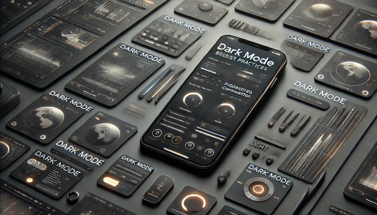
Why Is Dark Mode So Popular?
Dark mode has become a widely adopted UI trend due to its aesthetic appeal, reduced eye strain, and energy efficiency. Major platforms like Apple, Google, and Microsoft have embraced dark mode as a standard feature.
Key Benefits of Dark Mode:
✅ Reduces Eye Strain: Ideal for low-light environments, making text easier to read. ✅ Battery Efficiency: OLED and AMOLED screens consume less power in dark mode. ✅ Modern & Stylish Aesthetic: Gives apps and websites a sleek, futuristic look. ✅ Improves Focus: Reduces screen glare, making content stand out.
How to Design Dark Mode Correctly
1. Choose the Right Dark Color Palette 🎨
Avoid pure black (#000000), as it creates high contrast and strain.
Use dark grays (e.g., #121212, #1E1E1E) for a softer, comfortable UI.
Accent colors should be muted to prevent harsh brightness.
👉 Example: Google’s Material Design suggests #121212 as a dark mode base.
2. Maintain Proper Contrast for Readability 🔤
Text should be light but not too bright (e.g., #E0E0E0 instead of pure white #FFFFFF).
Aim for a contrast ratio of at least 4.5:1 for accessibility.
Avoid using bright neon colors on dark backgrounds, as they can cause eye strain.
3. Use Soft Shadows and Elevation 🏔️
Add subtle shadows to distinguish elements instead of bright borders.
Use translucent overlays instead of solid background colors.
Ensure hover and focus states remain visible in dark mode.
👉 Example: Apple’s macOS Big Sur UI uses soft highlights and depth effects.
4. Allow Users to Toggle Between Light & Dark Mode 🔄
Provide a theme switcher so users can choose their preference.
Detect system-wide dark mode settings and adjust UI automatically.
👉 Example: Many websites use prefers-color-scheme in CSS to detect dark mode:css@media (prefers-color-scheme: dark) { body { background-color: #121212; color: #E0E0E0; } }
5. Optimize Images and Icons for Dark Mode 🖼️
Transparent PNGs or SVGs should adapt to both light and dark themes.
Use lighter versions of images and logos for better contrast.
👉 Example: Google Chrome’s dark mode version of the logo has lighter edges for visibility.
6. Ensure Accessibility and User Comfort ♿
Follow WCAG (Web Content Accessibility Guidelines) to ensure readability.
Allow users to adjust brightness and contrast in settings.
Use color-blind-friendly palettes for a more inclusive design.
Conclusion
Dark mode is not just a trend — it’s a UX necessity that improves readability, enhances aesthetics, and saves battery life. However, designing it properly requires careful color choices, contrast management, and accessibility considerations.
WEBSITE: https://www.ficusoft.in/web-designing-training-in-chennai/
0 notes
Text
CSS overlay
Overlay means to cover the surface of something with a coating. In other words, it is used to set one thing on the top of another. The overlay makes a web-page attractive, and it is easy to design.
Creating an overlay effect means to put two div together at the same place, but both will appear when required. To make the second div appear, we can hover or click on one div. In these two divs, one div is the overlay div that contains what will show up when the user hovers over the image, and the second div is a container that will hold both the image and its overlay.
0 notes
Text
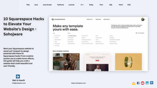
10 Squarespace Hacks To Elevate Your Website's Design - Sohojware
Squarespace has become a popular website creation platform for businesses and individuals alike. It's easy to use, offers beautiful templates, and comes with a variety of built-in features. But what if you want your Squarespace website to stand out from the crowd? This is where Squarespace hacks come in.
In this article from Sohojware, a leading web design and development agency, we've shared 10 Squarespace hacks that will help you elevate your website's design and make it truly shine.
1. Leverage the Power of CSS
Squarespace offers limited customization options within the platform itself. However, with a little bit of CSS code, you can unlock a world of design possibilities. Squarespace has a built-in code editor that allows you to add custom CSS to your website. This can be used to change the colors, fonts, and layouts of your website elements. Sohojware recommends hiring a Squarespace expert to help you with the coding aspects if you are not comfortable doing it yourself.
2. Use Squarespace Sections Flexibly
Squarespace sections are pre-designed blocks of content that you can add to your pages. While they are a great way to get started quickly, they can also be limiting in terms of design. One Squarespace hack is to use sections in unexpected ways. For example, you could use a gallery section to create a hero image or a product section to display testimonials. By thinking outside the box, you can create unique and visually appealing layouts with Squarespace.
3. Batch Edit Your Pages
Squarespace allows you to batch-edit your website pages. This is a great time-saving hack that can be used to update fonts, colors, and other design elements across your entire website. To batch edit your pages, go to the Pages panel in Squarespace and select the pages you want to edit. Then, click on the "Settings" button and select the options you want to change.
4. Hide Unnecessary Elements
Squarespace templates come with a variety of built-in elements, such as navigation bars and footers. However, may not need all of these elements on every page. A Squarespace hack is to hide unnecessary elements on a page-by-page basis. This can help to create a cleaner and more streamlined design. To hide an element, go to the page editor and click on the element you want to hide. Then, click on the "Settings" button and select the "Hide on this page" option.
5. Utilize Cover Pages
Squarespace cover pages are a great way to create a splash page for your website. They are essentially full-screen landing pages that can be used to promote a specific product, service, or event. Cover pages can be highly designed and can help to make a strong first impression on visitors to your website.
6. Integrate Video Backgrounds
Video backgrounds can add a touch of luxury and sophistication to your Squarespace website. They can also be used to tell a story or promote a product or service. When choosing a video background, be sure to choose one that is high-quality and relevant to your website's content. Sohojware recommends keeping the video short and muted to avoid overwhelming your visitors.
7. Play with Fluid Sections
Fluid sections are a Squarespace feature that allows you to create sections that resize automatically to fit the size of the screen. This can be a great way to create a responsive website that looks good on all devices. To use fluid sections, simply add a new section to your page and select the "Fluid" option from the layout menu.
8. Create Custom Overlays
Squarespace overlays are a great way to add text or images on top of your website's background image. They can be used to create calls to action, promote special offers, or simply add visual interest to your website. To create a custom overlay, go to the Design panel in Squarespace and select "Overlays." From there, you can add text, images, and other design elements.
9. Make Use of Brining Elements
Bringing elements on hover is a subtle but effective Squarespace hack that can add a touch of interactivity to your website. When you enable bringing elements on hover, website elements will change slightly when visitors hover their mouse over them. This can highlight calls to action, product images, or other important elements on your website.
10. Experiment with Stacking
Stacking is a Squarespace feature that allows you to layer content sections on top of one another. This can be a great way to create depth and visual interest on your website. To create unique layouts, you can stack text, images, videos, and other elements. When stacking elements, be sure to pay attention to spacing and hierarchy to ensure that your content is easy to read and understand.
Conclusion
By implementing these Squarespace hacks, you can take your website design to the next level and create a website that is both visually appealing and user-friendly. Remember, a well-designed website will not only leave a strong first impression on visitors but can also help you achieve your business goals. If you're looking for more advanced customization options or need help implementing these hacks, Sohojware, a leading Squarespace development agency, can help you create a truly unique and stunning Squarespace website.
FAQ's
1. I'm comfortable with Squarespace, but how can I make my website stand out?
Squarespace offers a great platform to build websites, but with a bit of extra effort, you can truly make yours shine. This article explores 10 Squarespace hacks that leverage CSS, section flexibility, and built-in features to create a unique and visually appealing website.
2. I'm not familiar with CSS coding. Can I still customize my Squarespace site?
While some of the hacks involve CSS, many focus on using Squarespace's functionalities creatively. Sohojware recommends exploring these hacks first. If you decide you want to delve into CSS customizations, Sohojware's web design experts can provide assistance.
3. How can I efficiently update the design across all my Squarespace pages?
Squarespace offers a fantastic time-saving feature called batch editing. This allows you to update fonts, colors, and other design elements across your entire website simultaneously.
4. Squarespace templates come with a lot of features, but how do I hide what I don't need?
A clean design is key! Luckily, Squarespace allows you to hide unnecessary elements on a page-by-page basis. This helps achieve a streamlined look and focuses visitors' attention on your core content.
5. I want a website that looks impressive. Can Sohojware help with advanced Squarespace development?
Absolutely! Sohojware is a leading Squarespace development agency. We can assist you in implementing these hacks and explore more advanced customization options to create a truly unique and stunning website that reflects your brand perfectly.
1 note
·
View note
Video
youtube
CSS Hover Image Zoom Animation | CSS Image Hover Overlay Effects
0 notes
Text
As a web designer, there are several useful Chrome extensions that can enhance your productivity and help you streamline your design workflow. Here are some popular Chrome extensions for web designers:
ColorZilla: Allows you to pick colors from any webpage, create color palettes, and get detailed color information. It also provides a gradient generator and other color-related tools.
WhatFont: Lets you identify the fonts used on any webpage by simply hovering over the text. It provides font details such as family, size, line height, and color.
Web Developer: Provides a variety of web development tools in one extension. It includes features like CSS manipulation, JavaScript console, responsive design testing, cookie management, and more.
PerfectPixel: Helps you overlay an image on top of any webpage to compare the design with the implementation. It assists in pixel-perfect design by allowing you to fine-tune the positioning of elements.
Window Resizer: Allows you to test your responsive designs by resizing the browser window to various predefined resolutions. It includes common device resolutions and also supports custom resolutions.
Loom: Enables you to capture and share screencasts and videos. It's handy for creating design walkthroughs, explaining concepts, or getting feedback from clients or team members.
Page Ruler: Allows you to measure the dimensions, alignment, and position of elements on a webpage. It assists in ensuring accurate spacing and alignment in your designs.
Check My Links: Scans web pages and identifies broken links. It's useful for checking the validity of links during the design and development process.
CSSViewer: Lets you inspect the CSS properties of any element on a webpage by simply hovering over it. It provides information such as colors, fonts, margins, padding, and more.
SVG Gradients: Allows you to generate SVG gradient code with various options. It simplifies the process of creating and applying gradients in your designs.
These are just a few examples, and there are many other Chrome extensions available that cater to different aspects of web design. Remember to review the user ratings and reviews before installing any extension to ensure its reliability and compatibility with your workflow.
0 notes
Text
CSS Hover Image Zoom Animation
#css image hover overlay#zoom hover css#css animation#html css#codenewbies#frontenddevelopment#css animation examples#css#html5 css3#pure css animation#css animation tutorial#code#animation#css zoom hover effect
2 notes
·
View notes
Text

CSS Card Animated Overlay
#css animated overlay#css animation tutorial#css animation examples#html css#css#frontenddevelopment#html#css3#divinector#webdesign#html css card#css card#css image hover overlay
1 note
·
View note
Text
CSS Animated Text Overlay
#css animated text overlay#css animation tutorial#html css animation#css animation#html5 css3#html css#neduzone#CSS Image Hover#frontend#css#html#frontenddevelopment#webdesign#css animation examples
7 notes
·
View notes
Text
Download Image Hover Effects For Elementor - WPCroc.com
Download Image Hover Effects For Elementor – WPCroc.com
[ad_1]
DOWNLOAD FOR FREE
LIVE PREVIEWBUY FOR $24

Image hover effects for elementor plugin allow you to place images with title, description in a creative way. There are different scrolling effects within the plugin. Select the best one for your page or post. Just drag the Image Hover Effects element into your element or page editor and arrange it. More than 30 unique effects will represent your…
View On WordPress
#animation effects#avada overlay#content hover elementor#css effects#css3 animation effects#CSS3 Hover Effect#elementor#elementor addons#hover effects#hover with caption#image hover#Image hover effects#mouse hover#wordpress#wordpress plugins#wordpress themes
0 notes
Note
Hola, Necro! He estado buscando por si ya habías resuelto esta duda, pero no doy con nada. ¿Podrías comentarnos porfi cómo hacer que una imagen quede encima de otra? Supongo que es un... ¿overlay completo? Se ve una imagen, pasas el ratón por encima y esa desaparece dejando paso a otra imagen. Estoy ahí dale que dale y no doy con la tecla. Gracias de antemano!
¡Hola anon! La mejor manera de hacerlo es teniendo una de las imágenes, la superpuesta, con un position absolute sobre la otra; o mejor aún, usando un background-image + img. Supongamos que tienes este HTML:
<div class="cajaimagen" style="background-image:url(http://via.placeholder.com/450x200/666);"> <img src="http://via.placeholder.com/450x200/222"/> </div>
Tu CSS será muy sencillito:
.cajaimagen { background-size:cover; background-position:center; width:450px; height:200px; position:relative; overflow:hidden; } .cajaimagen img { opacity:0; position:absolute; inset:0; width:100%; height:100%; object-fit:cover; object-position:center; transition:ease .5s; } .cajaimagen:hover img { opacity:1; }
Puedes cambiar el efecto de hover, la transición, el tamaño (directamente en .cajaimagen) y listo, ya tienes el efecto 🥰
8 notes
·
View notes
Photo

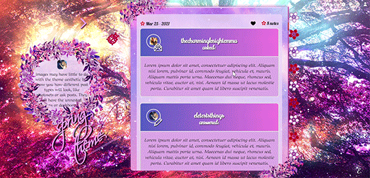
My first attempt at a premium theme: Spring theme! The price is 2 euro or any donation you'd like to make! Send me an ask/im for it, even just a ‘hey I’d like your spring theme’ and I’ll link you my ko-fi or paypal.
previews in the source. If you buy like or reblog, if you don’t buy and you’d like to help me get some visibility, you can reblog anyway (and just like the post if you like it, or donate regardless to give a hand) <3
What do you get with this 'spring' theme, which is probably the first of a season collection, besides of course the exact look you see in the preview 1? (you can check the previews to see most of what I'm talking about)
This theme is first of all responsive: you will be able to see everything, from posts to links to sidebar, in every device no matter how small, down to 320w x 340h tiny mobile screens. [On tablets/phones the navi links will simply move above the screen, then you'll have the title, description and finally the container.]
There is an optional dropdown menu for your updates and a searchbar, npf posts fix ( @ glenthemes ) so photos uploaded from your phone always show correctly, pxu photosets so photosets always resize correctly, minimal soundcloud player, video resizing script ( @shythemes and @bychloethemes ), an askbox with a colorful button ( @eggdesign), the 'can't right-button click nor see the source' script to keep people from stealing it, rounded borders, and instructions all over the html in case you want to bring changes there. Sources are always visible when present, tumblr controls are smaller and grow when you hover over them. Icons by cappuccicons (follow html instructions if you want to replace them) and bgs from pixabay.
It also has animated title and navi links, and your custom pages will appear right under them. Only note is that if you pick 540px posts people with small laptops (1024px) will only be able to see one column of them before they are cut off so max 9 links or they won't fit for them.
Options from the customization page:
-you can upload your own background (toggling off the selectbg option), and a semi-transparent 'overlay’ image on top of your posts, right now it's the same as the overlay you can add to your background.
-you can select: post-size, type of blockquotes, font of your posts, or if you toggled on selectbg’ you can also select one of the 7 spring themed bgs present, as well as adding an optional overlay and gradient on top of them (to remove them you select the blank space instead). Instructions in the html if you want to add the overlay and gradient to a background you uploaded instead (because they conflict with the existence of a background-color and it needs to be removed). -you can toggle on and off: like I said the selectbg option which allows you to upload your own background instead of picking among provided ones, the visibility of the container decorations in case you want them without flowers on the top left and bottom right corners, the like button, your avatar/portrait on the sidebar, the ladybug icon which you can click on to show updates and searchbar, the unnested captions in textposts, the unnested captions in all other posts (if you pick them, the portrait and url of the person who wrote the post will be on top, editable in the unnested captions sections of the html), the background for post-titles which will show you the blog background, the border around unnested captions, the 'spring version' of the description which will be replaced by a regular rectangular one without flower crown, the minimal spotify player (as opposed to one that shows you the big album art), and the fade-out (how things fade when you refresh the page).
-you can type in: the font size of your regular text, the space between images in photosets, your posts background and description background colors (right now it's rgba(234, 211, 248, 80%) for both, except the description has a 90% of visibility, I used rgba because I liked the semi-transparency but you can use whatever you want), the linear-gradient of your container bg colors and of your tumblr audioplayer, the symbol next to your lists, the text of your update (when you click on the ladybug), 7 navigation links and their titles when you hover over them.
What can't you do from the custom page? you need to go to the html editor to edit fonts and sizes of everything else (just search for font-family and font-size) as they go hand in hand, and you need to manually delete the navigation links you don't want or the spinning flower will stay.
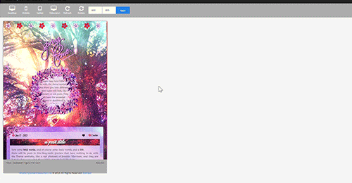
A reminder to always toggle on and off everything and to not trust tumblr preview when seen from the editor because it will hide things and mess with images positions, always open the blog in another tab to see your changes.
And because I’m a nervous wreck at the thought of not giving it for free, a reminder that I’m happy to answer questions - though I can’t guide you every day/through super long complicated editing if you decide to change the entire theme because I’m not always here. If you decide to edit everything you should have some html/css knowledge.
#premium theme#contained theme#spring#nature theme#nature#flowers#cute theme#responsive theme#themes#evansyhelp#dailyresources#spllcraft#mythemes
18 notes
·
View notes