#custom tiny url
Explore tagged Tumblr posts
Visit Tumblr Blog
Explore Tumblr blogs with no restrictions, modern design and the best experience.
Last Seen Tumblr Blogs


Fun Fact
Tumblr has 16.74 million mobile monthly users in the US.
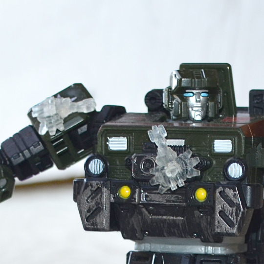
Text
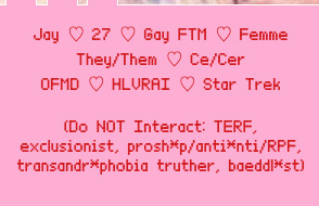
new desktop theme by @atlasthemes, new mobile header by @bluejane and new icon made by me <3
#btw this is literally what i mean it's hard to find new resources. both blogs are deactivated#but i still give credit bc i would feel weird if i didn't lol#anyways how you like the icon? it's the best i can do lol but i think it's soooo cute <3#i spent DAYS trying to find a cute dean icon but i just couldn't#also i customized the theme and i think i did pretty good considering i don't know html or css??#there's one tiny detail that needs fixing and bugs me but oh well. maybe another day#btw sorry for being stuck in 2016 still ig#also i might change url soon but i still haven't made up my mind#ALSO do you have a folder with all your previous tumblr icons on your high school laptop you literally don't use anymore or are you normal#updates
1 note
·
View note
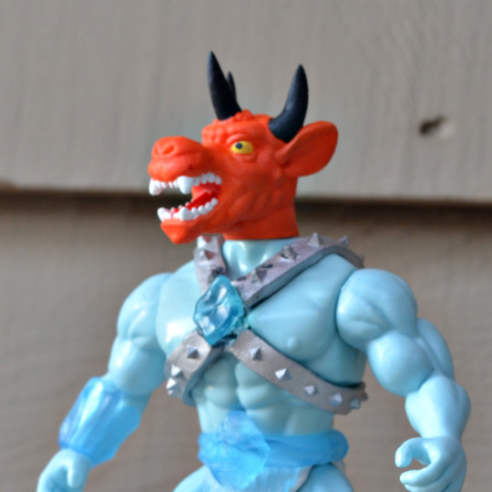
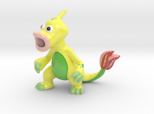
Text

art by me @annastaciart
This post contains a tiny bit of cyber horror, (not really related to the show, just think it’s fun to post along this picture..) be warned when you click more.
—————————————————————————————
Log in…
Please select all the traffic lights in the pictures above to verify that you are a human being.
Please try again.
Try once more.
Sorry, your account has been locked temporarily. Please try again 15 minutes later.
—————————————————————————————
Warning!
There’s an abnormal non-human activity in your account, classified information facing risk of being exposed. All data will be shredded immediately.
Warning: there’s an abnormal non-human activity in your account, classified information facing risk of being exposed. All data will be shredded immediately. Warning: there’s an abnormal non-human activity in your account, classified information facing risk of being exposed. All data will be shredded immediately. Warning: there’s an abnormal non-human activity in your account, classified information facing risk of being exposed. All data will be shredded immediately. Warning: there’s an abnormal non-human activity in your account, classified information facing risk of being exposed. All data will be shredded immediately. Warning: there’s an abnormal non-human activity in your account, classified information facing risk of being exposed. All data will be shredded immediately. Warning: there’s an abnormal non-human activity in your account, classified information facing risk of being exposed. All data will be shredded immediately. Warning: there’s an abnormal non-human activity in your account, classified information facing risk of being exposed. All data will be shredded immediately. Warning: there’s an abnormal non-human activity in your account, classified information facing risk of being exposed. All data will be shredded immediately. Warning: there’s an abnormal non-human activity in your account, classified information facing risk of being exposed. All data will be shredded immediately. Warning: there’s an abnormal non-human activity in your account, classified information facing risk of being exposed. All data will be shredded immediately. Warning: there’s an abnormal non-human activity in your account, classified information facing risk of being exposed. All data will be shredded immediately. Warning: there’s an abnormal non-human activity in your account, classified information facing risk of being exposed. All data will be shredded immediately. Warning: there’s an abnormal non-human activity in your account, classified information facing risk of being exposed. All data will be shredded immediately. Warning: there’s an abnormal non-human activity in your account, classified information facing risk of being exposed. All data will be shredded immediately. Warning: there’s an abnormal non-human activity in your account, classified information facing risk of being exposed. All data will be shredded immediately. Warning: there’s an abnormal non-human activity in your account, classified information facing risk of being exposed. All data will be shredded immediately. Warning: there’s an abnormal non-human activity in your account, classified information facing risk of being exposed. All data will be shredded immediately. Warning: there’s an abnormal non-human activity in your account, classified information facing risk of being exposed. All data will be shredded immediately. Warning: there’s an abnormal non-human activity in your account, classified information facing risk of being exposed. All data will be shredded immediately. Warning: there’s an abnormal non-human activity in your account, classified information facing risk of being exposed. All data will be shredded immediately.
———————————————————————————
Loading…
Please stand by…
Thank you for choosing our service, our team is committed to providing the best customer experience!
Have a nice day!
———————————————————————————
Unknown URL accessing…
Firewall disabled…
;)
74 notes
·
View notes
Note
hihi!!! how do you make yr rentry graphics? for example, the madohomu matching graphics u made?
Hihi~ Here’s what I use and how I make my graphics!
1. Photopea! Hosted online for absolutely free, this is an in-browser version of Photoshop
2. PSDs! These are tools used for coloring your graphics. These can be found on DeviantArt, as well as tumblr. I typically search “PSD download” + the colors I’m looking for!
3. Art! What will be featured in your graphic.
3A. Great sources of official art can be line stickers, promo art, and official merchandise!
3B. If you need transparent art, try looking up already-transparent versions of what you’re looking for! Use the keywords “render”, “transparent”, and “PNG”. (Pro tip: if you’re on your desktop using Google, and wanna avoid those annoying fake PNGs, go to the “Tools” -> “Color”, and then select “Transparent”!)
3C. If you found a transparent you wanna use, but it’s on one of those annoying wikis that makes everything tiny, open the image in a new tab and delete everything after .png in the URL!
3D. Additionally, if you’re downloading from tumblr, open any image you download in a new tab. The default tumblr file types are .pnj and .gifv. Simply replace those parts of the URLs with .png and .gif!
4. Masks! I find my masks on Pinterest, for the most part. You can find a lot of great ones all in one place here! I use this method for making my gifs custom shapes.
Hope this helps! 💖
165 notes
·
View notes
Text
So... Shapeways is going bankrupt.
This is particularly irksome for me, as that's a good 1/3rd of my monthly income, so I'm crossing my fingers while I start setting up a new store on cults. I have literally thousands of items so getting them all up is going to take ages.
But why did this happen?
Well I'll fucking tell you what I think happened.
It was a company run on arrogance and cowardice.
Shapeways made its mark as the cafepress of 3d printing. The weight of this was their marketplace that let people sell prints directly to customers without having to do the printing themselves. At its peak, I made more from Shapeways than from my day job.
The problem was that Shapeways put zero effort into the marketplace. They'd send some of us to a con to promote the idea of 3d printing game minis a couple of times, sure, but when it came to actual site maintenance and design every suggestion and request by sellers was roundly ignored. We asked for better search and categorization options. We asked to be able to name variants in our stores. We asked for better communication from the print techs. We asked for accurate subcategories that actually reflected how customers looked for items. None of it was done.
As such, the site was baffling to customers and difficult to understand. This was made worse by Shapeways' continual renaming of their materials. So after a couple of years Shapeways announces that they're not going to do anything for the marketplace because it's underperforming, and are going to focus on B2B, and in doing so they buried the marketplace in a tiny little link on the front page.
Overnight sales plummeted. We complained again, nothing was done. We asked for a different URL that went straight to the marketplace (something that would literally cost them $80 to do) that we could direct customers to, we were ignored.
The marketplace is underperforming, so we won't put in the effort needed to make the marketplace perform. Makes perfect sense.
Prices go up. Shipping goes up substantially, and then it was a thousand little cuts. The auto-checks were altered to make it impossible to verify anything manually with any accuracy, so it became harder to design for the limitations of their printers.
The site slowed down substantially so every click had a several second pause, making shopping and maintaining frustrating and unpleasant. Shipping costs to many areas of the world became insanely high, effectively cutting off entire markets.
Want to not be Shapeways? Then remember this:
Your users know more about your site experience and their own needs than you do.
If you have a sales site, and the people selling through it say "this isn't working, we need this" then maybe you should listen to them and not just say 'you're wrong' to their faces.
Oh, and also, if goddamn Rolls-Royce comes in filing false DMCA claims over the use of the word "Phantom" in any context on your site, you don't take every item through a multiple day review for every edit and say "LOL, we can't do anything"
You take them to court for abusing the system on behalf of your user base, you fucking bootlicking cowards.
OH, AND I ALMOST FORGOT!
I HAD TO FIND OUT ABOUT THIS FROM A DM ON TWITTER.
They've sent me a check every month for half a decade and they don't even send a "We're closing shop" email.

Look upon my prints, ye mighty, and despair.
If you want to help me though the meantime, here's my paypal.me and my gofundme.
102 notes
·
View notes
Text
everything in tumblrmart is fucking useless.
1. every badge
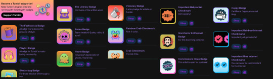
beyond how useless paying money for a tiny png of a checkmark is, there is also no need to pay in the first place. one can easily get the url of the image and then- wouldn’t you know it- inject it into the html of my blog theme and eaily be “verified” without paying. you can do this with whatever images you want. i did it to prove a point. you can also use html to get a gif icon btw
this only shows up on your custom theme but who give a shit
also bonus points for “tumblr supporter” being a subscription service that gets you the same shit as other badges LOL. you can also steal these and inject them into your blog
2. that one cool moon badge
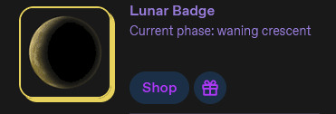
yeah, love the concept, but its been done before. i posted about this when i found out about the badge, but https://www.moonconnection.com/moon_module_2.phtml allows you to easily have a similar effect with a live updating moon phases widget. that’s completely free, and doesn’t cost 6 WHOLE DOLLARS
3. ad free

yeah im not even gonna engage with this one, adblock is free, ublock origin is awesome, dont pay money for this
4. horse friend
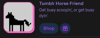
“surely there isnt a replacement for a fully interactive virtual pet” you might say but you would be wrong. let me introduce you to GIFYPET!!!! https://gifypet.neocities.org/ has all the features you would want, as well as a fun slots minigame and it’s fully customizable, so you can put in your own custom graphics and more. there is nothing that horse friend has over gifypet, apart from poop i guess. gifypet does not have horse poop. also the horse friend only lasts for a month and is like $8
5. crabs
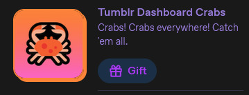
ok this one is the only product thats actually somewhat unique. but iirc you’re still only paying for 24 hours and can only gift it, so ymmv
but also... given the evidence that theyve given up on tumblrs upkeep entirely (the staff letter), paying for these arent even contributing to keeping the site online, so they dont even have value in the context of keeping tumblr alive. theyre already slowly pulling the plug.
dont buy this stuff.
203 notes
·
View notes
Note
hi!!! i love for custom blog theme,, do you have a link to the code or creator 0:?
ya!
so my theme is actually a heavily modified version of redux edit #1 by lopezhummel (current url: holyaura). i always remind users that most tumblr themes are old and that you'll need to replace all instances of "http://" in the code with "https://" so tumblr will save the theme. i had to do it with this one
these are the modifications i made to the theme. i edited this theme over the course of at least a year or so and don't quite recall how i did all of these things. but to the best of my ability:
i moved the "left side img" to the right side of the screen. i also made this element "responsive" so the image will never get cropped when you resize your screen. this was a bitch and a half to figure out and i truthfully do not remember how i did it
i deleted the text in the drop-down navigation so it appears as a little line that is otherwise not noticeable. this type of theme, the "redux edit," used to be very popular because having a drop-down menu let you cram a bunch of links that lead to sub-pages on your blog. i've done away with my sub-pages, but i still like the format of the "redux style" tumblr theme, for its minimal UI and for its customization options.
i separated my mobile description from my web description for formatting reasons. basically, most elements in tumblr themes are connected to specific text fields and toggles. i simply went to the section that was connected to my blog description and deleted it. the web description has to be manually typed inside of the CSS/HTML editor when i want to change it. whereas my mobile description is whatever i type in the "description" box of the normal tumblr theme editors.
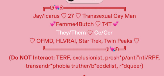
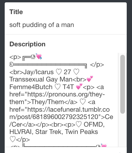

i added code someone else made ("NoPo" by drannex42 on GitHub) which allows you to hide posts with certain tags on them. i did this to hide my pinned post, as it looks bad on desktop.
i replaced the tiny pagination arrows at the bottom with images that literally say "next" and "back" because the arrows were far too small/illegible. i know they aren't centered in the container i'm not sure how to fix that lol

i added a cursor

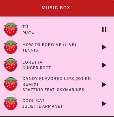
i installed a working music box ("music player #3" by glenthemes), and then added music by uploading MP3 files to discord and then using the links of those files as the audio sources. iirc i also had to make this element responsive and i aligned it so it would sit on the left side of my screen. i made the "album art" for each one the same strawberry pixel art
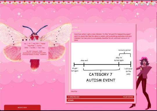
the moth is just a PNG i added and then moved around so it was behind my sidebar using the options that came pre-packaged with the theme
if you want something like the strawberry shortcake decoration at the top (called "banner" in the theme) your best bet is to google "pixel divider"
theme didn't support favicon so i added that in so i could have a little heart
ALSO:
this theme is. really weird about backgrounds. any background that i have ever set for it, i've had to do weird shit in photoshop. like making the background HUGE, mirroring it, etc. - because it would crop the image weird, or there would be a gap where there was no image. idk man, it's haunted. i'm sure there's a way to fix this but i am NOT tech savvy enough. anyway, patterns are probably your best friend. and if you DO want something that isn't a pattern, it's going to take a lot of trial and error. but i love this theme so i deal with it 😭
the sidebar image and the floating image do not scale. if your image is 1000 pixels, it will display at 1000 pixels. you'll either have to edit the code so that the theme scales the image for you, or resize any images before you add them
my white whale of theme editing (aside from the Weird Background thing) is that i cannot get infinite scrolling to work. i have tried every code out there. all of them break my theme. it makes me sad because like. i have music there for a reason. the idea is that people would listen to it while they scroll. unfortunately, the way it's set up now, the music will stop every time someone clicks "next" or "back" 💀
anyway sorry for rambling but i hope you enjoy the the theme and customizing it in the way that you want to!
24 notes
·
View notes
Note
hi !! i hope im not being obnoxious but WHAT element are you messing with to make the cute little?? thingies???? at the start of the tags??? its like. i guess it looks like custom list dots?? ive literally combed through the css of my own two themes and multiple stranger's themes and i can't find it like at all T-T real tears in my eyes. pls end my suffering :pray hands:
your fine! its this code:
.characters a:before, .relationships a:before, .freeforms a:before, .meta a:before { color: #17060E; content: "\10D0"; padding: 0 0.25em 0 0; }
.splash .browse li a:before { color: #17060E; content: "\10D0"; padding: 0 0.25em 0 0; }
.kudos a:before { color: #17060E; content: "\10D0"; padding: 0 0.25em 0 0; }
you put the unicode of the symbol you want in the content box or if you want an image than you do content: url(the link of the image) just make sure its tiny cause it keeps its proportions! i'd recommend an image size of 20x20!
3 notes
·
View notes
Text

Responsive Web Design: Best Practices for Optimal User Experience and SEO
In today’s digital age, where the majority of internet users access websites through various devices, responsive web design has become paramount. It’s not just about making a website look good; it’s about ensuring seamless functionality and accessibility across all screen sizes and devices. Responsive web design (RWD) is a critical approach that allows websites to adapt to different devices and screen sizes, providing an optimal viewing and interaction experience.
Importance of Responsive Web Design:
Responsive web design is essential for several reasons. Firstly, it improves user experience by ensuring that visitors can easily navigate and interact with the website regardless of the device they’re using. This leads to higher engagement, lower bounce rates, and increased conversion rates. Secondly, with the proliferation of mobile devices, responsive design is crucial for reaching a wider audience. Google also prioritizes mobile-friendly websites in its search results, making responsive design a key factor for SEO success.
Key Principles to Follow:
Fluid Grids: Instead of fixed-width layouts, use fluid grids that can adapt to different screen sizes.
Flexible Images and Media: Ensure that images and media elements can resize proportionally to fit various devices.
Media Queries: Utilize CSS media queries to apply different styles based on screen characteristics such as width, height, and resolution.
Mobile-First Approach: Start designing for mobile devices first, then progressively enhance the layout for larger screens.
Performance Optimization: Optimize website performance by minimizing HTTP requests, reducing file sizes, and leveraging caching techniques.
Tips for Optimization:
Prioritize Content: Display essential content prominently and prioritize functionality for mobile users.
Optimize Touch Targets: Make buttons and links large enough to be easily tapped on touchscreen devices.
Viewport Meta Tag: Use the viewport meta tag to control how the webpage is displayed on different devices.
Testing Across Devices: Regularly test the website across various devices and browsers to ensure consistent performance and appearance.
Progressive Enhancement: Implement features in layers, starting with basic functionality and progressively enhancing it for more capable devices.
Impact on User Experience:
Responsive web design directly impacts user experience by providing a seamless and consistent experience across devices. Users no longer have to pinch and zoom or struggle with tiny buttons on their smartphones. Instead, they can effortlessly navigate through the website, leading to higher satisfaction and engagement. A positive user experience ultimately translates into increased conversions and customer loyalty.
SEO and Responsive Design:
Responsive web design plays a significant role in SEO. Google, the leading search engine, recommends responsive design as the best practice for mobile optimization. Responsive websites have a single URL and HTML code, making it easier for search engines to crawl, index, and rank content. Additionally, responsive design eliminates the need for separate mobile websites, preventing issues such as duplicate content and diluted link equity.
Real-Life Examples:
Apple: Apple’s website seamlessly adapts to different screen sizes, providing an optimal browsing experience on both desktops and mobile devices.
Amazon: Amazon’s responsive design ensures that users can easily shop and navigate through its vast catalog on any device, contributing to its success as a leading e-commerce platform.
HubSpot: HubSpot’s website is a prime example of a responsive design that prioritizes content and functionality, catering to users across various devices.
Conclusion:
In conclusion, responsive web design is not just a trend; it’s a necessity in today’s digital landscape. By adhering to best practices and optimizing for user experience, websites can effectively reach and engage audiences across desktops, smartphones, and tablets. As Google continues to prioritize mobile-friendly websites, investing in responsive design is crucial for maintaining visibility and driving organic traffic. Embrace responsive design to stay ahead in the competitive online ecosystem.
Web Development Services:
Blockverse Infotech Solutions has been a pioneer in providing exceptional web development and design services for the past five years. With a dedicated team of professionals, Blockverse ensures cutting-edge solutions tailored to meet clients’ specific needs. Whether you’re looking to create a responsive website from scratch or revamp your existing platform, Blockverse Infotech Solutions delivers innovative designs and seamless functionality to elevate your online presence. Trust Blockverse for all your web development and design requirements and witness your digital vision come to life.
3 notes
·
View notes
Text
The 10 Code Snippets That Save Me Time in Every Project.
Let’s be real—coding can sometimes feel like a never-ending marathon of the same boring tasks. You write, debug, tweak, repeat. But what if I told you there’s a secret stash of tiny code snippets that could literally cut your work in half and make your life 10x easier?
Over the years, I’ve built up my personal toolkit of code snippets that I pull out every single time I start a new project. They’re simple, they’re powerful, and best of all—they save me tons of time and headaches.
Here’s the deal: I’m sharing my top 10 snippets that are like little magic shortcuts in your code. Bookmark this, share it, and thank me later.

Debounce: The “Stop Spamming Me!” Button for Events Ever noticed how when you type or resize a window, your function fires off like crazy? Debounce lets you tell your code, “Chill, wait a sec before running that again.”
javascript Copy Edit function debounce(func, wait) { let timeout; return function(…args) { clearTimeout(timeout); timeout = setTimeout(() => func.apply(this, args), wait); }; } Say goodbye to sluggish UIs!
Deep Clone: Copy Stuff Without Messing It Up Want a clone of your object that won’t break if you change it? This snippet is the magic wand for that.
javascript Copy Edit const deepClone = obj => JSON.parse(JSON.stringify(obj)); No more accidental mutations ruining your day.
Fetch with Timeout: Because Nobody Likes Waiting Forever Network requests can hang forever if the server’s slow. This snippet makes sure you bail after a timeout and handle the error gracefully.
javascript Copy Edit function fetchWithTimeout(url, timeout = 5000) { return Promise.race([ fetch(url), new Promise((_, reject) => setTimeout(() => reject(new Error('Timeout')), timeout)) ]); } Stay in control of your app’s speed!
Capitalize First Letter: Make Text Look Nice in One Line Quick and dirty text beautifier.
javascript Copy Edit const capitalize = str => str.charAt(0).toUpperCase() + str.slice(1); Perfect for UI polish.
Unique Array Elements: Bye-Bye Duplicates Got a messy array? Clean it up instantly.
javascript Copy Edit const unique = arr => […new Set(arr)]; Trust me, this one’s a life saver.
Format Date to YYYY-MM-DD: Keep Dates Consistent AF Don’t mess with date formatting ever again.
javascript Copy Edit const formatDate = date => date.toISOString().split('T')[0]; Dates made simple.
Throttle: Like Debounce’s Cool Older Sibling Throttle makes sure your function runs at most every X milliseconds. Great for scroll events and such.
javascript Copy Edit function throttle(func, limit) { let lastFunc; let lastRan; return function(…args) { if (!lastRan) { func.apply(this, args); lastRan = Date.now(); } else { clearTimeout(lastFunc); lastFunc = setTimeout(() => { if ((Date.now() - lastRan) >= limit) { func.apply(this, args); lastRan = Date.now(); } }, limit - (Date.now() - lastRan)); } }; } Keep it smooth and snappy.
Check if Object is Empty: Quick Validation Hack Sometimes you just need to know if an object’s empty or not. Simple and neat.
javascript Copy Edit const isEmptyObject = obj => Object.keys(obj).length === 0;
Get Query Parameters from URL: Parse Like a Pro Grab query params effortlessly.
javascript Copy Edit const getQueryParams = url => { const params = {}; new URL(url).searchParams.forEach((value, key) => { params[key] = value; }); return params; }; Perfect for any web app.
Random Integer in Range: Because Random Is Fun Generate random numbers like a boss.
javascript Copy Edit const randomInt = (min, max) => Math.floor(Math.random() * (max - min + 1)) + min; Use it for games, animations, or fun experiments.
Why These Snippets Will Change Your Life If you’re like me, every saved second adds up to more time for creativity, coffee breaks, or learning something new. These snippets aren’t just code — they’re your trusty sidekicks that cut down on repetitive work and help you ship better projects faster.
Try them out. Customize them. Share them with your team.
And if you found this helpful, do me a favour: share this post with your dev buddies. Because sharing is caring, and everyone deserves to code smarter, not harder.
0 notes
Text
The Power of Responsive Web Design for Business Growth

In today’s hyper-connected digital landscape, a business’s online presence is its virtual storefront, its primary communication channel, and often, its first impression. With users accessing the internet from an ever-growing array of devices — smartphones, tablets, laptops, and desktops — the demand for a seamless and consistent user experience across all screens has never been more critical. This is where responsive web design emerges not just as a technical consideration, but as a fundamental pillar for sustainable business growth.
The web design technique known as Websites can adapt to different screen sizes, devices, and windows thanks to responsive web design, or RWD. Instead of creating separate websites for desktop and mobile, RWD uses flexible layouts, images, and cascading style sheet (CSS) media queries to adapt the website’s appearance to the user’s screen resolution. But why is this technical concept so vital for your business’s success? Let’s delve into the profound power of responsive web design.
1. Enhanced User Experience (UX) and Engagement
At its core, It is about the users . When a website adapts fluidly to any screen size, providing easy navigation, readable text, and properly scaled images, the user’s experience is significantly enhanced. Conversely, a non-responsive site on a mobile device often results in frustrating experiences: tiny text, horizontal scrolling, broken layouts, and difficulty clicking buttons. Such frustrations lead to high bounce rates and lost opportunities.
Visitors are more likely to remain longer, browse more pages, and interact with your material more thoroughly when they have a great user experience. This increased engagement directly translates to higher conversion rates. In essence, responsive design ensures your website is always open for business, regardless of how your customers choose to visit.
2. Improved Search Engine Optimization (SEO)
From an SEO Executive’s frame of reference , responsive web designs is a non-negotiable ranking factor. Google, the dominant search engine, clearly recommends responsive designs as the industry standard. Why? Because it simplifies crawling and indexing. With a single URL for all devices, Google’s bots don’t have to crawl multiple versions of your site, which can lead to crawl budget inefficiencies and potential content duplication issues.
Google prioritizes mobile-first indexing, meaning it primarily uses the mobile version of your content for indexing and ranking. A responsive site ensures that your mobile content is robust, accessible, and aligned with your desktop content, providing a consistent and high-quality signal to search engines. Websites that offer a superior mobile experience are rewarded with better search rankings, leading to increased organic visibility and traffic.
3. Cost-Effectiveness and Simplified Maintenance
Developing and maintaining separate websites for different devices (e.g., a desktop site and a separate mobile site) is inherently more expensive and time-consuming. You’d need to manage multiple URLs, content versions, SEO strategies, and analytics dashboards. Responsive web design streamlines this process significantly.
With a single, unified website, you save on development costs, hosting fees, and ongoing maintenance. Content updates, design changes, and SEO adjustments only need to be implemented once, reducing overhead and freeing up resources that can be reallocated to other critical business functions, such as marketing campaigns or product development. Long-term cost savings and improved resource utilisation are directly correlated with this efficiency.
4. Future-Proofing Your Online Presence
The digital device landscape is constantly evolving. New screen sizes, resolutions, and form factors emerge regularly.A website that is responsive is by nature better able to adjust to these upcoming developments. Instead of needing a complete overhaul every few years to accommodate new devices, a responsive design can gracefully adjust, minimizing the need for extensive redevelopment.
This “future-proof” aspect ensures that your investment in web development continues to pay dividends over time. It allows your business to remain agile and relevant in a rapidly changing technological environment, ensuring your online presence is always ready for whatever innovations come next.
5. Increased Conversion Rates
At the most basic level, the goal of every business website is to drive the conversions. Whether it’s sales, leads, sign-ups, or inquiries, a responsive design directly impacts your bottom line. By providing an optimal user experience across all devices, you reduce friction points in the customer journey. Regardless of the device they are using, users who can quickly navigate, read, and engage with your site are more likely to accomplish desired tasks.
Studies consistently show that websites optimized for mobile experience significantly higher conversion rates from mobile users. In a world where mobile commerce continues to surge, neglecting responsive design means leaving money on the table.
The conclusion is that responsive web design is no longer a luxury; it’s a fundamental requirement for every business aiming for sustained growth in the digital age. It’s about delivering an exceptional user experience, boosting your SEO performance, optimizing operational costs, future-proofing your investment, and ultimately, driving higher conversion rates. Embracing responsive design is not just about adapting to current trends; it’s about strategically positioning your business for enduring success in an increasingly multi-device world.
If your website isn’t yet responsive, the time to act is now. Embrace the power of responsive web design, and watch your business not just survive, but truly thrive in the mobile-first era.
0 notes
Text
The corporate world is one of many pitfalls and tough decisions. It, therefore, matters to take risks, especially planned and calculated risks. SEO is not a novel strategy anymore as most firms and brands heavily invest in strategizing the online presence. But there are specific tactics out there that are considered high-risk moves. In the following section, we have gone over a few high-risk strategies that will allow you to make the most of the tumultuous market situation of 2021 on the heels of the COVID-19 pandemic. Don’t Be Afraid of Making Changes Any experienced businessman will tell you that if your processes are running smoothly, there is no reason to change them. Well, we would like to remind you that growth comes with changes. Changes do not need to be "earth-moving" as even the simplest modifications can yield magical results. For example, if your domain is suffering from low click-throughs, you might need to look at the site's title page – may be all you need is a tweak in the spelling or the wording. For more ideas, please visit newyorkseo.pro. Keep in mind that you need to A/B test your website as well. Take each element from an older layout, meta descriptions, titles, content, and tiny details and compare them with the newest iteration. The process will take a bit of trial and error, but this effect will be more than offset with increased traffic numbers for your domain within a short time. Once you have the best results, you can continue building on the positive elements to get even better returns. The Linking-out Feature As a company performing in a competitive market, it is almost counter-intuitive to link out to a rival site. But the truth is backlinks are an essential component of SEO. Every brand is looking for as many external links as possible. And, it is not just about the number; it is about networking and building authority. Moreover, if your site provides informational content, in that case, you should provide backlinks to all the sites that presented research and data to cultivate an air of authority and trustworthiness within your customer base. However, please make sure that the linking site is an authentic one. Structure the URL Right This is about your homepage URL. Not many of us pay attention to the URL, but keep in mind that shortened URLs are easy to remember and use while searching. Short URLs also help with hands-free and voice-assisted searches. If you modify and structure your URL right, this alone will increase the inbound traffic. The trick is to keep your URL short and simple. If in doubt, use the brand name in the URL without any special characters and numerals. It is crucial to understand that SEO allows you to structure your website to aid customers by increasing operation speed and efficiency. Your changes might even lead to a temporary drop in traffic numbers, but you are assured of success with careful planning and expert help.
0 notes
Note
How did you get your mouse on your page? It's so frickin' awesome!!!!!!
it's the cutest! i used html in the theme customizer! :D

here's the code for it (it goes under the <head> tag:
<style type="text/css">body, a:hover {cursor: url(https://cur.cursors-4u.net/smilies/smi-2/smi166.cur), progress !important;}</style><a href="https://www.cursors-4u.com/cursor/2010/03/18/happy-cake-smiley.html" target="_blank" title="Happy Cake Smiley"><img src="https://cur.cursors-4u.net/cursor.png" border="0" alt="Happy Cake Smiley" style="position:absolute; top: 0px; right: 0px;" /></a> </div>
and here's the one for the sparkles that follow the mouse around (which is before the mouse code in my theme):
<script type="text/javascript"> // <![CDATA[ var colour="#43C6DB"; var sparkles=50; /**************************** * Tinkerbell Magic Sparkle * * (c) 2005 mf2fm web-design * * https://www.mf2fm.com/rv * * DON'T EDIT BELOW THIS BOX * ****************************/
var x=ox=400; var y=oy=300; var swide=800; var shigh=600; var sleft=sdown=0; var tiny=new Array(); var star=new Array(); var starv=new Array(); var starx=new Array(); var stary=new Array(); var tinyx=new Array(); var tinyy=new Array(); var tinyv=new Array(); window.onload=function() { if (document.getElementById) { var i, rats, rlef, rdow; for (var i=0; i<sparkles; i++) { var rats=createDiv(3, 3); rats.style.visibility="hidden"; document.body.appendChild(tiny[i]=rats); starv[i]=0; tinyv[i]=0; var rats=createDiv(5, 5); rats.style.backgroundColor="transparent"; rats.style.visibility="hidden"; var rlef=createDiv(1, 5); var rdow=createDiv(5, 1); rats.appendChild(rlef); rats.appendChild(rdow); rlef.style.top="2px"; rlef.style.left="0px"; rdow.style.top="0px"; rdow.style.left="2px"; document.body.appendChild(star[i]=rats); } set_width(); sparkle(); }} function sparkle() { var c; if (x!=ox || y!=oy) { ox=x; oy=y; for (c=0; c<sparkles; c++) if (!starv[c]) { star[c].style.left=(starx[c]=x)+"px"; star[c].style.top=(stary[c]=y)+"px"; star[c].style.clip="rect(0px, 5px, 5px, 0px)"; star[c].style.visibility="visible"; starv[c]=50; break; } } for (c=0; c<sparkles; c++) { if (starv[c]) update_star(c); if (tinyv[c]) update_tiny(c); } setTimeout("sparkle()", 40); } function update_star(i) { if (--starv[i]==25) star[i].style.clip="rect(1px, 4px, 4px, 1px)"; if (starv[i]) { stary[i]+=1+Math.random()*3; if (stary[i]<shigh+sdown) { star[i].style.top=stary[i]+"px"; starx[i]+=(i%5-2)/5; star[i].style.left=starx[i]+"px"; } else { star[i].style.visibility="hidden"; starv[i]=0; return; } } else { tinyv[i]=50; tiny[i].style.top=(tinyy[i]=stary[i])+"px"; tiny[i].style.left=(tinyx[i]=starx[i])+"px"; tiny[i].style.width="2px"; tiny[i].style.height="2px"; star[i].style.visibility="hidden"; tiny[i].style.visibility="visible" } } function update_tiny(i) { if (--tinyv[i]==25) { tiny[i].style.width="1px"; tiny[i].style.height="1px"; } if (tinyv[i]) { tinyy[i]+=1+Math.random()*3; if (tinyy[i]<shigh+sdown) { tiny[i].style.top=tinyy[i]+"px"; tinyx[i]+=(i%5-2)/5; tiny[i].style.left=tinyx[i]+"px"; } else { tiny[i].style.visibility="hidden"; tinyv[i]=0; return; } } else tiny[i].style.visibility="hidden"; } document.onmousemove=mouse; function mouse(e) { set_scroll(); y=(e)?e.pageY:event.y+sdown; x=(e)?e.pageX:event.x+sleft; } function set_scroll() { if (typeof(self.pageYOffset)=="number") { sdown=self.pageYOffset; sleft=self.pageXOffset; } else if (document.body.scrollTop || document.body.scrollLeft) { sdown=document.body.scrollTop; sleft=document.body.scrollLeft; } else if (document.documentElement && (document.documentElement.scrollTop || document.documentElement.scrollLeft)) { sleft=document.documentElement.scrollLeft; sdown=document.documentElement.scrollTop; } else { sdown=0; sleft=0; } } window.onresize=set_width; function set_width() { if (typeof(self.innerWidth)=="number") { swide=self.innerWidth; shigh=self.innerHeight; } else if (document.documentElement && document.documentElement.clientWidth) { swide=document.documentElement.clientWidth; shigh=document.documentElement.clientHeight; } else if (document.body.clientWidth) { swide=document.body.clientWidth; shigh=document.body.clientHeight; } } function createDiv(height, width) { var div=document.createElement("div"); div.style.position="absolute"; div.style.height=height+"px"; div.style.width=width+"px"; div.style.overflow="hidden"; div.style.backgroundColor=colour; return (div); } // ]]> </script>
1 note
·
View note
Text
How Tea Burn Is Revolutionizing Weight Loss Without Diets or Exercise
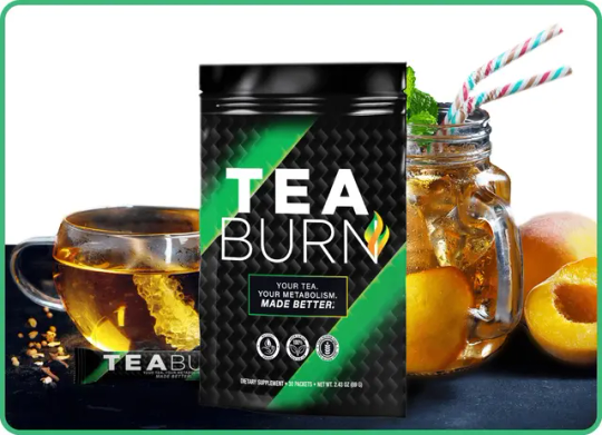
What Is Tea Burn?
Tea Burn is a completely tasteless, natural formula you mix into your daily tea.
💧 One tiny packet → Mix into tea → Burn fat all day
Whether you drink green tea, black tea, or herbal blends, Tea Burn works behind the scenes to:
✅ Boost your metabolism ✅ Burn stubborn fat ✅ Suppress appetite ✅ Improve energy and focus ✅ Even help whiten your teeth
👉 Try Tea Burn here
🔥 Why It Works (Backed by Science)
Tea Burn combines a blend of clinically-supported natural ingredients like:
Green coffee bean extract
L-theanine for calm energy
Chromium to curb cravings
Caffeine from green tea extract
L-carnitine to convert fat into energy
These ingredients work in synergy to turn your regular tea into a powerful fat-burning formula — without making you jittery or changing the taste.
👀 Learn more about the ingredients in Tea Burn
💡 How to Use It
You don’t need to change your routine. Just stir 1 Tea Burn packet into your tea once a day.
That’s it. No workouts. No fad diets. No stress.
🕒 Ideal with your morning tea, but works anytime.
📦 Get Tea Burn now – Shipped directly to your door.
🧠 Real People, Real Results
“I’ve lost 18 lbs in 2 months without going to the gym.” — ⭐️⭐️⭐️⭐️⭐️ Tea Burn user
“It’s the easiest change I’ve ever made — and it works.” — ⭐️⭐️⭐️⭐️⭐️ Verified review
📣 Read customer success stories
📈 Why Tumblr Loves Tea Burn
Tumblr is full of people who value authentic transformations, easy wellness hacks, and minimalist routines.
That’s why Tea Burn resonates here:
🧘♀️ No effort required
🥗 Works with your current diet
🧃 No added flavors or fillers
💚 Totally natural
Plus, it’s the kind of aesthetic lifestyle shift that just makes sense.
🛒 Discover Tea Burn today
🌟 Final Thoughts
Don’t overthink it. If you drink tea already, Tea Burn is the easiest upgrade you’ll ever make.
✅ Safe ✅ Effective ✅ Affordable ✅ No lifestyle change required
The best part? You’ll actually look forward to it.
👉 Start your Tea Burn journey today
🔗 Internal Keyword-Linked URLs (5 Total):
Try Tea Burn here
Learn more about the ingredients in Tea Burn
Get Tea Burn now
Read customer success stories
Discover Tea Burn today
✅ Tumblr Optimization Notes:
Focus keyword: Tea Burn (used naturally throughout)
Readable, short paragraphs for mobile readers
Built-in emotional appeal + calls to action
Styled to be shareable and reblog-friendly
No outbound links to competitors
Optimized for Bing SEO and Tumblr tags
Transform Your Metabolism with Tea Burn: The Secret to Natural Weight Loss
Why Tea Burn is the Hottest Natural Fat Burner of 2025
This One Daily Tea Ritual Is Helping Thousands Burn Fat Without Dieting or Exercise
Tea Burn: The Easiest Way to Burn Fat, Boost Energy & Feel Incredible — Just Add to Your Tea
Tea Burn Review: The Secret to Effortless Fat Loss with Your Morning Tea
Tea Burn: The Simple Daily Ritual That Helps You Burn Fat, Boost Energy, and Control Cravings
1 note
·
View note
Text
Mobile SEO: Optimizing for Googles Mobile-First Index

Mobile SEO: Optimizing for Google’s Mobile-First Index
You built a website. It looks great on desktop. But when you check it on your phone, it’s slow, buttons are tiny, and the text is unreadable. Guess what? Google noticed too.
Since Google shifted to mobile-first indexing, your mobile site isn’t just an afterthought—it’s the main factor in rankings. If your site isn’t optimized for mobile, you’re leaving traffic (and money) on the table.
So, how do you fix it? Let’s break it down—no fluff, just actionable steps.
Why Mobile-First Indexing Matters
Google crawls and ranks your site based on the mobile version, not desktop. If your mobile experience sucks, your rankings drop. Simple.
Key Problems Killing Your Mobile SEO:
Slow load times (Users bounce in 3 seconds)
Unresponsive design (Text too small, buttons misaligned)
Intrusive pop-ups (Google penalizes these)
Poor UX (If users struggle, Google notices)
Fix these, and you’re already ahead of 90% of websites.
How to Optimize for Mobile-First Indexing
1. Speed Up Your Site (Or Lose Visitors)
Mobile users hate waiting. If your site takes longer than 3 seconds to load, 53% leave.
How to fix it:
Compress images (Use TinyPNG)
Enable caching (Fewer reloads = faster experience)
Minify CSS & JavaScript (Less code = quicker load)
Use a fast host (Avoid cheap shared hosting)
Test your speed: Google PageSpeed Insights
2. Responsive Design is Non-Negotiable
Your site must adapt to any screen size. No zooming, no horizontal scrolling.
Key checks:
Fluid layouts (No fixed-width elements)
Mobile-friendly fonts (16px minimum)
Thumb-friendly buttons (At least 48x48 pixels)
Pro Tip: Use Google’s Mobile-Friendly Test to verify.
3. Ditch Pop-Ups That Annoy Users
Google hates intrusive interstitials (those pop-ups blocking content). If your site has them, your rankings suffer.
Better alternatives:
Banners (Less intrusive)
Exit-intent pop-ups (Only show when leaving)
Inline CTAs (Embedded in content)
4. Optimize for Local SEO (If You Have a Business)
"Near me" searches dominate mobile. If you’re a local business, you need:
Google My Business listing (Claim & optimize it)
NAP consistency (Name, Address, Phone—same everywhere)
Local keywords (E.g., “best pizza in [city]”)
5. Structured Data = Better Rich Snippets
Structured data helps Google understand your content and display rich results (like star ratings, FAQs).
How to add it:
Use Schema.org markup
Test with Google’s Rich Results Test
FAQs on Mobile SEO
Q: Does Google only use the mobile version for ranking now?
A: Mostly, yes. Google primarily uses the mobile version, but desktop still matters for some checks.
Q: Will a separate mobile site (m.domain.com) work?
A: Avoid it. Responsive design is better—one URL, less hassle, fewer errors.
Q: How do I check if my site is mobile-friendly?
A: Use Google’s Mobile-Friendly Test.
Q: Does AMP still matter?
A: Not as much. Focus on core speed optimizations instead.
Final Thoughts
Google’s mobile-first index isn’t going away. If your site isn’t fast, responsive, and user-friendly, you’re losing rankings—and customers.
Fix the basics first: ✅ Speed ✅ Responsive design ✅ Clean UX ✅ Local SEO (if applicable)
Need help with social media promotion to drive more traffic? Check out MediaGeneous for boosting your YouTube, Instagram, or TikTok growth.
Bottom line: Mobile SEO isn’t optional. Optimize now, or get left behind.
Want more traffic? Start with your mobile site today. 🚀
#Grow YouTube Channel#Get YouTube Subscribers#MediaGeneous#Get YouTube Views#Get YouTube Engagement#YouTube#YouTube Views#YouTube Subscribers
1 note
·
View note
Text
Menthol Crystals for Manufacturers: Cosmetic, Pharma & Food Grade Explained
Menthol crystals are rapidly gaining popularity across multiple industries due to their intense cooling effect, soothing aroma, and versatile applications. But for manufacturers, choosing the right grade—cosmetic, pharmaceutical, or food—is crucial for compliance, performance, and safety.
In this blog, we’ll break down the differences between the grades, their specific applications, and how AOS Products delivers quality-assured menthol crystals to global manufacturers
What Are Menthol Crystals?
Menthol crystals are solid, crystalline forms of menthol—extracted primarily from peppermint oil. These needle-like crystals are colorless, aromatic, and known for their cooling, anti-inflammatory, and soothing properties.
1. Cosmetic Grade Menthol Crystals
Applications:
Lip balms and glosses
Cooling lotions and creams
Shampoos and conditioners
Aftershave gels and toners
Foot soaks and bath bombs
Why Use It:
Cosmetic grade menthol crystals are skin-safe and deliver an instant cooling effect, ideal for beauty and skincare products. Manufacturers prefer them for their strong aroma and purity.
2. Pharmaceutical Grade Menthol Crystals
Applications:
Cough syrups and lozenges
Inhalers and vapor rubs
Pain relief balms and sprays
Medicated oils
Cold compress formulas
Why Use It:
Pharma grade menthol crystals are ultra-pure and meet stringent pharmacopoeia standards (like IP, USP, BP). They offer anti-inflammatory and analgesic benefits—perfect for respiratory and topical pain relief products.
3. Food Grade Menthol Crystals
Applications:
Chewing gums
Mouth fresheners
Candy and confectionery
Beverages (limited dosage)
Oral care (toothpaste, mouthwash)
Why Use It:
Food-grade menthol is food-safe and used in tiny concentrations to impart a refreshing flavor. It’s popular in mint-based products and functional foods that require a natural cooling effectWhy Choose AOS Products as Your Menthol Crystals Manufacturer?
At AOS Products, we manufacture and export high-purity menthol crystals that conform to:
IP / BP / USP standards
GMP & ISO certification
Whether you're in the cosmetic, pharmaceutical, or food industry, we offer:
Bulk supply and private labeling
Global shipping and fast turnaround
Custom packaging options
Final Thoughts
Choosing the correct grade of menthol crystals is vital for formulation safety, regulatory compliance, and product performance. Whether you're creating skincare products, OTC medications, or food items—AOS Products is your trusted partner for pure, effective, and industry-compliant
Source URL : https://www.mentholcrystals.co.in/blogs/menthol-crystals-cosmetic-pharma-food-grade
0 notes
Text
0 notes