#decorative arts exhibition catalogue
Text
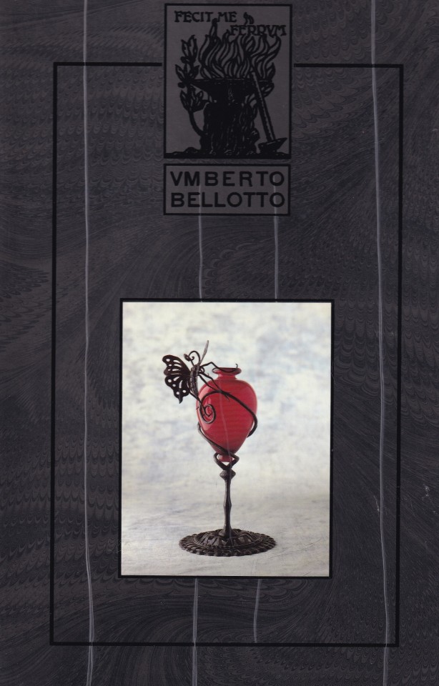
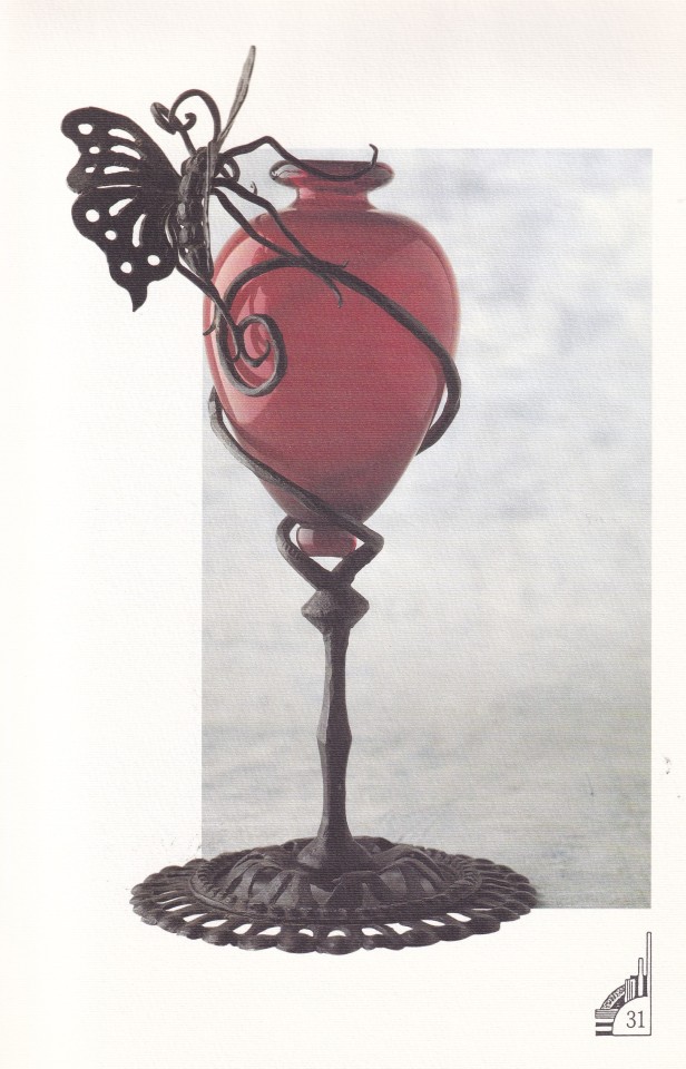


Umberto Bellotto 1882-1940 Ricami in ferro e vetro
Foto Gianni Mari e Medit.Fotografica
Progetto grafico Adriano Tommasi
Abi2ue, Sesto San Giovanni 1992, 63 pagine, 20,2x39cm,
euro 38,00
email if you want to buy [email protected]
Il catalogo, prima pubblicazione dedicata ad Umberto Bellotto, è stato realizzato in occasione della mostra organizzata da Daniela Balzaretti nella prima sede di Milano della Galleria, in Via Solferino 19, nell’aprile 1992.
Umberto Bellotto (Venezia 1882 – 1940)
‘Figlio d’arte, il padre era un fabbro veneziano, trascorre la giovinezza alternando periodi di apprendistato presso varie botteghe artigiane.
Dimostrando una viva attitudine artistica, apre molto presto un’officina propria, dove esegue opere, per lo più in ferro battuto, caratterizzate da forme ardite, che si discostano nettamente dal gusto corrente.
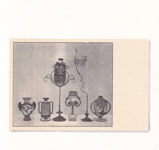
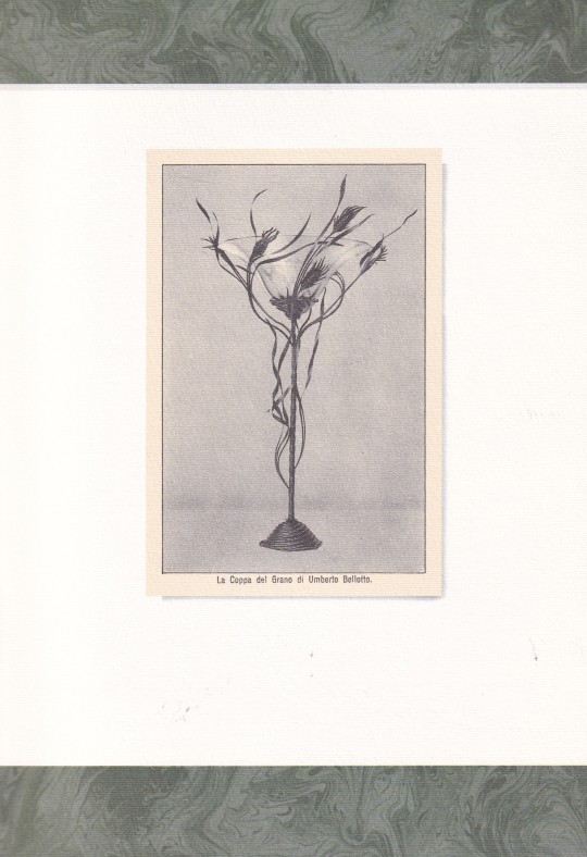
Attratto anche da altri materiali, quali il vetro e la ceramica, nel 1914, assieme a Cesare Laurenti, ottiene il brevetto per il ‘connubio di ferro e vetro’, con il quale realizza sia oggetti decorativi che applicazioni su particolari architettonici.
Ottiene la consacrazione ufficiale delle sue qualità artistiche alla Biennale del 1914, dove gli viene dedicata una sala intera, nella quale espone, oltre ai lavori in ferro, altre opere su suo disegno…‘
26/01/24
#Umberto Bellotto#exhibition catalogue#Galleria Balzaretti 1992#ricami ferro e vetro#vetro ceramica#ferro battuto#decorative arts books#fashionbooksmilano
9 notes
·
View notes
Text

MWW Artwork of the Day (4/23/24)
David Jagger (British, 1891-1958)
Olga (1936)
Oil on canvas, 117.5 x 89.5 cm.
Private Collection
In the forward to the 1935 catalogue for the Jagger exhibition at London's Leger Galleries, the critic H. Granville Fell wrote of the artist's work: "Never did a painter's performance speak more clearly for itself. […] There is something plus, and beyond the mere portrait, a decorative quality, an amptitude of line and mass and a harmonious ensemble of color often daringly original, that place them in the higher category of works of art, and this is never the result of flashy accident, but the outcome of much pondering and intelligent brain work."
43 notes
·
View notes
Text

As a constant wanderer between the worlds of East and West Iranian sculptor Parviz Tanavoli (*1937) has developed a multilayered oeuvre that relates as much to history as it does to modernity. Trained both in Iran and Italy, he basically from scratch created modern sculpture in Iran upon returning from Italy in 1959 and shortly thereafter started teaching at Tehran College of Decorative Arts. Here he also became head of the sculpting department, a position he held until 1979 and which was only briefly interrupted by a two-year stay at the Minneapolis College of Art and Design, a brief but important residence as it got him in touch with Pop Art.
For the last two decades Tanavoli has been based in Vancouver and is currently being honored with a retrospective at Vancouver Art Gallery: titled „Poets, Locks, Cages“ the exhibition gathers more than 100 works from all periods of Tanavoli’s career also including prints, paintings and mixed-media assemblages. The exhibition’s title plays at the three major themes in the his work, namely the poet, the locks and the cages with which he creates a connection with pre-Islamic Iranian traditions. The poet e.g. represents his deep identification with poetry and the poet as "annunciator of freedom, peace and love.“ Locks on the other hand are both a pet issue of Tanavoli, who has long been a passionate collector of all kinds of historic locks, but also take on a symbolic role in his art: they codify genitalia, protection, prohibition but also serve as a symbol of healing and hope, just like they did on the grillwork of ancient temples and tombs. And just like the lock the cage in Tanavoli’s work takes on a different meaning that is more about safeguarding than imprisoning and also make for interesting shadow plays.
These insights (and more) a further elaborated in the catalogue accompanying the exhibition which has recently been published by Hirmer: it contains four insightful essays that beyond Tanavoli’s symbology also address the different contexts in which his work came about as well as the important role Abby Weed Grey played for his career in the US. A beautiful way to get to know this pivotal Iranian artist!
23 notes
·
View notes
Text
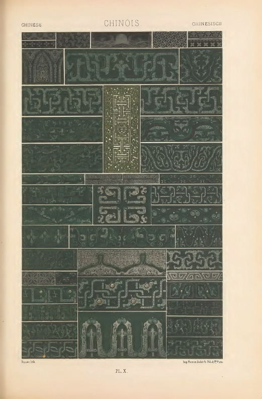
Albert Racinet's "Polychrome Ornament," 1869
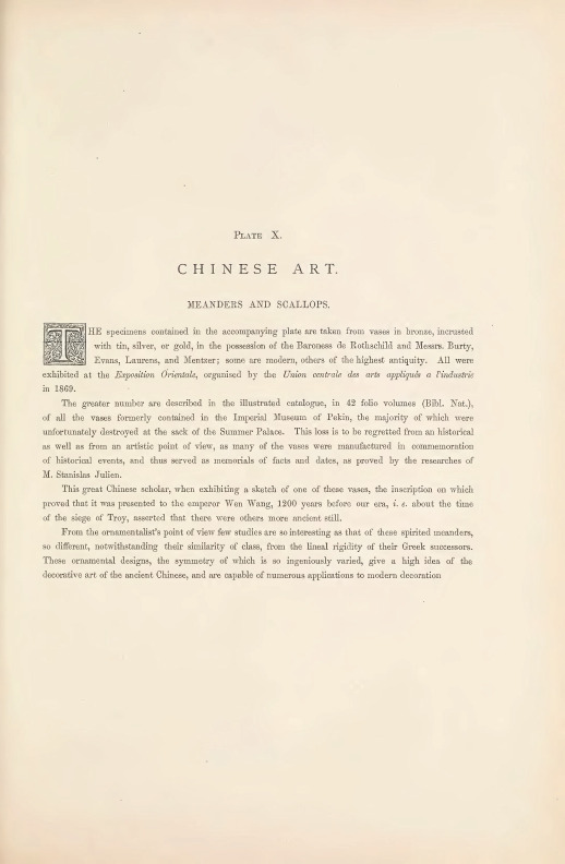
PLATE X.
CHINESE ART.
MEANDERS AND SCALLOPS.
THE specimens contained in the accompanying plate are taken from vases in bronze, incrusted with tin, silver, or gold, in the possession of the Baroness de Rothschild and Messrs. Burty, Evans, Laurens, and Mentzer; some are modern, others of the highest antiquity. All were exhibited at the Exposition Orientale, organised by the Union centrale des arts appliques a l'industrie in 1869.
The greater number are described in the illustrated catalogue, in 42 folio volumes (Bibl. Nat.), of all the vases formerly contained in the Imperial Museum of Pekin, the majority of which were unfortunately destroyed at the sack of the Summer Palace. This loss is to be regretted from an historical as well as from an artistic point of view, as many of the vases were manufactured in commemoration of historical events, and thus served as memorials of facts and dates, as proved by the researches of M. Stanislas Julien.
This great Chinese scholar, when exhibiting a sketch of one of these vases, the inscription on which proved that it was presented to the emperor Wen Wang, 1200 years before our era, i. e. about the time of the siege of Troy, asserted that there were others more ancient still.
From the ornamentalist's point of view few studies are so interesting as that of these spirited meanders, so different, notwithstanding their similarity of class, from the lineal rigidity of their Greek successors. These ornamental designs, the symmetry of which is so ingeniously varied, give a high idea of the decorative art of the ancient Chinese, and are capable of numerous applications to modern decoration
#art#1800s#1800s art#cultural art#illustration#albert racinet#antiquity#ancient art#chinese#chinese art#ancient china#1900s#1900s art#aesthetic#green#chinese aesthetic#design
8 notes
·
View notes
Photo


José María Sert (1874-1945)
'Vision de Naples'
An eleven-leaf screen, circa 1923
Giltwood and black glaze; decorated with scenes against the Bay of Naples, 390 x 800 cm.
Sotheby’s
Catalogue Note:
José Maria Sert (1874-1945), the "Tiepolo of the Ritz", is part of the closed circle of the great society artists of the 20th century. He married the famous Misia Godebska whom Forain introduced to him, better known as Misia Sert, a central figure in artistic and literary Paris at the end of the 19th century and between the wars. Muse successively of Mallarmé, Vuillard, Renoir, Proust, Diaghilev and Cocteau, Misia was also the confidante of Gabrielle Chanel for whom Sert created this screen.
Undermined by the Parisian avant-garde, he is part of a primarily decorative painting tradition influenced by Goya, Manet and of course Tiepolo. In his studio in the rue Barbet de Jouy, Sert created a grandiose decor in the image of his painting, mixing baroque furniture, gilded bronzes, crystals and Coromandel screens. Gabrielle Chanel retained this lesson in decoration and applied it in all her Parisian residences thereafter, as her apartment on rue Cambon still testifies. Sert held a salon there where he received the entire Café Society of the time, who commissioned him for multiple projects. Specializing in very large wall decorations and screens, he went from polychrome painting to monochrome painting on a gold background, which better suited his exuberant style. He received important commissions at the turn of the century throughout Europe and more particularly in England (between 1914 and 1915 for Lady Ripon at Combe Court and Sir Philip Sassoon at Lympe and between 1918 and 1919 for Sir Saxton Noble at Wretham Hall). He received his first commission in the United States in 1924 for Mr. Joshua Cosden's music room in Palm Beach. An exhibition in New York at the Wildenstein Galleries completed his launch across the Atlantic. He then undertook grandiose projects such as an entire room at the Waldorf Astoria in New York in 1930, and the entrance main building of Rockefeller Center, built in 1933.
"Art loses the last representative of great painting", wrote Paul Claudel in Le Figaro on 14 December 1945, on the death of his friend José María Sert. The monumentality of his work and the power of his personality made Sert an artist unanimously admired in his time.
#josé maría sert#art history#interior design#tiepolo#goya#furniture design#gold#trompe l'œil#naples#italy#paris#1920s#gabrielle chanel
27 notes
·
View notes
Photo
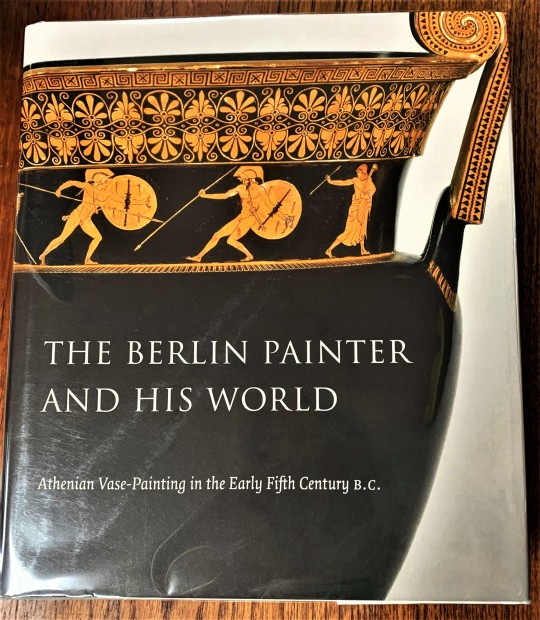

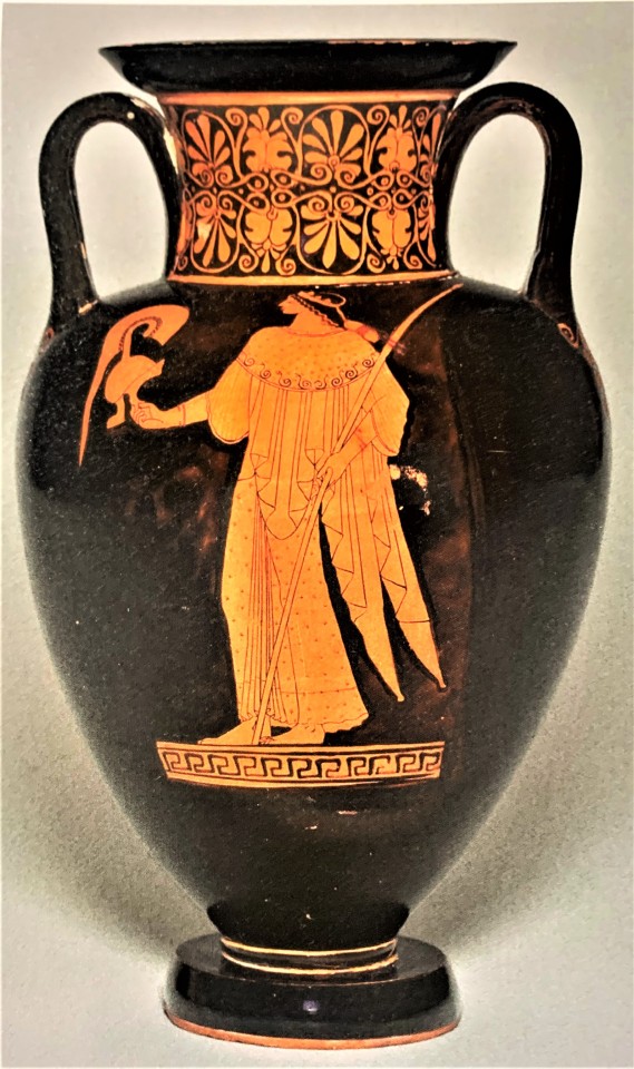
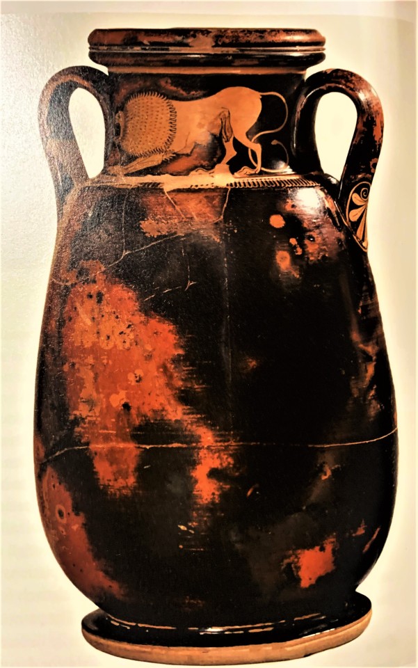
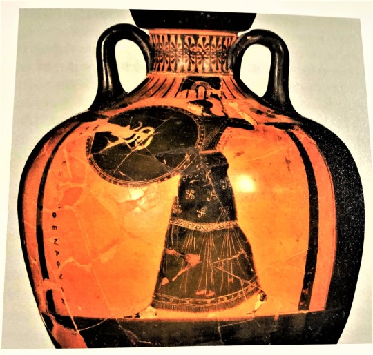
The Berlin Painter
Of all the vase painters of ancient Athens, there is one who continues to captivate all those who witness their works, not only for their splendor and skill, but also for their mystery. The identity of the artist dubbed the Berlin Painter is something we may never know. Although over 200 pieces have been identified as being painted by this individual, none of them hold the name of the artist. This is highly unusual, since by the time of the early 5th century BCE, the period when the Berlin Painter’s vases are dated, both master potters and painters would commonly place their names on their favored works.
The Berlin Painter and His World: Athenian Vase-Painting in the Early Fifth Century B.C. edited by J. Michael Padgett, Curator of Ancient Art at the Princeton University Art Museum, and published by the Museum in 2017 on the occasion of exhibitions of the same name at the Princeton University Art Museum and the Toledo Museum of Art, is the definitive work on this ancient Greek artist, and includes an updated catalogue raisonné, With contributions by several leading scholars, the work seeks to rebuild the ancient city of Athens though the ceramic remains by artists such as the Berlin Painter.
The highly decorated pottery of ancient Athens allows us to see the wide spread of influences this culture had on both the Mediterranean world and Central Europe. While beloved by those in the Hellenic world, others imported the pottery, as luxury items and elaborate symbols of wealth. The Etruscans from the Italian peninsula regularly furnished their tombs with kraters, wine mixing vessels, and the Celts of modern-day France and Germany would regularly feast using the Athenian pottery. Though lacking the fast-traveling methods available today, the broad distance where Athenian pottery can be found demonstrates that the cultures of the Mediterranean and Europe were closely connected.
View more Decorative Sunday posts.
View more of my Classics posts.
View more posts on Ancient Greece.
– LauraJean, Special Collections Classics Intern.
#Decorative Sunday#decorative arts#decorative plates#The Berlin Painter#Athens#ancient Athens#Ancient Greece#classical greece#vases#vase painting#5th century BCE#The Berlin Painter and His World#J. Michael Padgett#Princeton University Art Museum#Greek art#LauraJean
37 notes
·
View notes
Text
Konstantin Andreyevich Tereshkovich (Abramovich). (1902 - 1978).
The entertainer Maurice Chevalier. 1947.
Oil on canvas. 73 x 54 cm.
Top left: "C.Terechkovitch// Ao? T 1947".
On the back is the label: "Festival du film de cannes 1947// Exposition de peinture// sous les auspices du Musee de Grenoble// OEuvre figurant au// catalogue sous le № 128".
It comes from the collection of Maurice Chevalier. It was presented at the Cannes Festival in 1947.
Decorated in a frame.
Konstantin Andreevich Tereshkovich is a famous artist of Russian emigration, painter, graphic artist, whose heritage is now of increasing interest to museums and art lovers. He studied in the studios of K.F.Yuon, I.I.Mashkov, F.I.Rerberg, in MUZHVZ with P.P.Kuznetsov. Since 1918 - in Constantinople, since 1920 - in Paris. He studied at the Grande Chaumiere Academy. Participated in the Russian department of the exhibition "Contemporary French Art" in Moscow (1928), in the Great Exhibition of Russian Art in Belgrade. Held a number of solo exhibitions in Paris, Zurich, Helsinki, Nice, Cannes-sur-Mer, London, New York, Tokyo
Artistic Auctions
5 notes
·
View notes
Photo


Voided velvet upholstery used for the Maple Living-Room of Her Majesty at the Alexander Palace in Tsarskoe Selo
In the Maple Living-Room of Her Majesty, a variety of textiles were used to decorate the Empress’s informal reception-room which was made up of forty pieces of built-in and free-standing furniture. Among these various chairs, tables, sofas, etc. were a folding-screen with leaded-glass inserts, small stools or benches with curved arm rests and an upholstered wingback chair which was built in the same shape as the one from the Lilac Cabinet of Her Majesty.
In the collection of GMZ Tsarskoe Selo, there are pieces of these textiles which were cut from the furniture by the last chief curator of the Palace-Museum, Anatoly M. Kuchumov to preserve the textiles used, in the event a restoration were to happen as was hoped for. However this did not happen, and what had been left of the Maple Living-Room was stripped by the early 1950′s and a load-bearing wall was placed in the middle of the four windows, effectively making two exhibition halls. Today, the post-war configuration has been removed and the room faithfully reconstructed to how it looked prior to the Second World War.
One of the textiles in particular, a voided velvet ground of green with a stylised, blue and green peacock feather motif was used to decorate several pieces of furniture - a wingback chair, folding-screen, curved benches, and seat cushions for the seats of some of the wooden armchairs - all of which was designed and executed by the firm of F.F. Meltser & Co. - the Court Decorator being R.F. Meltser.
Currently, furniture is still in the production stage for the Maple Living-Room by the Tsarskoselskaya Restoration Workshop, and in the future the room will be filled with more pieces until the stage for this room is completed.
________________________________________________________________
Please enjoy these images, and If you'd like to share them elsewhere, you can download them yourself and if you do so, PLEASE remember to credit the institution/news source/author/photographer - in this case Gosfond, and GMZ Tsarskoe Selo, Mr. Newman appropriately! Thank-you.
________________________________________________________________
Photographs:
1. Remnant of the voided velvet used for upholstering furniture. This piece of textile is in the collection of GMZ Tsarskoe Selo (digitised via Gosfond).
2. An upholstered stool/bench from the furniture suite of the Maple Living-Room. Manufactured by the firm of F.F. Meltser & Co. Photograph from “Antiques, Objects of Art and Collectibles,” Circa. 2004.
3. An overstuffed, wingback chair from the furniture suite of the Maple Living-Room. Manufactured by the firm of F.F. Meltser & Co. Photograph from “Antiques, Objects of Art and Collectibles,” Circa. 2004.
4. Cropped detail of a photograph of the Maple Living-Room taken in 1928, by American photographer, “Mr. Newman” showing the folding-screen.
Sources:
Gosfond (State Museum Catalogue of the Museum Fund of Russia)
GMZ Tsarskoe Selo (Tsarskoe Selo State Museum Reserve)
"Antiques, Objects of Art and Collectibles," Circa. 2004.
Mr. Newman, Photographer. Circa. 1928.
Link of courtesy:
www.goskatalog.ru
https://antiqueland.ru/articles/1507/
#alexander palace#gmz tsarskoe selo#tsarskoe selo#gosfond#romanov#imperial russia#voided velvet#velvet#textile#maple room#russian archival material#empress alexandra feodorovna#art nouveau#jugendstil#style moderne#furniture
8 notes
·
View notes
Text

One more for #MosaicMonday:
House of the Rams' Heads Floor Mosaic
Roman, Antioch late 400s - early 500s C.E.
marble & limestone tesserae
76.2 × 208.3 cm (30 × 82 in.), 463 lb.
[Worcester Art Museum 1936.33]
"This is one of four extant parts of an elaborate wide border that presumably framed a large central panel now lost (see Kondoleon catalogue, p. 134). The design is made up of the repeated motif of two confronted rams' heads (actually the foreparts or protomes of the rams) set on a pair of open wings with gray ribbons fluttering below. The ram's heads are mainly in shades of yellow, ranging from dark to light, with some white and flesh-colored tesserae as well; their horns are of light and dark gray, indicating striations, and the horns of every second pair of rams are outlined in black; they wear red collars. Red-pink roses with gray stems punctuate the spaces between the confronted rams' heads and again between the pairs.
Several features of the design have led scholars to connect this mosaic and a related pavement found on the upper level of the House of the Phoenix, also from Daphne and today in the Louvre (see Kondoleon catalogue p. 134, fig. 2) to Sasanian art (*1). The motifs of wings with a fluttering ribbon and ram protomes above wings, distinctive to Persian art, are found on the textiles, rock carvings, seals and metalwork of the Sasanian period (*2). The juxtaposition of the borders featuring rams' protomes and the two stucco pieces decorated with rams in WAM's Antioch exhibition (cat. Nos.21 and 22) reflects the close correspondence between the Antioch mosaics and Sasanian art, but the path of transmission remains unclear. Although the individual components of the border are distinctly Sasanian, their specific use is not. In Sasanian art the protome motifs appear either singly, as in the case of the Worcester pattern block, or in pairs rising from a shared base, though almost always facing outward, stressing their more abstract and ornamental aspect (*3). Can the confronted Antiochene version of the motif be an illustration of the innate naturalistic tendencies of Hellenistic-Roman art? Since there is evidence for the borrowing of Greco-Roman artistic vocabulary, especially in Sasanian metalwork, we might assume that Antiochene workshops had a reciprocal interest in Sasanian motifs. The two Daphne borders demonstrate such an interest. Undoubtedly, motifs and designs were carried through the exchange of portable arts, most likely coins, textiles, and metalwork."
#ram#rams#mammals#ancient#ancient Rome#ancient art#Antioch mosaics#mosaics#Worcester Art Museum#Mosaic Monday#animals in art
2 notes
·
View notes
Text
Art Deco ring by austy_lee
●▬▬▬▬▬▬▬▬▬▬▬▬▬๑۩۞۩๑.▬▬▬▬▬▬▬▬▬▬▬▬▬●
Art deco is a reference to the Art Deco Movement which encompasses the 1920s and 30's, or the period between the wars. There was an overlap and transition from one movement to another and, in general, had it not been for the First World War, the Art Deco period would have begun earlier.
Art Nouveau and Art Deco were both International movements of the Decorative Arts and Architecture. The Art Nouveau movement, in terms of dates, covers the period 1890-1910 approximately, or late 19th century to pre-First World War. The Art Deco Movement encompasses the 1920s and 30’s, or the period between the wars. There was an overlap and transition from one movement to another and, in general, had it not been for the First World War, the Art Deco period would have begun earlier. The Exposition Internationale Des Art Decoratifs et Industriels et Modernes that finally took place in Paris in 1925 was being planned as early as 1912. The apotheosis of Art Nouveau is considered to be 1900 and 1925 for Art Deco.
The term ‘Art Nouveau’ was taken from the Gallery in Paris owned by Samuel Bing (had originally imported works and items from Japan from 1875) which was re-launched in 1895 as the Maison de L’Art Nouveau. The term ‘Art Deco’ is derived from the Exposition Internationale des Art Decoratifs et Industriels et Modernes that took place in Paris in 1925, but the term itself was coined at a later date.
To be called either Art Nouveau or Art Deco, the works will have to have been made within the correct timelines and also exhibit the characteristics of the movement. If you see a catalogue description “in the Art Nouveau style” or “in the Art Deco style”, it means the item shows the design characteristics but was made at a later date and is therefore not a period example.
2 notes
·
View notes
Photo


Il Déco in Italia
L’Eleganza della Modernità
a cura di Francesco Parisi
SilvanaEditoriale, Cinisello Balsamo 2022, 304 pagine, 315 ill., 24 x 28 cm, Brossura con alette, ISBN 9788836653966
euro 36,00
email if you want to buy :[email protected]
Il Déco in Italia, l’eleganza della modernità è il titolo della mostra inedita che il Forte di Bard ospita dal 2 dicembre 2022 al 10 aprile 2023.
Il volume, muovendo dalla sezione italiana dell’Exposition internationale des arts décoratifs et industriels modernes, evento epocale che si tenne a Parigi nel 1925 e da cui deriva il termine “Déco”, intende restituire, attraverso 230 opere circa, una fotografia di quanto si andava producendo in quegli anni non solo nelle arti decorative e nella grafica, ma anche in pittura, scultura e architettura. L’obiettivo è quello di scoprire il fil rouge del gusto déco italiano che, tramite le necessarie intersezioni di stili e temi guida – come la danza, la maschera e la spinta sintetica nell’analisi formale di animali esotici –, favorì quella ricerca orientata verso una maggiore struttura architettonica e geometrizzazione delle forme. Tra le opere illustrate, per citarne solo alcune, le sfavillanti ceramiche firmate da Gio Ponti per Richard Ginori e quelle celebri di Francesco Nonni, le delicate trasparenze buranesi di Vittorio Zecchin, gli straordinari dipinti di Aleardo Terzi e Umberto Brunelleschi, che segnano un versante più illustrativo della pittura di quegli anni, e i progetti di Armando Brasini e Piero Portaluppi. Spazio è dato anche a quel sottile legame che avvicinò il secondo Futurismo alla temperie déco, testimoniato dalla partecipazione all’Expo parigina di Giacomo Balla, Fortunato Depero ed Enrico Prampolini.
09/03/23
orders to: [email protected]
ordini a: [email protected]
twitter: @fashionbooksmi
instagram: fashionbooksmilano, designbooksmilano tumblr: fashionbooksmilano, designbooksmilano
#Déco in Italia#art exhibition catalogue#Forte di Bard 2022#eleganza modernità#arti decorative#grafica#pittura#scultura#design#moda#Gio Ponti#Brunelleschi#Portaluppi#Depero#design books#designbooksmilano#fashionbooksmilano
32 notes
·
View notes
Text
Exhibition Catalogue: Reflecting Upon Nude Veritas
Masterlist
BUY ME A COFFEE
Work written for University Assignment based on Catalogue Essays/Writings. Examples: A Painting - Manet's The Railway - A Painting - Mantegna's Adoration of the Magi - A Drawing - Hepworth Fenstration of the Ear - A Manuscript - The Chronicles of England
Painted during the end of the 19th century, by Viennese painter Gustav Klimt (1862-1918), the oil painting, Nude Veritas (Fig.1), comes from the era of the Vienna Secession, an art period closely related to Art Nouveau, roughly between the years of 1890-1914. Through mixed media this movement focused on combining the natural world with the man-made, using the fine arts, sculpture, and architecture for decorative motifs. Nude Veritas was created far before either world war and the artist died before the WWII.
Nude Veritas clearly has art nouveau links, with the displayed female nude, gold leaf decorative frame that’s bold and striking, and text that’s reminiscent of posters from the era. Drawing more on Art Nouveau, the painting is hung like a portrait, with a nonrepresentational background, presenting an idealised female nude. The body is flanked by decorative patterns of gold leaf and flowers which was another common motif of Art Nouveau.
While this work draws heavily on Art Nouveau, it lacks the finish that is most associated with the movement, like clean and bold contour lines, flat colours, and exaggerated curving patterns, which do feature in this work but only as a background decoration. Nude Veritas also features a “fuzzy” textural quality, thanks to Klimt’s use of oil on canvas achieving brushed out and light paint, allowing him to create this finish which draws on the Impressionist movement and contains traces of early Expressionism. Impressionism, approximately 1860 onwards, draws on saturated naturalistic colour to exaggerate emotion, with visible brushwork and painterly qualities. Paintings like these emphasised accurate depictions of light to form atmosphere, focusing on ordinary subject matter. Expressionism used distorted imagery of naturalistic scenes for a radically greater emotional effect, and to evoke moods and ideas. Whilst Nude Veritas conforms to some aspects of this movement, it largely draws on Art Nouveau and Impressionism.
Fig 1. Gustav Klimt, Nude Veritas, 1899, Oil on canvas painting, 240 x 64.5 cm, Austrian Theatre Museum, Vienna, Austria
The text featured on this oil painting reads as follows: “KANNST DU NICHT ALLEN GEFALLEN DUCH DEINE THAT UND DEIN KUNSTWERK – MACH ES WENIGEN RECHT: VIELEN GEFALLEN IST SCHLIMM” (“if you cannot please everyone with your actions and your artwork – please only a few: to please many is bad”). “NUDE VERITAS” (“nude truth”)
Holding what appears to be a mirror or looking glass, the subject faces the viewer, challenging them head on, despite a blank and indecipherable stare. With full frontal nudity, and addition of pubic hair, the form becomes less idealised and far more confrontational. As our eyes travel lower, following her body down, we find a snake tangled at her ankles. Once again being confronted by “Nude Truth”, we find the snake obscuring the words possibly representative of an obstruction of truth. Perhaps the woman is the embodiment of truth, her nakedness linked to the word “nude” before truth and being on display for all to see. Or perhaps she is telling us to see a naked truth, once more linked to her bareness on display.
With this in mind, we must understand Klimt’s work and background to understand how this piece is recontextualised in WWII by the Nazis. There is a forgotten history here, as Nude Veritas and many others feature in an exhibit held by the Third Reich Party in 1943. Klimt’s work predominantly features women, due to the nature of the movements he was a part of. “Whenever he was free to choose his sitter, Klimt preferred the dark-haired, Mediterranean type of woman to the blonde, Nordic type so pre- dominant in the German lands.”[1]
Although The Kiss is highly regarded and known today, his other work falls into relative obscurity. Around the time Nude Veritas (1899) was finished, Klimt was commissioned to paint ceilings (1900). Philosophy, one of these paintings “was attacked as "painted lunacy," "pathological," and "immoral."”[2] While this highlights that his work was ridiculed during his life and was seen as controversial, it raises interesting questions about what the Viennese public of the 1940’s thought, under Hitler’s rule, as this work and many others of Klimt’s were displayed. However, his works were not in a degrading exhibition that the Nazis had been known to make, where they displayed artworks to humiliate and condemn certain artists and styles.
“The majority came only to jeer, but a counter-protest was staged by a small minority.”[3] These provocative pieces Klimt painted emphasize a set of conservative sensibilities, yet “writing of the Klimt era, the German Meier- Graefe said: "Woman influenced all this art, good and bad alike […] the worship of women is an integral part of the national culture."[4] How can Klimt works be considered part of a sexual revolution when the Nazi party advocated for a specific archetype of woman. The hypocrisy of the Nazis is laid bare by this contradiction, reinforced by Nude Veritas herself, inviting us to see a naked truth.
It has been well documented that “close to 16,000 works [that were] deemed degenerate were sold, burned, or ridiculed in exhibits set up precisely for that purpose.”[5] The amount of art destroyed under the Nazis, as well as the art that was condemned as degenerate, in some respects overshadows the work they did endorsed. Furthermore, there’s an estimated “100,000 artworks stolen by the Nazis [that] have still not been located”.[6] It is perhaps this we should be focusing our attention on as well, in addition to trying to understand what they were endorsing, and what they wanted the public to take away from their encounters with endorsed works, like Nude Veritas.
It's safe to say that there were a lot of factors against Nude Veritas and Klimt in general, for his work to be endorsed by the Third Reich. Just by looking at Klimt’s work, it’s clear that he does not paint archetypal Aryan women, in fact he seems to avoid them. Moreover, he had a well-documented history of Jewish patronage in Fritz Waerndorfer and his wife Lili. So, despite Klimt being dead by the time his painting was hung on display in the exhibit in 1943, it’s impossible to erase the history he left behind, and the documentation of his life. Yet despite these reasons and the fact that “Adolf Hitler had a tight grasp on the art that was promoted by the Third Reich Party, not one to delegate the task.”[7] it’s a surprise to see Klimt, an artist who succeeded in Vienna where Hitler had failed, being so readily endorsed.
It is precisely all these reasons that make Klimt’s work so interesting to observe from the lens of the Third Reich and their propaganda. Nude Veritas becomes such an intriguing piece to witness as she demands a reflection of the truth, and a self-reflection from the viewer.
Nude Veritas stand upright (240 x 64.5 cm), at just over two and half meters tall; the painting is incredibly large and imposing with a presence demanding to be looked at. This demand for attention is reinforced by Klimt’s use of goldleaf all around the frame, which exudes luxury and material wealth, something the Nazis were fond of: “The U.S. government has estimated that German forces and other Nazi agents before and during World War II seized or coerced the sale of approximately one-fifth of all Western art then in existence.”[8]
While most nudes of women are painted with sensuality highlighting a show of vulnerability, and for the pleasure of the viewer, this painting she stands tall and domineers, despite being a woman in the nude, the space she is presented in and the canvas she is painted on. Her nudity can be read as a primal exposure. This motif of primality is strengthened by her wild unkempt hair, as it bunches all around her head in a voluminous mass, intertwined with what appears to be wild daisies, giving her an untamed appearance. This nudity becomes a far more provocative work because of the fierce undertones it presents for a woman at the time. Moreover, this wildness she carries in her physical appearance, linked with the possible interpretation that she is a physical representation of truth, she reflects the true nature of a human, or women, which is unexpected for contemporary viewers.
Her mirror or looking glass only serves to reinforce the narrative of truth. The favoured interpretation is that of the looking glass, perhaps she is implying we inspect what we are shown, or told as truth, more closely and with greater scrutiny. That there is more than meets the eye, to study and dissect the painting and to carry that scrutiny and translate it into the world around us. Although her face is indecipherable, her eyes look glassy and distant, perhaps blind to truth, but desperate to see it and seek it out as she clutches her looking glass close and almost protectively.
More on the snake, toward the bottom of the painting; snakes are seen representative of duplicity and cunningness. A sign of danger and deception even from a Christian perspective with the garden of Eden, the woman here could possibly be interpreted as Eve. The snake literally is covering the truth up, it also travels towards and around the woman, encircling her legs. Possibly to physically stop her from seeing the truth or deciphering it, and potentially restraining her.
While it is hard to gauge what a contemporary audience would have taken away from this piece, as a modern audience we have a retrospective of the work. We know historically that the Nazis hid concentration camps from the wider world, and destroyed a great many more prized artworks, books, manuscripts etc. Nude Veritas gains another layer of meaning to us, if we were to place ourselves in the contemporary context, the hidden truth of the Nazis, relating their presence to the snake deceiving truth, and a physical showing of wealth and material power by possessing this, and other artworks.
Bibliography:
Morowitz, Laura, 'Heil the Hero Klimt!': Nazi Aesthetics in Vienna and the 1943 Gustav Klimt Retrospective, (Oxford Art Journal, Vol. 39, No. 1, 2016) pp. 107-129 [accessed 12 February 2024]
Kaye, M. Lawrence, Avoidance and Resolution of Cultural Heritage Disputes: Recovery of Art Looted During the Holocaust, (Willamette Journal of International Law and Dispute Resolution, Vol.14, No. 2, 2006) pp. 243-268 [accessed 9 February 2024]
Werner, Alfred, Two Austrian Expressionists, (The Kenyon Review, Vol. 26, No. 4, 1964) pp. 599-616 [accessed 10 February 2024]
#art#art gallery#artwork#writing#art tag#essay#paintings#art exhibition#art show#painting#drawings#drawing#in this essay i will#essay writing#personal essay#short essay#my essays#mini essay#art history#artists#writers#history#writeblr#writers and poets#writers on tumblr#creative writing#historical#lecture#academic writing#dark academia
1 note
·
View note
Text

100 years ago, in 1923, one of Germany’s most progressive and artistically sophisticated design company’s was founded: the Haël Workshops for Artistic Ceramics, the brainchild of former Bauhaus student Margarete Heymann-Loebenstein (1899-1990) and a company that until its forced sale in 1934 distributed its most innovative products both in Germany and internationally. And although she had to handle the untimely death of her husband and cofounder Gustav Loebenstein in 1928 and the fact that she was now the single mother of two young children she was able to keep the company afloat and advance her artistic vision of sophisticated yet useful and simple ceramics.
Up until October 29 the Bröhan Museum in Berlin with „Haël. Margarete Heymann-Loebenstein and her Workshops for Decorative Ceramics 1923-1934“ presents a comprehensive retrospective of her seminal work that is accompanied by the present and even more comprehensive catalogue published by Hirmer Verlag. The catalogue provides a complete overview of Heymann-Loebenstein’s life and career including her upbringing, her Bauhaus episode as well as her flight and expulsion from Germany in 1936.
Her Bauhaus period, although only about a year long, should have long lasting influence on her work: in Johannes Itten’s preliminary course Heymann gained deep insights into the master’s color theory that would profoundly influence her ceramic works as well as the paintings and drawings she made in her free time. Her general interest in contemporary art also made her a frequent visitor of Herwarth Walden’s „Sturm“ gallery, a great source of inspiration for the Haël decors and ultimately also an exhibition venue for her works. Accordingly inspirations drawn from such diverse artists as among others Laszlo Moholoy-Nagy and Alexander Archipenko can be traced in the Hael/Heymann-Loebenstein products that also testament to her almost seismographic feel for new artistic developments.
In view of the dispersed sources related to Heymann-Loebenstein’s work the present catalogue is a groundbreaking publication that for the first time consolidates all relevant aspects of the artist’s biography, education, influences and artistic work. Warmly recommended!
#margarete heymann-loebenstein#design history#modern design#bauhaus#hirmer verlag#exhibition catalogue#design book#book
19 notes
·
View notes
Text
Home Living Room Design: Tips for Creating a Cozy and Inviting Space

In the area of interior design, the dwelling room serves because the coronary heart of the house, a space wherein family and buddies collect to unwind, join, and create loved reminiscences. Asense Interiors in Whitefield, renowned as one of the best interior designers in Bangalore, gives expert steering and revolutionary solutions to raise your property residing room design to new heights of comfort and style. Whether you reside inside the colourful community of Whitefield or the bustling coronary heart of Bangalore, Asense Interior brings remarkable knowledge and creativity to every undertaking, ensuring that your residing room becomes a welcoming sanctuary that displays your unique character and lifestyle.
When it involves interiors in Whitefield and past, Asense Interior knows that the living room is greater than simply an area to living room; it's a reflection of your flavor and a exhibit of your personal style. With their eager eye for element and commitment to excellence, they guide clients via each step of the design method, from idea to finishing touch. Whether it's interior decoration for living room or choosing an appropriate furniture pieces, their crew of professional designers guarantees that every element harmonizes seamlessly to create a cohesive and inviting space.
When it comes to interior decoration for living room, creating a cozy and inviting atmosphere is key to ensuring that this special area in your home becomes a welcoming place for family and guests. Start by carefully choosing colors that evoke warmth and comfort, and opt for simple shades like warm beige or creamy white, combined with accent colors that add depth and personality. Consider adding textures like plush rugs, soft throws and velvet upholstery to create layers of visual interest and tactile appeal. Strategically place lighting such as table lamps and floor lamps to enhance the coziness of the space and create a warm and inviting atmosphere, while ensuring an abundance of natural light during the day Additionally, consider add natural elements such as interior plants or botanical art mbayanti , Don't forget to personalize the room with your favorite artwork, family photos, and decorations to make it feel like you warm and belonging If you follow these tips, you can transform your living room into a comfortable and inviting sanctuary that teaches you to relax, unwind and be with your loved ones have precious moments.
Asense Interior's information extends past mere aesthetics; additionally they offer progressive answers to decorate the functionality of your living room. With their wardrobe door designs catalogue, owners can optimize garage area without compromising on fashion. From sleek sliding doorways to customizable interiors, Asense Interior empowers clients to create a garage answer that perfectly suits their desires and enhances the general design scheme of the room. Additionally, their know-how in interior modular kitchen design lets in them to seamlessly combine the kitchen with the residing room, creating a cohesive and efficient space this is best for enjoyable and socializing.
When it involves 2 BHK duplex house design, creating a comfortable and alluring area is paramount for fostering consolation and relaxation. One key detail to keep in mind is the design of the room, ensuring that furniture is organized in a way that promotes conversation and helps smooth movement. Opting for cushty seating alternatives inclusive of plush sofas and armchairs, paired with tender throws and cushions, can further beautify the coziness of the space. Additionally, incorporating heat lighting fixtures like ground lamps and table lamps can assist to create a welcoming ambiance, whilst also including a touch of sophistication to the room. Another important element of home living room design is selecting the proper shade scheme and decor elements. Soft, neutral tones like beige, cream, and mild grey can help to create a feel of tranquility, at the same time as pops of shade through accent pillows or artwork can add visual hobby and persona to the space. Finally, integrating garage answers which include built-in shelving units or a cloth cabinet with fashionable wardrobe door designs catalogue can help to preserve the room prepared and muddle-free, similarly improving its inviting atmosphere.
Interior modular kitchen design revolutionizes the heart of the house, imparting a super combination of functionality and fashion. By integrating modular factors along with cabinets, counter tops, and appliances, this design technique maximizes area efficiency while improving aesthetics. Modular kitchens provide flexibility in layout and configuration, allowing house owners to personalize their kitchen according to their specific wishes and choices. With sleek finishes, progressive garage answers, and present day technology, indoors modular kitchen design transforms mundane cooking spaces into state-of-the-art culinary hubs. Whether it is a compact urban condo or a spacious suburban home, modular kitchens provide limitless possibilities for growing green, organized, and visually attractive culinary environments that inspire creativity and increase everyday living.
Whether it is 2 BHK duplex house design or villa interior design, Asense Interior is aware that each space is specific and merits to be handled with care and interest. Their crew of experienced designers works carefully with clients to apprehend their vision and produce it to lifestyles with precision and creativity. From choosing the proper color palette to selecting the perfect lighting, they make certain that each factor of the residing room design is adapted to fulfill the patron's precise wishes and options.
Asense Interior is your trusted companion in creating a cozy and inviting residing room area that you'll love coming domestic to. With their understanding, creativity, and unwavering dedication to excellence, they remodel mundane living areas into havens of consolation and fashion. Whether you're seeking to revamp your present living room or create a new space from scratch, Best interior designers in Bangalore is here to help you deliver your vision to lifestyles with style and class.
0 notes
Text
Explore the Beauty of Human Expression: Artwork for Sale in Melbourne
The vibrant world of artistry is quite vast as every stroke of the brush, chisel of the sculptor's hand, and click of the camera captures the essence of human expression.
Artwork for sale in Melbourne is available at leading art galleries where one can buy anything from abstract paintings of flowers, lights and many other things to sculptures of humans.
Many people like mural paintings while some others love intricate Byzantine iconography and one can get all such creations of art at leading online art galleries thus making the buying process easy.
Collectible art is something that many people are fond of and whether one is drawn to the timeless elegance of works on paper or the contemporary allure of mixed media creations one can also visit the exhibitions hosted by leading online art galleries.
Many people and businesses love to have artwork in their buildings to make the house or building look significantly beautiful. Artworks really make the room look sophisticated and hence are found in many important meeting rooms of business organizations.
One can even get such artworks through leasing agreements from the leading art galleries and in this case, one can have the artwork for only as much time as one requires.
With leasing agreements ranging from six to twelve months, one can decorate the room in a specific way for a specific time with also the option of extending the lease. Most businesses like this way when it comes to art collections since this allows for tax-deductible options.
Not just clients who visit the business feel good looking at superb artworks but also employees feel a sense of calmness with quality artworks. With leasing agreements one not only makes the place beautiful while having tax deduction options one also supports the artists as they earn money in the whole process.
Artworks may at times look superficial but there is true beauty among them as they allow one to keep their imagination flourishing. They also have therapeutic qualities, providing comfort, solace, and inspiration during challenging times.
Whether through painting, sculpture, photography, or other mediums, artworks serve as windows into the human experience, fostering empathy, understanding, and a sense of belonging in our increasingly interconnected world.
If you are looking for works of art, check out the massive catalogue of leading art galleries online and you can buy beautiful artworks that can adore the room walls. Buy from the leading art galleries and get the product delivered to one’s house.
Source
1 note
·
View note
Text

We're catching up some on our Artist is Reading posts, forgive us for the forthcoming deluge—
Elizabeth Browne is a new faculty member in the Art History Department.
Elizabeth Saari Browne completed her PhD in the History, Theory, and Criticism of Architecture + Art at MIT. A specialist in eighteenth- and nineteenth-century French sculpture and decorative arts, her research interests include rococo aesthetics, the gendering of artistic media and practices, global contact in the age of Enlightenment, and questions of materiality and art historiography. Her current book project, tentatively titled Modeling Sculpture: Clodion and the Aesthetics of Terracotta in the Eighteenth Century, examines the vases, satyrs and bacchantes, and women and children made in terracotta by the French sculptor Claude Michel, called Clodion (1738-1814). The first English-language monograph on Clodion's clay compositions, the book situates their qualities of plasticity, mutability, and ambiguity within eighteenth-century theories of cognitive processes and burgeoning aesthetics, and challenges the idea of sculpture in the era of the Enlightenment as of a physically or conceptually stable form. Browne is also developing a second project on caricature and cruelty in eighteenth-century ornament.
Prior to joining the faculty at UGA, Browne worked in the curatorial departments of several museums, including Cooper Hewitt, Smithsonian Design Museum; the Museum of Fine Arts, Boston; the Santa Barbara Museum of Art; and the Samuel P. Harn Museum of Art in Gainesville, Florida. Her work has been published in Art History, the Burlington Magazine, the American Ceramic Circle Journal, the French Porcelain Society Journal, as well as in several exhibition catalogues.
Dr. Browne chose the following items to share with everyone:
Dare to Know: Prints and Drawings in the Age of Enlightenment
A Revolution on Canvas: The Rise of Women Artists in London and Paris, 1760 - 1830 by Paris A. Spies-Gans
Sculpture at the ends of Slavery by Caitlin Meehye Beach
Portrait of a woman in silk: hidden histories of the British Atlantic World by Zara Anishanslin
History, Painting, and the Seriousness of Pleasure in the Age of Louis XV by Susanna Caviglia
0 notes
Last Seen Blogs

aptumi
APTUMI

almagraphics
Alma Graphics

napleonsolo
Napleon Solo

cheyspace
Chey’s Space

sweetprapika
I need a drop