#designbestpractices
Explore tagged Tumblr posts
Visit Tumblr Blog
Explore Tumblr blogs with no restrictions, modern design and the best experience.
Last Seen Tumblr Blogs


Fun Fact
Post activity is at the highest at 4:00 pm EDT; notes peak at 10:00 pm EDT.
Text
How to Measure the Success of Your UI UX Design Company

In the competitive digital landscape, measuring the success of your UI UX design company is crucial to ensuring continuous improvement and client satisfaction. Understanding the key metrics and evaluation strategies allows you to gauge the effectiveness of your designs and the overall impact Ṁon your clients’ businesses. This article provides a comprehensive guide on how to measure the success of your UI UX design company, detailing essential metrics, tools, and best practices.
Key Performance Indicators (KPIs) for UI UX Success
User Engagement Metrics
User engagement is a direct indicator of how well your designs resonate with users. Key metrics to track include:
Session Duration: Finds the average quantity of time users spend on a website. Higher engagement is usually indicated by longer session durations.
Page Views per Session: Indicates how many pages a user visits during a session. More page views suggest that users find the content engaging and easy to navigate.
Bounce Rate: The proportion of users who visit a website after just viewing one page. A lower bounce rate often means that users find the site relevant and useful.
Conversion Rates
Conversion rates are critical in assessing the effectiveness of your design in achieving business goals. Key conversion metrics include:
Completion Rate: The proportion of site visitors who finish an intended task, like completing a transaction or completing a form..
Micro-Conversions: Smaller actions that lead towards a main conversion, like signing up for a newsletter or adding an item to the cart.
Customer Retention Rate: The percentage of repeat visitors or customers, indicating the long-term value of your design.
User Satisfaction and Feedback
User feedback provides qualitative insights into the user experience. Important methods to gather feedback include:
Surveys and Questionnaires: Collect direct feedback from users regarding their experience and satisfaction with the site.
Net Promoter Score (NPS): Measures user loyalty by asking how likely they are to recommend the site to others.
Usability Testing: Observing real users as they interact with the site to identify pain points and areas for improvement.
Tools for Measuring UI UX Success
Google Analytics
Google Analytics is a powerful tool for tracking user engagement and behavior on your website. It provides detailed reports on metrics like session duration, page views, and bounce rates. Setting up goal tracking in Google Analytics allows you to measure specific conversions and user actions.
Hotjar
Hotjar offers heatmaps and session recordings that visualize user interactions on your site. Heatmaps show where users click, scroll, and move their mouse, helping you understand which areas of the design attract the most attention. Session recordings provide insights into user behavior, revealing potential usability issues.
UserTesting
With the help of the platform UserTesting, you can test usability remotely using actual people.It provides video recordings of users as they navigate your site, along with their spoken feedback. This tool is invaluable for identifying usability issues and gathering qualitative insights.
Evaluating the Impact on Business Goals
Client Revenue Growth
The ultimate measure of your design’s success is its impact on your clients’ bottom line. By tracking client revenue before and after implementing your design, you can assess its effectiveness in driving business growth. Key metrics to monitor include:
Revenue per Visitor (RPV): The mean amount of money made for each individual visitor. An increase in RPV suggests that your design is effective in converting visitors into paying customers.
Average Order Value (AOV): The mean amount of money paid on each purchase.Higher AOV indicates that users find value in the products or services offered.
Return on Investment (ROI)
Calculating the ROI of your design services helps demonstrate their value to clients. ROI can be measured by comparing the cost of your services to the revenue generated as a result of your design. A positive ROI indicates that your design has successfully contributed to business growth.
Client Retention and Referrals
A successful UI UX design company not only attracts new clients but also retains existing ones and earns referrals. Key metrics to track include:
Client Retention Rate: The percentage of clients who continue to work with you over time. High retention rates indicate satisfaction with your services.
Referral Rate: The percentage of new clients who come from referrals. A high referral rate suggests that your existing clients are satisfied and willing to recommend your services to others.
Continuous Improvement and Iteration
A/B Testing
To find out which version of a webpage performs better, A/B testing compares the two versions.By testing different design elements, such as CTA buttons, layouts, and headlines, you can identify the most effective variations. A/B testing helps in making data-driven decisions and continuously improving the design.
Regular User Testing
Regularly conducting user testing ensures that your designs remain user-centric. By periodically gathering user feedback and observing their interactions, you can identify new pain points and areas for improvement. Continuous user testing helps in keeping the design aligned with user needs and expectations.
Staying Updated with Industry Trends
The UI UX design industry is constantly evolving, with new trends and technologies emerging regularly. Staying updated with industry trends and best practices helps in keeping your designs innovative and competitive. Participating in industry conferences, webinars, and online courses can provide valuable insights and inspiration.
Conclusion
Measuring the success of your UI UX design company involves a combination of quantitative and qualitative metrics. By tracking user engagement, conversion rates, and user satisfaction, you can gauge the effectiveness of your designs. Utilizing tools like Google Analytics, Hotjar, and UserTesting provides valuable insights into user behavior and preferences. Ultimately, the impact on client business goals, such as revenue growth and ROI, serves as a testament to the value of your design services. Continuous improvement through A/B testing, regular user testing, and staying updated with industry trends ensures that your designs remain effective and user-centric.
#UIUX#UXDesign#UIDesign#UserExperience#DesignMetrics#KPIs#UserEngagement#ConversionRates#UserFeedback#GoogleAnalytics#Hotjar#UserTesting#BusinessGrowth#ClientSatisfaction#A_BTesting#UsabilityTesting#DigitalDesign#DesignSuccess#ClientRetention#IndustryTrends#ContinuousImprovement#DesignBestPractices#ROI#CustomerRetention#DesignStrategy
0 notes
Text

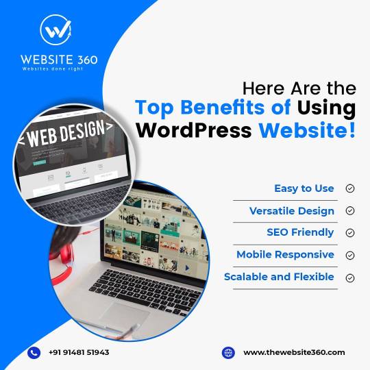
With its user-friendly interface and robust features, WordPress empowers you to create stunning websites with ease. Enjoy seamless customization, responsive designs, and built-in SEO tools to attract more visitors and grow your business.
🌐 : https://thewebsite360.com/
📞: 9148151945
#WebsiteDesign#UXDesign#ConversionOptimization#OnlineSuccess#WebDesignTips#EffectiveWebDesign#WebsiteSuccess#UserExperience#ConversionRateOptimization#DigitalPresence#WebsiteUsability#MobileFriendlyDesign#ResponsiveWebDesign#VisualAppeal#UserInterfaceDesign#WebsitePerformance#ContentStrategy#SEOOptimization#DesignBestPractices#WebsiteNavigation#CallToAction#BrandIdentity#UserEngagement#OnlineBusinessSuccess#WordPressWebsites#OnlinePresence#SEO#Customization
0 notes
Text

Best Image Format in Web Designing
When it comes to choosing the best image format for website designing, there are several factors to consider, including image quality, file size, and browser compatibility.
Here's a comprehensive suggestion on selecting the right image format for your website:
1. JPEG or JPG
JPEG aka JPG is a widely used image format suitable for photographs and images with a wide range of colors and gradients. It offers good compression while maintaining decent image quality. However, it utilizes lossy compression, which means some image details may be lost during compression.
Best use cases:
Photographs
Complex images with many colors and gradients
Images where small details aren't critical
Pros:
Good compression for photographic images
Supports millions of colors
Widely supported by web browsers
Cons:
Lossy compression can reduce image quality
Not suitable for images with transparency
2. PNG (Portable Network Graphics)
PNG is a popular image format for images that require transparency or sharp edges. It uses lossless compression, which means image quality remains high even after compression. However, PNG files can be larger in size compared to JPEG.
Best use cases:
Images with transparency (e.g., logos, icons)
Images with sharp edges and text
Graphics with simple shapes and limited colors
Pros:
Lossless compression maintains image quality
Supports transparency (both simple and alpha transparency)
Suitable for images with text overlays
Cons:
Larger file sizes compared to JPEG
Limited support for some older web browsers (like Internet Explorer 8 and below)
3. GIF (Graphics Interchange Format)
GIF is primarily used for simple animations and images with transparency. It supports animation by displaying a sequence of images in rapid succession. However, GIF has a limited color palette, making it less suitable for complex images.
Best use cases:
Simple animations (e.g., loading icons)
Images with transparency
Graphics with flat colors and simple shapes
Pros:
Supports animation
Supports transparency
Small file sizes for simple graphics
Cons:
Limited color palette (256 colors)
Not suitable for photographs or complex images
4. WebP
WebP is a modern image format developed by Google that aims to provide the best of both JPEG and PNG formats. It offers both lossy and lossless compression, supports transparency, and generally results in smaller file sizes compared to JPEG and PNG.
Best use cases:
All-purpose image format (photographs, graphics, animations)
Websites aiming for high performance and quick loading times
Pros:
Supports lossy and lossless compression
Supports transparency
Generally smaller file sizes
Modern format with good browser support
Cons:
Limited support in older web browsers (Internet Explorer)
5. SVG (Scalable Vector Graphics)
SVG is a vector-based format that uses XML to define graphics. It's resolution-independent and can be scaled without loss of quality. SVG is excellent for logos, icons, and graphics that need to look sharp on various screen sizes.
Best use cases:
Logos and icons
Graphics requiring scalability
Simplistic illustrations
Pros:
Resolution-independent (no loss of quality when scaled)
Small file sizes for simple graphics
Can be easily manipulated with CSS and JavaScript
Cons:
Not suitable for complex images or photographs
Final Thoughts
In conclusion, the choice of image format should be based on the type of content you're presenting on your website.
For photographs and complex images, JPEG is often a good choice. For images with transparency and sharp edges, PNG is ideal. GIF works well for simple animations, and WebP offers a modern, versatile alternative.
Finally, SVG is perfect for scalable graphics like logos and icons.
It's a good practice to use a combination of these formats throughout your website to achieve the best balance between image quality and performance.
Comment below if you've any questions about it!
#WebDesignTips#WebsitePerformance#ImageFormats#DigitalMarketing#GraphicDesign#UserExperience#WebDevelopment#ImageOptimization#DesignBestPractices#OnlineMarketing#WebDesignTrends#WebsiteOptimization#SEOStrategy#ContentOptimization#VisualContent#TechSolutions#CreativeDesign#UXDesign#WebPerformance#VisualAppeal#magicmarketing
0 notes
Text
Design a Website for Success. Learn how!

Discover 🌐 #thewebsite360 expert advice and insights on designing websites for maximum impact.
👩💻 Learn about user experience, conversion optimization, and best practices for an effective online presence.
🚀 Visit for more information: https://thewebsite360.com/
#webdesign#uxdesign#conversionoptimization#onlinesuccess#webdesigntips#effectivewebdesign#websitesuccess#userexperience#conversionrateoptimization#digitalpresence#website usability#mobliefriendlydesign#responsive web design#visualappeal#userinterfacedesign#websiteperformance#contentstrategy#seo optimization#designbestpractices#websitenavigation#call to action#brandidentity#userengagement#onlinebusinesssuccess
0 notes
Text
With its user-friendly interface and robust features, WordPress empowers you to create stunning websites with ease. Enjoy seamless customization, responsive designs, and built-in SEO tools to attract more visitors and grow your business.

#WebsiteDesign#UXDesign#ConversionOptimization#OnlineSuccess#WebDesignTips#EffectiveWebDesign#WebsiteSuccess#UserExperience#ConversionRateOptimization#DigitalPresence#WebsiteUsability#MobileFriendlyDesign#ResponsiveWebDesign#VisualAppeal#UserInterfaceDesign#WebsitePerformance#ContentStrategy#SEOOptimization#DesignBestPractices#WebsiteNavigation#CallToAction#BrandIdentity#UserEngagement#OnlineBusinessSuccess#WordPressWebsites#OnlinePresence#WebsiteDesign#SEO#Customization
0 notes
Text
The Impact of Typography on Mobile App Design
In the ever-evolving landscape of mobile app design, typography plays a critical role in shaping the user experience. The right choice of fonts, sizes, and layouts can make a significant difference in how an app is perceived and utilized. In this article, we will delve into the profound impact of typography on mobile app design, exploring its importance, best practices, and the psychological effects on users.
Why Typography Matters in Mobile App Design
Typography is not just about choosing a pretty font; it’s about creating a seamless and engaging user experience. Good typography enhances readability, guides users through the app, and reinforces the brand identity. In contrast, poor typography can lead to confusion, frustration, and ultimately, app abandonment.
Readability and Legibility
The primary goal of typography in mobile app design is to ensure readability and legibility. Readability refers to how easily a block of text can be read, while legibility concerns the clarity of individual characters. Given the small screens of mobile devices, achieving these two elements is paramount.
Font Selection: Choose fonts that are easy to read at various sizes. Sans-serif fonts like Arial, Helvetica, and Roboto are popular choices for mobile apps due to their clean and straightforward appearance.
Font Size: Optimal font size is crucial. Text that is too small can strain the eyes, while text that is too large can disrupt the layout. A common practice is to use a base font size of 16 pixels for body text.
Line Spacing: Adequate line spacing (leading) improves readability by preventing lines of text from blending together. A acceptable location to start is with a line height that is 1.5 times the font size.
Hierarchical Structure
Typography aids in creating a visual hierarchy that leads readers logically and naturally through the information.
By differentiating text elements such as headings, subheadings, and body text, designers can highlight important information and improve the overall user experience.
Headings: Use distinct font sizes, weights, or styles for headings to make them stand out. This helps users quickly identify key sections of the app.
Contrast: For better readability, make sure the text and background have enough contrast. Dark text on a light background is typically more readable than light text on a dark background.
Consistency: Maintain consistency in font choices, sizes, and styles throughout the app. This results in a unified and clean look.
Psychological Impact of Typography
Typography also has a psychological impact on users, influencing their perception and emotional response to the app. Different fonts and styles can evoke various feelings and associations, making it crucial for designers to choose wisely.
Serif vs. Sans-Serif: Serif fonts, with their decorative strokes, can convey a sense of tradition and reliability. Sans-serif fonts, however, are thought to be modern and clean. Depending on the app's purpose, one might be more appropriate than the other.
Font Personality: Each font carries a unique personality. For example, a playful, rounded font might be suitable for a children’s app, while a sleek, geometric font might be better for a tech-focused app.
Emotional Response: Typography can influence users' emotions and engagement levels. Well-chosen typography can make an app feel more inviting, trustworthy, and enjoyable to use.
Best Practices for Mobile App Typography
To harness the power of typography in mobile app design, follow these best practices:
1. Prioritize Clarity and Simplicity
Keep text clear and simple. Refrain from using excessively ornate typefaces as they may impede reading. Stick to a limited number of fonts and styles to maintain a clean and professional look.
2. Optimize for Different Screen Sizes
Ensure that your typography looks good on various screen sizes. Test your designs on different devices to make sure that text remains readable and well-organized.
3. Use Typography to Enhance Branding
Typography should align with your brand’s identity. Choose fonts and styles that reflect your brand's personality and values. Consistent use of typography helps reinforce brand recognition.
4. Implement Responsive Typography
Design your typography to be responsive. This means using relative units like ems or percentages for font sizes, allowing text to scale appropriately across different devices and screen orientations.
5. Focus on Accessibility
Accessibility is a key consideration in mobile app design. Ensure that your typography choices accommodate users with visual impairments. This includes providing sufficient contrast, using readable font sizes, and supporting screen readers.
Case Studies: Successful Use of Typography in Mobile Apps
1. Airbnb
Airbnb’s mobile app is a prime example of effective typography. The app uses a clean and modern sans-serif font, with a consistent hierarchy that guides users through listings, reviews, and booking details. The typography enhances readability and reinforces the brand's friendly and approachable image.
2. Instagram
Instagram utilizes a simple and elegant typography system. The use of bold fonts for usernames and light fonts for captions creates a clear visual hierarchy. This makes it easy for users to distinguish between different types of content and interactions.
3. Medium
Medium’s app focuses on readability, using a serif font for body text that mimics the experience of reading a printed article. The typography choices contribute to a comfortable and immersive reading experience, encouraging users to spend more time on the platform.
Conclusion
In conclusion, typography is a fundamental element of mobile app design that significantly impacts user experience. By prioritizing readability, establishing a clear visual hierarchy, and considering the psychological effects of font choices, designers can create more engaging and effective apps. Following best practices and learning from successful examples can help ensure that your mobile app's typography is both functional and aesthetically pleasing.
Website Here:- https://intorque.com/
#Typography#MobileAppDesign#UXDesign#UserExperience#FontChoice#Readability#Legibility#DesignTips#VisualHierarchy#PsychologicalImpact#AppDesign#DesignBestPractices#ResponsiveDesign#AppAccessibility#BrandIdentity#DesignInspiration#TechDesign#DigitalDesign#UIUX#GraphicDesign#DesignTrends
0 notes
Text
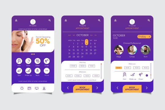
Designing Mobile Apps for Different Devices: Best Practices

In today's digital landscape, mobile apps must cater to a wide range of devices, from smartphones and tablets to wearables and smart TVs. Designing for such a diverse array of platforms presents unique challenges and opportunities. This comprehensive guide explores the best practices for designing mobile apps that provide a seamless user experience across different devices.
Understanding the Diversity of Mobile Devices
Smartphones and Tablets
Smartphones and tablets remain the most common devices for mobile app usage. However, the varying screen sizes, resolutions, and aspect ratios require careful consideration to ensure a consistent user experience.
Wearables
Wearables, such as smartwatches, demand a different approach due to their small screens and unique interaction methods. Apps designed for wearables should prioritize essential features and quick access.
Smart TVs and Other Devices
Smart TVs and other connected devices introduce new interaction paradigms, often relying on remote controls or voice commands. Designing for these platforms involves optimizing for larger screens and different user behaviors.
Best Practices for Designing Mobile Apps for Different Devices
Responsive Design
Adaptive Layouts
Responsive design is critical for accommodating various screen sizes and orientations. Implementing adaptive layouts ensures that your app looks and functions well on any device. This involves using flexible grids, scalable images, and relative units.
Breakpoints and Media Queries
Using breakpoints and media queries allows you to apply specific styles based on the device's characteristics. This approach helps tailor the user interface to different screen sizes and resolutions, enhancing the overall user experience.
Consistent User Interface (UI)
Uniform Visual Language
Maintaining a consistent visual language across all devices is essential for brand recognition and user familiarity. This includes using the same color schemes, typography, and iconography throughout your app.
Platform-Specific Guidelines
While consistency is crucial, it's also important to respect platform-specific design guidelines. Both iOS and Android have their own set of design principles (Human Interface Guidelines and Material Design, respectively) that should be followed to ensure a native look and feel.
Optimized Performance
Efficient Coding Practices
Performance optimization is vital for delivering a smooth user experience across different devices. Efficient coding practices, such as minimizing resource usage and optimizing load times, can significantly enhance app performance.
Testing on Multiple Devices
Thorough testing on a variety of devices is essential to identify and address performance issues. This includes testing on different operating systems, screen sizes, and hardware configurations to ensure compatibility and performance consistency.
Intuitive Navigation
Simplified User Flows
Designing intuitive navigation is crucial for user satisfaction. Simplified user flows, clear navigation paths, and easily accessible controls help users accomplish tasks efficiently.
Contextual Menus and Gestures
Incorporating contextual menus and gesture-based navigation can enhance the user experience, especially on smaller screens. This approach allows users to access additional options without cluttering the main interface.
Accessibility Considerations
Inclusive Design
Accessibility should be a priority in mobile app design. Implementing inclusive design practices, such as providing alternative text for images, using high-contrast color schemes, and ensuring keyboard and screen reader compatibility, makes your app usable for a broader audience.
Customizable Interface Options
Offering customizable interface options, such as adjustable font sizes and color themes, allows users to tailor the app to their preferences and needs, further enhancing accessibility.
Content Prioritization
Focus on Core Features
On smaller devices, it's important to prioritize core features and content. Focus on what users need most and present it prominently. This helps users achieve their goals without unnecessary distractions.
Progressive Disclosure
Using progressive disclosure techniques can improve the user experience by revealing additional information and options as needed. This approach keeps the interface clean and focused while still providing access to advanced features.
Case Studies and Examples
Instagram: A Unified Experience Across Devices
Instagram's mobile app provides a consistent user experience across smartphones, tablets, and web platforms. By maintaining a uniform visual language and intuitive navigation, Instagram ensures that users can seamlessly interact with the app regardless of the device they use.
Google Maps: Optimized for Wearables
Google Maps is a prime example of an app optimized for wearables. The app prioritizes essential features such as turn-by-turn navigation and quick access to saved locations, making it highly functional on small screens.
Conclusion
Designing mobile apps for different devices requires a thoughtful and strategic approach. By implementing responsive design, maintaining a consistent UI, optimizing performance, and prioritizing accessibility, developers can create apps that deliver a seamless user experience across all platforms. Embracing these best practices will not only enhance user satisfaction but also ensure that your app stands out in the competitive mobile market.
#mobile apps#MobileAppDesign#ResponsiveDesign#AdaptiveLayouts#UserExperience#UIUX#CrossPlatformDesign#SmartphoneApps#TabletApps#WearableApps#SmartTVApps#AppDevelopment#DesignBestPractices#ConsistentUI#PerformanceOptimization#IntuitiveNavigation#InclusiveDesign#Accessibility#ContentPrioritization#AppTesting#MobileDevelopment#TechTrends
0 notes