#diagrams
Explore tagged Tumblr posts
Visit Tumblr Blog
Explore Tumblr blogs with no restrictions, modern design and the best experience.
Last Seen Tumblr Blogs


Fun Fact
In February 2021, Tumblr had 518.6 million blog accounts.
Text


astronomical/astrological diagrams
from an astronomical-astrological composite manuscript, alsace, 15th c.
source: Vatican, Biblioteca Apostolica Vaticana, Pal. lat. 1370
#15th century#astronomy#astrology#cosmology#diagrams#rotae#zodiac signs#months#moon#illuminated manuscript
3K notes
·
View notes
Text
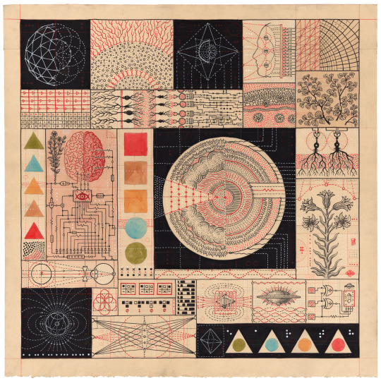
Sacred Geometries and Scientific Diagrams Merge in the Metaphysical World of Daniel Martin Diaz
4K notes
·
View notes
Text
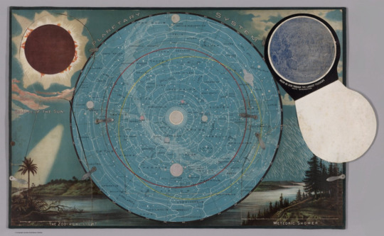
'planetary system with flap open showing moon,' pictorial map, levi walter yaggy, 1887.
533 notes
·
View notes
Text
I'd like to introduce you to LJS 57, a compendium of Astronomical text in Hebrew, written in Spain around 1391. It's an interesting combination of astronomy and astrology, and illustrates how the division between "science" and "not science" was not nearly so clear in the past as it is today. It has some fantastic illustrations of constellations!
🔗:
#medieval#manuscript#medieval manuscript#14th century#hebrew#astronomy#astrology#stars#constellations#illustrations#illuminations#diagrams#history of science#book history#rare books
4K notes
·
View notes
Text

I kind of want to write an actual post on this with some cool pictures from the manga and all, but this little diagram perfectly explains my thoughts for yoru and denji's "relationship" at the moment
#csm#chainsaw man#chainsaw man part 2#csm yoru#yoru#war devil#csm 181#denji#csm denji#csm spoilers#diagrams
714 notes
·
View notes
Text

Untitled (Mysticism), Leonora Carrington, 1956
#art#leonora carrington#british mexican artists#surrealism#1950s#creatures#diagrams#mysticism#black and white
155 notes
·
View notes
Text

Colymbiformes et Procellariiformes - Valentin Lvovič Bianchi - 1911 - via Internet Archive
240 notes
·
View notes
Text

Squares: A Public Place Design Guide for Urbanists by Mark C. Childs, Diagrams of types of courthouse squares
#squares#diagrams#plan#public space#public place#design#design guide#mark c. Childs#Diagrams of types of courthouse squares#A Public Place Design Guide for Urbanists#Urbanism
218 notes
·
View notes

Text
What is Dataflow? Part 2: Diagrams
This is the second part of a couple of posts about Dataflow, particularly why it's important for the world going forward and relating to the Crowd Strike IT disaster.
Read the first part here.
Before I get into this one today, I wanted to address a couple of things.
Firstly, Dataflow is something that nearly every single person can understand. You do NOT:
Need to have a degree in Computing Science
Need to work in IT
Need to be a data analyst / Spreadsheet master
If any of you see the word 'Data' and feel your eyes glazing over, try and snap out of it because, if you're anything like me, Dataflow is much more approachable as a concept.
Secondly, what do I mean by IT?
Traditionally in most of our media the all-encompassing 'IT department' handles everything to do with technology. But every business works differently and there are many job titles with lots of crossover.
For example, you can be an infrastructure engineer where your focus is on building and maintaining the IT infrastructure that connects your organisation internally and externally. This is a completely different role from an Application Portfolio Manager who is tasked with looking after the Applications used in business processes.
Both are technical people and come under the banner of 'IT' - but their roles are focused in different areas. So just bear that in mind!
Now that's out of the way, let's begin! This one will be a little bit deeper, and questions welcome!
An Intro to Diagrams
You probably do not need a history of why pictures are important to the human race but to cover our bases, ever since we put traced our hands on a cave wall we have been using pictures to communicate.

Jump forward in time and you have engineers like Leonardo Da Vinci drafting engineering schematics.

You get the idea, humans have been creating diagrams (Pictures) for thousands of years. Centuries of refinement and we have much more modern variations.
And there's one main reason why diagrams are important: They are a Common Language.
In this context, a Common Language helps bridge a language gap between disciplines as well as a linguistic gap. A Spanish electrician and a German electrician should be able to refer to the same diagram and understand each other, even if they don't know each other's language.
The reason they can do this is because they're are international standards which govern how electrical diagrams are created.
A Common Language for Digital?
Here's an image I've shown to clients from governments and institutions to global organisations.

Everything around us, from the products we use to the bridges we drive over and the buildings we live, work, enjoy and shop in had diagrams backing them.
You would not build a skyscraper without a structural engineering diagram, you would not build an extension on your house if an architect couldn't produce a blueprint.
Why is there not an equivalent for the Digital World and for Dataflow?
Where is the Digital Common Language?
This is the bit where the lightbulb goes on in a lot of people's heads. Because, as I mentioned in Part 1, the flow of data is the flow of information and knowledge. And the common mistake is that people think of dataflow, and only ever think about the technology.
Dataflow is the flow of information between People, Business Processes *and* Technology Assets.
It is not reserved to Technology specialists. When you look at the flow of data, you need to understand the People (Stakeholders) at the top, the processes that they perform (and the processes which use the data) and the technology assets that support that data.
The reason why this is important is because it puts the entire organisation in context.
It is something that modern businesses fail to do. They might have flow charts and network diagrams, and these are 'alright' in specific contexts, but they fall to pieces when they lack the context of the full organisation.
For example, here is a Network Diagram. It is probably of *some* value to technical personnel who work in infrastructure. Worth bearing in mind, some organisations don't even have something like this.

To be absolutely clear, this diagram will hold some value for some people within the organisation. I'm not saying it's completely useless. But for almost everyone else, it is entirely out of context, especially for any non-technical people.
So it doesn't help non-technical people understand why all of these assets are important, and it doesn't help infrastructure teams articulate the importance of any of these assets.
What happens if one of those switches or routers fails? What's the impact on the organisation? Who is affected? The diagram above does not answer those questions.
On the other side of the business we have process diagrams (aka workflow diagrams) which look like this.

Again we run into the same problem - This is maybe useful for some people working up at the process layer, but even then it doesn't provide context for the stakeholders involved (Are there multiple people/departments involved throughout) and it doesn't provide any context for technical personnel who are responsible for maintaining the technology that supports this process.
In short, nobody has the big picture because there is not a common language between Business & IT.
Conclusion
So what do we do? Well we need to have a Common Language between Business & IT. While we need people with cross-functional knowledge, we also need a common language (or common framework) for both sides of the organisation to actually understand each other.
Otherwise you get massively siloed departments completely winging their disaster recovery strategies when things like Crowd Strike goes down.
Senior Management will be asked questions about what needs to be prioritised and they won't have answers because they aren't thinking in terms of Dataflow.
It's not just 'We need to turn on everything again' - It's a question of priorities.
Thing is, there's a relatively simple way to do it, in a way that looking at any engineering diagram feels simple but actually has had decades/centuries of thought behind it. It almost feels like complete common sense.
I'll save it for Part 3 if you're interested in me continuing and I'll make a diagram of my blog.
The important thing is mapping out all the connections and dependencies, and there's not some magic button you press that does it all.
But rigorous engineering work is exactly that, you can't fudge it with a half-arsed attempt. You need to be proactive, instead of reacting whenever disaster strikes.
381 notes
·
View notes
Text
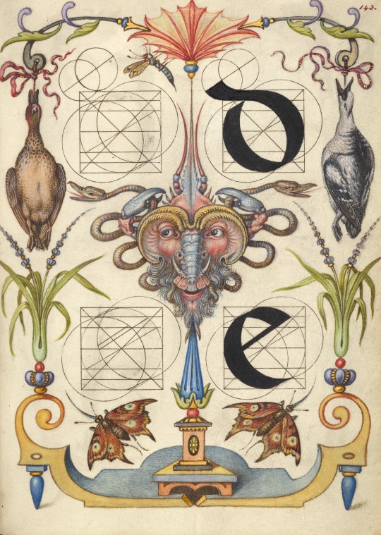
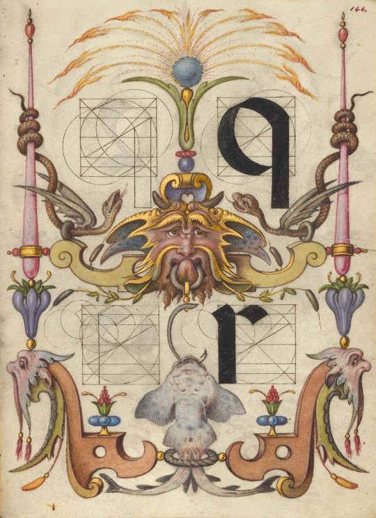
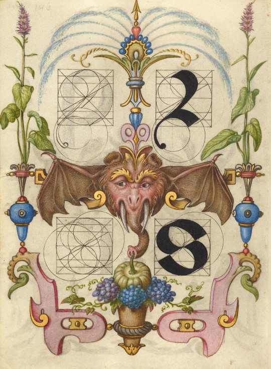
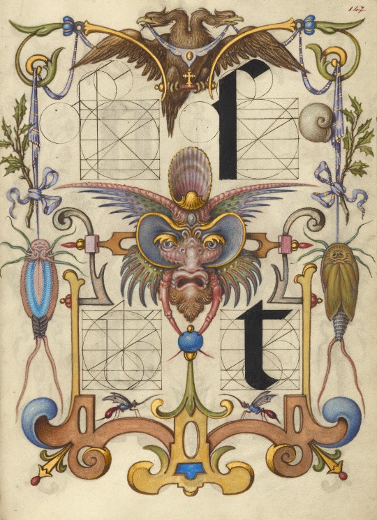
"guide to the construction of letters"
pages from the "model book of calligraphy", vienna, originally created by georg bocskay from 1561-62, illuminated and expanded by joris hoefnagel, c. 1591–96
source: Getty Museum Collection, Ms. 20 (86.MV.527), fol. 143r-147r
#16th century#joris hoefnagel#mira calligraphiae monumenta#model book of calligraphy#guide to the construction of letters#georg bocskay#calligraphy#geometry#diagrams#hybrids#grotesques#illuminated manuscript
1K notes
·
View notes
Text

‘Inside Information’ Cutaway Diagrams by Dorothy Dig Into the Makings of Pop Culture Icons
156 notes
·
View notes
Text
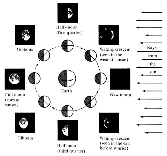
diagram of the lunar cycle from a children's book on calendars, necia h. apfel, 1985.
334 notes
·
View notes
Text
LJS 64 is a book of diagrams, many with moving parts, designed to accompany the work Theoricae novae planetarum by 15th-century Austrian Georg von Peurbach, who is considered one of the first modern astronomers. He was particularly interested in simplifying the Ptolemic system (which places the Earth in the center of the solar system). The diagrams in the book demonstrate increasingly complex planetary motion.
🔗:
LJS 64 was recently featured in #CoffeeWithACodex, you can watch the complete 30 minute video here:
#medieval#renaissance#manuscript#volvelles#diagram#diagrams#illustrations#astronomy#astrological#science#history of science#book history#rare books#16th century
919 notes
·
View notes
Text
Number of Graphs
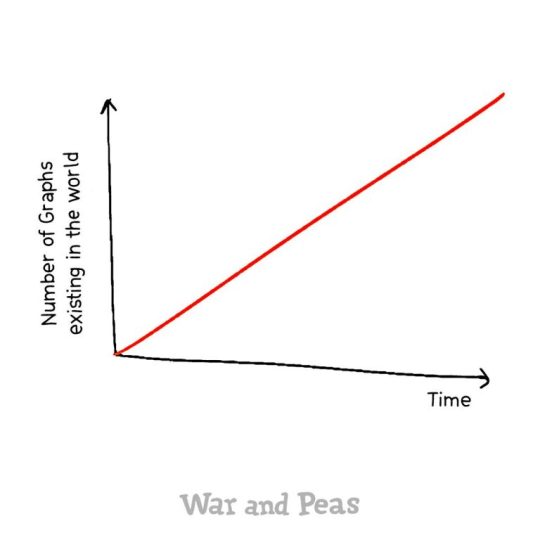
View On WordPress
565 notes
·
View notes
Text

the zine part is optional but just from firsthand experience it does really help
#to the multiple people who are going to feel this is targeted @ them: I make this chart because I KEEP having this conversation#the thing about option 2 is sometimes you also realize some of them would be cooler as women. and then you can do that. another win.#chariots chariots#''what if someone can tell it's inspired by something'' everything's inspired by something. set yourself free#diagrams
68 notes
·
View notes