#duplicate cleaner
Explore tagged Tumblr posts
Visit Tumblr Blog
Explore Tumblr blogs with no restrictions, modern design and the best experience.
Last Seen Tumblr Blogs


Fun Fact
69% of Tumblr users are millennials.
Text
Explore top duplicate photo finder tools to efficiently manage your images.
0 notes
Text
Free up space effortlessly! 🚀 Streamline your digital album and reclaim storage with just a few clicks. Say goodbye to clutter and hello to organization!
0 notes
Text

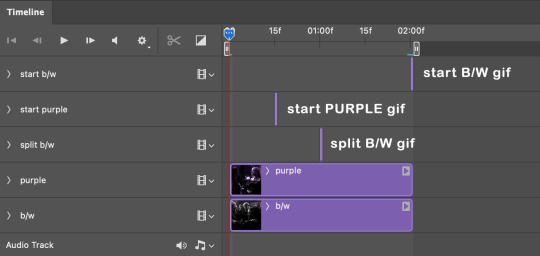
I got a couple of asks on how I did the text transition in this set. I'm going to explain as best as I can (with image references).
*Disclaimer: this assumes you have a basic understanding of giffing with video timeline, and keyframes. If you're new to keyframes, check out this tutorial by @userpeggycarter before proceeding.
Step 1: Go through, make your gif, color and all that jazz. if you're not familiar with giffing and need a guide, check this one out by @cal-kestis. Be mindful of the number of frames you have, as it is extremely important when keyframing begins. Make sure you have an even number of frames, or you will have an uneven transition. For this gif I'm at 60 frames total, and I'd be careful exceeding 70, as if you need to go back and delete... It just sucks, so be mindful! You'll see my gif and coloring under a group I titled "base" - and I highly recommend putting your gif/coloring/etc. into groups, as it will make the timeline a bit cleaner, and it's a little easier to find everything you need. But when you're done, you should be here:

*Quick note 1: Make sure your gif is in 8-bit mode. If you aren't familiar with bit modes, that is a tutorial for another time. For now, you can change it here:

Step 2.1: Pick your font/placement/etc. I really recommend being 100% on whatever you pick, along with the size. I've encountered problems when I move the font after the fact with alignment, so it's best to look your gif over to ensure you're satisfied. For this set, I went with Figtree, placed dead center.
I want to add to this by saying, thus far, I have found that white is the only color that works for this. I'm playing around with some other options, but black is 100% a no go. If you find a way to get that working, let me know. I'll amend this tutorial.
Photo of text settings, along with where you should be now.

Step 2.2: Since we're transitioning into a new set of words/text, you need to get that text ready as well. Shorten the length of time the first piece of text runs to halfway (I have 60 frames, so I cut it to 30).

Step 2.3: Duplicate your text layer, type your other text. The two texts should show for length of time, as you have an even number of frames, meaning you can divide by 2. Move it over to the end of where the previous text ends. If that makes no sense, it should look like the below: (again, folder for the typography to know where to reference. I have a small organization addiction so.. creator's choice)

*Quick note 2: I do not recommend changing to a new font or size with this, it won't look quite right. Of course, experiment away! This is just a small caution based on my own experimentation.
Now, to get to the actual fun part...
Step 3.1: Duplicate the first text layer. For this gif, it's the one that says "it didn't change anything". Once you duplicate it, you'll be turning it into a smart object. This is so the filter we apply works. Repeat for the second text layer. Lil gif below:

Quick note 3: I recommend going one text bit at a time, and also would tell you to put each typography layer into its own folder. This is really important for later, so doing it earlier is better.
Step 3.2: We will now apply the filter. To do this, you're going to click the smart object version of our text, then go to Filter → Stylize → Wind. For the gifset I made, I used Method → Blast and Direction → From the Right. Click "OK" and the filter will apply. Duplicate this for the other text layer.

Step 4: We now begin the keyframing. I highly recommend the rule of 0.3, which is when your transitions are over the span of multiples of 3 (i.e. if you start at frame 1 with 100% opacity, frame 3 will be at 0%). We'll be doing 6 frames from 100% to 0%, and vice versa, for this transition. This was the best time I found for this transition, but it's a matter of preference. Just follow that rule of 3.
Step 4.1: Click the smart layer of the text we made on the timeline, then click the little arrow on the left of the name of the layer. You'll see this:

See the little clock next to Opacity? Click it, and you get this lovely little yellow diamond. This is how we control the visibility of the Wind layer. It will start at 100%, keep it there.

Click the arrow on the right of the play button 6 times (aka get to the 6th frame), click the stopwatch again. While on this frame, and the yellow diamond clicked, change the opacity of the Wind layer to 0% It'll look like this:


You will repeat this, in reverse, at the end of the text layer.
Quick note 4: Sometimes, Photoshop is moody. To get the diamond on frame 30 (or whatever frame # the end of your text layer is), put it on the frame prior. You can then nudge that diamond over 1 frame. See below:


Repeat the process for the other text layer.
Step 5: We're basically done! Change your gif from video timeline to frames, maybe do a quick play through to make sure all is well.
Quick note 4 (it's the last one I promise): I have heard from many that when they work with keyframes, they end up with duplicate frames. I, personally, have not encountered this issue. I do not know if it is because of the version of Photoshop others are using, PC vs. Mac, or some other secret third thing. I recommend that, when you check your gif, verify if there are duplicate frames. The keyframe tutorial I linked earlier goes into further detail, and here is another lovely explanation from Nik, the master of all things keyframe transitions.
Step 5.1: Export, and give yourself a high five because you deserve it.
If you have any questions, don't hesitate to reach out! I'll try to clarify anything if needed. Happy giffing!
#*tutorial#c*#*ps#tutorial#userchibi#usertj#uservivaldi#userbuckleys#usertina#userroza#usershreyu#usersole#useralien#userabs#userrainbow#quicklings#userbambie#useraljoscha#userzal#userbess#userfern#tuserhol#usernolan#usermagic#userhallie#usershale#userholloway#tusermels#usergif#we will absolutely not be discussing that fact that i have been awake since 630 am
236 notes
·
View notes
Text
TILE TRANSITION TUTORIAL
a couple of people have asked me for a tutorial on how I did the penultimate gif in this set, so here goes! this is my first tutorial, so please feel free to reach out with further questions if anything's unclear.
note: this tutorial assumes you know the basics of gifmaking, can create the base gifs, and are familiar with timeline mode.
STEP ONE: create the base gifs! I'd recommend staying between 25-40 frames for each gif, since the transitions we'll use later tend to increase gif sizes. these are the ones I'll be using for this tutorial:


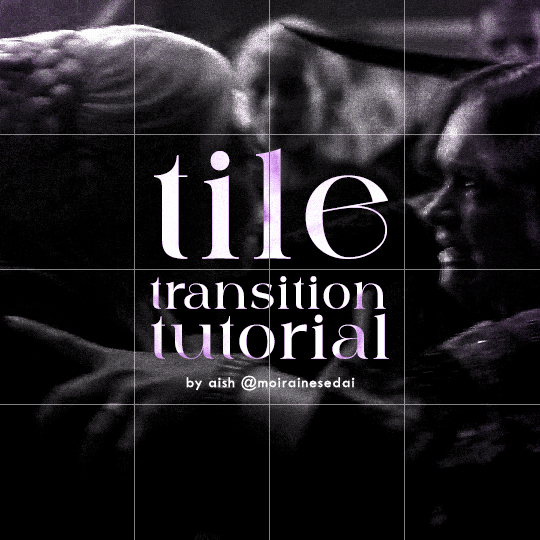
STEP TWO: create the guide layouts for both base gifs. for this panel, I chose a 4x4 grid — I would recommend keeping the number of "tiles" low because it can get tedious, but have a minimum of 9 (3x3 grid).

now your canvas should look like this:
STEP THREE: create the tiles. this is where the going gets rough; there might be easier ways to do this that I couldn't think of 😭 if there are any please send me an ask!
essentially, in this step we'll cut up the base gifs into smaller squares so that each tile can be manipulated separately when we put both gifs together. to do this, first create a square using the rectangle tool and the guides. then duplicate the base gif, move it above the square, apply a clipping mask, and then convert the clipped gif and square (selected in the image below) into one smart object.
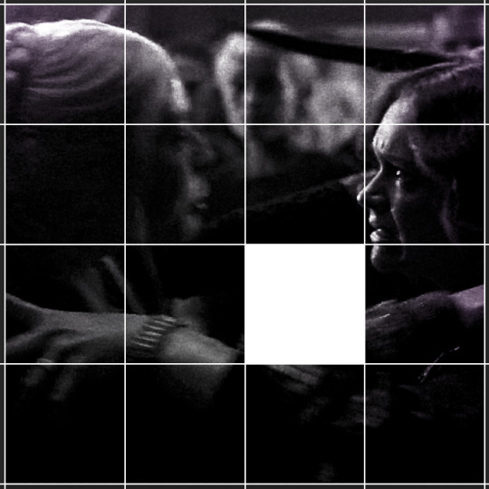

ALTERNATELY: you could duplicate the original base gif and use layer masks to isolate tiles. create a layer mask for the duplicated gif layer and, with the layer mask selected, drag your mouse over a square (using the guide layout) and press delete. then press ctrl/cmd + i to invert the layer mask so that the gif only shows in the square of your choosing.
now repeat until you've got the entire gif in tiles, and do the same for the other gif!
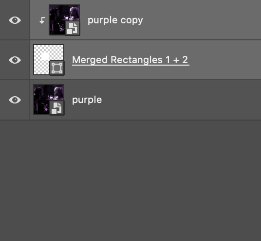
since the transition effect is achieved by staggering the crossfades for each tile of the final gif, you can cheat by having multiple tiles "flip" at a time, ideally no more than four. this means you need to cut the base gif up into fewer pieces. to do this, simply draw multiple squares instead of one and then merge the shapes, before duplicating and clipping the gif onto them.
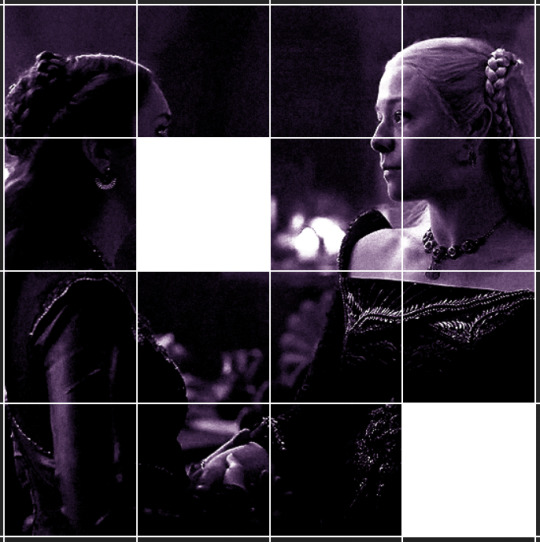
if you do this, it's essential to remember that you have to divide both gifs up in the exact same way. each piece of the b/w gif has to correspond to a piece of the purple gif!
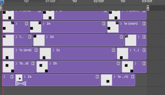
this is what the layers look like for each gif once I'm done:

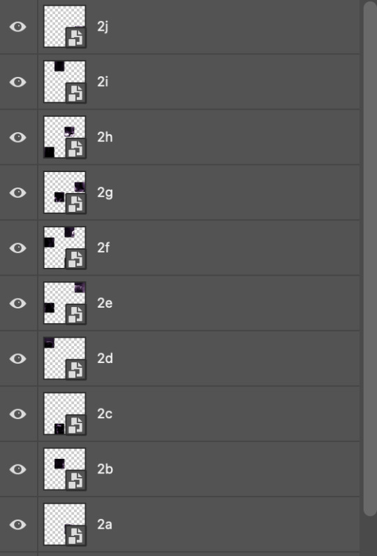
I have them lettered so that it'll be easier to match them up in the next step.
STEP FOUR: this is the complicated bit that took me two days to figure out. I'll do my best to explain but don't hesitate to reach out if something isn't clear!
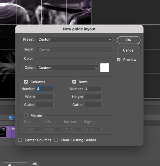
to begin, open up a new psd and import both base gifs into it. (remember to click "create video timeline" and ensure that your gifs are all in order before proceeding.)
now, the trickiest part about this transition is ensuring that all the little tiles sync up so that the larger gif is coherent. so first we'll create some markers (just empty layers) to ensure that everything lines up as it should. — marker 1: at about halfway through the first gif (b/w in this case) — marker 2: at about a quarter of the gif length — marker 3: close to the end of the gifs
at this point we're ready to start bringing in the tiles. I'm going to delete the base gifs from this new psd just to keep things cleaner!
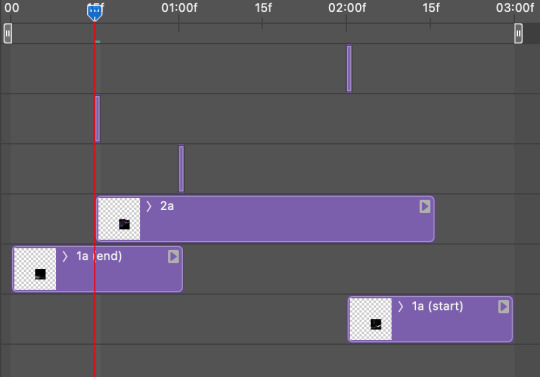
first thing to do is import my b/w tile. move the timeline slider over to marker 1 and split the first gif. (if it helps, rename the split gifs and add (start) and (end) to the two halves.) then, move the (end) half to the beginning of the timeline, and the (start) half to line up with marker 3.
the purple tile is easier to manage. simply import it into the psd and line it up with marker 2.
your timeline should now look like this:
notice the overlap between the gifs at their beginnings and ends — this is where you'll be able to cascade the tiles flipping, so it helps to have a significant amount of overlap.
crop the three gifs for this tile as you see fit! since this is the first tile I want to flip from b/w to purple, I'll crop gif 1a (end) all the way to the current position of the timeline slider (red line with blue tip) and leave the beginning of gif 2a uncropped. for the flip from purple to b/w, I'll crop both gifs a bit.
once that's done, drag all three gifs onto the same level in timeline so they form a video group. your timeline should look something like this:

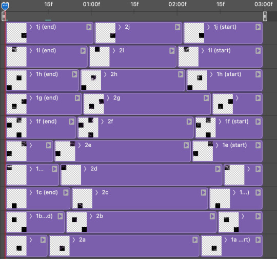
now you just repeat the process for all the other tiles! as long as you made sure that all the tiles in one gif correspond with tiles in the other gif in step three, this should be a fairly painless process. make sure to crop the starts/ends of the gifs separately so that they don't all flip together.
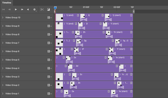
this is what my layers look once I've done all the tiles:
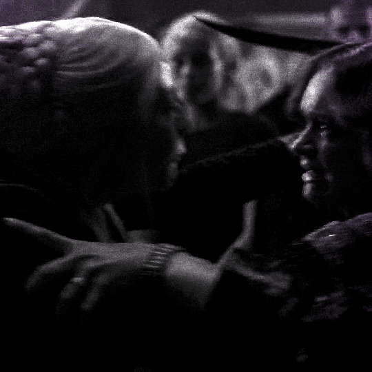
and the gif!
STEP FIVE: transitions! click on the half-white square (top right of the left column in the timeline, beside the scissors) and select the crossfade transition, then drag it between two gifs in a video group. it should create a two-triangle symbol and shorten the overall length of the video group.

apply the transition to all the tile flips, ensuring that the duration of all transitions is constant. this can sometimes be tricky because ps likes to change the duration of each transition, so right click on the transition symbol and manually change all your transition durations to be the same.
your layers should now look something like this:
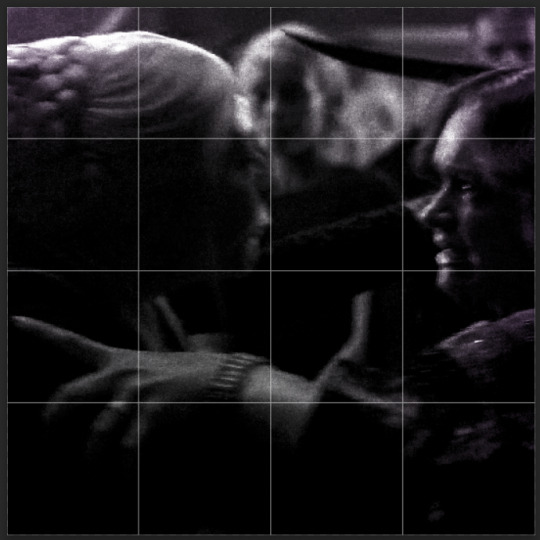
STEP SIX: draw the grid. bring back the guide layout from step two and using the line tool (I like 2px thickness), trace the grid. adjust opacity as you see fit (50-80% is usually a good idea), so that the canvas looks like this:
STEP SEVEN: export and celebrate! you're done!
I hope this tutorial made sense and was easy to follow, and happy giffing! my inbox is always open for any questions <3
#tutorial#ps help#ps tutorial#userace#alielook#userabs#usercats#userhella#userfaiths#tuserabbie#usershreyu#usertreena#tuserlucie#uservivaldi#usertj#usergiu#userroza
837 notes
·
View notes
Text
Some tips for The Sims 3 Buy/Build
Install LazyDuchess’ Smooth Patch to alleviate lag, esp in Buy/Build and CAS.
Keep your CC merged and organized, esp your patterns, this will also alleviate a lotta lag across all modes.
When building on community lots, or any lot rlly, avoid going to the edit world menu, and just put testingcheats enabled into the cheat window, then shift+click the ground of the lot to enter Buy/Build mode. This makes leaving it to save a lot easier, with less “preparing” screens to possibly get hung up in.
Lower your settings, you don’t need any adjacent lots loaded, and you certainly don’t need super water on either. You can always switch these back on when you’re done.
While you’re at it, remove your HQ mod, and turn off your Reshade/Gshade preset, or at least turn off your depth shaders. I only ever turn on my depth shaders when I’m taking screenshots for better fps while playing. The DoF shader esp requires a lotta resources your game could be using to simulate all those 78 townie sims instead.
Save as… vs Save, I Save as… at least every third save. It’s also just good habit to keep backups.
When using the CASt tool, set down everything you plan to CASt first, then switch to a category like the wall tool to avoid eventual lag and drag when using it a lot. Love yourself. You don’t have to suffer using CASt tool in an overpopulated category like misc deco.
Utilize the clone option through testing cheats to duplicate already CASted objects, it’ll keep your design just like the dropper tool, but it’s a lot less time consuming, I promise.
Don’t be afraid to use the swatch save tool for objects you use often, esp community lot objects, as it helps to keep your aesthetic consistent. I also keep all of my favorite streetlamps, benches, and public trash bins etc in a convenient custom collection folder to speed up the process of doing multiple lots in one sitting. These handy tools are there, use them.
The issue with custom counters. They mess up sometimes, if you can’t recolor it suddenly, here’s how to fix that. Now if you can’t place down a cupboard suddenly, even though nothing’s in the way, and you’ve got moveobjects on activated, try putting it on the wall a tile over, and then try adding it to your desired spot again. Lastly if you set down counters or cupboards at a corner, and it messes up the textures, but you can still recolor it, you could do what the video I linked above does, or you could simply pull out the CASt tool, and switch it back to any of its original swatches and click the check, then feel free to recolor it as you want.
Railings will also do the “can’t recolor” trick too, but this is a simple fix, just delete it, and replace it, and you’re good.
“Oh no, I switched between buy and build mode, and now my catalogue won’t load, and I can’t click on anything at all!” Don’t panic, hit F2 and/or F3 on your keyboard, these are shortcuts for switching between them, and if you’re lucky it’ll load properly again. Should you get the bug where you load a category and it’s somehow empty, don’t fret, just click on a different category and this should fix it. Then if you get the bug where all the objects you put down disappear suddenly, sorry your game is haunted. Call an exorcist, or just reload, they might reappear if you do.
Tbh, if you run into any kind of major bugs, it’s likely a sign to either save immediately or just restart your game. These only ever show up when you’ve been at it a while ( at least for me ), therefore starting fresh wouldn’t hurt. Probably also wouldn’t hurt to check whether you might’ve installed something the game didn’t agree with by running Dashboard, or put it through the ol’ Save Cleaner.
Honorable Mention: Keep an eye on the texture sizes and poly counts of objects. I know it’s tempting to build these ultra hyperrealistic lots with clutter at every inch, but unless you’re just doing it for screenshots, or for your story, or using it very sparingly, it is not by any means recommended purely for gameplay. This is just the truth when it comes to any Sims game. You don’t want lag, or max memory crashes, or save errors? The Sims 3 is a 32bit game, that’s almost old enough to drive, be easy on it.
484 notes
·
View notes
Text

Jaiden
Desolation/Stranger Avatar Creates Wax Duplicates Favorite weapon: Bat with spikes
Jaident worked as Baghera's cleaner when they worked for the Federation. Her job included things like forging corpses and destroying evidence.
75 notes
·
View notes
Note
Hi! I was just wondering if h could talk a bit more about the organizing service? What made you sign up for it/how did you find it?
I have a lot of clutter and I feel like something like that would be helpful lol
yeah! at the moment my brain is goo but I am happy to natter on a bit.
This was the service we used. They are pretty clearly hopping; there's obviously a hell of a market for the service especially among the neurodivergent and especially especially for ADHD folks.
I came into a bit of money this year I've been able to throw at big quality of life sinks, and that... was pretty obviously one of them. Spouse and I have spent the last decade or so ricocheting between stressful life events, many of which have destabilized our home (multiple floods and very hasty interstate moves, for example) and... it shows in the messiness of our home, which gets overwhelmingly cluttered and therefore hard to clean. Especially because we're both dog nerds and have accumulated.... a lot... of dog stuff over the years.
So. Cleaners seemed impossible with stuff everywhere and, also, overwhelming, did I mention that? Some of the stuff was aspirational (could we be the kind of people who eat ice cream out of fancy old timey sundae glasses? Turns out, no). Some of it was hobbies that we don't have anymore. Some of it was just not a good fit for our current storage. Some of it was duplicates from stuff we bought because we couldn't find the original.
What the organizers mostly did with us was go slowly through our shit, help work out what needed to stay and what needed to go, and then work out homes for things to live based on our needs. For example, my bedroom is pretty small and the laundry is in the basement, so we haven't really been great at getting clothes from laundry into dressers ... so we're pitching the dresser entirely and making a system for finding clean clothes quickly from a series of laundry baskets.
We have a shit ton of dog toys, including both stuffies and a lot of food puzzle toys. They helped walk through which toys needed to stay and which could go, and then they helped us create a series of boxes we can pull toys from a couple different types for every month to rotate among the toys they already have, based on the spaces we had available. (I bought one of those moveable sectional sofas where there's storage in every seat. Worth it.)
And it was just nice. The owner of the business noted that she hires based on the ability of the person to be kind at all times to people who are struggling with clutter and stuff, no matter why, and that was definitely bourne out for us. I think our organizers were one senior lady who has been at it a while and two newer folks, a middle aged lady who had retired from nursing and a youngish college kid, and they were a really good mix of thoughtful ideas and inquiries about how we currently use various spaces and what we'd LIKE those spaces to be instead.
It's easier to deal with someone else's mess than your mess, and it was a lot of up front assistance to get the house in a lot better shape than I could have done on my own. We paid about $3000 for 36 organizer-hours split over two days, and it was well well worth it. I think it will be much easier to clean the house and keep it tidy now, and I'm very much looking forward to getting to kick back and enjoy the results.
63 notes
·
View notes
Note
Your artworks looks like AI
To be honest I'm guessing this is a bot because I don't think my art is really a style that is mistakeable as AI. BUT just in case this is someone who genuinely doesn't know how to differentiate AI art versus human art, I'm gonna make a post on it rq!
One of the ways you can tell my art is not AI is because you can see all the individual strokes that I made. My style in particular makes this easier to distinguish than others because as an artist I really embrace this, while others prefer a very clean lineart and coloring process.
Here are some examples from mine:

This is from one I made of Nico underwater. If you look at the water you can see all the places I drew each line. By contrast, zooming in on AI art doesn't show any brush strokes at all. Often, there's also a weird "fuzz" I've noticed? Like rather than a human artist who simply makes a, say, yellow banana, and if you zoom in you just see yellow, for an AI if you zoom in it weirdly looks like the AI is struggling to make every pixel yellow so each pixel is slightly different. That's what I think of as the art being slightly fuzzy.
I tried searching google for some AI art to use as examples of this but I'm currently in a different country for an internship and they're still getting my WiFi set up, so my connection isn't loading any of the Google images with enough clarity to be able to zoom in a bunch so I can show you. But it's something I've noticed for a lottt of AI art--and so this coupled with lack of brush strokes can be a sign of AI.
Another thing that, in my opinion, is a way to determine something is human-made is the shape of the canvas! In my experience, when I see AI art online, it tends to be a very similar canvas shape each time. I don't think most AI creations have the ability to be creative with canvas shape. Meanwhile, a human might choose to make their canvas super wide or long or whatever. Since I created each piece of my art individually for the purpose of eventually combining it all into a comic-ish thing, each canvas I made was very very wide which would have been unusual for an AI. Such as:

From what I've seen, an AI would have created somewhat more even dimensions.
And finally, one of the dead giveaways for AI versus human art is simply what mistakes are made in the piece. Neither AI art nor human art is usually absolutely perfect, but the mistakes that an AI makes are not usually the same ones that a human makes! For example here, I didn't actually make lineart or sketches for the background because I had figured "eh, how hard is it to make a background like this?" However you can tell this didn't work out perfectly for me because my "sun" did not end up perfectly round hahaha. Look above Nico's head. It's like sort of lopsided. Getting a perfect circle without any sort of lineart or tool is very hard as an artist, at least for me! However an AI would not struggle with making a perfect circle. It would have been much cleaner. However, an AI would have probably struggled more with things like color and style consistency in the wings (there are a lot of feathers that could trip it up), body proportions, etc etc.
And, overall, these three things together are very consistent with everything I post. AI would struggle to recreate a style like this over and over again, and it also tends to struggle to make the same face over and over. I'm not sure if you've ever seen one of those videos where people ask AI to duplicate an image without making any changes, but it really cannot do it. For this reason it would have been difficult for an AI to make the same face so many different times for a consistent comic.
I realize this ask was most likely a bot tbh since I think my art is pretty obviously human, but as a hater of AI art, I will never turn down an opportunity to talk about ways to differentiate human versus AI art. I hope this was helpful to anyone who struggles with identifying things like this!
#artificial intelligence#identifying ai art#ai discourse#honestly#i have no idea how to tag this#i generally keep things on this account fandom-only so at some point I might make a second blog for non-fandom stuff#and this can go there#but for now#it is here#thank you for coming to my ted talk#art#artwork
35 notes
·
View notes
Note
What kind of drawing app do you use and how do you draw a clean line art very well even if it’s a doodle?
I use procreate, and a very small brush size for more control, and when I’m finished I’ll duplicate the line-art and overlap the two to make it look thicker. This way it looks like more “cleaner” and more defined
My hand works fast so I kinda use it to my advantage, drawing a super rough sketch and drawing over it once I get the rhythm of what I want it to look like
The extra sketching might make it look more tedious, but it my case it speeds everything up for me ahahh
So that’s the technical reason why I can draw so fast or whatever u say
45 notes
·
View notes
Text
HOW I PERSONALLY ORGANIZE MY DIGITAL ZINE MASTERCOPIES!
Hey zineovators, hello every'all. I am here to note down how I (PERSONALLY) fix around and assign my digitally-made zine mastercopies for easy access. This isn't meant to be a guide and it surely isn't the "correct" way to file zines, nor is this necessary, it might even be redundant for a lot of people, but this is just the way I do it. I have some really crappy guides throughout my yap session, BUT I will provide a REAL example using my own zine at the end! anyhow, let us begin! WHY DO I BOTHER?
because it makes my personal zine creation process more manageable
organization makes it less daunting for me to actually go through with the creation process
It tickles my fish brain to file and sort things, and it makes me happy to do so
so yeah, it all boils down to personal preference. I like making my digital process cleaner and a bit more streamlined, but you really don't have to follow me or use me as a standard. I just do what I do best.
That aside... TERMS I COINED AND WILL BE USING AND EXPLAINING (LIST) (yes this is based off of A/B/O but also coding)
ALPHA Mastercopy (A-Copy, Alpha copy)
BETA Mastercopy (B-Copy, Beta Copy, Physical Mastercopy)
OMEGA Mastercopy (O-Copy, Omega Copy, Assembled Mastercopy)
PRELIMINARIES!
A master copy in my own words is the original mother version of your zine that you can use to duplicate or create more copies for distribution purposes. You usually do not give a master copy away especially if you plan to make more prints of a specific zine design in the future! Also, I'm using the classic 8-page mini-zine format as an example here because...I specialize in mini-zines, lol. With that in mind, here is the portion you are waiting for.
ALPHA MASTER COPY (i.e.. RAW DIGITAL FILE)

The Alpha copy is the version of your zine that you made/scanned into a digital format. Typically I would use a PDF along with the zine design that I pre-formatted for this due to the clarity and easy access of PDF files. I avoid .png or .jpg because flattening my zine files tends to crush the text quality, by a LOT.
The Alpha copy doesn't have to just be the formatted version already. It can be individual panels, single pages, artwork or scanned pages, etc. That's also an alpha copy, but in its own way. The version I'm talking above is print-ready copy that is already prepared.

^ THIS counts as an alpha copy as well.
Now down below is an example of my own alpha copy in PDF format, featuring my DAVID SYLVIAN zine (I'll try to upload it on an archive soon, it will be completely free! Pls tell me in advance if you'd like to reproduce and distribute it irl since I dont want to get sued </3)

btw the tagline "be seen, make a zine" was taken from brattyxbre on YouTube. I would gladly recommend her for zine resources, discussions and zine-related topics, especially if you are a beginner!
BETA MASTER COPY (i.e.. PRINTED TEMPLATE)
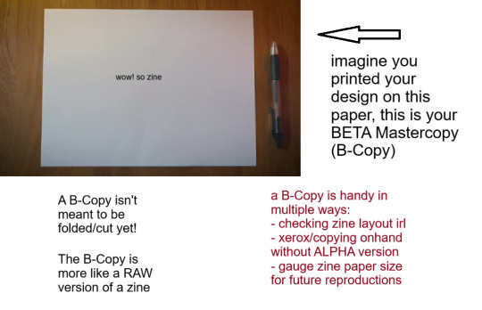
Your Beta copy is a version of your zine that is printed on paper with the proper formatting for folding/cutting already. The only difference with this version and omega copy is, well, you DON'T fold or cut this copy.
The primary purpose of a B-Copy is to check:
print quality (text visibility, color vibrance, ink bleeding, etc.)
graphic size and an overview of your zine's general physical appearance.
And the other, marginally vital role of your B-Copy is to serve as:
the physical print that you can use for XEROX (photocopying) or other copying services and tools
scannable output that you can scan/copy for distribution, especially if the person who wants your zine would like to assemble it themselves, if you do not have a final version of your zine on hand to share, or you yourself do not have your A-Copy for reproduction.
A printed copy that you can catalogue or archive, especially if you are the sort of person who retires zines, or are just deeply sentimental (like me, lol!).
Down below is the B-Copy of my example zine. Ignore the fact that this is literally my omega copy that I just dismantled because I don't have my Beta in hand lol. But approximately this is how it looks like.

I personally store B-copies (alongside O-copies) inside a dedicated clearbook or binder to safeguard against weathering or chemical ink deterioration, alongside some information and stuff about the zine itself. This is useful especially if you want to showcase zines and zine content to others, apart from safekeeping purposes.
I might make another longform infodump about digital and physical zine storage and archiving processes (because as an aspiring librarian I feel it is my duty to rant about that) but that will be for another time.
OMEGA MASTER COPY (i.e., FINAL EXAMPLE PRINT)

Okay this is kind-of self explanatory, but I will elaborate regardless.
If you are the sort of person who handcrafts zines (aka make, draw, write or assemble them traditionally) you likely know what the O-Copy is, because your original finished zine is what I am referring to as the Omega copy. That is, the ACTUAL "Master Copy" itself.
Omega Master Copy is what most zinesters and zine creators refer to as just the master copy. But seeing from this post, you KNOW I had to make it fancier (read: unnecessarily complicated)
The Omega copy serves as your first official print, and you can use this version to store or show around. The only difference is, if you end up using my organizing format (good luck!), you'll end up using the O-Copy more as a finished product display to show how it looks when finished as an assembled copy, and the B-Copy as the actual thing you use to reproduce or duplicate your zines for distribution.
Here is the example of my O-copy for my example zine. (again you will be able to access this through an archive soon, maybe I will announce it later on or just post about where I store them digitally.)

I used the software development jargon ALPHA, BETA & OMEGA because it kind of fits(?) lol. I am not a coding aficionado but I know loosely enough to utilize the words. But also, live laugh omegaverse. hopefully this helps(?) but also if you reached to this point, hi. I'm glad you indulged in my little rant. EDIT: here's the Internet Archive Link for the specific zine featured in this post! Have fun! Communicate, create, zineovate! Until next time.
#zines#fanzine#zine#zine preview#art zine#zine making#zinester#mini zine#digital archiving#master copy#zineovator#self publishing#david sylvian#japan band
28 notes
·
View notes
Text
Effortlessly declutter your photo library on macOS! Learn how to find and eliminate duplicate or near-identical snapshots with ease. Streamline your digital collection for a more organized and efficient experience.
0 notes
Text
Hybrid Class Review: Slayer part 3

(art by ringasure on DeviantArt)
Archetypes
The slayer class got a pretty robust array of archetypes for the time it was out, so let’s take a look at them!
Plenty of slayers add supernatural power into the mix, such as the shadowy abilities of both Ankou’s Shadows and Stygian Slayers, the former of which use shadow duplicates to attack from multiple angles, while the latter use magic to hide themselves in various ways. Meanwhile, Bloody Jakes do their best implacable stalker impressions, seeming to appear from impossible angles and set up cruel traps ahead of time. Conversely, Deliverers are less magical than they are zealous, but their faith drives them to inflict even greater wounds on those of opposing morality.
Some, meanwhile, specialize in hunting very specific targets. Some do so with supernatural powers as well, geared towards said foes. Covenbanes and Witch Killers specialize in hunting hags and spellcasters respectively, the former with uncanny senses gained from their past traumas, while the latter foment fear and anger against arcane casters and utilize anti-mage tactics. Meanwhile, Grave Wardens and Spirit Slayers focus on destroying the undead, the latter focusing on ghosts and spirits. Pureblades fight against alien horrors, while Spawn Slayers take on the most terrible and nearly unkillable foes: the Spawn of Rovagug. Finally, perhaps most sinisterly are the Family Hunters, who prey upon specific family lines, whether they deserve it or not.
Some archetypes prefer specific techniques or strategies, such as Avalanchers attacking from above, Guerilla’s attacking from ambush, Snipers and Woodland Snipers attacking from a distance, Toxic Snipers doing the same but with ample use of poisoned guns, and Spire Divers attacking from the water.
Others still fill a slightly different role than professional killer. Bounty Hunters focus on taking prey alive, while Butterfly Blades prefer espionage and blending in. Some work for criminal organizations, such as Cutthroats or Sczarni Executioners acting on their behalf, or Cleaners making sure to destroy evidence after the fact. Some are saboteurs and raiders, such as Dune Riders, while others instead work for legitimate organizations, such as the deadly precise Vanguards working as lethally effective soldiers. Finally, some prefer guile and deception, such as the infiltrating and backstabbing Turncoats, or the elite-mingling Velvet Blades.
Slayer archetypes add a lot of different flavors of professional killers, some overt, some subtle, some mundane, some supernatural. None of them really break the mold, but there’s a little something for everything for those wanting to customize their slaying experience.
That will do for today, but tomorrow I’ll give some of my thoughts on the class.
10 notes
·
View notes
Text
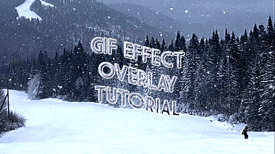
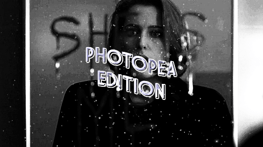

ages and ages ago @jaeyxns asked for a tutorial of how to overlay gif effects onto edits, so i am finally here! thank you so much for your patience. from the bottom of my heart, my bad.
we're going to look at two very similar scenarios here: overlaying a gif effect onto a still image and then onto another gif.
onwards!
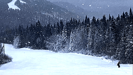
as mentioned in this great tutorial for the same effect on photoshop by @camwritesbooks, your first step in either case is going to be to find your overlay gif. you can do that by searching for the effect you want (smoke, snow, etc) on google or youtube- in this case, you may have to make your own gif- or searching for overlay gifs on tumblr. i got my falling snow gif from here. for the purposes of this tutorial, your overlay gif will work best if it includes a dark background (black is best) with light effects.
next you want to upload your gif(s) and, if relevant, image(s) to photopea. crop/resize as needed so that they're the same size by going to image in the master menu, then "image size" and plugging in the desired dimensions:
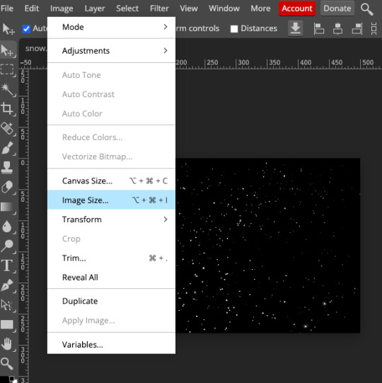
(to crop, you use the crop tool in the editor menu on the left!)
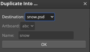
next, duplicate your overlay gif onto your base image/gif. you can do this by right-clicking on the folder in the workbar to the right, then selecting "duplicate into" and choosing your base from the dropdown:
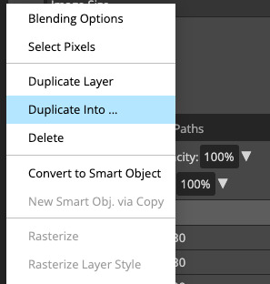
now go into your base gif. you should just see the overlay gif on top of it. to rectify this, select the folder of the overlay gif in the workbar, then go to the blending mode dropdown just above it (it will likely say "pass through") and change the blending mode to screen.
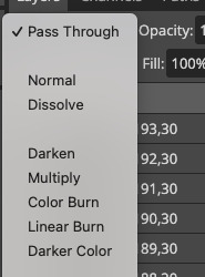
(if your overlay gif has a light background with dark effects, i THINK you can get the same effect if you choose darken instead, but i'm not completely sure.)
if your base is a still image, you're all done! you can go to file in the master menu and export as a gif.
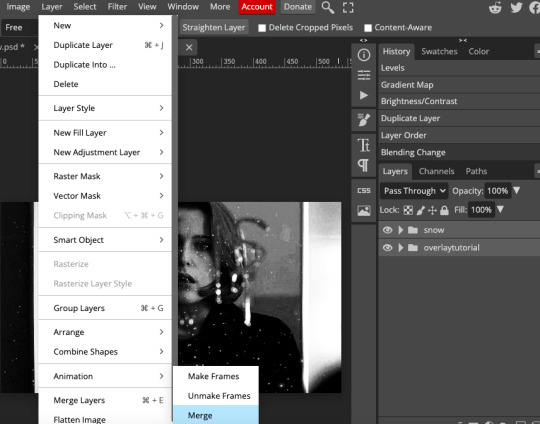
if your base is another gif, you've got one more step. you need to merge your gifs. i cover how to do that in this tutorial, but if you need a refresher, your first step here is to select the folders of both the base and overlay gifs at the same time. then, go to layer in the master menu, scroll down to "animation," and select "merge". DO NOT select "merge layers."
now you should be good to export your gif! if your base and overlay gifs weren't the same number of frames or the same framerate, it might look a little clunky at first, but you should be able to easily adjust the speed in the export window to make it look cleaner. i ended up speeding scully up to around 120%. there's a way you can completely fix the problem but it's really time-consuming and involves a lot of math, so i won't get into it here. if you'd like me to explain it in more detail, let me know!
as ever, let me know if you have any questions!!!
#arwen.text#tutorials#resources#completeresources#allresources#dailyresources#gif tutorial#photopea tutorial#photopea#overlay gifs
211 notes
·
View notes
Text

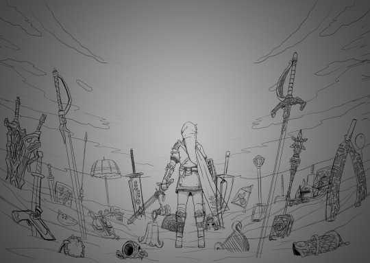
I haven't done one of these in forever! I think the last one I did was... four years ago? I thought it would be fun to make one again with my improved art skills and show the work that was put into this piece.
The final piece was one of three idea prompts I submitted for the zine. I was already sketching out thumbnails while I was waiting for approval, but I did draw for one of the rejected prompts as well. (Unfortunately I don't have access to them at this time but I'll add at a later date).
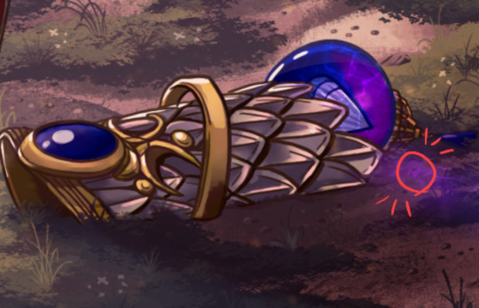
Once the weapon prompt was approved, I got started on a rough sketch. (The sketches were drawn cleaner than what I would normally do to make sure it was readable haha). The toughest part of the piece was its composition. Scattering the weapons was hard because I needed to make sure everything looked balanced and focus was placed on the master sword.
What ended up working for me was I managed to grab as many weapon models from the game as I could find, threw them into Blender, and arranged them until it looked good. A bonus of doing this was having good references for both the piece and the individual weapons themselves (which came in handy when I had to draw some of the detailing). The models were also size accurate so that helped a ton too. I did have to upscale the smaller weapons so they'd be more visible on the cover.
Some of the weapon placement was deliberate, others were put there to fill in space or for another reason. The majority of the characters wielded some variation of a sword so I sprinkled in different weapons and other things to break up the repetition. That includes stuff like the Fierce Deity Mask and Toon Zelda's helmet. The more sillier weapons like Tingle's balloon and King Daphnes' sail were placed in the back so they wouldn't clash too much with the other weapons.
I'll talk about some of the more of the symbolic stuff further down the post.

I also drew an alternative version of this piece with Link being in the center instead of the master sword.
Fun fact: at one point I did consider including Ganon since he's technically playable, but realized he doesn't have a weapon. This would have meant I would also had to include the big Cucco from the cucco mode so neither were ever conceptualized.
I intentionally left the art's tone ambiguous just in case the mod team had something in mind. I did picture it having a dawn color scheme though, and the mods wanted the cover to have a peaceful/hopeful vibe so that worked out. I did however add some sunset choices in my color concepts for more options. The four I made also had sepia versions to fit with the aesthetics of the game.
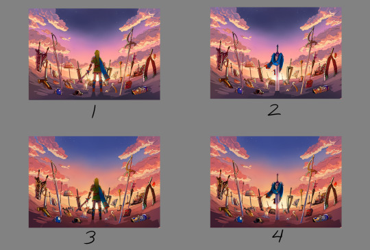

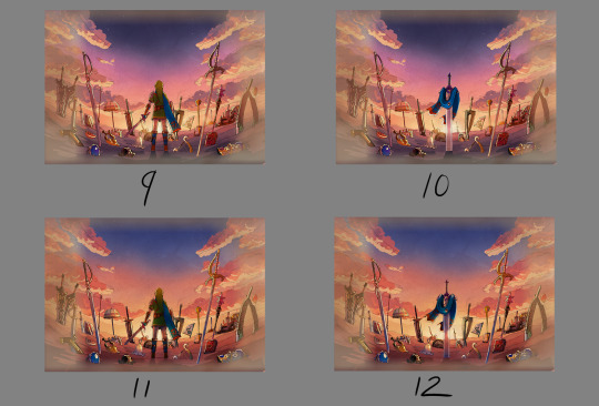

8 was the one the mods chose. However, I did end up slightly adding 6's colors into it to make the sky pop. This ended up being the finalized color concept.
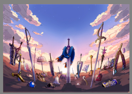
(It looks a little fuzzy because I ended up layering 8 and 6 on top of each other and I didn't position them correctly fghj).
When I do illustrations I start with the background first so I can use its colors for the foreground and midground. I normally don't draw clouds this big and up close so I had to be pretty delicate with how I rendered it. I'm glad I only had to do one side and just duplicate it to the other. Also I made the oranges in the sky and clouds subdued.
After the background was done, I tried rendering the ground and it was a disaster. This was early on in the rendering phase, but what was meant to be dirt started to look like sand. I tried to see if adding textures would help but it made the problem worse. I ended up taking a break from the ground and moved on to the weapons.
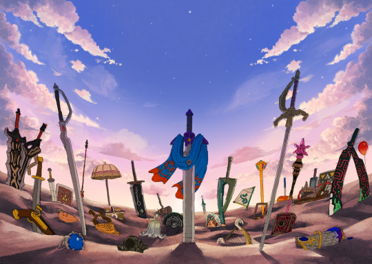
Next was the most grueling part of the piece: linearting. I am not kidding when I say doing the lineart took three whole days. I was also juggling with my other illustration I was working on for the zine so the timeline ended up stretching to a week. I'm a detail-oriented person and stuff like this isn't usually that bad for me but this one was pretty rough. The sweat and tears paid off, I think!
After lineart was done, I went back to render the ground again. It was becoming more polished and included more small rock formations, but the dirt-looking-like-sand bit wasn't improved. I opted to add grass instead since that would be easier to render. That was probably the right call because I think that helped with the desired tone for the cover.
I flipped-flopped between working on the grass and the weapons. This screenshot was when I had added the shading, textures, and some highlights. Oh, and I slightly tweaked the sky a bit.

With the grass and rendering done comes my favorite part: color editing. Started throwing overlays, soft lights, what have you on everything and used color balance to level out the colors. Also added light reflection on the ground for some of the weapons.
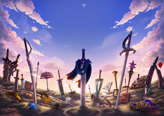
Something was missing from the illustration and I had no idea what it was. A friend had suggested particle effects and that did the trick! Everything was set and done and I submitted my illustration. When I saw the cover with the title for the first time, I noticed that the illustration was made a bit brighter than what I originally had (likely so the title stuck out better). I actually really liked that change and edited my own copy of my illustration accordingly.

With that said, now I want to talk about some of the more subtle details in this piece. You guys probably noticed these already, but I want to talk about them anyway! I mentioned deliberate weapon placements some ways up so let me go over that first.
Ghirahim's sword, Zelda's rapier, and the master sword are placed in sort of a triangular way meant to represent the triforce (although I think I messed up on the distance between them). I originally wanted Ganondorf's swords being in Ghirahim's spot but I was worried about contrast issues with the swords' darker color scheme and battling attention away from the master sword. I think the idea still works considering Ghirahim is Demise's sword (and Demise is like the Ganondorf of that game). Though Ganondorf's current placement can be viewed as him being a looming threat, for Hyrule Warriors and other Zelda titles.
I have Lana's tome and Cia's scepter close together to symbolize them being two sides of the same coin. Toon Link and Toon Zelda's were placed on opposite sides of the piece but slightly facing each other. Toon Link's and Tetra's are also diagonal from each other, both also representing a type of connection to each other. It's a similar deal with both forms of Midna's weapons as well as Yuga and Ravio. Speaking of Ravio, his weapon is the only one partially buried, sort of peaking over at the master sword to reflect his cowardice natureand being Link's Lorule opposite (at least the Link from a Linked Between Worlds). A similar idea with Fi is that she is somewhat of a silhouette behind the master sword to reflect her growth in Skyward Sword. (I know technically Fi is represented twice here, but her "weapon" in Hyrule Warriors is a different blade so that's why).
Like I said before not all weapons have symbolic placements like this, but a number of them do.
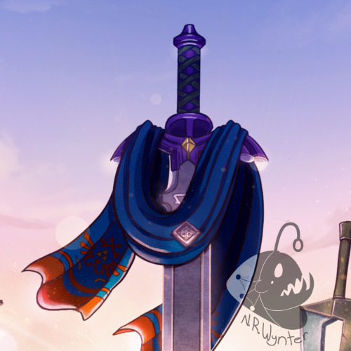
One more weapon detail I wanted to point out is on the master sword. I had this planned from the very beginning but I intentionally draped Link's scarf over the master sword so that the triforce of courage on the blade is the only one visible. I also intentionally highlighted the engraving to make it more prominent.
In the background, the sky is shaped in a way to resemble the Hyrulean royal crest. With the gap in between the clouds looking like the wings, the Master sword acting as the body, and the three visible stars as the triforce (but I messed that up slightly). Only thing I didn't include was the feet of the crest. It's not an exact 1-to-1, but here's an outline for a better visual:

On the topic of stars, there are 29 in total to represent all 29 characters. The brightest star above the master sword is meant to represent Link, but the other 28 are scattered around. Some are more visible than others so it may be hard to spot them all, but they're there.
Saving this last detail because it doesn't really have anything to do with Zelda and more to do with my art. I have always wanted to do this with my work for a while but haven't implemented it until now so I wanted to bring it attention.
From now on, all of my illustrations will have a hidden little angler fish blended into the scenery. I got the inspiration from Adventure Time's snail that appears in almost every episode incorporated somewhere and thought I could do something similar with my art. I'll show you guys where I placed this one, but you'll have to find the next ones on your own.
Not the clearest, but I promise in the future it'll be better drawn (and in case you're wondering, yes there are also little anglerfish in the other zine illustration too!). I just thought this would be a fun way people can interact with my art (and also act as an additional signature).
And that's it! If you have read all of my rambles, thank you!
32 notes
·
View notes
Text
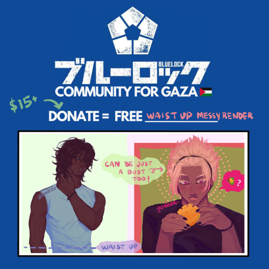
[ STATUS: CLOSED ]
hey yall i’m participating in #BLLKTWT4GAZA on twitter, so anyone who donates $15 or more can get a waist up drawing of a character! you can also check the hashtag on twitter to see other artists offering their art in return for donations as well. send me a DM if you're interested tho!
some info you should read before contacting me:
please read through to my commission terms here
dm me & i’ll send you a gfm that i’d like you to donate to. after donating, you must send me a screenshot of your donation where the time is visible so that i can make sure that no duplicates are being used! also, please mark the screenshot with your username!
the more you donate, the cleaner the rendering will be. i’ll add some examples below of what that looks like depending on how much you donate!
if you want 2 or more characters in one drawing, come and talk to me about how much you’d need to donate as a minimum amount. i won’t do more than 3 characters in a drawing for these though
references are highly appreciated and encouraged! they will help me finish your drawing much faster :]
the turnaround for these will probably be a bit longer than my usual time due to irl stuff, but if you need it by a certain time, please tell me as soon as you send me that first dm & i'll let you know if i can meet that deadline!
#free palestine#commissions for palestine#commissions for gaza#blue lock#if yall saw the giorno drawing i did#that was for this !!!
47 notes
·
View notes